Article

A Novel Curve Clustering Method for Functional Data: Applications to COVID-19 and Financial Data

School of Computing and Mathematical Sciences, University of Leicester, Leicester LE1 7RH, UK
*
Author to whom correspondence should be addressed.
Analytics 2023, 2(4), 781-808; https://doi.org/10.3390/analytics2040041
Submission received: 14 December 2022 / Revised: 11 September 2023 / Accepted: 28 September 2023 / Published: 8 October 2023
(This article belongs to the Special Issue Feature Papers in Analytics)

Abstract

:
Functional data analysis has significantly enriched the landscape of existing data analysis methodologies, providing a new framework for comprehending data structures and extracting valuable insights. This paper is dedicated to addressing functional data clustering—a pivotal challenge within functional data analysis. Our contribution to this field manifests through the introduction of innovative clustering methodologies tailored specifically to functional curves. Initially, we present a proximity measure algorithm designed for functional curve clustering. This innovative clustering approach offers the flexibility to redefine measurement points on continuous functions, adapting to either equidistant or nonuniform arrangements, as dictated by the demands of the proximity measure. Central to this method is the “proximity threshold”, a critical parameter that governs the cluster count, and its selection is thoroughly explored. Subsequently, we propose a time-shift clustering algorithm designed for time-series data. This approach identifies historical data segments that share patterns similar to those observed in the present. To evaluate the effectiveness of our methodologies, we conduct comparisons with the classic K-means clustering method and apply them to simulated data, yielding encouraging simulation results. Moving beyond simulation, we apply the proposed proximity measure algorithm to COVID-19 data, yielding notable clustering accuracy. Additionally, the time-shift clustering algorithm is employed to analyse NASDAQ Composite data, successfully revealing underlying economic cycles.

1. Introduction

The advent of the Big Data era brings both opportunities and challenges to humanity. Wedel and Kannan [1] said that “data is the oil of the digital economy”. Indeed, this data-rich environment is enhancing the way people live and work. To harness the potential of Big Data, identification, management, and analysis are essential tools for making intelligent and data-driven decisions. Nowadays, data are not only vast in capacity but also intricate in structure, encompassing elements like (ultra) high-dimensional data, (ultra) high-frequency data, and unequal observation time point data. Traditional data analysis techniques mainly focus on exploring univariate data, multivariate data, time-series data, cross-sectional data, and panel data. As a result, they encounter numerous limitations when attempting to extract information from Big Data. However, functional data analysis (FDA) has gained prominence as a research hotspot in statistics and various fields of science by capitalising on the advantages of utilising the functional features of observed data that vary across a continuum [2].
Generally speaking, functional data is a type of data with functional properties that describe information about curves, surfaces, or anything that varies over a continuum. One of the most significant topics in the FDA is functional clustering. Methodologies for functional data clustering have developed rapidly and have aroused intense interest among researchers over the past few decades. The existing functional clustering methods can roughly be categorised into four groups: raw data clustering, filtering methods, adaptive methods, and distance-based methods [3]. For raw data methods, functional data are clustered directly based on their discrete evaluation points [4]. This method is often the simplest, as the functions are typically already recorded at specific discrete observation points. Therefore, there is no requirement to reconstruct the functional form of the data, we can directly cluster the observation points. However, the drawback of this method is its disregard for the functional characteristics of the data, potentially leading to a loss of valuable information in this regard [3]. Filtering methods involve representing the curves using specific basis functions and then clustering them based on the coefficients of the basis expansion. Hence, the curves are expressed through a limited set of parameters (or coefficients), effectively reducing the dimensionality of the data. For the filtering phase, opting for a spline basis is a prevalent choice due to its optimal properties [5]. For instance, Abraham et al. [6] used the B-spline to fit the functional data and then cluster them by the K-means algorithm. Peng and Müller [7] used the functional principal component scores and the K-means algorithm to realise the clustering. Wu et al. [8] used functional principal component analysis and then clustered the principal scores based on the principal curves clustering method. Unlike the filtering methods, adaptive methods consider the basis expansion coefficients as random variables that adhere to a probability distribution, rather than treating them as parameters. For example, James and Sugar [9] used the basis expansion coefficients to cluster sparsely sampled functional data based on a mixture of Gaussian distributions. Bouveyron and Jacques [10] proposed a clustering algorithm for high-dimensional functional data within a specific functional subspace. The core idea involves assuming a Gaussian distribution for the functional principal components and defining a probabilistic model based on the mixture model. Distance-based methods modify traditional multivariate clustering algorithms to suit functional data, achieved by establishing specific distances or dissimilarities among curves. For instance, in the work of Ferraty and Vieu [11], they suggested employing a hierarchical clustering algorithm in conjunction with either the L 2 -metric or the semi-metric. Ieva et al. combined the K-means algorithm with L 2 distance [12]. Also, Tarpey and Kinateder explored the utilisation of L 2 distance with K-means for Gaussian processes [13].
Furthermore, Jacques and Preda [14] considered the dependency between the curves and proposed a model-based clustering method for multivariate functional data; Secchi et al. [15] presented the Bagging Voronoi classifiers algorithm, designed to handle the functional data of large geo-referenced datasets. Additionally, Boullé [16] introduced a novel nonparametric method based on piecewise constant density estimation, which offers the advantage of not requiring parametric settings for functional data clustering. Meanwhile, Verma et al. [17] provided an overview of the performance of various clustering algorithms in data mining, including K-means clustering, hierarchical clustering, Density-Based Spatial Clustering of Applications with Noise (DBSCAN), density-based clustering, Ordering Points to Identify the Clustering Structure (Optics), and the EM Algorithm. They point out that in all the discussed clustering techniques, the central approach involves finding cluster centres that represent each cluster. These centres act as reference points, aiding in identifying the core location of each cluster. When presented with an input, the system utilises a similarity metric between the input and cluster centres to assign the input to the nearest or most similar cluster.
In this paper, we present a novel functional clustering algorithm that hinges on a proximity measure designed for functional data trajectories, referred to as the proximity measure. This innovative approach takes inspiration from the aforementioned distance-based methods, leading us to introduce the fresh concept of proximity measurement. Diverging from the distance-based clustering methods commonly found in the literature, our proposed method takes into account both the shape and trend of the curves, operating independently of their specific positions. For instance, even if two functional curves share an identical trend but are widely separated, our proximity measure will still classify them within the same cluster. To put it succinctly, our focus is on their degree of similarity rather than their spatial proximity. In contrast, our proposed method stands apart from filtering clustering techniques as it does not require the estimation of the coefficients of the base expansion. We employ the B-spline smoothing technique to separate the real signal from the noisy data. Once the smoothed functional curves are derived from the discrete observation data, we have the flexibility to redefine the measuring points, either equidistant or nonuniform, as required to apply the proximity measure. To clarify, we extract the essence of the functional curve from the raw data and subsequently partition the smoothed functional curves into discrete measurement points once again. This strategy holds a significant advantage in handling original functional entities featuring unevenly spaced points or instances of missing data. It is worth noting that, unlike raw data clustering methods, we engage in reconstructing the functional structure of the data. This ensures the preservation of the data’s functional characteristics and the avoidance of any loss of valuable information. It is essential to highlight that K-means clustering necessitates prior knowledge of the number of clusters. This method proves highly susceptible to noise within datasets, which poses challenges in achieving optimal clustering. Another limitation of K-means lies in its inherent uncertainty, resulting in potentially varied clustering results across different runs, even when utilising the same dataset [18]. Likewise, our proposed proximity measure algorithm incorporates a crucial parameter known as the “proximity threshold”. This threshold possesses a clear range of values and does not need to be preconfigured before using the algorithm. Moreover, our algorithm ensures consistent clustering outcomes even across multiple runs.
Another noteworthy aspect of this paper is the rolling window clustering technique, derived from the introduced proximity measure algorithm, denoted as “time-shift clustering”. This method is designed to identify segments within historical data that share a similar trend with the observed data points of interest. In this context, the “rolling window” concept discussed in this paper has similarities to the “sliding window” concept introduced in the study of Keogh and Lin [19]. In their work, they asserted that “sliding window time-series clustering is never meaningful” due to instances of “trivial match”. However, our approach, unlike the “trivial match”, identifies subsequences that exhibit similar shapes to designated subsequences by searching across the entire timeframe, rather than focusing on locating cluster centres. Furthermore, it is important to note that the “trivial match” is typically employed in unsupervised clustering, whereas time-shift clustering falls under the category of supervised clustering. This distinction arises from our practice of presetting a target window as the designated subsequences. Another point of departure is that “trivial match” clusters the closest subsequences, which are the subsequences immediately to the left and right. In contrast, time-shift clustering can identify similar subsequences that are distant from the designated subsequences.
Finally, we applied the proposed algorithms to both simulated and real datasets. The outcomes demonstrate that the proposed methods exhibit excellent clustering accuracy and are adept at uncovering valuable insights within the data.
The rest of this paper is organised as follows. Section 2 elaborates on the principle of the proximity measure algorithm and time-shift clustering for functional data. The proposed method is demonstrated using some simulated examples in Section 3. Section 4 showcases the application of the proposed clustering method to COVID-19 and NASDAQ datasets. Finally, in Section 5, the advantages and disadvantages of the proposed algorithm are discussed, along with potential future directions.

2. Methodology

2.1. Proximity Measure and Functional Clustering Algorithm

In this section, we initially define a proximity measure for continuous functions and subsequently introduce our novel clustering algorithm for functional data, grounded in their curvilinear structure.
Let F m be the collection of m distinct continuous functions of [ T 0 , T 1 ] , i.e.,
F m = X i X i = f i ( t ) , i = 1 , , m , f i ( t ) f j ( t ) , i j , t [ T 0 , T 1 ] .
We define the proximity D i j between f i ( t ) F m and f j ( t ) F m as
D i j = 1 T 1 T 0 T 0 T 1 ( f i ( t ) f j ( t ) ) ( μ i μ j ) 2 d t = 1 T 1 T 0 T 0 T 1 ( f i ( t ) μ i ) ( f j ( t ) μ j ) 2 d t ,
where μ i = 1 T 1 T 0 T 0 T 1 f i ( t ) d t and μ j = 1 T 1 T 0 T 0 T 1 f j ( t ) d t .
Obviously, the proximity D i j between f i ( t ) and f j ( t ) satisfies the following properties:
D i j = D j i D i j 0 , and D i j = 0 if and only if f i ( t ) f j ( t ) C ,
where C R is a constant. Furthermore, we have the following.
Theorem 1.
The proximity D i j between f i ( t ) and f j ( t ) defined in Equation (2) satisfies the following reverse triangle inequality:
1 T 1 T 0 T 0 T 1 ( f i ( t ) μ i ) ( f j ( t ) μ j ) 2 d t 1 T 1 T 0 T 0 T 1 ( f i ( t ) μ i ) 2 d t 1 T 1 T 0 T 0 T 1 ( f j ( t ) μ j ) 2 d t 2 .
Proof. 
Let F i ( t ) = f i ( t ) μ i and F j ( t ) = f j ( t ) μ j , we have
1 T 1 T 0 T 0 T 1 F i ( t ) F j ( t ) 2 d t = 1 T 1 T 0 T 0 T 1 F i 2 ( t ) d t 2 T 1 T 0 T 0 T 1 F i ( t ) F j ( t ) d t + 1 T 1 T 0 T 0 T 1 F j 2 ( t ) d t 1 T 1 T 0 T 0 T 1 F i 2 ( t ) d t 2 T 1 T 0 T 0 T 1 F i ( t ) F j ( t ) d t + 1 T 1 T 0 T 0 T 1 F j 2 ( t ) d t 1 T 1 T 0 T 0 T 1 F i 2 ( t ) d t 2 T 1 T 0 T 0 T 1 F i 2 ( t ) d t T 0 T 1 F j 2 ( t ) d t + 1 T 1 T 0 T 0 T 1 F j 2 ( t ) d t ( by the Cauchy Schwarz inequality ) = 1 T 1 T 0 T 0 T 1 F i 2 ( t ) d t 1 T 1 T 0 T 0 T 1 F j 2 ( t ) d t 2 .
In practice, we only possess discrete observations of each function at a finite set of points. Consequently, continuous functions need to be estimated from these discrete observations using a basis of functions, such as the B-spline or Fourier basis. Subsequently, proximity can be calculated through numerical integration.
Suppose now we have m curves X i ( t ) ( i = 1 , , m ), denoted collectively by F m = { X i ,   i = 1 , , m } . Our proposed clustering algorithm for functional data is outlined in the following steps.
Step 1
Set up the proximity matrix. Based on Equation (2), we calculate the proximity D i j ,   i , j = 1 , 2 , , m , and obtain the following proximity matrix P M m × m :
P M m × m = D 11 D 12 D 1 m D 21 D 22 D 2 m D m 1 D m 2 D m m .
It is evident that within this proximity matrix, all diagonal entries are zero.
Step 2
Set a proximity threshold α . From the proximity matrix P M m × m , we find the largest D i j value and denote it by P M m a x . We define a threshold as α [ 0 , P M m a x ] . The threshold α plays a vital role in clustering and determines the number of clusters (hence it is also referred to as the threshold of cluster separation):
(a)
When α = 0 , we will have m clusters, meaning that each object is a cluster;
(b)
When α = P M m a x , we will have only one cluster, meaning that all objects belong to one cluster;
(c)
If α ( 0 , P M m a x ) , go to Step 3.
Step 3
Find the two initial centroids. We refer to the different groups of functions as clusters C k , k = 1 , 2 , , c . Assuming that X p and X q are such that their proximity is D p q = P M m a x and D p q > α , then we can determine the two initial cluster centroids: X p (belonging to C 1 ) and X q (belonging to C 2 ). It means that there exists a maximum difference between the trajectory of object X p and the trajectory of object X q . Thus, we set the objects X p and X q as two initial centroids, whilst C 1 and C 2 are two initial clusters.
Step 4
Find the third centroid (if possible). Search all objects in F m and find an object X r F m { X p , X q } such that D p r > α and D q r > α . Let X r = arg max X r F m { X p , X q } [ D p r + D q r ] . This means that the object X r cannot be grouped into C 1 or C 2 . In other words, there is a maximum difference between the trajectory of object X p , the trajectory of object X q , and the trajectory of object X r :
(a)
If X r exists, update the cluster centroids: X p , X q , and X r , and X r belongs to the third cluster C 3 . Go to Step 5.
(b)
If X r does not exist, go to Step 6.
Step 5
Try to find the fourth centroid. Following the same logic as in Step 4, for any object X h F m { X p , X q , X r } , check the following:
(a)
If D p h < D q h , D p h < D r h and D p h α , move object X h to C 1 with the cluster centroid X p ;
(b)
If D q h < D p h , D q h < D r h and D q h α , move object X h to C 2 with the cluster centroid X q ;
(c)
If D r h < D p h , D r h < D q h and D r h α , move object X h to C 3 with the cluster centroid X r ;
(d)
If D p h > α , D q h > α and D r h > α , let object X h be in a separate cluster C 4 .
Here, we call the C 1 to C 4 provisional clusters. Next, go to Step 7.
Step 6
If the object X r does not exist. For any object X h F m { X p , X q } :
(a)
If D p h < D q h , move object X h to C 1 with the cluster centroid X p ;
(b)
If D p h > D q h , move object X h to C 2 with the cluster centroid X q .
Similarly, we call the C 1 and C 2 provisional clusters. Next, go to Step 7.
Step 7
Check and iteration. We check all provisional clusters. For example, for the provisional cluster C 1 mentioned in Step 5 and Step 6, check the following:
(a)
If D s t α , X s , X t C 1 , C 1 is a completed cluster. Next, go to Step 8;
(b)
If there exists at least one pair of objects X s , X t C 1 , such that D s t > α , then we regard the cluster C 1 as a new collection of functions F m , where m is the size of C 1 , and repeat Step 3 to Step 7 for cluster C 1 only.
For the remaining provisional clusters, we execute the same process as described for cluster C 1 above.
Step 8
Update and complete. Update all clusters and gather all completed clusters from Step 7. The algorithm terminates when the number of objects in all the completed clusters equals the total number of objects in F m .
It is worth noting that within the above algorithm, a crucial inquiry arises regarding the determination of the proximity threshold α . This threshold α can be selected according to the specific scenario and research objectives in each case. Further elaboration on α selection will be provided in Section 4.

2.2. Time-Shift Clustering for Time-Series Data

In this section, we present a fresh concept called time-shift clustering, building upon the clustering method outlined earlier. It is important to clarify that the term “time-shift” in this context allows for position adjustments, enabling movement backwards or to different time points, rather than strictly adhering to a linear chronological order. This concept merges the proposed clustering algorithm with the rolling time window technique, with the aim of identifying historical data segments that are similar to current observations.
The rolling window analysis of time-series models is commonly employed to assess the stability of models and parameters over time or to forecast future situations [20,21,22]. As discussed in Section 1, the utilisation of the “rolling window” in this context differs from the “trivial match” mentioned in the work of Keogh and Lin [19]. Our emphasis lies solely on searching for and identifying necessary subsequences, without necessitating the estimation of a cluster centre among all the subsequences. Therefore, in our case, we utilise a rolling window to search backwards for historical periods that are similar to the current one. Regarding the time-shift clustering procedure, the primary clustering algorithm remains consistent with the one outlined in Section 2.1. Consequently, in the following, we will solely elucidate the aspect related to the rolling window.
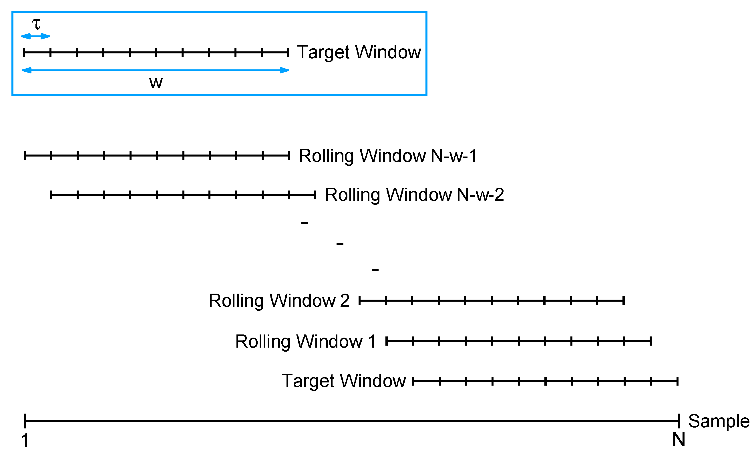
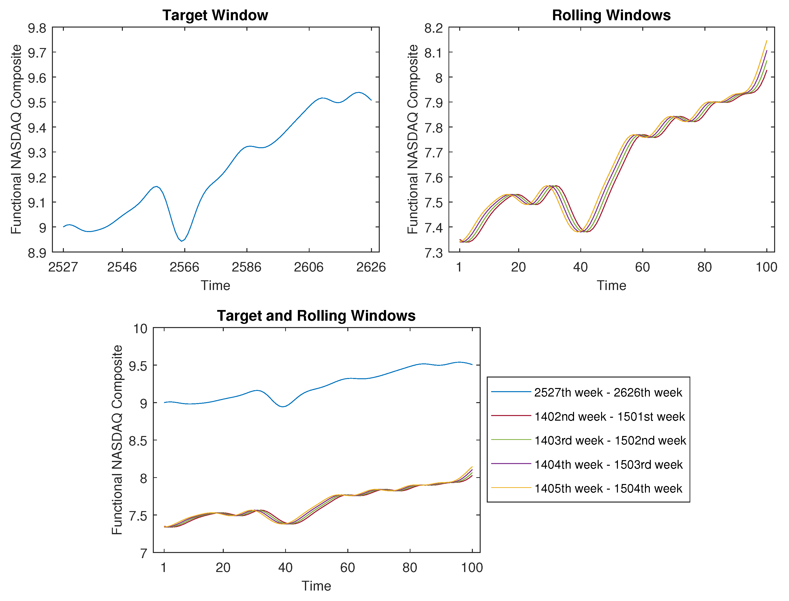
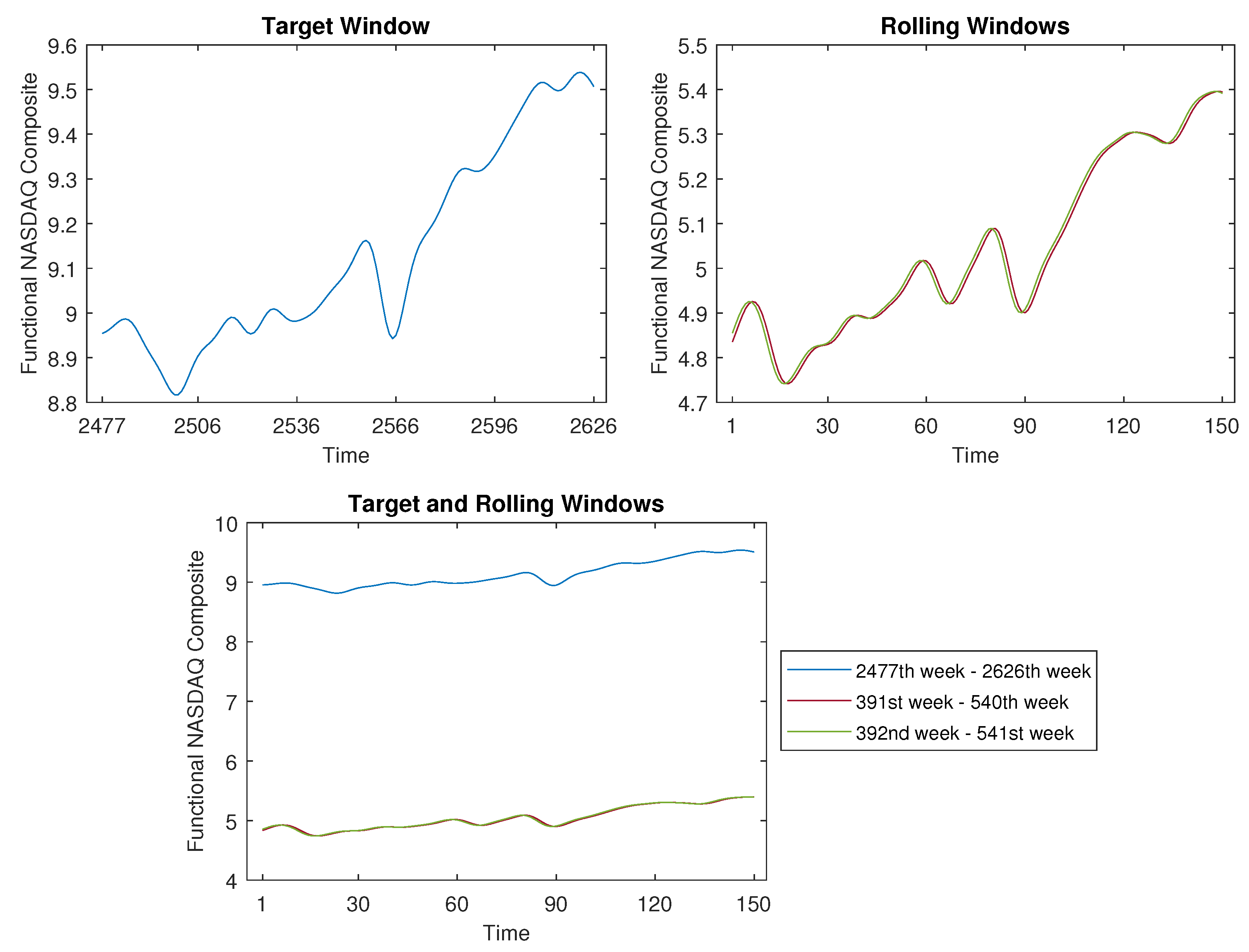
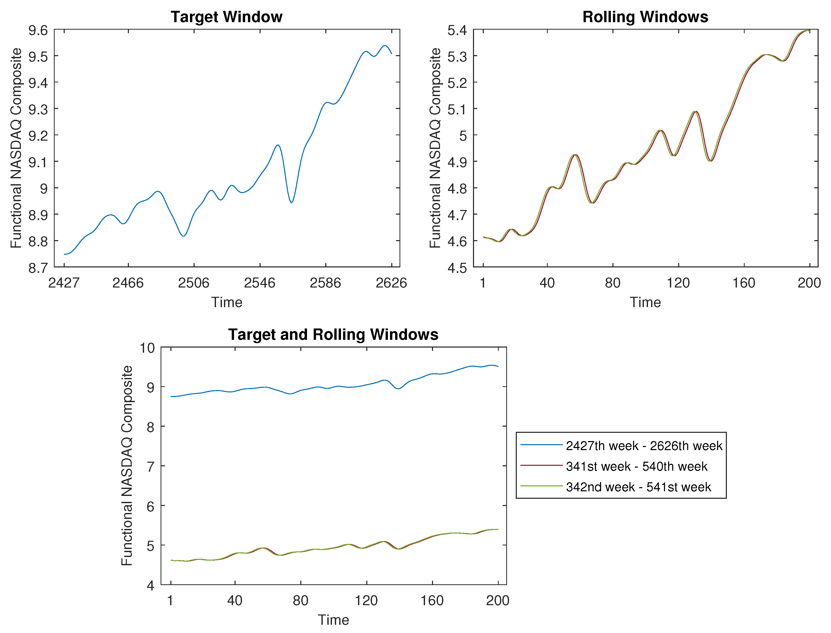
Given a time series with observations X ( t ) , for t = 1 , 2 , , N . Suppose that we are interested in the pattern of the most recent w observations, i.e., at the time points t = N w + 1 , , N , which could be recent w weeks, w months, or w years. We denote these time points as the target window. Our objective is to identify segments of the same length within the historical data X ( t ) ( t = 1 , 2 , , N 1 ) that exhibit patterns similar to the target window, employing a proximity measure. To attain this objective, we employ the rolling window method, which comprises the following three steps:
Step I
Choose a rolling step size τ and partition the complete time series into multiple windows. In this scheme, the first rolling window encompasses observations spanning the period from N w + 1 τ to N τ , the second rolling window spans observations from N w + 1 2 τ to N 2 τ , and so forth. When the rolling step size τ equals one, the time series is segmented into n = N w 1 windows. A larger value of τ indicates a swifter rolling of the windows.
Step II
Regard both the target window and each of the rolling windows as continuous functions, and then execute Step 1 to Step 8 of the clustering algorithm outlined in Section 2.1.
Step III
Examine all of the rolling windows (see Figure 1) to identify those that exhibit patterns similar to the target window.
The following schematic diagram illustrates the concept of the time-shift clustering procedure.

3. Numerical Experiments

To assess the efficacy of the proposed clustering algorithm, this section presents two simulated examples. We compare the performance of our method with that of traditional K-means clustering. In the case of K-means clustering, the observations are treated as objects ( X 1 , X 2 , , X m ) evaluated at a significantly high number of equidistant points within the interval.

3.1. Simulation Study

We generated two functional datasets as follows.
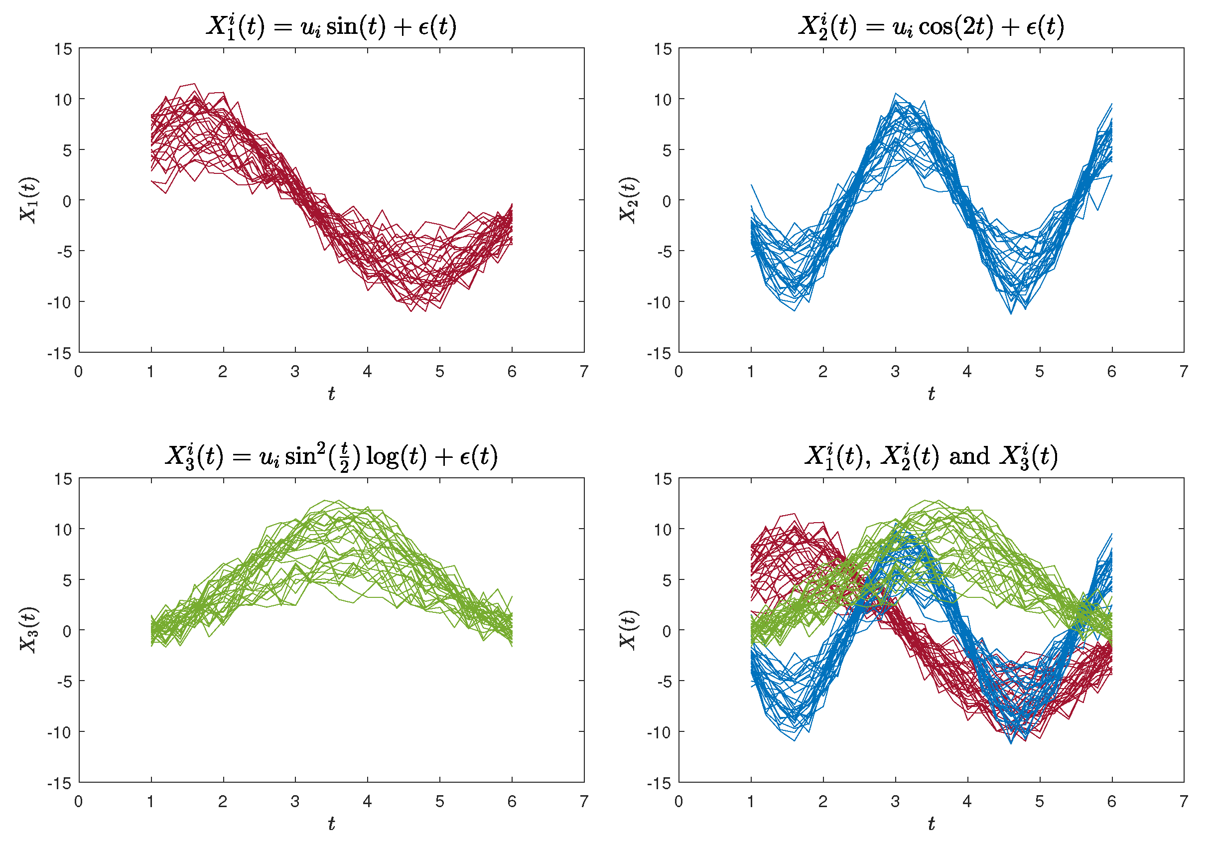
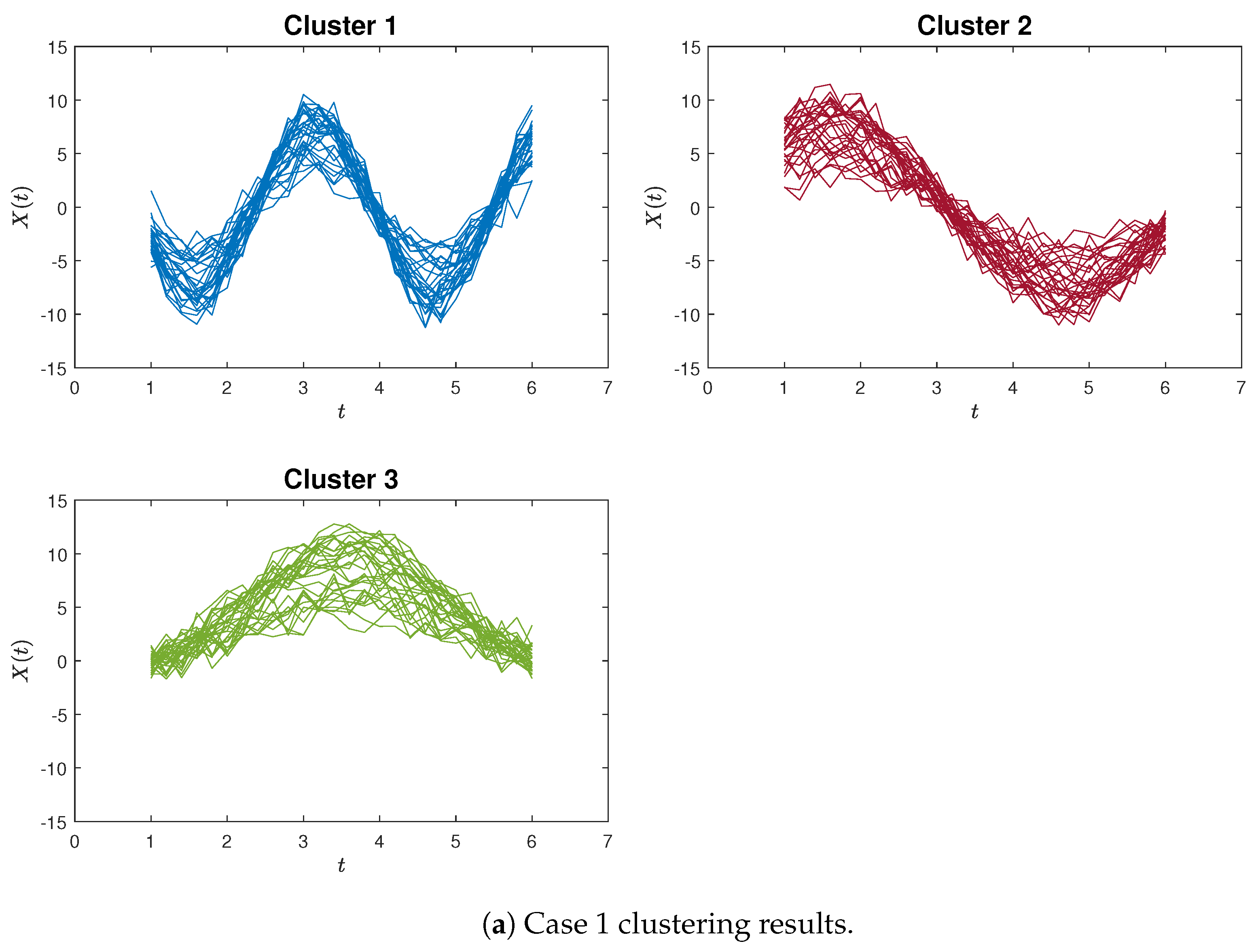
The first functional curves dataset (Case 1) was generated using the following functions:
X 1 i ( t ) = u i sin ( t ) + ϵ ( t ) , t [ 1 , 6 ] X 2 i ( t ) = u i cos ( 2 t ) + ϵ ( t ) , t [ 1 , 6 ] X 3 i ( t ) = u i sin 2 ( t 2 ) log t + ϵ ( t ) , t [ 1 , 6 ] ,
where u i U ( 3 , 10 ) , i = 1 , 2 , , 30 , and ϵ ( t ) N ( 0 , 1 ) . We generated 30 sample curves for each of the aforementioned three functions, each containing 26 data points. These data points were evaluated at equidistant intervals within the range of [ 1 , 6 ] . An illustration of the simulated curves is presented in Figure 2.
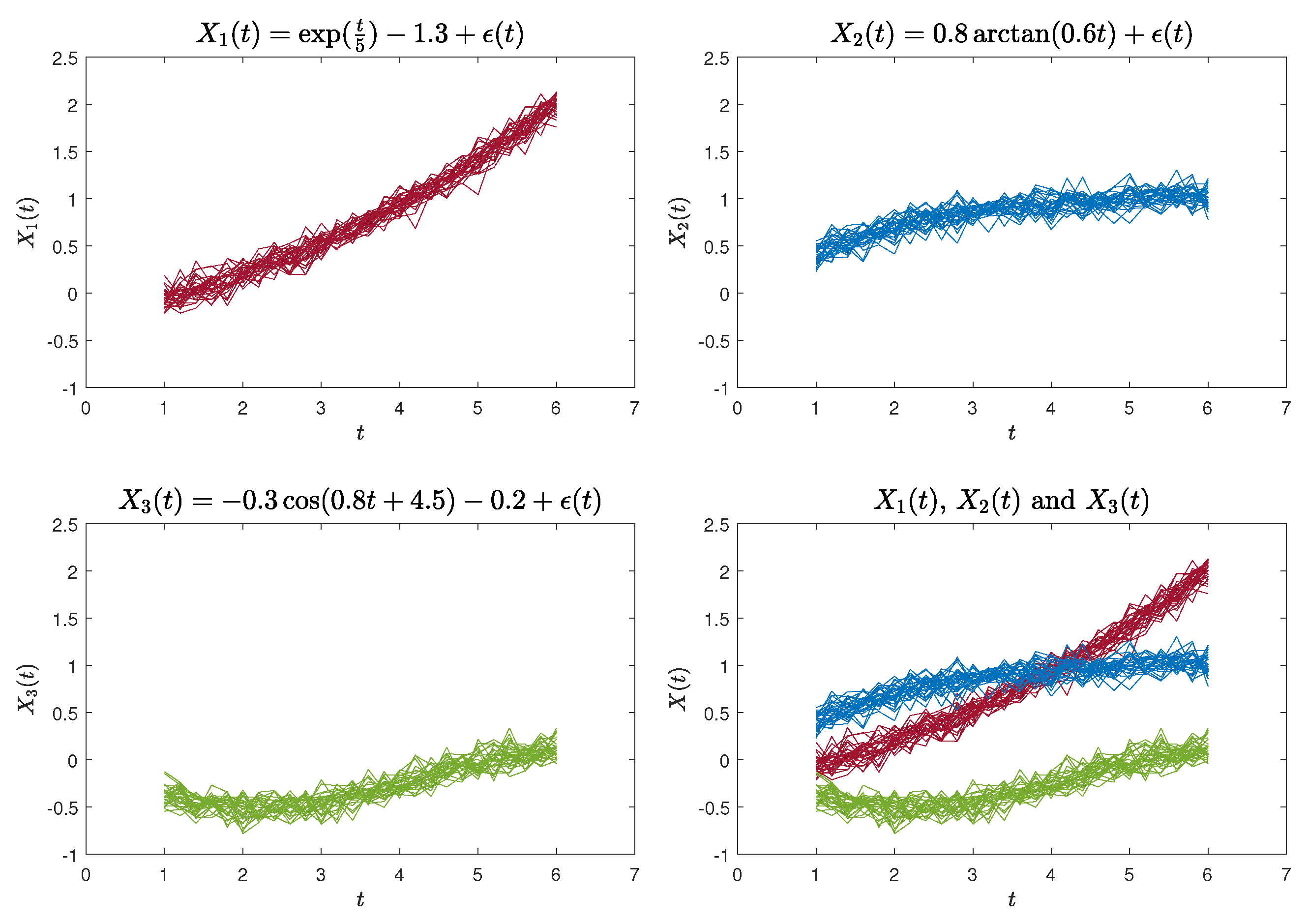
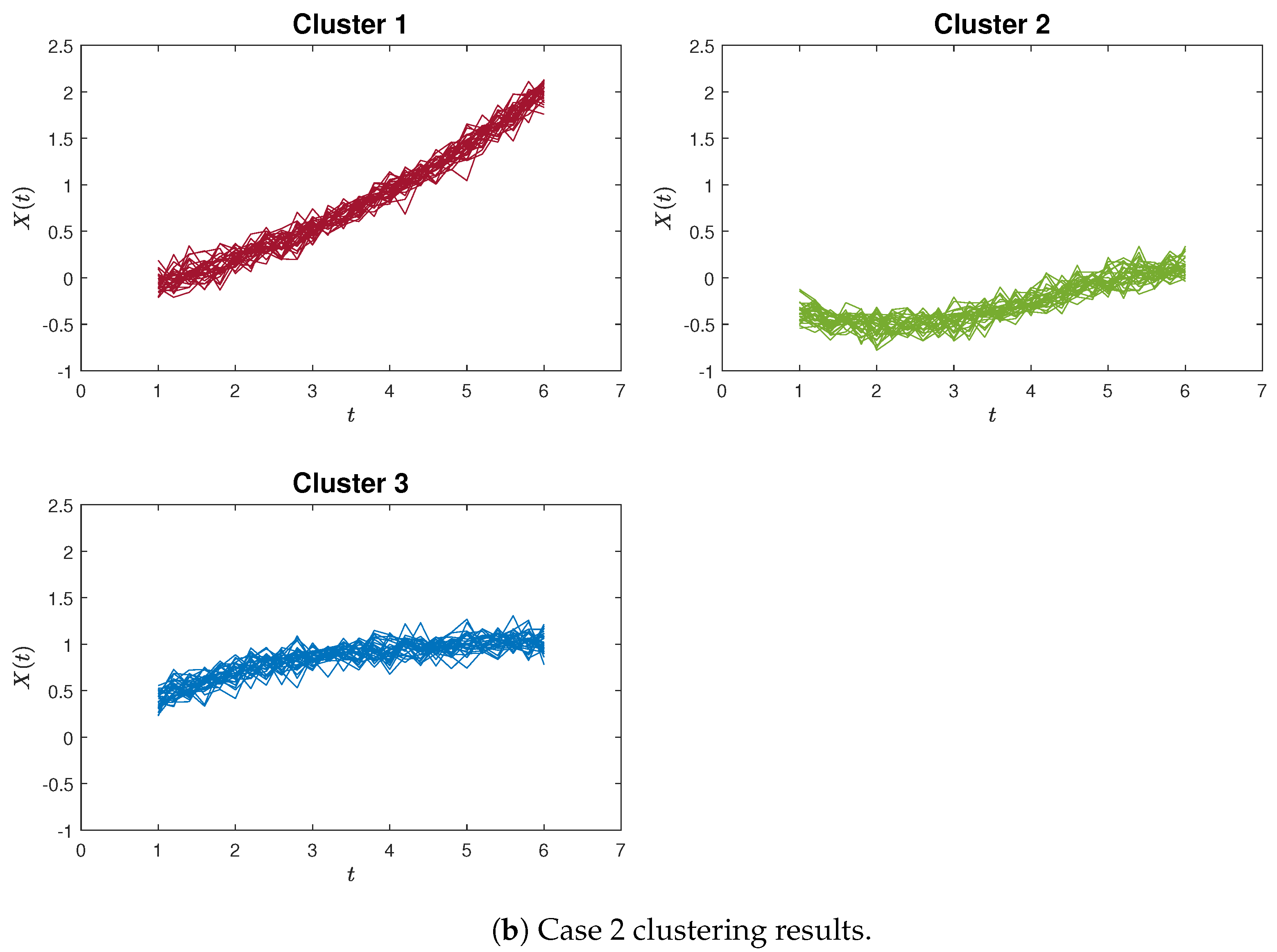
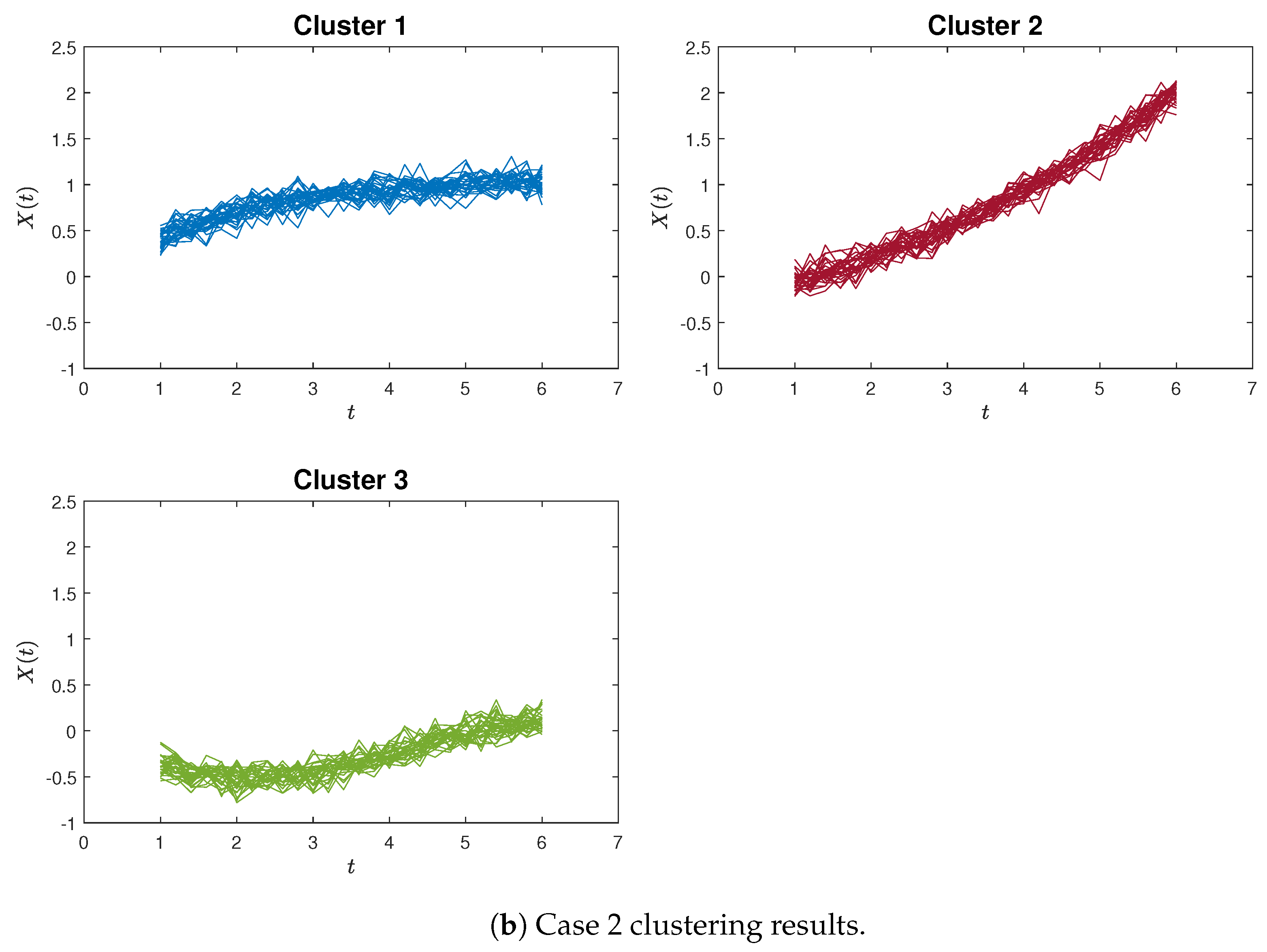
The second functional curves dataset (Case 2) is defined by the following functions [23]:
X 1 ( t ) = exp ( t 5 ) 1.3 + ϵ ( t ) , t [ 1 , 6 ] X 2 ( t ) = 0.8 arctan ( 0.6 t ) + ϵ ( t ) , t [ 1 , 6 ] X 3 ( t ) = 0.3 cos ( 0.8 t + 4.5 ) 0.2 + ϵ ( t ) , t [ 1 , 6 ] ,
where ϵ ( t ) N ( 0 , 1 ) . Likewise, we generated 30 sample curves for each of the aforementioned three functions, each comprising 26 data points. These data points were evaluated at equidistant intervals within the range of [ 1 , 6 ] . An illustration of the simulated curves is presented in Figure 3.

3.2. Simulation Results

A simulation study comprising 10,000 replications was carried out, considering the Case 1 and Case 2 functional curves datasets. We present the outcomes of our proposed clustering method and contrast them with the conventional K-means clustering approach. We choose to use the average error rate as our performance evaluation metric instead of the mode or median. This decision is based on the fact that the mode is not always unique, and the median closely approximates the mean value in our case. Opting for the mean value provides a more accurate representation of the error level since all error rates exhibit a relatively stable pattern devoid of outliers.
Therefore, the average error rates for these two clustering methods are presented in Table 1.
In the proximity measure method, the selection of the proximity threshold α depends on the desired number of clusters. Given that these 90 curves are generated by three distinct functions, the ultimate number of clusters should be three. Consequently, we set the proximity threshold α to yield a total of three final clusters. Notably, there exists a range of threshold values that lead to the formation of three clusters. Nonetheless, the clustering outcomes for varying threshold values exhibit remarkable similarity, with closely aligned error rates.
As an illustrative instance, Table 1 showcases five thresholds for both Case 1 and Case 2. The error rates for the K-means clustering approach are computed by specifying the correct number of clusters. The data in Table 1 reveal that the error rates produced by the proposed method for different threshold values are very similar and notably lower than those resulting from K-means clustering.
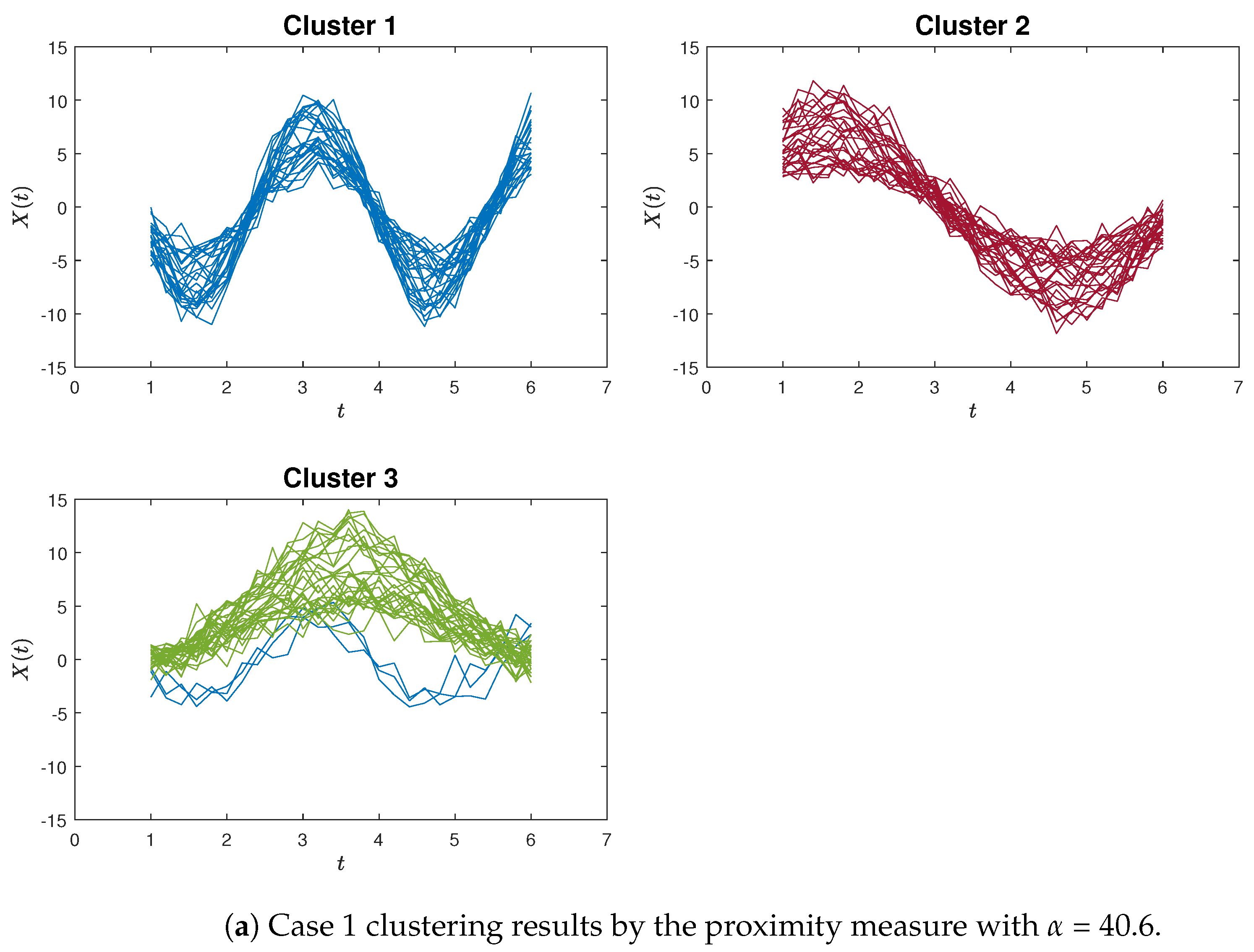
Let us now take a closer look at some of the typical clustering results.
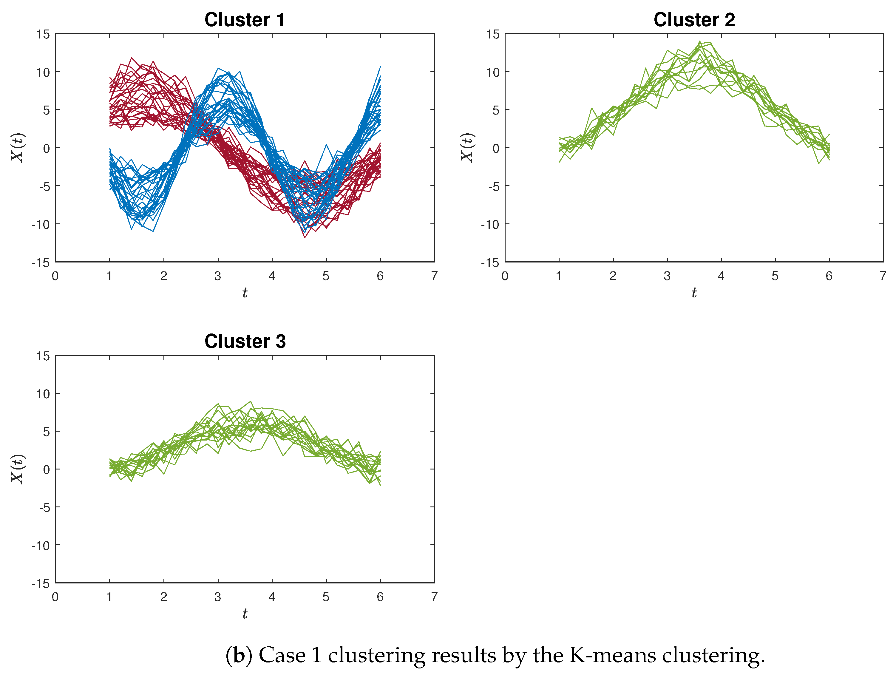
Figure 4a,b exemplify instances of poor clustering using the proposed proximity measure clustering and the K-means method for Case 1, respectively. A distinct contrast can be observed between these two clustering outcomes.
Similar patterns can be discerned in 
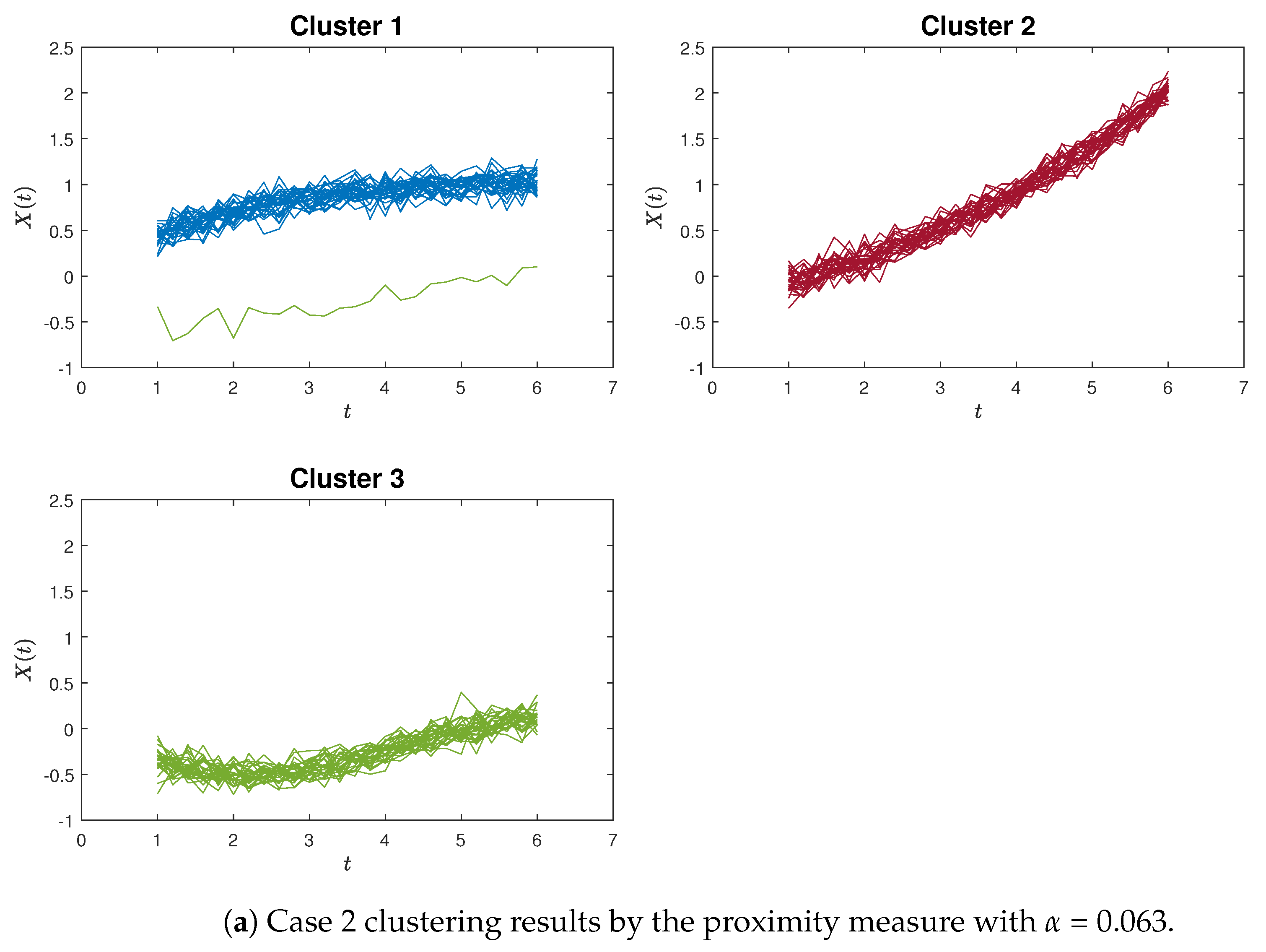
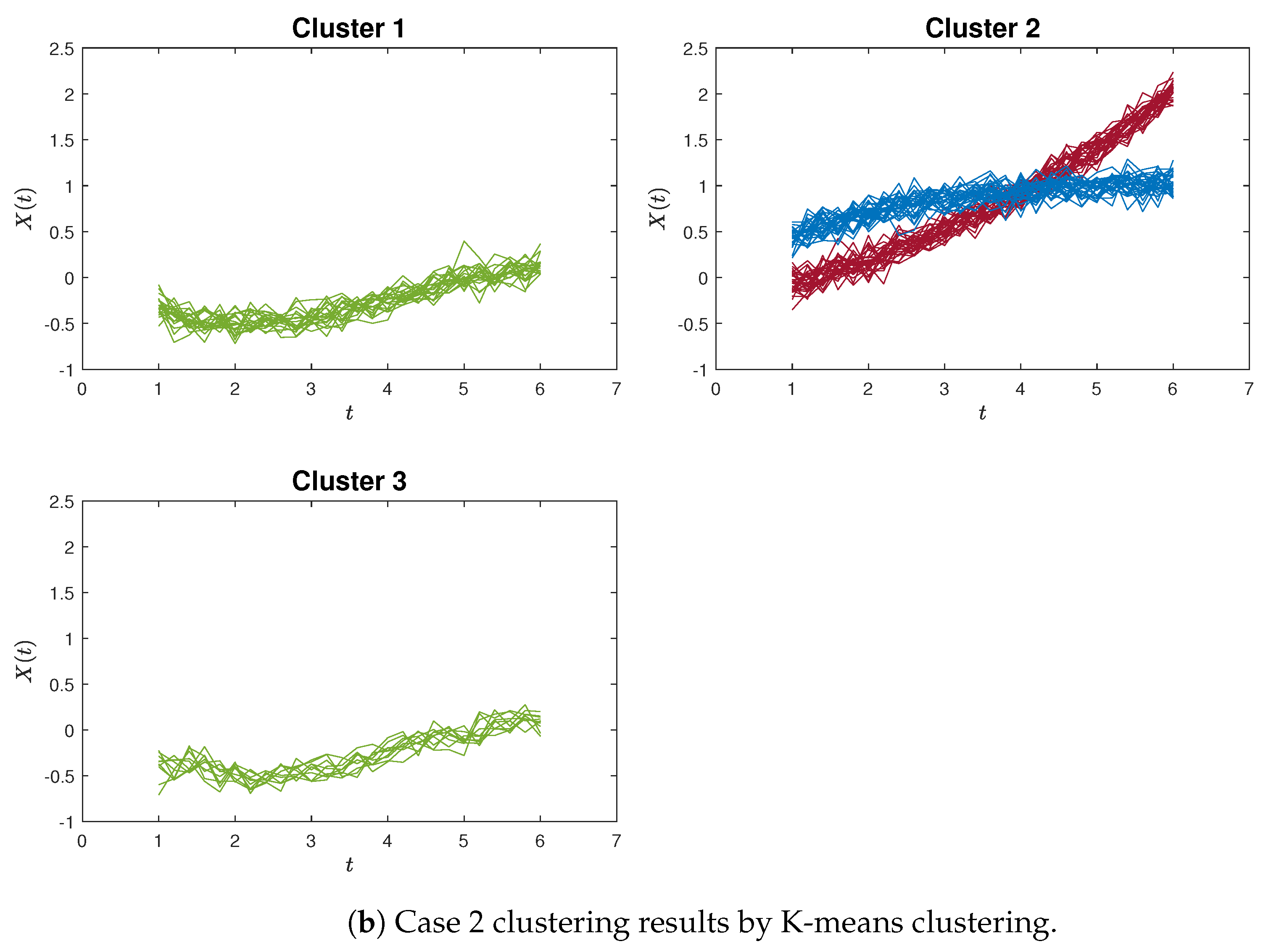
Figure 5a,b, which provide an example of poor clustering results using the proximity measure and the K-means method for Case 2, respectively.
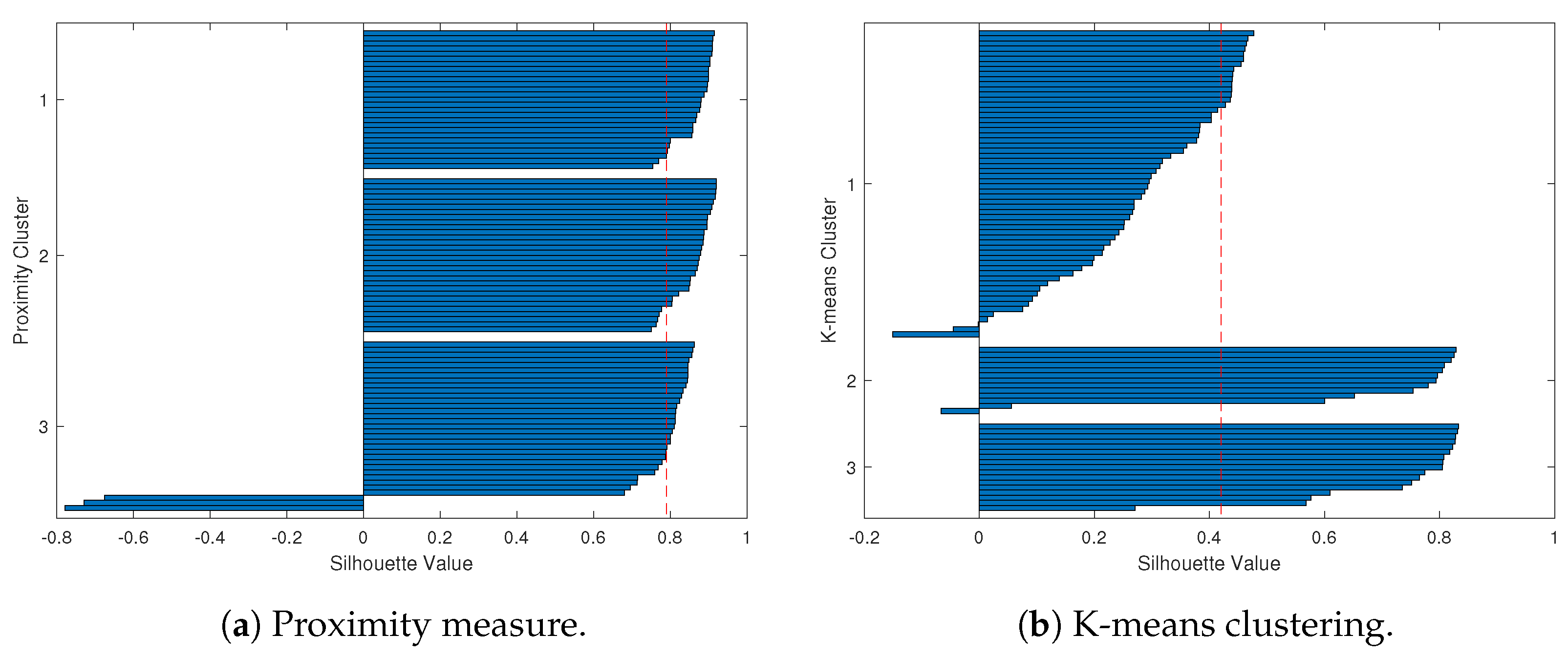
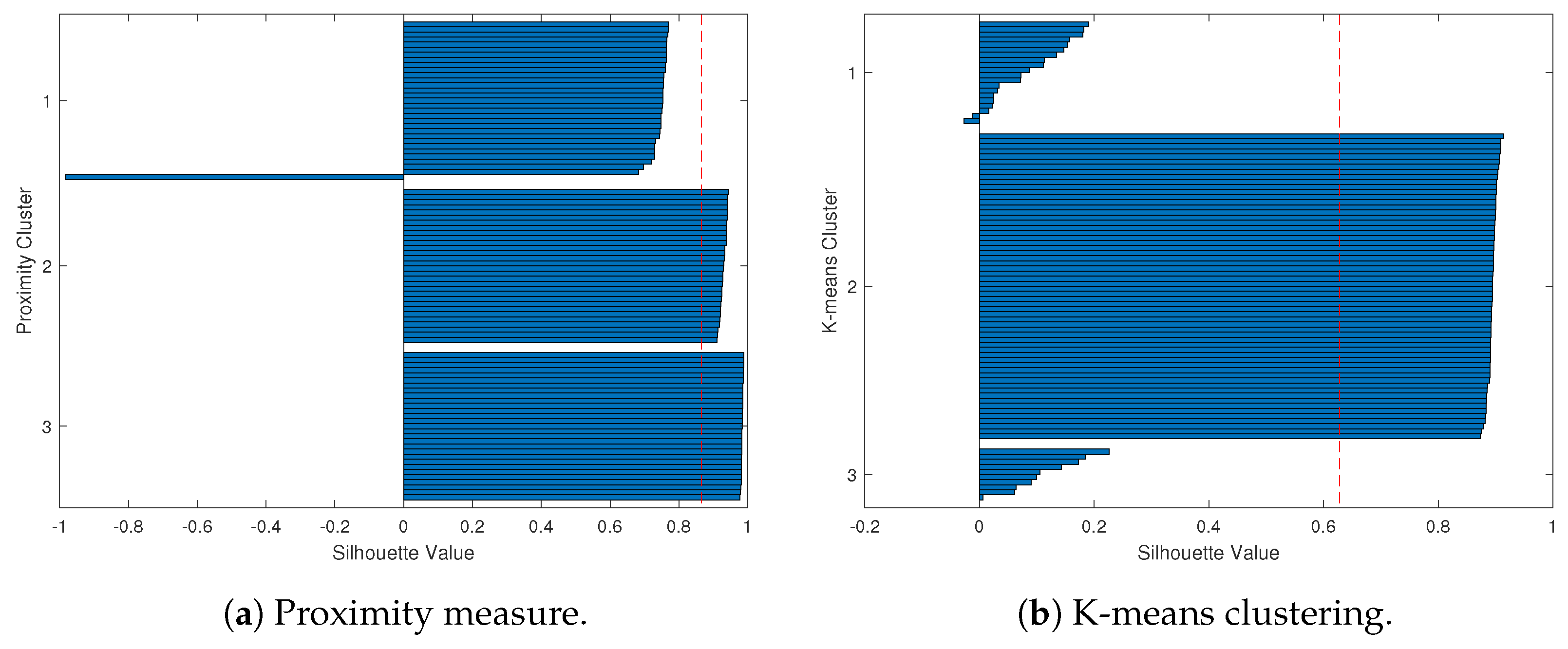
To provide a clearer demonstration, we use Silhouette analysis to illustrate the poor clustering results for the simulation study. Figure 6 and Figure 7 show the Silhouette plots for Case 1 and Case 2 using the proximity measure and K-means methods, which correspond to the clustering results of Figure 4 and Figure 5.
Overall, based on the Silhouette plots, the worst-case scenario for K-means clustering is even worse than that of the proximity measure.
Furthermore, we used the Rand Index (RI) and Adjusted Rand Index (ARI) to assess the performance of these two methods. In the proximity measure, both the RI and ARI values are very close to one, indicating significantly better performance compared to the K-means method, as shown in Table 2.
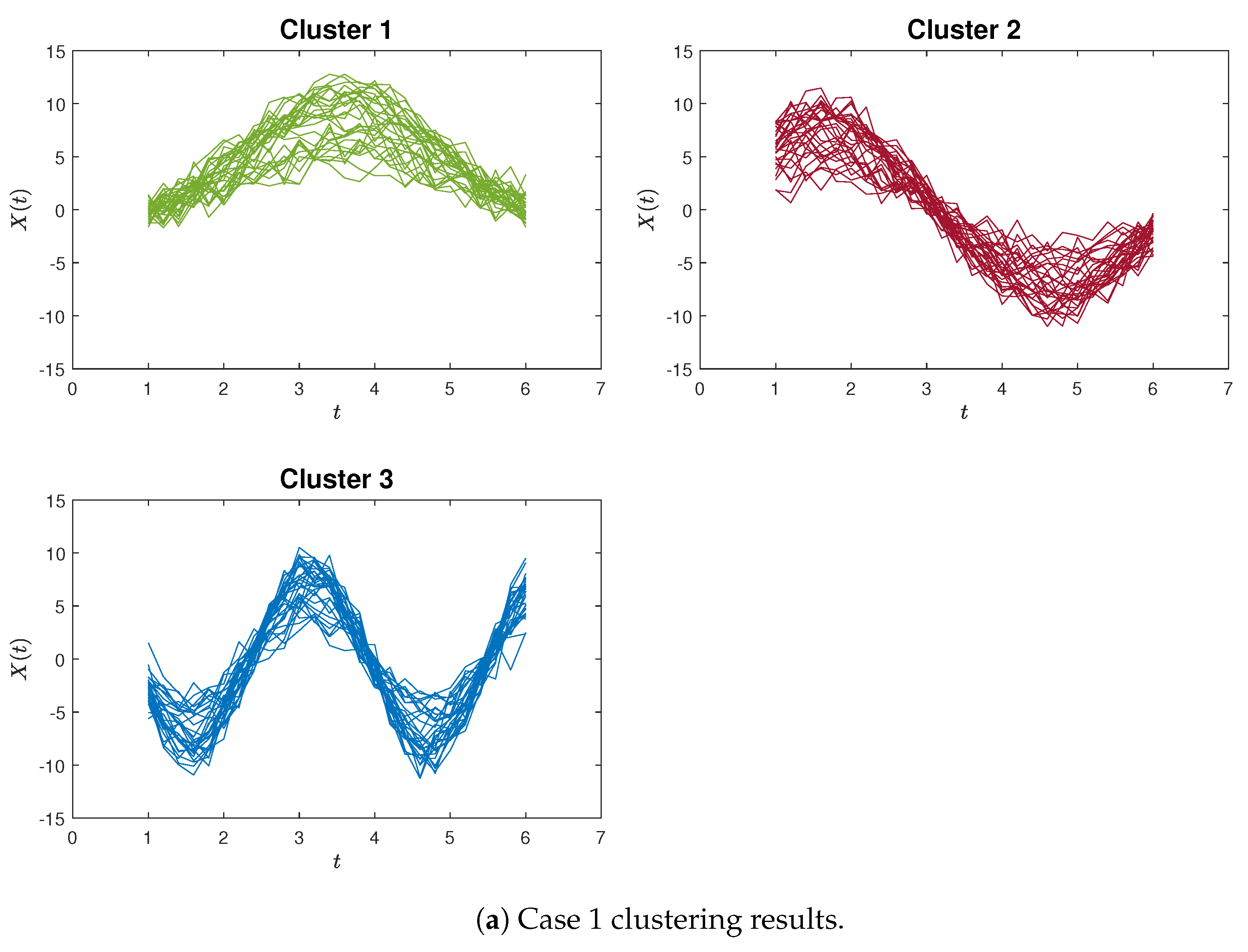
For illustrative purposes, examples of accurate clustering results are presented in Figure 8 and Figure 9 for both the proposed method and the K-means algorithm, in the context of Case 1 and Case 2, respectively. Hence, these simulation outcomes demonstrate the superiority of our proposed method in effectively identifying curvilinear characteristics within curve clustering.

4. Applications

Within this section, we employ the proximity measure algorithm on the COVID-19 dataset outlined in Section 4.1 and implement the time-shift clustering approach on the NASDAQ Composite dataset discussed in Section 4.2.

4.1. COVID-19 Confirmed and Death Cases Dataset

In December 2019, the first case of COVID-19 was identified in Wuhan, China. Within a matter of weeks, the pandemic rapidly extended beyond China’s borders, affecting countries around the world. During this period, the World Health Organization (WHO) declared COVID-19 a Public Health Emergency of International Concern (PHEIC). On March 11, 2020, the WHO officially designated COVID-19 as a “global pandemic”. This declaration prompted many countries to declare states of emergency and adopt various policies along with corresponding anti-epidemic measures [24]. Measures such as national or regional lockdowns, social distancing, mask mandates, closure of public places, and other interventions were implemented. Consequently, due to the diverse range of strategies adopted, the patterns and rates of virus transmission varied across different countries. In this section, we apply our proposed algorithm to cluster countries and uncover distinct spread curve patterns [25,26].

4.1.1. Data Description

The COVID-19 data for 49 countries are chosen from the 194 WHO member states across the six WHO regions. These data are manually extracted from the WHO Coronavirus Disease Situation Report. Notably, the WHO Coronavirus Disease Situation Report shifted to a weekly reporting format on 16 August 2020. Therefore, our dataset for confirmed COVID-19 cases and deaths is collected up until 16 August 2020. We chose the initial 49 countries from each WHO region based on their cumulative confirmed case count reaching 1000 before April 2020. These 49 countries represent 25% of the most severely affected nations across the six WHO regions. To be precise, our selection included five countries from the African Region, eleven from the Region of the Americas, eight from the Eastern Mediterranean Region, ten from the European Region, seven from the Southeast Asia Region, and eight from the Western-Pacific Region. Figure 10 displays the geographical distribution of these 49 countries on the Coronavirus (COVID-19) Dashboard by region.
The COVID-19 dataset covers the time span from 22 January 2020 to 16 August 2020. China reported the first confirmed case and, subsequently, other countries, like the USA and Italy, reported their first confirmed cases after around two to three months. To establish a uniform reference point, we defined time zero as the moment when each country reported at least 10 daily confirmed new cases for the first time. Following this, we continued to monitor the data for 136 days, resulting in a total of 136 observations for each country. To provide consistency, we further normalised the data by representing the number of daily confirmed new cases per million people.
Regarding the daily confirmed deaths data, we opted to include only 43 countries from the aforementioned 49. This exclusion was due to the fact that in six countries (Singapore, New Zealand, Nepal, Thailand, Maldives, and Sri Lanka), the number of daily confirmed deaths is exceedingly close to zero.
We took the logarithmic transformation for both the case data and the death data and used the B-spline for smoothing. The smoothed daily confirmed new cases for the 49 countries are depicted in Figure 11, while Figure 12 showcases the smoothed daily confirmed new deaths for the 43 countries.

4.1.2. Results

We implemented the proposed proximity measure clustering algorithm on both the case data and the death data. Table 3 provides several instances illustrating the impact of the proximity threshold α on the cluster count. It is important to recognise that the selection of the threshold α is intricately connected to the specific circumstances and purpose of the clustering process.
Figure 13 illustrates the clustering outcomes for confirmed new cases with six clusters ( α = 2.65 ). Similarly, Figure 14 displays the clustering outcomes for confirmed new deaths with six clusters ( α = 3.15 ). Furthermore, more comprehensive clustering results for confirmed new cases and confirmed new deaths can be found in Appendix A Figure A1 and Figure A2.
Based on Figure A1, the COVID-19 confirmed new cases across the 49 countries are categorised into six clusters as described below. The first cluster comprises ten countries, with four countries from the Region of the Americas, two countries from the Eastern Mediterranean Region, two countries from the Southeast Asia Region, and the remainder from other regions. Within this particular cluster, the primary curve trajectories exhibit a steep ascent accompanied by minor fluctuations during the initial phases. These countries experienced a rapid propagation of the coronavirus, lacking effective preventive measures during that period. Examples of such nations include Brazil, the USA, the United Arab Emirates, and India, among others. The second cluster comprises four countries, including three from the Western-Pacific Region, namely China, Malaysia, and New Zealand, along with Thailand. A distinctive characteristic of these four countries is the occurrence of a minor increase followed by a subsequent decline in the count of confirmed new cases. This trend emerges due to the prompt implementation of measures to curb the virus spread, such as national or regional lockdowns. The third cluster encompasses twelve countries, with four hailing from the African Region (Algeria, Nigeria, Ghana, and Cameroon) and three from the Western-Pacific Region (Singapore, the Philippines, and Japan), along with others like Ecuador and Sri Lanka. These nations are characterised by relatively smaller populations and exhibit case curve trajectories that remain relatively flat over time. The fourth cluster encompasses twelve countries, consisting of five from the Region of the Americas (including Peru and Chile), four from the Eastern Mediterranean Region (like Qatar and Egypt), and three from the Southeast Asia Region (such as Bangladesh and Indonesia). In these countries, the count of COVID-19 confirmed new cases experiences a gradual and slow increase over time. The fifth cluster comprises nine countries, encompassing eight from the European Region, such as the UK, Spain, and Italy, as well as Canada. In these nations, the count of COVID-19 confirmed new cases demonstrates a rapid initial increase followed by a gradual decline. This downward trajectory is possibly attributed to measures such as social distancing and the closure of public spaces. The sixth cluster consists of just two countries, namely Korea and Australia. In these nations, the case numbers initially rise, followed by a decline, and then a subsequent rise once more. This unique pattern sharply contrasts with the trends observed in the other five clusters.
Analysing Figure A2, we observed that the COVID-19 confirmed new deaths across the 43 countries are divided into six clusters as detailed below. The first cluster comprises five countries, all stemming from the European Region, including Spain, Italy, Germany, Belgium, and the Netherlands. Within this cluster, the central curve trajectories display a notable surge followed by an abrupt decline. This pattern may stem from these European countries’ swift and effective implementation of measures to curtail the increase in mortality rates. The second cluster encompasses six countries, of which four belong to the Western-Pacific Region (China, Korea, Malaysia, and Australia), while the other two hail from the Eastern Mediterranean Region and the European Region. A key characteristic of these countries is the occurrence of a slight increase followed by a substantial decrease in confirmed new deaths. The third cluster comprises six countries, with four originating from the Region of the Americas, including the USA, Brazil, Peru, and Mexico, while the remaining two are from the European Region and the Southeast Asia Region. In this cluster, the identified trend involves a rapid surge in deaths followed by a sustained high level of fatalities. The fourth cluster encompasses 21 countries, primarily from the African Region, the Region of the Americas, and the Eastern Mediterranean Region. The trajectory of COVID-19 confirmed new deaths in these nations indicates a sustained, gradual increase over time. The fifth cluster comprises two countries: one originating from the African Region and the other from the European Region. The death toll in these countries remains notably low throughout the study period. The sixth cluster encompasses three countries: two from the European Region and one from the Region of the Americas. These countries exhibit a pattern similar to the first cluster, albeit with a notably slower initial rise during the early stages of the pandemic.

4.2. NASDAQ Composite Data

Within this section, we employed our time-shift clustering approach to analyse the NASDAQ Composite data. The dataset consists of weekly NASDAQ Composite data gathered from February 1, 1971, to May 24, 2021, encompassing a total of 2626 weeks. We applied a logarithmic transformation to the raw data and utilised B-spline techniques to obtain smoothed observations. The data overview is presented in Figure 15.
Subsequently, we implemented the proposed time-shift clustering algorithm on this dataset. Our objective was to identify segments within the historical data that exhibit patterns akin to the current observations of interest. As examples, we considered three cases, with the widths of the target windows as w 1 = 100 , w 2 = 150 , and w 3 = 200 , respectively. They represented a 100-week target window (i.e., from the 2527th week to the 2626th week), a 150-week target window (i.e., from the 2477th week to the 2626th week), and a 200-week target window (i.e., from the 2427th week to the 2626th week), respectively. We used a rolling step size τ = 1 so that there were a total of 2525, 2475, and 2425 rolling windows, respectively. The results are displayed in Figure 16, Figure 17 and Figure 18.
As depicted in Figure 16, the target window’s width was set at w 1 = 100 , covering the actual period spanning from 24 June 2019 to 24 May 2021. For this analysis, we opted for a proximity threshold of α 1 = 0.0029 , yielding four analogous curves identified among the 2525 rolling windows. The week numbers corresponding to these four curves are detailed in the legend of the bottom panel. For example, the first curve, spanning from the 1402nd week to the 1501st week, encompasses the actual period from 15 December 1997 to 15 November 1999. The remaining three curves can be interpreted similarly.
Upon comparing the target window to these four rolling windows, it becomes evident that their shapes bear a striking resemblance. This implies that the developmental trajectory of the NASDAQ Composite Index during the interval from 2019 to 2021 is similar to that of the period spanning 1997 to 1999. Consequently, if there is an interest in predicting the forthcoming trend following May 2021, these historical data might yield valuable insights.
Likewise, when our focus shifts to the pattern of the most recent 150 weeks, we set the window width to w 2 = 150 . This scenario is depicted in Figure 17, where we identified two comparable curves within the 2475 rolling windows. For the target window, the actual period spans from 9 July 2018 to 24 May 2021, while the two akin curves relate to the timeframe around 31 July 1978 to 8 June 1981.
Illustrated in Figure 18 is the scenario considering the most recent 200 weeks. In this case, the target window spans from 24 July 2017 to 24 May 2021. Correspondingly, the two akin curves pertain to the timeframe roughly spanning from 15 August 1977 to 8 June 1981.
Let us use Figure 18 as an illustrative example to delineate the contrast in the application approach between the “rolling window” in our study and the “trivial match” described in Keogh and Lin’s work [19]. From Figure 18, it is apparent that our “rolling window” can identify two similar segments (around the 391st week to the 540th week) that are distant from the target window (spanning the 2427th week to the 2626th week). And, our method circumvents the necessity of estimating cluster centres. So, the proposed time-shift clustering algorithm is meaningful.
The significance of the proximity threshold α lies in its control over the level of similarity established between the target window and the rolling windows. To illustrate this point, consider the case of w 3 = 200 presented in Figure 19. Here, the results are shown for two instances: when the proximity threshold α 3 is set to 0.004325 (Figure 19a) and when α 3 is increased to 0.0062 (Figure 19b). Evidently, in Figure 19a, only one similar curve is identified. Conversely, upon decreasing the threshold further (below 0.004325), no corresponding curves are discovered. In contrast, Figure 19b showcases an increased number of similar curves, facilitated by the larger threshold value of α 3 = 0.0062 .

5. Discussion and Conclusions

In this paper, we introduced a novel curve clustering algorithm based on the proximity measure for continuous functions. To validate the utility and effectiveness of these proposed algorithms, we conducted several numerical experiments and compared the outcomes against the K-means clustering algorithm. The simulation results underscore the capability of our algorithm to identify curvilinear features within functional data, yielding clustering results with enhanced accuracy compared to K-means. Moreover, as observed in Figure 4a,b and 
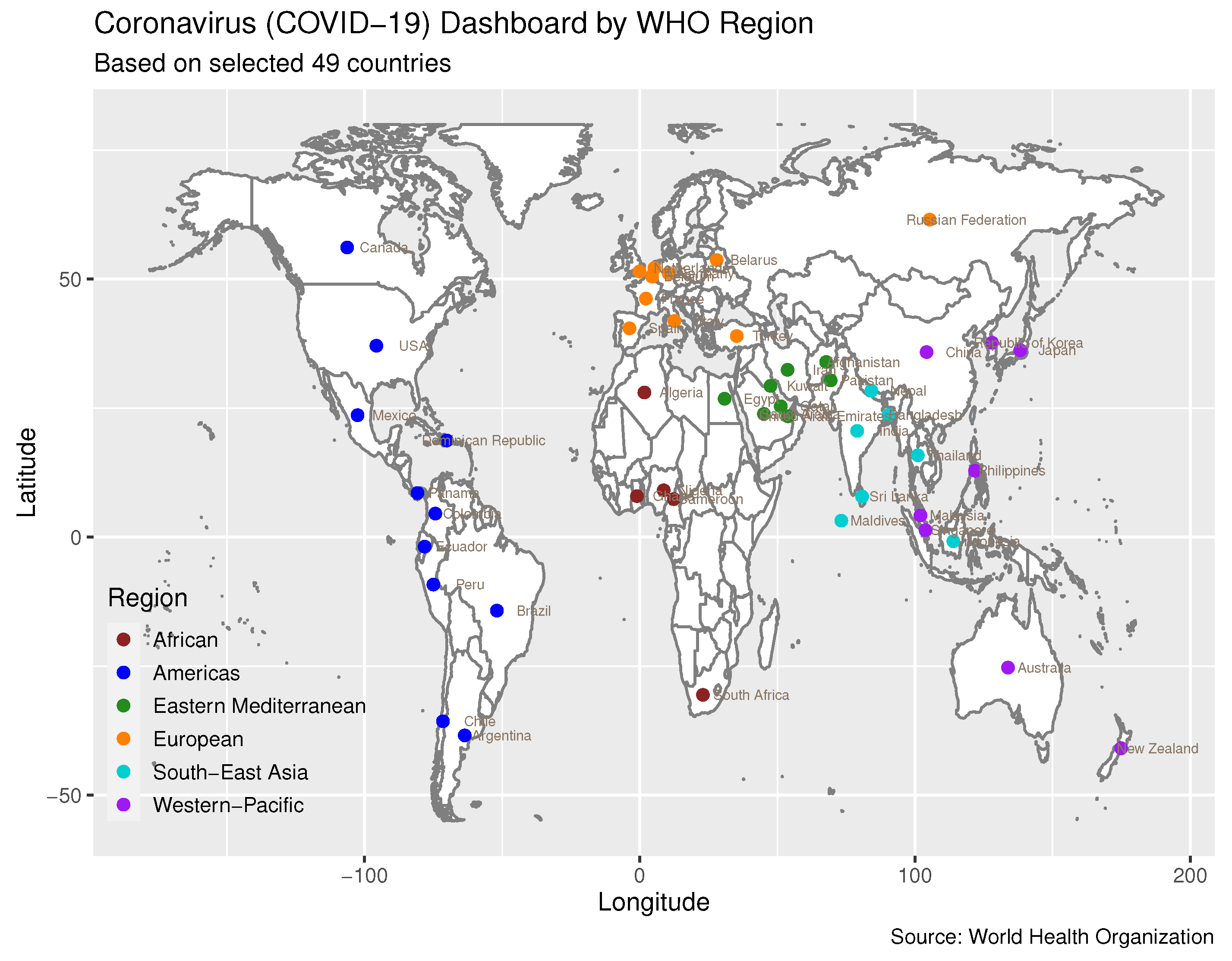
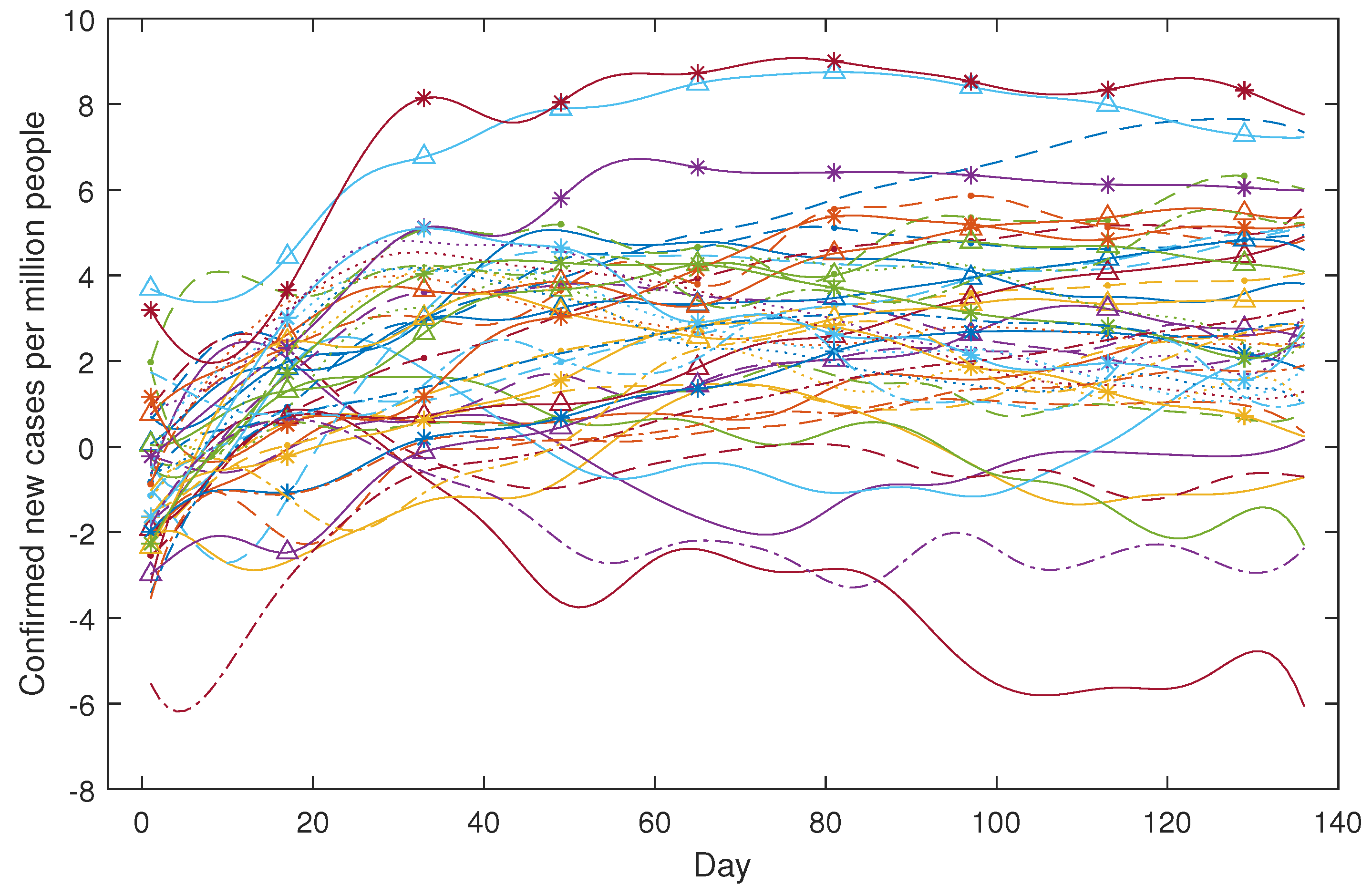
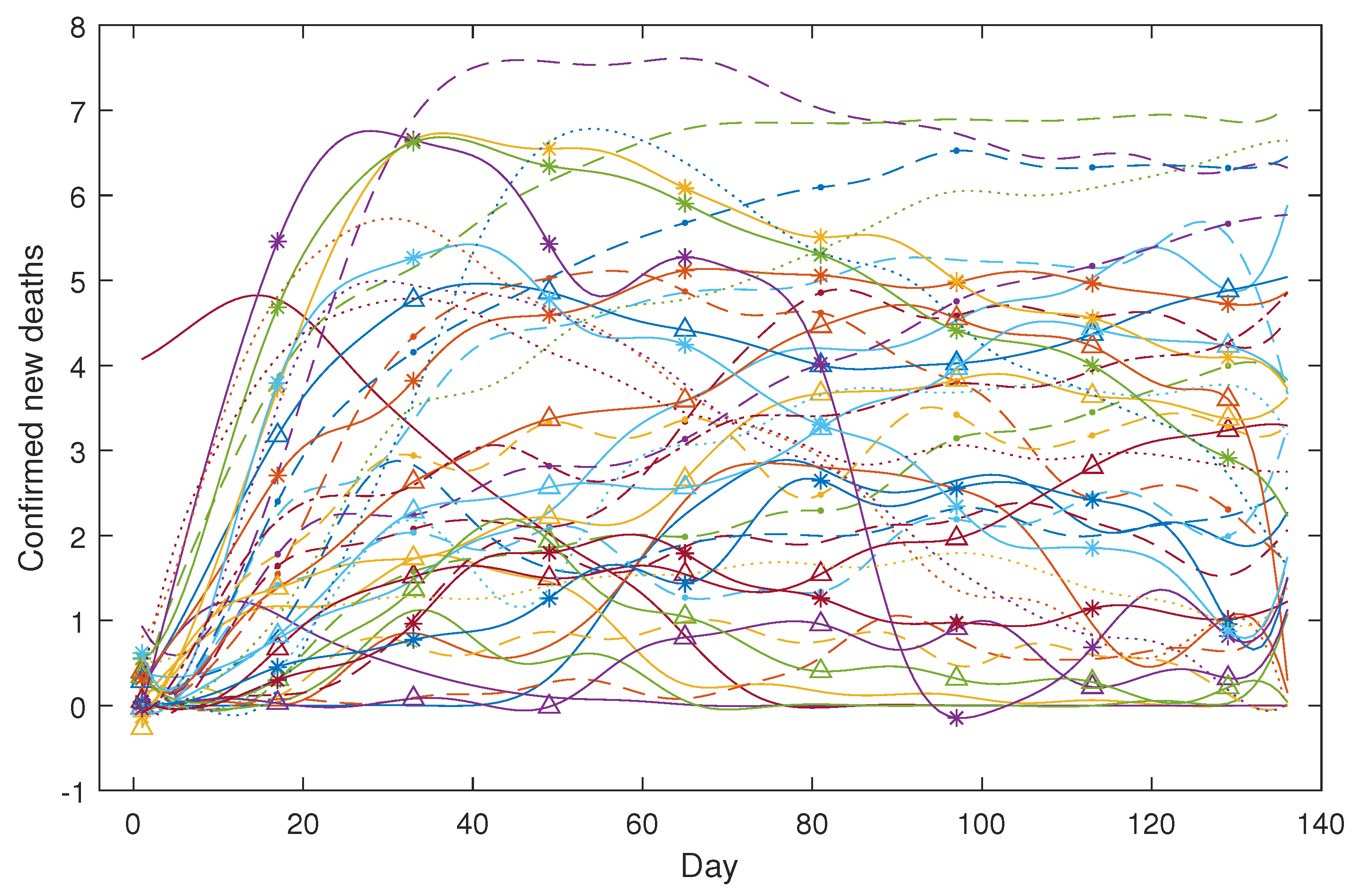
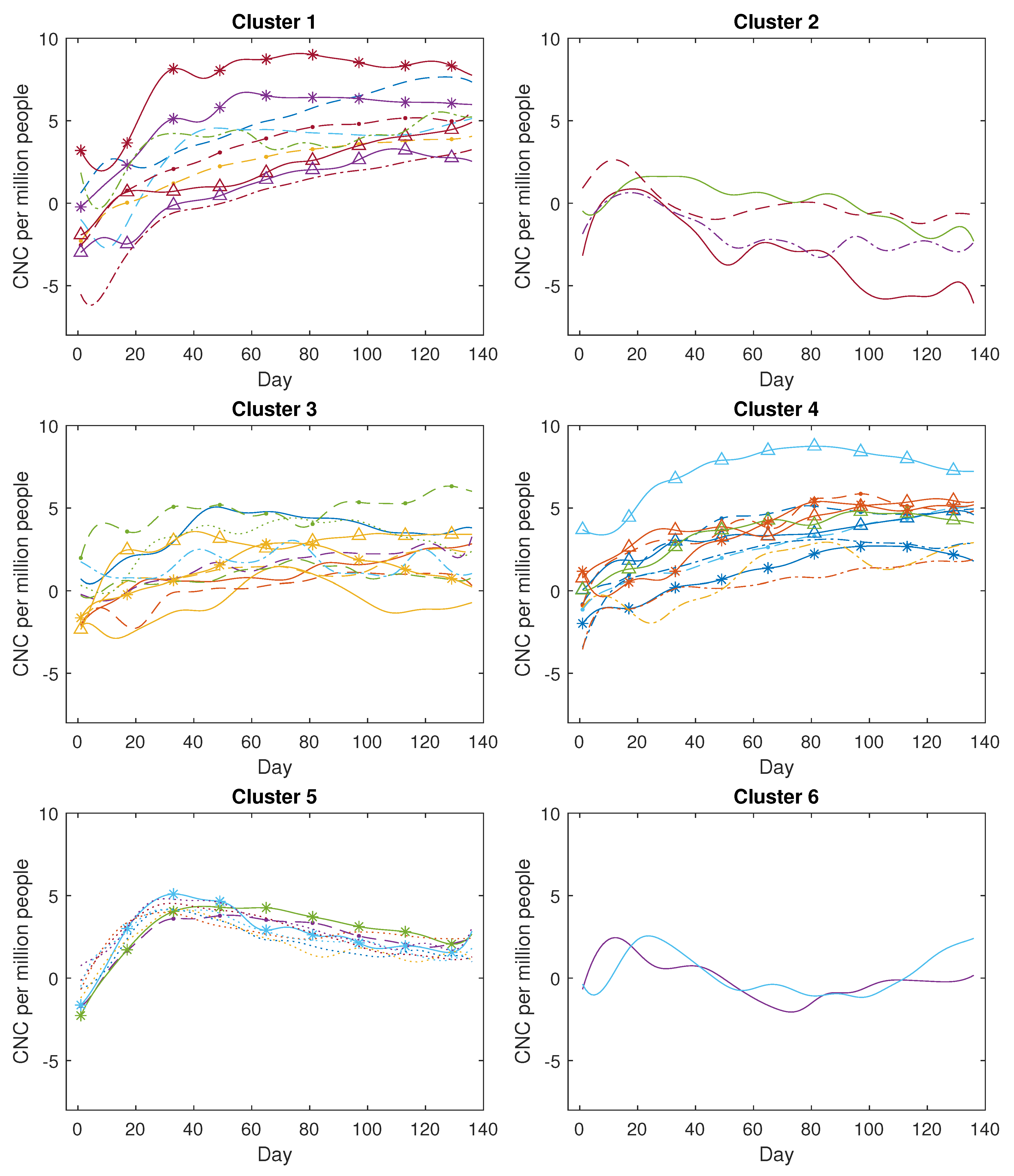
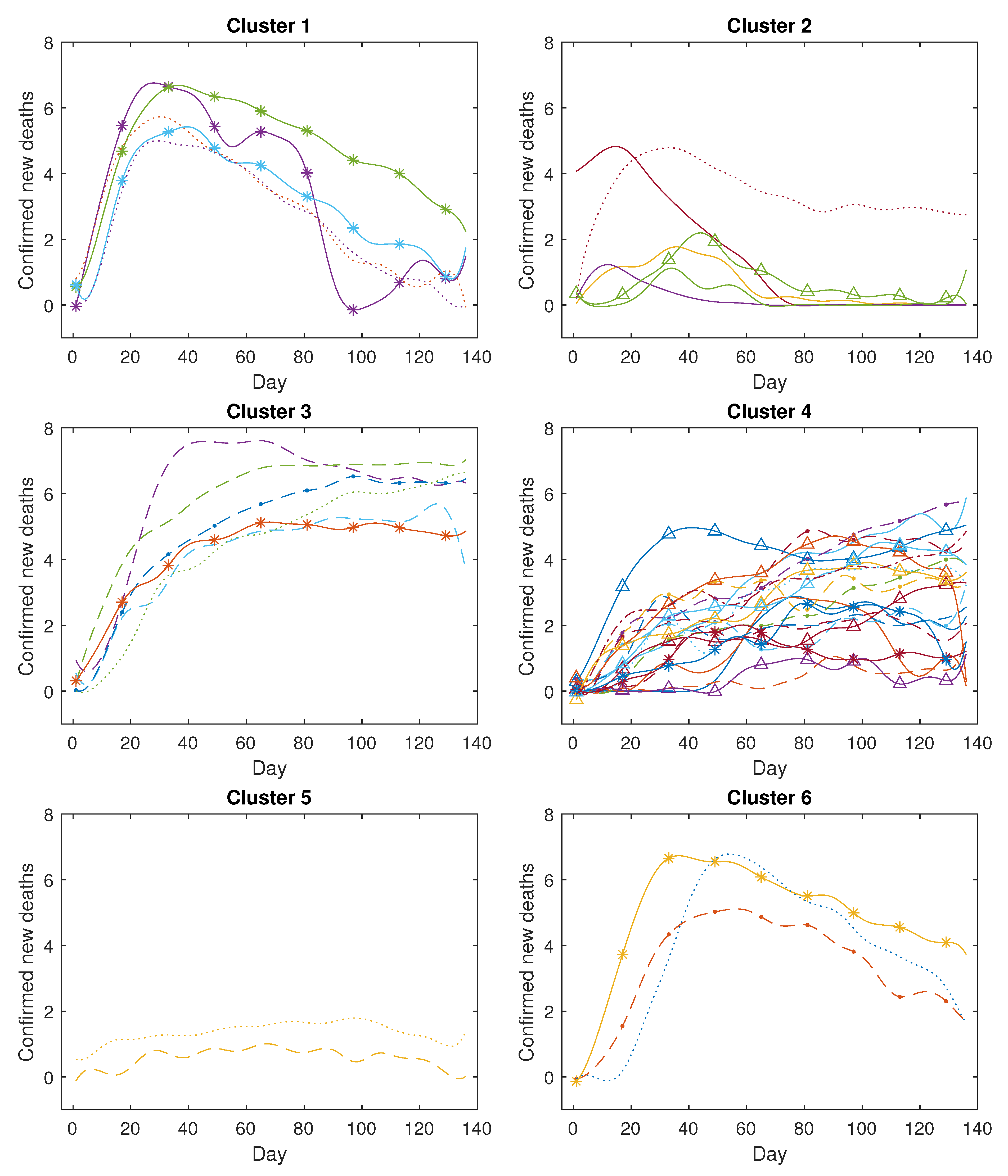
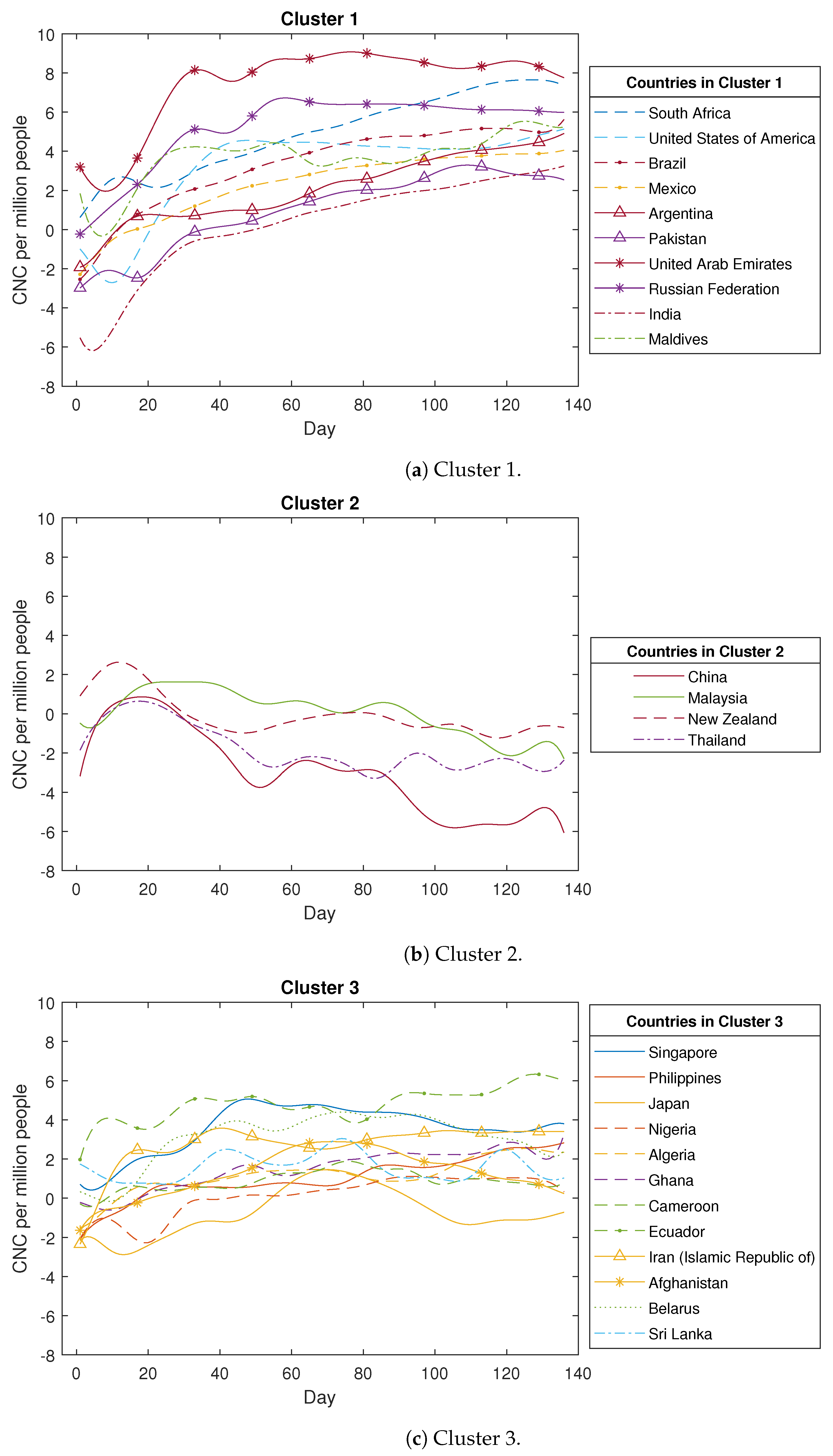
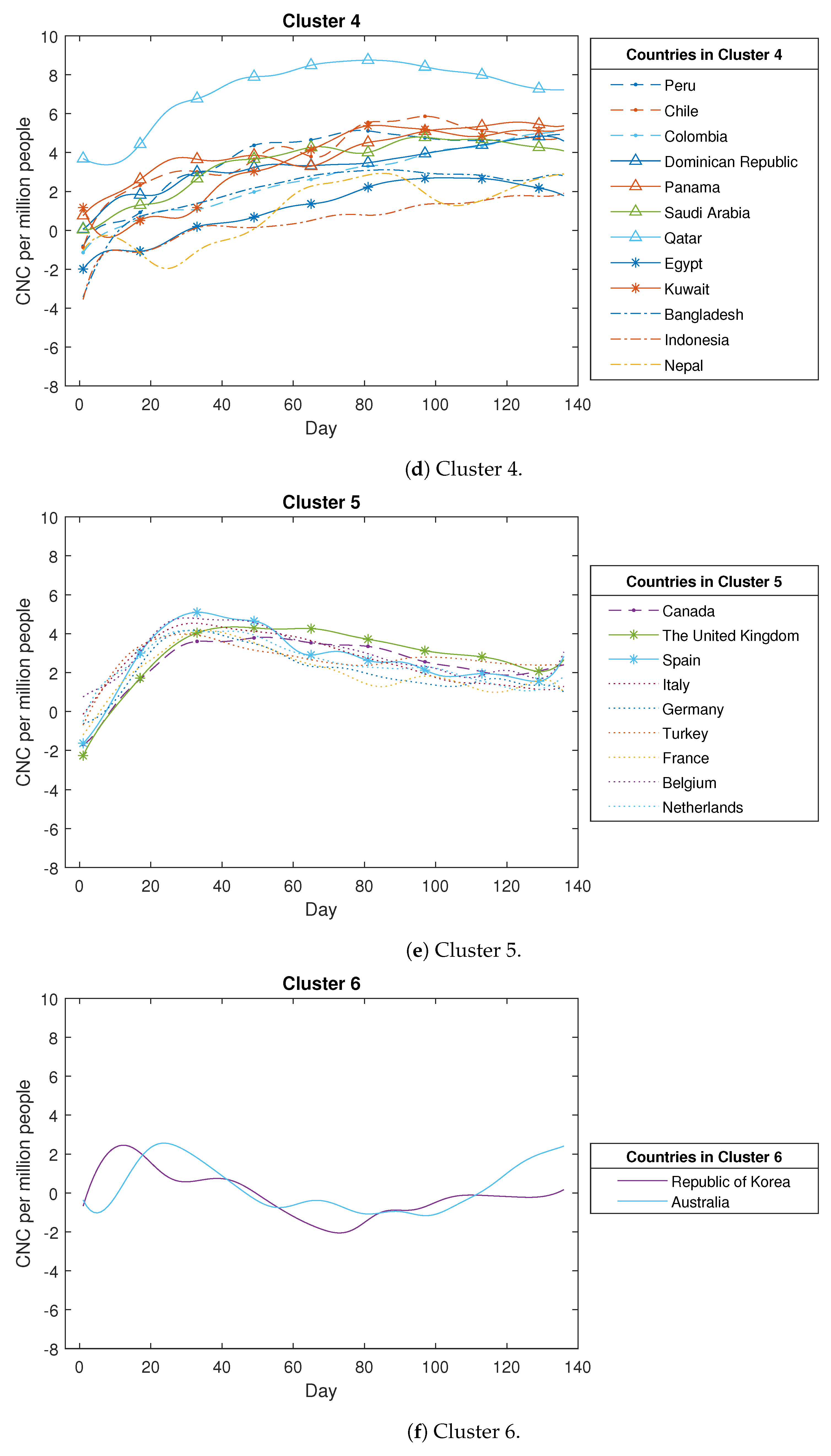
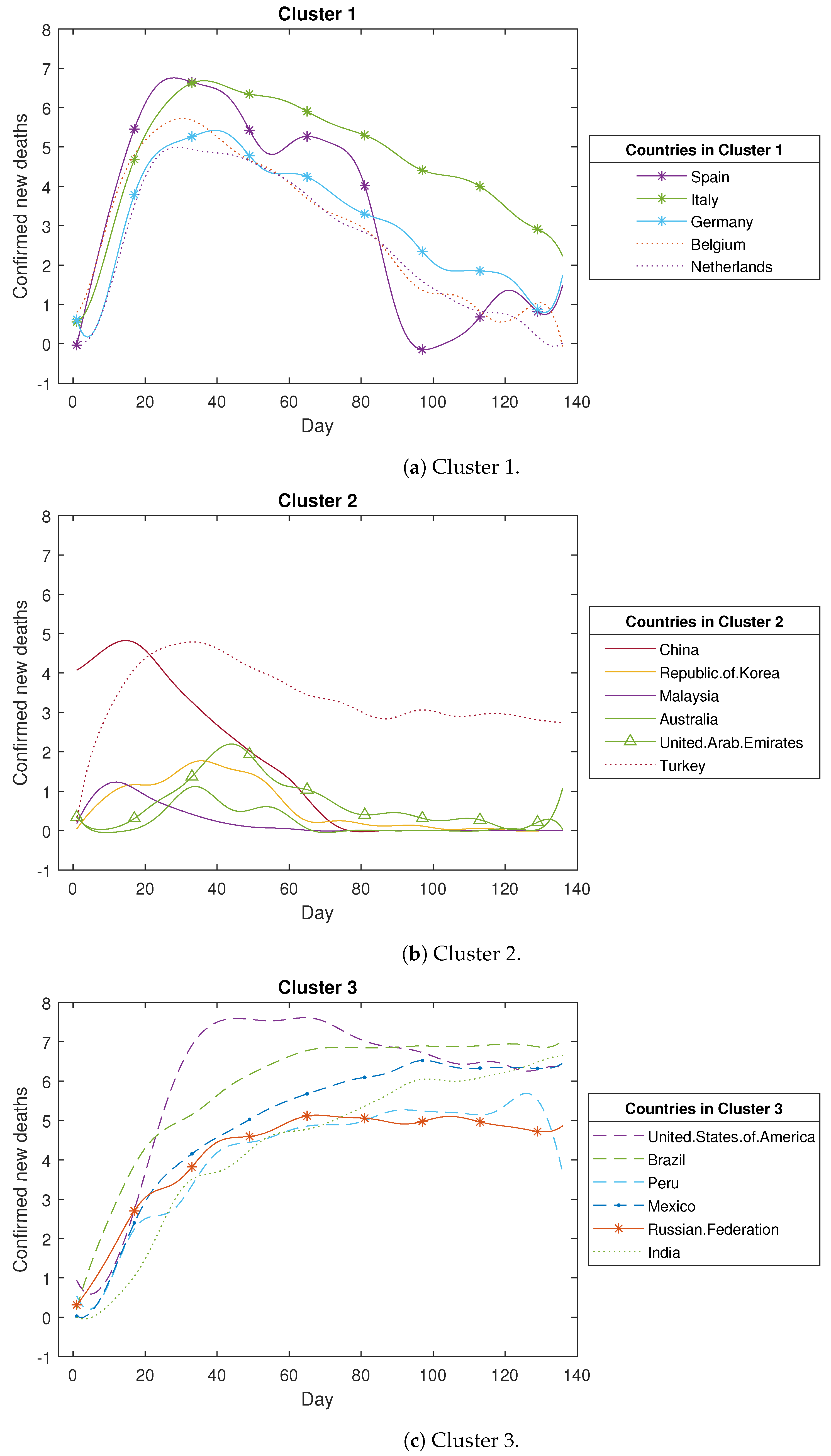
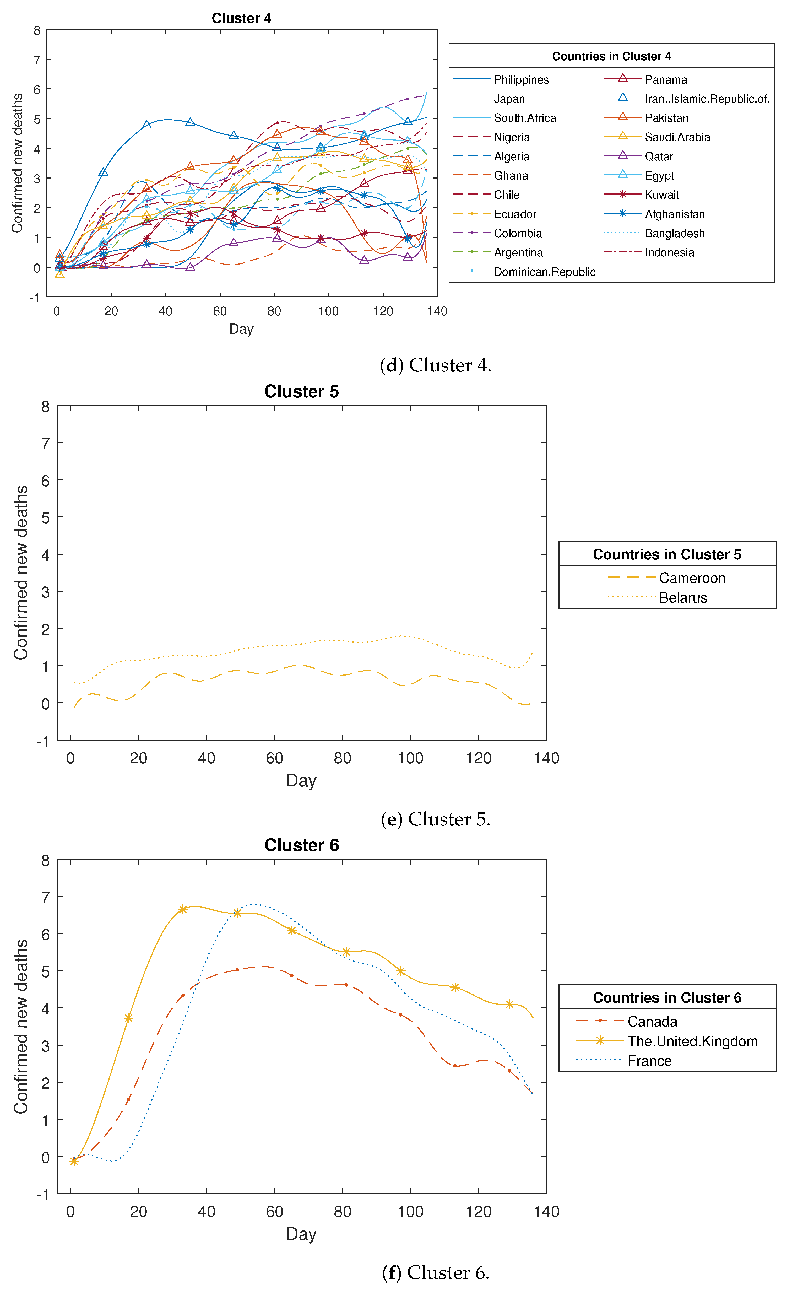
Figure 5a,b, the proximity measure algorithm can effectively focus on a curve’s trend while remaining independent of its positional information. In contrast, the K-means clustering approach tends to cause confusion since it cannot disregard positional information, which consequently results in dissimilar curves being grouped together due to close proximity. Subsequently, we extended our analysis by applying the proximity measure algorithm to the COVID-19 dataset. The obtained clustering results are satisfactory, demonstrating that confirmed new cases and confirmed new deaths in 49 countries can be grouped into six clusters based on the designated threshold. Each group can be explained by certain common features.
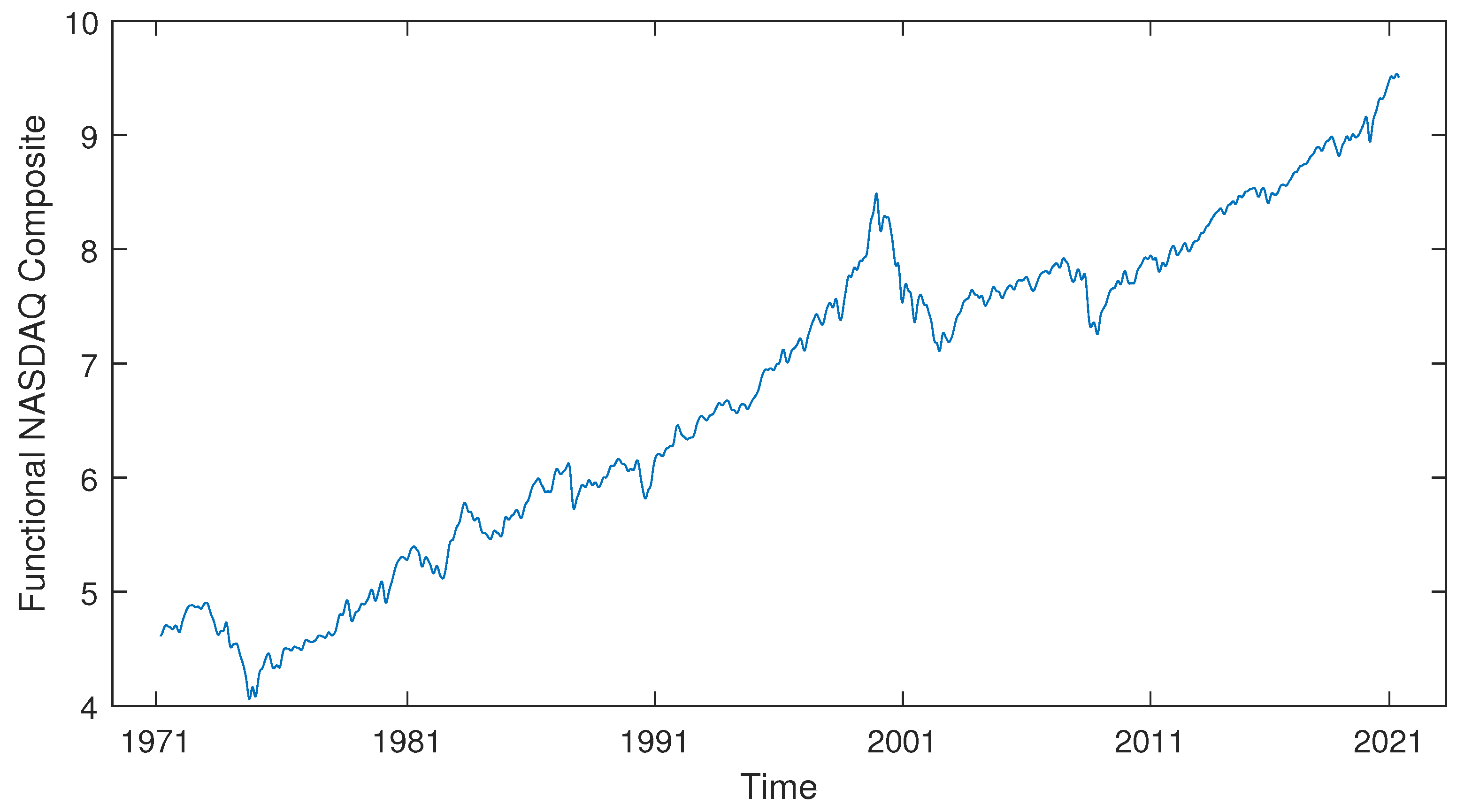
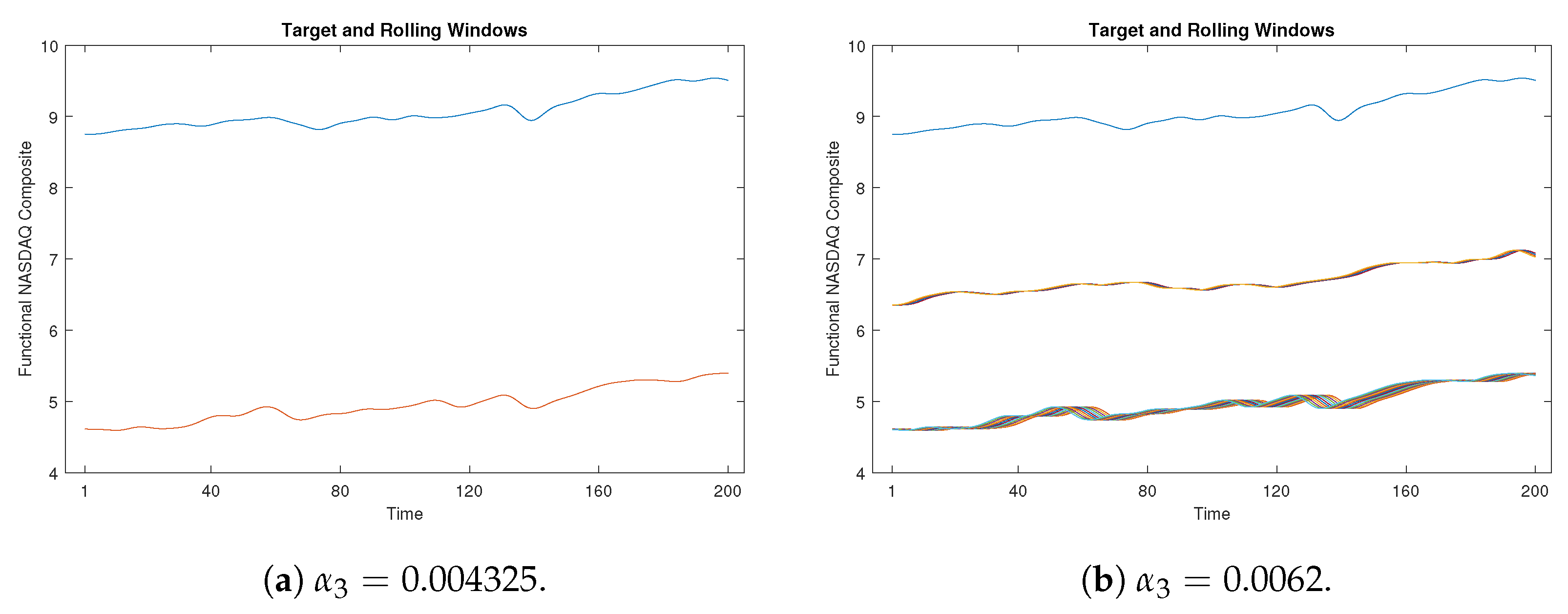
Moreover, we have extended our efforts by developing a time-shift clustering algorithm that merges proximity measure clustering with a rolling window technique. This innovative approach was then applied to the NASDAQ Composite data, resulting in the successful identification of similar subsequences that correspond to three target windows. This has been proven we can extend this method to explore and mine any functional dataset with potential periodic regularity.
The findings of this paper can be understood as the proposed proximity measure enriches the field of functional data clustering. It is especially suitable for identifying and clustering curve features of function curves, without interference from spatial position information. Searching for similar subsequences across the entire timeframe may be considered a further validation of the flexible applicability of the proximity measures.
Although the proposed algorithms have demonstrated effectiveness, it is important to note that the choice of the proximity threshold remains a significant consideration. This choice is closely tied to the specific context and goals of clustering, making it potentially challenging to determine an appropriate value in certain scenarios. Determining an optimal proximity threshold is an aspect we intend to address in future research. Moreover, future investigations should focus on clustering continuous functional curves directly, without the need to convert them into discrete data.
Another avenue of future exploration involves extending the algorithms to cluster surfaces and multidimensional functional data. Additionally, the time-shift clustering approach holds promise for applications in assessing economic cycles within finance, showcasing its potential usefulness beyond the contexts explored in this paper.

Author Contributions

Conceptualisation, T.W. and B.W.; methodology, T.W.; software, T.W.; writing—original draft preparation, T.W.; writing—review and editing, T.W. and B.W.; supervision, B.W. All authors have read and agreed to the published version of the manuscript.

Funding

This research received no external funding.

Institutional Review Board Statement

Not applicable.

Informed Consent Statement

Not applicable.

Data Availability Statement

Not applicable.

Acknowledgments

The authors thank the editor and the reviewers for their very helpful and constructive comments.

Conflicts of Interest

The authors declare no conflict of interest.

Appendix A

Appendix A.1. COVID-19 Output for Confirmed New Cases

Figure A1. The detailed clustering results for COVID-19 confirmed new cases (CNC) (in log scale).
Analytics 02 00041 g0a1aAnalytics 02 00041 g0a1b

Appendix A.2. COVID-19 Output for Confirmed New Deaths

Figure A2. The detailed clustering results for COVID-19 confirmed new deaths (in log scale).
Analytics 02 00041 g0a2aAnalytics 02 00041 g0a2b

References

  1. Wedel, M.; Kannan, P. Marketing analytics for data-rich environments. J. Mark. 2016, 80, 97–121. [Google Scholar] [CrossRef]
  2. Ferraty, F. Recent Advances in Functional Data Analysis and Related Topics; Springer: Berlin/Heidelberg, Germany, 2011. [Google Scholar]
  3. Jacques, J.; Preda, C. Functional data clustering: A survey. Adv. Data Anal. Classif. 2014, 8, 231–255. [Google Scholar] [CrossRef]
  4. Bouveyron, C.; Brunet-Saumard, C. Model-based clustering of high-dimensional data: A review. Comput. Stat. Data Anal. 2014, 71, 52–78. [Google Scholar]
  5. Wahba, G. Spline Models for Observational Data; SIAM: Philadelphia, PA, USA, 1990. [Google Scholar]
  6. Abraham, C.; Cornillon, P.A.; Matzner-Løber, E.; Molinari, N. Unsupervised curve clustering using B-splines. Scand. J. Stat. 2003, 30, 581–595. [Google Scholar] [CrossRef]
  7. Peng, J.; Müller, H.G. Distance-based clustering of sparsely observed stochastic processes, with applications to online auctions. Ann. Appl. Stat. 2008, 2, 1056–1077. [Google Scholar] [CrossRef]
  8. Wu, R.; Wang, B.; Xu, A. Functional data clustering using principal curve methods. Commun. Stat.-Theory Methods 2022, 51, 7264–7283. [Google Scholar] [CrossRef]
  9. James, G.M.; Sugar, C.A. Clustering for sparsely sampled functional data. J. Am. Stat. Assoc. 2003, 98, 397–408. [Google Scholar] [CrossRef]
  10. Bouveyron, C.; Jacques, J. Model-based clustering of time series in group-specific functional subspaces. Adv. Data Anal. Classif. 2011, 5, 281–300. [Google Scholar] [CrossRef]
  11. Ferraty, F.; Vieu, P. Nonparametric Functional Data Analysis: Theory and Practice; Springer Science & Business Media: New York, NY, USA, 2006. [Google Scholar]
  12. Ieva, F.; Paganoni, A.M.; Pigoli, D.; Vitelli, V. Multivariate functional clustering for the morphological analysis of electrocardiograph curves. J. R. Stat. Soc. C Appl. Stat. 2013, 62, 401–418. [Google Scholar] [CrossRef]
  13. Tarpey, T.; Kinateder, K.K. Clustering functional data. J. Classif. 2003, 20. [Google Scholar] [CrossRef]
  14. Jacques, J.; Preda, C. Model-based clustering for multivariate functional data. Comput. Stat. Data Anal. 2014, 71, 92–106. [Google Scholar] [CrossRef]
  15. Secchi, P.; Vantini, S.; Vitelli, V. Bagging Voronoi classifiers for clustering spatial functional data. Int. J. Appl. Earth Obs. Geoinf. 2013, 22, 53–64. [Google Scholar] [CrossRef]
  16. Boullé, M. Functional data clustering via piecewise constant nonparametric density estimation. Pattern Recognit. 2012, 45, 4389–4401. [Google Scholar] [CrossRef]
  17. Verma, M.; Srivastava, M.; Chack, N.; Diswar, A.K.; Gupta, N. A comparative study of various clustering algorithms in data mining. Int. J. Eng. Res. Appl. (IJERA) 2012, 2, 1379–1384. [Google Scholar]
  18. Pham, D.T.; Dimov, S.S.; Nguyen, C.D. Selection of K in K-means clustering. Proc. Inst. Mech. Eng. Part C J. Mech. Eng. Sci. 2005, 219, 103–119. [Google Scholar] [CrossRef]
  19. Keogh, E.; Lin, J. Clustering of time-series subsequences is meaningless: Implications for previous and future research. Knowl. Inf. Syst. 2005, 8, 154–177. [Google Scholar] [CrossRef]
  20. Shang, H.L.; Kearney, F. Dynamic functional time-series forecasts of foreign exchange implied volatility surfaces. Int. J. Forecast. 2021, 38, 1025–1049. [Google Scholar] [CrossRef]
  21. Swanson, N.R. Money and output viewed through a rolling window. J. Monet. Econ. 1998, 41, 455–474. [Google Scholar] [CrossRef]
  22. Zivot, E.; Wang, J. Modeling Financial Time Series with S-PLUS; Springer: New York, NY, USA, 2006; Volume 2. [Google Scholar]
  23. Shi, J.Q.; Wang, B. Curve prediction and clustering with mixtures of Gaussian process functional regression models. Stat. Comput. 2008, 18, 267–283. [Google Scholar] [CrossRef]
  24. Chakraborty, T.; Ghosh, I. Real-time forecasts and risk assessment of novel coronavirus (COVID-19) cases: A data-driven analysis. Chaos Solitons Fractals 2020, 135, 109850. [Google Scholar] [CrossRef]
  25. Boschi, T.; Di Iorio, J.; Testa, L.; Cremona, M.A.; Chiaromonte, F. The shapes of an epidemic: Using Functional Data Analysis to characterize COVID-19 in Italy. arXiv 2020, arXiv:2008.04700. [Google Scholar]
  26. Zarikas, V.; Poulopoulos, S.G.; Gareiou, Z.; Zervas, E. Clustering analysis of countries using the COVID-19 cases dataset. Data Brief 2020, 31, 105787. [Google Scholar] [CrossRef] [PubMed]
Figure 1. Time-shift clustering process.
Analytics 02 00041 g001
Figure 2. 90 simulated curves for Case 1.
Analytics 02 00041 g002
Figure 3. 90 simulated curves for Case 2.
Analytics 02 00041 g003
Figure 4. The poorly clustering results for Case 1. In the proximity measure algorithm illustration (Figure 4a), certain misclassifications occur within Cluster 3, yet only three blue curves are inaccurately grouped. In contrast, within the K-means clustering illustration (Figure 4b), a more pronounced issue arises in Cluster 1, where the red and blue curves are not discriminated. Additionally, the green curves are erroneously split between Cluster 2 and Cluster 3.
Analytics 02 00041 g004aAnalytics 02 00041 g004b
Figure 5. The poor clustering results for Case 2. Figure 5a indicates only one green curve erroneously placed in Cluster 1, while Figure 5b highlights the continued challenge of distinguishing between red and blue curves and the imprecise division of the green curve.
Analytics 02 00041 g005aAnalytics 02 00041 g005b
Figure 6. The Silhouette plots for Case 1 (the red dashed line is the average Silhouette value). Figure 6a represents the worst-case clustering scenario using a proximity measure, where three clusters exceed the average Silhouette score and are close to one, and only three outliers (the three blue curves in Figure 4a) are present in Cluster 3. However, Figure 6b shows the worst-case clustering scenario using a K-means method, where a large Cluster 1 includes all red and blue curves, while the green curves are divided between Cluster 2 and Cluster 3.
Analytics 02 00041 g006
Figure 7. The Silhouette plots for Case 2 (the red dashed line is the average Silhouette value). For the worst-case clustering scenario of the proximity measure, Figure 7a depicts that almost every Silhouette value is close to one, with only one outlier (a green curve in Figure 5a) erroneously assigned to Cluster 1. Also, for the K-means method, Figure 7b shows a large Cluster 2 that includes all the red and blue curves, while the green curves are divided between Cluster 1 and Cluster 3.
Analytics 02 00041 g007
Figure 8. The clustering results by the proximity measure for Case 1 and Case 2.
Analytics 02 00041 g008aAnalytics 02 00041 g008b
Figure 9. The clustering results by K-means clustering for Case 1 and Case 2.
Analytics 02 00041 g009aAnalytics 02 00041 g009b
Figure 10. Coronavirus (COVID-19) Dashboard. Data sources: WHO Coronavirus Disease Situation Report, accessed on October 2020 (https://www.who.int/emergencies/diseases/novel-coronavirus-2019/situation-reports).
Analytics 02 00041 g010
Figure 11. COVID-19 confirmed new cases per million people (in log scale). Citations for population data: United Nations, Department of Economic and Social Affairs, Population Division (2019). World Population Prospects 2019, Online Edition. Rev. 1.
Analytics 02 00041 g011
Figure 12. COVID-19 confirmed new deaths (in log scale).
Analytics 02 00041 g012
Figure 13. The clustering results for COVID-19 confirmed new cases (CNC) (in log scale).
Analytics 02 00041 g013
Figure 14. The clustering results for COVID-19 confirmed new deaths (in log scale).
Analytics 02 00041 g014
Figure 15. The NASDAQ Composite data (in log scale). Data sources: NASDAQ Composite from Yahoo Finance Website, accessed on June 2021 (https://finance.yahoo.com/quote/%5EIXIC).
Analytics 02 00041 g015
Figure 16. The time-shift clustering results for a 100-week target window.
Analytics 02 00041 g016
Figure 17. The time-shift clustering results for a 150-week target window.
Analytics 02 00041 g017
Figure 18. The time-shift clustering results for a 200-week target window.
Analytics 02 00041 g018
Figure 19. The time-shift clustering results for a 200-week target window with α 3 = 0.004325 and α 3 = 0.0062 . Here, the blue line indicates the target window, while the remaining lines represent rolling windows.
Analytics 02 00041 g019
Table 1. The average error rates for the simulation study.
AlgorithmProposed MethodK-Means Clustering
Case 1 error rates5.09% ( α 1 = 40.4)
5.15% ( α 2 = 40.5)
5.17% ( α 3 = 40.6)6.4%
5.20% ( α 4 = 40.7)
5.23% ( α 5 = 40.8)
Case 2 error rates2.61% ( α 1 = 0.061)
2.19% ( α 2 = 0.062)
2.23% ( α 3 = 0.063)5.95%
2.32% ( α 4 = 0.064)
3.26% ( α 5 = 0.065)
Table 2. Rand Index (RI) and Adjusted Rand Index (ARI) for the simulation study.
Cluster MethodCase 1Case 2
RIARIRIARI
Proximity measure0.95730.90300.98530.9665
K-means clustering0.72010.43840.72530.4509
Table 3. The relationship between the proximity threshold and the number of clusters.
Functional DatasetProximity Threshold α Number of Clusters C k
COVID-19 confirmed new cases4.354
3.855
2.656
2.407
2.248
COVID-19 confirmed new deaths3.954
3.555
3.156
2.367
1.958
Disclaimer/Publisher’s Note: The statements, opinions and data contained in all publications are solely those of the individual author(s) and contributor(s) and not of MDPI and/or the editor(s). MDPI and/or the editor(s) disclaim responsibility for any injury to people or property resulting from any ideas, methods, instructions or products referred to in the content.

