1. Introduction
As atmospheric carbon concentrations continue to rise, the threats posed by extreme weather events have become increasingly evident. Governments and private entities worldwide have shown a growing interest in understanding climate change’s past and future trajectories. People want to know how data related to carbon emissions, precipitation, reservoir levels, electricity supply, and so on vary over time in different geographical regions. One example could be the expected water-level changes of various reservoirs in a certain country over the years before 2050. This demand involves visualizing space–time multivariate data consisting of discrete and continuous variables. Traditionally, environmental scientists have employed various mapping techniques, including some classic statistical charts, to meet this demand. However, modern research often yields large datasets of many variables due to the quantitative revolution based on powerful computers and limitless internet. As data become more multidimensional, especially when one of those dimensions is time, classic statistical charts become less effective in popularizing science. Therefore, there is a need to develop new visualization methods to satisfy the general public’s thirst for presenting and comprehending the kinds of information mentioned above.
1.1. History
A variable is a value with changing characteristics, e.g., age and height. Through the pattern of a single variable or multiple variables’ change, we can observe the change of characteristic(s). For example, the value of a boy’s age (height) being greater means that the boy’s characteristics are older (heavier); the values of age and height becoming greater simultaneously means that as the boy gets older, he gets taller. Drawing a line graph is a clever method to illustrate the change pattern of variables. This process is called “visualization”. Technically, multivariate data can project several different variables into multidimensional space; therefore, two groups of variables can be drawn in two-dimension diagrams. However, when the groups of variables increase, the diagram has too many dimensions to visualize on flat paper. The term “curse of dimensionality” refers to the troubles encountered in multidimensional data visualization, including finding relevant projections, selecting meaningful dimensions, and eliminating noise. Extracting relevant and meaningful information from multidimensional data is complex and cumbersome [
1]. However, visualizing such datasets is vital to understanding deep characteristics, especially those that cannot be observed at a glance [
2].
Many visualization approaches are designed to handle multidimensional data. Early literature used faces to graphically represent points in n-dimensional space [
3]. In this method, the faces’ characteristics (i.e., eyes, noses, mouths) are determined by the position of the point. Grouping those faces that resemble each other allows for cluster analysis, and by looking at the sequence of faces corresponding to successive points in time to locate the places where the faces change characteristics, we can identify time points where a multivariate stochastic process changed characteristics. Although the “Chernoff’s face” method has high operability for the researcher(s), critics argue it is the wrong choice for visualization because differentiating between the faces and comparing their characteristics are difficult [
4]. Further, the correspondence between facial characteristics and the meaning they represent is hard to connect, i.e., using noses and ears to represent mineral features is strange. Third, the face characteristics are not (usually) ordinal thus not fundamentally suitable to represent ordinal data. Finally, readers’ feelings about the whole face may give them more than the sum of the meanings of their parts. For example, some of Chernoff’s faces seem angry, but actually, the emotion of the faces does not have any meaning [
5].
Because Chernoff’s face method is far from perfect, researchers in the decades following its introduction often used other methods to visualize multidimensional data, with one of the most common ways of displaying them being scatterplots. A scatterplot is a two-dimensional statistical diagram different from other ubiquitous presentation graphics—pie charts, line graphs, and bar charts. The classic scatterplot was later adapted to go beyond simple 2D views and deal with additional data complexity. A similar method is called the “ternary plot”, designed to display a set of three-variable data in which the values of the three variables must sum to some constant, usually 1.0 or 100%. Because the three values cannot vary independently, there are only two degrees of freedom, so that the ternary plot can show three variables on 2D paper. Another method for adding a third and even fourth dimension on a scatterplot is to mark the scatters with the different colors and sizes; among them, a diagram with size-diverse scatters is usually called the “bubble chart”. The ultimate method to display high-dimensional data is the scatterplot matrix, which proposed in 1980s [
6,
7,
8,
9,
10]. For a set of data variables x
1, x
2, …, x
k, researchers can display k dimensions by a k × k scatterplot matrix. Therefore, a scatterplot can display not only 2D data but data with more dimensions. A concept similar to the scatterplot matrix is used in macroeconomics.
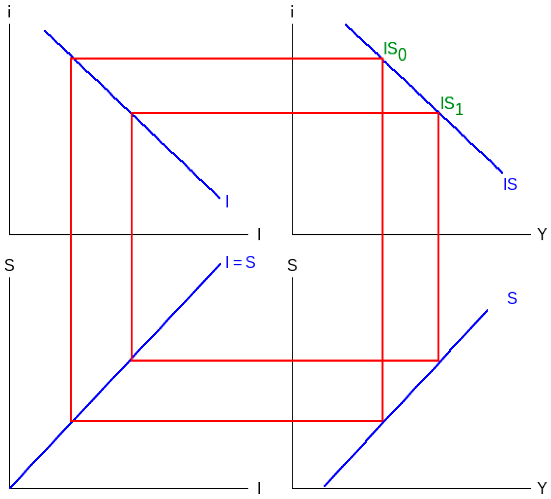
Figure 1 shows a four-quadrant diagram in part of an IS-LM model. In the diagram, if the value in quadrant I moves from IS
0 to IS
1, it will cause the values in quadrants IV, III, and II to move sequentially because quadrant I and IV share the same X-axis, quadrants IV and III share the same Y-axis, and quadrants III and II share the same X-axis as well. This method cleverly displays the relationship between the four changing variables. Although the above methods are helpful in some cases, they also have disadvantages: (a) The classic scatterplot usually cannot display negative values. (b) The severe limitation of a ternary plot when it comes to summing to a constant makes it not useful in many situations. (c) The bubbles in a bubble chart may overlap, or there may be too many to read. (d) A scatterplot matrix makes it complicated to see high-dimensional data patterns that can only be understood when considering three or more data dimensions simultaneously [
11]. (e) A four-quadrant diagram is only suitable with 4D data and is relatively unintuitive.
Inselberg and Dimsdale [
12] proposed another method called the “parallel coordinates plot”. In a parallel coordinates plot, each dimension is represented by a vertical line, and the points belonging to the same data are connected as a line. Although this method can display high-dimensional data, its drawbacks are many as well: (a) the patterns that are observed highly depend on the order of the vertical line; (b) even when researchers design a plot with reorderable parallel axes, they have to draw many plots on the paper to solve the former problem, which leads to another problem of having too many figures on the paper; and (c) the previous literature found subjects′ ability to see clusters is worse when data are drawn by parallel coordinates plots compared to scatterplots [
13,
14,
15]. Showing a polar version of the parallel coordinates plot can resolve the third problem to a certain extent. This method is called a “star plot” (radar plot or polar plot), designed to rearrange the axis of the original parallel coordinates as a star sign and line the points belonging to the same data. Though a star plot is easier to understand, the first and second problems of the original parallel coordinates plot are not solved. There is a new limitation: the data values should all be non-negative and very similar in size, which usually requires rescaling the variables to a uniform range [
16].
Recent technology has provided more robust support to make multi-dimensional data, such as three-dimensional scatterplots. All the graphics discussed above are static displays; by contrast, dynamic graphics, drawn by new technology, allow readers to directly rotate a high-dimensional graphic to reduce its dimensions to a reasonably intuitive lower number of dimensions [
17]. However, understanding 3D scatterplots and even lower dimensional graphs created by dimensionality reduction from high-dimensional datasets is very challenging [
18], and such scatterplots are difficult for the general public to draw. For other methods of high-dimensional data visualization, please see Friendly and Denis [
19]. For the space–time multivariate data, the representative visualization method uses Cartograms drawn by Geographic Information Systems. Peña-Araya et al. [
20] reported three techniques to display the relationship between two or more variables over space and time. These methods are currently the most commonly used in scientific articles, but when the data span a long period, it can lead to overly complex statistical maps. Additionally, using Geographic Information Systems is not a very basic technique. Therefore, for specific requirements, a simpler method is needed.
1.2. Research Aim
From the past to nowadays, visualization techniques are usually based on scatterplots and parallel coordinates. According to the systematic review by Bertini et al. [
1], scatterplot-related and parallel-coordinates-related methods account for 80%. The above fact intimates that the researchers are used to displaying multivariate data using scatter plots and parallel coordinates. This being the case, why do we need to develop a new method?
The first reason is that scatterplots and parallel coordinate plots have difficulty displaying “discrete variables” and the year variable. A discrete variable is one type of variable, as opposed to another type called a “continuous variable”. Discrete variables are finite or infinite but countable, e.g., gender and customer number. Among them, gender is a finite variable containing male, female, and others; customer number is an infinite but countable variable in which N equals 1, 2, 3, …. Continuous variables are infinite and uncountable, e.g., time for waiting and soda’s actual capacity Lin and Chen [
21]. In addition, a dummy variable is a special variable that uses 0 and 1 to replace uncountable but classable continuous variables with discrete ones. Both axes of classic scatterplots, parallel coordinate plots, and their similar methods are usually only suitable to display continuous variables; among them, one of the few methods that can be used to illustrate discrete variables is the bubble chart. Furthermore, displaying a chronological variable using the X-axis is strange in classic scatterplots, parallel coordinate plots, and similar methods, even if time is a continuous variable.
Second, diagrams are usually more challenging to draw and understand when data have more dimensions, especially high-dimensional scatterplots and parallel coordinate plots. Plots that display high-dimensional data usually lack legibility. In other words, they are challenging for the general public to use. It is also vital to introduce a clever method for science popularization to make diagrams user-friendly for the general public, who do not have enough knowledge or techniques to draw a professional plot. After all, we must also recognize that professional software, e.g., SAS, SPSS, R, MATLAB, and ArcGIS, is challenging to learn.
In summary, this study aims to introduce a new method (after this referred to as the “Δ table” or delta table) to visualize space–time multivariate data consisting of discrete and continuous variables for the general public. Discrete variables also include dummy variables, which transform from continuous variables. The significant features of the new method are that it can display discrete variables (including “space”) and continuous variables (including “year”) simultaneously, and the conception of threshold is contained as well. Under normal circumstances, each place name has no order relationship, so it is a discrete variable; years have an order relationship and are considered continuous variables. The details will be addressed in the next section. Everyone can make out their diagram using spreadsheet software, e.g., Excel. Simultaneously, the chart form is a table that is easy for almost every reader to understand. The Δ table is similar to Chernoff’s face but avoids its original shortcomings, i.e., the categories of scatterplots and parallel coordinate plots. It is worth emphasizing that the Δ table is proposed for use in some occurrences without any intention to replace other previous methods.
2. Developing the New Method
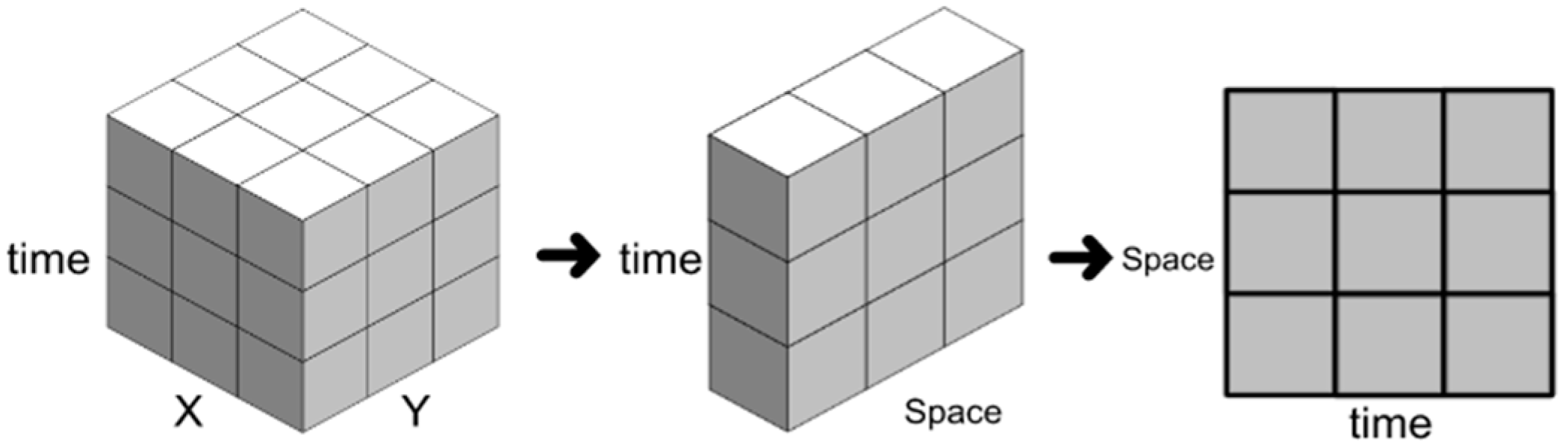
The origin of the Δ table comes from the concept of the “space–time cube”. The space–time cube aggregates space–time bins into a three-dimensional grid data structure of a cube. The X and Y axes are the defined space, and the third axis refers to time. Each bin represents the total number of data that occurred in that space during that time. If the researchers do not need to consider the 2D space, the original X and Y axes can be dimensionally reduced to a flat table (
Figure 2), using place names or mileage to represent spatial variables. The spatial variables can be order-related (e.g., mileage from north to south), category-related (e.g., cities in different countries), or unrelated, which can bring readers a different degree of richness of information. Lu et al. [
22] and Chang and Tsai [
23] used this method to map traffic incidents and freeway flow. Differently, this study reserved bins and put shapes and colors inside them to represent more variables.
The shapes in the bin are suggested as triangles, “△” and “▽”, which can be used to display a set of continuous variables if the value has increased or decreased compared to the previous bin (i.e., the left-side column in the same row). Not only does the triangle have a tip that can point in the direction of change, but the triangle sign is also similar to the Greek alphabet uppercase delta “Δ”, which at most times means “change” in mathematics; so, the triangle sign can quickly help readers think about its meaning. If the value does not change, the suggested sign is the em dash “—”, which usually refers to letters or words that have been omitted to display that there is no change. Another suggestion is that researchers can define a threshold to decide if the triangle sign is hollow or solid (i.e., “▲” and “▼”) because the readers can only see the change direction of value rather than the actual value in a Δ table. For some variables that represent a specific feature below a certain level, this design can highlight the presence or absence of that feature. For example, if a triangle sign represents the water level of a reservoir, a solid/hollow triangle can be used to represent whether the water level is lower than the dead water level (water shortage) or not; if the triangle sign represents the air quality index, a solid/hollow triangle can be used to represent whether air quality surpasses a dangerous level or not. Moreover, the color of bins is another crucial component of this kind of chart, which displays a set of discrete or dummy variables. Although the number of colors is not limited, more than three may not be suitable due to potential confusion.
Table 1 is an example of a Δ table with fabricated data on the coronavirus disease 2019 (COVID-19)-case growth rate in each district in three cities. The “△” and “▲” (“▽” and “▼”) in the particular bin mean that the value has increased (decreased) compared to the bin in its left-side column and the same row. The triangle is solid if the value is larger than 1%, which indicates significant change; otherwise, it is hollow. If the death-cases growth rate in a district is more than the average of the whole country in the same month, the bin will be filled with grey. According to
Table 1, many messages were delivered, including:
For a specific row, the changes with time in a specific district are clearly visible. For example, the COVID-19-cases growth rate in district A changed from severe to slightly increasing; however, the death-case rate remained above the whole country’s average without significant change;
For a specific column, the situations of all cities in a specific month are clearly visible. For example, the COVID-19-case growth rates were increasing severely, and the death-cases growth rates were above the whole country’s average in cities X and Y in January. The situation in city Z was not that serious in the same month;
The situation in a specific space and time is shown for a particular bin. For example, in January, district A showed severe increases in COVID-19-case growth rates and a higher death-case growth rate than the averages of the whole country;
Two sets of variables displayed by triangles and bin color can be combined to produce additional meaning. Therefore, the cumulative number and frequency of occurrences of that additional meaning at a particular time or place can be calculated. For example, suppose COVID-19 cases increase more than 1% and death-cases are higher than the nationwide average at the same time. In that case, it means the epidemic situation is “very severe” (i.e., “
![Foundations 04 00007 i001]()
”). District A has had a “very severe” situation for 6 months, and two-thirds of the cities had a “very severe” situation in January;
Because the spatial variables have category-related relationships in this case, readers can observe that the situation in the same city is similar. Among the three cities, the situations in cities X and Y are more similar but not similar in city Z. That is, the pattern of virus infections is not uniform across the country and is particularly severe in specific cities.
In summary, the classic Δ table is suitable for visualizing space–time multivariate data consisting of discrete and continuous variables. The space (time) variable is displayed as the discrete (continuous) variable. Generally, although spatial variables are treated as discrete variables, more information can be seen if there are categorical or ordinal relationships between spaces. In addition, at least two variables can be displayed in the table. One of them must be a continuous variable that represents their change with time by “△”, “▽” and “—”; the option of using a hollow or solid triangle (“▲” and “▼”) is used to display whether the change surpassed the threshold to compensate for the disadvantage that the actual value cannot be shown in the Δ table. If the actual value is so vital that it must be shown, the Δ table may not be suitable, and a line graph is the proper choice. Displaying the color of bins could represent discrete or dummy variables (transform from the continuous variable). It is worth noting that the color of bins might hide information put in the bins. If the variable displayed by triangles is essential, the bin’s color should be lighter to emphasis the triangles; otherwise, the bin’s color should be darker to highlight the bin itself (
Figure 3).
3. Case Study Example
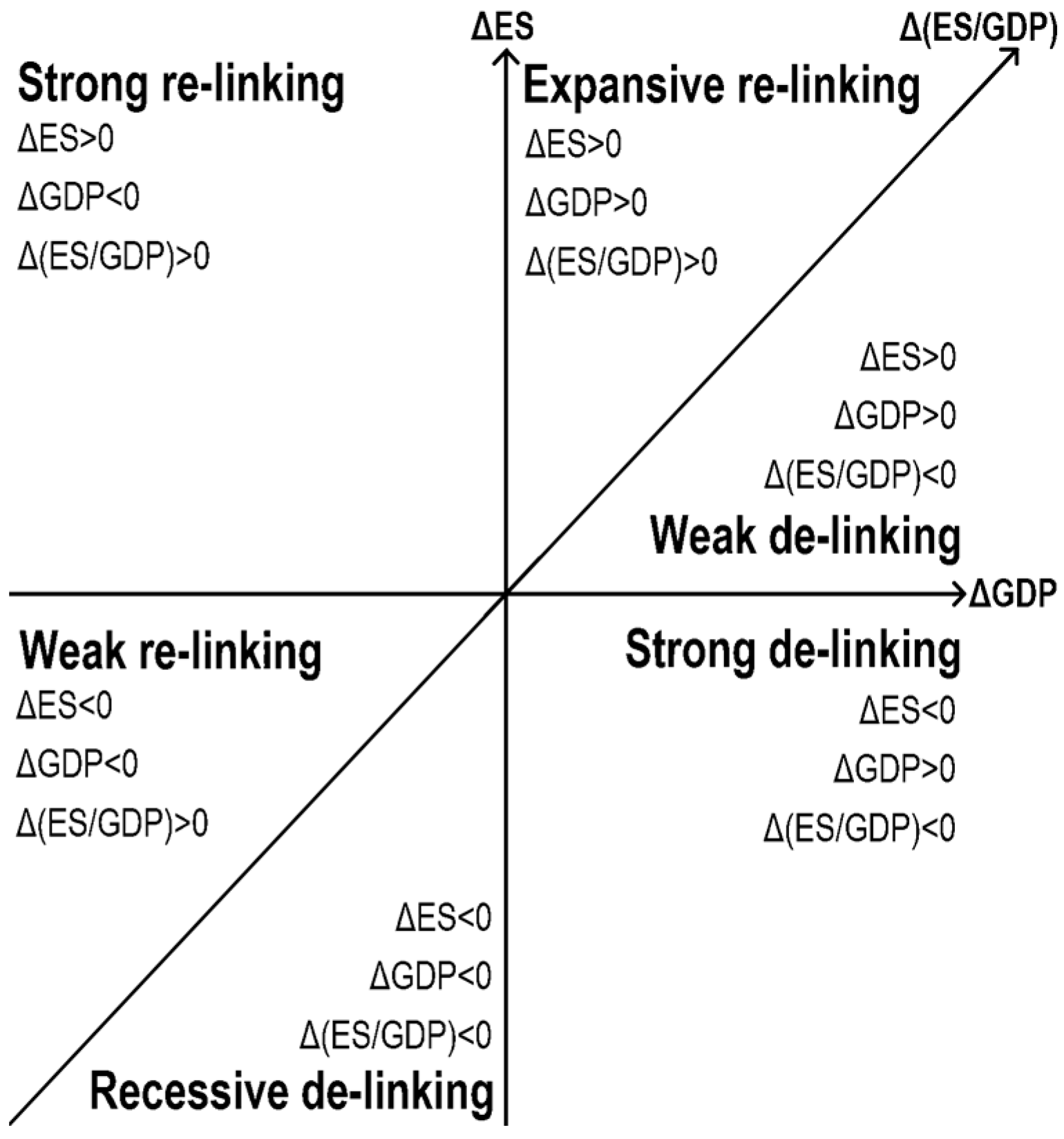
As the global population increases and the need for industrial and commercial activities grows, the human community must obtain more energy and resources to maintain the living environment. Generally speaking, the higher the economic development (usually referred to by gross domestic product, GDP), the higher the consumption of energy and resources. Both usually couple with each other. How to break their coupling has become an essential goal for countries worldwide. The Organization for Economic Cooperation and Development once listed the “decoupling” of economic growth and environmental stress (ES) as the primary goal in the first decade of the 21st century Ruffing [
24]. More and more studies, including Vehmas et al. [
25], have proposed methodologies to assess decoupling. They used
Figure 4 to define the de-linking and re-linking between ΔGDP and ΔES. Strong de-linking is where ΔGDP is positive, ΔES is negative, and Δ(ES/GDP) is less than zero. Expansive re-linking is where both ΔGDP and ΔES are positive, and Δ(ES/GDP) is more than zero. In practice, strong de-linking means economic growth is achieved through more efficient technology and reduced pressure on the environment; expansive re-linking means that economic growth is obtained through more inefficient technology with increasing environmental pressure. The original table in Vehmas et al. [
25] displayed six countries/regions. Their table has some features and drawbacks; one is that the ΔGDP, ΔES, and Δ(ES/GDP) are displayed as three independent columns, so the authors cannot display data each year to avoid having too many columns on the table.
As a result, we introduce the survey of (de)coupling as a case study to apply our new visualization method to demonstrate the usefulness of the Δ table. First, we collected data from open sources, including the annual consumption of natural gas, annual coal consumption, annual oil consumption, annual biomass energy consumption, greenhouse gas emissions, total waste production, and resource (metallic substances, water, fertilizer, and power) consumption, which are chosen to present the ES. Among them, power consumption is the most suitable indicator for ES since other data have not been available for long enough. The datasets of power consumption come from the United States Energy Information Administration, and the datasets of GDP come from the World Bank. At the same time, we also filtered all economies to select a representative one for three categories: developed, newly industrialized, and developing. Due to incomplete data, many economies were excluded from the selected list. Only fourteen economies seemed to be suitable to be involved in our research. Then, we used a comprehensive cluster analysis of various indicators and divided selected economies into three groups. United States, Germany, United Kingdom, Norway, Netherlands, and Japan are examples of developed economies; South Korea and Taiwan represent newly industrialized economies; and the developing economies include Brazil, India, China, Thailand, the Philippines, and Saudi Arabia. Among them, the per capita annual income of USD 30,000 is a significant boundary between developed and other economies.
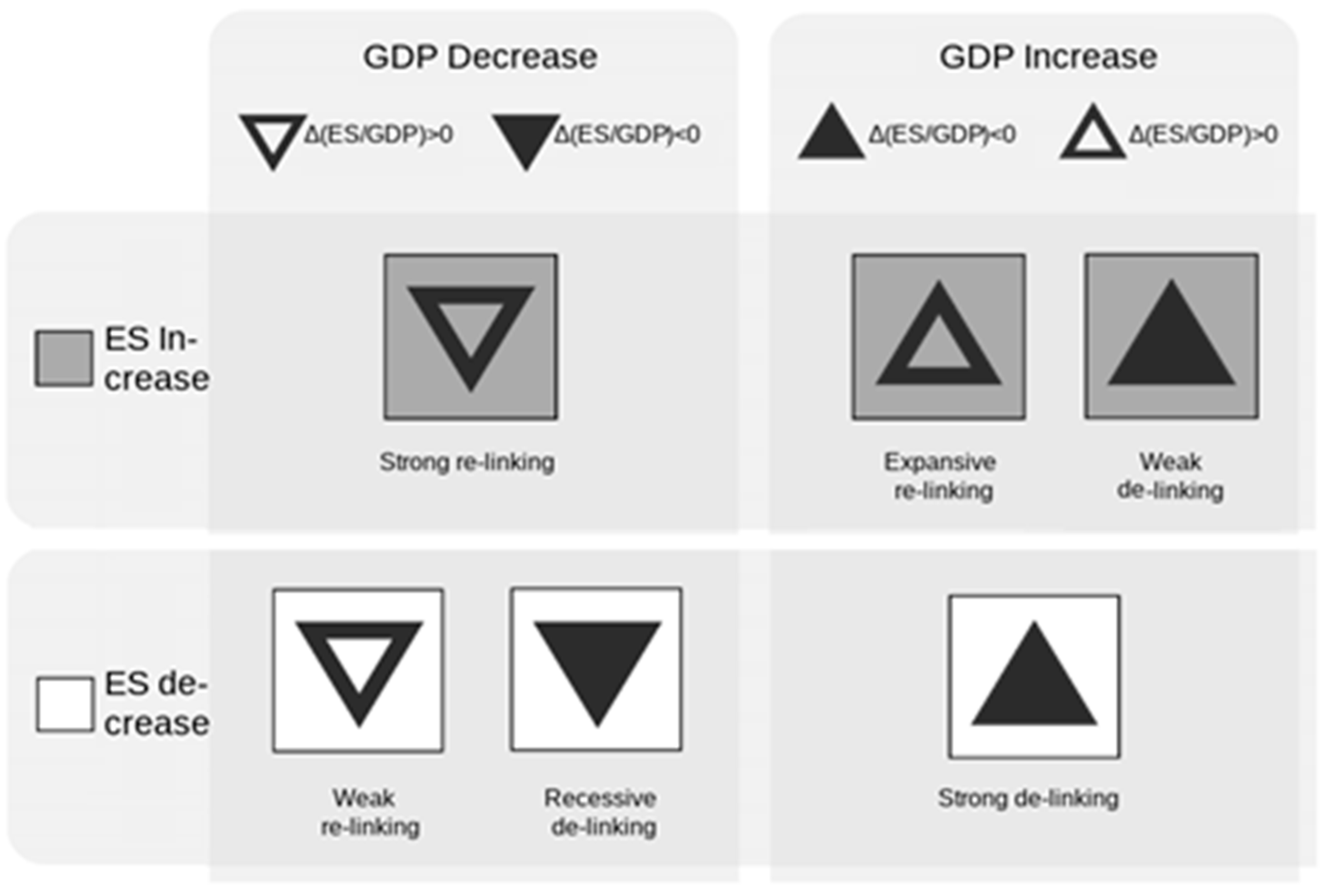
Table 2 is the survey result, visualized as a Δ table. It contains multi-variable data on space (economies), time (1983–2014), GDP, and the ES (which is referred to by electricity consumption per capita). The triangles represent the change in GDP and are filled in with black if the Δ(ES/GDP) is negative. The color of the bins represents the change of ES, and the colors only include white and gray. As a result,
![Foundations 04 00007 i002]()
represents expansive re-linking,
![Foundations 04 00007 i003]()
represents weak de-linking, ▲ represents strong de-linking, ▼ represents recessive de-linking, ▽ represents weak re-linking, and
![Foundations 04 00007 i004]()
represents strong re-linking (
Figure 5).
Finally,
Table 2 shows that the patterns of the newly industrialized and developing economies are similar and remain in a coupling situation. On the contrary, the developed economies started to achieve strong de-linking after 2008. This Δ table proves that the newly industrialized economies should do more effect to achieve the decoupling between GDP growth and change of ES. Significantly, the differences in many indices, such as the Human Development Index and GDP per capita, between the newly industrialized and developed economies for recent decades are increasingly minor. Thus, there is no excuse not to improve the development model of newly industrialized economies to be consistent with the standards of developed economies. Furthermore, economies with a per capita annual income of more than USD 30,000 are all trending toward decoupling, and the decoupling performance of the developed country group is relatively stable compared to other economic groups. Among the decoupling types, “strong decoupling” makes up the majority, indirectly reflecting the effectiveness of these countries’ relevant resource management policies. It could be attributed to the fact that these economies pay great attention to and actively participate in international conventions and norms. Moreover, the abovementioned pattern also comes close to appearing when we use other indicators as the ES to assess (de)coupling [
26].
4. Conclusions
Based on the case study example, the Δ table visualization method and the analysis of decoupling patterns provide valuable insights into the complex relationship between GDP growth and change of ES. A notable finding was that economies with a per capita annual income of more than USD 30,000 tended to trend toward decoupling. This threshold serves as a significant benchmark for assessing the potential for decoupling in different countries. In contrast, newly industrialized and developing economies showed a consistent coupling pattern. It suggests that newly industrialized economies must make more significant efforts to achieve decoupling. Such improvements are not only feasible but essential for sustainable growth. The findings of this case study offer a roadmap for policymakers and stakeholders to navigate the challenges of balancing economic growth with environmental preservation in the 21st century. The above patterns and facts would have been almost impossible to observe if we had displayed these data using other visualization methods. As a result, our new visualization method has significant value in transferring this kind of data into information.
Recently, some studies, such as Dallison et al. [
27], have used triangles in their research articles figures. However, there is still a lack of systematic explanation of how triangles help to visualize space–time multivariate data consisting of discrete and continuous variables. This study introduces the methodology of the Δ table for the general public to easily generate clever tables that are friendly to both cartographers and readers. In the Δ table, the spatial and temporal data compose the main row and column of the table; meanwhile, other discrete and continuous variables are displayed in the bins of the table. Therefore, a large amount of information can be presented in a flat table, which overcomes the shortcomings of previous methods to a certain extent. However, we acknowledge that some limitations remain in addition to the functional ones illustrated in the main text. First, the Δ table is considered to have a gap in making further changes aesthetically. An outstanding design helps the reader understand the table. Second, the Δ table has the potential to create more variant tables with similar styles, for example, by replacing the data in rows from spatial variables with others. The preliminary idea is to convert the data of 365 (366) days from one column into a matrix; each row shows data from the first to the last day of each month, and each column shows specific days from January to December. Finally, follow-up research could discuss the degree of acceptance of students and the general public in schools and daily circumstances. This new method should be used in future research to confirm that the Δ table provides higher understanding and drawing ability for the general public through Delphi questionnaires, focus groups, or other social experiment methods.
To sum up, this paper points out a target worthy of further research: how to convey more information to the general public through concise diagrams and tables. After all, developing the abovementioned technique is essential for helping the public understand multidimensional data. However, we also need more evidence to make sure the practicality of new methods.
Author Contributions
Conceptualization, C.-E.L. and B.-W.W.; methodology, C.-E.L.; validation, B.-W.W.; investigation, C.-E.L. and B.-W.W.; resources, B.-W.W.; data curation, B.-W.W.; writing—original draft preparation, C.-E.L.; writing—review and editing, N.-W.K.; visualization, C.-E.L.; supervision, M.-H.Y.; project administration, M.-H.Y.; funding acquisition, M.-H.Y. All authors have read and agreed to the published version of the manuscript.
Funding
This study is financially supported by the National Science and Technology Council of the Republic of China (110-2625-M-001-002-MY3) and Academia Sinica Sustainability Science Research Program (AS-SS-112-02).
Institutional Review Board Statement
Ethical review and approval were waived for this study, because they are not applicable.
Informed Consent Statement
Not applicable.
Data Availability Statement
Acknowledgments
The author thanks peer reviewers and editors for contributing to this study. We also thank Meng-Hsuan Matthew Wu for drawing
Figure 5.
Conflicts of Interest
The authors declare no conflicts of interest.
References
- Bertini, E.; Tatu, A.; Keim, D. Quality metrics in high-dimensional data visualization: An overview and systematization. IEEE Trans. Vis. Comput. Graph. 2011, 17, 2203–2212. [Google Scholar] [CrossRef] [PubMed]
- Card, S.K.; Mackinlay, J.D.; Schneiderman, B. Readings in Information Visualization: Using Vision to Think; Morgan Kaufmann: Burlington, MA, USA, 1999. [Google Scholar]
- Chernoff, H. The use of faces to represent points in k-dimensional space graphically. J. Am. Stat. Assoc. 1973, 68, 361–368. [Google Scholar] [CrossRef]
- Kosara, R. A Critique of Chernoff Faces. 2007. Available online: https://eagereyes.org/criticism/chernoff-faces (accessed on 25 December 2023).
- Maphugger. The Trouble with Chernoff. 2013. Available online: https://maphugger.com/post/44499755749/the-trouble-with-chernoff (accessed on 25 December 2023).
- Becker, R.A.; Chambers, J.M. S: An Interactive Environment for Data Analysis and Graphics; Wadsworth: Belmont, CA, USA, 1984. [Google Scholar]
- Stata (n.d.) Graph Matrix. Available online: https://www.stata.com/manuals/g-2graphmatrix.pdf (accessed on 25 December 2023).
- Cleveland, W.S.; McGill, R. The many faces of a scatterplot. J. Am. Stat. Assoc. 1984, 79, 807–822. [Google Scholar] [CrossRef]
- Friendly, M.; Denis, D. The early origins and development of the scatterplot. J. Hist. Behav. Sci. 2005, 41, 103–130. [Google Scholar] [CrossRef] [PubMed]
- Chambers, J.M.; Clevland, W.S.; Kleiner, B.; Turkey, P.A. Graphical Methods for Data Analysis; Wadsworth Statistical/Probability Series; Wadsworth International Group: Fairview, TN, USA, 1983. [Google Scholar]
- Ware, C. Static and moving patterns. In Information Visualization: Perception for Design; Ware, C., Ed.; Morgan Kaufmann: Burlington, MA, USA, 2013; pp. 183–243. [Google Scholar]
- Inselberg, A.; Dimsdale, B. Parallel Coordinates: A Tool for Visualizing Multi-Dimensional Geometry. In Proceedings of the First IEEE Conference on Visualization, San Francisco, CA, USA, 23–26 October 1990; IEEE Computer Society Press: Washington, DC, USA, 1990; pp. 361–378. [Google Scholar]
- Holten, D.; van Wijk, J.J. Evaluation of cluster identification performance for different PCP variants. Comput. Graph. Forum 2010, 29, 793–802. [Google Scholar] [CrossRef]
- Li, J.; Martens, J.B.; van Wijk, J.J. Judging correlation from scatterplots and parallel coordinate plots. Inf. Vis. 2010, 9, 13–29. [Google Scholar] [CrossRef]
- Dimara, E.; Bezerianos, A.; Dragicevic, P. Conceptual and methodological issues in evaluating multidimensional visualizations for decision support. IEEE Trans. Vis. Comput. Graph. 2017, 24, 749–759. [Google Scholar] [CrossRef] [PubMed]
- Partl, C.; Plaschzug, P.; Ladenhauf, D.; Fernitz, G. (n.d.) Star Plots: A Literature Survey. Available online: https://courses.isds.tugraz.at/ivis/surveys/ss2010/g4-survey-starplots.pdf (accessed on 25 December 2023).
- Sanftmann, H.; Weiskopf, D. 3D scatterplot navigation. IEEE Trans. Vis. Comput. Graph. 2012, 18, 1969–1978. [Google Scholar] [CrossRef] [PubMed]
- Coimbra, D.B.; Martins, R.M.; Neves, T.T.; Telea, A.C.; Paulovich, F.V. Explaining three-dimensional dimensionality reduction plots. Inf. Vis. 2016, 15, 154–172. [Google Scholar] [CrossRef]
- Friendly, M.; Denis, D.J. Milestones in the History of Thematic Cartography, Statistical Graphics, and Data Visualization. 2001. Available online: http://www.datavis.ca/milestones/ (accessed on 25 December 2023).
- Peña-Araya, V.; Pietriga, E.; Bezerianos, A. A Comparison of Visualizations for Identifying Correlation over Space and Time. IEEE Trans. Vis. Comput. Graph. 2020, 26, 375–385. [Google Scholar] [CrossRef] [PubMed]
- Lin, H.L.; Chen, J.C. Statistics: Methods and Application; Yeh Yeh Book Gallery: Taipei, Taiwan, 2006. [Google Scholar]
- Lu, C.T.; Boedihardjo, A.P.; Shekhar, S. Analysis of spatial data with map cubes: Highway traffic data. In Geographic Data Mining and Knowledge Discovery, 2nd ed.; Miller, H.J., Han, J.W., Eds.; Routledge: Abingdon, UK, 2009; pp. 69–97. [Google Scholar]
- Chang, K.C.; Tsai, Y.M. GIS data exploration and the application in traffic data. Public Gov. Q. 2019, 7, 42–47. [Google Scholar]
- Ruffing, K. Indicators to measure decoupling of environmental pressure from economic growth. Sustain. Indic. Sci. Assess. 2007, 67, 211. [Google Scholar]
- Vehmas, J.; Kaivo-oja, J.; Luukkanen, J. Global Trends of Linking Environmental Stress and Economic Growth; Finland Futures Research Centre 6: Turku, Finland, 2003. [Google Scholar]
- Wu, B.W. The Analysis of Material and Consumption and the Decoupling in Different Countries. Master’s Thesis, Department of Geography, National Taiwan Normal University, Taipei, Taiwan, 2018. Available online: https://hdl.handle.net/11296/y7pass (accessed on 15 December 2023).
- Dallison, R.J.; Patil, S.D.; Williams, A.P. Impacts of climate change on future water availability for hydropower and public water supply in Wales, UK. J. Hydrol. Reg. Stud. 2021, 36, 100866. [Google Scholar] [CrossRef]
| Disclaimer/Publisher’s Note: The statements, opinions and data contained in all publications are solely those of the individual author(s) and contributor(s) and not of MDPI and/or the editor(s). MDPI and/or the editor(s) disclaim responsibility for any injury to people or property resulting from any ideas, methods, instructions or products referred to in the content. |
© 2024 by the authors. Licensee MDPI, Basel, Switzerland. This article is an open access article distributed under the terms and conditions of the Creative Commons Attribution (CC BY) license (https://creativecommons.org/licenses/by/4.0/).


 represents expansive re-linking,
  represents weak de-linking, ▲ represents strong de-linking, ▼ represents recessive de-linking, ▽ represents weak re-linking, and
  represents strong re-linking (Figure 5).


