1. Introduction
COVID-19 is a global challenge that demands researchers, policymakers, and governments to address multiple dimensions related to public health, socioeconomic impact, psychological impact, educational gap and many other issues [
1]. The United States had high numbers of coronavirus cases and deaths, with high variability in cases and mortality among communities across the nation [
2]. Researchers have identified risk factors for COVID-19 mortality, such as age and comorbid diseases [
3]. Based on the CDC data as of 10 February 2021, 81.2% (359,956) of deaths were reported in the older population of age 65 and up in the United States [
4]. There were also data suggesting that the social determinants of health such as poverty, physical environment (e.g., smoke exposure, homelessness) and race or ethnicity can also have a considerable effect on COVID-19 outcome [
3,
5,
6]. COVID-19 has also disproportionately affected racial and ethnic minority groups, with high rates of death in African American, Native American and Latin populations [
7]. At the regional level, it is important for policymakers to understand how the average COVID-19 risks are associated with the region’s demographic, socioeconomic and health factors and how the association patterns are changing over time.
We are interested in, at the county level, how associations between risk factors and COVID-19 case fatality rate (CFR) have changed over the course of the pandemic in two states, New York and Florida, that were hit hard by the pandemic. For each state, we divided the COVID-19 pandemic period into three seasonal phases based on the observed major peaks of COVID-19 outbreaks. We looked at county-level associations between demographic, socioeconomic and health factors and the reported COVID-19 CFR in the three phases from the beginning of the pandemic till mid-January 2021. This was the time period before COVID-19 vaccines became widely available. We used correlation tests to identify significant associations and used graphical models to untangle direct and indirect associations with the multivariate data comprising all the relevant covariates.
In this analysis, we observed that, during the early phases of the pandemic, the reported CFR was much higher than in later phases, and association patterns were complex and suggest that risk factors were multifaceted. The percentage of the population aged 65 and older was associated with reported CFR in Florida but not in New York. As the pandemic progressed, especially during the winter phase, socioeconomic factors such as median household income and health factors such as the prevalence of adult smoking and fatality rate due to respiratory diseases became more significantly associated with the reported CFR. We used causal graphical models [
8,
9] to sort the associated factors according to which ones were more likely to be directly associated with the COVID-19 case fatality rate. The limitation of observational studies does not allow us to make causal conclusions, but trends and changes in association patterns furnish important data-supported hypotheses for understanding the pandemic in depth. It was remarkable that there was as much commonality in association patterns during the third phase between the two states, even though the two states implemented different mitigation measures and were commonly contrasted in news reports.
2. Materials and Methods
2.1. Data Sources and Preparation
County-level, daily reported COVID-19 cases and deaths numbers were obtained from USAFacts [
10]. For each county, we computed the reported CFR as the ratio of the reported confirmed deaths to the reported confirmed cases. As discussed in Angelopoulos et al. [
11], this simple and “naïve” estimation of CFR has limitations since, for example, both cases and deaths can be under-reported, but compensating for such biases would be difficult without collecting substantial additional data. This naïve estimation is still an informative and practical measure of the severity of an ongoing pandemic.
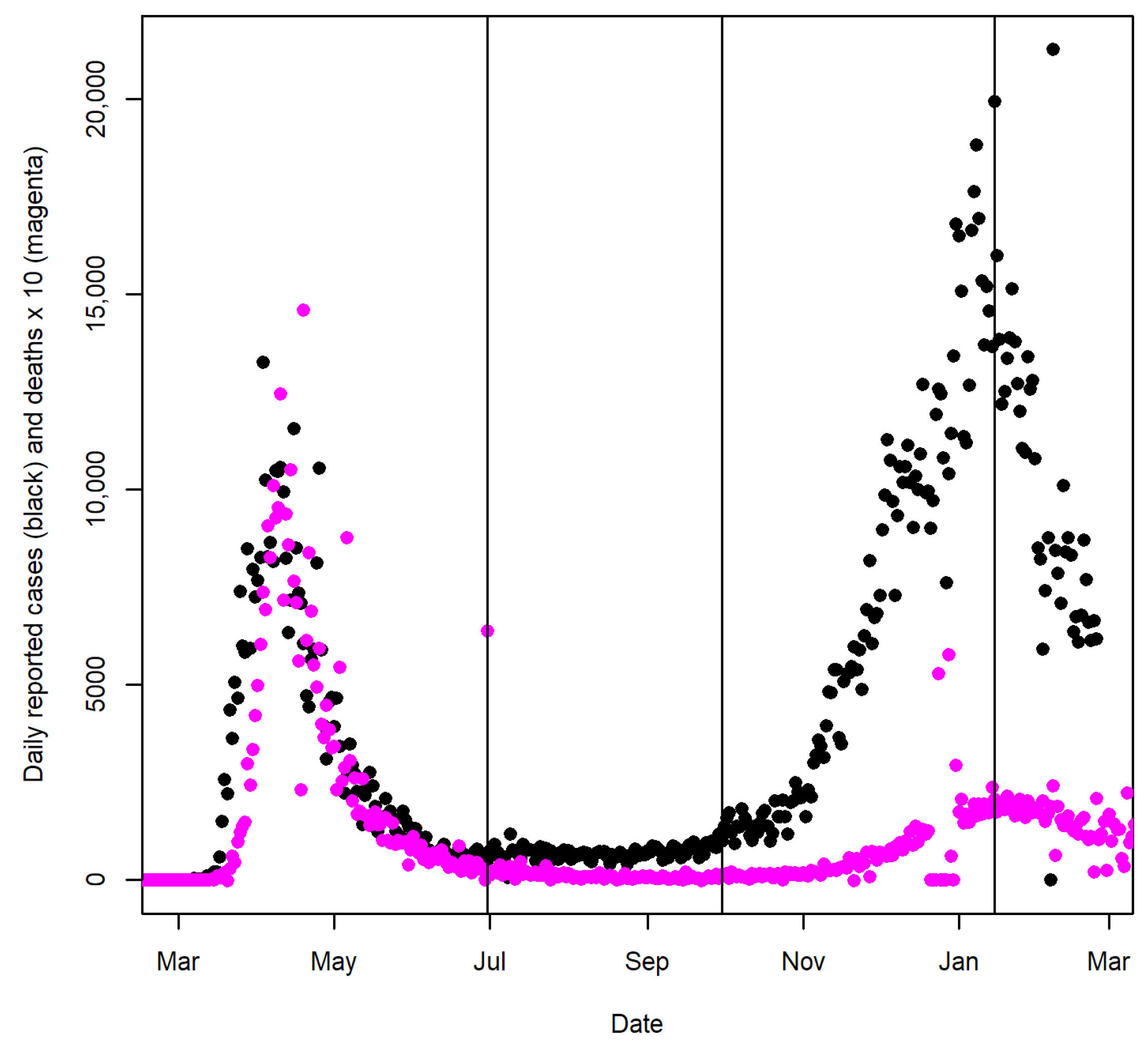
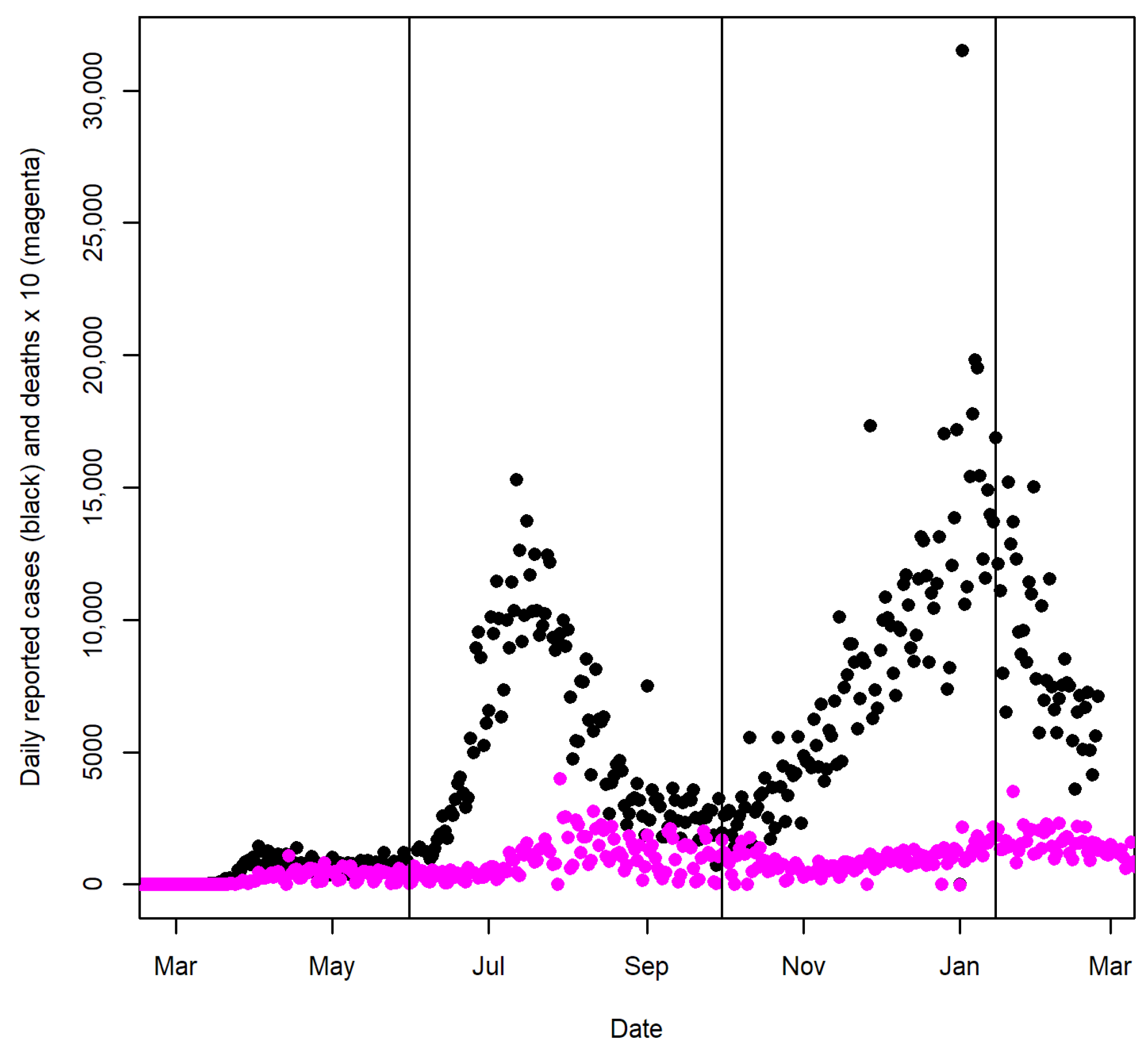
For New York and Florida, we divided the pandemic period up until 15 January 2021 into three seasonal phases based on the observed major peaks in each state (see
Figure 1 and
Figure 2). We computed the reported CFR during each phase for the counties of New York and Florida. The first phase in New York included the days from 1 March to 30 June 2020, and the first phase in Florida included the days from March 1 to 31 May 2020. The second phase in New York was the period between 1 July and 30 September. The second phase in Florida included the days from 1 June to 30 September 2020. The third phases in both states were the days between 1 October 2020 and 15 January 2021, which was the period when two major holidays, Thanksgiving and Christmas, likely increased indoor gatherings. Since both deaths and cases were aggregated over each phase, the estimated CFR was less affected by the reporting lag.
We obtained covariate data reflecting various potential demographic, socioeconomic and health risk factors from the County Health Rankings 2021 and 2022 Analytics Datasets [
12,
13] and an abridged dataset curated by the Yu group [
14].
Table 1 summarizes the 21 covariates used in our analyses in detail. The 2022 County Health Rankings data updated the health-related covariates in our list to reflect 2019’s measurements.
The datasets were merged by the Federal Information Processing Standards (FIPS) code for each county to create a final dataset for the statistical analysis in the
R software (R Core Team, Vienna, Austria) [
15].
2.2. Statistical Analysis
For univariate analysis, we conducted tests of correlations between the 21 covariates and the reported CFR for each COVID-19 phase among counties in the states of New York and Florida. We explored both the Pearson correlation and Spearman’s rank correlation. The test of correlation using the Pearson correlation coefficient is equivalent to the test of the regression coefficient in a univariate simple linear regression. Spearman’s rank correlation was also considered since it is less sensitive to the influence of outlying data points. Exploratory visualization was used to examine the correlations between the reported CFR and the covariates.
Tetrad software (Ramsey et al, Pittsburgh, USA) 7.1.0-0 [
16] was used to build graphical models to examine associations between the covariates and the reported CFR during the third COVID-19 phase in each state. The Greedy Fast Casual Inference Algorithm for continuous random variables (GFCIc) [
17] was used to build the graphical models. GFCIc takes a dataset of continuous variables as input and outputs a graphical model called a partial ancestral graph (PAG), which represents a set of causal Bayesian networks that cannot be distinguished by the algorithm. The GFCIc assumes that cases in the data are independent and identically distributed. The formal interpretation of nodes and edges in PAG is listed in
Table 2 [
18]. At a more intuitive level, in the large sample limit, the PAG [
19] output by GFCIc will entail the set of conditional independence relationships judged to hold in the population represented by its input dataset. With a finite sample size, the resulting graphical model may not be completely accurate, but one can use the PAG that GFCIc returns as a data-supported hypothesis about causal relationships that exist among the variables in the dataset.
3. Results
3.1. New York State
In order to explore potential county-level demographic, socioeconomic and health risk factors of COVID-19 during each of the three seasonal phases (see
Figure 1), we performed tests of correlation between the reported CFR in each phase and the county-level covariates listed in
Table 1. We will focus our discussion on test results based on Spearman’s rank correlation coefficients since the rank correlation is less sensitive to the influence of a small number of outlying data points. Results based on the Pearson correlation coefficient—which is equivalent to the test of the regression coefficient in a univariate simple linear regression—are listed in
Appendix A,
Table A1.
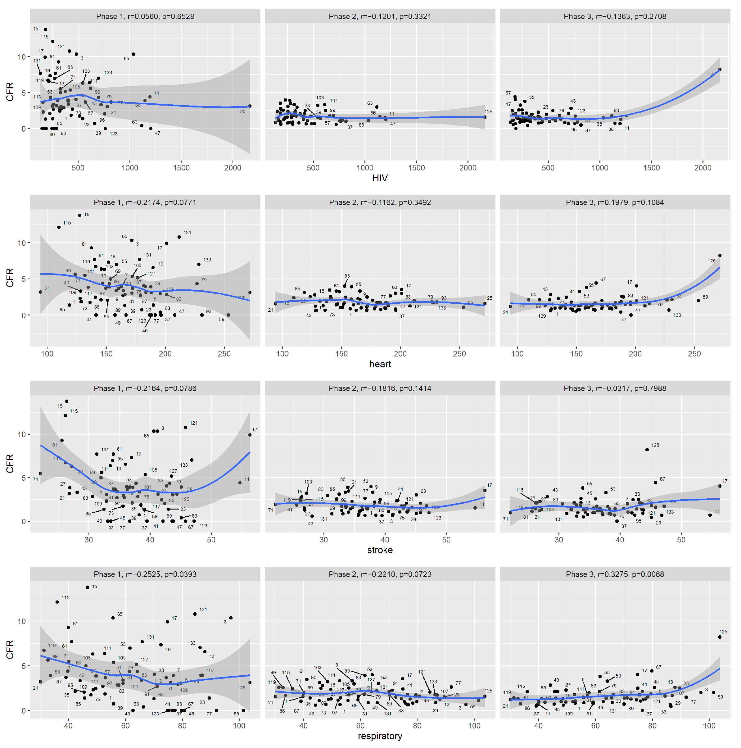
According to Spearman’s rank correlation test results (listed in
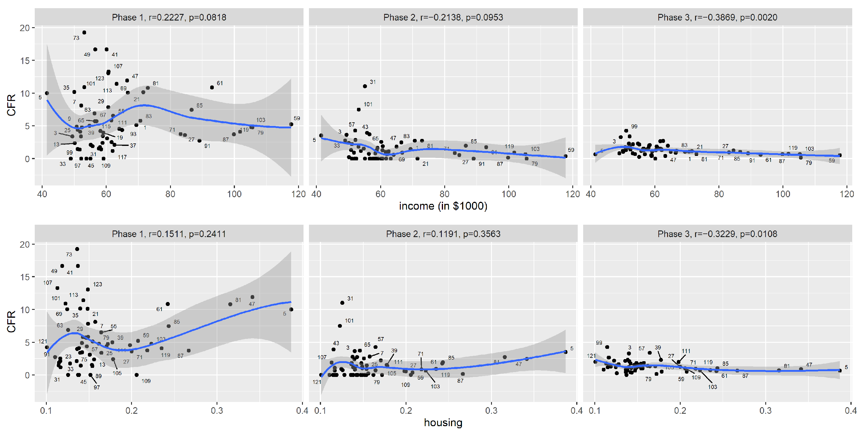
Table 3), during the first phase (1 March to 30 June of 2020) of COVID-19, among counties in New York State, the reported CFR was significantly correlated with the prevalence of an obese population, and also moderately correlated with stroke and respiratory diseases mortality rates. However, the signs of the correlation coefficients are all counter-intuitive: for example, counties with higher stroke mortality rates actually tended to have lower reported CFRs for COVID-19 during this period. This is likely due to confounding factors: for example, one contributing factor is that the virus hit major cities first, at a time when the county was not yet prepared to respond. To visually inspect the trends, we plotted the reported CFR against the covariates (
Figure 3,
Figure 4,
Figure 5). By examining the scatter plots, we see that the reported CFRs were much higher than in later phases. As we know now, COVID-19 tests were not readily available during this period, and it was likely patients with severe symptoms were more likely to be diagnosed and recorded. The reported CFRs also showed great variation among counties, and for many covariates, the scatter plots display nonlinear and nonmonotonic trends that cannot be captured by Spearman’s rank correlation.
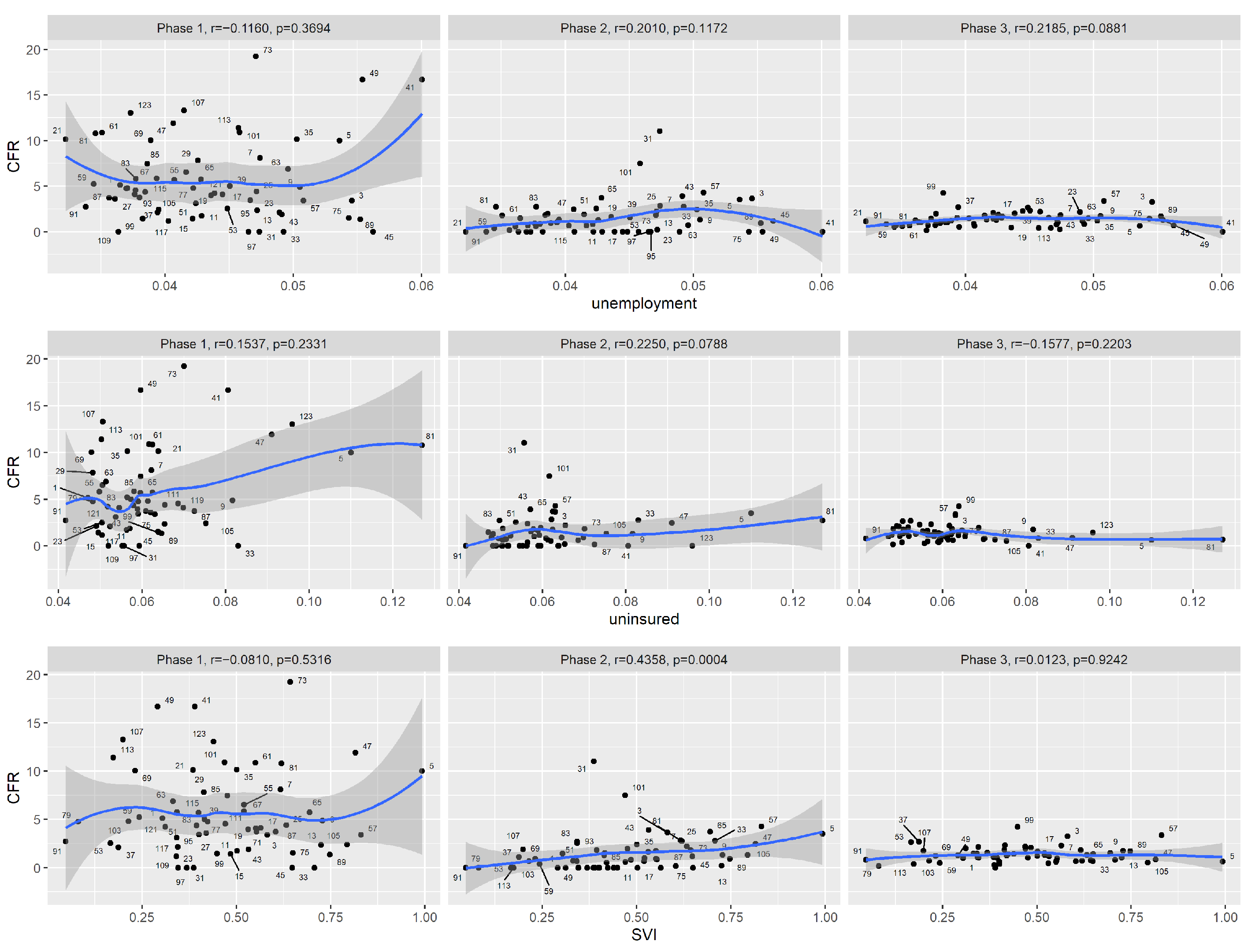
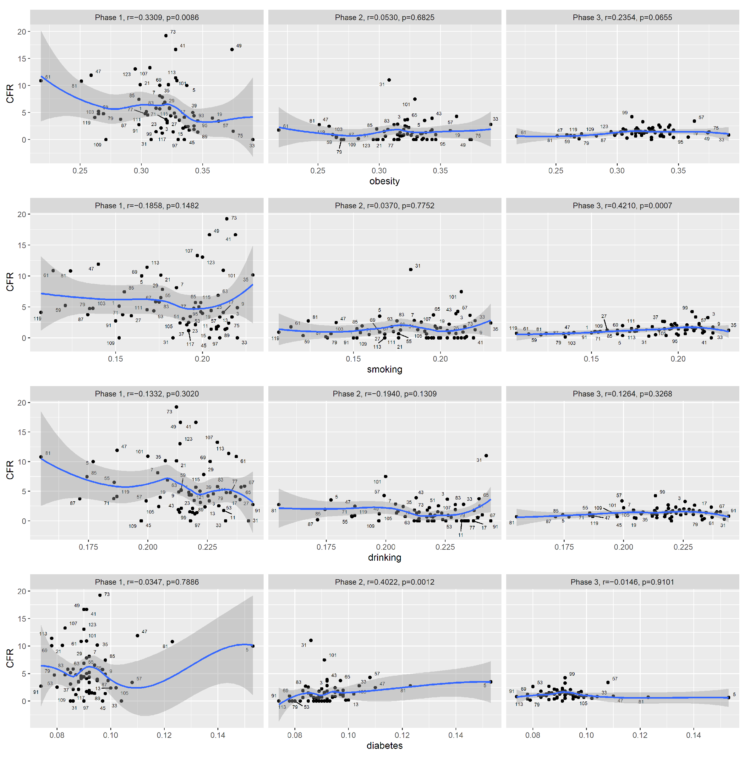
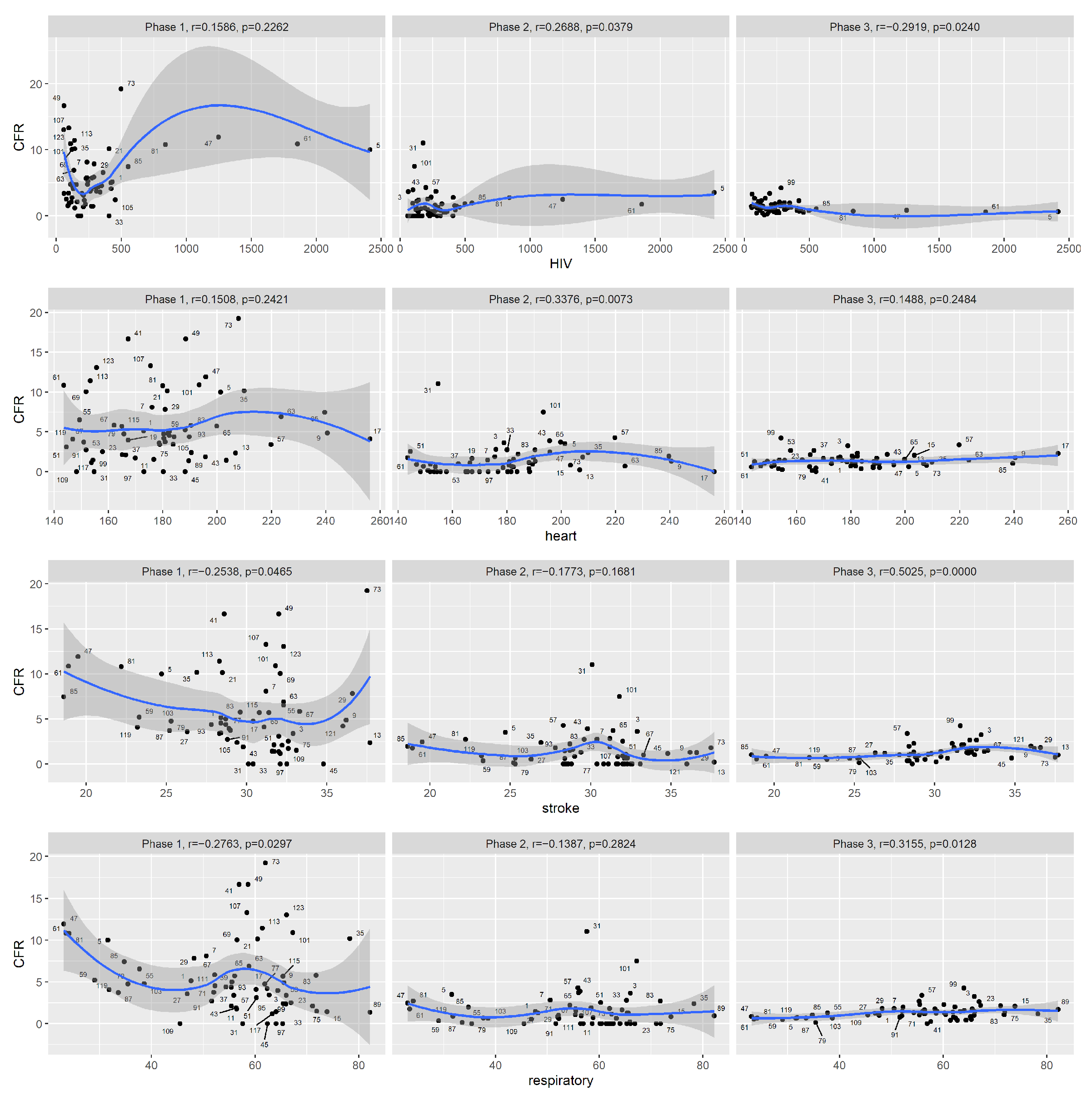
During the second phase (1 July to 30 September 2020), increased COVID-19 CFR at the county level was associated with an increased percentage of the black population and decreased percentage of the white population, increased SVI, increased prevalence of diabetes, increased HIV prevalence and increased heart mortality rate. Note that New York State did not experience a high peak during this phase.
During the third phase (1 October 2020 to 15 January 2021), increased COVID-19 CFR at the county level was associated with many measurements of racial compositions, decreased median household income, increased prevalence of adult smokers, increased HIV prevalence and increased stroke and respiratory disease mortality rates. The negative association with housing problems was likely due to confounding. The noise level was much lower during this phase. From the scatter plots, we see that overall, the reported CFRs had greatly decreased in phase 3. When it comes to median household income, the reduction in CFR among the high-income counties was greater than among the low-income counties.
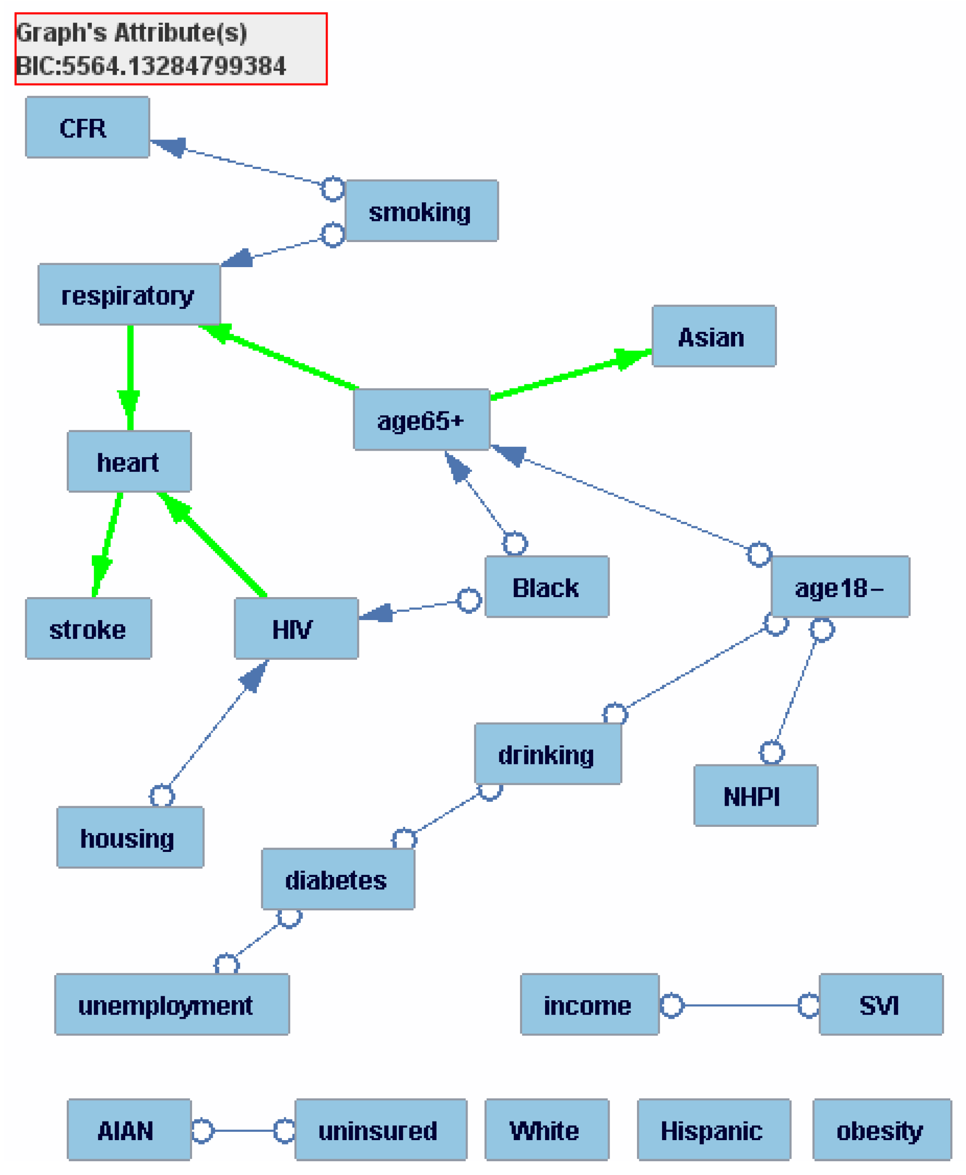
We fit graphical models to the CFR and covariates data from the third phase using the software Tetrad. With a finite sample size, the resulting graphical model may not be completely accurate and should be viewed as a data-supported hypothesis about causal relationships that exist among the variables. Intuitively speaking, the factors that are closer to the CFR in the resulting graphical model are more (likely to be) directly associated with the CFR (see
Table 2 for technical interpretation of the graph). The graphical model (
Figure 6) shows that the percentage of adult smokers is the only covariate that is directly associated with the reported CFR. In other words, the graphical model indicates that once we apply the percentage of adult smokers, other covariates are no longer significantly correlated with the reported CFR. This suggests that data from New York counties are most compatible with the interpretation that the other significant covariates reported from the correlation analysis are indirectly associated with CFR through the effect of smoking.
3.2. Florida State
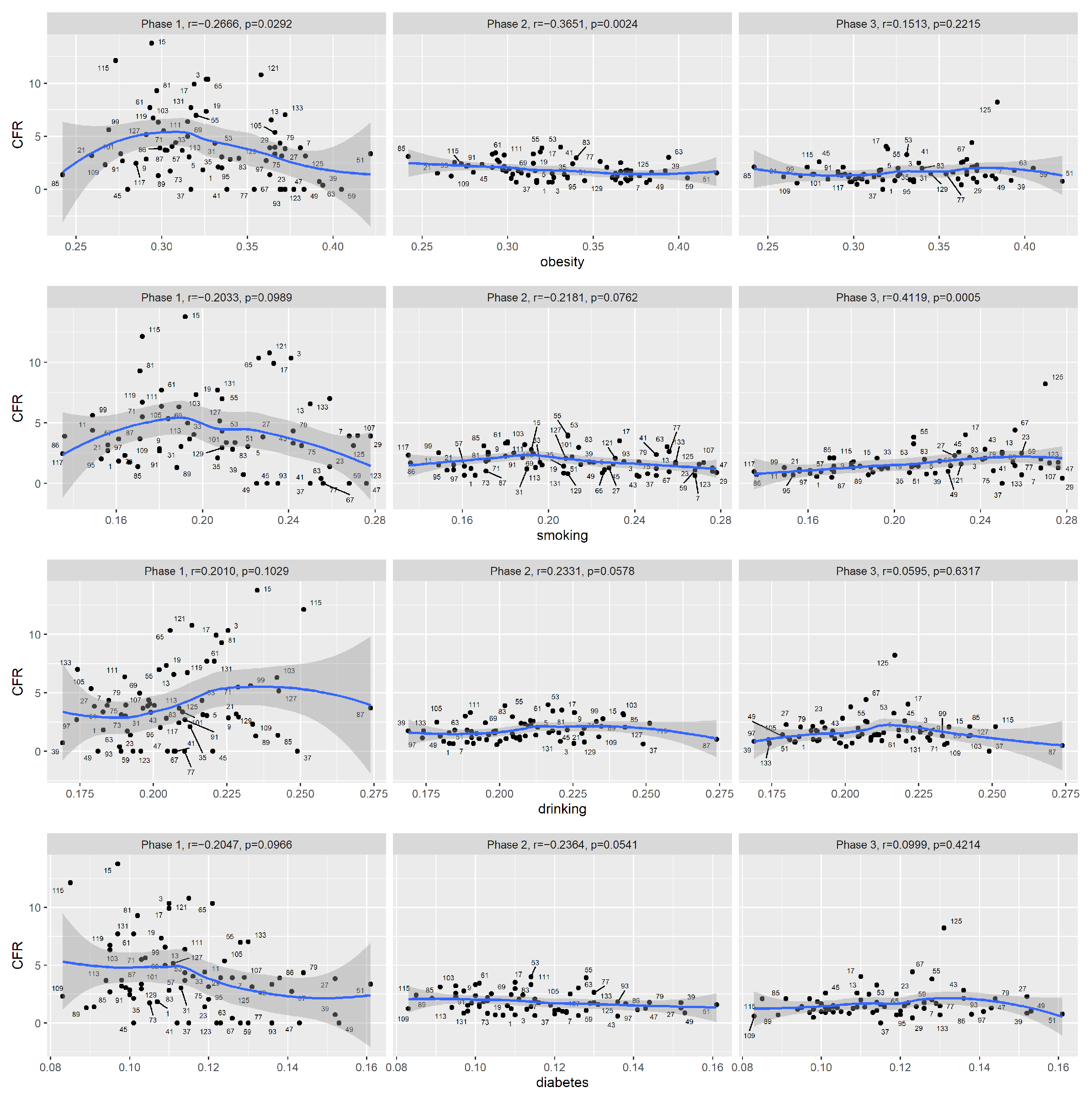
The results from the test of Spearman correlations are summarized in
Table 4 for the three phases of Florida (The results from the test of Pearson correlations are summarized in
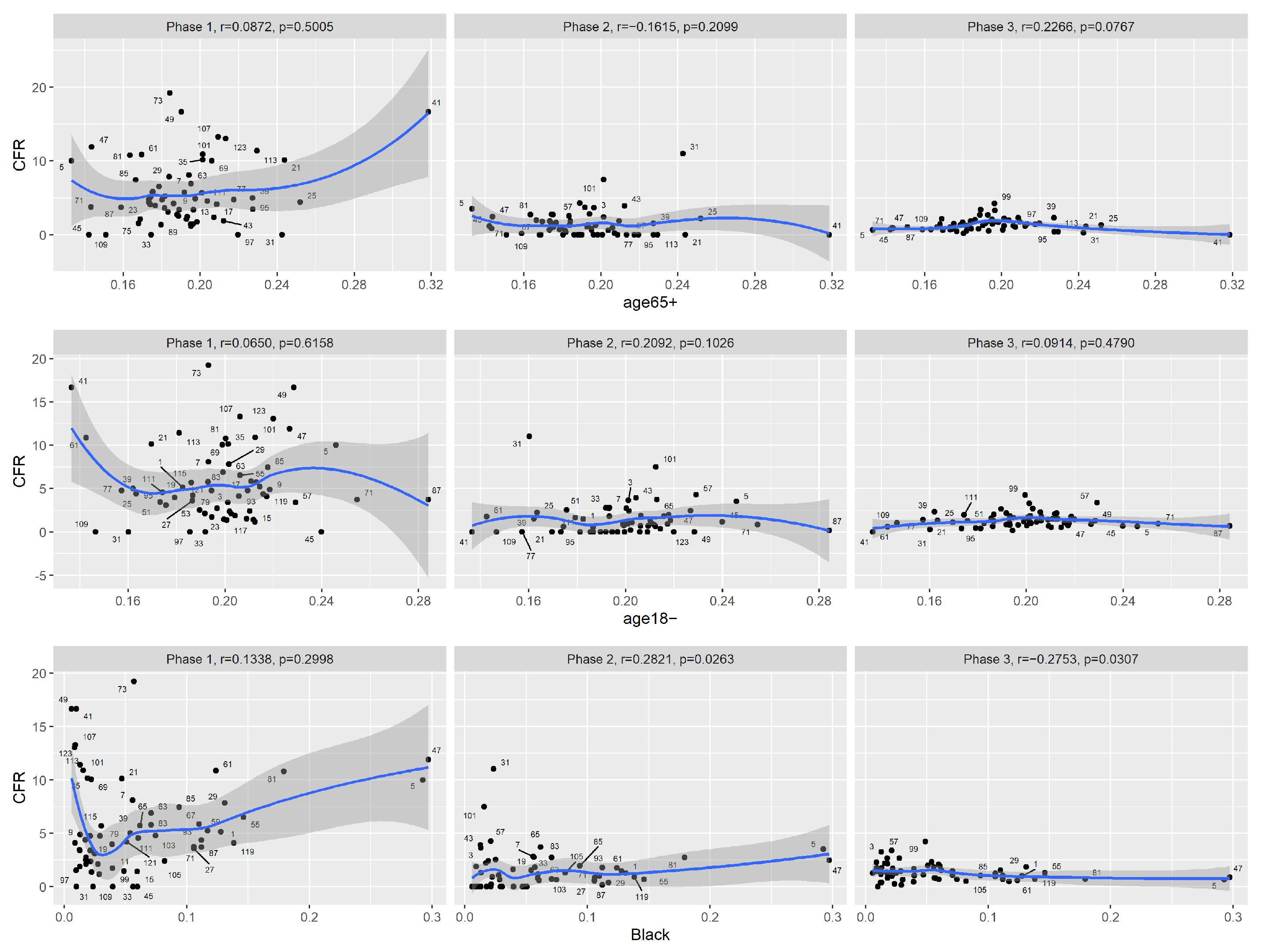
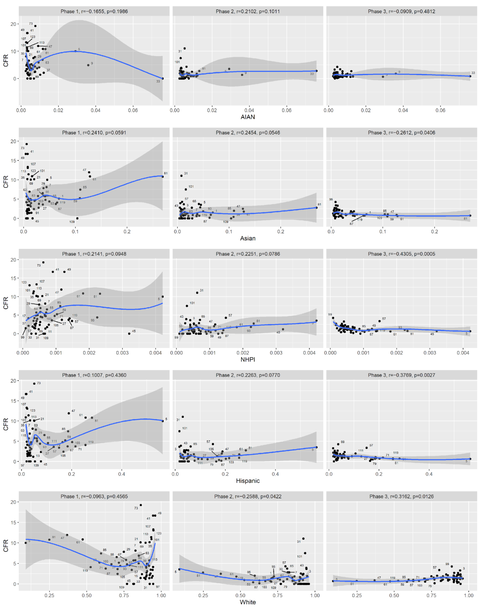
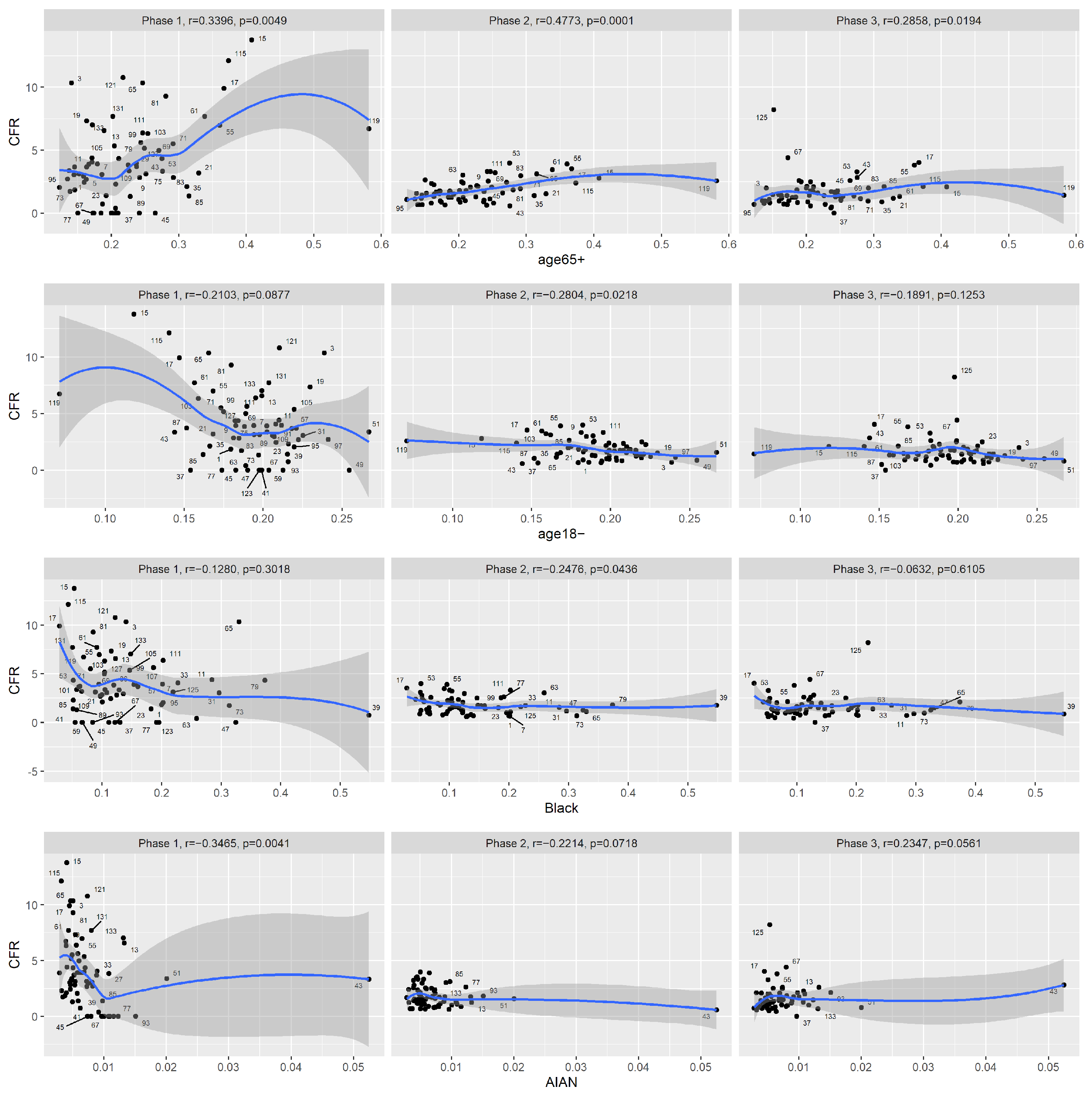
Appendix A Table A2). Among Florida counties, during the first phase of COVID-19 (1 March to 31 May 2020), the reported CFR was significantly correlated with the percentage of the population aged 65 and older and the percentage of the AIAN population. The reported CFR was also moderately associated with the prevalence of obesity and the fatality rate of respiratory diseases, but similar to New York State’s case, the signs of correlations were counter-intuitive and were likely due to confounding and also the nonmonotonic nature of the curves, which Spearman’s correlation can not handle. Note that Florida only experienced a minor peak during this phase.
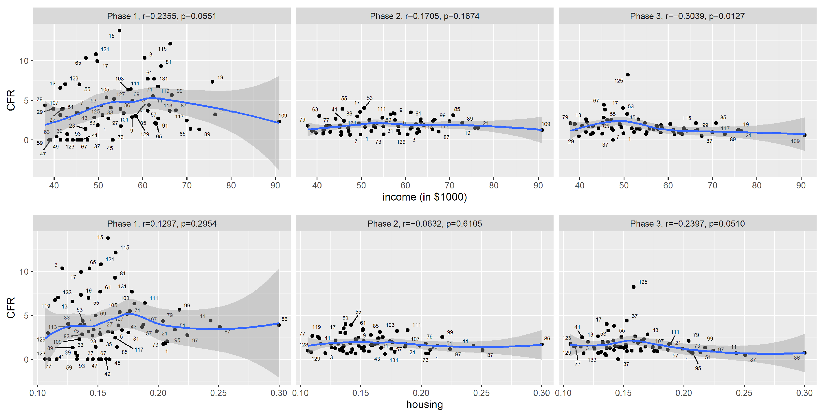
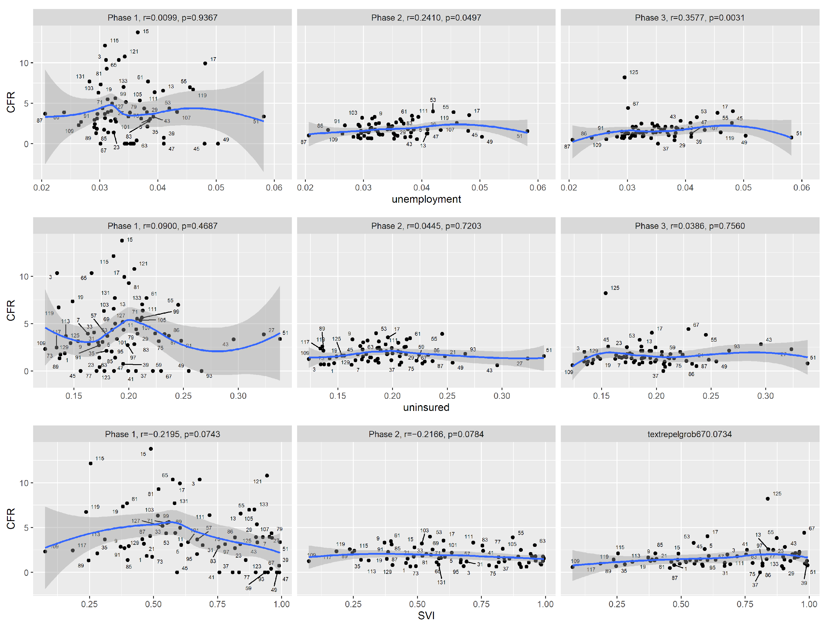
During the second phase (1 June to 30 September 2020), the reported CFR was significantly correlated with the percentage of the population aged 65 or older, the percentage of the population aged 18 or younger, the percentage of the black population and the prevalence of obesity. During the third phase (1 October 2020 to 15 January 2021), the percentage of the population aged 65 or older was still significantly correlated with the reported CFR, but the correlation was less significant compared to the first two phases. The reported CFR was significantly correlated with median household income, unemployment rate, the prevalence of smokers and the fatality rate of respiratory diseases.
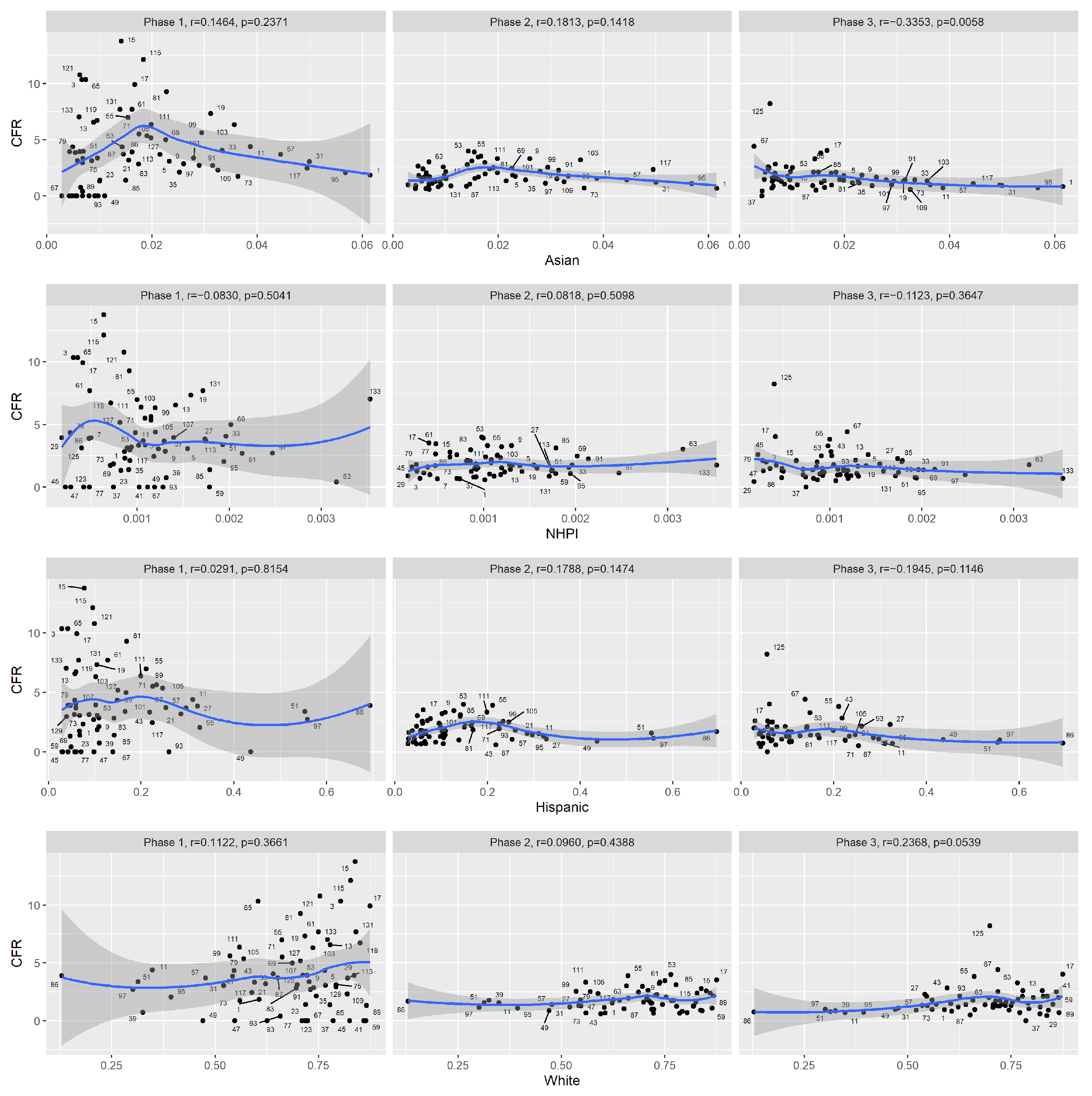
In
Figure 7,
Figure 8,
Figure 9, we plotted the reported CFR in Florida counties against demographic, socioeconomic and health-related covariates.
The graphical model (
Figure 10) estimated using Tetrad shows that for the third phase, the prevalence of adult smokers is the only covariate that is directly associated with the reported CFR. In other words, once we adjust for the effect of this covariate, other covariates are no longer significant. This agrees with New York State’s graphical model.
4. Discussion
In this study, we examined how the association patterns between demographic, socioeconomic and health factors and the reported CFR changed over time in the states of New York and Florida during the COVID-19 pandemic up until mid-January 2021. In each state, we divided the pandemic period into three phases. It is understandable that data from the early phase of the COVID-19 pandemic were noisy and did not display clear association patterns. Many factors contributed to the uncertainty in the observed CFR: diagnostic tests were not widely available, knowledge on effective treatments was limited, steps had not yet been taken to protect the vulnerable groups, and state-wide lockdown protocols were still being discussed. In the early phases, there was evidence in Florida State that the age distribution of the county residents was associated with the reported CFR early in the pandemic. As the pandemic progressed, the association with age distribution became weaker. However, the association with age distribution was not significant in New York.
As the pandemic progressed, the data became much less noisy, and interesting association patterns started to emerge. In the third phase of both states, the reported CFR was more associated with socioeconomic factors and health factors. The graphical model suggests that in both states, the prevalence of adult smokers was most directly associated with reported CFR. It is not surprising that the median household income was associated with the CFR during the third phase in both states. A cnbc.com article [
20] pointed out that low-income workers tended to work in sectors that were considered “essential” during the pandemic, and their jobs often required them to be on-site. These factors increased their risk of being infected by COVID-19. In the third phase, lockdown restrictions were lighter compared to the earlier two phases, but increased economic activities also meant an increased possibility of those essential workers being infected with COVID-19. People living in more socio-economically disadvantaged neighborhoods and minority ethnic groups have higher rates of almost all the known underlying clinical risk factors associated with the severity and mortality of COVID-19, including hypertension, diabetes, asthma, chronic obstructive pulmonary disease (COPD), heart disease, liver disease, renal disease, cancer and cardiovascular disease [
6], so an exact causal relationship is difficult to infer from observational data.
We considered different multiple regression models, but we decided to use graphical models for explicability and simplicity. The graphical model for the CFR and the covariates provides suggestive evidence regarding direct or indirect associations. For spatial considerations, we explored clustering of the counties based on the observed death counts from the first wave. There were a few challenges. For example, the cases and death numbers were highly uneven across counties. The pandemic reached different regions at different times. The confounding factors affecting the association analysis would also impact the clustering analysis. Further, while clustering allows us to group the counties, it does not directly reveal the factors underlying the groups. For temporal considerations, by aggregating counts over time in our association analysis, we alleviated the impact of some of the potential confounding factors.
The associations we discovered are not causation: they should be viewed as data-supported hypotheses. The verification of the causal hypotheses will be more challenging, as is usually the case: one can eliminate some unlikely causal links by testing conditional independences on new datasets, but ultimately randomized experiments will be needed to confirm a causal relation.
There is no simple unit measure for the severity of COVID-19. For example, for our purpose, the population fatality rate would not be a good measure since when the pandemic first hit, it only affected a few counties. For this reason, we chose the reported CFR in this study. In fact, the impact of COVID-19 on society is multifaceted. Our study reflects one aspect of the pandemic.
5. Conclusions
As pointed out by many, during the COVID-19 pandemic, vulnerable groups are restricted to not only elderly people but also people with ill health and/or comorbidities. Socioeconomic conditions can also have a considerable effect on COVID-19 outcomes. In this work, we highlighted how the associations between demographic, health and socioeconomic factors and the reported CFR had changed over time as the pandemic progressed. We examined data up to January of 2021, the period before vaccination became widely available. We saw that during the early phase of the pandemic, the reported CFR was high, and the data were highly noisy. It is likely that many factors contributed to the high reported CFR: the lack of tests, the lack of effective treatment and the lack of mitigation strategies. During this phase, it is hard to clearly identify simple risk factors and simple risk groups. As the pandemic progressed, the usual suspect factors started to emerge as significant risk factors for the report CFR. It is quite remarkable that during the third phase of the pandemic, New York and Florida actually shared common risk factors for the CFR: the two states implemented quite different mitigation measures. In future work, we would like to examine the impact of vaccination on COVID-19 and the demographic, health and socioeconomic variables.
Author Contributions
Conceptualization, M.J., Y.D., S.B. and S.C.; methodology, M.J., Y.D., S.B. and S.C.; software, M.J. and Y.D.; formal analysis, M.J. and Y.D.; visualization, M.J. and Y.D.; investigation, M.J., Y.D., S.B. and S.C.; data curation, Y.D.; writing—original draft preparation, M.J. and Y.D.; writing—review and editing, M.J., Y.D., S.B. and S.C.; supervision, Y.D., S.B. and S.C. All authors have read and agreed to the published version of the manuscript.
Funding
S.C. was funded by NSF DMS Award #2154564.
Institutional Review Board Statement
Not applicable.
Informed Consent Statement
Not applicable.
Data Availability Statement
Acknowledgments
We would like to thank participants of the COVID-19 discussion group at Oregon State University. We thank the two reviewers for their constructive comments.
Conflicts of Interest
The authors declare no conflict of interest.
Abbreviations
The following abbreviations are used in this manuscript:
| CFR | case fatality rate |
| AIAN | American Indian and Alaska Native |
| PAG | partial ancestral graph |
| SVI | Social vulnerability index |
Appendix A. Test of Pearson correlations
Table A1.
Test for correlation between the reported CFR and covariates among New York counties for the three COVID phases. Listed are Pearson correlations and corresponding test p-values.
Table A1.
Test for correlation between the reported CFR and covariates among New York counties for the three COVID phases. Listed are Pearson correlations and corresponding test p-values.
| | Phase 1 | Phase 2 | Phase 3 |
|---|
| | r | p | r | p | r | p |
|---|
| age65+ | 0.199 | 0.120 | 0.036 | 0.782 | 0.019 | 0.885 |
| age18− | −0.017 | 0.893 | 0.007 | 0.959 | 0.087 | 0.500 |
| Black | 0.185 | 0.149 | 0.091 | 0.482 | −0.255 | 0.045
|
| AIAN | −0.116 | 0.370 | 0.121 | 0.350 | −0.091 | 0.484 |
| Asian | 0.182 | 0.156 | 0.068 | 0.601 | −0.277 | 0.029 |
| NHPI | 0.144 | 0.265 | 0.136 | 0.292 | −0.316 | 0.012 |
| Hispanic | 0.133 | 0.303 | 0.087 | 0.500 | −0.311 | 0.014 |
| White | −0.164 | 0.202 | −0.096 | 0.459 | 0.321 | 0.011 |
| income | 0.023 | 0.861 | −0.226 | 0.078 | −0.402 | 0.001 |
| housing | 0.169 | 0.189 | 0.056 | 0.667 | −0.328 | 0.009 |
| unemployment | 0.054 | 0.674 | 0.200 | 0.120 | 0.129 | 0.318 |
| uninsured | 0.319 | 0.012 | 0.148 | 0.251 | −0.184 | 0.153 |
| SVI | −0.022 | 0.864 | 0.281 | 0.027 | 0.037 | 0.773 |
| obesity | −0.208 | 0.105 | 0.046 | 0.720 | 0.271 | 0.033 |
| smoking | −0.074 | 0.568 | 0.088 | 0.497 | 0.427 | 0.001 |
| drinking | −0.162 | 0.207 | −0.057 | 0.661 | 0.123 | 0.342 |
| diabetes | 0.115 | 0.374 | 0.253 | 0.048 | −0.057 | 0.659 |
| HIV | 0.297 | 0.021 | 0.145 | 0.269 | −0.250 | 0.054 |
| heart | 0.101 | 0.435 | 0.127 | 0.326 | 0.149 | 0.247 |
| stroke | −0.166 | 0.198 | −0.094 | 0.469 | 0.376 | 0.003 |
| respiratory | −0.211 | 0.100 | −0.022 | 0.864 | 0.348 | 0.006 |
Table A2.
Test for correlation between the reported CFR and covariates among Florida counties for the three COVID phases. Listed are Pearson correlations and corresponding test p-values.
Table A2.
Test for correlation between the reported CFR and covariates among Florida counties for the three COVID phases. Listed are Pearson correlations and corresponding test p-values.
| | Phase 1 | Phase 2 | Phase 3 |
|---|
| | r | p | r | p | r | p |
|---|
| age65+ | 0.424 | 0.000 | 0.501 | 0.000
| 0.122 | 0.327 |
| age18− | −0.314 | 0.010 | −0.337 | 0.005 | −0.127 | 0.305 |
| Black | −0.188 | 0.127 | −0.209 | 0.089 | −0.051 | 0.681 |
| AIAN | −0.186 | 0.133 | −0.237 | 0.054 | 0.110 | 0.376 |
| Asian | 0.003 | 0.979 | 0.021 | 0.864 | −0.310 | 0.011 |
| NHPI | −0.126 | 0.311 | 0.061 | 0.623 | −0.182 | 0.140 |
| Hispanic | −0.090 | 0.470 | −0.028 | 0.822 | −0.195 | 0.114 |
| White | 0.196 | 0.111 | 0.159 | 0.198 | 0.223 | 0.069 |
| income | 0.201 | 0.103 | 0.108 | 0.386 | −0.247 | 0.044 |
| housing | 0.031 | 0.805 | −0.117 | 0.348 | −0.207 | 0.093 |
| unemployment | −0.012 | 0.925 | 0.230 | 0.061 | 0.162 | 0.190 |
| uninsured | −0.033 | 0.790 | −0.016 | 0.896 | 0.033 | 0.790 |
| SVI | −0.240 | 0.050 | −0.206 | 0.094 | 0.223 | 0.070 |
| obesity | −0.274 | 0.025 | −0.330 | 0.006 | 0.195 | 0.114 |
| smoking | −0.202 | 0.101 | −0.218 | 0.077 | 0.372 | 0.002 |
| drinking | 0.264 | 0.031 | 0.200 | 0.104 | 0.028 | 0.825 |
| diabetes | −0.285 | 0.020 | −0.233 | 0.058 | 0.125 | 0.313 |
| HIV | −0.066 | 0.594 | −0.135 | 0.277 | 0.305 | 0.012 |
| heart | −0.210 | 0.088 | −0.135 | 0.275 | 0.339 | 0.005 |
| stroke | −0.189 | 0.125 | −0.117 | 0.345 | 0.148 | 0.233 |
| respiratory | −0.211 | 0.086 | −0.219 | 0.075 | 0.369 | 0.002 |
References
- Lambert, H.; Gupte, J.; Fletcher, H.; Hammond, L.; Lowe, N.; Pelling, M.; Raina, N.; Shahid, T.; Shanks, K. COVID-19 as a global challenge: Towards an inclusive and sustainable future. Lancet Planet. Health 2020, 4, e312–e314. [Google Scholar] [CrossRef]
- Dong, E.; Du, H.; Gardner, L. An interactive web-based dashboard to track COVID-19 in real time. Lancet Infect. Dis. 2020, 20, 533–534. [Google Scholar] [CrossRef]
- Hawkins, R.B.; Charles, E.J.; Mehaffey, J.H. Socio-economic status and COVID-19–related cases and fatalities. Public Health 2020, 189, 129–134. [Google Scholar] [CrossRef] [PubMed]
- CDC. Provisional Death Counts for Coronavirus Disease 2019 (COVID-19). 2021. Available online: https://www.cdc.gov/nchs/covid19/mortality-overview.htm (accessed on 1 July 2022).
- Abrams, E.M.; Szefler, S.J. COVID-19 and the impact of social determinants of health. Lancet Respir. Med. 2020, 8, 659–661. [Google Scholar] [CrossRef]
- Bambra, C.; Riordan, R.; Ford, J.; Matthews, F. The COVID-19 pandemic and health inequalities. J. Epidemiol. Community Health 2020, 74, 964–968. [Google Scholar] [CrossRef] [PubMed]
- Tai, D.B.G.; Shah, A.; Doubeni, C.A.; Sia, I.G.; Wieland, M.L. The disproportionate impact of COVID-19 on racial and ethnic minorities in the United States. Clin. Infect. Dis. 2021, 72, 703–706. [Google Scholar] [CrossRef] [PubMed]
- Glymour, C.; Zhang, K.; Spirtes, P. Review of causal discovery methods based on graphical models. Front. Genet. 2019, 10, 524. [Google Scholar] [CrossRef] [PubMed] [Green Version]
- Pearl, J. Causality; Cambridge University Press: Cambridge, UK, 2009. [Google Scholar]
- USAFacts. Detailed Methodology and Sources: COVID-19 Data. 2022. Available online: https://usafacts.org/articles/detailed-methodology-covid-19-data (accessed on 1 July 2022).
- Angelopoulos, A.N.; Pathak, R.; Varma, R.; Jordan, M.I. On identifying and mitigating bias in the estimation of the COVID-19 case fatality rate. Harv. Data Sci. Rev. 2020. Special Issue 1. [Google Scholar] [CrossRef]
- University of Wisconsin Population Health Institute. County Health Rankings & Roadmaps 2021. Available online: www.countyhealthrankings.org (accessed on 1 July 2022).
- University of Wisconsin Population Health Institute. County Health Rankings & Roadmaps 2022. Available online: www.countyhealthrankings.org (accessed on 1 July 2022).
- Altieri, N.; Barter, R.L.; Duncan, J.; Dwivedi, R.; Kumbier, K.; Li, X.; Netzorg, R.; Park, B.; Singh, C.; Tan, Y.S.; et al. Curating a COVID-19 Data Repository and Forecasting County-Level Death Counts in the United States. Harv. Data Sci. Rev. 2021. Special Issue 1. [Google Scholar] [CrossRef]
- R Core Team. R: A Language and Environment for Statistical Computing; R Foundation for Statistical Computing: Vienna, Austria, 2020. [Google Scholar]
- Ramsey, J.D.; Zhang, K.; Glymour, M.; Romero, R.S.; Huang, B.; Ebert-Uphoff, I.; Samarasinghe, S.; Barnes, E.A.; Glymour, C. TETRAD—A toolbox for causal discovery. In Proceedings of the 8th International Workshop on Climate Informatics, Boulder, CO, USA, 19–21 September 2018. [Google Scholar]
- Ogarrio, J.M.; Spirtes, P.; Ramsey, J. A hybrid causal search algorithm for latent variable models. In Proceedings of the Conference on Probabilistic Graphical Models (PMLR), Lugano, Switzerland, 6–9 September 2016; pp. 368–379. [Google Scholar]
- TETRAD. Tetrad Manual. 2020. Available online: https://cmu-phil.github.io/tetrad/manual/ (accessed on 1 July 2022).
- Zhang, J. Causal reasoning with ancestral graphs. J. Mach. Learn. Res. 2008, 9, 1437–1474. [Google Scholar]
- Connley, C. How COVID-19 Exacerbated America’s Racial Health Disparities. 2020. Available online: https://www.cnbc.com/2020/05/14/how-covid-19-exacerbated-americas-racial-health-disparities.html (accessed on 1 July 2022).
| Publisher’s Note: MDPI stays neutral with regard to jurisdictional claims in published maps and institutional affiliations. |
© 2022 by the authors. Licensee MDPI, Basel, Switzerland. This article is an open access article distributed under the terms and conditions of the Creative Commons Attribution (CC BY) license (https://creativecommons.org/licenses/by/4.0/).


