Exhibiting Uncertainty: Visualizing Data Quality Indicators for Cultural Collections


Abstract
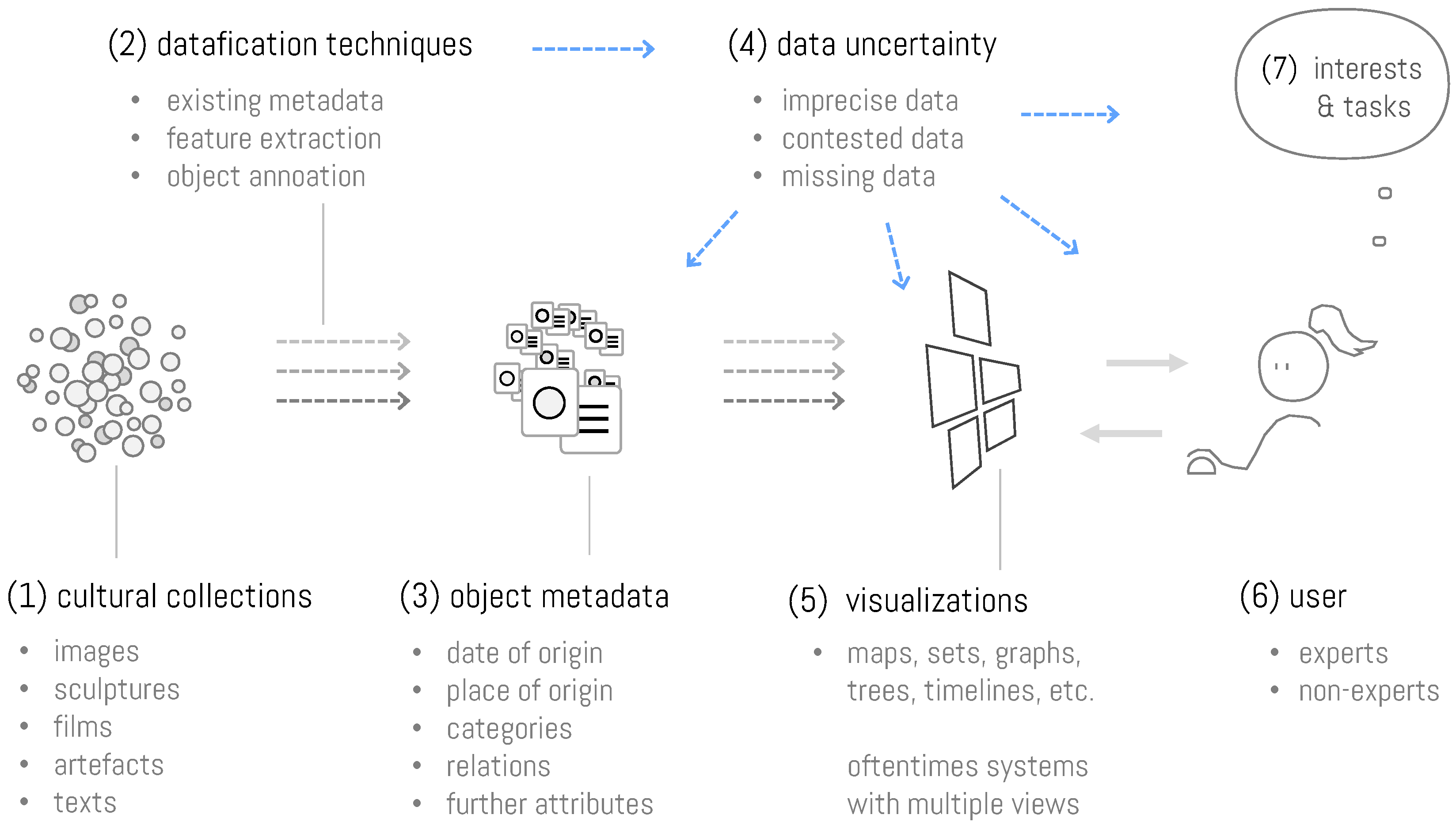
:1. Introduction
2. Related Work
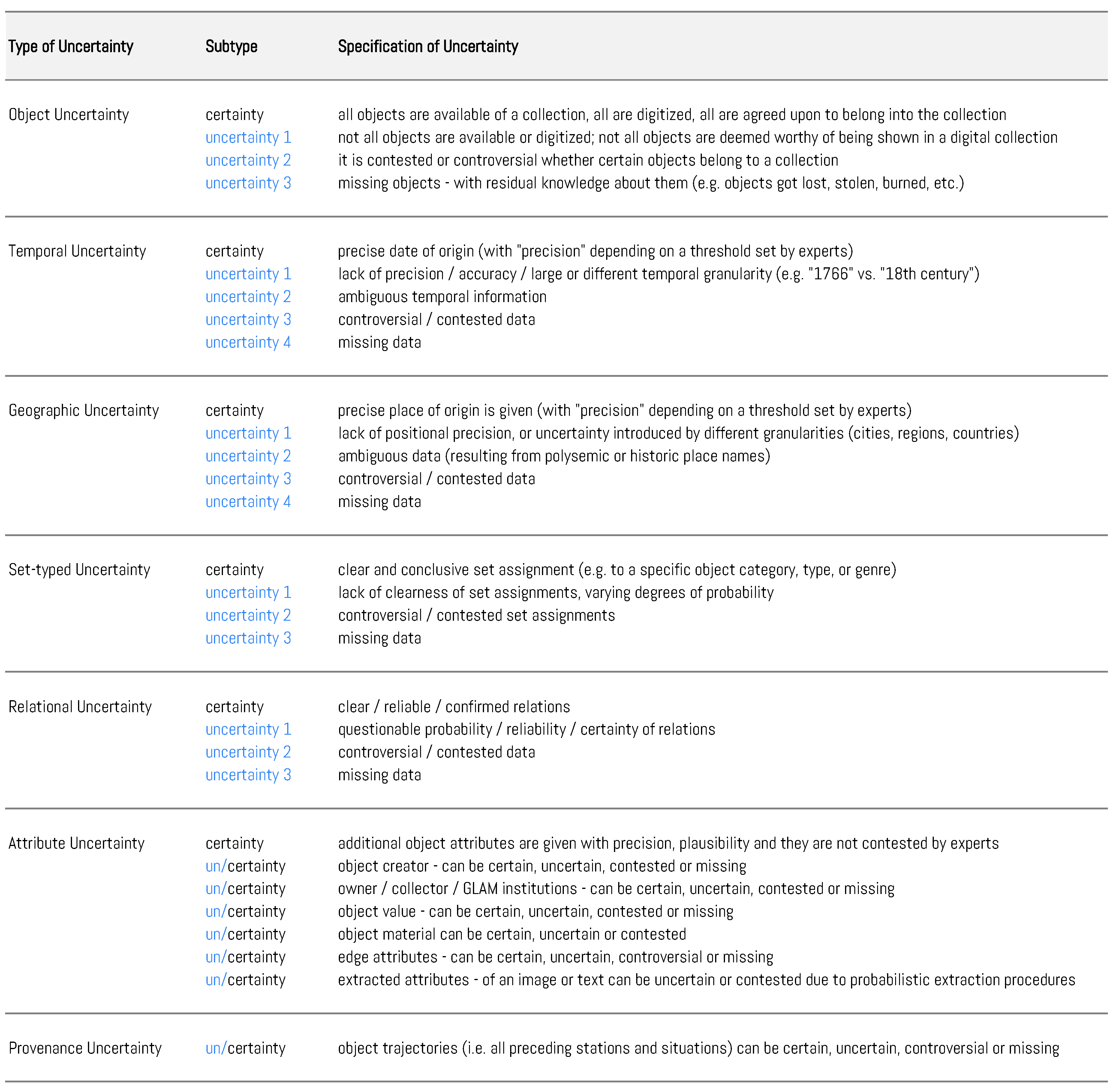
3. Types of Uncertainty in Cultural Collections
3.1. Object Uncertainty
3.2. Temporal Uncertainty
3.3. Geospatial Uncertainty
3.4. Set-Typed Uncertainty
3.5. Uncertainty in Graphs and Trees
3.6. Uncertainty of Attributes
3.7. Provenance Uncertainty
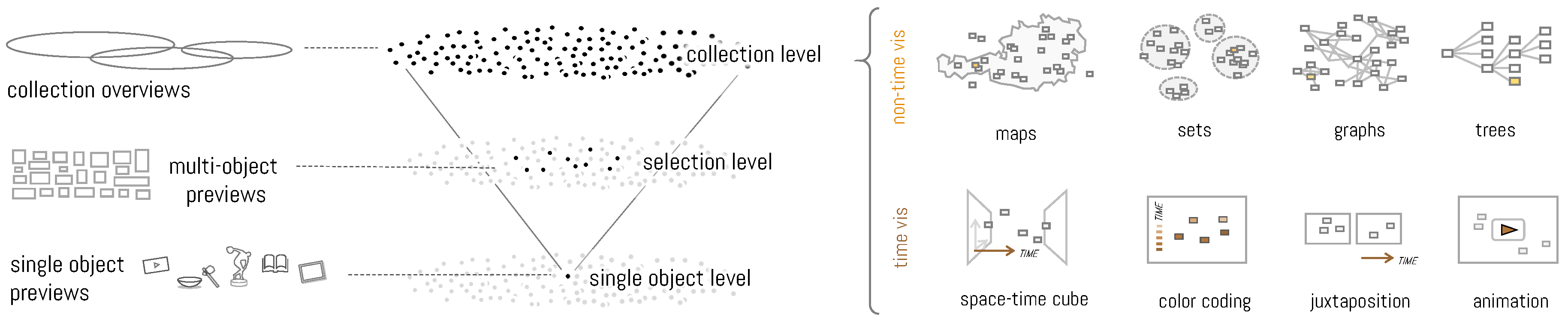
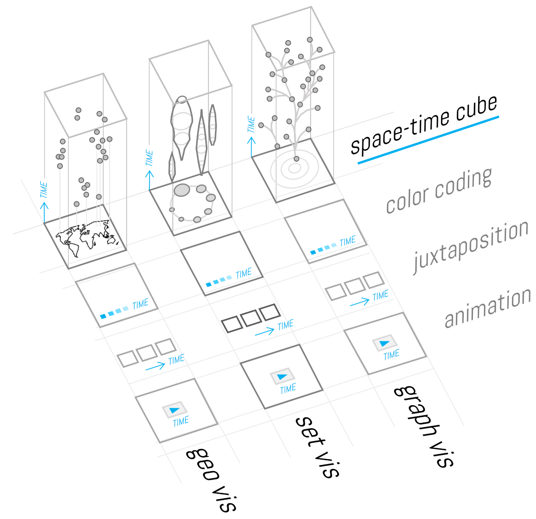
4. Synoptic (Uncertainty) Visualization for Cultural Collections
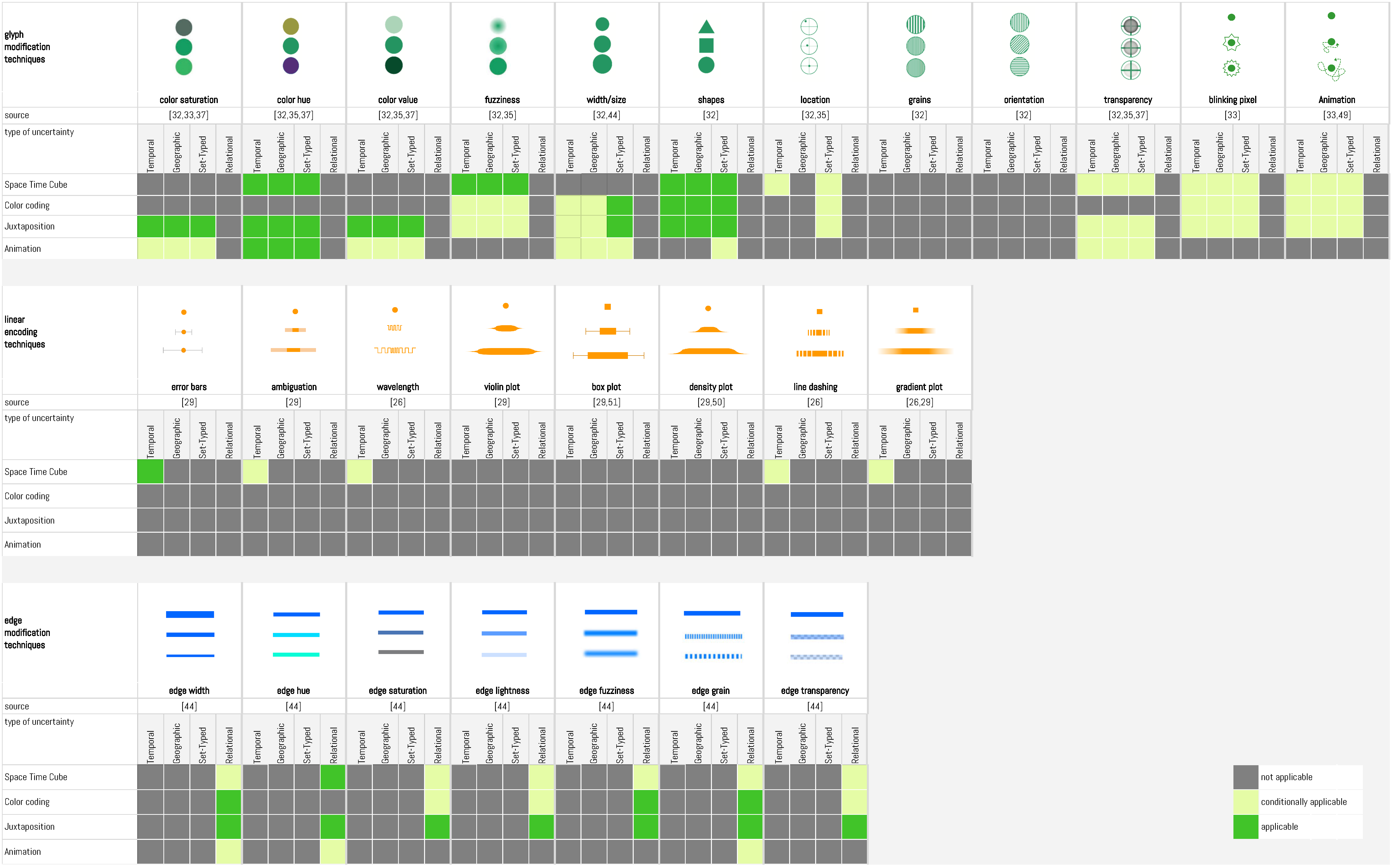
4.1. Uncertainty Encoding Techniques
4.2. The PolyCube Project
5. Discussion
5.1. Omission vs. Visual Complexity
5.2. Flexibility vs. Consistency
5.3. Uncertainty Visualization—Cui Bono?
5.4. Uncertainty Visualization in the Humanities—In Dire Need for Future Studies
6. Conclusions
Author Contributions
Funding
Acknowledgments
Conflicts of Interest
References
- Gold, M.K. (Ed.) Debates in the Digital Humanities; University of Minnesota Press: Minneapolis, MN, USA, 2012. [Google Scholar]
- Gold, M.K.; Klein, L.F. (Eds.) Debates in the Digital Humanities 2019; University of Minnesota Press: Minneapolis, MN, USA, 2019. [Google Scholar]
- Drucker, J. Is There a “Digital” Art History? Vis. Resour. 2013, 29, 5–13. [Google Scholar] [CrossRef]
- Critical Inquiry. Computational Literary Studies: A Critical Inquiry Online Forum. Available online: https://critinq.wordpress.com/2019/03/31/computational-literary-studies-a-critical-inquiry-online-forum/ (accessed on 26 July 2019).
- Schäfer, M.T.; Van Es, K. The Datafied Society: Studying Culture through Data; Amsterdam University Press: Amsterdam, The Netherlands, 2017. [Google Scholar]
- Jänicke, S.; Franzini, G.; Cheema, M.; Scheuermann, G. Visual text analysis in digital humanities. Comput. Graph. Forum 2017, 36, 226–250. [Google Scholar] [CrossRef]
- Alharbi, M.; Laramee, R.S. SoS TextVis: A Survey of Surveys on Text Visualization; The Eurographics Association: Geneva, Switzerland, 2018. [Google Scholar] [CrossRef]
- Windhager, F.; Federico, P.; Schreder, G.; Glinka, K.; Dörk, M.; Miksch, S.; Mayr, E. Visualization of Cultural Heritage Collection Data: State of the Art and Future Challenges. IEEE Trans. Vis. Comput. Graph. 2019, 25, 2311–2330. [Google Scholar] [CrossRef] [PubMed]
- Moretti, F. Graphs, Maps, Trees: Abstract Models for a Literary History; Verso Books: Brooklyn, NY, USA, 2005. [Google Scholar]
- Windhager, F.; Salisu, S.; Schreder, G.; Mayr, E. Orchestrating Overviews. A Synoptic Approach to the Visualization of Cultural Collections. Open Libr. Humanit. 2018, 4, 1–39. [Google Scholar] [CrossRef]
- Baca, M. Practical issues in applying metadata schemas and controlled vocabularies to cultural heritage information. Cat. Classif. Q. 2003, 36, 47–55. [Google Scholar] [CrossRef]
- Doerr, M. Ontologies for cultural heritage. In Handbook on Ontologies; Springer: Berlin/Heidelberg, Germany, 2009; pp. 463–486. [Google Scholar]
- Ruecker, S.; Radzikowska, M.; Sinclair, S. Visual Interface Design for Digital Cultural Heritage: A Guide to Rich-Prospect Browsing; Ashgate Publishing, Ltd.: Farnham, UK, 2011. [Google Scholar]
- Kucher, K.; Kerren, A. Text visualization techniques: Taxonomy, visual survey, and community insights. In Proceedings of the 2015 IEEE Pacific Visualization Symposium (PacificVis), Hangzhou, China, 14–17 April 2015; pp. 117–121. [Google Scholar] [CrossRef]
- Manovich, L. Data science and digital art history. Int. J. Digit. Art Hist. 2015. [Google Scholar] [CrossRef]
- Bender, K. Distant Viewing in Art History. A Case Study of Artistic Productivity. Int. J. Digit. Art Hist. 2015, 1, 100–110. [Google Scholar] [CrossRef]
- Arnold, T.; Tilton, L. Distant viewing: Analyzing large visual corpora. Digit. Scholarsh. Humanit. 2019, fqz013. [Google Scholar] [CrossRef]
- Van Hooland, S. From spectator to annotator: Possibilities offered by user-generated metadata for digital cultural heritage collections. In Proceedings of the CILIP Conference on Immaculate Catalogues: Taxonomy, Metadata and Resource Discovery in the 21st Century, Norwich, UK, 13–15 September 2006. [Google Scholar]
- Stange, J.E.; Kleymann, R. Towards Hermeneutic Visualization in Digital Literary Studies. Digi. Humanit. Q. 2019. under review. [Google Scholar]
- Windhager, F.; Salisu, S.; Mayr, E. Uncertainty of What for Whom—And Does Anyone Care? Propositions for Cultural Collection Visualization; 2019; under review. [Google Scholar]
- Wu, Y.; Yuan, G.X.; Ma, K.L. Visualizing flow of uncertainty through analytical processes. IEEE Trans. Vis. Comput. Graph. 2012, 18, 2526–2535. [Google Scholar] [CrossRef]
- Sacha, D.; Senaratne, H.; Kwon, B.C.; Ellis, G.; Keim, D.A. The Role of Uncertainty, Awareness, and Trust in Visual Analytics. IEEE Trans. Vis. Comput. Graph. 2016, 22, 240–249. [Google Scholar] [CrossRef] [PubMed]
- Therón, R.; Losada, A.G.; Benito, A.; Santamaría, R. Toward supporting decision-making under uncertainty in digital humanities with progressive visualization. In Proceedings of the Sixth International Conference on Technological Ecosystems for Enhancing Multiculturality, Salamanca, Spain, 24–26 October 2018; ACM: New York, NY, USA, 2018; pp. 826–832. [Google Scholar] [Green Version]
- Brodlie, K.; Allendes-Osorio, R.; Lopes, A. A Review of Uncertainty in Data Visualization. In Expanding the Frontiers of Visual Analytics and Visualization; Dill, J., Earnshaw, R., Kasik, D., Vince, J., Wong, P.C., Eds.; Springer: London, UK, 2012; pp. 81–109. [Google Scholar] [CrossRef] [Green Version]
- Whitelaw, M. Generous Interfaces for Digital Cultural Collections. Digit. Humanit. Q. 2015, 9, 205. [Google Scholar]
- Kräutli, F.; Boyd Davis, S. Known Unknowns: Representing uncertainty in historical time. In Proceedings of the Electronic Visualisation and the Arts (EVA) 2013, London, UK, 29–31 July 2013. [Google Scholar]
- Bludau, M.J.; Dörk, M.; Heidmann, F. Relational Perspectives as Situated Visualizations of Art Collections. In Proceedings of the ADHO Conference on Digital Humanities (DH), Utrecht, The Netherlands, 9–12 July 2019; ADHO: Utrecht, The Netherlands, 2019. [Google Scholar]
- Dörk, M.; Pietsch, C.; Credico, G. One View is not Enough. High-level Visualizations of a Large Cultural Collection. Inf. Des. J. 2017, 23, 39–47. [Google Scholar]
- Gschwandtner, T.; Bögl, M.; Federico, P.; Miksch, S. Visual Encodings of Temporal Uncertainty: A Comparative User Study. IEEE Trans. Vis. Comput. Graph. 2015, 22, 539–548. [Google Scholar] [CrossRef] [PubMed] [Green Version]
- Mason, J.S.; Retchless, D.; Klippel, A. Domains of uncertainty visualization research: A visual summary approach. Cartogr. Geogr. Inf. Sci. 2017, 44, 296–309. [Google Scholar] [CrossRef]
- MacEachren, A.M.; Robinson, A.; Hopper, S.; Gardner, S.; Murray, R.; Gahegan, M.; Hetzler, E. Visualizing geospatial information uncertainty: What we know and what we need to know. Cartogr. Geogr. Inf. Sci. 2005, 32, 139–160. [Google Scholar] [CrossRef]
- MacEachren, A.M.; Roth, R.E.; O’Brien, J.; Li, B.; Swingley, D.; Gahegan, M. Visual Semiotics & Uncertainty Visualization: An Empirical Study. IEEE Trans. Vis. Comput. Graph. 2012, 18, 2496–2505. [Google Scholar] [CrossRef]
- Kardos, J.; Moore, A.; Benwell, G.L. The visualisation of uncertainty in spatially-referenced attribute data using trustworthy data structures. In Proceedings of the 15th Annual Colloquium of the Spatial Information Research Centre (SIRC 2003: Land, Place and Space), Dunedin, New Zealand, 1–2 December 2003. [Google Scholar]
- Jänicke, S.; Wrisley, D.J. Visualizing uncertainty: How to use the fuzzy data of 550 medieval texts. In Proceedings of the ADHO Conference on Digital Humanities (DH), Lincoln, NE, USA, 16–19 July 2013. [Google Scholar]
- Kinkeldey, C.; MacEachren, A.M.; Schiewe, J. How to assess visual communication of uncertainty? A systematic review of geospatial uncertainty visualisation user studies. Cartogr. J. 2014, 51, 372–386. [Google Scholar] [CrossRef]
- Liem, J.; Goudarouli, E.; Hirschorn, S.; Wood, J.; Perin, C. Conveying Uncertainty in Archived War Diaries with GeoBlobs. In Proceedings of the IEEE VIS 2018 Electronic Conference, Berlin, Germany, 21–26 October 2018. [Google Scholar]
- Robinson, A.C. Representing the Presence of Absence in Cartography. Ann. Am. Assoc. Geogr. 2019, 109, 286–300. [Google Scholar] [CrossRef]
- Alsallakh, B.; Micallef, L.; Aigner, W.; Hauser, H.; Miksch, S.; Rodgers, P. The State-of-the-Art of Set Visualization. Comput. Graph. Forum 2016, 35, 234–260. [Google Scholar] [CrossRef]
- Park, Y.; Park, J. Disk diagram: An interactive visualization technique of fuzzy set operations for the analysis of fuzzy data. Inf. Vis. 2010, 9, 220–232. [Google Scholar] [CrossRef]
- Zhu, L.; Xia, W.; Liu, J.; Song, A. Visualizing fuzzy sets using opacity-varying freeform diagrams. Inf. Vis. 2018, 17, 146–160. [Google Scholar] [CrossRef]
- Salisu, S.; Xu, K.; Wagstaff, A.; Biggs, M.; Phillips, G. TimeSets for Uncertainty Visualisation. In Proceedings of the Computer Graphics and Visual Computing (CGVC), Bournemouth, UK, 15–16 September 2016; Turkay, C., Wan, T.R., Eds.; The Eurographics Association: Geneva, Switzerland, 2016. [Google Scholar] [CrossRef]
- Albrecht, K.; Dörk, M.; Müller, B. Culturegraphy. Leonardo 2016, 50, 209–210. [Google Scholar] [CrossRef]
- Coburn, J. I Don’t Know What I’m Looking for: Better Understanding Public Usage and Behaviours with Tyne & Wear Archives & Museums Online Collections; Museums and the Web: Toronto, ON, Canada, 2016. [Google Scholar]
- Guo, H.; Huang, J.; Laidlaw, D.H. Representing uncertainty in graph edges: An evaluation of paired visual variables. IEEE Trans. Vis. Comput. Graph. 2015, 21, 1173–1186. [Google Scholar] [CrossRef] [PubMed]
- Schwank, J.; Schöffel, S.; Stärz, J.; Ebert, A. Visualizing uncertainty of edge attributes in node-link diagrams. In Proceedings of the 2016 20th International Conference Information Visualisation (IV), Lisbon, Portugal, 19–22 July 2016; pp. 45–50. [Google Scholar] [CrossRef]
- Schulz, C.; Nocaj, A.; Goertler, J.; Deussen, O.; Brandes, U.; Weiskopf, D. Probabilistic graph layout for uncertain network visualization. IEEE Trans. Vis. Comput. Graph. 2016, 23, 531–540. [Google Scholar] [CrossRef] [PubMed]
- Berg-Fulton, T.; Newbury, D.; Snyder, T. Art Tracks: Visualizing the stories and lifespan of an artwork. In MW2015: Museums and the Web 2015; Archives & Museum Informatic: Toronto, ON, Canada, 2015. [Google Scholar]
- Drucker, J. Performative Materiality and Theoretical Approaches to Interface. Digit. Humanit. Q. 2013, 7, 143. [Google Scholar]
- Hullman, J.; Resnick, P.; Adar, E. Hypothetical outcome plots outperform error bars and violin plots for inferences about reliability of variable ordering. PLoS ONE 2015, 10, e0142444. [Google Scholar] [CrossRef]
- Kay, M.; Kola, T.; Hullman, J.R.; Munson, S.A. When(Ish) is My Bus? User-centered Visualizations of Uncertainty in Everyday, Mobile Predictive Systems. In Proceedings of the 2016 CHI Conference on Human Factors in Computing Systems, San Jose, CA, USA, 7–12 May 2016; ACM: New York, NY, USA, 2016. [Google Scholar] [CrossRef]
- Bonneau, G.P.; Hege, H.C.; Johnson, C.R.; Oliveira, M.M.; Potter, K.; Rheingans, P.; Schultz, T. Overview and state-of-the-art of uncertainty visualization. In Scientific Visualization; Springer: Berlin/Heidelberg, Germany, 2014; pp. 3–27. [Google Scholar] [CrossRef]
- Windhager, F.; Filipov, V.A.; Salisu, S.; Mayr, E. Visualizing uncertainty in cultural heritage collections. In Proceedings of the EuroVis Workshop on Reproducibility, Verification, and Validation in Visualization, Brno, Czech Republic, 4 June 2018; The Eurographics Association: Geneva, Switzerland, 2018; pp. 7–11. [Google Scholar]
- Salisu, S.; Mayr, E.; Filipov, V.A.; Leite, R.A.; Miksch, S.; Windhager, F. Shapes of Time: Visualizing Set Changes Over Time in Cultural Heritage Collections; EuroVis 2019-Posters; Madeiras Pereira, J., Raidou, R.G., Eds.; The Eurographics Association: Geneva, Switzerland, 2019. [Google Scholar] [CrossRef]
- Edelstein, D.; Findlen, P.; Ceserani, G.; Winterer, C.; Coleman, N. Historical Research in a Digital Age: Reflections from the Mapping the Republic of Letters Project. Am. Hist. Rev. 2017, 122, 400–424. [Google Scholar] [CrossRef]
- Baldonado, M.Q.W.; Woodruff, A.; Kuchinsky, A. Guidelines for Using Multiple Views in Information Visualization. In Proceedings of the Working Conference on Advanced Visual Interfaces, Palermo, Italy, 24–26 May 2000; ACM: New York, NY, USA, 2000; pp. 110–119. [Google Scholar] [CrossRef]
- Mayr, E.; Federico, P.; Miksch, S.; Schreder, G.; Smuc, M.; Windhager, F. Visualization of Cultural Heritage Data for Casual Users; IEEE VIS Workshop on Visualization for the Digital Humanities (vis4dh): Baltimore, MD, USA, 2016; Available online: https://publik.tuwien.ac.at/files/PubDat_250950.pdf (accessed on 26 July 2019).


© 2019 by the authors. Licensee MDPI, Basel, Switzerland. This article is an open access article distributed under the terms and conditions of the Creative Commons Attribution (CC BY) license (http://creativecommons.org/licenses/by/4.0/).
Share and Cite
Windhager, F.; Salisu, S.; Mayr, E. Exhibiting Uncertainty: Visualizing Data Quality Indicators for Cultural Collections. Informatics 2019, 6, 29. https://doi.org/10.3390/informatics6030029
Windhager F, Salisu S, Mayr E. Exhibiting Uncertainty: Visualizing Data Quality Indicators for Cultural Collections. Informatics. 2019; 6(3):29. https://doi.org/10.3390/informatics6030029
Chicago/Turabian StyleWindhager, Florian, Saminu Salisu, and Eva Mayr. 2019. "Exhibiting Uncertainty: Visualizing Data Quality Indicators for Cultural Collections" Informatics 6, no. 3: 29. https://doi.org/10.3390/informatics6030029