Article

Impact of Accelerated Climate Change on Maximum Temperature Differences between Western and Coastal Sydney

School of Mathematical and Physical Sciences, University of Technology Sydney, P.O. Box 123, Ultimo, NSW 2007, Australia
*
Author to whom correspondence should be addressed.
Climate 2023, 11(4), 76; https://doi.org/10.3390/cli11040076
Submission received: 21 February 2023 / Revised: 22 March 2023 / Accepted: 23 March 2023 / Published: 26 March 2023
(This article belongs to the Special Issue Recent Climate Change Impacts in Australia)

Abstract

:
The aims of this study are to assess the impacts of accelerated climate change on summer maximum temperatures since the early 1990s in the Australian city of Sydney’s eastern coastal and western inland suburbs. Western Sydney currently experiences far more intense summer (December–March) heat waves than coastal Sydney, with maximum temperatures exceeding those of coastal Sydney by up to 10 °C. Aside from increased bushfire danger, extreme temperature days pose health and socio-economic threats to western Sydney. Permutation tests of consecutive summer periods, 1962–1991 and 1992–2021, are employed to determine the differential climate change impacts on maximum summer temperatures at two locations: Sydney and Richmond, representative of eastern and western Sydney, respectively. Attribution of observed maximum summer temperature trends in Sydney and Richmond was performed using machine learning techniques applied to known Australian region oceanic and atmospheric climate drivers. It was found that there is a marked disparity in the percentage of summer days above the 95th percentile during the accelerated climate change period (1992–2021) between Richmond (+35%) and Sydney (−24%), relative to 1962–1991. The climate drivers detected as attributes were similar in both Sydney and Richmond, but, unsurprisingly, Sydney was more affected than Richmond by the oceanic climate drivers.

1. Introduction

Increasing global emissions threaten to disproportionately impact the future of Greater Western Sydney (GWS) [
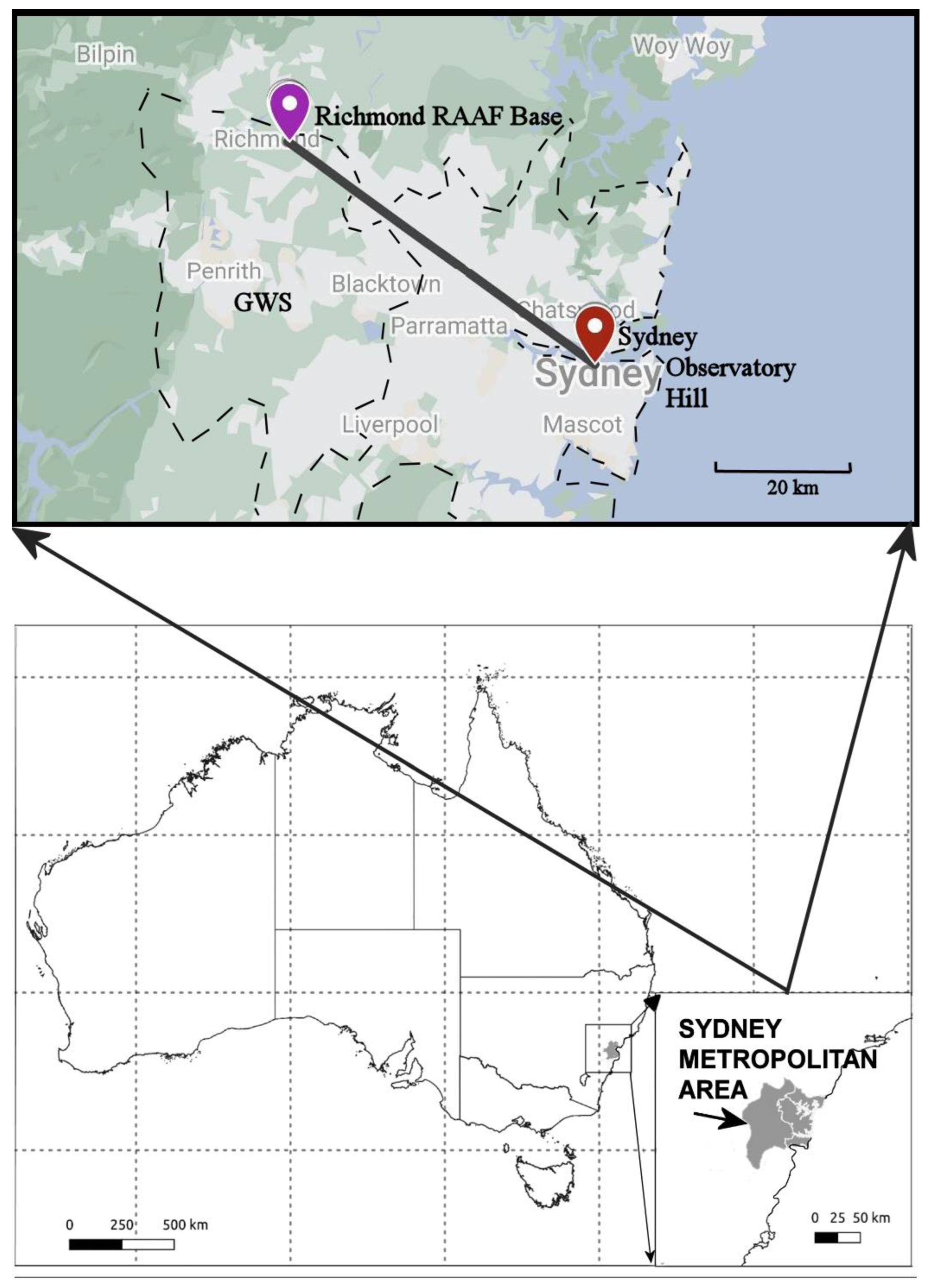
1], with some suburbs already experiencing temperatures 8 °C to 10.5 °C greater than the Sydney coastal region during heatwaves. While this disparity is partially underpinned by western Sydney’s inadequate urban planning and its geographical distance away from coastal sea breezes [2], a more contentious point at present is whether the recent extreme temperatures are caused by climate change, natural variability, or both. GWS starts approximately 30 km inland from coastal Sydney. GWS extends about another 30 km inland and includes the suburbs of Penrith, Blacktown, Liverpool, and Richmond (Figure 1).
The impacts of rising temperatures and extreme heat are contributing to longer summers, shorter winters, and decreasing time frames for implementing bushfire management strategies [3]. The 2019/2020 Australian bushfires were a pronounced consequence of this warming, with a report by the Royal Commission into National Natural Disaster Arrangements [4] highlighting that future fires will be more difficult to control as there is less time to take precautions such as prescribed burning. With 24 million hectares of land and ecosystems burnt, 3000 homes destroyed, and around three billion animals killed or displaced, the ramifications of the bushfires are captured in the quote, “…what was unprecedented is now our future” [4].
The urban heat island effect occurs in areas where high concentrations of buildings and manufactured surfaces, which absorb and retain heat more readily, have replaced natural land cover. This effect is present in both coastal Sydney and GWS, exacerbating temperatures that push the limits of human endurance [5]. The human body’s ability to cool itself reduces at temperatures above 35 °C [6], especially if dewpoints are elevated, and the effects on vulnerable populations, such as children in classrooms without air-conditioning and low-income family households, contrasts with the effects on populations living near cooler coastal areas [7]. A report titled, ‘HeatWatch: Extreme heat in western Sydney’ by [2], highlights the ongoing trend in rising extreme temperature days, with analysis finding that western Sydney is projected to experience up to 46 days per year above 35 °C by 2090 [2].
With longer, intense summers driving more prolonged heatwaves, droughts, and bushfires, the economic burden of dealing with these disastrous events is increasing [5]. Climate Council statistics [7] highlight that the costs associated with extreme weather events in Australia have more than doubled since the 1970s and that Australians are five times more likely to be displaced by such events than people living in Europe. GWS has a higher unemployment rate and the highest proportion of low-income families in the Sydney region [8]. The escalating climate crisis threatens to exacerbate the socioeconomic divide and push more people into poverty. As this disparity, relative to coastal Sydney, increases in GWS, the consequences are striking, with regions such as the Blacktown city council implementing evacuation shelters to mitigate growing heatwave risks [9].
Two-thirds of the population growth in Sydney, by 2036, is projected to occur in GWS, and with the increased population comes extensive infrastructure development and a growing economy [8], one which is set to be disproportionately impacted by extreme temperatures. Given this alarming reality, there is an urgent need to understand how Sydney’s western suburbs differ from near-coastal suburbs in terms of temperature as well as factors that contribute to these differences.
Recent research highlights a growing interest in understanding the roles of Australian region climate drivers, particularly global warming, in influencing these changes. One study [10] examined precipitation and temperature trends to understand drought conditions in Canberra, a rapidly growing region in inland southeast Australia. An increase in mean temperature was established for all seasons through permutation testing for two 20-year periods, starting in 1979. In addition, wavelet analysis was used to identify El Niño South Oscillation (ENSO) trends over time, providing a solid rationale to attribute climate drivers. However, the combination of linear and non-linear statistical models concluded that the most important drivers were the Indian Ocean Dipole (IOD) and the global warming temperature attributes. Another study investigating differences between inland and coastal locations [11] performed a comparative study between inland Scone and coastal Newcastle, in the Hunter region of NSW. This research performed permutation testing on the differences in mean minimum and maximum temperature across three 20-year periods; it was concluded that temperatures have strongly increased in Newcastle since 1958. The inland location showed gradually increasing temperature but had weaker statistically significant evidence. This comparative study of coastal and inland locations did not attempt to link these changes to climate drivers, highlighting an overall gap in the literature.
The above-mentioned comparative studies did attempt to link the observed changes to climate drivers, highlighting a significant gap in the literature. Unlike those studies, the present research aims at assessing the impacts of climate change on rising maximum summer temperatures in Sydney, compared with those in western Sydney, with a focus on identifying links with large-scale Australian region climate drivers.
Hence, the aims of this study are twofold. First, the maximum temperature data for two locations, one in western Sydney and the other in coastal Sydney (see Figure 1), are split into two 30-year periods (1962–1991 and 1992–2021). To quantify the rising temperatures over the most recent 30-year period relative to the first 30-year period, resampling permutation testing was employed to assess whether the observed changes are statistically significant. Second, the application of a range of machine learning (ML) techniques is employed to attribute the monthly maximum temperatures to identify the most significant Australian climate drivers for each of the two locations over the past 60 years. Additionally, it is of particular interest to determine how well the non-linear ML techniques, including Support Vector Machines (with a range of kernels) and Random Forests, performed compared with multiple linear regression.

2. Materials and Methods

2.1. Data Sources and Pre-Processing

The time series data for the mean monthly maximum temperature were obtained from the Australian Bureau of Meteorology (BOM) Climate Change datasets, for the coastal and western Sydney locations, Sydney and Richmond, respectively [12]. The datasets spanned the years 1961–2021. The BOM Climate Change data are rigorously quality controlled, and data are included only if no errors are detected [13]. To assess the impacts of accelerated global warming, the datasets were split into two 30-year climate periods, 1962–1991 and 1992–2021, with the second period aligning with accelerated global warming [14].
The present study focusses on the summer months, defined as December to March, rather than December to February, consistent with [3] who found that temperatures marking summer are not cooling until after March. They also showed that Sydney’s summer now is 28 days longer than between 1950 and 1969. Hence, March is included in our definition of summer.

2.2. Permutation Testing

Permutation testing is a non-parametric test that makes few assumptions about the underlying distribution, such as stationarity, making it an effective technique to test the null hypothesis that two data groups have identical distributions [15,16]. This technique is similar to bootstrap resampling, where a sampling distribution is built for both periods by permuting the observed data without replacement. From the built sampling distributions, statistical significance tests can be performed to assess the difference between the two distributions, with the null hypothesis assuming that there is no difference between both distributions. Permutation tests in the present study were performed to determine the statistical significance of differences in the mean, median, and variance and in the 25th and 90th percentiles, of maximum temperatures between the two periods, for both Sydney and Richmond.

2.3. Wavelet Analysis

A wavelet analysis was employed on the detrended maximum temperature time series to transform the one-dimensional time series into a two-dimensional time–frequency space and to determine the periodicity of signals [16]. Wavelet analysis is well-suited to our data, for detecting potential periodic climate drivers that are non-stationary and multiscale, such as the El-Niño Southern Oscillation (ENSO). Following [17], the Morlet wavelet was used in this study, which is described by,
ψ 0 ( η ) = π 1 4 e i ω 0 η e η 2 2 ,
where η is a non-dimensional time parameter, and ω 0 is the non-dimensional frequency. The continuous wavelet for a given time series, x n , is given by,
W n ( s ) = n = 0 N 1 x n ψ * ( ( n n ) δ t s ) ,
where n is a localized time index; s is the wavelet scale; N is the number of points in the time series; and * is the complex conjugate. For computational efficiency, the wavelet transform is computed in the Fourier space using the discrete Fourier transform of x n :
x ^ k = 1 N n = 0 N 1 x n e 2 π i k n N ,
where, k = 0 ,   1 ,   ,   N 1 is the frequency index. The Fourier transform of ψ ( t / s ) is given by ψ ^ ( s ω ) . Applying the convolution theorem and taking the Fourier transform provide the wavelet transform in Fourier space:
W η ( s ) = k = 0 N 1 x ^ k ψ ^ * ( s ω k ) e ω k n δ t ,
where
ω k = { 2 π k N δ t   : k     N 2 2 π k N δ t   : k > N 2
The local wavelet power spectrum is defined by
P ( s ) = | W n ( s ) | 2 ,
which provides the time evolution of periodic signals in the time series. The global power spectrum, which is equivalent to applying a Fourier transform on the time series and provides an overview of the dominant periodicities in the time series, can also be calculated using,
W ¯ 2 ( s ) = 1 N n = 0 N 1 | W n ( s ) | 2 .

2.4. Machine Learning for Attribution

Machine learning techniques are used to reveal the attributes that explain trends found in the summer monthly maximum temperature data, for both Sydney and Richmond. The predictor variables considered are the known Australian region climate drivers, both individually as well as two-way interactions of some of the drivers. The interactions are obtained by scalar multiplication of the two selected climate drivers (e.g., GlobalT * DMI). The interactions are intended to account for the compounded influences of drivers, as one driver may reinforce another [18,19]. Other interactions considered but not included in the study were three-way interactions and inverse relationships. They have not been assessed because they require prohibitive amounts of time for testing.
Following the approach of [10,20], three ML approaches were chosen in reference to capture both linear and non-linear effects. The techniques chosen were Linear Regression (LR), Support Vector Regression (SVR), and Random Forests (RF). Each ML technique uses expanding window cross validation and both forward and backward selection methods.

2.4.1. Linear Regression (LR)

As described by [21], linear regression is the relationship of variables established by fitting a linear equation. Advantages of the regression model include its simplicity and effectiveness at finding relationships between the predictors and output if they fall along a hyperplane. For instance, if there is a curvilinear relationship, then additional quadratic or cubic forms of a predictor can be added [22]. However, these alternatives were not considered here because linear regression is ineffective for detecting non-linear relationships between climate drivers and outputs. Hence, we also apply the following methods to capture non-linear relationships between the climate drivers and response variables.

2.4.2. Support Vector Regression (SVR)

To capture non-linear effects, we employed SVR with two kernels: radial basis functions and polynomial functions. Whereas linear regression seeks to find parameters so that the model’s root sum of squares is minimized, SVR allows more flexibility to define how much error is acceptable to fit the data. This is important as a limitation of the linear regression is that it can be influenced by outlier points [22]. The objective function becomes to minimize the coefficients or the L2 norm of the coefficient vector, 𝑤, given the maximum absolute allowable error, 𝜖. Values that fall outside this error are described by slack variables, 𝜉, that measure the deviation of the data outside the 𝜖 bounds [23]. There also is another hyperparameter, C, which can be tuned to set a tolerance for the inclusion of points that do lie outside the initially selected error bounds.
As described by [23], the SVR techniques becomes the minimization of
1 2 w 2 + C i = 1 n [ ξ i ] ,
subject to
ywixi∣ ≤ 𝜖 + 𝜉
where y is the variable of interest being predicted, and x i are the predictors included in the SVR model.
The linear model used for prediction is represented as:
f ( x ) =   β + i = 1 n a ^ i K ( x i ,   x )
where 𝑛 is the number of support vectors; β is the bias term; a ^ i are the support vectors (when a ^ i   0 ); and 𝐾 is the kernel function [22,23].
When the predictors are linear, the Kernel function reduces to the form:
K ( x i , x ) = j = 1 m x i j x j ,
where 𝑚 is the number of predictors.
However, some kernel functions, which have slightly different optimization problems, can be used to capture non-linear functions, such as those used in this study [22]: polynomials (poly) = (𝜙(𝑥𝑖𝑗𝑥𝑗) + 1)𝑑 and radial basis functions (RBF) = exp(−𝜎‖𝑥𝑖𝑗 − 𝑥𝑗2), where 𝜙 and 𝜎 are scaling parameters.

2.4.3. Random Forests (RF)

Random forests are ensemble methods that take many decorrelated decision trees and average them [21,22]. Each tree is built on a set of predictors [24], and the RF process is described in detail by [21,22]. As [21] note, an advantage of RF is that they are relatively simple to train and tune while also overcoming the inherent noisiness of individual trees. In general, they also improve predictive accuracy by reducing the variance inherent in a single tree [22]. Trees are also appropriate candidates as they capture complex structures and relationships within the data. For this study, they can capture possible non-linear relationships [24].

2.4.4. Forward and Backward Selection

The three ML methods are modeled on training data, using forward and backward selection. They are described by [25]. Simply put, forward selection begins with one climate driver and sequentially adds another, based on which additional climate driver achieves minimal error. This process continues until the testing error is minimized. Backward selection, in contrast, begins with all predictors and eliminates candidates until the testing errors rise above those with all predictors.

2.4.5. Expanding Window Cross Validation

Expanding window cross-validation, e.g., [26], is one of several methods available to avoid over-fitting of the attributes in a time series. The technique avoids the possibility of the training datasets obtaining knowledge of the future values of the time series (the testing data), when testing the accuracy of the predictors against the test data. Here, the window of the training dataset was expanded in several stages until the entire time series was used in the modeling approach, with a fixed size of the test dataset. For example, an initial training window of size 15 and testing window of size 5 would begin with training a model on years 1962–1976 and testing it on the years 1977–1981; it would gradually be expanded until the method trains a model on years 1962–2014 and tests on data from 2015 to 2019. The expanding window method was applied to a range of training and testing window sizes. It should be noted that the availability of climate driver data resulted in the models only being trained on data up to 2019.

2.5. Australian Climate Drivers

The climate drivers chosen here are the known influences on eastern Australian climate. These climate drivers were chosen as they have been selected in several previous studies as possible attributes (e.g., [19,20,27]. The drivers selected were global temperature anomalies (GlobalT), global sea surface temperature anomalies and Tasman Sea surface temperature anomalies (GlobalSSTA and TSSSTA, respectively), Niño3.4 anomalies (Niño3.4), the Dipole mode index (DMI), the Southern annular mode (SAM), and the Southern oscillation index (SOI). Note that GlobalT, SOI, and SAM are atmospheric drivers, whereas GlobalSSTA, TSSTA, Niño3.4, and DMI are oceanic drivers.
Tasman Sea surface temperature anomalies (TSSSTA) were attained from the BOM (Climate change and variability: Tracker: Australian timeseries graphs), and all other datasets were obtained from the National Oceanic and Atmospheric Administration (NOAA) climate timeseries (https://psl.noaa.gov/gcos_wgsp/Timeseries/ (accessed on 14 October 2022).

2.5.1. Global Temperature (GlobalT)

The global mean temperature is a key indicator for measuring global warming [28] and is linked to the sharp rise in Earth’s surface temperature [29]. The present study uses monthly global temperature datasets from the NASA GISTEMP analysis. There are two other major data reconstructions, one by the Climatic Research Unit (CRU) of the University of East Anglia and the other by NOAA’s National Climatic Data Centre (NCDC). However, all three methodologies are underpinned by input data from NOAA’s Global Historical Climatology Network (GHCN), which collects data from more than 40,000 climate stations around the globe [29]. The data are represented as anomalies or departures from the 1951 to 1980 average [30,31].
In general, there is no consensus on how global warming will affect ENSO events and the sea surface temperature variability associated with it [32]. However, [33] presents strong evidence for the increase in El Niño events in the eastern Equatorial Pacific and Central Pacific in the future as a response to global warming.

2.5.2. Global and Tasman Sea Surface Temperature Anomalies (GlobalSSTA and TSSTA)

Sea surface temperatures (SSTs) are a measure of temperature from the top millimeter of the ocean’s surface and are an important driver of the climate [34]. SST time series are analyzed as departures from average temperature conditions, as these anomalies are more consistent for wider areas than actual temperatures [35].
There are two sea surface temperature anomaly (SSTA) datasets used in this analysis: the global SSTA (GlobalSSTA) and the Tasman Sea SSTA (TSSSTA). The Tasman Sea provides a smaller localized representation of the regional climate drivers around eastern Australia. The Tasman Sea also is a global warming hotspot [36], with the warmest anomalies since 1880 being recorded in 2015/2016 [37]. Increasing temperatures drive change in the ocean circulation patterns and can result in currents changing, as evidenced by the East Australian Current extending further south [38]. With these rising temperatures in the Tasman Sea being more pronounced than the global temperatures [38], the impact of this on marine life, ecosystems, and the climate becomes far reaching. At intervals of about 2–7 years, the global SSTA becomes significantly higher than usual and marks the occurrence of El Niño events [39,40]. These warm conditions also correlate with negative SOI values and contribute to changes in weather patterns by imposing usual to dry conditions in eastern Australia [39]. The State of the Climate Report 2018 [41] highlights that oceans around Australia have warmed by around 1 °C since 1910 [41].
Niño3.4 is an oceanic driver that measures the average SST between 5° N–5° S and 170°–120° W and is one of indices the BOM uses to classify El Niño–Southern Oscillation, or ENSO, phases [42,43]. ENSO is a quasi-periodic climate variation that occurs in the tropical Pacific Ocean every 2–7 years [44]. The Australian Bureau of Meteorology (BOM) defines El Niño phases as having significantly warmer SSTs in the equatorial pacific for a given time of the year, with the opposite for La Niña [38]. Currently, an El Niño event is declared when the Niño3.4 index shows temperatures 0.8 °C warmer than average, alongside meeting SOI criteria. For a La Niña phase, the Niño3.4 index must be 0.8 °C cooler than average [42,45]. Weisheimer et al. [46] argue that ENSO phases are the most predictable climate variable, with several current models providing predictions 6–12 months ahead. Measuring the entire tropical Pacific through one index is difficult, so multiple indices are used to determine ENSO events [47].

2.5.3. The Dipole Mode Index (DMI)

The dipole mode index (DMI) measures the intensity of the Indian Ocean Dipole (IOD) [48]. It is defined as the SST anomaly gradient between the western pole of the Arabian sea and the eastern pole to the south of Indonesia. Figure 2.4 These regions are the west and east of the Equatorial Indian Ocean, respectively [48,49]. The IOD can coincide with ENSO events to intensify the impacts of El Niño and La Niña [49,50]. There are three DMI phases—neutral, positive, and negative—which usually begin around May or June and peak between August and October [51].
During a positive IOD, there is a weakening of westerly winds near the equator from Africa, allowing warm pools of water to shift toward the west [52]. Thus, a positive DMI refers to the phase during which the western Equatorial region is warmer than usual, and SSTs in the eastern region are cooler than usual. This positive SST gradient results in lower rainfall and higher than normal temperatures across Australia during spring and winter [51]. Conversely, a negative SST gradient is a result of intensified westerlies and an increase in the concentration of warm waters near Australia [52], typically producing above average rainfall over south Australia as weather systems have more moisture [51]. As such, positive IOD phases correlate with El Niño while negative phases correlate with La Niña events [49].

2.5.4. The Southern Annular Mode (SAM)

The Southern Annular Mode (SAM) refers to the north-to-south movement of prevailing westerlies in the Southern Hemisphere (SH) [51]. SAM signals capture 22–34% of the variability in atmospheric circulation, and, consequently, SAM is seen as the leading mode of climate variability in the SH middle and high latitudes [53]. This study uses the methodology described by Marshall [54] to calculate SAM. SAM is an important climate driver because of its impacts on the westerlies encircling Antarctica, and it affects both rainfall and temperatures variations over eastern Australia.
In positive phases of SAM, the westerly winds encircling Antarctica intensify and result in weaker westerly winds and cold fronts penetrating eastern Australia. For summer months, this means a positive SAM is associated with increased rainfall as moist air from the Tasman Sea is brought in by the resulting increase in easterly winds [49]. These rainfall variabilities also influence surface temperatures, with the increased rainfall reducing maximum temperatures across southern and eastern Australia [55]. A negative phase of SAM is characterized by the westerly winds expanding toward Australia and can cause lower than normal rainfall in parts of eastern Australia [49,56].

2.5.5. Southern Oscillation Index (SOI)

The SOI is an atmospheric index used by the BOM for determining the intensity of ENSO patterns [48]. It is a measure of the normalized difference in sea level pressure between Tahiti, in the Central Pacific, and Darwin, in the western Pacific [57]. SOI anomalies indicate the intensity of the Walker Circulation, a large-scale atmospheric circulation over the tropical Pacific. El Niño events are characterized by a weakening or even a reversal of this circulation, with more convection, moist air, and below average pressure anomalies occurring in Tahiti and the opposite occurring in the western Pacific [58]. However, a positive SOI indicates the strengthening of easterlies and increases oceanic upwelling, leading to a decrease in sea surface temperature [40,59]. These anomalies often begin at the coast but eventually shift westward along the equator and result in positive SST anomalies over most of the equatorial Pacific which in turn, further weaken the easterly winds [58]. This coupled atmospheric and oceanic pattern is referred to as El Niño-Southern Oscillation, or ENSO. Currently, the BOM declares a La Niña event when there have been persistent positive SOI values about +7 or +8 or an El Niño event when there have been negative SOI values below −7 or −8 [49].

3. Results

3.1. Exploratory Data Analysis

3.1.1. Percentile Plots

To interpret the time series, the data are plotted for both Sydney and Richmond and are divided into two climate periods: a representative accelerated climate warming period (1992–2021) and the immediately preceding climate period (1962–1991). These plots are shown in Figure 2a–d, respectively. There are some pronounced differences in the two periods. For Sydney, whereas the lower percentiles exhibit very small changes, the upper 90th and 95th percentiles have risen by 0.8 °C and 0.9 °C, respectively, over the second climate period, 1992–2021. The variance in the 1992–2021 period has increased, and the median maximum temperature has increased by more than half a degree, suggesting significant warming. The upper percentile bands also have shifted upward, implying that the Sydney summers are becoming hotter and more extreme. Notably, the change in the Richmond median maximum temperature has increased, only by 0.18 °C during the second period. However, the 90th and 95th Richmond mean maximum temperatures are very high at 35.4 °C and 37.8 °C, respectively, which amplify any further increase.
More important is the rise of the Sydney and Richmond 90th and 95th percentiles, by over 0.5 °C, with the 90th percentile of the second period even exceeding the 95th percentile of the first climate period. The lower percentiles, such as the 20th and 25th percentiles, have also shifted higher, indicating that the temperature range also is shifting upward. Note that in both plots, since about 2013, temperatures have been increasing, and between 2017 and 2019 they were above the 90th percentile band. Finally, the most recent two summers, 2020 and 2021, have cooler mean maximum temperatures, having been influenced by climate drivers La Niña and the IOD, which brought increased cloud cover and rainfall [51].

3.1.2. Box Plots

The temperature values were converted into box plots to understand better the data distribution for each month and for the entire summer (December–March). These box plots (Figure 3) show that the medians and the variances have increased in the second climate period at both locations. The pronounced differences in Sydney (Figure 3a) for December to March indicate a possibly significant difference in medians across the two periods. The Richmond plots (Figure 3b) show a smaller increase except for February. For both regions, January is the warmest month. The Sydney plots also highlight larger upper quartile values in the second period than the first, suggesting an increase in upper extreme maximum temperatures over the last 30 years. Note the trend in the data, which are more negatively skewed in the second period compared to the first period, with more of the data shifting upward. This likely indicates a change in the median.

3.2. Permutation Testing

Permutation testing was performed to detect statistically significant differences between the two climate periods. The results for each month mostly affirm what was noted in the boxplots and percentile charts (Table 1). Over the last 30 years, there has been a clear increase in median temperatures in Sydney, with statistically significant results (p-values < 0.05) for January (p-value = 0.002), February (p-value = 0.014), and March (p-value = 0.011). Despite the increasing trends noted in the exploratory analysis for Richmond, most of the differences are not statistically significant, except for January (p-value = 0.049). Notably, January has become significantly warmer in both Sydney and Richmond since 1992, and with the 90th percentile differences also being statistically significant, there is strong evidence that extreme temperatures have increased in January.
As noted by [3], Greater Sydney summers have extended beyond February. When the summer months (December–March) are aggregated to capture the entire summer period, there is stronger evidence for an increase in median temperatures for both Sydney (p-value = 0.005, Table 2) and Richmond (p-value = 0.087, Table 2). As a measure of central tendency, the median is more appropriate than the mean because it is more robust to the presence of outliers such as upper extreme temperature values.

3.3. Daily Data

The daily data for both regions were obtained from the Australian Bureau of Meteorology (http://www.bom.gov.au/climate/data/index.shtml, accessed on 14 October 2022), for the same two climate periods. To investigate the extreme daily temperatures, the upper 90th and 95th percentiles from the first climate period were used as baselines to calculate the number of days over these percentile values for both periods. Notably, the number of days above the 90th and 95th percentile for both periods in Sydney has not changed significantly with p-values both greater than 0.05 (Table 3). In fact, the number of days above the 95th percentile has decreased by about 24%, dropping from 181 days to 139 days (Figure 4 and Table 4).
Conversely, Richmond shows clear differences, with the total number of days having increased by 120 days for the 90th percentile and 64 days for the 95th percentile (Table 4). The time series plot (Figure 5) visualizes this increase, with a greater number of high values evident in the second period. The mean number of days above the 90th percentile each year has also significantly risen (p-value = 0.0728, Table 3). However, despite a 35% increase in the number of days above the 95th percentile, it does not represent a statistically significant change (p = 0.236).

3.4. Wavelet Analysis

Wavelet analysis was applied to the mean maximum temperature, for each area and for all summers from 1962 to 2021 (Figure 6a,b). For the local wavelet spectra, the solid, black contour is the cone of influence. The thin, dashed, black, and red contours represent statistically significant signals at the 90th and 95th confidence levels, respectively. The horizontal peaks in the right panel of each figure show which periodic signals are dominant in the time series. The blue line is the global wavelet power spectrum, and the dashed contours represent statistically significant signals at the 90% (black) and 95% (red) confidence levels.
The local power spectrum plot of Sydney shows statistically significant two-to-seven-year periodicity from the late 1970s to mid-1980s. However, from the mid-1980s onward, there is greater power, suggesting that this periodicity has more relevance since then. Two-to-seven-year periodicities are indicative of ENSO influences, and for Sydney, ENSO seems to strongly influence mean maximum temperature from the mid-1980s and onward. Similarly, for Richmond, the global power spectrum shows strong statistically significant peaks over the two-to-seven-year period, again implying the existence of an ENSO influence on the maximum temperature. When observing how these periodic signals developed over the time series, it is clear there is evidence of a two-to-three-year periodicity from the late 1970s to mid-1980s. This strengthens from the mid-1980s, and the high power in the two-to-seven-year range suggests that ENSO has been more influential since then. However, the global spectrum indicates statistical significance only of a two-to-five-year periodicity. Hence, the wavelet analysis suggests that attributes such as the Niño3.4 are of importance for both locations.

3.5. Machine Learning Attribution Results

The percentage of expanding windows for each attribute using the eight different methods is shown in Table 5 and Table 6 for Sydney and Richmond, respectively. The most influential attributes for Sydney appear to be the TSSSTA, DMI, GlobalT * TSSSTA, Niño3.4 * SOI, and SAM * SOI. Meanwhile, Richmond appears most influenced by DMI, Niño3.4, GlobalT * SAM, and Niño3.4 * SOI. Additionally, SAM * SOI, DMI * GlobalSSTA, and GlobalSSTA * TSSSTA all have a similar strong influence on Richmond mean maximum temperature. Overall, this highlights the influence of ENSO, the Indian Ocean, SAM, and the Tasman Sea on temperatures in both Sydney and Richmond. There also are influences from global warming on both sites, although the influence appears strongest for Richmond with numerous global warming indicators (as interactions with other predictors) among the most frequently selected attributes.

4. Discussion

Analysis of Maximum Temperatures

The monthly boxplots (Figure 3) suggest that the maximum temperature medians and ranges have increased significantly for both coastal and inland Sydney between the climate periods of 1962–1991 and 1992–2021. In general, the largest shifts are noted for January, implying that January, the month with the warmest summer temperatures, also is warming fastest. The percentile charts, split across the climate periods (Figure 2), show that some of the highest recorded summer temperatures correspond with moderate to extreme El Niño phases. ENSO influences were also noted in the wavelets (Figure 6a,b), with 2–7-year signals influencing temperature in both areas, supporting the reliance on ENSO. In Sydney, mean maximum temperatures have increased strongly over the last 60 years for all months except December. Richmond’s monthly maximum temperatures have not changed significantly, except for January. However, for entire summer periods of December–March, maximum temperatures for both locations have increased.
Daily temperature analysis provides stronger evidence for the disparate temperatures experienced in both areas, with the sharp rise in the number of days over the 90th and 95th percentile for Richmond (Table 1), compared to Sydney. This result is consistent with the HeatWatch reports, which found that extreme temperature days are increasing in Sydney’s western suburbs [2,6]. In contrast, we found that extreme temperature days in the summer months have been decreasing in Sydney’s coastal suburbs over the period 1992–2021 relative to the period 1962–1991. We do note that for the unexpectedly slight decrease in the number of very hot (>90th percentile) and extreme heat (>95th percentile) days, a possible explanation is due to increased differential heating between the hot interior and the near-ocean water which thereby enhances the sea-breezes at the coast [60]. This effect is also known from more recent studies [61]. Having noted January as being the hottest month, both Sydney and Richmond exhibit the strongest evidence for January having experienced an increased mean and 95th percentile of maximum temperature. This reflects the fact that higher temperature values are increasing for both areas and clearly more so for Richmond.
Machine learning attribution revealed that Sydney is mostly influenced by Tasman SST anomalies, likely due to its coastal location. TSSSTA, GlobalSSTA, and GlobalT, all indicators of global warming, are prominent as attributes selected. Appearing independently and through interaction terms, we can infer that the impacts of global warming are amplifying the influence of other atmospheric and oceanic drivers. The influence of ENSO is also represented through the appearance of Niño3.4 in a high percentage of expanding windows for both regions. Moreover, Niño3.4 interacting with GlobalT ranks higher for Richmond than for Sydney. This result confirms the analysis of the Australian Bureau of Meteorology [58] that the strongest impacts of ENSO events are usually felt inland, with more varied effects on coastal eastern Australia. The assessment of model performance revealed that SVR and random forests generally performed best.

5. Conclusions

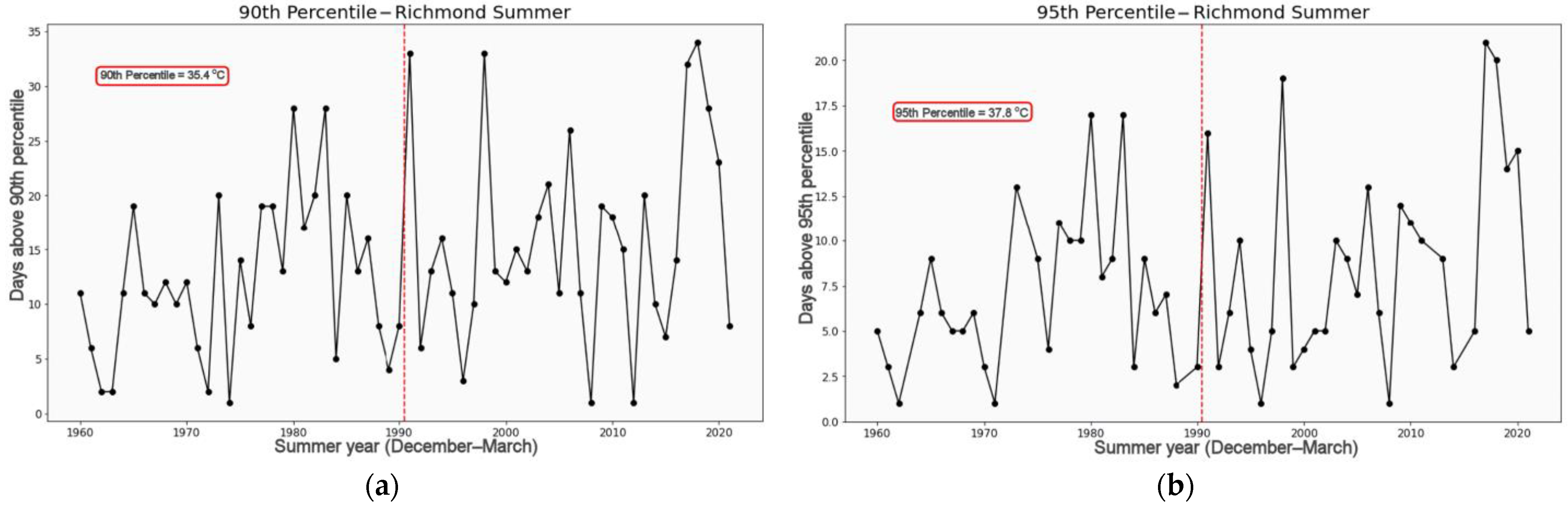
This study analyzed changes in maximum summer temperatures for the Sydney coastal location of Observatory Hill when compared with the western inland location of Richmond, using statistical resampling methods, wavelets, and machine learning (ML) attribution techniques. Given that Sydney’s western suburbs are projected to absorb the majority of Sydney’s future population growth, rising temperatures will have increasing human health, socio-economic, and urban planning impacts. Warming temperatures also are driving significant differences in the number of extreme heat days, defined here as above the 95th percentile, being experienced in inland suburbs compared with coastal suburbs.
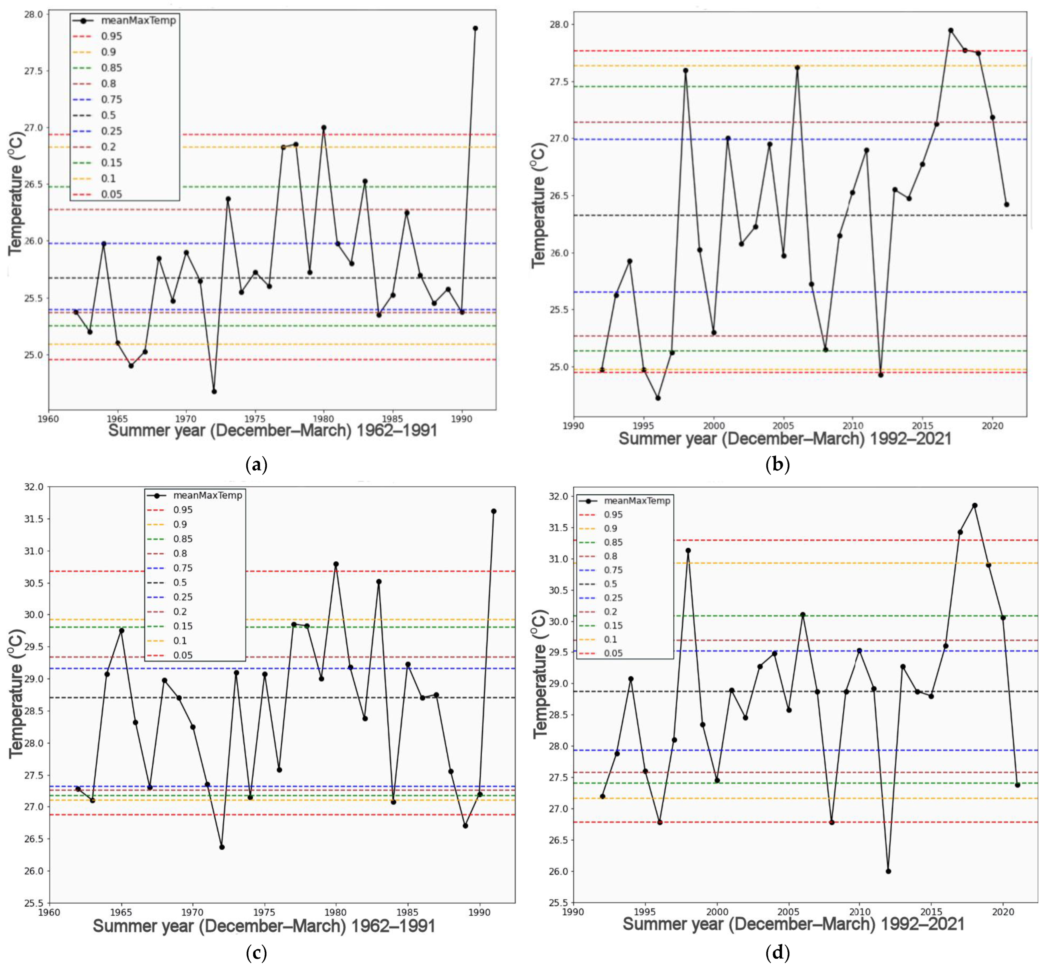
Analysis of the two most recent 30-year climate periods, 1962–1991 and 1992–2021, revealed increased medians and upper percentile values in the last 30 years for both locations. This was confirmed by permutation testing of the 4-month summer December to March periods. The results revealed significant increases in the median of maximum temperatures both for Observatory Hill, Sydney and Richmond, coastal and inland locations, respectively.
Various climate drivers and their two-way interactions with each other were considered for ML attribution. When employing methods of linear regression, SVM with the poly and RBF kernels, and random forests, it was SVM RBF and random forests that performed best. The results show common, highly influential drivers for both regions: Niño3.4, DMI, SAM * SOI, and GlobalT * SAM. Results for both Sydney and Richmond highlight the influence of global warming indicators, both individually and in combination with other climate drivers, in driving temperature changes.
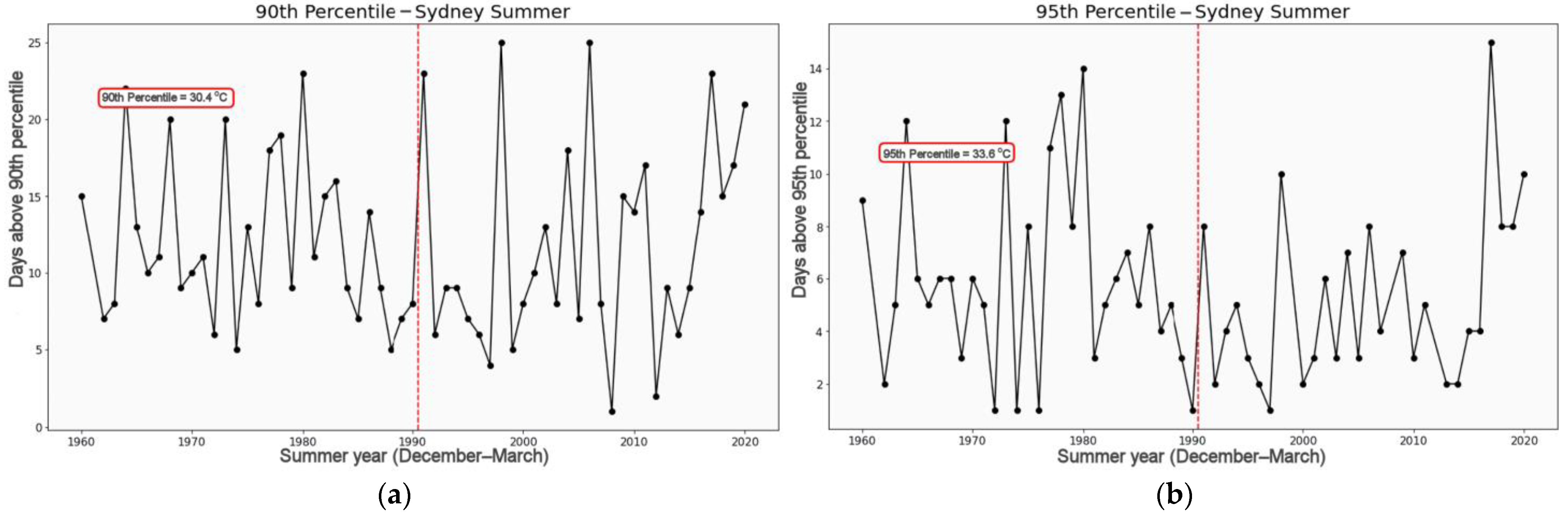
For Sydney and Richmond, data analysis detected increasing median and 90th and 95th percentile values, suggesting that summers are becoming hotter and more extreme. January and February are notably the warmest months.
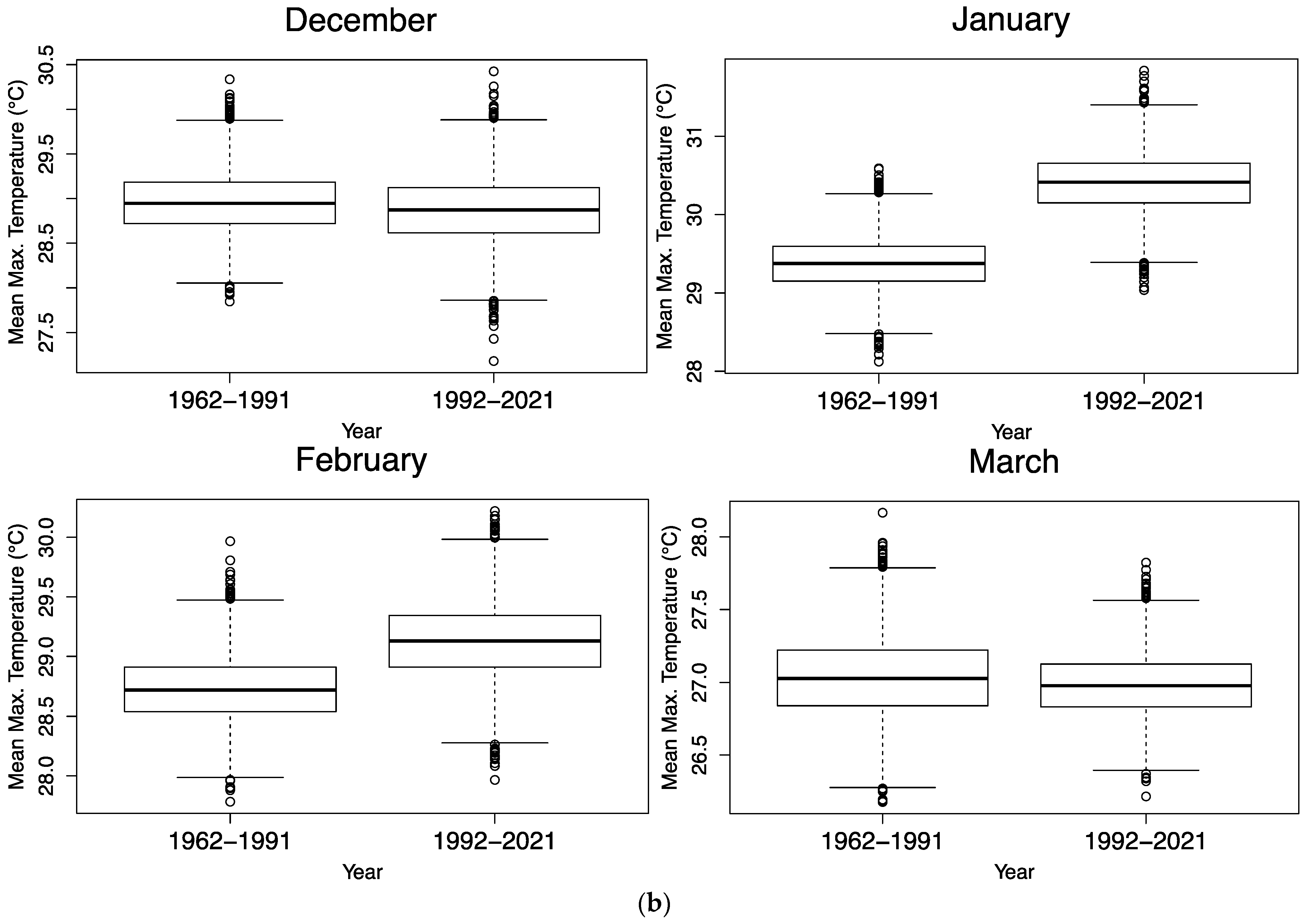
Permutation testing of differences in the median for individual months shows that Sydney has warmed for all months except December compared with the previous climate period. However, January was the only statistically significant increase for Richmond. When the entire summer period was analyzed, there is considerable evidence that median temperatures have risen for both Sydney and Richmond.
While these results show rapidly increasing maximum summer temperatures for Sydney compared to Richmond, the daily data analysis indicates that extreme temperature days have increased drastically for Richmond. Using the 90th and 95th percentiles from the first period as a baseline, Richmond experienced an increase of 120 and 64 days, respectively, in the second period. In contrast, for Sydney, the corresponding numbers of days shown decreases by 4 and 52 days. These findings underline the worsening situation in western Sydney compared with coastal Sydney.
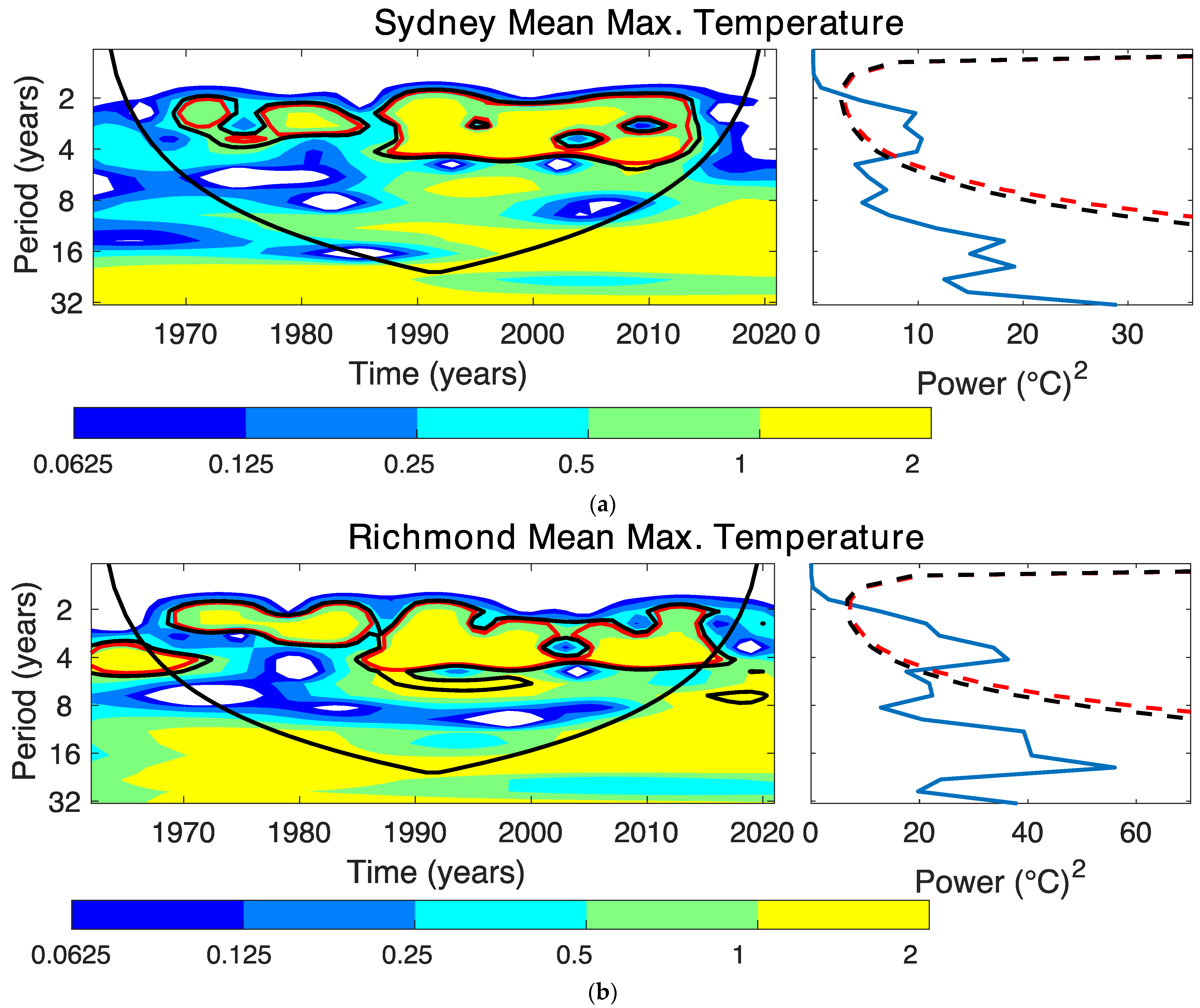
A wavelet analysis was employed to understand periodic signals and both regions highlight significant ENSO influences on maximum temperatures from the mid-1980s onward. Applying ML techniques with expanding window cross-validation indicates that both Richmond and coastal Sydney share the common influential climate drivers of Niño3.4, SAM * SOI, IOD, and GlobalT * SAM. However, the Tasman Sea and Global SSTs have had far more influence on Sydney than Richmond. When investigating the performance of the ML techniques in this study, SVR with the polynomial function kernel and forward selection method performed the best for both sites, because it selected the most prominent attributes and produced lower standard deviations relative to other techniques.

Author Contributions

Conceptualization, L.L. and M.S.; methodology, L.L., J.H., J.W. and A.G.; software, V.B. and J.H.; validation, J.H., J.W. and A.G.; formal analysis, L.L., M.S., J.W. and A.G.; investigation, L.L., M.S. and A.G.; resources, J.W.; data curation, J.H.; writing—original draft preparation, V.B.; writing—review and editing, M.S., L.L. and J.H.; visualization, V.B.; supervision, L.L., J.W. and A.G.; project administration, J.W. and A.G. All authors have read and agreed to the published version of the manuscript.

Funding

This research received no external funding.

Data Availability Statement

All data used are freely available via the web links in the text and references. The precipitation and temperature data are available at: http://www.bom.gov.au/climate/data/.

Acknowledgments

All authors acknowledge the University of Technology Sydney for supporting this research.

Conflicts of Interest

The authors declare no conflict of interest.

References

  1. Melville-Rea, H. Western Sydney Will Swelter through 46 Days Per Year over 35 °C by 2090, Unless Emissions Drop Significantly. Available online: https://theconversation.com/westernsydney-will-swelter-through-46-days-per-year-over-35-c-by-2090-unless-emissions-drop-significantly-177056 (accessed on 9 October 2022).
  2. HeatWatch: Extreme Heat in Western Sydney. Available online: https://australiainstitute.org.au/report/HeatWatch-extreme-heat-in-western-sydney-2022/ (accessed on 9 October 2022).
  3. Out of Season: Expanding Summers and Shrinking Winters in Subtropical and Temperate Australia. Available online: https://australiainstitute.org.au/wp-content/uploads/2020/12/P834-Out-of-Season-WEB.pdf (accessed on 18 February 2023).
  4. Royal Commission into National Natural Disaster Arrangements: Report. Available online: https://apo.org.au/node/309191 (accessed on 9 October 2022).
  5. Policymakers on Notice to Address Human-Induced Climate Change, ‘Half-Measures’ No Longer an Option. Available online: https://www.themandarin.com.au/182988-policymakers-on-notice-human-induced-climate-change/ (accessed on 14 February 2023).
  6. HeatWatch: Extreme Heat in Western Sydney. Available online: https://australiainstitute.org.au/wp-content/uploads/2020/12/Western-Sydney-HeatWatch-WEB.pdf (accessed on 9 October 2022).
  7. Untouchable Playgrounds: Urban Heat and the Future of Western Sydney. Available online: https://www.climatecouncil.org.au/urban-heat-island-effect-western-sydney/ (accessed on 9 October 2022).
  8. About Greater Western Sydney. Available online: https://www.westernsydney.edu.au/rcegws/rcegws/About/about_greater_western_sydney (accessed on 6 November 2022).
  9. ‘Homes Aren’t Safe’: Western Sydney Prepares Evacuation Shelters for Hot Summers. Available online: https://www.smh.com.au/national/nsw/homes-aren-t-safe-western-sydney-preparesevacuation-shelters-for-hot-summers-20220505-p5aioj.html (accessed on 9 October 2022).
  10. Hartigan, J.; MacNamara, S.; Leslie, L.M. Application of Machine Learning to Attribution and Prediction of Seasonal Precipitation and Temperature Trends in Canberra, Australia. Climate 2020, 8, 76. [Google Scholar] [CrossRef]
  11. Hartigan, J.; MacNamara, S.; Leslie, L.M. Comparing precipitation and temperature trends between inland and coastal locations. ANZIAM J. 2019, 60, C109–C126. [Google Scholar] [CrossRef]
  12. Climate Change Datasets. Available online: http://www.bom.gov.au/climate/data/index.shtml (accessed on 9 October 2022).
  13. Climate Data Quality Control. Available online: http://www.bom.gov.au/climate/data-services/about-data-observations.shtml#tabs=Quality-control (accessed on 18 February 2023).
  14. IPCC. Climate Change 2022: Impacts, Adaptation, and Vulnerability. Contribution of Working Group II to the Sixth Assessment Report of the Intergovernmental Panel on Climate Change; Pörtner, H.-O., Roberts, D.C., Tignor, M., Poloczanska, E.S., Mintenbeck, K., Alegría, A., Craig, M., Langsdorf, S., Löschke, S., Möller, V., Okem, A., Rama, B., Eds.; Cambridge University Press: Cambridge, UK; New York, NY, USA, 2022; p. 3056. [Google Scholar] [CrossRef]
  15. Canny, J. Combinatorics and Discrete Probability: Stats: Permutation Tests and Bootstrapping [Lecture Notes]; EECS: Berkeley, CA, USA, 2008; p. 154+196. Available online: https://inst.eecs.berkeley.edu/~cs174/sp08/lecs/index.html (accessed on 14 October 2022).
  16. Wilcox, R.R. Introduction to Robust Estimation and Hypothesis Testing, 5th ed.; Elsevier, Inc.: Amsterdam, The Netherlands, 2011. [Google Scholar]
  17. Torrence, C.; Compo, G.P. A Practical Guide to Wavelet Analysis. Bull. Am. Meteorol. Soc. 1998, 79, 61–78. [Google Scholar] [CrossRef]
  18. Richman, M.B.; Leslie, L.M. The 2015–2017 Cape Town Drought: Attribution and Prediction Using Machine Learning. Procedia Comput. Sci. 2018, 140, 248–257. [Google Scholar] [CrossRef]
  19. Richman, M.B.; Leslie, L.M. Machine Learning for Attribution of Heat and Drought in Southwestern Australia. Procedia Comput. Sci. 2020, 168, 3–10. [Google Scholar] [CrossRef]
  20. Richman, M.B.; Leslie, L.M. Attribution and Prediction of Maximum Temperature Extremes in SE Australia. Procedia Comput. Sci. 2014, 36, 612–617. [Google Scholar] [CrossRef] [Green Version]
  21. Hastie, T.; Tibshirani, R.; Friedman, J.H. The Elements of Statistical Learning: Data Mining, Inference, and Prediction, 2nd ed.; Springer: Berlin/Heidelberg, Germany, 2009. [Google Scholar]
  22. Kuhn, M.; Johnson, K. Applied Predictive Modeling; Springer: New York, NY, USA, 2013. [Google Scholar] [CrossRef]
  23. Richman, M.B.; Leslie, L.M.; Ramsay, H.A.; Klotzbach, P.J. Reducing Tropical Cyclone Prediction Errors Using Machine Learning Approaches. Procedia Comput. Sci. 2017, 114, 314–323. [Google Scholar] [CrossRef]
  24. Cutler, A.; Cutler, D.R.; Stevens, J.R. Random Forests. In Ensemble Machine Learning; Zhang, C., Ma, Y., Eds.; Springer: New York, NY, USA, 2012; pp. 157–175. [Google Scholar] [CrossRef]
  25. Maldonado, S.; Weber, R. A wrapper method for feature selection using Support Vector Machines. Inf. Sci. 2009, 179, 2208–2217. [Google Scholar] [CrossRef]
  26. Brownlee, J. Long Short-Term Memory Networks with Python Develop Sequence Prediction Models with Deep Learning; Machine Learning Mastery EBook: San Juan, PR, USA, 2017. [Google Scholar]
  27. Hartigan, J.; MacNamara, S.; Leslie, L.M.; Speer, M. Attribution and Prediction of Precipitation and Temperature Trends within the Sydney Catchment Using Machine Learning. Climate 2020, 8, 120. [Google Scholar] [CrossRef]
  28. Foster, G.; Rahmstorf, S. Global temperature evolution 1979–2010. Environ. Res. Lett. 2011, 6, 044022. [Google Scholar] [CrossRef]
  29. Farmer, G.T.; Cook, J. (Eds.) Earth’s Surface Temperature. In Climate Change Science: A Modern Synthesis: Volume 1—The Physical Climate; Springer: Dordrecht, The Netherlands, 2013; pp. 135–157. [Google Scholar] [CrossRef]
  30. Hansen, J.; Ruedy, R.; Sato, M.; Lo, K. Global Surface Temperature Change. Rev. Geophys. 2010, 48, RG4004. [Google Scholar] [CrossRef] [Green Version]
  31. Rantanen, M.; Karpechko, A.Y.; Lipponen, A.; Nordling, K.; Hyvärinen, O.; Ruosteenoja, K.; Vihma, T.; Laaksonen, A. The Arctic has warmed nearly four times faster than the globe since 1979. Commun Earth Env. 2022, 3, 168. [Google Scholar] [CrossRef]
  32. Ham, Y.-G. El Niño events will intensify under global warming. Nature 2018, 564, 192–193. [Google Scholar] [CrossRef] [PubMed] [Green Version]
  33. Cai, W.; Borlace, S.; Lengaigne, M.; van Rensch, P.; Collins, M.; Vecchi, G.; Timmermann, A.; Santoso, A.; McPhaden, M.J.; Wu, L.; et al. Increasing frequency of extreme El Niño events due to greenhouse warming. Nat. Clim. Change 2014, 4, 111–116. [Google Scholar] [CrossRef] [Green Version]
  34. Nasa Earth Observations. Sea Surface Temperature Anomaly (1 Month—AQUA/AMSR-E, 2002-11): Nasa Earth Observations. Available online: https://neo.gsfc.nasa.gov/view.php?dtasetId=AMSRE_SSTAn_M (accessed on 9 October 2022).
  35. About the Sea Surface Temperature Timeseries Graphs. Available online: http://www.bom.gov.au/climate/change/about/sst_timeseries.shtm (accessed on 9 October 2022).
  36. Hobday, A.J.; Pecl, G.T. Identification of global marine hotspots: Sentinels for change and vanguards for adaptation action. Rev. Fish Biol. Fish. 2014, 24, 415–425. [Google Scholar] [CrossRef]
  37. Oliver, E.C.J.; Benthuysen, J.A.; Bindoff, N.L.; Hobday, A.J.; Holbrook, N.J.; Mundy, C.N.; Perkins-Kirkpatrick, S.E. The unprecedented 2015/16 Tasman Sea marine heatwave. Nat. Commun. 2017, 8, 16101. [Google Scholar] [CrossRef] [PubMed] [Green Version]
  38. Ridgway, K.R. Long-term trend and decadal variability of the southward penetration of the East Australian Current: East Australian Current Trend. Geophys. Res. Lett. 2007, 34, L13613. [Google Scholar] [CrossRef]
  39. About ENSO Outlooks. Available online: http://www.bom.gov.au/climate/ahead/about-ENSO-outlooks.shtml (accessed on 9 October 2022).
  40. Southern Oscillation Index (SOI): National Oceanic. Available online: https://www.ncei.noaa.gov/access/monitoring/enso/soi (accessed on 10 August 2022).
  41. State of The Climate 2018. Available online: https://www.csiro.au/en/research/environmental-impacts/climate-change/State-of-the-Climate/Previous/State-of-the-Climate-2018 (accessed on 9 October 2022).
  42. ENSO Forecast. Available online: http://www.bom.gov.au/climate/enso/outlook/#tabs=ENSO-Forecast (accessed on 9 October 2022).
  43. Rayner, N.A. Global analyses of sea surface temperature, sea ice, and night marine air temperature since the late nineteenth century. J. Geophys. Res. 2003, 108, 4407. [Google Scholar] [CrossRef] [Green Version]
  44. McPhaden, M.J.; Santoso, A.; Cai, W. (Eds.) El Niño Southern Oscillation in a Changing Climate, 1st ed.; Wiley: Hoboken, NJ, USA, 2020. [Google Scholar] [CrossRef]
  45. Gao, Z.; Hu, Z.-Z.; Zheng, F.; Li, X.; Li, S.; Zhang, B. Single-year and double-year El Niños. Clim. Dyn. 2022, 1–9. [Google Scholar] [CrossRef]
  46. Weisheimer, A.; Balmaseda, M.A.; Stockdale, T.N.; Mayer, M.; Sharmila, S.; Hendon, H.; Alves, O. Variability of ENSO Forecast Skill in 2-Year Global Reforecasts over the 20th Century. Geophys. Res. Lett. 2022, 49, e2022GL097885. [Google Scholar] [CrossRef]
  47. Why Are There So Many ENSO Indexes, Instead of Just One? Available online: https://climate.gov/author/anthony-barnston (accessed on 18 February 2023).
  48. Dipole Mode Index (DMI). Available online: http://psl.noaa.gov/gcos_wgsp/Timeseries/DMI/index.html (accessed on 5 March 2022).
  49. Climate Driver Update. Available online: http://www.bom.gov.au/climate/enso/#tabs=Overview (accessed on 9 October 2022).
  50. Saji, N.H.; Yamagata, T. Possible impacts of Indian Ocean Dipole mode events on global climate. Clim. Res. 2003, 25, 151–169. [Google Scholar] [CrossRef]
  51. Australian Rainfall during El Niño and La Niña Events. Available online: http://www.bom.gov.au/climate/history/enso/ (accessed on 10 August 2022).
  52. Polonsky, A.-T.; Anton, T.I. The IOD–ENSO Interaction: The Role of the Indian Ocean Current’s System. Atmosphere 2021, 12, 1662. [Google Scholar] [CrossRef]
  53. Fogt, R.L.; Marshall, G.J. The Southern Annular Mode: Variability, trends, and climate impacts across the Southern Hemisphere. WIREs Clim. Change 2020, 11, e652. [Google Scholar] [CrossRef]
  54. Marshall, G.J. Trends in the Southern Annular Mode from Observations and Reanalyses. J. Clim. 2003, 16, 4134–4143. [Google Scholar] [CrossRef]
  55. Hendon, H.H.; Thompson, D.W.J.; Wheeler, M.C. Australian Rainfall and Surface Temperature Variations Associated with the Southern Hemisphere Annular Mode. J. Clim. 2007, 20, 2452–2467. [Google Scholar] [CrossRef]
  56. Bureau of Meteorology. (2019, December 6). Southern Annular Mode. Available online: http://www.bom.gov.au/watl/about-weather-and-climate/australian-climateinfluences.shtml?bookmark=sam (accessed on 9 October 2022).
  57. Ropelewski, C.F.; Jones, P.D. An Extension of the Tahiti–Darwin Southern Oscillation Index. Mon. Weather. Rev. 1987, 115, 2161–2165. [Google Scholar] [CrossRef]
  58. The three phases of the El Niño–Southern Oscillation (ENSO). Available online: http://www.bom.gov.au/climate/enso/history/ln-2010-12/three-phases-of-ENSO.shtml (accessed on 18 February 2023).
  59. Holton, J.R.; Hakim, G.J. Chapter 11—Tropical Dynamics. In An Introduction to Dynamic Meteorology, 5th ed.; Holton, J.R., Hakim, G.J., Eds.; Academic Press: Cambridge, MA, USA, 2013; pp. 377–411. [Google Scholar] [CrossRef]
  60. Lebassi-Habtezion, B.; González, J.; Bornstein, R. Modeled large-scale warming impacts on summer California coastal-cooling trends. J. Geophys. Res. 2011, 116, D20114. [Google Scholar] [CrossRef] [Green Version]
  61. Zhoua, Y.; Guana, H.; Huanga, C.; Lingli Fana, L.; Saeedeh Ghariba, S.; Batelaana, O.; Simmons, C. Sea breeze cooling capacity and its influencing factors in a coastal city. Build. Environ. 2019, 166, 106408. [Google Scholar] [CrossRef]
Figure 1. Map of Sydney metropolitan area enclosed by dashed lines. GWS is enclosed by the dashed lines that includes the cities of Richmond, Penrith, Blacktown, and Liverpool. Additionally marked are the two Australian Bureau of Meteorology observing sites of Observatory Hill and Richmond RAAF Base. The detailed Sydney Metropolitan area is also shown as an inset map within Australia.
Climate 11 00076 g001
Figure 2. (a) Sydney (Observatory Hill) mean maximum temperature for summer (December–March) 1962–1991, (b) as in (a), except for 1992–2021, (c) Richmond mean maximum temperature for summer (December–March) 1962–1991, (d) as in (c), except for 1992–2021. The solid black line is the average of the mean maximum temperature for the summer months. The dotted lines show the 5th and 95th percentiles (bottom and top red), 10th and 90th (bottom and top yellow), 15th and 85th (bottom and top green), 20th and 80th (bottom and top brown), 25th and 75th (bottom and top blue), and 50th percentiles (middle black) for each climate period.
Climate 11 00076 g002
Figure 3. Box plots of the mean maximum temperature for each of the four summer months, December–March, grouped in the two climate periods, (a) Sydney, (b) Richmond.
Climate 11 00076 g003aClimate 11 00076 g003b
Figure 4. Number of days above the (a) 90th percentile and (b) 95th percentile across the timeseries for Sydney. The red outlined box denotes the percentile value that is used as the baseline marker and the dotted red line splits the two climate periods.
Climate 11 00076 g004
Figure 5. Number of days above the (a) 90th percentile and (b) 95th percentile across the time series for Richmond. The red outlined box denotes the percentile value that is used as the baseline marker and the dotted red line splits the two climate periods.
Climate 11 00076 g005
Figure 6. (a) Sydney time wavelet analysis for summer, mean maximum temperatures. The left panel shows the local wavelet power spectrum, and the right panel shows the global power spectrum, (b) Richmond time wavelet analysis for summer, mean maximum temperatures. The left panel shows the local wavelet power spectrum, and the right panel shows the global power spectrum.
Climate 11 00076 g006
Table 1. p-values of difference in mean, median, variance, 25th percentile, and 95th percentile for each summer month. p-values < 0.05 for the mean, median, and variance are in bold, as are p-values for the changes in the 25th and 90th percentiles. Tests were conducted using 5000 resamples.
MeanMedianVariance25th Percentile90th Percentile
SydneyDecember0.56740.22540.64500.84700.7654
January0.00660.00240.49960.03400.0316
February0.04900.01380.13220.32620.0300
March0.02500.01120.26460.19620.0406
RichmondDecember0.85980.58840.52220.65340.9114
January0.04920.26420.63080.14140.0222
February0.34560.15780.35240.37480.6270
March0.89120.81420.29380.77900.6814
Table 2. p-values for difference in mean, median, variance, 25th percentile, and 95th percentile for entire summer months combined. Significant p-values < 0.05 are in bold, and those just above or < 0.10 are in bold italics. Tests were conducted using 5000 resamples.
MeanMedianVariance25th Percentile90th Percentile
Sydney0.00260.00540.04660.16860.0008
Richmond0.22720.08700.10401.00000.1732
Table 3. p-values from the permutation testing of differences in the average number of summer days above the 90th and 95th percentiles for Sydney and Richmond. Tests were conducted using 5000 resamples.
90th Percentile95th Percentile
SYDNEYMean0.94980.3476
Median0.60860.2070
RICHMONDMean0.07280.2036
Median0.21200.7924
Table 4. Total number of days above the 90th and 95th percentile for Sydney and Richmond. The percentile values are computed using the first climate period.
PeriodDays Above 90th PercentileDays Above 95th Percentile
SYDNEY1962–1991358181
1992–2021354139
RICHMOND1962–1991375188
1992–2021495252
Table 5. Attribute selection for Sydney data using the eight different ML techniques. The percentage of expanding windows selecting the attribute is shown for each of the eight methods (columns 2–9). The mean and standard deviation for rows and columns is shown.
ATTRIBUTESLR FSVM RBF FSVM Poly FRF FLR BSVM RBF BSVM Poly BRF BMeanStd Dev
DMI924669417421387757.3724.32
GlobalSSTA105977513821447747.1224.17
GlobalT515477333626496248.4016.59
Niño3.4216467495131567451.6018.26
SAM84472492115469042.9528.21
SOI464964511328518548.4021.56
TSSSTA316472547715629758.9725.97
DMI * GlobalSSTA334949315123337442.9516.26
DMI * GlobalT363846387718366444.2318.38
DMI * Niño3.4384669491821498546.7922.47
DMI * SAM03369461810468238.1428.50
DMI * SOI185467463662518752.5620.70
DMI * TSSST35462494433448746.7924.08
GlobalSSTA * GlobalT213659443333497944.2318.32
GlobalSSTA * Niño3.4334459383341647949.0416.70
GlobalSSTA * SAM133844461533448539.7422.18
GlobalSSTA * SOI264464412344698249.0420.94
GlobalSSTA * TSSSTA135962644628389550.6425.15
GlobalT * Niño3.4513851412654566447.7612.10
GlobalT * SAM413854365662568553.5315.77
GlobalT * SOI49414136841417741.6718.83
GlobalT * TSSSTA64674959559599256.7324.38
Niño3.4 * SAM183841461515628239.7423.82
Niño3.4 * SOI316272511054728754.8124.63
Niño3.4 * TSSSTA134956492121648744.8725.46
SAM * SOI464456514441649054.4916.20
SAM * TSSSTA87416754315678251.9230.42
SOI * TSSSTA8546459833648246.4727.46
Mean32.1448.0860.6246.5232.1432.0552.6681.78
Std Dev23.289.4810.547.9821.6515.2310.848.67
Table 6. Attribute selection for Richmond data using the eight different ML techniques. The percentage of expanding windows selecting the attribute is shown for each of the eight methods (columns 2–9). The mean and standard deviation for rows and columns is shown. Attributes are ranked from highest to lowest mean.
ATTRIBUTESLR FSVM RBF FSVM Poly FRF FLR BSVM RBF BSVM Poly BRF BMeanStd Dev
DMI1006264366246547962.8219.81
GlobalSSTA214967442628387743.5919.96
GlobalT414151413118417442.3116.22
Niño3.4796269464631568258.9717.71
SAM23566744238497943.5924.33
SOI215664313128467243.5918.84
TSSSTA386467464626368550.9619.36
DMI * GlobalSSTA627262414423595652.2415.44
DMI * GlobalT595951445923367750.9616.59
DMI * Niño3.4136272361828469245.8327.67
DMI * SAM18626444215448742.9527.54
DMI * SOI135954363364498248.7221.28
DMI * TSSST86264592623499047.4426.86
GlobalSSTA * GlobalT215141494131567946.1517.71
GlobalSSTA * Niño3.4444459383826548548.4017.79
GlobalSSTA * SAM34664414128598545.8324.61
GlobalSSTA * SOI214651463138648247.4419.19
GlobalSSTA * TSSSTA285659444451498752.2417.00
GlobalT * Niño3.4233856362344547243.2716.87
GlobalT * SAM494151495936697753.8513.84
GlobalT * SOI154649411326517739.7421.23
GlobalT * TSSSTA463859441031468544.8721.45
Niño3.4 * SAM284462413818448244.5519.72
Niño3.4 * SOI366256541538729253.2123.61
Niño3.4 * TSSSTA54469442115648743.5928.75
SAM * SOI624464415126547952.5616.39
SAM * TSSSTA15726254046567948.0827.30
SOI * TSSSTA105664381036679046.4728.00
Mean32.1453.3060.0743.0432.1430.0452.2081.14
Std Dev23.549.837.276.1016.0312.759.577.39
Disclaimer/Publisher’s Note: The statements, opinions and data contained in all publications are solely those of the individual author(s) and contributor(s) and not of MDPI and/or the editor(s). MDPI and/or the editor(s) disclaim responsibility for any injury to people or property resulting from any ideas, methods, instructions or products referred to in the content.

