
Evaluation of Qualitative Colour Palettes for Tactile Maps

Abstract
:1. Introduction
- RQ1: Which colour palette attracts the most attention?
- RQ2: What is the impact of the palette used on the legibility and understanding of maps?
- RQ3: Which colour palette is rated as the best by testers?
2. Materials and Methods
2.1. VIEW Model
- Visibility—being easily seen, attracting the most attention;
- Informational—transferring necessary information;
- Emotional Appeal—triggering emotions, judgements;
- Workability—functionality, reliability.
2.2. Case Study
2.2.1. Colour Palettes
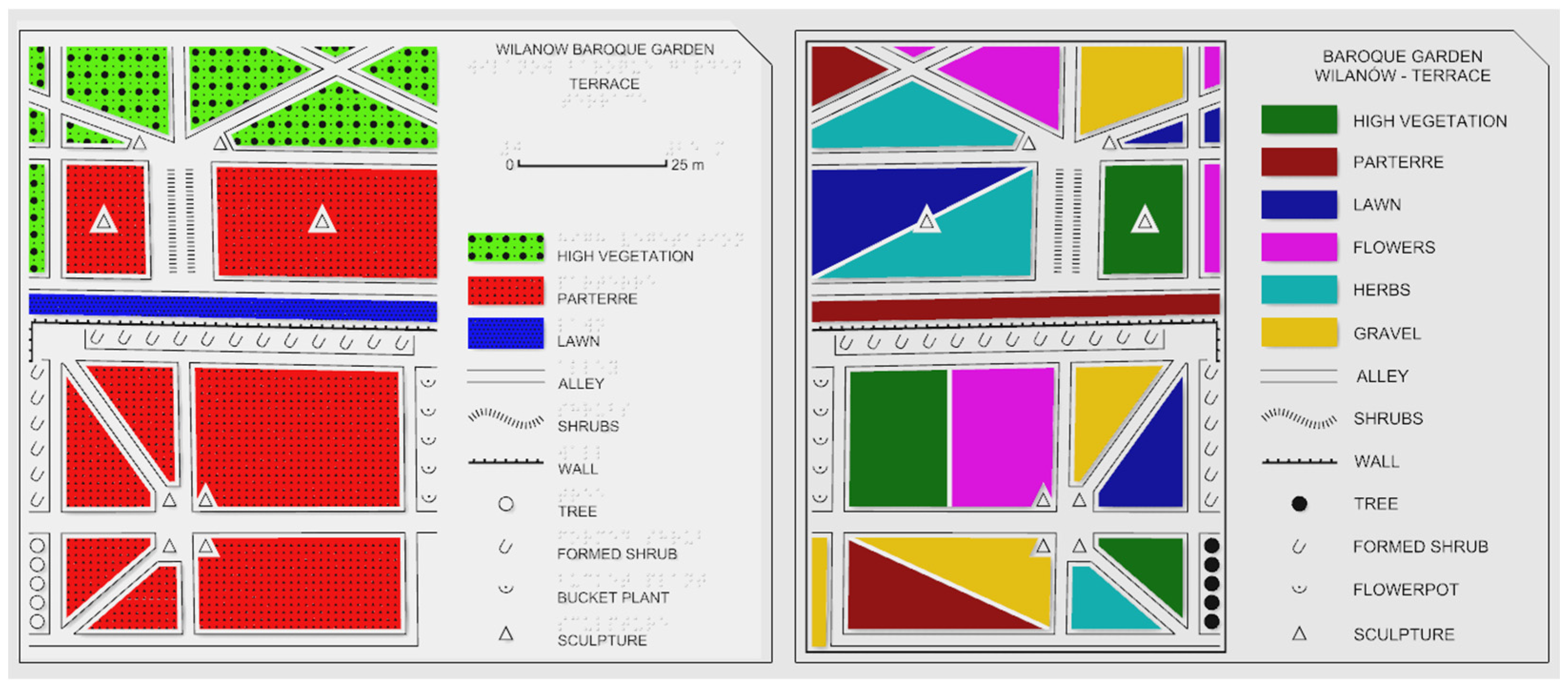
- Existing map—from the existing maps of the European Union in the Tactile Atlas of Poland [31]. We have extracted only the 6 colours used for area symbols.
- Python optimizer—we prepared an algorithm that generated the values of relative luminance (0–1) of each colour to maximize the minimum contrast between the closest (most similar) pairs of colours. Then, the particular RGB values were manually selected to match the hues forming subtractive (CMY) and additive (RGB) colours.
- Colour blindness—colours extracted from the 15-colour palette designed by Martin Krzywinski [32] that considers the 3 most common types of colour blindness: deuteranopia, protanopia, and tritanopia. The goal was to maximize the contrast and differentiate hues as much as possible.
- Hand-picked—a very subjective authors’ selection of distinct colours from the visible spectrum to achieve the highest luminance differences, while maintaining the maximum saturation of colours.
2.2.2. Tactile Maps Stimuli
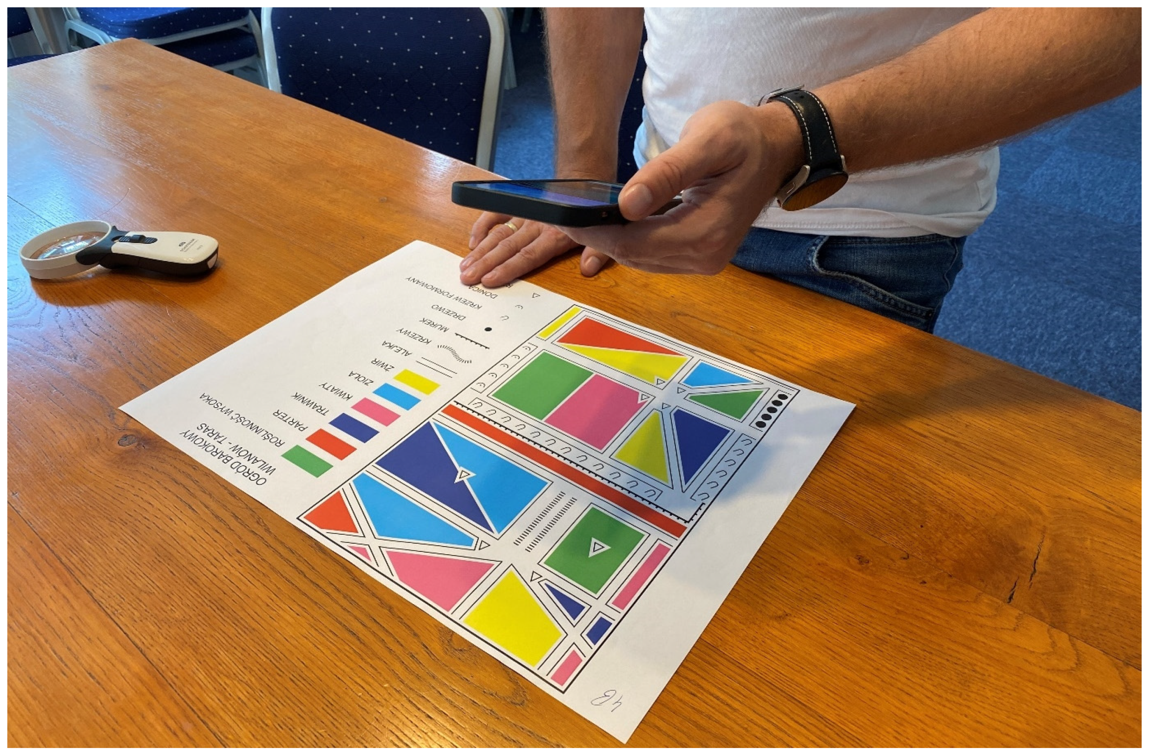
2.2.3. Study Session
3. Results
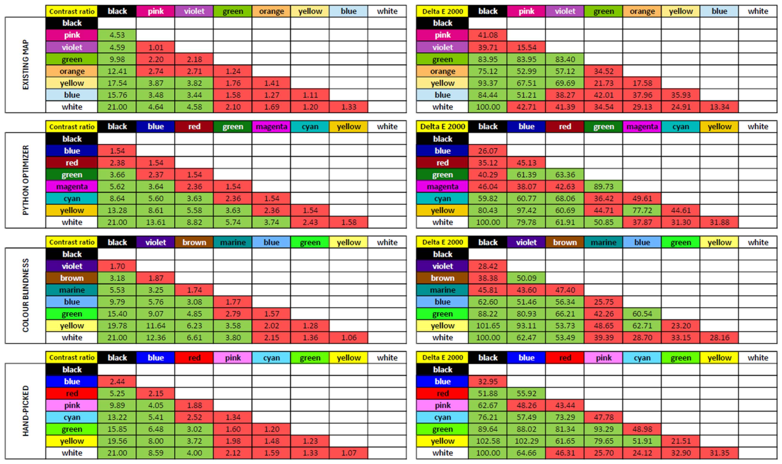
3.1. Colour Calculations
3.2. Map Evaluation
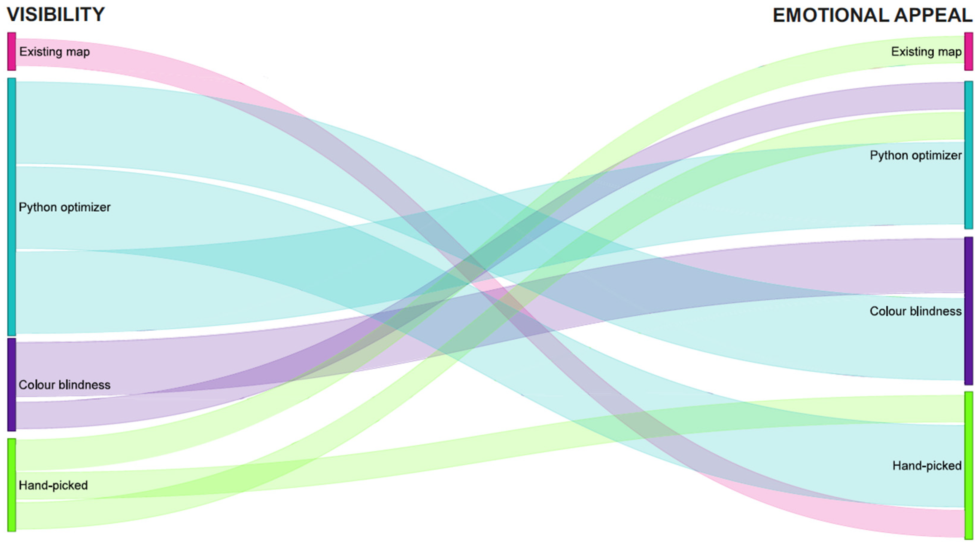
3.3. Visibility
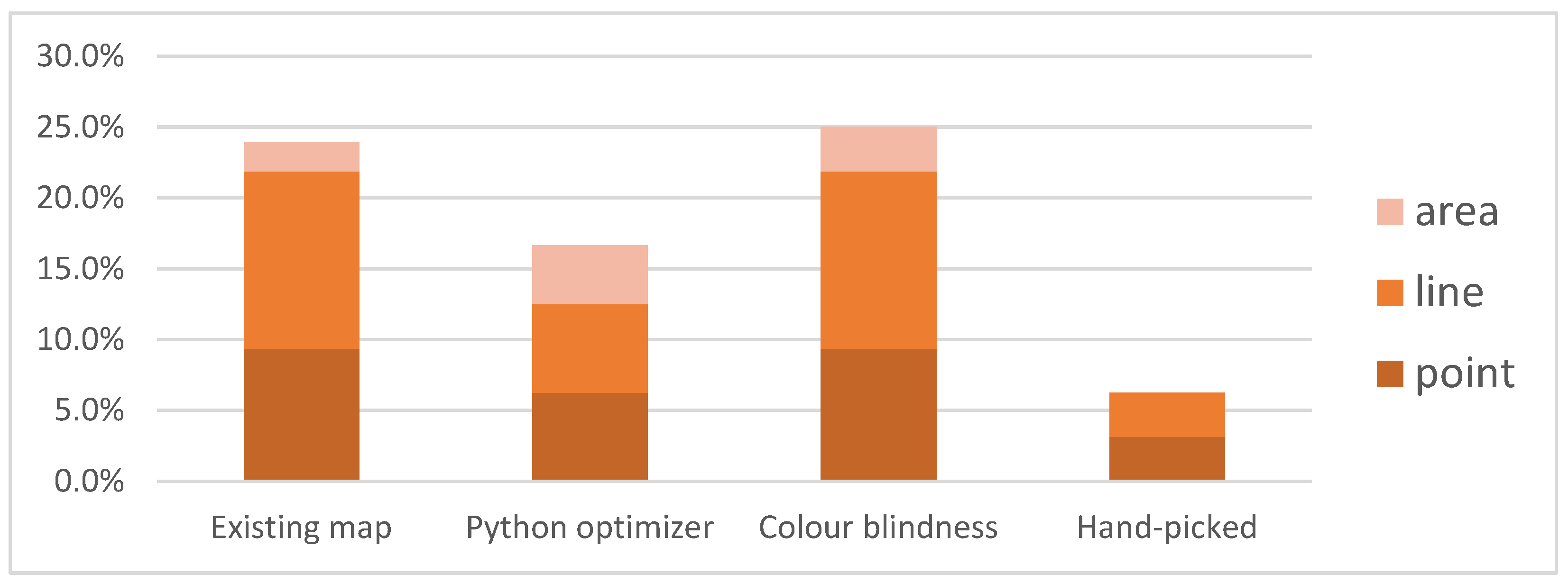
3.4. Informational/Workability
3.5. Emotional Appeal
3.6. Final Score
3.7. Qualitative Feedback
- COMMENT: It would be easier to distinguish area symbols if colours were enhanced with tactile patterns.
- RESPONSE: The final maps of historic parks will include both graphic content and tactile patterns, enhanced with audio descriptions. However, during colour palette testing, only the graphic content was used.
- COMMENT: In general, darker colours were preferred. Brighter colours should be replaced, e.g., yellow in the Existing map palette.
- RESPONSE: The palettes evaluated not only were optimized in terms of contrast and colour distances (Delta E 2000) but also considered people with complete colour blindness. Variability in brightness ensures legibility in grayscale, and participants could alter lighting conditions during the session.
- COMMENT: Labels were legible but could be improved. The black print font should be bold with increased spacing between characters.
- RESPONSE: We used a standard uppercase 16 pt Arial font for black print labels and will modify the font used on future maps.
- COMMENT: The construction lines of point symbols and line symbols are too thin.
- RESPONSE: Graphic variants of symbols used during tests were based on tactile counterparts evaluated previously [20]. We will modify their graphic variants on future maps.
- COMMENT: The colours applied did not recall characteristics of the real-world features they depicted.
- RESPONSE: The study focused on colour contrasts in different combinations, using mock-up maps. In the second iteration of tests (cf. Section 4), actual historic parks were evaluated to maintain associations between colours and mapped objects.
4. Discussion
5. Conclusions
Author Contributions
Funding
Data Availability Statement
Acknowledgments
Conflicts of Interest
Appendix A

| Existing Map—8 colours | |||||||||||
|---|---|---|---|---|---|---|---|---|---|---|---|
| Colour code | Colour | RsRGB | GsRGB | BsRGB | R | G | B | Relative luminance | L | a | b |
| black | 0 | 0 | 0 | 0.00 | 0.00 | 0.00 | 0.00 | 0 | −1 | −1 | |
| pink | 224 | 5 | 133 | 0.75 | 0.00 | 0.23 | 0.18 | 49 | 76 | −8 | |
| violet | 177 | 76 | 183 | 0.44 | 0.07 | 0.47 | 0.18 | 49 | 51 | −39 | |
| green | 127 | 198 | 0 | 0.21 | 0.56 | 0.00 | 0.45 | 73 | −42 | 70 | |
| orange | 254 | 186 | 97 | 0.99 | 0.49 | 0.12 | 0.57 | 80 | 18 | 53 | |
| yellow | 253 | 236 | 137 | 0.98 | 0.84 | 0.25 | 0.83 | 93 | −5 | 49 | |
| blue | 196 | 228 | 245 | 0.55 | 0.78 | 0.91 | 0.74 | 89 | −9 | −13 | |
| white | 255 | 255 | 255 | 1.00 | 1.00 | 1.00 | 1.00 | 100 | −1 | −1 | |
| Existing map—7 colours | |||||||||||
| Colour code | Colour | RsRGB | GsRGB | BsRGB | R | G | B | Relative luminance | L | a | b |
| black | 0 | 0 | 0 | 0.00 | 0.00 | 0.00 | 0.00 | 0 | −1 | −1 | |
| violet | 162 | 81 | 144 | 0.36 | 0.08 | 0.28 | 0.16 | 46 | 39 | −20 | |
| green | 116 | 180 | 60 | 0.17 | 0.46 | 0.05 | 0.37 | 67 | −37 | 51 | |
| orange | 247 | 170 | 95 | 0.93 | 0.40 | 0.11 | 0.49 | 76 | 23 | 49 | |
| blue | 184 | 222 | 241 | 0.48 | 0.73 | 0.88 | 0.69 | 86 | −11 | −15 | |
| yellow | 255 | 244 | 130 | 1.00 | 0.90 | 0.22 | 0.88 | 95 | −8 | 54 | |
| white | 255 | 255 | 255 | 1.00 | 1.00 | 1.00 | 1.00 | 100 | −1 | −1 | |
| Existing map—6 colours | |||||||||||
| Colour code | Colour | RsRGB | GsRGB | BsRGB | R | G | B | Relative luminance | L | a | b |
| black | 0 | 0 | 0 | 0.00 | 0.00 | 0.00 | 0.00 | 0 | −1 | −1 | |
| orange | 236 | 108 | 45 | 0.84 | 0.15 | 0.03 | 0.29 | 61 | 47 | 56 | |
| green | 116 | 180 | 60 | 0.17 | 0.46 | 0.05 | 0.37 | 67 | −37 | 51 | |
| blue | 184 | 222 | 241 | 0.48 | 0.73 | 0.88 | 0.69 | 86 | −11 | −15 | |
| yellow | 255 | 244 | 130 | 1.00 | 0.90 | 0.22 | 0.88 | 95 | −8 | 54 | |
| white | 255 | 255 | 255 | 1.00 | 1.00 | 1.00 | 1.00 | 100 | −1 | −1 | |
| Python Optimizer—8 colours | |||||||||||
| Colour code | Colour | RsRGB | GsRGB | BsRGB | R | G | B | Relative luminance | L | a | b |
| black | 0 | 0 | 0 | 0.00 | 0.00 | 0.00 | 0.00 | 0 | −1 | −1 | |
| blue | 0 | 0 | 165 | 0.00 | 0.00 | 0.38 | 0.03 | 16 | 48 | −82 | |
| red | 154 | 0 | 15 | 0.32 | 0.00 | 0.00 | 0.07 | 32 | 54 | 40 | |
| green | 10 | 119 | 15 | 0.00 | 0.18 | 0.00 | 0.13 | 43 | −45 | 42 | |
| pink | 232 | 0 | 234 | 0.81 | 0.00 | 0.82 | 0.23 | 55 | 86 | −58 | |
| cyan | 0 | 185 | 185 | 0.00 | 0.49 | 0.49 | 0.38 | 68 | −41 | −13 | |
| yellow | 241 | 203 | 0 | 0.88 | 0.60 | 0.00 | 0.61 | 83 | 2 | 82 | |
| white | 255 | 255 | 255 | 1.00 | 1.00 | 1.00 | 1.00 | 100 | −1 | −1 | |
| Python Optimizer—7 colours | |||||||||||
| Colour code | Colour | RsRGB | GsRGB | BsRGB | R | G | B | Relative luminance | L | a | b |
| black | 0 | 0 | 0 | 0.00 | 0.00 | 0.00 | 0.00 | 0 | −1 | −1 | |
| blue | 0 | 0 | 180 | 0.00 | 0.00 | 0.46 | 0.03 | 19 | 51 | −87 | |
| red | 172 | 0 | 10 | 0.41 | 0.00 | 0.00 | 0.09 | 36 | 59 | 47 | |
| green | 0 | 137 | 0 | 0.00 | 0.25 | 0.00 | 0.18 | 49 | −51 | 50 | |
| pink | 254 | 72 | 255 | 0.99 | 0.06 | 1.00 | 0.33 | 64 | 81 | −55 | |
| yellow | 243 | 194 | 40 | 0.90 | 0.54 | 0.02 | 0.58 | 81 | 7 | 74 | |
| white | 255 | 255 | 255 | 1.00 | 1.00 | 1.00 | 1.00 | 100 | −1 | −1 | |
| Python Optimizer—6 colours | |||||||||||
| Colour code | Colour | RsRGB | GsRGB | BsRGB | R | G | B | Relative luminance | L | a | b |
| black | 0 | 0 | 0 | 0.00 | 0.00 | 0.00 | 0.00 | 0 | −1 | −1 | |
| blue | 5 | 0 | 200 | 0.00 | 0.00 | 0.58 | 0.04 | 22 | 56 | −94 | |
| red | 197 | 0 | 14 | 0.56 | 0.00 | 0.00 | 0.12 | 42 | 65 | 51 | |
| green | 30 | 162 | 0 | 0.01 | 0.36 | 0.00 | 0.26 | 58 | −55 | 57 | |
| yellow | 245 | 180 | 20 | 0.91 | 0.46 | 0.01 | 0.52 | 78 | 15 | 76 | |
| white | 255 | 255 | 255 | 1.00 | 1.00 | 1.00 | 1.00 | 100 | −1 | −1 | |
| Colour Blindness—8 colours | |||||||||||
| Colour code | Colour | RsRGB | GsRGB | BsRGB | R | G | B | Relative luminance | L | a | b |
| black | 0 | 0 | 0 | 0.00 | 0.00 | 0.00 | 0.00 | 0 | −1 | −1 | |
| violet | 73 | 0 | 146 | 0.07 | 0.00 | 0.29 | 0.03 | 29 | 49 | −63 | |
| brown | 146 | 73 | 0 | 0.29 | 0.07 | 0.00 | 0.11 | 40 | 28 | 49 | |
| marine | 0 | 146 | 146 | 0.00 | 0.29 | 0.29 | 0.23 | 54 | −34 | −11 | |
| blue | 109 | 182 | 255 | 0.15 | 0.47 | 1.00 | 0.44 | 71 | −9 | −45 | |
| green | 36 | 255 | 36 | 0.02 | 1.00 | 0.02 | 0.72 | 88 | −78 | 76 | |
| yellow | 255 | 255 | 109 | 1.00 | 1.00 | 0.15 | 0.94 | 98 | −14 | 67 | |
| white | 255 | 255 | 255 | 1.00 | 1.00 | 1.00 | 1.00 | 100 | −1 | −1 | |
| Colour Blindness—7 colours | |||||||||||
| Colour code | Colour | RsRGB | GsRGB | BsRGB | R | G | B | Relative luminance | L | a | b |
| black | 0 | 0 | 0 | 0.00 | 0.00 | 0.00 | 0.00 | 0 | −1 | −1 | |
| marine | 0 | 73 | 73 | 0.00 | 0.07 | 0.07 | 0.05 | 27 | −22 | −7 | |
| blue | 0 | 109 | 219 | 0.00 | 0.15 | 0.71 | 0.16 | 46 | 7 | −65 | |
| orange | 219 | 109 | 0 | 0.71 | 0.15 | 0.00 | 0.26 | 58 | 40 | 65 | |
| pink | 255 | 182 | 219 | 1.00 | 0.47 | 0.71 | 0.60 | 82 | 30 | −9 | |
| yellow | 255 | 255 | 109 | 1.00 | 1.00 | 0.15 | 0.94 | 98 | −14 | 67 | |
| white | 255 | 255 | 255 | 1.00 | 1.00 | 1.00 | 1.00 | 100 | −1 | −1 | |
| Colour Blindness—6 colours | |||||||||||
| Colour code | Colour | RsRGB | GsRGB | BsRGB | R | G | B | Relative luminance | L | a | b |
| black | 0 | 0 | 0 | 0.00 | 0.00 | 0.00 | 0.00 | 0 | −1 | −1 | |
| marine | 0 | 73 | 73 | 0.00 | 0.07 | 0.07 | 0.05 | 27 | −22 | −7 | |
| blue | 0 | 109 | 219 | 0.00 | 0.15 | 0.71 | 0.16 | 46 | 7 | −65 | |
| pink | 182 | 109 | 255 | 0.47 | 0.15 | 1.00 | 0.28 | 59 | 49 | −63 | |
| green | 36 | 255 | 36 | 0.02 | 1.00 | 0.02 | 0.72 | 88 | −78 | 76 | |
| white | 255 | 255 | 255 | 1.00 | 1.00 | 1.00 | 1.00 | 100 | −1 | −1 | |
| Hand-Picked—8 colours | |||||||||||
| Colour code | Colour | RsRGB | GsRGB | BsRGB | R | G | B | Relative luminance | L | a | b |
| black | 0 | 0 | 0 | 0.00 | 0.00 | 0.00 | 0.00 | 0 | −1 | −1 | |
| blue | 0 | 0 | 255 | 0.00 | 0.00 | 1.00 | 0.07 | 29 | 67 | −113 | |
| red | 255 | 0 | 0 | 1.00 | 0.00 | 0.00 | 0.21 | 54 | 80 | 69 | |
| pink | 255 | 130 | 255 | 1.00 | 0.22 | 1.00 | 0.44 | 72 | 59 | −43 | |
| cyan | 100 | 220 | 255 | 0.13 | 0.72 | 1.00 | 0.61 | 82 | −28 | −29 | |
| green | 100 | 255 | 0 | 0.13 | 1.00 | 0.00 | 0.74 | 89 | −69 | 81 | |
| yellow | 255 | 255 | 0 | 1.00 | 1.00 | 0.00 | 0.93 | 98 | −17 | 92 | |
| white | 255 | 255 | 255 | 1.00 | 1.00 | 1.00 | 1.00 | 100 | −1 | −1 | |
| Hand-Picked—7 colours | |||||||||||
| Colour code | Colour | RsRGB | GsRGB | BsRGB | R | G | B | Relative luminance | L | a | b |
| black | 0 | 0 | 0 | 0.00 | 0.00 | 0.00 | 0.00 | 0 | −1 | −1 | |
| blue | 0 | 0 | 255 | 0.00 | 0.00 | 1.00 | 0.07 | 29 | 67 | −113 | |
| red | 255 | 0 | 0 | 1.00 | 0.00 | 0.00 | 0.21 | 54 | 80 | 69 | |
| cyan | 100 | 220 | 255 | 0.13 | 0.72 | 1.00 | 0.61 | 82 | −28 | −29 | |
| green | 100 | 255 | 0 | 0.13 | 1.00 | 0.00 | 0.74 | 89 | −69 | 81 | |
| yellow | 255 | 255 | 0 | 1.00 | 1.00 | 0.00 | 0.93 | 98 | −17 | 92 | |
| white | 255 | 255 | 255 | 1.00 | 1.00 | 1.00 | 1.00 | 100 | −1 | −1 | |
| Hand-Picked—6 colours | |||||||||||
| Colour code | Colour | RsRGB | GsRGB | BsRGB | R | G | B | Relative luminance | L | a | b |
| black | 0 | 0 | 0 | 0.00 | 0.00 | 0.00 | 0.00 | 0 | −1 | −1 | |
| red | 255 | 0 | 0 | 1.00 | 0.00 | 0.00 | 0.21 | 54 | 80 | 69 | |
| blue | 100 | 220 | 255 | 0.13 | 0.72 | 1.00 | 0.61 | 82 | −28 | −29 | |
| green | 100 | 255 | 0 | 0.13 | 1.00 | 0.00 | 0.74 | 89 | −69 | 81 | |
| yellow | 255 | 255 | 50 | 1.00 | 1.00 | 0.03 | 0.93 | 98 | −17 | 92 | |
| white | 255 | 255 | 255 | 1.00 | 1.00 | 1.00 | 1.00 | 100 | −1 | −1 | |
| Contrast Ratio | black | pink | violet | green | orange | yellow | blue | white | Delta E 2000 | black | pink | violet | green | orange | yellow | blue | white | |
|---|---|---|---|---|---|---|---|---|---|---|---|---|---|---|---|---|---|---|
| EXISTING MAP 8 COLOURS | black | black | ||||||||||||||||
| pink | 4.53 | pink | 41.08 | |||||||||||||||
| violet | 4.59 | 1.01 | violet | 39.71 | 15.54 | |||||||||||||
| green | 9.98 | 2.20 | 2.18 | green | 83.95 | 83.95 | 83.40 | |||||||||||
| orange | 12.41 | 2.74 | 2.71 | 1.24 | orange | 75.12 | 52.99 | 57.12 | 34.52 | |||||||||
| yellow | 17.54 | 3.87 | 3.82 | 1.76 | 1.41 | yellow | 93.37 | 67.51 | 69.69 | 21.73 | 17.58 | |||||||
| blue | 15.76 | 3.48 | 3.44 | 1.58 | 1.27 | 1.11 | blue | 84.44 | 51.21 | 38.27 | 42.01 | 37.96 | 35.93 | |||||
| white | 21.00 | 4.64 | 4.58 | 2.10 | 1.69 | 1.20 | 1.33 | white | 100.00 | 42.71 | 41.39 | 34.54 | 29.13 | 24.91 | 13.34 | |||
| Contrast ratio | black | violet | green | orange | blue | yellow | white | Delta E 2000 | black | violet | green | orange | blue | yellow | white | |||
| EXISTING MAP 7 COLOURS | black | black | ||||||||||||||||
| violet | 4.12 | violet | 37.08 | |||||||||||||||
| green | 8.34 | 2.03 | green | 60.45 | 70.05 | |||||||||||||
| orange | 10.87 | 2.64 | 1.30 | orange | 48.51 | 48.51 | 38.21 | |||||||||||
| blue | 14.76 | 3.59 | 1.77 | 1.36 | blue | 80.11 | 44.66 | 40.32 | 39.20 | |||||||||
| yellow | 18.51 | 4.50 | 2.22 | 1.70 | 1.25 | yellow | 96.77 | 67.67 | 24.66 | 24.67 | 38.75 | |||||||
| white | 21.00 | 5.10 | 2.52 | 1.93 | 1.42 | 1.13 | white | 100.00 | 43.84 | 34.86 | 30.26 | 15.76 | 25.86 | |||||
| Contrast ratio | black | orange | green | blue | yellow | white | Delta E 2000 | black | orange | green | blue | yellow | white | |||||
| EXISTING MAP 6 COLOURS | black | black | ||||||||||||||||
| orange | 6.75 | orange | 55.75 | |||||||||||||||
| green | 8.34 | 1.24 | green | 60.45 | 51.95 | |||||||||||||
| blue | 14.76 | 2.19 | 1.77 | blue | 49.45 | 49.45 | 40.32 | |||||||||||
| yellow | 18.51 | 2.74 | 2.22 | 1.25 | yellow | 96.77 | 41.36 | 24.66 | 38.75 | |||||||||
| white | 21.00 | 3.11 | 2.52 | 1.42 | 1.13 | white | 100.00 | 39.70 | 34.86 | 15.76 | 25.86 | |||||||
| Contrast ratio | black | blue | red | green | pink | cyan | yellow | white | Delta E 2000 | black | blue | red | green | pink | cyan | yellow | white | |
| PYTHON OPTIMIZER 8 COLOURS | black | black | ||||||||||||||||
| blue | 1.54 | blue | 26.07 | |||||||||||||||
| red | 2.38 | 1.54 | red | 35.12 | 45.13 | |||||||||||||
| green | 3.66 | 2.37 | 1.54 | green | 40.29 | 61.39 | 63.36 | |||||||||||
| pink | 5.62 | 3.64 | 2.36 | 1.54 | pink | 46.04 | 38.07 | 42.63 | 89.73 | |||||||||
| cyan | 8.64 | 5.60 | 3.63 | 2.36 | 1.54 | cyan | 59.82 | 60.77 | 68.06 | 36.42 | 49.61 | |||||||
| yellow | 13.28 | 8.61 | 5.58 | 3.63 | 2.36 | 1.54 | yellow | 80.43 | 97.42 | 60.69 | 44.71 | 77.72 | 44.61 | |||||
| white | 21.00 | 13.61 | 8.82 | 5.74 | 3.74 | 2.43 | 1.58 | white | 100.00 | 79.78 | 61.91 | 50.85 | 37.87 | 31.30 | 31.88 | |||
| Contrast ratio | black | blue | red | green | pink | yellow | white | Delta E 2000 | black | blue | red | green | pink | yellow | white | |||
| PYTHON OPTIMIZER 7 COLOURS | black | black | ||||||||||||||||
| blue | 1.66 | blue | 27.37 | |||||||||||||||
| red | 2.76 | 1.66 | red | 38.08 | 47.52 | |||||||||||||
| green | 4.58 | 2.76 | 1.66 | green | 45.39 | 65.37 | 67.26 | |||||||||||
| pink | 7.59 | 4.57 | 2.75 | 1.66 | pink | 54.47 | 45.20 | 47.56 | 92.50 | |||||||||
| yellow | 12.56 | 7.57 | 4.55 | 2.74 | 1.66 | yellow | 77.43 | 91.92 | 53.34 | 41.29 | 70.38 | |||||||
| white | 21.00 | 12.66 | 7.61 | 4.59 | 2.77 | 1.67 | white | 100.00 | 75.87 | 58.53 | 46.86 | 31.48 | 31.44 | |||||
| Contrast ratio | black | blue | red | green | yellow | white | Delta E 2000 | black | blue | red | green | yellow | white | |||||
| PYTHON OPTIMIZER 6 COLOURS | black | black | ||||||||||||||||
| blue | 1.84 | blue | 28.90 | |||||||||||||||
| red | 3.38 | 1.84 | red | 42.06 | 49.43 | |||||||||||||
| green | 6.22 | 3.38 | 1.84 | green | 53.12 | 70.66 | 71.52 | |||||||||||
| yellow | 11.42 | 6.21 | 3.38 | 1.84 | yellow | 73.84 | 86.80 | 44.98 | 40.16 | |||||||||
| white | 21.00 | 11.41 | 6.21 | 3.37 | 1.84 | white | 100.00 | 72.24 | 53.60 | 41.46 | 32.69 | |||||||
| Contrast ratio | black | violet | brown | marine | blue | green | yellow | white | Delta E 2000 | black | violet | brown | marine | blue | green | yellow | white | |
| COLOUR BLINDNESS 8 COLOURS | black | black | ||||||||||||||||
| violet | 1.70 | violet | 28.42 | |||||||||||||||
| brown | 3.18 | 1.87 | brown | 38.38 | 50.09 | |||||||||||||
| marine | 5.53 | 3.25 | 1.74 | marine | 45.81 | 43.60 | 47.40 | |||||||||||
| blue | 9.79 | 5.76 | 3.08 | 1.77 | blue | 62.60 | 51.46 | 56.34 | 25.75 | |||||||||
| green | 15.40 | 9.07 | 4.85 | 2.79 | 1.57 | green | 88.22 | 80.93 | 66.21 | 42.26 | 60.54 | |||||||
| yellow | 19.78 | 11.64 | 6.23 | 3.58 | 2.02 | 1.28 | yellow | 101.65 | 93.11 | 53.73 | 48.65 | 62.71 | 23.20 | |||||
| white | 21.00 | 12.36 | 6.61 | 3.80 | 2.15 | 1.36 | 1.06 | white | 100.00 | 62.47 | 53.49 | 39.39 | 28.70 | 33.15 | 28.16 | |||
| Contrast ratio | black | marine | blue | orange | pink | yellow | white | Delta E 2000 | black | marine | blue | orange | pink | yellow | white | |||
| COLOUR BLINDNESS 7 COLOURS | black | black | ||||||||||||||||
| marine | 2.05 | marine | 24.83 | |||||||||||||||
| blue | 4.21 | 2.05 | blue | 40.81 | 31.11 | |||||||||||||
| orange | 6.20 | 3.03 | 1.47 | orange | 53.30 | 52.40 | 54.12 | |||||||||||
| pink | 12.97 | 6.33 | 3.08 | 2.09 | pink | 75.52 | 66.09 | 47.34 | 40.79 | |||||||||
| yellow | 19.78 | 9.65 | 4.70 | 3.19 | 1.53 | yellow | 101.65 | 69.17 | 79.18 | 43.35 | 54.61 | |||||||
| white | 21.00 | 10.25 | 4.99 | 3.39 | 1.62 | 1.06 | white | 100.00 | 63.72 | 47.04 | 41.69 | 21.84 | 28.16 | |||||
| Contrast ratio | black | marine | blue | pink | green | white | Delta E 2000 | black | marine | blue | pink | green | white | |||||
| COLOUR BLINDNESS 6 COLOURS | black | black | ||||||||||||||||
| marine | 2.05 | marine | 24.83 | |||||||||||||||
| blue | 4.21 | 2.05 | blue | 40.81 | 31.11 | |||||||||||||
| pink | 6.62 | 3.23 | 1.57 | pink | 50.06 | 43.06 | 29.25 | |||||||||||
| green | 15.40 | 7.52 | 3.66 | 2.33 | green | 88.22 | 64.32 | 72.90 | 64.83 | |||||||||
| white | 21.00 | 10.25 | 4.99 | 3.17 | 1.36 | white | 100.00 | 63.72 | 47.04 | 35.51 | 33.15 | |||||||
| Contrast ratio | black | blue | red | pink | cyan | green | yellow | white | Delta E 2000 | black | blue | red | pink | cyan | green | yellow | white | |
| HAND-PICKED 8 COLOURS | black | black | ||||||||||||||||
| blue | 2.44 | blue | 32.95 | |||||||||||||||
| red | 5.25 | 2.15 | red | 51.88 | 55.92 | |||||||||||||
| pink | 9.89 | 4.05 | 1.88 | pink | 62.67 | 48.26 | 43.44 | |||||||||||
| cyan | 13.22 | 5.41 | 2.52 | 1.34 | cyan | 76.21 | 57.49 | 73.29 | 47.78 | |||||||||
| green | 15.85 | 6.48 | 3.02 | 1.60 | 1.20 | green | 89.64 | 88.02 | 81.34 | 93.29 | 48.98 | |||||||
| yellow | 19.56 | 8.00 | 3.72 | 1.98 | 1.48 | 1.23 | yellow | 102.58 | 102.29 | 61.65 | 79.65 | 51.91 | 21.51 | |||||
| white | 21.00 | 8.59 | 4.00 | 2.12 | 1.59 | 1.33 | 1.07 | white | 100.00 | 64.66 | 46.31 | 25.70 | 24.12 | 32.90 | 31.35 | |||
| Contrast ratio | black | blue | red | cyan | green | yellow | white | Delta E 2000 | black | blue | red | cyan | green | yellow | white | |||
| HAND-PICKED 7 COLOURS | black | black | ||||||||||||||||
| blue | 2.44 | blue | 32.95 | |||||||||||||||
| red | 5.25 | 2.15 | red | 51.88 | 55.92 | |||||||||||||
| cyan | 13.22 | 5.41 | 2.52 | cyan | 76.21 | 57.49 | 73.29 | |||||||||||
| green | 15.85 | 6.48 | 3.02 | 1.20 | green | 89.64 | 88.02 | 81.34 | 48.98 | |||||||||
| yellow | 19.56 | 8.00 | 3.72 | 1.48 | 1.23 | yellow | 102.58 | 102.29 | 61.65 | 51.91 | 21.51 | |||||||
| white | 21.00 | 8.59 | 4.00 | 1.59 | 1.33 | 1.07 | white | 100.00 | 64.66 | 46.31 | 24.12 | 32.90 | 31.35 | |||||
| Contrast ratio | black | red | blue | green | yellow | white | Delta E 2000 | black | red | blue | green | yellow | white | |||||
| HAND-PICKED 6 COLOURS | black | black | ||||||||||||||||
| red | 5.25 | red | 51.88 | |||||||||||||||
| blue | 13.22 | 2.52 | blue | 76.21 | 73.29 | |||||||||||||
| green | 15.85 | 3.02 | 1.20 | green | 89.64 | 81.34 | 48.98 | |||||||||||
| yellow | 19.60 | 3.73 | 1.48 | 1.24 | yellow | 102.58 | 61.65 | 51.91 | 21.51 | |||||||||
| white | 21.00 | 4.00 | 1.59 | 1.33 | 1.07 | white | 100.00 | 46.31 | 24.12 | 32.90 | 31.35 |
Appendix B


Appendix C. Study Session Scenario

References
- Dent, B. Visual Organization and Thematic Map Communication. Ann. Assoc. Am. Geogr. 1972, 62, 79–93. [Google Scholar] [CrossRef]
- Robinson, A.H.; Morrison, J.L.; Muehrcke, P.C.; Kimerling, J.A.; Guptill, S.C. Elements of Cartography, 6th ed; John Wiley & Sons, Inc.: New York, NY, USA, 1995; ISBN 0471555797. [Google Scholar]
- Krygier, J.; Wood, D. Making Maps: A Visual Guide to Map Design for GIS, 3rd ed.; Guilford Press: New York, NY, USA; London, UK, 2016. [Google Scholar]
- Guillon, M.; Dumbleton, K.; Theodoratos, P.; Gobbe, M.; Wooley, C.B.; Moody, K. The Effects of Age, Refractive Status, and Luminance on Pupil Size. Optom. Vis. Sci. 2016, 93, 1093–1100. [Google Scholar] [CrossRef] [PubMed]
- Jenny, B.; Kelso, N.V. Color Design for the Color Vision Impaired. Cartogr. Perspect. 2007, 61–67. [Google Scholar] [CrossRef]
- Harrower, M.; Brewer, C.A. ColorBrewer.Org: An Online Tool for Selecting Colour Schemes for Maps. Cartogr. J. 2003, 40, 27–37. [Google Scholar] [CrossRef]
- Barbosa, C.; Sousa, T.; Monteiro, W.; Araújo, T. Enhancing Color Scales for Active Data Physicalizations. Appl. Sci. 2024, 14, 166. [Google Scholar] [CrossRef]
- Bourne, R.R.A.; Flaxman, S.R.; Braithwaite, T.; Cicinelli, M.V.; Das, A.; Jonas, J.B.; Keeffe, J.; Kempen, J.H.; Leasher, J.; Limburg, H.; et al. Magnitude, Temporal Trends, and Projections of the Global Prevalence of Blindness and Distance and near Vision Impairment: A Systematic Review and Meta-Analysis. Lancet Glob. Health 2017, 5, e888–e897. [Google Scholar] [CrossRef] [PubMed]
- United States Census Bureau S1810 Disability Characteristics. Available online: https://data.census.gov/table/ACSST1Y2022.S1810 (accessed on 8 January 2024).
- Dickinson, C.; Trillo, A.H.; Crossland, M.D. Low Vision: Principles and Management, 1st ed.; Elsevier: Amsterdam, The Netherlands, 2023; ISBN 9780323876346. [Google Scholar]
- Koch, W.G. State of the Art of Tactile Maps for Visually Impaired People. In Lecture Notes in Geoinformation and Cartography; Springer: Berlin/Heidelberg, Germany, 2012; pp. 137–151. ISBN 9783642122729. [Google Scholar]
- Więckowska, E.; Chojecka, A.; Mikołowicz, B.; Fuksiński, C.; Mendruń, J.; Olczyk, M.; Rudnicka, M. Standardy Tworzenia Oraz Adaptowania Map i Atlasów Dla Niewidomych Uczniów. 2012. Available online: http://pzn.org.pl/wp-content/uploads/2016/07/instrukcja_tworzenia_i_adaptowania_ilustracji_i_materialow_tyflograficznych_dla_niewidomych.pdf (accessed on 5 February 2024).
- Araújo, N.S.; Delazari, L.S.; Fernandes, V.O.; Júnior, M.A. A Bibliometric Study of Graphic Variables Used on Tactile Maps. Int. Arch. Photogramm. Remote Sens. Spat. Inf. Sci.—ISPRS Arch. 2020, 43, 25–32. [Google Scholar] [CrossRef]
- ISO 19028; Accessible Design—Information Contents, Figuration and Display Methods of Tactile Guide Maps. ISO: Geneva, Switzerland, 2016.
- Kim, J.S.; Aheimer, B.; Manrara, V.M.; Bedny, M. Shared Understanding of Color among Sighted and Blind Adults. Proc. Natl. Acad. Sci. USA 2021, 118, e2020192118. [Google Scholar] [CrossRef] [PubMed]
- Nolan, C.; Morris, J. Improvement of Tactual Symbols for Blind Children; AmericanPrintingHousefortheBlind, Inc.: Louisville, KY, USA, 1971. [Google Scholar]
- Wabiński, J.; Mościcka, A.; Touya, G. Tactile Maps Design Guidelines Standardization: Literature and Best Practices Review. Cartogr. J. 2022, 59, 239–258. [Google Scholar] [CrossRef]
- W3C Web Content Accessibility Guidelienes 2.1. Available online: https://www.w3.org/TR/WCAG21/ (accessed on 29 December 2023).
- Zwirowicz-Rutkowska, A.; Mościcka, A.; Araszkiewicz, A.; Wabiński, J.; Kiliszek, D. Tactile Maps of Historical Gardens: Method of Content Selection. Herit. Sci. 2023, 11, 45. [Google Scholar] [CrossRef]
- Mościcka, A.; Śmiechowska-Petrovskij, E.; Wabiński, J.; Araszkiewicz, A.; Kiliszek, D. Methodical Testing of Tactile Cartographic Signs in Isolation and in Context. Cartogr. Geogr. Sci. 2024. under review. [Google Scholar]
- Shimp, T.A.; Andrews, J.C. Advertising, Promotion, and Other Aspects of Integrated Marketing Communications, 10th ed.; Cengage Learning, Inc.: Boston, MA, USA, 2017. [Google Scholar]
- Twedt, D.W. How Much Value Can Be Added Through Packaging? J. Mark. 1968, 32, 58–61. [Google Scholar] [CrossRef]
- Červenka, P.; Hanouskov, M.; Másilko, L.; Nečas, O. Tactile Graphics Production and Its Principles; Masaryk University: Brno, Czech Republic, 2013. [Google Scholar]
- Regis, T.; Nogueira, R.E. Contribuição Para o Ensino-Aprendizagem Degeografia: A Padronizacao de Mapas Tateis. In Proceedings of the 14° Encontro de Geógrafos da América Latina: “Reencuentro de Saberes Territoriales Latinoamericanos”, Lima, Peru, 8–11 April 2013. [Google Scholar]
- Rowell, J.; Ungar, S. The World of Touch: Results of an International Survey of Tactile Maps and Symbols. Cartogr. J. 2003, 40, 259–263. [Google Scholar] [CrossRef]
- IEC 61966-2-1:1999; Multimedia Systems and Equipment—Colour Measurement and Management—Part 2-1: Colour Management—Default RGB Colour Space—sRGB. International Electrotechnical Commission: Geneva, Switzerland, 2019.
- CIE 116-1995; Industrial Colour-Difference Evaluation. International Commission on Illumination (CIE): Vienna, Austria, 2001.
- International Commission on Illumination (CIE). Colorimetry, 3rd ed.; International Commission on Illumination (CIE): Vienna, Austria, 2004; ISBN 3901906339. [Google Scholar]
- Tkalcic, M.; Tasic, J. Colour Spaces—Perceptual, Historical and Applicational Background. In Proceedings of the EUROCON 2003. Computer as a Tool, IEEE, Ljubljana, Slovenia, 22–24 September 2003. [Google Scholar]
- Mokrzycki, W.; Tatol, M. Colour Difference ΔE—A Survey. Mach. Graph. Vis. 2011, 20, 383–411. [Google Scholar]
- The Head Office of Geodesy and Cartography; Polish Blind Association, Map “Unia Europejska” [Scale 1:15 000 000] from Atlas Polski 2020 [Tactile Atlas of Poland]. Available online: http://www.geoportal.gov.pl/ (accessed on 5 February 2024).
- Krzywinski, M. Designing for Color Blindness. Available online: http://mkweb.bcgsc.ca/colorblind/#projecthome (accessed on 23 January 2024).
- Wabiński, J.; Śmiechowska-Petrovskij, E.; Mościcka, A. Applying Height Differentiation of Tactile Signs to Reduce the Minimum Horizontal Distances between Them on Tactile Maps. PLoS ONE 2022, 17, e0264564. [Google Scholar] [CrossRef] [PubMed]
- Brewer, C.A. Spectral Schemes: Controversial Color Use on Maps. Cartogr. Geogr. Inf. Sci. 1997, 24, 203–220. [Google Scholar] [CrossRef]


| Palette | Similarity Score | Contrast Score |
|---|---|---|
| Existing map | 22.0 | 17 |
| Python optimizer | 16.5 | 20.5 |
| Colour blindness | 12.5 | 16 |
| Hand-picked | 15.0 | 12 |
| Dimension | Component | Weight | Total Weight |
|---|---|---|---|
| Visibility | First iteration | 0.75 | 1 |
| Second iteration | 0.25 | ||
| Informational/Workability | Errors—point | −0.25 | 3 |
| Errors—line | −0.25 | ||
| Errors—area | −0.5 | ||
| Protracted analyses—point | −0.125 | ||
| Protracted analyses—line | −0.125 | ||
| Protracted analyses—area | −0.25 | ||
| Similarity score | −1 | ||
| Contrast score | 0.5 | ||
| Emotional Appeal | n/a | 1 | 1 |
| Palette | Visibility | Informational/ Workability | Emotional Appeal | Final Score |
|---|---|---|---|---|
| Existing map | 0.00 | 0.00 | 0.00 | 0.00 |
| Python optimizer | 1.00 | 0.77 | 1.00 | 1.00 |
| Colour blindness | 0.19 | 1.00 | 1.00 | 0.80 |
| Hand-picked | 0.22 | 0.94 | 0.80 | 0.72 |
Disclaimer/Publisher’s Note: The statements, opinions and data contained in all publications are solely those of the individual author(s) and contributor(s) and not of MDPI and/or the editor(s). MDPI and/or the editor(s) disclaim responsibility for any injury to people or property resulting from any ideas, methods, instructions or products referred to in the content. |
© 2024 by the authors. Licensee MDPI, Basel, Switzerland. This article is an open access article distributed under the terms and conditions of the Creative Commons Attribution (CC BY) license (https://creativecommons.org/licenses/by/4.0/).
Share and Cite
Wabiński, J.; Śmiechowska-Petrovskij, E. Evaluation of Qualitative Colour Palettes for Tactile Maps. ISPRS Int. J. Geo-Inf. 2024, 13, 94. https://doi.org/10.3390/ijgi13030094
Wabiński J, Śmiechowska-Petrovskij E. Evaluation of Qualitative Colour Palettes for Tactile Maps. ISPRS International Journal of Geo-Information. 2024; 13(3):94. https://doi.org/10.3390/ijgi13030094
Chicago/Turabian StyleWabiński, Jakub, and Emilia Śmiechowska-Petrovskij. 2024. "Evaluation of Qualitative Colour Palettes for Tactile Maps" ISPRS International Journal of Geo-Information 13, no. 3: 94. https://doi.org/10.3390/ijgi13030094