
Interactive Web Mapping Applications for 2D and 3D Geo-Visualization of Persistent Scatterer Interferometry SAR Data
 , , , and
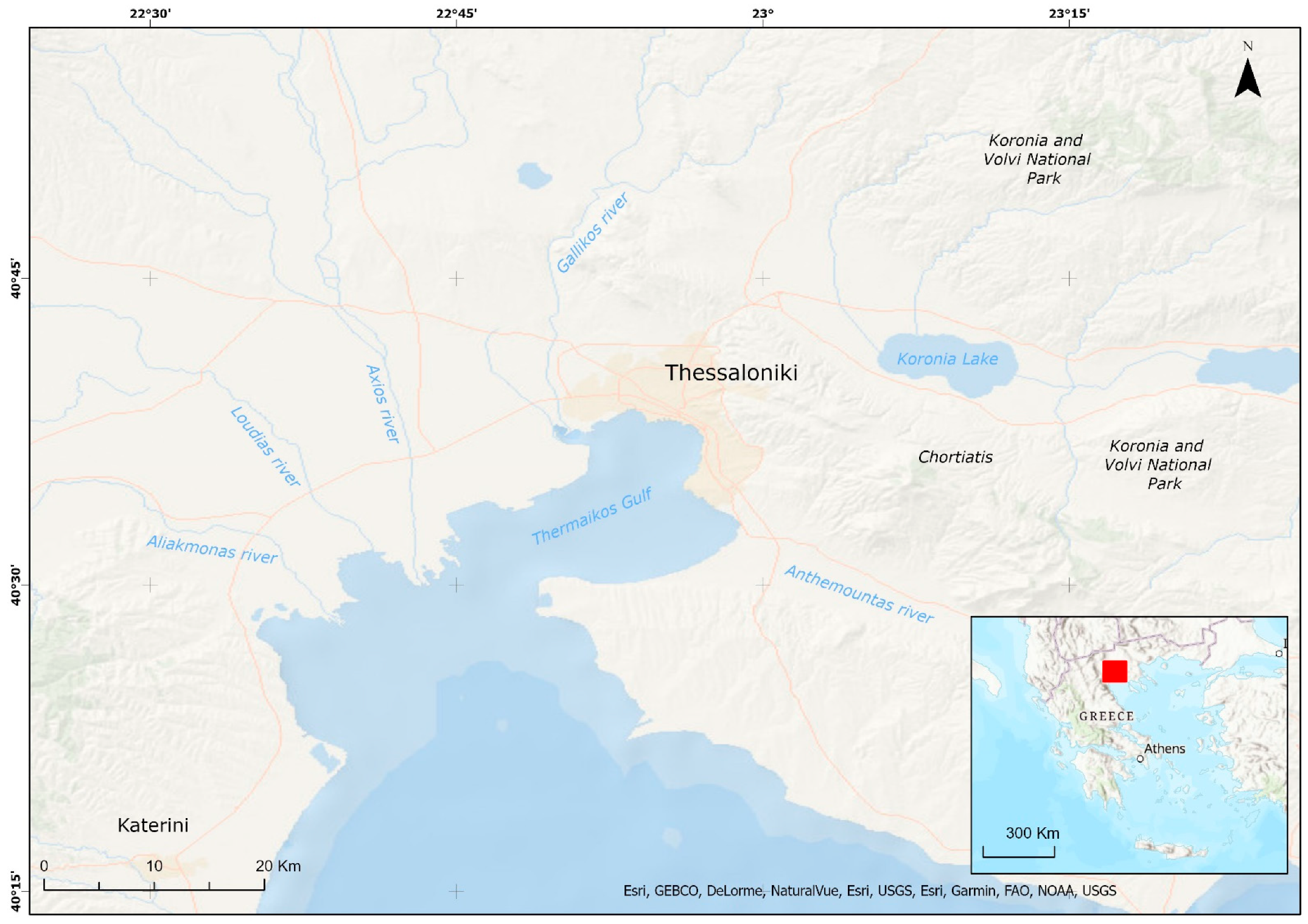
Abstract
:1. Introduction
2. Study Area
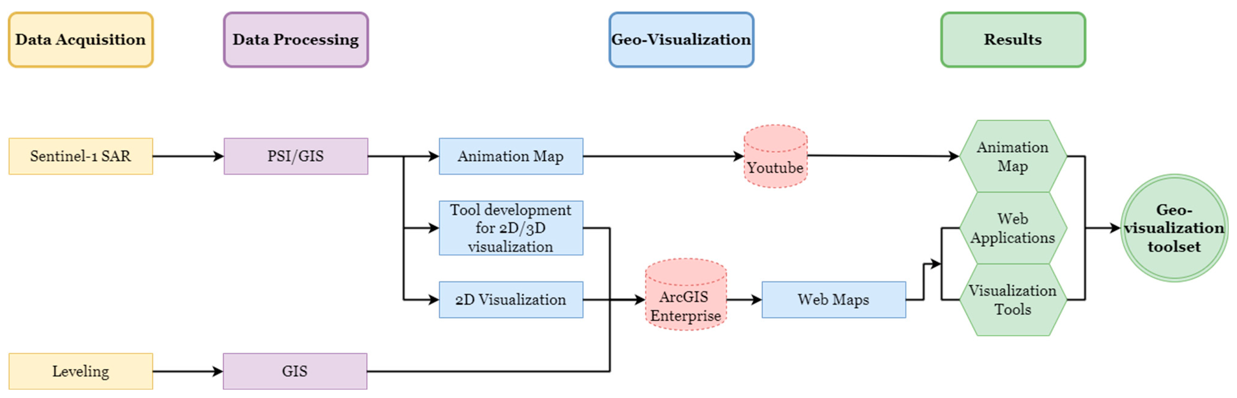
3. Materials and Methods
- Data Acquisition, describing the SAR and the leveling data used;
- Data Processing, detailing the techniques implemented for processing the SAR imagery as well as their post-processing as part of their preparation for further cartographic analysis;
- Geo-Visualization, referring to an animated map, cartographic tools, and 2D layers properly visualized that contribute to the web map creation.
3.1. Data Acquisition
3.2. Data Processing
3.3. Geo-Visualization
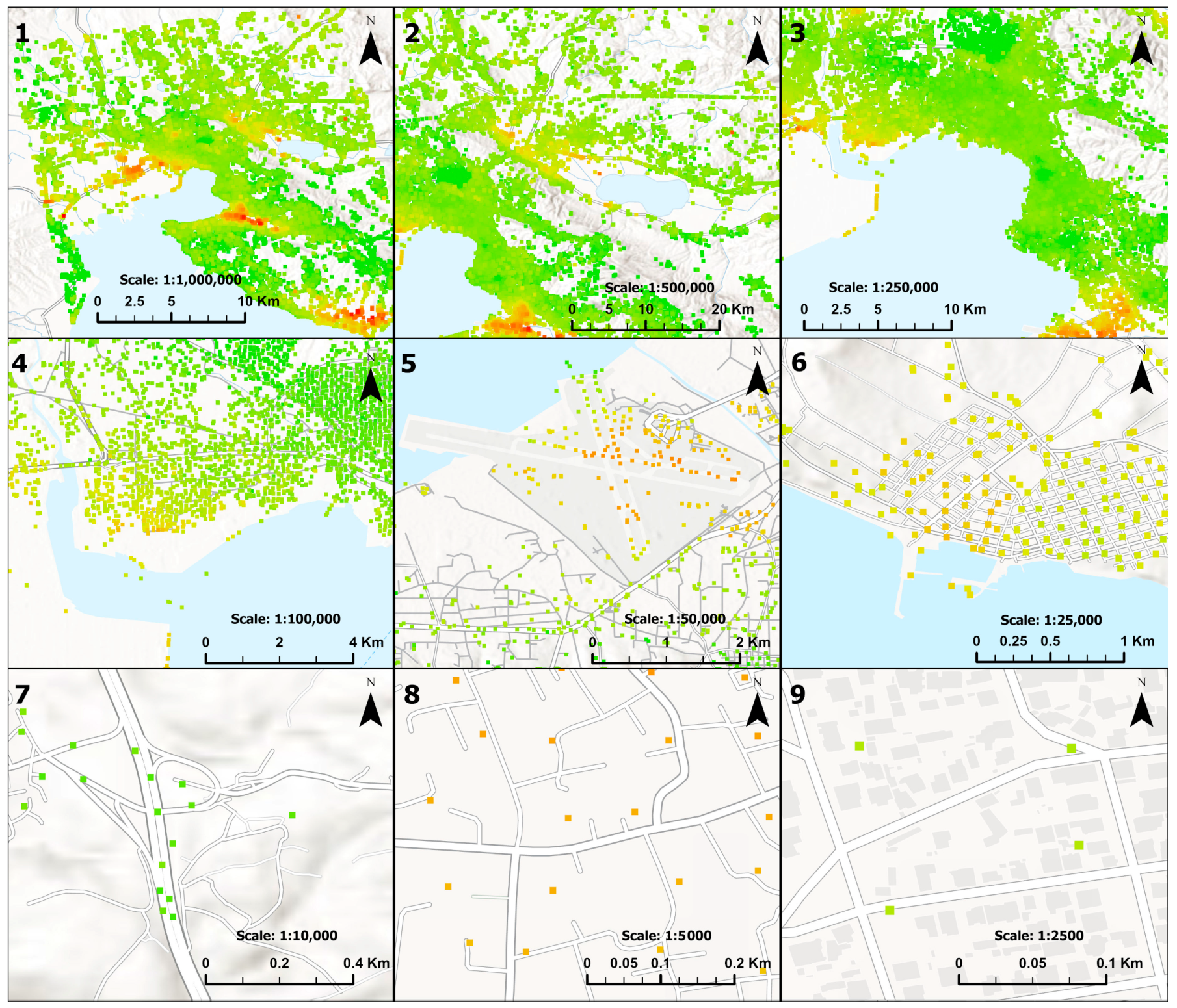
- 1:1,000,000, covering the whole study area, correlated with the extent of a SAR satellite image;
- 1:500,000, able to present PSI data over extensive geomorphological units, such as lakes, mountains, rivers, etc.;
- 1:250,000, suitable for the presentation of PSI data covering municipalities and big cities;
- 1:100,000, providing a sufficient depiction of PSI data over cities and villages.
- 1:50,000, able to provide information on PSI data over big human structures such as airports, bridges, etc.;
- 1:25,000, providing presentation of PSI data even over smaller areas, such as rural areas and settlements;
- 1:10,000, suitable for presenting PSI data over different sizes of public road networks;
- 1:5000, able to present PSI data on building blocks;
- 1:2500, for neighborhood or building-based scale presentation of PSI data.
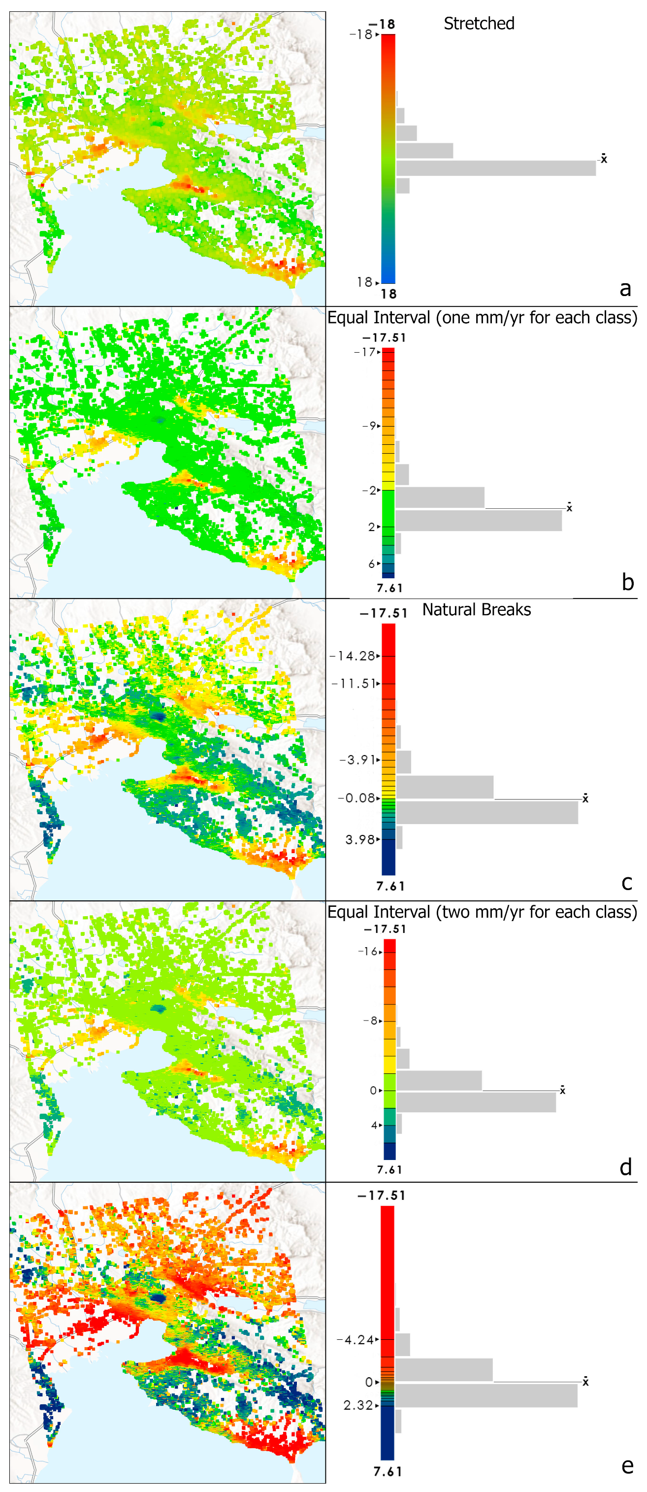
3.3.1. 2D Visualization to Web Maps
- The velocity web map, presented in millimeters per year, visualizes the mean velocity rates of the study area for the period between 2015–2020;
- Time series web map, visualizing the displacement values in millimeters of the study area. Each point of the data set includes information on the displacement value of every intermediate date between 2015–2020;
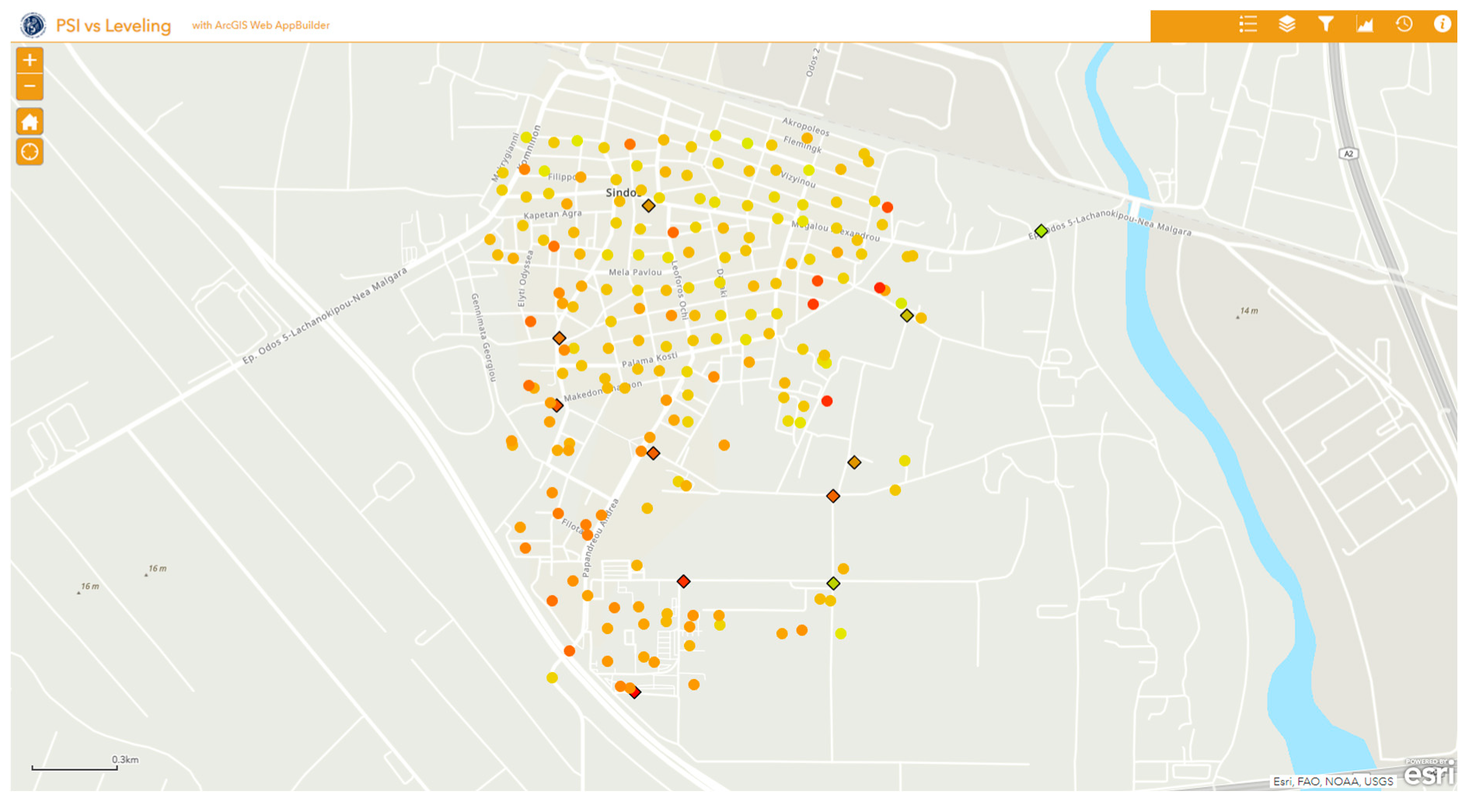
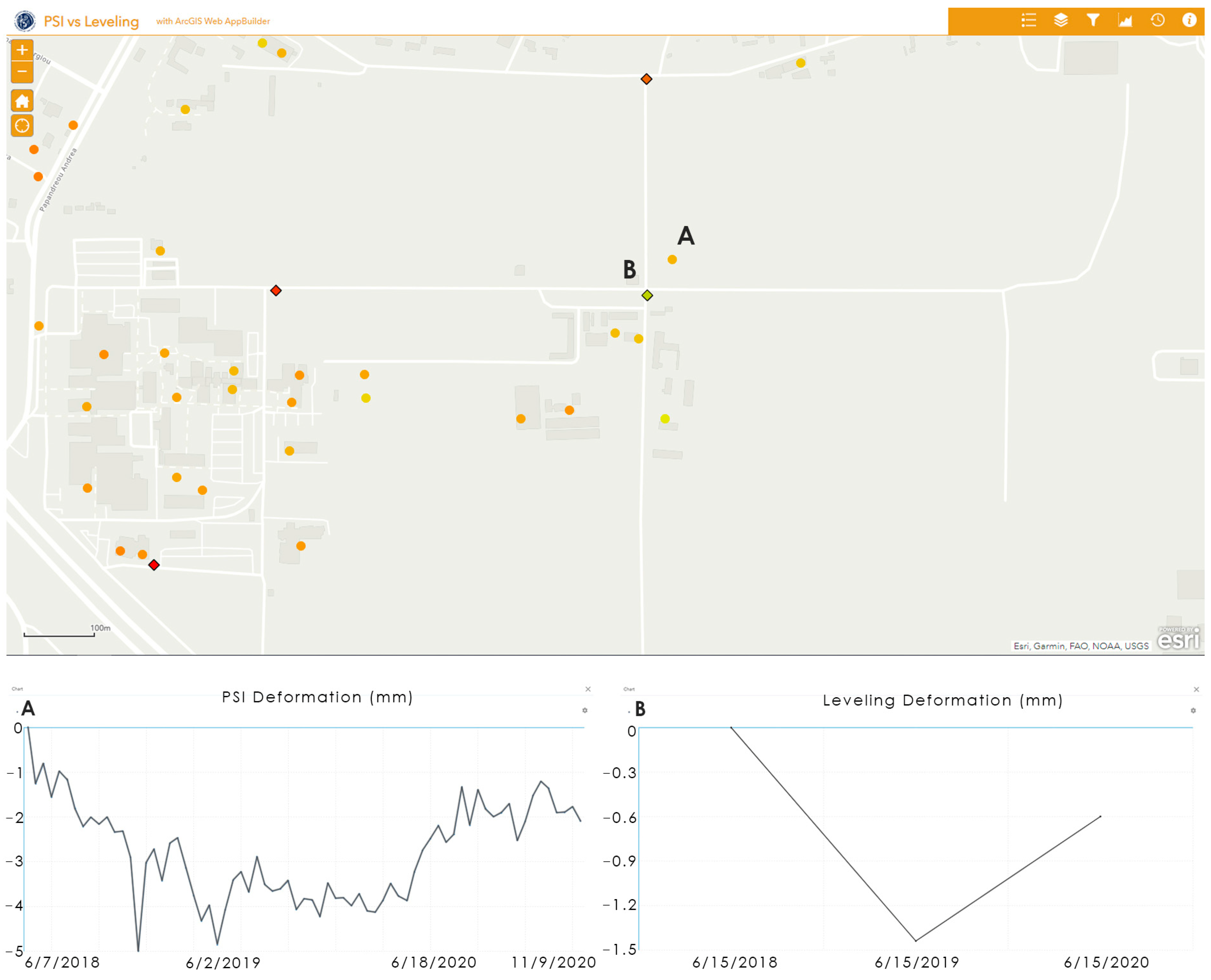
- Leveling data web map presents time series values of PSI data combined with leveling-derived displacement values. Both datasets present displacement in millimeters for the period of June 2018–June 2020.
3.3.2. Animated Map
3.3.3. Tool Development for 2D/3D Visualization
3.3.4. Web Map Applications
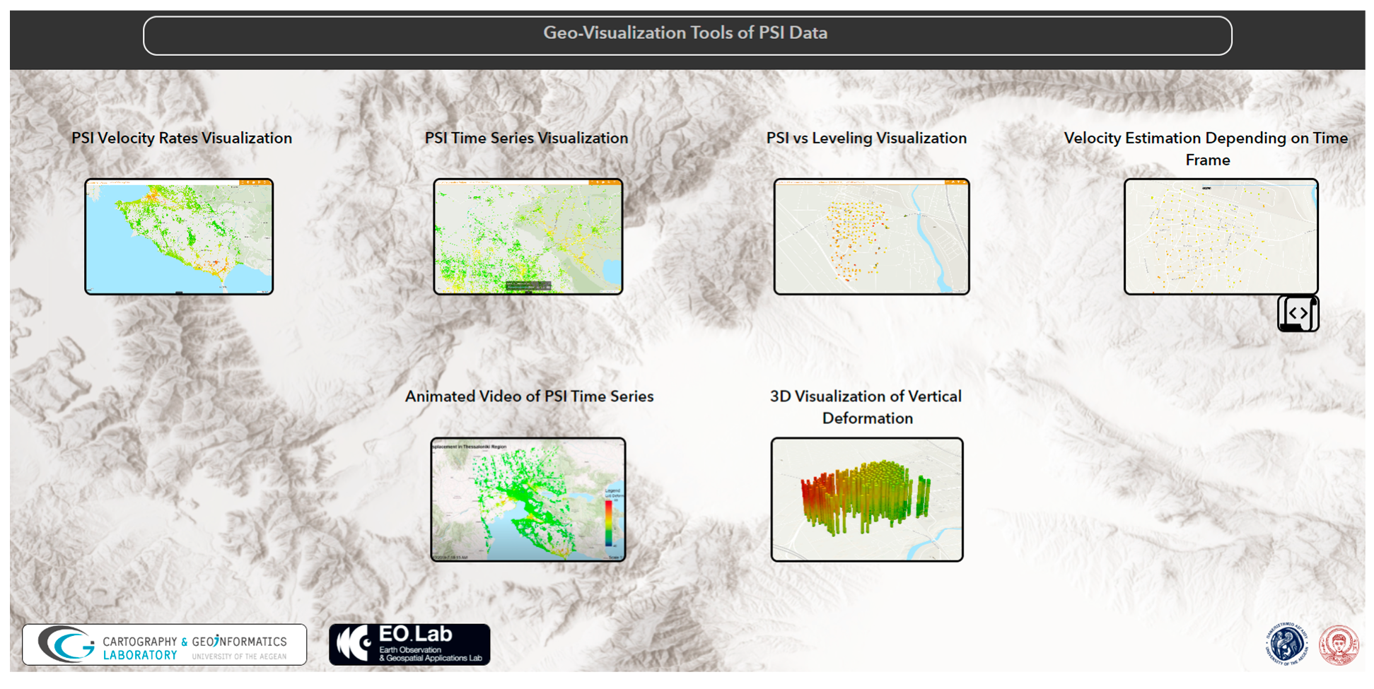
3.3.5. Geo-Visualization Toolset
4. Results and Discussion
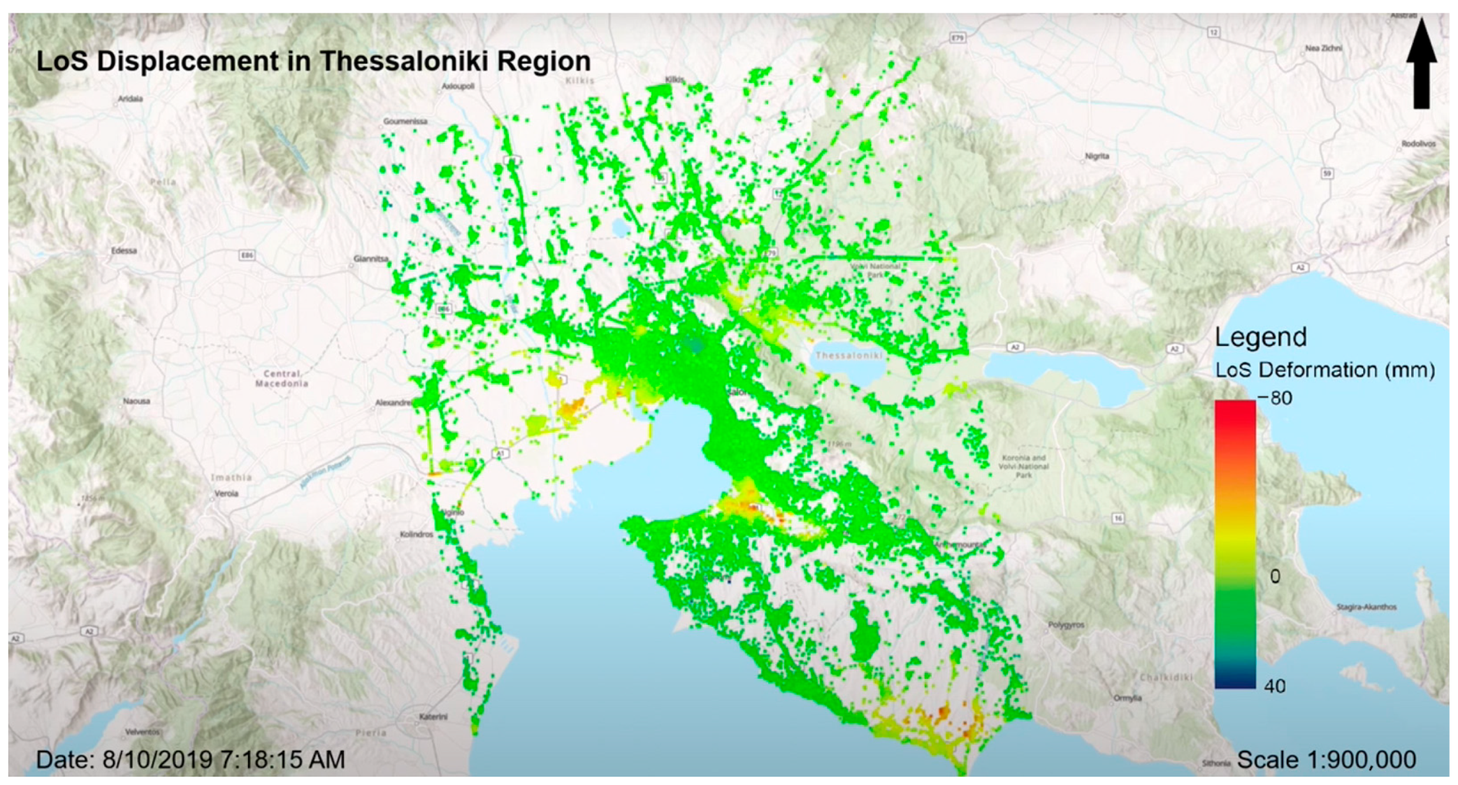
4.1. Animated Map
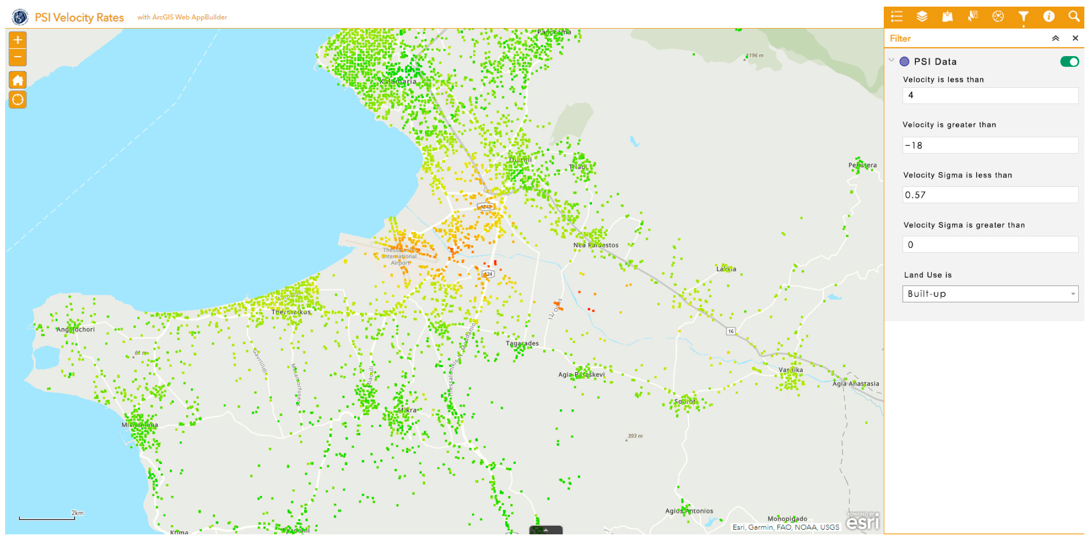
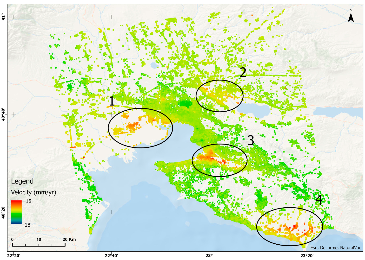
4.2. PSI Velocity Rates Web Map Application
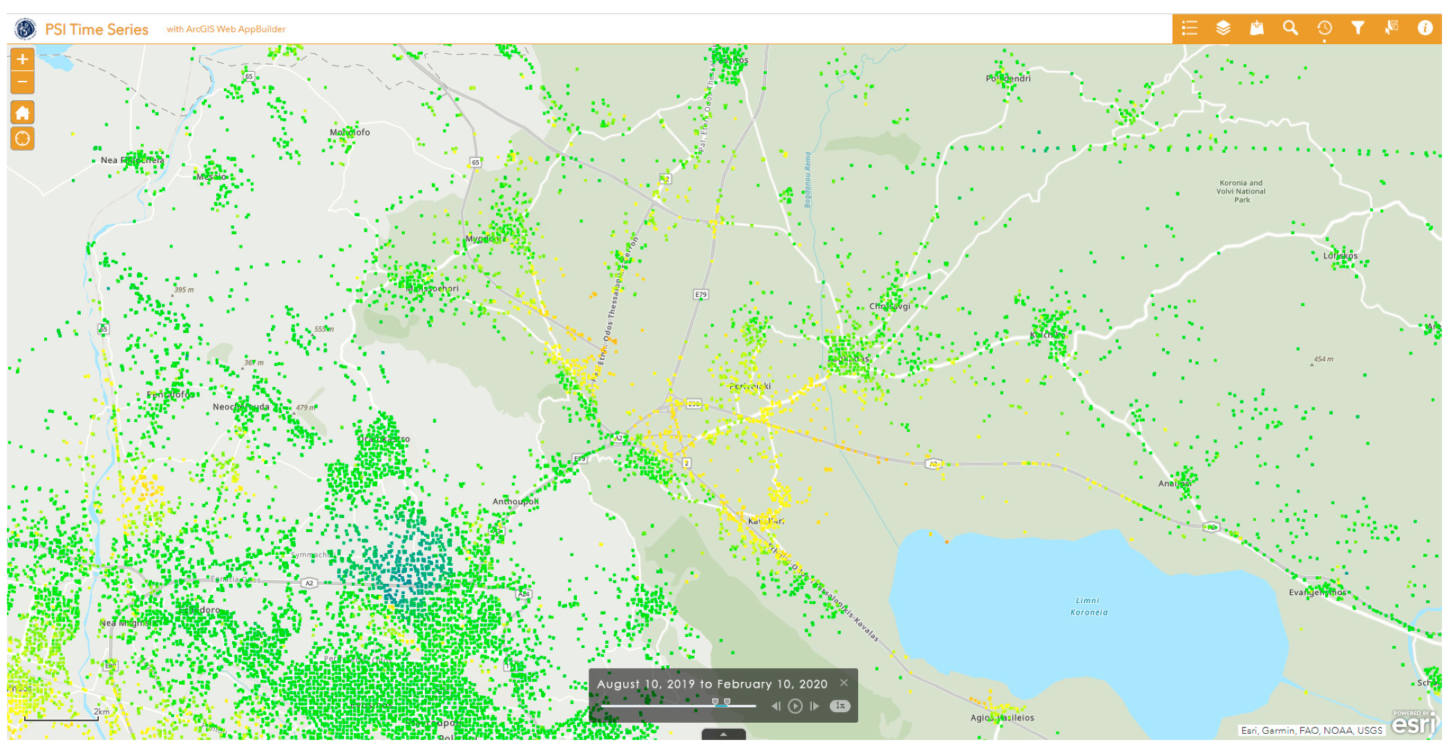
4.3. PSI Time Series Web Map Application
4.4. PSI Versus Leveling Web Map Application
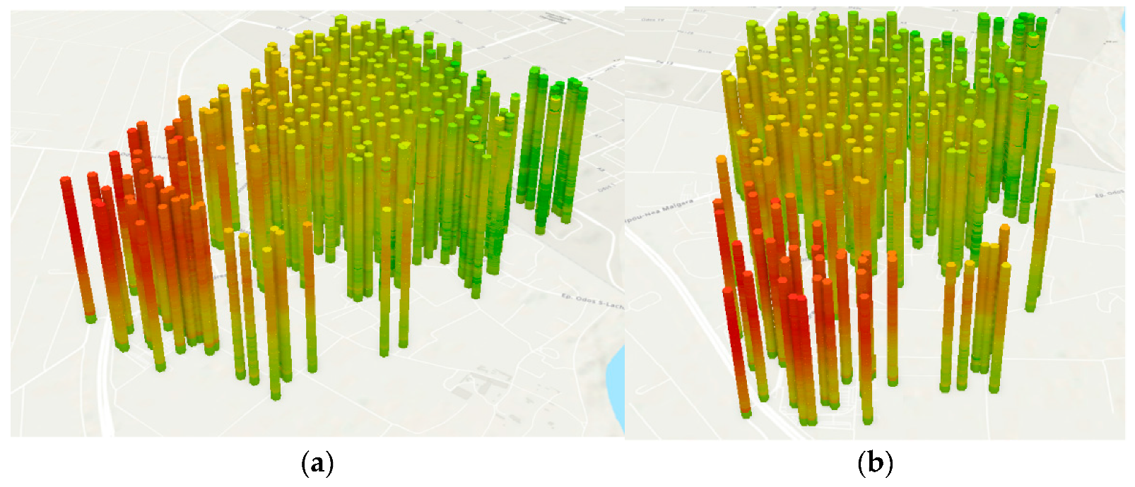
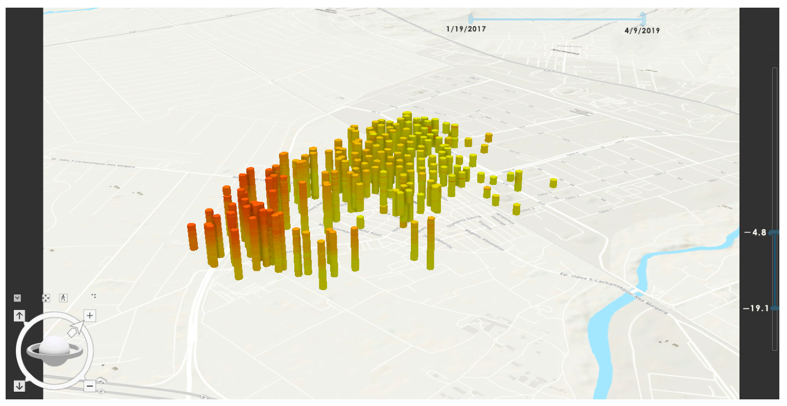
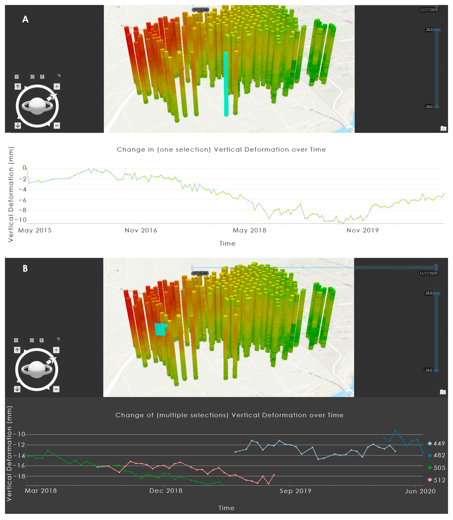
4.5. 3D Visualization of Vertical Displacement Tool
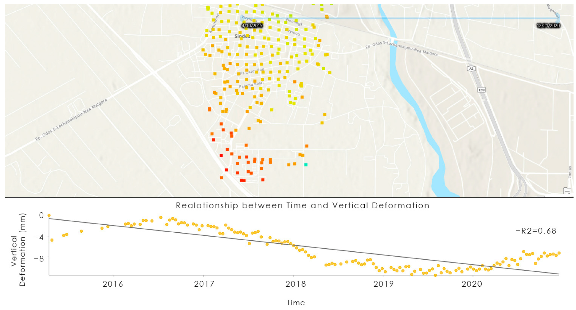
4.6. Velocity Estimation Depending on Time Frame Tool
4.7. Geo-Visualization Toolset
5. Conclusions
- PSI velocity rates web map application contributes to efficient visualization of mean velocity rates of a study area. This web map application enables each user to interactively explore PSI velocity rates in detail, offering a variety of tools, including filtering, analyzing, and exporting subsets of the dataset.
- PSI time series web map application contributes to the visualization of the temporal evolution of deformation values. This web map application enables expert users to have a quick exploration of temporal PSI deformation values, as well as offering tools for filtering by date and exporting subsets of the dataset. For non-expert users, a temporal overview of PSI time series values is provided by the animated map.
- PSI versus leveling web map application contributes to the interactive comparison between PSI and leveling datasets. This web map application enables expert users to easily import leveling data (when available) in order to evaluate PSI measurements. Users also have the option of temporal exploration and comparison of both data sources by graph generation presenting trends of displacement.
- 3D visualization of the vertical displacement tool contributes to efficient visualization of the evolution of PSI time series values of displacements in one map. This visualization tool enables expert users to immediately explore PSI time series values by applying date and displacement value filters as well as to generate graphs of time series displacements. Utilizing the 3D visualization tool enables users to verify whether the evolution of PSI time series values is smooth and stable or even to detect and visualize any abrupt phenomena that occur.
- Velocity estimation of vertical displacement tool contributes to velocity estimation rate over different subareas and temporal subsets. By using this tool, expert users have the opportunity to isolate and explore abrupt phenomena by re-measuring velocity rates for those subareas as well as generating graphs of PSI time series evolution of data displacement.
- The combination of all those tools is about fulfilling each visualization need. Each of the cartographic applications, map tools, or animated map of the toolset could be tailored with mostly any generic PSI export data to provide a complete operational tool for interactive data visualization for each case study. Further research is mainly oriented on the investigation of scale issues (geographic, cartographic, spatial, and temporal) on efficient visualization of PSI fine resolution data, which will lead to the development of useful cartographic tools.
Author Contributions
Funding
Institutional Review Board Statement
Informed Consent Statement
Data Availability Statement
Conflicts of Interest
References
- Konecny, M. Review: Cartography: Challenges and potential in the virtual geographic environments era. Ann. GIS 2011, 17, 135–146. [Google Scholar] [CrossRef]
- Taylor, D.R.F. Cartographic Visualization and Spatial Data Handling. In Advances in GIS Research: Proceedings of the 6th International Symposium on Spatial Data Handling; Waugh, T.C., Healey, R.G., Eds.; Taylor & Francis: London, UK, 1994; pp. 16–28. [Google Scholar]
- Cartwright, W.; Peterson, M.P. Multimedia Cartography; Springer: Berlin/Heidelberg, Germany, 1999; pp. 1–10. [Google Scholar]
- Neumann, A. Web mapping and web cartography. In Springer Handbook of Geographic Information; Springer: Berlin/Heidelberg, Germany, 2011; pp. 273–287. [Google Scholar]
- Zerdoumi, S.; Hashem, I.A.T.; Jhanjhi, N.Z. A New Spatial Spherical Pattern Model into Interactive Cartography Pattern: Multi-Dimensional Data via Geostrategic Cluster. Multimed. Tools Appl. 2022, 81, 22903–22952. [Google Scholar] [CrossRef] [PubMed]
- Norman, D. Things That Make Us Smart: Defending Human Attributes in the Age of the Machine; Diversion Books: New York, NY, USA, 2014. [Google Scholar]
- Buja, A.; Cook, D.; Swayne, D.F. Interactive High-Dimensional Data Visualization. J. Comput. Graph. Stat. 1996, 5, 78–99. [Google Scholar]
- Yi, J.S.; ah Kang, Y.; Stasko, J.; Jacko, J.A. Toward a Deeper Understanding of the Role of Interaction in Information Visualization. IEEE Trans. Vis. Comput. Graph. 2007, 13, 1224–1231. [Google Scholar] [CrossRef] [PubMed]
- Roth, R.E. Interacting with Maps: The Science and Practice of Cartographic Interaction. Ph.D. Thesis, University of Wisconsin–Madison, Madison, WI, USA, 2011; 215p. [Google Scholar]
- Roth, R.E. An Empirically-Derived Taxonomy of Interaction Primitives for Interactive Cartography and Geovisualization. IEEE Trans. Vis. Comput. Graph. 2013, 19, 2356–2365. [Google Scholar] [CrossRef]
- Bamler, R.; Hartl, P. Synthetic Aperture Radar Interferometry. Inverse Probl. 1998, 14, R1. [Google Scholar] [CrossRef]
- Li, F.; Liu, G.; Gong, H.; Chen, B.; Zhou, C. Assessing Land Subsidence-Inducing Factors in the Shandong Province, China, by Using PS-InSAR Measurements. Remote Sens. 2022, 14, 2875. [Google Scholar] [CrossRef]
- Crosetto, M.; Monserrat, O.; Cuevas-González, M.; Devanthéry, N.; Luzi, G.; Crippa, B. Measuring Thermal Expansion Using X-Band Persistent Scatterer Interferometry. ISPRS J. Photogramm. Remote Sens. 2015, 100, 84–91. [Google Scholar] [CrossRef]
- Osmanoǧlu, B.; Dixon, T.H.; Wdowinski, S.; Cabral-Cano, E.; Jiang, Y. Mexico City Subsidence Observed with Persistent Scatterer InSAR. Int. J. Appl. Earth Obs. Geoinf. 2011, 13, 1–12. [Google Scholar] [CrossRef]
- Perissin, D.; Wang, T. Time-Series InSAR Applications Over Urban Areas in China. IEEE J. Sel. Top. Appl. Earth Obs. Remote Sens. 2011, 4, 92–100. [Google Scholar] [CrossRef]
- Sousa, J.J.; Hooper, A.J.; Hanssen, R.F.; Bastos, L.C.; Ruiz, A.M. Persistent Scatterer InSAR: A Comparison of Methodologies Based on a Model of Temporal Deformation vs. Spatial Correlation Selection Criteria. Remote Sens. Environ. 2011, 115, 2652–2663. [Google Scholar] [CrossRef]
- Sun, H.; Zhang, Q.; Zhao, C.; Yang, C.; Sun, Q.; Chen, W. Monitoring Land Subsidence in the Southern Part of the Lower Liaohe Plain, China with a Multi-Track PS-InSAR Technique. Remote Sens. Environ. 2017, 188, 73–84. [Google Scholar] [CrossRef]
- Blasco, J.M.D.; Foumelis, M.; Stewart, C.; Hooper, A. Measuring Urban Subsidence in the Rome Metropolitan Area (Italy) with Sentinel-1 SNAP-StaMPS Persistent Scatterer Interferometry. Remote Sens. 2019, 11, 129. [Google Scholar] [CrossRef]
- Foumelis, M.; Delgado Blasco, J.M.; Brito, F.; Pacini, F.; Pishehvar, P. Snapping for Sentinel-1 Mission on Geohazards Exploitation Platform: An Online Medium Resolution Surface Motion Mapping Service. In Proceedings of the International Geoscience and Remote Sensing Symposium (IGARSS), Brussels, Belgium, 11–16 July 2021. [Google Scholar]
- Gehlot, S.; Hanssen, R.F. Monitoring and interpretation of urban land subsidence using radar interferometric time Series and multi-source GIS database. In Remote Sensing and GIS Technologies for Monitoring and Prediction of Disasters; Springer: Berlin/Heidelberg, Germany, 2008; pp. 137–148. [Google Scholar]
- Van der Horst, T.; Rutten, M.M.; van de Giesen, N.C.; Hanssen, R.F. Monitoring Land Subsidence in Yangon, Myanmar Using Sentinel-1 Persistent Scatterer Interferometry and Assessment of Driving Mechanisms. Remote Sens. Environ. 2018, 217, 101–110. [Google Scholar] [CrossRef]
- Papoutsis, I.; Kontoes, C.; Alatza, S.; Apostolakis, A.; Loupasakis, C. InSAR Greece with Parallelized Persistent Scatterer Interferometry: A National Ground Motion Service for Big Copernicus Sentinel-1 Data. Remote Sens. 2020, 12, 3207. [Google Scholar] [CrossRef]
- Pumpuang, A.; Aobpaet, A. The Comparison of Land Subsidence between East and West Side of Bangkok, Thailand. Built Environ. J. 2020, 17, 1–9. [Google Scholar] [CrossRef]
- Abubakar, S.; Aravind, A.; Shanmugaveloo, L. Surface Deformation Studies in South of Johor Using the Integration of InSAR and Resistivity. CaJoST 2021, 3121, 167–172. [Google Scholar]
- Zhang, X.; Feng, M.; Zhang, H.; Wang, C.; Tang, Y.; Xu, J.; Yan, D.; Wang, C. Detecting Rock Glacier Displacement in the Central Himalayas Using Multi-Temporal Insar. Remote Sens. 2021, 13, 4738. [Google Scholar] [CrossRef]
- Kotzerke, P.; Siegmund, R.; Langenwalter, J. End-To-End Implementation and Operation of the European Ground Motion Service (EGMS); Technical Report EGMS-D3-ALG-SC1-2.0-006; European Environment Agency: Copenhagen, Denmark, 2022. [Google Scholar]
- Bredal, M.; Dehls, J.; Larsen, Y.; Marinkovic, P.; Lauknes, T.R.; Stødle, D.; Moldestad, D.A. The Norwegian National Ground Motion Service (InSAR.No): Service Evolution. In Proceedings of the AGU Fall Meeting, San Francisco, CA, USA, 9–13 December 2019; p. G13C-0559. [Google Scholar]
- Mountrakis, D. Geology and Geotectonic Evolution of Greece; University Studio Press: Thessaloniki, Greece, 2010. [Google Scholar]
- Tranos, M.D.; Papadimitriou, E.E.; Kilias, A.A. Thessaloniki—Gerakarou Fault Zone (TGFZ): The Western Extension of the 1978 Thessaloniki Earthquake Fault (Northern Greece) and Seismic Hazard Assessment. J. Struct. Geol. 2003, 25, 2109–2123. [Google Scholar] [CrossRef]
- Meinhold, G.; Kostopoulos, D.K. The Circum-Rhodope Belt, Northern Greece: Age, Provenance, and Tectonic Setting. Tectonophysics 2013, 595–596, 55–68. [Google Scholar] [CrossRef]
- Raspini, F.; Loupasakis, C.; Rozos, D.; Moretti, S. Advanced Interpretation of Land Subsidence by Validating Multi-Interferometric SAR Data: The Case Study of the Anthemountas Basin (Northern Greece). Nat. Hazards Earth Syst. Sci. 2013, 13, 2425–2440. [Google Scholar] [CrossRef]
- Svigkas, N.; Papoutsis, I.; Loupasakis, C.; Kontoes, C.; Kiratzi, A. Geo-Hazard Monitoring in Northern Greece Using InSAR Techniques: The Case Study of Thessaloniki. In Proceedings of the 9th International Workshop Fringe, Frascati, Italy, 23–27 March 2015; Volume 731. [Google Scholar] [CrossRef] [Green Version]
- Costantini, F.; Mouratidis, A.; Schiavon, G.; Sarti, F. Advanced InSAR Techniques for Deformation Studies and for Simulating the PS-Assisted Calibration Procedure of Sentinel-1 Data: Case Study from Thessaloniki (Greece), Based on the Envisat/ASAR Archive. Int. J. Remote Sens. 2016, 37, 729–744. [Google Scholar] [CrossRef]
- Elias, P.; Benekos, G.; Perrou, T.; Parcharidis, I. Spatio-Temporal Assessment of Land Deformation as a Factor Contributing to Relative Sea Level Rise in Coastal Urban and Natural Protected Areas Using Multi-Source Earth Observation Data. Remote Sens. 2020, 12, 2296. [Google Scholar] [CrossRef]
- Holdahl, S.R.; Morrison, N.L. Regional Investigations of Vertical Crustal Movements in the US, Using Precise Relevelings and Mareograph Data. Tectonophysics 1974, 23, 373–390. [Google Scholar] [CrossRef]
- Nakano, T.; Matsuda, I. A Note on Land Subsidence in Japan. Geogr. Rep. Tokyo Metrop. Univ. 1976, 11, 147–162. [Google Scholar]
- Dong, H.; Gu, D.; Li, G.; Zhang, L.; Chen, S.Y.; Wang, W.L. Research on Vertical Recent Crustal Movement of the Mainland of China; Xi’an Carto2 Graphic Publishing House: Xi’an, China, 2002. [Google Scholar]
- Cigna, F.; Esquivel Ramírez, R.; Tapete, D. Accuracy of Sentinel-1 PSI and SBAS InSAR Displacement Velocities against GNSS and Geodetic Leveling Monitoring Data. Remote Sens. 2021, 13, 4800. [Google Scholar] [CrossRef]
- Morgan, J.D.; Eddy, B.; Coffey, J.W. Activating Student Engagement with Concept Mapping: A Web GIS Case Study. J. Geogr. High. Educ. 2022, 46, 128–144. [Google Scholar] [CrossRef]
- Degbelo, A. FAIR Geovisualizations: Definitions, Challenges, and the Road Ahead. Int. J. Geogr. Inf. Sci. 2022, 36, 1059–1099. [Google Scholar] [CrossRef]
- Gardner Oldemeyer, T.A.; Russell, G.P. Interactive Web Mapping Tools and Custom Subsurface Cross-Sections for Interdisciplinary Geologic Investigation. Appl. Comput. Geosci. 2022, 13, 100077. [Google Scholar] [CrossRef]
- Gehlot, S.; Perski, Z.A.; Hanssen, R. Web-Based Framework for Ps-Insar Data Interpretation Assisted By Geo-Spatial Information Fusion. In Proceedings of the ISPRS Mid-term Symposium, ‘Remote Sensing: From Pixels to Processes’, Enschede, The Netherlands, 8–11 May 2006; pp. 2–5. [Google Scholar]
- Kraak, M.; Edsall, R.; MacEachren, A.M. Cartographic Animation and Legends for Temporal Maps: Exploration and or Interaction. In Proceedings of the 18th International Cartographic Conference, Stockholm, Sweden, 23–27 June 1997; pp. 1–8. [Google Scholar]
- Aobpaet, A.; Cuenca, M.C.; Hooper, A.; Trisirisatayawong, I. InSAR Time-Series Analysis of Land Subsidence in Bangkok, Thailand. Int. J. Remote Sens. 2013, 34, 2969–2982. [Google Scholar] [CrossRef]
- Karimzadeh, S.; Cakir, Z.; Osmanoĝlu, B.; Schmalzle, G.; Miyajima, M.; Amiraslanzadeh, R.; Djamour, Y. Interseismic Strain Accumulation across the North Tabriz Fault (NW Iran) Deduced from InSAR Time Series. J. Geodyn. 2013, 66, 53–58. [Google Scholar] [CrossRef]
- ESA WorldCover. Available online: https://esa-worldcover.org/en (accessed on 22 February 2022).
- Doukas, I.; Ifadis, I.; Savvaidis, P. Monitoring and Analysis of Ground Subsidence Due to Water Pumping in the Area of Thessaloniki, Hellas; Aristotle University of Thessaloniki: Thessaloniki, Greece, 2004; pp. 1–14. [Google Scholar]
- Psimoulis, P.; Ghilardi, M.; Fouache, E.; Stiros, S. Subsidence and Evolution of the Thessaloniki Plain, Greece, Based on Historical Leveling and GPS Data. Eng. Geol. 2007, 90, 55–70. [Google Scholar] [CrossRef]
- Raucoules, D.; Parcharidis, I.; Feurer, D.; Novalli, F.; Ferretti, A.; Carnec, C.; Lagios, E.; Sakkas, V.; Le Mouelic, S.; Cooksley, G.; et al. Ground Deformation Detection of the Greater Area of Thessaloniki (Northern Greece) Using Radar Interferometry Techniques. Nat. Hazards Earth Syst. Sci. 2008, 8, 779–788. [Google Scholar] [CrossRef]
- Mouratidis, A.; Albanakis, K. Hypsometric Changes Near Kavallari Based on Multi-Temporal Dems and Extensive Gnss Measurements. In Proceedings of the 9th Geographical Conference of Greece, Athens, Greece, 5–7 November 2010; pp. 116–123. [Google Scholar]
- Berti, M.; Corsini, A.; Franceschini, S.; Iannacone, J.P. Automated Classification of Persistent Scatterers Interferometry Time Series. Nat. Hazards Earth Syst. Sci. 2013, 13, 1945–1958. [Google Scholar] [CrossRef]
- Mirmazloumi, S.M.; Wassie, Y.; Navarro, J.A.; Palamà, R.; Krishnakumar, V.; Barra, A.; Cuevas-González, M.; Crosetto, M.; Monserrat, O. Classification of Ground Deformation Using Sentinel-1 Persistent Scatterer Interferometry Time Series. GISci. Remote Sens. 2022, 59, 374–392. [Google Scholar] [CrossRef]
- Kozel, J.; Štampach, R. Practical Experience with a Contextual Map Service. In Geographic Information and Cartography for Risk and Crisis Management. Lecture Notes in Geoinformation and Cartography; Konecny, M., Zlatanova, S., Bandrova, T., Eds.; Springer: Berlin/Heidelberg, Germany, 2010; pp. 305–316. [Google Scholar] [CrossRef]


Disclaimer/Publisher’s Note: The statements, opinions and data contained in all publications are solely those of the individual author(s) and contributor(s) and not of MDPI and/or the editor(s). MDPI and/or the editor(s) disclaim responsibility for any injury to people or property resulting from any ideas, methods, instructions or products referred to in the content. |
© 2023 by the authors. Licensee MDPI, Basel, Switzerland. This article is an open access article distributed under the terms and conditions of the Creative Commons Attribution (CC BY) license (https://creativecommons.org/licenses/by/4.0/).
Share and Cite
Kalaitzis, P.; Foumelis, M.; Vasilakos, C.; Mouratidis, A.; Soulakellis, N. Interactive Web Mapping Applications for 2D and 3D Geo-Visualization of Persistent Scatterer Interferometry SAR Data. ISPRS Int. J. Geo-Inf. 2023, 12, 54. https://doi.org/10.3390/ijgi12020054
Kalaitzis P, Foumelis M, Vasilakos C, Mouratidis A, Soulakellis N. Interactive Web Mapping Applications for 2D and 3D Geo-Visualization of Persistent Scatterer Interferometry SAR Data. ISPRS International Journal of Geo-Information. 2023; 12(2):54. https://doi.org/10.3390/ijgi12020054
Chicago/Turabian StyleKalaitzis, Panagiotis, Michael Foumelis, Christos Vasilakos, Antonios Mouratidis, and Nikolaos Soulakellis. 2023. "Interactive Web Mapping Applications for 2D and 3D Geo-Visualization of Persistent Scatterer Interferometry SAR Data" ISPRS International Journal of Geo-Information 12, no. 2: 54. https://doi.org/10.3390/ijgi12020054