Article

Spatial Prediction of COVID-19 Pandemic Dynamics in the United States

1
Cancer Early Detection Advanced Research Center, Knight Cancer Institute, Oregon Health & Science University, 2720 S Moody Ave., Portland, OR 97201, USA
2
Department of Industrial Engineering, College of Engineering, Koç University, Rumelifeneri Yolu, Sarıyer, İstanbul 34450, Turkey
3
School of Medicine, Koç University, Rumelifeneri Yolu, Sarıyer, İstanbul 34450, Turkey
4
Program in Biostatistics, Division of Public Health Sciences, Fred Hutchinson Cancer Research Center, 1100 Fairview Ave. N, Seattle, WA 98109, USA
5
Brenden Colson Center for Pancreatic Care, Oregon Health & Science University, 2730 S Moody Ave., Portland, OR 97201, USA
6
Department of Radiation Medicine, Knight Cancer Institute, Oregon Health & Science University, 3181 SW Sam Jackson Park Road, Portland, OR 97239, USA
*
Author to whom correspondence should be addressed.
ISPRS Int. J. Geo-Inf. 2022, 11(9), 470; https://doi.org/10.3390/ijgi11090470
Submission received: 28 July 2022 / Revised: 24 August 2022 / Accepted: 29 August 2022 / Published: 30 August 2022
(This article belongs to the Collection Spatial Components of COVID-19 Pandemic)

Abstract

:
The impact of COVID-19 across the United States (US) has been heterogeneous, with rapid spread and greater mortality in some areas compared with others. We used geographically-linked data to test the hypothesis that the risk for COVID-19 was defined by location and sought to define which demographic features were most closely associated with elevated COVID-19 spread and mortality. We leveraged geographically-restricted social, economic, political, and demographic information from US counties to develop a computational framework using structured Gaussian process to predict county-level case and death counts during the pandemic’s initial and nationwide phases. After identifying the most predictive information sources by location, we applied an unsupervised clustering algorithm and topic modeling to identify groups of features most closely associated with COVID-19 spread. Our model successfully predicted COVID-19 case counts of unseen locations after examining case counts and demographic information of neighboring locations, with overall Pearson’s correlation coefficient and the proportion of variance explained as 0.96 and 0.84 during the initial phase and 0.95 and 0.87 during the nationwide phase, respectively. Aside from population metrics, presidential vote margin was the most consistently selected spatial feature in our COVID-19 prediction models. Urbanicity and 2020 presidential vote margins were more predictive than other demographic features. Models trained using death counts showed similar performance metrics. Topic modeling showed that counties with similar socioeconomic and demographic features tended to group together, and some of these feature sets were associated with COVID-19 dynamics. Clustering of counties based on these feature groups found by topic modeling revealed groups of counties that experienced markedly different COVID-19 spread. We conclude that topic modeling can be used to group similar features and identify counties with similar features in epidemiologic research.

1. Introduction

The COVID-19 pandemic is an unprecedented global health crisis that, as of May 2022, infected more than 515 million people and has taken more than 6.2 million lives worldwide [1]. In the United States, the spread of COVID-19 rapidly outstripped public health systems, leading to an extremely deadly and widespread pandemic. Even after the initial case surge, the nation struggled to control disease spread as it faced ongoing limitations in the availability of personal protective equipment, testing, intensive care unit beds, ventilators, and eventually vaccines. COVID-19′s long incubation period and propensity for asymptomatic spread mean that reactive measures are likely to be too late to quell widespread infection. Therefore, in future pandemics, targeting interventions to geographic areas at the greatest risk of disease spread could provide a means of suppressing the hot-spot formation and flattening the pandemic curve.
A range of intersecting biological, demographic, and socioeconomic factors determine susceptibility to COVID-19 [2,3,4]. These factors vary significantly across geographic areas and often reflect society’s structural inequities. Spatial analysis employing Geographical Information Systems (GIS), in which data are layered upon spatial coordinate information, allows researchers to examine associations between biological, demographic, and socioeconomic factors and COVID-19 pandemic dynamics within and between geographically-defined regions. Research at the county level is well suited to understanding spatial features associated with the pandemic, as COVID-19 spread depends upon proximity, and public health interventions and resources are generally organized at the county level. Studies utilizing GIS reported that, among counties in the United States, measures of income inequality, poverty, urbanicity, poor healthcare access, and increased proportion of non-white individuals are associated with COVID-19 incidence and death [5,6,7,8]. Similarly, in England, relative humidity and hospital accessibility were negatively related to the COVID-19 mortality rate, whereas the percentage of Asian people, of Black people, and the unemployment rate were positively related to the COVID-19 mortality rate [9]. A recent study reposted that race/ethnic disparities in COVID-19 risk are higher even among insured adults [10].
In this study, we build upon these known demographic, medical, and social associations with the goal of developing more accurate predictions that capture the heterogeneity in associations between spatial structure and features and compare them across different temporal phases of the pandemic. We curated a large dataset of GIS-tagged demographic, socioeconomic, and political data and utilized the machine learning approach, structured Gaussian processes ( S G P ) to develop dynamic prediction models of localized COVID-19 cases and death counts. We applied this approach to both the initial spread of COVID-19 across the US in spring 2020 and the dramatic expansion of infections during autumn 2020 when the virus was ubiquitous. This allowed us to directly compare factors driving disease dynamics during different phases of the pandemic. Because many of the most prognostic factors, such as household income and access to insurance, are geographically restricted, we hypothesized that they served as surrogates for other unmeasured county characteristics. We, therefore, explored whether counties could be grouped by similar spatial features using topic modeling (TM) with latent Dirichlet allocation (LDA) to predict those counties with the greatest COVID-19 case burden. Although TM was previously used for COVID-19 modeling, it was in the context of natural language processing, such as finding weekly COVID-19 concerns through LDA Topic Modeling [11], psychological assessments, and Twitter to understand the changes in COVID-19 spread [12]. To our knowledge, there are no studies investigating geographical and demographic characterizations of US counties in relation to COVID-19 using TM.

2. Materials and Methods

We retrieved county-level daily case counts from 22 January 2020 to 21 March 2021, provided by the Center for Systems Science and Engineering at Johns Hopkins University. We extracted county-specific features from the United States Census Bureau and the National Center for Health Statistics population estimates. County-specific features used in this study are shown in Table S1, along with the source information. Boundary shapefile of counties downloaded from TIGER/Line database (https://www.census.gov (accessed on 30 April 2020)). We normalized the daily confirmed COVID-19 case and death counts per 100,000 residents and then calculated the 7-day moving average.

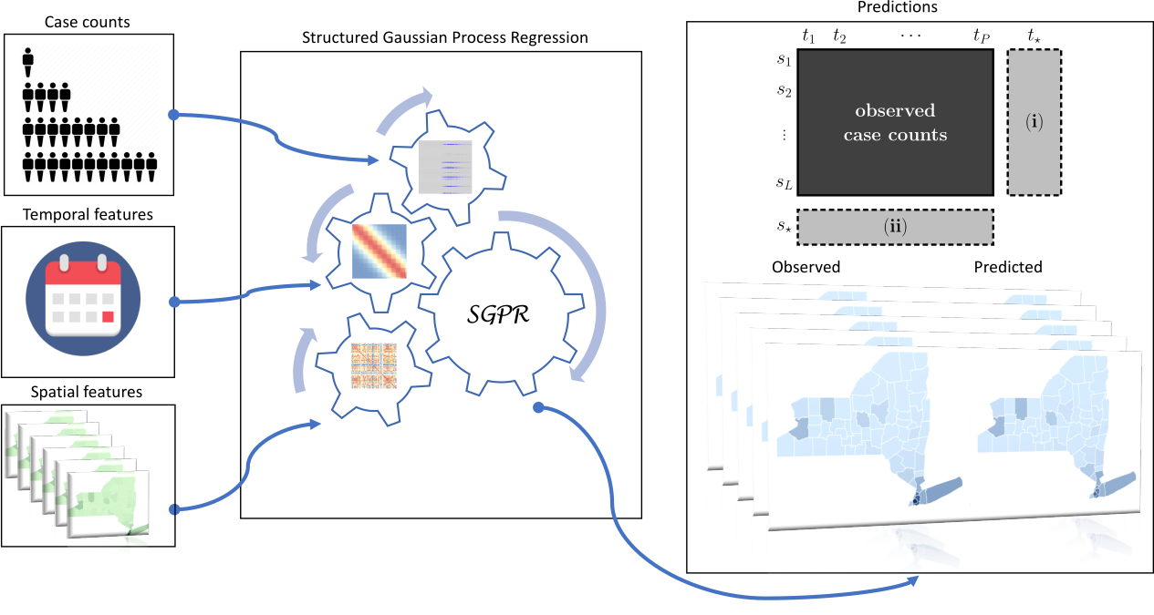
2.1. Supervised Prediction Algorithm: Gaussian Process Regression

Gaussian process regression ( G P R ) is suitable to capture highly complex dependencies between input and output variables thanks to its nonlinear nature brought by kernel functions. We used a computational strategy based on G P R that enabled us to perform predictions under spatial (i.e., predicting case counts for unseen locations) and temporal (i.e., predicting case counts for future time periods) for infectious diseases and proven to outperform existing methods frequently used and considered as the standard machine learning algorithms to capture temporal, spatial, and spatiotemporal dependencies in ecological and epidemiological applications [13,14,15]. We used the Structured Gaussian Process ( S G P ) regression algorithm to predict case counts for each county of a given state. S G P allows performing spatiotemporal predictions thanks to the Kronecker multiplication of kernels calculated on spatial and temporal features. For a given training data set { ( x i ,   y i ) } with i = 1 , ,   N ,   G P R uses a probabilistic formulation to model the relationship between the input covariates and the output as follows [11]:
y = f + ξ , f   |   X   ~   N o r m a l ( f ; 0 , K ) , ξ   |   σ y 2   ~ N o r m a l ( ξ ; 0 , σ y 2 I ) ,
where y = [ y 1   y 2 y N ] T is the vector of observed output values, f = [ f 1   f 2 f N ] T is the vector of underlying true values for the corresponding input data instances X = [ x 1   x 2 x N ] T , ξ = [ ξ 1   ξ 2 ξ N ] T is the vector of measurement noise values that are assumed to follow an isotropic multivariate normal distribution with the variance parameter σ y 2 , 0, and I are the vector of zeros and the identity of proper sizes, respectively, and k ( . , . ) is a kernel function that calculates a similarity measure between two data instances.
In spatiotemporal modeling, we can represent each data instance x i   as a pair of location and time period vectors ( s l ,   t p ) , where l indexes locations, p indexes time periods, L is the number of locations, and P is the number of time periods. We can also form a response matrix of size L × P   to store y i values of these pairs.
In this case, the kernel function between data instances can be written as the multiplication of two separate kernel functions:
k ( x i , x j ) = k ( ( s l ,   t p ) , ( s m , t q ) ) = k s ( s l ,   s m ) k t ( t p , t q ) ,
where k s ( . , . ) gives the similarity between geographical locations using spatial features, and k t ( . , . ) calculates the similarity between time periods using temporal features.
The kernel matrix calculated on the training instances can be written as the Kronecker product of two smaller kernel matrices calculated on the geographical locations and the time periods, respectively.
K = K s     K t
where K , K s , and K t are of sizes L P × L P , L × L , and P × P , respectively.
We integrated spatial features (such as geographical coordinates and location-specific demographic information) and temporal features (such as the day, month, and year information of the reported case counts) for location and time period pairs that were used as data instances in our Gaussian process formulation. After calculating a Gaussian kernel for each spatial and temporal feature, spatial, and temporal kernels are combined separately, then combined spatial and temporal kernels are unified with Kronecker multiplication to a larger spatiotemporal kernel, which allows us to make predictions for each given location and time point (Figure A1). We calculated a Gaussian kernel for each spatial feature and added it to our feature set, but only if it improved the prediction quality on the validation set in terms of normalized root mean square error ( N R M S E ), i.e., forward feature selection. We used the kernel calculated on the latitude and longitude of each county by default in the feature selection process. We set the standard deviation of measurement noise values σ y as the mean of pairwise Euclidean distances between training instances. After performing cross-validation on the training set, we picked the kernel width parameter as the mean variance of log-scaled observed case counts of training instances multiplied by the scaler hyperparameter. The parameter set used for cross-validation was 1/8, 1/4, 1/2, 1, 2, 4, and 8. Our implementation of SGP is publicly available at https://github.com/cigdemak/sgp_covid-19 (accessed on 26 July 2022) and https://doi.org/10.5281/zenodo.7013731 (accessed on 26 July 2022).
For the regression algorithm, we designed two different prediction scenarios: spatial prediction and temporal prediction. We performed spatial prediction for (i) initial disease dynamics: the 30 days following the first case in each county and (ii) nationwide disease dynamics: the time period between 11 September 2020, when the nationwide rise in cases began, and 21 March 2021, when the epidemic curve was completed (see Figure A2).
By Tobler’s first law of geography, near things are similar to each other more than distant things. This phenomenon, known as spatial autocorrelation, has unwanted consequences, such as overfitting with non-causal predictors [16,17]. In order to overcome this, there have been studies suggesting designing the cross-validation for spatial models, such as block cross-validation when the folds are not randomly chosen but using a spatial strategy to construct the folds [18,19]. However, COVID-19 cases/deaths may be very high in one county while the adjacent counties may have too low COVID-19 cases/deaths, thus here, we followed a similar approach to have a balanced representation of different case/death number distributions when selecting counties in our train and test sets to address some of the aforementioned issues.
For spatial prediction, we divided counties into three groups by first ordering their total case counts and then taking the counties numbered with the multiples of one and three as training set and the counties numbered with the multiples of two as the test set. We used the counties numbered with the multiples of one and three as two sets for cross-validation to optimize the kernel width parameter. We first trained the spatial algorithms using case counts of two-thirds of the counties over the given number of days as the observed response matrix, leading to a training set of   2 / 3 × L × P training instances with the optimized hyperparameter. We then tested the trained models by predicting observed case counts of one-third of the counties for the same time periods, leading to a test set of 1 / 3 × L × P . For the initial phase of the pandemic predictions, the number of time points, P , is 30 days. For the nationwide phase of the pandemic predictions, the number of time points, P , is 426 days (from 12 April 2020 to 28 March 2021). For both of the spatial prediction models, the overall total number of locations, L , is 3071 counties.
In temporal prediction, we are interested in finding case counts in observed locations for a future unseen time period. We predicted daily COVID-19 case counts/death counts for each location at the beginning of each week for a week starting from 6 April 2020, the peak of the first rise, until 21 March 2021. We used the last week of the training dataset as the validation dataset to select the spatial features with the forward selection method and also to optimize the model’s response noise parameter. Accuracy was assessed using Pearson’s correlation coefficient ( P C C ) , which showed how well the dynamics of the event counts was captured by the algorithms, and the proportion of variance explained ( R 2 ) , which showed the proportion of total variation in outcomes explained by the model. S G P implementation in R is publicly available [13].

2.2. Unsupervised Prediction Algorithm: Topic Modeling

Topic modeling (TM) is an unsupervised machine learning technique that is capable of going over a set of documents, identifying the words that are distinctive to the documents within them, and automatically clustering word groups and similar expressions that best characterize a set of documents.
In this paper, we used TM to cluster the US counties that were similar in their topics (i.e., spatial feature groups) and found the relation between COVID-19 cases/deaths of county clusters with their topics. We defined each county as a document and each spatial feature as a word in the topic modeling setting. With the extracted topics from spatial data, we analyzed the topic scores of each county to extract information about the spatial dynamics of COVID-19 cases/deaths.
T M uses the Latent Dirichlet Allocation (LDA) algorithm as a baseline algorithm that associates words and documents to topics by linking together co-occurring words in k-number of topics, which then can be related to the documents by comparing the relative occurrence of words in each topic, then outputs a topic-word and topic-document distribution. Using this approach, T M finds sets of co-occurring spatial features (i.e., words) that can then link counties (i.e., documents) to topics.
LDA derives, from the original high-dimensional data, (i) 𝜃, the probability distributions over the topics for each county in the dataset, and (ii) 𝜙 the probability distributions over the spatial features for each topic. 𝜃 and 𝜙 indicate how important a spatial feature is for a county and how important spatial features are for the topic, respectively. Here, we used a collapsed Gibbs sampler in which we assign each spatial feature in each county to a certain topic by randomly sampling from a distribution where the probability of a spatial feature being assigned to a topic is proportional to the contribution of that spatial feature to the topic and the contribution of that topic to the county.
Given N counties, D spatial features, and a choice of K topics, the model is therefore made up of two sets of Dirichlet distributions:
ϕ k D i r i c h l e t D ( β ) ,   k = 1 K θ d D i r i c h l e t K ( α ) ,   d = 1 N
where α and β are vectors of length K and D representing the priors of per-county topics and per-topic spatial features, respectively. The use of smaller values of α and β makes it possible to control the sparsity of the model (i.e., the number of topics per county and number of spatial features per topic). Then, L D A models every county using the following generative process:
  • For a given county d, the topic distribution, θ d D i r i c h l e t K ( α ) is drawn.
  • For the i t h   spatial feature in the county,
    (a)
    A topic assignment z i ~   θ d is drawn,
    (b)
    and a spatial feature w i   ~   ϕ z i is drawn and observed.
We ran L D A with the package ‘lda’ in R. Total number of topics was found using the rate of perplexity change elbow plot reported by Zhao and colleagues [20]. To visualize how cases and deaths related to topics, deaths, and cases from the initial phase and nationwide phase, as described above, were binned into 5 categorical quintiles of mean cases/100K and deaths/100K and regressed against average topic scores.

2.3. Clustering Counties

To group counties together by the relative contributions of topics to each county, we imputed the dimensionally reduced LDA topics into a Louvain clustering algorithm using a resolution of 0.7, which resulted in 9 clusters. Topic contributions were then shown by plotting the average z-score normalized topic scores across all counties within a given cluster. Then, to see which clusters had a high incidence of deaths/cases per capita, we plotted a histogram of the number of counties across each quintile.

3. Results

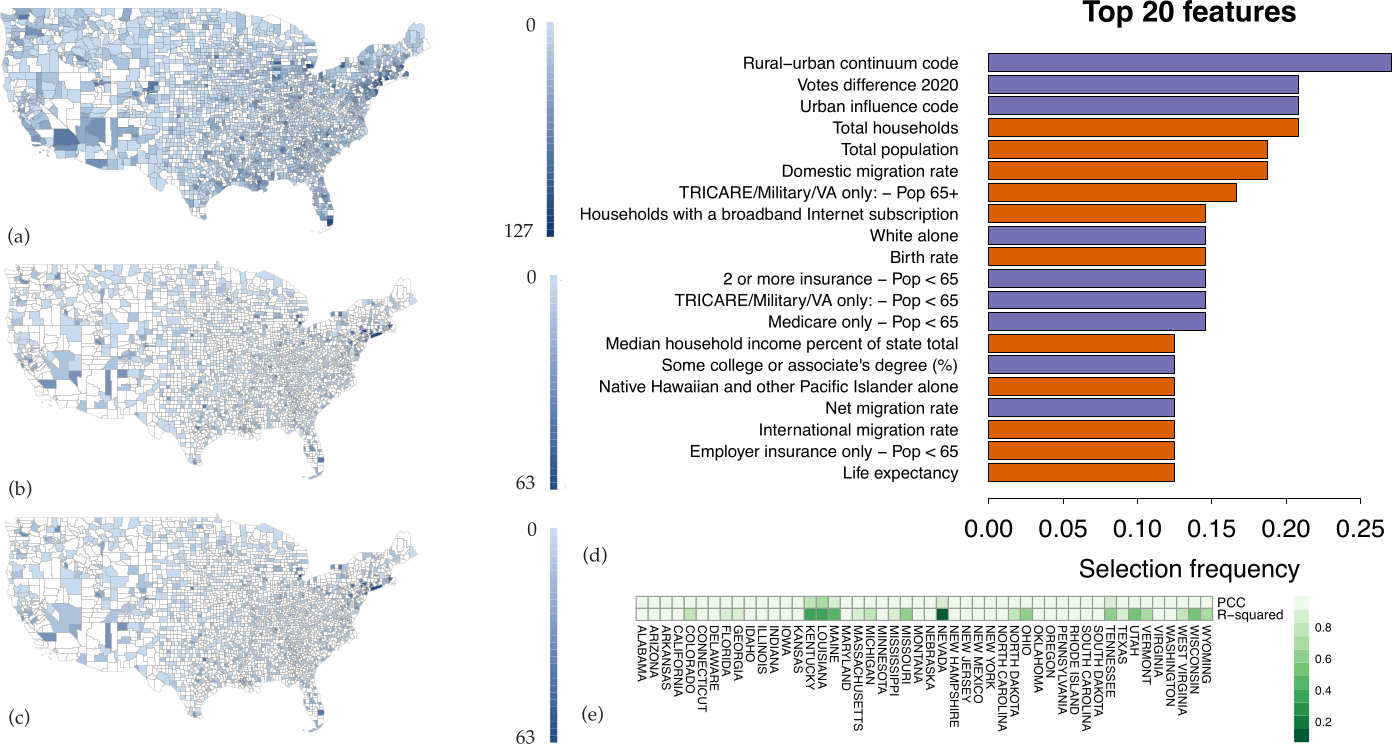
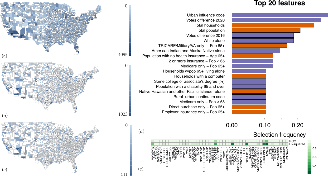
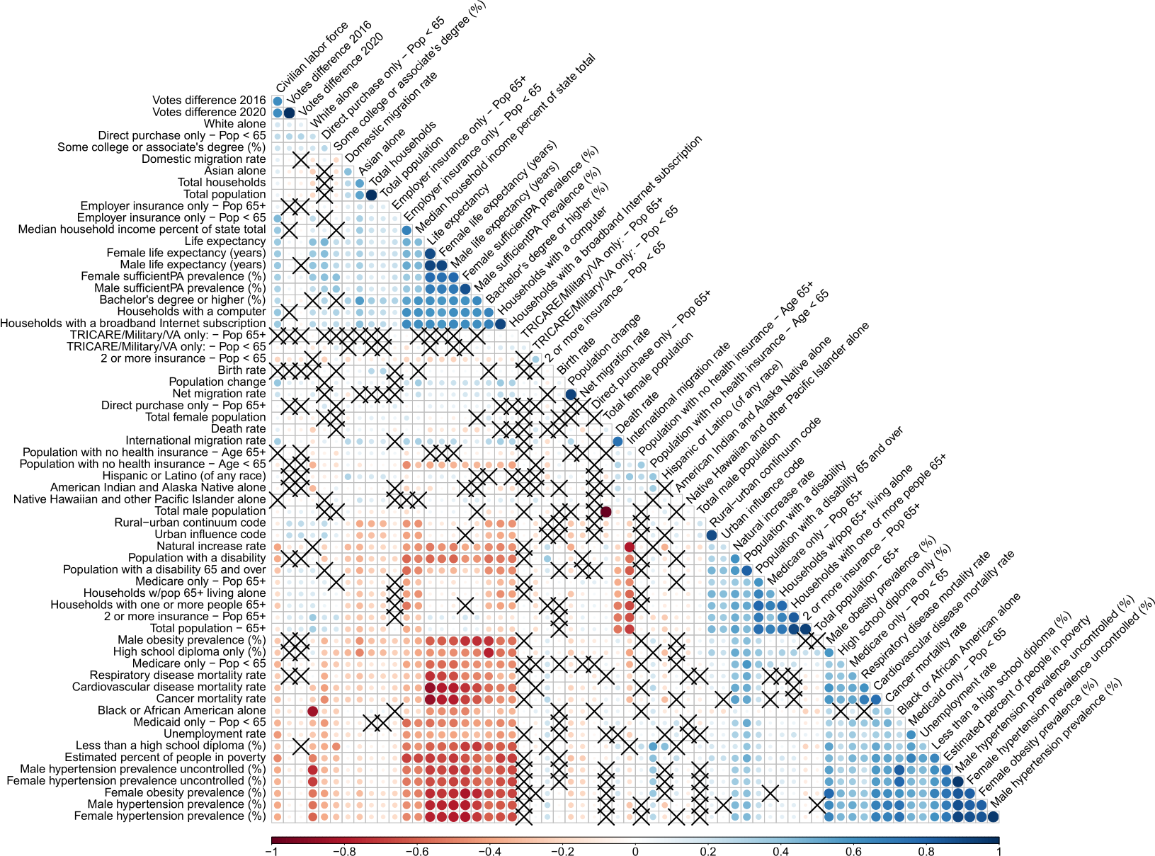
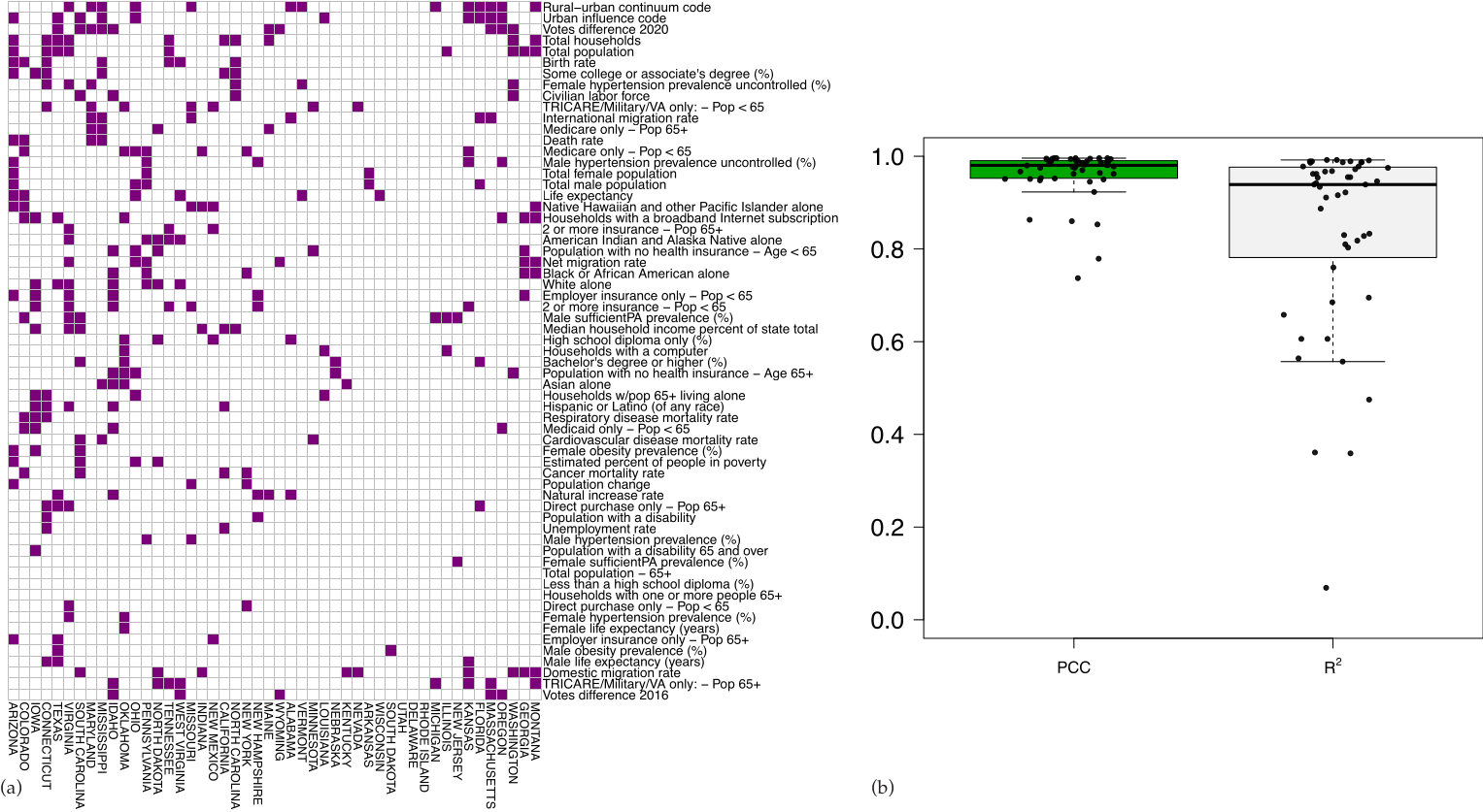
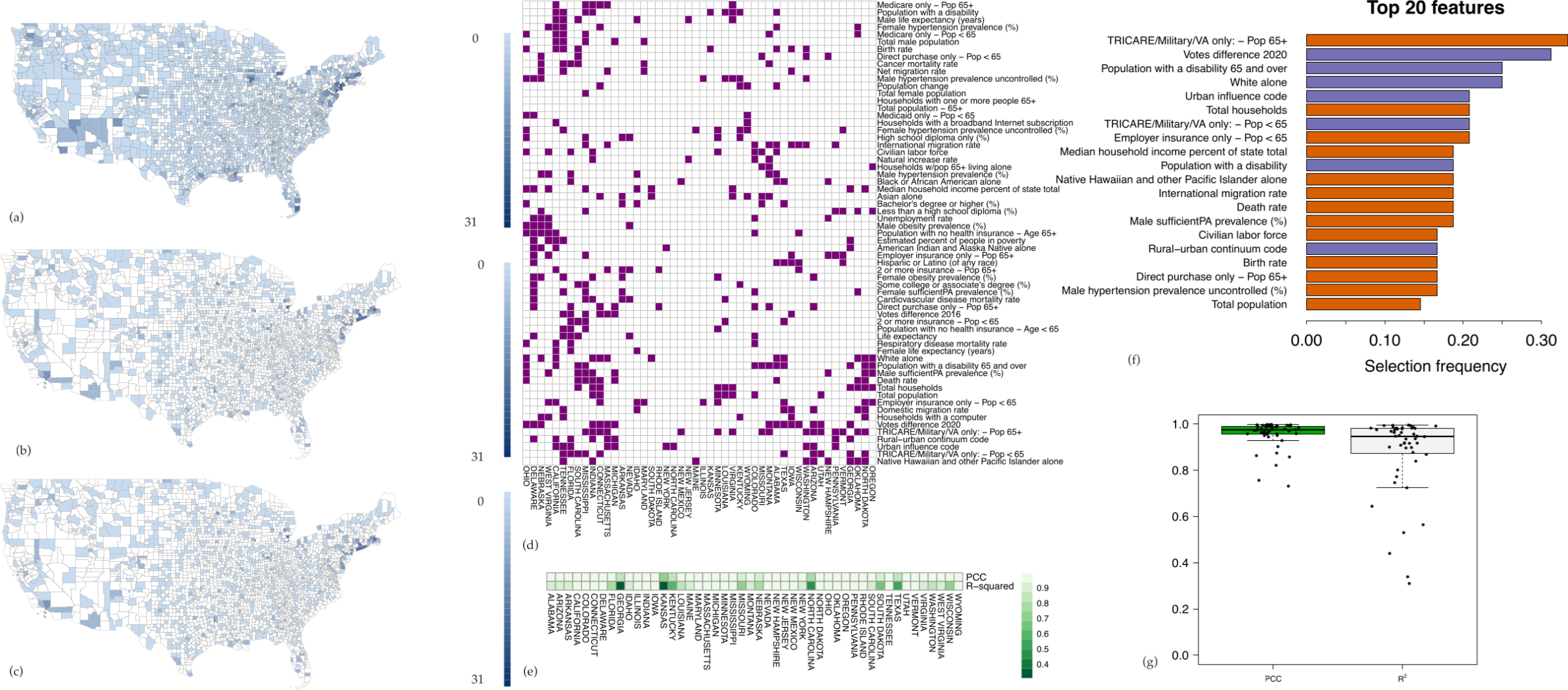
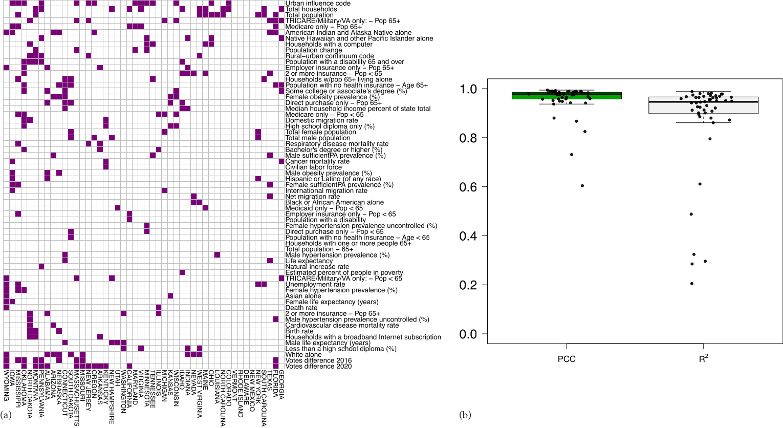
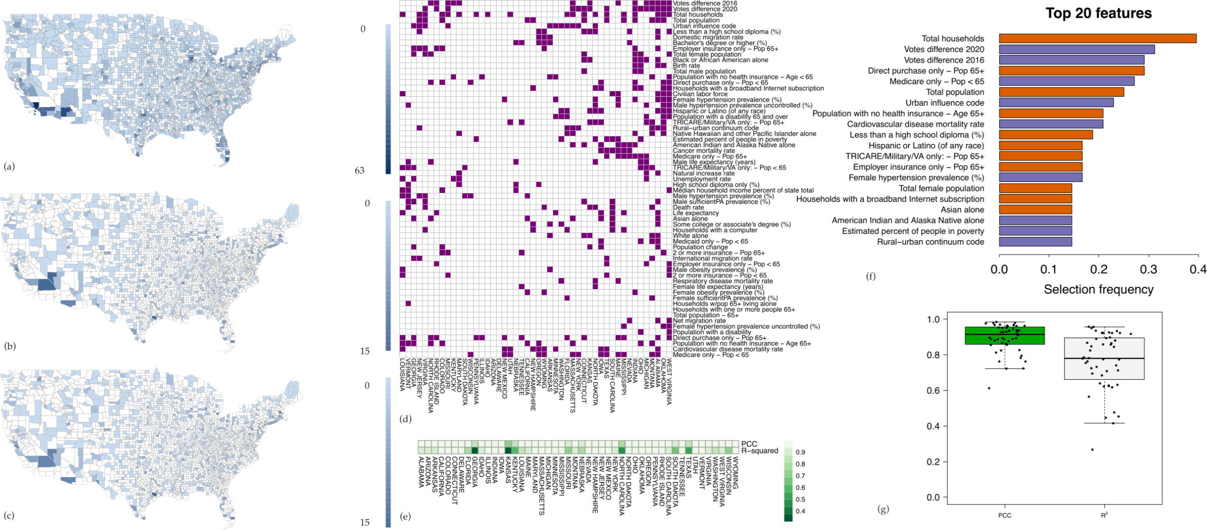
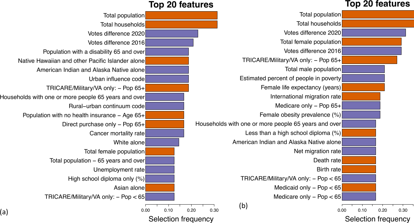
3.1. Defining Spatial Features

We first sought to define the spatial features that predicted the initial rise in cases, defined here as the 30 days following the first confirmed case in each county. To do so, we trained an S G P regression algorithm on two-thirds of the counties in each state (Figure 1a). For each state, the S G P model used neighboring location case counts and demographic features to identify a different set of features to predict the dynamics of case spread in each county. We chose to restrict feature selection across counties at the state level because state borders represent the main political division at which public health systems implemented mitigation measures and other policies. The algorithm used these state-by-state models to generate case predictions in the remaining one-third of “unseen” test counties (Figure 1b), and then compared them to the observed case counts in these counties (Figure 1c) to evaluate model performance. Figure A3a shows the features selected for the prediction models in each state. The top three most predictive features across all states were Rural-urban continuum code (ranged between 0–9 with a higher score meaning more rural), Vote difference 2020, and urban influence code (a higher score means more rural), all of which negatively correlated with case counts (Figure 1d). The next three most frequently selected features—Total households, total population and domestic migration rate (net of in-migration–out-migration)—are positively correlated with case counts and reflect the known strong association between population and COVID-19 spread [21,22]. The remaining top predictive features reflected the importance of health insurance, education, race, income, and population density in predicting case growth. The overall Pearson’s correlation coefficient ( P C C ) and the proportion of variance explained ( R 2 ) of this model applied across counties were 0.96 and 0.84, respectively (Figure A3b). Model performance varied across states, with a median P C C of 0.98 and a median R 2 of 0.94 (Figure 1e). R 2 was greater than 0.90 in the majority of states, demonstrating that the models built on spatial features could account for most of the variance in case counts.
We then applied an identical approach to generate a spatial model utilizing COVID-19-associated deaths over the first 30 days following the first death in each county as the dependent variable (Figure A4). Consistent with prior reports, the features most frequently selected to predict deaths included measures of advanced age and non-white race [23,24]. Vote difference 2020 remained the second most frequently selected feature to predict deaths.

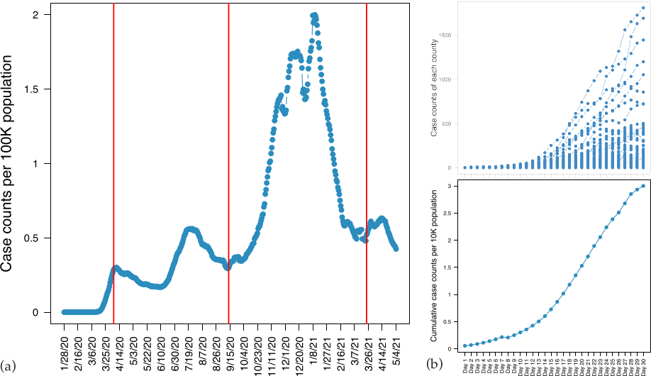
3.2. Analysis of the Nationwide Phase Dynamics

We next extended our analysis to a later phase of the pandemic, commonly called the “third wave,” which we defined as the period between 11 September 2020, when national case counts were at a local nadir, and 21 March 2021, which marked the next local nadir. In contrast with the initial case rise, during this phase, the SARS-CoV-2 virus was circulating in nearly all counties, testing was more broadly available, and there was a better understanding of modes of spread (droplets and aerosols) and effective mitigation measures, including distancing and masking. Case counts in training counties, predicted case counts in test counties, and observed case counts in test counties are shown in Figure 2a–c, and feature selection for the models derived in each state is shown in Figure A5a. The results largely echoed those from the initial phase, with Urban influence code, Vote difference 2020, Total households, and Total population the most frequently selected features across all states (Figure 2d). The model again demonstrated a very strong P C C of 0.95 with a R 2 of 0.87, although the model underestimated significant case growth across a subpopulation of counties (Figure A5b). Across states, the model median P C C was 0.98 and the median R 2 was 0.95 (Figure 2e). We generated an independent model to predict deaths during the nationwide phase (Figure A6). Because the time interval included both a nationwide rise and fall in cases, which could be governed by different spatial factors, we repeated the models for case and death predictions over the rising phase alone, from 11 September 2020 to 1 January 2021. The most frequently selected features during this interval closely reflected those selected over the full epidemic curve, although the total female population was selected more frequently in the models predicting deaths over the rising phase (Figure A7b). We provided a color-coded comparison figure of the top five most frequently selected features of the four prediction scenarios covered for spatial analysis of case and death counts during initial and nationwide phases of COVID-19 pandemics, see Supplementary Material Figure S1.
We generated daily case and death count predictions for each week t across all counties from 6 April 2020 to 21 March 2021 using the spatial features and case counts up through week t-1 as an internal validation of the selected features sets. Consistent with our other analyses, we found that the prediction models most frequently included features associated with population and urbanicity, presidential vote margin, and older age. State-by-state case and death count predictions based on both the spatial and temporal models described above can be reviewed on interactive maps at https://cigdemak.shinyapps.io/sgp_covid-19/ (accessed on 26 July 2022).

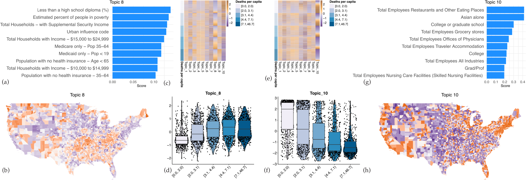
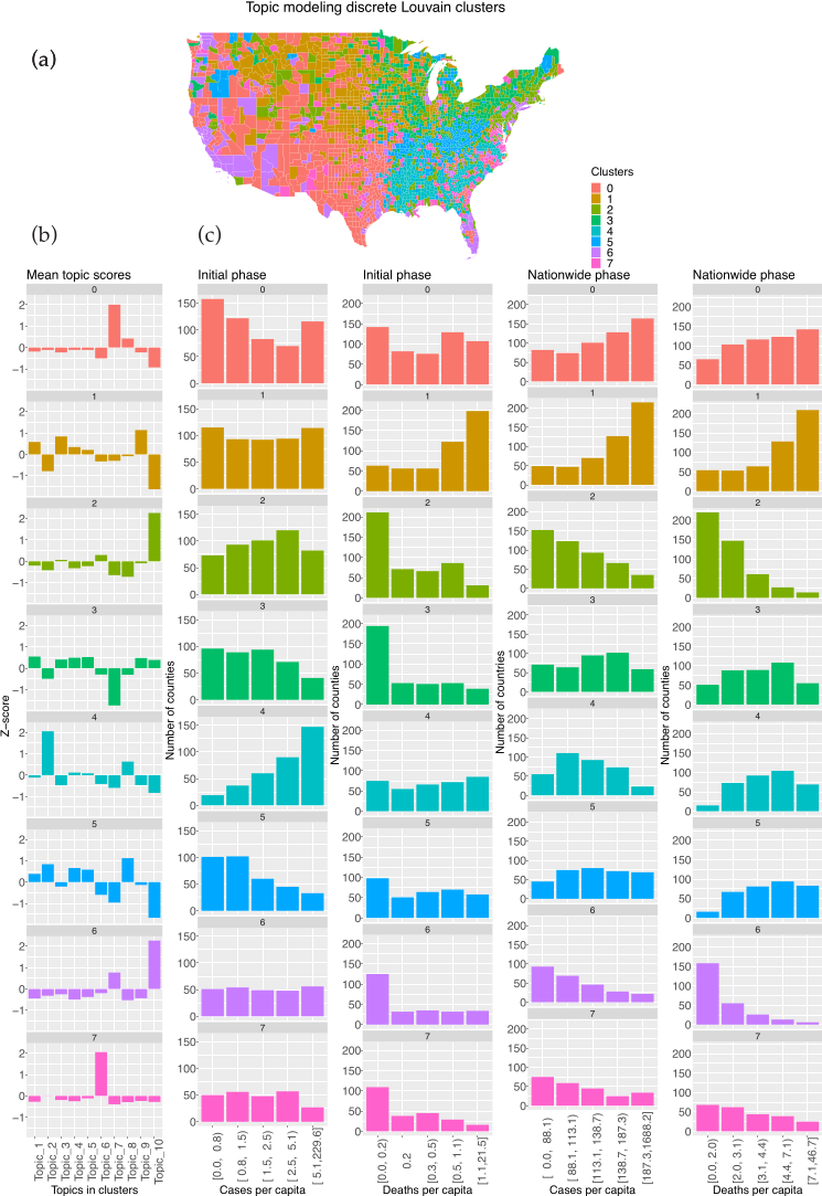
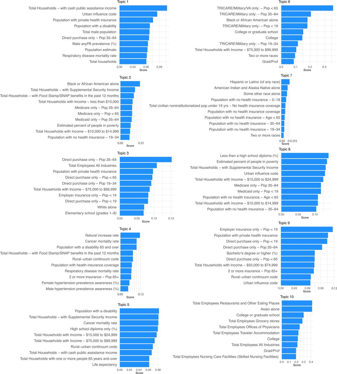
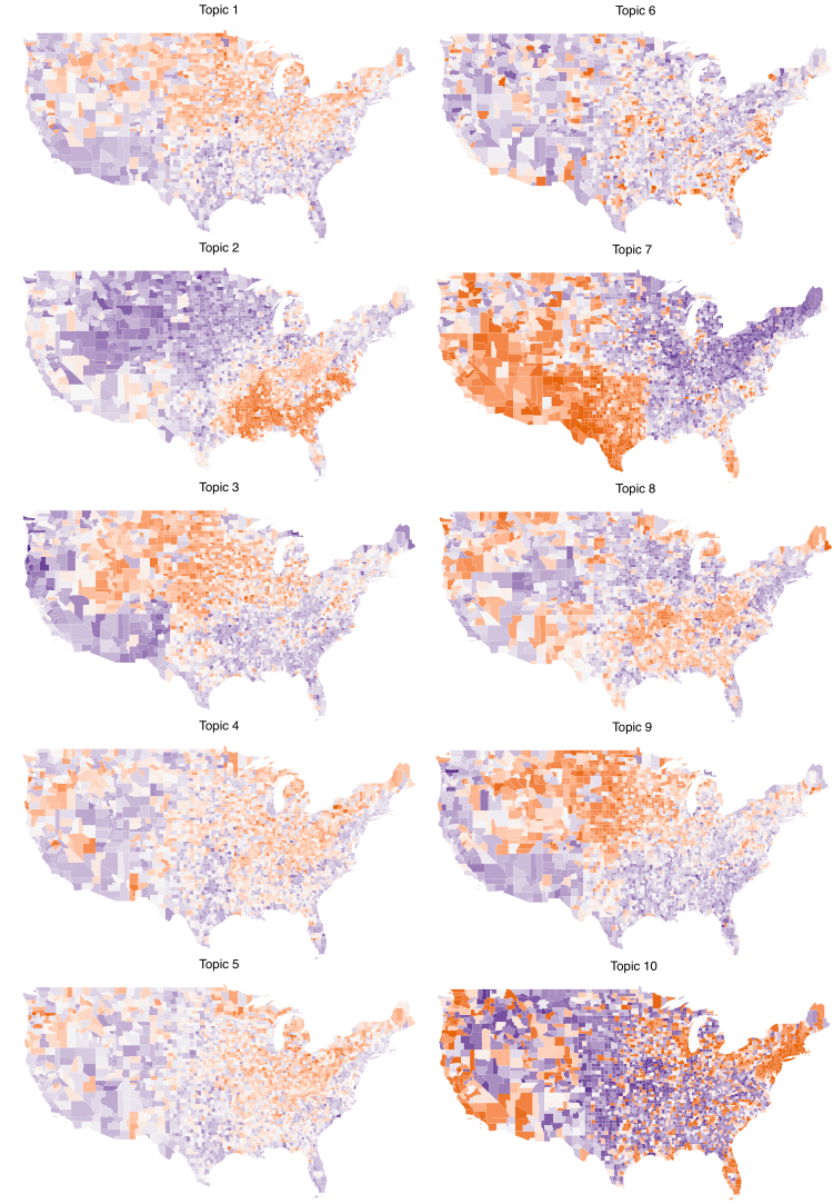
3.3. Topic Modeling and Unsupervised Cluster Analysis Reveals High Risk Counties

One limitation of the spatial prediction models described above is that many features are similar, so the features selected by the S G P modeling are not always the true driver of case growth. Indeed, sets of features cluster along well-described socioeconomic, educational, and health axes (Figure 3). Notably, neither Vote difference 2020 nor Vote difference 2016 is strongly correlated with any spatial features, suggesting that the political leaning of a county is an independent risk factor for COVID-19 spread. Furthermore, the features selected in the models are heterogeneous across states, limiting the ability to define “high risk” locales. For that reason, we set out to group counties by sets of similar spatial features that together are associated with the risk of COVID-19 spread. We used a topic modeling ( T M ) framework using the Latent Dirichlet Allocation ( L D A ) algorithm to reduce the dimensionality of the data. Using this approach, we utilized T M   to find sets of co-occurring features that can then link counties to topics (i.e., a set of features grouped together by T M ).
By applying T M we found sets of similar features that score each county and feature association to each topic (i.e., set of features grouped together by T M ). The top features contributing to each topic are shown in Figure A8. Topics grouped together many geographically similar counties (Figure A9), such as topics 2 and 3, which occurred largely in the South and Midwestern regions of the US, respectively. T M also grouped geographically remote but demographically similar counties, such as topic 8, which largely showed features associated with low socioeconomic status. Notably, vote differences were not a primary contributor to any topic, consistent with the low correlation between political orientation and the other features in our dataset. To see how topics related to COVID-19 spread, we looked at the relationship between COVID cases/deaths and topic scores by plotting topic scores against quintiles of cases or deaths for each phase in the pandemic. Several topics showed correlations with cases and deaths (Figure 4c,e). We provided the correlations of topics between initial and nationwide cases and deaths in the supplementary material, Figure S2. For example, topic 8 (e.g., less than high school diploma, percent of people in poverty, households with supplemental security income, and Medicaid) correlated positively with deaths during the nationwide phase (Figure 4d). Topic 10, which had high feature score contributions from higher education and access to services, showed a negative correlation to the death rate (Figure 4f).
We, therefore, clustered the counties using county-specific topic scores in a Louvain clustering algorithm to segregate discrete groups of counties with a similar set of spatial features (i.e., topic contributions). After clustering, counties with similar socioeconomic and demographic compositions tended to group together (Figure 5a). In order to highlight the feature and topic contributions of each cluster of counties, Figure 5b shows the mean topic score for each topic within each cluster of counties. For example, Cluster 1 is composed of counties with high scores from topics 1, 3, and 9 and low topic 10 scores. This cluster highlights most of the Midwest region, where the largest surge in cases and deaths occurred during the autumn 2020 period of the nationwide phase of the pandemic (Figure 5c). Clustering further delineated cases from deaths, and the initial phase from nationwide phase dynamics, highlighting plasticity in the composition of spatial features most associated with COVID risk across the course of the pandemic. Cluster 3, which was geographically restricted to the Southeast US, was associated with high COVID-19 case counts during the initial phase. In contrast, Cluster 0, restricted to Texas, the lower Midwest, and the Rocky Mountain region, was associated with high COVID-19 spread during the nationwide phase (Figure 5c).
We also performed predictions using SGP with topics (i.e., spatial feature groups) extracted from TM; however, prediction accuracies of SGP were not improved. Prediction in the early stage of the pandemic was especially unsuccessful using topics because there were fewer events to train our prediction model, and, therefore, using an approximated version of the spatial features failed to perform predictions. On the other hand, prediction accuracies of cases and deaths during the nationwide phase, when the number of events was far greater, yielded P C C of 0.92 and 0.86 with a R 2 of 0.80 and 0.73, respectively. The most frequently selected three topics were 3, 2, and 8 for nationwide case counts predictions and 3, 8, and 10 for nationwide death counts predictions.

4. Discussion

We adopted S G P analysis to generate highly predictive models for COVID-19 case growth and found that the majority of variance in COVID-19 spread can be explained by the spatial features included in each model. Both case and death counts in each county, measures of urbanicity, age, and presidential voting margin were found to be the most predictive features by S G P algorithm. Mirroring well-established risk factors for COVID-19 infection and mortality [25,26,27,28,29], we found that the most optimal spatial models frequently included non-white race and measures of socioeconomic status. However, our S G P analysis showed that the factors predicting cases and mortality across the US differ geographically. This geographic heterogeneity makes it difficult to apply a uniform set of features to identify counties at greatest risk. Because many of the features are highly correlated, our S G P modeling approach may have obscured stronger effects by diluting selection among similar features. For example, urban influence code, rural–urban continuum, population density, and total households all describe a county’s urbanicity, yet each individually shows up among the most selected features associated with COVID-19 dynamics, effectively competing for inclusion in the model. Furthermore, these measures of urbanicity also correlated with the number of individuals over 65 years old, who represent the highest risk cohort for COVID-19 mortality [30,31]. Correlation analysis also revealed interactions between socioeconomic, health, and racial features, complicating the interpretation of the relationships between these features and COVID-19 dynamics. To compensate for these deficits in the model, we sought to identify which combinations of spatial features are most consistently associated with COVID-19 spread using topic modeling to reduce the dimensionality of the data. Although the data used to create the unsupervised groupings did not include COVID-19 data, topics were correlated with both cases and deaths. Counties represented by similar topics clustered geographically, supporting the utility of this analysis to identify similar places. In accordance with our S G P analysis and prior studies, topics associated with low socioeconomic status correlated with high case and death counts, whereas topics associated with increased wealth and education exhibited an inverse correlation with cases and deaths. By clustering counties according to their topics—the feature sets found through T M —we were then able to identify those counties across the US that were demographically similar and found that combinations of topics were associated with more case and death burden. These combinations of features likely relate not only to factors that increase the rate of spread or mortality but also adherence and implementation of mitigation measures.
Aside from population metrics, presidential vote margin was the most consistently selected spatial feature in our COVID-19 prediction models. Notably, the presidential vote margin was not correlated with any other features, suggesting that political orientation represents an independent risk factor for COVID-19 spread. Politics played a prominent role in the US response to the coronavirus pandemic, with mitigation policies and adherence varying widely between areas under Democratic or Republican governance. It is not clear whether this association stems from a “top-down” effect of the administration’s dismissive management and communication approach or reflects growing distrust in science on the ideological right [32,33]. Indeed, recent work linked partisanship to attitudes about COVID-19 policy and mitigation measures from the beginning of the pandemic, before polarized messaging had developed [34,35,36].
The development and implementation of spatially-informed prediction models suffer from several limitations. Our models did not include mitigation measures or vaccine coverage due in part to inconsistencies in implementation and data availability. The end date for the nationwide phase analysis, March 31, was before vaccine availability was opened to the general public in most states, but differences in vaccine uptake to that point represented a potential confounder. Early case numbers were heavily influenced by low test availability, leading to significant missing data. However, our analyses found similar features predicted case dynamics throughout the pandemic, suggesting that the effect of this missing data may be minimal. Finally, T M and Louvain clustering generate highly overlapping feature sets that may be specific to the breadth of data included. Thus, while spatial analysis provides a powerful predictive tool, the precise effect of each feature or set of features is likely to be context-specific.
In conclusion, we show that spatial features account for the majority of variation in COVID-19 case and death dynamics across the US. Predictive modeling based on combinations of spatial features can identify counties at the greatest risk for COVID-19 spread and can be used to direct aggressive mitigation strategies and limited resource pools to these areas. Finally, we show that topic modeling provides a new approach to dimensionality reduction in epidemiologic data and may be of value in other datasets with highly collinear variables.

Supplementary Materials

The following supporting information can be downloaded at: www.mdpi.com/article/10.3390/ijgi11090470/s1, Table S1: Spatial features, Figure S1: Color-coded comparison of top five most frequently selected features of the four prediction scenarios we covered for spatial analysis of case and death counts during initial and nationwide COVID-19 pandemics, Figure S2: Topic correlations with initial and nationwide cases and deaths.

Author Contributions

Conceptualization, Çiğdem Ak, Alex D. Chitsazan and Aaron J. Grossberg; methodology, Çiğdem Ak, Mehmet Gönen and Alex D. Chitsazan; software, Çiğdem Ak and Alex D. Chitsazan; validation, Çiğdem Ak and Alex D. Chitsazan; formal analysis, Çiğdem Ak and Alex D. Chitsazan; investigation, Çiğdem Ak, Alex D. Chitsazan, Aaron J. Grossberg and Ruth Etzioni; resources, Çiğdem Ak, Alex D. Chitsazan and Aaron J. Grossberg; data curation, Çiğdem Ak; writing—original draft preparation, Çiğdem Ak and Aaron J. Grossberg; writing—review and editing, Çiğdem Ak, Alex D. Chitsazan and Aaron J. Grossberg; visualization, Çiğdem Ak and Alex D. Chitsazan; supervision, Aaron J. Grossberg, Mehmet Gönen and Ruth Etzioni; project administration, Aaron J. Grossberg; funding acquisition, Aaron J. Grossberg All authors have read and agreed to the published version of the manuscript.

Funding

This work was supported by funding (CEDAR7900620) from the Cancer Early Detection Advanced Research Center at the Knight Cancer Institute, Oregon Health & Science University (C.A., A.D.C., R.E., and A.J.G.) and the National Cancer Institute (K08 CA245188) awarded to A.J.G.

Institutional Review Board Statement

Ethical review and approval were waived for this study because the analysis of de-identified, publicly available data does not constitute human subjects research as defined at 45 CFR 46.102 and therefore does not require IRB review.

Informed Consent Statement

Patient consent was waived because the study included only deidentified publicly available data and could not be carried out practicably without waiver.

Data Availability Statement

Publicly archived datasets analyzed can be found in Table S1 with their links. Data supporting the temporal prediction results can be found at https://cigdemak.shinyapps.io/sgp_covid-19/ (accessed on 26 July 2022).

Conflicts of Interest

The authors declare no conflict of interest.

Appendix A

Figure A1. Overview of our predictive computational framework structured Gaussian process regression ( S G P R ).
Ijgi 11 00470 g0a1
Figure A2. (a)US-wide total 7-day moving average case counts per 100 thousand population and the dates we selected for analysis of early and late pandemic dynamics. Red lines are at 6 April 2020, 11 September 2020, and 21 March 2021. (b) 7-day moving average case counts of the first month with a case of each US county and US-wide cumulative case counts of the first month with a case.
Ijgi 11 00470 g0a2
Figure A3. (a) Selected predictive features for each state by the algorithm for the initial phase prediction of cases. (b) P C C and R 2 values of the predictions reported as a box plot.
Ijgi 11 00470 g0a3
Figure A4. (ac) On three different maps, we presented the data used for training our model for the initial phase prediction of deaths, the test data (i.e., holdback, observed) and our predictions for test locations. Deaths were aggregated over 30 days in each county in the maps. (d) Selected predictive features for each state. (e) P C C and R 2 values of the predictions reported as a heatmap per state. One can identify the states falling far from the observed versus predicted line from the accuracy heatmap. (f) The most predictive top 20 features selected overall by the algorithm for the initial phase. Purple-colored features are negatively correlated with the death counts and the orange-colored features are positively correlated with the case counts. (g) P C C and R 2 values of the predictions reported as a box plot.
Ijgi 11 00470 g0a4
Figure A5. (a) Selected predictive features for each state by the algorithm for the nationwide phase prediction of cases. (b) P C C and R 2 values of the predictions reported as a box plot.
Ijgi 11 00470 g0a5
Figure A6. (ac) On three different maps, we presented the data used for training our model for the nationwide phase prediction of deaths, the test data (i.e., holdback, observed) and our predictions for test locations. Deaths were aggregated over the time period after 11 September 2020 until 21 March 2021 in each county in the maps. (d) Selected predictive features for each state. (e) P C C and R 2 values of the predictions reported as a heatmap per state. (f) The most predictive top 20 features selected overall by the algorithm for the nationwide phase. Purple-colored features are negatively correlated with the death counts and the orange-colored features are positively correlated with the case counts. (g) P C C and R 2 values of the predictions reported as a box plot.
Ijgi 11 00470 g0a6
Figure A7. (a,b) The most predictive top 20 features selected overall by the algorithm for case and death count predictions from 11 September 2020 to 1 January 2021, respectively. Purple-colored features are negatively correlated with the case/death counts and the orange-colored features are positively correlated with the case/death counts, respectively.
Ijgi 11 00470 g0a7
Figure A8. Top 10 feature scores for spatial features associated with each topic.
Ijgi 11 00470 g0a8
Figure A9. Normalized topic scores for each county in the US. Legend of the map is the same as the as the topic score heatmaps given in (Figure 4c,e) where given a topic, counties with colors closer to orange have a high topic value and counties with colors closer to purple have low topic value.
Ijgi 11 00470 g0a9

References

  1. WHO. World Health Organization Coronavirus (COVID-19) Dashboard. Available online: https://covid19.who.int/ (accessed on 14 May 2022).
  2. Blanco-Melo, D.; Nilsson-Payant, B.E.; Liu, W.C.; Uhl, S.; Hoagland, D.; Moller, R.; Jordan, T.X.; Oishi, K.; Panis, M.; Sachs, D.; et al. Imbalanced Host Response to SARS-CoV-2 Drives Development of COVID-19. Cell 2020, 181, 1036–1045. [Google Scholar] [CrossRef] [PubMed]
  3. Karmakar, M.; Lantz, P.M.; Tipirneni, R. Association of Social and Demographic Factors With COVID-19 Incidence and Death Rates in the US. JAMA Netw. Open 2021, 4, e2036462. [Google Scholar] [CrossRef] [PubMed]
  4. Upshaw, T.L.; Brown, C.; Smith, R.; Perri, M.; Ziegler, C.; Pinto, A.D. Social determinants of COVID-19 incidence and outcomes: A rapid review. PLoS ONE 2021, 16, e0248336. [Google Scholar] [CrossRef] [PubMed]
  5. Andersen, L.M.; Harden, S.R.; Sugg, M.M.P.D.; Runkle, J.D.P.D.; Lundquist, T.E. Analyzing the spatial determinants of local COVID-19 transmission in the United States. Sci. Total Environ. 2021, 754, 142396. [Google Scholar] [CrossRef]
  6. Garcia, E.; Eckel, S.P.; Chen, Z.; Li, K.; Gilliland, F.D. COVID-19 mortality in California based on death certificates: Disproportionate impacts across racial/ethnic groups and nativity. Ann. Epidemiol. 2021, 58, 69–75. [Google Scholar] [CrossRef]
  7. Mollalo, A.; Vahedi, B.; Rivera, K.M. GIS-based spatial modeling of COVID-19 incidence rate in the continental United States. Sci. Total Environ. 2020, 728, 138884. [Google Scholar] [CrossRef]
  8. Sung, B. A spatial analysis of the effect of neighborhood contexts on cumulative number of confirmed cases of COVID-19 in U.S. Counties through October 20 2020. Prev. Med. 2021, 147, 106457. [Google Scholar] [CrossRef]
  9. Sun, Y.; Hu, X.; Xie, J. Spatial inequalities of COVID-19 mortality rate in relation to socioeconomic and environmental factors across England. Sci. Total Environ. 2021, 758, 143595. [Google Scholar] [CrossRef]
  10. McCloskey, J.K.; Ellis, J.L.; Uratsu, C.S.; Drace, M.L.; Ralston, J.D.; Bayliss, E.A.; Grant, R.W. Accounting for Social Risk Does not Eliminate Race/Ethnic Disparities in COVID-19 Infection Among Insured Adults: A Cohort Study. J. Gen. Intern. Med. 2022, 37, 1183–1190. [Google Scholar] [CrossRef]
  11. Zamani, M.; Schwartz, H.A.; Eichstaedt, J.; Guntuku, S.C.; Ganesan, A.V.; Clouston, S.; Giorgi, S. Understanding Weekly COVID-19 Concerns through Dynamic Content-Specific LDA Topic Modeling. Proc. Conf. Empir. Methods Nat. Lang. Process. 2020, 2020, 193–198. [Google Scholar] [CrossRef]
  12. Pasquini, G.; Ferguson, G.; Bouklas, I.; Vu, H.; Zamani, M.; Zhaoyang, R.; Harrington, K.D.; Roque, N.A.; Mogle, J.; Schwartz, H.A.; et al. The where and when of COVID-19: Using ecological and Twitter-based assessments to examine impacts in a temporal and community context. PLoS ONE 2022, 17, e0264280. [Google Scholar] [CrossRef] [PubMed]
  13. Ak, C.; Ergonul, O.; Sencan, I.; Torunoglu, M.A.; Gonen, M. Spatiotemporal prediction of infectious diseases using structured Gaussian processes with application to Crimean-Congo hemorrhagic fever. PLoS Negl. Trop. Dis. 2018, 12, e0006737. [Google Scholar] [CrossRef]
  14. Ak, C.; Ergonul, O.; Gonen, M. A prospective prediction tool for understanding Crimean-Congo haemorrhagic fever dynamics in Turkey. Clin. Microbiol. Infect. 2020, 26, e121–e123. [Google Scholar] [CrossRef]
  15. Ak, Ç.; Ergönül, Ö.; Gönen, M. Structured Gaussian Processes with Twin Multiple Kernel Learning. In Proceedings of the 10th Asian Conference on Machine Learning, Beijing, China, 14–16 November 2018; pp. 65–80. [Google Scholar]
  16. Roberts, D.R.; Bahn, V.; Ciuti, S.; Boyce, M.S.; Elith, J.; Guillera-Arroita, G.; Hauenstein, S.; Lahoz-Monfort, J.J.; Schröder, B.; Thuiller, W.; et al. Cross-validation strategies for data with temporal, spatial, hierarchical, or phylogenetic structure. Ecography 2017, 40, 913–929. [Google Scholar] [CrossRef]
  17. Ploton, P.; Mortier, F.; Rejou-Mechain, M.; Barbier, N.; Picard, N.; Rossi, V.; Dormann, C.; Cornu, G.; Viennois, G.; Bayol, N.; et al. Spatial validation reveals poor predictive performance of large-scale ecological mapping models. Nat. Commun. 2020, 11, 4540. [Google Scholar] [CrossRef]
  18. Valavi, R.; Elith, J.; Lahoz-Monfort, J.J.; Guillera-Arroita, G. blockCV: An r package for generating spatially or environmentally separated folds for k-fold cross-validation of species distribution models. Methods Ecol. Evolut. 2019, 10, 225–232. [Google Scholar] [CrossRef]
  19. Brenning, A. Spatial machine-learning model diagnostics: A model-agnostic distance-based approach. arXiv 2021, v1, 1–16. [Google Scholar] [CrossRef]
  20. Zhao, W.; Chen, J.J.; Perkins, R.; Liu, Z.; Ge, W.; Ding, Y.; Zou, W. A heuristic approach to determine an appropriate number of topics in topic modeling. BMC Bioinform. 2015, 16 (Suppl. 13), S8. [Google Scholar] [CrossRef]
  21. Rubin, D.; Huang, J.; Fisher, B.T.; Gasparrini, A.; Tam, V.; Song, L.; Wang, X.; Kaufman, J.; Fitzpatrick, K.; Jain, A.; et al. Association of Social Distancing, Population Density, and Temperature With the Instantaneous Reproduction Number of SARS-CoV-2 in Counties Across the United States. JAMA Netw. Open 2020, 3, e2016099. [Google Scholar] [CrossRef]
  22. Sy, K.T.L.; White, L.F.; Nichols, B.E. Population density and basic reproductive number of COVID-19 across United States counties. PLoS ONE 2021, 16, e0249271. [Google Scholar] [CrossRef]
  23. Lawton, R.; Zheng, K.; Zheng, D.; Huang, E. A longitudinal study of convergence between Black and White COVID-19 mortality: A county fixed effects approach. Lancet Reg. Health Am. 2021, 1, 100011. [Google Scholar] [CrossRef]
  24. Cheng, K.J.G.; Sun, Y.; Monnat, S.M. COVID-19 Death Rates Are Higher in Rural Counties With Larger Shares of Blacks and Hispanics. J. Rural Health 2020, 36, 602–608. [Google Scholar] [CrossRef] [PubMed]
  25. Golestaneh, L.; Neugarten, J.; Fisher, M.; Billett, H.H.; Gil, M.R.; Johns, T.; Yunes, M.; Mokrzycki, M.H.; Coco, M.; Norris, K.C.; et al. The association of race and COVID-19 mortality. EClinicalMedicine 2020, 25, 100455. [Google Scholar] [CrossRef]
  26. Gold, J.A.W.; Rossen, L.M.; Ahmad, F.B.; Sutton, P.; Li, Z.; Salvatore, P.P.; Coyle, J.P.; DeCuir, J.; Baack, B.N.; Durant, T.M.; et al. Race, Ethnicity, and Age Trends in Persons Who Died from COVID-19—United States, May–August 2020. MMWR Morb. Mortal. Wkly. Rep. 2020, 69, 1517–1521. [Google Scholar] [CrossRef]
  27. Price-Haywood, E.G.; Burton, J.; Fort, D.; Seoane, L. Hospitalization and Mortality among Black Patients and White Patients with COVID-19. N. Engl. J. Med. 2020, 382, 2534–2543. [Google Scholar] [CrossRef]
  28. Luo, Y.; Yan, J.; McClure, S. Distribution of the environmental and socioeconomic risk factors on COVID-19 death rate across continental USA: A spatial nonlinear analysis. Environ. Sci. Pollut. Res. Int. 2021, 28, 6587–6599. [Google Scholar] [CrossRef]
  29. Hawkins, R.B.; Charles, E.J.; Mehaffey, J.H. Socio-economic status and COVID-19-related cases and fatalities. Public Health 2020, 189, 129–134. [Google Scholar] [CrossRef]
  30. Jin, J.; Agarwala, N.; Kundu, P.; Harvey, B.; Zhang, Y.; Wallace, E.; Chatterjee, N. Individual and community-level risk for COVID-19 mortality in the United States. Nat. Med. 2021, 27, 264–269. [Google Scholar] [CrossRef]
  31. Woolf, S.H.; Chapman, D.A.; Lee, J.H. COVID-19 as the Leading Cause of Death in the United States. JAMA 2021, 325, 123–124. [Google Scholar] [CrossRef]
  32. McCright, A.M.; Dentzman, K.; Charters, M.; Dietz, T. The influence of political ideology on trust in science. Environ. Res. Lett. 2013, 8, 044029. [Google Scholar] [CrossRef]
  33. Gonsalves, G.; Yamey, G. Political interference in public health science during COVID-19. BMJ 2020, 371, m3878. [Google Scholar] [CrossRef] [PubMed]
  34. Allcott, H.; Boxell, L.; Conway, J.; Gentzkow, M.; Thaler, M.; Yang, D. Polarization and public health: Partisan differences in social distancing during the coronavirus pandemic. J. Public Econ. 2020, 191, 104254. [Google Scholar] [CrossRef] [PubMed]
  35. Bruine de Bruin, W.; Saw, H.W.; Goldman, D.P. Political polarization in US residents’ COVID-19 risk perceptions, policy preferences, and protective behaviors. J. Risk Uncertain. 2020, 61, 177–194. [Google Scholar] [CrossRef]
  36. Clinton, J.; Cohen, J.; Lapinski, J.; Trussler, M. Partisan pandemic: How partisanship and public health concerns affect individuals’ social mobility during COVID-19. Sci. Adv. 2021, 7, eabd7204. [Google Scholar] [CrossRef] [PubMed]
Figure 1. Spatial modeling of case dynamics during initial phase of pandemic. Blue shade indicates observed cases over first 30 days in counties used for model training (a) and testing (observed) (b), with predicted case counts in test counties shown in (c). Cases were aggregated over 30 days in each county in the maps. (d) The most predictive top 20 features selected overall by the algorithm for the initial phase. Purple-colored features are negatively correlated with case counts, and the orange-colored features are positively correlated with the case counts. (e) P C C and R 2 values of all predictions.
Ijgi 11 00470 g001
Figure 2. Spatial modeling of case dynamics during nationwide phase of pandemic. Blue shade indicates observed cases over first 30 days in counties used for model training (a) and testing (observed) (b), with predicted case counts in test counties shown in (c). Cases were aggregated over the time period after 11 September 2020 until 21 March 2021 in each county in the maps. (d) The most predictive top 20 features selected overall by the algorithm for the nationwide phase. Purple-colored features are negatively correlated with case counts, and the orange-colored features are positively correlated with case counts. (e) P C C and R 2 values of the predictive models on a state-by-state level.
Ijgi 11 00470 g002
Figure 3. Correlation matrix of the spatial features used in the S G P model. Blue indicates positive correlation, red indicates negative correlation, and cross indicates no correlation. Shade indicates strength of correlation per scale shown at bottom of matrix.
Ijgi 11 00470 g003
Figure 4. Topic modeling identifies associations between sets of spatial features and COVID-19 dynamics. (a) Top 10 feature scores for features associated with topic 8. (b) Topic 8 scores for each county in the US. Legend of the map is the same as the topic score heatmaps given in (c,e). (c) Heatmap of each county z-scored topic score against the mean deaths during the nationwide phase, binned into quintiles. To highlight the relationships between topic scores and deaths, the heatmap is sorted by topic 8. (d) Boxplot of topic scores for each county across death quintiles for topic 8, showing positive correlation with death counts. (e) Heatmap of each county z-scored topic score against the mean deaths during the nationwide phase, binned into quintiles. In order to highlight the relationships between topic scores and deaths, the heatmap is sorted by topic 10. (f) Boxplot of topic scores for each county across death quintiles for topic 10, showing negative correlation with death counts. (g) Top 10 feature scores for features associated with topic 10. (h) Topic 10 scores for each county in the US. Legend of the map is the same as the topic score heatmaps given in (c,e).
Ijgi 11 00470 g004
Figure 5. Counties clustered using spatial topics show similar patterns in COVID-19 cases/death counts. Clustering by topics can identify high- and low-risk counties. (a) Geographical map of counties and their discrete cluster assignments when topic-county matrix inputted into Louvain clustering. (b) Mean topic score for each topic for each of the 9 clusters of counties. (c) Bar graph of the number of countries within each cluster that fall within each quintile bin of cases and deaths for the initial as well as nationwide phases of the pandemic.
Ijgi 11 00470 g005
Publisher’s Note: MDPI stays neutral with regard to jurisdictional claims in published maps and institutional affiliations.

