

Visualisation of Information Using Patient Journey Maps for a Mobile Health Application

Abstract
:1. Introduction
2. Review of Literature and Applications
2.1. PJMs
2.2. Mobile Health Applications
2.3. User Experience Evaluation Metrics for Mobile Health Apps
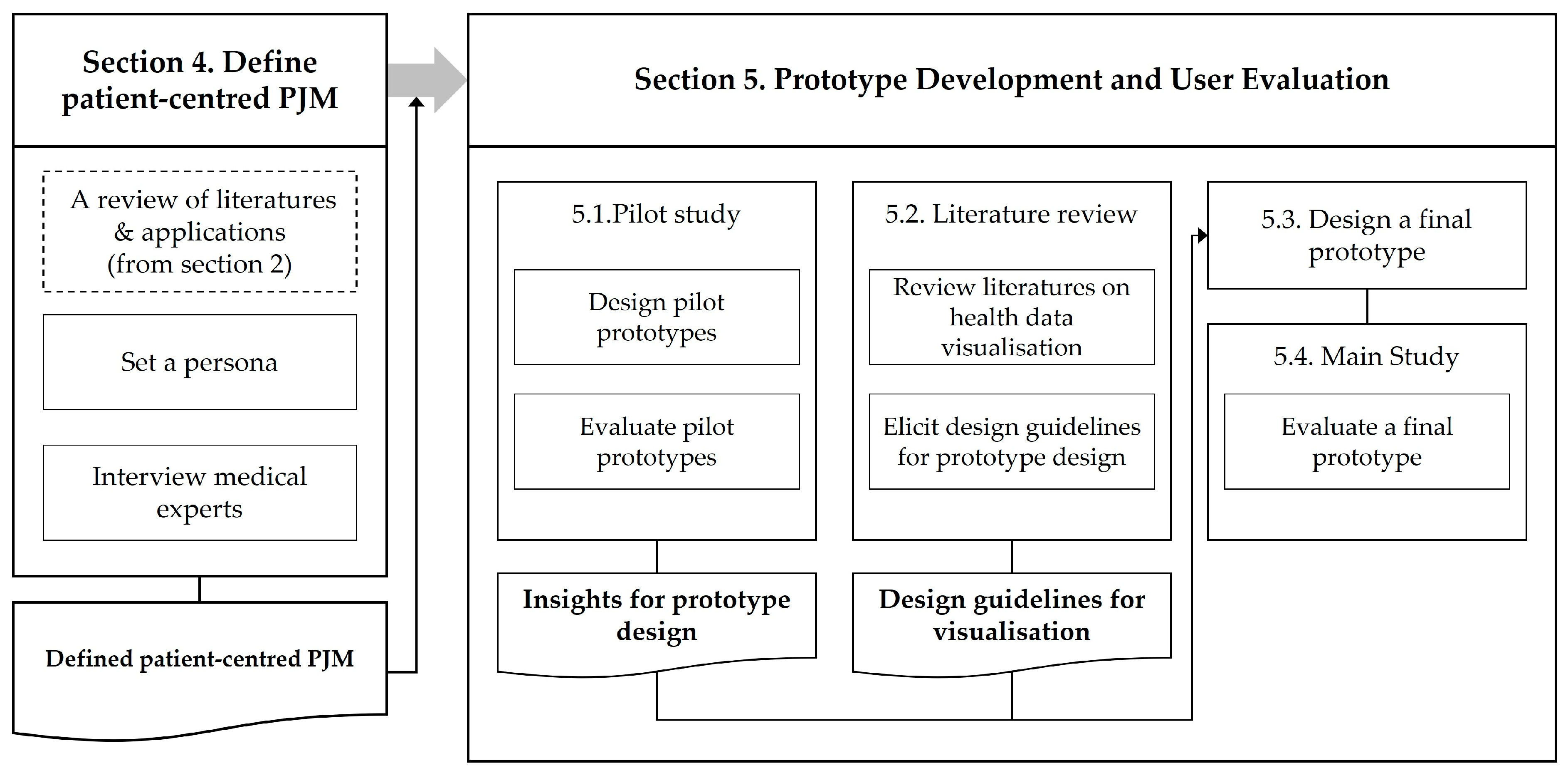
3. Research Process
4. Defining Patient-Centred PJMs
4.1. Methods
4.2. Persona
4.3. Patient-Centred PJM
5. Prototype Development and User Evaluation
5.1. Pilot Study
5.1.1. Participants
5.1.2. Prototype Design
5.1.3. Methods
5.1.4. Results
5.2. Literature Reviews for the Visualisation of Mobile Health Data

| Design Guideline | References |
|---|---|
| In health data visualisation, time-based visualisations help you understand your data better than non-time-based visualisations. | [46] |
| Medical information is unfamiliar data to the ordinary user, so you should actively use icons for better understanding. | [47] |
| Bar graphs are a great way to present data that need to be quickly viewed and understood. | [47,48] |
| At-a-glance data visualisation. | [47] |
| Visualisations should contain detailed and accurate data. | [48,51,52,53] |
| In time-based data visualisations, users should be able to identify the point in time (year, month, date, hour, etc.). | [49] |
| Data visualisations need to be within a single screen. | [47,50,51,54] |
| Using proper colour coding can improve the understanding of your visualisations. | [51,53] |
| The visualisation should be easy and quick to understand. | [52] |
| The user should be able to choose how much information is displayed. | [54] |
| The visualisation’s design should include information about context. | [53,54] |
5.3. Final Prototype Design
5.4. Main Study
5.4.1. Participants
5.4.2. Methods
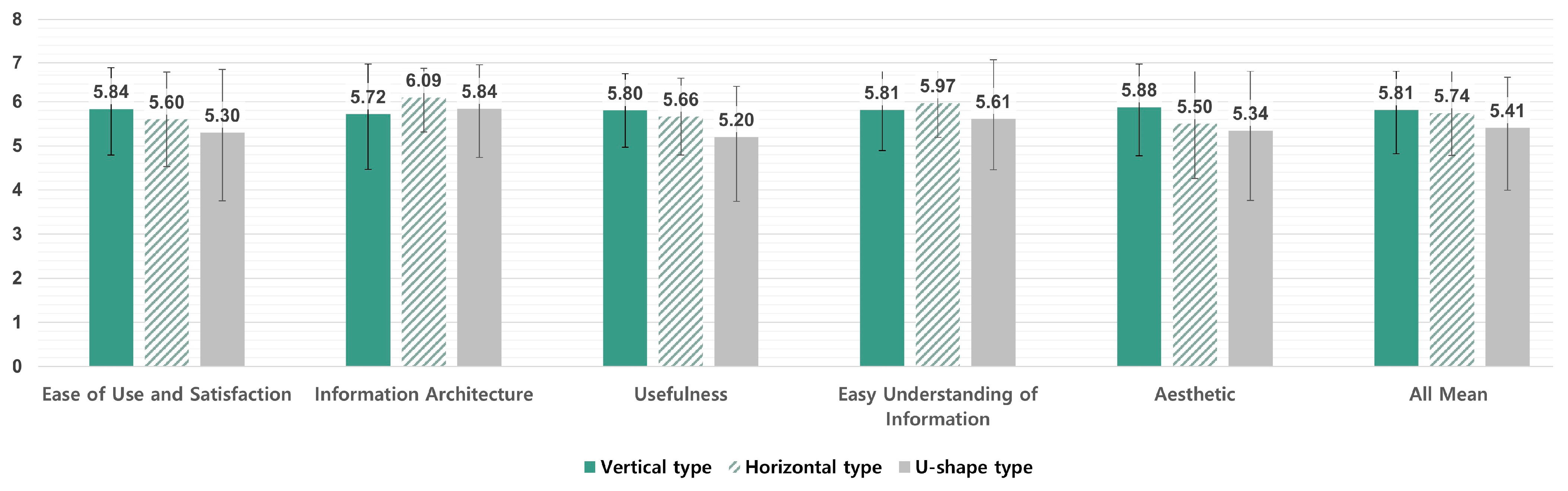
5.4.3. Results of the Main Study
‘The best part is that I can see my records at a glance, especially in situations where I need to see my previous treatment history or check my medication history at the hospital’.(P1-20s)
‘I can see my health at a glance, so I think I can use it well’.(P11, 40s)
‘It’s so good (to see it by disease), but I wonder if it’s possible to aggregate and show the records like this’.(P12, 40s)
‘I don’t know if it’s actually a feasible technology’.(P13, 40s)
‘I think colour helps, like when you use colour to distinguish subway lines, but I don’t know if it helps much’.(P1-20s)
‘The different colours made it easier to distinguish, and I don’t think people would know what the disease colours mean, so I think it’s just right now’.(P3, 20s)
‘If there are multiple disease cards that have been cured, it would be nice to be able to see only the cured ones (cured ones and those under treatment at once)’.(P15, 40~60s)
‘I don’t think it’s necessary to see a cured disease from the top’.(P5, 20s)
‘When I look at what the doctors write, I see how it’s expressed in English and how severe it is, but when I look at the diagnosis, I think it’s important to change it to make it easier for us to see’.(P1, 20s)
‘Most of the words themselves are written in an easy way, but since it is medical information, I think there are situations where difficult terms appear. In such cases, it would be good to have additional explanations’.(P6, 20s)
6. Discussion
6.1. Importance of PJMs from a Patient’s Perspective
6.2. Important Elements of the PJM UX
6.3. Limitations and Further Research
6.4. Contribution
7. Conclusions
Author Contributions
Funding
Institutional Review Board Statement
Informed Consent Statement
Data Availability Statement
Conflicts of Interest
References
- Schnall, R.; Bakken, S.; Rojas, M.; Travers, J.; Carballo-Dieguez, A. mHealth technology as a persuasive tool for treatment, care and management of persons living with HIV. AIDS Behav. 2015, 19, 81–89. [Google Scholar] [CrossRef] [PubMed]
- Zhang, K.; Aslan, A. Design Frameworks for Mobile Health Technology: A State-of-the-Art Review of Research from 2015–2021. Int. J. Health Syst. Transl. Med. 2022, 2, 1–13. [Google Scholar] [CrossRef]
- Kao, C.K.; Liebovitz, D.M. Consumer mobile health apps: Current state, barriers, and future directions. PM&R 2017, 9, S106–S115. [Google Scholar]
- Baumann, L.A.; Baker, J.; Elshaug, A.G. The impact of electronic health record systems on clinical documentation times: A systematic review. Health Policy 2018, 122, 827–836. [Google Scholar] [CrossRef]
- Samadbeik, M.; Fatehi, F.; Braunstein, M.; Barry, B.; Saremian, M.; Kalhor, F.; Edirippulige, S. Education and Training on Electronic Medical Records (EMRs) for health care professionals and students: A Scoping Review. Int. J. Med. Inform. 2020, 142, 104238. [Google Scholar] [CrossRef]
- Uslu, A.; Stausberg, J. Value of the Electronic Medical Record for Hospital Care: Update From the Literature. J. Med. Internet Res. 2021, 23, e26323. [Google Scholar] [CrossRef]
- Caligtan, C.A.; Dykes, P.C. Electronic health records and personal health records. Semin. Oncol. Nurs. 2011, 27, 218–228. [Google Scholar] [CrossRef]
- Zhou, L.; DeAlmeida, D.; Parmanto, B. Applying a User-Centered Approach to Building a Mobile Personal Health Record App: Development and Usability Study. JMIR mHealth uHealth 2019, 7, e13194. [Google Scholar] [CrossRef]
- Koskinen, J.; Rantanen, M.M. What is a PHR? Definitions of Personal Health Record (PHR) used in literature—A systematic literature review. In Well-Being in the Information Society, Proceedings of the Fruits of Respect: 8th International Conference, WIS 2020, Turku, Finland, 26–27 August 2020; Proceedings 8; Springer International Publishing: Berlin, Germany, 2020; pp. 24–49. [Google Scholar]
- Heart, T.; Ben-Assuli, O.; Shabtai, I. A review of PHR, EMR and EHR integration: A more personalized healthcare and public health policy. Health Polic. Technol. 2017, 6, 20–25. [Google Scholar] [CrossRef]
- Ahern, D.K.; Woods, S.S.; Lightowler, M.C.; Finley, S.W.; Houston, T.K. Promise of and potential for patient-facing technologies to enable meaningful use. Am. J. Prev. Med. 2011, 40, S162–S172. [Google Scholar] [CrossRef]
- Choi, W.; Chun, J.W.; Lee, S.J.; Chang, S.H.; Kim, D.J.; Choi, I.Y. Development of a MyData platform based on the personal health record data sharing system in Korea. Appl. Sci. 2021, 11, 8208. [Google Scholar] [CrossRef]
- Choi, B.K.; Park, Y.T.; Park, H.A.; Lane, C.; Jo, E.C.; Kang, S. Factors of quality of care and their association with smartphone based PHR adoption in South Korean hospitals. BMC Med. Inform. Decis. Mak. 2021, 21, 1–9. [Google Scholar] [CrossRef]
- Norman, C.D.; Skinner, H.A. eHealth literacy: Essential skills for consumer health in a networked world. J. Med. Internet Res. 2006, 8, e506. [Google Scholar] [CrossRef]
- Lee, K.; Lim, K.; Jung, S.Y.; Ji, H.; Hong, K.; Hwang, H.; Lee, H.Y. Perspectives of Patients, Health Care Professionals, and Developers Toward Blockchain-Based Health Information Exchange: Qualitative Study. J. Med. Internet Res. 2020, 22, e18582. [Google Scholar] [CrossRef] [PubMed]
- Tang, P.C.; Ash, J.S.; Bates, D.W.; Overhage, J.M.; Sands, D.Z. Personal health records: Definitions, benefits, and strategies for overcoming barriers to adoption. J. Am. Med. Inform. Assoc. 2006, 13, 121–126. [Google Scholar] [CrossRef] [PubMed]
- Sijm-Eeken, M.; Zheng, J.; Peute, L. Towards a lean process for patient journey mapping—A case study in a large academic setting. In Digital Personalized Health and Medicine; IOS Press: Amsterdam, The Netherlands, 2020; pp. 1071–1075. [Google Scholar]
- Joseph, A.L.; Kushniruk, A.W.; Borycki, E.M. Patient journey mapping: Current practices, challenges, and future opportunities in healthcare. Knowl. Manag. E-Learn. 2020, 12, 387. [Google Scholar]
- Percival, J.; McGregor, C. An evaluation of understandability of patient journey models in mental health. JMIR Human Factors 2016, 3, e5640. [Google Scholar] [CrossRef]
- McCarthy, S.; O’Raghallaigh, P.; Woodworth, S.; Lim, Y.Y.; Kenny, L.C.; Adam, F. Embedding the pillars of quality in health information technology solutions using “Integrated Patient Journey Mapping”(IPJM): Case study. JMIR Hum. Factors 2020, 7, e17416. [Google Scholar] [CrossRef]
- Borycki, E.M.; Kushniruk, A.W.; Wagner, E.; Kletke, R. Patient journey mapping: Integrating digital technologies into the journey. Knowl. Manag. E-Learn. 2020, 12, 521. [Google Scholar]
- Agarwal, M. The Application of a Patient Journey Map for Improved Patient Centered Care Transitions. Doctoral Thesis, University of Michigan, Ann Arbor, MI, USA, 2017. [Google Scholar]
- Simonse, L.; Albayrak, A.; Starre, S. Patient journey method for integrated service design. Des. Health 2019, 3, 82–97. [Google Scholar] [CrossRef]
- O’Dell, C.A. Improving the User Experience in Healthcare through Service Design: Developing a Digital Identity for Patients. 2020. Available online: https://yorkspace.library.yorku.ca/xmlui/handle/10315/37723 (accessed on 3 April 2023).
- Pires, I.M.; Marques, G.; Garcia, N.M.; Flórez-Revuelta, F.; Ponciano, V.; Oniani, S. A Research on the Classification and Applicability of the Mobile Health Applications. J. Pers. Med. 2020, 10, 11. [Google Scholar] [CrossRef] [PubMed]
- Hassenzahl, M.; Burmester, M.; Koller, F. AttrakDiff: Ein Fragebogen zur Messung wahrgenommener hedonischer und pragmatischer Qualität. In Mensch & Computer 2003: Interaktion in Bewegung; B.G. Teubner: Stuttgart, Germany, 2003; pp. 187–196. [Google Scholar]
- Laugwitz, B.; Held, T.; Schrepp, M. Construction and Evaluation of a User Experience Questionnaire. Comput. Sci. 2008, 5298, 63–76. [Google Scholar] [CrossRef]
- Minge, M.; Riedel, L. meCUE—Ein modularer Fragebogen zur Erfassung des Nutzungserlebens [meCUE—A modular questionnaire for capturing the user experience]. Mensch Comput. 2013, 9, 89–98. [Google Scholar]
- Díaz-Oreiro, I.; López, G.; Quesada, L.; Guerrero, L.A. Standardized Questionnaires for User Experience Evaluation: A Systematic Literature Review. Proceedings 2019, 31, 1014. [Google Scholar]
- Hajesmaeel-Gohari, S.; Khordastan, F.; Fatehi, F.; Samzadeh, H.; Bahaadinbeigy, K. The most used questionnaires for evaluating satisfaction, usability, acceptance, and quality outcomes of mobile health. BMC Med. Inform. Decis. Mak. 2022, 22, 22. [Google Scholar] [CrossRef]
- Brooke, J. SUS-A quick and dirty usability scale. Usability Eval. Ind. 1996, 189, 4–7. [Google Scholar]
- Lewis, J.R. Psychometric evaluation of the PSSUQ using data from five years of usability studies. Int. J. Hum. Comput. Interact. 2002, 14, 463–488. [Google Scholar]
- Lewis, J.R. IBM computer usability satisfaction questionnaires: Psychometric evaluation and instructions for use. Int. J. Hum. Comput. Interact 1995, 7, 57–78. [Google Scholar] [CrossRef]
- Muro-Culebras, A.; Escriche-Escuder, A.; Martin-Martin, J.; Roldán-Jiménez, C.; De-Torres, I.; Ruiz-Muñoz, M.; Gonzalez-Sanchez, M.; Mayoral-Cleries, F.; Biró, A.; Tang, W. Tools for evaluating the content, efficacy, and usability of mobile health apps according to the consensus-based standards for the selection of health measurement instruments: Systematic review. JMIR mHealth uHealth 2021, 9, e15433. [Google Scholar] [CrossRef]
- Yen, P.-Y.; Wantland, D.; Bakken, S. Development of a customizable health IT usability evaluation scale. In Proceedings of the AMIA Annual Symposium Proceedings, Washington, DC, USA, 13–17 November 2010; p. 917. [Google Scholar]
- Yen, P.-Y.; Sousa, K.H.; Bakken, S. Examining construct and predictive validity of the Health-IT usability evaluation scale: Confirmatory factor analysis and structural equation modeling results. J. Am. Med. Inform. Assoc. 2014, 21, e241–e248. [Google Scholar] [CrossRef]
- Zhou, L.; Bao, J.; Setiawan, I.M.A.; Saptono, A.; Parmanto, B. The mHealth app usability questionnaire (MAUQ): Development and validation study. JMIR mHealth uHealth 2019, 7, e11500. [Google Scholar] [CrossRef] [PubMed]
- Tao, D.; LeRouge, C.; Smith, K.J.; De Leo, G. Defining information quality into health websites: A conceptual framework of health website information quality for educated young adults. JMIR Hum. Factors 2017, 4, e6455. [Google Scholar] [CrossRef] [PubMed]
- Azad-Khaneghah, P.; Neubauer, N.; Miguel Cruz, A.; Liu, L. Mobile health app usability and quality rating scales: A systematic review. Disabil. Rehabil. Assist. Technol. 2021, 16, 712–721. [Google Scholar] [CrossRef] [PubMed]
- Kim, G.; Kim, G.; Hwang, D.; Kim, H.K. Analyzing User Experience Evaluation Scale of mHealth Apps. In Proceedings of the Korean Society for Emotion and Sensibility Conference, Seoul, Republic of Korea, 27–30 April 2022; Volume 2022, pp. 18–21. [Google Scholar]
- Park, J.; Han, S.H.; Kim, H.K.; Cho, Y.; Park, W. Developing elements of user experience for mobile phones and services: Survey, interview, and observation approaches. Hum. Factors Ergon. Manuf. Serv. Ind. 2013, 23, 279–293. [Google Scholar] [CrossRef]
- Kim, H.K.; Han, S.H.; Park, J.; Park, W. How user experience changes over time: A case study of social network services: How user experience changes over time. Hum. Fact. Ergon. Manuf. Serv. Ind. 2015, 25, 659–673. [Google Scholar] [CrossRef]
- Veloski, J.; Tai, S.; Evans, A.S.; Nash, D.B. Clinical vignette-based surveys: A tool for assessing physician practice variation. Am. J. Med. Qual. 2005, 20, 151–157. [Google Scholar] [CrossRef]
- Heale, B.S.E.; Khalifa, A.; Stone, B.L.; Nelson, S.; Del Fiol, G. Physicians’ pharmacogenomics information needs and seeking behavior: A study with case vignettes. BMC Med. Inform. Decis Mak. 2017, 17, 113. [Google Scholar] [CrossRef]
- Gilbert, S.; Mehl, A.; Baluch, A.; Cawley, C.; Challiner, J.; Fraser, H.; Millen, E.; Montazeri, M.; Multmeier, J.; Pick, F.; et al. How accurate are digital symptom assessment apps for suggesting conditions and urgency advice? A clinical vignettes comparison to GPs. BMJ Open 2020, 10, e040269. [Google Scholar] [CrossRef]
- Ledesma, A.; Bidargaddi, N.; Strobel, J.; Schrader, G.; Nieminen, H.; Korhonen, I.; Ermes, M. Health timeline: An insight-based study of a timeline visualization of clinical data. BMC Med. Inform. Decis. Mak. 2019, 19, 1–14. [Google Scholar] [CrossRef]
- Islam, A.; Bezerianos, A.; Lee, B.; Blascheck, T.; Isenberg, P. Visualizing information on watch faces: A survey with smartwatch users. In Proceedings of the 2020 IEEE Visualization Conference (VIS), Salt Lake City, UT, USA, 25–30 October 2020; pp. 156–160. [Google Scholar]
- Blascheck, T.; Besançon, L.; Bezerianos, A.; Lee, B.; Isenberg, P. Glanceable visualization: Studies of data comparison performance on smartwatches. IEEE Trans. Vis. Comput. Graph. 2018, 25, 630–640. [Google Scholar] [CrossRef]
- Ola, O.; Sedig, K. Beyond simple charts: Design of visualizations for big health data. Online J. Public Health Inform. 2016, 8, e195. [Google Scholar] [CrossRef] [PubMed]
- Senathirajah, Y.; Kaufman, D.R.; Cato, K.D.; Borycki, E.M.; Fawcett, J.A.; Kushniruk, A.W. Characterizing and visualizing display and task fragmentation in the electronic health record: Mixed methods design. JMIR Hum. Factors 2020, 7, e18484. [Google Scholar] [CrossRef] [PubMed]
- Bastardo, R.; Castro, M.; Pavão, J.; Ramos, L. A timeline model for clinical events: Empowering data. Procedia Comput. Sci. 2022, 196, 1053–1058. [Google Scholar] [CrossRef]
- Hossain, F.; Islam-Maruf, R.; Osugi, T.; Nakashima, N.; Ahmed, A. A Study on Personal Medical History Visualization Tools for Doctors. In Proceedings of the 2022 IEEE 4th Global Conference on Life Sciences and Technologies (LifeTech), Osaka, Japan, 7–9 March 2022; pp. 547–551. [Google Scholar]
- Arcia, A.; Suero-Tejeda, N.; Bales, M.E.; Merrill, J.A.; Yoon, S.; Woollen, J.; Bakken, S. Sometimes more is more: Iterative participatory design of infographics for engagement of community members with varying levels of health literacy. J. Am. Med. Inform. Assoc. 2016, 23, 174–183. [Google Scholar] [CrossRef] [PubMed]
- Rajabiyazdi, F.; Perin, C.; Oehlberg, L.; Carpendale, S. Exploring the design of patient-generated data visualizations. In Proceedings of the Graphics Interface Conference (GI), Toronto, ON, Canada, 28–29 May 2020. [Google Scholar]
- Zhang, Z.; Kmoth, L.; Luo, X.; He, Z. User-centered system design for communicating clinical laboratory test results: Design and evaluation study. JMIR Hum. Factors 2021, 8, e26017. [Google Scholar] [CrossRef]


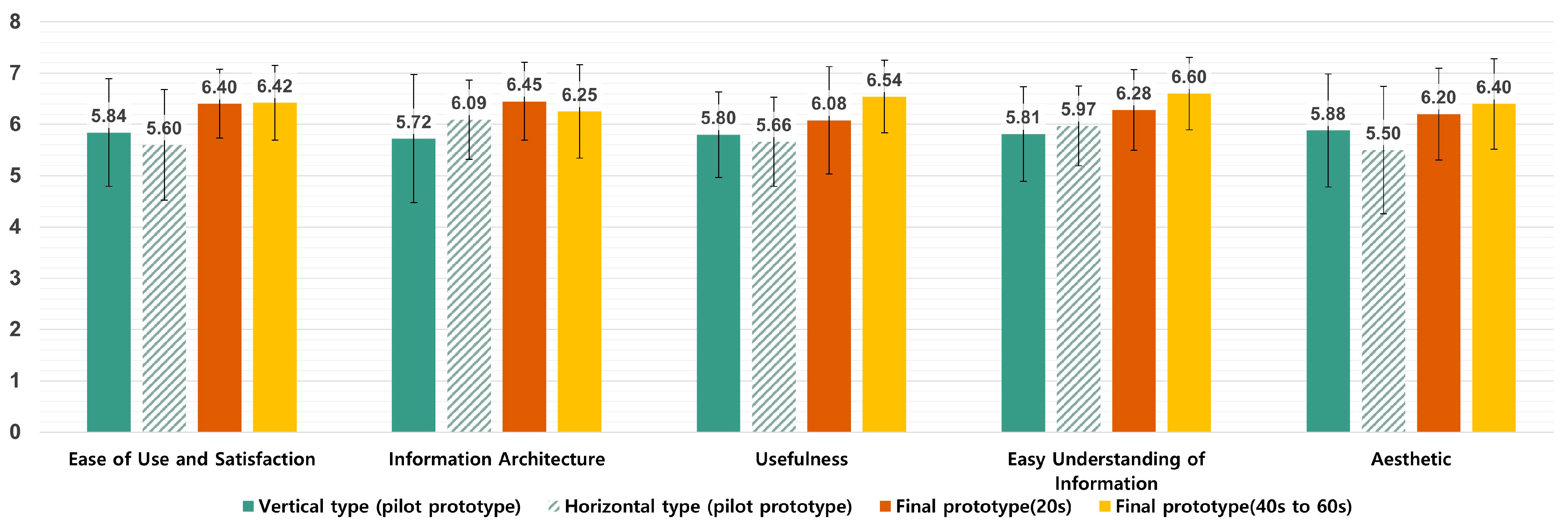
| Factor | Questions | |||||
|---|---|---|---|---|---|---|
| Ease of Use and Satisfaction | Q1. The app was easy to use. | |||||
| Q2. The interface of the app allowed me to use all the functions offered by the app. | ||||||
| Q3. I feel comfortable using this app in social settings. | ||||||
| Q4. The amount of time involved in using this app has been fitting for me. | ||||||
| Q5. Overall, I am satisfied with this app. | ||||||
| Information Architecture | Q6. Whenever I made a mistake using the app, I could recover easily and quickly. | |||||
| Q7. The navigation was consistent when moving between screens. | ||||||
| Usefulness | Q8. This app has all the functions and capabilities I expect it to have. | |||||
| Q9. The app would be useful for my health. | ||||||
| Q10. The app helped me manage my health effectively. | ||||||
| Q11. This mobile health app provided a suitable way to get medical care. | ||||||
| Q12. The app improved my access to health care services. | ||||||
| Easy Understanding of Information | Q13. The medical/health information in the app is accurate, well written, and relevant to the purpose of the app. | |||||
| Q14. The information provided by the app is comprehensive and concise. | ||||||
| Q15. Descriptions of visual information (charts, graphs, images, etc.) provided by the app are logical and clear. | ||||||
| Q16. The information provided by the app was easy to understand. | ||||||
| Aesthetics | Q17. This app is using the appropriate colours. | |||||
| Q18. I like the menu structure and design of the app and find it easy to use. | ||||||
| Answers (7-point Likert scales) | ||||||
| 1 | 2 | 3 | 4 | 5 | 6 | 7 |
| Strongly disagree | Disagree | Somewhat disagree | Neutral | Somewhat agree | Agree | Strongly agree |
| Name | Age | Marital Status | Job |
|---|---|---|---|
| Eunji, Kim | 47 | Married | English Teacher |
| Personalspecifics | |||
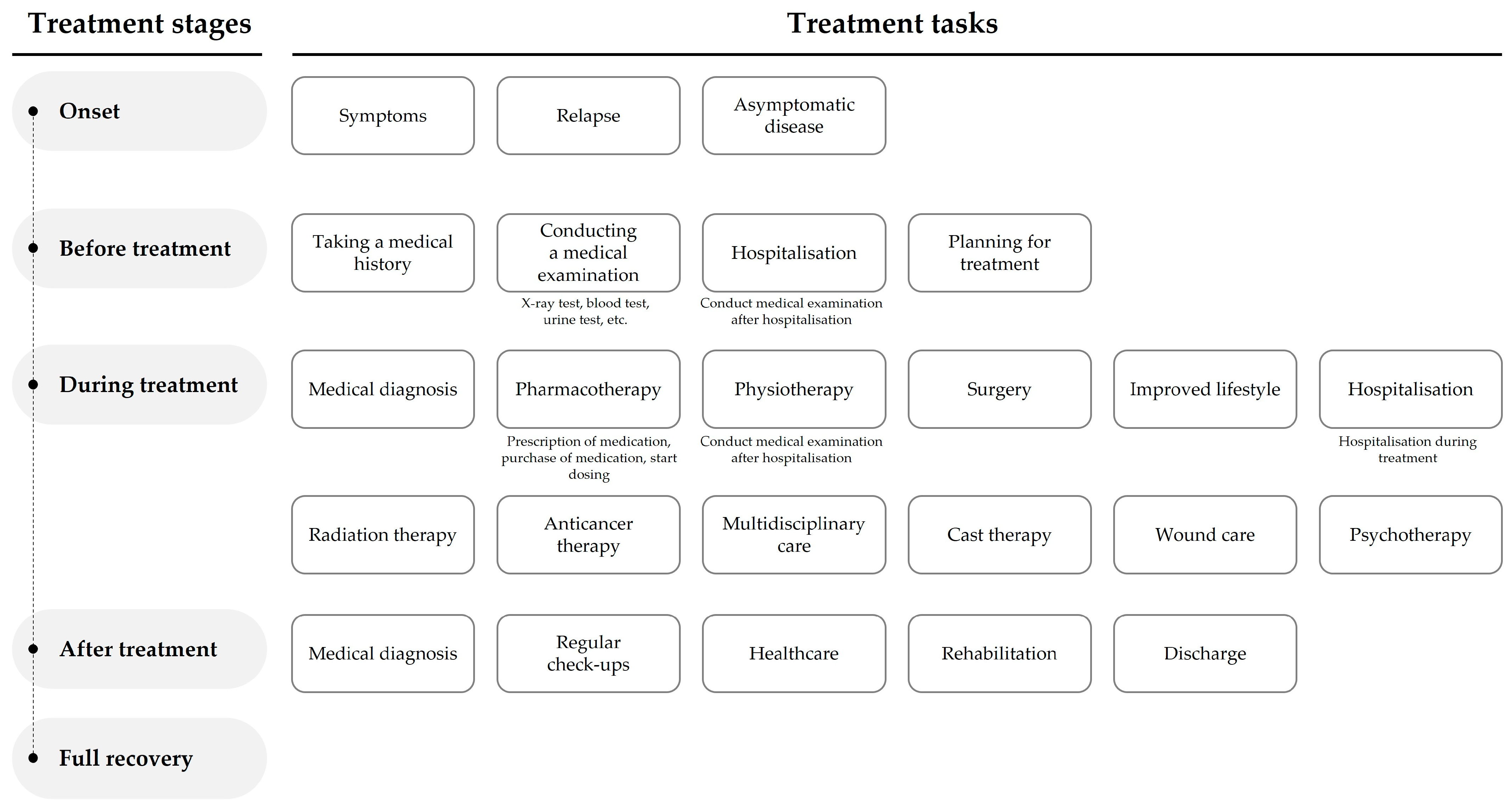
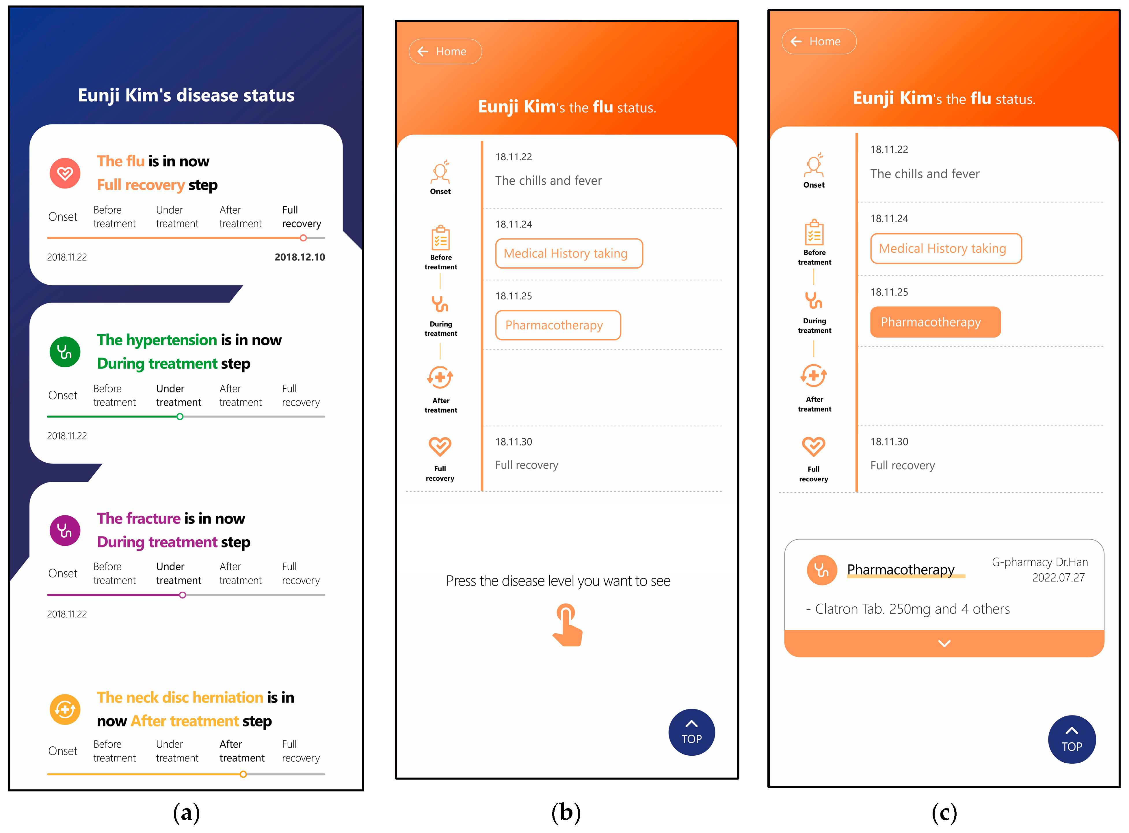
| Daily life | Thanks to her normal healthy lifestyle, Eunji Kim was only being treated for minor diseases without major diseases. She was diagnosed with hypertension in a medical examination in 2019 and began to take an interest in disease management. In the meantime, she suffered a neck disc herniation and a fracture due to a traffic accident on a trip to Jeju Island that year. The neck disc herniation is on the road to recovery through physiotherapy after surgery, and for the fracture, she is undergoing a new cast treatment as the bone that had been broken during medical rehabilitation broke again. She did not have to worry about her health before, but she is confused because she has to manage all kinds of diseases at once due to hypertension, neck disc herniation, and fracture. | ||
| Health state | Diseases | Under treatment: hypertension, fracture (relapse) After treatment: neck disc herniation Full recovery: flu | |
| Prescription information | Hypertension: after hospitalisation, surgery was performed, medication was administered, and the symptoms were under control. Fracture (relapse): the fracture that was under management has returned, and medication and cast therapy are being prescribed. Neck disc herniation: recovery is under way through postoperative rehabilitation. Flu: flu without vaccination, easily cured with medication. | ||
| Trouble | She is confused by the sudden increase in the number of diseases she has to manage, so she is worried about how to understand and manage her illness. | ||
| Core values and needs | She wants to take care of her health while considering the diseases she has experienced so far. | ||
| # | Questions |
|---|---|
| 1 | Which of the medicines you take to treat high blood pressure is listed first? |
| 2 | How high did your fever rise when you got the flu? |
| 3 | As a result of the disc test, how many times did bones grow in the cervical spine? |
| 4 | When you saw the doctor for the fracture, which hospital did you see? |
| 5 | When did you start rehabilitation treatment for the disc herniation? |
Disclaimer/Publisher’s Note: The statements, opinions and data contained in all publications are solely those of the individual author(s) and contributor(s) and not of MDPI and/or the editor(s). MDPI and/or the editor(s) disclaim responsibility for any injury to people or property resulting from any ideas, methods, instructions or products referred to in the content. |
© 2023 by the authors. Licensee MDPI, Basel, Switzerland. This article is an open access article distributed under the terms and conditions of the Creative Commons Attribution (CC BY) license (https://creativecommons.org/licenses/by/4.0/).
Share and Cite
Lee, B.; Lee, J.; Cho, Y.; Shin, Y.; Oh, C.; Park, H.; Kim, H.K. Visualisation of Information Using Patient Journey Maps for a Mobile Health Application. Appl. Sci. 2023, 13, 6067. https://doi.org/10.3390/app13106067
Lee B, Lee J, Cho Y, Shin Y, Oh C, Park H, Kim HK. Visualisation of Information Using Patient Journey Maps for a Mobile Health Application. Applied Sciences. 2023; 13(10):6067. https://doi.org/10.3390/app13106067
Chicago/Turabian StyleLee, Boram, Juwan Lee, Yoonbin Cho, Yuan Shin, Chaesoo Oh, Hayun Park, and Hyun K. Kim. 2023. "Visualisation of Information Using Patient Journey Maps for a Mobile Health Application" Applied Sciences 13, no. 10: 6067. https://doi.org/10.3390/app13106067