Article

Enhanced Intensity Analysis to Quantify Categorical Change and to Identify Suspicious Land Transitions: A Case Study of Nanchang, China

by
Zheyu Xie
1,
Robert Gilmore Pontius Jr
2,
Jinliang Huang
1,* and
Vilas Nitivattananon
3
1
Fujian Key Laboratory of Coastal Pollution Prevention and Control, Xiamen University, Xiamen 361102, China
2
School of Geography, Clark University, Worcester, MA 01610, USA
3
Urban Environment Management Program, Asian Institute of Technology, Pathumthani 12120, Thailand
*
Author to whom correspondence should be addressed.
Remote Sens. 2020, 12(20), 3323; https://doi.org/10.3390/rs12203323
Submission received: 15 September 2020 / Revised: 9 October 2020 / Accepted: 9 October 2020 / Published: 13 October 2020

Abstract

:
Conventional methods to analyze a transition matrix do not offer in-depth signals concerning land changes. The land change community needs an effective approach to visualize both the size and intensity of land transitions while considering possible map errors. We propose a framework that integrates error analysis, intensity analysis, and difference components, and then uses the framework to analyze land change in Nanchang, the capital city of Jiangxi province, China. We used remotely sensed data for six categories at four time points: 1989, 2000, 2008, and 2016. We had a confusion matrix for only 2016, which estimated that the map of 2016 had a 12% error, while the temporal difference during 2008–2016 was 22% of the spatial extent. Our tools revealed suspected errors at other years by analyzing the patterns of temporal difference. For example, the largest component of temporal difference was exchange, which could indicate map errors. Our framework identified categories that gained during one time interval then lost during the subsequent time interval, which raised the suspicion of map error. This proposed framework facilitated visualization of the size and intensity of land transitions while illustrating possible map errors that the profession routinely ignores.

1. Introduction

Land change measurement helps to understand the coupled human-environmental system [1,2]. The spatiotemporal pattern of land-change can reflect underlying human activities and show how humans interact with nature over time [3,4,5]. Large-scale ongoing modifications to land-use and land cover (LULC) have several environmental and socio-economic implications, including those for land productivity, biodiversity change, and urban heat island effect, all of which influence long-term environmental sustainability [6,7]. However, land change analysis relies on the data used and the methods implemented. Errors in the LULC data can propagate through change analysis. Robust methods are needed to offer in-depth signals of land change over time. As such, it remains challenging to develop a universal framework to measure land change for informing decision-makers.
Post-classification change analysis depends on the LULC data classified from remotely sensed images [8,9,10]. Some researchers mistakenly assume that data are sufficiently accurate when map accuracy is greater than 85% correct. Other authors realize the flaw of the traditional rule of thumb. For example, Quan et al. [11] suspected that data error might account for some transitions from Built to Cultivated because the data at four time-points had overall errors of 11%, 8%, 5%, and 4%. Suspicious land transitions are those transitions for which we suspect that the temporal difference is due to error in the maps rather than real change on the ground. Shafizadeh-Moghadam et al. [12] identified a suspicious land transition from Artificial to Cultivated using the GlobeLand30 dataset, which claims an accuracy greater than 80% at 2010 [13]. Kappa is a metric of accuracy that continues to be pervasive [14,15,16] despite harsh criticism [17]. It is possible that the change is erroneous and that land transitions are suspicious, even when the kappa coefficients are high at each time point.
Pontius Jr and Lippitt [18] offered a method to compute the size of map error that could account for the observed map differences between two time-points. Aldwaik and Pontius Jr [19] presented a method to compute the minimum hypothetical error in the data that could account for each observed deviation from a uniform intensity, but they do not give an example where empirical errors are compared to the hypothetical errors. The profession needs more illustrations that compare the sizes of the temporal differences to the sizes of the errors to see whether the errors could account for the differences between time-points.
The conventional method of assessing land change is to compare bi-temporal maps derived from remotely sensed imagery and to produce land a transition matrix [20], which is a table of numbers where the rows show the categories at the start of the time interval, while the columns show the same sequence of categories at the end of the time interval. Transition matrices are the foundation for various metrics that analyze temporal change among categories [11,20,21]. The traditional metrics can provide a general understanding of spatiotemporal patterns of land dynamics [22,23,24]. However, some popular metrics fail to reveal both gross loss and gross gain of each category [25,26] and fail to give insight into the underlying processes in land change [27,28]. There is a dilemma that several transition matrices can form a wall of numbers that is daunting to interpret but which scientists frequently need to compare several time intervals [25].
Intensity Analysis is a quantitative framework that reveals the signals of change at three levels of detail—interval level, category level, and transition level [29,30]. Intensity Analysis is applied around the world [29,31,32,33,34]. Pontius Jr [26] further developed the method of Difference Components, which facilitates comparison of each category with other categories and with the difference overall. Each difference is the sum of three components—Quantity, Exchange, and Shift [35], which apply to each category and the overall extent [11,26]. Yang et al. [21] proposed a table to display results from Intensity Analysis at the transition level. Tang et al. [36] enhanced the table so that it indicated the degree to which a transition is targeted or avoided, but the modification fails to show the size of each transition. Researchers need a way to report a temporal sequence of transition matrices in graphical form, which is one of our enhancements to Intensity Analysis.
Our article proposes a novel methodology for presenting transition matrices and illustrates the methodology with a case study from Nanchang. Nanchang, the capital of the Jiangxi province, is typical of the national ecological civilization pilot area. Nanchang is in the Poyang Lake plain and plays an important role in regional economic and ecological health. Figure 1 shows how Nanchang belongs to the Poyang Lake watershed, downstream within the Yangtze River basin. Poyang Lake is the largest freshwater lake in China. Since the 1980s, urbanization and socio-economic development have accelerated. Nanchang is facing dual pressures from urbanization and ecological conservation, over the past 40 years. Driven by rapid urbanization during recent decades, Nanchang experienced degradation to aquatic environments associated with lake reclamation. Measuring land change in the urban center near Poyang Lake is critical to provide a scientific basis for sustainable land management and urban planning.
Our article presents a framework that integrates error analysis, Intensity Analysis, and Difference Components, to quantify categorical changes and to identify suspicious land transitions. Two specific objectives were to give (1) an example that compared the observed errors to the errors that could explain change and (2) a method to visualize the transition pattern in terms of both the size and the intensity of the transitions. Other researchers can use this framework to identify suspicious transitions and quantify categorical changes.

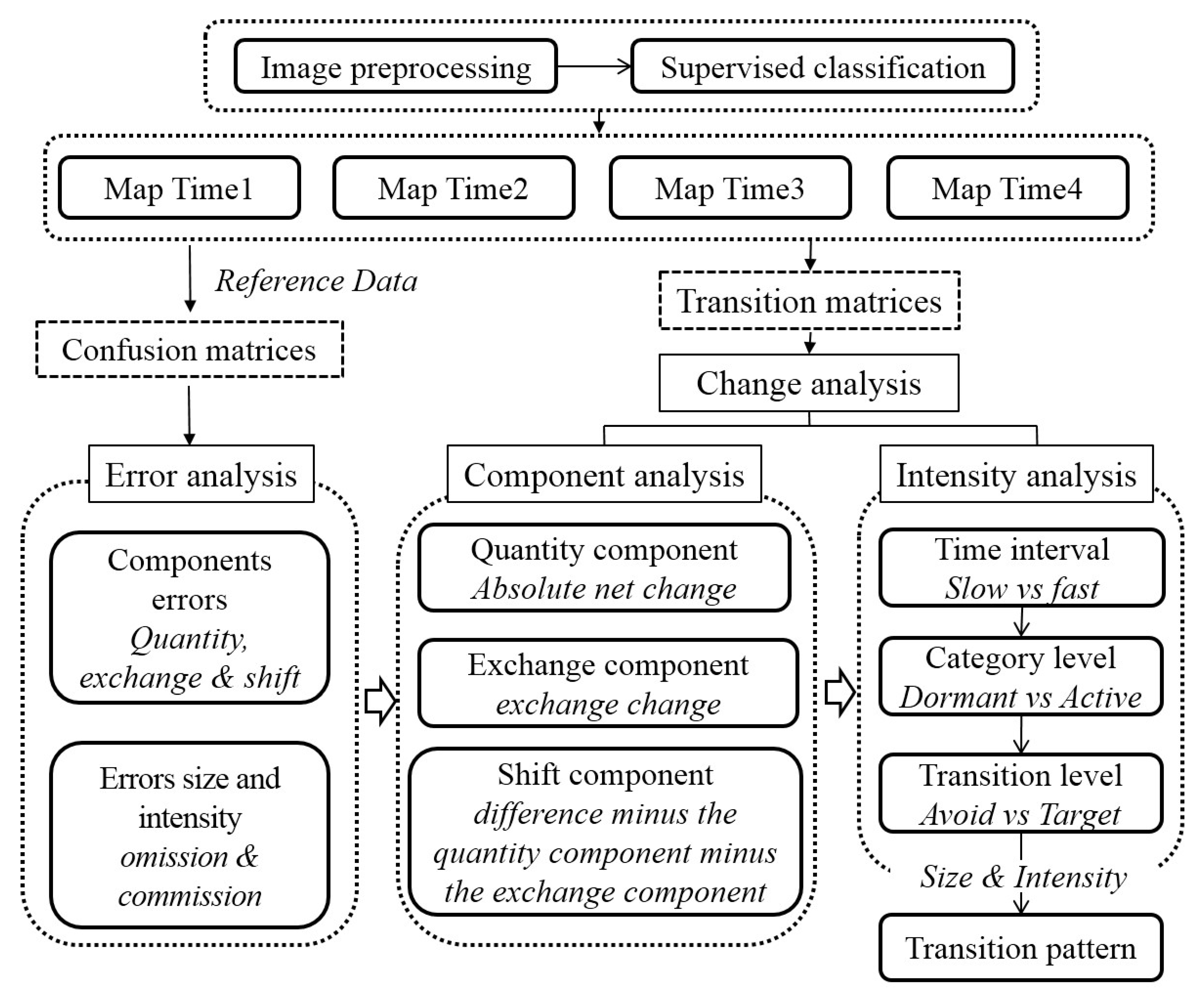
2. Analytical Framework

Figure 2 shows our proposed framework to analyze land change. The framework mainly consists of three components: (1) data pre-processing, (2) error analysis, and (3) change analysis.
Our framework is suitable for situations where researchers have a confusion matrix at one time-point but lack information concerning errors at other time-points. Our method offers useful insights to find transitions that we suspect were caused by error, while we have no proof because we lacked the confusion matrices for three of our four time-points and we lacked information concerning errors of temporal change, as is frequently the situation in the profession. We created a method of visualization called transition pattern, which showed both the size and intensity of the transitions across multiple time intervals, in a single graphic.

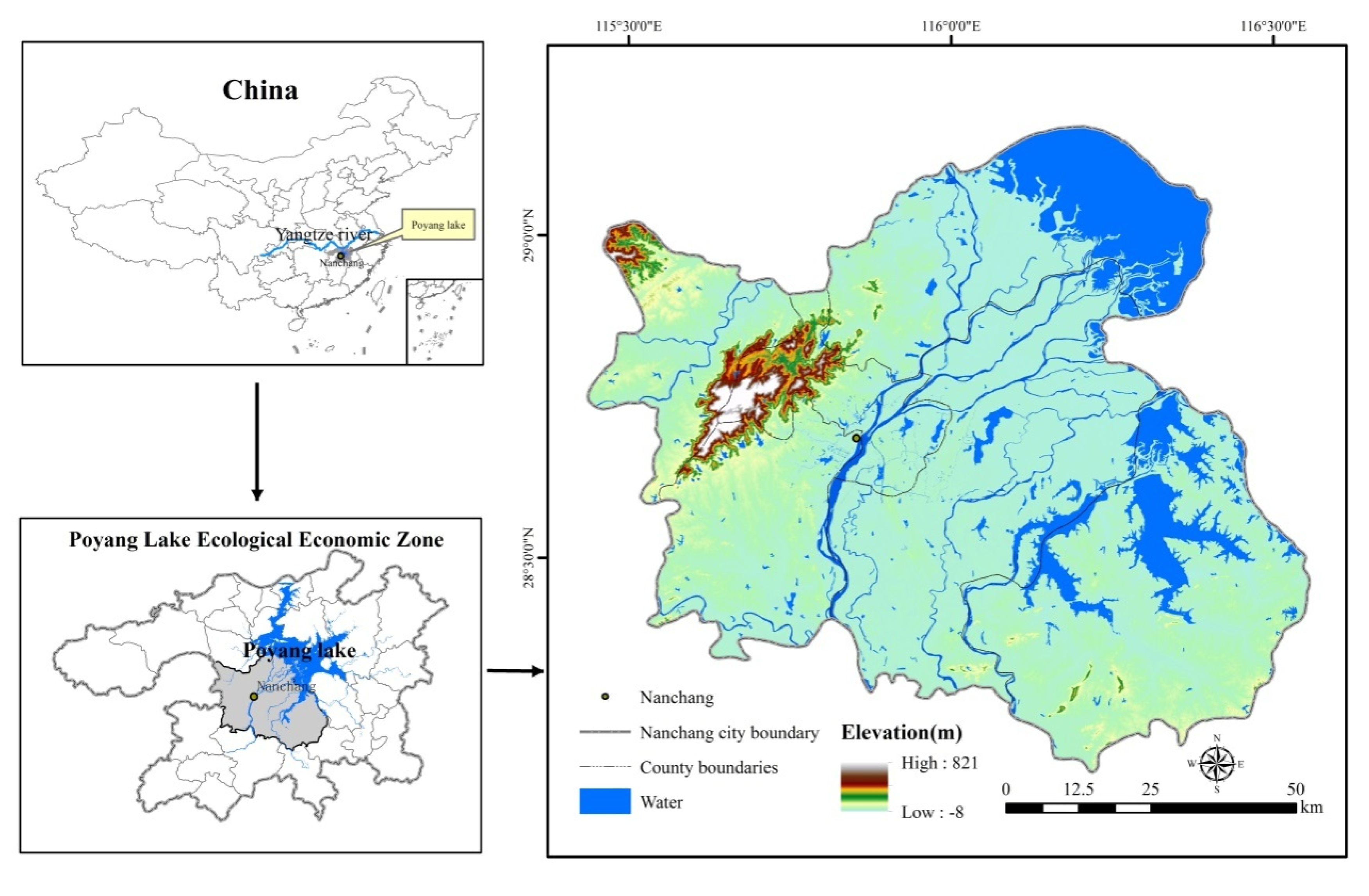
2.1. Data Collection and Processing

Multi-temporal satellite images are from Landsat Thematic Mapper (TM) at 1989, 2000, and 2008, and Operational Land Imager (OLI) at 2016. Table S1 describes the satellite images that serve as the basis for the map of land categories. These Landsat images were from the United States Geological Survey. Before performing land classification, the acquired images were geo-rectified and processed for atmospheric correction. All acquired images were geo-rectified with reference to topographic maps, using at least 30 ground control points in each image, such as road intersections and stream confluences. The root mean squared errors of geometric rectification were less than half a pixel, as a result of using the first-order polynomial nearest neighbor algorithm. We performed a supervised classification to produce the map at 2016. We then used the 2016 map to help to classify each of the preceding years in sequence. The operation consisted of overlaying the map of 2016 on the 2008 image, so we could use visual interpretation to group pixels with the same characteristics. We repeated this procedure for 2000 and 1989, to produce a sequence of maps at 1989, 2000, 2008, and 2016. We assigned every cluster to one of six land categories and then compared the 2016 classification with the high-resolution image at 2016, which is available on Google Earth. We collected 1000 purely random reference samples to assess accuracy at 2016 and generated a confusion matrix at 2016. Each map had six categories: builtup, woodland, water, cropland, aquaculture, and bareland.

2.2. Error Analysis

We analyzed the confusion matrix at 2016, similar to how we analyzed a transition matrix of temporal difference. The loss of i corresponds to the commission error of i, the gain of j corresponds to the omission error of j, and persistence of j corresponds to the agreement of j. The supplementary materials gives the notation and equations. We also applied Equations (13) and (16) from Aldwaik and Pontius Jr [19] to assess whether the errors at 2016 could account for the deviation between the uniform change intensity and each category’s gain intensity during 2008–2016.

2.3. Change Component

We budgeted the differences during each time interval into three components called Quantity, Exchange, and Shift [35]. The supplementary materials gives equations for those concepts for each category j and the extent during each time interval t, denoted as dtj, qtj, etj, stj, Dt, Qt, Et, and St. Table S2 defines the mathematical symbols that the equations use.

2.4. Intensity Analysis

Intensity analysis is a hierarchical framework that compares a uniform intensity to observed intensities of temporal changes among categories [12,37]. Aldwaik and Pontius Jr [29] created Intensity Analysis to dissect transition matrices at three levels of detail: time interval, category, and transition.

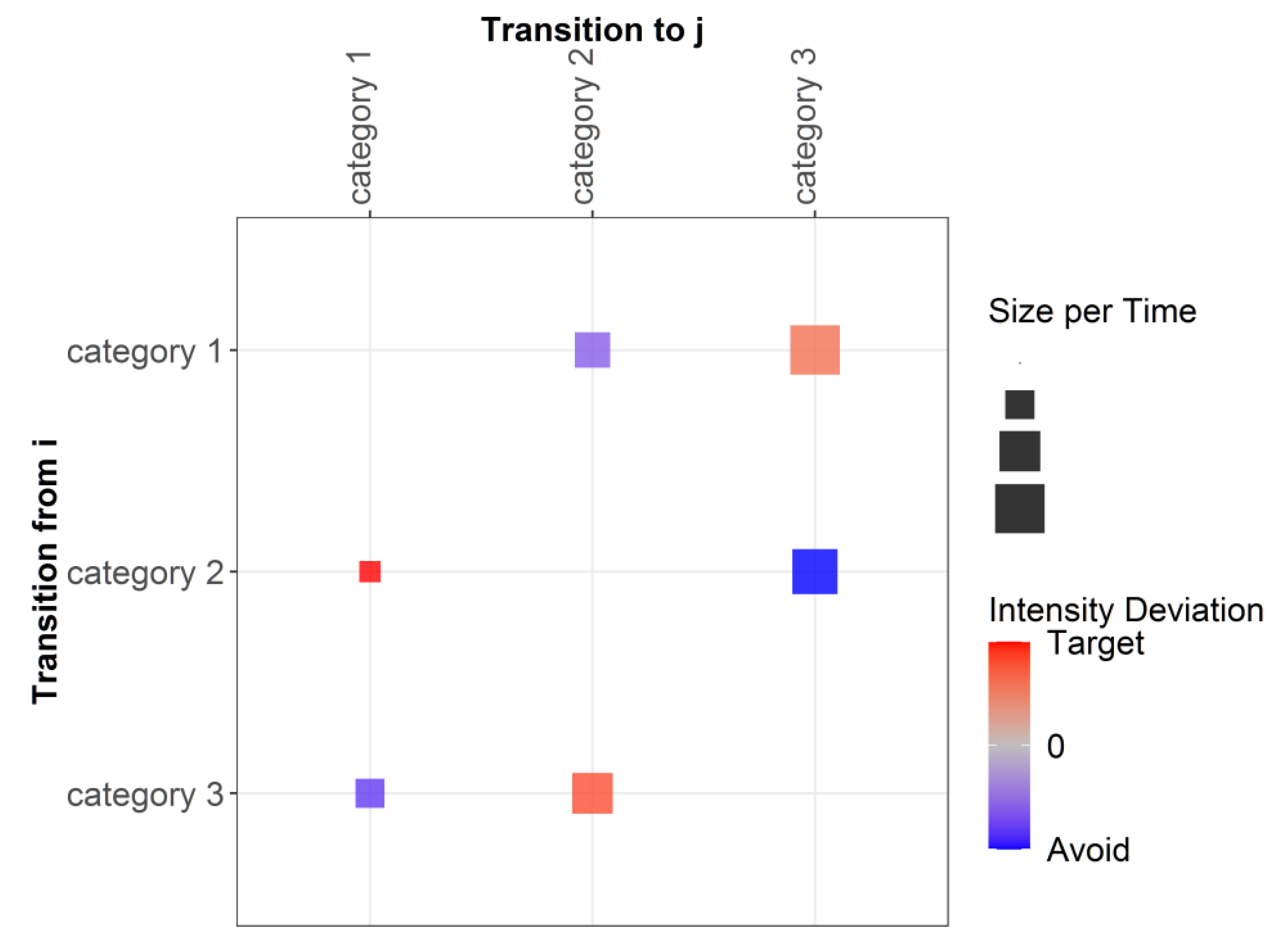
2.5. Transition Pattern

We coined the phrase “transition pattern” as our method to visualize both the size and intensity of the transitions. Figure 3 shows the design of the transition pattern. The rows show a category’s losses. The columns show a category’s gains. Diagonal entries are excluded because they indicate persistence, not change. The size of the square was proportional to the annual area of the transition. The color of the square revealed the transition intensity with which the column category gained from the row category. If the intensity for a particular transition is greater than the column’s uniform transition intensity, then the square is a shade of red and we say that the gaining category targeted the row category. If the intensity for a particular transition is less than the column’s uniform transition intensity, then the square is a shade of blue and we say that the gaining category avoided the row category. The intensity deviation in Figure 3 refers to the deviation between the transition intensity Rtij of a particular off-diagonal entry and the column’s uniform transition intensity Wtj. The supplementary materials gives the equations for Rtij and Wtj. Readers should compare the colors within a column to see how each column’s gaining category targets or avoids each row’s losing category.

3. Results

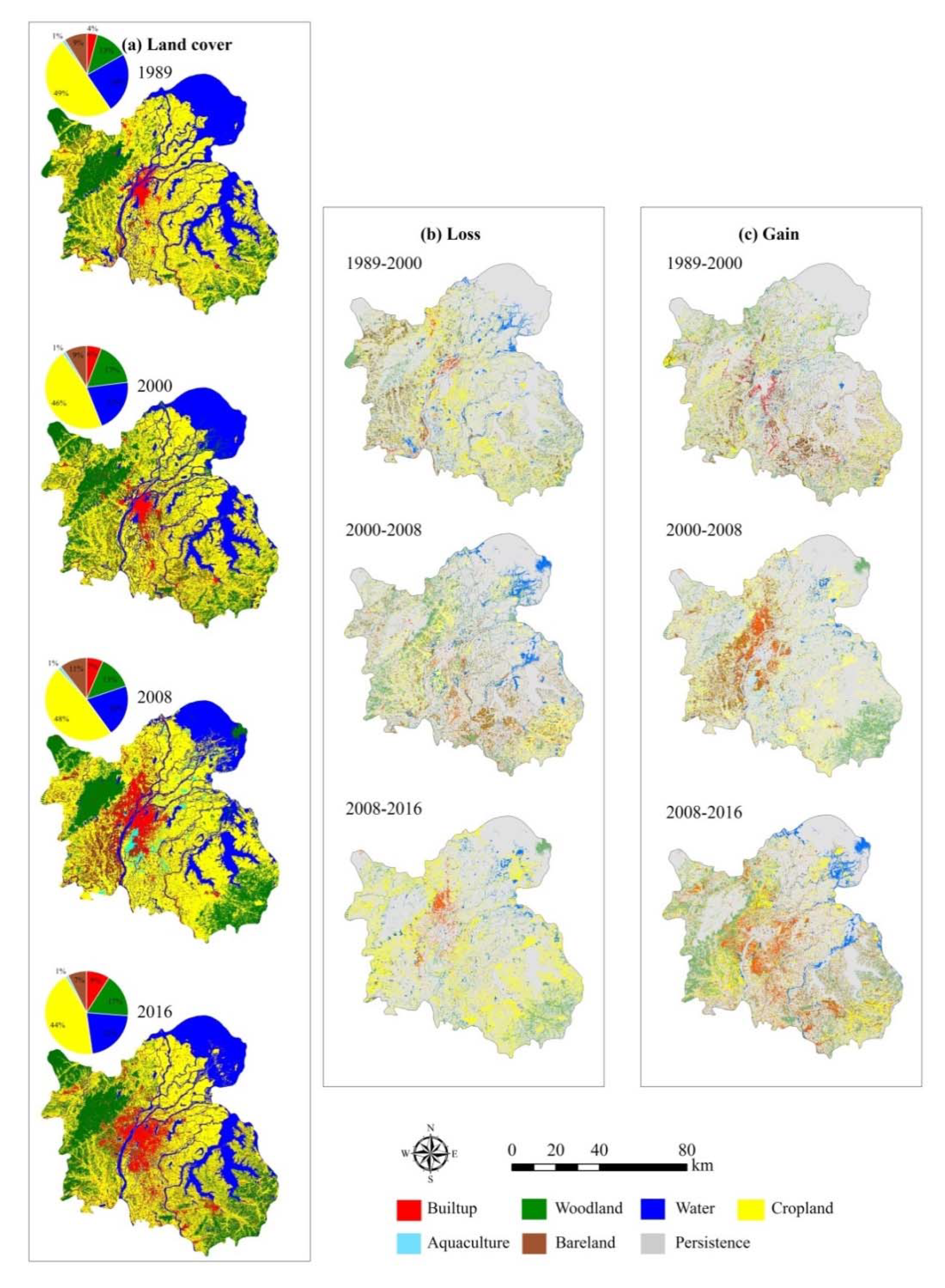
3.1. LUCC Classifications
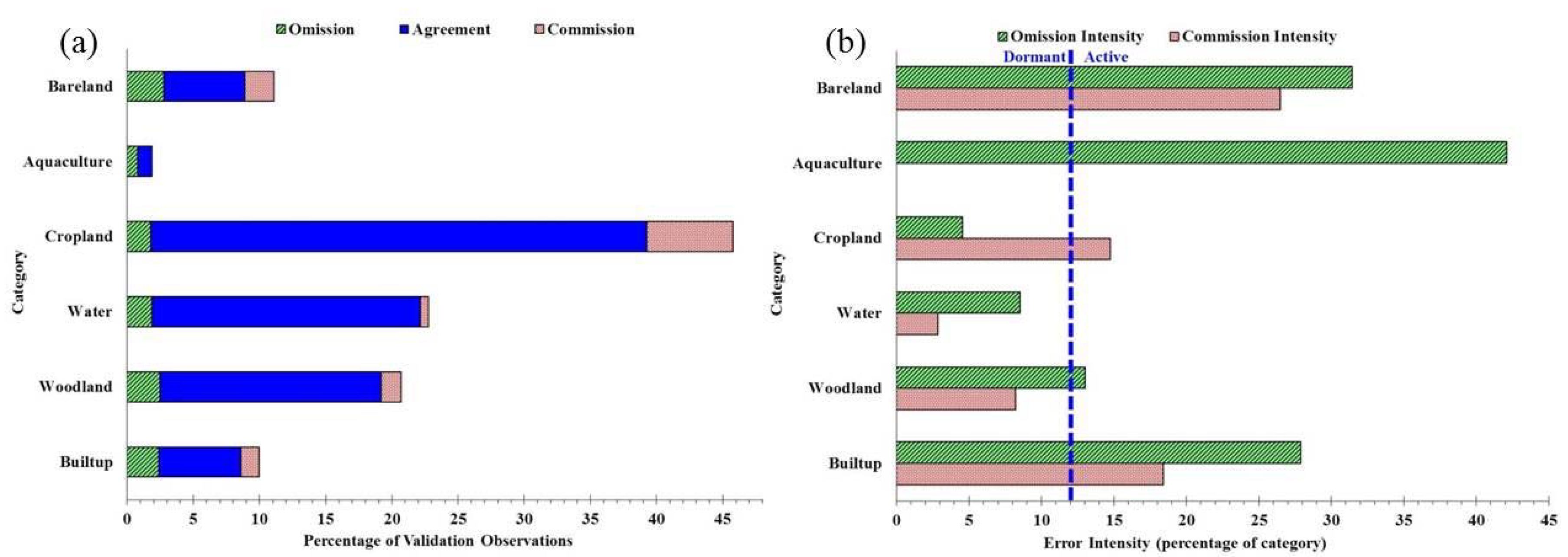
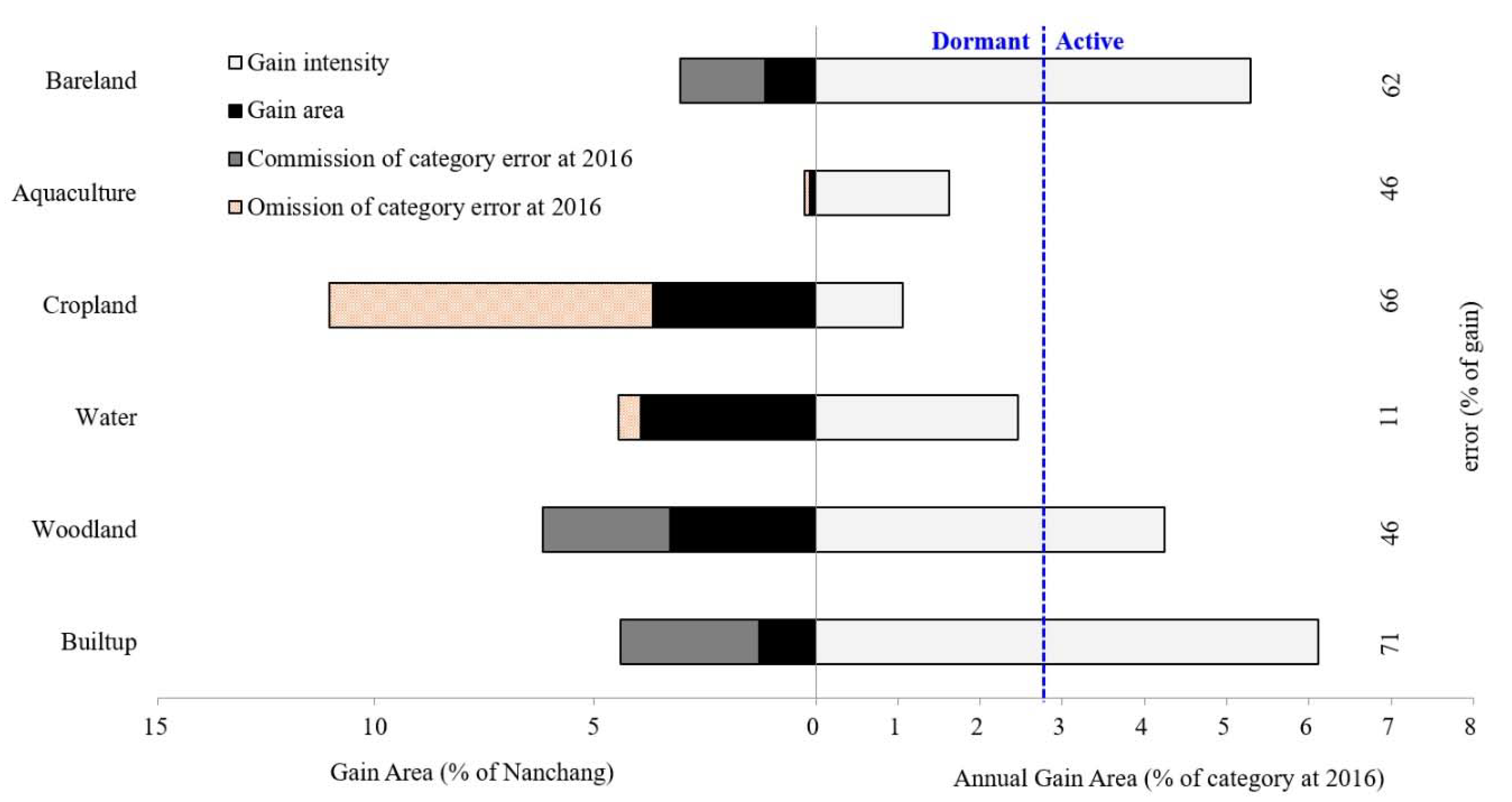
Figure 4 presents the maps and percentages of the six land categories at the four time-points. All maps on the left concerning land cover looked similar because the change was less than 30% for all time intervals. The maps of Loss and Gain are essential to see the transitions. Suspicious transitions included patches in the northeast that changed from water to woodland and cropland during 2000–2008, then reverted to water during 2008–2016. In the southeast, large patches of cropland transitioned to woodland during 2000–2008, then transitioned back to cropland during 2008–2016. Additionally, many patches in the north gained builtup during 2000–2008 then lost builtup during 2008–2016. Map errors might contribute to such temporal differences where a category gains during one time interval then loses during the subsequent time interval. The purpose of our framework is to call attention to possible problems with data, even when we do not have confusion matrices.

3.2. Error Analysis

Figure 5 describes the category level errors for (a) size and (b) intensity of Nanchang at 2016. The union of Omission and Agreement in Figure 5a is the number of observations in the Reference information for each category. The union of Commission and Agreement is the number of observations in the map for each category. If the commission error was larger than the omission error for a category, then the map overestimated the size of that category, as illustrated by the cropland. The largest component of error derived from an overestimation of cropland. If the commission error was smaller than the omission error for a category, then the map underestimated the size of that category, as all categories except the cropland illustrate. The uniform line in Figure 5b shows that the overall error in 2016 was 12% of Nanchang’s spatial extent.
Figure 6a shows the size of the components by category as a percentage of the validation observations at 2016. The positive sign on cropland indicates that the map overestimated the size of the cropland. The negative sign on the other categories indicated that the map underestimated the size of those categories. The lines in Figure 6b show that quantity error and exchange error constitute 39% and 46% of the overall error. Quantity error occurred because the map overestimated the size of the cropland and underestimated the size of the other categories. Exchange occurred when pairs of categories were confused with each other. The quantity component accounted for the most error within aquaculture, cropland, and water. Exchange accounted for most of the error within the other categories and most of the error overall.

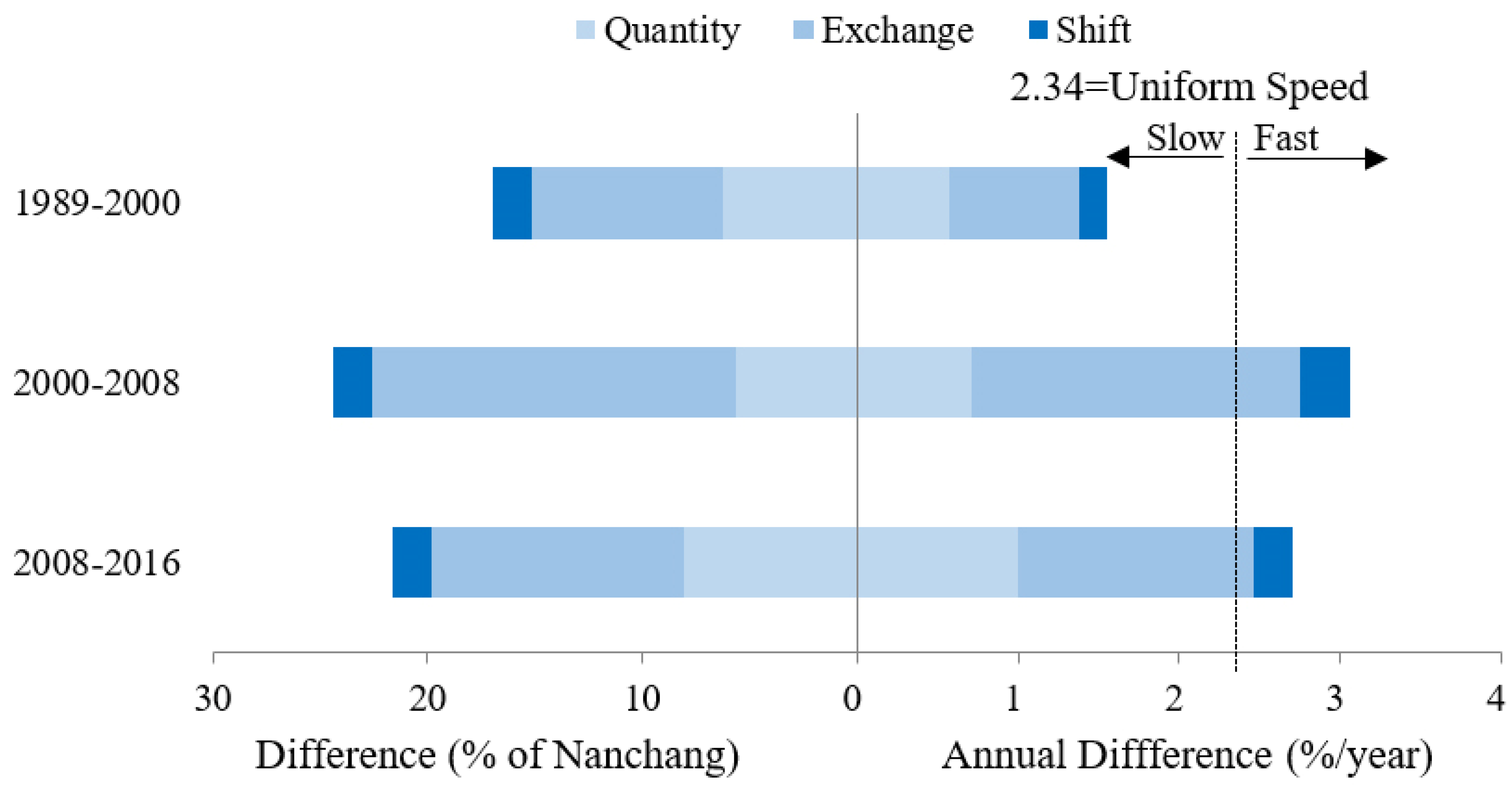
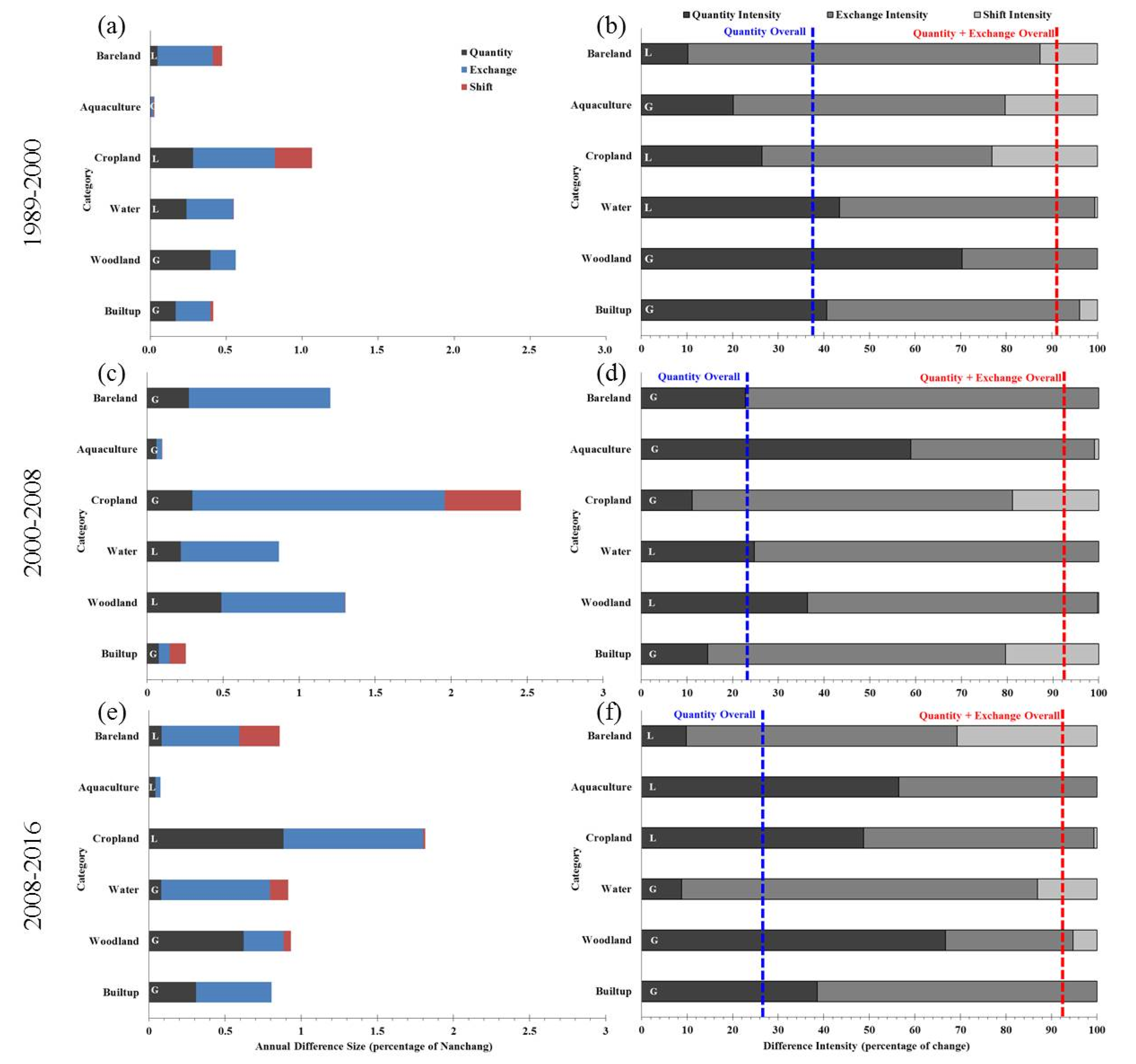
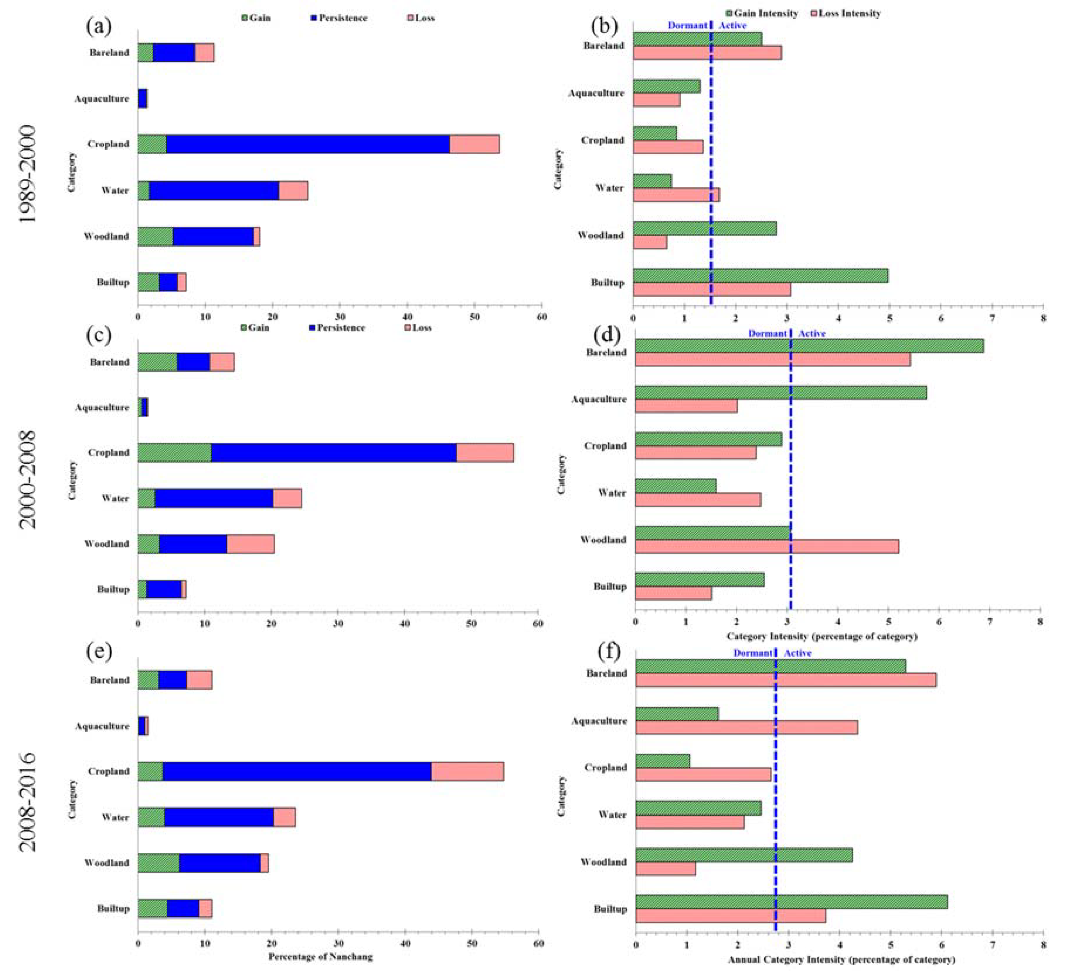
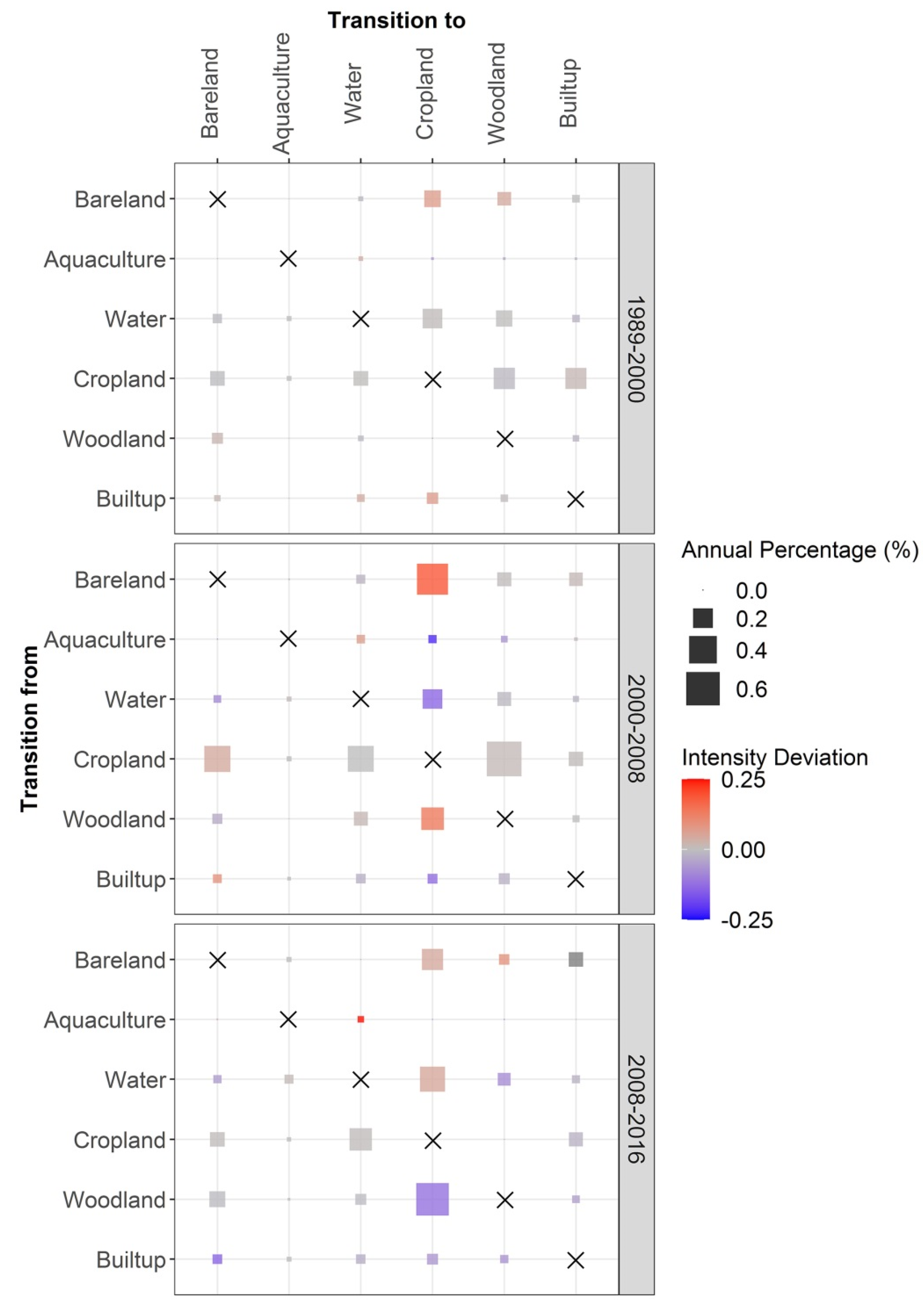
3.3. Change Analysis

Figure 7 combines the results from Difference Components and Intensity Analysis for the time interval level. Exchange is the largest component during all three intervals, especially during the second interval. Exchange occurs when some locations in the map experience a transition from category A to B, while the other locations experience a transition from B to A. Map error can cause exchange. The left side of Figure 7 indicates that quantity difference accounts for 6, 6, and 8 percent of Nanchang during the three time intervals. Figure 7 shows the temporal difference during 2008–2016 was 22 percent of the spatial extent. Figure 5b shows that the map at 2016 had a 12 percent error. The error at 2016 was more than half the size of the temporal difference during 2008–2016. Thus, we should not believe that all of the temporal difference was real change during 2008–2016. The left side of Figure 7 shows the size of the temporal difference during each time interval, while the intervals had different durations. The right side of Figure 7 shows the annual difference during each time interval. The annual difference accelerated then decelerated across the three time intervals. The annual difference during 1989–2000 was less than the uniform speed during the temporal extent, indicating that the annual difference during 1989–2000 was slow, relative to the temporal extent. The annual difference during the other two time intervals was faster than the uniform speed.
Figure 8a,c,e show the difference components during each interval as a percentage of Nanchang. Croplands experienced the largest differences during all intervals. The largest quantity components occurred with cropland and woodland. The letter L in a quantity component denotes net loss and the letter G denotes net gain. Croplands experienced net loss, then net gain, then net loss across the three time intervals. Woodland experienced just the opposite, meaning net gain, then net loss, then net gain across the three time intervals. We suspect that confusion between Cropland and Woodland in the maps could account for this pattern, especially because cropland and woodland could be difficult to distinguish in remotely sensed images. Figure 8e indicates that cropland experienced net loss during 2008–2016, while Figure 5 shows that the map at 2016 overestimated the size of croplands. The implication was that the map at 2008 probably overestimated croplands, even more than the 2016 map overestimated cropland. Overestimation of cropland at 2008 would account for some of the substantial gain of cropland during 2000–2008, which was a major reason why the annual change was fastest during 2000–2008. This demonstrates how our analysis gives insights into how the map error can influence the difference between time-points for which we do not have confusion matrices.
Figure 8b,d,f show the components of temporal difference as a percentage of the temporal difference for each category. Builtup’s exchange component was larger than its quantity component during all three time intervals, which meant that the net gain of builtup was smaller than the simultaneous loss and gain of builtup. The substantial losses of builtup were suspicious. Figure 5 shows that the map at 2016 underestimated the size of the builtup, which might account for some of the apparent losses of builtup. The largest component of difference was exchange, for most of the categories, which could signal map error. The vertical lines in Figure 8b,e,f show how the overall difference derived from its three components. The Quantity component accounted for 27 percent of the overall difference during 2008–2016. The largest component of difference overall during all time intervals was exchange, shown by the difference between the red line and the blue line. When Exchange accounts for a substantial portion of the temporal difference, then we become suspicious of map errors.
Figure 9a,c,e show for each category the size of gain, persistence, and loss, as a percentage of Nanchang. Cropland accounts for more than 43% of Nanchang at the four time-points, while cropland had the largest losses and gains. Figure 9b,d,f show the annual intensity of loss and gain as a percentage of each category’s size. The vertical line indicated that the annual differences were 1.6%, 3.1%, and 2.7% of Nanchang’s area during the three time intervals, respectively, which were identical to the annual differences in Figure 7. If a bar stopped before the line, then the category’s loss or gain was dormant, meaning the change of the category was less intensive than in Nanchang overall. If a bar exceeded the line, then the category’s loss or gain was active, meaning the change of the category more intensive than that in Nanchang overall. The large sizes of cropland and water in the denominators of their intensities produced their dormant intensities.
Figure 10 shows the level of error in the map at 2016, which would be necessary to explain the deviations between uniform change and the gain intensities in Figure 9f. Results from Equation (13) in Aldwaik and Pontius Jr [19] indicate that commission intensity at 2016 could not account for all of the deviations between the uniform line and the gain intensities in Figure 9f. We compared the error intensities on the right side of Figure 10 with the corresponding error intensities in Figure 5b. The errors in terms of commission intensities of builtup, woodland, and bareland on the right side of Figure 10 were larger than those in Figure 5b, therefore, commission error could account for some but not all of the deviations between uniform and observed gain intensity for those three categories. This indicated that gains of those categories were truly active. Results from Equation (16) in Aldwaik and Pontius Jr [19] indicate that omission intensity at 2016 could account for some but not all of the deviations between the uniform line and the gain intensities in Figure 9f. The omission intensities of water, cropland, and aquaculture on the right side of Figure 10 were larger than the corresponding omission intensities in Figure 5b. Therefore, the omission error could not account entirely for the deviation between uniform and observed gain intensity. This indicates that gains of those categories were truly dormant.
Figure 11 shows the transition patterns during three time intervals, which revealed both the size and intensity of transitions over time. Figure 11 immediately shows that the largest transitions were from cropland to woodland during the second time interval and from woodland to cropland during the third time interval. Confusion between woodland and cropland in the data could explain the large sizes of those transitions. Readers should look down each column to see whether the gain of the column category targets or avoids categories at the start of each time interval. A substantial portion of cropland’s gain derived from bareland, as cropland’s gain targeted bareland during all three time intervals. The cropland’s gain targeted water during 2008–2016, which could reflect the process of converting lakes to farmland in Nanchang. The transition from woodland to cropland was large during the last time interval, but the transition avoided due to the woodland’s large size. Builtup’s gain derived mainly from cropland and bareland. Woodland gained most from cropland during the second time interval and targeted bareland during the first and third intervals. Bareland’s gain derived mostly from its targeting of cropland during the second time interval. Water gained mostly from cropland and targeted aquaculture during all three time intervals.

4. Discussion

4.1. Error Analysis in the Framework Proposed for Land Change Analysis

Some investigators are under the false impression that maps are good enough to analyze change when the map at each time-point is greater than 85% correct [13,38]. The single metric of percent correct fails to convey the various types of errors. The error matrix is the most common method to summarize the various types of errors [9,39]. The matrix is sometimes referred to as a confusion matrix because it identifies the pairs of categories that are confused with each other [40]. Category level error metrics, such as overall omission and commission could be computed using the error matrix [10,41,42]. Standard accuracy assessment techniques were developed for single-date remotely sensed data, while the error matrix-based accuracy assessment method could be modified for evaluation of change detection [43,44,45]. Confusion matrices sometimes do not exist because of the difficulties in collecting reliable field-based data, especially for time-points from the distant past [8].
Our framework offered insights concerning how to identify suspicious transitions when detailed information concerning error matrices do not exist. Our proposed framework is a collection of tools to help scientists consider whether errors could explain particular temporal differences. For example, Figure 5b shows that the map at 2016 has a 12 percent error. Meanwhile, Figure 7 shows that the difference during 2008–2016 was 22 percent of the spatial extent. Thus, we should not believe that all of the temporal difference was real change. Figure 5a shows that the map at 2016 overestimated cropland, in spite of the cropland’s net loss during 2008–2016. The error percentages on the right side of Figure 10 were greater than the error intensities in Figure 5b, meaning that the estimated map error could not explain all deviations between a category’s gain intensity and the uniform line. We suspect data error might account for some of the apparent transition from builtup to cropland. We saw the same transition in GlobeLand30 [12], which is a global land cover data product with a 30 m spatial resolution, with 10 classes at the years 2000 and 2010 [13].
We used the framework to identify possible misclassification due to confusion between categories. Figure 7 shows that exchange was the largest component during each time interval, while Figure 8 shows that the largest component was exchange for most of the categories, which would exist when pairs of categories were confused with each other. Quan et al. [11] found similar results of land exchange in Changsha, China. Figure 9 shows that the gain intensity and loss intensity of both builtup and bareland were larger than uniform intensity during the first and third time intervals. This was consistent with other studies that used questionable data to analyze land change in an inland city of China [34,46].

4.2. Transition Pattern to Communicate Both Size and Intensity in One Graphic

Compared to traditional methods such as the land-use dynamic degree, Intensity Analysis and difference components are ways to offer in-depth signals concerning land changes [19]. This is the reason why researchers apply them widely throughout the world. Previous applications of Intensity Analysis graphically showed the sizes and the intensities of the changes at three levels of detail as lengths of bars [22]. We proposed the transition pattern as an alternative way to visualize the transition level analysis, as matrices that show both the size and intensity of the transitions. Previous research presented the intensity and size of the transitions from one gaining category at a time [11,22,47]. Yang et al. [21] proposed a table that showed all transitions and whether a transition was targeting or avoiding, but failed to show the size of each transition and failed to show how intensively the transition was targeted or avoided. Our transition pattern revealed in one graphic the sizes and intensities of all transitions during multiple time intervals.

4.3. Research Agenda

Our framework is suitable for situations where researchers have a confusion matrix for one time point, but lack information concerning errors at the other time-points, such as with the Globeland30 data [48]. Future researchers should make matrices that show errors of change during a time interval, not just errors of categories at a single time-point. It is possible that maps have small errors at their individual time-points but have larger errors concerning change. This can occur when the maps are inconsistent in some temporal respects. For example, our maps are mosaics of images that derive from various months. The seasonal inconsistency among time-points is a reason why the maps’ temporal differences between years might not reflect annual change on the ground. Future methods to identify suspicious transitions should consider the entire time series of each pixel. Our method considers only pairs of sequential time-points. It would be helpful to consider all time-points simultaneously to look for suspicious transitions, such as patches that toggle between two categories across sequential time-points as Figure 4 illustrates.

5. Conclusions

Our article offers a framework to integrate error analysis, intensity analysis, and difference components to measure land change. We illustrated the framework with data from a growing inland city in China. The analysis provides evidence that not all temporal differences indicate real land change. The framework offers clues to identify temporal differences that map errors might have caused. The transition pattern proposed in this study presents a temporal sequence of transition matrices in graphical form. This framework facilitates visualization of the size and intensity of land transitions, while calling attention to possible map errors that the profession routinely ignores.

Supplementary Materials

The following are available online at https://www.mdpi.com/2072-4292/12/20/3323/s1, Table S1: Landsat satellite imagery. Table S2: mathematical notation. Text S1: Equations for difference components. Text S2: The calculation methods for Intensity analysis at three levels.

Author Contributions

Conceptualization, J.H. and Z.X.; methodology, R.G.P.J.; formal analysis, Z.X.; resources, Z.X., R.G.P.J., J.H. and V.N.; data curation, Z.X., R.G.P.J. and J.H.; writing—original draft preparation, Z.X.; writing—review and editing, R.G.P.J., J.H. and V.N.; supervision, R.G.P.J. and J.H.; project administration, R.G.P.J. and J.H.; funding acquisition, R.G.P.J. and J.H. All authors have read and agreed to the published version of the manuscript.

Funding

This research was supported by the National Natural Science Foundation of China (Grant No.41471154; Grant No. 41971231). The United States National Science Foundation supported this work through its Long Term Ecological Research Network via grant OCE-1637630 for Plum Island Ecosystems.

Acknowledgments

We would like to thank the United States Geological Survey (USGS) for providing the Landsat images used in this study. The first author wishes to thank Ting Huang and Daishe Wu in the School of Resources Environment & Chemical Engineering of Nanchang University, for the valuable suggestions on result analysis. We sincerely thank the editors and the anonymous reviewers for their constructive comments and suggestions.

Conflicts of Interest

The authors declare no conflict of interest.

References

  1. Lambin, E.F.; Meyfroidt, P. Global land use change, economic globalization, and the looming land scarcity. Proc. Natl. Acad. Sci. USA 2011, 108, 3465–3472. [Google Scholar] [CrossRef] [PubMed] [Green Version]
  2. Turner, B.; Robbins, P. Land-change science and political ecology: Similarities, differences, and implications for sustainability science. Annu. Rev. Environ. Resour. 2015, 33, 295–316. [Google Scholar] [CrossRef]
  3. Lambin, E.F.; Geist, H.J. Land-Use and Land-Cover Change: Local Processes and Global Impacts; The IGBP Series; Springer: Berlin/Heidelberg, Germany, 2006. [Google Scholar] [CrossRef]
  4. Song, X.-P.; Hansen, M.C.; Stehman, S.V.; Potapov, P.V.; Tyukavina, A.; Vermote, E.F.; Townshend, J.R. Global land change from 1982 to 2016. Nat. Cell Biol. 2018, 560, 639–643. [Google Scholar] [CrossRef] [PubMed]
  5. Lin, M.; Tao, L.; Sun, C.; Jones, L.; Sui, J.; Zhao, Y.; Liu, J.; Xing, L.; Ye, H.; Zhang, G.; et al. Using the Eco-Erosion Index to assess regional ecological stress due to urbanization—A case study in the Yangtze River Delta urban agglomeration. Ecol. Indic. 2020, 111, 106028. [Google Scholar] [CrossRef]
  6. Duveiller, G.; Caporaso, L.; Abad-Viñas, R.; Perugini, L.; Grassi, G.; Arneth, A.; Cescatti, A. Local biophysical effects of land use and land cover change: Towards an assessment tool for policy makers. Land Use Policy 2020, 91, 104382. [Google Scholar] [CrossRef]
  7. Yohannes, H.; Soromessa, T.; Argaw, M.; Dewan, A. Changes in landscape composition and configuration in the Beressa watershed, Blue Nile basin of Ethiopian Highlands: Historical and future exploration. Heliyon 2020, 6, 04859. [Google Scholar] [CrossRef] [PubMed]
  8. Lu, D.; Mausel, P.; Brondízio, E.; Moran, E. Change detection techniques. Int. J. Remote Sens. 2004, 25, 2365–2401. [Google Scholar] [CrossRef]
  9. Lu, D.; Weng, Q. A survey of image classification methods and techniques for improving classification performance. Int. J. Remote Sens. 2007, 28, 823–870. [Google Scholar] [CrossRef]
  10. Zhou, P.; Huang, J.; Pontius, R.G., Jr.; Hong, H. Land classification and change intensity analysis in a coastal watershed of Southeast China. Sensors 2014, 14, 11640–11658. [Google Scholar] [CrossRef] [Green Version]
  11. Quan, B.; Pontius, R.G., Jr.; Song, H. Intensity Analysis to communicate land change during three time intervals in two regions of Quanzhou City, China. GIScience Remote Sens. 2019, 57, 21–36. [Google Scholar] [CrossRef]
  12. Shafizadeh-Moghadam, H.; Minaei, M.; Feng, Y.; Pontius, R.G., Jr. GlobeLand30 maps show four times larger gross than net land change from 2000 to 2010 in Asia. Int. J. Appl. Earth Obs. Geoinform. 2019, 78, 240–248. [Google Scholar] [CrossRef]
  13. Chen, J.; Chen, J.; Liao, A.; Cao, X.; Chen, L.; Chen, X.; He, C.; Han, G.; Peng, S.; Lu, M.; et al. Global land cover mapping at 30m resolution: A POK-based operational approach. ISPRS J. Photogramm. Remote Sens. 2015, 103, 7–27. [Google Scholar] [CrossRef] [Green Version]
  14. Jin, Y.; Fan, H. Land use/land cover change and its impacts on protected areas in Mengla County, Xishuangbanna, Southwest China. Environ. Monit. Assess. 2018, 190, 509. [Google Scholar] [CrossRef] [PubMed]
  15. Jiao, M.; Hu, M.; Xia, B. Spatiotemporal dynamic simulation of land-use and landscape-pattern in the Pearl River Delta, China. Sustain. Cities Soc. 2019, 49, 101581. [Google Scholar] [CrossRef]
  16. Shen, G.; Yang, X.; Jin, Y.; Luo, S.; Xu, B.; Zhou, Q. Land use changes in the zoige plateau based on the object-oriented method and their effects on landscape patterns. Remote Sens. 2019, 12, 14. [Google Scholar] [CrossRef] [Green Version]
  17. Pontius, R.G., Jr.; Millones, M. Death to Kappa: Birth of quantity disagreement and allocation disagreement for accuracy assessment. Int. J. Remote Sens. 2011, 32, 4407–4429. [Google Scholar] [CrossRef]
  18. Pontius, R.G., Jr.; Lippitt, C.D. Can Error Explain Map Differences Over Time? Cartogr. Geogr. Inf. Sci. 2006, 33, 159–171. [Google Scholar] [CrossRef]
  19. Aldwaik, S.Z.; Pontius, R.G., Jr. Map errors that could account for deviations from a uniform intensity of land change. Int. J. Geogr. Inf. Sci. 2013, 27, 1717–1739. [Google Scholar] [CrossRef]
  20. Romero-Ruiz, M.; Flantua, S.G.A.; Tansey, K.; Berrío, J. Landscape transformations in savannas of northern South America: Land use/cover changes since 1987 in the Llanos Orientales of Colombia. Appl. Geogr. 2012, 32, 766–776. [Google Scholar] [CrossRef]
  21. Yang, J.; Gong, J.; Gao, J.; Ye, Q. Stationary and systematic characteristics of land use and land cover change in the national central cities of China using intensity analysis: A case study of Wuhan City. Res. Sci. 2019, 41, 701–716. [Google Scholar] [CrossRef]
  22. Huang, B.; Huang, J.; Pontius, R.G., Jr.; Tu, Z. Comparison of Intensity Analysis and the land use dynamic degrees to measure land changes outside versus inside the coastal zone of Longhai, China. Ecol. Indic. 2018, 89, 336–347. [Google Scholar] [CrossRef]
  23. Mazraeh, H.M.; Pazhouhanfar, M. Effects of vernacular architecture structure on urban sustainability case study: Qeshm Island, Iran. Front. Arch. Res. 2018, 7, 11–24. [Google Scholar] [CrossRef]
  24. Mirza, R.; Moeinaddini, M.; Pourebrahim, S.; Zahed, M.A. Contamination, ecological risk and source identification of metals by multivariate analysis in surface sediments of the khouran Straits, the Persian Gulf. Mar. Pollut. Bull. 2019, 145, 526–535. [Google Scholar] [CrossRef] [PubMed]
  25. Pontius, R.G., Jr.; Huang, J.; Jiang, W.; Khallaghi, S.; Lin, Y.; Liu, J.; Quan, B.; Ye, S. Rules to write mathematics to clarify metrics such as the land use dynamic degrees. Landsc. Ecol. 2017, 32, 2249–2260. [Google Scholar] [CrossRef]
  26. Pontius, R.G., Jr. Component intensities to relate difference by category with difference overall. Int. J. Appl. Earth Obs. Geoinformation 2019, 77, 94–99. [Google Scholar] [CrossRef]
  27. Li, X.; Wang, M.; Liu, X.; Chen, Z.; Wei, X.; Che, W. MCR-Modified CA–Markov model for the simulation of urban expansion. Sustainability 2018, 10, 3116. [Google Scholar] [CrossRef] [Green Version]
  28. Huang, F.; Huang, B.; Huang, J.; Peng, Y. Measuring land change in coastal zone around a rapidly urbanized bay. Int. J. Environ. Res. Public Health 2018, 15, 1059. [Google Scholar] [CrossRef] [PubMed] [Green Version]
  29. Aldwaik, S.Z.; Pontius, R.G., Jr. Intensity analysis to unify measurements of size and stationarity of land changes by interval, category, and transition. Landsc. Urban. Plan. 2012, 106, 103–114. [Google Scholar] [CrossRef]
  30. Varga, O.G.; Pontius, R.G., Jr.; Singh, S.K.; Szabó, S. Intensity Analysis and the Figure of Merit’s components for assessment of a Cellular Automata—Markov simulation model. Ecol. Indic. 2019, 101, 933–942. [Google Scholar] [CrossRef]
  31. Manandhar, R.; Odeh, I.O.A.; Pontius, R.G., Jr. Analysis of twenty years of categorical land transitions in the Lower Hunter of New South Wales, Australia. Agric. Ecosyst. Environ. 2010, 135, 336–346. [Google Scholar] [CrossRef]
  32. Mallinis, G.; Koutsias, N.; Arianoutsou, M. Monitoring land use/land cover transformations from 1945 to 2007 in two peri-urban mountainous areas of Athens metropolitan area, Greece. Sci. Total. Environ. 2014, 490, 262–278. [Google Scholar] [CrossRef] [PubMed]
  33. Wan, L.; Zhang, Y.; Zhang, X.; Qi, S.; Na, X. Comparison of land use/land cover change and landscape patterns in Honghe National Nature Reserve and the surrounding Jiansanjiang Region, China. Ecol. Indic. 2015, 51, 205–214. [Google Scholar] [CrossRef]
  34. Quan, B.; Ren, H.; Pontius, R.G., Jr.; Liu, P. Quantifying spatiotemporal patterns concerning land change in Changsha, China. Landsc. Ecol. Eng. 2018, 14, 257–267. [Google Scholar] [CrossRef]
  35. Pontius, R.G., Jr.; Santacruz, A. Quantity, exchange, and shift components of difference in a square contingency table. Int. J. Remote. Sens. 2014, 35, 7543–7554. [Google Scholar] [CrossRef]
  36. Tang, J.; Li, Y.; Cui, S.; Xu, L.; Ding, S.; Nie, W. Linking land-use change, landscape patterns, and ecosystem services in a coastal watershed of southeastern China. Glob. Ecol. Conserv. 2020, 23, e01177. [Google Scholar] [CrossRef]
  37. Teixeira, Z.; Marques, J.C.; Pontius, R.G., Jr. Evidence for deviations from uniform changes in a Portuguese watershed illustrated by CORINE maps: An Intensity Analysis approach. Ecol. Indic. 2016, 66, 382–390. [Google Scholar] [CrossRef] [Green Version]
  38. Quan, B.; Bai, Y.; Römkens, M.; Chang, K.T.; Song, H.; Guo, T.; Lei, S. Urban land expansion in Quanzhou City, China, 1995–2010. Habitat Int. 2015, 48, 131–139. [Google Scholar] [CrossRef]
  39. Congalton, R.G. Accuracy assessment and validation of remotely sensed and other spatial information. Int. J. Wildland Fire 2001, 10, 321–328. [Google Scholar] [CrossRef] [Green Version]
  40. Campbell, D.; Stafford Smith, M.; Davies, J.; Kuipers, P.; Wakerman, J.; McGregor, M.J. Responding to health impacts of climate change in the Australian desert. Rural Remote Health 2008, 8, 1008. [Google Scholar] [CrossRef]
  41. Berlanga-Robles, C.A.; Ruiz-Luna, A.; Ruiz-Luna, A. Integrating remote sensing techniques, geographical information systems (GIS), and stochastic models for monitoring land use and land cover (LULC) changes in the northern coastal region of Nayarit, Mexico. GISci. Remote Sens. 2011, 48, 245–263. [Google Scholar] [CrossRef]
  42. Estoque, R.C.; Murayama, Y. A geospatial approach for detecting and characterizing non-stationarity of land-change patterns and its potential effect on modeling accuracy. GISci. Remote Sens. 2014, 51, 239–252. [Google Scholar] [CrossRef]
  43. Morisette, J.T.; Khorram, S. Accuracy assessment curves for satellite-based change detection. Photogramm. Eng. Remote Sens. 2000, 66, 875–880. [Google Scholar] [CrossRef]
  44. Lowell, K. An area-based accuracy assessment methodology for digital change maps. Int. J. Remote Sens. 2001, 22, 3571–3596. [Google Scholar] [CrossRef]
  45. Foody, G.M. Status of land cover classification accuracy assessment. Remote Sens. Environ. 2002, 80, 185–201. [Google Scholar] [CrossRef]
  46. Zhang, Y.; Xu, B. Spatiotemporal analysis of land use/cover changes in Nanchang area, China. Int. J. Digit. Earth 2014, 8, 312–333. [Google Scholar] [CrossRef]
  47. Huang, J.; Pontius, R.G., Jr.; Li, Q.; Zhang, Y. Use of intensity analysis to link patterns with processes of land change from 1986 to 2007 in a coastal watershed of southeast China. Appl. Geogr. 2012, 34, 371–384. [Google Scholar] [CrossRef]
  48. Gong, P.; Li, X.; Zhang, W. 40-Year (1978–2017) human settlement changes in China reflected by impervious surfaces from satellite remote sensing. Sci. Bull. 2019, 64, 756–763. [Google Scholar] [CrossRef] [Green Version]
Figure 1. Location of the study extent.
Remotesensing 12 03323 g001
Figure 2. Framework for analyzing land change.
Remotesensing 12 03323 g002
Figure 3. Structure of transition pattern.
Remotesensing 12 03323 g003
Figure 4. Maps of (a) land categories (b) losses and (c) gains in Nanchang.
Remotesensing 12 03323 g004
Figure 5. Category level errors at 2016 for (a) size and (b) intensity. The dashed line is the error overall, as a percentage of Nanchang validation observations.
Remotesensing 12 03323 g005
Figure 6. Category level components of error at 2016 in terms of (a) size and (b) intensity. The + symbol denotes that the map overestimates the size of the category while the—symbol denotes that the map underestimates the size of the category. Dashed lines show the overall component intensities in Nanchang.
Remotesensing 12 03323 g006
Figure 7. Size of temporal difference on the left and annual difference on the right during three time intervals.
Remotesensing 12 03323 g007
Figure 8. (a,c,e) Size and (b,d,f) Intensity of differences during three time intervals in Nanchang. L denotes net loss and G denotes net gain.
Remotesensing 12 03323 g008
Figure 9. Category level losses and gains for (a,c,e) size and (b,d,f) intensities. The dashed line indicates the annual difference in overall percentage of Nanchang.
Remotesensing 12 03323 g009
Figure 10. Category level gains during 2008–2016.
Remotesensing 12 03323 g010
Figure 11. Transition patterns for three time intervals. Each square’s size indicates the transition’s size. The gradient of colors indicates the deviation between the transition intensity and the column’s uniform transition intensity. Intensity Deviation = RtijWtj. Red means targeting and blue means avoiding.
Remotesensing 12 03323 g011

