Article

Integration with Visual Perception—Research on the Usability of a Data Visualization Interface Layout in Zero-Carbon Parks Based on Eye-Tracking Technology

1
School of Design and Art, Lanzhou University of Technology, Lanzhou 730050, China
2
School of Design, Shanghai Jiao Tong University, Shanghai 200240, China
*
Author to whom correspondence should be addressed.
Sustainability 2023, 15(14), 11102; https://doi.org/10.3390/su151411102
Submission received: 20 May 2023 / Revised: 4 July 2023 / Accepted: 13 July 2023 / Published: 17 July 2023
(This article belongs to the Topic 3D Computer Vision and Smart Building and City)

Abstract

:
With the continued application of data visualization technology in sustainable development, the construction of carbon emission monitoring platforms is becoming increasingly popular in industrial parks. However, there are many kinds of such interfaces, the usability of which remains unclear. Therefore, in order to explore the usability of current carbon emission visualization interfaces in parks and put forward humanized optimization strategies for their subsequent design, this study used eye-tracking technology to analyze the data readability of six types of layouts from three aspects of visual perception features: integrity, understandability, and selectivity. Quantitative data from eye movement experiments and visual perception characteristics were evaluated using a Likert scale in an analysis of different layouts, and the correlation data between three visual perception characteristics and the readability of different layout data were obtained using an SPSS tool. The results show that, compared with a layout containing 3D graphics, the pure data type of interface has a shorter task completion time and higher readability; however, it provides fewer choices for users and is less interesting. In addition, there is a significant negative correlation between integrity and task completion time; the more complete the interface layout, the shorter the task completion time. In summary, a certain correlation was found between visual perception characteristics and the readability of interface layout using this method. At the same time, the advantages and disadvantages of different interface layouts were also analyzed, and more humanized optimization directions and strategies were devised. This is vital for aiding subsequent research on the influence of specific layout elements to optimize visualization interfaces that display carbon emission data.

1. Introduction

As an important tool to help decision making in the information age, data visualization technology also plays an essential role in the sustainable development of society [1]. From a regional perspective, effective visualization technology can be used to manage the overall carbon emissions in industrial parks and help urban planners and policymakers to make more rational scientific decisions [2,3,4]. In terms of carbon capture and storage, it can also help regions develop more stable and cost-effective programs [5]. From the perspective of household units, data visualization can also help households to rationally manage electricity and energy consumption to reduce carbon emissions [6,7,8]. Many scholars have also studied the application of visualization tools in the construction, transportation, and energy fields in key areas of carbon emissions. This includes the use of a physical information system for the real-time monitoring of carbon emissions in buildings [9], and the use of visualization technology to help the construction industry analyze carbon emission risks and irregular emissions [10]. Developing intelligent transportation and logistics systems to reduce carbon emissions and fuel consumption in these fields [11,12,13] and using data visualization technology to build a framework for energy-sustainable systems are essential [14]. Data visualization technology has become an established and effective tool that can be widely used to curb the acceleration of the global greenhouse effect. Producing emissions from construction, production, transportation, and energy use, industrial parks are one of the major sources of carbon emissions in China [15]. Therefore, data visualization technology is commonly used for internal carbon emission monitoring in these areas. At present, the process of carbon emission assessment is relatively well established (Figure 1), but the optimization of visual interfaces requires further research. Therefore, designing a data visualization interface with an intelligent layout that is consistent with users’ visual perceptions will help decision makers to obtain effective data more quickly and accurately to formulate relevant countermeasures.
In an analysis of the literature, we found that most studies on regional carbon emission visualization focus on the data itself, including data sources, data architectures, and data applications [16,17,18,19,20]. Although the maturity and widespread application of this technology was promoted by these studies, few scholars have studied visual interfaces displaying carbon emission data from the perspective of user cognition. Visual perception, as an important part of user cognition, is also the main method of human interaction with visual interfaces and plays an important role in helping people to understand, master, and use data [21]. At the same time, visual interfaces lacking a relevant visual perception basis have the opposite effect, leading to cognitive confusion and misunderstanding [22]. Therefore, scientific and intelligent visual interfaces must be designed according to users’ visual perception characteristics [23,24]. Some scholars have studied the interaction between interface layout and visual perception via eye-tracking technology in online stores, software stores, APP applications, and car center consoles [25,26,27,28,29], including the influence of different layout and aesthetic rules on user selection of goods, software usability information retrieval and recognition, and human–computer interactions. These studies all show that different layouts affect people’s recognition of reading information in some way. Therefore, the interface layout design involving data reading must consider the influence of human visual perception so that the data feedback via visual perception can help to analyze the usability, ease of use, and data readability of visual interfaces. At present, there are two main aspects of research on visual perception and interface layout design. On the one hand, the interface layout can be evaluated and optimized according to the relevant perceptual characteristics of visual perception [25,30,31,32]; on the other hand, the influence of different layouts as one of the components of the interface on visual perception can be studied [33,34,35]. Together, these research approaches can be used to determine the pros and cons of the visual interface. However, visual perception features are not the main aspect of these studies on visual perception, so most studies focus on the specific optimization direction of some layout aspects, some formal rules, etc., and lack the influence and role of visual perception features in layout optimization at the macro level. Therefore, it is difficult to systematically humanize the visual interface. In addition, eye-tracking technology has become a reliable technology for studying the relationship between human visual perception and interfaces, graphics, interactions, etc. Such tools can track eye movement data that is difficult to determine, including fixation time, a heat map, and eye movement trajectory. These explicit data can help designers to create interface layouts that are more in line with people’s cognitive and aesthetic needs [36,37,38,39,40,41]. In addition, in recent years, related technical studies have collected visual cognitive data to improve visual interaction and user attention [42,43,44]. Eye-tracking technology was used to collect quantitative data in this study.
In summary, since the application of carbon emission data visualization technology in industrial parks in China is in its infancy, existing visual interface designs lack relevant design paradigms, and there is no specific research sample with data readability. Therefore, this study aims to collect users’ search times using eye-tracking technology as an evaluation index of data readability. As the evaluation indicators of interface usability, a heat map and eye movement trajectory map are combined with the relevant knowledge in the field of visual perception to evaluate the data readability and interface usability of the existing visual interface layout. In addition, the subjective rating scales of users are collected from three aspects of visual perception features: understandability, selectivity, and integrity. Eye-movement-related data were combined to measure the extent to which these three features influence data readability. In this study, we conclude that different types of layout methods have an impact on the time it takes users to read data, and the integrity characteristics of different layouts have a significant impact on data readability.
In the Materials and Methods section, the experimental design and specific process of the study are introduced in greater detail, including how to obtain more scientific eye-movement data and qualitative data. The resulting visual analysis data are presented in the Results section. In the Discussion section, we analyze the reasons for these results and propose relevant design suggestions. The limitations, innovativeness, and practical significance of this study are presented in the conclusion.
The main contributions of this study are as follows: (1) We innovatively compare the three characteristics of visual perception with related research fields, study the influence of visual perception on interface usability from a macro perspective, and provide a systematic research idea for the humanized design of a data visualization interface. (2) A combined method of eye-tracking technology and subjective evaluation is used to confirm the influence of the integrity of the three characteristics of visual perception on the readability of the interface, which is helpful for researchers in related fields to clearly grasp the focus of the influence of visual perception when conducting such research. (3) Six common visual interface layouts were analyzed, and the advantages and disadvantages of different layouts are summarized. This can help subsequent relevant designers adapt to the visual requirements of the park according to the characteristics of these layouts.

2. Materials and Methods

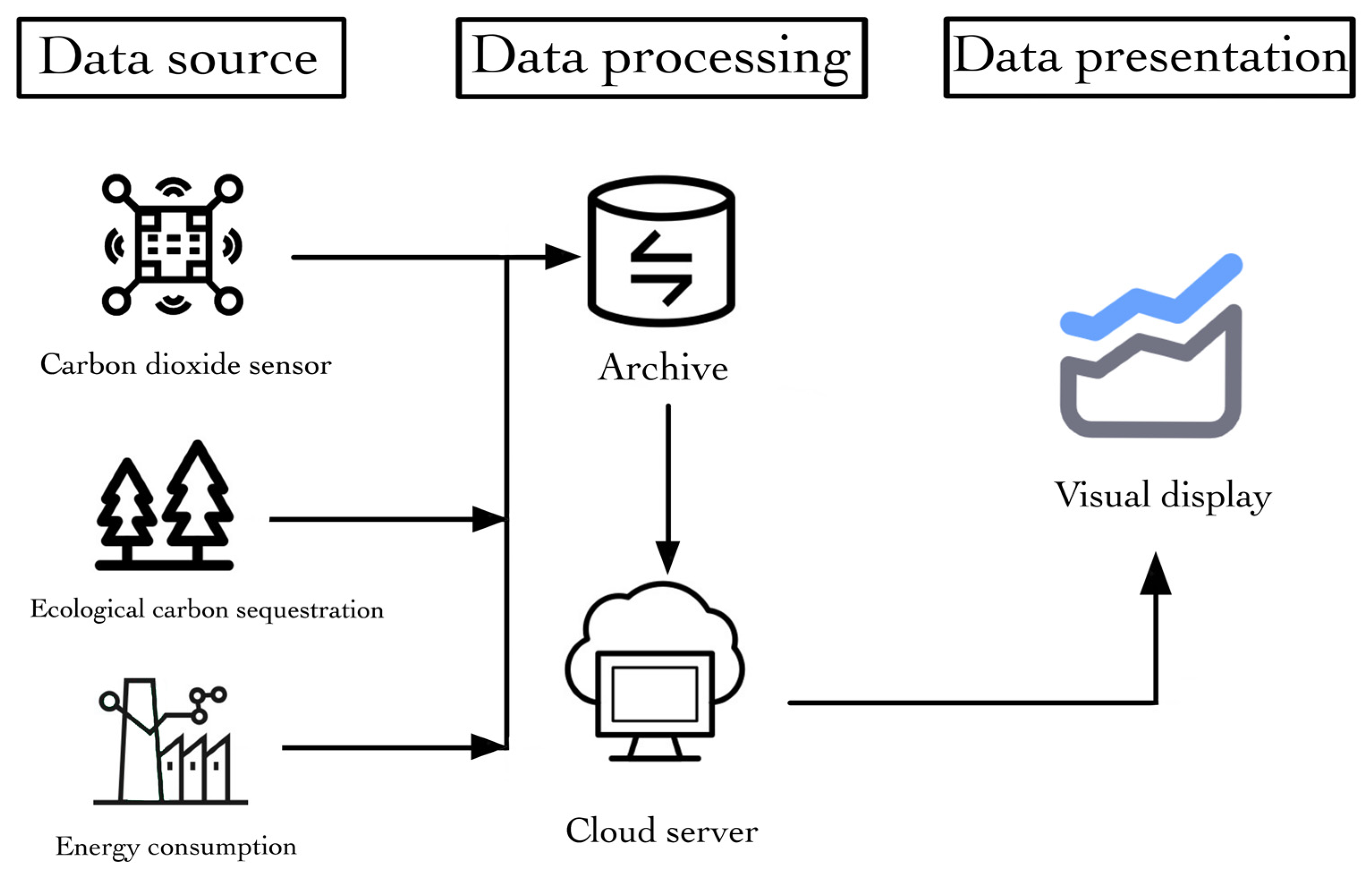
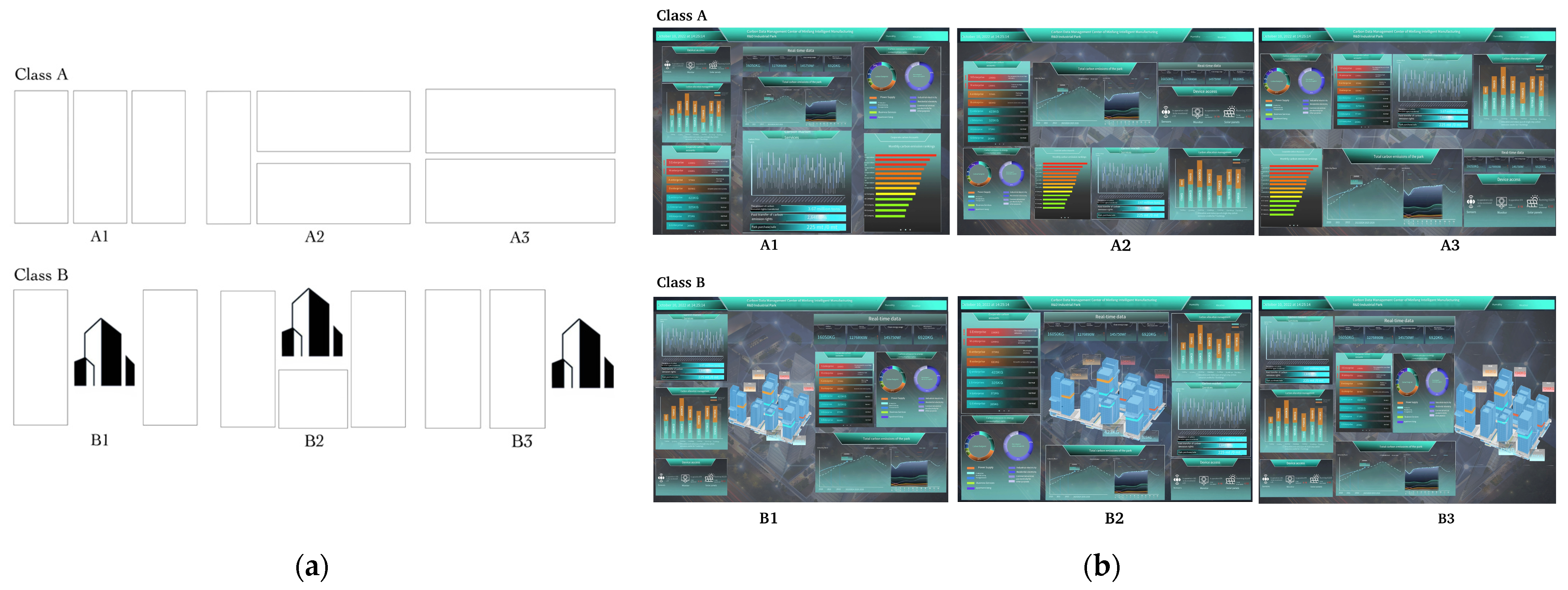
2.1. Sample Collection

With the strengthening of China’s binding force on reducing carbon emissions and the wide application of data visualization systems, carbon emission visualization systems are being developed and constructed for various industrial parks. In this study, a total of 100 carbon emission visualization interface samples were collected from parks via a network collection. Finally, the 100 samples were clustered using layout similarity to obtain six representative samples (Figure 2).
Using feature extraction and redesign, two major categories and six minor categories of visual interfaces with different layouts were established (Figure 3a): a pure data flow interface (Class A) and an interface containing maps/buildings (Class B). Because maps and buildings have similar attributes in the visual interface, they are classified into one category, and subsequent research focuses on buildings. Considering the requirements for variables in eye-tracking experiments, the relevant elements from six types of interfaces were homogenized (Figure 3b). Due to the compression of the building module on the data module in the interface of type B, it becomes smaller, so an information module is added to the interface of type A to balance the size of the two and offset the influence of this variable. These six interfaces are used as experimental stimulus materials.

2.2. Data Collection

The participants in this experiment were from Northern University for Nationalities. All 30 participants had normal, color vision and were not familiar with the experiment in advance. All participants gave their informed consent to participate in the study. The experiment was set up in a quiet room with constant light. Participants were seated 65 cm away from a 15.6-inch monitor. A Tobii Pro X3 eye tracker (sampling rate 120 Hz) was placed directly below the monitor to record eye-movement data from each participant. Gaze heatmaps, gaze curves, and associated time data were exported by Tobii Pro Lab Screen Edition. The stimulus materials in this experiment were six types of interfaces obtained after classifying and de-differentiating the visual interfaces of carbon neutrality data in 100 parks (Figure 3b). When displayed, all the interfaces fill the whole 1920 × 1080 screen, the interface background is uniformly adjusted to gray, and all the pictures are stored in the form of jpg bitmaps. In terms of task setting, each type of interface was assigned two data search tasks of comparable difficulty. After freely watching the assigned interface, participants clicked the mouse to jump to the start of the search task according to the prompts and then clicked the mouse again to complete the task. The experiment ended after the user completed the task twice. In order to eliminate the influence of the subjects’ memory of relevant data content on the experiment, each subject only needed to perform data search tasks for one type of interface, and there were 5 subjects for each type of interface. A total of 30 subjects participated in the data search tasks for 6 types of interfaces. After completing the eye-tracking experiment, each participant was asked to fill out a one-way rating scale for six types of interface visual perceptual features. The table was designed around three visual perceptual features: understandability, selectivity, and integrity. Considering that the three types of feature concepts are too abstract to quantify the score, the scoring options of the questionnaire were further optimized. Integrity was interpreted as “unity”, and the strength of integrity was reflected by the participants’ feeling of interface unity and coordination. Understandability was interpreted as “understandable”, and the easier it was for participants to understand the interface, the more understandable the interface was. Selectivity is interpreted as “interesting”, and the more interesting areas indicate that the type of interface can be selected to view more areas, and the selectivity is stronger. The study was conducted in accordance with the guidelines of the Declaration of Helsinki. The study was non-invasive and did not investigate human or physiological data, and all data were processed anonymously. According to the institutional guidelines of Lanzhou University of Technology, it is not necessary to submit materials for ethical review.

2.3. Data Analysis

For a data visualization interface with high information density, the time spent on searching for target information is the key data point in the analysis of the readability of interface data [45]. The mouse event in eye-tracking technology can help researchers to more accurately record the duration of an event. The time difference of the relevant process was calculated in combination with each node of the experimental process. In this experiment, this technology was used to record the time when each participant triggered the data search and ended the data search. The above data can be used to calculate the mean value of the task completion time for each interface, allowing the interface data readability to be interpreted in terms of time attributes.
In addition, the heat map indicating the degree of participants’ gaze also reflects the degree of people’s reading of the data and their interest in the interface (Figure 4a). The degree of attention is intuitively shown by the change of hot spots from green to red, and the deeper the red, the higher the attention of the user. The eye-tracking map can be used to interpret the interface layout through the eye shifts and jumps of the participants when watching the interface (Figure 4b). The larger the trajectory point, the longer the subject looked at it. Combined with the data reading time, the eye-tracking map can also help to determine which layout can help people to read information more effectively [39,43]. The presentation of heat maps and eye-tracking maps can help researchers and designers understand people’s visual habits and the layout of the interface in order to design a data visualization interface that is more readable and more consistent with visual perception. In this experiment, the hot spot accumulation map and eye-tracking accumulation map of five participants in each interface will be collected to evaluate and analyze different interface layouts combined with task completion time.
To match the quantitative data, qualitative data were also collected in this experiment. Firstly, the subjective evaluation of participants regarding the visual perception of various interfaces was carried out and then used to briefly analyze the nature of the interface. Combined with the quantitative data obtained from the experiment, the degree of interaction between the two was verified. A Pearson correlation test (one-tailed) was conducted on the influence of the three characteristics of visual perception (integrity, understandability, and selectivity) on the readability of the data. Thus, the correlation coefficient ranking between the three features and data readability can be obtained, which can help designers better grasp the visual perception needs of users when making interface layout arrangements.

3. Results

3.1. Effect of Layout on Data Reading Time

Table 1 shows the completion times for 30 participants who participated in six types of interface data search tasks. To avoid contingency, each user was arranged to perform two data search tasks, so each participant had two-time data. By de-streaming the data, three data values were retained for each data search task on each interface for the mean calculation.
After calculating the mean value, we can obtain the average time consumed by each interface in data reading (Table 2). The ranking result of the class A interface according to duration is A3 < A1 < A2, the result of sorting the type B interface is B3 < B2 < B1, and the total ranking is A3 < A1 < A2 < B3 < B2 < B1. The results clearly show that the data search time of the type A interface is generally shorter than that of the type B interface. Table 3 clearly shows that the average time for the type A interface to complete the task is about 10 s less than that of the type B interface.
Table 3 clearly shows that the total average time taken to complete the task using the type A interface is about 10 s less than that of the type B interface. The data readability of the type A interface (containing only data) is significantly higher than that of the type B interface (containing architectural pictures) [27].

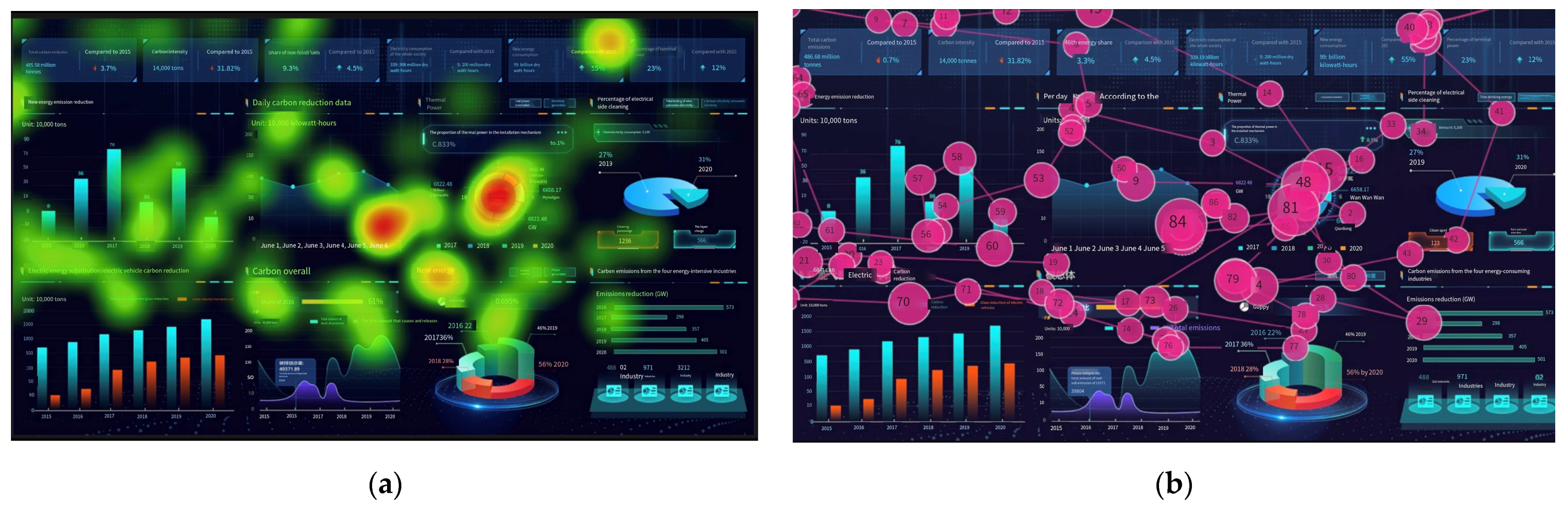
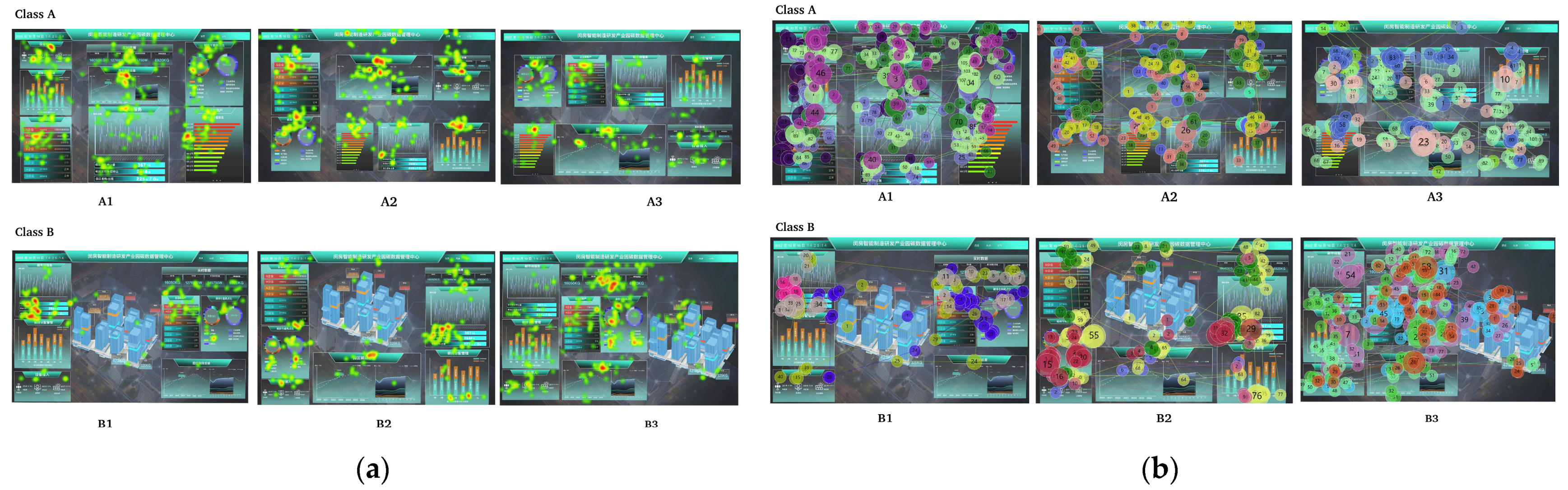
3.2. Differences in Eye Movement Indicators of Layout

Panel a of Figure 5 shows the cumulative hot spots of five participants with different interface layouts when they freely watched the interface. It can be found that the hotspot distribution of the class A interface is relatively uniform, and each module has a high degree of gaze. In contrast, the focus on the class B interface is directed toward the data module, and the attention paid to the architectural pictures is seriously lacking. Compared with B1 and B2, the visual hotspots of the B3 interface are more prominent in the central region, while the B2 interface is concentrated in the lower region without architectural pictures. The B1 interface has a higher degree of fixation in the left region of architectural pictures. An interesting phenomenon is that the area with higher attention in B3 also appears on the left side of the architectural pictures.
Panel b of Figure 5 shows the cumulative eye track of five participants with different layouts when they freely viewed the interface. Combined with the viewpoint trajectory diagram, it can be found that in the type A interface, participants’ visual perspectives diverge from the middle to the two sides. The final visual landing point of the A1 interface with a vertical line layout is in the lower right area. Similarly, the visual landing point of the A3 interface with a horizontal line layout also appears in the lower right area. Only the A2 interface with both horizontal and vertical layouts has scattered visual landing points. In contrast, the line-of-sight map of the class B interface clearly shows the neglect of architectural pictures. When we observe the B1 interface, although the participants’ first focus on the architectural picture located in the middle of the interface, their visual perspectives then directly jump to the right area of the interface where the data module is denser. B2 is concentrated in the middle and lower areas. As the most complex interface of the three types of B interfaces, in B3, it is intuitively found that the visual landing point in the central region is significantly higher than that in other regions. By comparison, in the interface containing architectural pictures, areas with denser information modules are more likely to attract the attention of participants.

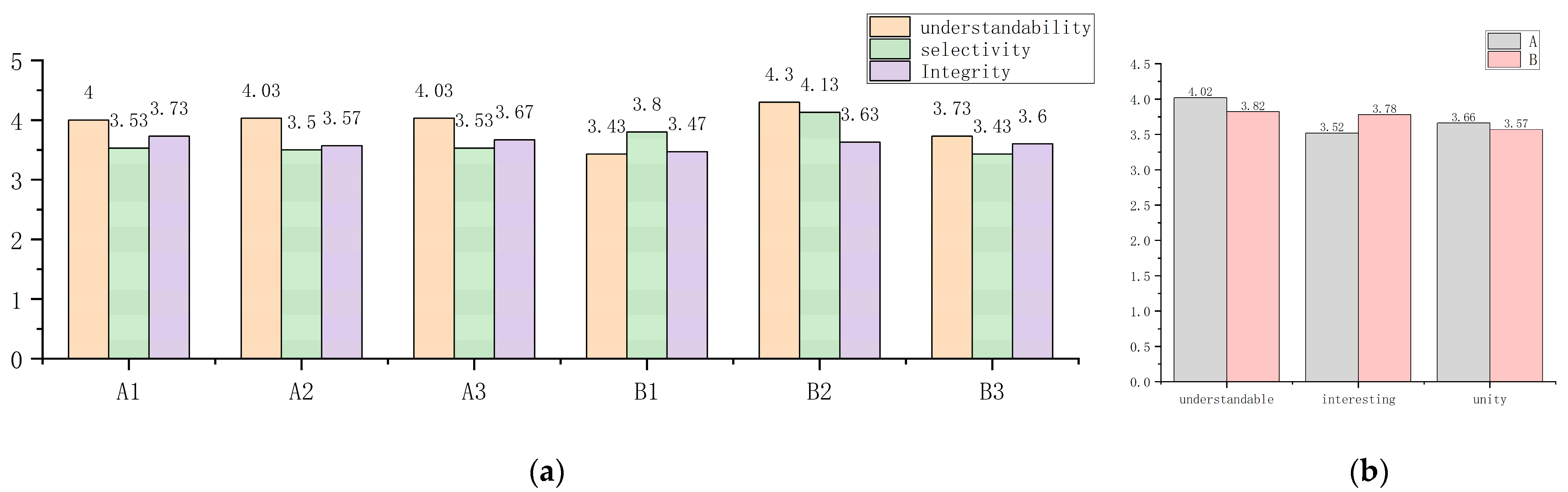
3.3. Visual Perception Evaluation of Interfaces

Figure 6a shows the three visual perception feature evaluations of the six samples. Figure 6b shows the mean values of the three evaluations of the two types of interfaces. It can be clearly seen from the figure on the right that the understandability and unity of the class A interface with pure data composition are greater than those of the class B interface with architectural pictures, while the class B interface is significantly better than class A in terms of interest. Architectural pictures add more interesting variety to the interface, but they also reduce the comprehensibility and integrity of the interface to a certain extent.

3.4. Effect of Visual Perception Characteristics on Data Readability

A Pearson correlation coefficient was used to calculate the correlation between the data shown in Table 2 and those shown in Figure 6a. The correlation value r is presented in Table 4.
r = i = 1 n X i X ¯ Y i Y ¯ i = 1 n X i X ¯ 2 i = 1 n Y i Y ¯ 2
In the above formula, there are three values of “X”, which are the subjective evaluation scores of the three visual perceptual features of the six samples, as shown in Figure 6a. “Y” is the total duration of the two data search tasks corresponding to the six samples, i.e., the total duration listed in Table 2. Therefore, the size of “n” in the formula is 6.
Table 4 shows the Pearson correlation coefficient of the average data search time for two types of interfaces with different visual perception characteristics. Since time data reflect data readability to a certain extent, this table can also be regarded as the influence degree of different visual perception characteristics on data readability of different interfaces. It can be seen from the table that, among the three types of visual perception features, the impact of integrity on data readability is the most significant, showing a significant negative correlation. The stronger the integrity, the shorter the data search time, and the greater the data readability.

4. Discussion

Carbon emissions are invisible and can continuously occur in all aspects of park operation, such as construction, production, and transportation. Therefore, the urgency of collecting and displaying carbon emission data is vital [46]. Accurate and efficient data reading efficiency can help decision makers grasp the trend of carbon emissions in real time to formulate timely and effective relevant measures. Therefore, analyzing the usability of the interface layout and determining the location of key carbon emission data in the interface are major issues.
When comparing type A interfaces separately, it was found that the more regular horizontal or radial layout of A3 and A1 means that it takes less time to complete the data search task, which is also consistent with the conclusions of Li Y and Yang R [47]. A2, which has both a radial and horizontal layout, is slightly inferior in terms of information retrieval, and its evaluation of integrity is lower than A3 and A1. Therefore, in interface layout planning, we should try to avoid simultaneous radial and horizontal layouts. Comparing class B interfaces separately, it can be found that the location of 3D pictures has a great impact on the data search task time. The task time of B3, where the picture appears at the end of the screen, is 15.3 s and 8 s shorter than the task times of B1 and B2, where the picture appears in the middle. This is because the 3D graphics placed in the middle of the interface extend the user’s line of sight. At the same time, because the graphic area in B2 is smaller than that in B1, it has less impact on line-of-sight blocking and shorter time comparison. This point has also been demonstrated in the study by Ren J, Wang H and Hao M, Xiaozhou Z, et al. [48,49]. In summary, it is necessary to pay attention to the influence of its size and placement position on other data modules when typesetting 3D pictures. Placing it alone on one side of the interface may help users shorten their saccade distance to ensure the high efficiency of data readability.
By comparing the data search time of type A and type B interfaces, it can be clearly found that the data readability of the 2D interface with pure data is higher than that of the interface with 3D graphics, which is also verified by Stewart and Cipolla et al. [50]. However, in combination with the subsequent visual perception evaluation of participants, the B-type interface also has significant advantages regarding the degree of user interest. On the other hand, since industrial parks area carbon emission complexes in many aspects, 3D models can also help decision makers to intuitively understand the sources of carbon emissions [51], so it is not a wise choice to simply exclude 3D graphics from interface design. The reasonable allocation of the proportion of 2D graphics and 3D models in the interface layout can be utilized in future research to improve the readability of the visual interface data of carbon emissions in the park. By observing the eye-track maps of B1 and B2, people are accustomed to moving their visual focus from the middle of the interface to both ends, especially the more data-intensive area. However, if the data-intensive area is originally in the middle of the interface, such as B3, then people’s visual focus will return to this area. Based on the above results of the separate analysis of class A and Class B interfaces, it is better to choose a one-way regular layout when designing the interface layout, with key data placed in the middle of the layout and 3D graphics placed on the side close to the key data of the interface. Subsequent research should explore the influence of placing the screen on the right or left side of the interview on the reading of key data.
In addition, due to the development of digital twin technology, virtual dynamic 3D models have also been applied to data visualization interfaces [52,53,54,55,56], and some interfaces have begun to change the transparency of data components and overlap them with dynamic models covering the screen. This kind of design has a sense of beauty combined with science and technology and, thus, has a strong visual impact. However, its specific impact on data reading is unknown; therefore, determining this impact is the next step for future research.
Finally, as no researchers have previously combined these three types of visual perceptual features with eye-tracking technology to study the usability of data visualization interfaces, especially for newly emerging zero-carbon parks, this study provides another research idea for humanized design in related fields. However, this study only preliminarily explored the possible relationship between interface usability and three types of visual perception characteristics. This study simply started from the overall layout and analyzed it using a basic Pearson correlation coefficient. Consequently, the collected data are limited and the statistical analysis was weak; many detailed elements of the interface layout were also not considered. In the future, we plan to use an ablation research method to study the influence of color scheme, border design, information module transparency, background blur degree, and interaction mode on interface usability to enhance research and data reliability in this field of study. The data regarding visual perception and data readability obtained in this study will provide some basic support for subsequent research.

5. Conclusions

In summary, combined with the three characteristics of visual perception, we used eye-tracking technology to study and explore the layout of existing visual interfaces that display carbon emission data in industrial parks, ultimately suggesting ways to improve the layout of the visual interface of carbon emission data in a universal manner. The humanization of interface design is a topic that previous studies have not explored in depth. When planning the layout of an interface, we should pay attention to the requirements of the integrity of the interface and try to avoid the simultaneous appearance of radial and horizontal layouts. When typesetting 3D pictures, the influence of size and placement on other data modules must be considered. Graphics that are too large reduce the space required for other data and negatively affect readability. Inappropriate placement of graphics can also prolong the line of sight for users. Placing key data in the middle of the layout and placing 3D graphics at the side of the interface close to key data also helps users focus their vision on key areas.
This study innovatively considered three types of visual perception features and preliminarily demonstrated their correlation with the usability of a visual interface, which provided new research ideas for subsequent visual interfaces that monitor carbon emissions in industrial parks. This will help researchers to humanize the interface design to be more consistent with visual perception cognitive characteristics, which also contributes to improving the usability of the interface and the readability of data, and helps the decision makers to develop more efficient and scientific carbon emission reduction strategies to a certain extent.
In addition, it should be noted that this study also has some limitations. For example, the research object was mainly a static interface layout, and interactive animation in the visual interface was not studied. The subjects were mainly young women and men, and thus other age groups were not considered. Moreover, the research method was an indirect rather than direct comparison. Further research should focus on addressing the shortcomings and limitations of this study, including the analysis of the impact of dynamic 3D animation on the data readability of a carbon emission visualization interface, analyzing the suitability of the proportion of 2D pictures and 3D models in the interface, and the application of digital twin technology in the carbon emission visualization interfaces of industrial parks.

Author Contributions

Conceptualization, J.H., G.L. and L.W.; methodology, G.L. and J.H.; software, G.L.; formal analysis, G.L. and L.W.; investigation, G.L.; data curation, G.L.; writing—original draft preparation, G.L.; writing—review and editing, J.H., L.W. and G.L.; visualization, G.L.; supervision, L.W.; project administration, J.H. All authors have read and agreed to the published version of the manuscript.

Funding

This research was funded by the National Key R&D Program of China (2022YFB3402001), the National Natural Science Foundation of China (No. 52035007, 51975360), the Major Project of National Social Science Foundation of China (No. 17ZDA020), and the Ministry of Education “Human Factors and Ergonomics” University Industry Collaborative Education Project (No. 202209LH16).

Institutional Review Board Statement

This study was conducted in accordance with the guidelines of the Declaration of Helsinki. The study was non-invasive and did not investigate human or physiological data; all data were processed in an anonymized form. According to the institutional guidelines of Lanzhou University of Technology, there was no need to submit material for ethical review.

Informed Consent Statement

Informed consent was obtained from all subjects involved in the study.

Data Availability Statement

Not applicable.

Acknowledgments

We thank all participants in the experiment and all reviewers for their valuable comments on this paper.

Conflicts of Interest

The authors declare no conflict of interest.

References

  1. Jern, M.; Franzen, J. Integrating infovis and geovis components. In Proceedings of the 2007 11th International Conference Information Visualization (IV’07), Zurich, Switzerland, 4–6 July 2007; pp. 511–520. [Google Scholar]
  2. Park, J.; Yang, B. GIS-enabled digital twin system for sustainable evaluation of carbon emissions: A case study of Jeonju city, south Korea. Sustainability 2020, 12, 9186. [Google Scholar] [CrossRef]
  3. Wu, C.; Hu, W.; Zhou, M.; Li, S.; Jia, Y. Data-driven regionalization for analyzing the spatiotemporal characteristics of air quality in China. Atmos. Environ. 2019, 203, 172–182. [Google Scholar] [CrossRef]
  4. Adenle, Y.A.; Alshuwaikhat, H.M. Spatial estimation and visualization of CO2 emissions for campus sustainability: The case of King Abdullah University of Science and Technology (KAUST), Saudi Arabia. Sustainability 2017, 9, 2124. [Google Scholar] [CrossRef] [Green Version]
  5. Middleton, R.S.; Yaw, S.P.; Hoover, B.A.; Ellett, K.M. SimCCS: An open-source tool for optimizing CO2 capture, transport, and storage infrastructure. Environ. Model. Softw. 2020, 124, 104560. [Google Scholar] [CrossRef]
  6. Ming, F.X.; Habeeb, R.A.A.; Nasaruddin, F.H.B.; Gani, A.B. Real-time carbon dioxide monitoring based on iot & cloud technologies. In Proceedings of the 2019 8th International Conference on Software and Computer Applications, Penang, Malaysia, 19–21 February 2019; pp. 517–521. [Google Scholar]
  7. Liu, X.; Jin, Z. Visualisation approach and economic incentives toward low carbon practices in households: A survey study in Hyogo, Japan. J. Clean. Prod. 2019, 220, 298–312. [Google Scholar] [CrossRef]
  8. Nilsson, A.; Stoll, P.; Brandt, N. Assessing the impact of real-time price visualization on residential electricity consumption, costs, and carbon emissions. Resour. Conserv. Recycl. 2017, 124, 152–161. [Google Scholar] [CrossRef]
  9. Liu, G.; Yang, H.; Fu, Y.; Mao, C.; Xu, P.; Hong, J.; Li, R. Cyber-physical system-based real-time monitoring and visualization of greenhouse gas emissions of prefabricated construction. J. Clean. Prod. 2020, 246, 119059. [Google Scholar] [CrossRef]
  10. Tao, X.; Mao, C.; Xie, F.; Liu, G.; Xu, P. Greenhouse gas emission monitoring system for manufacturing prefabricated components. Autom. Constr. 2018, 93, 361–374. [Google Scholar] [CrossRef]
  11. Su, Y.; Fan, Q.M. The green vehicle routing problem from a smart logistics perspective. IEEE Access 2019, 8, 839–846. [Google Scholar] [CrossRef]
  12. Hsu, C.Y.; Yang, C.S.; Yu, L.C.; Lin, C.F.; Yao, H.H.; Chen, D.Y.; Lai, K.R.; Chang, P.C. Development of a cloud-based service framework for energy conservation in a sustainable intelligent transportation system. Int. J. Prod. Econ. 2015, 164, 454–461. [Google Scholar] [CrossRef]
  13. Li, X.; Tang, J.; Li, W.; Si, Q.; Guo, X.; Niu, L. A Bibliometric Analysis and Visualization of Aviation Carbon Emissions Studies. Sustainability 2023, 15, 4644. [Google Scholar] [CrossRef]
  14. Xu, J.; Liu, T. Technological paradigm-based approaches towards challenges and policy shifts for sustainable wind energy development. Energy Policy 2020, 142, 111538. [Google Scholar] [CrossRef]
  15. Yu, X.; Zheng, H.; Sun, L.; Shan, Y. An emissions accounting framework for industrial parks in China. J. Clean. Prod. 2020, 244, 118712. [Google Scholar] [CrossRef]
  16. Vulic, N.; Rüdisüli, M.; Orehounig, K. Evaluating energy flexibility requirements for high shares of variable renewable energy: A heuristic approach. Energy 2023, 270, 126885. [Google Scholar] [CrossRef]
  17. Chen, Y.; Xia, R.; Zou, K.; Yang, K. FFTI: Image inpainting algorithm via features fusion and two-steps inpainting. J. Vis. Commun. Image Represent. 2023, 91, 103776. [Google Scholar] [CrossRef]
  18. Trappey, A.J.C.; Liang, C.-P.; Lin, H.-J. Using Machine Learning Language Models to Generate Innovation Knowledge Graphs for Patent Mining. Appl. Sci. 2022, 12, 9818. [Google Scholar] [CrossRef]
  19. Kang, R.; Liatsis, P.; Kyritsis, D.C. Emission Quantification via Passive Infrared Optical Gas Imaging: A Review. Energies 2022, 15, 3304. [Google Scholar] [CrossRef]
  20. Liu, Y.; Xu, J.; Yi, W. Massive-scale carbon pollution control and biological fusion under big data context. Future Gener. Comput. Syst. 2021, 118, 257–262. [Google Scholar] [CrossRef]
  21. Healey, C.; Kocherlakota, S.; Rao, V.; Mehta, R.; Amant, R.S. Visual perception and mixed-initiative interaction for assisted visualization design. IEEE Trans. Vis. Comput. Graph. 2008, 14, 396–411. [Google Scholar] [CrossRef] [Green Version]
  22. Franconeri, S.L.; Padilla, L.M.; Shah, P.; Zacks, J.M.; Hullman, J. The science of visual data communication: What works. Psychol. Sci. Public Interest 2021, 22, 110–161. [Google Scholar]
  23. Bigne, E.; Chatzipanagiotou, K.; Ruiz, C. Pictorial content, sequence of conflicting online reviews and consumer decision-making: The stimulus-organism-response model revisited. J. Bus. Res. 2020, 115, 403–416. [Google Scholar] [CrossRef]
  24. Wang, J.; Gui, T.; Cheng, M.; Wu, X.; Ruan, R.; Du, M. A survey on emotional visualization and visual analysis. J. Vis. 2023, 26, 177–198. [Google Scholar] [CrossRef]
  25. Sulikowski, P.; Kucznerowicz, M.; Bąk, I.; Romanowski, A.; Zdziebko, T. Online Store Aesthetics Impact Efficacy of Product Recommendations and Highlighting. Sensors 2022, 22, 9186. [Google Scholar] [CrossRef]
  26. Fu, J. Usability evaluation of software store based on eye-tracking technology. In Proceedings of the 2016 IEEE Information Technology, Networking, Electronic and Automation Control Conference, Chongqing, China, 20–22 May 2016. [Google Scholar]
  27. Wu, Z.; Li, Z.; Li, X.; Li, H. Research on Aging Design of News APP Interface Layout Based on Perceptual Features. In Human-Computer Interaction. Design and User Experience Case Studies: Thematic Area, HCI 2021, Held as Part of the 23rd HCI International Conference, HCII 2021, Virtual Event, 24–29 July 2021; Springer International Publishing: Berlin/Heidelberg, Germany, 2021. [Google Scholar]
  28. Zuo, Y.; Qi, J.; Fan, Z.; Wang, Z.; Xu, H.; Wang, S.; Zhang, N.; Hu, J. The influence of target layout and target graphic type on searching performance based on eye-tracking technology. Front. Psychol. 2023, 14, 1052488. [Google Scholar] [CrossRef] [PubMed]
  29. Xiao, Y.; Miao, K.; Huang, Y. The effects of graphical encodings on reading performance of the data chart displayed on the periphery of attention. Displays 2023, 77, 102378. [Google Scholar] [CrossRef]
  30. Li, J.; Chen, Y. An Analysis of the Influence of Visual Perception Characteristics to the Usability Design of Infants application Interface. Adv. Mater. Res. 2013, 655, 2093–2098. [Google Scholar] [CrossRef]
  31. Li, J.; Liu, Y.; Wang, C. Evaluation of graph layout methods based on visual perception. In Proceedings of the Tenth Indian Conference on Computer Vision, Graphics and Image Processing, Guwahati, India, 18–22 December 2016. [Google Scholar]
  32. Wang, S.; Xue, C.; Zhang, J.; Shao, J. Interface Design of GIS System Based on Visual Complexity. In Advances in Usability and User Experience, Proceedings of the AHFE 2019 International Conferences on Usability & User Experience, and Human Factors and Assistive Technology, Washington, DC, USA, 24–28 July 2019; Springer International Publishing: Berlin/Heidelberg, Germany, 2020. [Google Scholar]
  33. Wang, W.; Hong, X.; Dang, S.; Xu, N.; Qu, J. 3D Space Layout Design of Holographic Command Cabin Information Display in Mixed Reality Environment Based on HoloLens 2. Brain Sci. 2022, 12, 971. [Google Scholar] [CrossRef]
  34. Huang, X.; Huang, C. NGD: Filtering graphs for visual analysis. IEEE Trans. Big Data 2016, 4, 381–395. [Google Scholar] [CrossRef]
  35. Tian, L.; Ma, Y.; Liu, Z. Teaching Reform of Web Page Design Based on Computer Vision. In Proceedings of the 2016 4th International Education, Economics, Social Science, Arts, Sports and Management Engineering Conference (IEESASM 2016), Yinchuan, China, 13–14 August 2016; Atlantis Press: Paris, France, 2016. [Google Scholar]
  36. Namoun, A. Three column website layout vs. grid website layout: An eye tracking study. In Design, User Experience, and Usability: Designing Interactions: 7th International Conference, DUXU 2018, Held as Part of HCI International 2018, Las Vegas, NV, USA, 15–20 July 2018; Springer International Publishing: Berlin/Heidelberg, Germany, 2018. [Google Scholar]
  37. Diego-Mas, J.A.; Garzon-Leal, D.; Poveda-Bautista, R.; Alcaide-Marzal, J. User-interfaces layout optimization using eye-tracking, mouse movements and genetic algorithms. Appl. Ergon. 2019, 78, 197–209. [Google Scholar] [CrossRef]
  38. Peruzzini, M.; Grandi, F.; Pellicciari, M. Exploring the potential of Operator 4.0 interface and monitoring. Comput. Ind. Eng. 2020, 139, 105600. [Google Scholar] [CrossRef]
  39. Goldberg, J.; Helfman, J. Eye tracking for visualization evaluation: Reading values on linear versus radial graphs. Inf. Vis. 2011, 10, 182–195. [Google Scholar] [CrossRef]
  40. Yan, S.; Tran, C.C.; Chen, Y.; Tan, K.; Habiyaremye, J.L. Effect of user interface layout on the operators’ mental workload in emergency operating procedures in nuclear power plants. Nucl. Eng. Des. 2017, 322, 266–276. [Google Scholar] [CrossRef]
  41. Majooni, A.; Masood, M.; Akhavan, A. An eye-tracking study on the effect of infographic structures on viewer’s comprehension and cognitive load. Inf. Vis. 2018, 17, 257–266. [Google Scholar] [CrossRef]
  42. Zhang, J.; Huang, H.; Jin, X.; Kuang, L.D.; Zhang, J. Siamese visual tracking based on criss-cross attention and improved head network. Multimed. Tools Appl. 2023, 1–27. [Google Scholar] [CrossRef]
  43. Jiang, H.; Ma, X.; Nie, W.; Yu, Z.; Zhu, Y.; Anandkumar, A. Bongard-hoi: Benchmarking few-shot visual reasoning for human-object interactions. In Proceedings of the IEEE/CVF Conference on Computer Vision and Pattern Recognition, New Orleans, LA, USA, 18–24 June 2022; pp. 19056–19065. [Google Scholar]
  44. Aflalo, E.; Du, M.; Tseng, S.Y.; Liu, Y.; Wu, C.; Duan, N.; Lal, V. Vl-interpret: An interactive visualization tool for interpreting vision-language transformers. In Proceedings of the IEEE/CVF Conference on Computer Vision and Pattern Recognition, New Orleans, LA, USA, 18–24 June 2022; pp. 21406–21415. [Google Scholar]
  45. Brychtova, A.; Coltekin, A. An empirical user study for measuring the influence of colour distance and font size in map reading using eye tracking. Cartogr. J. 2016, 53, 202–212. [Google Scholar] [CrossRef] [Green Version]
  46. Timothy, D.; Onisimo, M.; Riyad, I. Quantifying aboveground biomass in African environments: A review of the trade-offs between sensor estimation accuracy and costs. Trop. Ecol. 2016, 57, 393–405. [Google Scholar]
  47. Li, Y.; Yang, R. Research on Information Interfaces Visual Search Efficiency and Matching Mechanism Based on Similarity Theory. In HCI International 2018–Posters’ Extended Abstracts: 20th International Conference, HCI International 2018, Las Vegas, NV, USA, 15–20 July 2018; Springer International Publishing: Berlin/Heidelberg, Germany, 2018. [Google Scholar]
  48. Ren, J.; Wang, H.; Shao, J. Experimental Study on Dynamic Map Information Layout Based on Eye Tracking. In Intelligent Human Systems Integration 2020, Proceedings of the 3rd International Conference on Intelligent Human Systems Integration (IHSI 2020): Integrating People and Intelligent Systems, Modena, Italy, 19–21 February 2020; Springer International Publishing: Berlin/Heidelberg, Germany, 2020. [Google Scholar]
  49. Hao, M.; Xiaozhou, Z.; Chengqi, X.; Weiye, X.; Lesong, J. The Influence of the Threshold of the Size of the Graphic Element on the General Dynamic Gesture Behavior. In Human Systems Engineering and Design II, Proceedings of the 2nd International Conference on Human Systems Engineering and Design (IHSED2019): Future Trends and Applications, Munich, Germany, 16–18 September 2019; Springer International Publishing: Berlin/Heidelberg, Germany, 2020. [Google Scholar]
  50. Stewart, B.M.; Cipolla, J.M.; Best, L.A. Extraneous information and graph comprehension: Implications for effective design choices. Campus-Wide Inf. Syst. 2009, 26, 191–200. [Google Scholar] [CrossRef] [Green Version]
  51. Wang, H. Research on three-dimensional visualization technologies. In 2016 4th International Conference on Advanced Materials and Information Technology Processing (AMITP 2016), Guilin, China, 24–25 September 2016; Atlantis Press: Paris, France, 2016; pp. 261–265. [Google Scholar]
  52. Žilinskas, A.; Žilinskas, J. Three-dimensional visualization by means of multidimensional scaling. In Proceedings of the 20th International Conference EURO Mini Conference Continuous Optimization and Knowledge-Based Technologies (EurOPT-2008), Neringa, Lithuania, 20–23 May 2008; pp. 71–76. [Google Scholar]
  53. Liang, J.; Gong, J.; Liu, J.; Zou, Y.; Zhang, J.; Sun, J.; Chen, S. Generating orthorectified multi-perspective 2.5 D maps to facilitate Web GIS-based visualization and exploitation of massive 3D city models. ISPRS Int. J. Geo-Inf. 2016, 5, 212. [Google Scholar] [CrossRef] [Green Version]
  54. Capece, N.; Erra, U.; Grippa, J. GraphVR: A Virtual Reality Tool for the Exploration of Graphs with HTC Vive System. In Proceedings of the 2018 22nd International Conference Information Visualisation (IV), Fisciano, Italy, 10–13 July 2018; pp. 448–453. [Google Scholar]
  55. Steinbeck, M.; Koschke, R.; Rüdel, M.O. How evostreets are observed in three-dimensional and virtual reality environments. In Proceedings of the 2020 IEEE 27th International Conference on Software Analysis, Evolution and Reengineering (SANER), London, ON, Canada, 18–21 February 2020; pp. 332–343. [Google Scholar]
  56. Xie, Y.; Yang, J.; Wen, Y. Research on Comprehensive Energy Efficiency Control and Optimization Technology for the Internet of Things for Three-Dimensional “Common Intelligence” Visualization. In Proceedings of the 2022 IEEE International Conference on Electrical Engineering, Big Data and Algorithms (EEBDA), Changchun, China, 25–27 February 2022; pp. 801–806. [Google Scholar]
Figure 1. Carbon emission visualization process.
Sustainability 15 11102 g001
Figure 2. Representative sample.
Sustainability 15 11102 g002
Figure 3. Design of experimental stimulus materials: (a) type of interface layout after classification and analysis; (b) stimulus material processed via homogenization and de-differentiation.
Sustainability 15 11102 g003
Figure 4. Sample images: (a) gaze heat map; (b) eye track map.
Sustainability 15 11102 g004
Figure 5. Results of the collection of two eye movement indicators: (a) gazing hotspot accumulation graph of six types of samples; (b) the cumulative plot of the eye track for the six types of samples.
Sustainability 15 11102 g005
Figure 6. Visual perception evaluation of interfaces: (a) visual perception evaluation value of six samples; (b) the mean value of visual perception evaluation of the two types of interfaces.
Sustainability 15 11102 g006
Table 1. Time taken for 30 participants to complete the task.
SampleParticipantsTask1 DurationTask2 Duration
A1114.019.4 **
29.03.4 *
38.718.8
45.1 *5.2
502:58.4 **7.2
A2116.517.6 **
24.4 *8.4 *
38.814.6
47.612.0
501:01.6 **11.8
A318.47.8
26.87.6
35.7 *8.9
418.021.1 **
521.1 **4.2 *
B1134.4 **24.4
221.712.4 *
314.4 *36.4 **
426.713.1
516.415.4
B214.1 *7.7 *
217.725.7
312.612.9
415.631.2 **
539.5 **11.4
B3119.23.9 *
202:20.8 **12.8
314.713.4 **
47.3 *5.3
511.48.4
* The minimum of each group. ** The maximum of each group.
Table 2. The average duration of the task for each sample.
Time 1A1A2A3B1B2B3
Task 1 average duration10.510.911.121.615.315.1
Task 2 average duration10.412.808.117.616.708.8
Total duration20.923.719.239.231.923.9
1 The extreme values have been removed.
Table 3. Average time spent searching for data across the two categories of interfaces.
CategoryTotal Average Duration
A21.3
B31.7
Table 4. The correlation value “r” of visual perception features and total average time.
Type IntegrityUnderstandabilitySelectivity
ATotal duration−0.7040.114−0.917
BTotal duration−0.746−0.3140.550
A&BTotal duration−0.777 *−0.4580.697
* p < 0.05.
Disclaimer/Publisher’s Note: The statements, opinions and data contained in all publications are solely those of the individual author(s) and contributor(s) and not of MDPI and/or the editor(s). MDPI and/or the editor(s) disclaim responsibility for any injury to people or property resulting from any ideas, methods, instructions or products referred to in the content.

