3.1. Preliminary Data Analysis
The variables under analysis were as follows:
, , is the PM concentration each year: 2015 (), 2016 (), …, and 2020 ().
, , is the PM concentration each month: January (), February (), …, and December ().
, , is the PM concentration each day: Monday (), Tuesday (), …, and Sunday ().
, , is the PM concentration pooled for each group of two hours. Specifically, the concentration at 0:00 and 1:00 is represented by , the concentration at 2:00 and 3:00 is represented by , …, and the concentration at 22:00 and 23:00 is represented by .
Table 2 shows a statistical summary of the PM
concentration measurements (in
) taken from downtown Quito each year, from 2015 to 2020. In this research, outliers were considered to be those values that were above the third quartile plus 1.5-times the interquartile range [
73]. The last column of
Table 2 represents the percentage of outliers that each variable had.
As seen in other studies on PM
concentration [
1], the summary statistics (
Table 2) showed both that the mean was greater than the median and that the skewness as greater than zero for all variables. In addition, all the kurtosis values were greater than 6, becoming greater than 1000 in the year 2017. All this indicates either that the variables follow a heavy-tailed distribution [
64,
74] or that this behavior is due to the presence of a mixture of distributions.
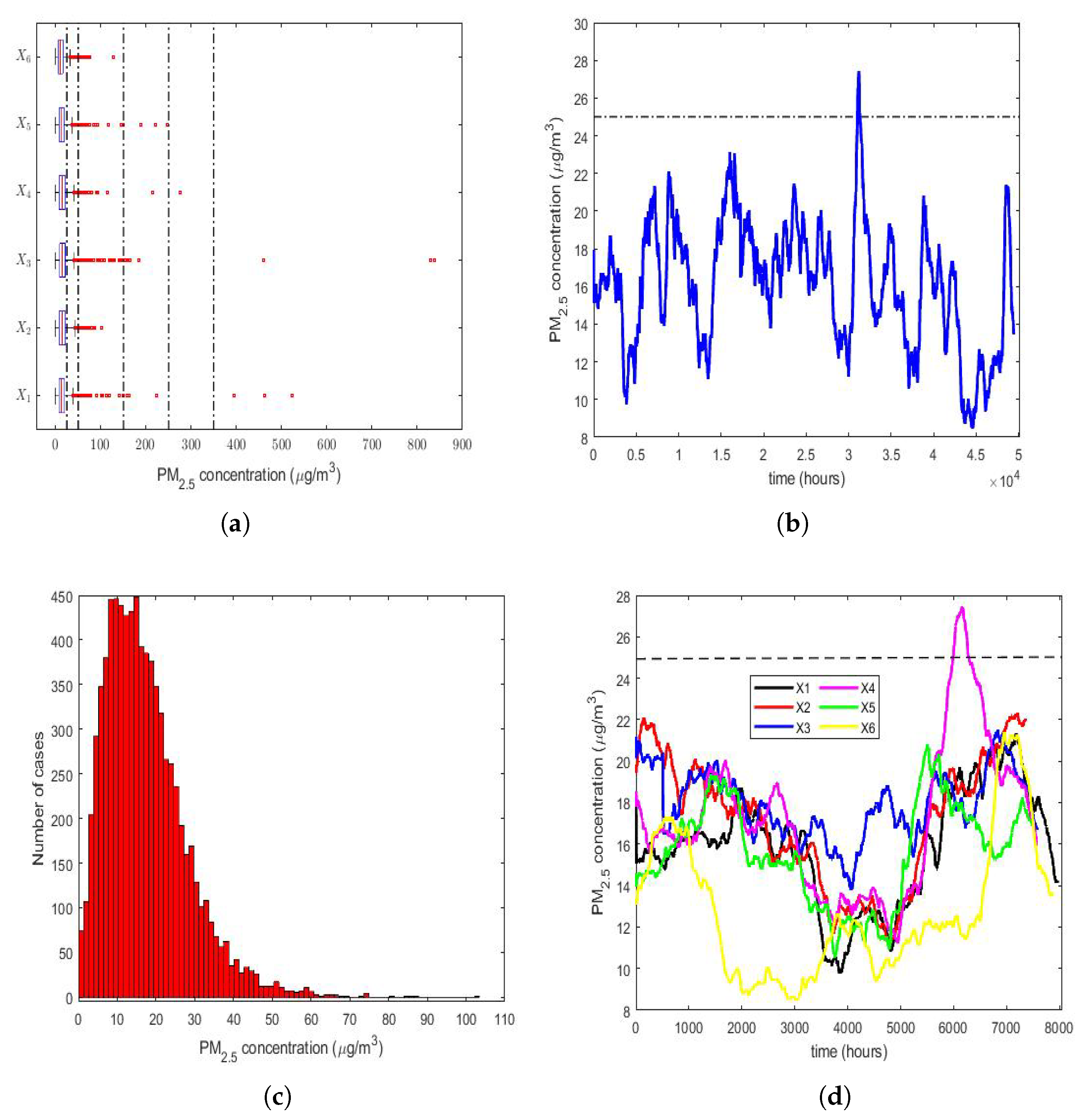
The four graphs shown in
Figure 2 are as follows:
A box plot diagram of all years (2015–2020) (
Figure 2a).
The moving average (MA) of the time series consisting of all observations from 1 January 2015 to 31 December 2020 (
Figure 2b).
A histogram of the year 2016 (
Figure 2c), because
is the variable that has the lowest skewness and the lowest kurtosis (see
Table 2).
The MAs of all years (2015–2020) (
Figure 2d).
The size that was used to carry out the MA smoothing was equal to 720, because this is the number of PM concentration measurements taken in a 30-day month. However, it should not be forgotten that not all possible data were available, because there were missing data.
According to what is indicated in the Quito air quality reports that were issued by the Quito Environmental Protection Agency from 2003 to 2019 (these reports are available online for the general public and can be downloaded from
http://www.quitoambiente.gob.ec/index.php/informes (accessed on 30 September 2022)), the air pollution categories due to the average PM
concentration in Quito over 24 h are as follows:
Desirable level: [0, 25 µg/m3).
Acceptable level: [25 µg/m3, 50 µg/m3).
Caution level: [50 µg/m3, 150 µg/m3).
Alert level: [150 µg/m3, 250 µg/m3).
Alarm level: [250 µg/m3, 350 µg/m3).
Emergency level: [350 µg/m3, ∞).
Therefore, in order to locate the measured values of the PM
concentration levels in the above-mentioned 6 air pollution categories, five vertical dashed lines are drawn in
Figure 2a to separate each of these 6 categories, indicating the air pollution level. From
Figure 2a, every year had PM
concentration outliers that were above the acceptable level; 4 years had outliers that were above the caution level, although they were very few; 3 years had either 1, 2, or 3 outliers above the alert level; 2 years had either 2 or 3 outliers above the alarm level, which were within the interval corresponding to the emergency level. Although the percentage of outliers of each year was approximately less than or equal to 3% (see
Table 2), the above indicates that the observations did not follow a Gaussian distribution.
Figure 2b indicates that the PM
concentration was stable during the time period analyzed. Moreover, it was observed that, by smoothing the observations, the desirable level of air pollution was only exceeded on one occasion. In this figure, the upper limit of this level is represented by a dashed horizontal line. Lastly, it can be concluded that exceeding the desirable level of air pollution occurred only at specific moments, and never in a sustainable way.
In general,
Figure 2d shows that the time series of the PM
concentration values of the year 2020 (
) had lower values than the other time series (i.e.,
), but the graphs appear interlaced among the time series of each of the first 5 years of the study.
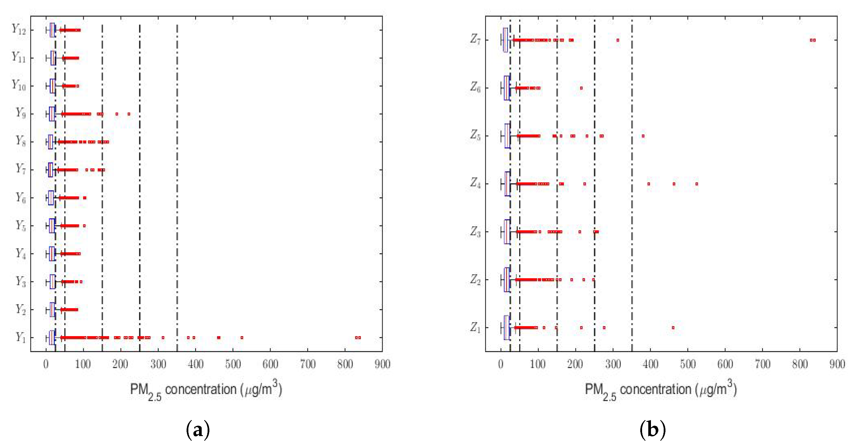
Finally, a box plot of the observations for months, days of the week, and every two hours of the day is provided in
Figure 3. This figure shows that all the variables had extreme observations on the right, which were generally close to each other, and that in very few cases, some of these observations fell within the emergency level of air pollution due to the PM
concentration.
Most of the abnormally high observations occurred in the month of January (see
Figure 3a) and in the early and middle hours of the day (see
Figure 3c). Without taking the abnormally high observations into account, the behavior of the variables was very similar between all the months (see
Figure 3a), the days of the week (see
Figure 3b), and the hours of the day (see
Figure 3c). Furthermore,
Figure 3 shows that a large number of observations were at the caution level, which were outliers. Hence, this seems to indicate that these variables followed heavy-tailed distributions.
3.2. Results Taking into Account the Possible Impact of Meteorological Factors on the PM Concentration Levels
The analysis of the role that meteorological factors play in the PM
concentration levels is of paramount importance [
7,
75,
76,
77,
78], because changes in these factors can considerably affect the concentration levels of this air pollutant. Therefore, the aim of the next paragraphs of the paper is to make a comparison between different meteorological variables that could influence the PM
concentration levels in the region under study. To make this comparison, we focused on the years 2020 and 2019, which was the year just before the pandemic.
3.2.1. Descriptive Statistics: 2020 vs. 2019
The meteorological variables that were taken into consideration were as follows:
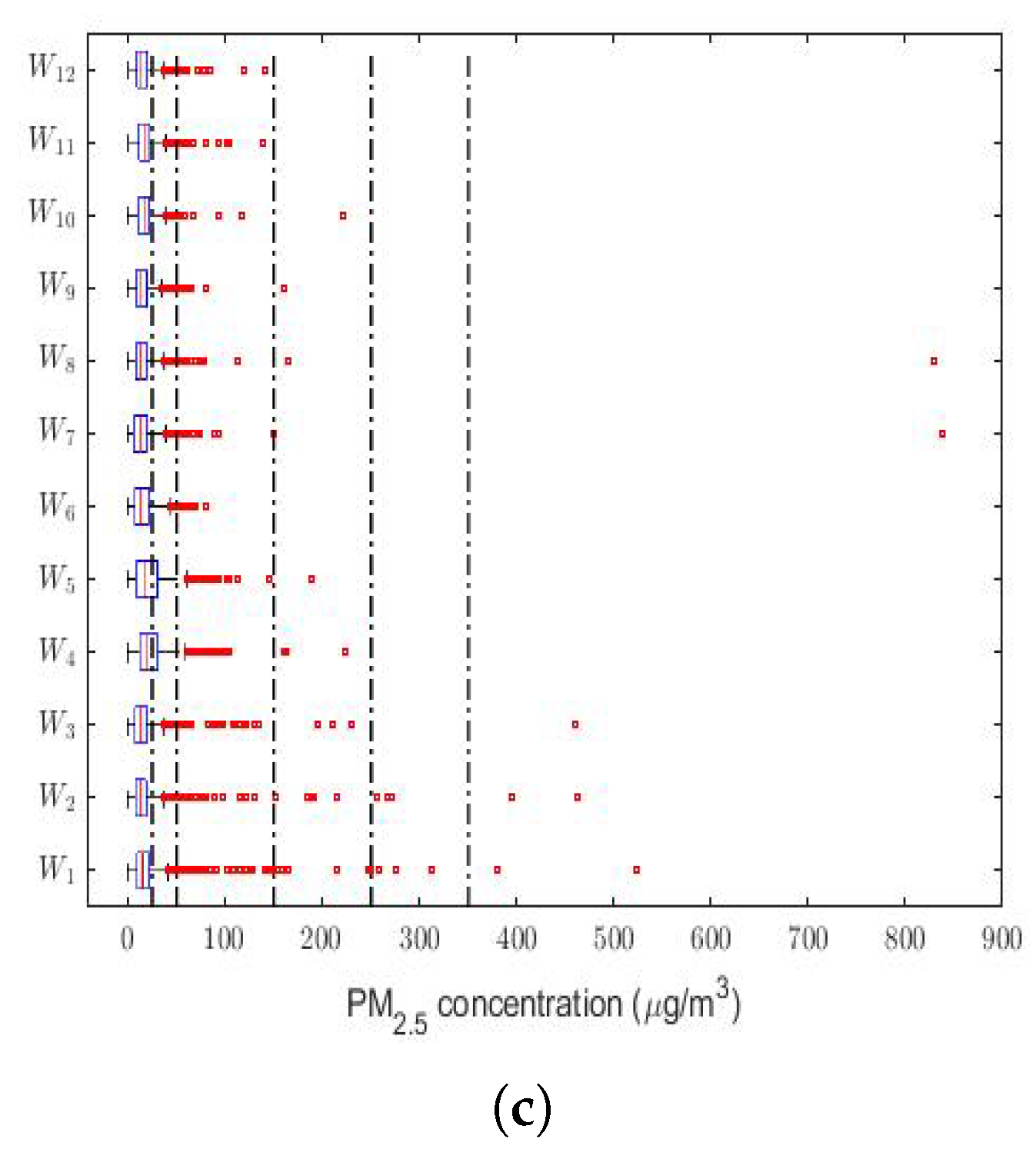
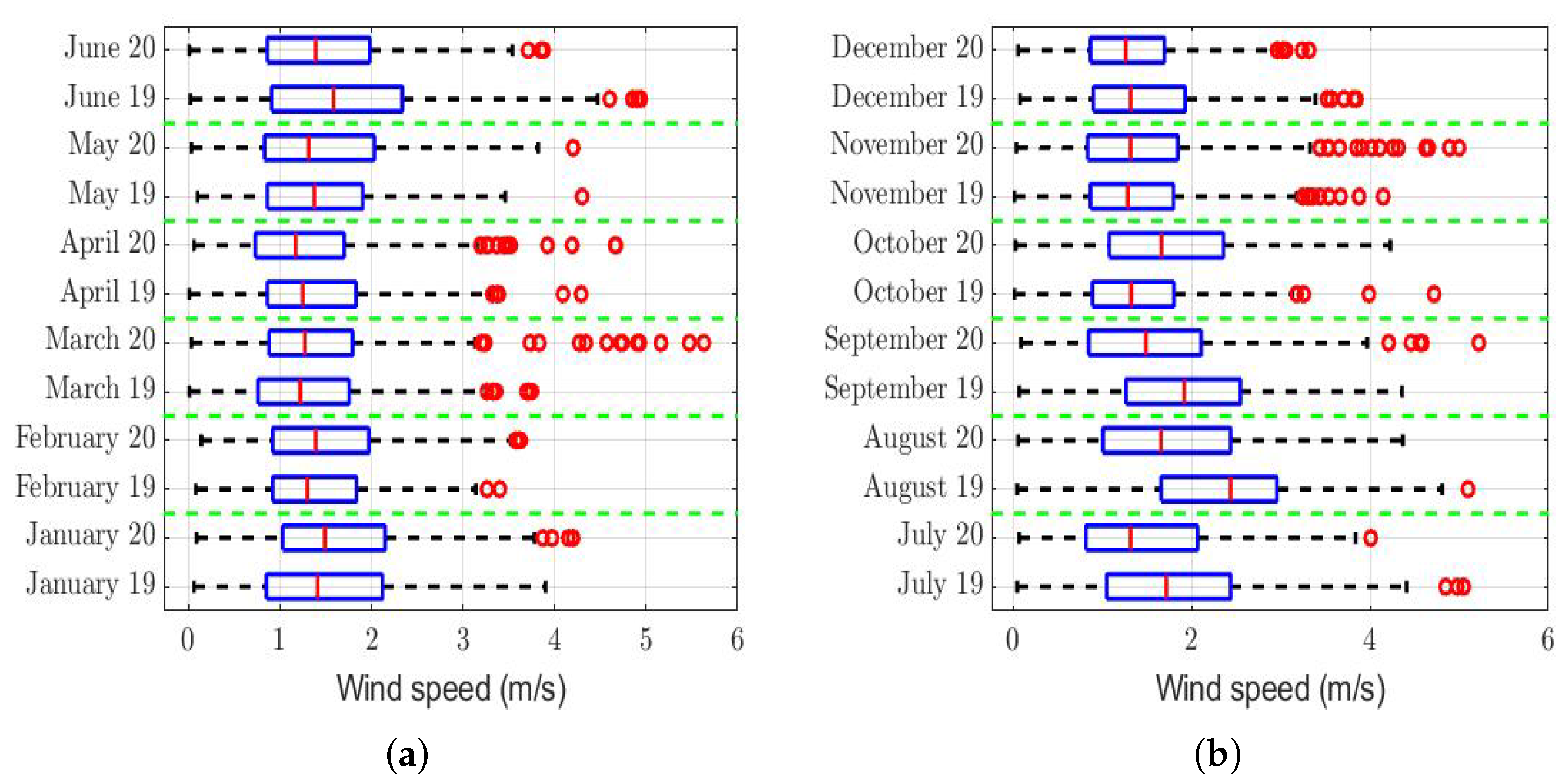
The box plots of the measurements of these meteorological variables are provided in
Figure 4,
Figure 5,
Figure 6,
Figure 7,
Figure 8,
Figure 9,
Figure 10 and
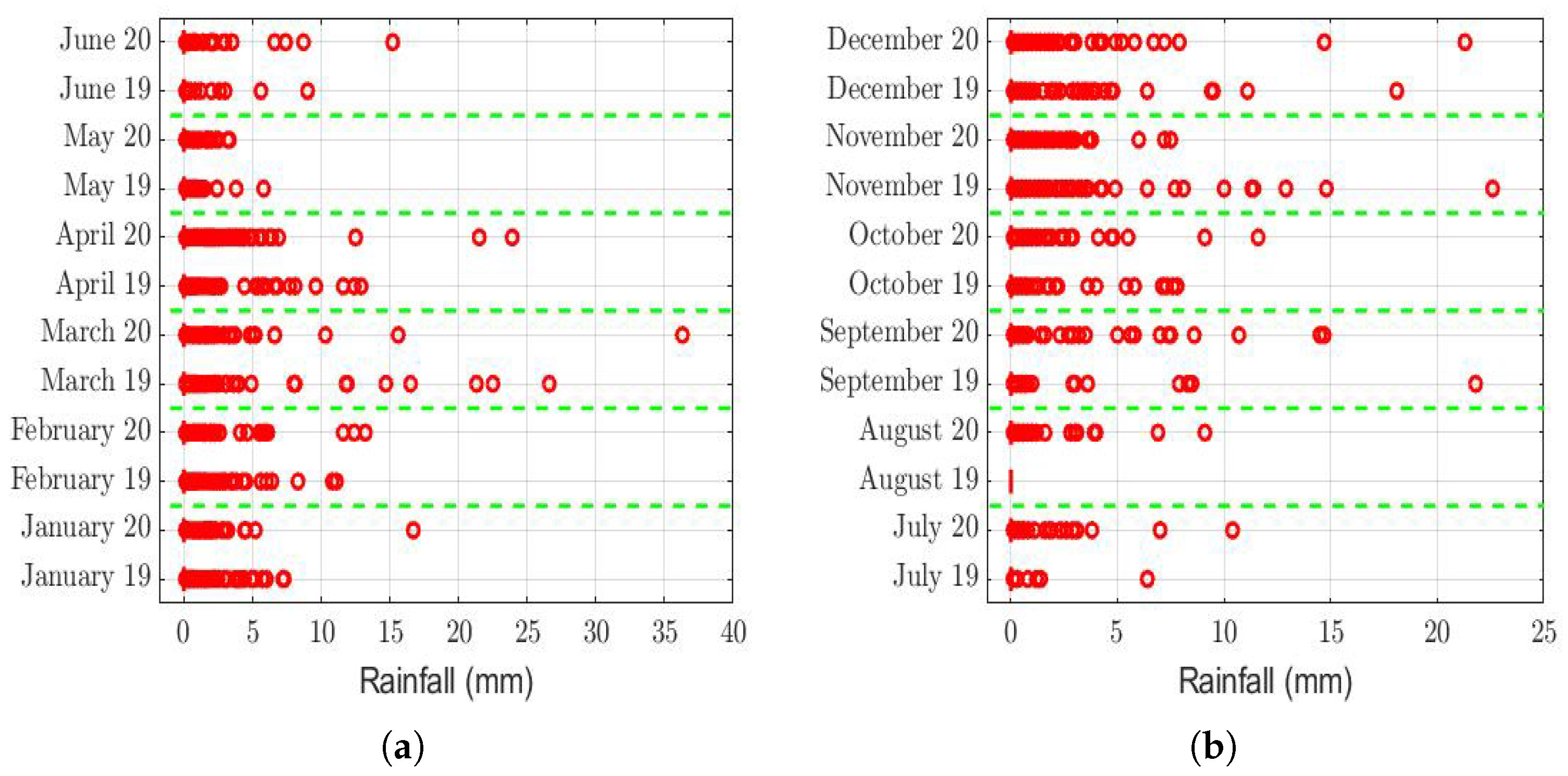
Figure 11. These figures show that there were no considerable differences in terms of wind speed in 2019 and 2020. In addition, with respect to relative humidity, it can be said that, although there were small differences in the summer months, these were insignificant. In the same way, there was not a big difference in terms of rainfall. Regarding this, it is worth saying that in Quito. it seems that it does not rain in large quantities; in fact, in August 2019, it did not rain at all, according to the measurements considered.
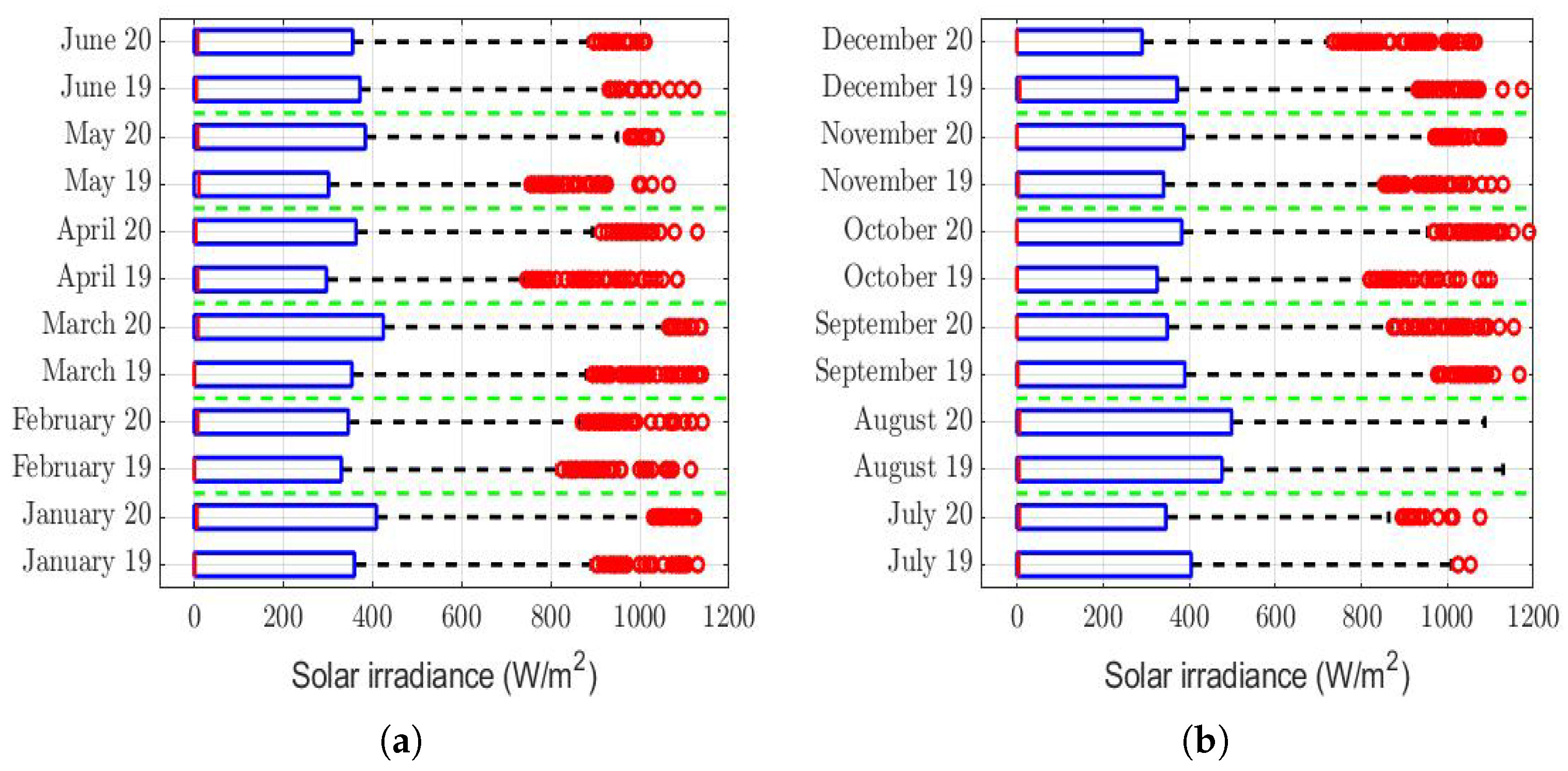
Furthermore, as for the previous meteorological variables, it seems that the box plots indicate that there were no considerable differences in terms of solar irradiance, wind speed, temperature, and atmospheric pressure.
Finally, it cannot be said that the ultraviolet index in 2019 was considerably different from that of 2020.
3.2.2. Comparison by Means of Statistical Hypothesis Testing: 2020 vs. 2019
In this part of the paper, the possible differences between the meteorological variables are established, in the two years under study, using statistical hypothesis testing of homogeneity between populations.
That said, in this paper, it was decided to establish nonparametric hypothesis testing due to the following reasons: (1) in view of the box plots (shown in
Figure 4,
Figure 5,
Figure 6,
Figure 7,
Figure 8,
Figure 9,
Figure 10 and
Figure 11), it does not seem that the distributions of the considered meteorological variables followed a normal distribution, and (2) independence between observations of the same meteorological variable cannot be guaranteed, because the value of each observation was reasonably dependent on the value of the previous observation.
Through statistical hypothesis testing, it was intended to analyze both differences between values and their respective medians and the size of these differences. The above was carried out using the Wilcoxon rank-sum test [
70].
Given a meteorological variable of a specific month, the null hypothesis () was that the distribution of that variable in 2020 was equal to the distribution of the same variable in 2019 plus K, K ∈ . The alternative hypothesis () was that the distribution of that variable in 2020 was different from the distribution of the same variable in 2019 plus K.
The results of the test are shown in
Table 3. If in this table, any of the rows indicating the meteorological variable name shows the value 0 in the month columns, this means that
was not rejected. On the contrary, if the value is 1, then
was rejected in favor of
. In addition, the values that appear in the rows called
K are the ones that must be entered in order not to reject
, at the
significance level. Finally, the rows called
p-value [
70] show the probability that the test statistic had a value that was equal to or greater than the calculated value from the data shown in the random sample, assuming
is true.
Table 3 shows that, in six months, the wind speed was somewhat higher in 2019, while in four months, it was higher in 2020. However, these variations were not systematic. In addition, given that the largest difference was found in August, but this was only 0.6 m/s, it cannot be said that the wind speed had a greater influence on the PM
concentration in one year than in the other, because the range of variability of the observations was between 0 and 6 m/s (see
Figure 4).
Table 3 also shows that the difference in relative humidity (see
Figure 5) between the months of 2019 and 2020 was at most equal to 10%. Additionally, it shows that there was no behavior pattern that indicated that the relative humidity during the months of a year was always greater than or equal to that in the same months of the other year. In fact, in one year, the summer had the highest relative humidity value, but the autumn of the same year had the lowest value. Therefore, the variations shown in
Table 3 do not seem to be large enough to ensure that the relative humidity had significantly more influence in one year than in the other.
Considering the instants in which the rainfall was different from 0, both in 2019 and in 2020,
Table 3 shows that it was the same in both years, with the exception that in August 2019, it did not rain. In addition, the difference of 0.2 mm (i.e.,
K=
mm) in the months of October 2019 and 2020 was insignificant compared to the range of values that this variable took (see
Figure 6). Therefore, there are no sufficient arguments to say that the rainfall caused the PM
concentration to be higher in one year than in the other.
Solar irradiance took very large values throughout the day, during each month. This is shown in
Figure 7, which shows extreme values of up to 1200 W/m
. Therefore, the rows showing this variable in
Table 3 tell us that the homogeneity between the solar irradiance in 2019 and the solar irradiance in 2020 cannot be rejected. Nevertheless, it is true that the null hypothesis (
) was rejected in June, but it is also true that this happened in a very weak way, because
was accepted at the
=
significance level. On the other hand, there were differences in the first months of both years, but these were insignificant compared to the values taken by the meteorological variable. Therefore, it cannot be said that the solar irradiance influenced so much as to make the PM
concentration higher in one year than in the other.
However, it is important to mention that as the p-value = = , when comparing the solar radiation of June 2019 with that of June 2022, we modified the test for a linear transformation in which the dependent variable (i.e., X) represents the distribution of solar irradiance in June 2020 and the independent variable (i.e., Y) represents the distribution of solar irradiance in June 2019. Now, : , and : .
Once the above-mentioned linear transformation was performed, the Wilcoxon rank-sum test was applied, and it was concluded that was accepted, with p-value = 0.161 > . Note that this model showed that the solar irradiance in June 2020 was less than the solar irradiance in June 2019. Therefore, the foregoing allowed us to conclude that there were no notable systematic differences between the distributions of solar irradiance by months, between the years 2019 and 2020, because the differences were mainly due to very low constants.
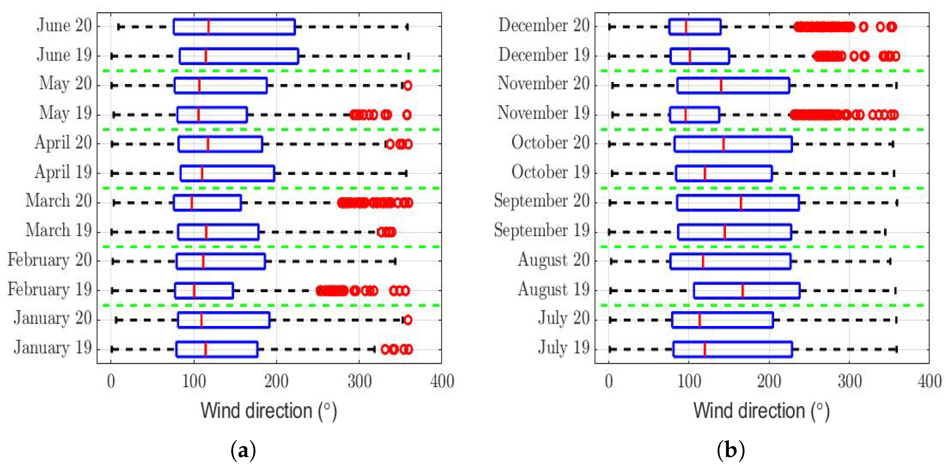
Regarding the wind direction, the rows of
Table 3 of this variable show that the hypothesis that the difference between the wind direction between the months is a constant was not rejected. Furthermore, the maximum value of the difference that is reached in said table was less than 10% of the maximum value that the variable can take (see
Figure 8). Moreover, due to the sign of this difference alternates throughout the months of the year, this could indicate that the differences were not systematic and that the influence of this variable may not have been significant.
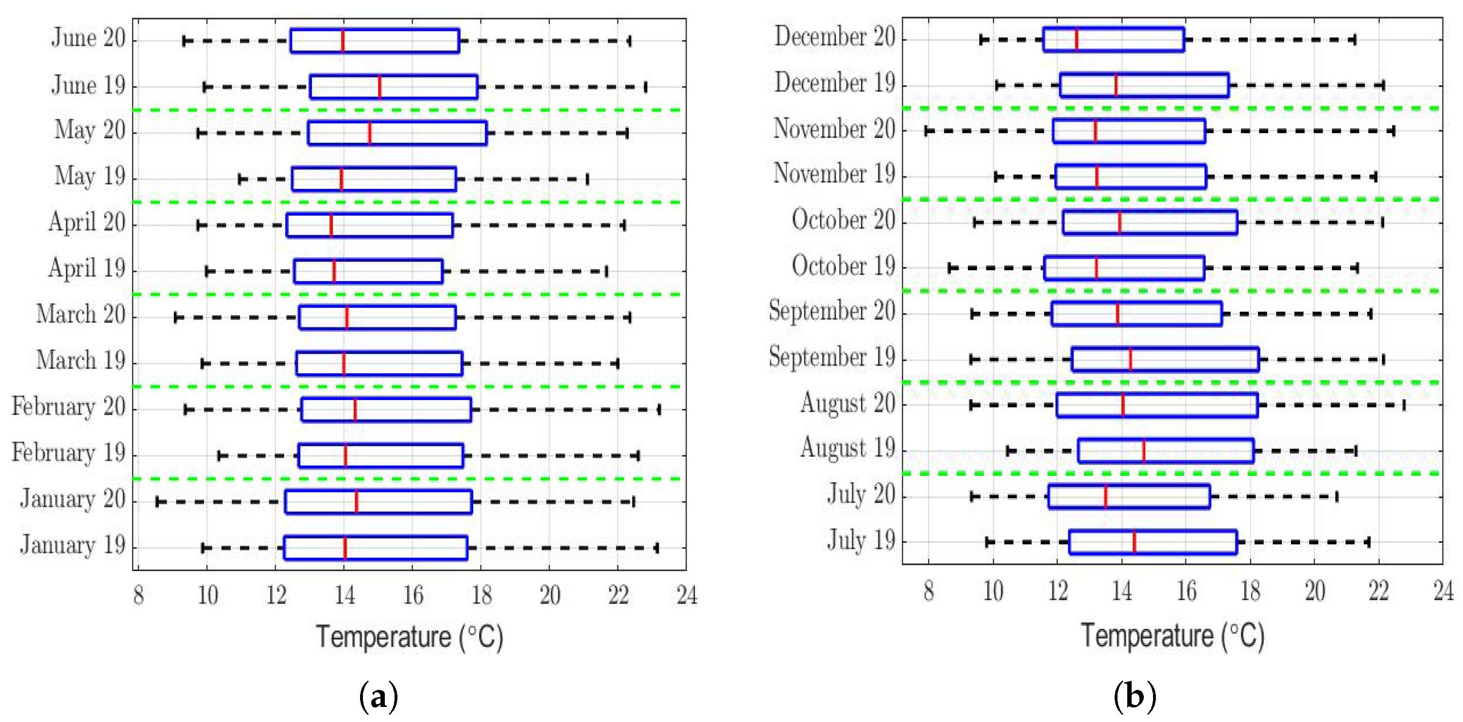
Regarding the temperature, the rows of
Table 3 of this variable show that its value was a little lower in the summer months of 2020 than in the summer months of 2019. However, this table also shows that this difference was very small compared to the range of values that this variable took (see
Figure 9). Additionally, the runs had values that were either very small or equal to 0. Therefore, there were not enough arguments to say that the temperature in 2019 was significantly different from that of 2020.
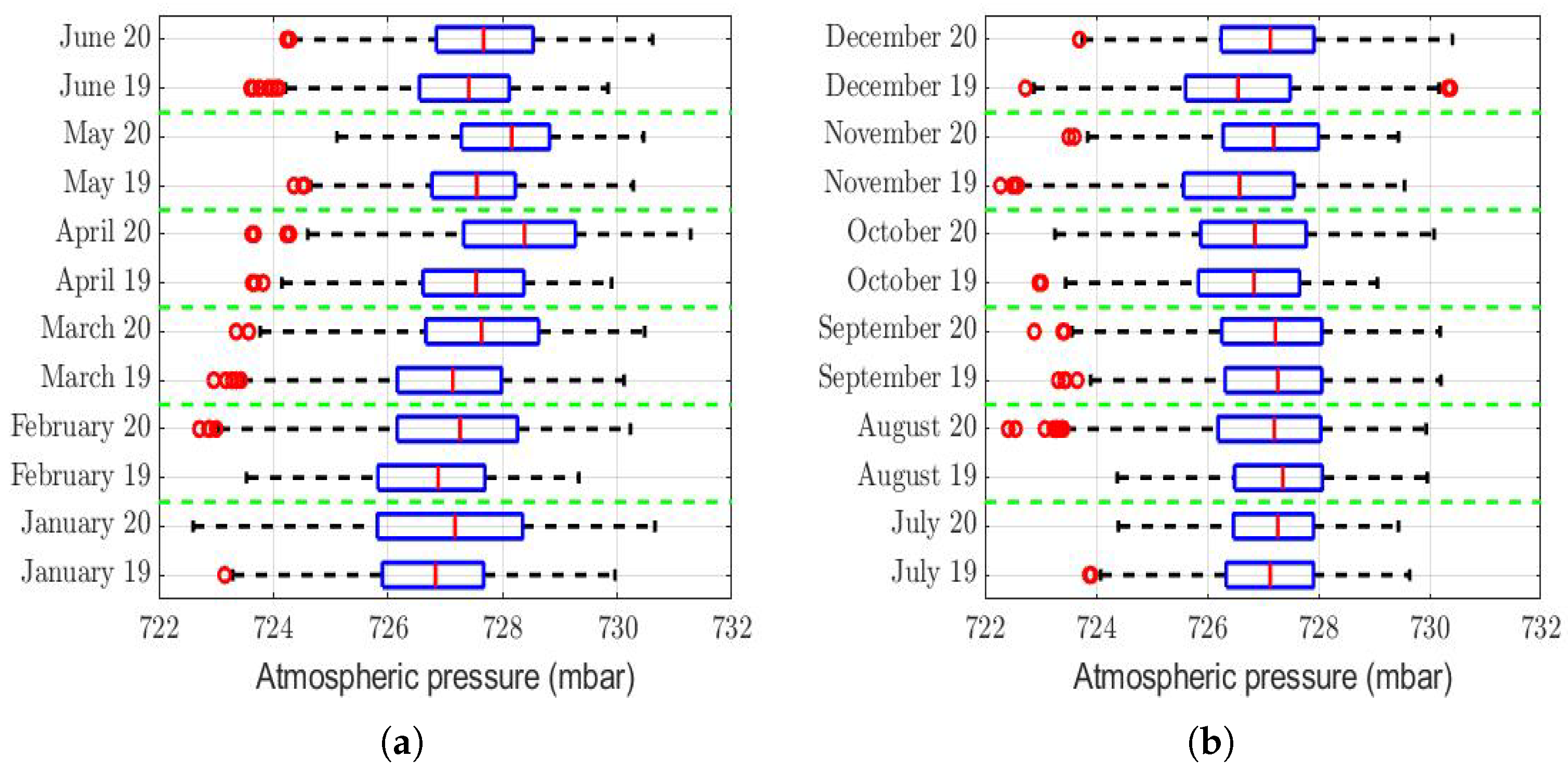
Another variable that was analyzed was atmospheric pressure. The rows of
Table 3 of this variable show that, in 8 months of the year, this was higher in 2020 than in 2019, although this difference was very small compared to the range of values that this variable took (see
Figure 10). Therefore, if this variable had any type of influence on the differences that existed in the PM
concentration in 2020 compared to 2019, this influence was small. In addition, it is noteworthy that most of this difference appeared in the first half of the year, when the lockdowns had either not yet began or just began.
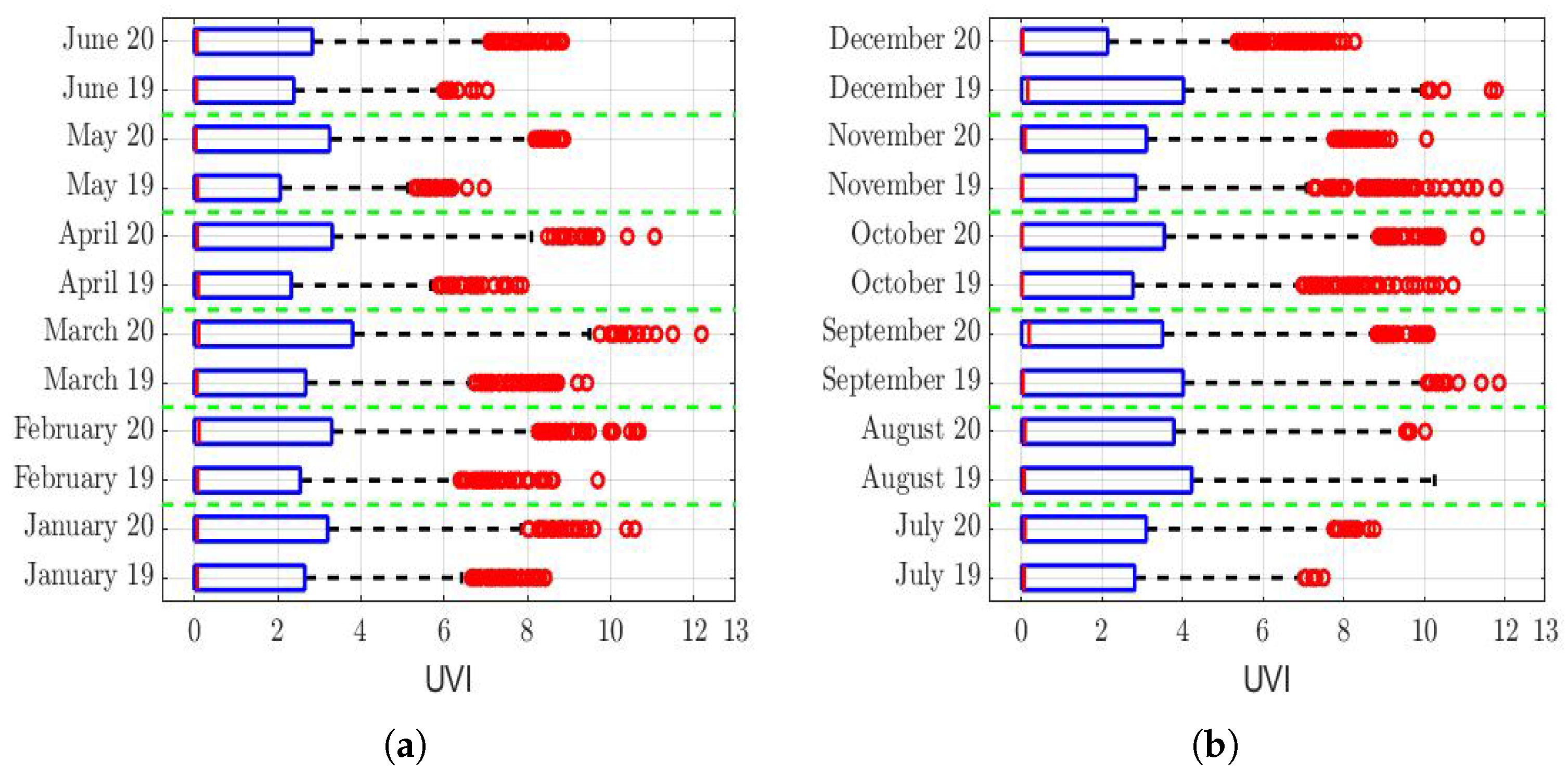
Regarding the ultraviolet (UV) index analysis (see
Figure 11), the last rows of
Table 3 show that the hypothesis that the UV index during 2019 and 2020 was the same cannot be rejected, except for the month of December. In fact, it cannot be said that, in December, this difference was equal to a constant. In a nutshell, we think this is because all the December 2019 outliers were larger than the December 2020 outliers (see
Figure 11b). That said, since this difference only occurred in the last month of the year, this did not materially influence what happened during the previous 11 months of the year. Therefore, the structure of the PM
concentration of all the year 2020 cannot be significantly affected by the fact that the UV index of December 2019 was different from that of December 2020.
The analysis of this last variable deserves special attention, because the sequences of missing values had sizes smaller than those corresponding to one week. However, more than half of the month of December 2020 was missing observations. To verify this, two periods were considered. The first (P1) was from 0:00 on 1 December to 11:00 on 19 December. On the other hand, the second period considered (P2) was from 12:00 on 19 December to 23:00 on 31 December.
Table 4 shows the data classified as either missing or not in the month under analysis.
Given the large amount of missing data in period P1 (see
Table 4), it was decided to carry out the statistical hypothesis test of the equality of the distributions using only the data from period P2, for which the null hypothesis (
) was that the UV index distribution in P2 of December 2020 was equal to the UV index distribution in P2 of December 2019. The alternative hypothesis (
) was that the UV index distribution in P2 of December 2020 was different from the UV index distribution in P2 of December 2019.
Taking the above into account, the application of the Wilcoxon rank-sum test showed that was accepted with p-value = = . Therefore, the hypothesis that the UV index in 2019 was similar to that of 2020 can no longer be rejected with a confidence level.
The above explanation was important, because it showed that it cannot be said that the behavior of the meteorological variables had a significantly different influence on the PM concentration in 2019 with respect to the one in 2020 in the study region.
3.3. Missing Data Imputation
Taking into account what was explained in
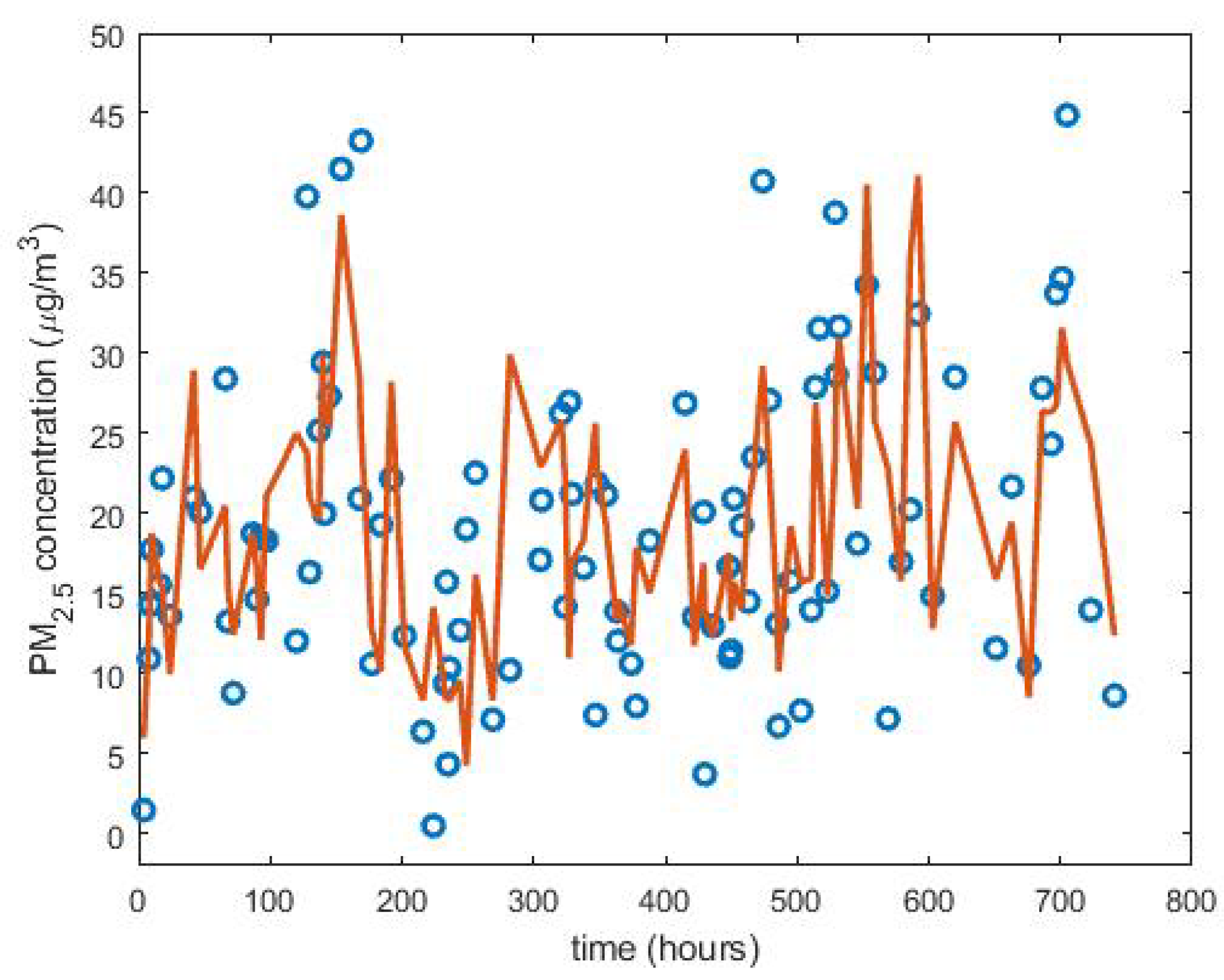
Section 2.3, 100 data from March 2019 were randomly removed. By doing this, it was observed that both the missing data were generally isolated observations and at most there were sequences of four missing data. In addition, all the interpolations that were tested gave better results than any of the designed estimates, which indicated that, with runs of few observations, it seems better to interpolate.
For the case study, the 100 data were eliminated in a uniform way, and the best results, with the four methods to evaluate the model, were obtained by piecewise linear interpolation (see
Figure 12). However, Pearson’s linear correlation coefficient was 0.68, which is not very high.
When 111 data from March 2019 were deleted in the same positions as the ones of the 111 missing observations of August 2013, a succession of 82 missing observations was obtained, another of 24 missing observations, and another 5 remaining observations, which were sequences of 1 or 2 missing data. Now, March 2019 was filled in by putting the estimated data in the same positions as the ones of the 111 observations of August 2013 that were missing.
Unlike the previous case, none of the interpolations used were among the best models evaluated. Now, the six best results were obtained with the mean (
), Andrew’s wave (
) of the dataset for one day over five years, and the mean (
), median (
), Andrew’s wave (
), 0.1-trimmed mean (
), and 0.2-trimmed mean (
) of the dataset for one week over five years.
Table 5 shows the statistics that were used to evaluate the models. In view of these results, in this case, it was decided to choose
for filling in the suppressed data.
When 64 data located in the same positions of the 64 missing observations of February 2010 were removed from March 2019, a succession of 47 missing data was obtained along with other of 5 missing data and another of 4 missing data. The rest were missing data located in isolated positions. Now, the best results were obtained with four robust estimates: the estimate and Andrew’s wave () of the data for the month of the missing observation and the median () and Andrew’s wave () of the data corresponding to the missing observation in the previous five years.
Table 6 shows the statistics that were used to evaluate the models, and in view of the results, it was decided to select
for filling in the suppressed data. Furthermore, the values obtained in this way were highly correlated with those obtained with
, because
.
When 49 data located in the same positions as the ones of the 49 missing observations of September 2020 were removed from March 2019, two successions of 12 missing data were obtained along with another succession of 11 missing data, another of 8 missing data, one more of 4 missing data, and finally, 2 missing data that were located in isolated positions.
In this case, based on the methods used to evaluate the models, the best results were also obtained by piecewise linear interpolation, although similar results were also obtained with the nearest values and cubic interpolations.
Table 7 shows the interpolation methods that were used to evaluate the models.
Lastly, when 33 data from March 2019 that were located in the same positions as the ones of the 33 missing data from August 2010 were deleted, it was observed that these missing data formed a single succession of length 33. Now, with the statistics to evaluate the models, it was obtained that the best results were with estimates, although with very low values of the correlation coefficients. In this case, the best results were obtained with
(see
Table 8), which is the median of the data for a day with around three hours for five years.
Table 8 shows the statistics that were used to evaluate the models. In this table,
is the general estimate,
is the mean of the data for a day with around three hours for five years, and
is the 0.2-trimmed mean for the data for a day with around three hours for five years. Additionally,
is the mean for the data for a week with around three hours for five years.
Once all of the above had been performed, the next step was to decide which were the most appropriate methods to fill in the missing observations, based on the characteristics of the sequences of such missing observations. Therefore, for all the above, it was decided to fill in the missing observation sequences using piecewise linear interpolation when the length of the missing observation sequences was less than 20. Likewise, in the case that the length of the sequences of missing observations was greater than 20 and less than 40, the median of the data was chosen for a day with around three hours during five years. This is represented by Set 3. Furthermore, the median of the missing observation in the previous five years was chosen to analyze sequences of missing observations whose length was greater than 40 and less than 70. This is represented by Set 7. Finally, when the length of the missing data sequences was greater than 70, it was decided to analyze the data using the mean of the data for one day with a three-hour frame over five years. This is represented by Set 3.
For the convenience of analyzing the information with missing data, here, it was decided to group the information from each of the semesters into data sequences of a length equal to 4096. Consequently, from the 1059 missing values in the first semester, as indicated in
Table 1, it was decided to fill in only 838 to guarantee that the semesters were made up of 4096 data. In the same way, of the 1153 missing values in the second semester, as shown in
Table 1, it was decided to fill in only 806 to guarantee that the semesters were made up of 4096 data.
To end this subsection, it is highlighted that what was performed was to homogenize the data for the 5 years prior to 2020. To do this, the empty spaces corresponding to missing observations were filled in with plausible data. Of course, the researchers could also carry out the analysis of the information only with the available data, but this could imply that the result of the study carried out was not the best possible, because the available data were not homogenized.
3.4. Description of Feature Vectors and Comparison between Them
Here, the size of the sequences was adapted to be able to build a non-overlapping partition of sequences of size , and for each of these cells, a multiscale decomposition of the discrete Daubechies wavelet family with five levels was performed. In this paper, the 6 years considered for the analysis had observations in each semester. Thus, to carry out the comparative study of the years, each sequence of size was divided into two parts: one with the even observations and the other with the odd ones. Then, each of these parts was divided into two sequences of elements each. Therefore, in each year, there were four subsequences (i.e., four trimesters) of size 2048 elements.
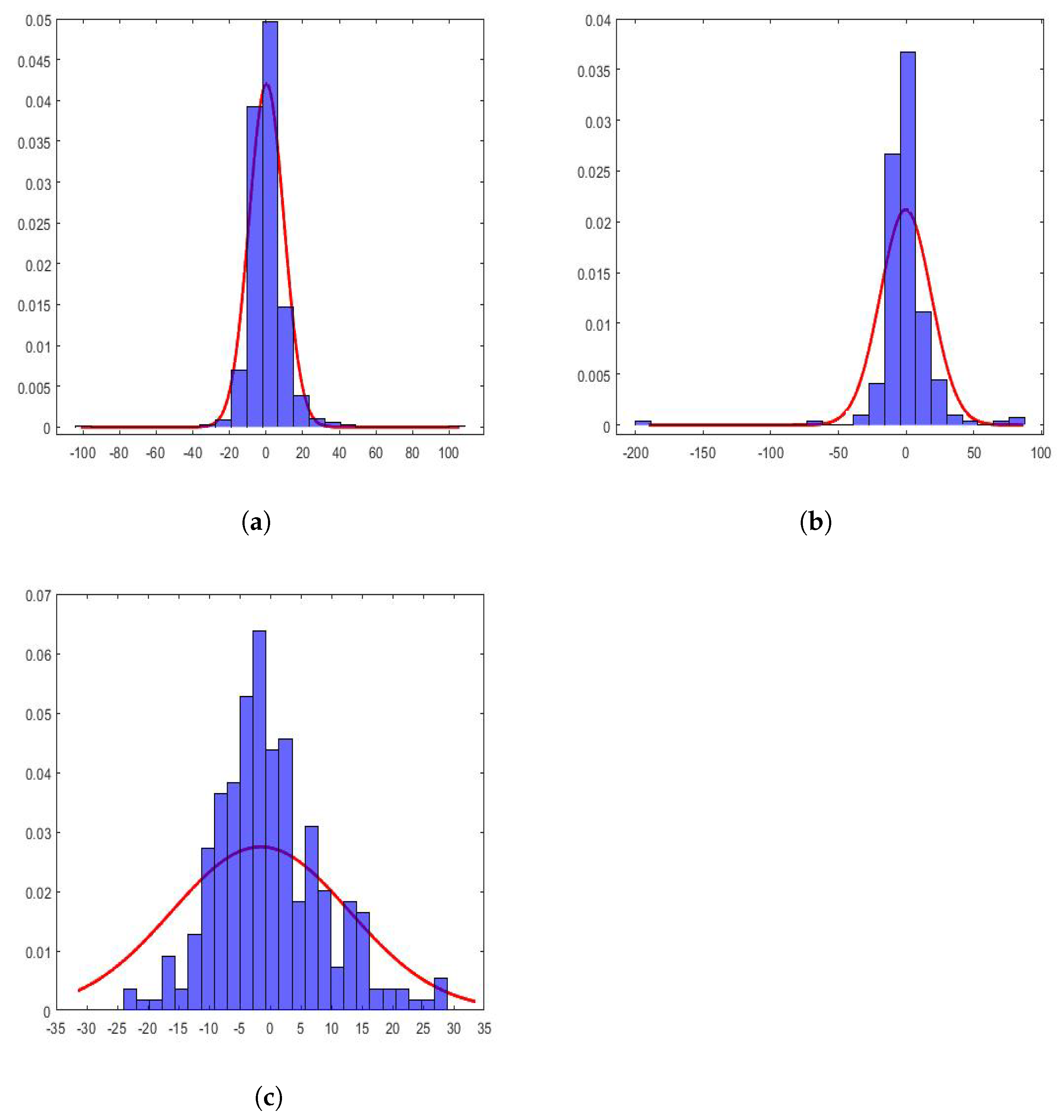
In the case under study, the values of the coefficients of the wavelet scales of the considered subsequences followed distributions that were very far from the Gaussian ones. This can be seen in
Figure 13. In this figure, the histograms of the following are shown: (1) approximation of the first level, first subsequence of the year 2015, (2) approximation of the third level, second subsequence of the year 2017, and (3) approximation of the fifth level, third subsequence of the year 2019. Additionally, along with the above, the maximum likelihood estimate of a normal distribution of each subsequence is also shown. This characteristic has also been observed by other authors [
44,
45,
79].
All histograms shown in
Figure 13 appear more pointed at the origin and heavier-tailed than the fitted Gaussian distributions. This shows that the subsequences contained a spatial structure with relatively smooth areas separated by abrupt transitions. Therefore, the wavelet coefficients had values near to zero in these uniform regions and were of great relative value in the transition zones, which were small when speaking in comparative terms of the areas. The above could be a reason that would justify the shape of these distributions.
The density functions of the marginal wavelets can be modeled using extreme value parametric distributions [
80], whose parameters are related to the mean, variance, skewness, and kurtosis. Therefore, these moments are the characteristics of the distributions of the coefficients at the different levels of decomposition.
In this research, 56 values were obtained taking into account the following: the eight estimators described in the
Materials and Methods Section (i.e., the mean, standard deviation, skewness, kurtosis, minimum, maximum, and 2nd and 98th centiles) for the full year, the marginal distributions of the detail coefficients of the
levels, and the approximation coefficients of the fifth level. Additionally, for joint distributions, the entire subsequence of three regressions were considered. Therefore, the total number of these statistics was equal to 24.
Due to what is stated in this subsection, there were four subsequences of size each for the series of each year. These subsequences represent the quarters of a year. From here, a feature vector with components was obtained. Therefore, each year was characterized by a vector of dimension .
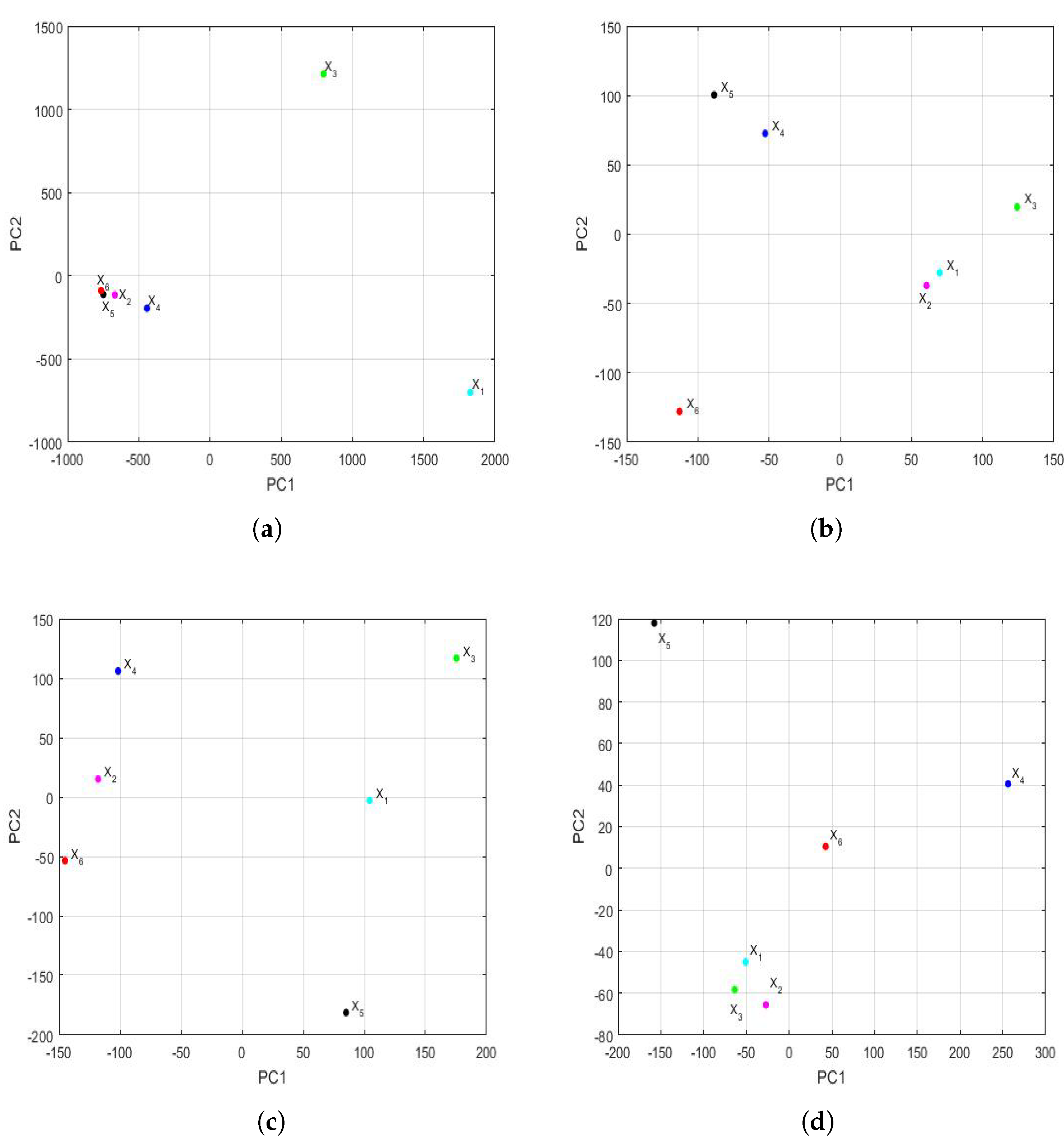
3.4.1. Comparison between Feature Vectors by Using Principal Component Analysis
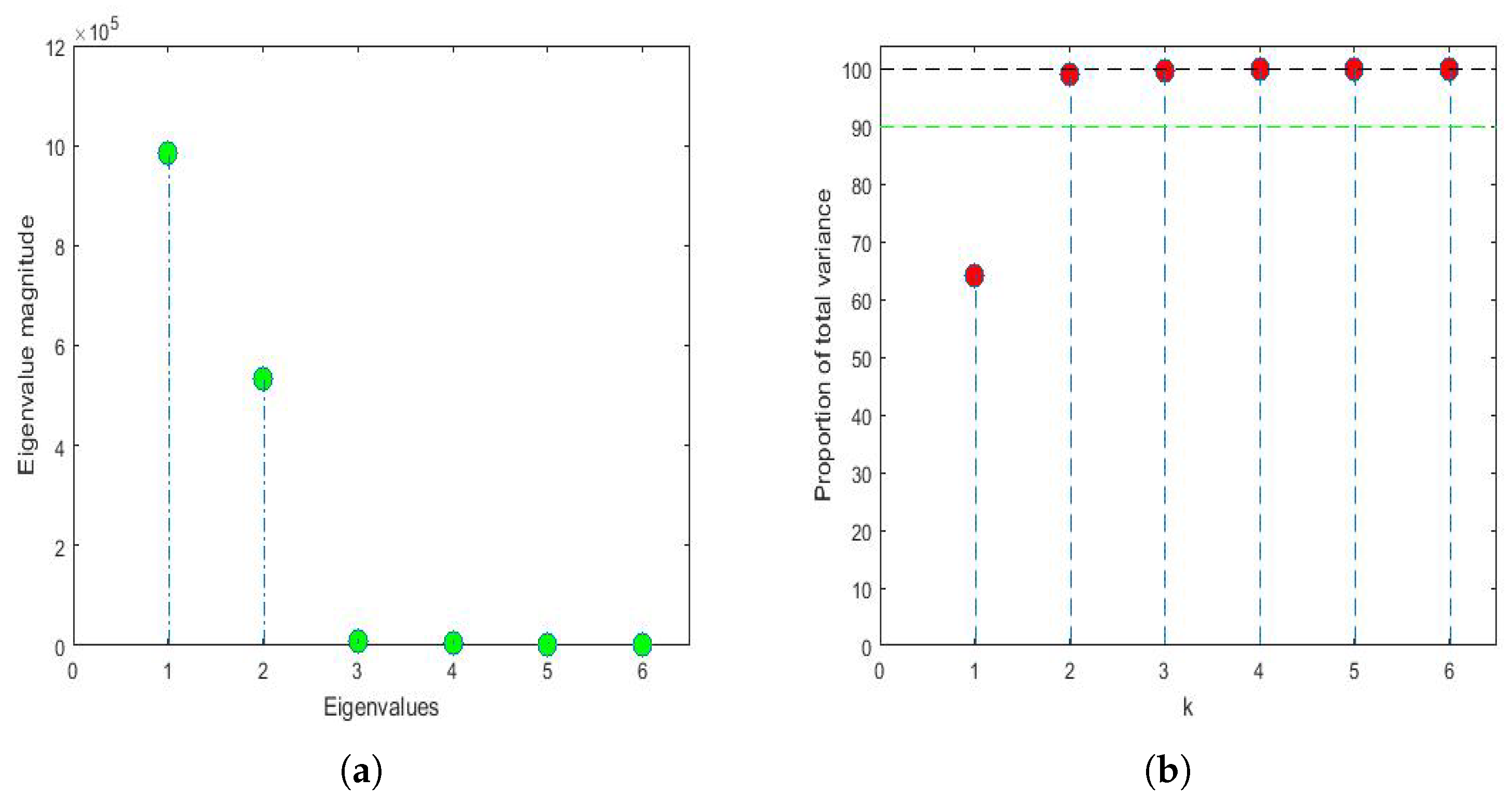
Applying the same philosophy of analysis explained by the authors in previous research [
43,
81], when analyzing the years under study, it was found that, for
and
, the first three eigenvalues were 983,811, 533,076 and 8910 and that, from the fifth eigenvalue onward, the eigenvalues were equal to zero because only 6 years were analyzed (i.e.,
). The first eigenvalues and the accumulated variability are shown in
Figure 14. Thus, by keeping only the first two principal components,
of the variability was collected. In the same way, by keeping only the first three principal components, then
of the variability was collected.
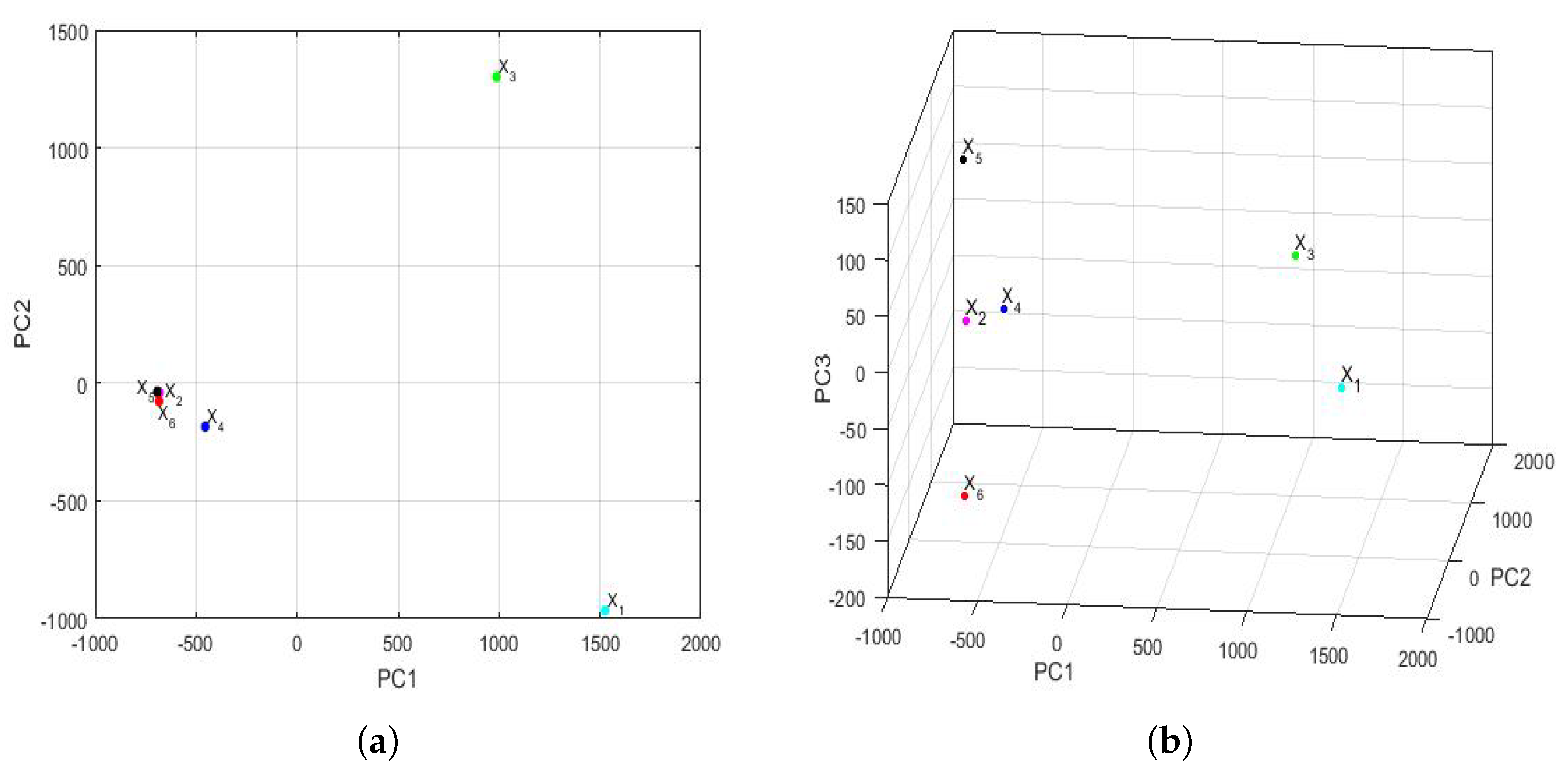
The feature vectors [
43] of the 6 years that were studied are shown in
Figure 15, being the axes of such a figure the first principal components. In the two-dimensional graph (
Figure 15a), it is observed, on the one hand, that the points appear to form the vertices of an isosceles triangle, where one of these vertices is made up of a grouping of the feature vectors of the variables
,
,
, and
. On the other hand, it is observed that the other two variables (i.e.,
and
) are the other two vertices of the isosceles triangle. Furthermore, when analyzing the three-dimensional graph (
Figure 15b), it is noticed that the feature vectors of the variables
and
appear equidistant from all the others and that the feature vectors of the variables
and
are very close and located in a plane, together with the feature vectors of the variables
and
. Moreover, the feature vectors of the variables
and
lie on both sides of the aforementioned plane.
Taking into account all that has been said above, it can be concluded that the variable (i.e., year 2020) had different characteristics from the rest of the years, as did the variable . This happened because the plane determined by the feature vectors of the first four years (i.e., the feature vectors of the variables , , , and ) separated and from the other variables. Finally, an analogy appeared between the years corresponding to the variables and .
3.4.2. Comparison between Feature Vectors by Using Multidimensional Scaling
The Hausdorff distance and the Euclidean distance between the vectors that characterize the PM
concentration of each year under study are shown in
Table 9. The distances between the feature vectors, in general, preserved the order, but the magnitudes of these differences were very remarkable.
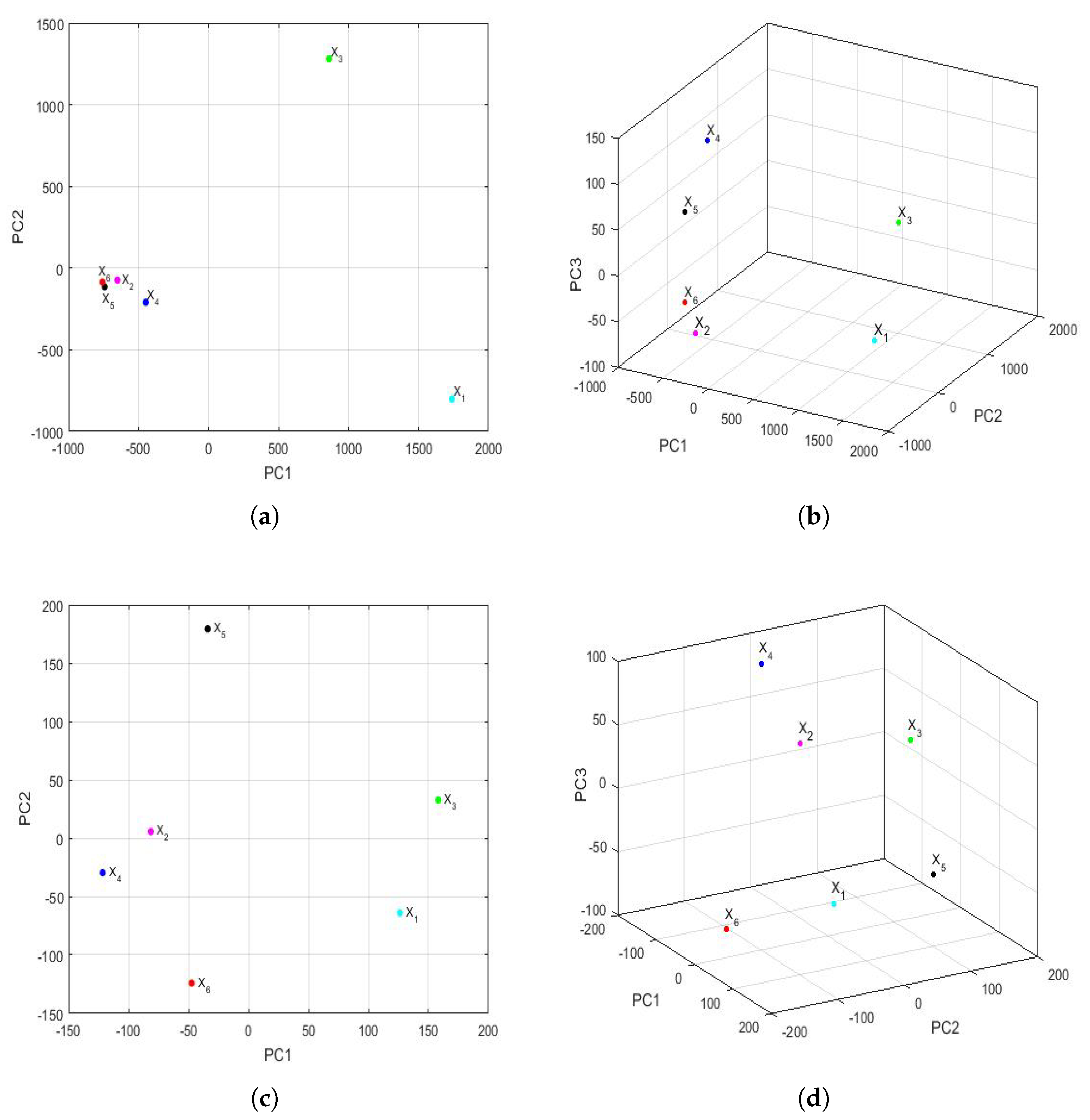
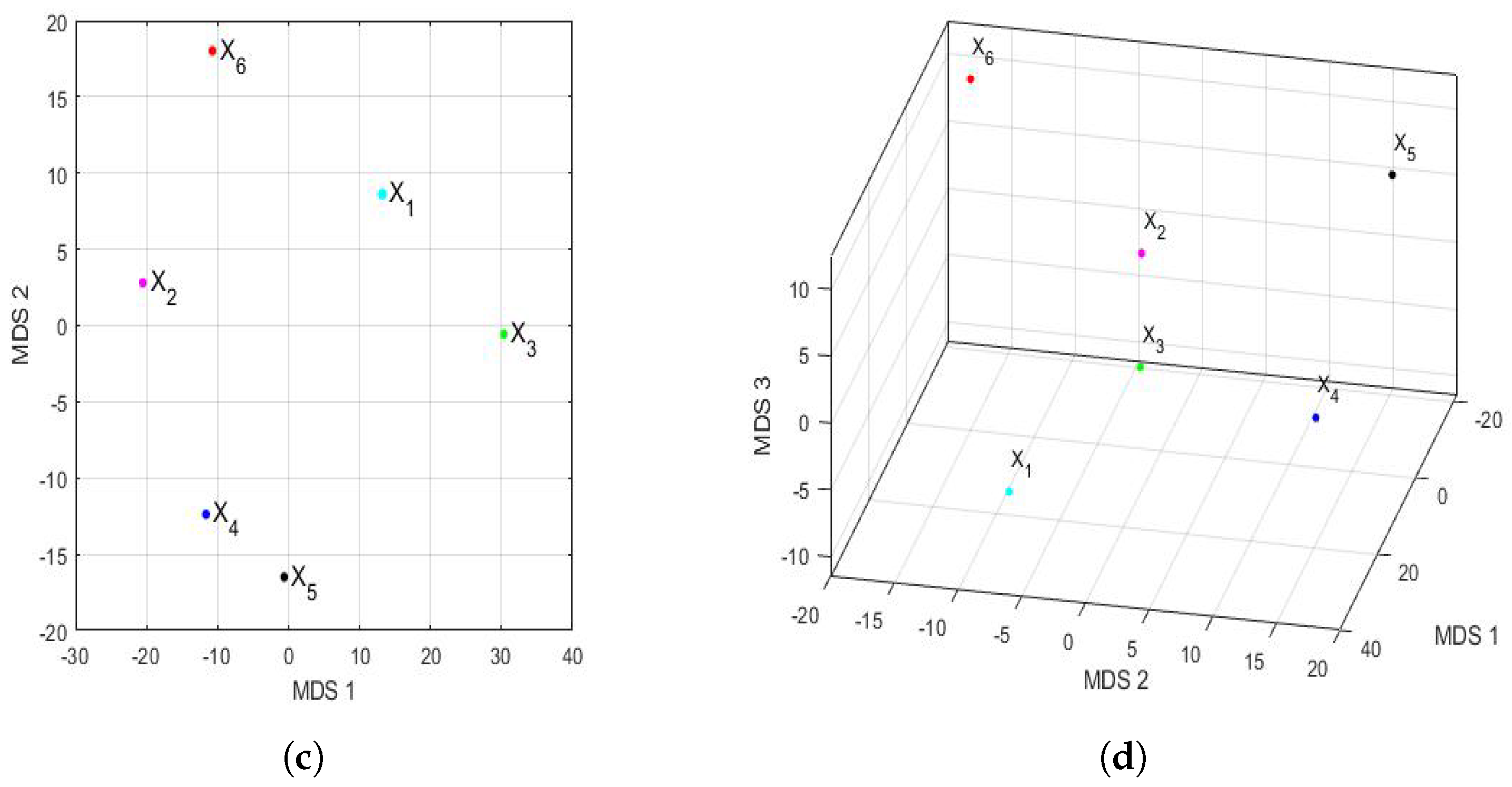
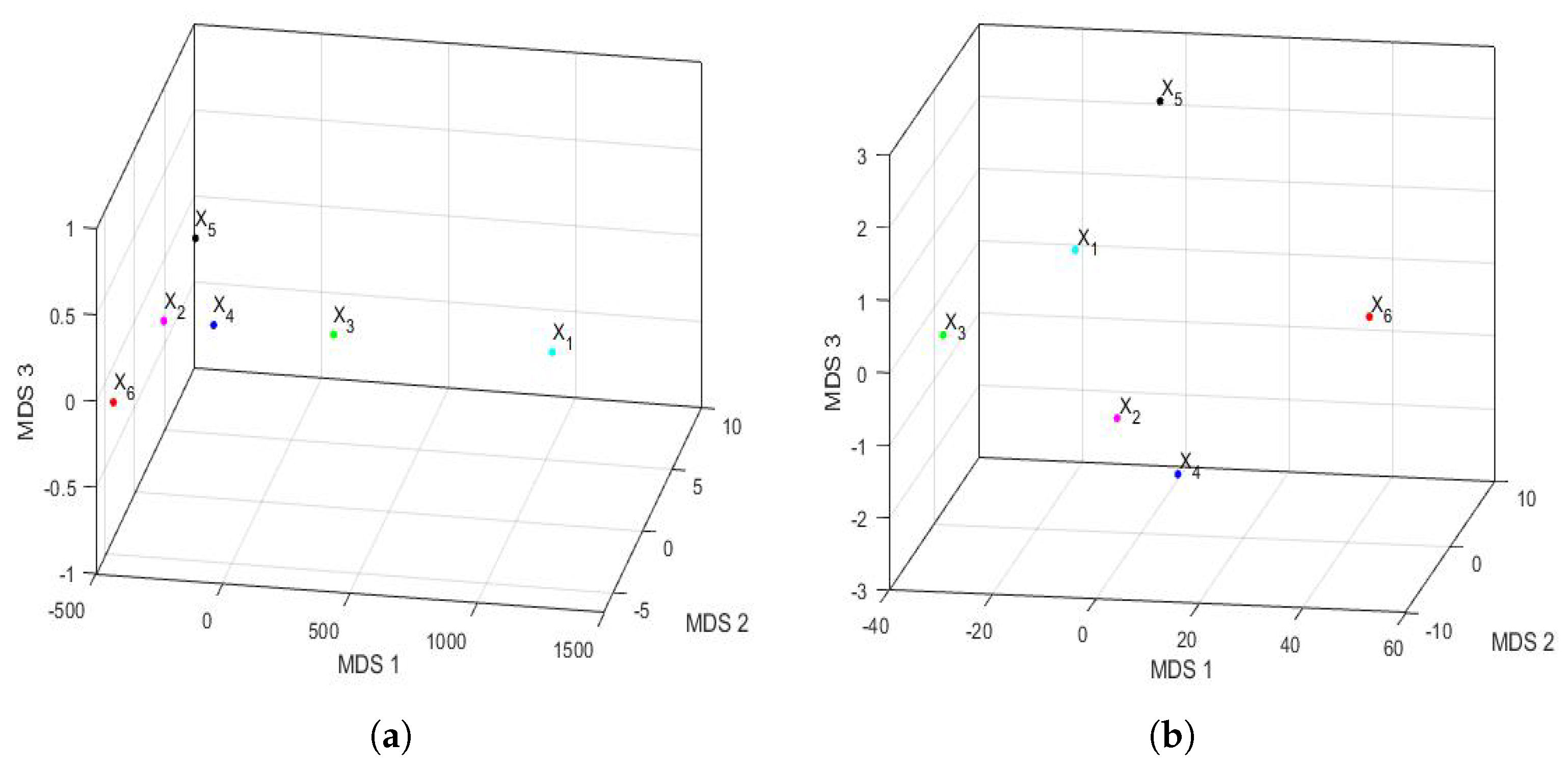
Figure 16 shows the principal coordinate graphs of the vectors that characterize the PM
concentration by years, when performing the nonmetric MDS with the Hausdorff distance between the feature vectors. Furthermore, the order of the stress Equation (
3) was
, which turned out to be excellent following the criteria established in other research [
72].
Based on the results, when comparing
Figure 15 and
Figure 16, it can be said that the graphs based on the nonmetric MDS allow a better differentiation of the set of all years under study than the graphs based on the PCA. In the case of the nonmetric MDS, the conclusions obtained with the two-dimensional graph (
Figure 16a) were the same as those obtained with the three-dimensional graph (
Figure 16b), since in the latter, all the points seem to be located on the same plane. This plane seems to be determined by an origin point, which is the feature vector of the variable
, an axis consisting of the feature vectors of the variables
and
, and another axis consisting of the feature vectors of the variables
,
, and
.
According to this procedure, the most similar years were 2016 (
) and 2019 (
). Additionally, the year 2020 (
), as with the PCA method, was far from all the others, because the horizontal axis separates the feature vector associated with
from all the others. Moreover, the years 2016 (
) and 2019 (
) were similar to each other because they formed the only appreciable grouping. Having said this, the only difference with respect to the conclusions obtained with the PCA was that the variable
was more similar to the variable
, instead of
(see
Figure 15). The rest of the conclusions, such as that
,
, and
were different from all the other variables, continued to hold.
3.4.3. Additional Comparative Analysis by Semesters
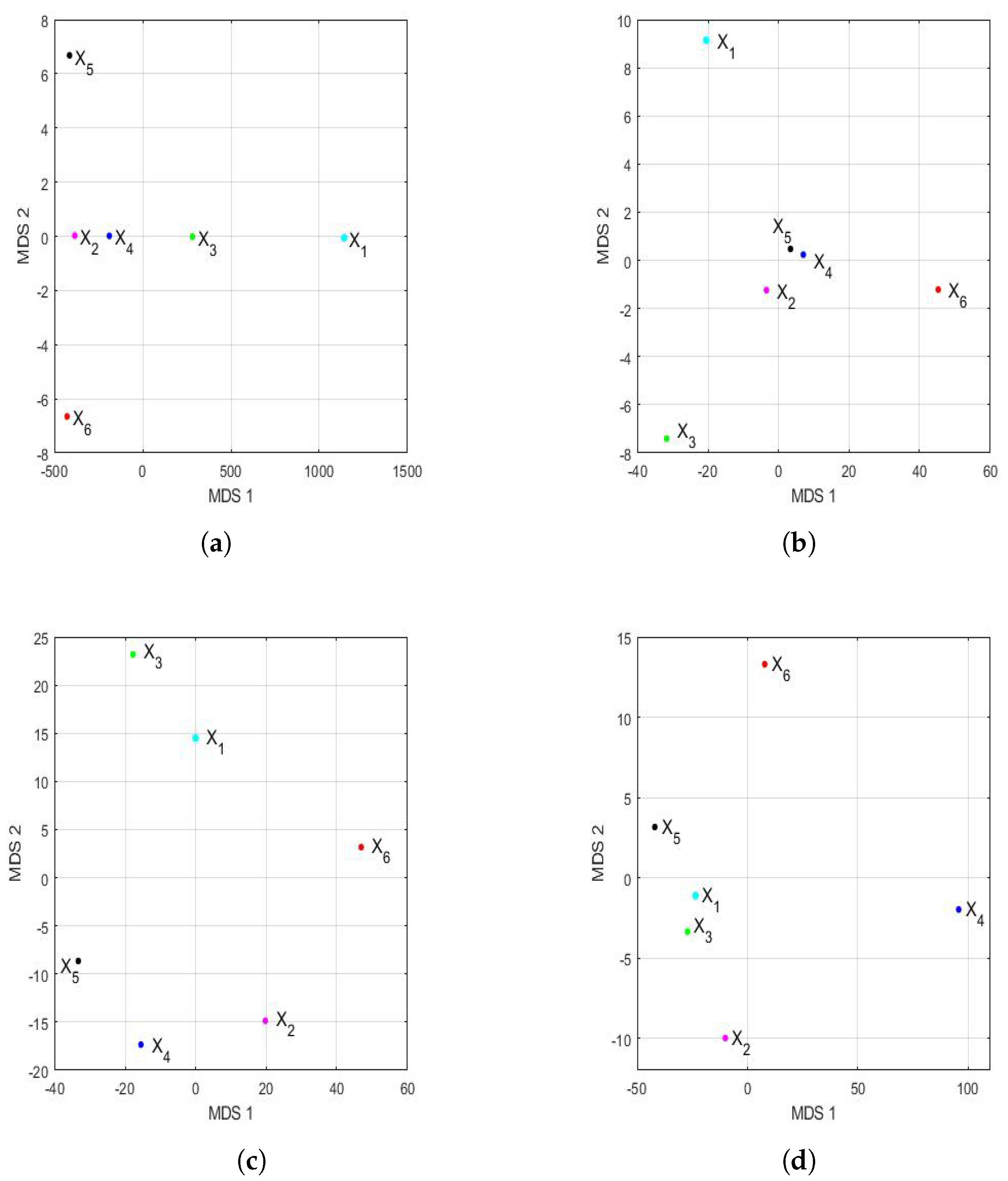
At this point, it is worth remembering that the data that were completed for each semester were for the same month, day, and time for each of the six years. Furthermore, given that 4096 observations were available for each semester, it was decided to make the same comparisons previously made for each semester. That is, a comparison was made between the first semester of the 2015–2020 six-year term and the second semester of the same six-year term. Likewise, it is worth remembering that, in the first three months of 2020, there were no changes in the historic center of the city of Quito that could be attributed to the restrictions due to the coronavirus disease (COVID-19).
As proven in this section (
Section 3.4), for each semester, there was a vector that characterized it of dimension 320, and by subdividing the series that forms each semester into four parts, it returned to have 80 values that characterized each of the subdivisions.
That said, when performing the principal component analysis of the six years under study, for the first semester of each year, it was found that more than of the variability of the observations could be explained with the first two principal components. Likewise, of the variability of the observations of the second semester of the six years under study could be explained with the first three principal components.
Figure 17 shows the representation of the feature vectors for each of the years of the 2015–2020 six-year term, with respect to the first two principal components and the first three principal components. In addition, the above was performed for both the first semester and the second semester of each year.
Considering the scale,
Figure 17 shows many more differences in the first semester than in the second semester. Additionally, considering the graph in two dimensions (shown in
Figure 17a), for the first semesters, a great resemblance to the same graph can be seen for the years (see
Figure 15a). Here, the points are located at the vertices of a triangle, and in one of the vertices, there is a grouping that consists of the years 2016 (
), 2018 (
), 2019 (
), and 2020 (
).
On the other hand, when observing the three-dimensional graph of the first semester (shown in
Figure 17b), it can be seen that there are differences from
Figure 15b. In this case, the differences between the four years grouped in the two-dimensional graph (shown in
Figure 17a) are smaller, and no great differences are seen in the year 2020 (
) compared with the others.
The above changed remarkably when analyzing the results of the second semester. The scale of the observations shown in
Figure 17c,d allowed us to better appreciate the discrepancies between the second semesters of all years. In fact, all the points appear to be points on a sphere whose center is equidistant from all of them. Now, the second semester of 2020 (
) differed from the second semesters of the rest of the years, and there were no groupings between the feature vectors that were considered.
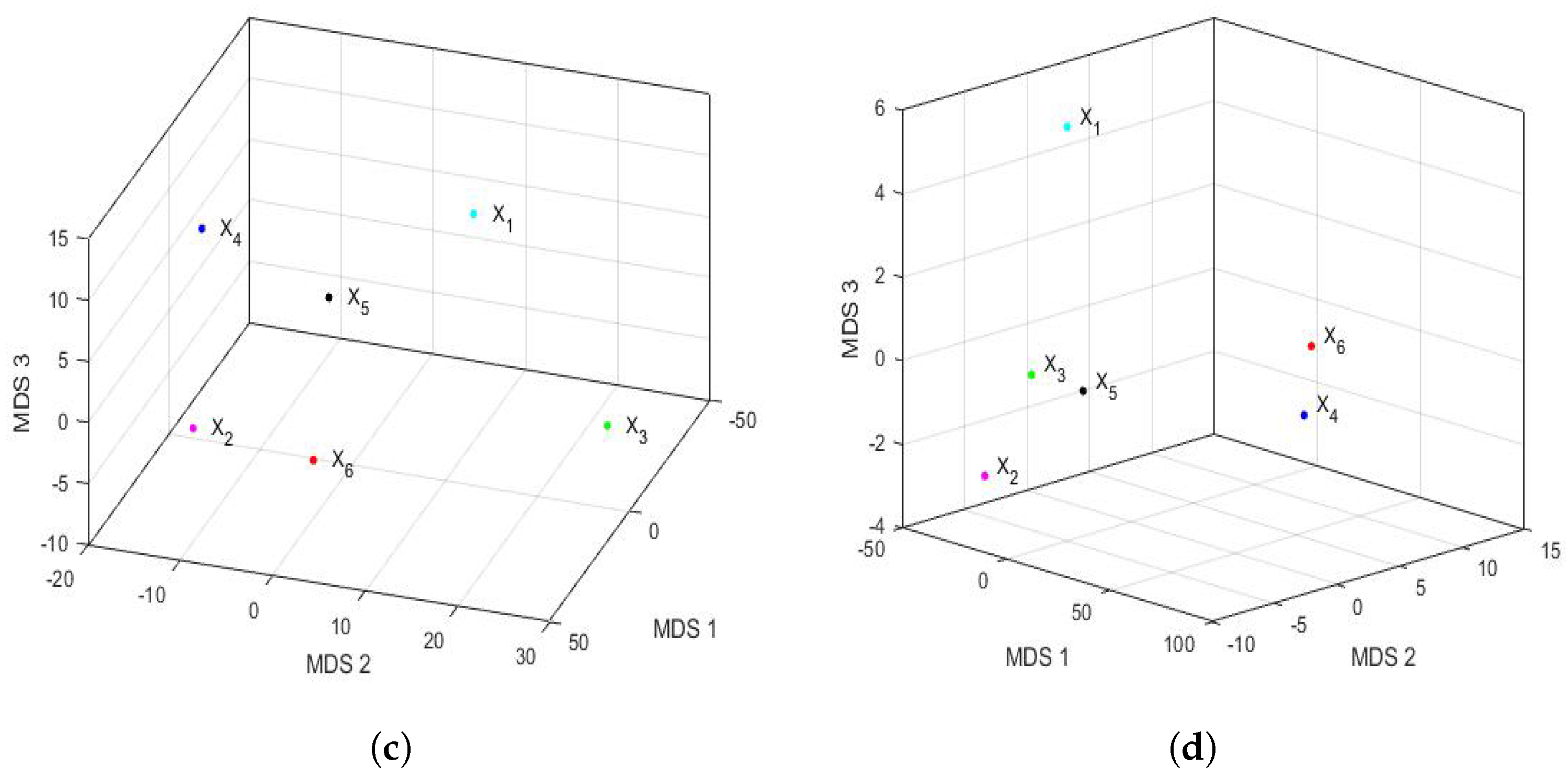
At this point, we carried out the analysis of the disparities in the PM
concentration in the 2015–2020 six-year term by semester by using MDS. In order to do this,
Figure 18 shows the representation of the feature vectors for each of the years of the 2015–2020 six-year term, with respect to the first two principal coordinates and the first three principal coordinates. In addition, as in
Figure 17, the above was performed for both the first semester and the second semester of each year. In this case, the appraisals for the first semester (see
Figure 18a,b) were relatively similar to those made for the full years (see
Figure 16). Furthermore, the order of the stress Equation (
3) was
for both the two-dimensional and the three-dimensional cases, which turned out to be excellent [
72].
Additionally, as in
Figure 16, the two-dimensional graph does not provide more information than the three-dimensional graph.
Figure 18a,b show that the vectors are located in a plane determined by two practically orthogonal axes. Moreover, the differences from
Figure 16 are as follows: (1) the points are more concentrated than in the case of the years, and (2) the point
(2016) appears displaced in the second coordinate. Moreover, as with PCA, the differences in the conclusions by years were obtained for the second semester (see
Figure 18c,d). The first difference was that the two-dimensional fit was acceptable (
), and the three-dimensional fit was excellent (
). In addition, the concentration of values in the first coordinate is much higher for the second semester graph than in the year graph (see
Figure 16).
Finally, the second half of 2020 (
) was clearly distinguishable from the rest of the years (see
Figure 18c,d), and now, there seemed to be a certain similarity between the second half of 2016 (
) and 2017 (
) (see
Figure 18d). Moreover, the graph of the points for the second semester also seems to suggest that all the points are equidistant from a point that would be the center of a sphere.
3.4.4. Additional Comparative Analysis by Trimesters
In this case, the four parts into which the 8192 observations for each year were separated did not strictly correspond to the trimesters, although half of the observations did correspond to the semesters. In addition, the same analysis that was carried out for years and for semesters is carried out in this subsubsection, remembering that, in the first months of 2020, the PM concentration at the air quality monitoring station under study was not affected by causes due to COVID-19. Furthermore, now, each feature vector had 320 elements, but these 320 values characterized a series of 2048 observations, while in the case of years, they characterized a series of 8192 observations, while in the case of semesters, they characterized a series of 4096 observations.
Figure 19 shows the graph of the first principal components of the feature vectors for the trimesters of each of the years. This figure shows the great difference in magnitude that existed in terms of the differences between the variables in the first trimester in relation to all other trimesters. Now, the variability explained by the first two principal components was as follows:
in the first trimester,
in the second trimester,
in the third trimester, and
in the fourth trimester.
In addition,
Figure 19 shows that, in the second trimester, it can already be seen that the year 2020 (
) differed from the rest of the years in each trimester. Apart from the first trimester, the groupings appeared to occur between the variables
(2015) and
(2016) in the second trimester and the variables
(2015),
(2016), and
(2017) in the fourth trimester. Here, it should be noted that the third trimester graph appears equidistant from a point in the center of all of them.
Figure 20 shows the analysis carried out by PCA of the feature vectors of the trimesters in three dimensions. In some cases, three-dimensional graphical representations were more accurate than two-dimensional graphical representations. These graphs, which explain
,
,
, and
of the variability of the feature vectors for each semester, respectively, corroborate the greater distance that existed between the feature vectors in the first trimester than in the other trimesters. In addition,
Figure 20 also shows that the first trimester of 2020 (
) was similar to the first trimester of 2016 (
) and 2019 (
) (see
Figure 20a). Furthermore, in the third and fourth trimester graphs (shown in
Figure 20c,d), the variable corresponding to the year 2020 is clearly seen to be far from the others. Moreover, in the third trimester, the arrangement of the points is similar to the arrangement of the points in
Figure 17d, which corresponds to the analysis of the differences by semester. In short, the points appear to be located on a sphere with a center equidistant from all of them. Besides, drawing one more conclusion about the fourth trimester, it can be said that there existed only similarities between the points of the variables
(2015),
(2016), and
(2017).
To finalize the study of the differences between the feature vectors of the trimesters, the graphs obtained through the analysis carried out using the nonmetric MDS were considered. In this case, the stress values were excellent, being in both two and three dimensions.
Figure 21 shows the analysis carried out by the nonmetric MDS of the feature vectors of the trimesters in two dimensions. It is observed that
Figure 21a is similar to
Figure 18a. In addition, as with PCA, there was a large difference in the differences between the first trimester measurements versus the other trimesters. What is more, it was observed that 2020 (
) was very far from the other years. Furthermore, joining the analysis with the graphs in
Figure 22, it can be concluded that the variables
(2016) and
(2018) were both similar in the second trimester and far from all the other variables in that trimester (see
Figure 22b). Moreover, in the third trimester, the variables seem to be located in a sphere with a center equidistant from all the points (see
Figure 22c). Besides, in the graphs corresponding to the fourth trimester (see
Figure 21d and
Figure 22d), the variables
(2018) and
(2020) are clearly far from the others, and the variables
(2016),
(2017), and
(2019) can be grouped together.
3.6. Summary
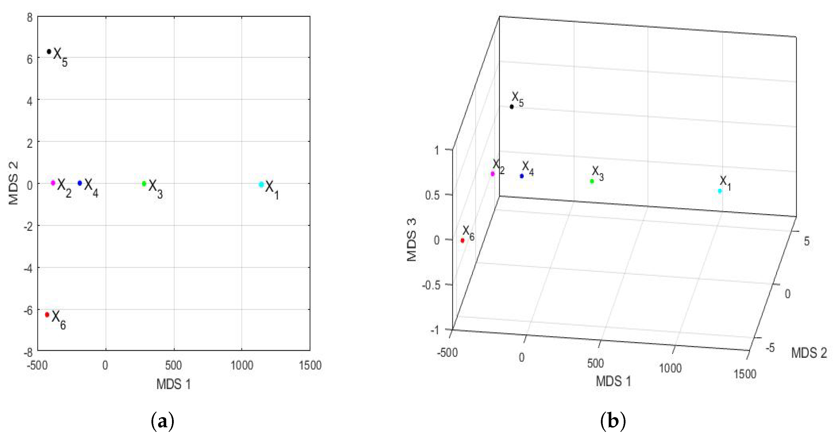
In summary, within the framework of pattern recognition, a computational tool applied to the analysis of the differences, or classification, of the concentration of PM in the region under study was presented. This tool made it possible to visually reflect a measure of the distance between years during the 2015–2020 six-year term, based on all the data collected during that time period.
Here, after carrying out a previous statistical analysis of the data, it was found that observations were missing in a non-random context, because these observations were missing consecutively during hours of the same day, even during all hours of the day. In addition, the above must be added to the fact that there were very few missing observations in isolation.
Furthermore, the number of observations with high PM
concentration was approximately
of the total observations, indicating that the observations may have come from heavy-tailed distributions. Moreover, this large number of observations could have been due to the existence of a mixture of distributions, although in the analyses that the authors carried out when studying other series of polluting materials, this hypothesis is less likely [
1,
59,
60].
Due to the complexity in the distribution of the observations and the structure of the missing values, in this research, it was decided to fill in some missing values in a few hours of each semester to achieve a quantity that would be a power of two. This was done for technical reasons, in order to apply the transforms efficiently. Therefore, the data analysis was carried out guaranteeing the existence of a sufficient number of observations to perform the study of the data by hours of each month and year efficiently.
To the above, it must be added that this study took into account the fact that, as a consequence of the COVID-19 pandemic, in 2020, there were restrictions that reduced some of the causes that provoke the emission of particulate matter in the area where the measurements were made. Therefore, it was decided not to fill in any of the missing data in 2020.
In order to be able to fill in the missing data with plausible values, different datasets related to each of the missing data were built and different interpolation methods were applied, together with classical and robust statistics. Then, to test the quality of the proposed method to fill in the missing data, a month was taken as the test month, and several comparisons were made with different observations that were purposely made to disappear by the authors of this paper in the chosen test month. This month was March 2019, and it was taken as a test month because, in that month, there was only one missing observation. Therefore, this month was used to fill in some observations following the behavior patterns of the data and, thus, be able to assess the characteristics and qualities of the proposed method.
Once this was done, 8192 observations were available for each year of study and 4096 each semester. Thus, following general pattern recognition methods, it was decided to extract a feature vector for each time period that was considered (i.e., year, semester, and trimester). The dimension of this vector was equal to 320. Naturally, there were fewer nuances by years than by quarters, because despite having the same dimensions, the time series in each case had different lengths. Next, to analyze the differences between the feature vectors that were built, two techniques were used: PCA and nonmetric MDS. In addition, during the application of the MDS, once the feature vectors were built, the Hausdorff distance between said vectors was applied. In short, the choice of the Hausdorff distance was due to the fact that many distances depend on the variability of the measurements, while the Hausdorff distance is a metric by which the degree of similarity between two vectors is determined.
To make the graphical representations, figures were used that represented in the same two-dimensional or three-dimensional graph both the objects under study (i.e., years, semesters, and trimesters) and the variables (i.e., feature vectors). That said, since PCA retains the greatest variability through the first principal components, through linear combinations of the orthogonal variables, the graphical representations showed the differences between the analyzed units (i.e., years, semesters, and trimesters) using the point of view of the dispersion of the variables.
On the other hand, by using MDS, the data were transformed into points that represented the distance between them, and the differences between real distances and adjusted distances were minimized. It is worth mentioning that, in the case of the Euclidean distances, there is a duplication between MDS and PCA. However, in the case of considering similarities instead of distances, the nonmetric MDS is preferable because it tries to reproduce those similarities. Unlike PCA, with nonmetric MDS, only the lack of similarity is taken into account. Therefore, the variability between the observations was not considered.
The results of the analysis carried out for the annual series of the six-year period that was studied (i.e., 2015–2020) confirmed the difference that existed between the PM concentration in 2020 and the PM concentration in the 2015–2019 five-year period. These differences became more evident through the analysis that was performed by using the nonmetric MDS, because sometimes, it was enough to use the two-dimensional representation to be able to appreciate the significant differences that existed between the periods corresponding to some years with respect to others. However, on the other hand, in order to appreciate these differences with PCA, it was necessary to carry out the three-dimensional representation on several occasions to be able to reaffirm that there were some discrepancies between the different periods of time that were studied.
The above-mentioned differences had different scales, which were greater when the PCA was used than when the nonmetric MDS was used. In general, here, it was possible to separate more and better the units that were analyzed by using nonmetric MDS-based graphs than by using PCA-based graphs. Regarding this result, the authors of this paper think that this is so because, with PCA, the variability of the data is retained in an orthogonal way, and both the study elements and their characteristics are represented. On the other hand, the nonmetric MDS only tries to reproduce the distance that exists between the study elements, without trying to retain the variability of the data in an orthogonal way. The differences between the results yielded by using both techniques (i.e., PCA and nonmetric MDS) have already been mentioned by other authors [
82].
Regarding the results of the analysis of the semesters and trimesters, the PCA showed that the difference in PM concentration between the first semester of 2020 and the first semester of the other years was less appreciable than the difference in PM concentration between the second semester of 2020 and the other years. Additionally, the nonmetric MDS showed that there was a clear difference between the PM concentration in 2020 and the other years, both in the first semester and in the second semester. Furthermore, it is clear that this technique only needed to work in two dimensions to show the clear differences that existed between the analyzed semesters. Moreover, the results of the analysis by trimesters, using the described procedures, reaffirmed the difference between 2020 and the other years. This difference became more noticeable from the second trimester onward. Besides, in the first trimester, the magnitudes of the differences were much greater when using the nonmetric MDS than when using the PCA.
On the other hand, there were clear differences between the rest of the trimesters by using both procedures. However, once again, with the nonmetric MDS, it was possible to better appreciate the difference that existed between trimesters. In this sense, even working in two dimensions was enough to appreciate the clear differences between the analyzed trimesters by using the nonmetric MDS.
In light of the forgoing, it can be said that the measures taken by governments to curb the spread of the coronavirus disease (COVID-19) [
17,
18] also helped cities reduce air pollution due to particulate matter [
19,
20,
21,
22,
23,
24,
25,
26,
27,
28,
29].
Finally, and unfortunately, variants of the virus (SARS-CoV-2) continue to affect many countries. However, the international scientific community is working tirelessly in search of vaccines that offer effective protection against variants of the virus and that avoid the need for new lockdowns [
83,
84].


 ,
, 


