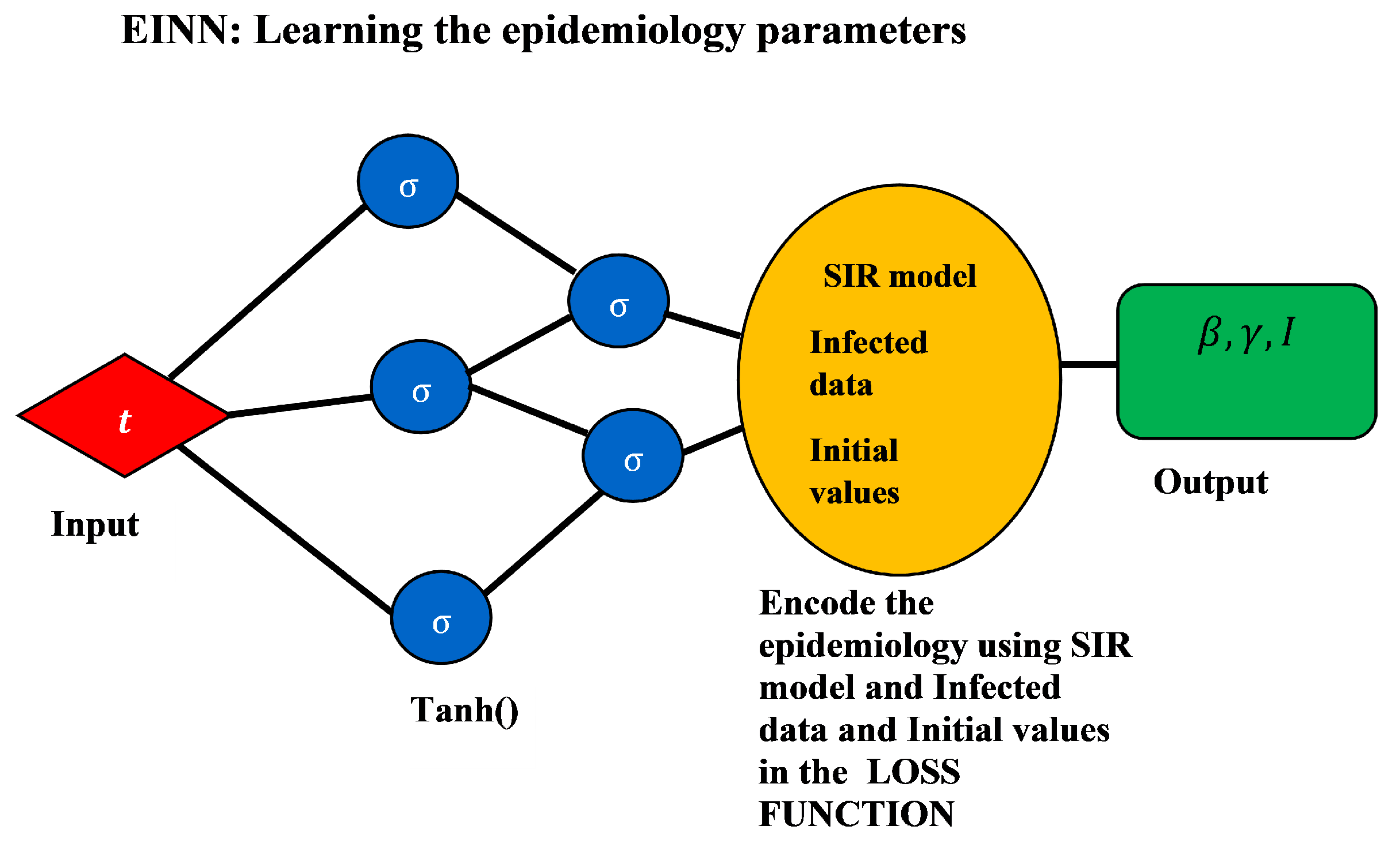
3.2. Data-Driven Simulations
In this section, the EINN algorithm is used to learn different
and
for different vaccination rates:
. The underlying assumption is that these rates are assumed the same rate per day for ten months of vaccination. The goal is to analyze the impact of how vaccination with vaccine efficacy makes infections reduce to zero quickly. These values combined with the learned epidemiology parameter values are used to do numerical simulation for model (
1) using a standard ODE solver.
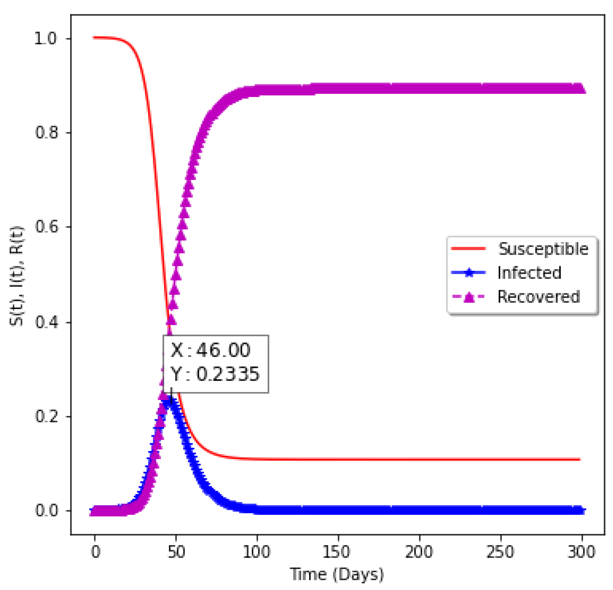
Figure 8 shows the model without vaccination. The epidemiology informed neural network is used to find the epidemiological parameters of the model and the values are passed into the numerical solver to obtain the shape of the graph. It takes 46 days to have a peak assuming there is no vaccination. Approximately
of the population will be infected with the virus.
Table 2 presents the impact of vaccination with efficacy rate of
. In this table, at the different vaccination rates
v, the EINN learns different
and
to produce different basic reproduction number
for the entire period. Equation (
7) is used to compute the basic reproduction number. As vaccination rate
v increases from
to
, it leads to the reduction in
value, from
to
.
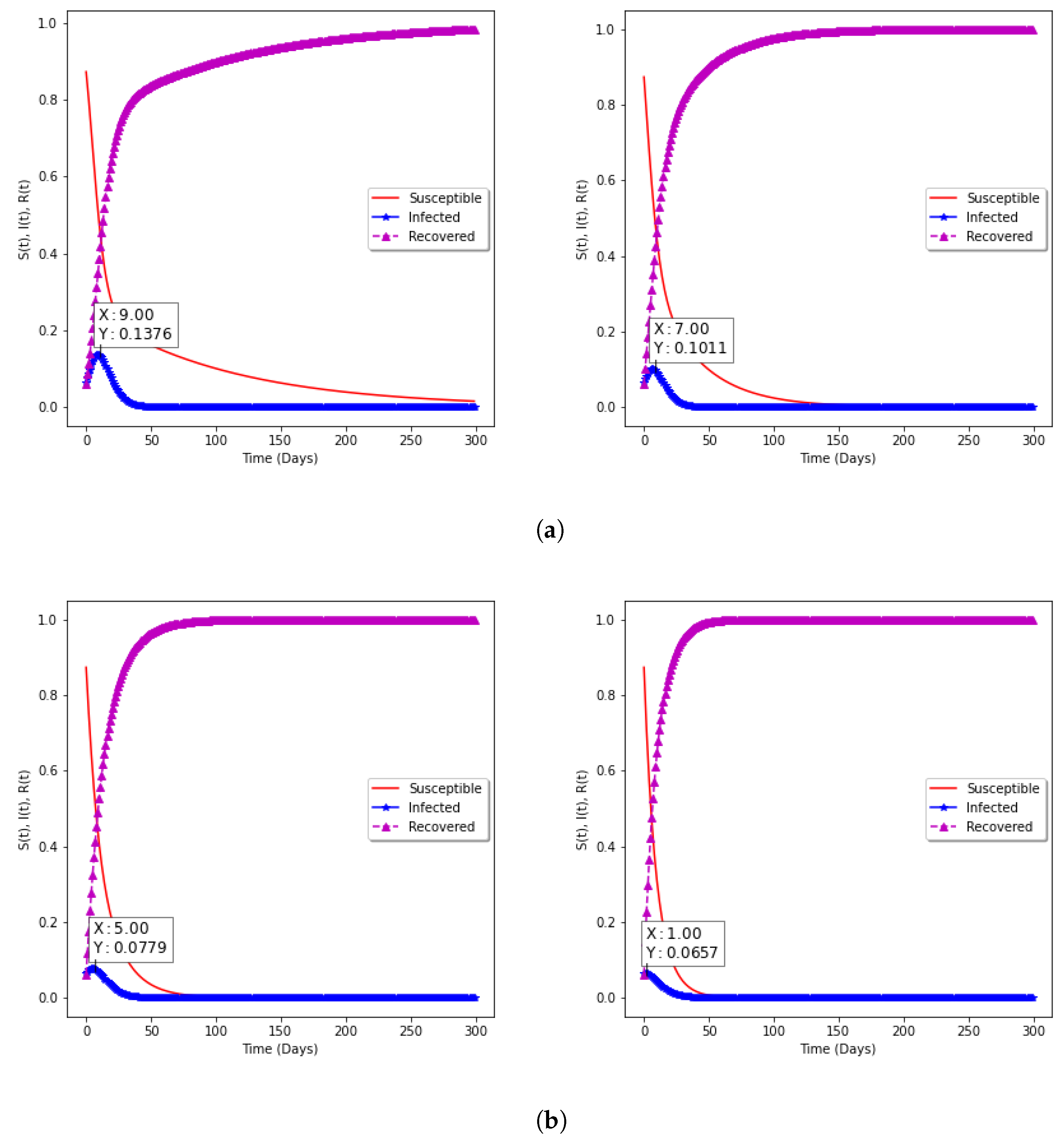
In
Figure 9a,b, the model with vaccination is presented. The impact on Susceptible, Infected, and Recovered groups in the population can be seen, while the percentage of the Susceptible individuals decreases as the vaccination rate increases, the percentage of Recovered individuals increases. With the choice of fixed vaccine efficacy
, two points are significant: (
a) With vaccination rate of
and
, it can be observed that the percentage of the spread reduces from
to
as the rate of vaccination increases from
to
, respectively; (
b) with vaccination rates of
and
, the percentage of the spread further reduces to
and
for correspondingly.
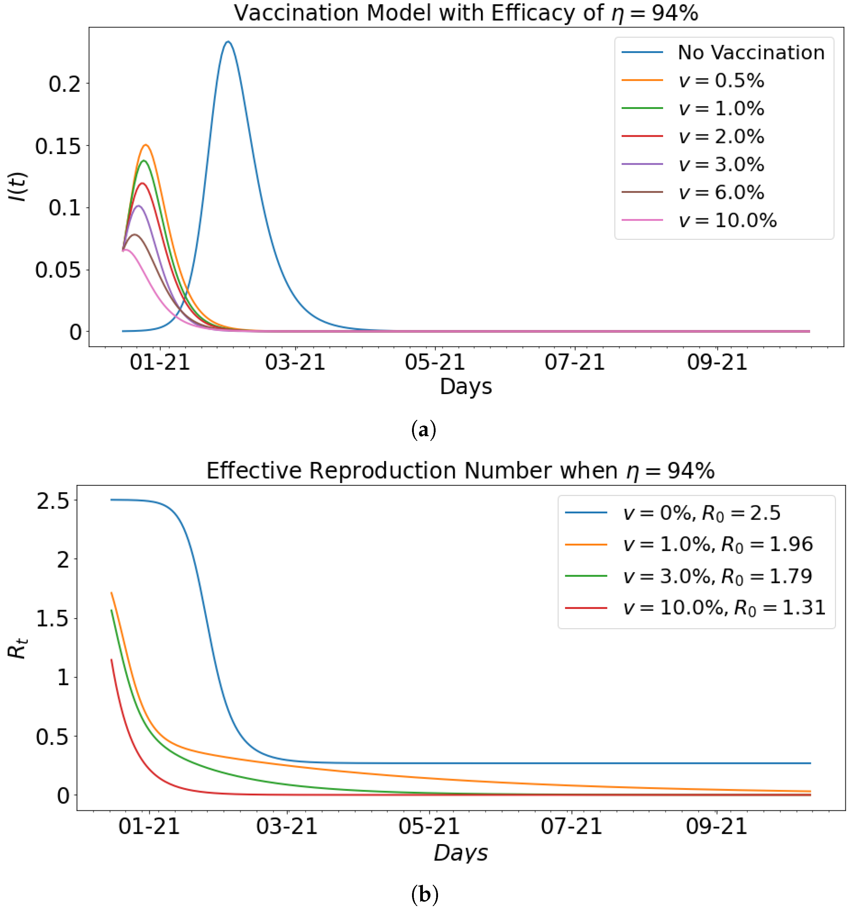
The impact of vaccination with
efficacy is presented in
Table 3. It can be observed from the table that for
,
decreased from
to
. This means that the higher the efficacy rate, the faster the decline in the spread of the virus. This claim is further supported by the fact that when vaccination rate
v increases to
, the
in
Table 2 is
and the
in
Table 3 is
.
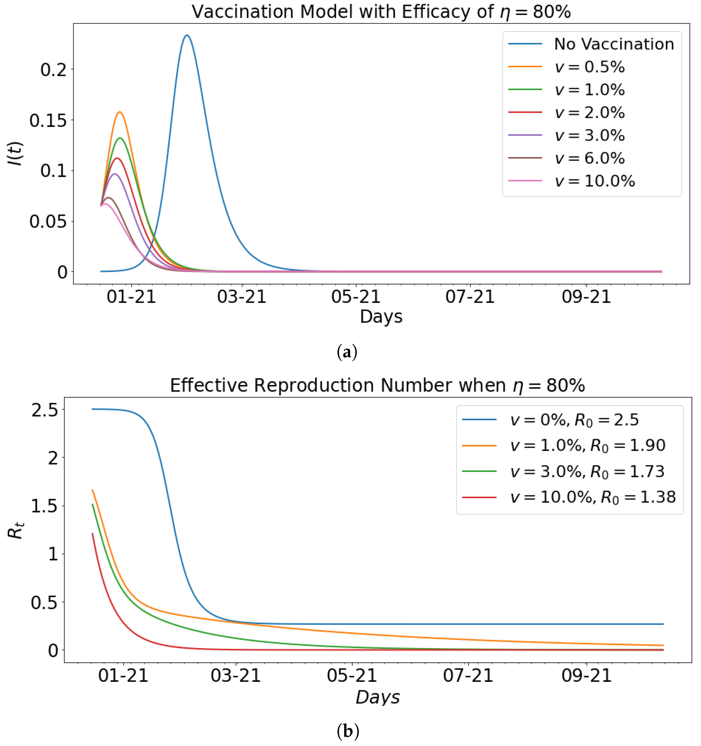
Figure 10 shows the impact of vaccination with fixed efficacy at
on the infected population and the effective reproduction number that corresponds to the basic reproduction number computed in
Table 2. In particular, it can be seen that as the respective effective reproduction number for vaccination rates of
and
. The decrease in the effective reproduction number as shown in the graphs is indicative of the impact vaccination has on the infected group.
Figure 11 shows the impact of vaccination with fixed efficacy at
on the infected population and the effective reproduction number that corresponds to the basic reproduction number computed in
Table 3. In particular,
Figure 11b shows the respective effective reproduction number for vaccination rates of
and
.
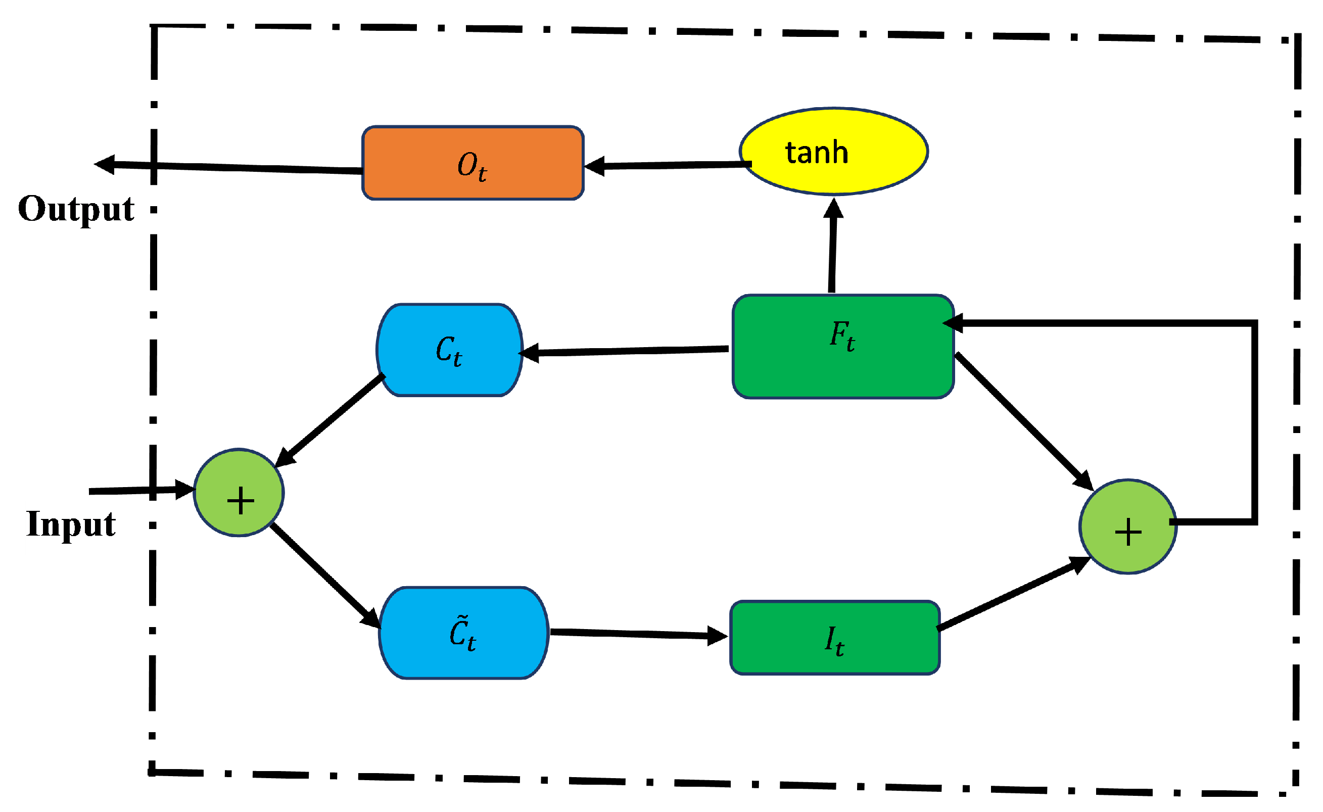
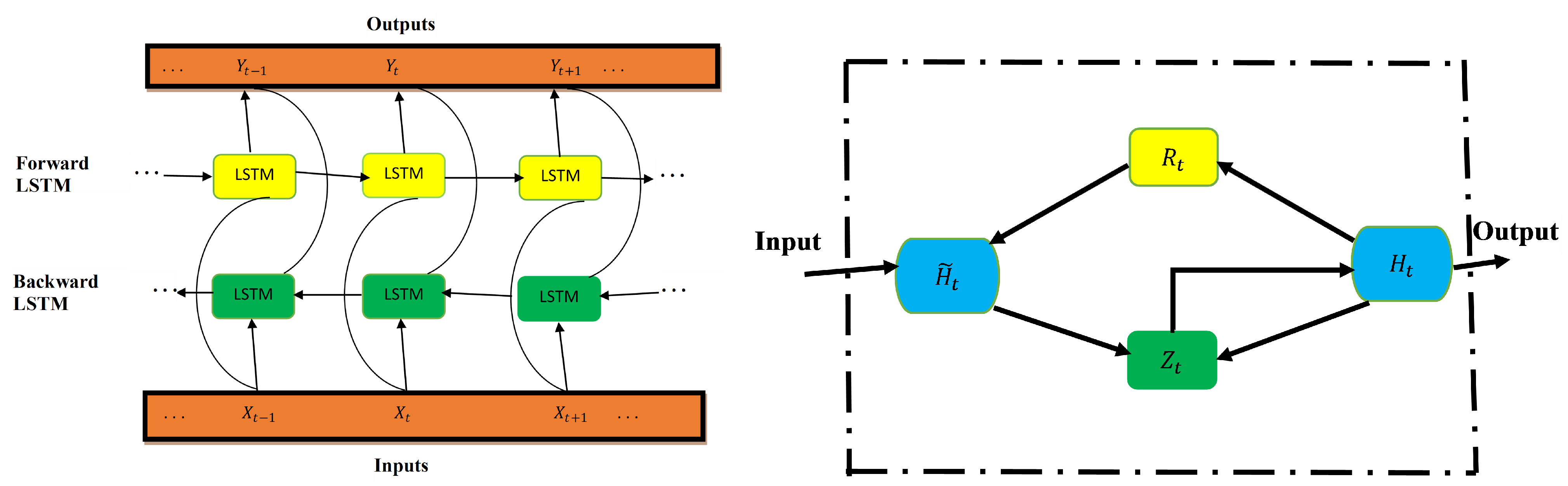
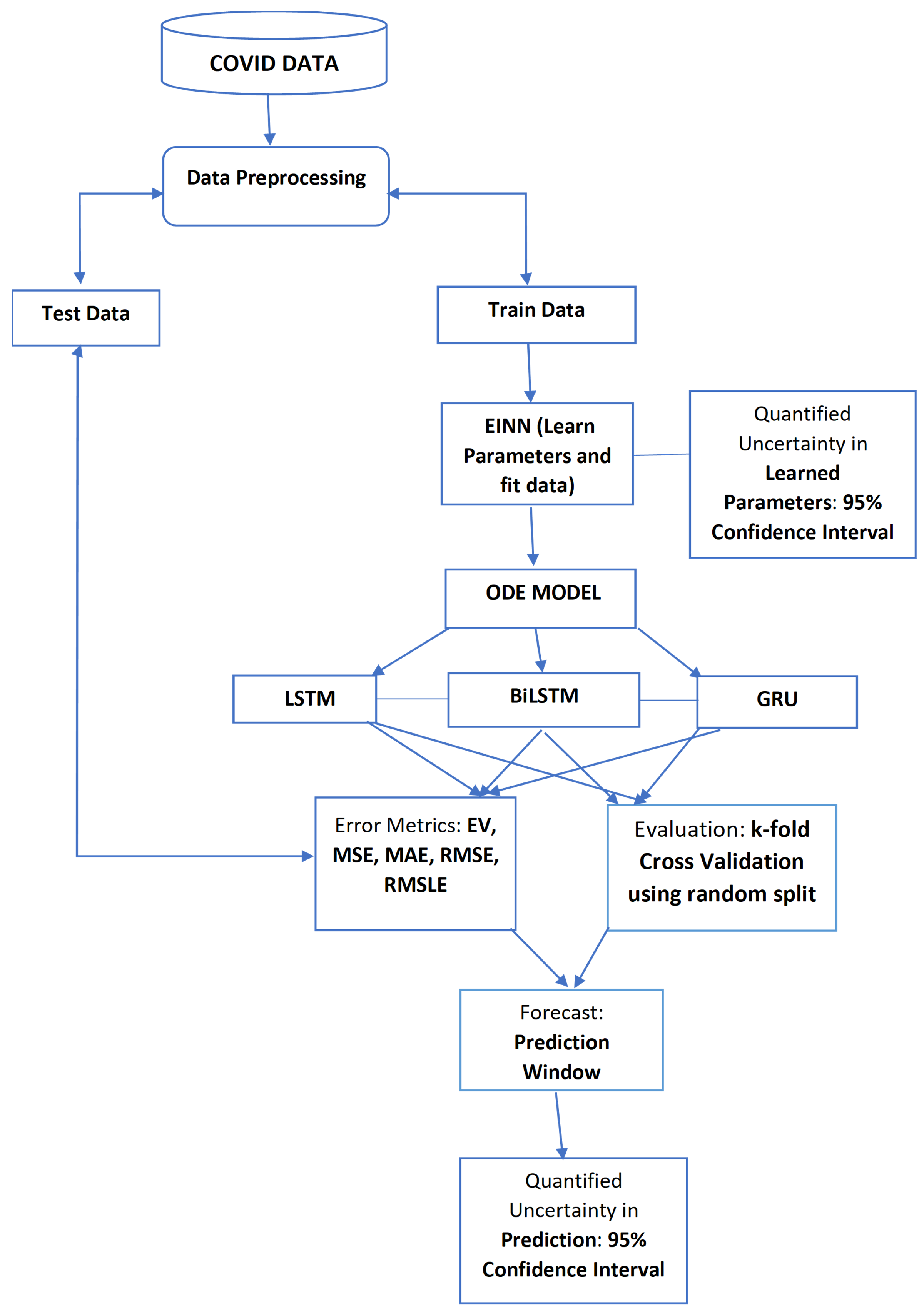
Various data-driven simulations (using the real data and ResNet data) are performed for predicting daily infected cases using LSTM, BiLSTM, and GRU for Tennessee. The LSTM, BiLSTM, and GRU are used to learn these dynamics of infected cases. The parameter settings for data-driven simulations are given in
Table 4.
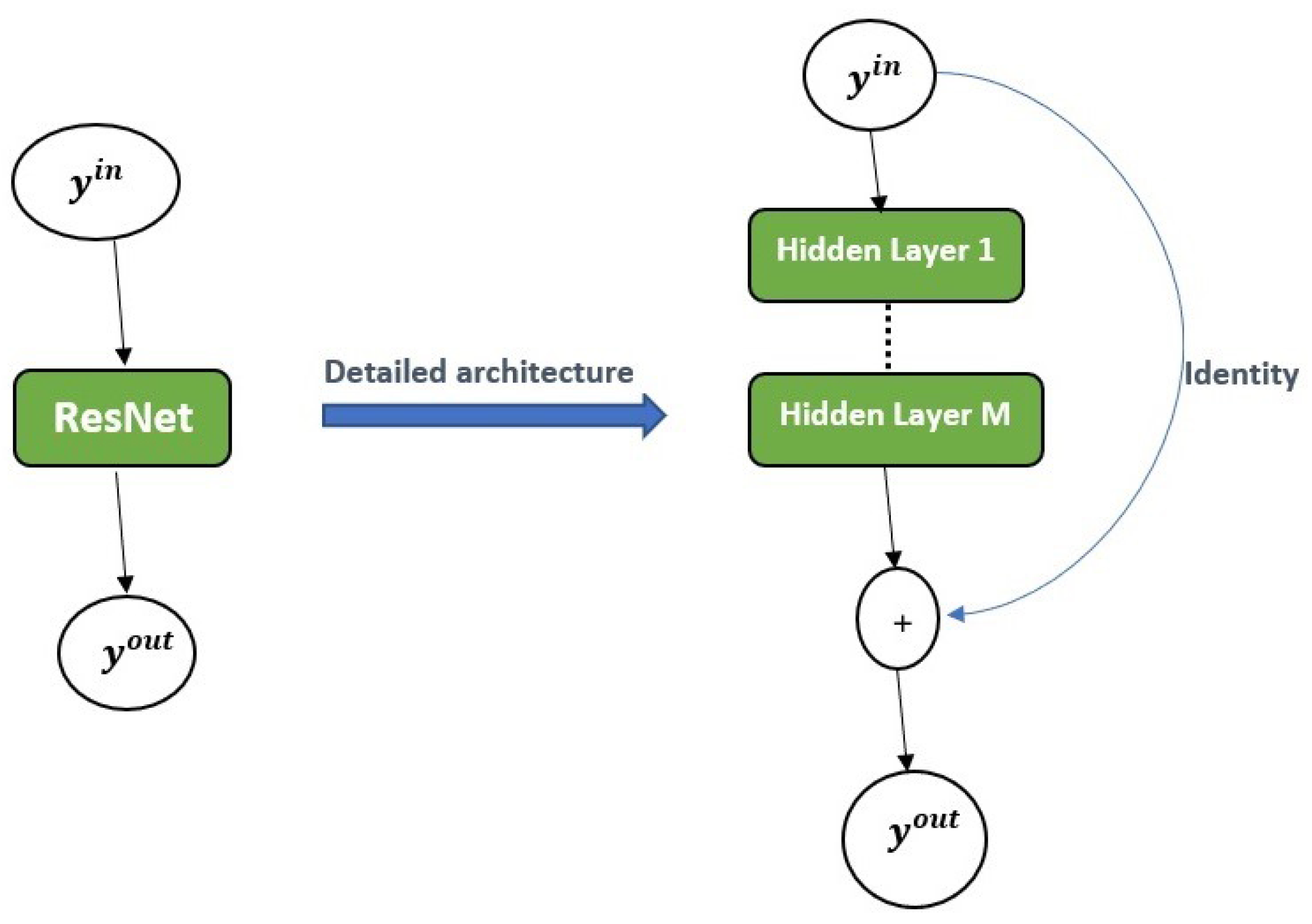
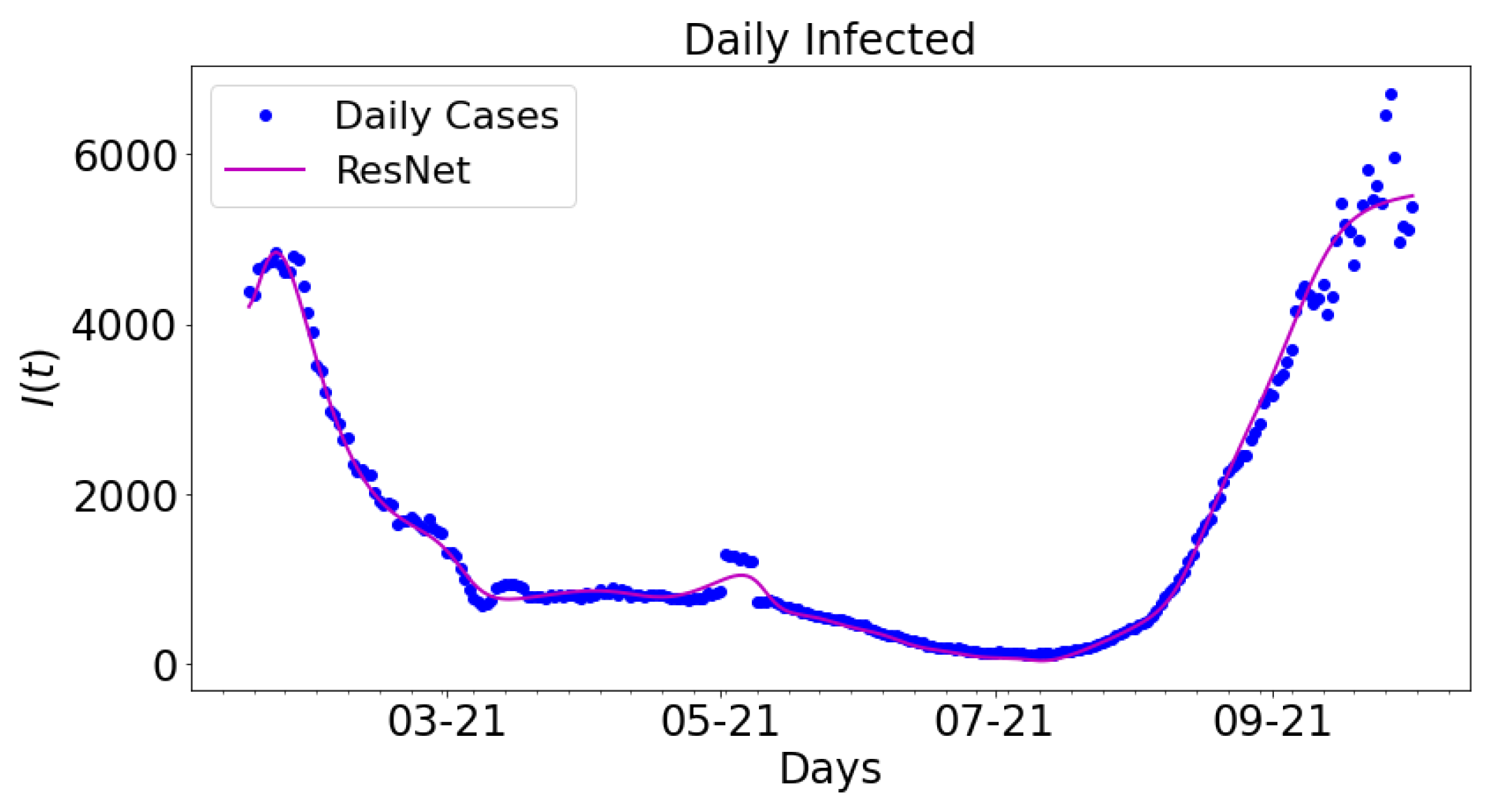
Figure 12 shows the data-driven simulation for learning the infected group using ResNet compared with the daily infected cases. For comparative analysis, the outcome from the ResNet is compared with the daily infected cases. The magenta colored graph is ResNet. The data span a nine-month period: 16 January 2021 to 16 September 2021.
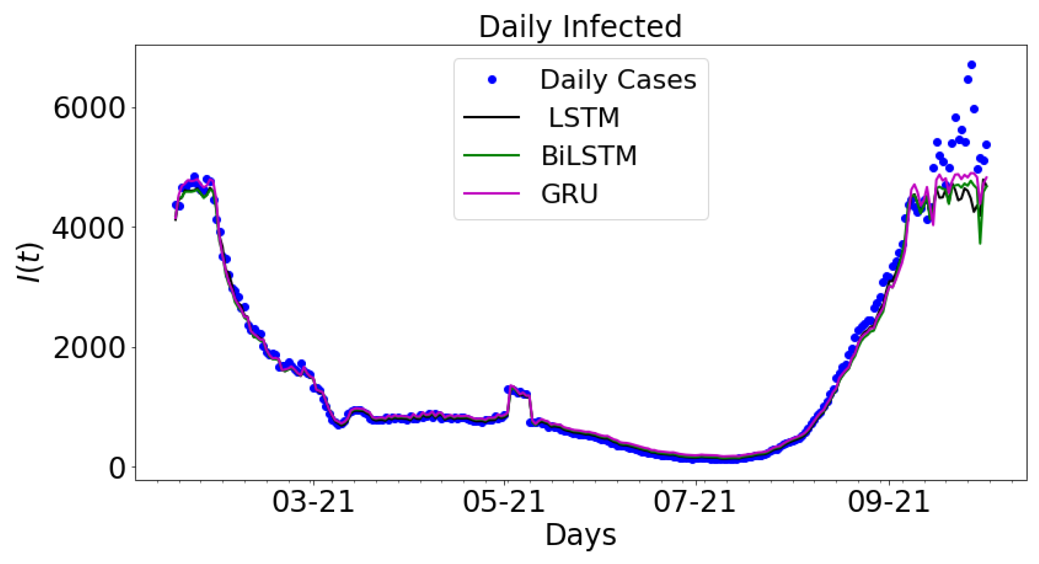
In
Figure 13, the output from LSTM, BiLSTM, and GRU are plotted along with the daily infected cases. The real COVID-19 data is used to train the LSTM, BiLSTM, and GRU architectures. The results are plotted along with the daily infected cases. The graph of daily cases is colored blue. The black colored graph shows the output for LSTM, the green colored graph is the graph for BiLSTM, and the magenta colored graph is the graph for GRU. The data spans nine months period: 16 January 2021 to 16 September 2021.
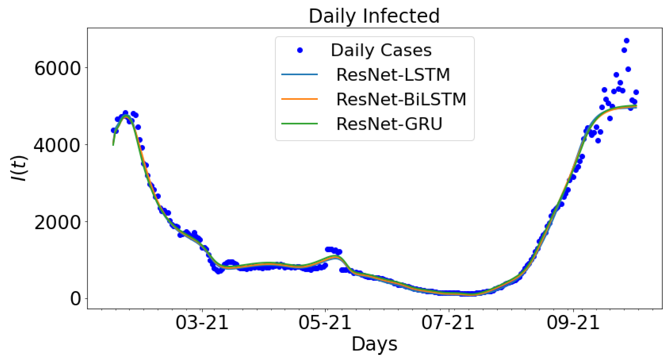
A consideration is made for the hybrid approach: ResNet-LSTM, ResNet-BiLSTM, ResNet-GRU. The outcome ResNet is used as the input data for LSTM, BiLSTM, and GRU. The parameter settings in
Table 4 are applied to the different hybrid approaches to generate the ensuring outputs.The outcome for the hybrid approach is shown in
Figure 14. The daily new cases are plotted along with ResNet-LSTM, ResNet-BiLSTM, ResNet-GRU. The outcome from the ResNet architecture is called the ResNet data, which is used to train LSTM, BiLSTM, and GRU. The daily cases and ResNet-LSTM are both colored blue while the ResNet-BiLSTM and ResNet-GRU are colored orange and green, respectively. The data spans nine months period: 16 January 2021 to 16 September 2021.
3.3. Error Metrics for Data-Driven Simulations
The error metrics from data-driven simulation for real COVID-19 data and for ResNet data from Tennessee are shown below. The data is split into two train and test sets, while the train data is used to train the models, the error metrics are obtained from the difference between the test data of the actual COVID-19 data and the test data from the model.
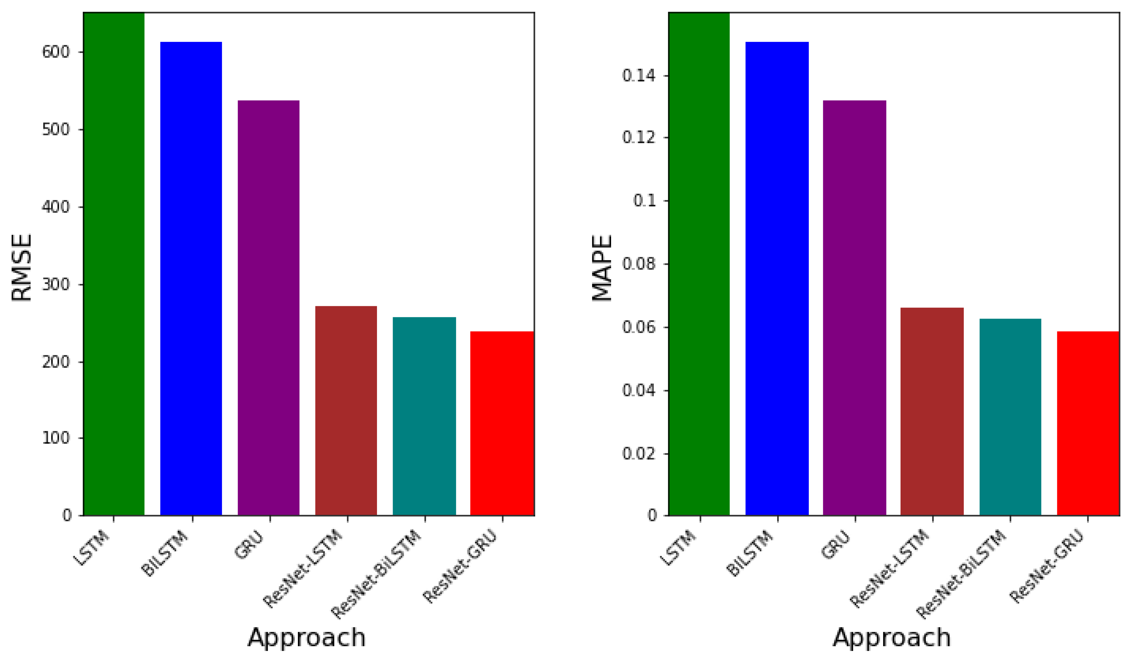
Table 5 shows the error metrics table for LSTM, BiLSTM, GRU, ResNet-LSTM, ResNet-BiLSTM, and ResNet-GRU. It can be observed that the RMSE values for LSTM, BiLSTM, and GRU are
,
,
, respectively. GRU has the smallest RSME value. Additionally, the MAPE values (relative errors) are
,
,
, respectively, for LSTM, BiLSTM, and GRU. The model with the least MAPE value is GRU. Besides, the corresponding EV values for LTSM, BiLSTM, and GRU are
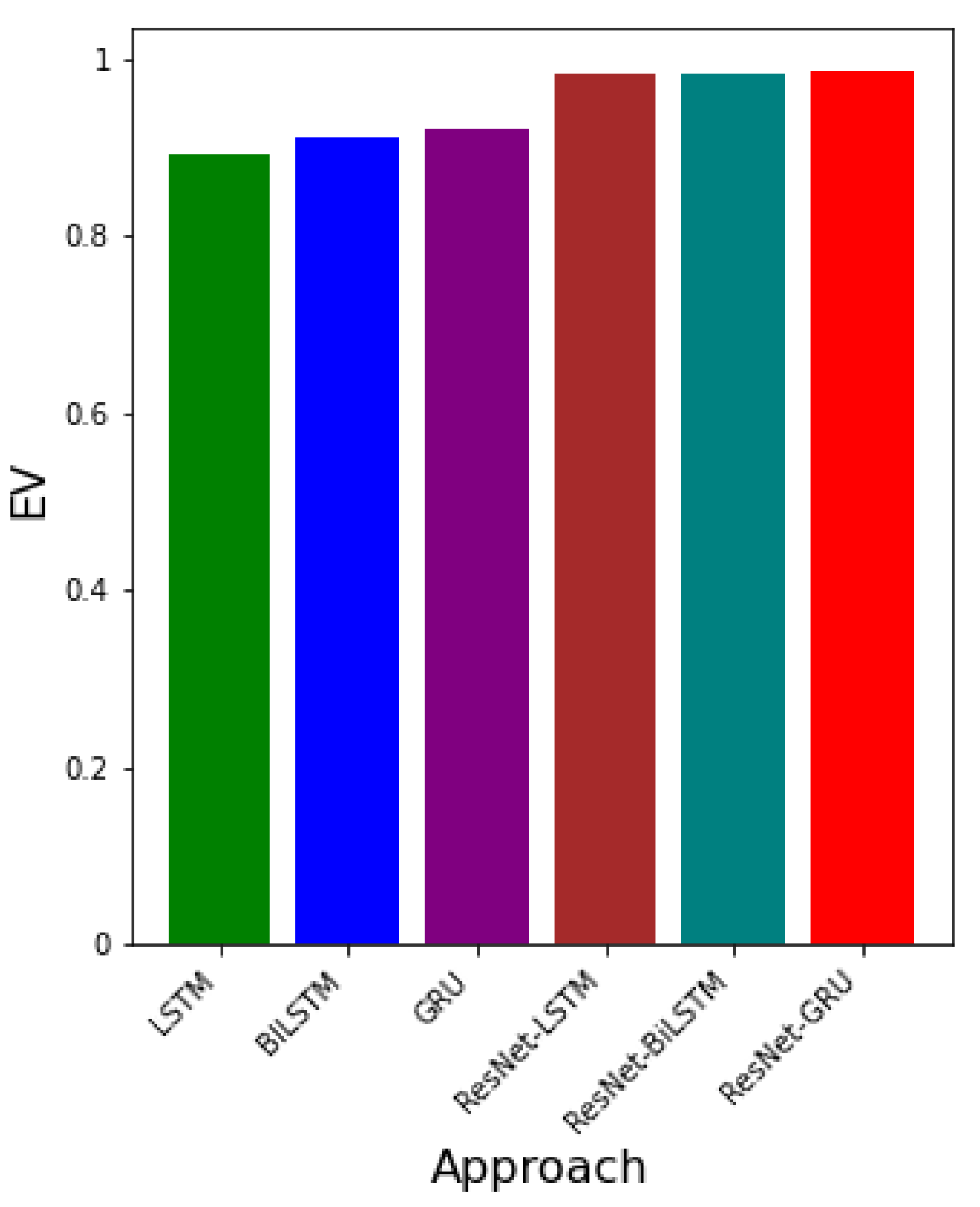
,
,
. The model with the greatest EV value is GRU. This implies that, using real COVID-19 data, the model with the best error values is GRU. RMSE values for ResNet-LSTM, ResNet-BiLSTM, and ResNet-GRU are
,
,
, respectively. The corresponding MAPE and EV values are
,
,
and
,
,
. The hybrid approach with the overall best error values in terms of RMSE, MAPE, and EV is ResNet-GRU.
Figure 15 presents both the RMSE and MAPE values for each approach. Both error metrics show that the approach with the least error values is ResNet-GRU.
Figure 16 gives the EV values for each approach. It can be seen that the approach with the greatest EV is ResNet-GRU.
The outcome of the errors obtained from the ResNet-LSTM, ResNet-BiLSTM, and ResNet-GRU, LSTM, BiLSTM, and GRU are presented. The error metrics RMSE, MAPE, and EV are used to determine which algorithm learns the dynamic better. In particular, the RMSE is deployed. Smaller values of RMSE indicate the best algorithm in comparison to the others. The values of EV closer to 1 demonstrates lower variation in the predictive power of the neural network.
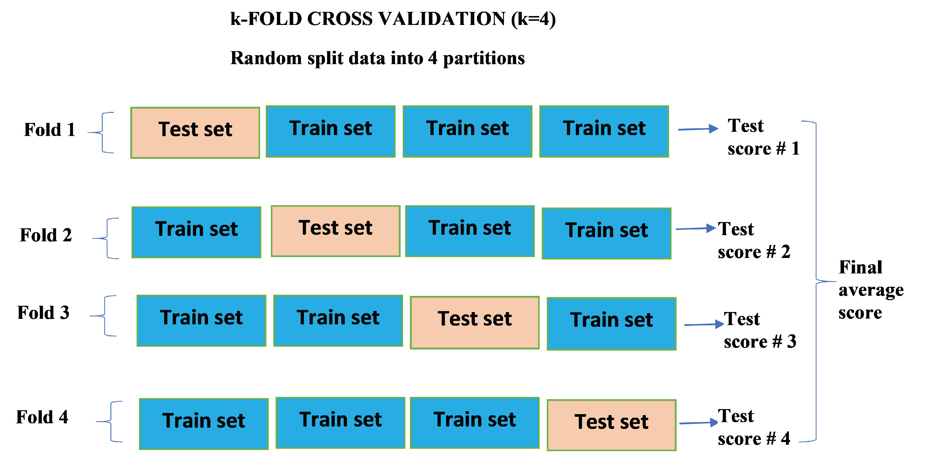
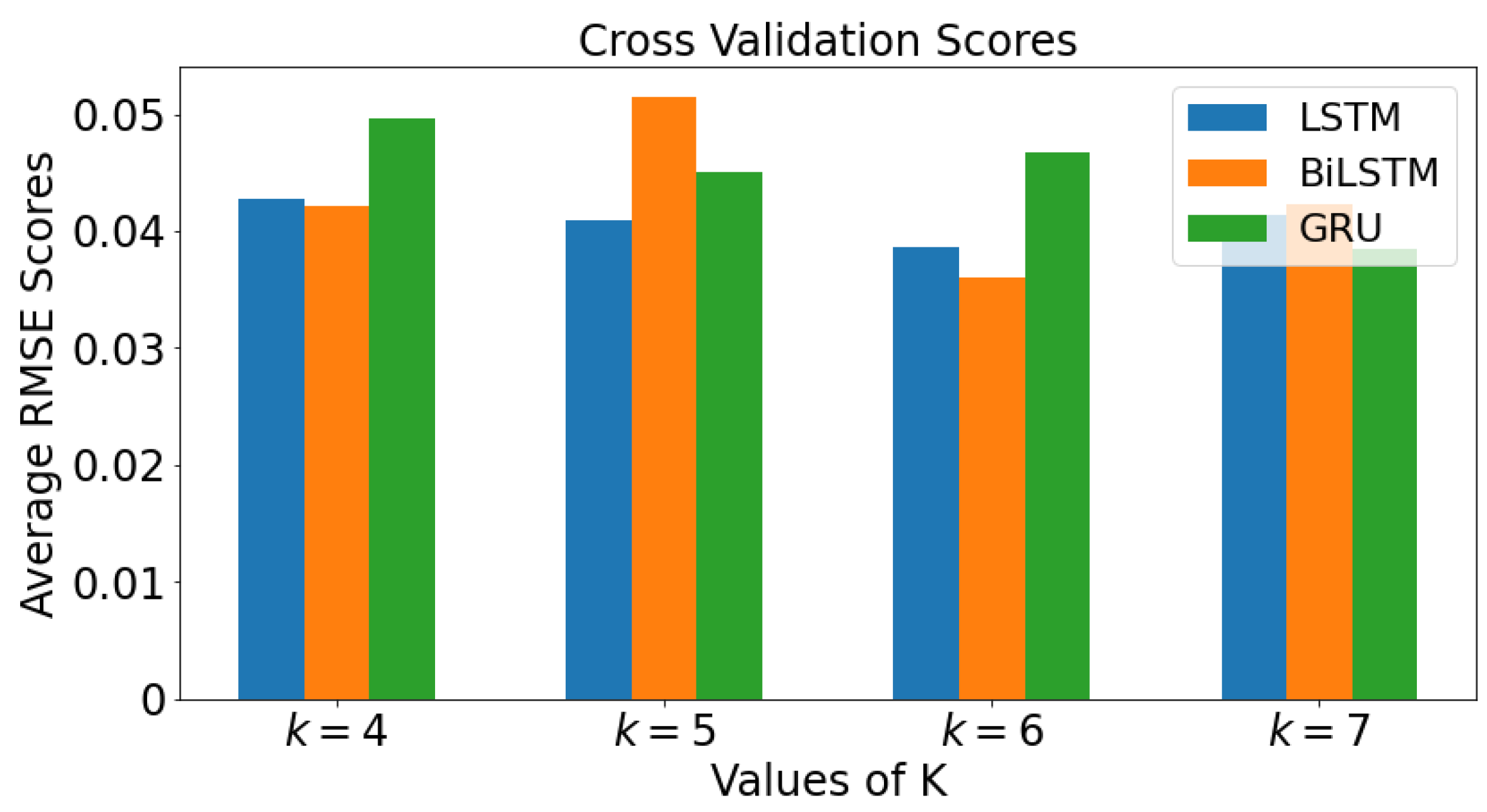
3.4. k-Fold Cross Validation
The mean values of the RMSE for all four values of
k are plotted against each value of
k for each model in a bar graph in
Figure 17 for real COVID-19 data. The graph colored blue is LSTM while orange colored and green colored graphs are BiLSTM and GRU, respectively. When
, BiLSTM has lowest average RMSE value, followed by LSTM and then GRU. For
, LSTM has the lowest average RMSE value, followed by GRU, then BiLSTM. It can be seen that as the value of
k value increases to 7, the smallest value of RMSE value is GRU, followed by LSTM, then BiLSTM.
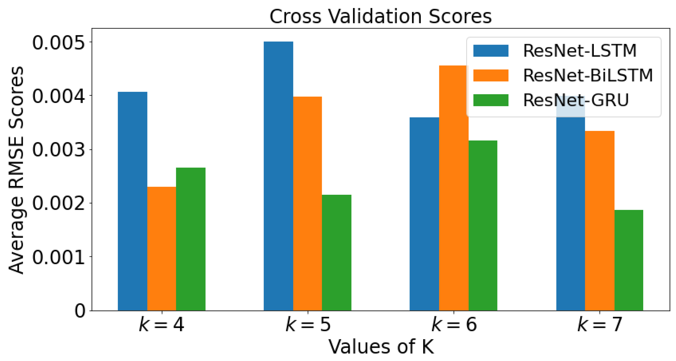
Figure 18 demonstrate the mean value of the RMSE. All four values of
k are plotted against each value of
k for each model in a bar graph for ResNet data. The bar graph shows the cross validation scores for Tennessee. When
, the model with lowest RMSE value is ResNet-BiLSTM, followed by ResNet-GRU, then ResNet-LSTM. With
, the model with lowest RMSE value is ResNet-GRU, followed by ResNet-BiLSTM, then ResNet-LSTM. When
, it can be observed that ResNet-GRU has the lowest RMSE value, followed by ResNet-LSTM and ResNet-BiLSTM. As the value of
k increases from 5 to 7, it can be inferred that ResNet-GRU has smallest average RMSE value.


