Article

Automated Classification of User Needs for Beginner User Experience Designers: A Kano Model and Text Analysis Approach Using Deep Learning

1
Beijing Key Laboratory of Applied Experimental Psychology, National Demonstration Center for Experimental Psychology Education (Beijing Normal University), Faculty of Psychology, Beijing Normal University, Beijing 100875, China
2
School of Artificial Intelligence, Beijing University of Posts and Telecommunications, Beijing 100876, China
3
National Institute of Metrology, Beijing 100029, China
4
Section of Hematology-Oncology, Department of Medicine, Baylor College of Medicine, Houston, TX 77030, USA
5
Department of Mechanical Engineering, Stanford University, Stanford, CA 94306, USA
*
Author to whom correspondence should be addressed.
AI 2024, 5(1), 364-382; https://doi.org/10.3390/ai5010018
Submission received: 21 December 2023 / Revised: 26 January 2024 / Accepted: 31 January 2024 / Published: 2 February 2024
(This article belongs to the Topic Machine Learning in Internet of Things)

Abstract

:
This study introduces a novel tool for classifying user needs in user experience (UX) design, specifically tailored for beginners, with potential applications in education. The tool employs the Kano model, text analysis, and deep learning to classify user needs efficiently into four categories. The data for the study were collected through interviews and web crawling, yielding 19 user needs from Generation Z users (born between 1995 and 2009) of LEGO toys (Billund, Denmark). These needs were then categorized into must-be, one-dimensional, attractive, and indifferent needs through a Kano-based questionnaire survey. A dataset of over 3000 online comments was created through preprocessing and annotating, which was used to train and evaluate seven deep learning models. The most effective model, the Recurrent Convolutional Neural Network (RCNN), was employed to develop a graphical text classification tool that accurately outputs the corresponding category and probability of user input text according to the Kano model. A usability test compared the tool’s performance to the traditional affinity diagram method. The tool outperformed the affinity diagram method in six dimensions and outperformed three qualities of the User Experience Questionnaire (UEQ), indicating a superior UX. The tool also demonstrated a lower perceived workload, as measured using the NASA Task Load Index (NASA-TLX), and received a positive Net Promoter Score (NPS) of 23 from the participants. These findings underscore the potential of this tool as a valuable educational resource in UX design courses. It offers students a more efficient and engaging and less burdensome learning experience while seamlessly integrating artificial intelligence into UX design education. This study provides UX design beginners with a practical and intuitive tool, facilitating a deeper understanding of user needs and innovative design strategies.

1. Introduction

In recent years, the focus of the industrial landscape in China has gradually shifted from manufacturing to services, and research on user needs has become crucial for positioning product and service functionality [1]. Enterprise demand for better user experience (UX) has created a need for UX education [2,3]. Although analyzing user needs is essential to UX research, it is also highly challenging [4]. With the UX industry gaining popularity, many beginners with diverse professional backgrounds are stepping into the field [5]. Their lack of industry experience and insight makes it difficult to classify or prioritize user needs and determine the direction of product or service development. Current methods, such as affinity diagrams, while valuable, often require extensive resources and expertise, limiting their accessibility to beginners and educational settings. Therefore, this study bridges this gap by introducing an innovative tool integrating the Kano model with deep learning. Theoretically, it advances our understanding of how AI can be effectively employed in UX research. Practically, it offers a user-friendly solution for beginners in UX design, making the complex process of user needs classification more approachable and less resource intensive.

1.1. Background and Significance

This study draws inspiration from the UX Foundation course. The course organically integrates design thinking and strategies from Stanford University, teaching a project-based approach to the entire product development process, from user research to prototype design [6,7]. Traditionally, user needs have been collected and classified using questionnaire surveys, interviews (or focus groups), and user journey maps according to specific scenarios or goals [8,9]. However, in the current era of big data and the Industry 4.0 trend, researchers have begun utilizing web crawlers to capture user comments from various forums or social media platforms to extract user needs [10,11]. Moreover, different types of deep learning models have been shown to perform well in Chinese text classification tasks and have been used for user needs classification [12,13]. Compared to traditional methods, deep learning-based approaches are more efficient and can guide decision making for novice practitioners in UX. However, developing or running complex code presents a significant challenge to design teams and hinders the usability of these classification tools. Therefore, enabling UX beginners to easily use text analysis methods to classify user needs is critical.

1.2. Research Objectives

This study aims to develop a user-friendly tool with a graphic user interface (GUI) that utilizes deep learning techniques to classify user needs according to the Kano model. The tool is intended to benefit individuals who are new to UX research. Moreover, the current study compares this tool with a traditional affinity diagram method to evaluate its usability and effectiveness in achieving UX beginners’ goals, reducing their workload and improving UX. The primary motivation behind this study is to facilitate beginners in user experience (UX) design to better analyze and interpret user needs. By recognizing the challenges that novices face, this research aims to provide an intuitive and practical approach to categorizing user needs. By integrating deep learning techniques with the Kano model, this study endeavors to simplify and clarify the process of user needs classification. This approach not only intends to make the UX design process more accessible to beginners, but also to instill a foundational understanding of how advanced analytical tools like deep learning can be harmoniously combined with established UX frameworks like the Kano model. Ultimately, this research seeks to empower beginners with the tools and knowledge necessary to contribute to the UX design field effectively.

2. Related Works

2.1. Affinity Diagram

The affinity diagram is a method for organizing and categorizing a large amount of information or ideas, typically used in a collaborative team environment [14]. This method is widely used in user-centered design (UCD) as a bottom-up method of categorizing user needs [15,16]. Design teams often adopt this method after generating multiple users’ needs through brainstorming to organize them based on their similarities, so it is essentially a clustering method [16,17]. Designers start with scattered user needs during clustering and gradually refine their commonalities. The affinity diagram process involves five specific steps. Firstly, data collection is undertaken by gathering extensive user feedback or needs through interviews, surveys, or user comments. In the second step, each collected need or idea is written on a yellow sticky note and then affixed to a whiteboard or wall. The third step involves group categorization, where team members collaboratively review these sticky notes, grouping them based on similarities or connections in the needs or ideas. This process often entails frequent movement and reorganization of the sticky notes. The fourth step is creating themes, wherein a representative theme or title is created for each group of needs and noted on a red sticky note. These red sticky notes are then placed above the corresponding groups. Finally, deeper insights are drawn in the fifth step. The team members discuss each group and record deeper insights about user needs on blue sticky notes. These insights help them understand the underlying reasons and motivations behind the needs.
The data for the current study have already been collected and have been placed in an Excel table, as shown in Figure 1a. The participants copy these needs onto the yellow sticky notes in the pre-prepared online whiteboard tool Boardmix, as shown in Figure 1b. They then complete steps three to five, ultimately resulting in the outcome shown in Figure 1c.
In summary, affinity diagramming is a powerful tool for organizing and categorizing user needs based on their similarities. However, this approach also has significant limitations, primarily manifested as follows:
i.
It is suitable for relatively open-ended problems while relying on participants’ intuition and lacking scientific basis as guidance. Brainstorming encourages divergent thinking, but when the research problem is more complex or has a professional threshold, the reliability of intuition decreases, and researchers need to use logical thinking to think about the issue.
ii.
The human working memory capacity has limitations [18]. Combining brainstorming with affinity diagramming when dealing with tasks with large data volumes can bring a significant workload to researchers, and they may lose focus in the process.
iii.
It requires team collaboration, which means it also requires high workforce costs. The reliability of the results depends on the professional level of the team. Different teams may produce completely different results for the same problem.

2.2. Kano Model

The Kano model, a tool or method proposed by Professor Noriaki Kano from Japan, is often used to classify user needs based on their attributes and priority rankings [19,20]. The classic Kano model divides user needs into five categories: attractive needs, one-dimensional needs, indifferent needs, must-be needs, and reverse needs. In practical user needs research, we should first meet the user’s must-be needs, which the user considers we must do. After meeting the most basic needs, we should strive to meet the user’s one-dimensional needs, which are the competitive factors that make the product superior to its competitors. Finally, we must aim to fulfil the user’s attractive needs; meeting these needs will significantly increase user satisfaction and loyalty [21]. Additionally, indifferent needs refer to attributes to which users are neutral; these neither increase satisfaction nor cause dissatisfaction. Reverse needs, in contrast, can lead to dissatisfaction if present, as they are contrary to user expectations.
The Kano model’s advantage lies in its measurable calculation method, which provides a scientific basis for classifying user needs and constructing a classification model to analyze textual data. Many researchers have employed the Kano model or its variants to investigate the UX or demands of various products, including electronic devices, online websites, and mobile apps [22,23,24]. Researchers use machine learning or deep learning techniques on diverse online platforms, including Amazon, the Xiaomi community, and Ctrip [25,26,27]. In addition to the evident advantages of the Kano model and deep learning technologies in text categorization and user needs analysis, the outcomes of these methods are often presented in the forms of complex datasets or technical reports, which can be challenging for non-expert users to comprehend. Therefore, developing a user-friendly application with a Graphical User Interface (GUI) is essential to effectively disseminate research findings to a broader audience, especially beginners in UX design. A GUI provides an intuitive and easily understandable platform, enabling users to interact with complex data and gain insights seamlessly. Furthermore, GUIs enhance technological acceptance and user satisfaction by reducing the cognitive load required for comprehending and applying these complex analyses. In this way, our research transcends the realm of professionals, offering a valuable resource for novices and the educational sector.

3. Materials and Methods

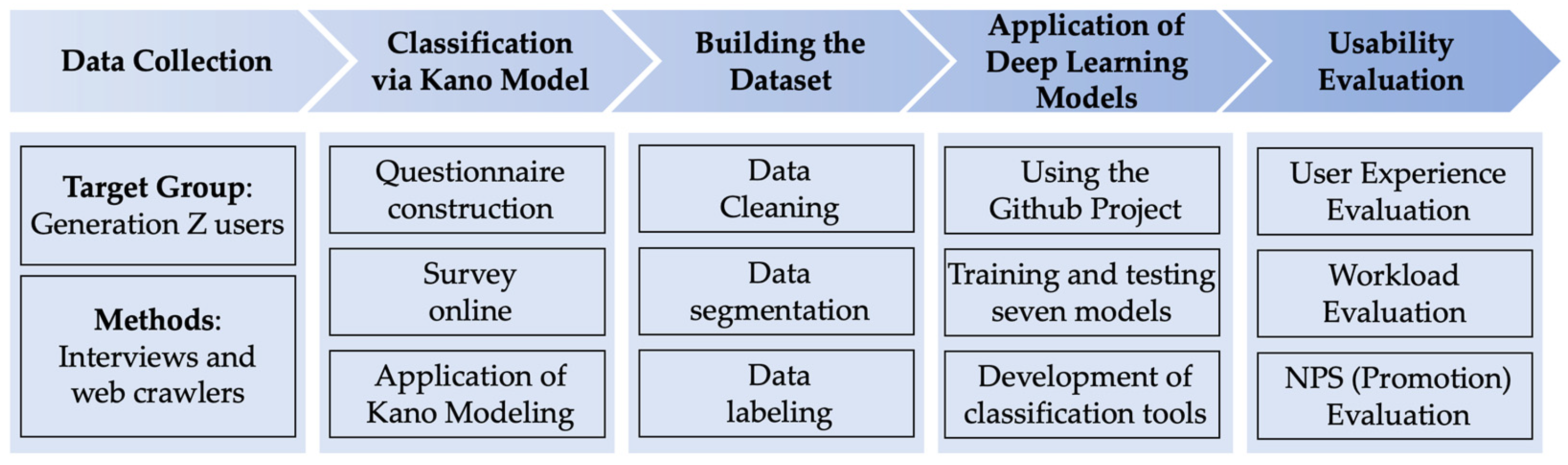
The workflow shown in Figure 2 delineates the steps of our research methodology, including data collection, classification via the Kano Model, building the dataset, the application of deep learning models, and usability evaluation. In the relevant section, each step meticulously details the tools and methods employed, ensuring the transparency and reproducibility of the research. The purpose of this flowchart is to provide a clear visual guide for readers, aiding in the comprehension of the entire research process.

3.1. Data Collection

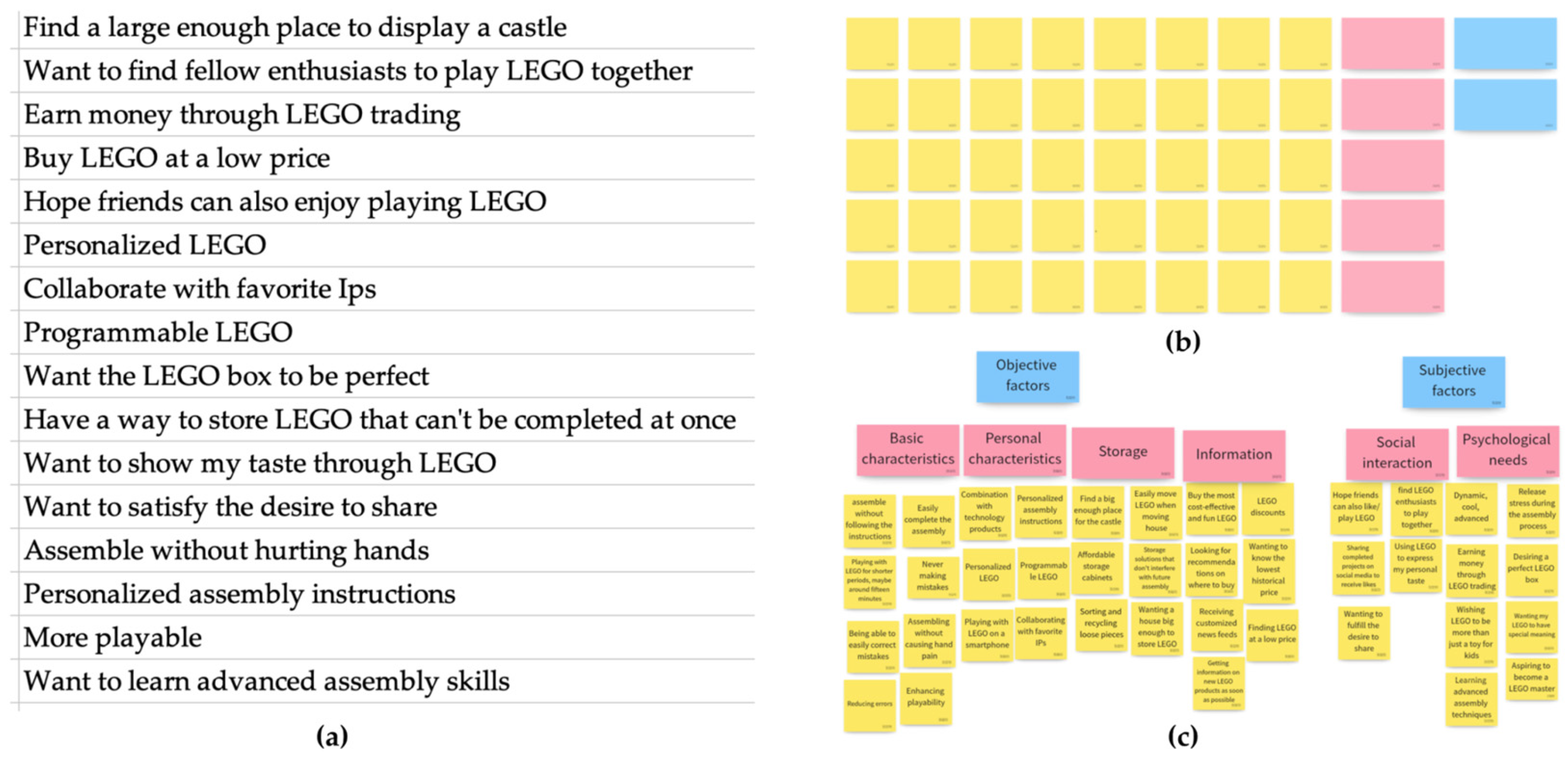
The first step of this study was to collect user needs as comprehensively as possible. With the support of a project in the UX Foundation course, this study focused on the needs of Generation Z (born between 1995 and 2009). A combination of interviews and web scraping methods were used for data collection. Twelve participants who had previously or were currently using the toys were interviewed individually, with each interview lasting about 30 min. The interviews aimed to gather basic information about the participants, including their understandings of the toys, preferences, UX, and expected features. Based on the interview results, 16 needs or expectations were identified and organized. In addition to the interviews, 3000 online reviews of LEGO toys (Billund, Denmark) were collected from JD.com using web scraping techniques. To ensure the data were mainly sourced from Generation Z, the products selected for data collection were suitable for ages 14 and above. The researchers extracted three additional needs from the online reviews that were not mentioned in the interviews.
In summary, this study collected 19 categories of demands from Generation Z through interviews and web scraping techniques. Additionally, we collected 3000 online comments about LEGO toys from JD.com.

3.2. Classification Based on the Kano Model

We surveyed the 19 user needs using a Kano model-based questionnaire and classified them according to the results. The study consisted of the following steps.
Firstly, we constructed a questionnaire consisting of two parts. The first part comprised demographic information of the participants, including age, gender, and whether they had purchased the LEGO toys. The second part consisted of a set of questions, each comprising a pair of positive and negative questions for each of the 19 identified user needs, as shown in Table 1. It should be noted that since this study did not involve the ranking of needs, we did not use a question about the importance of each need.
Next, we released the online questionnaire and collected responses using the Credamo platform. One hundred and two valid participants (32 males and 70 females) with a mean age of 23.45 ± 2.25 were recruited for this study. All participants met the criteria of Generation Z. Among them, 90.20% (92 individuals) reported that they purchased the LEGO toys, indicating the sample’s high representativeness.
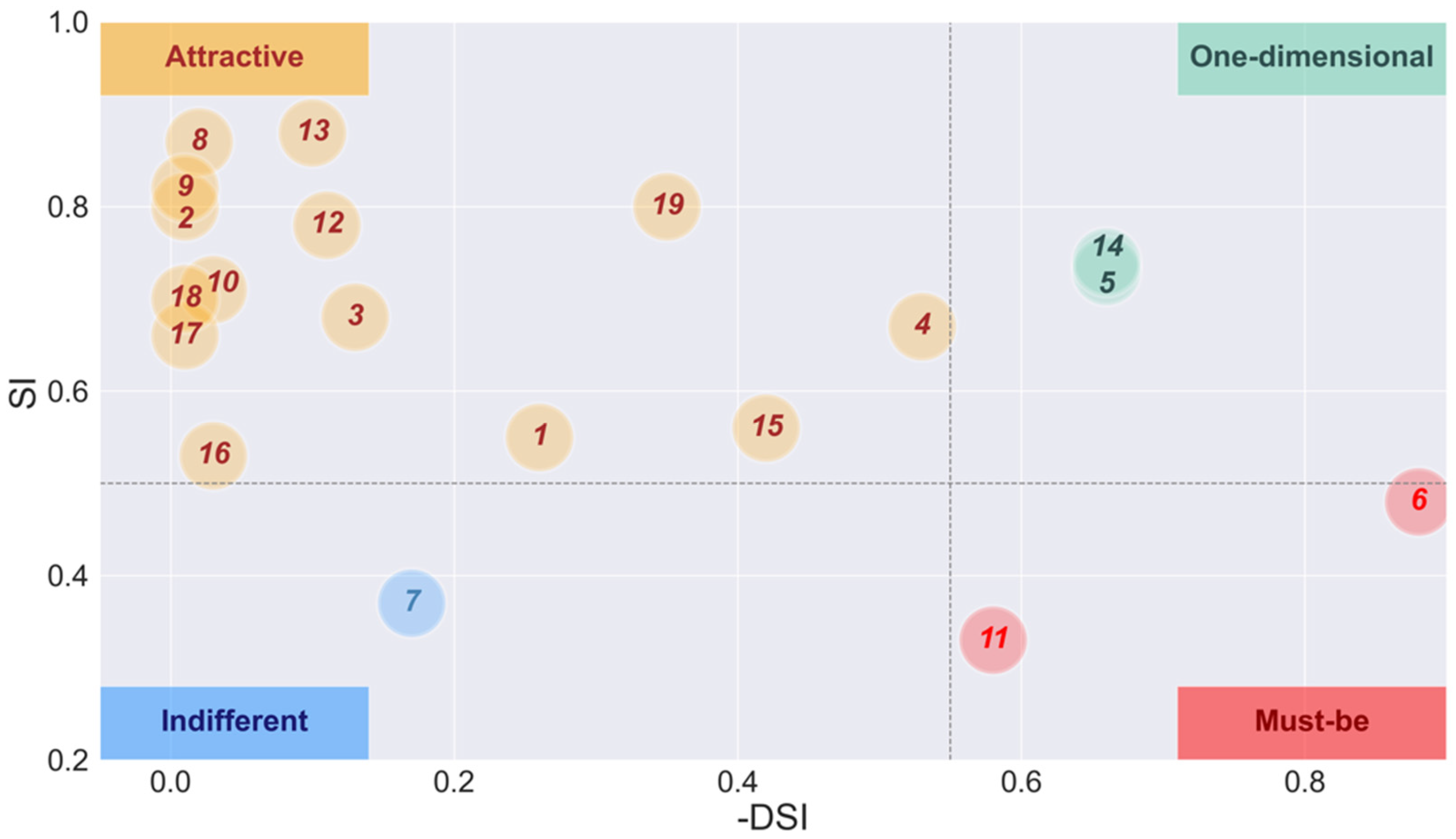
Subsequently, using the evaluation method shown in Table 2, we obtained the A, O, M, I, R, and Q coefficients of the 19 user needs. The Kano model-based questionnaire analysis uses the A, O, M, I, R, and Q coefficients to categorize user needs. ‘A’ stands for attractive needs, ‘O’ stands for one-dimensional needs, ‘M’ stands for must-be needs, ‘I’ stands for indifferent needs, ‘R’ stands for reverse needs, and ‘Q’ stands for questionable or uncertain responses. These coefficients represent the categorizing of each user’s needs based on the participants’ responses to the functional and dysfunctional aspects of the products. Table 2 illustrates the method used to determine these coefficients. The respondents’ answers to the pairs of positive and negative questions for each user need should yield different combinations corresponding to one of these coefficients. The category of each need is then determined by the highest frequency of responses aligning with these coefficients.
Finally, Satisfaction Influence (SI) coefficients and Dissatisfaction Influence (DSI) coefficients are calculated to visualize the analysis results on the coordinate axis [28]. The SI and DSI coefficients are computed using better and worse values [29].
Better value (SI) = (A + O)/(A + O + M + I)
Worse value (DSI) = (O + M) × (−1)/(A + O + M + I)

3.3. Dataset Preprocessing and Labeling

In the manual labeling process, our primary objective was to annotate the dataset according to the distinct user needs categories as identified according to the Kano model. In this study, we applied four prominent types of user needs: attractive needs, one-dimensional needs, must-be needs, and indifferent needs. Consequently, our labeling incorporated this four-categorization label. This categorization was not arbitrary; in practical applications and academic research, user needs are expected to be classified into the four categories above. The incidence of other categories, such as reverse needs and questionable options, is relatively infrequent.
Firstly, we removed duplicated data in the reviews and eliminated useless characters (including English letters, numbers, emoticons, and punctuation marks). Then, using the Chinese word segmentation tool Jieba in Python to segment the text, we removed stop and low-frequency words (words with a frequency of less than 10 in all texts) to obtain the initial preprocessing file, reducing the data from 3760 to 2795 records. Finally, we labeled each text according to the Kano model. Moreover, we removed all of the text spaces in the dataset to generate another dataset. This work can provide more options for the deep learning model, which can be trained based on either words or characters.
After preprocessing and labeling the dataset, we obtained two versions, one with text spaces and one without. These two datasets will be used for model training.

3.4. Deep Learning Models for Text Classification

The text classification tool developed in this study was implemented with the help of an open-source Chinese text classification project based on the PyTorch framework, which can be found at github.com/649453932/Chinese-Text-Classification-Pytorch (accessed on 3 March 2023). This project achieved excellent results on a news headline classification dataset of 200,000 samples [
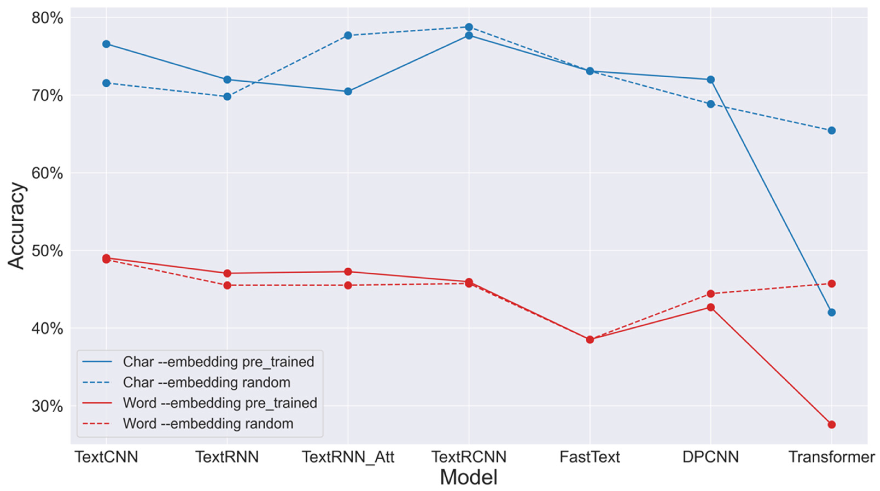
30]. In this study, we replaced the news headline dataset with two datasets obtained from the previous step of preprocessing and labeling. We trained and tested seven deep-learning models on these datasets, including TextCNN, TextRNN, TextRNN_Att, TextRCNN, FastText, DPCNN, and Transformer. Each model can be trained using either randomly initialized or pre-trained word embeddings. We obtained 28 (7 models × 2 datasets × 2 embeddings method) classification accuracies.
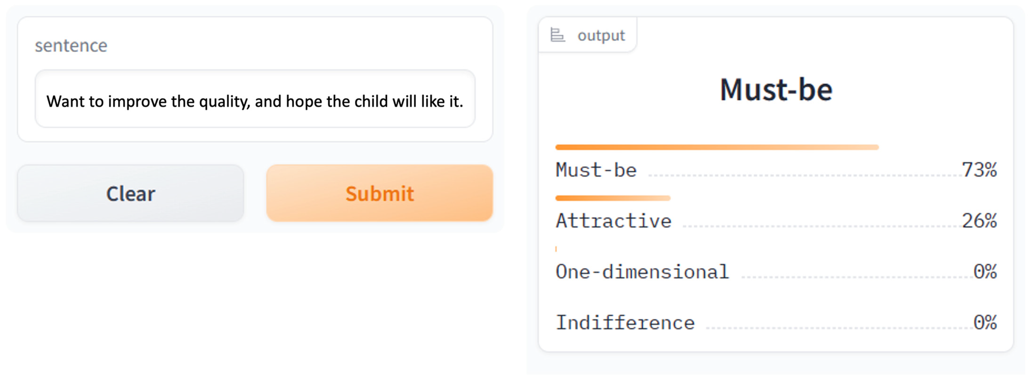
Based on the model and training mode with the highest accuracy, we developed a user-friendly text classification tool to assist novice users in automatically classifying user needs. While the existing Chinese-Text-Classification (CTC)-PyTorch tool is a general-purpose Chinese text classifier, our tool is fine-tuned to categorize text based on user needs, as defined in the Kano model. This includes custom-built categorizations namely must-be, attractive, one-dimensional, and indifferent needs, which are particularly relevant for UX research. When receiving a text representing user feedback or opinions about products, the tool displays the corresponding category of the user need and the probability for the four types.

3.5. Usability Evaluation

3.5.1. Participants

Forty participants (19 males and 21 females) with a mean age of 22.65 ± 3.08 were recruited for this study; they were undergraduate students in the “Design Thinking” course and graduate students in the “UX Foundation” course at our institute. All participants were beginners in UX and had no relevant work experience but had learned some classic user research methods. The 40 participants were randomly divided into eight groups of five people (the affinity diagram method is usually a team task). Four groups were randomly selected first to use the text classification tool and then apply the classic affinity diagram method for user needs classification. The remaining four groups first employed the affinity diagram method, followed by the text classification tool.
To prevent any confusion, it should be clarified that in this study, including the usability evaluation phase, the participants were recruited on three separate occasions: through interviews, online surveys, and usability evaluations. There was no overlap among the participants in these different occasions. Detailed information about the participants recruited for each of these three occasions is presented in Table 3.

3.5.2. Materials and Tools

The materials and tools used in this experiment can be divided into three main parts:
  • The materials prepared for the text analysis method included the text classification tool developed in the previous steps and an Excel document used to record the classification results.
  • The materials prepared for the affinity diagram method included an Excel document containing 40 user needs and a pre-configured online whiteboard tool. The whiteboard tool features 40 prearranged yellow rectangles (allowing users to paste the text from the Excel document into the yellow blocks) and copyable pink and blue rectangular blocks, as illustrated in Figure 1. Each group was prepared with a whiteboard separately.
  • Online questionnaire: An online survey was created on the Credamo platform, which includes the NASA Task Load Index (NASA-TLX) [31], User Experience Questionnaire (UEQ) [31,32], and Net Promoter Score (NPS) [33,34] for usability evaluation. The online survey also includes questions to record participants’ basic information, such as gender, age, length of time spent learning UX or design thinking, student ID, and contact information (to pay participant fees).
    i.
    The NASA-TLX scale was used to measure the cognitive workload of each participant. The scale consists of six dimensions: mental demand, physical demand, temporal demand, performance, effort, and frustration. Higher scores indicate an increased cognitive workload. The calculation formula for the overall score is presented as Equation (3). Here, D, E, F, G, H, and I represent the scores for each dimension, while wdimension denotes the corresponding dimension’s weight. These weights are determined based on each dimension’s relative importance compared to the others, as ascertained by participants through pairwise comparisons in the survey.
    Overall   Score = D × 5 × w Cognitive 21 + E × 5 × w Physical 21 + F × 5 × w Temporal 21                                                                       + G × 5 × w Performance 21 + H × 5 × ( w Effort ) 21 + I × 5 × ( w Frustrationl ) 21
    ii.
    The UEQ questionnaire was used to measure the perceived usability of each method. The questionnaire includes six aspects: attractiveness, perspicuity, efficiency, dependability, stimulation, and novelty.
    iii.
    The NPS is an established metric for evaluating user recommendation likelihood for a product or service. It is calculated based on users’ responses to a single question asking them to rate their likelihood of recommending the tool on a scale from 0 (“not likely at all”) to 10 (“extremely likely”). Scores from 0 to 6 categorize users as detractors, scores from 7 to 8 categorize them as passives, and scores from 9 to 10 categorize them as promoters. The final NPS is calculated by subtracting the percentage of detractors from the percentage of promoters, resulting in a score that ranges from −100 to 100. A positive score indicates a higher proportion of promoters, suggesting stronger user endorsement.

3.5.3. Experimental Design

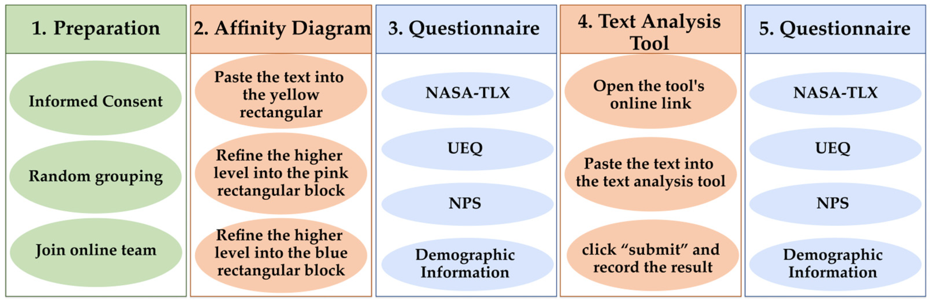
In this study, a single-factor, two-level, within-subjects design was utilized to evaluate and compare the performance of the text classification tool developed in previous stages with the conventional user needs classification method—the affinity diagram. The usability test procedure is presented in Figure 3. The sequencing of the second (affinity diagram) and fourth steps (text analysis tool) may vary across groups to counterbalance potential order effects.
Taking the sequence in Figure 2 as an example, the following detailed description of the experimental procedure is used.
During the preparation phase, after every 40 participants read and signed the informed consent form, they were randomly assigned to eight groups. The grouping method was introduced in the previous section, “Section 3.5.1 Participants”. We established a WeChat group chat for each team to distribute the experimental materials to the participants efficiently and effectively.
After the preparation phase was completed, four group participants were invited to use the affinity diagram method for classification first. They utilized the pre-prepared online whiteboard tool, Boardmix, for the experiment. This task can be broken down into three parts: first, the participants were required to paste the text from the Excel file into yellow rectangular blocks; then, they grouped these yellow rectangles based on structural or content similarity and wrote their shared needs in pink rectangles; finally, they further refined these pink rectangles and recorded their commonalities in blue rectangles.
After completing the classification task using the affinity diagram, each participant was asked to complete an online questionnaire.
After sufficient rest, the participants were asked to use the text analysis tool for classification. This task could also be divided into three parts. First, the participants needed to open a webpage link to access the classification tool we developed. Then, they pasted the texts of user needs from the Excel file into the tool. Finally, they clicked “submit” and recorded the resulting categories in the Excel file.
Following this task, the participants were asked to complete the same online questionnaire.
There are three additional points to note. First, the other four groups of participants performed the two tasks in a different sequence, using the text analysis tool before the online affinity diagram to balance the order effects in the within-subjects design. Second, both tasks used the same set of 40 needs texts, which were placed in an Excel document and sent to the participants via WeChat group chats. Third, the groups used the text classification tool to classify the needs separately as individual tasks. In contrast, the groups used the affinity diagram as a team task. 
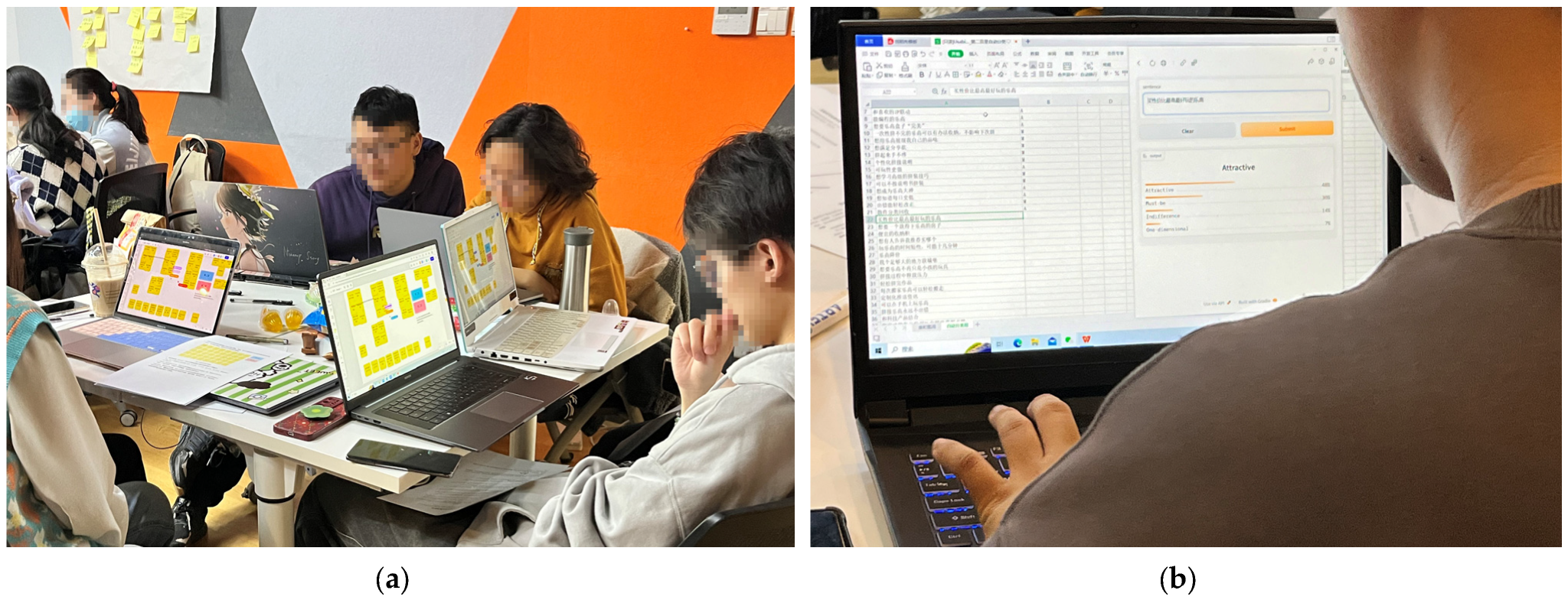
Figure 4 illustrates the implementation of the 2 methods.

3.5.4. Data Analysis

A paired-samples t-test was utilized to determine whether significant differences exist between the two methods based on the data collected from the NASA-TLX and UEQ.

4. Results

4.1. Result of Questionnaire Survey Based on the Kano Model

4.1.1. Statistical Analysis

In this study, 19 user needs were extracted from interviews and online reviews gathered through web scraping. These needs were numbered and listed in the first two columns of Table 3.
We compared the results of the questionnaire survey with the evaluation table of the Kano model (as shown in Table 2) to determine the proportion of each need falling into the different categories of attractive need (A), one-dimensional need (O), must-be need (M), indifferent need (I), reverse need (R), questionable result (Q). The category with the highest proportion was assigned to each user’s need. As shown in columns 3–8 of Table 4, the 19 user needs were classified into four items: attractive (one), one-dimensional (two), must-be (two), and indifferent (one).

4.1.2. Quadrant Analysis

To better visualize the results, we calculated the SI and DSI values for each user’s needs (as described in the Methods section). We plotted them as the vertical and horizontal coordinates (respectively, taking absolute values) in a scatterplot (see Figure 5), where the numbers on each point correspond to the user need ID.
Based on the better–worse coefficient, we divided the scatterplot into four quadrants.
The first quadrant represents the one-dimensional needs, with two needs falling into this category, indicating that providing these features increases user satisfaction. In contrast, their absence decreases satisfaction, making them a competitive quality attribute.
The second quadrant represents attractive needs, with 14 needs falling into this category, indicating that their absence does not decrease user satisfaction. However, their provision leads to a significant increase in satisfaction and loyalty.
The third quadrant represents indifferent needs, with one need falling into this category, indicating that users do not care whether these features are present or not, as they do not affect their satisfaction.
The fourth quadrant represents must-be needs, with two needs falling into this category, indicating that this feature does not increase user satisfaction. However, its absence leads to a significant decrease in satisfaction.

4.2. Deep Learning Model and Tool Development

In Section 3.3, the online comment data were preprocessed and labeled according to four categories, forming two text classification datasets: one in word with spaces and one in Char without spaces. First, both datasets were randomly split into training, validation, and testing sets using the train_test_split function from the Sklearn library in Python, with a ratio of 6:2:2. Seven deep learning models for text classification, including TextCNN, TextRNN, attention-based TextRNN, TextRCNN, FastText, DPCNN, and Transformer, were trained and tested on these two datasets using different word embedding methods (random or pre-trained). The test results, shown in Figure 6, revealed that the TextRCNN model, using randomly initialized word embeddings, achieved the highest classification accuracy of 78.77%. Subsequently, the interactive tool will be developed using the TextRCNN model with randomly initialized word embeddings.
We developed an interactive text classification tool to facilitate a more intuitive use of our text classification models. This tool uses the Python gradio library, allowing users to input text and obtain predicted probabilities for each of the four classes (see Figure 6). The user-friendly interface, depicted in Figure 7, is clean and straightforward, negating the need for prior training. The interface features a large input area on the left, where users can enter texts of varying lengths for analysis. The tool swiftly processes the text and presents the classification results upon submission. The output includes the identified category of user needs per the Kano model and the respective probability scores, all in a simple, digestible format. In the development process, we used the TextRCNN model with randomly initialized word embeddings as the basis and integrated this model into our interactive tool [35]. The tool automatically preprocesses the user input and utilizes the trained model for classification. Through this tool, users can gain a more intuitive understanding of the effectiveness of text classification. We believe an interactive tool will positively impact the promotion and application of text classification models and help more users, especially beginners, make informed decisions when classifying user needs.

4.3. Usability Evaluation

4.3.1. UX

The UEQ scores of 40 participants across two tasks are presented in Figure 8, which were divided into six dimensions. The paired-sample t-test showed that the attractiveness of the affinity diagrams is significantly lower than that of the text analysis tool; t(39) = −6.08, p < 0.001. The perspicuity of the affinity diagram is significantly lower than that of the text analysis tool; t(39) = −6.74, p < 0.001. The efficiency of the affinity diagram is significantly lower than that of the text analysis tool; t(39) = −8.55, p < 0.001. The dependability of the affinity diagram is significantly lower than that of the text analysis tool; t(39) = −5.33, p < 0.001. The stimulation of the affinity diagram is significantly lower than that of the text analysis tool; t(39) = −2.43, p = 0.020. The novelty of the affinity diagram is significantly lower than that of the text analysis tool; t(39) = −4.45, p < 0.001.
Table 5 shows the mean and standard deviation of the UEQ scores across each dimension. The UEQ scores range from −3 to 3, with higher scores indicating better performance in the respective dimension. The text analysis tool outperformed the affinity diagram method across all six dimensions, reflected by its higher average scores. This result suggests that the text analysis tool offers superior user experience compared to the conventional affinity diagram approach.
The dimensions of the UEQ can be further categorized into three qualities: attractiveness, pragmatic quality (i.e., perspicuity, efficiency, and dependability), and hedonic quality (i.e., stimulation and novelty). Attractiveness is regarded as an independent dimension of value, whereas pragmatic quality pertains to dimensions related to the task, and hedonic quality relates to dimensions unrelated to the task. The scores for these three qualities for the 40 participants are presented in Figure 9. The paired-sample t-test showed that the attractiveness of the affinity diagrams is significantly lower than that of the text analysis tool; t(39) = −6.08, p < 0.001. The pragmatic quality of the affinity diagram is significantly lower than that of the text analysis tool; t(39) = −7.60, p < 0.001. The hedonic quality of the affinity diagram is significantly lower than that of the text analysis tool; t(39) = −3.74, p < 0.001.
Table 6 shows the mean and standard deviation of the UEQ scores for each quality aspect. The results indicate that the text analysis tool outperformed the affinity diagram method in all three qualities, as demonstrated by its higher average scores. Firstly, the higher scores in attractiveness quality suggest that users prefer the automated tool, likely due to its intuitiveness and ease of use. Secondly, the high scores in pragmatic quality indicate that users can complete tasks quickly and accurately while also gaining a better understanding of the tool’s functionalities and operations. Lastly, the tool also scored better in hedonic quality, indicating that users find it more interesting and innovative during use, and that its design and functionalities are innovative. These findings validate the advantages of the text classification tool developed in this study, demonstrating its strong usability and positive user experience.

4.3.2. Workload

The NASA-TLX scores of 40 participants across two tasks are presented in Figure 10, which were also divided into six dimensions. The paired-sample t-test showed that the overall workload of the affinity diagrams is significantly higher than that of the text analysis tool; t(39) = 8.07, p < 0.001. The mental demand of the affinity diagram is significantly higher than that of the text analysis tool; t(39) = 9.31, p < 0.001. The physical demand of the affinity diagram is significantly higher than that of the text analysis tool; t(39) = 3.13, p = 0.003. The temporal demand of the affinity diagram is significantly higher than that of the text analysis tool; t(39) = 6.96, p < 0.001. The performance demand of the affinity diagram is significantly higher than that of the text analysis tool; t(39) = 3.97, p < 0.001. The effort demand of the affinity diagram is significantly higher than that of the text analysis tool; t(39) = 6.40, p < 0.001. The frustration of the affinity diagram is significantly higher than that of the text analysis tool; t(39) = 6.40, p < 0.001.
Table 7 shows the mean and standard deviation of the NASA-TLX scores, including one overall score and scores on six different dimensions. The calculation formula for the overall score is presented as Equation (3). It is evident that the workloads, both in the six dimensions and overall, are lower for the text analysis tool compared to that for the affinity diagram. Such results indicate that the automated classification tool significantly reduces the user’s workload compared to the traditional method.

4.3.3. NPS

The NPS scores from the 40 participants indicate their general attitude toward the affinity diagram method and the automated classification tool. Figure 11 shows the distribution of these scores. For the affinity diagram method, the results were predominantly negative, with 29 participants being classified as detractors (scores 0–6), eight as passives (scores 7–8), and only three as promoters (scores 9–10), resulting in an NPS score of −65. This score reflects a general dissatisfaction among users with the traditional method. In contrast, the automated classification tool demonstrated a more positive reception. It had 9 detractors, 13 passives, and 18 promoters, leading to an NPS score of 23. This score indicates a favorable user attitude towards the tool, suggesting that it was more well received and likely to be recommended by users.
These NPS scores clearly illustrate the users’ preference for the automated classification tool over the affinity diagram method, indicating its potential advantages in user experience education. This preference is likely due to the tool’s intuitive design and efficient operation, which aligns with the educational goals of simplifying the learning process and enhancing user engagement.

5. Discussion

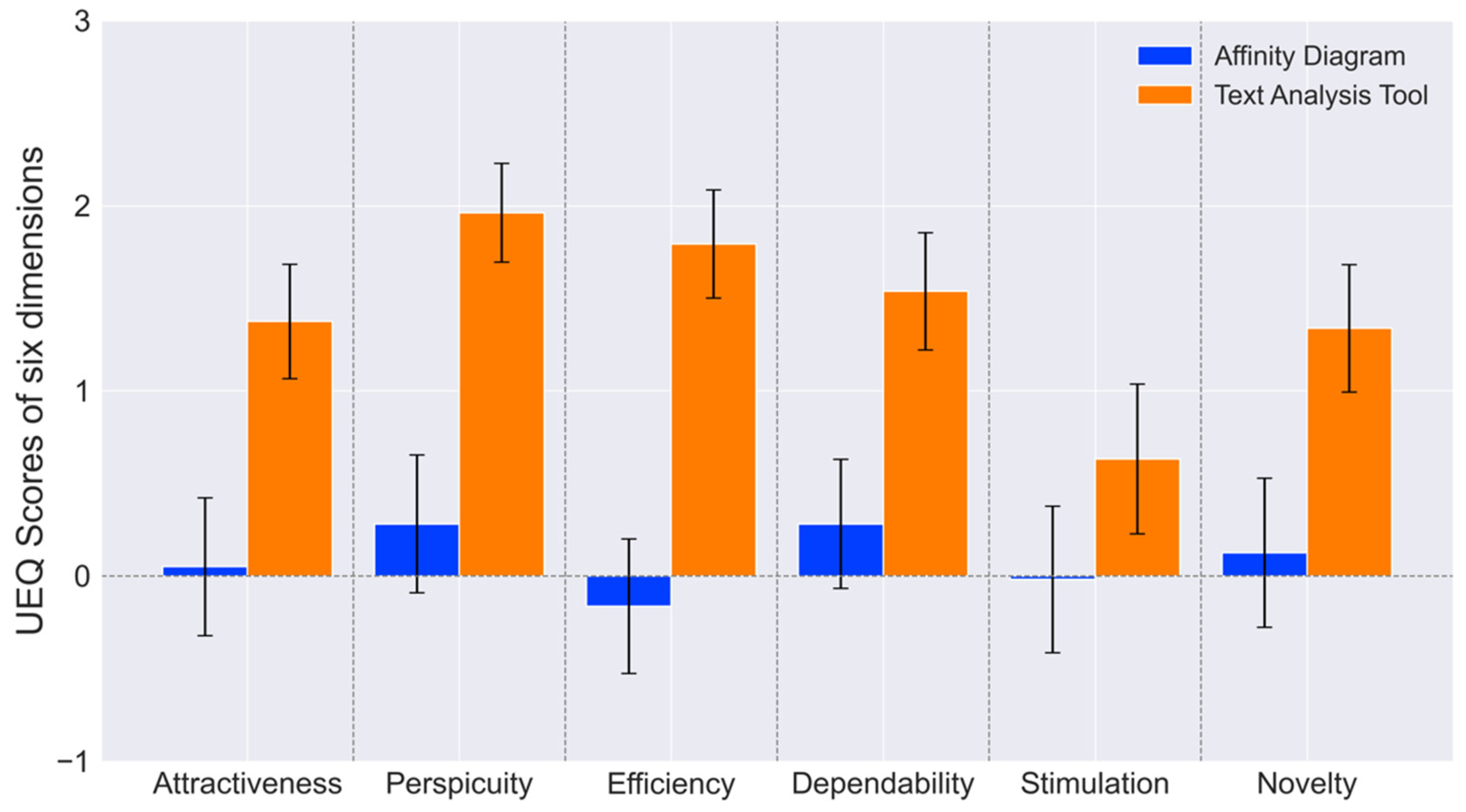
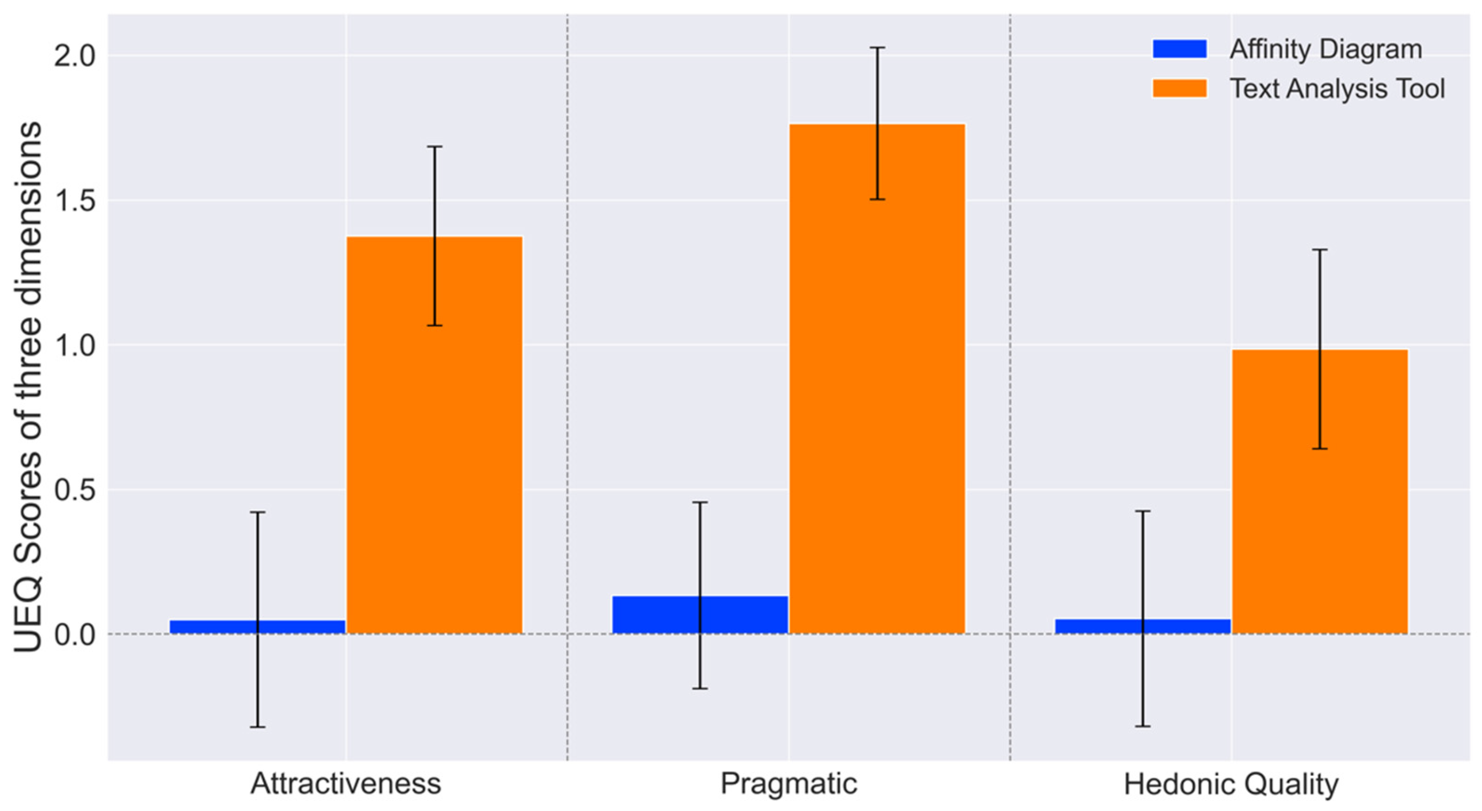
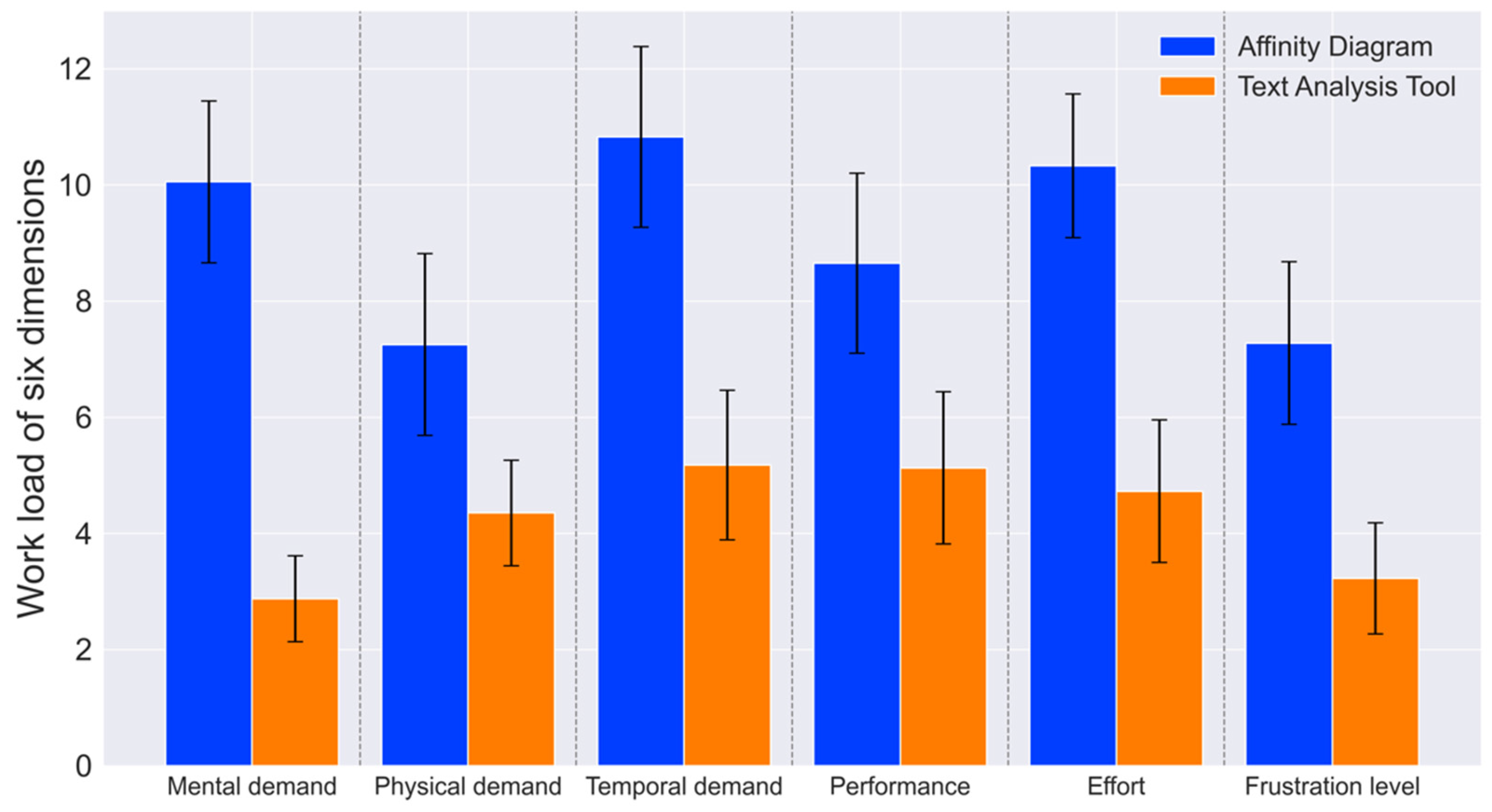
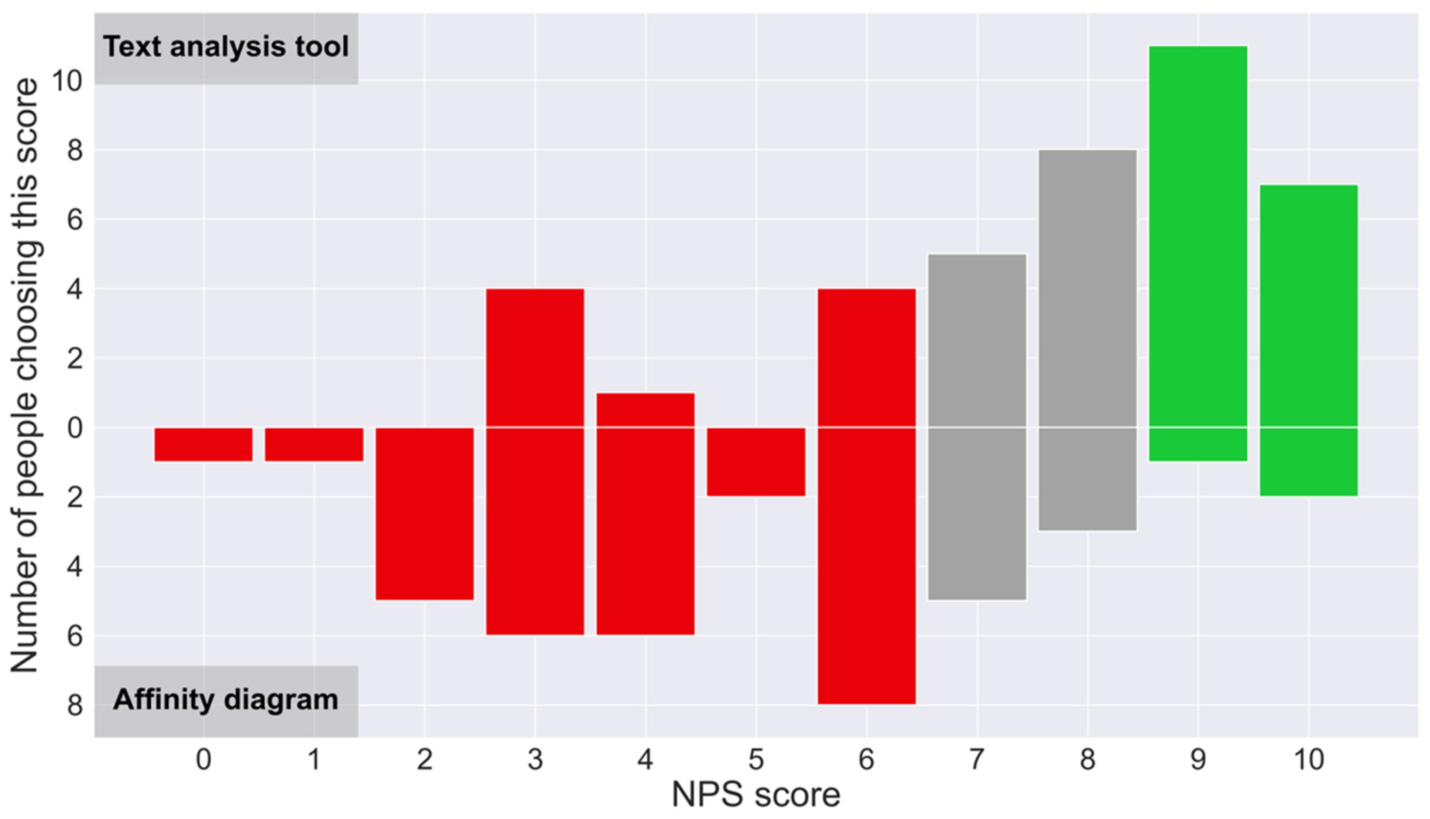
This study contributes to two key areas. Firstly, it introduces a novel text classification tool that utilizes the Kano model and deep-learning technology to categorize user needs efficiently, with potential applications in education. This study collected 19 user needs from Generation Z users of LEGO toys through interviews and web crawling. Subsequently, the researchers classified these needs into four categories, comprising two must-be needs, two one-dimensional needs, thirteen attractive needs, and one indifferent need, using a Kano model-based questionnaire. Based on the classification results, a dataset was generated through preprocessing and labeling over 3000 online reviews. The researchers then employed seven deep-learning models to train and predict the data, with the RCNN model being identified as the most effective. Using this model, the researchers developed a graphical text classification tool that accurately outputs the corresponding category and probability of user input text according to the Kano model. By integrating this tool into UX design curricula, educators can facilitate the learning process for students, helping them understand the importance of user needs classification and providing them with a practical, efficient method for applying the Kano model in their projects. Secondly, the study conducted a usability test on the developed tool, highlighting its potential as an educational resource for UX design courses. The results demonstrated that the tool performed better than the traditional affinity diagram method in six dimensions and in three qualities of the UEQ, indicating a superior UX. Additionally, the study used the NASA-TLX to measure the task load. The results showed that the tool had lower levels of mental demand, physical demand, temporal demand, performance, effort, and frustration than the affinity diagram, indicating a smaller workload. Furthermore, the NPS score of 23 showed the participants’ overall positive attitude toward the method. These findings suggest that the developed tool has the potential to be a valuable addition to text classification tools and can facilitate the efficient categorization of user needs with a superior UX for educational purposes.
When analyzing the reasons for these results, we found that our tool’s higher attractiveness, compared to traditional affinity diagram methods, could be attributed to its user-friendly interface and the integration of trending technologies related to AI and text analysis. Its higher clarity, efficiency, and reliability might stem from its ability to provide clear, quick, and consistent categorization and probability outputs. In contrast, the affinity diagram method, which relies on clustering rather than categorization, lacks clear decision-making support, potentially leading to lower clarity, efficiency, and reliability. These factors contribute to our tool’s superior practicality. Additionally, our tool’s higher stimulation and novelty could be due to its innovative combination of the Kano model with text analysis methodologies, which brings a fresh perspective to users. These factors contribute to our tool’s superior quality of pleasure. From the NASA-TLX perspective, the tool’s lower mental and physical demands and effort are likely due to its straightforward input mechanism, leading to immediate results, compared to the more cognitively demanding process of clustering and refining needs using affinity diagrams. Unlike the subjective and varying results of affinity diagrams, the tool’s lower self-performance (lower values indicate better performance) could be attributed to its definitive and reliable results. Finally, the tool’s lower frustration level could be due to its consistent ability to classify needs, avoiding the ambiguity that can occur with affinity diagrams. The higher NPS for our tool can be explained by its superior user experience and lower task load compared to affinity diagrams.
However, the current study has several limitations. Firstly, our study involved manually labeling online comments for a specific period, which is time-sensitive and labor-intensive. Secondly, the features of the tool we developed are relatively limited. Thus, we plan to add more features in the future, such as the automatic recording of input text and output categories in a table or allowing users to provide feedback as a basis for reinforcement learning.
Although the tool is still in the early stages of development, it has proven to be usable and well received. Artificial intelligence profoundly impacts our daily lives, ranging from ChatGPT [36] to midjourney [37]. Simultaneously, researchers, from Scratch [38] to CNN Explainer [39], have emphasized the significance of providing user-friendly, graphical, and interactive tools to disseminate research findings to a broader audience, especially novices or learners, thus enabling more individuals to benefit from these research results. Recent studies highlight the growing significance of deep learning-based automated classification tools. For instance, the Deep-PR method in mobile-edge networks offers improved POI recommendations by refining feature spaces [40]. In the IoT domain, DeepClassifier efficiently classifies NOMA signatures, reducing the computational complexity by 90% [41]. Similarly, a new traffic forecasting model combines deep and graph embeddings in the green Internet of Vehicles, enhancing the prediction reliability by up to 25% [42]. These advancements demonstrate the pivotal role of deep learning tools in enhancing efficiency and technological capabilities across various sectors.
It is important to emphasize that we do not intend to suggest that the traditional affinity diagram method is not helpful. In contrast, it is an effective research method. On the one hand, the affinity diagram method refines user needs twice, which reflects human creativity. While deep learning methods make predictions (classify) based on existing data, design teams using the affinity diagram method may generate unprecedented ideas that cannot be classified into pre-existing categories [43]. On the other hand, the scope of application of the affinity diagram method is not limited to user needs classification. Many researchers have produced excellent research results using the affinity diagram method, including public administration [44] and software development [45]. Furthermore, automated classification cannot replace user researchers or designers with rich experience. Although it may extract industry experience or user characteristics from a large amount of data, it still lacks human empathy and creativity, which is crucial in UCD [46,47,48].

6. Conclusions

The usability evaluation results indicate that beginner UX designers found the user-need classification tool to significantly outperform the affinity diagram method regarding attractiveness, perspicuity, efficiency, dependability, stimulation, and novelty. Furthermore, the tool demonstrated significantly lower scores in mental demand, physical demand, temporary demand, performance, effort, and frustration levels compared to the affinity diagram method. Additionally, the tool achieved a higher Net Promoter Score (NPS). These results compellingly demonstrate the superiority of the automated tool over the affinity diagram method, emphasizing the importance of providing novice UX designers with an effective user needs classification tool. The automated tool, with its enhanced user experience and reduced workload, emerges as a promising educational resource in UX design. It simplifies the understanding of the Kano model and text analysis, particularly benefiting beginners. Its efficient, user-friendly interface and the positive reception indicated by the NPS highlight its potential for UX education.
Our fundamental point is that researchers must foster a more harmonious relationship between artificial intelligence and users, making AI achievements more accessible to different fields. A simple interactive interface can enhance UX (attractiveness, usefulness, and hedonic value) and reduce workload. In the future, improving UX while coexisting with artificial intelligence presents both a challenge and an opportunity.

Author Contributions

Conceptualization, W.L.; methodology, L.L.; software, Z.Z.; validation, S.M.; formal analysis, L.Z.; investigation, T.H; writing—original draft preparation, Z.Z.; writing—review and editing, Z.Z. and H.C.; supervision, S.M.; project administration, R.H. All authors have read and agreed to the published version of the manuscript.

Funding

This research received no external funding.

Institutional Review Board Statement

This study was conducted according to the guidelines of the Declaration of Helsinki and approved by the Ethics Committee of Beijing Normal University (Code: 202202280023).

Informed Consent Statement

Informed consent was obtained from all subjects involved in the study.

Data Availability Statement

The dataset and source codes utilized in the study can be found here: https://github.com/Seirios033/Chinese-text-classification-Kano (accessed on 24 January 2024).

Acknowledgments

We are immensely grateful to the students at Beijing Normal University who participated in this work and provided us with their invaluable support. Your contribution has been significant, and we sincerely appreciate your involvement.

Conflicts of Interest

The authors declare no conflicts of interest.

References

  1. Liu, W.; Xin, X.; Sun, S.; Liu, C. Construction of curriculum system for master’s degree in user experience based on psychology. Res. Teach. 2021, 44, 71–79. [Google Scholar]
  2. Vorvoreanu, M.; Gray, C.M.; Parsons, P.; Rasche, N. Advancing UX Education: A Model for Integrated Studio Pedagogy. In Proceedings of the CHI ’17: 2017 CHI Conference on Human Factors in Computing Systems, Denver, CO, USA, 6–11 May 2017; Association for Computing Machinery: New York, NY, USA, 2017; pp. 1441–1446. [Google Scholar] [CrossRef]
  3. Getto, G.; Beecher, F. Toward a Model of UX Education: Training UX Designers Within the Academy. IEEE Trans. Prof. Commun. 2016, 59, 153–164. [Google Scholar] [CrossRef]
  4. Permatasari, D.I.; Fahrul Hardiansyah, F.; Ainun Wakhidah, M.; Bagus Afridian Rasyid, M. UX Design Documentation Application Using The Five Planes Method. In Proceedings of the 6th International Conference on Sustainable Information Engineering and Technology 2021, Malang, Indonesia, 13–14 September 2021; ACM: New York, NY, USA, 2021; pp. 29–32. [Google Scholar] [CrossRef]
  5. Bollini, L. Mapping the Teaching Challenges of User Experience and Interface Design Classes in Public Italian Universities. In Proceedings of the Inted2016: 10th International Technology, Education and Development Conference, Valencia, Spain, 7–9 March 2016; Chova, L.G., Martinez, A.L., Torres, I.C., Eds.; The International Academy of Technology, Education & Development: Valenica, Spain, 2016; pp. 7828–7833. [Google Scholar]
  6. Liu, W.; Byler, E.; Leifer, L. Engineering Design Entrepreneurship and Innovation: Transdisciplinary Teaching and Learning in a Global Context. In Proceedings of the Design, User Experience, and Usability: Case Studies in Public and Personal Interactive Systems: 9th International Conference, DUXU 2020 (Held as Part of the 22nd HCI International Conference, HCII 2020), Copenhagen, Denmark, 19–24 July 2020; Springer International Publishing: Cham, Switzerland, 2020. Part III. pp. 451–460. [Google Scholar] [CrossRef]
  7. Liu, W.; Lee, K.-P.; Gray, C.M.; Toombs, A.L.; Chen, K.-H.; Leifer, L. Transdisciplinary Teaching and Learning in UX Design: A Program Review and AR Case Studies. Appl. Sci. 2021, 11, 10648. [Google Scholar] [CrossRef]
  8. Yam, C.H.-K.; Yeoh, E.-K.; Wong, E.L.-Y.; Lai, A.H.-Y.; Ip, E.M.-Y.; Chow, T.-Y.; Wang, K. Experience of a Demand-Side Subsidy Scheme for Residential Long-Term Care: Perspectives of Elderly and Their Carers. BMC Geriatr. 2023, 23, 12. [Google Scholar] [CrossRef]
  9. Sun, H.; Yang, Q.; Wu, Y. Evaluation and Design of Reusable Takeaway Containers Based on the AHP–FCE Model. Sustainability 2023, 15, 2191. [Google Scholar] [CrossRef]
  10. Dash, S.B.; Jain, A.; Dey, L.; Dasgupta, T.; Naskar, A. Factors Affecting User Experience of Contact Tracing App during COVID-19: An Aspect-Based Sentiment Analysis of User-Generated Review. Behav. Inf. Technol. 2023, 42, 249–264. [Google Scholar] [CrossRef]
  11. Hussain, J.; Azhar, Z.; Ahmad, H.F.; Afzal, M.; Raza, M.; Lee, S. User Experience Quantification Model from Online User Reviews. Appl. Sci. 2022, 12, 6700. [Google Scholar] [CrossRef]
  12. Liu, B.; Han, F.X.; Niu, D.; Kong, L.; Lai, K.; Xu, Y. Story Forest: Extracting Events and Telling Stories from Breaking News. ACM Trans. Knowl. Discov. Data 2020, 14, 31. [Google Scholar] [CrossRef]
  13. Liu, L.; Zhang, L.; Ye, P.; Liu, Q. User Needs Mining Based on Topic Analysis of Online Reviews. Teh. Vjesn. Tech. Gaz. 2019, 26, 230–235. [Google Scholar] [CrossRef]
  14. Scupin, R. The KJ Method: A Technique for Analyzing Data Derived from Japanese Ethnology. Hum. Organ. 1997, 56, 233–237. [Google Scholar] [CrossRef]
  15. Holtzblatt, K.; Beyer, H. (Eds.) Design for Life. In Contextual Design: Evolved; Synthesis Lectures on Human-Centered Informatics; Springer International Publishing: Cham, Switzerland, 2015; pp. 5–10. [Google Scholar] [CrossRef]
  16. Mazur, L.M.; Adapa, K.; Meltzer-Brody, S.; Karwowski, W. Towards Better Understanding of Workplace Factors Contributing to Hospitalist Burden and Burnout Prior to COVID-19 Pandemic. Appl. Ergon. 2023, 106, 103884. [Google Scholar] [CrossRef]
  17. Ortiz, M.A.; Kim, D.H.; Bluyssen, P.M. Substantiation of Home Occupant Archetypes with the Use of Generative Techniques: Analysis and Results of Focus Groups. Intell. Build. Int. 2022, 14, 239–257. [Google Scholar] [CrossRef]
  18. Baddeley, A.D.; Hitch, G. Working Memory. In Psychology of Learning and Motivation; Bower, G.H., Ed.; Academic Press: Cambridge, MA, USA, 1974; Volume 8, pp. 47–89. [Google Scholar] [CrossRef]
  19. Kano, N.; Seraku, N.; Takahashi, F.; Tsuji, S. Attractive Quality and Must-Be Quality. J. Jpn. Soc. Qual. Control 1984, 14, 147–156. [Google Scholar] [CrossRef]
  20. Matzler, K.; Hinterhuber, H.H. How to Make Product Development Projects More Successful by Integrating Kano’s Model of Customer Satisfaction into Quality Function Deployment. Technovation 1998, 18, 25–38. [Google Scholar] [CrossRef]
  21. Chen, S.C.; Chang, L.; Huang, T.H. Applying Six-Sigma Methodology in the Kano Quality Model: An Example of the Stationery Industry. Total Qual. Manag. Bus. Excell. 2009, 20, 153–170. [Google Scholar] [CrossRef]
  22. Wang, W.; Wei, T.; Zhang, Y.; Wang, Y. A Method of Intelligent Product Design Cue Construction Based on Customer Touchpoint Correlation Analysis and Positive Creativity Theory. Adv. Mech. Eng. 2019, 11, 1687814018819347. [Google Scholar] [CrossRef]
  23. Hellmers, J.; Thomaschewski, J.; Holt, E.-M.; Wriedt, T. Usability Evaluation Methods for a Scientific Internet Information Portal. J. Univers. Comput. Sci. 2012, 18, 1308–1322. [Google Scholar]
  24. Li, Y.; Zhu, L. Multi-Objective Optimisation of User Experience in Mobile Application Design via a Grey-Fuzzy-Based Taguchi Approach. Concurr. Eng. Res. Appl. 2020, 28, 175–188. [Google Scholar] [CrossRef]
  25. Forootani, A.; Rastegar, M.; Jooshaki, M. An Advanced Satisfaction-Based Home Energy Management System Using Deep Reinforcement Learning. IEEE Access 2022, 10, 47896–47905. [Google Scholar] [CrossRef]
  26. Sobuj, M.; Alam, M.A.; Zannat, A. Evaluation of Face Masks Quality Features Using Kano Model and Unsupervised Machine Learning Technique. Res. J. Text. Appar. 2023, 27, 560–572. [Google Scholar] [CrossRef]
  27. Yang, H.; Huo, Y.; Jia, R.; Sha, F.; Hu, N.; Yu, L.; Wang, Y. Sustainable Recognition Methods of Modeling Design Features of Light and Micro Vehicle-Mounted UAV: Based on Support Vector Regression and Kano Model. Sustainability 2022, 14, 8210. [Google Scholar] [CrossRef]
  28. Yang, C.C. The Refined Kano’s Model and Its Application. Total Qual. Manag. Bus. Excell. 2005, 16, 1127–1137. [Google Scholar] [CrossRef]
  29. Berger, C.; Blauth, R.; Boger, D.; Bolster, C.; Burchill, G.; DuMouchel, W.; Pouliot, F.; Richter, R.; Rubinoff, A.; Shen, D.; et al. Kano’s Methods for Understanding Customer-Defined Quality. Cent. Qual. Manag. J. 1993, 4, 3–36. [Google Scholar]
  30. Ma, Y.; Liu, X.; Zhao, L.; Liang, Y.; Zhang, P.; Jin, B. Hybrid embedding-based text representation for hierarchical multi-label text classification. Expert Syst. Appl. 2022, 187, 115905. [Google Scholar] [CrossRef]
  31. Hart, S.G.; Staveland, L.E. Development of NASA-TLX (Task Load Index): Results of Empirical and Theoretical Research. In Advances in Psychology; Hancock, P.A., Meshkati, N., Eds.; Human Mental Workload; North-Holland Publishing: Amsterdam, The Netherlands, 1988; Volume 52, pp. 139–183. [Google Scholar] [CrossRef]
  32. Laugwitz, B.; Held, T.; Schrepp, M. Construction and Evaluation of a User Experience Questionnaire. In HCI and Usability for Education and Work; Holzinger, A., Ed.; Lecture Notes in Computer Science; Springer: Berlin/Heidelberg, Germany, 2008; pp. 63–76. [Google Scholar] [CrossRef]
  33. Schrepp, M.; Hinderks, A.; Thomaschewski, J. Applying the user experience questionnaire (UEQ) in different evaluation scenarios. In Proceedings of the Design, User Experience, and Usability—Theories, Methods, and Tools for Designing the User Experience: Third International Conference, DUXU 2014 (Held as Part of HCI International 2014), Heraklion, Crete, Greece, 22–27 June 2014; Springer International Publishing: Cham, Switzerland, 2014. Part I. pp. 383–392. [Google Scholar] [CrossRef]
  34. Reichheld, F.F. The One Number You Need to Grow. Harv. Bus. Rev. 2003, 81, 46–55. [Google Scholar] [PubMed]
  35. Lai, S.; Xu, L.; Liu, K.; Zhao, J. Recurrent Convolutional Neural Networks for Text Classification. In Proceedings of the Twenty-Ninth AAAI Conference on Artificial Intelligence, Austin, TX, USA, 25–30 January 2015; Volume 29. [Google Scholar] [CrossRef]
  36. Van Dis, E.A.M.; Bollen, J.; Zuidema, W.; van Rooij, R.; Bockting, C.L. ChatGPT: Five Priorities for Research. Nature 2023, 614, 224–226. [Google Scholar] [CrossRef] [PubMed]
  37. Lyu, Y.; Wang, X.; Lin, R.; Wu, J. Communication in Human-AI Co-Creation: Perceptual Analysis of Paintings Generated by Text-to-Image System. Appl. Sci. 2022, 12, 11312. [Google Scholar] [CrossRef]
  38. Resnick, M.; Maloney, J.; Monroy-Hernandez, A.; Rusk, N.; Eastmond, E.; Brennan, K.; Millner, A.; Rosenbaum, E.; Silver, J.; Silverman, B.; et al. Scratch: Programming for All. Commun. ACM 2009, 52, 60–67. [Google Scholar] [CrossRef]
  39. Wang, Z.J.; Turko, R.; Shaikh, O.; Park, H.; Das, N.; Hohman, F.; Kahng, M.; Chau, D.H. CNN Explainer: Learning Convolutional Neural Networks with Interactive Visualization. IEEE Trans. Vis. Comput. Graph. 2021, 27, 1396–1406. [Google Scholar] [CrossRef]
  40. Guo, Z.; Yu, K.; Kumar, N.; Wei, W.; Mumtaz, S.; Guizani, M. Deep-Distributed-Learning-Based POI Recommendation Under Mobile-Edge Networks. IEEE Internet Things J. 2023, 10, 303–317. [Google Scholar] [CrossRef]
  41. Pan, J.; Ye, N.; Yu, H.; Hong, T.; Al-Rubaye, S.; Mumtaz, S.; Al-Dulaimi, A.; Chih-Lin, I. AI-Driven Blind Signature Classification for IoT Connectivity: A Deep Learning Approach. IEEE Trans. Wirel. Commun. 2022, 21, 6033–6047. [Google Scholar] [CrossRef]
  42. Guo, Z.; Yu, K.; Konstantin, K.; Mumtaz, S.; Wei, W.; Shi, P.; Rodrigues, J.J.P.C. Deep Collaborative Intelligence-Driven Traffic Forecasting in Green Internet of Vehicles. IEEE Trans. Green Commun. Netw. 2023, 7, 1023–1035. [Google Scholar] [CrossRef]
  43. Walny, J.; Carpendale, S.; Riche, N.H.; Venolia, G.; Fawcett, P. Visual Thinking In Action: Visualizations As Used On Whiteboards. IEEE Trans. Vis. Comput. Graph. 2011, 17, 2508–2517. [Google Scholar] [CrossRef] [PubMed]
  44. Psomas, E.; Keramida, E.; Bouranta, N. Practical Implications of Lean, Six Sigma and Lean Six Sigma in the Public Administration Sector: A Systematic Literature Review. Int. J. Lean Six Sigma 2022, 13, 1277–1307. [Google Scholar] [CrossRef]
  45. Mehta, A.; Mehta, N.; Bindal, I. Maximizing Integrative Learning in Software Development Teams: A Systematic Review of Key Drivers and Future Research Agenda. J. Syst. Softw. 2022, 190, 111345. [Google Scholar] [CrossRef]
  46. Li, J.; Holtta-Otto, K. Inconstant Empathy-Interpersonal Factors That Influence the Incompleteness of User Understanding. J. Mech. Des. 2023, 145, 021403. [Google Scholar] [CrossRef]
  47. Kirkpatrick, K. Can AI Demonstrate Creativity? Commun. ACM 2023, 66, 21–23. [Google Scholar] [CrossRef]
  48. Auernhammer, J.; Roth, B. The Origin and Evolution of Stanford University’s Design Thinking: From Product Design to Design Thinking in Innovation Management. J. Prod. Innov. Manag. 2021, 38, 623–644. [Google Scholar] [CrossRef]
Figure 1. The operation of the affinity diagram method. (a) The user needs data prepared in advance. (b) Online whiteboard tool Boardmix prepared in advance. (c) The completed affinity diagram.
Ai 05 00018 g001
Figure 2. Workflow of the current study.
Ai 05 00018 g002
Figure 3. The usability test procedure.
Ai 05 00018 g003
Figure 4. Actual experimental photographs. (a) Participants completing classification tasks in groups using an online whiteboard tool (Boardmix) for the affinity diagram; (b) participants completing the classification task individually using the text analysis tool.
Ai 05 00018 g004
Figure 5. User need categories based on better and worse values.
Ai 05 00018 g005
Figure 6. Classification accuracy of models with different word embedding methods.
Ai 05 00018 g006
Figure 7. The user interface of the classification tool. In actual use, Chinese text will be entered.
Ai 05 00018 g007
Figure 8. UX (6 dimensions) of participants under two tasks. Error bars represent 95% CI.
Ai 05 00018 g008
Figure 9. UX (3 qualities) of participants under two tasks. Error bars represent 95% CI.
Ai 05 00018 g009
Figure 10. The workload (6 dimensions) of participants under two tasks. Error bars represent 95% CI.
Ai 05 00018 g010
Figure 11. The number of people choosing different NPS values (0–10) under two tasks.
Ai 05 00018 g011
Table 1. Illustration of positive and negative questions in the Kano questionnaire.
Positive and Negative QuestionsOptions
Positive: How would you feel if the LEGO toys you purchased had a high value for money?1. I like it that way
2. It must be that way
3. I am neutral
4. I can live with it that way
5. I dislike it that way
Negative: How would you feel if the LEGO toys you purchased did not have a high value for money?1. I like it that way
2. It must be that way
3. I am neutral
4. I can live with it that way
5. I dislike it that way
Table 2. Evaluation table for the Kano model.
Users Need EvaluationDysfunctional
1. I Like It That Way.2. It Must Be That Way.3. I Am Neutral4. I Can Live with It That Way5. I Dislike It That Way
Functional1. I like it that wayQAAAO
2. It must be that wayRIIIM
3. I am neutralRIIIM
4. I can live with it that wayRIIIM
5. I dislike it that wayRRRRQ
Table 3. Participant details for each recruitment occasion.
OccasionNationalityFemale CountMale CountAge (M ± SD)
InterviewChina8424.09 ± 3.09
Online SurveyChina703223.45 ± 2.25
usability evaluationChina211922.65 ± 3.08
Table 4. Results of user need categories.
User NeedsNo.A (%)O (%)M (%)I (%)R (%)Q (%)SIDSIResult
Value for money146.088.8217.6527.45000.55−0.26A
With freebies279.410.98019.61000.80−0.01A
Recycling of individual parts361.765.886.8625.49000.68−0.13A
Diverse types437.2529.4123.539.80000.67−0.53A
Attractive appearance523.5349.0216.6710.78000.73−0.66O
Good quality67.8440.2048.043.92000.48−0.88M
Exquisite packaging730.396.869.8052.94000.37−0.17I
IP collaboration884.311.96012.750.9800.87−0.02A
Technology and programming978.4300.9815.691.962.940.82−0.01A
Personalized products1066.670.981.9625.492.941.960.71−0.03A
Easy-to-understand instruction books1116.6713.7339.2221.576.861.960.33−0.58M
Encourages creativity1267.659.800.9820.5900.980.78−0.11A
Interactive1380.396.862.948.8200.980.88−0.10A
Psychological satisfaction1430.3943.1422.553.92000.74−0.66O
Easy to store1536.2719.6122.5521.57000.56−0.42A
Sharing online platform1650.980.981.9644.120.980.980.53−0.03A
Finding like-minded individuals1762.750.98032.351.961.960.66−0.01A
Introduced friends to the product1868.630.98030.39000.70−0.01A
Giving as a beloved gift1951.9628.436.8612.75000.80−0.35A
Table 5. Descriptive statistics of the UX in 6 dimensions.
Affinity DiagramText Analysis Tool
MSDMSD
Attractiveness ***0.051.201.381.00
Perspicuity ***0.281.201.960.86
Efficiency ***−0.161.171.790.94
Dependability ***0.281.121.541.02
Stimulation *−0.021.280.631.31
Novelty ***0.131.301.341.11
*: p < 0.05, ***: p < 0.001.
Table 6. Descriptive statistics of the UX in 3 qualities.
Affinity DiagramText Analysis Tool
MSDMSD
Attractiveness ***0.051.201.381.00
Pragmatic ***0.131.041.760.85
Hedonic quality ***0.051.200.981.11
***: p < 0.001.
Table 7. Descriptive statistics of the workload in 6 dimensions.
Affinity DiagramText Analysis Tool
MSDMSD
Overall score ***43.2314.8921.2011.36
Mental demand ***10.054.492.882.39
Physical demand **7.255.054.352.93
Temporal demand ***10.835.025.184.16
Performance ***8.655.005.134.23
Effort ***10.334.004.733.95
Frustration ***7.284.523.233.08
**: p < 0.01, ***: p < 0.001.
Disclaimer/Publisher’s Note: The statements, opinions and data contained in all publications are solely those of the individual author(s) and contributor(s) and not of MDPI and/or the editor(s). MDPI and/or the editor(s) disclaim responsibility for any injury to people or property resulting from any ideas, methods, instructions or products referred to in the content.

