West Lake Tourist: A Visual Analysis System Based on Taxi Data

Abstract
:1. Introduction
- (1)
- Find the travel patterns of tourists by visual analysis. Combined with the background of Hangzhou tourism city, through the design of the visualization system, the travel patterns specific to tourists can be explored by visual analysis. The tool can be directly used by experts in the city planning field.
- (2)
- Dynamic presentation of OD travel process. OD travel process means the spatiotemporal trajectory evolution. The co-evolution demonstrates the travel patterns of the crowd. Therefore, our system demonstrates the entire process of a trip and uses the clustering algorithm to group the tourists. For these tourists, our system can offer both time-consuming comparisons and changes in spatial distance.
2. Related Works
2.1. Visualization of Selection and Query
2.2. Spatiotemporal Data Visualization
2.3. POI Data Analysis
3. Dataset Introduction and System Architecture
3.1. Data Introduction
3.1.1. Target Area
3.1.2. Taxi Data
3.1.3. POI Data
3.2. Data Cleaning and System Achitecture
3.2.1. Data Cleaning
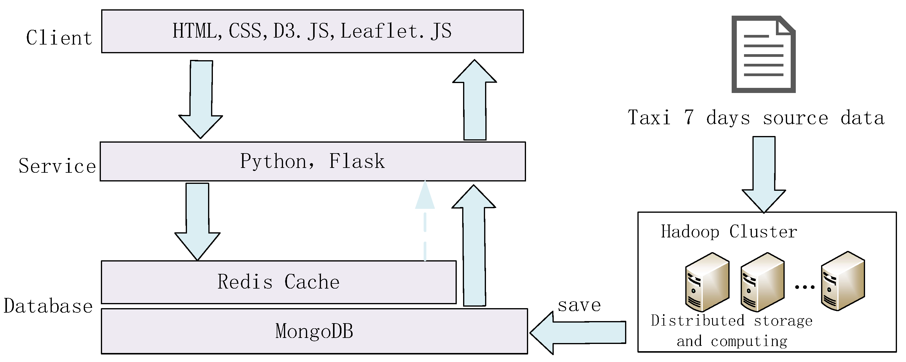
3.2.2. System Architecture
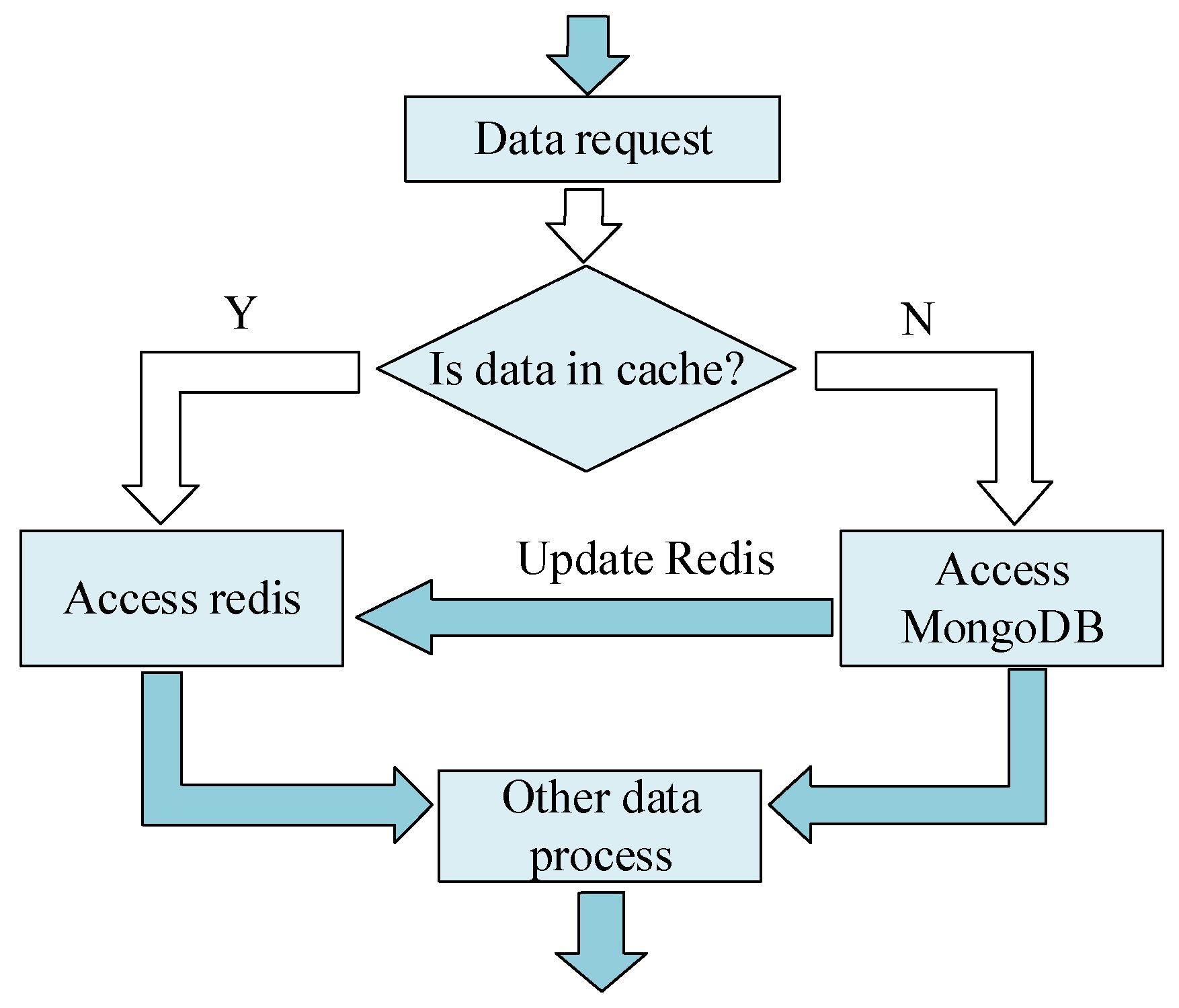
3.2.3. Redis Cache Technology
| ifkey in Redis: |
| value = GET key |
| else: |
| access MongoDB; |
| value = GET key |
| access Redis; |
| SET key value |
| returnvalue; |
4. Visual Interface
4.1. Time Visual Analysis View
4.2. Heatmap and Scatter Plot Linkage View
Linkage Between Heatmap and Scatter Plot View
4.3. OD Travel Visual Analysis View
4.3.1. OD Visual Analysis Process
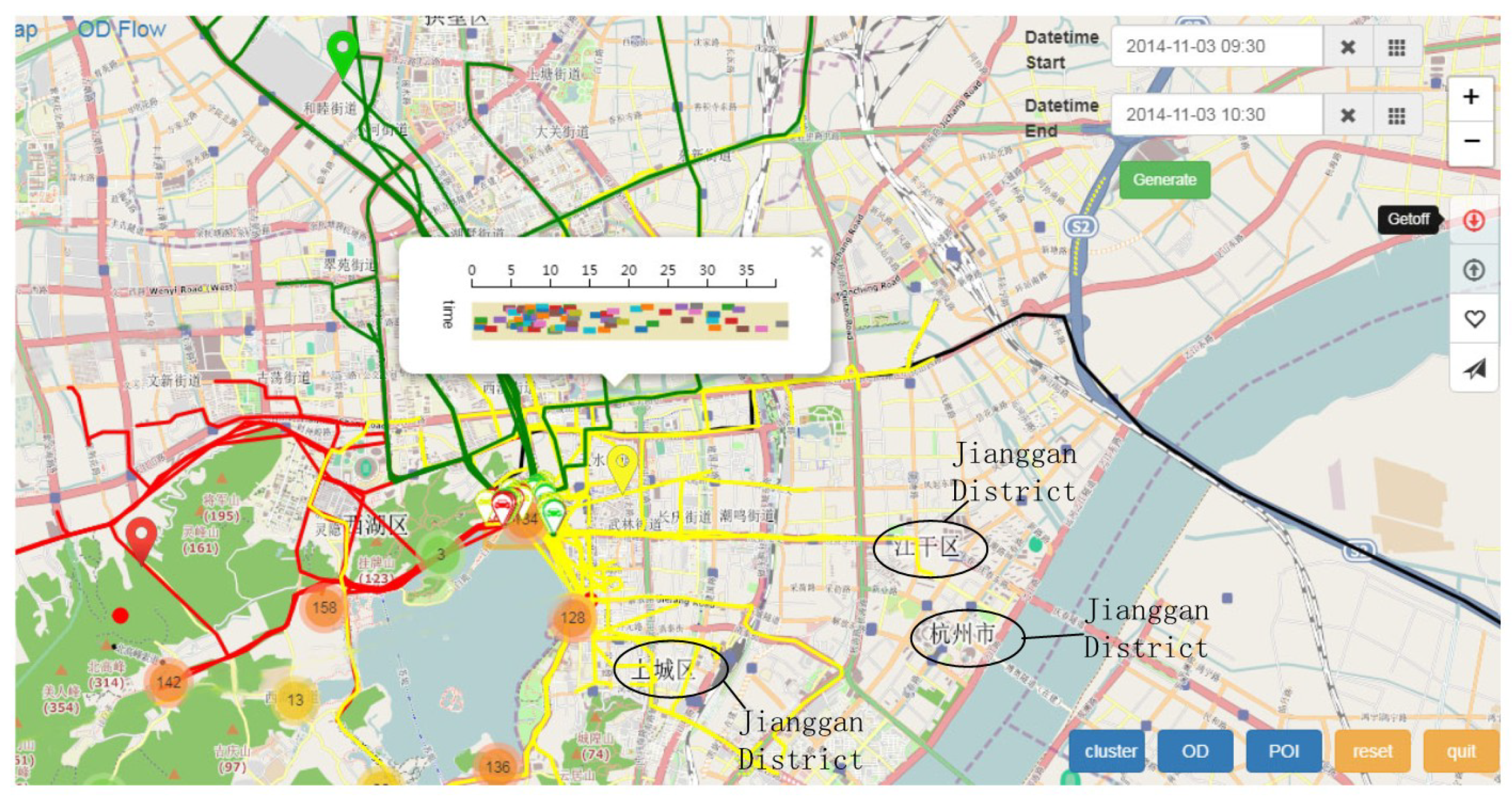
- Step 1
- Select the time period t, and generate the pick-up point or the drop-off point in the target area.
- Step 2
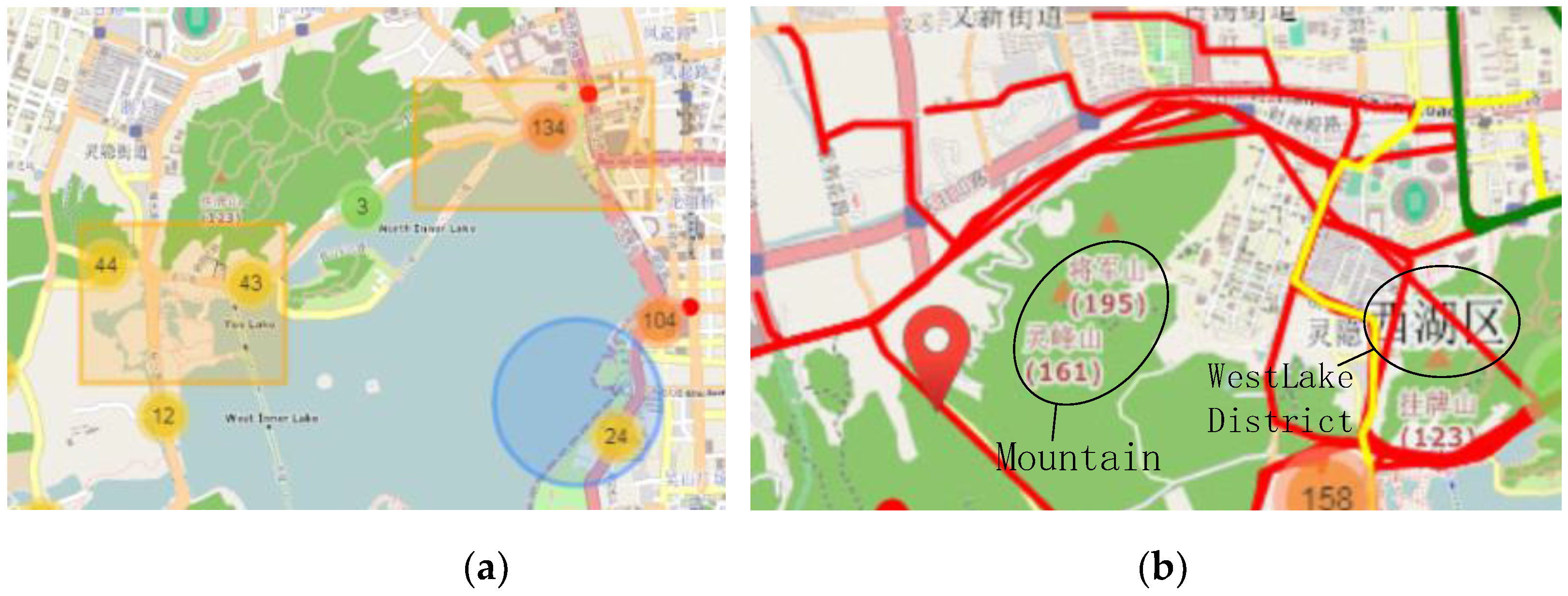
- Click the rectangle button to select or edit the area. Click on the cluster button to cluster the coordinates of origin or destination of the target tourist using the K-Means algorithm. The clustering attribute is the coordinates of the pick-up or the drop-off. The clustering center will be displayed as a bigger marker on the map.
- Step 3
- Click the OD button, and the markers which stand for the tourist will move, leaving a travel trajectory on the map.
- Step 4
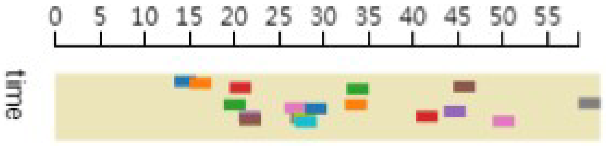
- Clicking the cluster center will make a time bar view pop up.
- Step 5
- Clicking on the POI button will make the system calculate the amounts of POI (school, enterprise, residential, shopping) as a radius of 500 m nearby the cluster center, as well as display the results in the fireworks view.
4.3.2. Visual Selection and OD Trajectory View
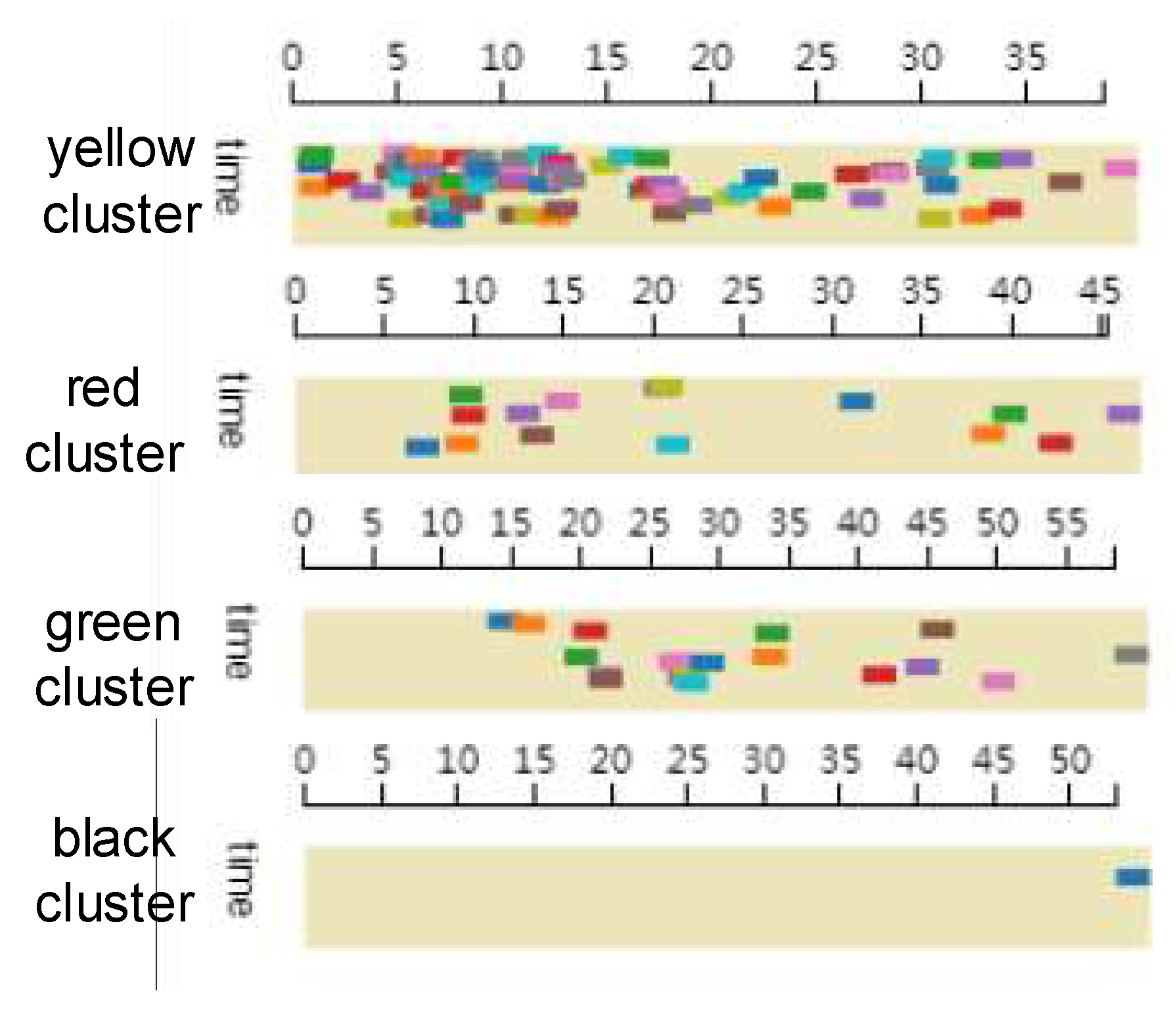
4.3.3. Time Bar View
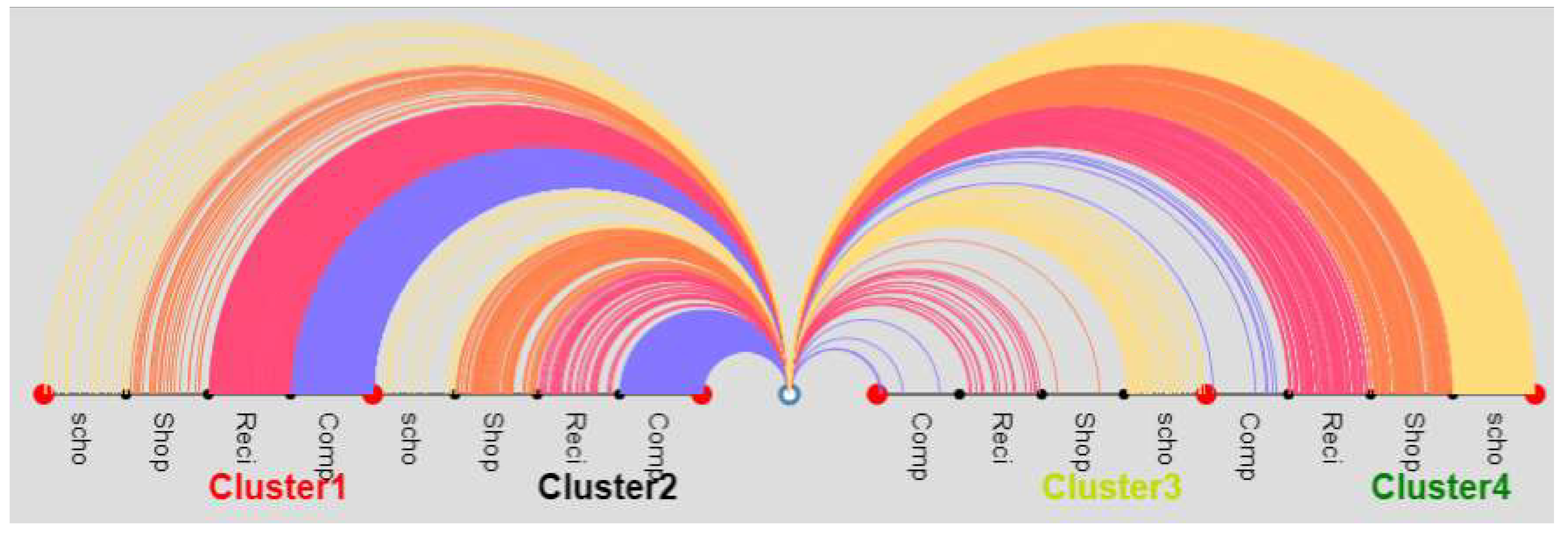
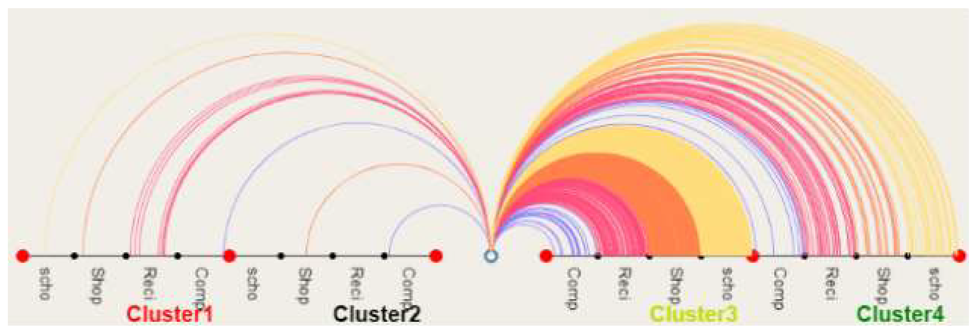
4.3.4. POI Fireworks View
5. Visual Analysis Case
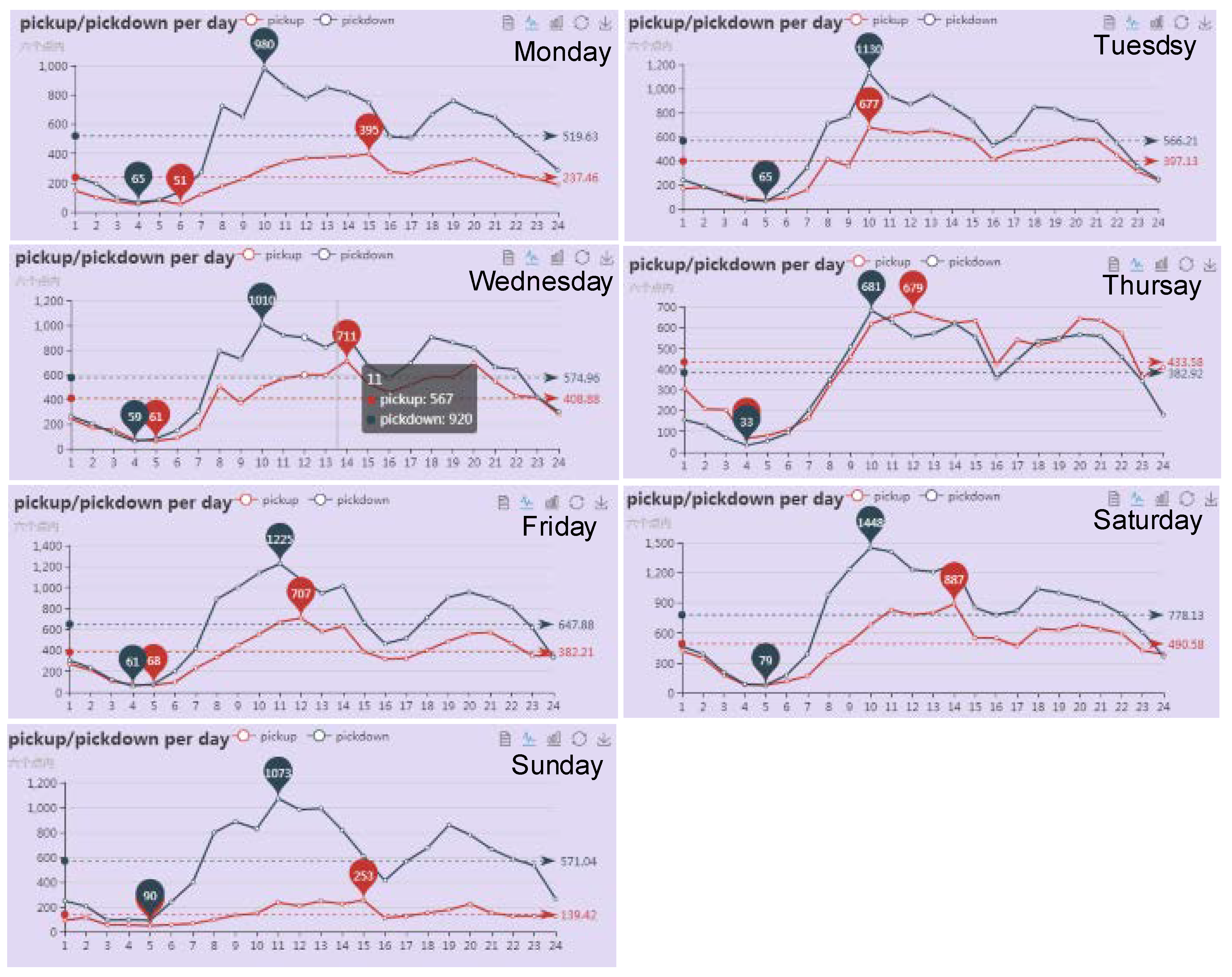
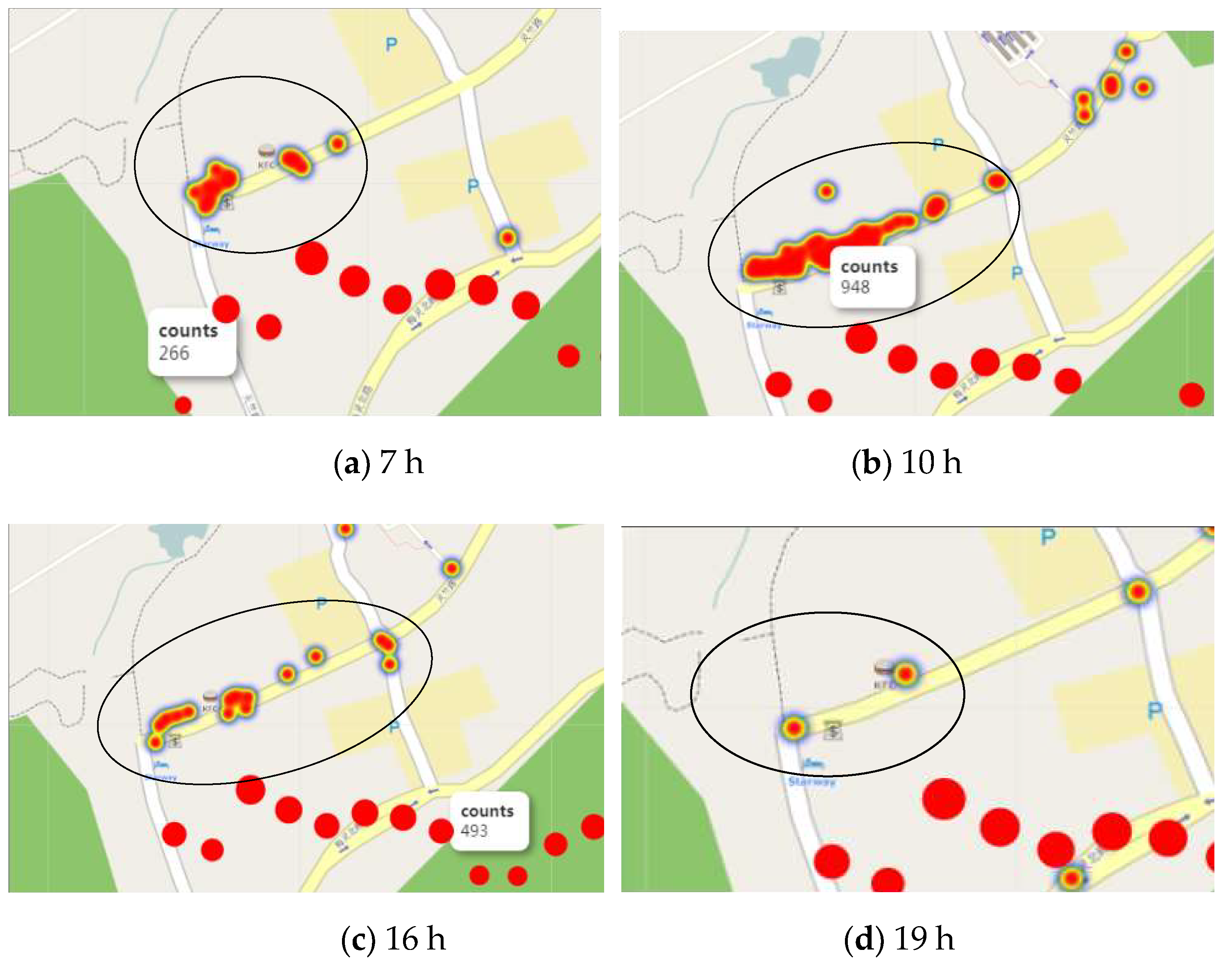
5.1. Travel Time Patterns
- drop-off: (12.86%, 14.01%, 14.23%, 9.48%, 16.03%, 19.26%, 14.13%);
- pick-up: (9.54%, 15.95%, 16.43%, 17.42%, 15.35%, 19.71%, 5.6%).
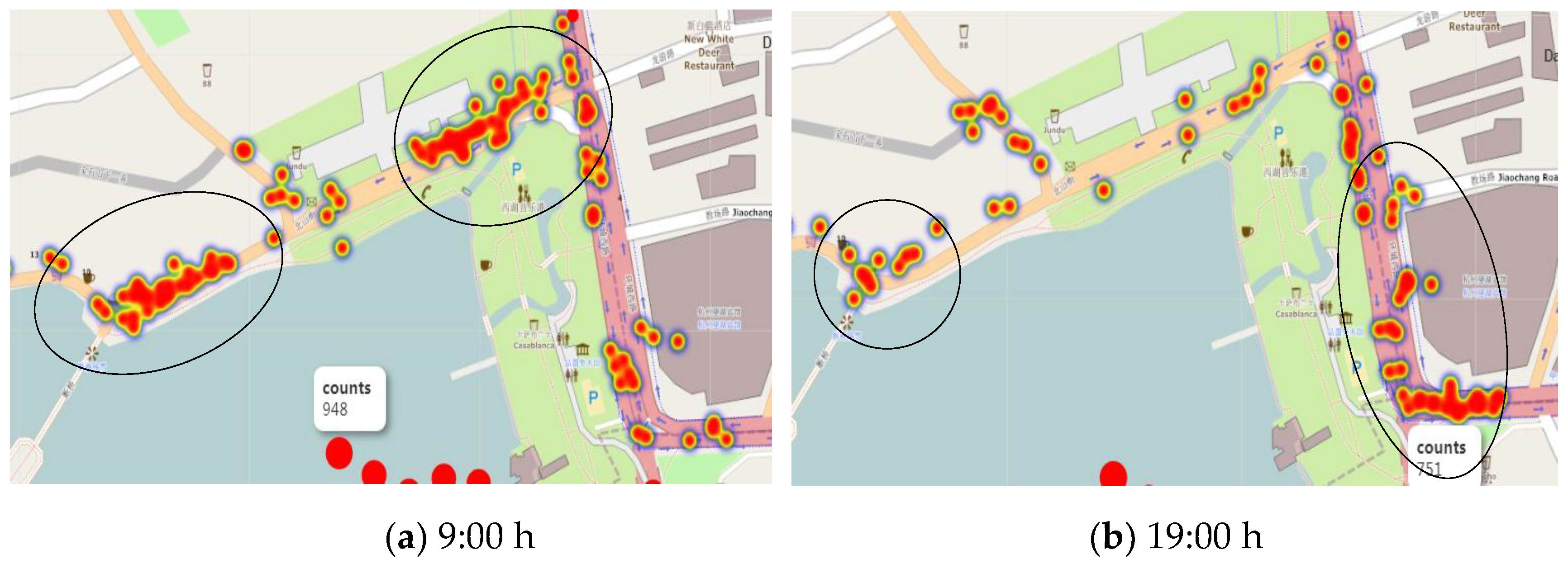
5.2. Travel Regional Patterns
5.3. OD Spatiotemporal Information and POI Social Function Visualization
- Step 1
- Visual selectionSelecting the target tourist whom will be explored with the selector in the tool bar.
- Step 2
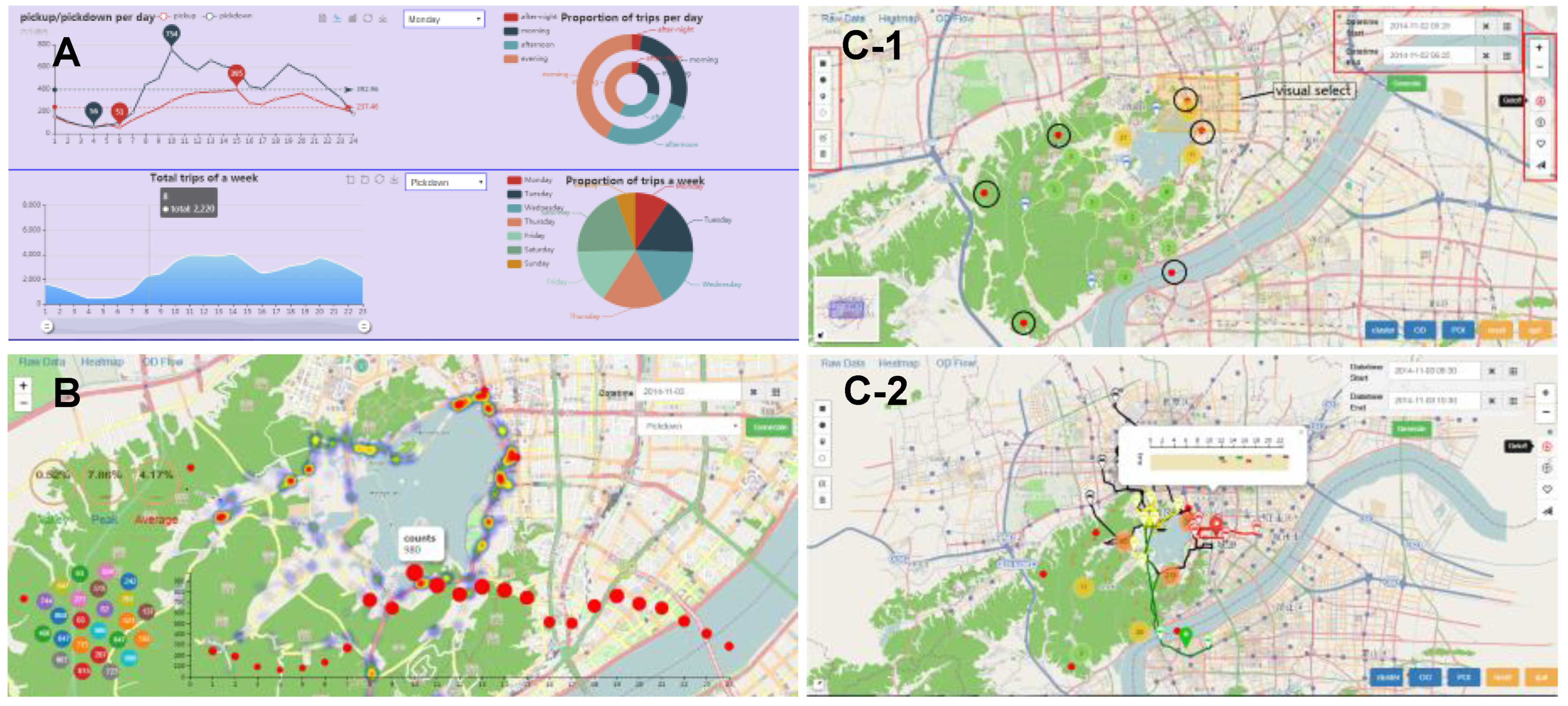
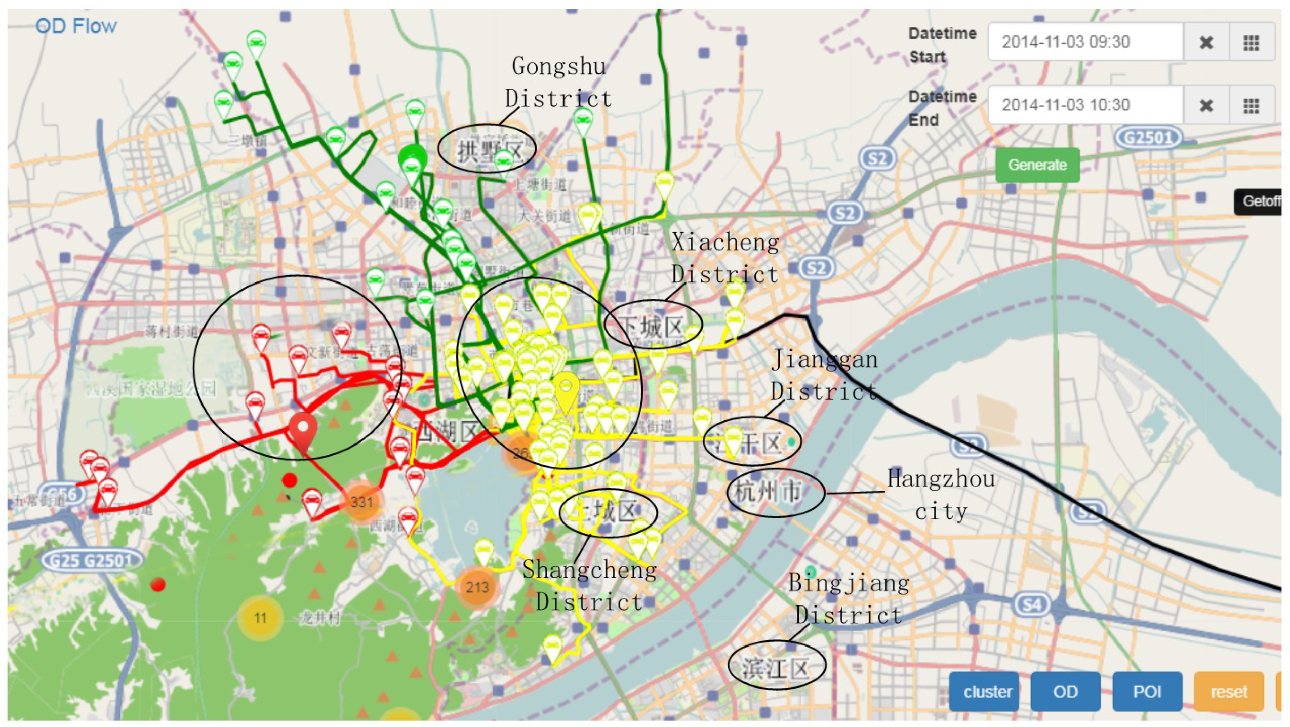
- Tourist clusteringClicking the cluster button will cluster the destination area. As shown in Figure 12, the clustering results show four cluster centers centered on Tianmu Mountain, West Lake Cultural Square, Gongshu District, and Xianghu Lake. In the case of traveling on Monday, we can find that the yellow clusters centered on the West Lake Cultural Square cluster have the biggest number of tourists, indicating the main origin of the exploration area; the red clusters centered on the Tianmu Mountain represent the Xihu District, and the number of tourists in Gongshu District with Moganshan Road is the third.
- Step 3
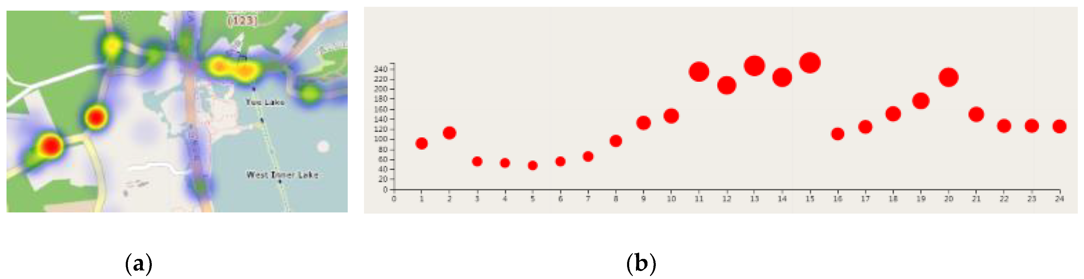
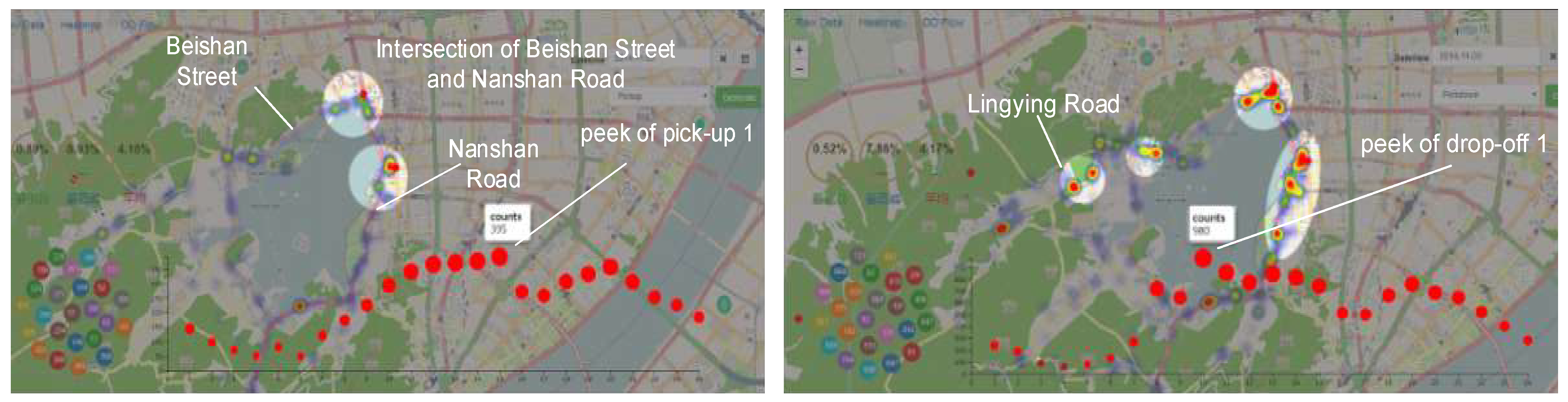
- OD process displays dynamicallyClicking the OD button, markers standing for passengers will dynamically move and leave a trajectory. As shown in Figure 13, we can find the line of Lingyin Road and Beishan Street, represented by the red line, and the line of Nanshan Road, represented by the yellow line, is thicker than other routes, indicating that the travel volume of these road is larger. Upon clicking the cluster center marker of the yellow cluster, the time bar of the cluster will pop up, showing that the yellow cluster travel time period is mostly in 0 to 20 min, and the longest time cost is 40 min. Figure 14 shows the four clusters’ travel time distributions, and it can clearly be seen that the people who are centered on the West Lake Cultural Square spend around 0 to 30 min, and the time cost centered on Tianmu Mountain is both 5 to 20 min and 35 to 45 min. The green cluster time cost of the Gongshu District, which is based on Moganshan Road, is 15 to 50 min, and there is only one route in black cluster. The time cost from Xiaoshan Airport is more than 50 min.
- Step 4
- POI semantic analysisIn the deeper exploration of the spatial semantics of the OD, we combined the urban POI. The generated POI fireworks view is shown in Figure 15. We can see the West Lake Cultural Square represented by the yellow arcs, which is the most densely curved, covers different functions, shopping malls, and schools as the first, and residence and enterprises is second. In the Gongshu District, represented by the green arcs, the POI numbers of residence and the school are more than the shopping malls and enterprises. The West Lake District, represented by the red arcs, are mainly residential areas.
6. Conclusions
Author Contributions
Funding
Acknowledgments
Conflicts of Interest
References
- Ahlberg, C.; Williamson, C.; Shneiderman, B. Dynamic queries for information exploration: An implementation and evaluation. In Proceedings of the SIGCHI Conference on Human Factors in Computing Systems, Monterey, CA, USA, 3–7 May 1992. [Google Scholar]
- Heer, J.; Agrawala, M.; Willett, W. Generalized selection via interactive query relaxation. In Proceedings of the SIGCHI Conference on Human Factors in Computing Systems, Florence, Italy, 5–10 April 2008. [Google Scholar]
- Liu, Z.; Jiang, B.; Heer, J. imMens: Real-time Visual Querying of Big Data. In Computer Graphics Forum; Blackwell Publishing Ltd.: Oxford, UK, 2013. [Google Scholar]
- Peng, Y. A System for Query, Analysis and Visualization of a Multi-Dimensional Relational Database. IEEE Trans. Vis. Comput. Graph. 2002, 8, 52–65. [Google Scholar]
- Modoni, G.E.; Sacco, M.; Terkaj, W. A semantic framework for graph-based enterprise search. Appl. Comput. Sci. 2014, 10, 66–74. [Google Scholar]
- Modoni, G.E.; Sacco, M.; Terkaj, W. A telemetry-driven approach to simulate data-intensive manufacturing processes. Procedia CIRP 2016, 57, 281–285. [Google Scholar] [CrossRef]
- Andrienko, G.; Andrienko, N.; Rinzivillo, S.; Nanni, M.; Pedreschi, D.; Giannotti, F. Interactive visual clustering of large collections of trajectories. In Proceedings of the 2009 IEEE Symposium on Visual Analytics Science and Technology, Atlantic City, NJ, USA, 12–13 October 2009. [Google Scholar]
- Schreck, T.; Bernard, J.; Von Landesberger, T.; Kohlhammer, J. Visual Cluster Analysis of Trajectory Data with Interactive Kohonen Maps. Inf. Vis. 2009, 8, 14–29. [Google Scholar] [CrossRef] [Green Version]
- Rinzivillo, S.; Pedreschi, D.; Nanni, M.; Giannotti, F.; Andrienko, N.; Andrienko, G. Visually driven analysis of movement data by progressive clustering. Inf. Vis. 2008, 7, 225–239. [Google Scholar] [CrossRef] [Green Version]
- Zeng, W.; Fu, C.W.; Arisona, S.M.; Qu, H. Visualizing interchange patterns in massive movement data. In Computer Graphics Forum; Blackwell Publishing Ltd.: Oxford, UK, 2013. [Google Scholar]
- Guo, H.; Wang, Z.; Yu, B.; Zhao, H.; Yuan, X. Tripvista: Triple perspective visual trajectory analytics and its application on microscopic traffic data at a road intersection. In Proceedings of the 2011 IEEE Pacific Visualization Symposium, Hong Kong, China, 1–4 March 2011. [Google Scholar]
- Chu, D.; Sheets, D.A.; Zhao, Y.; Wu, Y.; Yang, J.; Zheng, M.; Chen, G. Visualizing hidden themes of taxi movement with semantic transformation. In Proceedings of the 2014 IEEE Pacific Visualization Symposium, Yokohama, Japan, 4–7 March 2014. [Google Scholar]
- Blei, D.M.; Ng, A.; Jordan, M. Latent dirichlet allocation. Journal of machine Learning research (3). J. Mach. Learn. Res. 2003, 3, 993–1022. [Google Scholar]
- Tominski, C.; Schumann, H.; Andrienko, G.; Andrienko, N. Stacking-Based Visualization of Trajectory Attribute Data. IEEE Trans. Vis. Comput. Graph. 2012, 18, 2565–2574. [Google Scholar] [CrossRef] [PubMed] [Green Version]
- Jiang, X.; Zheng, C.; Tian, Y.; Liang, R. Large-scale taxi O/D visual analytics for understanding metropolitan human movement patterns. J. Vis. 2015, 18, 185–200. [Google Scholar] [CrossRef]
- Huang, G. Research and Implementation of Weibo Public Opinion Visualization System. Ph.D. Thesis, Jiangsu University, Zhenjiang, China, 2016. [Google Scholar]
- Liu Band Zhang, L. “Development in the water”-the city’s waterfront era is coming. In Proceedings of the 2017 China Urban Planning Annual Meeting, Dongguan, China, 18–20 November 2017. [Google Scholar]
- Tomita, Y.; Kitsuregawa, M.; Itoh, M.; Yokoyama, D.; Toyoda, M.; Kawamura, S. Visual Exploration of Changes in Passenger Flows and Tweets on Mega-City Metro Network. IEEE Trans. Big Data 2016, 2, 1. [Google Scholar]


© 2019 by the authors. Licensee MDPI, Basel, Switzerland. This article is an open access article distributed under the terms and conditions of the Creative Commons Attribution (CC BY) license (http://creativecommons.org/licenses/by/4.0/).
Share and Cite
Jiang, Y.; Cao, J.; Liu, Y.; Fan, J. West Lake Tourist: A Visual Analysis System Based on Taxi Data. Smart Cities 2019, 2, 345-358. https://doi.org/10.3390/smartcities2030021
Jiang Y, Cao J, Liu Y, Fan J. West Lake Tourist: A Visual Analysis System Based on Taxi Data. Smart Cities. 2019; 2(3):345-358. https://doi.org/10.3390/smartcities2030021
Chicago/Turabian StyleJiang, Yunliang, Junjie Cao, Yong Liu, and Jing Fan. 2019. "West Lake Tourist: A Visual Analysis System Based on Taxi Data" Smart Cities 2, no. 3: 345-358. https://doi.org/10.3390/smartcities2030021