Article

A Visual Data Storytelling Framework

1
Department of Computer Science and Software Engineering, The University of Western Australia, Perth, WA 6009, Australia
2
Department of Computer Science, Umea University, 90187 Umea, Sweden
3
School of Social Sciences, The University of Western Australia, Perth, WA 6009, Australia
*
Author to whom correspondence should be addressed.
Informatics 2022, 9(4), 73; https://doi.org/10.3390/informatics9040073
Submission received: 19 August 2022 / Revised: 18 September 2022 / Accepted: 19 September 2022 / Published: 23 September 2022
(This article belongs to the Section Social Informatics and Digital Humanities)

Abstract

:
While the consumption of visual information becomes a daily commodity integrated into our lives, data visualisation is dominated by dashboards and charts. The main contribution of this article is an advanced way to visualise data as a data story. We converged paradigms from digital storytelling, serious games, and data visualisation to turn data into useful insights. The creation, management, and analysis of data have been increasingly given more attention in industry and professional practices. However, the potential of packaging data and analytic results into easily digestible and visually explorable content intended for non-professional audiences has not yet been investigated to its full extent. We contributed towards overcoming the gap between data analytics and data presentation. By integrating a story-like environment and entertainment into data visualisation, we explore the possibilities of efficiently communicating data and insights to general audiences in a casual context. We present this modular approach to customising messages for visual data storytelling from an information and communication perspective, including a test prototype developed to illustrate our data storytelling framework.

1. Introduction

Among many ways of utilising visual information, image/video sharing services and data visualisation are two of the most well-known applications. The former is usually associated with various forms of entertainment and the latter with a need for clarity of data presentation to enable their efficient use and applications. Images are arguably the dominant way of communicating information in contemporary culture. We now create more and more visual content for entertainment purposes, and in the meanwhile, we also use data visualisation as a tool for supporting productivity and decision making in industries and businesses. Both of these visual-based approaches revolve around the processes of communicating and making sense of information, yet they are perceived as existing in separate spheres of activity and influence. However, if their respective strengths are synthesised, then they can considerably enhance strategies for data visualisation and communication.
Data are a bountiful source of information. Data contain a wealth of embedded knowledge and insight within their simplified, ‘raw’ form. However, in most cases, to transform data into a human-understandable form requires an analytics process, simplification, and the selection of appropriate visualisation methods. Raw data are normally difficult to grasp by a lay audience, but the eye-catching images, graphics, gifs, and videos that proliferate across the circuits of everyday life and popular culture are easy to understand but sometimes not very meaningful, as they are often created for the purpose of sheer aesthetic stimulus or entertainment. From this point of view, it seems viable to bring entertainment and data visualisation together in order to package ‘serious’ data into entertaining content for general audiences. This would potentially expand the practical field of data visualisation and make it more appealing to the public.
As stated in Kosara and Mackinlay’s works, the next step in visualisation [1] is to move from exploration and data analysis to presentation [1]. The use of visualisation as a tool for data exploration and analysis has been well explored and described in [2,3]. Thus, within the scope of this study, we put our focus on the presentation of data. More specifically, the aim was to explore how to improve the communication of information and insights discovered during the data analysis process. We specially emphasized the communication of insights to general-non-professional audiences. In this study, we did not intend to investigate the data analysis process. Instead, we emphasized the creation of visual content based on information gained from data analysis. In other words, we focused on how to better present findings from data analysis to general audiences through a visual-story format.
Based and extended on previous work in narrative visualisation [4] and casual visualisation [5], this study presents a framework for creating visual data storytelling applications in an interactive digital platform for general audiences. We proposed a visual data storytelling coding strategy based on information unit structuring, associated computational technologies, methods emerging from serious games, and entertainment computing and studied cognitive factors to pursue better memorability and desirability. With the aim of creating story-like data content, we proposed a design for a new interdisciplinary framework toward composing data with story elements and translating informational units into a visual environment. In this article, we explore more engaging ways to share data with the general public. We aimed to visualise data in an entertaining and insightful interactive visual form as a viable option for the creation of data stories. The basic idea of our approach is illustrated in Figure 1.
To explore the new potential of visual data storytelling from conceptual and technical aspects, two pilot studies were conducted [6,7]. On top of those pilot studies, the next phase of the experiments is outlined in this article and aimed to put forward a modular framework. The framework was based on the communication of information to support visual data storytelling content development and enabling a customised unconventional data representation. This paper’s research questions are summarised as follows:
  • RQ1—What is the appropriate coding strategy to compose data into an entertaining story composition which maintains the communication quality of key information in an environment with increased complexity and redundancy?
  • RQ2—How to apply data storytelling with technologies emerging from digital media to develop novel visual data storytelling content beyond conventional textual and chart-based styles?

2. Related Works

Data visualisation is one of the core concepts for this research. Some of the previous research into data visualisation has focused on the design aspects [8] of visualisation, and some of them gave more attention to the cognition process [9]. There are also works that focused on the technical aspects of the use of visualisation in data analysis [10].
Within the domain of “data storytelling”, researchers are exploring data storytelling for various purposes, e.g., business [11] and education [12]. As many works have noted, data storytelling is commonly used for professional purposes; consequently, its visual efficiency is always one of the top priorities [13]. Thus, the visualisations and the visual styles of data storytelling in such areas are often designed in a simplistic fashion [14]. As noted, most data storytelling studies are focused on its application in a professional context. While data visualisation researchers have started to pay attention to broader audiences [15], it becomes increasingly important to consider the frameworks and techniques that allow data storytelling in a casual context and to create entertaining content out of complex data sets. The potential of visual data storytelling has not been fully explored yet. As a first step, our main objective was to provide a framework for enhanced data storytelling.
As more and more data are collected and processed on a daily basis, the ways of sharing and communicating information grounded in data become increasingly significant. The exploration of modern ways of expression provides new modalities to give data meaning. For instance, there is the concept of serious storytelling [16]—“storytelling outside the entertainment context”—and cognitive big data as a new paradigm for defining data-driven visualisations [17].

2.1. Casual Visualisation and Narrative Visualisation

Research on casual visualisation [5,18] has discussed systems that are designed not for work tasks but for more casual purposes. Pousman et al. identified four major differences between traditional information visualisation systems and casual information visualisation: user population, usage pattern, data type, and insight [5]. They addressed that one of the challenges for casual information visualisation is how to design the system while trading “utilitarian” goals for a wider set of “useful” goals [5]. Thus, with our research, we sought to provide a modular and customisable framework to support the visual data storytelling content development and to help users to communicate the information contained in serious data to general non-professional viewers.
In Trajkova et al.’s research about the casual data visualisation of COVID-19 on Twitter, they identified that the top three challenges for interpreting data visualisations are mistrust, proportional reasoning, and temporal reasoning [18]. Reflecting on the challenges, our framework especially emphasised the message planning phase of data storytelling. It provides an approach that users can more consciously plan their message for the viewers.
We noted that there are models that are developed for narrative visualisation. In Satyanarayan and Heer’s research, they summarised a model for narrative visualisation that covers scenes, parameters, annotations, and triggers [19]. Through interviews, they identified that exploration, drafting, and production are the three major phases of the design process [19].
In other research on data videos by Amini et al., they proposed a similar process that includes reading and interpreting data, selecting data, crafting the narrative structure, and integrating strategies to engage viewers [20]. Hullman and Diakopoulos’s research proposed four editorial layers for narrative visualisation: data, visual representation, textual annotations, and interactivity [21]. These models provide valuable insight regarding how to structure a narrative visualisation system.
However, most of the current narrative visualisation models [4,19,20,21,22] are based on the observation and examination of existing narrative visualisation samples. As the well-known quote of Oren Harari stated, “the electric light did not come from the continuous improvement of the candle” [23]. On one hand, it is important to make improvements based on existing practice or specimens; on the other hand, it is also very important to look at the essential need and purpose from a basic perspective and explore alternative approaches. Thus, instead of being based on the observation and examination of existing narrative visualisation samples, we sought to develop a framework based on basic communication principles that are more flexible and that support the exploration of unconventional data storytelling styles. In this research, we integrated the items from other narrative visualisation models and designed a framework based on basic communication principles that contain three design phases: message planning, information composing, and visual element mapping. We introduced methods supporting the customisation of a variety of types of visual elements to carry various information.
A story is a way to present data and is also a way to package information in an easy-to-understand format [1]. Kosara and Mackinlay suggested that moving from exploration to analysis to presentation is a natural progression [1]. Thus, in the context of data visualisation and data storytelling, we sought to identify the differences between the analysis-oriented process and the narrative-oriented process. In the research of Amini et al., they suggested that a story has four stages: establisher, initial, peak, and release [20]. In the research of Figueiras, the author introduced strategies of narrative visualisation that add short stories with text annotations and add time references to bring in the sense of story flow [22]. In Segel and Heer’s research, they summarised seven genres of narrative visualisation based on an analysis of online journalism [4]. The above research provides great strategies and methods to introduce story into visualisation. However, their methods are mostly focused on pairing narrative text with data visualisation graphics and suggested a standard beginning-middle-ending story structure. We note that there are other types of narrative styles such as stream of consciousness [24], which do not follow normal temporal structure and causality. There are also some stories, such as the famous six words story—“For sale: baby shoes, never worn” [25]—that do not include standard story components such as character and context. Thus, while designing this visual data storytelling framework, we identified different categories of visual channels that carry information and used a modular structure to support data story customisation.
It is important to understand the wider context of our research work. Concepts such as emerging media design that contributes to human experience and knowledge processing (e.g., aesthetics, emotional binding, reflection, and wisdom) [26] as well as those from media study research affect how humans process insights. An example from media studies is the famous quote “the medium is the message” [27], which describes the effect of how humans perceive media content. In the context of data storytelling, Hullman and Diakopoulos stated that the design techniques in narrative visualisation can significantly affect the viewer’s interpretation [21]. Thus, it would be beneficial to plan the message first and then choose the design techniques accordingly. With our framework, we introduced such an approach to plan the information at a basic level and design the visual representation.

2.2. Our Extension of Existing Research Works

Within this section we briefly summarise how we extended existing research works in data visualisation, narrative visualisation, and data storytelling through our newly developed framework. The major contributions are presented in Table 1.

3. Design of the Visual Data Storytelling Framework

Within the scope of this study, we present a framework that covers our approach of visual data storytelling from three major perspectives: concept, component, and procedure. From the perspective of concept, we introduced the basis of our approach and defined the general intention and strategies of data storytelling. From the perspective of component, we outlined the extended design space for visual data storytelling and the key elements of its information structure. From the perspective of procedure, we explained the process of visual data storytelling content creation and the information to visual transformation. Figure 2 shows the key items of the visual data storytelling framework.
In the following sections, we explain and demonstrate these items in detail. The narrative visualisation progress is explained in Section 3.2. The cognitive and communication theories are explained in Section 3.2 and Section 3.3. The visual channels are explained in Section 3.3.2 and demonstrated in Section 4. The information units are explained in Section 3.3.3 and demonstrated in Section 4. The story environment is explained in Section 3.3.2 and demonstrated in Section 4. The data to story transformation is explained in Section 3.3.3 and demonstrated in Section 4.
The basic structure of our framework is grounded on cognitive and communication theories [9,28]. We integrated the three-phase design process (exploration, drafting, and production) as identified by Satyanarayan and Heer [19] and the four-phase storyboard process (reading and interpreting data, selecting data, crafting the narrative structure, and integrating strategies to engage viewers) as identified by Amini et al. [20]. To perform this, we introduced three phases of information processing supporting visual data storytelling into our narrative visualisation process: structuring, composing, and translating. Based on Satyanarayan and Heer’s narrative visualisation model (scenes, parameters, annotations, triggers) [19] and Hullman and Diakopoulos’s narrative visualisation editorial layers (data, visual representation, textual annotations, and interactivity) [21], we identified an extended range of visual channels to address these components within a four-part story structure (character, background, event, and effect).

3.1. Definition of Components of the Framework

This section provides a brief explanation and description of the key concepts and terms that are relevant for this research.
Visual Data Storytelling: In the scope of this research, we refer to visual data storytelling as a practice that communicates information within a dataset to its audience via visual media. It composes all information units in a story-like format and delivers them to general or casual audiences.
Information Unit: An information unit encapsulates a piece of key information that needs to be delivered to the audience. Information units also can be an atomic representation of data and story. They are the most basic building blocks of a visual data storytelling composition. There are three subtypes of information units: data message, story component, and expression attachment. They are distinct because of the different types of information that they carry and the different purposes that they serve:
Data Message—A data message is an information unit that carries a simple and basic message from the dataset (e.g., what are the major energy-consuming industries in a nationwide energy consumption dataset). The focus and aspects that intend to be presented to the audience as part of a dataset are selected by determining what the Data Messages are.
Story Component—A story component is an information unit that carries a single piece of information that will constitute a component of the story (e.g., who the major character is in the story, what activity occurred in the story). The most basic elements of a story are character, setting, action, and effect. The characters and settings define the story world. The actions and effects build up the events in the story. Thus, story components are the information that identifies and describes each basic functional part of a story. The major function of story components is to build up a story structure that other information units can attach to.
Expression Attachment—An expression attachment is an information unit that carries a piece of information that relates to the expression and presentation under narrative considerations (e.g., ‘tone’ when referring to a specific part of the story). It provides a subjective spin to other information units when attached to those. Expression attachment also can act as a lead for attention if used properly.
Story Environment: A story environment is a visual environment or space that represents a story. It is a combination of several specific visual elements. A proper story environment provides a sense of a story that describes information through entities and events. A story environment acts as a placeholder for the entity(es) (one of the two major parts of a story) and event(s) (the other one of the two major parts of a story). Characters and backgrounds are considered as entities; actions and effects are considered as events.
Visual Element: A visual element is an individual visual object. It is a visual representation of an entity or an event. Visual elements are the building blocks of a story environment. Within each visual element, there are several visual channels that are available for carrying information units.
Visual Channels: Visual channels are the channels within a visual element that the information units can be encoded into. They are the very simple visual attributes, symbols, or subitems that are present in a visual element.

3.2. Introducing Visual Data Storytelling as a Process

Within the scope of this section, we explore some basic motivational factors underlining the importance of visual data storytelling. We first discuss how cognition and memory would affect communication quality in a communication system when the end-receiver is a human instead of a machine. Secondly, we analyse the differences between visual data storytelling and regular data visualisation, then compare the workflow of narrative-oriented process and analysis-oriented process.

3.2.1. Cognitive and Communication Aspects

Consider communication in a telecommunication context where the receiver and destination are machines. The noise and interference that need to be addressed involve the transmission process and transmission medium [28]. This means the interference mostly occurs on the transmission side. However, when the receiver and destination are human in a visual media communication context, the interferences involve the cognition and interpretation process. This is on the receiver and destination side. Thus, a receiver-focused corresponding coding strategy must be applied to ensure the accuracy of information transference.
For data visualisation in a professional context, maximising the data-ink ratio [11,13] has been found as an efficient way to ensure the accuracy of information transference. In other words, it is a coding strategy that simplifies the message and removes unnecessary uncertainty to reduce interference that occurs in the interpretation process.
However, consider visual data storytelling in a more casual context, where the audience is the general public instead of professional practitioners. The data visualisation is expected to perform as consumable content or artwork rather than support productivity. The straightforward removal of unnecessary uncertainty to reduce the interference strategy will no longer be viable and concerns the aesthetic response process. In Iser’s theory [29], a work of art is not a creation of the author or the audience; rather, it is a composition of both. The author leaves the structure and clues. Then, the audience interprets the artwork with their subjective experience [29]. Therefore, the freedom of interpretation is a necessary and desirable uncertainty. Without the desirable uncertainty, the visual content cannot engage and inspire the aesthetic response. Additionally, it will appear plain and unengaging as consumable content. Thus, a new corresponding coding strategy is required to reflect the desirable uncertainty that occurs in the casual context of visual data storytelling.
Consider the human brain as a receiver. How does its decoding process work? How do we optimise its coding strategy? In the domain of mnemonic and memory study, elaborative encoding is considered an efficient strategy to enhance memory [30]. For example, the specific elaborative encoding method of loci [30] involves creating an imaginary environment based on a familiar location. Then, one visualises the information that must be memorised into that imaginary environment as an object or character. When the information must be recalled, one can simply visit the mental environment and find the imaginary object. By encoding the information into the spatial environment, the memory is reinforced by spatial relationships.
According to the Schema Theory [31], a schema is an adaptive network structure of a person’s existing knowledge. It is considered a mechanism that guides the cognitive process and influences memory formation and recall. Schema’s characteristics are similar to a story structure (e.g., the interconnectivity of events and objects, the chronological ordering structure) [31]. Schema-based memory study also shows that the quality of the story memory increases with the strengthening of the interconnectivity between events [32].

3.2.2. Comparing Visual Data Storytelling and Regular Data Visualisation

Visual data storytelling is the process that packages data into a graphic form. It shares the same procedure of data-to-visual translation and is similar to any other visualisation process. However, due to its specific methods and aims, it forms a distinct approach. Unlike traditional visualisation, which is fundamentally an analysis-oriented process [2,3], visual data storytelling relies on a narrative-oriented process. The major differences between the two processes are shown in Figure 3.
The two processes share similar features, but their approaches in specific phases are different. The differences between the analysis-oriented process and the narrative-oriented process are shown in Table 2. In the following subsection, we compare the two processes through an example. The example is based on the data that were used for our prototype.

3.2.3. Analysis-Oriented Process

The data used for our first prototype were retrieved from Australia Energy Report 2018 (https://www.energy.gov.au/publications/australian-energy-update-2018, accessed on 22 September 2022). Two variables, which present Western Australia Energy Consumption by Industries in the year 2016–2017, were chosen. The first variable was a categorical variable (the name of the industries (e.g., agriculture, mining, manufacturing)), whereas the second variable is a numerical variable (the consumption numbers measured in petajoules (e.g., 22.8, 299.8, 232.8.)).
In an analysis-oriented process for regular data visualisation, the first thing is to ask a question: what is the fact that needs to be found out from the data? From this question, the author then determines the variables that are related and chooses the appropriate visualisation plot (e.g., bar chart, scatter plot, hexbin plot, etc.) to support this finding.
In the case of the example data, assume we want to acquire an overview of the industrial energy consumption of Western Australia in the year 2016–2017. Based on this intention, the related variables are the names of the industries and the consumption numbers. After the two target variables are identified, a visualisation graphic is applied to these two variables. A bar chart is chosen as the visualisation graphic because of its suitability for showcasing the distribution and the overall comparison in terms of numerical variables. The consumption numbers are allocated to bars and the name of industries are allocated to labels. By conducting this, we provide a good overview of the energy consumption fact. The bar chart is shown in Figure 4a.

3.2.4. Narrative-Oriented Process

In a narrative-oriented process for visual data storytelling, the first question is: what message from the data is needed to be communicated to the audience? At this point, the author should already have a good understanding of the data. From this question, the author then determines the key information that needs to be delivered and composes them together into a story environment.
In the case of the example data, first, three pieces of information from the data are determined as the message that needs to be told to the audience: (1) names of the industries, (2) values of consumption numbers, and (3) differences in the values of numbers. These three pieces of information are the basic information units that need to be communicated. Then, the three data-related information units (data messages) are composed with other story-related information units (story components and expression attachments) into a story environment. At this stage, the information units are encoded into the characters, stage props, and their movements. This process was designed to present data in a more entertaining and memorable way. Finally, the story environment is presented to the audience as a game-like digital installation. The screenshot of the prototype is shown in Figure 4b.

3.2.5. Data Processing Procedures from Analysis to Storytelling

Data in their raw state are not an easy format for humans to understand. Through data analysis, insights of the underlying patterns and characters are extracted from raw data. The information at this stage is valuable for professional practice such as building prediction models and supporting decision-making, but it is still not in a very friendly format for general non-professional audiences. Thus, this information needs to be further processed to become more appealing and understandable for casual audiences.
The story is a way to present data and is also a way to package information in an easy-to-understand format [1]. When moving from the data analysis stage to the data presentation stage, storytelling is a method that can further process the information extracted from the data into a friendly format for non-professional audiences.
We defined a three-part structure for composing information extracted from data into a story format: data message, story component, and expression attachment. In order to better communicate data to non-professional audiences, data need to be processed from their original state, through data analysis and attaching storytelling elements to finally be transformed into a casual audience-friendly format. In the following sections, the procedure of composing data messages into story composition will be explained and demonstrated through the development of a visual data storytelling prototype.

3.3. Our Visual Data Storytelling Framework

3.3.1. Communication Quality

In a communication system, a coding strategy is applied to secure the accuracy of information transference, which may suffer distortion from noise and interference. A simple and straightforward code is most efficient for environments where uncertainty is minimally caused by noise and interference. Meanwhile, a more sophisticated coding strategy is required in a more complex environment where uncertainty is unavoidable.
When conducting visual data storytelling via visual media in a casual context, the desirable uncertainty is a necessary part of the aesthetic experience. A coding strategy similar to the error correction code is a good option to prevent information corruption caused by misunderstanding or misinterpretation. There are two requirements for the coding strategy. First, it must carry the core message with several channels to prevent message loss due to misunderstanding or misinterpretation. Second, it must have a self-explanation and self-maintenance structure to prevent message corruption due to misinterpretation; this retains the validity of the structure’s message. Thus, applying a story structure as a coding strategy for visual data storytelling is a viable and suitable option.
Maguire et al.’s [33] study showed that people who used the spatial learning strategy show better memory quality than the control group, who were allocated no memory strategy. The functional MRI (fMRI) results also showed that the experimental participants’ brain regions were more active in areas that respond to spatial memory during the experimental task than the control group [33]. According to Upala et al. [34], the context environment (where the to-be-present concepts are located) greatly influences the comprehensibility and memorability of those concepts. Generally, counterintuitive concepts in intuitive-supportive contexts have a better memory recall rate [34,35]. Thorndyke and Yekovich’s research on schema and story memory [32] suggests that stories with stronger and clearer interconnectivity between events tend to be more memorable [32].
Considering the above information, our basic communication enhancement strategy comprises the following principles:
  • The information is encoded into a spatial story environment.
  • The story environment includes the four basic story components: character, background, action, and effect.
  • The story environment design aims to make interconnections between the story components/visual elements.
  • The design of the visual elements that represent key information units is creative or unordinary. The design of the other context elements is familiar and logical.

3.3.2. Visual Channels within a Story Environment

When shifting the application context from professional presentation to entertaining storytelling, the communication context also shifts from a lecture-like environment to a story-like environment. This is similar to the differences between watching a lecture recording versus a feature movie. People have different expectations and concerns in different contexts. Consequently, the information structure and hierarchy also vary in different contexts. In a lecture environment, information is structured based on the topic and knowledge key points. In a story environment, information is composed around the characters and their actions. Borner’s visualisation framework [8] provided a detailed framework of graphic variables and symbols for visualisation in data analyses. Based on previous visualisation studies [8,11,13], we designed a new framework to reflect the changes from a static lecture environment to a dynamic story environment. Derived from Chatman’s story structure (action, happening, character, and setting) [36], we first introduced two major aspects of a story environment: entity and event. Then, these two aspects were further broken down into four elements: character, background, action, and effect. Based on Satyanarayan and Heer’s narrative visualisation model (scenes, parameters, annotations, triggers) [19] and Hullman and Diakopoulos’s narrative visualisation editorial layers (data, visual representation, textual annotations, and interactivity) [21], we identified an extended range of visual channels. These channels (as shown in Figure 5) cover the essential components and editorial spaces of narrative visualisation content. By allocating planned information units into selected visual channels, the user not only can customise their visual data storytelling content, but they also may create unique combinations that are beyond the conventional narrative visualisation model. Figure 5 shows the basic encoding channels within a story environment.
Generally, many data visualisation approaches lean toward a simplistic approach [8,11], minimising the number of visual elements and simplifying the visual dimensions to achieve better visual efficiency or information density. However, adding extra visual elements is not as impractical as it seems. Bateman et al. focused on visual embellishment for data visualisation [37] and showed that interpretation accuracy is the same in simplistic visualisations and in embellished visualisations. This also relates to characters or story elements that might be utilised as part of the process. Long-term memory (2~3 weeks) of embellished visualisations is even better than simplistic visualisations [37]. We argue that communication quality, a well-designed storytelling visualisation, packed with entertaining features can be as efficient as simplistic visualisation designs.

3.3.3. Composition of Information Units into a Story

Stories have always been an efficient way to communicate information and share knowledge throughout human history. Storytelling can be considered a process of constructing information to achieve better communication quality. Thus, our visual data storytelling framework breaks down the dataset into several information units. Following this, they are constructed into a story composition, along with other non-data information units. Finally, the organised structure is visualised into a visual space and delivered to audiences through visual media. The basic structure of our visual data storytelling is shown in Figure 6, which is based on Shannon and Weaver’s communication model [28] and Ware’s visualisation model [9].
As mentioned above, the information unit is a basic component of the visual data storytelling structure. So, what exactly is an information unit? With the scope of this research, an information unit is considered:
  • Very basic meaning/information that is communicated in a human visual communication context.
  • A single unit/element that is processed and encoded throughout the visual data storytelling process.
  • A loose equivalent of an information bit (which is commonly referred to in the telecommunication relevant domain) in a human visual communication context.
The core of our data storytelling framework involves structuring information units. To do so, we integrated the three-phase design process (exploration, drafting, and production) identified by Satyanarayan and Heer [19] and the four-phase storyboard process (reading and interpreting data, selecting data, crafting the narrative structure, integrating strategies to engage viewers) identified by Amini et al. [20] into our narrative visualisation process. Based on this research work, we introduced three phases of information processing for visual data storytelling: structuring, composing, and translating. In the structuring phase, the user determines all the data-related and story-related information units that they want to deliver. This is performed by analysing the data and considering the target viewers. In the composing phase, the user pairs data-related information units with story-related information units to form story composition. In the translating phase, the user allocates planned information units into selected visual channels to create visual elements, which will subsequently form the final visual data storytelling content. The basic procedure is shown in Figure 7. It presents a view of how the information is planned to be communicated by breaking down everything into a series of information units. Take an example of an information unit: the name of the data entry. The name of the data entry is a basic information unit in a dataset. We obtain a functional information unit by combining it with a narrative information unit. This can be a character that carried the characteristics of the data entry or an object that represents the data entry. We intend to use the interconnection of story components to achieve a more natural and self-maintaining communication package by composing multiple information units together in a story structure. If one of the components goes missing in the communicating process or somehow is not delivered, then the related story components can still reflect the missing part to a certain extent.
Another reason for enriching serious data with entertaining features is to build a greater attraction for targeted audience groups (i.e., general nonprofessional audiences). Professional audiences naturally have their interest in the raw information contained in data. In contrast, general nonprofessional audiences are not necessarily motivated to understand all the details contained in data. Thus, vivid visual style and interactive function are designed to encourage audiences to engage with data and obtain an overview of the messages they are particularly interested in.
As the presented framework is part of a larger series of projects that we are currently investigating [6,7], at this stage, we present one of the key elements to allow a better understanding of this research. We introduced information units as a core component to package insights, information, and meaning. By using this construct, we were able to evaluate its validity through the development of a software prototype. In the following section, we provide a basic example of the utilisation of this framework that uses a general story structure to support the communication of the data.

3.4. Measurements for the Framework

Information visualisation for casual purposes is more challenging to evaluate because it tends to convey different kinds of insight and has different goals [5]. The modular structure of our visual data storytelling framework provides a convenient way to identify information and visual components. Thus, it will be more flexible in terms of adapting to different evaluations and measurements.
There are many evaluation approaches in the domain of visualisation. In Satyanarayan and Heer’s works on narrative visualisation [19], a method to measure the authoring process through behavior observation and interviews was presented. In Borkin et al.’s research work on the memory of visualisation [38], a measurement framework for the recognition and recall memory with visualisation samples and memory tests was presented. In Wang et al.’s research on data comics infographics [39], the measurements of the effectiveness and engagement through a self-report questionnaire was presented. There are also methods from other domains that can be adapted to the evaluation and measurement of visual data storytelling, such as cognitive load [40] and emotional response [41].

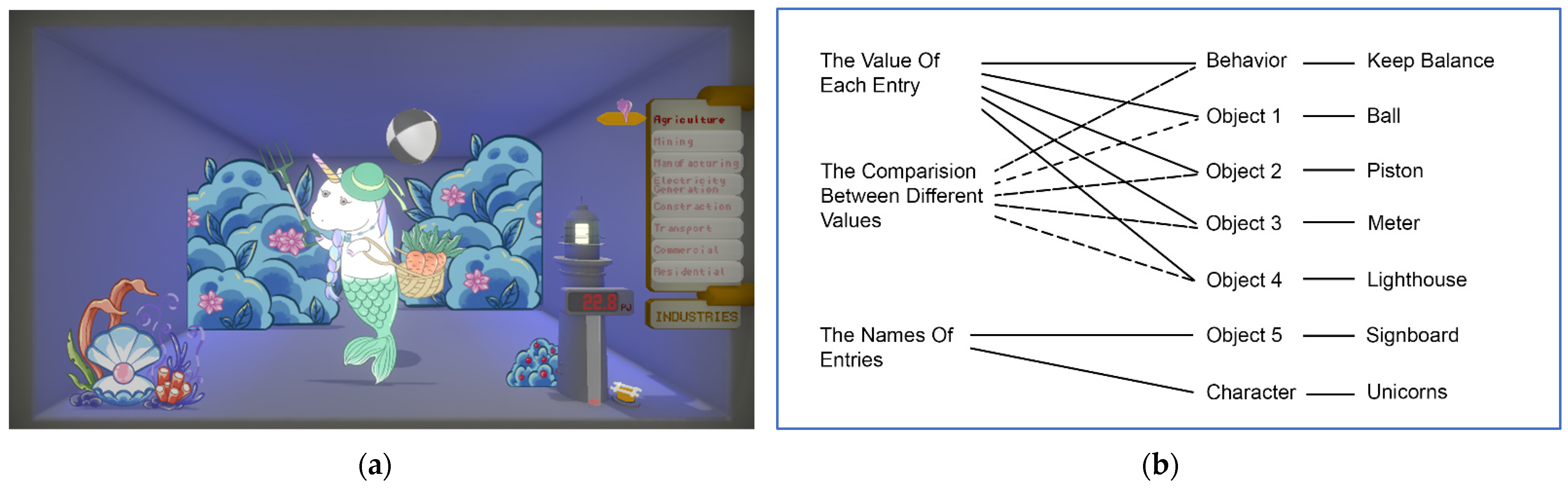
4. Demonstrate the Framework through a Prototype

4.1. Prototype Implementation

An interactive visual data storytelling prototype was developed when adopting machine learning methods to support our visual data storytelling content creation. This project’s focus is on creating entertaining visualisations with computational tools. It is beneficial to include an aspect of interactivity, given that we adopted a dynamic storytelling approach. Besides, we utilised machine learning methods to generate actions for characters.

4.2. Platform and Tools

The prototype was developed using the Unity platform. The prototype provides a simple interactive function and presents the data in a dynamic style and in a story-like visual environment. In the prototype, audiences can choose different data entries by moving the indicator around with their keyboard input. After a data entry is selected, a character representing the entry will appear on the stage and carry out its performance. The data-related information units are encoded into the character’s performance and stage props. While the audience views the stage and performance, the data entry is presented in various visual channels simultaneously.
For this project, the C# scripts were used to implement the interactive functionality. The data entry value was assigned to different attributes of stage props and characters within the C# scripts. Thus, when the audience selects a data entry, the related character is activated and conducts its performance, while related stage props operate accordingly to reflect the data entry value. The data entry values are directly linked to several stage prop attributes, including the piston’s speed attribute, lighthouse’s light intensity, meter column’s y-position, and ball’s scale attribute.
The characters’ behaviors were generated by using the ML-Agents Toolkit (https://unity.com/products/machine-learning-agents, accessed on 22 September 2022). One of the sample environments provided in the toolkit-3D Ball was used in this project. The necessary sensors and training configurations were already set in the sample environments. By attaching and fitting the provided environments into our stage and characters, and then assigning the trained behavior models to corresponding characters, the action or movement animation will be automatically generated by the trained behavior models. After this, by changing the training time of a model or changing the property of the object (such as the size of the ball) in the training environments, the behavior of each character is customised to reflect the value of the data entry.
The prototypes can be executed on various devices and platforms (e.g., PC, iOS, and web browser) due to Unity’s multi-platform exportation function. The screenshots that are showed in the article are taken from the web browser version of the prototype.

4.3. Test-Dataset: Australian Energy Consumption

The dataset used to develop the prototype was the Australian energy consumption data (https://www.energy.gov.au/publications/australian-energy-update-2018, accessed on 22 September 2022). The dataset includes the amount of the annual energy consumption for each Australian state, sorted by types of fuels and industries. Figure 8 shows a sample of the dataset. As this project explores the ways of presenting data-related information units in a story-like visual environment, the size of the dataset is not a major consideration at this time. As an initial attempt, only a small part of the dataset was used in this project. Three of the most basic information units were chosen to be presented in the prototypes. These are the names of the entries, the value of each entry, and a comparison among the different values.

4.4. Proof of Concept Prototype Information Mapping

For the initial prototype, the mapping between the data-related information units and visual story elements are shown in Figure 9. The names of the entries were encoded into the design of the characters and the signboard. The value of each entry was encoded into the character’s behavior and several visual aspects of multiple objects (e.g., height, size, speed, and intensity). The comparison between different values was not emphasised in this prototype. However, it is perceivable through observing the scene.
In a who-where-what format, the story is about sea-unicorns enjoying a game of ball balancing on the seafloor. Therefore, the logic of action is as follows: the more energy the character has, the bigger the ball it can handle. In this prototype, the machine learning agent is trained to keep a ball balanced on a flat surface without letting it fall to the ground.
There are several reasons to use machine learning-generated actions. First, non-looping movements attract attention to the character and the ball. These are major visual elements carrying the data-related information unit. Second, different behaviors indirectly emphasise data value differences. It is not necessarily harder to balance a large ball. However, a change in the ball size provokes a different behavior, given that the machine learning agent is trained with a particular ball size. We presented a sense of difference through behavior and movement, which are unusual visual channels compared to others normally used in visualisations (e.g., size, colour, and shape).
As mentioned in earlier sections, studies on memorability suggest that counterintuitive concepts in intuitive-supportive contexts have better memory recall rates [34,35]. Thus, when designing the prototype, we chose to use a theme that most people are familiar with—an amusement park—as application context. Then, when coming to major characters, we chose to use a rather uncommon creature—sea-unicorn—to represent each name of the data entries. The intention here was to use this counterintuitive character to draw attention to the key information, therefore enhancing their memorability.

4.5. Translation of Data Storytelling Components

In terms of the actual information processing procedure, the narrative-oriented process of visual data storytelling has three major phases, which are structuring, composing, and translating. The detailed workflow of the whole process is shown in Figure 10. In the following section, the detailed workflow of each phase is explained through the example of the data that were used for our prototype.

4.5.1. Structuring

In the phase of structuring, the first step is to determine the data messages. In this case, the data messages are:
  • Data Message 1: names of the industries (creating awareness about what energy-consuming industries exist).
  • Data Message 2: values of consumption numbers (how much energy each industry consumes).
  • Data Message 3: differences in the value of numbers (creating awareness about which industries used more energy and which used less).
The second step is to determine the priority of each data message. These priorities are used as parameters later for the translating phase. In this case, the allocated priorities are:
  • First Priority: Data Message 1.
  • Second Priority: Data Message 2 and Data Message 3.
Then, it is important to determine story components and expression attachments. In this case, they are:
  • Story Component 1~8: characters (eight unicorns).
  • Story Component 9~13: environment props (lighthouse, meter, piston, ball, and signboard).
  • Story Component 14~15: actions/movements (ball playing, piston movement).
  • Expression Attachment 1~3: cute, fun, and lively.

4.5.2. Composing

In the phase of composing, information units are composed together into information compositions. The basic formula for this is:
  • Information Composition = Story Component + Data Message + Expression Attachment.
The compositions that are formed in this phase will be translated into visual elements later in the translation phase. In this case, the information compositions are:
  • Information Composition 1~8: Story Component 1~8 + Data Message 1 + Expression Attachment 1.
  • Information Composition 9~13: Story Component 9~13 + Data Message 2 + Expression Attachment 2.
  • Information Composition 14~15: Story Component 14~15 + Data Message 3 + Expression Attachment 3.

4.5.3. Translating

In the phase of translation, the information compositions are first translated into visual elements. The information units within each information composition are encoded into selected visual channels of each visual element. Table 3 shows the mapping between information units and visual elements for the design of the example prototype.
For practical purposes, the mapping for story component and expression attachment should be performed before data message. In addition, because the movements and interactions are dependent on characters and properties, the mapping to figures precedes the mapping to animations. The logic of the translating process from an information composition to a visual element is shown in the flowchart presented in Figure 11. In the case of the current prototype, most of the mapping for data messages can be performed computationally, but a large amount of human input is still needed for the visual channels to be related to the design and style.
The second step is to translate the information priorities into the visual position. At this stage, visual elements are organised in the 3D space according to the designed infor-mation priority. Interactive functions and animations are also used to highlight prioritised information. In the design of the example prototype, the translation from information priorities to the visual position is as follows:
  • First priority-related visual elements: Position at major center position and first right-side front position. Allocate with direct interaction and character animation.
  • Second priority-related visual elements: Position at minor center position and second right-side front position. Allocate with indirect interaction and simple animation.

5. Conclusions

This work is part of a larger set of projects [6,7] that aim to develop an information unit-based data storytelling framework, which is bridging theories and methods from multiple disciplines—data visualisation, communication, storytelling, and interactive media. In this article, we presented an approach to creating a visual data storytelling application on interactive digital platforms for general audiences. We aimed to create entertaining and story-like data content. Thus, our approach was focused on the composition of a dataset and story elements, as well as the mapping routes between information units and visual channels. It also adopted game development and machine learning methods to support our visual data storytelling content creation. This framework sought to provide a better understanding of the different components of a visual data storytelling content. It also opened possibilities to more thoroughly evaluate the function and effect of each component. Those are the measurement of communication efficiency of the information encoded in a character’s body or an object’s movement pattern.

5.1. Key Contributions

In the following, we briefly discuss the response to the two research questions that we stated above.
RQ1: What is the appropriate coding strategy to compose data into an entertaining story composition that maintains the communication quality of key information in an environment with increased complexity and redundancy?
We contributed with aspects of appropriate coding strategies of how to compose data into entertaining story compositions by maintaining communication quality and increasing the complexity and redundancy of messages through:
  • Description of the story structure strategy in the visual data storytelling context balancing desirable uncertainty and communication accuracy.
  • Definition of the concept of information units as a conceptual basic element in the visual data storytelling communication process to support framework building.
  • Introduction of a modular approach to customising messages for visual data story-telling at a basic information level.
RQ2: How to apply data storytelling with technologies emerging from digital media to develop novel visual data storytelling content beyond conventional textual and chart-based styles?
We focused on the implementation of the visual data storytelling framework to develop novel visual data storytelling content outside the conventional ‘narrative text plus data chart’ model. This demonstrates how a visual data storytelling content creation process can function and benefit from technologies from the wider digital media domain:
  • Demonstration of a potential way to create visual data storytelling content that presents information within a visual story environment instead of the conventional ‘narrative text plus data chart’ model.
  • Introduction of a prototype development with the game engine Unity that applies the approach of composing a dataset with story elements to communicate it as a visual composition in a casual context.
Data visualisation is many times a matter of integrating information systems through dashboards [42]. Our approach extended this idea by providing a well-structured process to develop data storytelling based on existing digital media tools based on legacy information systems.
Compared to the application of visualisation for data exploration and analysis, the presentation of data with visual data storytelling is a more subjective process. A certain data result can have different meanings in different contexts; a certain colour can also have different indications in different countries or cultures. This study provided a general framework that outlined the design spaces, components, and procedure of visual data storytelling. It intends to support content creators to customise their presentations to adapt to the needs of different genres or in different regions. The modular structure of the framework also provides a potential foundation for the further development of computational tools or systems.
Nevertheless, our basic framework contributes to the epistemology of data visualisa-tion through a thorough definition of the basic dimensions that are required to tell visual stories based on raw input data. We conceptualised the framework and proofed its validi-ty through the development of a software prototype.

5.2. Limitations and Future Work

After an evaluation of the framework and the first prototype, we discovered some limitations, which will be improved in future works utilising different types of data sets. The first one is that setting up the story environment requires high graphic design efforts in aspects such as character design and stage design. While the strength of this visual da-ta storytelling framework lays in its customisable content through editing information units, it provides a flexible solution that can be adapted to different genres of data story-telling, such as data video and data comic.
The prototype demonstrated only a very specific, focused, and unconventional style of data storytelling to illustrate the process. For future development, it will be beneficial to address the needs of different genres of narrative and develop a more detailed guideline for each genre. We plan to adopt those in future extensions of our framework.
As mentioned above, this work is part of a larger set of projects. At this stage, we fo-cused on the conceptualisation and design of the information unit-based framework. Thus, for the initial prototype, we used a very simple and general story structure to sup-port the communication of the data. To focus on the story design, we only considered lim-ited interactive features and did not include the personalisation or adaptation of content to end-user preferences at this stage. However, this will also be part of future research works and based on models emerging from different forms of media (e.g., [43]).
This framework illustrates visual data storytelling from three major perspectives: concept, component, and procedure. It outlines the structure and components of the data storytelling content. Based on this framework, further evaluation and measurement methods can be developed to target the specific elements of the visual data storytelling contents. For future study, we plan to integrate methods from user experience, cognition psychology, and communication design to investigate the performance of different information composition and presentation styles. Controlled experiments will be designed to examine audiences’ memory quality, emotional response, and cognitive character for different designs of data presentation.
For the next stage of our research, we are currently working on the creation of more sophisticated compositions of information units and more complex information mapping possibilities between raw data and the interactive story environment. The plan is to develop a more comprehensive narrative design that will increase the interconnectivity between each information unit. Therefore, we want to further enhance the communication quality and provide a better entertainment experience. A user study is also currently in process. End-users will give feedback on the initial design to help us gain a deeper understanding of communication quality and user experience. The future prototype will be based on the outcomes of this study and build on top of our key findings.

Author Contributions

Conceptualization, Y.Z.; Software, Y.Z.; Supervision, M.R., A.L., K.D. and G.M.H.; Writing—original draft, Y.Z.; Writing—review & editing, Y.Z., M.R., A.L., K.D. and G.M.H. All authors have read and agreed to the published version of the manuscript.

Funding

This research received no external funding.

Institutional Review Board Statement

The study was conducted in accordance with the requirements of the National Statement on Ethical Conduct in Human Research (National Statement) and the policies and procedures of The University of Western Australia, and approved by the Ethics Committee of The University of Western Australia (RA/4/20/6292, 30 September 2020).

Informed Consent Statement

Not applicable.

Conflicts of Interest

The authors declare no conflict of interest.

References

  1. Kosara, R.; Mackinlay, J. Storytelling: The Next Step for Visualization. Computer 2013, 46, 44–50. [Google Scholar] [CrossRef]
  2. Börner, K.; Polley, D.E. Visual Insights: A Practical Guide to Making Sense of Data; The MIT Press: Cambridge, MA, USA, 2014. [Google Scholar]
  3. Wickham, H.; Grolemund, G. R for Data Science: Import, Tidy, Transform, Visualize, and Model Data; O’Reilly Media, Inc.: Sebastopol, CA, USA, 2017. [Google Scholar]
  4. Segel, E.; Heer, J. Narrative Visualization: Telling Stories with Data. IEEE Trans. Vis. Comput. Graph. 2010, 16, 1139–1148. [Google Scholar] [CrossRef]
  5. Pousman, Z.; Stasko, J.; Mateas, M. Casual Information Visualization: Depictions of Data in Everyday Life. IEEE Trans. Vis. Comput. Graph. 2007, 13, 1145–1152. [Google Scholar] [CrossRef] [PubMed]
  6. Zhang, Y. Converging Data Storytelling and Visualization. In Proceedings of the International Conference on Entertainment Computation, Poznan, Poland, 17–20 September 2018. [Google Scholar]
  7. Zhang, Y.; Lugmayr, A. Designing a User-Centered Interactive Data-Storytelling Framework. In Proceedings of the 31st Australian Conference on Human-Computer-Interaction, Fremantle, WA, Australia, 2–5 December 2019; Association for Computing Machinery: New York, NY, USA, 2019; pp. 428–432. [Google Scholar]
  8. Börner, K. Atlas of Knowledge: Anyone Can Map; The MIT Press: Cambridge, MA, USA, 2015. [Google Scholar]
  9. Ware, C. Information Visualization: Perception for Design; Elsevier: Amsterdam, The Netherlands; Morgan Kaufman: Boston, MA, USA, 2013. [Google Scholar]
  10. Wilkinson, L. The Grammar of Graphics; Springer: New York, NY, USA, 1999. [Google Scholar]
  11. Knaflic, C.N. Storytelling with Data: A Data Visualization Guide for Business Professionals; Wiley: Hoboken, NJ, USA, 2015. [Google Scholar]
  12. Ma, K.; Liao, I.; Frazier, J.; Hauser, H.; Kostis, H. Scientific Storytelling Using Visualization. IEEE Comput. Graph. Appl. 2012, 32, 12–19. [Google Scholar] [PubMed]
  13. Tufte, E.R. The Visual Display of Quantitative Information; Graphics Press: Cheshire, CT, USA, 1983. [Google Scholar]
  14. Lee, B.; Riche, N.H.; Isenberg, P.; Carpendale, S. More Than Telling a Story: Transforming Data into Visually Shared Stories. IEEE Comput. Graph. Appl. 2015, 35, 84–90. [Google Scholar] [CrossRef]
  15. Lee, B.; Choe, E.K.; Isenberg, P.; Marriott, K.; Stasko, J.; Rhyne, T.-M. Reaching Broader Audiences with Data Visualization. IEEE Comput. Graph. Appl. 2020, 40, 82–90. [Google Scholar] [CrossRef]
  16. Lugmayr, A.; Sutinen, E.; Suhonen, J.; Sedano, C.; Hlavacs, H.; Montero, C. Serious storytelling—A first definition and review. Multimed. Tools Appl. 2017, 76, 15707–15733. [Google Scholar] [CrossRef]
  17. Lugmayr, A.; Stockleben, B.; Scheib, C.; Mailaparampil, M. Cognitive big data: Survey and review on big data research and its implications. What is really ‘new’ in big data? J. Knowl. Manag. 2017, 21, 197–212. [Google Scholar] [CrossRef]
  18. Trajkova, M.; Alhakamy, A.; Cafaro, F.; Vedak, S.; Mallappa, R.; Kankara, S.R. Exploring Casual COVID-19 Data Visualizations on Twitter: Topics and Challenges. Informatics 2020, 7, 35. [Google Scholar] [CrossRef]
  19. Satyanarayan, A.; Heer, J. Authoring Narrative Visualizations with Ellipsis. Comput. Graph. Forum 2014, 33, 361–370. [Google Scholar] [CrossRef]
  20. Amini, F.; Riche, N.H.; Lee, B.; Hurter, C.; Irani, P. Understanding Data Videos: Looking at Narrative Visualization through the Cinematography Lens. In Proceedings of the 33rd Annual ACM Conference on human factors in computing systems, ACM, Seoul, Korea, 18–23 April 2015; pp. 1459–1468. [Google Scholar]
  21. Hullman, J.; Diakopoulos, N. Visualization Rhetoric: Framing Effects in Narrative Visualization. IEEE Trans. Vis. Comput. Graph. 2011, 17, 2231–2240. [Google Scholar] [CrossRef] [PubMed]
  22. Figueiras, A. Narrative Visualization: A Case Study of How to Incorporate Narrative Elements in Existing Visualizations. In Proceedings of the 2014 18th International Conference on Information Visualisation, Paris, France, 16–18 July 2014; pp. 46–52. [Google Scholar]
  23. McQueen, M. How to Prepare Now for What’s Next: A Guide to Thriving in an Age of Disruption.; John Wiley & Sons, Incorporated: Newark, NJ, USA, 2018. [Google Scholar]
  24. Baldick, C. The Oxford Dictionary of Literary Terms; Oxford University Press, Incorporated: Oxford, UK, 2015. [Google Scholar]
  25. Fishelov, D. The Poetics of Six-Word Stories. Narrative 2019, 27, 30–46. [Google Scholar] [CrossRef]
  26. Lugmayr, A.; Zou, Y.; Stockleben, B.; Lindfors, K.; Melakoski, C. Categorization of ambient media projects on their business models, innovativeness, and characteristics—Evaluation of Nokia Ubimedia MindTrek Award Projects of 2010. Multimed. Tools Appl. 2012, 66, 33–57. [Google Scholar] [CrossRef]
  27. McLuhan, M. Understanding Media: The Extensions of Man; Routledge & Kegan Paul Limited: London, UK, 1964. [Google Scholar]
  28. Shannon, C.E.; Weaver, W. Mathematical Theory of Communication; University of Illinois Press: Urbana, IL, USA, 1964. [Google Scholar]
  29. Iser, W. The Act of Reading: A Theory of Aesthetic Response; Johns Hopkins University Press: Baltimore, MD, USA, 1978. [Google Scholar]
  30. Roediger, H.L. The effectiveness of four mnemonics in ordering recall. J. Exp. Psychol. Hum. Learn. Mem. 1980, 6, 558–567. [Google Scholar] [CrossRef]
  31. Ghosh, V.E.; Gilboa, A. What is a memory schema? A historical perspective on current neuroscience literature. Neuropsychologia 2014, 53, 104–114. [Google Scholar] [CrossRef]
  32. Thorndyke, P.W.; Yekovich, F.R. A critique of schema-based theories of human story memory. Poetics 1980, 9, 23–49. [Google Scholar] [CrossRef]
  33. Maguire, E.A.; Valentine, E.R.; Wilding, J.M.; Kapur, N. Routes to remembering: The brains behind superior memory. Nat. Neurosci. 2002, 6, 90–95. [Google Scholar] [CrossRef]
  34. Upala, M.A.; Gonce, L.O.; Tweney, R.D.; Slone, D.J. Contextualizing Counterintuitiveness: How Context Affects Comprehension and Memorability of Counterintuitive Concepts. Cogn. Sci. 2007, 31, 415–439. [Google Scholar] [CrossRef]
  35. Van Kesteren, M.T.R.; Ruiter, D.J.; Fernández, G.; Henson, R.N. How schema and novelty augment memory formation. Trends Neurosci. 2012, 35, 211–219. [Google Scholar] [CrossRef]
  36. Chatman, S.B. Story and Discourse: Narrative Structure in Fiction and Film; Cornell University Press: Ithaca, NY, USA, 1978. [Google Scholar]
  37. Bateman, S.; Mandryk, R.L.; Gutwin, C.; Genest, A.; McDine, D.; Brooks, C. Useful junk? The effects of visual embellishment on comprehension and memorability of charts. In Proceedings of the 28th International Conference on Human Factors in Computing Systems—CHI Textquotesingle10, Atlanta, GA, USA, 10–15 April 2010; ACM Press: Times Square, NY, USA, 2010. [Google Scholar]
  38. Borkin, M.A.; Bylinskii, Z.; Kim, N.W.; Bainbridge, C.M.; Yeh, C.S.; Borkin, D.; Pfister, H.; Oliva, A. Beyond Memorability: Visualization Recognition and Recall. IEEE Trans. Vis. Comput. Graph. 2016, 22, 519–528. [Google Scholar] [CrossRef]
  39. Wang, Z.; Wang, S.; Farinella, M.; Murray-Rust, D.; Riche, N.H.; Bach, B. Comparing Effectiveness and Engagement of Data Comics and Infographics. In Proceedings of the 2019 CHI Conference on Human Factors in Computing Systems, Glasgow, UK, 4–9 May 2019; Association for Computing Machinery: Glasgow, Scotland, 2019; pp. 1–12. [Google Scholar]
  40. Leppink, J.; Paas, F.; van der Vleuten, C.P.M.; van Gog, T.; van Merriënboer, J.J.G. Development of an instrument for measuring different types of cognitive load. Behav. Res. Methods 2013, 45, 1058–1072. [Google Scholar] [CrossRef] [PubMed]
  41. Benedek, J.; Miner, T. Measuring Desirability: New methods for evaluating desirability in a usability lab setting. In Proceedings of the Usability Professionals Association Conference, Orlando, FL, USA, 8–12 July 2002. [Google Scholar]
  42. Lugmayr, A. Brief introduction into information systems & management research in media industries. In Proceedings of the 2013 IEEE International Conference on Multimedia and Expo Workshops (ICMEW), San Jose, CA, USA, 15–19 July 2013; IEEE: New York, NY, USA, 2013; pp. 1–6. [Google Scholar]
  43. Lugmayr, A.; Reymann, S.; Kemper, S.; Dorsch, T.; Roman, P. Bits of Personality Everywhere: Implicit User-Generated Content in the Age of Ambient Media. In Proceedings of the 2008 IEEE International Symposium on Parallel and Distributed Processing with Applications, Sydney, Australia, 10–12 December; IEEE: New York, NY, USA, 2008; pp. 516–521. [Google Scholar]
Figure 1. Conceptual overview of our visual data storytelling approach.
Informatics 09 00073 g001
Figure 2. Key items of the visual data storytelling framework.
Informatics 09 00073 g002
Figure 3. Comparing regular data visualisation with visual data storytelling.
Informatics 09 00073 g003
Figure 4. A bar chart and the interactive prototype. Both are based on the same data. (a) The bar chart; (b) the visual data storytelling prototype.
Informatics 09 00073 g004
Figure 5. Visual channels within the story environment.
Informatics 09 00073 g005
Figure 6. The basic process of visual data storytelling.
Informatics 09 00073 g006
Figure 7. The basic procedure of processing information units.
Informatics 09 00073 g007
Figure 8. Screenshot of the Australian energy consumption data in Microsoft Excel.
Informatics 09 00073 g008
Figure 9. Initial prototype and its information mapping. (a) The screenshot of the prototype; (b) the information mapping of the prototype.
Informatics 09 00073 g009
Figure 10. Major phases of information processing: structuring, composing, and translating.
Informatics 09 00073 g010
Figure 11. Logic flowchart of the translating process from an information composition to a visual element.
Informatics 09 00073 g011
Table 1. Our extension of existing research works in data visualisation, narrative visualisation, and data storytelling.
Key ConceptsOur ContributionReference
Graphic variables and design elements for data visualization.We design a new modular and customizable framework to reflect the changes from a static lecture environment to a dynamic story environment, and support the visual data storytelling content development.[8,9,10,11]
Narrative visualization components and layers.We identified an extended range of visual channels which cover the essential components and editorial spaces of narrative visualisation content.[4,19,21]
Design process and phases of narrative visualization.By integrating existing narrative visualisation studies with the communication model, we introduced three phases of information processing for visual data storytelling: structuring, composing and translating.[19,20]
Table 2. Comparing table of regular data visualisation and visual data storytelling.
Analysis Oriented Process
of
Ordinary Data Visualisation
Narrative Oriented Process
of
Visual Data Storytelling
Analysis orientedOrientationNarrative oriented
ProfessionalsAudienceNon-professionals
VariablesBasic UnitInformation Units
Simple messageInformation FeatureStory-like information composition
ThinEntertainmentRich
2D static visual spaceVisual Space3D dynamic visual space
StraightforwardVisual ComplexityRelatively complex
Table 3. Mapping between information units and visual elements.
Information CompositionVisual ElementVisual ChannelTransformation
Information Composition
No. 1~No. 8
Unicorn
No. 1~No. 8
(Figure)
Colour
Clothes/Accessories
Design Style
Story Component ↦ Character (Unicorn)
Expression Attachment ↦ Design (Unicorn)
Data Massage ↦ Hue (Body, Accessory): Body, Accessory ∈ Unicorn
Data Massage ↦ Assortment (Accessory): Accessory ∈ Unicorn
Information Composition
No. 9
Lighthouse
(Figure)
Shade/Lighting
Design Style
Story Component ↦ Property (Lighthouse)
Expression Attachment ↦ Design (Lighthouse)
Data Massage ↦ Luminance (Beacon): Beacon ∈ Lighthouse
Information Composition
No. 10
Meter
(Figure)
Text
Size/Length
Design Style
Story Component ↦ Property (Meter)
Expression Attachment ↦ Design (Meter)
Data Massage ↦ Text (Number): Number ∈ Meter
Data Massage ↦ Length (Bar): Bar ∈ Meter
Information Composition
No. 11
Piston
(Figure)
Design Style Story Component ↦ Property (Piston)
Expression Attachment ↦ Design (Piston)
Information Composition
No. 12
Ball
(Figure)
Size/Length
Design Style
Story Component ↦ Property (Ball)
Expression Attachment ↦ Design (Ball)
Data Massage ↦ Size (Ball)
Information Composition
No. 13
Signboard
(Figure)
Text
Design Style
Story Component ↦ Property (Signboard)
Expression Attachment ↦ Design (Signboard)
Data Massage ↦ Text (Word): Word ∈ Signboard
Information Composition
No. 14
Ball Playing
(Animation)
Movement Pattern Story Component ↦ Action (Unicorn, Ball)
Expression Attachment ↦ Design (Movement Pattern): Movement Pattern ∈ Unicorn, Ball
Data Massage ↦ Movement Pattern (Unicorn, Ball)
Information Composition
No. 15
Piston Movement
(Animation)
Movement Frequency Story Component ↦ Action (Piston)
Expression Attachment ↦ Design (Movement Frequency): Movement Frequency ∈ Piston
Data Massage ↦ Movement Frequency (Piston)
Explanation of the symbols: ↦: transformed into/ mapped to; ∈: belong to/ is an element of.
Publisher’s Note: MDPI stays neutral with regard to jurisdictional claims in published maps and institutional affiliations.

