An Evaluation of Graphical Formats for the Summary of Activities of Daily Living (ADLs)


Abstract
:1. Introduction
2. Related Works
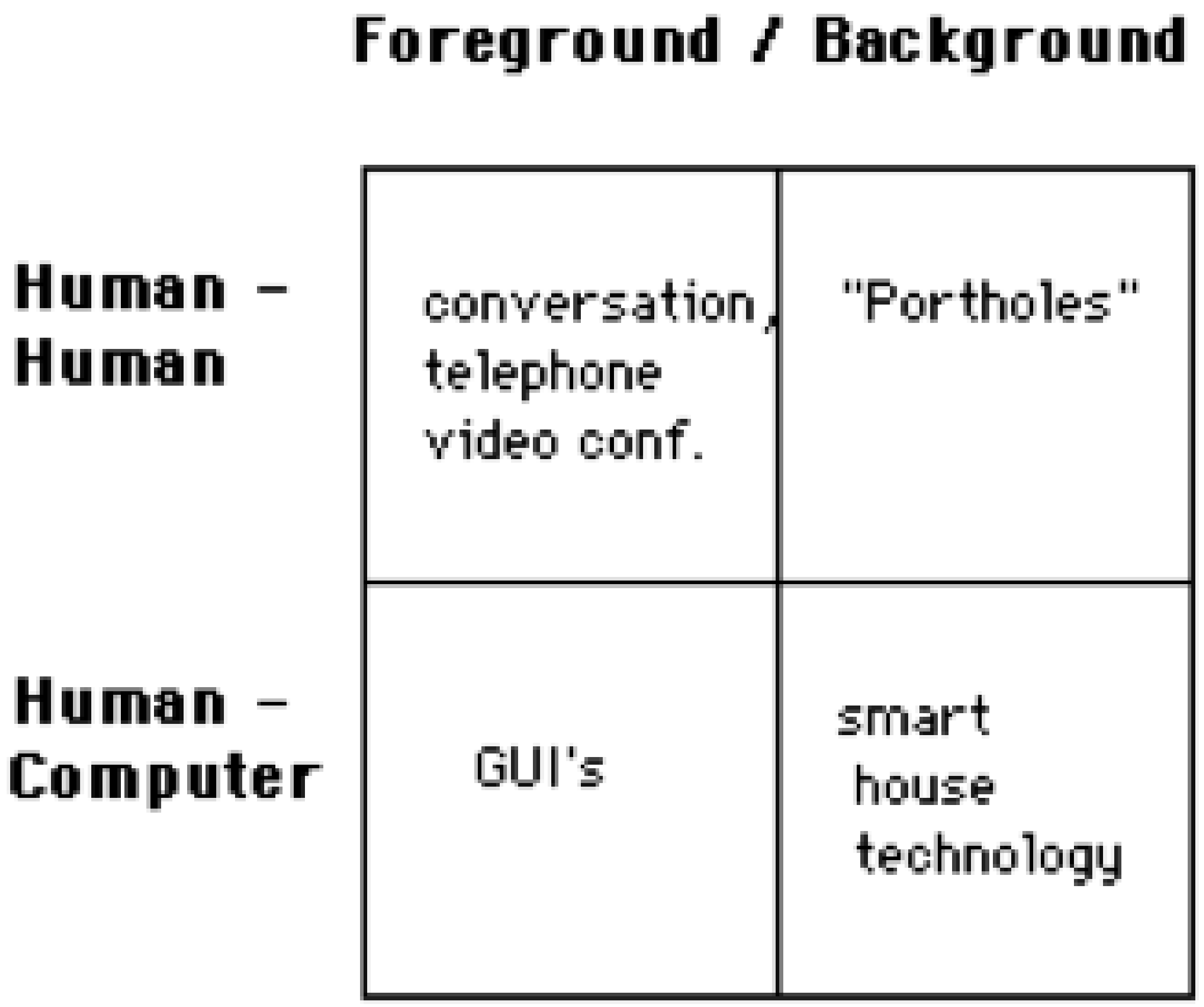
2.1. How Humans Interact With Computers
2.2. Assisted Living UI Review
2.3. AAL and ADLs Systems UI Design Review
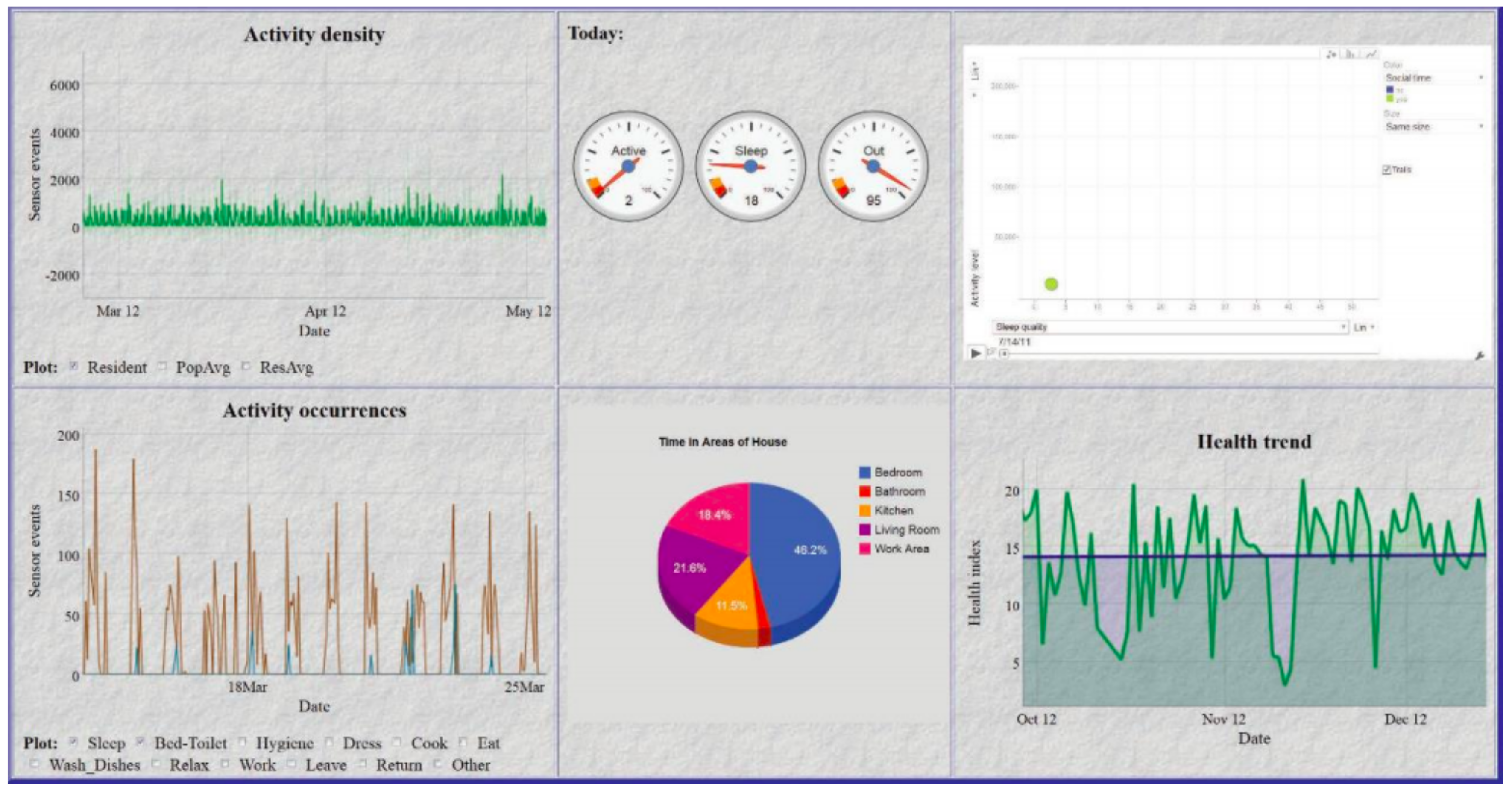
2.4. Assisted Living UI Data Visualisation Methodologies
3. Research Methodology for Caregiver UI Usability Studies
3.1. Aims and Objectives
- This research specifically sought to establish which UI was deemed by caregivers to be the easiest and most effective when remotely monitoring the daily activity information of loved ones.
- Current trends in user-centric applications for elder care support were investigated and used to inform the creation of a UI, not for the elder, but for caregivers who are often in a constant state of concern regarding the elder’s ability to continue living autonomously.
- This research on interfaces was specific to this category of user, that is, the informal caregivers, and it sought their opinion on which UI offered the most constant, informed and timely reassurance using easily recognisable icons to represent a summarisation of a loved one’s daily activity tasks.
3.2. Sample
3.3. Ethical Issues
- This research sought to establish which UI is deemed by caregivers to be the easiest and most effective when remotely monitoring the daily activity information of their loved one.
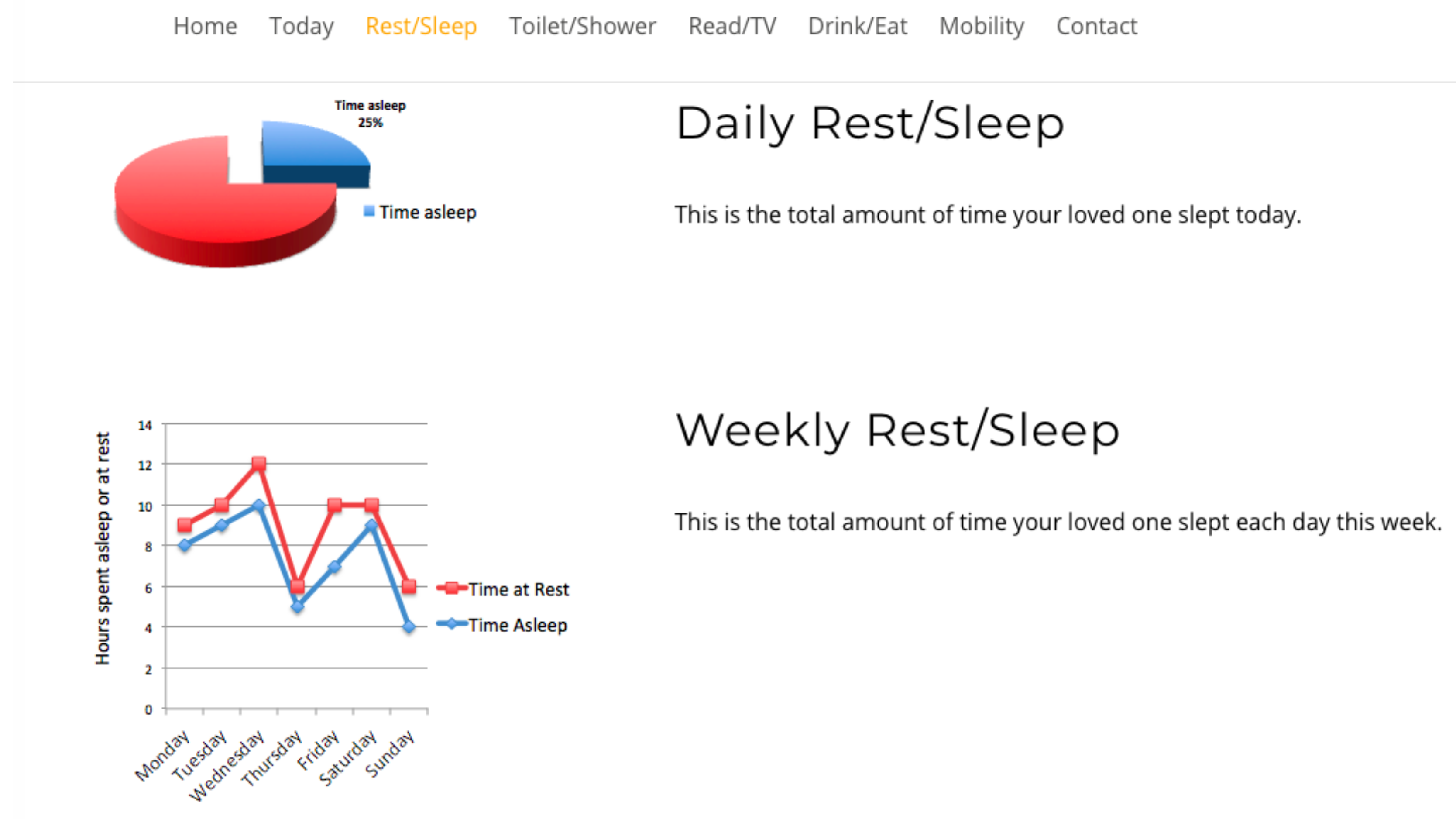
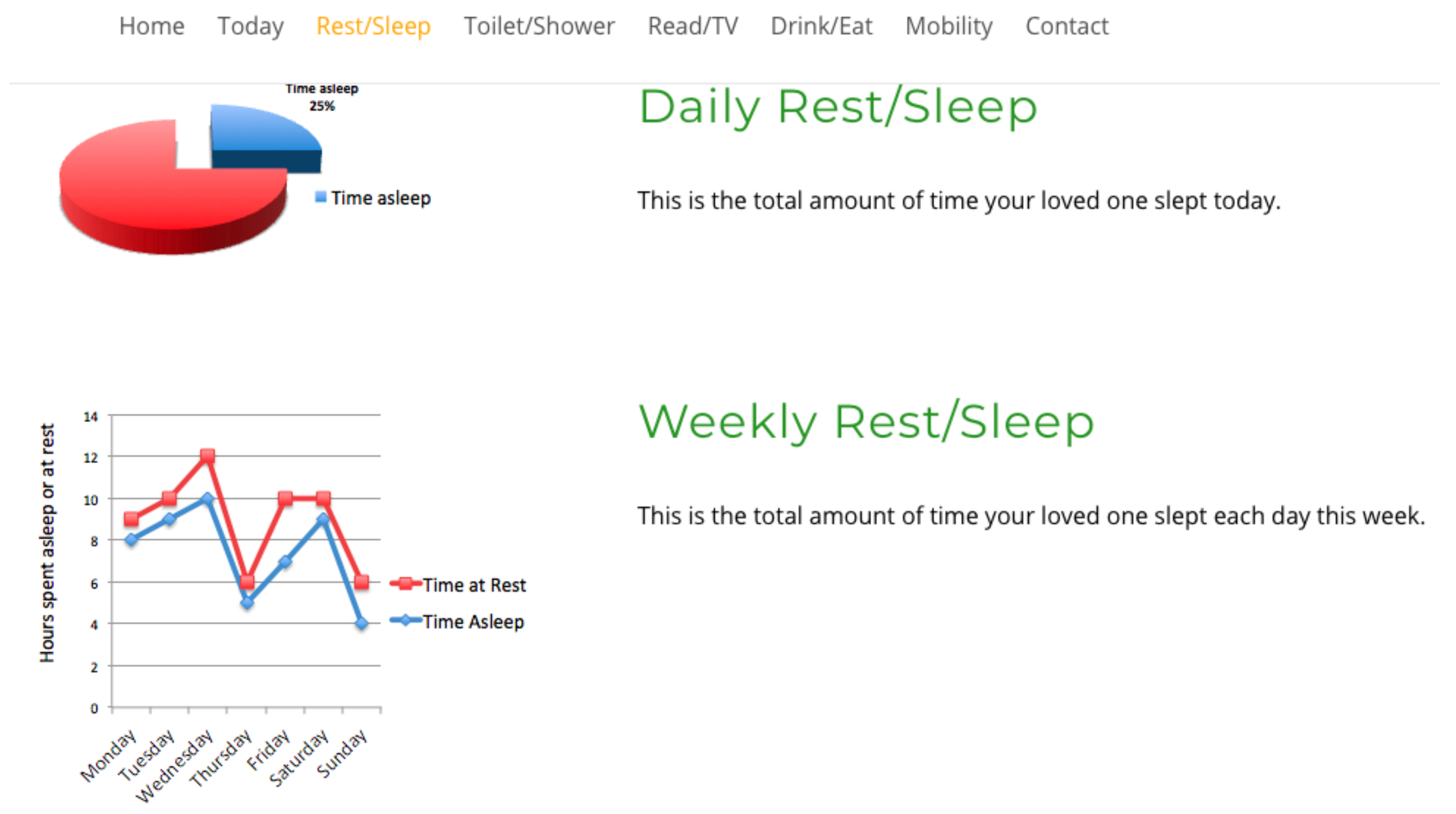
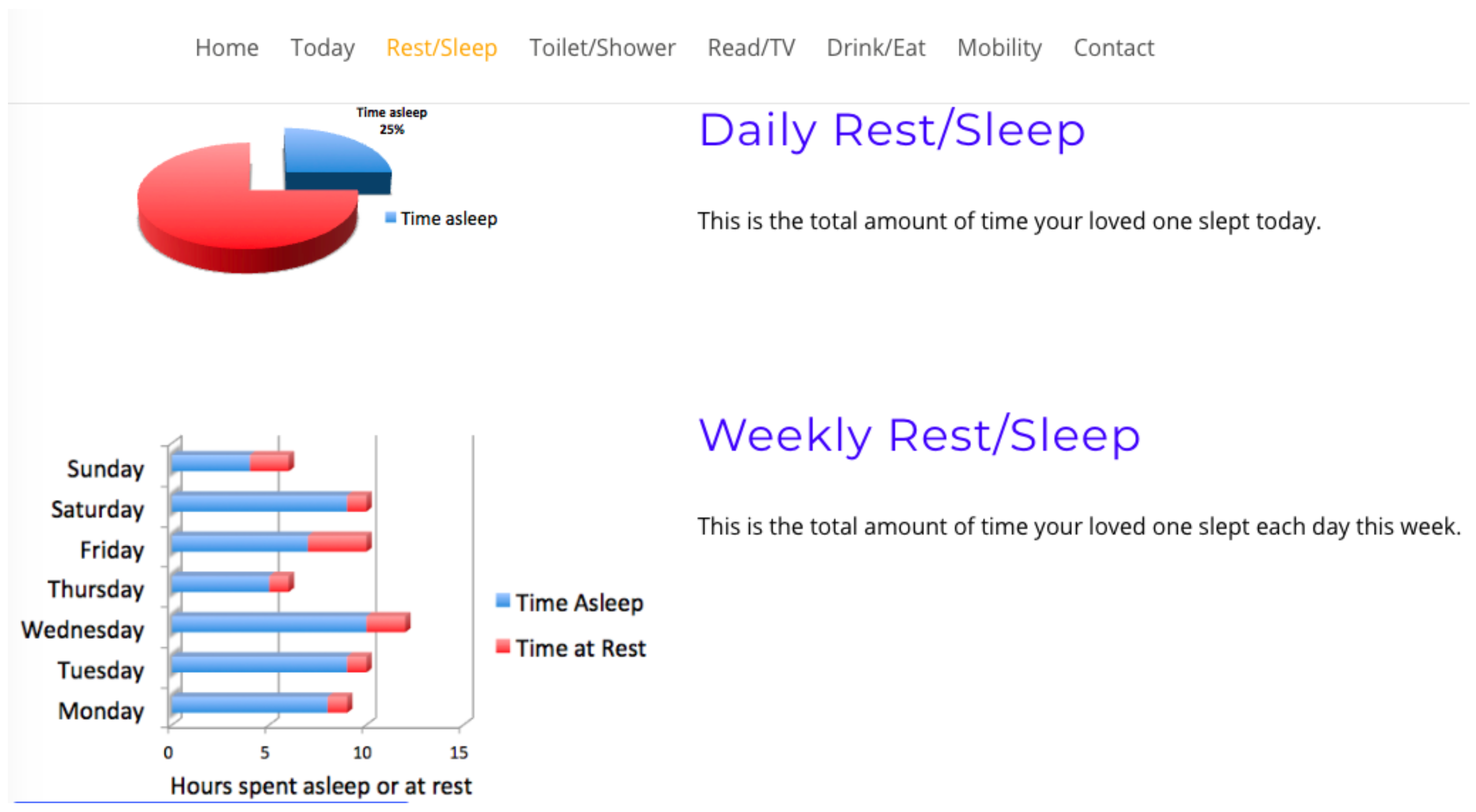
- To determine if an interface which combines two graph formats is deemed to be the most usable and effective by caregivers, the combination will include a pie graph visualising short-term daily activity analysis and a line or bar graph format for longitudinal activity analysis.
- This question gathered demographic information on participants, such as, age range, gender, IT and caring experience of elders for statistical purposes.
- It also sought to determine if a combination graph format is deemed the most effective by caregivers, and which combination was selected by the majority of caregivers as their preferred choice of interface. Which of the two combinations offered for comment were the preferred choice, pie and line graph or pie and bar for summarising and visualising daily and longitudinal activities.
3.4. Methodology and Statistical Analysis (t-Test)
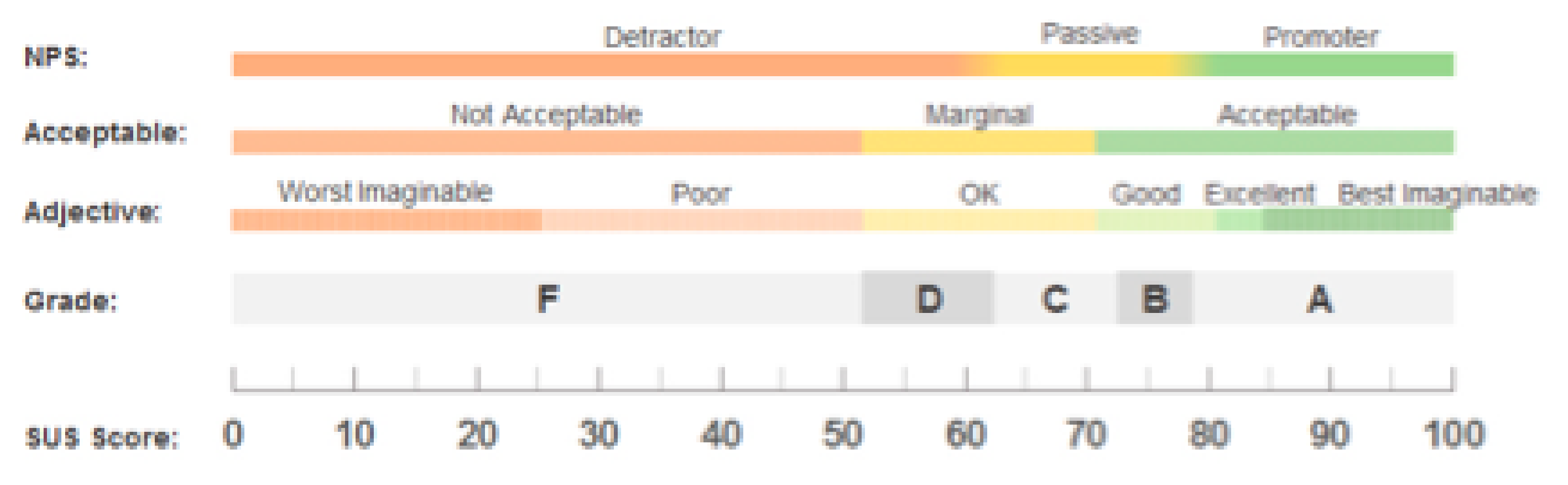
Scoring Methodology for System Usability Scale
- A = 80.3 or higher means a high UI usability score;
- C = 68 or approximately means improvements could be made with the UI;
- F = 51 or under renders usability a serious issue with the UI.
4. Results
4.1. Questionnaire 1
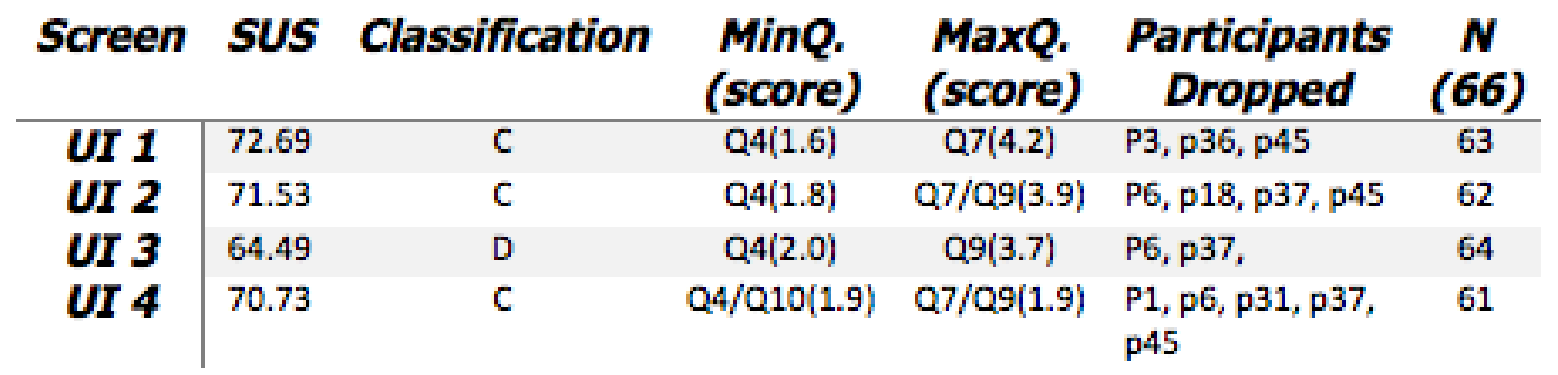
- What is established from the results are some agreement on Q4 and Q7.Question 4: I think that I would need the support of a technical person to be able to use this website? Question 7: I would imagine that most people would learn to use this website very quickly?
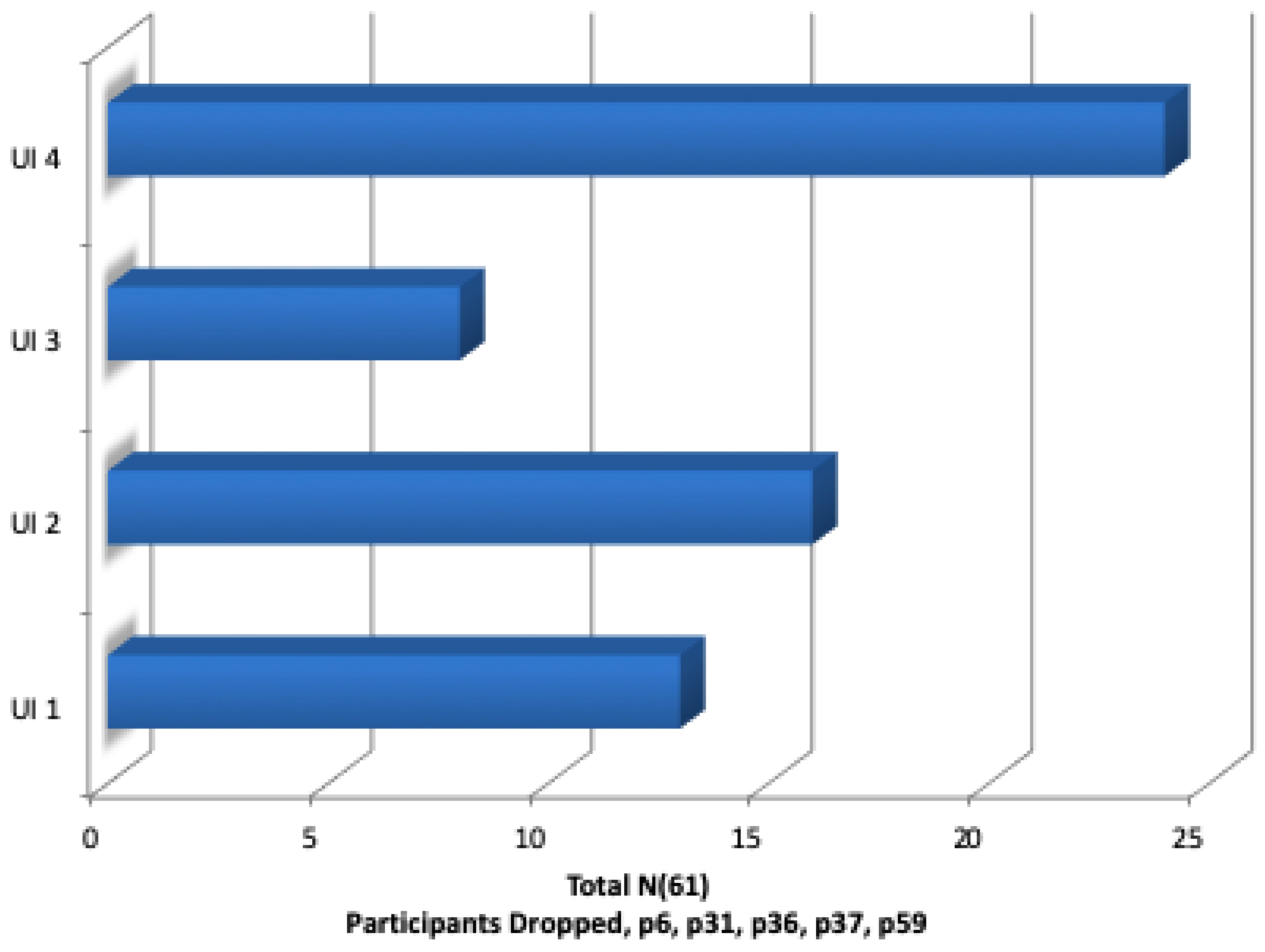
- When participants were requested to rank their UIs in order of preference for ’Ease of Use’, UI-4 was chosen by the most participants as their first preference.
- However, the SUS scoring system did not affirm this, with UI 4 only receiving an overall score of 70.73.
4.2. Questionnaire 2
4.2.1. Reliability
4.2.2. Demography
Q2: Analysis of SUS Results
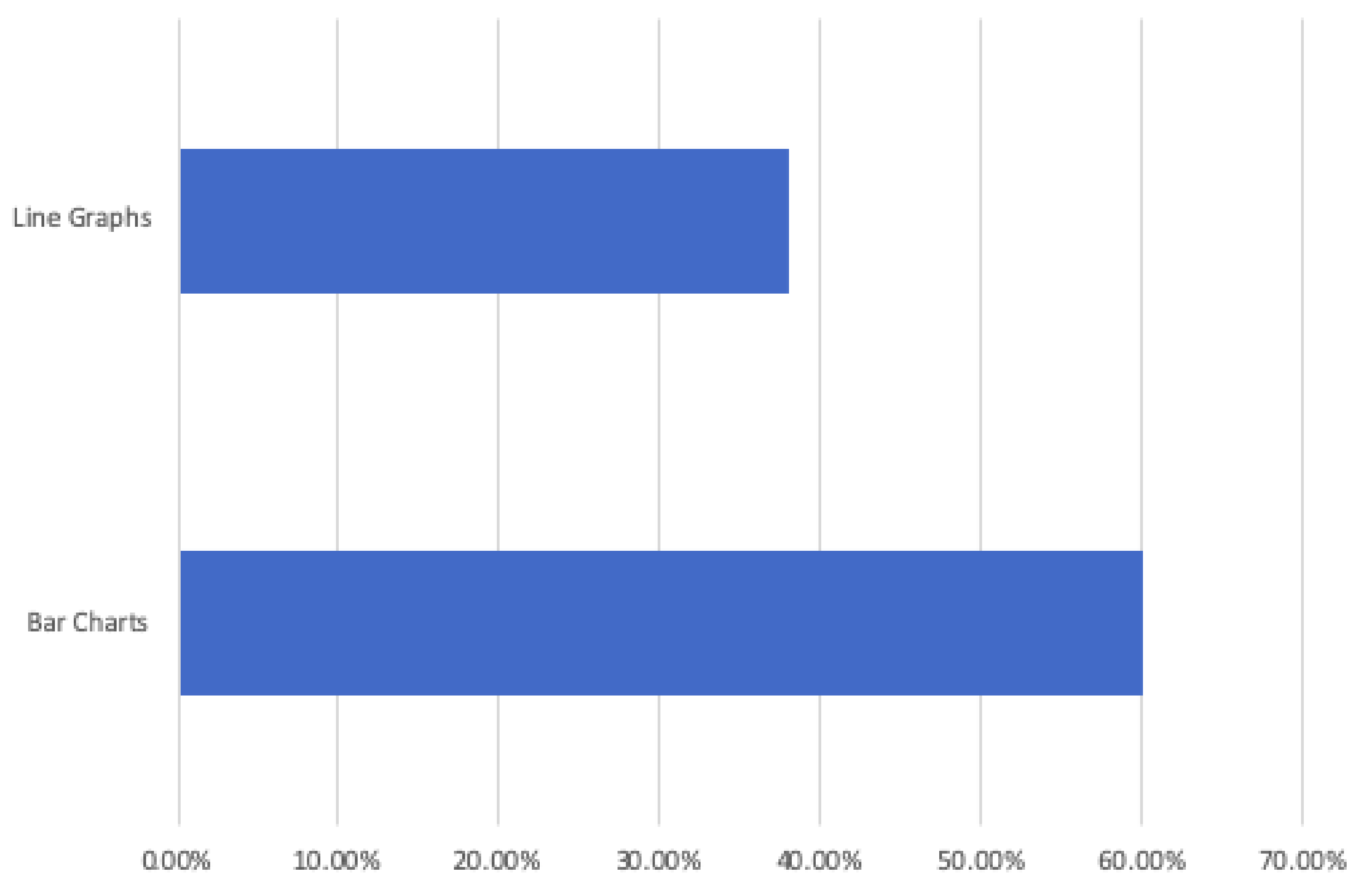
Interface Preference, Line or Bar Graph
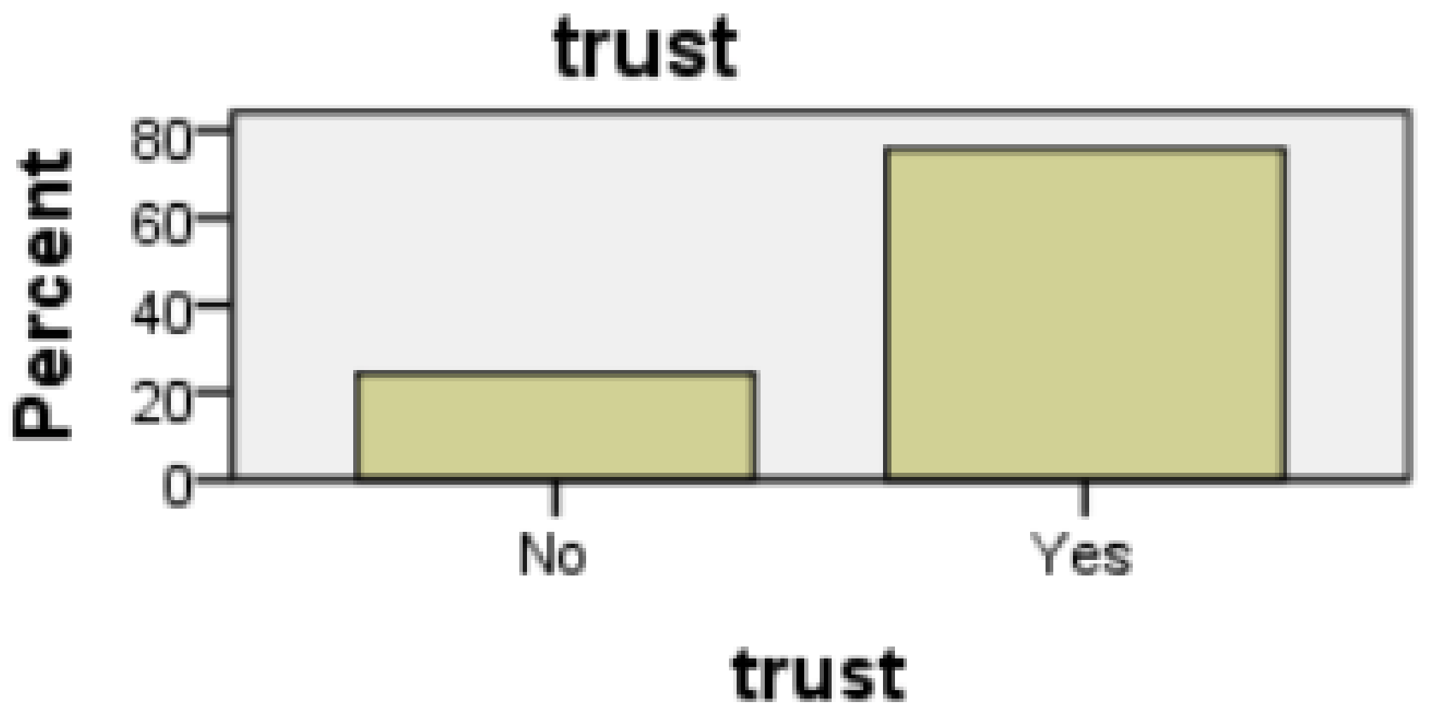
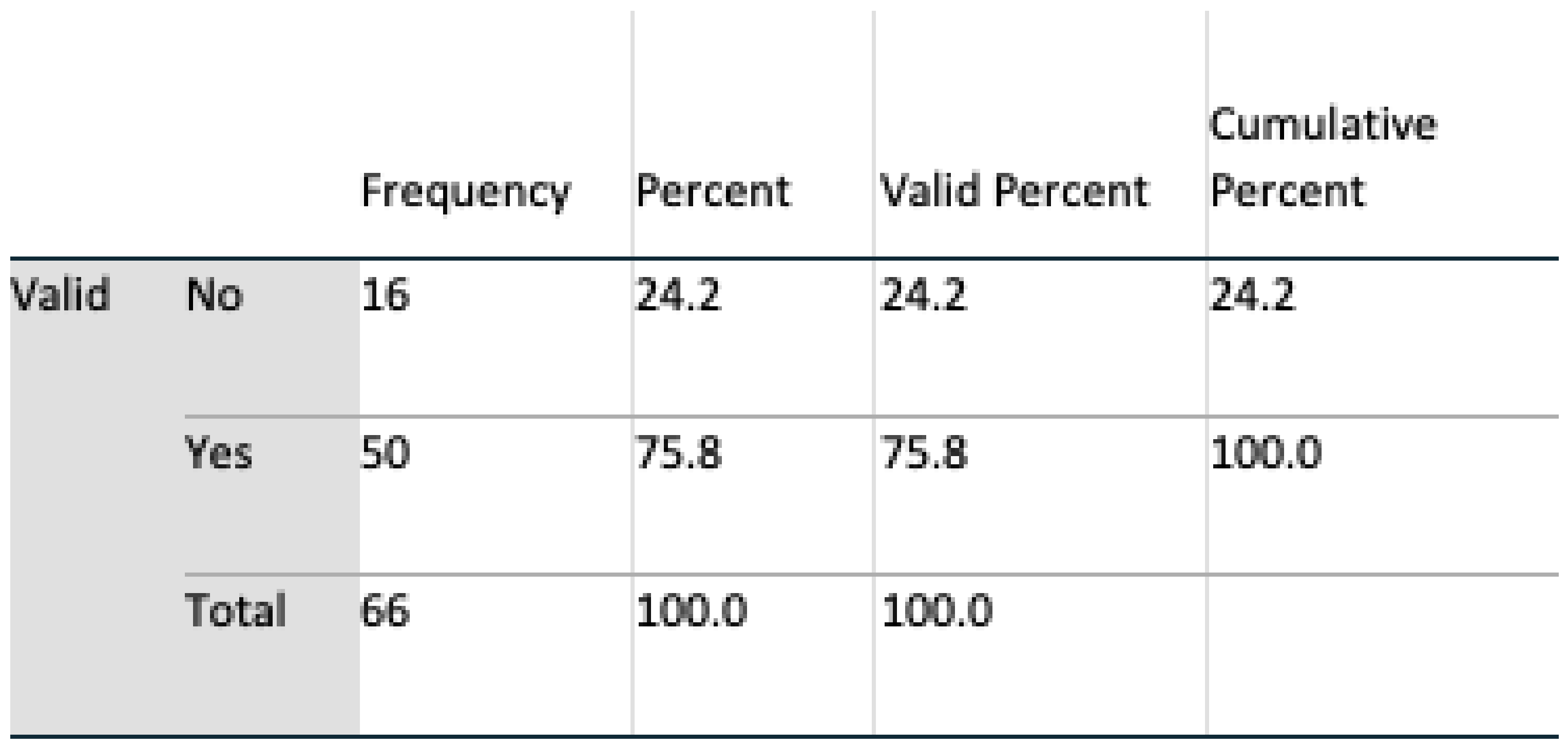
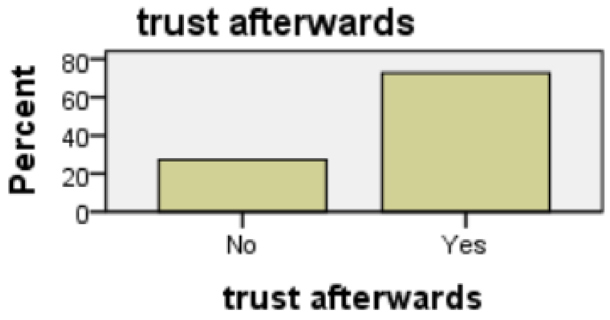
Trust of Technology
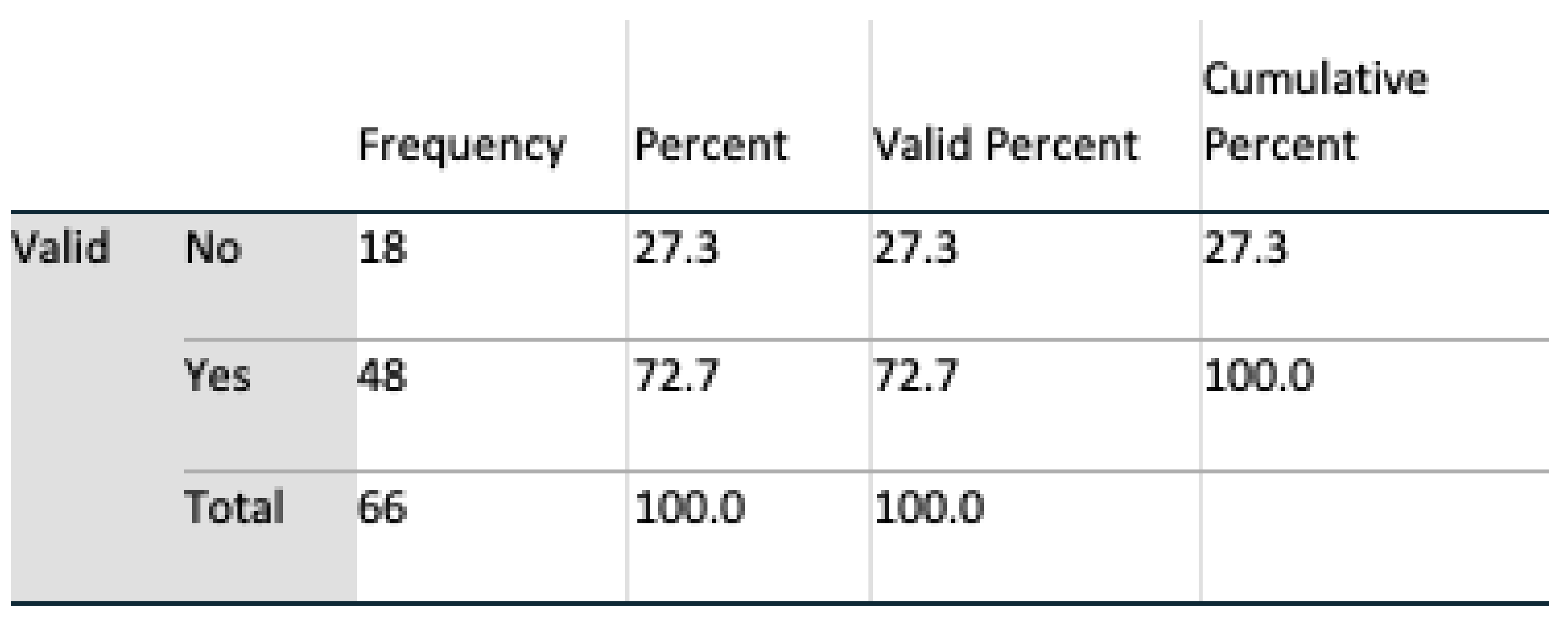
Perception of Security
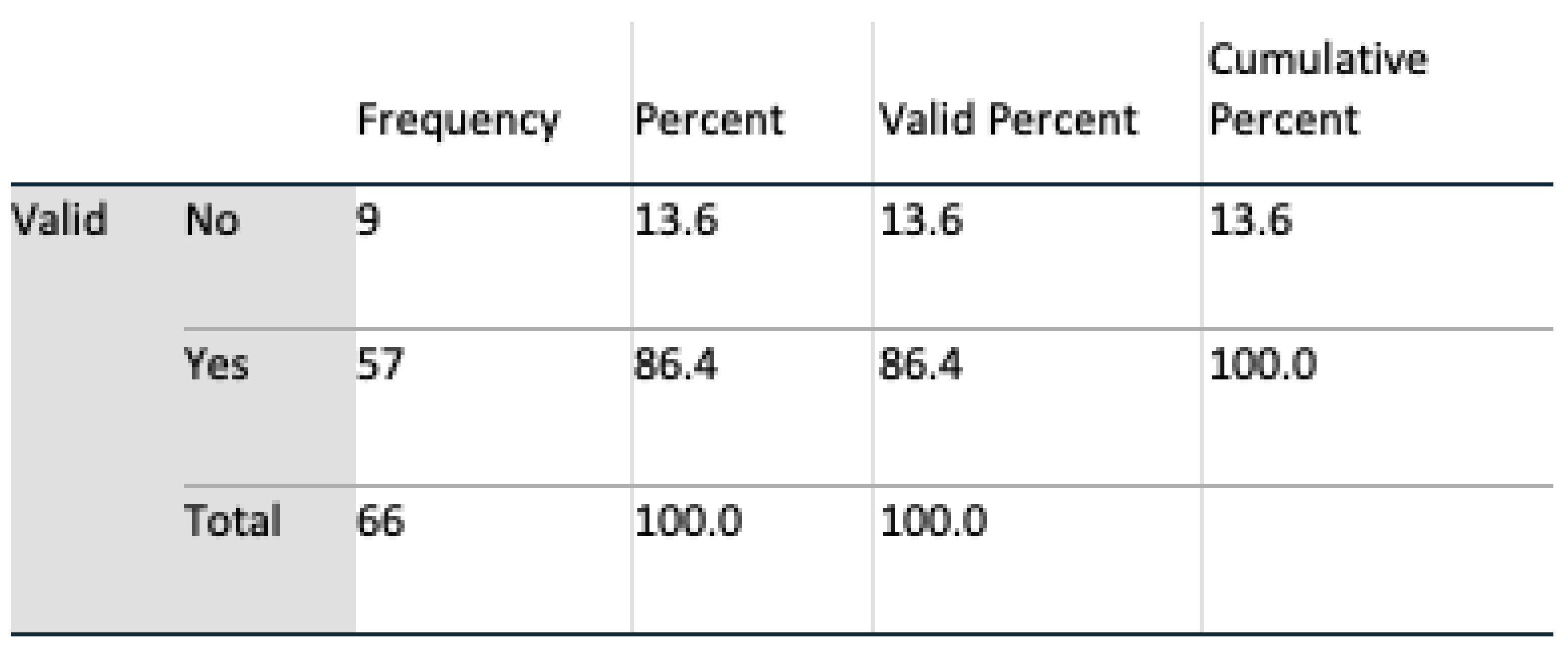
Perception of Privacy
The Carer Dimension
Subjects as Potential Receivers of Care
Gender Differences
4.3. UI Research Contribution
4.4. Respondent Feedback
5. Future Work
6. Conclusions
Author Contributions
Funding
Acknowledgments
Conflicts of Interest
Abbreviations
| AAL | Ambient Assisted Living |
| ADLs | Activities of Daily Living |
| AL | Assisted Living |
| AmI | Ambient Intelligence |
| HCC | Human Centered Computing |
| HCI | Human Computer Interaction |
| ICT | Information and Communications Technology |
| LD | Linear Dichroism |
| SUS | System Usability Scale |
| UCD | University College Dublin |
| UI | User Interface |
| URL | Uniform Resource Locator |
| UX | User eXperience |
Appendix A. Evaluation of User Interface (UI) Usability for Caregivers Monitoring an Elder’s Activities of Daily Living (ADLs) UCD Ethics Reference no LS-18-65


Appendix B. Evaluation of User Interface (UI) Usability for Caregivers Monitoring an Elder’s Activities of Daily Living (ADLs) UCD Ethics Reference no LS-19-67


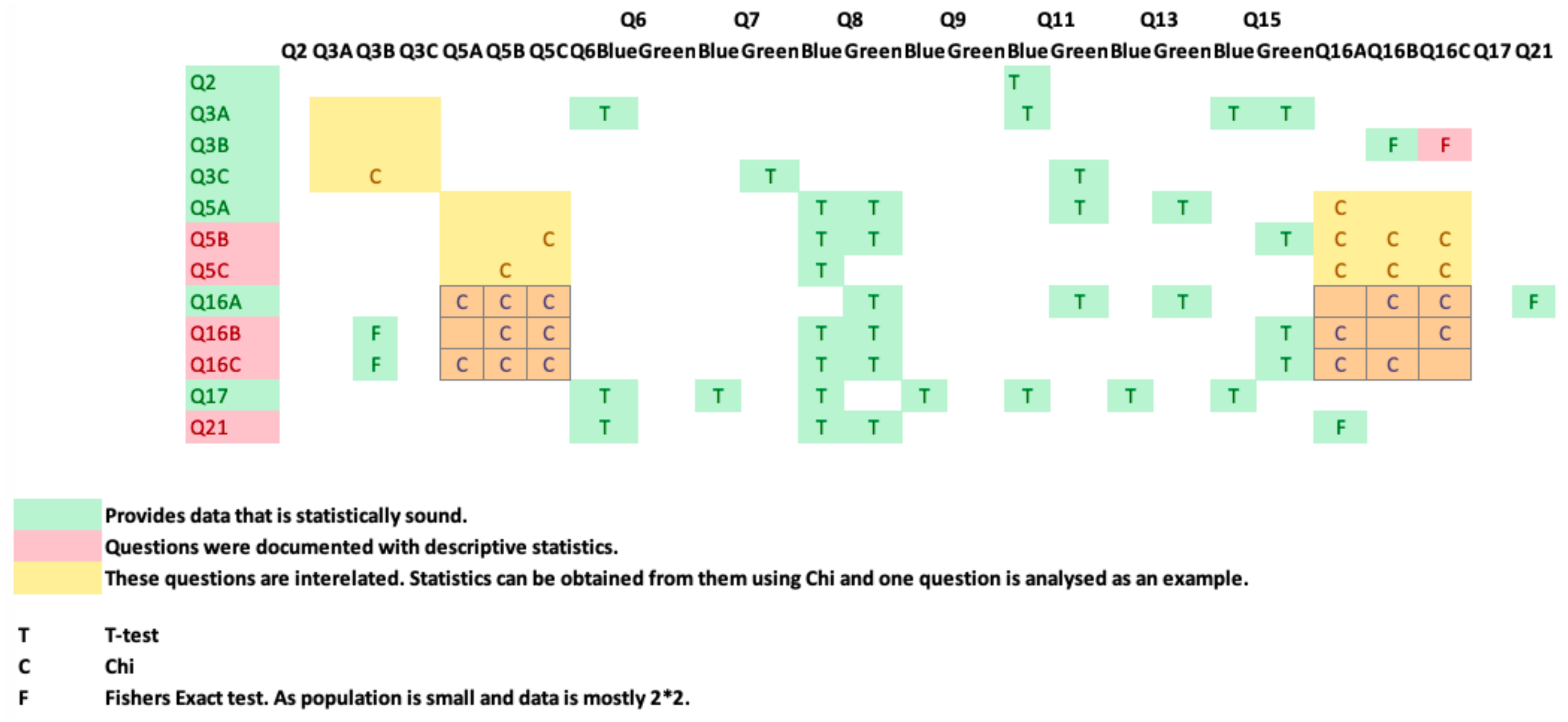
Appendix C. Q2 Cross-Correlation of Questions—Evaluation of User Interface (UI) Usability for Caregivers Monitoring an Elder’s Activities of Daily Living (ADLs) UCD Ethics Reference no LS-19-67
References
- Giannakouris, K. Ageing Characterises the Demographic Perspectives of the European Societies. In Statistics in Focus; Eurostat Office for Official Publications of the European Communities: Luxembourg, 2008; Volume 72. [Google Scholar]
- Gavrilov, L.A.; Heuveline, P. Aging of population. Encycl. Popul. 2003, 1, 32–37. [Google Scholar]
- Walker, A. Commentary: The emergence and application of active aging in Europe. J. Aging Soc. Policy 2008, 21, 75–93. [Google Scholar] [CrossRef] [PubMed]
- Stanley, M.; Cheek, J. Well-being and older people: A review of the literature. Can. J. Occup. Ther. 2003, 70, 51–59. [Google Scholar] [CrossRef] [PubMed]
- Falco, J.; Vaquerizo, E.; Lain, L.; Artigas, J.; Ibarz, A. AmI and deployment considerations in AAL services provision for elderly independent living: The MonAMI project. Sensors 2013, 13, 8950–8976. [Google Scholar] [CrossRef] [PubMed] [Green Version]
- Frey, J.; Neßelrath, R.; Stahl, C. An open standardized platform for dual reality applications. In Proceedings of the International Conference on Intelligent User Interfaces (IUI) Workshop on Location Awareness for Mixed and Dual Reality LAMDa11, Palo Alto, CA, USA, 13–16 February 2011; Volume 1316. [Google Scholar]
- Chen, J.H.; Chi, P.P.Y.; Chu, H.H.; Chen, C.C.H.; Huang, P. A smart kitchen for nutrition-aware cooking. IEEE Pervasive Comput. 2010, 9, 58–65. [Google Scholar] [CrossRef]
- Nielsen, J. 10 Usability Heuristics for User Interface Design; Nielsen Norman Group: Austin, TX, USA, 1995; Volume 1. [Google Scholar]
- Shneiderman, B.; Plaisant, C. Designing the User Interface: Strategies for Effective Human-Computer Interaction; Pearson Education: New Delhi, India, 2010. [Google Scholar]
- Pak, R.; McLaughlin, A. Designing Displays for Older Adults; CRC Press: Boca Raton, FL, USA, 2010. [Google Scholar]
- Crews, D.E.; Zavotka, S. Aging, disability, and frailty: Implications for universal design. J. Physiol. Anthropol. 2006, 25, 113–118. [Google Scholar] [CrossRef] [Green Version]
- Laslett, P. The third age and the disappearance of old age. In Preparation for Aging; Springer: Boston, MA, USA, 1995; pp. 9–16. [Google Scholar]
- Obrist, M.; Bernhaupt, R.; Beck, E.; Tscheligi, M. Focusing on elderly: An iTV usability evaluation study with eye-tracking. In Lecture Notes in Computer Science, Proceedings of the European Conference on Interactive Television EuroITV 2007, Amsterdam, The Netherlands, 24–25 May 2007; Springer: Berlin/Heidelberg, Germany, 2007; Volume 4471, pp. 66–75. [Google Scholar]
- Pazhoumand-Dar, H. FAME-ADL: A data-driven fuzzy approach for monitoring the ADLs of elderly people using Kinect depth maps. J. Ambient Intell. Hum. Comput. 2019, 10, 2781–2803. [Google Scholar] [CrossRef]
- Debes, C.; Merentitis, A.; Sukhanov, S.; Niessen, M.; Frangiadakis, N.; Bauer, A. Monitoring activities of daily living in smart homes: Understanding human behavior. IEEE Signal Process. Mag. 2016, 33, 81–94. [Google Scholar] [CrossRef]
- Ni, Q.; García Hernando, A.B.; Pau de la Cruz, I. A context-aware system infrastructure for monitoring activities of daily living in smart home. J. Sens. 2016, 2016, 9493047. [Google Scholar] [CrossRef] [Green Version]
- Andò, B.; Baglio, S.; Lombardo, C.O.; Marletta, V. A multisensor data-fusion approach for ADL and fall classification. IEEE Trans. Instrum. Meas. 2016, 65, 1960–1967. [Google Scholar] [CrossRef]
- Keohane, S.M.; Gerard, S.N.; Heching, A.; Adams, S.S.; Tarr, P. Reflections on the effectiveness of a high density ambient sensor deployment for monitoring healthy aging. In Proceedings of the International Conference on Human Aspects of IT for the Aged Population, Las Vegas, NV, USA, 15–20 July 2018; Springer: Cham, Switzerland, 2018; pp. 315–333. [Google Scholar]
- Lorenz, A.; Oppermann, R. Mobile health monitoring for the elderly: Designing for diversity. Pervasive Mob. Comput. 2009, 5, 478–495. [Google Scholar] [CrossRef]
- Buxton, B. Integrating the Periphery and Context: A New Model of Telematics. In Proceedings of the Graphics Interface, Quebec, QC, Canada, 17–19 May 1995; Canadian Information Processing Society: Mississauga, ON, Canada, 1995; pp. 239–246. [Google Scholar]
- Dourish, P.; Bly, S. Portholes: Supporting awareness in a distributed work group. In Proceedings of the SIGCHI Conference on Human Factors in Computing Systems, Monterey, CA, USA, 3–7 May 1992; ACM: New York, NY, USA, 1992; pp. 541–547. [Google Scholar]
- Gross, T. Ambient interfaces: Design challenges and recommendations. In Human Computer Interaction: Theory and Practice; Lawernce Erlbaum Associates: London, UK, 2003; pp. 68–72. [Google Scholar]
- Ju, W.; Leifer, L. The design of implicit interactions: Making interactive systems less obnoxious. Des. Issues 2008, 24, 72–84. [Google Scholar] [CrossRef]
- Wan, J.; O’Grady, M.J.; O’Hare, G.M. Implicit interaction: A modality for ambient exercise monitoring. In Proceedings of the IFIP Conference on Human-Computer Interaction, Uppsala, Sweden, 24–28 August 2009; Springer: Berlin/Heidelberg, Germany, 2009; pp. 900–903. [Google Scholar]
- Portet, F.; Vacher, M.; Golanski, C.; Roux, C.; Meillon, B. Design and evaluation of a smart home voice interface for the elderly: Acceptability and objection aspects. Pers. Ubiquitous Comput. 2013, 17, 127–144. [Google Scholar] [CrossRef] [Green Version]
- Dillon, A. User interface design. In MacMillan Encyclopedia of Cognitive Science; MacMillan: London, UK, 2003; Volume 4, pp. 453–458. [Google Scholar]
- Stefaner, M.; Ferré, S.; Perugini, S.; Koren, J.; Zhang, Y. User interface design. In Dynamic Taxonomies and Faceted Search; Springer: Berlin/Heidelberg, Germany, 2009; pp. 75–112. [Google Scholar]
- Galitz, W.O. The Essential Guide to User Interface Design: An Introduction to GUI Design Principles and Techniques; John Wiley and Sons: Hoboken, NJ, USA, 2007. [Google Scholar]
- Arab, F.; Malik, Y.; Abdulrazak, B. Evaluation of PhonAge: An adapted smartphone interface for elderly people. In Proceedings of the IFIP Conference on Human-Computer Interaction, Cape Town, South Africa, 2–6 September 2013; Springer: Berlin/Heidelberg, Germany, 2013; pp. 547–554. [Google Scholar]
- Edwardson, C.L.; Winkler, E.A.; Bodicoat, D.H.; Yates, T.; Davies, M.J.; Dunstan, D.W.; Healy, G.N. Considerations when using the activPAL monitor in field-based research with adult populations. J. Sport Health Sci. 2017, 6, 162–178. [Google Scholar] [CrossRef] [PubMed] [Green Version]
- Madrid, N.M.; Fernández, J.M.; Seepold, R.; Augusto, J.C. Sensors for Ambient Assisted Living (AAL) and Smart Homes. In Autonomous Sensor Networks; Springer: Berlin/Heidelberg, Germany, 2012; pp. 39–71. [Google Scholar]
- Claassen, R.; Willems, C.G. Evaluation of the implementation process of “Customized Care by Lifestyle Monitoring”. In Everyday Technology for Independence and Care: AAATE; IOS Press Ebooks: Amsterdam, The Netherlands, 2011; Volume 29, p. 152. [Google Scholar]
- Memon, M.; Wagner, S.; Pedersen, C.; Beevi, F.; Hansen, F. Ambient assisted living healthcare frameworks, platforms, standards, and quality attributes. Sensors 2014, 14, 4312–4341. [Google Scholar] [CrossRef]
- Carbonell, N. Ambient multimodality: Towards advancing computer accessibility and assisted living. Univ. Access Inf. Soc. 2006, 5, 96–104. [Google Scholar] [CrossRef] [Green Version]
- Hanke, S.; Mayer, C.; Hoeftberger, O.; Boos, H.; Wichert, R.; Tazari, M.R.; Wolf, P.; Furfari, F. universAAL—An open and consolidated AAL platform. In Ambient Assisted Living; Springer: Berlin/Heidelberg, Germany, 2011; pp. 127–140. [Google Scholar]
- Sixsmith, A.; Meuller, S.; Lull, F.; Klein, M.; Bierhoff, I.; Delaney, S.; Savage, R. SOPRANO—An ambient assisted living system for supporting older people at home. In Proceedings of the International Conference on Smart Homes and Health Telematics, Tours, France, 1–3 July 2009; Springer: Berlin/Heidelberg, Germany, 2009; pp. 233–236. [Google Scholar]
- Amoretti, M.; Copelli, S.; Wientapper, F.; Furfari, F.; Lenzi, S.; Chessa, S. Sensor data fusion for activity monitoring in the PERSONA ambient assisted living project. J. Ambient Intell. Hum. Comput. 2003, 4, 67–84. [Google Scholar] [CrossRef]
- AMIGO Project. Ambient Intelligence for the Networked Home Environment. STReP in the 6th Framework Programme of the European Union. 2004. Available online: http://www.amigo-project.org (accessed on 14 March 2016).
- Bekiaris, E.; Bonfiglio, S. The OASIS concept. In Proceedings of the International Conference on Universal Access in Human-Computer Interaction, San Diego, CA, USA, 19–24 July 2009; Springer: Berlin/Heidelberg, Germany, 2009; pp. 202–209. [Google Scholar]
- Bekiaris, A.; Mourouzis, A.; Maglaveras, N. The REMOTE AAL project: Remote health and social care for independent living of isolated elderly with chronic conditions. In Proceedings of the International Conference on Universal Access in Human-Computer Interaction, Orlando, FL, USA, 9–14 July 2011; Springer: Berlin/Heidelberg, Germany, 2011; pp. 131–140. [Google Scholar]
- Kornowski, R.; Zeeli, D.; Averbuch, M.; Finkelstein, A.; Schwartz, D.; Moshkovitz, M.; Weinreb, B.; Hershkovitz, R.; Eyal, D.; Miller, M.; et al. Intensive home-care surveillance prevents hospitalization and improves morbidity rates among elderly patients with severe congestive heart failure. Am. Heart J. 1995, 129, 762–766. [Google Scholar] [CrossRef]
- Simsík, D.; Galajdova, A.; Siman, D.; Andrasova, M. First experience of implementation of social services based on ICT in Slovakia—(CR-ROM). Eur. J. Phys. Rehabil. Med. 2011, 47, 33–34. [Google Scholar]
- Kleinberger, T.; Jedlitschka, A.; Storf, H.; Steinbach-Nordmann, S.; Prueckner, S. An approach to and evaluations of assisted living systems using ambient intelligence for emergency monitoring and prevention. In Proceedings of the International Conference on Universal Access in Human-Computer Interaction, San Diego, CA, USA, 19–24 July 2009; Springer: Berlin/Heidelberg, Germany, 2009; pp. 199–208. [Google Scholar]
- Pruckner, S.; Madler, C.; Beyer, D.; Berger, M.; Kleinberger, T.; Becker, M. Emergency monitoring and prevention–-eu project emerge. In Ambient Assisted Living-AAL; Springer: Berlin/Heidelberg, Germany, 2012. [Google Scholar]
- Wang, Q.; Shin, W.; Liu, X.; Zeng, Z.; Oh, C.; AlShebli, B.K.; Caccamo, M.; Gunter, C.A.; Gunter, E.; Hou, J.; et al. I-Living: An Open System Architecture for Assisted Living. In Proceedings of the 2006 IEEE International Conference on Systems, Man and Cybernetics—SMC, Taipei, Taiwan, 8–11 October 2006; pp. 4268–4275. [Google Scholar]
- Brennan, A.; Barrett, K.; Byrne, C.; O’Hare, G.M.; Kavanagh, A. Review of User Interfaces for Caregivers in Ambient Assisted Living. In Proceedings of the AMBIENT 2018, Athens, Greece, 18–22 November 2018. [Google Scholar]
- Williamson, S.S.; Gorman, P.N.; Jimison, H.B. A mobile/web app for long distance caregivers of older adults: Functional requirements and design implications from a user centered design process. In AMIA Annual Symposium Proceedings; American Medical Informatics Association: Bethesda, MD, USA, 2014; Volume 2014, p. 1960. [Google Scholar]
- Zulas, A.L.; Crandall, A.S.; Schmitter-Edgecombe, M. September. Caregiver needs from elder care assistive smart homes: Children of elder adults assessment. In Proceedings of the Human Factors and Ergonomics Society Annual Meeting, Chicago, IL, USA, 27–31 October 2014; Sage: Los Angeles, CA, USA, 2014; Volume 58, pp. 634–638. [Google Scholar]
- Pasina, L.; Brucato, A.L.; Falcone, C.; Cucchi, E.; Bresciani, A.; Sottocorno, M.; Taddei, G.C.; Casati, M.; Franchi, C.; Djade, C.D.; et al. Medication non-adherence among elderly patients newly discharged and receiving polypharmacy. Drugs Aging 2014, 31, 283–289. [Google Scholar] [CrossRef]
- Zulas, A.L.; Crandall, A.S. Assessing professional caregiver needs in assistive smart homes. In Handbook of Smart Homes, Health Care and Well-Being; Springer International Publishing: New York, NY, USA, 2017; pp. 121–131. [Google Scholar]
- Santo, K.; Richtering, S.S.; Chalmers, J.; Thiagalingam, A.; Chow, C.K.; Redfern, J. Mobile phone apps to improve medication adherence: A systematic stepwise process to identify high-quality apps. JMIR mHealth uHealth 2016, 4, e132. [Google Scholar] [CrossRef] [PubMed]
- Fan, C.; Forlizzi, J.; Dey, A.K. A spark of activity: Exploring informative art as visualization for physical activity. In Proceedings of the 2012 ACM Conference on Ubiquitous Computing, Pittsburgh, PA, USA, 5–8 September 2012; ACM: New York, NY, USA, 2012; pp. 81–84. [Google Scholar]
- Tong, X.; Gromala, D.; Bartram, L.; Rajabiyazdi, F.; Carpendale, S. Evaluating the Effectiveness of Three Physical Activity Visualizations? How People Perform vs. Perceive. In Proceedings of the Personal Visualization: Exploring Data in Everyday Life 2015, Chicago, IL, USA, 25 October 2015; p. 2015. [Google Scholar]
- Wu, F.; Zhao, H.; Zhao, Y.; Zhong, H. Development of a wearable-sensor-based fall detection system. Int. J. tElemed. Appl. 2015, 2015, 2. [Google Scholar] [CrossRef] [PubMed] [Green Version]
- Faria, S.M.; Fernandes, T.R.; Perdigoto, F.S. Mobile web server for elderly people monitoring. In Proceedings of the 2008 IEEE International Symposium on Consumer Electronics, Vilamoura, Portugal, 14–16 April 2008; pp. 1–4. [Google Scholar]
- Wang, Z.; Yang, Z.; Dong, T. A review of wearable technologies for elderly care that can accurately track indoor position, recognize physical activities and monitor vital signs in real time. Sensors 2017, 17, 341. [Google Scholar] [CrossRef] [Green Version]
- Liu, C.H.; Wen, J.; Yu, Q.; Yang, B.; Wang, W. HealthKiosk: A family-based connected healthcare system for long-term monitoring. In Proceedings of the 2011 IEEE Conference on Computer Communications Workshops (INFOCOM WKSHPS), Shanghai, China, 10–15 April 2011; pp. 241–246. [Google Scholar]
- Moshnyaga, V.; Osamu, T.; Ryu, T.; Hayashida, A.; Sakamoto, D.; Imai, Y.; Shibata, T. An intelligent system for assisting family caregivers of dementia people. In Proceedings of the 2014 IEEE Symposium on Computational Intelligence in Healthcare and e-health (CICARE), Orlando, FL, USA, 9–12 December 2014; pp. 85–89. [Google Scholar]
- Coradeschi, S.; Cesta, A.; Cortellessa, G.; Coraci, L.; Galindo, C.; Gonzalez, J.; Karlsson, L.; Forsberg, A.; Frennert, S.; Furfari, F.; et al. GiraffPlus: A system for monitoring activities and physiological parameters and promoting social interaction for elderly. In Human-Computer Systems Interaction: Backgrounds and Applications 3; Springer: Cham, Switzerland, 2014; pp. 261–271. [Google Scholar]
- Coradeschi, S.; Cesta, A.; Cortellessa, G.; Coraci, L.; Gonzalez, J.; Karlsson, L.; Furfari, F.; Loutfi, A.; Orlandini, A.; Palumbo, F.; et al. Giraffplus: Combining social interaction and long term monitoring for promoting independent living. In Proceedings of the 2013 6th International Conference on Human System Interactions (HSI), Sopot, Poland, 6–8 June 2013; pp. 578–585. [Google Scholar]
- Taylor, A.; Wilson, R.; Agamanolis, S. A home health monitoring system designed to support carers in their caring role. In Proceedings of the 2009 International Conference on eHealth, Telemedicine, and Social Medicine, Cancun, Mexico, 1–7 February 2009; pp. 194–199. [Google Scholar]
- Vermeulen, J.; Neyens, J.C.; Spreeuwenberg, M.D.; van Rossum, E.; Sipers, W.; Habets, H.; Hewson, D.J.; De Witte, L.P. User-centered development and testing of a monitoring system that provides feedback regarding physical functioning to elderly people. Patient Prefer. Adherence 2013, 7, 843. [Google Scholar] [CrossRef] [Green Version]
- Gopaul, C. BRIDGeViz: A data visualization Web application for monitoring elderly behaviour in AAL systems. Master’s Thesis, Politecnico Di Milano, Milan, Italy, 2017. [Google Scholar]
- Consolvo, S.; Klasnja, P.; McDonald, D.W.; Avrahami, D.; Froehlich, J.; LeGrand, L.; Libby, R.; Mosher, K.; Landay, J.A. Flowers or a robot army? Encouraging awareness and activity with personal, mobile displays. In Proceedings of the 10th International Conference on Ubiquitous Computing, Seoul, Korea, 21–24 September 2008; ACM: New York, NY, USA, 2008; pp. 54–63. [Google Scholar]
- Choe, E.K.; Lee, B.; Kay, M.; Pratt, W.; Kientz, J.A. SleepTight: Low-burden, self-monitoring technology for capturing and reflecting on sleep behaviors. In Proceedings of the 2015 ACM International Joint Conference on Pervasive and Ubiquitous Computing, Osaka, Japan, 7–11 September 2015; ACM: New York, NY, USA, 2015; pp. 121–132. [Google Scholar]
- Leite, F.; Cho, Y.; Behzadan, A.H.; Lee, S.; Choe, S.; Fang, Y.; Akhavian, R.; Hwang, S. Visualization, information modeling, and simulation: Grand challenges in the construction industry. J. Comput. Civ. Eng. 2016, 30, 04016035. [Google Scholar] [CrossRef] [Green Version]
- Shih, P.C.; Han, K.; Poole, E.S.; Rosson, M.B.; Carroll, J.M. Use and adoption challenges of wearable activity trackers. In Proceedings of the IConference 2015, Newport Beach, CA, USA, 24–27 March 2015. [Google Scholar]
- Dewancker, I.; Borisoff, J.F.; Jin, B.T.; Mitchell, I.M. MobiSense: Lifespace tracking and activity monitoring on mobile phones. In Proceedings of the Rehabilitation Engineering and Assistive Technology Society of North America Annual Conference, Washington, DC, USA, 7–10 July 2014; pp. 13–15. [Google Scholar]
- Schenk, A.K.; Witbrodt, B.C.; Hoarty, C.A.; Carlson, R.H., Jr.; Goulding, E.H.; Potter, J.F.; Bonasera, S.J. Cellular Telephones Measure Activity and Lifespace in Community-Dwelling Adults: Proof of Principle. J. Am. Geriatrics Soc. 2011, 59, 345–352. [Google Scholar] [CrossRef]
- Hicks, J.; Ramanathan, N.; Falaki, H.; Longstaff, B.; Parameswaran, K.; Monibi, M. Ohmage: An Open Mobile System for Activity and Experience Sampling; The Wiley Handbook of Developmental Psychopathology; John Wiley & Sons: Hoboken, NJ, USA, 2017. [Google Scholar]
- Ramanathan, N.; Alquaddoomi, F.; Falaki, H.; George, D.; Hsieh, C.K.; Jenkins, J.; Ketcham, C.; Longstaff, B.; Ooms, J.; Selsky, J.; et al. Ohmage: An open mobile system for activity and experience sampling. In Proceedings of the 2012 6th International Conference on Pervasive Computing Technologies for Healthcare (PervasiveHealth) and Workshops, 21–24 May 2012; pp. 203–204. [Google Scholar]
- Tong, X. Encouraging Physical Activity with Gamification Approaches: Goal-Setting, Social Community, and “FitPet” Game-Based Mobile Application. Ph.D. Thesis, Communication, Art and Technology, School of Interactive Arts and Technology, Simon Fraser University, Beijing, China, 2015. [Google Scholar]
- Rind, A.; Wang, T.D.; Aigner, W.; Miksch, S.; Wongsuphasawat, K.; Plaisant, C.; Shneiderman, B. Interactive information visualization to explore and query electronic health records. Found. Trends Hum. Comput. Interac. 2013, 5, 207–298. [Google Scholar] [CrossRef]
- Shneiderman, B.; Plaisant, C.; Hesse, B.W. Improving healthcare with interactive visualization. Computer 2013, 46, 58–66. [Google Scholar] [CrossRef]
- Monroe, M.; Lan, R.; Lee, H.; Plaisant, C.; Shneiderman, B. Temporal event sequence simplification. IEEE Trans. Vis. Comput. Graphics 2013, 19, 2227–2236. [Google Scholar] [CrossRef] [Green Version]
- Li, I.; Dey, A.K.; Forlizzi, J. Understanding my data, myself: Supporting self-reflection with ubicomp technologies. In Proceedings of the 13th International Conference on Ubiquitous Computing, Beijing, China, 17–21 September 2011; ACM: New York, NY, USA, 2011; pp. 405–414. [Google Scholar]
- Li, I.; Medynskiy, Y.; Froehlich, J.; Larsen, J. Personal informatics in practice: Improving quality of life through data. In Proceedings of the CHI’12 Extended Abstracts on Human Factors in Computing Systems, Austin, TX, USA, 5–10 May 2012; ACM: New York, NY, USA, 2012; pp. 2799–2802. [Google Scholar]
- Epstein, D.; Cordeiro, F.; Bales, E.; Fogarty, J.; Munson, S. Taming data complexity in lifelogs: Exploring visual cuts of personal informatics data. In Proceedings of the 2014 Conference on Designing Interactive Systems, Vancouver, BC, Canada, 21–25 June 2014; ACM: New York, NY, USA, 2014; pp. 667–676. [Google Scholar]
- Zhu, N.; Diethe, T.; Camplani, M.; Tao, L.; Burrows, A.; Twomey, N.; Kaleshi, D.; Mirmehdi, M.; Flach, P.; Craddock, I. Bridging e-health and the internet of things: The sphere project. IEEE Intell. Syst. 2015, 30, 39–46. [Google Scholar] [CrossRef] [Green Version]
- Burrows, A.; Coyle, D.; Gooberman-Hill, R. Privacy, boundaries and smart homes for health: An ethnographic study. Health Place 2018, 50, 112–118. [Google Scholar] [CrossRef] [PubMed]
- Tonkin, E.L.; Woznowski, P.R. Activities of Daily Living Ontology for Ubiquitous Systems. In Proceedings of the 2018 IEEE International Conference on Pervasive Computing and Communications Workshops (PerCom Workshops), Athens, Greece, 19–23 March 2018; pp. 573–578. [Google Scholar]
- Wang, Y.; Fadhil, A.; Reiterer, H. Supporting Action Planning for Sedentary Behavior Change by Visualizing Personal Mobility Patterns on Smartphone. In Proceedings of the 12th EAI International Conference on Pervasive Computing Technologies for Healthcare, New York, NY, USA, 21–24 May 2018; ACM: New York, NY, USA, 2018; pp. 396–401. [Google Scholar]
- Huang, D.; Tory, M.; Aseniero, B.A.; Bartram, L.; Bateman, S.; Carpendale, S.; Tang, A.; Woodbury, R. Personal visualization and personal visual analytics. IEEE Trans. Vis. Comput. Graphics 2014, 21, 420–433. [Google Scholar] [CrossRef] [PubMed]
- Norris, J.M.; Plonsky, L.; Ross, S.J.; Schoonen, R. Guidelines for reporting quantitative methods and results in primary research. Lang. Learn. 2015, 65, 470–476. [Google Scholar] [CrossRef]
- McMillan, J.H.; Schumacher, S. Research in Education: Evidence-Based Inquiry, My Education Lab Series; Pearson: Upper Saddle River, NJ, USA, 2010. [Google Scholar]
- Borgo, R.; Abdul-Rahman, A.; Mohamed, F.; Grant, P.W.; Reppa, I.; Floridi, L.; Chen, M. An empirical study on using visual embellishments in visualization. IEEE Trans. Vis. Comput. Graphics 2012, 18, 2759–2768. [Google Scholar] [CrossRef] [PubMed]
- Katz, S. Studies of illness in the aged. The index of ADL: A standardized measure of biologic and psychologic function. JAMA 1963, 185, 94–99. [Google Scholar] [CrossRef] [PubMed]
- Tullis, T.S.; Stetson, J.N. A comparison of questionnaires for assessing website usability. In Proceedings of the Usability Professional Association Conference, Paderborn, Germany, 7–11 June 2004; Volume 1. [Google Scholar]
- Brooke, J. SUS-A quick and dirty usability scale. Usability Eval. Ind. 1996, 189, 4–7. [Google Scholar]
- Lumley, T.; Diehr, P.; Emerson, S.; Chen, L. The importance of the normality assumption in large public health data sets. Annu. Rev. Public Health 2002, 23, 151–169. [Google Scholar] [CrossRef]


© 2020 by the authors. Licensee MDPI, Basel, Switzerland. This article is an open access article distributed under the terms and conditions of the Creative Commons Attribution (CC BY) license (http://creativecommons.org/licenses/by/4.0/).
Share and Cite
Byrne, C.A.; O’Grady, M.; Collier, R.; O’Hare, G.M.P. An Evaluation of Graphical Formats for the Summary of Activities of Daily Living (ADLs). Healthcare 2020, 8, 194. https://doi.org/10.3390/healthcare8030194
Byrne CA, O’Grady M, Collier R, O’Hare GMP. An Evaluation of Graphical Formats for the Summary of Activities of Daily Living (ADLs). Healthcare. 2020; 8(3):194. https://doi.org/10.3390/healthcare8030194
Chicago/Turabian StyleByrne, Caroline A., Michael O’Grady, Rem Collier, and Gregory M. P. O’Hare. 2020. "An Evaluation of Graphical Formats for the Summary of Activities of Daily Living (ADLs)" Healthcare 8, no. 3: 194. https://doi.org/10.3390/healthcare8030194