1. Introduction
Learning Management Systems (LMS) are widespread around the world [
1], among which Moodle (Modular Object-Oriented Dynamic Learning Environment) is a leading example. Found not only in academia [
1], it is also a commercial product in many businesses and companies. Live Moodle usage statistics are reported in [
2]. Moodle is currently consolidated in 232 countries, with over
registered sites. Its expansion is partly because it is an open-source product, which greatly facilitates new developments of the package and research; as a result, more than 1600 plugins have been developed to date. As with other LMS tools, Moodle collects a large amount of data including all the interactions of registered participants (students, teachers, and editors, among others). All these data can offer insight into the online behavior of students, improving both learning and teaching [
3].
The large volumes of data now available highlight the relevance of e-Learning Analytics (e-LA) and Educational Data Mining (EDM) in the current educational environment. The definition of e-LA in [
4] is: “the measurement, collection, analysis and reporting of data about learners and their contexts, for purposes of understanding and optimizing learning and the environments in which it occurs”.With this definition in mind, it is impossible to bypass these activities which are fundamental innovations integrated in the teaching–learning process and in higher education. In fact, the studies that have focused on the application of such techniques within these fields have exponentially increased [
1,
5,
6].
As Romero et al. [
7] affirmed, tools in this field of knowledge are not generally designed for simple, user-friendly experiences (UX). Greater importance is attached to other quality factors, such as their power and flexibility, when working with large volumes of data. Thus, the tools often became overly complex, and their features are not aligned with the basic teaching-related requirements. There is also the added problem of the technical, bureaucratic, or institutional complexities of their integration, as in some cases of the added costs to commercial licenses. In contrast, the default installation of a Moodle instance has no suitable display blocks or plugins that can facilitate analytic visualization.
We have developed a desktop application called UBUMonitor in order to solve these teacher-related limitations toward LMS interaction. The software application is open source, can be installed by a teacher, and is functionally configurable to adapt to any standard Moodle learning object. The objective of UBUMonitor is to serve as a customizable visual analysis tool of Moodle e-learning for the user community. The rest of the paper is structured as follows. In
Section 2, the state of the art is listed, showing different server/web vs. client/desktop-based solutions related to LMS visualization and display problems. In
Section 3, the open-source orientation followed by its development and distribution is described, and a brief technical report on its architecture is issued. The main features of the tool are described from three key perspectives: logs, grades, and activity completion. Subsequently, the advanced uses of UBUMonitor in relation to real pedagogical cases are detailed in
Section 4. The evaluation of the tool is presented in
Section 5, as well as its limitations and threats for its institutional integration in
Section 6. Finally, the conclusions follow in
Section 7, and then, some future lines of work are offered.
2. Related Work
Moodle is a widely used LMS with a large number of additional tools for e-Learning Analytics (e-LA), Educational Data Mining (EDM), and visual analytics. Some works, among which [
8], have reviewed these tools providing exhaustive compilations based on previous works [
9,
10]. As explained in [
8], the large number of tools in this field is constantly growing, complicating any exhaustive enumeration and description of them all.
Therefore, our focus is limited to Moodle visualization tools, taking into account the three mainstream solutions: Moodle blocks and plugins, Web apps, and client apps. Our analysis is focused on those works that have studied LMS logs and grade data with the purpose of processing them to provide acceptable learning-related analytical visualization.
2.1. Moodle Blocks and Plugins
Blocks and plugins are deployed inside the Moodle server to provide a Web-based solution. These software components require their installation and customization in the current organization of the Moodle platform. With any update of the server, these software components have to be installed or updated again, as long as a compatible version remains available. Some of these components are reviewed below.
GISMO [
11] is a very well-known solution “for the analysis and presentation of log data on a Moodle server”. It provides a graphical visualization centered on student activities on online courses. The MOCLog tool [
12] extends the functionality of GISMO to implement the pedagogical indicators for administrators and teachers: collaboration between students, teacher–student interaction, information access, course learning level, student learning level, teacher facilitation level, etc. The drawback of both tools is the lack of updates: in the case of GISMO, the last available version was dated 2014 (supported by Moodle version 2.x), whereas in the case of the MOCLog, the latest version was dated 2013.
The estimated time that the course participants dedicate to a Moodle course can be viewed with the Course dedication block [
13]. The interaction time is estimated using the number of clicks, sessions, and session duration computed from logged data. The course dedication block provides three perspectives: course dedication time, group dedication time, and student dedication time. It also provides a link to download all data in spreadsheet format. Using heatmap visual metaphors [
14], the engagement per activities can be also visualized in Moodle.
A customizable block, such as [
15], can be used to generate reports and graphs. Additional SQL knowledge is required to get the most out of this block, and technical user profiles are not always available. On the other hand, a public repository of predefined queries is available. Along similar lines, but without such a high level of customization, Learning Analytics for Moodle [
16] is an active plugin collecting log data and visualizing aggregated and anonymized data for students, teachers, and managers.
SmartKlass [
17] is a learning analytic dashboard for institutions, teachers, and students. It is used to analyze data on student interactions with the platform and to generate an extensive set of charts. The use of this tool helps teachers to identify students who are lagging behind in their learning and who are not accessing learning resources. It provides a shared view, for teachers and students, that compares individual, group, and course performance. This display, both collective and individual, can be used to compare participation on different courses across the institution. Activity completion, course completion, and other options can be enabled. As with other tools mentioned in this section it is somewhat out of date. The most recent updates were in 2016, although the plugin is currently working with the last versions of Moodle 3.x.
The Moodle Engagement Analytics Plugin (MEAP) provides information on student progress using a broad range of indicators. The block provides feedback on a student’s level of engagement, sending personalized messages generated from parametric templates.
MEAP+, an extension of MEAP Analytics Graphs, was launched in [
18]. MEAP+ uses a design-based research approach to assess and to enhance its graphs. It is based on Information, Representation, Affordance for action, and Change (IRAC). Applying the IRAC framework, MEAP+ adds an important improvement for identifying unmotivated students, which is based on a new indicator that includes personalized gradebook information.
Over the past few years, blocks related to the exclusive management of the activity and its completion have emerged; an example is Activity Track [
19]. Given the novelty of their integration in Moodle, the emergence of modules along these lines will in all likelihood continue.
2.2. Web Server Applications
Another group of solutions are those based on Web applications. Although they generate functional visual analyses of learning patterns, they tend to be oriented toward an institutional management profile rather than the pedagogical work of teachers. One advantage of the solution based on independent Web services is visual analysis of learning in multiple LMS systems and multiple institutional Moodle instances. Their installation requires qualified technical staff.
AAT (Academic Analytics Tool) [
20] analyzes student online behavior, attempting to detect complex and confused materials. It provides comprehensive and customized information to its users, allowing them not only to select from predefined types of information but also to specify the information in which they may have an interest. AAT can be used independently from the learning system at the educational institution. It means that the tool is compatible with different learning systems and can be easily updated to newer versions of the same learning system.
Intelliboard [
21] works with most of the well-known LMSs: Blackboard, Canvas, Desire2Learn, and Moodle. It is a complete commercial implementation of the e-learning analysis frameworks in LMS. In addition to the visual analysis through customizable dashboards, it defines a set of informed decision rules together with an Artificial Intelligence (AI) assistant called LISA. Its multi-platform architecture is based on a commercial web application. On the one hand, it integrates LMSs through web services and, on the other hand, an open-source plugin maintained by the company. The learning data, gathered from all the institutional instances using the Web service, provide real-time institutional analysis not identified in any other work in this literature review.
2.3. Desktop/Client Applications
An option to avoid server installations is to use client applications or desktop solutions integrated with third-party software. Some advantages of these applications are that they: (1) can be locally run with all machine resources; (2) typically require a network connection at specific times; and (3) permit access to multiple institutional Moodle instances. On the other hand, a disadvantage of this solution is related to the lack of a secure and private method of accessing the exported data.
The use of Excel spreadsheets in [
22] gives an example of the utility of the Excel log files exported from Moodle. Pivot tables and chart generation, included in a natural way in this tool, are powerful and easily applied techniques. This application extracts data stored by Moodle to its data sheets to maintain historical data and to provide reasonable data protection. The application explores how learning materials are accessed in courses and whether the use of specific self-evaluation quizzes has an impact on the final mark.
In [
23], another approach is proposed to use Excel macros for analyzing Moodle records, giving a complete dashboard with custom filters and a high degree of detail. The main goal of the study was to provide (to teacher and students) an overview of their behaviors in the online course. This line of work was extended in [
24,
25] combining the data records in Excel data sheets with Visual Basic macros. With these data, it is possible to generate a Time Series Cross-Section (TSCS), which displays page views of student course material. The authors provided a powerful time analysis of the records but did not take into account some other information: the degree to which activities are completed, and secure and private data access, among others.
Although the development of client applications is somewhat unusual, CoSyLMS [
26] is a tool for the assessment and the monitoring of both individual and collective progress and for providing feedback. It can also be used to discover groups of learners with similar browsing behavior. Unfortunately, it was developed on Visual Basic, preventing it from running on non-Windows operating systems.
A different approach is the development of open-source Javascript libraries to parse the logs of any LMS [
27]. This work follows a similar principle to our work on the “local first” treatment of data, using a JavaScript Moodle Learning Analytics Front End (JSMLA). Moreover, without limiting itself to Moodle, it does not focus on important information such as grades or activity completion, and the user interface is relatively closed to open interaction as in our case.
2.4. Characteristics of Visual E-Learning Analysis Tools
Table 1 summarizes the characteristics of the analytical e-learning visualization tools explained above. It includes the following columns: name or reference, software architecture type, data used for visual e-learning analysis, capability of the tool to customize the charts (by filtering courses, students, and learning objects), roles in LMS that the visual analysis can target, capability of the tool to access multiple instances of Moodle (or other LMSs), license, date of the latest commit in the open software repository (if available), and the latest supported version of Moodle. Three types of architectures were identified in the table: one dependent on the LMS (plugins or blocks) and two that are independent of the LMS (Web services or clients in real time, or based on exports). The choice to install a plugin in the LMS or a web application is not a decision that teachers can make, which prevents them from performing an e-learning analysis. The last row of the table summarizes the characteristics of UBUMonitor.
The solutions based on the LMS data export (Deployment column in
Table 1 with value client) are not complex to use, although they only incorporate the log activity at present (LA Data column) in the LMS, and they ignore the grades. In addition, the export-based data-update process is not scripted and therefore requires teacher intervention. Desktop client applications can integrate the export process by running a program on the teacher’s computer or through Excel macros. It is worth noting that teachers must be very careful with the exported data that contain private information on students, which must be treated confidentially, and that requires secure and private access.
It may be noted that the visual e-learning analysis tools studied in Moodle use no activity completion information (LA Data column). In most LMSs (Coursera, Udacity, Udemy, etc.), the analysis of student progress uses the activity completion functionalities. Moodle implements this functionality in an advanced way, as teachers can use customized criteria to specify when a learning object has been completed by the student.
The particular analysis of the Custom column reflects the current trend in e-learning analysis, with tools that include customization of the visual interaction through filters for courses, students, and teaching resources. Furthermore, the e-learning analysis trend not only includes interaction on learning resources but also performance based on grades (LA Data column).
Another desirable feature is the ability of the application to access multiple instances of Moodle (Multi column). In contrast to plugin-based solutions, client applications have not been found in open software project development environments such as sourceforge.com, github.com, gitlab.com, and bitbucket.com (License column).
Currently, both MEAP+ [
28] and Intelliboard [
21] are the most complete solutions from the point of view of using Moodle data. Nonetheless, both suffer from drawbacks: Intelliboard [
21] requires a commercial license, whereas MEAP+, as with many other plugin-based solutions with open source licenses, have not been maintained over time.
3. UBUmonitor Development and Features
As identified above, the current visual e-learning analysis tools suffer from some drawbacks:
Plugins or blocks require server re-installation when new versions are available. Moreover, they are not usually well-maintained, and they are frequently consigned to oblivion when new Moodle versions arrive.
The installation and updating of plugins on the institutional server is a decision in which academic staff cannot always participate or intervene.
Solutions based on data exportation require extra steps (data downloading) and extra care in relation to the private data of students.
There is no software capable of extracting and visualizing all the data that LMSs generate. They usually focus on logs and grades, ignoring other features such as activity completion.
This section presents an open-source desktop client solution called UBUMonitor, with which easy monitoring and visualization can be achieved with no impact on the operative LMS system. An additional advantage is its ease of reuse with any different Moodle system without additional tuning so that the teacher can monitor different courses on different platforms with little or no effort. UBUMonitor uses all the information from Moodle for its analysis: LMS access logs, activity grades, and progress of activity completion.
3.1. Open-Source Orientation
UBUMonitor has been developed as a desktop application with Java (version 8) and JavaFX as its GUI library. With a hybrid solution, the charts are generated with JavaScript libraries embedded in HTML pages and displayed in JavaFX Webviews.
Seventeen Java libraries with Apache 2.0, BSD 2-clause, BSD 3-clause, JSON, and LGPL 3.0 licenses.
Nine JavaScript libraries with Apache 2.0, MIT, and BSD 3-clause licences.
One icon library with Font Awesome Free License.
In the early stages, it was decided to distribute the releases as a Java executable file (extension .jar). Gradually, in later stages, it was distributed as portable and native executable for different platforms such as Win32, Win64, GNU/Linux, and MacOS.
Due to user update problems, it was later decided to include a launcher to search for new versions and download them automatically with minimal user interaction. Therefore, the development has been currently divided into two projects:
In
Figure 1, the process of deployment in the client desktop computer is shown. First, there is the download of the application launcher (step 1), which checks for and downloads any updates to the application (step 2) before running it (step 3). The first two steps are transparent to the user with the latest locally available version.
The software has been developed as open source under the MIT License and is publicly available (source and releases) on the GitHub repository. More than 10 stable version releases have been published since July 2019.
3.2. Architecture and Technical Features
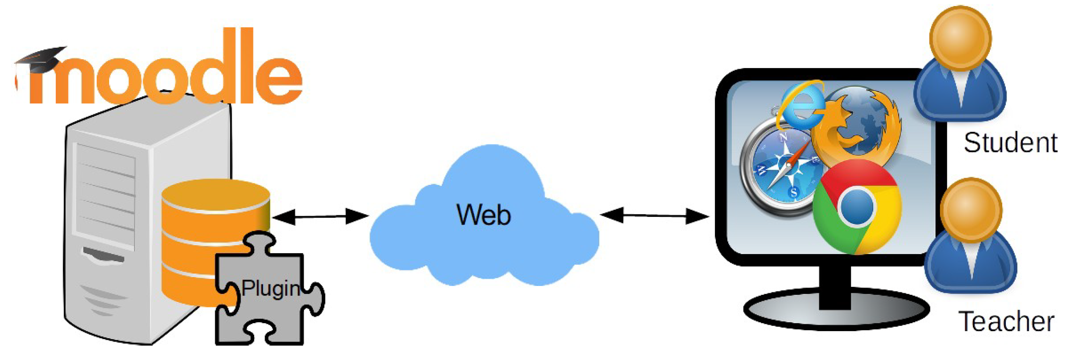
The proposed architecture is different from the typical approach that can be observed in other solutions. In their daily work, the teachers use a web browser (e.g., Chrome, Firefox, Edge, etc.) as a basic tool. All Moodle interactions are based on HTTPS connections, assuming that they are always connected to the server, as can be seen in
Figure 2.
The architecture of UBUMonitor is easy to use and different in that it only requires an HTTPS connection to validate and to select the course, and to download the data. Once the information is downloaded and stored in a local persistent cache, all other interactions can be fulfilled offline without further requests to the Moodle server. Additionally, operating the program in offline mode works without a network connection, loading previous data courses in a transparent way. This architecture is shown, and its main steps are listed in
Figure 3.
Moodle data can be downloaded using different techniques. Logins, the list of the courses, the gradebook, and activity completion are collected using the REST-API web service available in Moodle.
Log data may also be downloaded using a web scraping library (as there is no web service available at this time in Moodle 3.9).
Once the data are cleaned and processed, they are stored on the local file system. Very fast subsequent access is possible with this solution, minimizing network requests and time processing. Only if the user wishes to refresh the local data will they have to connect in order to download the current snapshot once again from the Moodle system. An important aspect of UBUMonitor is security: all local files are encrypted with the user key by applying the Blowfish algorithm before storage. UBUMonitor allows both HTTPS and HTTP protocols, simplifying the use of remote, local, and intranet servers.
3.3. General Overview
As a first step, teachers must identify themselves with a login/password and provide the URL to their LMS. Validation with the Moodle login/password or integrating systems with SSO authorization are two current options. Once the teacher has connected to the Moodle server and selected a particular course, the data are downloaded, processed, cleaned, and reorganized for rapid filtering and graphing. These steps are hidden from the teacher but are perhaps of importance, as they might give the user the feeling that the Moodle server is providing clean, chart-ready data.
Some of the screenshots were taken using the Mount Orange School web (
https://school.moodledemo.net/ (accessed on 20 October 2021)) with the permission of the originator of the content, Moodle Pty. Ltd. In
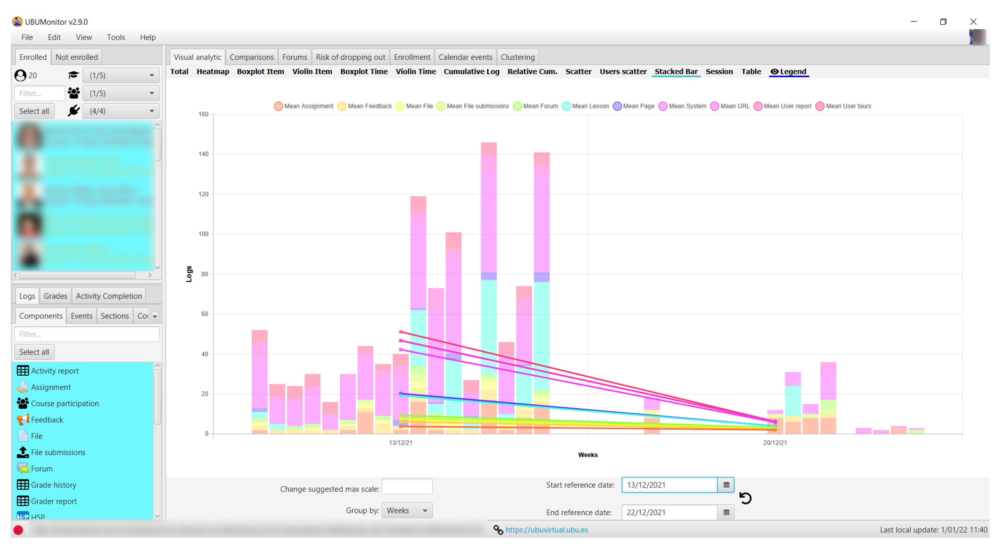
Figure 4, we show an initial preview of the main screen when the course has been loaded. The list of enrolled students is on the left-hand side, and the available data on the students appear below: records, grades, and activity completion. All the roles (teachers, students, etc.) are included as participants, as all interactions on the Moodle platform are recorded, and therefore, they may all be analyzed. Useful information is shown at the bottom on the status bar: the online or offline status of the connection (i.e., green circle vs. red circle), the name of the subject and the server from which the data were extracted are both displayed, and on the right-hand side, the date of the latest local update of the data is displayed at the current time.
The teachers can change the selection of students (filtering by role, group, and last connection) and cross-check the information with various filters based on information extracted from logs, grades, and completion of activities. In addition, in the case of logged data, the date threshold can be established with different temporal group criteria such as day, week, month, etc., providing a more advanced filtering feature. Similar filters can be applied using the start and the end dates of the activities.
On the basis of the teacher’s selections, the main central region is used to display the different charts. The set of available charts depends on the current selection (e.g., log vs. grades vs. activity completion), although some elements are common, such as the hide/unhide option for the mean, groups, and legends. The current version of the tool is capable of exporting charts and data in different well-known formats such as PNG and CSV.
Based on this general review of the main features of the UBUMonitor, the following subsections present the three main aspects for which UBUMonitor offers specific visualizations: by logs, by grades, and by activity completion.
3.4. Log Visualization
Log data are a fundamental point in LA tasks as is their application for EDM. Moodle can display user activity logs in text mode, can filter them, and can download them (although this is not an intuitive option and not always well known by regular Moodle users).
UBUMonitor hides the complexity of the following processes: downloading, cleaning, and structuring the data. Once log data are loaded on UBUMonitor, the data appear grouped in four different facets (see
Figure 5): component type, event, section, and course module.
First of all, users have to select the elements that they wish to be displayed. Depending on the selection, the resulting charts group and display the data, focusing on different aspects of the activity in the course. In the four cases, text filtering of the element is enabled.
Figure 5a shows the set of components from which there are some log entries in this course. As can be seen, this course includes class activities (such as forums, quizzes, surveys, wikis, etc.) and more classic resources (such as folders, glossaries, etc.). Moreover, there are also less classic components, such as online text submissions, submission comments, system, etc.
The component level brings together all records relating to that type. If the teacher wishes to obtain a detailed breakdown of the activities by component type, the
Events tab must be selected.
Figure 5b shows an example, where the different types of events for glossary, grade report, online text submissions, and quiz can be seen. The options provide a detailed review of student activity on very specific issues.
However, in some cases, it may be necessary to group the records from a temporal or structural point of view in the course. Under the
Sections tab, the current structure of the course (as it was configured in Moodle) is shown. Typically, two ways of structuring the course are used: a timeframe into weeks, giving more weight to chronology, or a structured division, using course topics or blocks.
Figure 5c shows the result of compiling the course structure on the basis of topics. By default, the only sections that are currently visible to the students are shown, although hidden sections can also be displayed. The collection and study of the accesses, taking into account the structure of the course, is another potential use of this tool.
The last tab takes us to the level of detail of an individual component on the course. Each resource or activity included in the course is called a course module. In this
Course Module tab, all the e-learning activities and resources in the course are listed in the same visual order as they actually are in Moodle. In
Figure 5d, an example of this visualization is shown. The individualized access of one or several students to a concrete learning object of the course may be controlled and visualized with this view. In this case, we can also work with the hidden course modules.
Once the data selection is completed, there are 13 possible views for the data log including line, bar, stacked bar, heatmap, scatter, boxplot, and violin charts.
3.5. Grade Visualization
One of the Moodle core modules is the gradebook. The publication of grades through documents (e.g., spreadsheet, PDF files, etc.) posted as resources is an alternative that is easy to apply but questionable from various points of view. Data privacy and compliance with current data-protection regulations, as well as the lack of integration of these published grades with the Moodle gradebook, discourage these practices. If the visualization and comparison of data are not included as an incentive in the platform itself, it appears logical that teachers finally solve these problems with documents as a compromise solution.
UBUMonitor loads the complete gradebook (if grades were previously inserted in Moodle). Once the course data have been loaded, the gradebook is displayed in its corresponding Grades tab along with its filters. Teachers can filter the categories and items by name or Moodle activity type. It means they can apply different views, for example, to see only grades on quizzes or assignments, ignoring the other grade items. This feature, combined with the selection of a set of students, gives a customized data view. In general, in these grade charts, the x-axis shows the categories or items selected in the gradebook, while the y-axis shows the grades on a scale.
Once the item selection is completed, there are seven possible views for the grades including line, stacked bar, radar, boxplot, violin charts, tables, and parallel category charts.
3.6. Activity Completion Visualization
Another aspect that can be visualized with UBUMonitor is activity completion. Although with a similar solution to the Moodle table, it includes some additional advanced features. As can be seen in
Figure 6, a table is shown with only the selected students and course modules, reducing the scope of the original chart.
The table also provides a visual summary on the horizontal axis with either a red, a yellow, a light green, or a dark green bar related to the percentage of completed course modules (i.e., 25%, 50%, 75%, and 100%, respectively). On the vertical axis, the number of students that completed the current activity and the percentage is shown. Additionally, a tooltip is shown for each completion mark, with its completion date and time.
This table provides a quick and intuitive view of student progress from the point of view of visualization and/or other requirements that the teacher may have set up. As the date and time of completion are available in Moodle, teachers can filter the data between two dates not only by viewing the current status but also with any previous snapshot of activity completion over time. Activity completion tracking should be expressly enabled by the teacher in the course configuration. Otherwise, the activity completion data will not be available.
4. Teaching Use Cases with UBUMonitor
The previous sections have shown the whole set of main views integrated in the tool. Nonetheless, the combined use of the visual analytic functionalities of UBUMonitor means that it can be focused on analyzing the e-teaching and e-learning process. This section details user cases taken from the daily use of UBUMonitor.
The log and grade data were taken from courses forming part of the Computer Science Degrees at the University of Burgos. The number of students on each course was around 20 to 90, with a duration of 12 academic weeks, and 4 weeks for evaluation.
4.1. Comparison of the Behavior between Students in the Same Small Group
Good teaching practice in the design of learning tasks is to divide a large group into small groups of two to seven students. A common problem in small groups is the disparity of accountability and effort made by each member, especially when the same grade is usually awarded to them all. Although individual assignments and their corresponding grades permit discrimination, it is difficult to be clear about individual effort in group work and to confirm whether these perceptions or sensations of the teacher in the laboratory are real or otherwise. Visualization of the logs combined with the grades can help invest greater confidence in the course results.
Let us take as an example a couple of students who have collaborated in small group lab assignments. The activities of both students over the weeks are shown in the heatmap in
Figure 7a. It can be observed how the activity of the second student is much higher, confirming in some way the previous assumption. Although the relation between a large number of accesses and good results and grades is debatable, and in some cases it is not fulfilled [
29], low accesses to the subject usually end up with low results.
A radar chart can also be used for the comparison (see
Figure 7b). The student with the highest weight has a more regular figure, with high grades on each axis. However, the student with a weaker performance has an irregular figure, with low performance on each axis, corresponding to individual tests, some of which are even directly related to lab assignments.
4.2. Checking Assessable E-Learning Activities
UBUMonitor can be useful for intuitive approaches to performance comparison, enabling the detection of assessable e-learning activities that are not functioning properly.
In
Figure 8a, an example of a four-month subject with four assessable e-learning activities is shown. The boxplot chart of each of the four e-learning activities provides a overview of how they are working. Grade distribution of the first assessable e-learning activities is adjusted, with a median close to 5 and a symmetrical data distribution. However, the second assessable e-learning activity had very poor results, with the median well below 5 and with the majority of data below 5. The design of this particular assessable e-learning activity should be reviewed. While the third and fourth assessable e-learning activities follow a more coherent pattern (i.e., similar to the first one), the fourth activity grades are more dispersed, as can be seen from the chart of
Figure 8a.
Figure 8b displays bimodality in the third and fourth e-learning activities (both of which are related). This could show that there are two types of students.
4.3. Checking the Learning Sequence
One aspect of interest that is worth reviewing is the design of the learning sequences on the course. From a structural and time scheduling point of view, accesses should correlate with the course design. Thus, if this is not detected, the situation may need to be corrected.
Figure 9 shows an applied case. In the example, a section with cross-sectional contents was included in the course, with information on the assessable evidence. Theoretically, this section should be accessed throughout the course and by every student. The heatmap plot was used to verify the correctness of the approach, which shows the effective number of accesses throughout the whole semester. It shows students who have accessed during almost every week and students who have not accessed in some or several consecutive weeks. This latter case can be a possible risk of dropout.
4.4. Detection Error Configuration on E-Learning Objects
The use of UBUMonitor generated some collateral results that were not initially expected, especially regarding the revision of the students’ activity in the different e-learning objects that make up a course. Classic errors may be detected with experience of its use, such as:
Resources/activities that are not visible to students.
Resources/activities with too restrictive or incorrect access conditions.
Incorrect access dates set in resources or activities.
Incorrect or broken resource/activity links.
By monitoring the activity in the modules or sections of the course and in the absence of student activity (without logs), the teacher can deduce that there is something wrong with the configuration of the resource/activity. Although in practice, students should report such incidents, they are not always proactive, and in some cases, this has even been used as an excuse or subterfuge for delaying or not complying with certain deliveries.
4.5. Detailed Access Analysis on E-Learning Objects
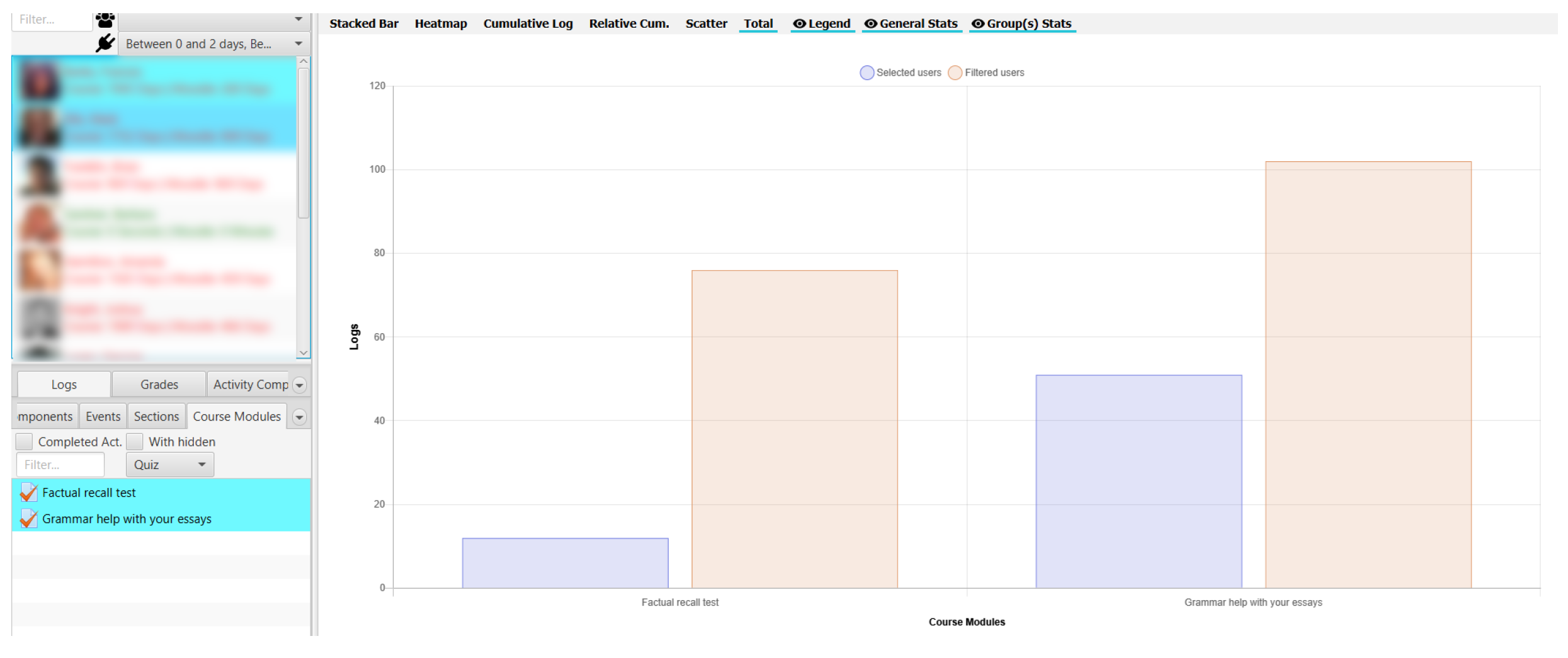
Most of the charts focus on the temporal facet, but UBUMonitor includes the possibility of focusing on different items in the log view, adding up the number of logs of a subset of students over a given time span. From this different point of view, the teacher can answer other questions, such as: What are the most visited items in the subject? What are the most visited sections? What type of events are used most of all?
Using the total chart all these kinds of questions can be answered. In
Figure 10, the number of total accesses for sections is presented. The teacher should review the coherent number of accesses with the weight of each section. In the case of detecting a great deviation, a redesign of the sections should be contemplated.
The analysis can be on a lower scale, for example showing the different number of events in the forums. In
Figure 11, we can see that most of the logs related to the forums are linked to views, in contrast with the minimal creation and publication of content. Students often prefer to view content without participating actively. In this case, the teacher should rethink new strategies to promote the active participation of the students.
Finally, in
Figure 12, a more complicated case is presented. We are analyzing the self-assessment quizzes of a subject. The chart shows the total number of accesses for the two quizzes that were designed. The second quiz has a higher number of accesses among the students. However, we can also compare it with a subset of two selected students. In practice, a high percentage of these accesses really belong to these two students (even more so in the second quiz), when we have a total of 11 enrolled students, so certain actions should be applied to encourage the other students to participate in these activities.
4.6. Checking Teacher Activity
Although it was not one of the initial goals of the application, the activity of the teachers is also monitored. Since Moodle logs include all enrolled users activity, teachers’ logs are also read and processed.
For example, the activity among different teachers can be compared, taking into account the temporal distribution of the course and the teaching load assigned. In
Figure 13, the heatmap for three teachers participating in a course is shown. Teachers 1 and 3 have been assigned 50% of the teaching load, while teacher 2 simply reviews the subject very occasionally for similarity with other related subjects.
The temporal assignment of the course is different, with the first months being given to teacher 3 and the last months being given to teacher 1. In this case, in conclusion, the activity on the platform of teacher 3 was much higher than the activity of the other two teachers.
4.7. Comparison of Access Profile Online vs. Blended Learning
We are currently using LMSs such as Moodle both for online teaching and for blended learning. However, the access profiles of students on each of these modalities differed. UBUMonitor has an option to visualize the temporary access patterns of the students according to their profiles. These patterns must be taken into account when designing some of the course activities and resources. In particular, with the dates and timetable for submitting assignments and evaluations, student availability differs greatly depending on their profiles (e.g., full-time students vs. workers).
The time pattern in an online course is very different. If we analyze their access pattern by days, in
Figure 14a, we see how the design of this concrete course, in which the deliveries are every Wednesday, influences the access peak that is shown.
Figure 14b shows the heat map by hours in the same course. As can be seen, the highest accesses occur in the afternoon/evening. On the other hand, it can be seen how some specific students have very different access patterns, which reflects student diversity. It can also depend on the student employment situation among students who generally combine work and studies.
However, in the case of blended mode teaching, the change is evident. Given that part of the activity on the platform is combined with face-to-face activities, we can see in
Figure 15a how the activity of a lab group with a fixed schedule on Thursday is also reflected in their logs. The access core is established between the working hours. The peak of access in the display by day (see
Figure 15b) also corroborates this idea. On the other hand, the activity outside the platform at non-fixed times is lower than in the online mode.
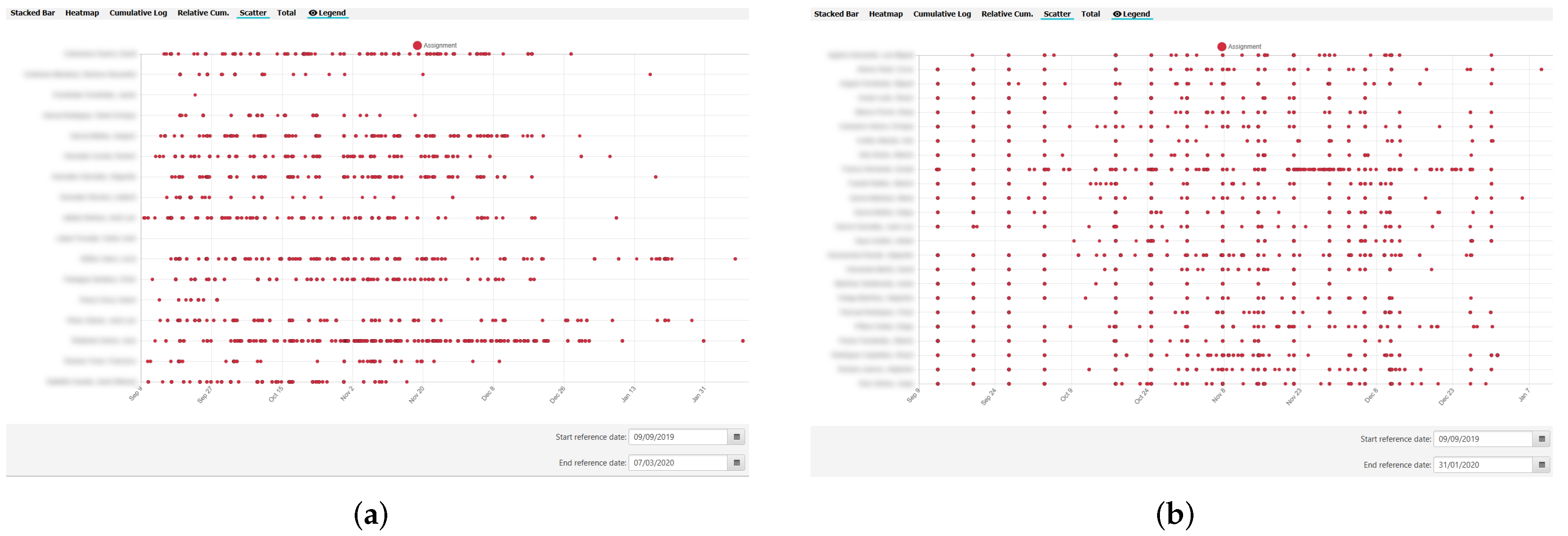
The charts confirmed that the same course taught in two different modes (online vs. blended) has very different access patterns. Similar conclusions can be deduced and confirmed using the scatter chart.
For example, if we review the assignment fulfillment cadence, we can see how this pattern in online learning is completely irregular (see
Figure 16a); nevertheless, the assignments are completed with a very regular pattern in blended learning (see
Figure 16b).
5. Evaluation
The UBUMonitor evaluation tool has been internally and externally evaluated over the past three years. From these evaluations, some limitations and threats have been identified, which should be taken into account when addressing similar proposals for such e-learning contexts and the implementation of open-source educational software.
In a first phase, four teachers (three in the IT area and one in Health Sciences) tested UBUMonitor for bugs and improvements on their own courses (and after restoring backups of previous courses on local servers). UBUMonitor has been internally evaluated over the last three years in three ways: using the institutional Moodle server of the University of Burgos (version 3.5, 3.7, 3.8 and 3.9), on testing platforms such as Mount Orange School, and using our own local deployment of Moodle (version 3.7, 3.8, 3.9, and 3.11).
Among these teachers, a series of twenty courses were tested, all of which had real data with more than 400 students. In the second phase, a new teacher started to use the tool, testing it against internal courses of the University of Burgos. The goal was to obtain a stable version to be tested in a wider environment.
Once the version was considered stable, an internal teacher training course was designed and proposed at the institution. The course was part of the specialized Virtual Teaching Training Program organized by the university’s Teacher Training Institute.
Three such courses have been held between 2019 and 2021. Planning and participation is shown in
Table 2. An enrollment capacity range of 15 to 30 participants was established. All participants were university teaching staff. While the first course could be attended in face-to-face mode, the following two courses were given in online mode due to the health situation provoked by COVID-19.
The User Experience Questionnaire (UEQ) [
30] was the chosen evaluation instrument. In the words of its authors, their aim was to develop a questionnaire to facilitate a quick evaluation by end users preferably covering a complete impression of the user experience. It should enable users to express feelings, impressions, and attitudes very simply and immediately that arise when participating in the product under investigation. The UEQ is currently available in more than 30 languages and offers tools for analyzing the results. As indicated in [
31], UEQ is among the three most widely used UX questionnaires in use today, and it is the most used in the last three years according to this study.
5.1. The First Training Course
The initial enrollment amounted to 16 students, although the final number was reduced to 13. The participants reflected a very varied profile, including teachers from different areas/departments, although the main body belonged to Computer Science.
A training session of 2 h was given using UBUMonitor v2.4.8. Once the course was completed and after giving the students a few weeks to test the application, a usability survey was performed using an integrated Moodle survey. The survey model was based on the Spanish translation [
32] of the original English model described in [
30].
In all, 11 participants (68% of enrollments and 84% of attendees) completed the survey. Next, we used the Excel datasheet provided in the web site User Experience Questionnaire (available at
https://www.ueq-online.org/ (accessed on 21 February 2022)).
Table 3 shows the results. Analyzing the table, the six main aspects measured by the survey were very satisfactory (on a scale ranging
), considering fairly good values from 1.5, although some aspects need to be reviewed.
5.2. The Second Training Course
The initial enrollment amounted to 26 students, including teachers from very different areas/departments. A training session of 2 h was given using UBUMonitor v2.6.3 through a virtual room, with Skype for Business from Microsoft.
The course was completed, and after giving the students a few weeks to test the application, the same usability survey was performed using an integrated Moodle survey. The survey was completed by 10 participants (38% of enrollments and 40% of attendees). The fact that this course was taught for the first time in online mode, with a certain inexperience of teachers and participants, and the fact of transferring the surveys to online mode, together with a situation of confinement of the population, was of little help in the data-collection process.
Table 4 shows the results. Analyzing the table, the six main aspects measured by the survey were less satisfactory (on a scale ranging
), considering between neutral and good from
to
. In general, worse values were obtained than in the first course, so a review of these factors was carried out. In particular, the results should be treated with caution given the particular social situation at the time.
5.3. The Third Training Course
The initial enrollment amounted to 25 participants. A training session of 3 h was given using UBUMonitor v2.7.0 through a virtual room, with Microsoft Teams. Again, after the course was completed, the same usability survey was performed using an integrated Moodle survey.
The survey was completed by 15 participants (60% of enrollments and 60% of attendees). The negative effect of online instruction seems to have been attenuated, resulting in higher participation in the surveys. Greater experience of online delivery (among both teachers and participants), together with an increase in time dedicated to the course and the change of video conference platform, are factors that could have had positive contributions.
The results are shown in
Table 5. Five of the six aspects measured by the survey were most satisfactory (on a scale ranging from
). However, the aspect Perspicuity continued to have a declining rating and merits further study.
5.4. The Global Evaluation
Taking all the surveys from all three courses (36 participants), the following global results are shown in
Table 6. The data should be treated with a degree of caution, as they are from different courses with different factors (e.g., a different software version), but they give us the chance to assume an overall view of the current state of the tool from a UX point of view.
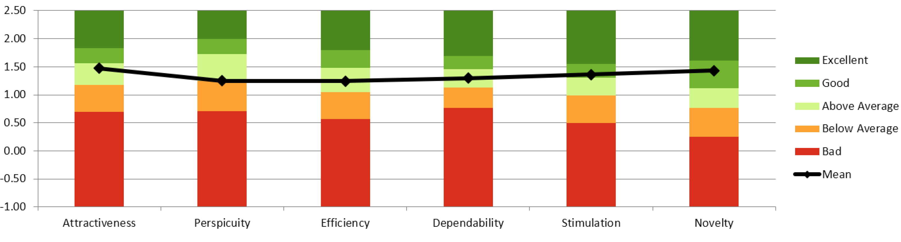
As was assessed in [
30], the tool was compared with other tools, and the measured scale parameters were set in relation to existing values from a benchmark dataset. This dataset contained data from 18,483 persons from 401 studies concerning different products (business software, web pages, web shops, social networks). The comparison of the results for the evaluated product with the data in the benchmark yielded conclusions on the relative quality of the evaluated product compared to other products.
As can be seen in
Figure 17, UBUMonitor obtains
Above average values in five of the six factors, with two of these factors (
Stimulation and
Novelty) in the
Good category. Only the
Perspicuity factor is in the average and should be the focus of further studies and improvement proposals.
6. Threats and Lessons Learned on Institutional Integration
Although the survey results were positive, we are aware of the strengths and weaknesses of using UBUMonitor. From a purely technical point of view, the chosen architecture shown in
Section 3.2 has certain advantages and disadvantages. The use of client applications facilitates the complete use of the machine’s local resources, and with a portable distribution, we believe that it is, in principle, a valid solution. The distribution as a thin client, with hardly any impact due to its installation, has meant that both the distribution and testing of new versions can be comfortably completed. Therefore, it is not in any way inconvenient for teachers. On the other hand, special emphasis has been placed on assessing the usability of the application. As pointed out in other works [
33], it is also advisable to review the achievement of goals and the effect on students. Along these lines, we are already considering the integration of the collection of statistics on the use of the tool, subject to user consent.
Moreover, this solution is an attempt to avoid the classic problem of adopting new innovations within the short/medium term, as in the case of LA and their associated tools. This
pipeline problem was mentioned in [
34,
35], where the authors pointed out that the adoption of these sorts of tools tends to be problematic, moving from unawareness of LA to a state of high interest. We think that our proposal is easy to deploy and to drive forward, but it requires a certain effort of dissemination and training among the academic staff.
Nonetheless, in the future, the functionalities could be integrated as a server plugin, which was previously expressed in the evaluation surveys as a suggestion or requirement from the teachers. Aware of these difficulties, which are not only technical but also bureaucratic and economic, as previously discussed, there is some understandable reticence at the centers responsible for virtual education managed through Moodle.
The bureaucratic and economic aspects of including plugins and externally sourced products can be problematic, as security, privacy, and development issues are mixed in with these products, which means that organizations are often reluctant to include non-certified software. When the inclusion of such software is outsourced, as is often the case, then software maintenance issues could increase. The problem of who is responsible for such software and the effects on the system as a whole are difficult both to predict and to quantify. Any further development of and support for the modules are often abandoned, and their support is not assured in the long term, which can mean that functionalities become vital for daily use and cannot be included in future updates of new versions with complaints from current users. A more complete analysis of these sorts of problems, from a leadership and an institutional level, is analyzed in [
36], breaking down more strategic points from the scope of this work. The proposed software presented in this paper presents none of these problems, permitting independent development and deployment, and easing the testing of new versions. However, it may also limit its expansion, as the Moodle community is accustomed to plugin and block-based solutions.
Other particular limitations are linked to our institutional Moodle configuration. Nevertheless, it could be replicated in other institutions. For certain reasons outside the scope of this study, IP address information is not included in log data. Therefore, the geopositional information was not considered at a first stage, although we recognize its interest, and a number of charts could be provided related to this information.
As mentioned above, UBUMonitor makes it possible to gather and to collect high volumes of student information. This information makes it possible to apply specific measures to certain students, to identify at-risk students, and to decrease drop-out rates, among others, aiming to personalize education. Nevertheless, incorrect use of tools such as this can increase the control-related feelings of the student and could be counterproductive. As with any other tool, UBUMonitor must be properly used, avoiding over use. The existing students are open to the idea of their data being used for these purposes [
37], but the problem of the privacy paradox [
38] is also present. A great effort within the educational organization is needed to communicate the purpose of the data that are collected with tools such as Moodle and UBUMonitor.
7. Conclusions and Future Research
In this paper, UBUMonitor has been presented, which is a Java-based multi-platform desktop tool for e-learning analysis that facilitates the personalized visualization of grades and activity log data extracted from Moodle. Its customization capability is based on the simple combination of student selection, logs, grades, and activity completion, with multiple filters, groupings, and types of charts. The result is an innovative tool with multiple pedagogical capabilities for the analysis of e-learning. UBUMonitor is open source and therefore is available to all teachers regardless of institutional decisions on the installation of specialized Moodle plugins for learning analysis.
We have highlighted a series of innovations not observed in the other tools analyzed in
Section 2. From a pedagogical point of view, the tool provides a complete set of charts for visual e-learning analysis. In particular, we would like to highlight the violin chart, which has been featured in detail, to analyze threshold values of grades with their distributions. The second innovation is that it represents the information on Moodle activity completion using time windows. This Moodle feature is highly configurable after the enhancements of version 3.3, but it takes no account of activity completion table queries with temporary filters.
Moreover, we may highlight, from a technical point of view, two strong features. First, there is the data security and privacy aspect, ensuring that all data extracted from the institutional server are kept encrypted. Second, there is a public and open software development process. The agile software development process performed to develop UBUMonitor is compliant with good software engineering practices such as task management, change management, continuous deployment, continuous quality, continuous documentation, and internationalization. Both the product license and the development process follow the open source philosophy.
Although there are many similar solutions, both commercial and open source, many of these tools simply focus on a more global vision of the courses and their students. On the contrary, with UBUMonitor, teachers may conduct thorough investigations of the activity and the e-learning levels of each student on the course, with visual analytics of each completed learning interaction in Moodle. It all helps teachers to analyze and make decisions on their courses with specific data from student logs on activities/resources, activity completion, and student grades, with a level of detail that other tools cannot currently offer. The benefit to students of the visual analyses with UBUMonitor depends on the individual teacher/designer of the pedagogical patterns. A future line of work is to revise a catalogue of pedagogical patterns [
39] and to include a new descriptive element in each pattern aimed at incorporating how to use visual analyses of student activity and performance in the LMS.
As with any other software, there are always features to be improved and expanded. Along these lines, some information such as student engagement, time spent on the platform, clustering, and learning sequence analysis (as shown in [
13,
18,
40]) could also be visualized with UBUMonitor in the future. Some of them have been included in latest versions, such as comparisons, forums, enrollment, event timeline, or clustering, although their enumeration and description are outside the scope of this work.
Data exportation is another area to work on, since UBUMonitor is a tool that can be integrated with other widely used tools, such as spreadsheets, statistical packages, libraries, and machine learning tools. Even though, at present, the focus of the tool is on visualization, the generation of additional information and its integration with data from third parties promises to be an important improvement in the future.
In particular, the surveys conducted show a certain problem with the Perspicuity feature. Although the tool in its fundamental core has remained stable, focusing on logs, grades, and activity completion as fundamental elements to visualize, it seems that the introduction of additional functionalities obfuscates the use of the tool. Along these lines, the integration of the tool in future institutional e-learning and b-learning plans, together with a more detailed study of the actual statistics of use and practical use by the teaching staff, may help to redirect its orientation and accompanying research work.


 ,
, 


