1. Introduction
The Water Quality Model (WQM) is a term used to describe a mathematical method that enables predicting, controlling, and ensuring drinking water quality in a water distribution system. Such a method includes input water quality measurements, such as the pH, turbidity, TOC, redox, free chlorine, and others. As output, the process generates a decision indicating whether the water is safe for drinking. An algorithm or some computational method calculates the transition between inputs and output. One may perform the calculation manually or fully automated.
The ISO standard 24522 [
1] (Water and wastewater quality event detection) defines several options for this type of model. Generally, all processes, including water quality measurement, have some PV (process variability).Regarding the DT (delay time), the PV may be high in the case of a short period (a few minutes). However, as the relevant DT is longer, it is expected to see the PV converge to some steady state. The current paper examines the relationship between the two measurements (PV and DT) as a detection tool for abnormality.
The literature includes many examples of identification methods for detecting water quality abnormality. The current section reviews the most common forms. Dempster [
2] lists real-time ways of using machine learning to identify water quality abnormality. Dempster introduced the concept of multivalued mapping, which associates each element of a space of possibilities with a set of possible outcomes. The above method allows for a more flexible representation of uncertainty than traditional probability theory, where each factor is associated with a single result. Perelman et al. [
3] used an artificial neural network to predict water quality using time series data and compared the expected value to the actual one to detect water quality disruptions.
The proposed process involves using a combination of multiple sensors and data fusion algorithms to obtain more accurate and reliable measurements of water quality parameters. The innovation is related to a new statistical method for identifying abnormal events in the water quality data, such as changes in the concentration of different contaminants, based on the correlation structure of the data. Dibo et al. [
4] implemented an extended Dempster–Shafer method. They used the comprehensive Dempster–Shafer method, a mathematical framework for reasoning under uncertainty, to integrate the data from different sensors and determine the likelihood of contamination events. The authors combined data from multiple sensors, including temperature, pH, and dissolved oxygen, to comprehensively view the water quality in real-time. Liu et al. [
5] improved the Dempster–Shafer method. Their main achievements are higher accuracy, cost-effective, and comprehensive monitoring.
Hagar et al. [
6] used CANAY, a free software tool that uses a multivariable regression to predict water quality parameters and compare the expected value with the actual value measured. An event is declared when this difference is large enough for a significant period. [
7] Demonstrated the usage of PCA (Principal Component Analysis) analysis applied to UV absorption as a tool for identifying possible water quality events, the authors used a UV-Vis absorption spectroscopy sensor to measure the absorbance spectrum of water samples at different wavelengths and then applied PPCA (Probabilistic Principal Component Analysis) to analyze the data and detect anomalies by calculating the likelihood of an example in the PPCA plan.
Since water distribution systems are chlorinated, the level of residual chlorine should be in some steady state. Deviation from this steady state signals abnormality. Nejjari et al. [
8] showed a solution for this issue. They based their model on residual chlorine levels using the EPANET modeling tool.
In recent work, Mao et al. [
9] implemented a spatial-temporal-based event detection approach with multivariate time-series data for water quality monitoring (M-STED). The third part of their method established a spatial model with Bayesian networks to estimate the state of the backbones in the next timestamp and trace any “outlier” node to its neighborhoods to detect a contamination event. The authors of [
10] applied three models for comparing the actual versus the predicted value of the quality parameters. First was the Holt–Winters model, which uses a time series forecasting method that considers three components: level, trend, and seasonality. The model uses exponential smoothing to forecast past time series values. Second was the McKenna model, a mathematical model used for predicting the behavior of chemical reactions in liquid media. The model uses the mass balance equations that describe the conservation of the different species involved in the response. Third was an artificial neural network (ANN). This method uses the input of measurements to detect the gap between the actual and predicted values of the dependent output. They inspected events by observing unexpected changes in quality measurements compared to the predicted values. The authors of [
11] extended the above approach by applying several additional models to water quality data. After preprocessing and feature selection, they used k-nearest neighbors (k-NN), support vector machines (SVM), decision trees, random forests, and ANNs to classify the water quality data as either standard or anomalous.
They used logistic regression, linear discriminant analysis, SVM, an ANN, deep neural network (DNN), recurrent neural network (RNN), and long short-term memory (LSTM). The results showed that the random forest algorithm outperformed the other models regarding the accuracy, sensitivity, and specificity in detecting anomalies in the water quality data.
Each of the above WQMs included tuning parameters. These parameters are the knobs used to make the model valuable and accurate. Accuracy refers to four situations: true positive, false positive, true negative, and false negative. The aggregation of these four measurements is translated into a statistical quality index, such as Kappa, indicating the model’s reliability.
A more recent survey by Liu et al. [
12] provided a comprehensive review article that delved into the methodologies and strategies employed in pinpointing unfavorable events within potable water systems. The paper analyzed the current techniques, highlighting their strengths and limitations. The review is a pivotal resource for researchers and policymakers keen on improving water safety standards and management practices.
The above models did not address one central question: the time delay issue. The time delay parameter defines how long the model should wait before it triggers an alarm. Setting the delay time shorter than optimal will generate excessive false positives. Selecting a delay longer than optimal will generate extreme false negatives. It may also cause true positive alarms to be triggered with a delay, causing a loss of significant time, which is critical regarding water networks.
What is also not addressed explicitly by the above methods is the issue of true negative events (TNE). The literature uses the phrase true negative to refer to a situation in which the model did not trigger an alarm, and this action is correct. However, most records do not generate a warning in a typical dataset. This causes the calculation of Kappa statistics to be useless. This paper suggests that a TNE is a situation in which an event detected by the algorithm ended before it matured sufficiently to generate a trigger; i.e., it finished before the end of the delay period. For such a case, the TNE is correct. Hence, the TNE is essential to the model’s efficiency calculation.
The tuning process of a WQM is considered a time-consuming process that can be performed most of the time by experts only. If performed poorly, the result may be either false positives or negatives. In other cases, it will lead to frustration and aborting the method. In both cases, the model turns out to be useless. Asking the end user, i.e., the water quality engineer, to allocate a substantial amount of time to calibrate their models seems impossible. Thus, one of the significant subjects addressed by the current paper is creating a simple tuning method.
Hence, the present paper addresses three issues:
The paper starts by describing a multiparameter method for water quality measurement. It follows what is described by Brill [
13] and Brill and Brill [
14]. Unlike [
15] which used KMean based on three parameters, and thus assumed normal distribution of the quality measurements, the presented methodology is a more general one and uses two tuning parameters: DT – Delay time and PV. Given the above scenario, this paper then presents how each event type (TP – True Positive, FP – False Positive, TN – True Negative, FN – False Negative) is defined. Lastly, a graphical calibration method for tuning the algorithm parameters is presented. The second part of the paper implements the technique over a dataset from a monitoring station. The algorithm assigns a number to each of the events in the dataset. Then, the algorithm examines each event in a two-phase plane of DT and PV parameters. Given its location in this plane, a decision about whether to notify is made. In parallel, human experts classify the events as True or False events. By combining information from these two sources (Notify/Not Notify and True/False), a simple graphical demonstration of the data enables the user to select the thresholds for the model. Thresholds are the minimum level of DT (henceforth, DTmin) and the minimum level of PV (henceforth, PVmin). An illustrative example supports the implementation of the method.
2. Description and Calibration of the Proposed Model
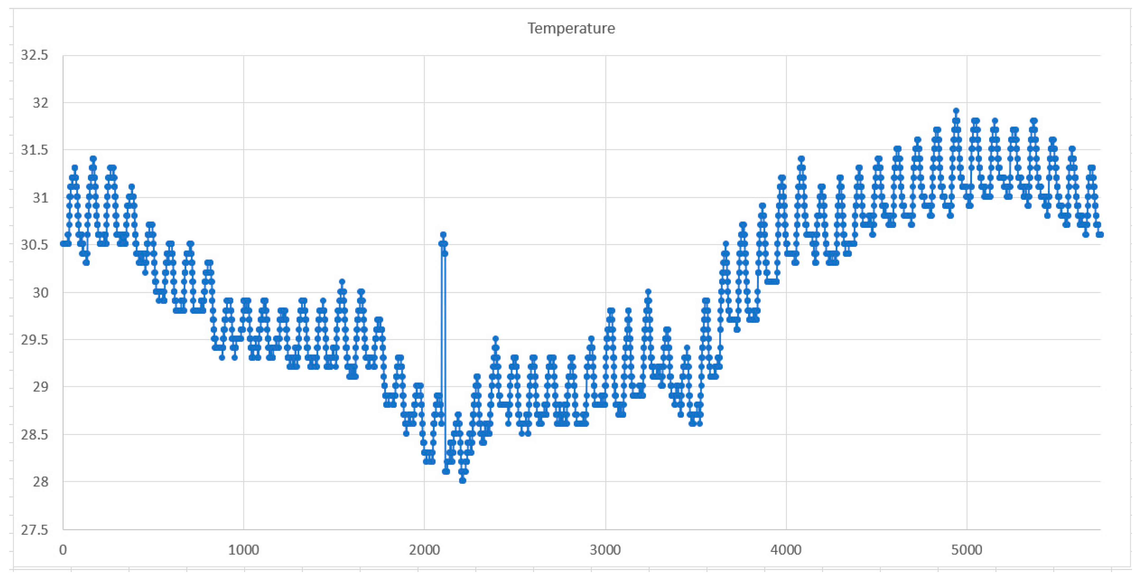
This section describes the calibration of the WQM. Assume there is an online system in which online sensors measure the water quality. The online system records every fixed interval (e.g., every minute or two). Each data record contains a timestamp and a vector of K measurements. The full dataset includes a K × M table in which each of the K columns contains all the data measurements of a single sensor, and each row of the M rows contains K measurements for a specific timestamp.
Step 1:
The first step of the algorithm is to normalize the values in the dataset. Normalization refers to a process in which a data value will replace each value in the dataset from 0 to 1. This normalized data will allow determining the Euclidean distance (or any other metric distance method) over the complete set of variables without referring to the original physical units of each variable. Since the control system produces a new record every new time interval, we assume the dataset contains M rows at a certain point. Suppose that each row has an index m (1 to M). The algorithm calculates the normalized value of measurement k in row m by Equation (1):
The terms in Equation (1) are as follows:
—normalized value at row m and column k.
—value at row m and column k.
—maximum value in column k
—minimum value in column k.
Hence, the values are normalized based on the range between each measurement’s minimum and maximum value and not based on the standard deviation, as in Cheng et al. [
16]. Please note that the algorithm also uses a filter mechanism by trimming exceptional records from both ends of each parameter axis, i.e., eliminating upper and lower single percentages from each column’s data before calculating the max and min values.
The pros and cons of normalizing values using the above method are beyond the scope of this paper. However, it is worth noting that an alternative normalized method based on the standard deviation may produce some bias in central measurements such as average, standard deviation, and others in the case when the distribution is highly non-symmetric, while the range-based method as implemented in this case is more immune to random bias in data.
Step 2:
The second step of the algorithm is to track the movement of the location of a Virtual Center Point (VCP) in an M-dimensional hyperspace.
Figure 1 shows the traveling path of such a virtual point in a two-dimensional space. The normalized values are the VCP coordination at each timestamp (as calculated in step 1).
The VCP traveled from timestamp
to its location
within five timestamps. The term “total traveling distance” refers to the distance the VCP traveled from point
to point
until it arrived at
. The green arrow shows the actual traveling distance (ATD). Equation (2) shows the ATD between two records in the dataset with a time lag (LAG) of
timestamps, calculated using a standard Euclidean distance and given by Equation (2):
The two v terms in Equation (2) (inside the parentheses) refer to the normalized vectors. The first is for the last record, and the second is for the first location (located s steps back). In
Figure 1, this means the data record at
and the data record at
. The algorithm calculates the term
for each record in the dataset. The number of data points recorded between the first and last in each calculation is called the LAG.
Step 3:
Figure 2a,b explain step 3 of the algorithm. The horizontal axis in each figure depicts the period: each tick in the axis is a different record (row) in the dataset. The vertical axis in each figure represents the distance traveled during a period that ends at this timestamp and has started
timestamps previously. This period refers to the LAG selected for the calculations, in this example, five steps. The green line in each figure is the corresponding curve for the distance traveled during the time stamp, ending in each time stamp. The difference between
Figure 2a,b is the LAG size (in terms of records) used to calculate the actual traveling distance. The number of steps in
Figure 2a is smaller than in
Figure 2b. Hence, on average, the distance traveled by the virtual point under the
Figure 2a regime is smaller than that traveled under the
Figure 2b regime.
The red line in each of the figures is a different threshold. The term
shows the level of the red line in
Figure 2a. The
value summarizes the cumulative time the green line value is above the red.
Figure 2b illustrates the exact mechanism. The higher
is, the smaller
is, and vice versa. Also, in
Figure 2b, a negative relationship is obtained between
and
.
Each portion of an area between the red and green lines has a base.
Figure 3 shows this base. Its units are minutes. Therefore, for each level of the red line represented by the Distance axis, it is possible to calculate the total time spent above the line by summing all the bases.
The discussion refers to
Figure 3, which transforms the discussion into the control arena.
Speaking control-wise, it is assumed that when a process is characterized by high variability, it is recommended to wait only a short delay time before the alarm is declared. The lower the process variability, the higher the delay time before triggering an alarm. Process variability is expressed in this case as the ATD of the VCP as shown in
Figure 1. Two different examples of the relations between the variability and the delay time are shown in
Figure 3 as curves
and
. Each of these curves is a set of combinations of the Variability and Delay time for different LAG.
It is important to note that the
and
curves in
Figure 3 are unknown. The process of discovering these curves (or at least one) is explained in what follows.
It is notable that the time scale of
Figure 2 (the vertical axis) is not shown in
Figure 3. The Vertical axis of
Figure 3 depicts the PV. On the other hand, the delay time shown in
Figure 2 on the vertical axis is shown in
Figure 3 on the horizontal axis and is named DT. The points
and
in
Figure 3, located on curve
,, express a single combination of the delay time (expressed as the red line in
Figure 2a) and variability as expressed by the green line in
Figure 2a. Similarly, the point
and
in
Figure 3, located on the curve
, expresses a single combination of delay time (expressed as the red line in
Figure 2b) and variability, as expressed by the green line in
Figure 2b.
Step 4
The stage is ready for introducing the tuning process based on the information presented thus far. The following discussion pertains to
Figure 4, which illustrates a singular Delay (
) to Process Variability (
) curve.
We assume a specific
curve is selected (by choosing the lag time
). A point on the selected
curve is selected (denoted by the green dot). This point corresponds to
and
, the delay time and the corresponding variability. Hence, any event in which the delay time is greater than
and the distance traveled is more extended than
will generate an alarm. Examples of such events are shown in points 1 and 3 in
Figure 4. Any circumstance not fulfilling these two conditions will not create an alarm event. Examples of such a point are 2 and 4.
Additionally, suppose a human expert has classified all events as True (marked with a square) or False (marked with a triangle) based on process knowledge.
Considering the information above, by merging the expert classification and algorithm classifications, each event can be categorized as one of the following:
TRUE Positive events: Marked by filled squares. See point 1 as an example.
FALSE Positive events: Marked by filled triangles. See point 4 as an example.
TRUE Negative events: Marked by non-filled triangles. See point 2 as an example.
FALSE Negative events: Marked by non-filled squares. See point 3 as an example.
The classification should refer to two facts: the event’s location in the Variability to Time Delay space relative to the green point and the expert’s subjective estimate concerning whether the specific event should or should not have generated an alarm. For example, point 1 in
Figure 4 depicts an event that caused an alarm and was classified as True by the user. Hence, it will be classified as True Positive. Point 2 in
Figure 4 mistakenly did not generate an alarm and was classified as a False Negative. Point 3 in
Figure 4 mistakenly caused an alarm and is classified as a False Positive. Moreover, finally, point 4 in
Figure 4, which depicts an event that did not create an alarm correctly, is classified as a True Negative.
Once a set of events is classified, as shown in
Figure 4, a Kappa statistic can be evaluated for these points.
Step 5:
The calibration process has now reached its final stage—the estimation of parameters for the S curve. Assuming that the S curve has the functional form
the task is to find a set of values for
including the green point and to generate the optimal Kappa.
Hence, the corresponding parameters are estimated using the least squares method for a given set of and points as measured for a given LAG .


