Article

Developing Visual-Assisted Decision Support Systems across Diverse Agricultural Use Cases

1
Department of Computer Science, Celestijnenlaan 200A, 3001 Leuven, Belgium
2
Department of Natural Resources Management and Agricultural Engineering, Agricultural University of Athens, Iera Odos 75, 11855 Athens, Greece
*
Author to whom correspondence should be addressed.
Agriculture 2022, 12(7), 1027; https://doi.org/10.3390/agriculture12071027
Submission received: 1 June 2022 / Revised: 5 July 2022 / Accepted: 11 July 2022 / Published: 14 July 2022
(This article belongs to the Special Issue Application of Decision Support Systems in Agriculture)

Abstract

:
Decision support systems (DSSs) in agriculture are becoming increasingly popular, and have begun adopting visualisations to facilitate insights into complex data. However, DSSs for agriculture are often designed as standalone applications, which limits their flexibility and portability. They also rarely provide interactivity, visualise uncertainty and are evaluated with end-users. To address these gaps, we developed six web-based visual-assisted DSSs for various agricultural use cases, including biological efficacy correlation analysis, water stress and irrigation requirement analysis, product price prediction, etc. We then evaluated our DSSs with domain experts, focusing on usability, workload, acceptance and trust. Results showed that our systems were easy to use and understand, and participants perceived them as highly performant, even though they required a slightly high mental demand, temporal demand and effort. We also published the source code of our proposed systems so that they can be re-used or adapted by the agricultural community.

1. Introduction

The digital revolution is transforming agriculture; the rapid spread of several cutting-edge technologies such as Global Positioning System (GPS), remote sensing, artificial intelligence, robotics and the Internet of Things [1] has led to a big increase in the data volumes available from farms [2]. In addition, there is an increasing use of unmanned aerial vehicles (UAVs) in recent years for various tasks, including monitoring, yield estimation, etc. [3], which further increases the data volume. Many agri-food operators, therefore, often find themselves surrounded by large volumes of data [4], and need powerful techniques for decision-making tasks. Fortunately, with the emergence of the precision agriculture concept, modern machinery, computerised tools and information and communication technologies are being used to support agri-food operators with optimised input management, decision making and improved productivity [5].
Information visualisation provides an additional layer of understanding on top of the precision agriculture concept [4,6]. It provides a way to utilise “the processing power of modern computers with human cognition and visual abilities to better support analysis tasks” [7]. Interactive visualisations allow for better understanding of large volumes of complex data by aggregating, filtering or exploring relevant information. Therefore, visualisation tools have been widely used in various domains to assist with tasks that might otherwise require significant cognitive effort. In agriculture, visualisations have proven to be useful to effectively communicate uncertainty in seasonal climate prediction [8]; manage pests, crops, irrigation and fertilisers [9]; and support decision-making in precision agriculture [10]. Nevertheless, the area of (precision) agriculture still lacks the support with a framework and reference systems to develop DSS [4,11]. Besides, the majority of the interfaces have been designed for standalone computers, rather than adopting web technologies, thus hampering portability, reusability and cross-platform support [12]. Finally, evaluation of agricultural DSSs using a user-centred evaluation approach is limited despite its importance in understanding end-users and to potentially improve the system [13,14].
To address these gaps, we propose a set of reference visualisation libraries, visual analytic components and an interaction framework and show their applicability by developing various web-based DSSs across six agricultural use cases, and made the systems freely available to anyone. Then, we demonstrate an evaluation of these systems using a user-centric evaluation method, an approach that is still limited in agriculture, by focusing on usability, workload, acceptance and trust. A graphical overview of the identified gaps and contributions of this work is presented in Figure 1.
In the following subsections, we discuss previous work related to existing decision support systems in precision agriculture, visual analytic components and interaction framework.

1.1. Decision Support Systems in Precision Agriculture

DSSs are an important part of precision agriculture in supporting agri-food operators with crucial decision making, farm management and planning tasks [9]. Typically, data is first gathered from multiple sources such as sensors, satellites and in-field observations, and analysed with statistical models. The analysis output is then displayed to the agri-food operator who uses it for decision making.
Among the various DSSs developed to support precision agriculture, Vite.net [15], for instance, supports crop management within vineyards. It provides important information about vine growth, pest control and diseases in grape berries, and allows farmers to make informed management decisions. Another system, DyNoFlo Dairy [16], is designed for farmers and regulatory agencies. Its main purpose is to integrate nutrient budgeting, crop and optimisation models to assess nitrogen leaching from dairy farm systems. The tool provides a representation of all system modules and their connections, allowing users to interact with different models to optimise nitrogen leaching and profit. In another subdomain, AquaCrop [17] supports simulation analysis towards the impact of climate change, especially rainfall, on wheat yield. Similarly, ATLAS [18] allows a simulation of crop availability on a landscape across different crop scenarios in relation to pests, diseases and biological control.
Additionally, there are DSSs that aim to optimise yield, while preserving resources [19] such as fertiliser. An exemplar DSS in this field includes CropSAT [20], which assists in calculating variable rate application for nitrogen fertilisation based on satellite images. The images generated in CropSAT show representations of crop biomass variation, which is difficult to achieve by in-field assessments.
Visualisation has also become an important aspect of DSSs in precision agriculture. By visualising a large volume of data with complex information, users can consume them more easily. As such, a number of visual DSSs have been proposed for various use cases of agriculture [9]. For example, Blauth and Ducati [21] developed a farm management tool that visualises land usage in a vineyard by adding layers on a map. The tool keeps track of vineyard data such as grape variety, yield and inventory, and shows important information such as vegetation, bare soil and nearby urban areas. Another example is AgMine [22], which assists wheat growers by illustrating seasonal rainfall and yield production. For irrigation management, Byishimo and Garba [23] proposed a tool that visualises real-time data collected from in-field sensors, allowing farmers to monitor the soil, temperature and water. A different tool, DIDAS [24], allows farm evaluations based on soil, evaporation, plant resistance and land structure and assists with the design and scheduling of the drip irrigation systems. In particular, it provides visualisations to analyse water flow so that farmers can create irrigation schedules when water is scarce.
Evidently, there has already been a large number of DSSs, with and without visualisations, proposed by previous research efforts. However, due to the lack of common interfaces and reference systems, existing systems resulted in incompatibilities across the platforms and end-users, hindering the uptake of precision agriculture [4]. Besides, according to a recent systematic literature review [11], no framework is available in precision agriculture to guide the implementation of the systems. Thus, in this work, we introduce reference technologies and interaction frameworks to develop cross-platform compatible and highly interactive DSSs for precision agriculture.

1.2. Visual Analytic Components

Our previous systematic review shows that almost all of the DSSs in agriculture have been designed as standalone applications [9] which are not flexible and portable in comparison to the web applications. Besides, as described in Section 1.1, there is a need for common interfaces and reference systems. Fortunately, a number of open-source visualisation libraries are available nowadays with extended documentations and supports for popular web programming languages such as JavaScript. D3.js [25], for example, is the most popular visualisation library for JavaScript applications with multiple out of the box visualisation, customisations and data manipulation options. Vega [26] and Vega-lite [27] are another family of popular visualisation libraries for web applications with a choice for high-level language for rapid development. Chart.js [28] is another high-level open-source visualisation library for rapid development, but it only supports eight common chart types. To support the development of common interfaces and provide a reference system, we have selected a set of visualisation components that have widely been used in visual analytics systems and are also widely supported by the existing visualisation libraries. These components are as follows:

1.2.1. Bar Chart and Histogram

Bar charts show comparisons among discrete categories. One axis of the chart shows the specific categories being compared, and the other axis represents a measured value. They can have bars clustered in groups, showing the values of grouped variables. A histogram is a type of bar chart typically used to represent the distribution of data points in a dataset. Thus, in most visualisation libraries, a single component is used to visualise the bar chart and histogram (see Vega-Lite Bar for example https://vega.github.io/vega-lite/docs/bar.html (accessed on 1 June 2022)).

1.2.2. Time Series

A time series is a distribution of data points visualised according to the time dimension. It is usually presented as a sequence with successive equally spaced points in time. Time series is a subset of line chart where the trend in data is visualised over equal intervals of time. Thus, the line chart type is typically used to create time series in most visualisation libraries (e.g., Vega-Lite https://vega.github.io/vega-lite/docs/line.html (accessed on 1 June 2022) and Chart.js https://www.chartjs.org/docs/latest/charts/line.html (accessed on 1 June 2022)).

1.2.3. Scatter Plot

Scatter plots are two-dimensional visualisations that use dots (also referred to as circles) to represent the values for two different variables, one plotted along the x-axis and the other plotted along the y-axis. Scatter plots are extremely useful in comparing the relationship and correlation between two variables.

1.2.4. Radar Chart

Radar charts are representations of multivariate data in the form of a two-dimensional radial chart. They visualise three or more quantitative variables represented on axes starting from the same centre point. Despite their ability to represent multivariate data, due to the nature of their circular design, the amount of variables they can represent without hindering usability is finite. Thus, one must pay attention not to overpopulate the chart.

1.2.5. Pie Chart

Pie charts represent the proportion of a quantity using slices in a circular pie. The arc length of each slice is proportional to the quantity it represents. Due to their circular design, pie charts also have the same limitation as radar charts.

1.2.6. Choropleth Map

Choropleth maps are geographical representations of data which show changes across a large geographic landscape such as countries, states, or watersheds. Note that many visualisation libraries use the Mercator projection by default, which exaggerates the size of the countries that are away from the equator. One should recognise such a limitation of the Mercator projection and adapt the projection style as required. For instance, the D3 library https://github.com/d3/d3-geo (accessed on 1 June 2022) has geoNaturalEarth and geoEqualEarth functions, which can render non-distorted earth projections.

1.2.7. Farm Map

Farm maps show a close-up view of a particular field visualising data such as yield or quality on each subdivision of the field, instead of a large area view in the Choropleth Map. Farm maps can have several layers representing various types of data. For instance, maps with a combination of satellite-based image and heatmap layers are quite common in the agriculture domain. Often times, data such as Normalised Difference Vegetation Index (NDVI) is often shown as a layer of a heatmap on top of a geographical map.

1.2.8. Parallel Coordinates

Parallel coordinates, although not commonly used by the existing agriculture DSSs, can visualise multidimensional data across interconnected parallel columns. Each column (parallel lines) represents a variable and can span up to n parallel lines. Each horizontal line represents a set of data points across the parallel lines.

1.2.9. Progress Circle

A progress circle is a circular progress bar typically representing the distribution of several variables (like pie charts), the saturation of one variable or the completion of certain tasks.

1.2.10. Uncertainty Graph

The uncertainty graph, similar to the time series chart, uses lines to connect individual data points that display quantitative values over a specified time interval. Unlike the time series chart, the uncertainty graph contains a set of confidence bends that represent how likely the data could deviate from its trajectory in the future. Such an uncertainty representation is often seen in use cases involving prediction tasks. In the agriculture domain, CropGIS [29], for example, uses a time series to show data about biomass development of maize with a range of confidence bends in predicting various meteorological scenarios.

1.2.11. Word Cloud

Word clouds visualise text data that are typically in the form of words or tags representing a particular topic. These words or tags are usually single words and the importance of a word is highlighted by its size. Additionally, colour can be used to depict importance or to cluster the words. Word clouds are not commonly used in the agriculture DSSs but could be useful in use cases involving text data, such as consumer feedback, field expert reports, etc.

1.3. Interaction Framework

Interactive visualisations allow users to better understand data by aggregating, filtering or exploring relevant information. The existing tools in precision agriculture have limited interactions. For instance, a tool designed to support irrigation decisions that visualises real-time field data in a time series [23] should also allow users to filter and explore the data. In other words, to assist with complex problem solving, systems should allow end-users to engage in open-ended inquiry and support the exploration processes [30]. Gotz and Zhou [31] identified a set of actions available for users in different visual analysis environments. A few examples of the actions include annotate, merge, brush, sort, revisit, zoom and pan. Gotz and Zhou also grouped these actions into three categories: exploration, insight and meta. Exploration actions include filter, inspect, brush, sort, etc.; insight actions include annotate, bookmark, create, modify and remove; and meta actions include delete, edit, redo, revisit and undo. Another established categorisation of interaction techniques for information visualisation systems has been proposed by Yi et al. [32]. The categories are select, explore, reconfigure, encode, abstract/elaborate, filter and connect, which have influenced the design of the visual-assisted DSSs presented in this paper. Details of these categories are described in the following paragraphs.
Select enables users to mark data items of interest. The technique is used to select items that may be interesting to revisit at a later stage.
Explore enables users to examine a different subset of the data. A typical explore operation is panning, that enables users to see a different part of a geographic map.
Reconfigure enables users to change the arrangement of representations to provide them with different perspectives onto the dataset. Reconfigure interaction techniques allow users to change the way data items are arranged in order to provide different perspectives on the dataset. Examples include the selection of different data elements to represent in parallel coordinates or changing the attributes assigned to the x- and y-axis of scatter plots.
Encode enables users to alter the representation of data, such as changing a pie chart to a histogram. As with other interaction techniques, the purpose of changing the type of representation is to uncover new aspects or patterns. In addition to changing the visualisation techniques, some tools also allow users to change the colour scheme or size.
Abstract/elaborate allows users to adjust the level of abstraction of a data representation. A tool-tip interaction technique that provides the user with additional information belongs to this category. Another common abstract/elaborate technique is zooming. Through zooming, users can change the scale of a representation so that they can see an overview of a larger dataset (using zoom-out) or the detailed view of a smaller dataset (using zoom-in).
Filter allows users to change the set of data items based on some specific conditions. In this type of interaction, users specify a range or condition, so that only data items meeting those criteria are presented. Sliders are, for instance, commonly used to filter the time period that is of interest. Users select ranges by moving sliders to show the data items that meet particular constraints. Many other systems provide a check or input box that enables users to filter the data items.
Connect allows users to “(1) highlight associations and relationships between data items that are already represented and (2) show hidden data items that are relevant to a specified item”. A typical example is a brushing technique that highlights a data element that is selected in one view in other related views.

2. Materials and Methods

2.1. Use Cases

To demonstrate an application of the visual analytic components, open-source visualisation libraries and interaction framework that were discussed in the previous section, we devised six agricultural use cases in collaboration with five industries and research institutes from Greece, France and Italy. These use cases therefore represent some of the most critical and timely decision support tasks in agriculture. The following subsections describe each of these use cases and the visual-assisted DSSs that were developed for each use case. Unlike previously proposed work, these DSSs have been designed using the common visual analytic components, open-source visualisation libraries, and interaction framework, and show their flexibility across various use cases.

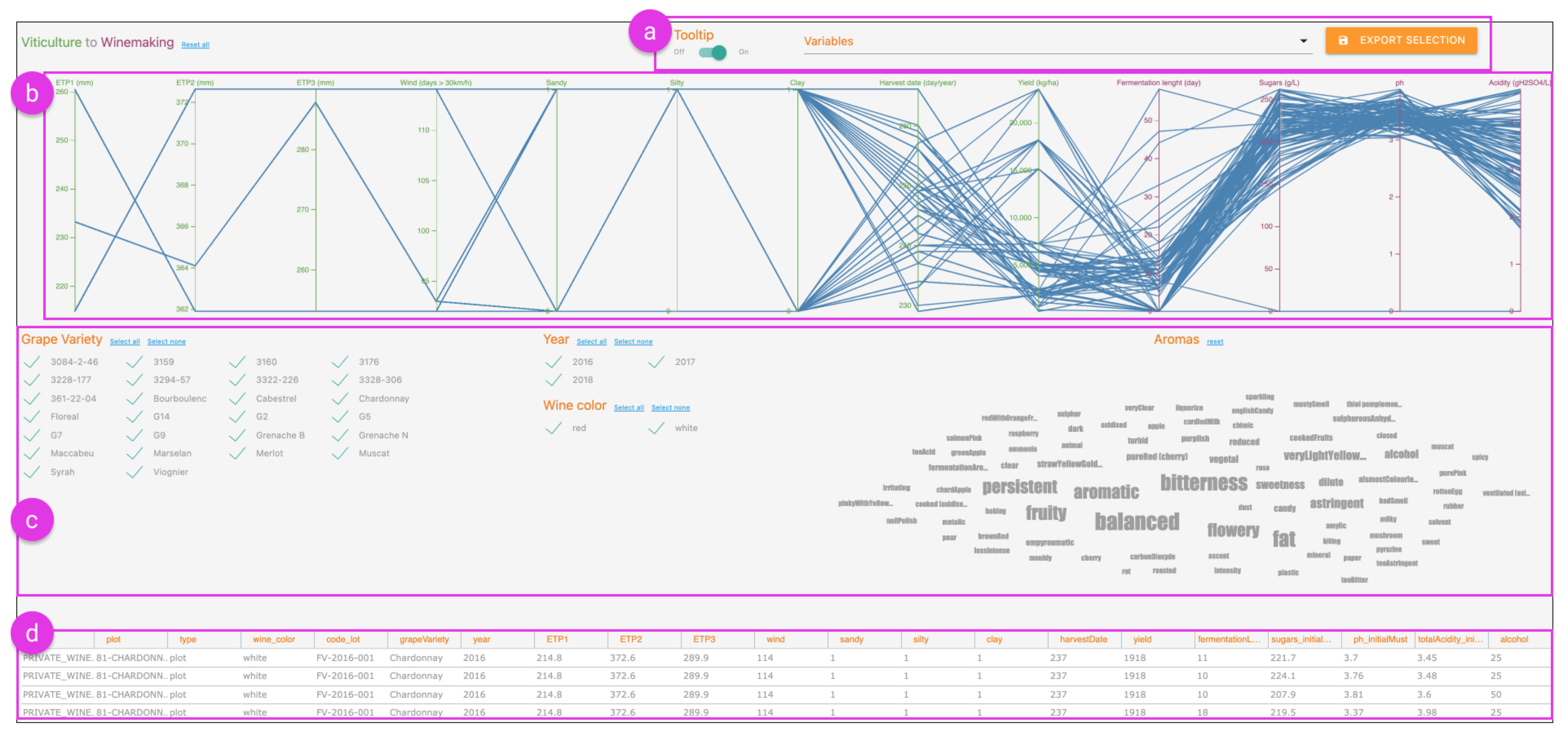
2.1.1. Correlation Analysis of Multivariate Data

Soil properties, climate conditions and cultivation techniques constitute significant variables, which affect the quality of the final agricultural product [33,34,35]. It is, therefore, important for domain experts to be able to correlate all these relevant data in a simple and timely way, in an effort to answer intelligence and data competence questions on how some attributes, such as soil properties, affect product quality and yield. Based on sensor, farming and phenological data derived from test sites, the domain experts have to be able to understand the existing correlations and associations between the various types of data.
To improve the identification of relationships between the different data variables by domain experts, we adapted an existing tool, GaCoVi [36], which is short for Gapped Correlation Visualisation. To that end, we used a dataset from a vineyard where the variables are divided into the sensor, farming and phenological variables derived from the field (i.e., independent variables or features) and those that describe the quality of the final product (i.e., dependent or target variables). Figure 2a shows the correlation of each feature derived from the field with each of the target variables that describe the final product quality. The longer the bar, the higher the correlation strength. The colour encodes the correlation direction: red indicates a negative correlation, and green a positive correlation. Figure 2b shows the correlation within the different features derived from the field. The grayscale encodes the correlation strength. Hovering the cursor on a square displays the correlation’s direction in its stroke colour (green or red), and reveals a tooltip with the correlation details. The same tooltip is available by hovering the cursor on any of the bars in Figure 2a.
Features are ordered in such a way that closer rows have a higher correlation. In most datasets, this is not perfectly possible, but the visualisation is optimised to minimise the error [36]. To increase the efficacy of checking how correlated two consecutive rows are, there is a gap between rows where the bigger the gap, the lower the correlation strength is. If two consecutive rows are not correlated at all (i.e., correlation is 0), the gap will be the size of one square. Details on the algorithms that rule the row order and the gaps can be found in [36].
Finally, features can be removed and restored using the controls in Figure 2c. Removing features can be helpful when many features are available since it improves the row ordering of the remaining features, easing the domain expert in identifying relationships and insights.
The dashboard’s front-end is developed using the Svelte framework [37], Carbon Components Svelte [38] for the user interface (UI) components, and Vega [26] for the visualisations. The dashboard requires a separate back-end that calculates the correlations and optimal row ordering, and exposes an application programming interface (API) for the front-end to receive the outputs. The back-end is developed in R with data.table [39] for data wrangling, seriation [40] for the rows ordering algorithm and plumber [41] to generate the API. The source code for this tool is available at https://github.com/AugmentHCI/agriviz_public/tree/main/gacovi (accessed on 1 June 2022).

2.1.2. Analysis of Plant Growth

In agriculture, plant growth and conditions are closely observed to achieve maximal yield or to understand the effect of growth conditions on plants [42]. Counting leaves of a plant gives a clear idea of the plant’s health and its current development stage. In addition, analysing plant growth enables experts to feed agronomic models used in DSSs in precision agriculture. However, as a large number of plants go through various development stages under differing conditions, recalling individual plants’ development stages under various conditions and analysing their growth over time can become a demanding task.
To support the analysis of plant growth at various stages, we built a visual-assisted DSS that visualises the number of leaves derived from plant images. For our showcase, we used a dataset that contains images of grapevines in various growth stages, the plants’ genotype, the experimental condition under which the plants were grown (i.e., well watered, water deficit, or severe water deficit), the number of leaves counted by human experts and the number of leaves predicted by a deep learning technique from the images. The deep learning technique is out of scope in this paper and is therefore not described in detail.
The dashboard visualises the data in a line chart (Figure 3b), where the x- and y-axis represent the timeline and the number of leaves, respectively. Each line thus represents a plant’s growth over time. Clicking a data point reveals a popup window (Figure 3c) showing an image of the corresponding plant from the given date. In this window, users can add their observation notes in the comment textbox. Users can also compare the real label (i.e., average number of leaves found by human experts) and predicted label (i.e., number of leaves found by the deep learning technique).
The toolbar at the top of the interface (Figure 3a) contains functionalities to make global changes to the interface. From the toolbar, users can filter the plants by genotype and experimental conditions, switch between the real and predicted leaf count to encode on the y-axis of the chart and export the selected data after exploration.
The chart is developed using the D3 [25] and D3-tip [43] visualisation libraries. The interface itself is a web application developed with vanilla JavaScript using the Micromodal [44], jQuery [45] and Underscore [46] libraries. The source code for this tool is available at https://github.com/AugmentHCI/agriviz_public/tree/main/Leaf-Counting (accessed on 1 June 2022).

2.1.3. Exploratory Analysis of Heterogeneous Data

Organisations often possess large amounts of heterogeneous data from different steps in the production process (e.g., data on climate, soil, harvest and lab analyses). To filter and analyse these heterogeneous data, experts need to run complex search queries [47,48]. In contrast, well-designed data visualisations can immediately show this information, such that experts can actively explore the data without relying on serendipitous discoveries and complex search queries.
To support experts in analysing heterogeneous datasets, we developed a dashboard following Shneiderman’s mantra of “overview first, zoom and filter, then details on demand.” [49]. A dataset that contains multiple linked data from grape harvesting to wine making is used as an example. Figure 4 shows our dashboard, which consists of several components that serve as visual filters to help explore the complex heterogeneous dataset.
Figure 4. Interface for the exploratory analysis of heterogeneous data: (a) toolbar; (b) parallel coordinates (see Figure 5 for details); (c) filters (see Figure 6 for details); (d) data table (see Figure 7 for details).
Agriculture 12 01027 g004
Figure 5. A section of the parallel coordinates from Figure 4b where the brushing technique is applied to filter the data. Due to linked data, such a filter in the parallel coordinates also affect the other components.
Agriculture 12 01027 g005
Figure 6. The filter components from Figure 4c showing that the data can be filtered by Grape Variety, Year, Wine Colour and Aromas.
Agriculture 12 01027 g006
Figure 7. The data table from Figure 4d showing the same data as the parallel coordinates.
Agriculture 12 01027 g007
Parallel coordinates (Figure 4b) are used as the prominent part of the dashboard since they provide an efficient way to visualise and explore heterogeneous data [50]. The vertical, equally spaced axes represent the variables of the dataset, and wines are visualised as connected sets of points, one for each variable on every axis. The data table at the bottom of the dashboard (Figure 4d and Figure 7) shows the exact values of each wine that appears in the parallel coordinates.
Brushing [51], also simply known as selecting a subset of data, can be applied on multiple variables simultaneously in the parallel coordinates. For example, experts can select wines with a harvest date between 240 and 250 days per year and a fermentation length between 20 and 40 days (see Figure 5). Experts can also filter the dataset using the grape variety, harvest year, wine colour and wine aroma (Figure 4c and Figure 6 for details). Wine aromas are typically noted by experts during the sensory analysis stage of wine making. A word cloud is used to visualise these aromas, which encodes the frequency of detected aroma to the size of the words. For example, “balanced” and “bitterness” are the most frequent aromas in the dataset, hence reflected by their largest sizes in the word cloud.
Thanks to the linked views, for every visual filter applied, either in the parallel coordinates or in Figure 4c, all other components immediately update to the current selection. For example, by applying the brushing technique in the parallel coordinates Figure 4b, the aromas will also be filtered in Figure 4c. The same constraint also applies to the data table (Figure 4d).
The toolbar (Figure 4a) provides a number of functions such as (1) enabling/disabling tooltip, which shows the name of the wine when hovering in the parallel coordinates; (2) selecting/deselecting the variables to be displayed in the parallel coordinates; and (3) exporting currently selected data.
The dashboard itself is a web application developed using jQuery [45], Underscore [46], SlickGrid [52] and parcoords-es [53] libraries. It is styled with Materialize [54], a front-end framework based on Material Design. The source code for this tool is available at https://github.com/AugmentHCI/agriviz_public/tree/main/VinetoWine (accessed on 1 June 2022).

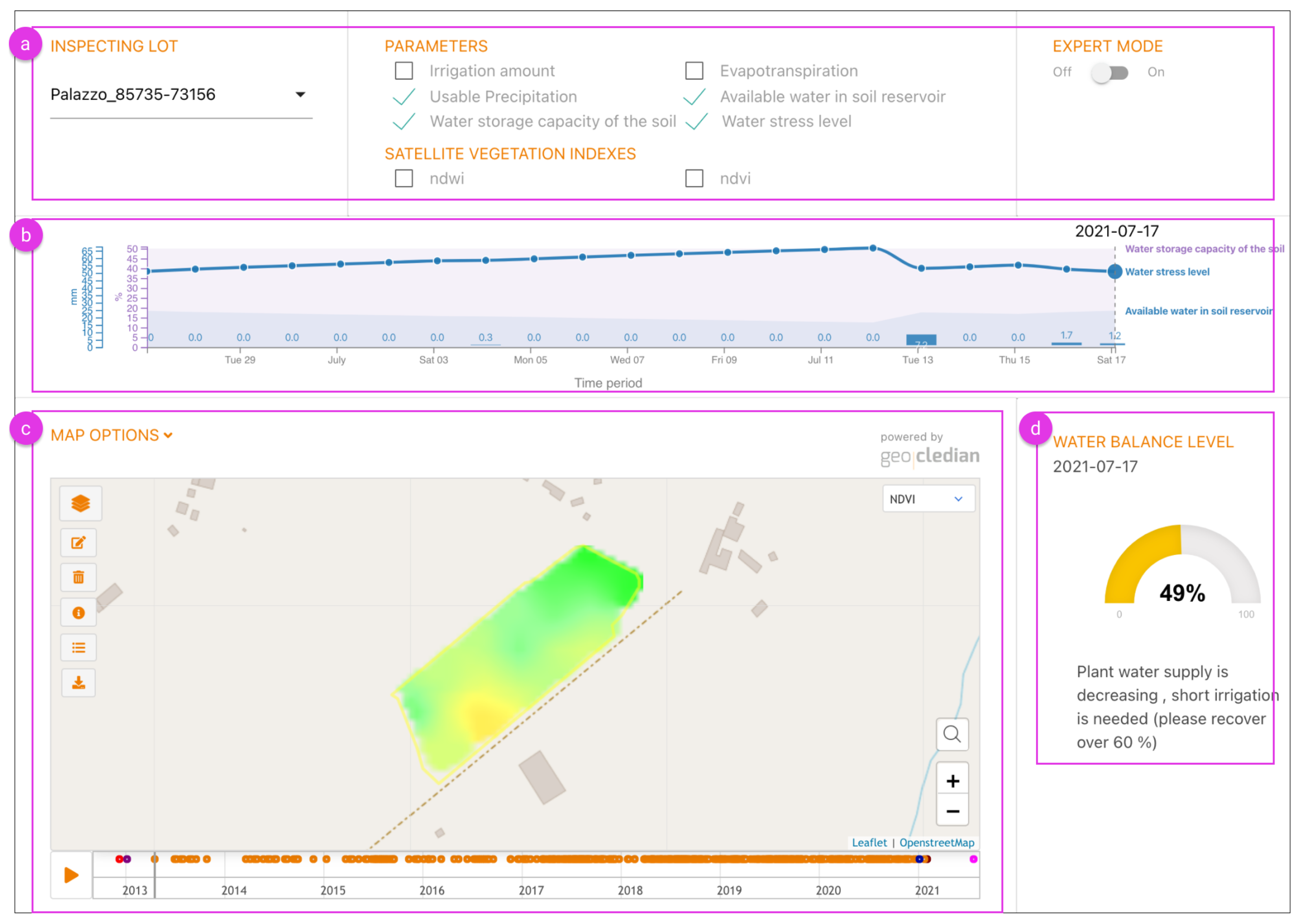
2.1.4. Analysis of Water Stress and Irrigation Requirements

Optimising irrigation is one of the practices that has a high economical impact on the food chain industry [55]. The correct irrigation of the crops is connected to the quality and quantity of the final product. DSSs can offer valuable information on water stress and irrigation requirements, combining various data types gathered from weather stations.
We designed a dashboard that allows farmers and agricultural experts to visually inspect irrigation data for each lot independently and receive a decision support on irrigation requirements (see Figure 8). Through the partner institutions, we received (1) real-time data from sensors such as precipitation, evapotranspiration, available water in soil reservoir and water displacement; (2) satellite-derived data such as the Normalised Difference Water Index (NDWI) and Normalised Difference Vegetation Index (NDVI); and (3) other calculated data such as water stress levels, water storage capacity of the soil and daily irrigation amount. These data from different sources are integrated in the dashboard to offer real-time decision support.
The toolbar at the top of the dashboard (Figure 8a) allows users to configure a number of settings. First, users can select a lot they wish to inspect. After selecting a lot, they can select/deselect the sensors and satellite parameters to be visualised in the dashboard. The expert mode allows users to add additional parameters to analyse, including temperature, wind and humidity fluctuations. These parameters are hidden from the toolbar by default to reduce information overload.
The parameters selected in the toolbar are visualised in the chart below (Figure 8b). Single point values such as usable precipitation are represented with vertical bars in the chart, while connected data such as evapotranspiration or temperature are represented with lines. Percentage data such as water storage capacity of the soil and water availability in the soil reservoir are represented with areas in the chart. Thus, the graph supports multiple data types with varying units. In addition to these data, the water balance level of the lot is also highlighted using a gauge in the lower right bottom of the dashboard (Figure 8d). The water balance level is calculated as H 2 D i s p A W C · 100 , where H2Disp is the available water in soil reservoir and AWC is the water storage capacity of the soil. The gauge uses thresholds to provide text-based suggestions on irrigation requirements.
The map widget (Figure 8c) allows users to inspect their lots using satellite parameters over a longer time period. This widget is provided by Geocledian GmbH https://www.geocledian.com (accessed on 1 June 2022) and can display heatmap overlays of not just NDWI and NDVI but also Normalised Difference Red Edge Index normalised difference red edge index (NDRE1 and NDRE2), Enhanced Vegetation Index (EVI2) and Soil Adjusted Vegetation Index (SAVI).
The dashboard is developed using jQuery [45] and Underscore [46] libraries. It is styled with the Materialize framework [54]. The chart is developed using the D3 library [25] and the gauge is based on JustGage [56]. The source code for this tool is available at https://github.com/AugmentHCI/agriviz_public/tree/main/Irrigation (accessed on 1 June 2022).

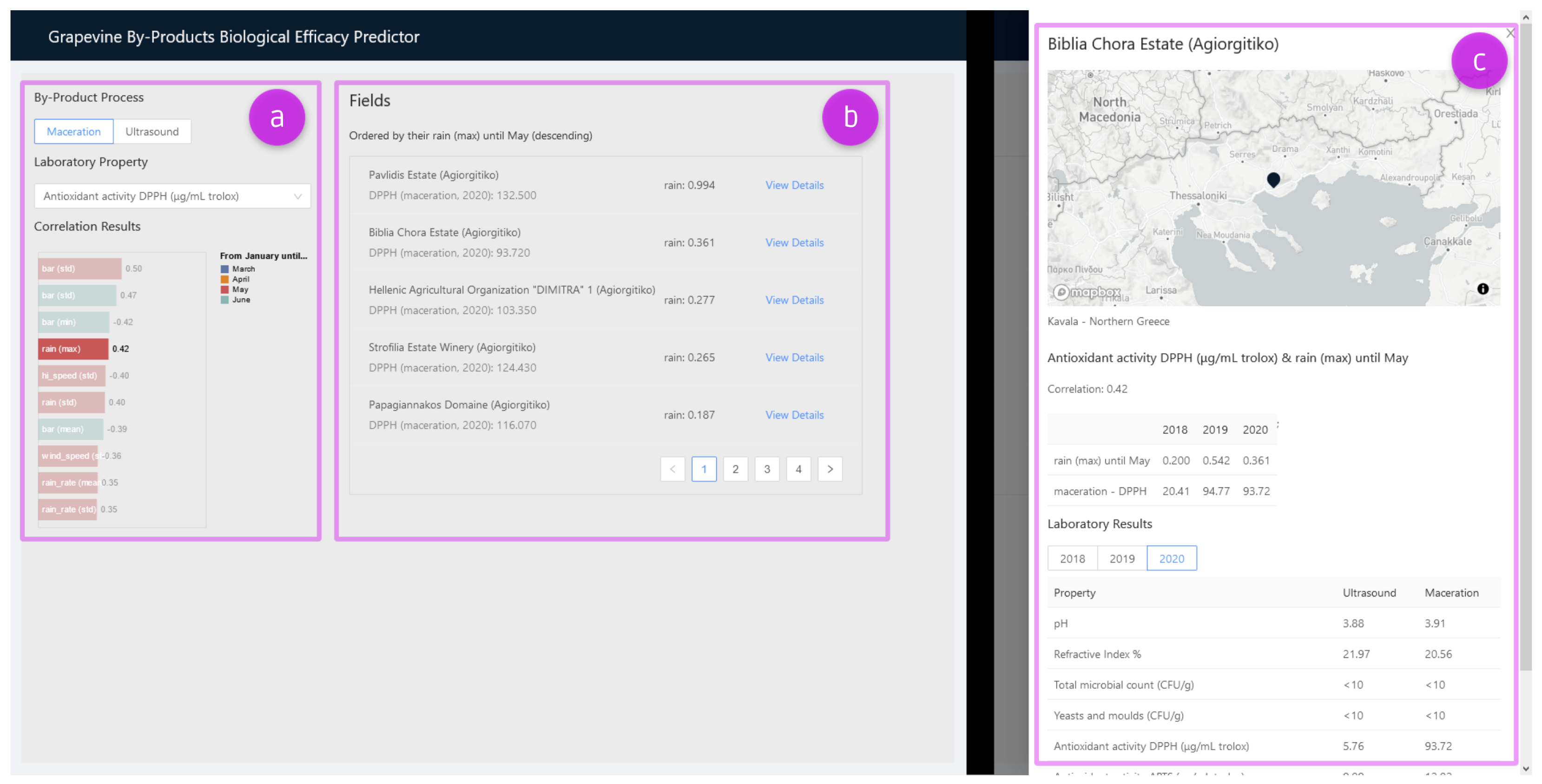
2.1.5. Analysis of Biological Efficacy in by-Products

Agricultural products often go through multiple stages of processing which produce various by-products [57]. For both economic and environmental reasons, it is considered best to extract the most out of agricultural products during multiple stages of processing. Wine making, for example, produces a lot of by-products [58], which may have a significant biological value for cosmetics and food supplements. With adequate data and tools, experts can make informed decisions about the selection of by-products in order to produce high value-added ingredients for cosmetics and food supplements. This use case focuses on selecting the best farming by-products for producing natural cosmetics using wine making as an example scenario.
Grapevine leaves’ biological efficacy and their correlation with weather and satellite vegetation indices can help in selecting fields or vineyards that could supply the best quality leaves for next year’s natural cosmetics production. To improve the field selection process carried out by decision makers, we designed and developed a dashboard that communicates biological efficacy of grapevine by-products from various fields (see Figure 9). This visual-assisted DSS contains three main sections. First, Figure 9a allows users to select a laboratory property and a laboratory extraction method. A bar chart visualises the weather and satellite vegetation indices that are most correlated with the selected laboratory property. Second, Figure 9b shows the candidate fields with their last available data for the chosen laboratory property. By clicking on the bars in Figure 9a, the fields in Figure 9b can be ordered by available weather and satellite vegetation indices. Finally, the side-panel in Figure 9c shows extra field details, which is displayed when the user clicks on “View Details” in Figure 9b. The side-panel contains a map showing the field’s location, the current and historical weather data or satellite vegetation indices based on what is selected in the bar chart in Figure 9a, and all the available historical laboratory results of biological efficacy analysis.
The dashboard is developed using the React framework [59] together with Vega-Lite [27] for the bar chart visualisation, react-map-gl [60] (a Mapbox GL JS [61] wrapper for React) for the map component, and Ant Design [62] for the remaining UI components. The source code for this tool is available at https://github.com/AugmentHCI/agriviz_public/tree/main/biological-efficacy (accessed on 1 June 2022).

2.1.6. Uncertainty-Aware Price Prediction

Uncertainty plays a central role in data analysis [63] and is relevant in various contexts, ranging from climate and meteorological studies [64,65,66] to the interpretation of medical data [67]. By understanding that point estimates may vary, users can make more informed decisions. This holds especially when working with DSSs [68], so visualising their uncertainty is crucial. However, in agriculture, the application of uncertainty visualisations is limited [9]. Therefore, there is a need for more uncertainty-aware applications such as CropGIS [29], which visualises the biomass development of maize under various uncertain meteorological conditions.
Selling prices of agricultural products are also prone to uncertainty [69], as they are affected by many factors, including economic events, meteorological fluctuations and political decisions. Therefore, predictive statistical methods and machine learning models should capture this uncertainty, and their prediction outcomes should be visualised accordingly. To meet the latter requirement, we developed an interactive uncertainty-aware dashboard with which users can explore an extensive dataset of product prices in European countries, along with a forecast of their evolution.
The dashboard consists of a classical line chart (see Figure 10b), which shows the historical price evolution of a food product in one or more countries. Users can change the product, and add or remove countries via autocomplete drop-down lists at the top of the dashboard (Figure 10a). It is possible to compare multiple countries simultaneously, and to get details on demand by hovering over the chart.
In addition, by clicking the checkboxes at the bottom of the dashboard, as shown in Figure 10c,c.1, users can enrich the visualisation with four extra components related to prediction and uncertainty. First, a dashed line indicates the predicted price for five years after the last known data point. For demonstration, this prediction is made via linear regression. Second, the uncertainty of the future prediction is visualised as fans; shaded areas corresponding to prediction intervals (50– 95 % in steps of 5, and 99 % ), which can be hovered over to see details about their upper and lower bounds at a specific date, as shown in Figure 10b.1. The lighter the colour, the farther away from the predicted price. Third, a dashed past fit line demonstrates the prediction model’s approximation of the historical product prices. Fourth, the past uncertainty is visualised as fans, similar to the future uncertainty.
The freedom to activate any combination of components allows users to gain different insights. For example, combining past data, future prediction and future uncertainty gives a fine-grained idea of the future price evolution, while communicating how reliable specific values are. Alternatively, the past data, past fit and past uncertainty together express the accuracy of the prediction model for the known historical data. Finally, only combining the past fit and future uncertainty allows to analyse main trends in price changes.
The dashboard is developed using the React framework [59] together with the D3 library [25]. The linear regression model and uncertainty intervals are implemented in R. The source code for this tool is available at https://github.com/AugmentHCI/agriviz_public/tree/main/product-prices (accessed on 1 June 2022).

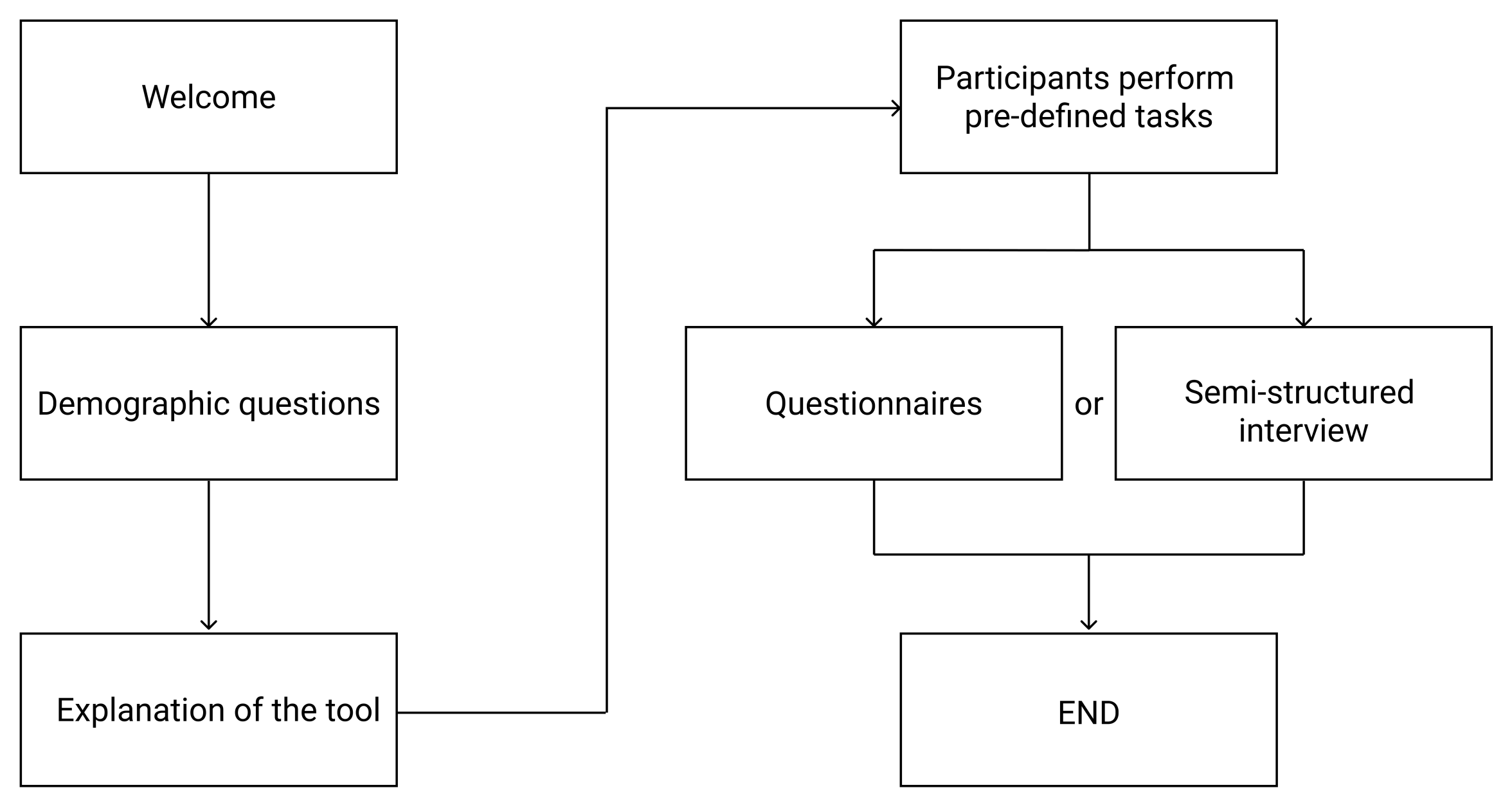
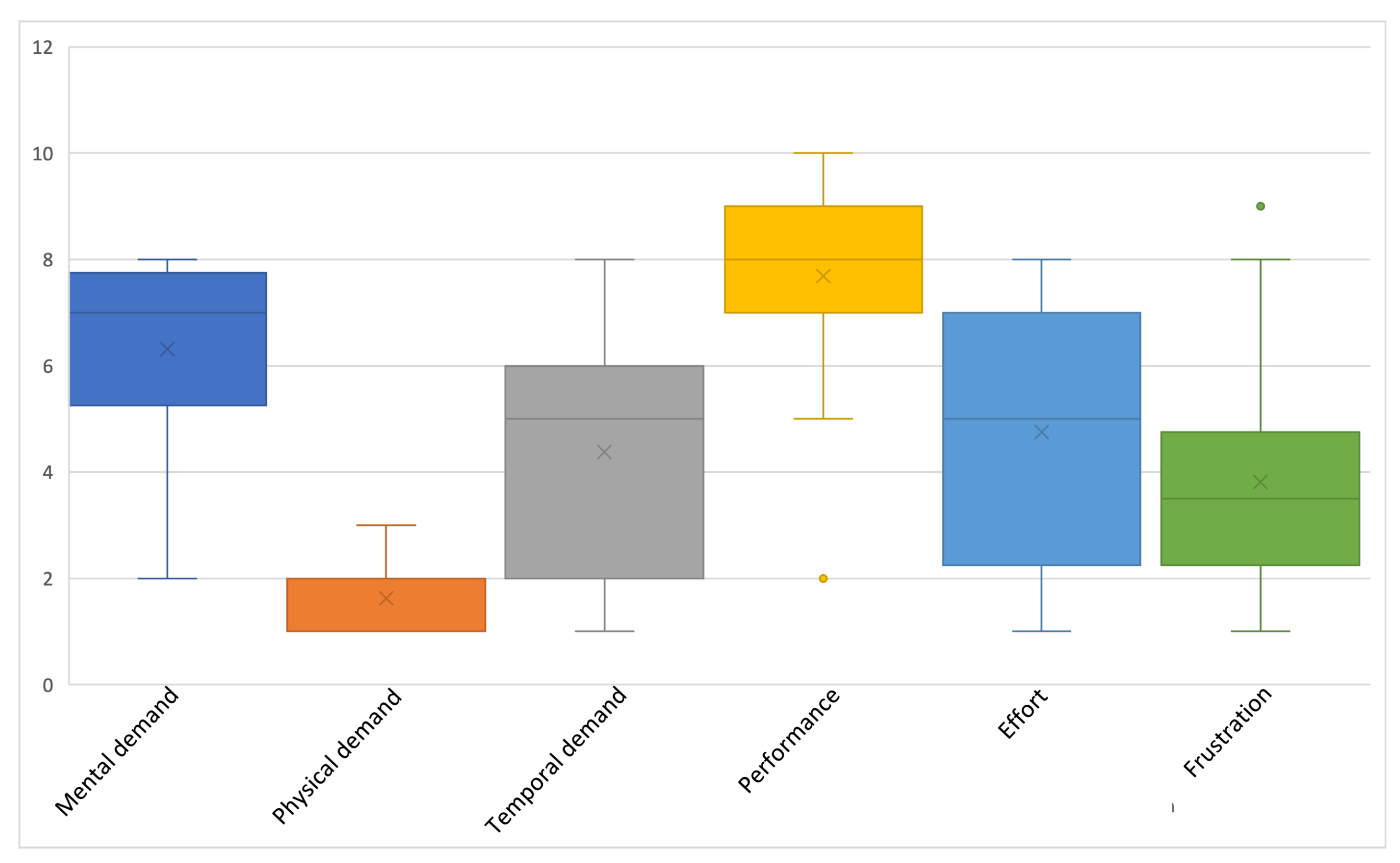
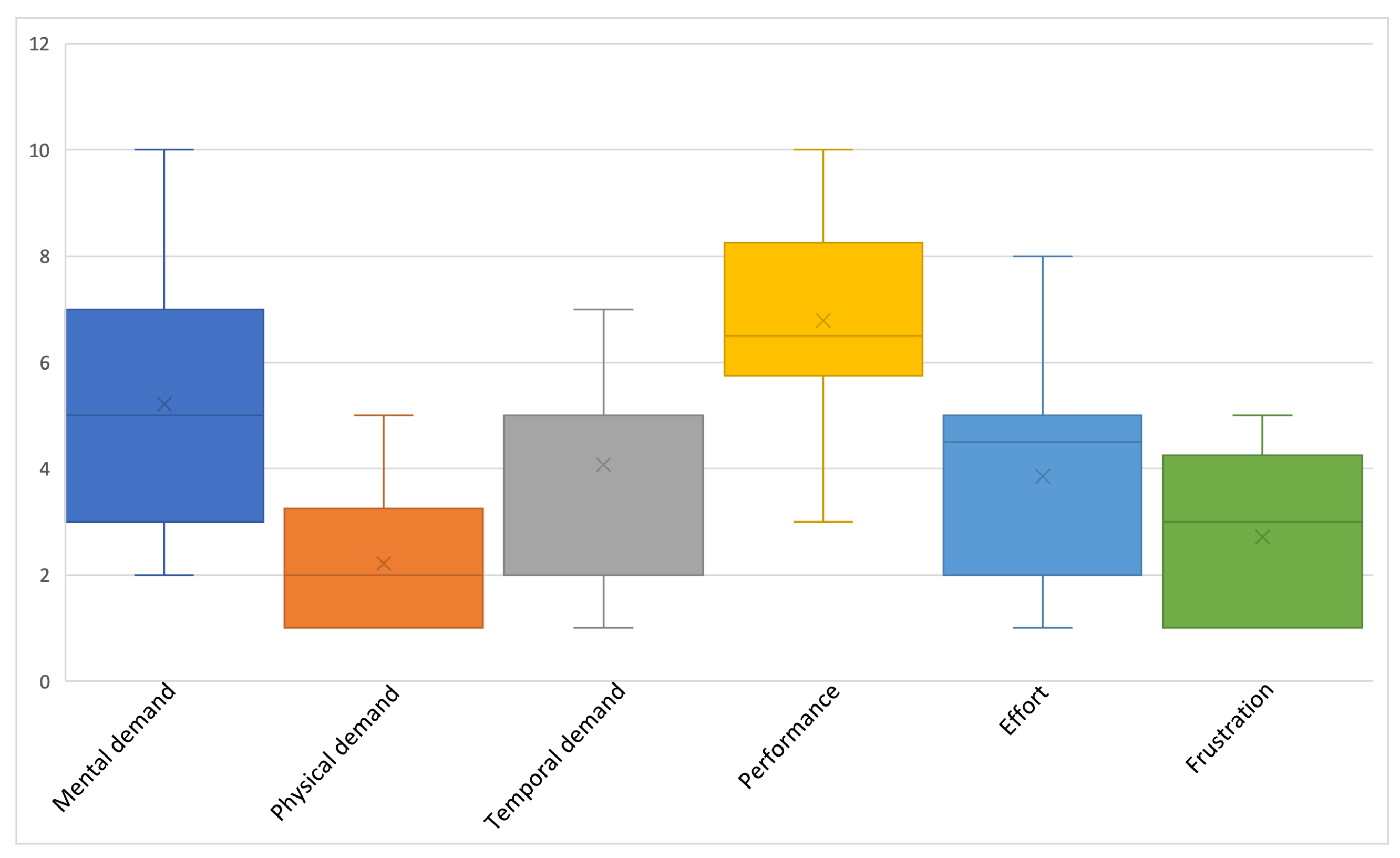
2.2. Evaluation Procedure

Following the research approach in Human-Computer Interaction [70], the interfaces were evaluated by target users who were either clients or researchers at the respective industries and research institutes with which the use cases were developed. The demographics of the participants are described further under each subsection in Figure 3.
Figure 11 shows an overview of the evaluation procedure. In every use case, participants first filled out a demographics questionnaire that captured their age, gender, occupation, education, and openness towards new technology. We then briefly introduced them to the tool under evaluation and explained its purpose. Next, participants performed a number of predefined tasks in the tool, and after they completed those successfully and had no further questions, a set of questionnaires or a semi-structured interview was administered, depending on the use case.
Table 1 presents an overview of all metrics used in the evaluations. For the first five use cases, we measured usability, workload and acceptance with the System Usability Scale (SUS) [71], the NASA Task Load Index (NASA-TLX) [72], and select questions from the Unified Theory of Acceptance and Use of Technology (UTAUT) [73], respectively. To capture additional usability feedback from the participants, we also added an optional open-ended question to the first five use cases. The SUS questionnaire contains a set of 10 questions with 5 response options, from Strongly agree to Strongly disagree [74]. The SUS score can range from 0 (negative) to 100 (positive) [75]. Previous work has proposed a number of ways to interpret the SUS score [76]. For example, according to Sauro [77], a SUS score of 68 is considered average, meaning it is at the 50th percentile. Bangor et al. [75] proposed a method that is easier for non-human factor experts to interpret in terms of adjectives such as “poor”, “okay”, “good” or “excellent” (see Figure 12). We used the method of Bangor et al. to interpret the SUS scores in this paper.
NASA-TLX contains a set of six questions for six dimensions, designed to obtain workload estimates from users. The dimensions are mental demand, physical demand, temporal demand, overall performance, effort and frustration level. While the original approach to analyse NASA-TLX was to generate a single overall workload score, we analyse and present the responses to individual dimension instead, which is also a common practise [72]. In addition, we also reduced the original 100-points range to a 10-points range while still allowing the participants to indicate the task load from very low (1) to very high (10). The UTAUT questionnaire contains four key dimensions: performance expectancy, effort expectancy, social influence and facilitating conditions. According to Venkatesh et al. [73], performance expectancy refers to “the degree to which an individual believes that using the system will help them attain gains in job performance”. Social influence refers to “the degree to which an individual perceives that important others believe they should use the new system”. Effort expectancy refers to “the degree of ease associated with the use of the system”. Facilitating conditions refers to “the degree to which an individual believes that an organisational and technical infrastructure exists to support the use of the system”. While these dimensions, together with gender, age, experience and voluntariness of use, were originally used to model usage intention and behaviour of users, we analysed each of the four dimensions separately to focus on the users’ current situations.
For the last use case, we investigated usability and user trust using a semi-structured interview. The interview responses were recorded, and later transcribed and analysed thematically. The questions were as follows:
  • What do you see while you are using the tool? What strikes you?
  • Do you trust the prediction model? Which parts of the visualisation made you say that?
  • Is it clear how the prediction model works? Which parts of the visualisation made you say that? Would you like to explore other things to get insights in the prediction model?
  • Would you use this visualisation for your job activities? If no, do you think we can change the visualisation such that it would be more useful? If yes, does the visualisation contain enough information to fulfil these activities?

3. Results

3.1. Correlation Analysis of Multivariate Data

The interface developed for this use case can be found in Figure 2. It was evaluated by sixteen participants from various agricultural industries, including vine growers, wine makers, agronomists, oenologists and researchers. Most participants were male (62.5%), had a postgraduate degree (62.5%), were 18–44 years old (37.5%) and reported to be open to try out new technology (81.3%). Half of the participants were also familiar with statistical correlation.
Figure 13 shows the distribution of SUS scores among the participants. As described earlier, we used the adjective rating scale of Bangor et al. [75] to interpret the SUS score (see Figure 12). Although most of the responses were skewing towards a higher score, the mean score for this interface was 61.7 (standard deviation (SD) = 14.7), which on the adjective rating scale is between OK and GOOD.
Figure 14 shows the NASA-TLX results. The perceived mental demand, temporal demand and effort were quite high, but the perceived performance received the highest score among all six subscales, which indicates that participants were satisfied with their performance despite the high mental and temporal demand and effort. Responses to the open-ended question indicated that four of the participants found the tool to be complex and required some time to understand it well. At the same time, they acknowledged that the tool “has the potential to become even more useful on a practical level” (p 1.8). To improve user understanding, additional explanations for various components should be added to the tool. One participant suggested that a textual explanation of the correlated variables would be useful. Another participant mentioned that the variables could be sorted by their correlation strength and importance to the use case.
Figure 15 shows that, in terms of user acceptance captured by the UTAUT questionnaire, most participants agreed with the effort expectancy and facilitating conditions constructs. However, they disagreed with the performance expectancy construct and gave neutral answers for the social influence construct. Half of the participants reported that the tool does not yet allow them to accomplish tasks more quickly, although the majority reported that the tool would be useful for their job.

3.2. Analysis of Plant Growth

The interface developed for this use case can be found in Figure 3. It was evaluated by fifteen participants from the wine industry: vine growers, engineers, consultants, researchers working on viticulture and winemaking and one head of a cooperative winery. Most participants were male (73.3%) and postgraduate (80%), and almost half of them were 55–64 years old (46.7%). The majority of the participants also reported to be open to try new technology (93.4%).
The mean SUS score for this tool was 65.8 (SD = 10.6), which puts it in the region between OK and GOOD. The SUS score distribution in Figure 16 shows that only one-third (5/15) of the participants gave a score above 73 (i.e., above GOOD). No feedback was received for the open-ended question.
The NASA-TLX results in Figure 17 show that performance received the highest score among all six subscales, indicating that participants were satisfied with their performance. The rest of the subscales received lower scores (i.e., below 5 out of 10 points), which indicates that mental, physical and temporal demands, effort and frustration were quite low for this tool.
The UTAUT results in Figure 18 reflect that effort expectancy received a high score, meaning the tool was easy to use and understand. The same holds for facilitating conditions, showing that participants had the necessary knowledge and resources to use the tool. Interestingly, the social influence construct received a large number of neutral responses. It appears that the participants were uncertain about the potential reception of the tool from their organisation or senior management team.

3.3. Exploratory Analysis of Heterogeneous Data

The interface developed for this use case can be found in Figure 4. The participants for this use case were identical to the ones from the ‘Analysis of Plant Growth’ use case in Section 3.2. However, one participant did not complete the evaluation, which left this use case with fourteen participants.
This tool obtained a mean SUS score of 68.2 (SD = 15.9), which puts it in a slightly higher region between OK and GOOD. The score distribution in Figure 19 tells us that most participants (10/14) gave a score between 52 and 73. No feedback was received for the open-ended question.
The NASA-TLX results in Figure 20 are quite similar to those of the previous use case: the performance subscale again received the highest score, indicating that most participants were satisfied with their performance. The other five subscales received quite low scores.
The UTAUT results in Figure 21 show that almost all participants believed the tool to be useful for their job, but most felt uncertain about whether the tool would enable them to accomplish tasks more quickly or increase the chance of getting a raise. Most participants also responded positively in the effort expectancy construct, which indicates that the tool was easy to use and understand. The social influence construct again received quite a lot of neutral responses.

3.4. Analysis of Water Stress and Irrigation Requirements

The interface developed for this use case can be found in Figure 8. Sixteen participants evaluated this interface, who were wine makers, farmers, researchers, software engineers and agronomists. Most participants were male (75%), graduate (56.3%) and 18–34 (31.3%) or 45–54 (31.3%) years old. Almost three quarters of the participants reported to be open to try new technology (68.8%).
This tool received a mean score of 64.4 (SD = 14.1), which puts it in the middle percentile in the region between OK and GOOD. The score distribution in Figure 22 tells us that almost half of the participants (7/16) gave a score between 52 and 73. Among the remaining nine, five participants gave a score above 73 and the rest below 52. No feedback was received for the open-ended question.
From the NASA-TLX result, we found that this tool requires slightly high mental demand, temporal demand and effort (see Figure 23). Perhaps related to these, the participants’ frustration was also high despite having increased perceived performance scores.
Looking at the UTAUT result, however, we did not find many negative responses (see Figure 24). The social influence construct received quite a number of neutral responses. The result of this construct is consistent with the previous use cases. Interestingly, 13 out of 16 participants disagreed that the tool is incompatible with other tools they use. Thus, the compatibility of this tool appears to be good.

3.5. Analysis of Biological Efficacy in by-Products

The interface developed for this use case can be found in Figure 9. Fifteen participants evaluated this interface; ten of them were active in the natural cosmetics industry, four in research on grapevine-related disciplines and one in winery. Slightly over half of the participants were females (53.3%), post-graduates (66.7%) and between 35–44 (60%) years old. Almost all participants reported to be open to try new technology (86.7%).
This tool, among the rest, received the highest SUS score with a mean of 75.2 and a standard deviation of 11.3 putting it in the the region between GOOD and EXCELLENT. Looking at the score distribution in Figure 25, we found that none of the participants rated this tool below 52. Besides, over half of the participants (9/15) gave a score above 73 (i.e., above the GOOD region). No feedback was received for the open-ended question.
The NASA-TLX result shows that, in general, the tool had low mental, physical and temporal demands, effort and frustration although a few participants reported slightly higher mental demand and effort (see Figure 26). On the other hand, the perceived performance of the tool was quite high.
The UTAUT result also shows that very few negative responses were reported in all of the four constructs (see Figure 27). However, there are still quite a large number of neutral responses for the social influence construct. The same is true for the incompatibility with other tools where almost half of the participants gave a neutral response. At the same time, the same amount of participants also disagreed with the incompatibility of the tool, indicating that for almost half of the participants this tool would be compatible with other tools they use.

3.6. Uncertainty-Aware Price Prediction

The interface developed for this use case can be found in Figure 10. Nine participants evaluated this interface; one participant was active in the financial sector whereas all other participants were active in a sector related to the food industry. All participants were male and held a post-graduate degree, and the majority reported to be open to trying new technology (70%). A thematic analysis of the transcribed semi-structured interviews resulted in three main themes, which are presented in the following subsections.

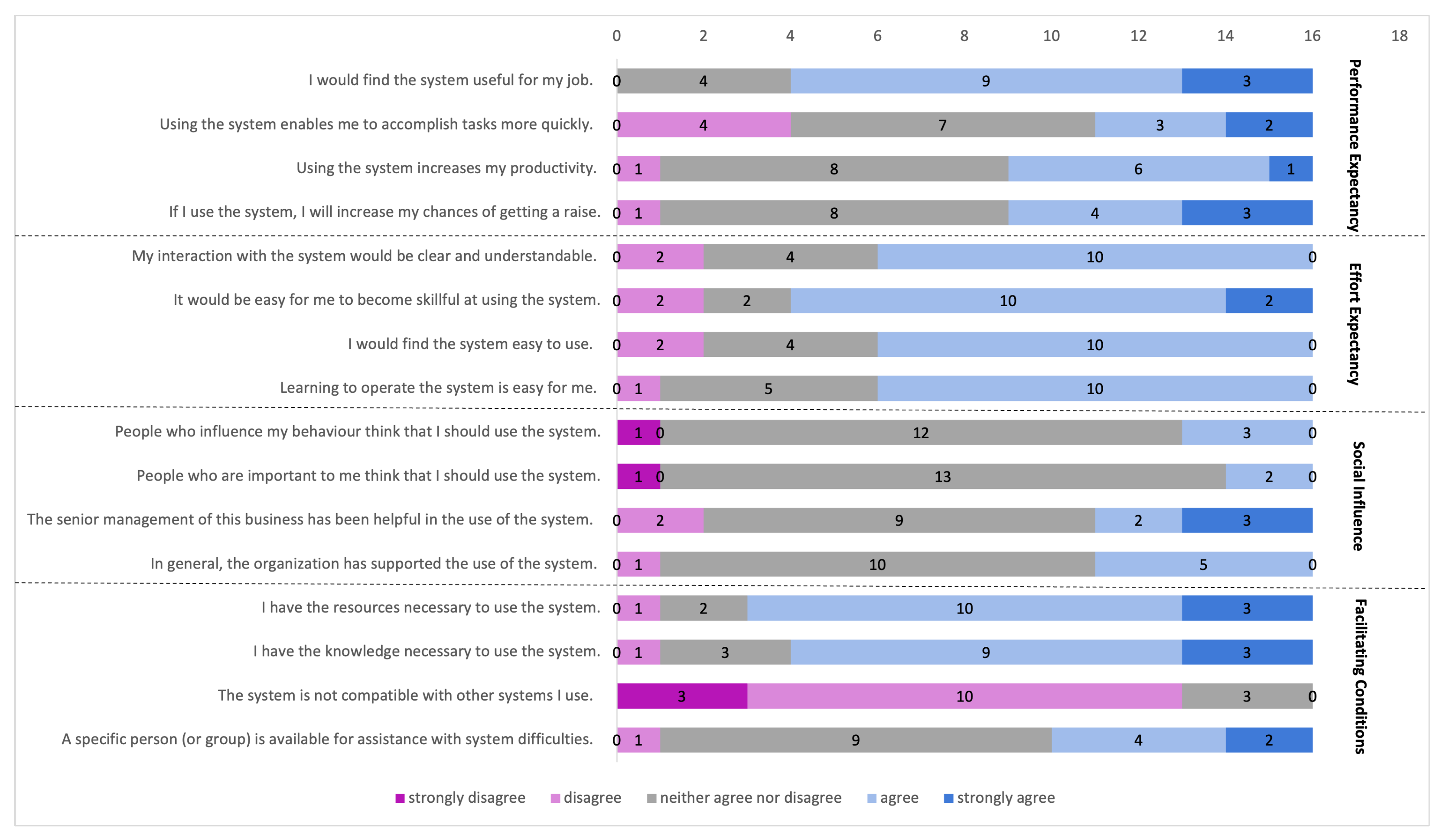
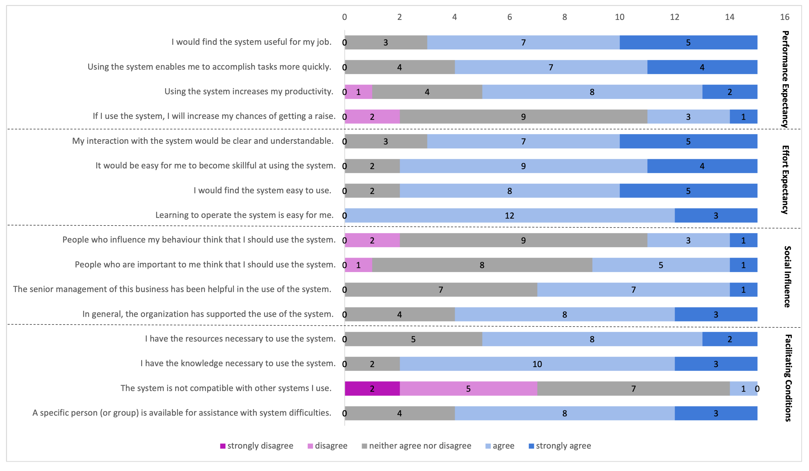
3.6.1. A Useful and Generic Tool

Even though analysing price evolution and predicting prices was not part of most participants’ job activities, eight participants mentioned that (parts of) the visualisation or a similar variant could be useful for their current job activities or for their sector in general. For example, participants explained: “It is a good tool for the food industry. It helps food companies to predict prices.” (p 5.2) and “Exploring the past data is interesting because it allows to adapt strategies to different policies. […] I suppose that people who take decisions on different levels would use this instrument to investigate particular markets.” (p 5.4).
The tool is also deemed useful for the financial sector. Changing the dataset would allow similar analyses within the same visualisation. For instance, one participant described: “It’s a tool that I would use to predict future pricing. […] I like it, I would definitely use it. Not for pricing in particular but rather for interest rates, for which [the visualisation] can be used because the basic idea is the same. That would help me make better business decisions: low interest rates are an incentive to spend more money, high interest rates to save more money.” (p 5.8).

3.6.2. Trust in Prediction Tools Is Multi-Faceted
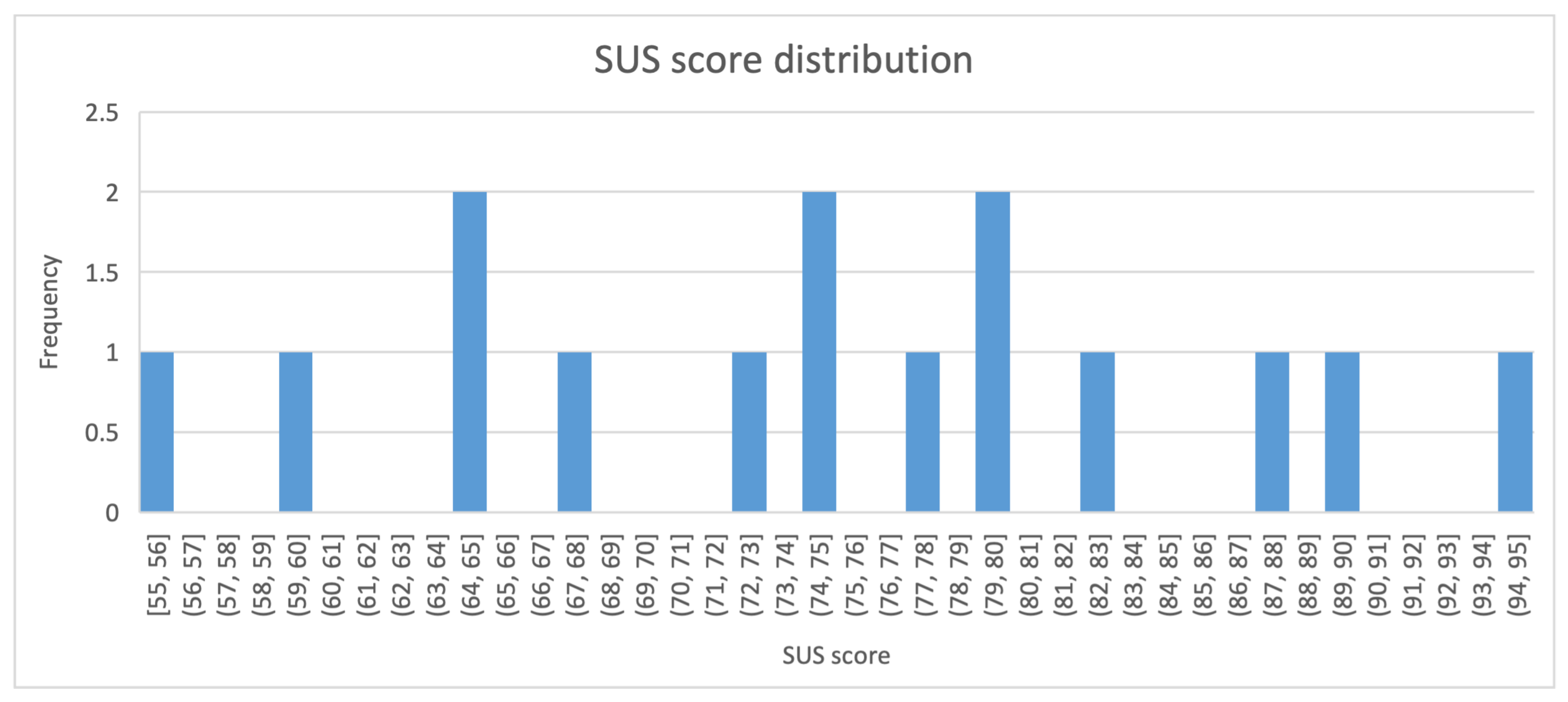
Trust in the prediction model can be influenced by many factors. Users are less likely to make important business decisions if they do not trust the model outputs. To trust a model, participants described that it is first important to know where the data originated from and whether it is of good quality. In addition, trust can be influenced by the assumed expertise of the model developers, and whether they are associated with an official body. For example, participants explained: “I generally accept the given information—the evolution, the approach—as I suppose that the developers have the competence to develop a prediction model so I can trust it.” (p 5.4) and “If this prediction comes from an official body then it could be more reliable because it would be the fruit of a convergent opinion of different predicting scientists“ (p 5.5).
Next, participants also reported that the background information about the prediction model is required to gain trust. For example, a participant explained: “In order to trust the prediction model, I need to know how it was developed and how the model uses the raw data in order to make a prediction.” (p 5.1). Similarly, another participant explained: “It is very critical to me to understand what other factors the model takes into account to make such a strong increasing claim, for example climate change or geopolitical considerations that can influence the price. Since I do not know these, I cannot trust the model.” (p 5.3).
Interestingly, having clear visualisations with the ability to compare countries led to increased trust. For instance, one participant mentioned, “With more countries [enabled], I would feel more confident and trust the predictions more because I would have something to compare the results.” (p5.7). This is most likely due to the belief that countries with historically similar prices should also have similar predictions. A participant reported: “Historically, the price in France is closely linked to the Netherlands, so I expect that the actual price went down like in the Netherlands.” (p 5.1).
Related to the visualisation aspect, participants also stressed the importance of uncertainty components: “[Adding uncertainty] is more reasonable, because when we need to predict something, there is always uncertainty. This is what I would expect.” (p5.1). Another participant described: “The past uncertainty makes the tool a bit more reliable. […] without uncertainty it would be less reliable.” (p 5.2).

3.6.3. Usability

The visualisation and its main goal were clear to all participants. One of them described: “It is very easy to understand the aim of the tool. […] The tool has a particular aim: evaluate past and future in terms of price.” (p 5.4). Participants also pointed out a usability issue: when showing the data for multiple countries simultaneously, the visualisation could become confusing. For instance, “It causes some problems in the visualisation such as [overlap] especially when adding more countries.” (p 5.5). However, it was acknowledged that “With more [than two] countries it is a little confusing because of all the colours, but in the end the user decides how many countries are visible.” (p 5.2).

4. Discussion

In this paper, we introduced reference visualisation libraries, visual analytic components and an interactive framework to support rapid prototyping and the development of common interfaces, a crucial gap in precision agriculture [11]. To demonstrate their applicability, we presented six visual-assisted DSSs for six use cases that represent some of the most critical and timely decision support tasks in agriculture. These DSSs are different from the previous tools in that they use common visualisation libraries, visual analytic components and an interactive framework, while supporting highly diverse use cases. Next, we demonstrated a user-centred evaluation technique and its relevance in understanding end-users and ultimately in improving the tools.
In terms of usability, results from the SUS questionnaire have shown that the tools received mean scores ranging from 61.7 to 75.2. According to the adjective rating scale of Bangor et al. [75], usability of the proposed tools fell in the regions higher than 52, the OK margin (see Figure 12). Looking at the distribution of the scores (Figure 13, Figure 16, Figure 19, Figure 22 and Figure 25), we found that the majority of participants gave scores of above 52 (the OK margin on the adjective rating scale) in all of the tools. The lower mean scores were contributed by a small percentage of participants. For instance, in the Correlation Analysis of Multivariate Data use case which received the lowest SUS score, 3 out of 16 participants gave scores lower than 52.
Even though the mean scores, according to the adjective rating scale, indicate that they are in the OK and higher regions, should be pointed out that the adjective rating scale is just one of many ways of interpreting the SUS score [75]. For example, according to Sauro [77], a SUS score below 68 is considered below average. The SUS score allows us to quickly detect usability issues. However, it should not be used solely to make absolute judgements about the “goodness” of a system [71]. How usable a system is should be determined by factors such as success rate and the type of the failures observed when the system was tested [75]. Additional feedback from participants and context often provide a better understanding of the underlying usability issues. As shown by the final use case, interviews are a great method to activate the participants to provide elaborate feedback. One should also consider that interviews are often resource intensive requiring additional time from both participants and researchers.
We used NASA-TLX and UTAUT questionnaires in the first five use cases to gain more insights into the perceptions of workload and acceptance of the tools. The NASA-TLX results showed that most of the tools presented in this work required slightly high mental demand, temporal demand and effort. Therefore, the participants felt that a slightly high (1) mental and perceptual activity, (2) rapid pace (due to time pressure) and (3) mental and physical effort was required when using the tools. These should be addressed by providing intuitive explanations of various components in the interface and reiterating the development cycle taking into account the expectation, interpretation and knowledge of the target users [78]. While the tools presented in this work were designed with particular use cases in mind, their contributions are with the ability to customise and the demonstrations of interactive visualisation components in various agricultural use cases.
Interestingly, despite a slightly high mental demand, temporal demand and effort, the participants’ frustration was generally low. Among all the tools, the one designed for the analysis of water stress and irrigation requirements use case (see Figure 8) had a slightly higher frustration. Regardless, the participants reported high perceived performance scores across the tools. The UTAUT results showed that the effort expectancy construct received constantly higher scores, which indicates that the tools were easy to use and understand. On the other hand, the social influence construct received a large number of neutral scores. Therefore, in almost all cases, the participants were uncertain about the potential reception of the tool from their organisation or senior management team. A recent meta-analysis has shown that perceived profitability is a driving factor for the adoption of precision agriculture tools tey2022meta. Therefore, for practical application and adoption of any given tool, one should consider involving multiple stakeholders from the target organisations and management teams. Following a participatory design approach could allow all the stakeholders to steer the development process [79]. The UTAUT results also showed that the participants were divided between being positive and neutral about the compatibility of the tools with other tools they use. The compatibility of a tool with the existing infrastructure may depend on the way data is processed and the technology being used. Given the flexibility of the visual analytic components and visualisation libraries introduced in this paper, the proposed DSSs can also be easily customised to improve their compatibility.
As this paper is the first attempt to demonstrate the applicability of reference visualisation libraries, visual analytic components and an interactive framework, it is not without limitations. First, the DSS designed for each use case was evaluated for the first time with end-users who had varying backgrounds and expectations. Thus, additional iterations will help improve usability of the tools and meet the specific requirements of the end-users. Second, recruiting participants for evaluation has proven to be a difficult task in this domain. Most of the end-users, who were the clients of the industries and research institutes we collaborated with, had limited time during the time frame of this research. With more time, focus group interviews with all end-users would have provided us with a better understanding of their specific requirements.

5. Conclusions

Despite a large number of DSSs proposed for the domain of precision agriculture, there is a lack of common interfaces, reference systems and frameworks to guide the development of DSSs [4,11] Besides, the practice of user-centred evaluation of DSSs is limited in this domain. To address these gaps, in this paper, we proposed a number of visual analytic components, open-source visualisation libraries and an interaction framework. We then demonstrated the applicability of these components, libraries and frameworks by developing six visual-assisted DSSs in various agricultural use cases. Using the experts from various agricultural domains as participants, we evaluated the tools focusing on usability, workload, acceptance and trust. The results showed that in terms of usability, measured by the SUS questionnaire [74], the proposed DSSs achieved acceptable usability scores by obtaining OK, GOOD and EXCELLENT ratings on the adjective rating scale [75]. The NASA-TLX [72] results showed that despite having a slightly high mental demand, temporal demand and effort, the perceived performance by the participants was high with the systems. The UTAUT questionnaire [73] showed that the systems were easy to use and understand, but the participants were uncertain about the potential reception of the tool from their organisation or senior management team. Source code for all the systems proposed in this work are also published so that they can be adapted and improved further. In the future, we intend to reuse the proposed components, libraries and interaction framework to create a flexible dashboard that allows non-technical users to explore heterogeneous datasets by calling interconnected visualisation components.

Author Contributions

Conceptualization, N.-N.H., D.R., J.O. and A.K.; data curation, N.-N.H., D.R. and J.O.; formal analysis, N.-N.H., D.R. and J.O.; funding acquisition, A.K. and K.V.; investigation, D.R., J.O. and A.K.; methodology, N.-N.H., D.R. and J.O.; project administration, N.-N.H. and A.K.; resources, A.K. and K.V.; software, D.R., J.O. and R.D.C.; supervision, N.-N.H., A.K. and K.V.; validation, N.-N.H., D.R. and J.O.; visualization, N.-N.H., D.R., J.O. and R.D.C.; writing—original draft, N.-N.H., D.R., J.O. and R.D.C.; writing—review and editing, N.-N.H., D.R., J.O., R.D.C., A.K. and K.V. All authors have read and agreed to the published version of the manuscript.

Funding

Funding for this research has been provided by the European Union’s Horizon 2020 research and innovation programme: BigDataGrapes Project (grant agreement number 780751).

Institutional Review Board Statement

The study was conducted according to the guidelines of KU Leuven and individual institutes involved in the study. No personal data that can be used to identify individual participant was recorded. All the institutes involved in the study collected and stored the data according to the European Union’s GDPR guidelines.

Informed Consent Statement

Informed consents were obtained from all subjects involved in the study.

Data Availability Statement

The raw evaluation results presented in this paper are available on request from the corresponding author. The data is not publicly available to preserve the anonymity of the participants.

Acknowledgments

We would like to thank the following colleagues who have supported the experiments: Pascal Neveu, Coraline Damasio, Arnaud Charleroy, Maritina Stavrakaki, Simone Parisi, Pantelis Natskoulis and Vivi Katifori.

Conflicts of Interest

The authors declare no conflict of interest. The funder had no role in the design of the study; in the collection, analyses or interpretation of data; in the writing of the manuscript, or in the decision to publish the results.

References

  1. Nowak, B. Precision agriculture: Where do we stand? A review of the adoption of precision agriculture technologies on field crops farms in developed countries. Agric. Res. 2021, 10, 515–522. [Google Scholar] [CrossRef]
  2. Jedlička, K.; Charvát, K. Visualisation of big data in agriculture and rural development. In Proceedings of the IST-Africa Week Conference (IST-Africa), Gaborone, Botswana, 9–11 May 2018. [Google Scholar]
  3. Aslan, M.F.; Durdu, A.; Sabanci, K.; Ropelewska, E.; Gültekin, S.S. A Comprehensive Survey of the Recent Studies with UAV for Precision Agriculture in Open Fields and Greenhouses. Appl. Sci. 2022, 12, 1047. [Google Scholar] [CrossRef]
  4. Charvat, K.; Junior, K.C.; Reznik, T.; Lukas, V.; Jedlicka, K.; Palma, R.; Berzins, R. Advanced visualisation of big data for agriculture as part of databio development. In Proceedings of the IGARSS 2018-2018 IEEE International Geoscience and Remote Sensing Symposium, Valencia, Spain, 22–27 July 2018; pp. 415–418. [Google Scholar]
  5. Tey, Y.S.; Brindal, M. A meta-analysis of factors driving the adoption of precision agriculture. Precis. Agric. 2022, 23, 353–372. [Google Scholar] [CrossRef]
  6. Ruß, G.; Kruse, R.; Schneider, M.; Wagner, P. Visualization of agriculture data using self-organizing maps. In International Conference on Innovative Techniques and Applications of Artificial Intelligence; Springer: London, UK, 2008; pp. 47–60. [Google Scholar]
  7. Rind, A.; Wang, T.D.; Aigner, W.; Miksch, S.; Wongsuphasawat, K.; Plaisant, C.; Shneiderman, B. Interactive information visualization to explore and query electronic health records. Found. Trends Hum. Comput. Interact. 2013, 5, 207–298. [Google Scholar] [CrossRef]
  8. Frías, M.D.; Iturbide, M.; Manzanas, R.; Bedia, J.; Fernández, J.; Herrera, S.; Cofiño, A.S.; Gutiérrez, J.M. An R package to visualize and communicate uncertainty in seasonal climate prediction. Environ. Model. Softw. 2018, 99, 101–110. [Google Scholar] [CrossRef] [Green Version]
  9. Gutiérrez, F.; Htun, N.N.; Schlenz, F.; Kasimati, A.; Verbert, K. A review of visualisations in agricultural decision support systems: An HCI perspective. Comput. Electron. Agric. 2019, 163, 104844. [Google Scholar] [CrossRef] [Green Version]
  10. Wachowiak, M.P.; Walters, D.F.; Kovacs, J.M.; Wachowiak-Smolíková, R.; James, A.L. Visual analytics and remote sensing imagery to support community-based research for precision agriculture in emerging areas. Comput. Electron. Agric. 2017, 143, 149–164. [Google Scholar] [CrossRef]
  11. Cisternas, I.; Velásquez, I.; Caro, A.; Rodríguez, A. Systematic literature review of implementations of precision agriculture. Comput. Electron. Agric. 2020, 176, 105626. [Google Scholar] [CrossRef]
  12. Teniwut, W.; Hasyim, C. Decision support system in supply chain: A systematic literature review. Uncertain Supply Chain. Manag. 2020, 8, 131–148. [Google Scholar] [CrossRef]
  13. Parker, C. A user-centred design method for agricultural DSS. In Proceedings of the EFITA-99: Proceedings of the Second European Conference for Information Technology in Agriculture, Bonn, Germany, 27 September 1999; pp. 27–30. [Google Scholar]
  14. Grigera, J.; Garrido, A.; Zaraté, P.; Camilleri, G.; Fernández, A. A mixed usability evaluation on a multi criteria group decision support system in agriculture. In Proceedings of the XIX International Conference on Human Computer Interaction, Palma, Spain, 12–14 September 2018; pp. 1–4. [Google Scholar]
  15. Rossi, V.; Salinari, F.; Poni, S.; Caffi, T.; Bettati, T. Addressing the implementation problem in agricultural decision support systems: The example of vite. net ®. Comput. Electron. Agric. 2014, 100, 88–99. [Google Scholar] [CrossRef]
  16. Cabrera, V.E.; Breuer, N.E.; Hildebrand, P.E.; Letson, D. The dynamic North Florida dairy farm model: A user-friendly computerized tool for increasing profits while minimizing N leaching under varying climatic conditions. Comput. Electron. Agric. 2005, 49, 286–308. [Google Scholar] [CrossRef]
  17. Lorite, I.J.; García-Vila, M.; Santos, C.; Ruiz-Ramos, M.; Fereres, E. AquaData and AquaGIS: Two computer utilities for temporal and spatial simulations of water-limited yield with AquaCrop. Comput. Electron. Agric. 2013, 96, 227–237. [Google Scholar] [CrossRef] [Green Version]
  18. Thierry, H.; Vialatte, A.; Choisis, J.P.; Gaudou, B.; Parry, H.; Monteil, C. Simulating spatially-explicit crop dynamics of agricultural landscapes: The ATLAS simulator. Ecol. Inform. 2017, 40, 62–80. [Google Scholar] [CrossRef] [Green Version]
  19. McBratney, A.; Whelan, B.; Ancev, T.; Bouma, J. Future directions of precision agriculture. Precis. Agric. 2005, 6, 7–23. [Google Scholar] [CrossRef]
  20. Lundström, C.; Lindblom, J. Considering farmers’ situated knowledge of using agricultural decision support systems (AgriDSS) to Foster farming practices: The case of CropSAT. Agric. Syst. 2018, 159, 9–20. [Google Scholar] [CrossRef]
  21. Blauth, D.A.; Ducati, J.R. A Web-based system for vineyards management, relating inventory data, vectors and images. Comput. Electron. Agric. 2010, 71, 182–188. [Google Scholar] [CrossRef]
  22. Armstrong, L.J.; Nallan, S.A. Agricultural decision support framework for visualisation and prediction of Western Australian crop production. In Proceedings of the 3rd International Conference on Computing for Sustainable Global Development (INDIACom), New Delhi, India, 16–18 March 2016; pp. 1907–1912. [Google Scholar]
  23. Byishimo, A.; Garba, A.A. Designing a farmer interface for smart irrigation in developing countries. In Proceedings of the 7th Annual Symposium on Computing for Development, Nairobi, Kenya, 18–20 November 2016; pp. 1–3. [Google Scholar]
  24. Friedman, S.P.; Communar, G.; Gamliel, A. DIDAS–User-friendly software package for assisting drip irrigation design and scheduling. Comput. Electron. Agric. 2016, 120, 36–52. [Google Scholar] [CrossRef]
  25. Bostock, M.; Ogievetsky, V.; Heer, J. D3 data-driven documents. IEEE Trans. Vis. Comput. Graph. 2011, 17, 2301–2309. [Google Scholar] [CrossRef]
  26. Satyanarayan, A.; Russell, R.; Hoffswell, J.; Heer, J. Reactive vega: A streaming dataflow architecture for declarative interactive visualization. IEEE Trans. Vis. Comput. Graph. 2015, 22, 659–668. [Google Scholar] [CrossRef]
  27. Satyanarayan, A.; Moritz, D.; Wongsuphasawat, K.; Heer, J. Vega-Lite: A Grammar of Interactive Graphics. IEEE Trans. Vis. Comput. Graph. 2017, 23, 341–350. [Google Scholar] [CrossRef] [Green Version]
  28. Chart.js | Open Source HTML5 Charts for your Website. Available online: https://www.chartjs.org/ (accessed on 28 June 2021).
  29. Machwitz, M.; Hass, E.; Junk, J.; Udelhoven, T.; Schlerf, M. CropGIS–A web application for the spatial and temporal visualization of past, present and future crop biomass development. Comput. Electron. Agric. 2019, 161, 185–193. [Google Scholar] [CrossRef]
  30. Mirel, B. Interaction Design for Complex Problem Solving: Developing Useful and Usable Software; Morgan Kaufmann (Elsevier): Burlington, MA, USA, 2004. [Google Scholar]
  31. Gotz, D.; Zhou, M.X. Characterizing users’ visual analytic activity for insight provenance. Inf. Vis. 2009, 8, 42–55. [Google Scholar] [CrossRef]
  32. Yi, J.S.; ah Kang, Y.; Stasko, J.; Jacko, J.A. Toward a deeper understanding of the role of interaction in information visualization. IEEE Trans. Vis. Comput. Graph. 2007, 13, 1224–1231. [Google Scholar] [CrossRef] [Green Version]
  33. Parr, J.; Papendick, R.; Hornick, S.; Meyer, R. Soil quality: Attributes and relationship to alternative and sustainable agriculture. Am. J. Altern. Agric. 1992, 7, 5–11. [Google Scholar] [CrossRef]
  34. Bisbis, M.B.; Gruda, N.; Blanke, M. Potential impacts of climate change on vegetable production and product quality–A review. J. Clean. Prod. 2018, 170, 1602–1620. [Google Scholar] [CrossRef]
  35. Gruda, N. Do soilless culture systems have an influence on product quality of vegetables? J. Appl. Bot. Food Qual. 2009, 82, 141–147. [Google Scholar] [CrossRef]
  36. Rojo, D.; Htun, N.N.; Verbert, K. GaCoVi: A Correlation Visualization to Support Interpretability-Aware Feature Selection for Regression Models. In EuroVis 2020—Short Papers; Kerren, A., Garth, C., Marai, G.E., Eds.; The Eurographics Association: Goslar, Germany, 2020. [Google Scholar] [CrossRef]
  37. Svelte Framework. Available online: https://svelte.dev/ (accessed on 28 June 2021).
  38. Carbon Components Svelte. Available online: https://carbon-svelte.vercel.app/ (accessed on 28 June 2021).
  39. Dowle, M.; Srinivasan, A. data.table: Extension of ‘data.frame’. R package version 1.14.0. Available online: https://rdatatable.gitlab.io/data.table/ (accessed on 28 June 2021).
  40. Hahsler, M.; Hornik, K.; Buchta, C. Getting things in order: An introduction to the R package seriation. J. Stat. Softw. 2008, 25, 1–34. [Google Scholar] [CrossRef] [Green Version]
  41. Schloerke, B.; Allen, J. plumber: An API Generator for R. R package version 1.1.0. Available online: https://www.rplumber.io/ (accessed on 28 June 2021).
  42. Uddain, J.; Hossain, K.A.; Mostafa, M.; Rahman, M. Effect of different plant growth regulators on growth and yield of tomato. Int. J. Sustain. Agric. 2009, 1, 58–63. [Google Scholar]
  43. D3-tip. Available online: https://github.com/caged/d3-tip (accessed on 28 June 2021).
  44. Micromodal.js. Available online: https://micromodal.vercel.app/ (accessed on 28 June 2021).
  45. jQuery. Available online: https://jquery.com/ (accessed on 28 June 2021).
  46. Underscore.js. Available online: https://underscorejs.org/ (accessed on 28 June 2021).
  47. Asgarian, A.; Soffianian, A.; Pourmanafi, S. Crop type mapping in a highly fragmented and heterogeneous agricultural landscape: A case of central Iran using multi-temporal Landsat 8 imagery. Comput. Electron. Agric. 2016, 127, 531–540. [Google Scholar] [CrossRef]
  48. Zingaretti, L.M.; Renand, G.; Morgavi, D.P.; Ramayo-Caldas, Y. Link-HD: A versatile framework to explore and integrate heterogeneous microbial communities. Bioinformatics 2020, 36, 2298–2299. [Google Scholar] [CrossRef]
  49. Shneiderman, B. Dynamic queries for visual information seeking. IEEE Softw. 1994, 11, 70–77. [Google Scholar] [CrossRef] [Green Version]
  50. Inselberg, A.; Dimsdale, B. Parallel coordinates: A tool for visualizing multi-dimensional geometry. In Proceedings of the First IEEE Conference on Visualization: Visualization90, San Francisco, CA, USA, 23–26 October 1990; pp. 361–378. [Google Scholar]
  51. Martin, A.R.; Ward, M.O. High-Dimensional Brushing for Interactive Exploration of Multivariate Data. Master’s Thesis, Worcester Polytechnic Institute, Worcester, MA, USA, 1995. [Google Scholar]
  52. SlickGrid. Available online: https://slickgrid.net/ (accessed on 28 June 2021).
  53. parcoords-es. Available online: https://github.com/BigFatDog/parcoords-es (accessed on 28 June 2021).
  54. Materialize. Available online: https://materializecss.com/ (accessed on 28 June 2021).
  55. Navarro-Hellín, H.; Martinez-del Rincon, J.; Domingo-Miguel, R.; Soto-Valles, F.; Torres-Sánchez, R. A decision support system for managing irrigation in agriculture. Comput. Electron. Agric. 2016, 124, 121–131. [Google Scholar] [CrossRef] [Green Version]
  56. JustGage. Available online: https://toorshia.github.io/justgage/ (accessed on 28 June 2021).
  57. Muchovej, R.M.; Pacovsky, R. Future directions of by-products and wastes in agriculture. Agricultural Uses of By-Products and Wastes; ACS Publications: Washington, DC, USA, 1997; pp. 1–19. [Google Scholar]
  58. Ye, Z.; Harrison, R.; Cheng, V.; Bekhit, A. Wine making by-products. Valorization of Wine Making By-Products; CRC Press: Boca Raton, FL, USA, 2016; pp. 73–116. [Google Scholar]
  59. React. Available online: https://reactjs.org/ (accessed on 28 June 2021).
  60. React-map-gl. Available online: https://visgl.github.io/react-map-gl/ (accessed on 28 June 2021).
  61. Mapbox GL JS. Available online: https://www.mapbox.com/mapbox-gljs (accessed on 28 June 2021).
  62. Ant Design. Available online: https://ant.design/ (accessed on 28 June 2021).
  63. Kay, M.; Kola, T.; Hullman, J.R.; Munson, S.A. When (ish) is my bus? User-centered visualizations of uncertainty in everyday, mobile predictive systems. In Proceedings of the 2016 Chi Conference on Human Factors in Computing Systems, San Jose, CA, USA, 7–12 May 2016; pp. 5092–5103. [Google Scholar]
  64. Potter, K.; Wilson, A.; Bremer, P.T.; Williams, D.; Doutriaux, C.; Pascucci, V.; Johnson, C.R. Ensemble-vis: A framework for the statistical visualization of ensemble data. In Proceedings of the International Conference on Data Mining Workshops, Sorrento, Italy, 17–20 November 2020; pp. 233–240. [Google Scholar]
  65. Boller, R.A.; Braun, S.A.; Miles, J.; Laidlaw, D.H. Application of uncertainty visualization methods to meteorological trajectories. Earth Sci. Inform. 2010, 3, 119–126. [Google Scholar] [CrossRef] [Green Version]
  66. Sanyal, J.; Zhang, S.; Dyer, J.; Mercer, A.; Amburn, P.; Moorhead, R. Noodles: A tool for visualization of numerical weather model ensemble uncertainty. IEEE Trans. Vis. Comput. Graph. 2010, 16, 1421–1430. [Google Scholar] [CrossRef] [PubMed]
  67. Ristovski, G.; Preusser, T.; Hahn, H.K.; Linsen, L. Uncertainty in medical visualization: Towards a taxonomy. Comput. Graph. 2014, 39, 60–73. [Google Scholar] [CrossRef]
  68. Daradkeh, M.; Abul-Huda, B. Incorporating uncertainty into decision-making: An information visualisation approach. In Proceedings of the International Conference on Decision Support System Technology, Thessaloniki, Greece, 23–25 May 2022; pp. 74–87. [Google Scholar]
  69. Mchopa, A.; Ruoja, C.; Huka, H. Price fluctuation of agricultural products and its impact on small scale farmers development: Case analysis from Kilimanjaro Tanzania. Eur. J. Bus. Manag. 2014, 6, 155–160. [Google Scholar]
  70. Lazar, J.; Feng, J.H.; Hochheiser, H. Research Methods in Human-Computer Interaction; Morgan Kaufmann (Elsevier): Burlington, MA, USA, 2017. [Google Scholar]
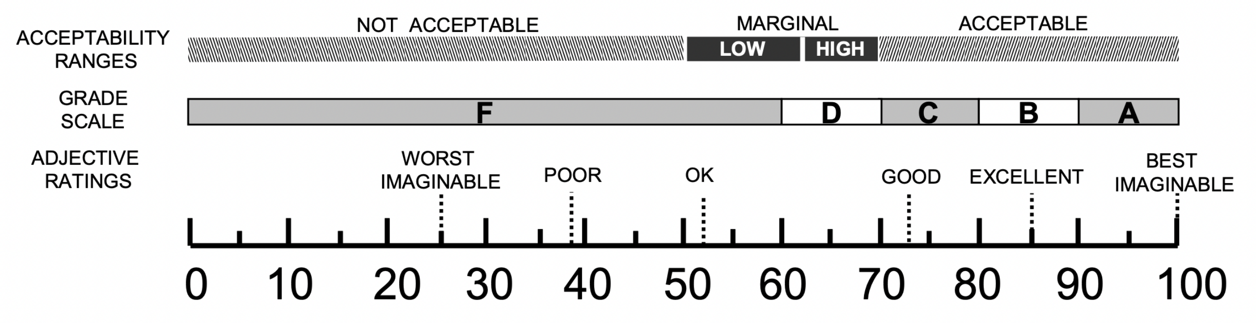
  71. Bangor, A.; Kortum, P.T.; Miller, J.T. An Empirical Evaluation of the System Usability Scale. Int. J. Human Comput. Interact. 2008, 24, 574–594. [Google Scholar] [CrossRef]
  72. Hart, S.G. NASA-task load index (NASA-TLX); 20 years later. In Proceedings of the Human Factors and Ergonomics Society Annual Meeting, Los Angeles, CA, USA, 1 October 2006; Sage Publications: Southend Oaks, CA, USA, 2006; Volume 50, pp. 904–908. [Google Scholar]
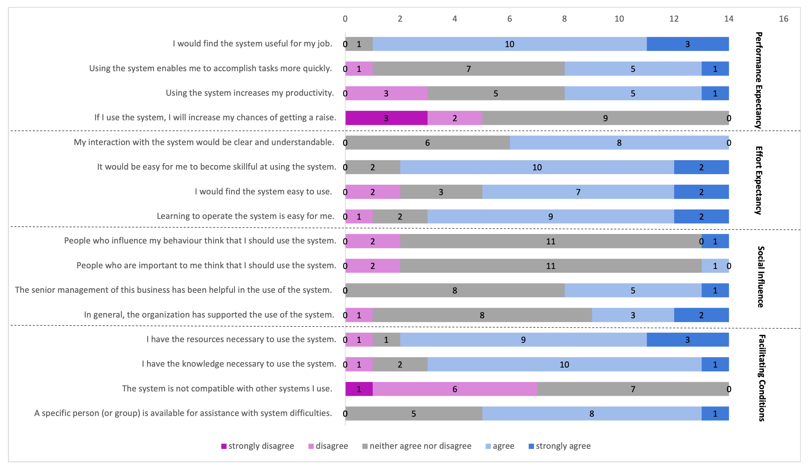
  73. Venkatesh, V.; Morris, M.G.; Davis, G.B.; Davis, F.D. User acceptance of information technology: Toward a unified view. MIS Q. 2003, 27, 425–478. [Google Scholar] [CrossRef] [Green Version]
  74. Brooke, J. SUS-A quick and dirty usability scale. Usability Eval. Ind. 1996, 189, 4–7. [Google Scholar]
  75. Bangor, A.; Kortum, P.; Miller, J. Determining what individual SUS scores mean: Adding an adjective rating scale. J. Usability Stud. 2009, 4, 114–123. [Google Scholar]
  76. Brooke, J. SUS: A retrospective. J. Usability Stud. 2013, 8, 29–40. [Google Scholar]
  77. Sauro, J. A Practical Guide to the System Usability Scale: Background, Benchmarks & Best Practices; Measuring Usability LLC: Denver, CO, USA, 2011. [Google Scholar]
  78. Larman, C.; Basili, V.R. Iterative and incremental developments. a brief history. Computer 2003, 36, 47–56. [Google Scholar] [CrossRef]
  79. Spinuzzi, C. The methodology of participatory design. Tech. Commun. 2005, 52, 163–174. [Google Scholar]
Figure 1. A graphical abstract highlighting the gaps in precision agriculture and contributions of this work.
Agriculture 12 01027 g001
Figure 2. Interface for correlation analysis of multivariate data: (a) the bars showing the correlation of each feature with each of the target variables; (b) the grayscale showing the strength of the correlation between the features; (c) toolbar.
Agriculture 12 01027 g002
Figure 3. Interface for the analysis of plant growth: (a) toolbar; (b) the line graph representing the plants; (c) a popup window showing an image of the plant captured on the given day.
Agriculture 12 01027 g003
Figure 8. Interface for the analysis of water stress and irrigation requirements: (a) toolbar; (b) chart visualising the parameters selected in the toolbar; (c) map widget visualising satellite data for the selected lot; (d) gauge visualising the water balance level with a text-based irrigation suggestion.
Agriculture 12 01027 g008
Figure 9. Interface for the analysis of biological efficacy in by-products: (a) by-product extraction method and correlation visualisation; (b) candidate fields ordered by rain fall; (c) detailed data of a field selected in (b).
Agriculture 12 01027 g009
Figure 10. Interface for uncertainty-aware price prediction: (a) toolbar; (b) price data for the product and countries selected in toolbar; (c) visualisation settings.
Agriculture 12 01027 g010
Figure 11. An overview of the evaluation procedure.
Agriculture 12 01027 g011
Figure 12. Adjective rating scale for the SUS score showing different regions ranging from ‘worst imaginable’ to ‘best imaginable’ [75].
Agriculture 12 01027 g012
Figure 13. SUS scores of the interface developed for the correlation analysis of multivariate data use case. The X-axis indicates a certain range of the score. The Y-axis indicates the number of participants who gave the score within the range.
Agriculture 12 01027 g013
Figure 14. A boxplot of the NASA-TLX results for the correlation analysis of multivariate data use case. Each of the six subscales was captured with a 10-points continuous scale from very low (1) to very high (10). The X-axis indicates the sub-dimensions of the score. The Y-axis indicates the statistics for each sub-dimension.
Agriculture 12 01027 g014
Figure 15. The UTAUT questionnaire results for the correlation analysis of multivariate data use case. Each coloured section indicates the number of participants who responded between ‘strongly disagree’ and ‘strongly agree’ (i.e., frequency).
Agriculture 12 01027 g015
Figure 16. SUS scores of the interface developed for the analysis of plant growth use case. The X-axis indicates a certain range of the score. The Y-axis indicates the number of participants who gave the score within the range.
Agriculture 12 01027 g016
Figure 17. A boxplot of the NASA-TLX result for the analysis of plant growth use case. Each of the six subscales was captured with a 10-point continuous scale from very low (1) to very high (10). The X-axis indicates the sub-dimensions of the score. The Y-axis indicates the statistics for each sub-dimension.
Agriculture 12 01027 g017
Figure 18. The UTAUT questionnaire results for the analysis of plant growth use case. Each coloured section indicates the number of participants who responded between ‘strongly disagree’ and ‘strongly agree’ (i.e., frequency).
Agriculture 12 01027 g018
Figure 19. SUS scores of the interface developed for the exploratory analysis of heterogeneous data use case. The X-axis indicates a certain range of the score. The Y-axis indicates the number of participants who gave the score within the range.
Agriculture 12 01027 g019
Figure 20. A boxplot of the NASA-TLX result for the exploratory analysis of heterogeneous data use case. Each of the six subscales was captured with a 10-points continuous scale from very low (1) to very high (10). The X-axis indicates the sub-dimensions of the score. The Y-axis indicates the statistics for each sub-dimension.
Agriculture 12 01027 g020
Figure 21. The UTAUT questionnaire result for the exploratory analysis of heterogeneous data use case. Each coloured section indicates the number of participants who responded between ‘strongly disagree’ and ‘strongly agree’ (i.e., frequency).
Agriculture 12 01027 g021
Figure 22. SUS scores of the interface developed for the analysis of water stress and irrigation requirements use case. The X-axis indicates a certain range of the score. The Y-axis indicates the number of participants who gave the score within the range.
Agriculture 12 01027 g022
Figure 23. A boxplot of the NASA-TLX result for the analysis of water stress and irrigation requirements use case. Each of the six subscales was captured with a 10-point continuous scale from very low (1) to very high (10). The X axis indicates the sub-dimensions of the score. The Y-axis indicates the statistics for each sub-dimension.
Agriculture 12 01027 g023
Figure 24. The UTAUT questionnaire result for the analysis of water stress and irrigation requirements use case. Each coloured section indicates the number of participants who responded between ‘strongly disagree’ and ‘strongly agree’ (i.e., frequency).
Agriculture 12 01027 g024
Figure 25. SUS scores of the interface developed for the analysis of biological efficacy in by-products use case. The X-axis indicates a certain range of the score. The Y-axis indicates the number of participants who gave the score within the range.
Agriculture 12 01027 g025
Figure 26. A boxplot of the NASA-TLX result for the analysis of biological efficacy in by-products use case. Each of the six subscales was captured with a 10-point continuous scale from very low (1) to very high (10). The X-axis indicates the sub-dimensions of the score. The Y-axis indicates the statistics for each sub-dimension.
Agriculture 12 01027 g026
Figure 27. The UTAUT questionnaire result for the analysis of biological efficacy in by-products use case. Each coloured section indicates the number of participants who responded between ‘strongly disagree’ and ‘strongly agree’ (i.e., frequency).
Agriculture 12 01027 g027
Table 1. Use cases and respective evaluation metrics.
Use CasesMetrics
Correlation analysis of multivariate dataSUS, NASA-TLX and UTAUT
Analysis of plant growthSUS, NASA-TLX and UTAUT
Exploratory analysis of heterogeneous dataSUS, NASA-TLX and UTAUT
Analysis of water stress and irrigation requirementsSUS, NASA-TLX and UTAUT
Analysis of biological efficacy in by-productsSUS, NASA-TLX and UTAUT
Uncertainty-aware price predictionSemi-structured interview focusing on usability and trust
SUS = System Usability Scale [71]; NASA-TLX = NASA Task Load Index [72]; UTAUT = Unified Theory of Acceptance and Use of Technology [73].
Publisher’s Note: MDPI stays neutral with regard to jurisdictional claims in published maps and institutional affiliations.

