1. Introduction
Systems that combine a huge number of elements together with complex interactions among them can be found in a wide range of domains such as social networks, finance, physics, and biotechnology, among others. During the last few decades, the size of these datasets has grown exponentially, in part due to technological advances that facilitate the generation or retrieval of data at speeds never seen before. The direct modeling of these entities and their relationships yields graphs of enormous complexity that often exceed the human capacity for interpretation. However, the large social and economic benefits derived from the human understanding of these domains drive the demand for effective techniques to enable their analysis and comprehension. In this sense, visual analytics aims at helping the user to understand large volumes of data thanks to the ability of humans to understand complex information received through the visual channel [
1]. While much effort has been devoted to designing algorithms that can scale to create pictures from very large graphs, the question remains on whether these depictions can be effectively processed by our cognitive system to extract meaningful knowledge.
Several factors contribute to the underlying difficulty in visually exploring and analyzing a graph. First, the complexity of the data itself has a direct impact on the challenges associated with its visualization. Different metrics can be applied to evaluate the complexity of a graph for visualization purposes, however, some of the most commonly used are the number of nodes and the number of edges, as well as their density [
2]. Beyond the number of elements that make up the dataset, its graphical representation will determine the visual complexity present in the image and the possibility of distinguishing some elements from the others. However, the fact that the entities are perceivable does not guarantee that our brain can understand them, since the mental effort required to do so may exceed our cognitive capacities.
Therefore, when designing a framework for the visualization of complex graphs, it is necessary to incorporate strategies to manage complexity in its different aspects. The reduction of the number of elements present in the image has a direct impact on the reduction of both visual and cognitive complexity. Depending on the user’s objective, this reduction may focus on a selection of a subset of data to be visualized. This can be achieved by eliminating the rest of the information from the display so that the user can focus only on a reduced set that can be selected by means of different techniques such as filtering or zooming. On other occasions, the analyst seeks to obtain a global view of the dataset, without eliminating any information but without getting lost in the details of each one of the elements. In these cases, data aggregation is presented as a solution to reduce the clutter of the image, not by discarding information, but by summarizing it.
Different criteria can be applied to identify aggregations or groups, from automatic techniques that apply similarity measures calculated from the properties of the data to supervised techniques that incorporate the user’s knowledge to create clusters. Particularly interesting is the generation of hierarchical aggregations that allow the visualization of data at multiple scales. Abstraction is one of the key concepts that allows handling complexity by hiding nonrelevant details, providing thus a simpler model to work with, without understanding all the hidden complexity. Applying this concept recursively results in a hierarchy of levels of abstraction, where the highest level represents the whole domain and the lowest level captures the details of the smallest elements of the dataset. Interactions are likely to be studied at any scale, even mixing elements from different scales to understand how they interplay among them (cross-scale analysis). Although this hierarchical structure of the nodes of a graph can be obtained algorithmically, there are multiple domains whose elements intrinsically present a hierarchical structure, such as those based on geographical distributions or biological organisms [
3]. In these cases, their study is usually carried out naturally at different scales, with higher levels of aggregation corresponding to higher levels of abstraction.
This paper focuses on the design of a visual framework (Carbonic) for the visualization of complex systems that can be represented as a compound graph, i.e., elements hierarchically structured and relations among elements at the finer scale that can be aggregated and studied at other higher scales. This multiscale approach is complemented by additional techniques aimed at reducing visual complexity, not forgetting the prominent role of interaction when visually exploring complex datasets. The interaction capabilities include the possibility of creation and editing so that the designed visual framework allows not only the exploration of existing compound graphs, but also their creation and editing in a visual environment. Multiple areas can benefit from this functionality, such as the addition or creation of synthetic scenes that constitute the input data for subsequent simulation processes or the construction of conceptual maps that allow the understanding of complex issues and their interrelations to understand the landscape of strategic domains either for decision-making or communication purposes. Specifically, Carbonic presents the following main features:
Strategies for managing the number of elements to be displayed. Two complementary approaches are provided: the first one discards certain information, either by eliminating particular elements through filter operations or by focusing the display on a subtree through zooming operations. The second approach allows reducing the amount of information by summarizing or aggregating data that are not individually displayed. In this way, groups of nodes can be aggregated into meta-nodes and groups of connections into meta-connections.
Multiscale visualization of the dataset, based on hierarchical aggregations that allow deciding the desired scale for each branch of the tree. Meta-nodes can be selectively collapsed or uncollapsed, depicting the aggregated meta-connections at multi-scale or cross-scale views. Additionally, visual metaphors can be rendered to summarize relevant information from the non-visible collapsed sub-tree.
Techniques for the reduction of visual cluttering, such as edge bundling, transparency, or on-the-fly adjustment of visualization parameters.
Interaction aimed at data exploration for performing topology-based, attribute-based, or browsing tasks. In addition, interaction also provides editing capabilities that allow users to modify an existing dataset or even create a new one from scratch.
Domain awareness taking as input a domain formalization. This guides the definition of filters (adjusting them to the domain properties) and allows defining constraints to guide the modification or creation of the system.
The rest of the paper is organized as follows:
Section 2 reviews the related work.
Section 3 describes the visualization approach followed in Carbonic as well as the strategies applied for complexity management and the provided interaction capabilities.
Section 4 presents two use cases applying Carbonic for the interactive exploration and for the visual creation of compound graphs. Finally, we discuss the use cases, provide some conclusions, and point towards future directions.
2. Related Work
Visually analyzing and exploring complex and large graphs in an interactive way can become a very cumbersome task, mainly due to the high number of entities and the high density of relationships. On the one hand, when the amount of data is huge, the scalability of the visualization techniques can become a problem and thus compromise the smooth interaction that is desirable in this type of system. On the other hand, even when computational capabilities are enough, the amount of information depicted can produce visual clutter, hindering the user’s capacity for extracting knowledge from the data.
One of the strategies that can be used when analyzing complex and large data is to apply a multiscale analysis approach. The main objective of this approach is to reduce complexity by increasing the level of abstraction. This method can be specifically applied to the analysis of complex and large graphs. For that purpose, besides the graph itself, it would be also necessary to have a hierarchical structure that models the levels of abstraction of the specific domain. The leaf nodes of this hierarchy would be the nodes of the graph. This combination of graph and hierarchy is known as a compound [
4] or clustered graph [
5]. The multi-scale nature of these structures allows analysis at different scales, changing the level of detail accordingly to the different levels of the hierarchy and aggregating the underlying information. The analysis at different levels of abstraction can be done using entities from the same level (multi-scale analysis) or entities from different levels of abstraction (cross-scale analysis). Visually analyzing this type of graph requires using a combined visualization of both the graph and the hierarchy.
In general, graph representation techniques can be classified into three main categories: node-link diagrams, adjacency matrices, and containment-based or adjacency-based representations [
6], the latter only being suitable for trees. Node-link representations are based on the visualization of nodes as simple marks (typically dots) and links as arcs that connect nodes. This type of representation is better suited for topology-based tasks [
7], but tends to get problematic when the number of entities is large. On the other hand, adjacency matrix representations are based on depicting a 2D array derived from the graph, where each node is assigned to a row and a column. In this matrix, each cell encodes whether there is a connection between the row node and the column node. In addition, the cell could also encode connection attributes using visual channels such as shape, area, or color [
8,
9]. Adjacency matrices have the advantage of being compact, predictable, and stable to connectivity changes. Moreover, adjacency matrices tend to behave better than node-link diagrams for large graphs [
10]. To get the benefits of both types of representation, hybrid approaches have been applied in systems such as
NodeTrix [
11],
MatLink [
12],
MatrixExplorer [
13], or
Responsive Matrix Cells [
14].
Regarding the representation of hierarchical structures, node-link diagrams, adjacency-based representations, and containment-based representations are the most used approaches [
15]. Node-link techniques applied to trees are considered an explicit representation as hierarchical relationships are encoded explicitly with line marks. Moreover, these representations try to encode the levels of the hierarchy using a rectilinear or radial alignment, while meeting some aesthetic conditions, such as not having edge-crossing and overlapping nodes, or minimizing the distance between nodes of the same level [
16]. On the other hand, containment-based and adjacency-based representations implicitly encode inclusion relationships and are in general well suited for applying a space-filling approach (maximizing the use of the available screen space).
Circle Packing [
17],
BeamTree [
18], and
TreeMap [
19] are examples of containment-based representations while
Sunburst [
13] and
Iclicle Plots [
20,
21] are examples of adjacency-based representations. Moreover, hybrid techniques can be found such as
Elastic Hierarchies [
22],
Dendrogramix [
23], or
Stacked Trees [
24]. Finally, Treevis.net [
25] provides a classification of a wide range of tree representations depending on the features discussed above, such as explicit vs. implicit, dimensionality, or node alignment.
For the specific visualization of compound graphs, some previous works are based on using a circle-packing representation for the hierarchy combined with a node-link diagram (
TugGraph [
26] and
GrouseFlocks [
27]). Other authors proposed to use a Treemap-based representation for the hierarchy combined with a node-link diagram (
ArcTree [
28] and
NFlowVis [
29]). Additionally, other relevant approaches are proposed in
TreeNetViz [
30], combining a Sunburst representation with node-link diagram, and
MatLink [
12], that applies a node-link diagram for the hierarchy in combination with an adjacency matrix for the graph. All these approaches use a tree representation as the layout substrate, while Drogrusoz et al. propose using a node-line diagram with a force-directed layout and representing the hierarchy by creating nested groups [
31].
On the other hand, when data are complex, it is also necessary to provide mechanisms that allow the analyst to establish a dialogue with the data, and this can be achieved through interactivity [
32]. In this way, the user, through manipulation of the visual representations, can build up an analytical discourse that can potentially lead to valuable new knowledge, confirm hypotheses previously established, or share findings and communicate them for effective decision-making [
33]. In the literature, different classifications for the techniques for visual interaction can be found. For example, Yi et al. suggest seven categories of interaction techniques: select, explore, reconfigure, encode, abstract/elaborate, filter, and connect [
34]. Furthermore, Keim divides the spectrum into five groups: dynamic projections, filtering, zooming, distortion, and linking and brushing [
35].
As for visual editing, Baudel’s work is noteworthy, although it does not focus on relational data, but proposes an extension of interactive manipulation techniques for the direct visual editing of complex datasets [
36]. With respect to editing a network, this process may involve either editing the attributes of nodes and relationships, or editing the existing nodes and relationships themselves. For the first case, Eichner et al. propose to use node-link diagrams paired with attribute-dependent layouts [
37]. For example, they use a scatterplot for placing the nodes of the node-link diagram, and with drag-and-drop gestures, the values of the attributes would be visually edited. Regarding the editing of nodes and relationships, there are some systems designed for editing the network through a table while updating the visual representation of the graph on the fly (for example,
Cytoscape [
38] or
Gephi [
39]), but this approach is not strictly visual-based. The visual-based approach most commonly used is editing the graph directly through its node-link representation (for example,
yEd Graph Editor (
https://www.yworks.com/products/yed, accessed on 10 June 2022) or
Visual Paradigm (
https://www.visual-paradigm.com/, accessed on 10 June 2022)). In this case, all of them use a similar approach for creating nodes, based on selecting a template and dragging it to the canvas or clicking on the location where the user would like the node to be placed. The creation of links can be defined by selecting the related nodes or by dragging the link to the canvas and then attaching it to the nodes [
40]. Apart from these general approaches, there are a couple of remarkable papers. On the one hand, Horak et al. propose editing the graph through the selection of a region of interest, which is displayed as a matrix and allows editing the connections [
14]. On the other hand, Gladisch et al. propose
EditLense, a tool that allows the insertion, editing, and removal of nodes and connections through gestural interaction with fingers [
41].
To summarize, the literature has approached the visualization of complex graphs, but the authors who focused on compound graphs have not covered the problems derived from the magnitude and complexity of the data. On the other hand, there are authors that have worked on the visual editing of graphs but not specifically for compound graphs. This paper presents Carbonic, which addresses the visualization, exploration, and editing of complex compound graphs. Furthermore, Carbonic is not a set of independent tools or strategies, but an integrative framework that allows performing these tasks visually and in a coordinated fashion.
3. Methods
3.1. Definitions
A directed graph, also known as digraph, consists of a set of nodes V and a set of directed edges E⊆. An edge ∈E of a digraph is an incoming edge of the node v and an outgoing edge of the node u; both nodes u and v are incident with the edge .
A rooted tree is a digraph with one special tree node , the root of T, such that for every other node u∈V∖ there is an unique path from to u.
From the above definition derives that every non-root node v∈V∖ in a tree has exactly one incoming edge ; u is called the parent of v (); conversely, v is a child of u (). A node without children is a leaf, while nodes with descendants are referred to as internal nodes. The descendants of v, , are all nodes u such that there is a path from v to u. Conversely, a node u on the unique path from to v is said to be an ancestor of v.
The depth of v, , is the number of edges making the path from to v. This implies that . The depth of the entire tree T is defined as = . The height of a node v, , is the depth of the subtree rooted at v.
A compound digraph consists of nodes V, directed inclusion edges E, and directed adjacency edges F. The inclusion digraph is a rooted tree, and no adjacency edge connects a node to one of its descendants or ancestors, i.e., for every adjacency edge , u and v are unrelated in T. If the adjacency edges are undirected, then D is called a compound graph.
An additional constraint may impose that the adjacency edges only connect leaf nodes. In this case, adjacency connections between their ancestors are only meta-connections that represent the adjacency edges between their descendants. These meta-connections will also be named meta-edges. Analogously, nodes that are not leaves will be referred to as meta-nodes.
3.2. Compound Graph Visualization
Carbonic is designed for the visualization of relational data in which network nodes present a hierarchical relationship. The hierarchy between nodes will be specified by inclusion edges, while the relationships or connections between them will be represented as adjacency edges. In addition, nodes may have associated properties that can be used to guide the exploration of the data (through operations such as selection or filtering) and the editing or creation of the dataset.
Moreover, Carbonic can use a formalization of the domain (loaded through a configuration file) which will establish constraints in the data, such as the types of entities that can be created at the different levels of the hierarchy: the entities’ attributes, and their types; or the relationships that are allowed between specific types of entities. This formalization is used inside Carbonic for different purposes. For example, it can be used for guiding the creation and editing process, allowing only the creation of specific entities depending on the level of the hierarchy. Furthermore, it can be used to automatically create the appropriate set of widgets for establishing filters on the entities’ attributes.
Some domains do not present an intrinsic hierarchical relationship but can also benefit from analysis at different levels of abstraction. For this purpose, Carbonic provides the possibility of obtaining a hierarchy of the nodes of a network by applying different clustering algorithms, such as hierarchical grouping based on category values of the nodes or based on community detection using Louvain’s method [
42]. In this way, the nodes of the original graph will become the leaf nodes of the tree and the hierarchical grouping algorithmically obtained will give rise to the meta-nodes.
Visualizing a compound graph implies simultaneously revealing the underlying tree structure of the nodes while depicting their adjacency edges. The next subsections explain the approach followed to represent these elements.
3.2.1. Visualization of the Tree: Nodes and Inclusion Edges
One of the first questions to be answered is why we want to visualize the hierarchical structure of the nodes in a compound graph. There may be different motivations, but the most direct one is because we want to observe the organizational structure of the data. Another important reason is to understand the distribution of data along the hierarchy; a third reason to depict the underlying hierarchy is to provide a visual reference to guide the multilevel navigation in complex datasets. Sunburst diagrams [
13] represent hierarchical relationships using an adjacency-based layout and following a space-filling approach with a radial layout. Although sunburst diagrams do not make optimal use of the screen space, especially in the corners, they provide an intuitive and effective view of a hierarchical structure and, consequently, of the abstraction levels encoded in the hierarchy.
Figure 1 shows the sunburst diagram of a small tree. Each concentric ring of the sunburst represents a depth level of the tree, and each tree node corresponds to a sector of the ring. The central ring corresponds to the tree root and the number of concentric rings is the depth of the tree. The color and the size of the sectors can be used to map a certain feature of the data. In the examples of this paper, the colors of the inner ring (depth = 1) have been selected so that the nodes are distinguishable from each other according to the tree color palette [
43]. In the successive depth levels, the color range available for the descendants is distributed among the nodes to make them as distinguishable as possible. To avoid adjacent nodes having similar colors, a permutation of the palette is performed.
Regarding the size of the sectors, each ascendant will span over the arc occupied by all of its descendants. The size of the leaf nodes may be uniform or may map some properties. In the example of
Figure 1, all the leaf nodes have been uniformly sized. Obviously, other schemes can be applied to make color and size represent other features of the data.
3.2.2. Visualization of the Adjacency Edges
Once the nodes of the hierarchy are radially depicted, the adjacency edges will be drawn as arcs that connect both incident nodes. In the case of adjacency edges having directionality, the arcs will incorporate an arrow as an indicator of the direction of the connection.
Figure 2 shows the adjacency edges connecting the leaves of the tree. Following the same principle as the one applied to the sectors, the color and thickness of the connections can encode different properties of the adjacency edges. In case there are different types of connections, each of them will be rendered with edges of different colors. As in the case of sectors, the thickness of edges in leaf nodes can be uniform or encode any property associated with the connection.
Meta-edges (i.e., aggregations of connections among descendant nodes) can also be drawn to present connectivity at different scales. Since the incident nodes of these meta-edges will be meta-nodes, meta-connections will summarize the adjacency edges of the meta-nodes’ descendants.
As the volume of data increases, the superposition of adjacency edges, meta-edges, and the hierarchy of nodes in the same diagram can be sometimes confusing and over-saturate the final image. For this reason, Carbonic offers a set of strategies for reducing the number of elements simultaneously depicted, as described in the next section.
3.3. Managing the Number of Elements
The presence of too many elements in an image contributes to increasing its visual and cognitive complexity, hindering the analysis process. One of the solutions to decrease the overload of the image is to reduce the number of elements in it, requiring strategies to select which information to present at each moment. Carbonic offers different options to reduce the number of elements to be displayed by filtering operations, focusing on a sub-branch of the tree, and through aggregations that allow summarizing the information and abstracting lower-level details. The following subsections describe in greater detail the operations provided to select the subset of data to be visualized.
3.3.1. Filtering
Filtering operations allow selecting elements to temporarily remove them from the view. Regarding the nodes, they can be directly selected with the mouse or a more powerful selection method can be applied based on the values of their attributes. Two alternatives are provided to visualize the results of a filtering operation: the first one will remove from the visualization all the filtered nodes. As a consequence, the space will be redistributed according to the elements that remain unfiltered to occupy the screen space available for them. The second alternative keeps the filtered nodes, showing them deemphasized in gray color. In this way, a view is obtained in which the removed nodes (inactive) and the nodes that have not been affected by the filter (active) coexist. This approach will minimize the changes in the layout helping the user not to lose the overall context. Regardless of which of the two filtering visualization options is applied, the adjacency edges of the filtered nodes are automatically removed from the displayed image, although they will still be aggregated by the meta-edges of their ancestor meta-nodes.
Figure 3 illustrates a filtering operation applying these two visualization options.
Carbonic also allows filtering connections. In this sense, the visualization can be configured to show all edges and meta-edges, none of them, only meta-edges or only edges between leaf nodes. In addition, filters can be set according to their properties, so that any filtered-out connections will disappear from the rendered image.
3.3.2. Hierarchy Pruning
The elements removed by the filtering operations presented in the previous section are targeted either by the direct user selection or by choosing those elements whose properties satisfy certain criteria. Additionally, Carbonic also supports other pruning operations that reduce the number of elements to be displayed by keeping visible only a subset of the original tree. Carbonic offers two types of pruning: the first one allows focusing on a branch of the hierarchy by selecting the node whose descendant tree will be displayed. This implies that the selected node becomes the root of the new visible tree, removing the rest of the hierarchy from the image. The context reference is provided by a breadcrumb trail where the hidden ancestors are shown, thus the user can mentally locate the point in the hierarchy from which the displayed hierarchy hangs (
Figure 4). The second pruning mode displays a limited number of levels starting from the root of the hierarchy, removing any elements present at lower levels (
Figure 5). To make the user aware of this situation, the outer side of the sector is highlighted as a visual mark that indicates the existence of elements that are deliberately not being displayed. It should be noted that this visual mark only appears in the sectors having descendants that have been removed from the visualization. In addition, the connections of the invisible nodes are aggregated into meta-connections that are displayed at the last visible level (
Figure 5).
3.3.3. Collapse and Uncollapse Operations
As stated previously, when the number of leaf nodes and their connections is too high for their direct visualization, applying multi-scale and cross-scale analysis can be helpful. For that purpose, Carbonic displays the hierarchical structure of the data as a collapsible sunburst diagram. Each sector of the diagram can be completely collapsed, hiding all its descendants and depicting an aggregated view of their children nodes. A collapsing operation on a meta-node implies that the descending sub-tree together with its adjacency edges is eliminated from the visualization, becoming represented by the collapsed meta-node and its meta-edges. This action can be applied selectively and individually to each meta-node, obtaining thereby a sunburst where its branches present heterogeneous levels of abstraction (
Figure 6). Similarly, a collapsed meta-node can be uncollapsed to show its descendant nodes and their connections. This operation can be performed level by level or recursively to unfold the descendant tree to its maximum level, until its leaf nodes are displayed.
3.4. Reducing Visual Cluttering
Though the number of elements to be displayed has a direct impact on the perceived visual complexity, it is also true that the application of space distribution techniques, arrangement of elements, or adjustment of visual properties can significantly alleviate the visual load of the image. The following is a description of the main decisions aimed at increasing the legibility of the final image.
3.4.1. Edge Bundling
Large datasets with a large number of connections usually generate images with an excessive number of overlapping edges, obscuring the underlying connectivity patterns. Edge bundling techniques enable modifying the trajectories of the connections in order to group them together creating edge bundles that produce a more structured image. Carbonic applies a hierarchical edge bundling algorithm [
44] where the user can parameterize the tension factor to be applied.
Figure 7 illustrates the effect of increasing the tension in the grouping of the adjacency edges.
3.4.2. Transparency
The adjustment of the alpha component helps to distinguish the elements even if they are overlapping. Applying transparency to the arcs representing the connections will facilitate the perception of the links when they overlap each other, as well as avoid the obfuscation of the hierarchy of nodes since the trajectory of the adjacent edges crosses over them. Transparency can be configured independently for the connections and for the nodes of the hierarchy. In the latter case, it can either affect the entire hierarchy or exclude the collapse front (the set of nodes that are not uncollapsed) for a better perception of the visible leaf nodes. The combined effect of tuning the tension factor and the alpha component is shown in
Figure 7.
3.4.3. Additional Decluttering Strategies
The positioning of the elements within Carbonic is based on a hierarchical, radially distributed arrangement. In this way, the placement of the nodes allows identifying their ancestors easily and avoids any overlapping with each other. However, in large datasets, the number of leaves can become extremely high. The fact that the hierarchy expands outwards in the sunburst implies that the available space increases with the depth of the tree, thus providing more space to draw the leaf nodes. This approach is complemented by collapse and uncollapse operations that allow only a subset of the leaf nodes to be expanded. In addition, distortion operations are provided to adjust the screen space allocated to a sector. In this way, the angle devoted to a sector and its descendants can be increased, thereby enhancing their visual exploration (
Figure 8).
Regarding the adjacency edges, in addition to the previously mentioned edge bundling technique, other options have been incorporated to modify their trajectory. Specifically, in the case where the dataset includes different types of connections (multi-layer network), each category can be depicted with a small offset (that can be modified interactively) to avoid overlapping among them (
Figure 9). The self-connections will run on the outside of the sunburst to reduce the overlap with the rest of the adjacency edges (
Figure 10a). Following the same approach, connections between siblings can optionally be shifted to the outside of the sunburst, thereby enabling a better perception of the relationships within a parent node since they are not obfuscated by the rest of the connections in the dataset (
Figure 10b).
3.5. Interaction for Exploration and Edition
Interactivity allows a more effective exploration of the relational data than that offered by a merely static image, especially when dealing with complex and large datasets. Therefore, all the operations previously mentioned oriented to the management of the number of elements and to the reduction of visual cluttering can be applied and configured interactively by the user. In addition, with the purpose of enhancing connectivity exploration, the highlighting operation of the ego-network of a given node is incorporated, given a maximum number of jumps (
Figure 11).
The automatic computation of certain metrics can both complement and assist the visual exploration of complex datasets. In this sense, Carbonic automatically computes centrality measures than can be used to guide filtering operations.
Finally, the inclusion of editing and creation capabilities provides a means for these operations to be used in the process of exploring the datasets, as well as making Carbonic not only a viewer but also an editor that allows the creation of compound graphs in an interactive and visual fashion. For this purpose, operations for editing, creating, and deleting nodes and adjacency edges have been incorporated through clicking and contextual menus. In case a formalization of the domain has been defined, then the creation and editing actions will be restricted by the entities and attributes established.
3.6. Visual Cues to Guide the Multiscale Exploration of the Compound Graph
All the features described in the previous sections share the goal of providing a visual framework for the exploration (and editing) of complex graphs at different levels of abstraction. The collapse and uncollapse operations naturally support exploration at different scales, while the combination of the different interactions provides tools to overview the dataset and to perform topology-based or attribute-based tasks. Nevertheless, it is possible that the number of pixels available to represent certain elements may not be sufficient, so they are practically not perceivable. In these cases, Carbonic superposes visual marks indicating the presence of elements that cannot be clearly perceived. This will make the user aware of the presence of non-visible information and of the need to apply operations to redistribute the space in case of wanting to observe the hidden elements (
Figure 12a).
Generally, a decrease in the level of abstraction implies an increase in the number of elements to be represented and, therefore, greater complexity in the image. Having information that complements the aggregated view of the descendants without the need to disaggregate the meta-node would guide the user in choosing the level of abstraction at which to visualize the data, avoiding costly uncollapse operations that increase the complexity of the visualization. For this purpose, a visual metaphor has been designed that summarizes the characteristics of the hanging tree of a collapsed meta-node. As a first approach, in this work we have chosen a simple and clean design, showing a square shape whose filling can encode variables related to the descendant tree. In the example shown in
Figure 12b, the width of the black filling represents the number of leaves while the height of the black filling encodes the depth of the hidden tree. This initial design could be replaced in future works by a glyph-based visual metaphor that could visually encode more variables.
4. Results and Discussion
This section illustrates the combined application of some Carbonic features and capabilities by means of two examples. The first one shows the visual exploration of a dataset containing the existing air routes between the world’s airports. The second example focuses on the creation and interactive exploration of a graph representing the hierarchical decomposition of a course, the dependencies between the explained concepts, and the results of the evaluation of the competencies acquired by a group of students.
The following subsections show these hypothetical workflows, describing a sequence of steps for the visual exploration and editing of the datasets. Obviously, these are just examples involving decisions that should be taken by the real user depending on his final goal. The Carbonic tool, documentation, and the examples presented are available at
https://vg-lab.es/carbonic/, accessed on 10 June 2022. This prototype has been developed using web-based technologies, such as HTML5, CSS3, and JavaScript. This makes Carbonic available for any system that has a web browser engine. HTML5 Canvas 2D has been used instead of SVG to achieve better performance.
4.1. Flight Routes Visualization
In this example, we will show how Carbonic can be used for the exploration of flight routes at different levels of abstraction. The dataset used for that purpose combines two datasets:
OurAirports (
https://ourairports.com/data/ accesssed on 10 June 2022), and
OpenFlights (
https://openflights.org/data.html, accesssed on 10 June 2022). The
OurAirports dataset stores the airports and will allow the creation of the hierarchical structure based on the location of the airport: city, region, country, and continent. On the other hand, the
OpenFlights database provides the air routes between the airports spanning the globe. In this way, the leaf nodes are the airports and the edges indicate that there is a route between the two incident airports. Additionally, the dataset has been filtered to discard inconsistencies, leaving a total of 19,222 connections among 55,741 airports. The
OurAirports dataset also provides other attributes for the airports which can be used in Carbonic for filtering operations. In this example we have used the attribute “Type” which can have the following values:
large airport,
medium airport,
small airport,
seaplane base, or
heliport.
Figure 13a shows the initial Carbonic visualization of the complete dataset, where the colors of the sectors follow the tree color palette, the size of the leaf nodes is unitary, and the nodes have been alphabetically sorted. The high complexity of the scene does not allow to discern the nodes from each other and it becomes impossible to follow the trajectory of the connections, presenting the usual hairball effect. Rolling up to the highest level of abstraction makes it possible to obtain a global view of the whole data without the need to look at each airport and each connection individually. This can be seen in
Figure 13b where a global collapsing has been performed, visualizing only the meta-nodes of the highest level of abstraction, which in this case corresponds to the continents. Since the size assigned to the leaf nodes is unitary, we see that the continents occupying a larger angle are those with a larger number of airports (in the example,
North America followed by
Europe and
South America).
Looking at the square marks placed in each sector, we observe that the continent with a higher connectivity degree is
North America, followed by
Asia and
Europe. It seems coherent that the continent with the largest number of airports is, at the same time, the one with the most air routes. However, it is striking that
Asia has such a high degree of connectivity, occupying such a small angle. This imbalance encourages us to further explore the distribution of connections and airports. By applying a property-based filter, we can remove closed airports, heliports, and seaplane bases from the visualization. This will allow us to remove elements that are not relevant, in this case, airports that do not have commercial routes. If we now map the degree of connectivity to the angle of the leaf nodes, then the largest continents will be those having the most routes.
Figure 14a shows the result of applying this modification and it is clear that
North and
South America have significantly reduced their size, while
Europe and
Asia have significantly increased their size. From this, it can be seen that the density of routes relative to the number of airports is much higher in
Europe and
Asia, while in the two American continents there are more airports, but some of them operate few passenger routes.
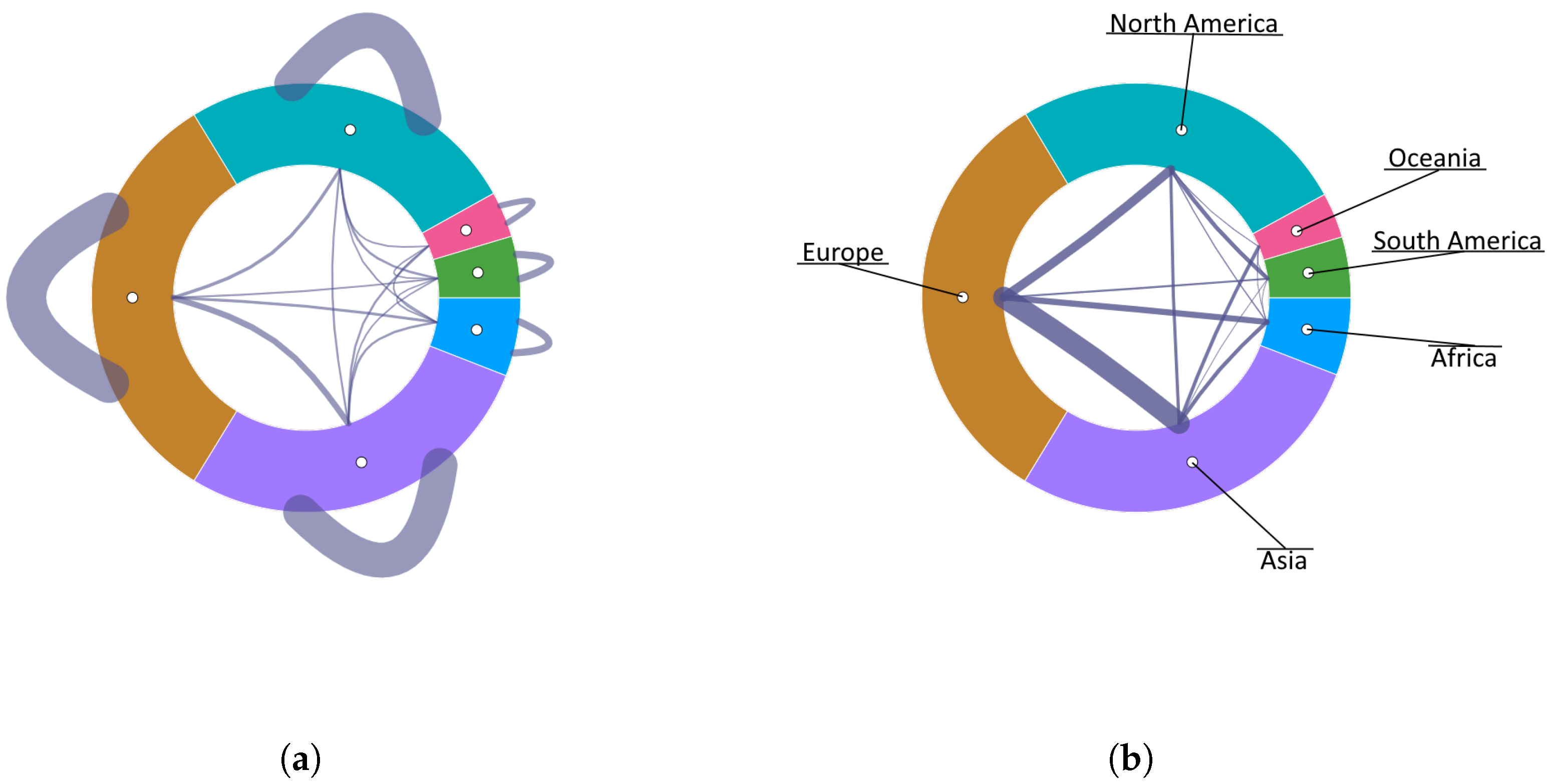
Looking at the thicknesses of the meta-connections associated with the continents in
Figure 14a, it is easy to see that the number of internal routes in
Europe,
North America, and
Asia is very high in comparison with the number of external routes with any of the other continents. If we eliminate from the visualization the self-connections (
Figure 14b) and focus on the routes between continents, it is clearly perceived that
Europe and
Asia are the two most highly connected continents, followed by
Europe to
North America, and
Europe to
Africa.
With the purpose of inspecting the routes between the two most connected continents (
Europe and
Asia), we proceed to filter out the rest of continents and uncollapse
Europe (
Figure 15a). To reduce visual clutter, sibling connections at the country level (in this case, European internal routes) can be depicted on the outward side, allowing a better analysis of the available routes between Asia and European countries (
Figure 15b). It is immediately observed that
Russia is the country of the European continent with the highest number of routes to
Asia, followed by
United Kingdom and
Germany. Uncollapsing
Asia we see that
Turkey is the Asian country most connected to
Europe (
Figure 15c).
With the aim of inspecting the connections across European countries, we can focus on the European continent by discarding the rest of the hierarchy from the visualization.
Figure 16a, where
Europe is shown as the root of the sunburst, reveals that
Spain and
Germany are the two most highly connected European countries. By disaggregating
Spain and highlighting the connections from
Germany, it can be clearly seen that the regions of
Spain with which
Germany mainly connects are the
Canary Islands, the
Balearic Islands and
Andalusia (
Figure 16b).
Returning to the highest level of abstraction and visualizing again the meta-connections between continents (
Figure 14a), we realize that, while
Europe and
Asia were the most highly connected, the meta-connection linking
Africa and
South America appears with a very small thickness, which indicates that there are few routes between the two continents. For further analyzing this fact, we focus on both continents by filtering out the rest of the meta-nodes and disaggregating
South America at the country level (
Figure 17a). In this view, it is clear that there is only one edge connecting
Africa to
Brazil, which implies that
Brazil is the only country in
South America that has air routes to the African continent. By uncollapsing
Africa we can now analyze which African countries
Brazil has routes to. Since we have already identified
Brazil as the only South American country with routes to
Africa, we can perform this analysis at a higher level of abstraction, visualizing
South America collapsed. Highlighting the direct connections of
South America, we observe that it has direct routes with only five African countries:
Morocco,
South Africa,
Togo,
Cape Verde, and
Angola (
Figure 17b).
4.2. Course Design: Visual Creation and Exploration of Course Contents
The second use case is concerned with the visual creation of a compound graph using the multiscale visualization framework proposed in this paper. This will be done by illustrating the design process of a course, specifically the “Computer Structure” course within the “Computer Science” degree program at Universidad Rey Juan Carlos in Madrid.
The planning of a course is an iterative process consisting of several phases. One of them is the structuring and sequencing of the contents, which is usually done using generic tools such as word processors or spreadsheets. A top-down approach is commonly followed in which the content is initially structured in large blocks or modules and then subdivided into finer levels of granularity. After defining the content to be taught, it will be necessary to sequence and make a temporal planning of the activities, assigning time slots to each one of them.
In the context of this use case, Carbonic supports the visual creation of the hierarchical structure of the course, also allowing the insertion and visualization of the dependency relationships between concepts, something that is typically in the mind of the teacher who is designing the course but is not commonly depicted in the course plans.
The creation of meta-nodes to represent the modules and their subdivisions can be done interactively through the context menu that appears when clicking with the mouse on the empty canvas displayed when launching Carbonic. However, prior formalization of the working domain will allow establishing the elements permitted at each level of the hierarchy as well as their attributes. This formalization (available at
https://vg-lab.es/carbonic/course-domain.djson, accessed on 10 June 2022) will guide the process of creating entities and relationships, avoiding the generation of erroneous elements according to each level of the hierarchy. In addition, as explained in
Section 3.2, the definition of which attributes can have each type of entity and their types allows the creation of appropriate filtering widgets for them.
In this example, the contents have been structured in four hierarchical levels:
modules,
units,
lessons, and
concepts. Concepts have two attributes: their relevance according to the teacher’s judgment and their duration, which reflects the time spent working on the concept in a session. In addition, the dependencies across concepts are formalized as directed adjacency relations, reflecting that the target concept depends on the source concept.
Figure 18 shows the course structure modeled using a traditional textual scheme. The creation of this hierarchical structure comprising the contents of the subject will be easily carried out through Carbonic’s graphical interface, simply by right-clicking the mouse and selecting the option to create children from the contextual menu (
Figure 19). Afterward, each node can be edited by right-clicking on it to set the appropriate values of its attributes, previously specified in the domain file. The result is shown in
Figure 20a, where the same structure created with Carbonic is depicted. Finally, adjacency relationships can be created by selecting the source and destination via a mouse click. For the sake of simplicity, only the dependencies between concepts of different units have been created, ignoring those between concepts of the same lesson or of the same unit.
Figure 20b shows the final result, where the contents distribution and the dependency among them can be simultaneously observed. It is easy to notice that Module 4 does not present any previous dependencies, which indicates that it could be moved and taught at any time during the course and even assessed whether those concepts could be moved to a different course.
When collapsing the diagram at the unit level (
Figure 21a), we observe that there are no dependencies between the two units of Module 1 (
Introduction and Performance and
Information Representation), therefore, their order could be interchanged without having any effect on the course progress. Additionally, there is a strong dependency between
Assembler Basics and
MIPS Programming units, while there is no dependency between the
Assembler module and the
Arithmetic Circuits unit, so the latter has the flexibility to be moved following the information representation unit. It is also easy to detect that there are no dependencies between the
Single Cycle and the
Multicycle unit. Although the degree of difficulty makes it advisable to teach
Single Cycle before
Multicycle, it would be feasible to interchange their order or even to eliminate the
Single Cycle implementation and teach only
Multicycle.
By selectively uncollapsing the
MIPS Programming unit (
Figure 21b), we observe that the last four lessons do not generate dependencies. They contain advanced concepts that are not essential for the continuation of the course and that can be cut or merged if necessary due to any unexpected contingency. The same analysis can be made when uncollapsing the
Arithmetic Circuits unit (
Figure 21c), since the last lesson does not generate any dependencies either.
The relevance associated with each concept has been assigned by the instructor of the subject according to his perceived importance in the range of [0, 10]. Filtering out the concepts whose relevance is below 9 yields the image shown in
Figure 22a, where the less relevant concepts appear faded in gray color and have no visible connections. If, additionally, we resize the leaf nodes to be proportional to their output degree, we obtain the image shown in
Figure 22b. We see that most of the concepts that have been labeled as having little relevance also have few further dependencies so that they take up very little space and even disappear from the diagram. Surprisingly, we see that the
Assembler Basics unit concepts occupy a large angle, despite being filtered out due to their low relevance. In this case, a lack of consistency between the relevance assigned by the instructor and the importance due to the dependencies presented by other later concepts is evident, supporting the instructor in decision-making to enhance and assess the understanding of these basic concepts.
4.3. Discussion
The results show two use cases using Carbonic from two different perspectives: in the first one, an existing dataset is visually explored, while in the second one, a graph is created from scratch using the visualization and interaction capabilities provided by Carbonic.
The first example shows a drastic reduction in complexity by visualizing the aggregated data at a higher level of abstraction (
Figure 13).
Figure 13b presents a decluttered image where the connectivity and proportion of airports on each continent are easily visualized. The visual separation between the internal routes to the continent and the external routes to the rest of the continents facilitates the perception of connectivity and the identification of the most strongly connected continents (
Europe and
Asia) and those with fewer air routes between them (
Africa and
South America). The selective uncollapsing of sectors allows cross-scale exploration and the identification of the countries with which a continent is mainly connected or the regions most connected to a given country. In this way, it is easily detected that
Brazil is the only country that directly interconnects
Africa. This information would have been very difficult to discern in a classical representation of air routes on a geographical map.
The second use case shows the usefulness of Carbonic as a support for planning the contents of a course. Carbonic’s editing capabilities allow creating the hierarchical structure of the concepts and establishing the dependencies between them, simultaneously visualizing the hierarchical structure of the contents and the relationships between them. The explicit visualization of this information can be of great help when rescheduling, deleting content, or modifying the temporal sequencing in which contents are addressed. In the example presented, the relevance attribute was associated with each concept taught, thus qualifying the contents according to the teacher’s criteria. The combination of filtering operations to discard less relevant concepts with the ability to scale the sectors according to a numerical attribute (in this case the degree of output connectivity) highlights the inconsistencies between the perceived relevance of certain concepts and their importance due to further dependencies with subsequent concepts.
5. Conclusions
This paper presents a framework for the visual exploration and editing of graphs by addressing the complexity derived from the high number of nodes and connections through different strategies.
On the one hand, the organization of the data into levels of abstraction allows information to be aggregated, thereby reducing the visual and cognitive complexity perceived by the user. In addition to the ability to summarize information by means of aggregations, we also have included operations to selectively eliminate certain elements: filtering, hierarchy pruning, or focusing on a subtree allows discarding less relevant information to focus the exploration on a subset of elements. The possibility of adjusting visual properties such as transparency or the location and trajectory of the elements facilitates the reduction of visual cluttering, boosting the perception of the represented elements. These features together with the interaction capabilities provide an efficient environment for the visual exploration of complex compound graphs.
The selected visual representation blends the hierarchical organization of nodes with their connectivity in an intuitive way. This hierarchical structure provides natural support for exploring the graph at different levels of abstraction, allowing the data to be visualized at an adaptive level of detail that provides more precision in areas of interest while showing a summary of information in other less relevant areas. This strategy facilitates the visualization of large graphs and helps to break down complex systems in order to analyze the interactions of their elements at different organizational levels. However, the aggregation of nodes into meta-nodes encapsulates details that would only be observable by uncollapsing the aggregated meta-node; this work proposes the enhancement of the representation by including visual metaphors that summarize properties of the collapsed (and therefore not visible) subtree to provide information to guide the user in the navigation process. The visual metaphor presented here is extremely simple, but a more elaborate design would allow a better characterization of the most relevant properties of the collapsed sub-tree, thereby providing a summarized outline of the hidden hierarchy without disaggregating the meta-node.
Many areas generate data that have a hierarchical organization, such as biological systems, geographical data, or socio-economic data. However, even when the nodes do not present an intrinsic hierarchy, it is possible to apply techniques for their automatic hierarchical grouping, based on certain attributes of interest. This would allow applying the developed visualization environment to analyze complex graphs following a multiscale approach, even if they do not present a compound graph structure. No less interesting would be to perform different hierarchical groupings of the same data, according to different properties, which would allow interpreting the data from multiple perspectives derived from the restructuring of the hierarchy.
The editing and creation capabilities turn this framework into a tool that aids the construction of graphs in a visual and interactive way, taking advantage of all the complexity management strategies already embedded in the viewer. This approach allows translating the mental model of a user by providing resources to build the representation following a top-down approach and to observe at the same time the hierarchical organization of the elements and their connections or dependencies.
The results shown in this paper illustrate the applicability of the proposed approach to two different domains, demonstrating both the capabilities for the exploration of existing datasets and the visual creation of graphs that reflect the mental structure that a user has of a given domain. In both cases, Carbonic provides strategies for conveying information in a meaningful way.
Regarding future work, the presented framework can evolve in multiple directions. The proposed techniques are currently included in a prototype that is only a preliminary implementation that needs to be improved in terms of usability and robustness. While several techniques have been proposed to manage complexity from the visualization point of view, there is also a need to deal with complexity from the computational perspective, by developing strategies for efficient memory management to handle extremely large graphs.
The incorporation of data of different nature, such as time-varying data, would allow us to extend the applicability of Carbonic to other domains and to show the temporal evolution of properties, connections, or hierarchy.
Finally, the integration of the proposed visual framework with other domain-specific tools would allow the development of a multiview environment where Carbonic would act as a visual front-end for interacting with simulation software for highly complex systems, such as those found in the field of neuroscience. Furthermore, the use of Carbonic in a specific application domain will allow the evaluation of the proposed approach with end users, which will greatly contribute to the refinement of both the underlying techniques and the interaction capabilities.


