Next Issue
Volume 11, April
Previous Issue
Volume 10, December


Arts, Volume 11, Issue 1 (February 2022) – 36 articles

Cover Story (view full-size image): 
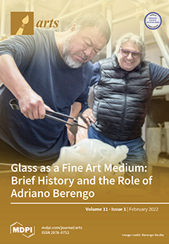
This article explores the role of glass as a medium in the fine arts rather than as a craft form and discusses the development of glass technologies and their application in fine arts. Glass is distinctive as a sculptural medium due to its optical properties and transparency—it can create the unique possibility of using the space both outside and inside a solid object. This article also demonstrates the importance of individuals in bringing glass as a fine art medium to the fore, in particular Adriano Berengo. Berengo has proved to be exceptional in promoting glass in fine arts and has been effective in encouraging well-known artists, from Ai Weiwei to Tony Cragg and from Jaume Plensa to César, to experiment with glass as a medium in his studio. (Author Dr. Goshka Bialek) View this paper
  • Issues are regarded as officially published after their release is announced to the table of contents alert mailing list.
  • You may sign up for e-mail alerts to receive table of contents of newly released issues.
  • PDF is the official format for papers published in both, html and pdf forms. To view the papers in pdf format, click on the "PDF Full-text" link, and use the free Adobe Reader to open them.
Order results
Result details
Section
Select all
Export citation of selected articles as:
13 pages, 2727 KiB  
Article
Quatre Peintres Belges au Travail: Paul Haesaerts’s Film on Edgar Tytgat, Albert Dasnoy, Jean Brusselmans and Paul Delvaux (1952)
by Joséphine Vandekerckhove
Arts 2022, 11(1), 36; https://doi.org/10.3390/arts11010036 - 18 Feb 2022
Viewed by 3287
Abstract
Belgian art historian and filmmaker Paul Haesaerts (1901–1974) made a significant contribution to the promotion of modern Flemish art. In the late 1940s, he started experimenting with the medium of film to practice a new form of lens-based art criticism. The understudied documentary [...] Read more.
Belgian art historian and filmmaker Paul Haesaerts (1901–1974) made a significant contribution to the promotion of modern Flemish art. In the late 1940s, he started experimenting with the medium of film to practice a new form of lens-based art criticism. The understudied documentary Quatre peintres belges au travail (1952) presents Belgian artists Edgar Tytgat, Albert Dasnoy, Jean Brusselmans and Paul Delvaux at work in their studio. On a large sheet of glass placed in front of the camera, they each paint one of the seasons that also represent a stage in a person’s life. A close reading of this Kodachrome color film sheds light on the context of mid-century art reproductions, mass media and post-war Flemish culture. It also examines in what way this film operates as Haesaerts’s concept of cinéma critique, while raising questions as to the way Haesaerts attempted to reconcile the spatial art of painting with the temporal medium of film. Full article
(This article belongs to the Special Issue Flemish Art: Past and Present)
Show Figures

Figure 1

11 pages, 1771 KiB  
Article
Art and Place: Crossing Borders in the Work of Perejaume
by Deborah Schultz
Arts 2022, 11(1), 35; https://doi.org/10.3390/arts11010035 - 15 Feb 2022
Viewed by 2577
Abstract
In a sequence of drawings from the mid-1990s, the Catalan artist Perejaume (b. 1957) visualizes the migration of art movements across geographical and political borders. In doing so, the artist offers visual forms for intangible journeys through time and space. In sharp contrast [...] Read more.
In a sequence of drawings from the mid-1990s, the Catalan artist Perejaume (b. 1957) visualizes the migration of art movements across geographical and political borders. In doing so, the artist offers visual forms for intangible journeys through time and space. In sharp contrast to earlier concepts of the development of art, from Vasari’s cyclical model of rise and fall to Alfred H. Barr’s linear ‘Development of Cubism and Abstract Art’, Perejaume’s drawings offer a less definitive, more suggestive, visualization of the migration of art movements. By locating his drawings in specific landscapes, the artist gives a sense of the complex spatial relations between art and place. Within his wider practice, Perejaume crosses many borders. Artist, poet, writer and performer, he works in an extensive range of styles and mediums. This paper explores Perejaume’s representations of the migration of art movements, proposing them as alternative visual and conceptual models for the shape of art history. Full article
(This article belongs to the Special Issue A 10-Year Journey of Arts)
Show Figures

Figure 1

11 pages, 3133 KiB  
Article
Ancient Ceramic Culture and Technological Characteristics of Xiaopi Kiln Ceramics
by Bai Mao Gong, Khunanan Sukpasjaroen and Thitinan Chankoson
Arts 2022, 11(1), 34; https://doi.org/10.3390/arts11010034 - 11 Feb 2022
Viewed by 2884
Abstract
In recent years, the Chinese government has attached great importance to the revitalization of traditional culture, and many traditional ceramic cultures have been revitalized and developed one after another. Xiaopi kiln ceramics is one of the most representative cultural symbols in Jinxi County, [...] Read more.
In recent years, the Chinese government has attached great importance to the revitalization of traditional culture, and many traditional ceramic cultures have been revitalized and developed one after another. Xiaopi kiln ceramics is one of the most representative cultural symbols in Jinxi County, Jiangxi Province. Due to local economic backwardness and other reasons, the excavation of Xiaopi kiln ceramic culture has not received due attention. However, with the economic rise of Jinxi County and the people’s pursuit of cultural self-confidence, the development of Xiaopi kiln ceramic culture has been supported by the local government and people. Therefore, entrusted by the Jinxi County Government, combined with the goal of unfolding the Xiaopi kiln ceramic culture, this study uses empirical research methods to carry out sampling statistics on 115 ancient ceramics unearthed using the Xiaopi kiln technique, so as to find out the technical characteristics of Xiaopi kiln ceramics, such as shape, glaze color, decorative pattern, and firing. Through descriptive analysis, this paper summarizes the industry positioning of Xiaopi kiln ceramics, which lays a theoretical foundation for the development of the Xiaopi kiln ceramic culture industry. Full article
(This article belongs to the Section Applied Arts)
Show Figures

Figure 1

20 pages, 18105 KiB  
Article
What Approach to Flemish Annunciations?
by Thor-Oona Pignarre-Altermatt
Arts 2022, 11(1), 33; https://doi.org/10.3390/arts11010033 - 10 Feb 2022
Cited by 1 | Viewed by 4446
Abstract
Through a series of case studies, this paper examines Flemish fifteenth and early sixteenth century paintings of the Annunciation in a domestic setting as an example of how the materiality and the spiritual dimension form two inseparable aspects of devotional practice. After questioning [...] Read more.
Through a series of case studies, this paper examines Flemish fifteenth and early sixteenth century paintings of the Annunciation in a domestic setting as an example of how the materiality and the spiritual dimension form two inseparable aspects of devotional practice. After questioning whether these paintings reflect contemporary interiors and practices of domestic devotion, the paper discusses their use as historical sources by addressing the domestic iconography of the Annunciation as a Flemish artistic tradition. It argues that it is necessary to consider these paintings as artworks to understand their primary role as devotional objects. Full article
(This article belongs to the Special Issue Flemish Art: Past and Present)
Show Figures

Figure 1

50 pages, 692 KiB  
Article
The Embodiment of Artistic Objects in Pablo Picasso’s Cubism
by Enrique Mallen
Arts 2022, 11(1), 32; https://doi.org/10.3390/arts11010032 - 09 Feb 2022
Viewed by 13355
Abstract
According to Michael Tucker, the breakdown of consciousness in modern art, a breakdown that carries the modern artist backwards to an all-embracing participation with the world, leads to a return to archaic qualities of participation mystique that involves constructive, creative elements of a [...] Read more.
According to Michael Tucker, the breakdown of consciousness in modern art, a breakdown that carries the modern artist backwards to an all-embracing participation with the world, leads to a return to archaic qualities of participation mystique that involves constructive, creative elements of a new vision of reality. This may be observed in Pablo Picasso, who wanted with the help of primitive vision to cleanse painting of the stale and paralyzing conventions that he viewed as a sham compared to the profound truth of art. For the Spaniard, painting at its origins was capable of an expressive force so powerful that even the great classic masters were unable to match it, much less strengthen it. The new art he defended was an art of creation, not imitation. It should follow its own generative principles. I examine the three major periods of Cubism (Cézannian, analytic and synthetic) from this perspective as a process of creativity in which Picasso struggled to find the true real and in the process opened up the possibility for new creations including his own persona. Full article
(This article belongs to the Special Issue A 10-Year Journey of Arts)
31 pages, 10408 KiB  
Article
Hedgehogs and Hedgehog-Head Boats in Ancient Egyptian Religion in the Late 3rd Millennium BCE
by Julia Clare Francis Hamilton
Arts 2022, 11(1), 31; https://doi.org/10.3390/arts11010031 - 08 Feb 2022
Cited by 1 | Viewed by 9488
Abstract
Hedgehogs held a special place in ancient Egyptian life like many other desert- and marsh-dwelling animals. Their natural defensive qualities were admired by ancient Egyptians and their bodily parts, notably their hardened spines, were used as ingredients in medico-magical prescriptions. In tomb reliefs [...] Read more.
Hedgehogs held a special place in ancient Egyptian life like many other desert- and marsh-dwelling animals. Their natural defensive qualities were admired by ancient Egyptians and their bodily parts, notably their hardened spines, were used as ingredients in medico-magical prescriptions. In tomb reliefs of the late 3rd Millennium BCE, hedgehogs are represented being carried alive by offering bearers or as background participants in desert hunting scenes. In later periods of Egyptian history, rattles, small unguent vessels, and scaraboid amulets were made in their shape, all of which are presumed to have had apotropaic purposes. A particular votive object of the Old Kingdom (c. 2686–2181 BCE) is a palm-sized modelled boat with a prow in the shape of a hedgehog head, which has been discovered at sites throughout Egypt. A similar representation of this motif is the so-called ‘Henet’-boat (from the word ḥnt[j]) with a hedgehog head at the prow facing inwards, which is found in late Old Kingdom art. This article reassesses the role of hedgehogs as protective or apotropaic entities and their association with boats, considering how ancient Egyptians understood their ecology and their predation of snakes, scorpions, and similar stinging creatures. An updated list is provided of known representations of hedgehog-head boats, including petroglyphs and as yet unpublished examples from tombs at Giza and Saqqara. The meaning of the ancient Egyptian word ḥnt(j) is also rexamined in relation to the representation of riverine and marsh-water boats in Old Kingdom tombs. Full article
(This article belongs to the Special Issue Animals in Ancient Material Cultures (vol. 3))
Show Figures

Figure 1

3 pages, 173 KiB  
Editorial
Acknowledgment to Reviewers of Arts in 2021
by Arts Editorial Office
Arts 2022, 11(1), 30; https://doi.org/10.3390/arts11010030 - 08 Feb 2022
Viewed by 1799
Abstract
Rigorous peer-reviews are the basis of high-quality academic publishing [...] Full article
16 pages, 260 KiB  
Article
Hong Kong as a Global Art Hub: Art Ecology and Sustainability of Asia’s Art Market Centre
by Zoran Poposki and Isaac Hok Bun Leung
Arts 2022, 11(1), 29; https://doi.org/10.3390/arts11010029 - 07 Feb 2022
Cited by 1 | Viewed by 6982
Abstract
Over the past decade, Hong Kong’s art market has experienced unprecedented growth, emerging as the second largest in the world in 2020 in terms of contemporary art auctions. Factors such as the city’s free-market economy and well-developed infrastructure, as well as its unique [...] Read more.
Over the past decade, Hong Kong’s art market has experienced unprecedented growth, emerging as the second largest in the world in 2020 in terms of contemporary art auctions. Factors such as the city’s free-market economy and well-developed infrastructure, as well as its unique position as a gateway to the large and growing Chinese art market, have led to major global art fairs and galleries establishing their presence in the city, in addition to the already present international auction houses. Moreover, the recent opening of M+, Hong Kong’s new museum of visual culture, as part of the West Kowloon Cultural District, is designed to further seal Hong Kong’s position and contribute to the continued growth of its art market. This paper explores the Hong Kong art ecosystem and its sustainability by focusing on leading art market institutions, anchor cultural organizations, and other key actors driving the development of the Hong Kong art system, on both the commercial and the nonprofit side; the effects of the expanding art market on the city’s art scene; the dynamics of the relationship between the Hong Kong art market and the broader Chinese art market; and the key emerging opportunities and challenges to Hong Kong’s future development as Asia’s premier art hub. Full article
(This article belongs to the Special Issue A 10-Year Journey of Arts)
31 pages, 10246 KiB  
Article
Color in Medieval Castle Architecture in Present-Day Poland and Czech Republic
by Dagmara Adamska, Przemysław Nocuń, Tomasz Ratajczak and František Záruba
Arts 2022, 11(1), 28; https://doi.org/10.3390/arts11010028 - 07 Feb 2022
Viewed by 5586
Abstract
Colors were ubiquitous in the medieval world, and castles were no exception. While in the eyes of most people their rich color schemes manifested power and wealth, some could also read the more nuanced messages these colors conveyed. The main objective of this [...] Read more.
Colors were ubiquitous in the medieval world, and castles were no exception. While in the eyes of most people their rich color schemes manifested power and wealth, some could also read the more nuanced messages these colors conveyed. The main objective of this paper is to discuss the use and role of color in the interiors of castles of medieval Bohemia and Poland. The picture is complemented by the analysis of color decorations of defensive residences of the Teutonic Order. The discussion takes into account the varying states of preservation and draws from the available written accounts. To present the most complete picture possible, we discuss royal residences, for which unfortunately limited data are available, as well as the better-preserved castles of dukes and knights. We discuss the identified iconographic programs and their chivalric, heraldic, and hagiographic motifs. Within the scope of our discussion are late forms of floral decorations, known as “green chambers”. The numerous examples presented in the paper prove that color was an important tool of visual social communication in castle architecture: it complemented the symbolism, and sometimes carried an independent message. Full article
(This article belongs to the Special Issue Color in Architecture: Theory and Practice)
Show Figures

Figure 1

23 pages, 19471 KiB  
Article
Color of Tenement Houses Built in the 19th and Early 20th Centuries in Wroclaw (Poland)—Research, Restoration and Conservation
by Przemyslaw Nowakowski
Arts 2022, 11(1), 27; https://doi.org/10.3390/arts11010027 - 07 Feb 2022
Viewed by 5928
Abstract
The article presents an analysis of the color evolution of tenement houses in Wroclaw in the 19th and early 20th centuries. Their various colors, confirmed by research, prove the term “Colorful Wroclaw”, appearing in the 1930s the architectural journals. The considerations were supported, [...] Read more.
The article presents an analysis of the color evolution of tenement houses in Wroclaw in the 19th and early 20th centuries. Their various colors, confirmed by research, prove the term “Colorful Wroclaw”, appearing in the 1930s the architectural journals. The considerations were supported, i.e., by iconographic material presenting the varied colors of renovated tenement houses in Wroclaw. The aim of this analysis is to show the role of scientific and conservation research in restoring the historical value of buildings. Examples of tenement house restoration projects show the practical application of scientific research to formulate conservation guidelines and organize renovation work. Renovation work also requires traditional and increasingly modern construction techniques. These historical buildings belong to the country’s cultural heritage. They are usually entered into the Monuments Register and are subject to conservation protection. Restoring their former appearance and character is possible thanks to the participation of national and international institutions. It deals with supporting the flow of knowledge and financial resources. The following research methods were used: archival and literature studies, analytical studies of selected conservation techniques and stratigraphic studies of paint coatings, and case studies when discussing renovation projects for selected tenement houses. Full article
(This article belongs to the Special Issue Color in Architecture: Theory and Practice)
Show Figures

Figure 1

13 pages, 3421 KiB  
Article
Architecture and Contemporary Visual Culture, the Image of Realism and the Realism of Image
by Iñaki Bergera and Javier de Esteban
Arts 2022, 11(1), 26; https://doi.org/10.3390/arts11010026 - 03 Feb 2022
Viewed by 5813
Abstract
The rise of visual culture and the role of images in shaping contemporary thought and global society has been a constant since the end of the last century. Called “Iconic turn” in the field of philosophy of perception and image theory, this process [...] Read more.
The rise of visual culture and the role of images in shaping contemporary thought and global society has been a constant since the end of the last century. Called “Iconic turn” in the field of philosophy of perception and image theory, this process has captured increasing attention in diverse academic fields, even in disciplines such as architecture where the role of images has not always been well considered. There is no doubt, however, that the visual nature of architecture makes the image essential in its conception, representation or perception. Within this relationship between architecture and image can be noted a recent change: a progressive attention toward realism as an alternative to an arbitrariness of form whose main consequence has been an uncritical use of images by architects and their consumption by society. The visual nature of some of the most influential works of the British architects Sergison Bates and Tony Fretton are exemplary for this purpose, aware of the importance of images in the shaping of everyday life and in the architectural narratives of the real. These works, in turn, allow us to explore the reciprocal strengthening that this realism as an attitude in being (architecture) and in looking (photography) has for an architectural practice that feeds on images and engenders them. Full article
(This article belongs to the Special Issue A 10-Year Journey of Arts)
Show Figures

Figure 1

37 pages, 24454 KiB  
Article
Sgraffito as a Method of Wall Decoration in the Renaissance and Mannerist Silesia
by Marzanna Jagiełło
Arts 2022, 11(1), 25; https://doi.org/10.3390/arts11010025 - 03 Feb 2022
Viewed by 4308
Abstract
During the Renaissance and Mannerist periods, in most European countries the fashion for decorating walls with sgraffiti covered a large part of continent, from Portugal to Romania, and from Central Italy to the German countries and Poland. Its popularity in the middle part [...] Read more.
During the Renaissance and Mannerist periods, in most European countries the fashion for decorating walls with sgraffiti covered a large part of continent, from Portugal to Romania, and from Central Italy to the German countries and Poland. Its popularity in the middle part of Europe peaked in the 16th and 17th centuries. In many regions, sgraffito was the dominant method of decorating buildings. Sgraffito styles were differentiated by design, artistic level, local conditions and investor preferences. In many regions north of the Alps, sgraffito decorations were, on the one hand, a frequently used method of modernizing medieval buildings, and, on the other, a form of expressing views, often religious ones. Everywhere, however, they expressed supranational belonging to the world of a post-medieval, revival community. It was no different in Silesia, where the sgraffiti madness arrived, thanks to artists who came from the northern regions of Italy around 1540 and settled down until the middle of the next century. The research carried out by the author has proven that, for Silesia, sgraffito was an iconic sign of the architecture of that period. In this region, then belonging to the Habsburg Monarchy, sgraffito decorations covered a wide variety of architectural objects, from barns, walls, and gates to tenement houses, manors, castles, and churches. In the case of the latter, research has shown that temples in Gothic style are heavily decorated with sgraffiti, which should be considered a distinctive feature when compared to other regions. At the same time, it was found that the vast majority of them appeared in forms and themes known to us from other countries covered by the sgraffito fashion. The frame composition made in this technique and, most probably modeled directly on the template by S. Serlia (Tutte L’opere d’Architettura et Prospettiva) from 1619, should be considered as the Silesian contribution to the sgraffito heritage as well as oval bossages. While studying Silesian sgraffito, some local technological differences were also noticed. With the advent of the Baroque period, a large part of the sgraffito decoration was covered (and thus preserved) with a new, baroque decorative costume. We still discover them in the present while carrying out conservation works (sometimes multiple) on historic buildings. Many others, those constantly on display, have been restored to preserve their original shape, or have been reconstructed. Various and simultaneously modernized methods are used to implement these works. Their correct selection depends on in-depth knowledge of sgraffito (historical, artistic, technological and technical) and their regional specificity. It also depends on the constant exchange of experiences between all those dealing with sgraffito heritage. Full article
(This article belongs to the Special Issue Color in Architecture: Theory and Practice)
Show Figures

Figure 1

17 pages, 3341 KiB  
Article
When the Sky Is Low and Heavy: David Lamelas and Transnational Heritage in Flanders
by Elize Mazadiego and Stefaan Vervoort
Arts 2022, 11(1), 24; https://doi.org/10.3390/arts11010024 - 26 Jan 2022
Viewed by 3531
Abstract
In 1992, artist David Lamelas installed Quand le ciel bas et lourd at the temporary exhibition America: Bride of the Sun—500 Years of Latin-America and the Low Countries at the Royal Museum of Fine Arts Antwerp (KMSKA), a show that explored the cultural, [...] Read more.
In 1992, artist David Lamelas installed Quand le ciel bas et lourd at the temporary exhibition America: Bride of the Sun—500 Years of Latin-America and the Low Countries at the Royal Museum of Fine Arts Antwerp (KMSKA), a show that explored the cultural, economic, and political exploitation of indigenous America by European forces, and its project of colonization and erasure. Lamelas’ work remained a public installation in KMSKA’s garden until March 2021 when it was dismantled as a result of the museum’s years-long renovation. This article examines the work in the context in which it was exhibited and later destroyed as a lens to examine two aspects of contemporary art and history in Flanders. Firstly, it foregrounds the complex, transnational heritage that Lamelas’ work presents and considers its implications upon the local, cultural scene in which it resided from the 1960s to 70s, in the 1990s and in the present. Secondly, the text frames Quand le ciel bas et lourd and America: Bride of the Sun as reverberating with the emergence of nationalism in Flanders and a global, postcolonial discourse in the art world. This article considers how aspects of Lamelas’ work and its elusive meanings over space and time might challenge monolithic understandings of Flemish art. Full article
(This article belongs to the Special Issue Flemish Art: Past and Present)
Show Figures

Figure 1

0 pages, 323 KiB  
Article
Our Cherished Moments of Involuntary Realism: Charles Harrison, Modernism, and Art Writing
by Stephen Moonie
Arts 2022, 11(1), 23; https://doi.org/10.3390/arts11010023 - 21 Jan 2022
Viewed by 2907
Abstract
In May 1969, Charles Harrison reviewed Morris Louis’ exhibition at the Waddington Galleries in London. Months later, he helped to install the exhibition When Attitudes Become Form at the Institute of Contemporary Arts. Harrison also wrote the catalogue text, published in Studio International [...] Read more.
In May 1969, Charles Harrison reviewed Morris Louis’ exhibition at the Waddington Galleries in London. Months later, he helped to install the exhibition When Attitudes Become Form at the Institute of Contemporary Arts. Harrison also wrote the catalogue text, published in Studio International. Those two texts marked a significant point in Harrison’s career. They were indicative of his disillusionment with modernist criticism, and of his burgeoning interest in the work of post-minimal and conceptual art. In this respect, the two essays mark a transition from modernism to post-modernism in the space between a formalist analysis of the art object and a more dispersed field of artistic practice, where a changed relationship between art practice, criticism, and curating was taking place. However, in the 2000s, Harrison came to reflect upon this cardinal moment. Harrison referred to his recollected experiences of the late 1960s as a ‘cherished moment of involuntary realism’, opening up issues around art writing which remain pertinent to the practice of art history. Full article
(This article belongs to the Special Issue A 10-Year Journey of Arts)
15 pages, 1497 KiB  
Article
Usological Turn in Archiving, Curating and Educating: The Case of Arte Útil
by Alessandra Saviotti and Gemma Medina Estupiñán
Arts 2022, 11(1), 22; https://doi.org/10.3390/arts11010022 - 21 Jan 2022
Viewed by 2909
Abstract
Since its inception in 2013, the Arte Útil archive has become a collective steadily expanding as a tool for research and a resource for social practitioners. The archive is available for consultation at the website and consists of a growing database of around [...] Read more.
Since its inception in 2013, the Arte Útil archive has become a collective steadily expanding as a tool for research and a resource for social practitioners. The archive is available for consultation at the website and consists of a growing database of around three hundred case studies that use art as a tool for societal change. It provides artistic strategies, a historical perspective, and a nexus between theory and praxis, besides being a platform to connect artistic projects and “users” from different geographies and contexts. Overall, it has become a nomadic pedagogical device able to trigger the discussion and the analysis of socially engaged art practice, its nature and its context involving not just artists but social agents and communities. As co-curators of the archive and educators, we interrogated ourselves regarding if curating as a social practice could expand the notion of education. Could we embrace the methodology of social practice to curate and generate pedagogical conditions fostering sustainability? Could we go beyond the conventional spaces and dynamics of academia? Could we integrate concepts like co-authorship and co-curating to cross from the arts to collective learning environments? How do we relate with the archive in other local contexts? In the last five years, we have implemented an evolving methodology that addresses all these questions, activating the Arte Útil archive as a pedagogical catalyst. The archive allowed collective experimentation and became a tool to infiltrate social practice both in the academic domain and galleries and museums’ educational ecosystems. In this article, we will analyse two different examples as case studies: from a research and artistic environment, a conversation with Onur Yıldız and Naz Kocadere, co-authors of “Art in use: case studies in Turkey” in May 2018, from a two-day workshop organised in collaboration with the Office of Useful Art at SALT Galata, Istanbul (TR); and from an educational perspective, the recent curriculum developed as part of the International Master Artists Educator (iMAE) in ArtEZ, Armhen (NL). Full article
(This article belongs to the Special Issue Curating the Social)
Show Figures

Figure 1

14 pages, 3720 KiB  
Article
A Bronze Reliquary for an Ichneumon Dedicated to the Egyptian Goddess Wadjet
by Robert Steven Bianchi
Arts 2022, 11(1), 21; https://doi.org/10.3390/arts11010021 - 20 Jan 2022
Cited by 2 | Viewed by 4645
Abstract
This is a short introduction to the hieroglyphic nature of ancient Egyptian material culture and its polyvalence using a bronze statuette of a lioness-headed goddess in front of an obelisk (formerly in the Omar Pasha Sultan Collection) as a case study. Because the [...] Read more.
This is a short introduction to the hieroglyphic nature of ancient Egyptian material culture and its polyvalence using a bronze statuette of a lioness-headed goddess in front of an obelisk (formerly in the Omar Pasha Sultan Collection) as a case study. Because the lioness is not identified by an accompanying inscription, the essay demonstrates methods by which the identification and significance of the image can be unpacked. Full article
(This article belongs to the Special Issue Animals in Ancient Material Cultures (vol. 3))
Show Figures

Figure 1

13 pages, 1625 KiB  
Article
Art and the City: Contemporary Art Galleries Districts in Paris from the End of the 19th Century until Today
by Alain Quemin
Arts 2022, 11(1), 20; https://doi.org/10.3390/arts11010020 - 18 Jan 2022
Cited by 1 | Viewed by 3185
Abstract
The space invested by contemporary art galleries is of utmost importance. Not only is it essential to have suitable premises, but they must also be in the right place: The physical address carries a lot of weight. The benefits to galleries of being [...] Read more.
The space invested by contemporary art galleries is of utmost importance. Not only is it essential to have suitable premises, but they must also be in the right place: The physical address carries a lot of weight. The benefits to galleries of being concentrated in the same areas are twofold: They are close to their competitors, which means they are close to the art market, and thus, by their collective presence, can boost the market by encouraging collectors to go to the same places built up as art districts. Moreover, the district’s qualifying function comes about through the collective construction of this grouping of galleries from which it benefits. Today in Paris, it is the Marais neighborhood—a sector that started developing in the 1970s but even more in the 1980s and 1990s—that epitomizes the place to be for contemporary art galleries. The implantation of contemporary galleries in Paris clearly results from a historical process that led them from the 8th arrondissement to the Marais, stopping briefly at Saint-Germain-des-Prés (or the 6th arrondissement) mostly for small avant-garde structures. Studying the implantation—here in Paris—of contemporary art galleries over time illustrates the dynamics that gird the installation choices and also shows how alive the urban fabric is. Galleries enter the transformations of the urban fabric, and when they are numerous enough, they also participate directly in its development. Full article
(This article belongs to the Special Issue A 10-Year Journey of Arts)
Show Figures

Figure A1

14 pages, 8397 KiB  
Article
Glass as a Fine Art Medium: Brief History and the Role of Adriano Berengo as a Fine Art Glass Impresario
by Goshka Bialek
Arts 2022, 11(1), 19; https://doi.org/10.3390/arts11010019 - 17 Jan 2022
Viewed by 4452
Abstract
This article explores the role of glass as a medium in the fine arts rather than as a craft form. It includes a short history of glass as an art medium, the development of glass technologies and their application in the field of [...] Read more.
This article explores the role of glass as a medium in the fine arts rather than as a craft form. It includes a short history of glass as an art medium, the development of glass technologies and their application in the field of fine art. It reflects the distinctiveness of glass as a sculptural medium due to its optical properties and transparency; glass’s inherent characteristics create the unique possibility of using the space both outside and inside a solid object. This article, furthermore, demonstrates the importance of specific individuals in bringing glass as a fine art medium to the fore, in particular Adriano Berengo. Berengo proves exceptional in promoting glass in the field of fine arts and has been particularly effective in encouraging well-known artists to experiment with it as a medium. The article discusses the impact of his efforts to establish cooperation with great names from all over the world, from Ai Weiwei to Tony Cragg and from Jaume Plensa to César, who have passed through Adriano Berengo’s studio. Full article
(This article belongs to the Special Issue A 10-Year Journey of Arts)
Show Figures

Figure 1

12 pages, 2133 KiB  
Editorial
An Interview with Gregory Sholette about the Precarious Workers Pageant Project
by Cristina Pratas Cruzeiro, Anne Douglas, Cláudia Madeira and Helena Elias
Arts 2022, 11(1), 18; https://doi.org/10.3390/arts11010018 - 17 Jan 2022
Viewed by 2479
Abstract
PrecariousWorkers Pageant[...] Full article
Show Figures

Figure 1

21 pages, 7429 KiB  
Article
New Form, New Material and Color Scheme, the Exposed Concrete Phenomenon—The Centennial Hall in Wrocław
by Jerzy Ilkosz, Ryszard Wójtowicz and Jadwiga Urbanik
Arts 2022, 11(1), 17; https://doi.org/10.3390/arts11010017 - 12 Jan 2022
Viewed by 3295
Abstract
The aim of the article is to present the remarkable changes in architecture that took place in the 20th century. They can easily be called a revolution regarding the architectural form and the color scheme. Progress was being made through the development of [...] Read more.
The aim of the article is to present the remarkable changes in architecture that took place in the 20th century. They can easily be called a revolution regarding the architectural form and the color scheme. Progress was being made through the development of reinforced concrete production methods. In the German Empire (Deutsches Kaiserreich), this material quickly found applications in more and more interesting solutions in architectural structures. In Wrocław (formerly Breslau), then located in the eastern German Empire, exceptional architectural works were realized before and after the First World War using new technology. In 1913, an unusual building was erected—the Centennial Hall, designed by Max Berg (inscribed on the UNESCO World Heritage List in 2006). Berg’s work was inspired by the works of both Hans Poelzig and Bruno Taut. On the one hand, it was a delight with the new material (the Upper Silesian Tower at the exhibition in Poznań, designed by H. Poelzig) and, on the other hand, with the colorful architecture of light and glass by B. Taut (a glass pavilion at the Werkbund exhibition in Cologne). Max Berg left the concrete in an almost “pure” form, not hiding the texture of the formwork under the plaster layer. However, stratigraphic studies of paint coatings and archival inquiries reveal a new face of this building. The research was carried out as part of the CMP (Conservation Management Plan—prepared by the authors of the article, among others) grant from The Getty Foundation Keeping It Modern program. According to the source materials, the architect intended to leave the exposed concrete outside of the building, while the interior was to be decorated with painting, stained glass, and sculpture. The stratigraphic tests showed that the external walls were covered with a translucent yellowish color coating. Thus, the Centennial Hall shows a different face of reinforced concrete architecture. Full article
(This article belongs to the Special Issue Color in Architecture: Theory and Practice)
Show Figures

Figure 1

20 pages, 8359 KiB  
Article
Wall Surfaces as Interfaces: The First Pompeian Style
by Annette Haug
Arts 2022, 11(1), 16; https://doi.org/10.3390/arts11010016 - 11 Jan 2022
Cited by 1 | Viewed by 3228
Abstract
This article investigates the role of wall surfaces as an interactive medium in the First Pompeian Style, referring to examples from Pompeii. Five different aspects are investigated in more detail: (1) surfaces and their relation to the core; (2) surface qualities; (3) surfaces [...] Read more.
This article investigates the role of wall surfaces as an interactive medium in the First Pompeian Style, referring to examples from Pompeii. Five different aspects are investigated in more detail: (1) surfaces and their relation to the core; (2) surface qualities; (3) surfaces as image carriers; (4) surfaces and their relation to the physical space; (5) surfaces and their relation to the social space. These aspects allow for a deeper understanding of the First Style’s ornamental, pictorial and spatial qualities. In this view, surfaces can be conceived as media interfaces. Full article
Show Figures

Figure 1

18 pages, 6593 KiB  
Article
Following the Thread: Elite Iconography on Weaving Objects at Poggio Civitate (Murlo)
by Nora K. Donoghue
Arts 2022, 11(1), 15; https://doi.org/10.3390/arts11010015 - 07 Jan 2022
Viewed by 3475
Abstract
Evidence for industrial scale production of numerous manufacturing processes has been attested in all phases of occupation at Poggio Civitate (Murlo). A subset of these, tools for the production of textiles and fibers, indicates that textile crafts were manufactured on a large scale [...] Read more.
Evidence for industrial scale production of numerous manufacturing processes has been attested in all phases of occupation at Poggio Civitate (Murlo). A subset of these, tools for the production of textiles and fibers, indicates that textile crafts were manufactured on a large scale as a part of a centralized and organized industry. These industrialized practices occurred within and around the monumental seventh and sixth century BCE complexes which displayed architectural decoration bearing iconographic themes that served to secure the positions of the aristocratic elites. This paper investigates the stamped decoration present on rocchetti and its relationship to the architectural decoration present on the monumental structures of the site. As small moveable objects used by members of the community, rocchetti present an opportunity to investigate the movement of elite images through the non-elite population of a community and their reception of aristocratic ideology presented in monumental structures. Full article
Show Figures

Figure 1

12 pages, 508 KiB  
Editorial
About Performance: A Conversation with Richard Schechner
by Cláudia Madeira, Cristina Pratas Cruzeiro, Anne Douglas and Helena Elias
Arts 2022, 11(1), 14; https://doi.org/10.3390/arts11010014 - 06 Jan 2022
Cited by 1 | Viewed by 3812
Abstract
Richard Schechner is University Professor Emeritus at New York University (https://tisch [...] Full article
20 pages, 4188 KiB  
Article
The Last Flemish Primitive: Jan Vercruysse’s Self-Fashioning of Artisthood and National Identity
by Anton Pereira Rodriguez
Arts 2022, 11(1), 13; https://doi.org/10.3390/arts11010013 - 06 Jan 2022
Viewed by 3370
Abstract
In 1989, the artist Jan Vercruysse (1948–2018) stated that he was “the last Flemish Primitive”. This comment, despite being only a fragment of a lengthy interview with Carolyn Christov-Bakargiev, became a trope in subsequent writings on Vercruysse. I argue that the statement was [...] Read more.
In 1989, the artist Jan Vercruysse (1948–2018) stated that he was “the last Flemish Primitive”. This comment, despite being only a fragment of a lengthy interview with Carolyn Christov-Bakargiev, became a trope in subsequent writings on Vercruysse. I argue that the statement was part of a deliberate strategy by Vercruysse in shaping his identity as a (Belgian) artist. First, I focus on Vercruysse’s Portraits of the Artist (1979–1984), a series of photographic works in which he uses the genre of the self-portrait—thereby implicitly referring to the Flemish Primitives—as a means to express the constructedness of artistic identity. Second, I explore Vercruysse’s construction of his identity and his relationship vis-à-vis the notion of Belgian art. Finally, the statement uttered in 1989 will be contextualized within the changing political and cultural context of Belgium and Flanders in the 1980s. I demonstrate how the statement can be read as invoking a radically different conception of Belgian art during this period. Full article
(This article belongs to the Special Issue Flemish Art: Past and Present)
Show Figures

Figure 1

28 pages, 12342 KiB  
Article
Colour and Light in Berlin and Wrocław (Breslau) Department Stores Built between 1927 and 1930
by Krystyna Kirschke and Paweł Kirschke
Arts 2022, 11(1), 12; https://doi.org/10.3390/arts11010012 - 05 Jan 2022
Viewed by 4465
Abstract
This paper presents the theoretical assumptions and design praxis concerning colour schemes used in the multi-threaded Moderne, Streamline Moderne and Art Deco styles, which were used in Germany during the interwar period to design commercial facilities. We based our analysis on selected cases [...] Read more.
This paper presents the theoretical assumptions and design praxis concerning colour schemes used in the multi-threaded Moderne, Streamline Moderne and Art Deco styles, which were used in Germany during the interwar period to design commercial facilities. We based our analysis on selected cases of department stores built in the years 1927–1930 in Berlin and Wrocław (Breslau at the time). Streamline Moderne and Art Deco, which was present in Germany alongside Expressionism, operated using a simple spatial structure that followed the precepts formulated by the Bauhaus: it featured rhythmically divided, disciplined facades clad in ceramics, sandstone or travertine, as well as large storefront windows with brass frames. These Modernist compositions were enriched with ceramic or brass cornices and friezes, overhangs and full-figure sculptures that were often gilded. The buildings’ interiors, designed following the principles of efficiency and functionality, had spatially accentuated and colour-marked entrance zones and grand, glazed courtyards that were given an expressive décor via ceramics, stone or exotic wood. The expression of these compositions was underscored by linear illumination and cascade-like chandeliers that formed light sculptures. In our paper, we also presented problems associated with the contemporary revitalisation and reconstruction of such buildings. We specifically focused on research findings that identified original ceramics production technologies and methods that allowed the recreation of the texture and colour of the facade of the A. Wertheim department store in Wrocław. Full article
(This article belongs to the Special Issue Color in Architecture: Theory and Practice)
Show Figures

Figure 1

20 pages, 17915 KiB  
Article
The Architectural Typology of Contemporary Façades for Public Buildings in the European Context
by Joanna Jabłońska, Małgorzata Telesińska, Agnieszka Adamska and Joanna Gronostajska
Arts 2022, 11(1), 11; https://doi.org/10.3390/arts11010011 - 04 Jan 2022
Cited by 3 | Viewed by 3585
Abstract
In contemporary architecture, a border between an exterior and an interior—a façade—is variously designed in terms of form, style, response to climate or culture, individual approach or tools used. Despite the diversity and multi-tread theoretical and practical discourse, the Authors propose the typology [...] Read more.
In contemporary architecture, a border between an exterior and an interior—a façade—is variously designed in terms of form, style, response to climate or culture, individual approach or tools used. Despite the diversity and multi-tread theoretical and practical discourse, the Authors propose the typology of contemporary façades for public buildings (open to society) in the context of European cities by extracting comprehensive architectural features. The term systematic reflects the complexness of the issue by the newly proposed element. Namely, it is a representation of a particular architectural feature with the use of scale. The elaboration consists of (1) an introduction with a literature review and thesis, (2) our aim and method, (3) a historical background; case studies, and systematics introduction (4) conclusions with typology proposal. Full article
Show Figures

Figure 1

16 pages, 11157 KiB  
Article
Recto and Verso: The Pictorial Fronts and the Marbled Reverses of Two Flemish Panel Paintings
by Kathrin Borgers
Arts 2022, 11(1), 10; https://doi.org/10.3390/arts11010010 - 03 Jan 2022
Viewed by 3019
Abstract
From the first third of the 15th century onwards, panel paintings with marbled reverses increasingly appeared in Flemish art. The fronts of these panels primarily depicted religious narrative scenes or portraits. The backs were decorated with an abstract pattern, referred to as marbling. [...] Read more.
From the first third of the 15th century onwards, panel paintings with marbled reverses increasingly appeared in Flemish art. The fronts of these panels primarily depicted religious narrative scenes or portraits. The backs were decorated with an abstract pattern, referred to as marbling. These painted marble facsimiles often differed in terms of design from other examples of stone imitations such as those used on the frame decorations of other panels. Unlike these frames, which suggest a greater illusionistic intention, the marbled reverses appear to function as abstract ornamentation. However, this article proposes that the painted backs are thematically linked to the pictorial narratives of the fronts. The marbled backs of Rogier van der Weyden’s Crucifixion and the Portrait of Margareta van Eyck will be considered in the context of a profane and a theological iconography. Both panels feature a reverse that can be identified as both an imitation of red porphyry and a representation of liquid paint. Metaphysical, material–semantic, and theological references will be revealed in the pictorial examples. Full article
(This article belongs to the Special Issue Flemish Art: Past and Present)
Show Figures

Figure 1

40 pages, 10470 KiB  
Article
Evolution in Approach to Colour in Tall Buildings’ Architecture on the Isle of Dogs, London, UK
by Agnieszka Zimnicka, Ewa Balanicka and Aleksandra Kroll
Arts 2022, 11(1), 9; https://doi.org/10.3390/arts11010009 - 31 Dec 2021
Cited by 2 | Viewed by 4057
Abstract
Architects’ approach towards colour in architectural design evolved radically in the recent 50 years, and ranges from a modernist aversion to a vernacular appreciation. These changes were linked to the development of culture, technology and scientific knowledge in different areas connected to human [...] Read more.
Architects’ approach towards colour in architectural design evolved radically in the recent 50 years, and ranges from a modernist aversion to a vernacular appreciation. These changes were linked to the development of culture, technology and scientific knowledge in different areas connected to human functioning. The authors have examined evolution in design of tall buildings in the Isle of Dogs in London (UK) since the 1980s. The area experienced major growth spurs in the turn of the 20th and 21st centuries, resulting in the greatest concentration of tall buildings in London today. The Island has been a playground for architects who have developed a range of approaches to the design of towers. The authors observed the evolution of architectural style, analyzed application of colour and made connections between scale, beauty and human behaviour. They concluded that colour in tall buildings’ architecture on the Isle of Dogs is predominantly used to disguise their massing. Colour detail facilitates the domestic feel of a public realm. Therefore, alongside decorative quality, and if considerately applied, colour may positively influence the quality of living and working environments. Full article
(This article belongs to the Special Issue Color in Architecture: Theory and Practice)
Show Figures

Figure 1

16 pages, 8299 KiB  
Article
Changes in the Medieval Colour Scheme of the Southern Façade of Wrocław Town Hall—A Case Study
by Andrzej Legendziewicz and Aleksandra Marcinów
Arts 2022, 11(1), 8; https://doi.org/10.3390/arts11010008 - 31 Dec 2021
Cited by 2 | Viewed by 2305
Abstract
The aim of this article is to discuss the colour transformations of one of the most representative Gothic façades in Central Europe—the southern façade of Wrocław Town Hall. Based on iconographic, architectural, and stratigraphic research, it was possible to find the remains of [...] Read more.
The aim of this article is to discuss the colour transformations of one of the most representative Gothic façades in Central Europe—the southern façade of Wrocław Town Hall. Based on iconographic, architectural, and stratigraphic research, it was possible to find the remains of two stages of medieval colour changes. Based on these discoveries, an attempt was made to reconstruct both phases of the medieval colour scheme. The research findings enable the object to be described with regard to the architecture and colours of late gothic façades in Poland, Czechia and Germany. Full article
(This article belongs to the Section Applied Arts)
Show Figures

Figure 1

17 pages, 2971 KiB  
Article
The Times of Caring in a Nuclear World: Sculpture, Contamination and Stillness
by Wallace Heim
Arts 2022, 11(1), 7; https://doi.org/10.3390/arts11010007 - 31 Dec 2021
Cited by 1 | Viewed by 2517
Abstract
Care takes time. Caring, whether with, for, or about a living being or entity that is more-than-human, disrupts expectations of how a linear, human time should progress. To practice care for the contaminated, the lands, waters, and animate life altered by human industry, [...] Read more.
Care takes time. Caring, whether with, for, or about a living being or entity that is more-than-human, disrupts expectations of how a linear, human time should progress. To practice care for the contaminated, the lands, waters, and animate life altered by human industry, is to extend that indeterminacy into distant, deeper time. Aesthetic representation of the affective and ethical dimensions of care, in this extreme, offers an experience that can transfer the arguments about nuclear contamination into more nuanced and sensed responses and contributes to current thinking about care in the arts worlds. I was commissioned to make a sculpture exhibition in 2020 as part of an anthropological study into the future of the Sellafield nuclear site in West Cumbria, UK. The exhibition, ‘x = 2140. In the coming 120 years, how can humans decide to dismantle, remember and repair the lands called Sellafield?’, consisted of three sculptural ‘fonts’ which engaged with ideas of knowledge production, nuclear technologies, and the affective dimensions of care about/for/with the contaminated lands and waters. This article presents my intentions for the sculptures in their context of a nuclear-dependent locale: to engage with the experience of nuclear futures without adversarial positioning; to explore the agential qualities of the more-than-human; and to create a stillness expressive of the relationality of the human and the contaminated through which one could fathom what care might feel like. These intentions are alongside theories of time, aesthetics, and care across disciplines: care and relational ethics, science and technology studies, and nuclear culture. Full article
Show Figures

Figure 1

Previous Issue
Next Issue
Back to TopTop