Article

Modelling the Impact of Adverse Weather on Airport Peak Service Rate with Machine Learning

EUROCONTROL, Centre du Bois des Bordes CS 41005, 91222 Brétigny-sur-Orge, France
*
Author to whom correspondence should be addressed.
Atmosphere 2023, 14(10), 1476; https://doi.org/10.3390/atmos14101476
Submission received: 29 July 2023 / Revised: 19 September 2023 / Accepted: 22 September 2023 / Published: 24 September 2023
(This article belongs to the Special Issue Aviation Meteorology: Current Status and Perspective)

Abstract

:
Accurate prediction of traffic demand and airport capacity plays a crucial role in minimising ground delays and airborne holdings. This paper focuses on the latter aspect. Adverse weather conditions present significant challenges to airport operations and can substantially reduce capacity. Consequently, any predictive model, regardless of its complexity, should account for weather conditions when estimating the airport capacity. At present, the sole shared platform for airport capacity information in Europe is the EUROCONTROL Public Airport Corner, where airports have the option to voluntarily report their capacities. These capacities are presented in tabular form, indicating the maximum number of hourly arrivals and departures for each possible runway configuration. Additionally, major airports often provide a supplementary table showing the impact of adverse weather in a somewhat approximate manner (e.g., if the visibility is lower than 100 m, then arrival capacity decreases by 30%). However, these tables only cover a subset of airports, and their generation is not harmonised, as different airports may use different methodologies. Moreover, these tables may not account for all weather conditions, such as snow, strong winds, or thunderstorms. This paper presents a machine learning approach to learn mapping from weather conditions and runway configurations to the 99th percentile of the delivered throughput from historical data. This percentile serves as a capacity proxy for airports operating at or near capacity. Unlike previous attempts, this paper takes a novel approach, where a single model is trained for several airports, leveraging the generalisation capabilities of cutting-edge machine learning algorithms. The results of an experiment conducted using 2 years of historical traffic and weather data for the top 45 busiest airports in Europe demonstrate better alignment in terms of mean pinball error with the observed departure and arrival throughput when compared to the operational capacities reported in the EUROCONTROL Public Airport Corner. While there is still room for improvement, this system has the potential to assist airports in defining more reasonable capacity values, as well as aiding airlines in assessing the impact of adverse weather on their flights.

1. Introduction

When the predicted traffic demand exceeds the airport capacity, air traffic flow management (ATFM) regulations are frequently implemented to prevent potential overloads. To manage the situation, flights affected by ATFM regulations are assigned ground delays, known as ATFM delays, with the purpose of smoothing the traffic demand and keeping it below the capacity. ATFM regulations are quite common at European airports. From the first resurgence of air traffic following the lifting of COVID-19 pandemic restrictions on 15 June 2021 until 31 May 2023 (just prior to the creation of this manuscript), a total of 1.3K ATFM regulations were implemented at airports within the European Civil Aviation Conference (ECAC) region. These regulations resulted in a total ATFM delay of 430K min across the network. Most of these ATFM regulations were caused by air traffic control (ATC) capacity (25%) and adverse weather conditions (13%).
Needless to say, accurate estimation of airport capacity is essential for ensuring the effective and efficient implementation of ATFM regulations. Underestimating capacity may force flights to wait in holding stacks, causing significant environmental impact and increasing fuel-related expenses. Underestimating capacity, on the other hand, would result in an excessive number of unnecessary ATFM delays, increasing operational costs.
At present, the principal shared platform for airport capacity information is the EUROCONTROL Public Airport Corner (https://www.eurocontrol.int/tool/airport-corner, accessed on 28 July 2023), referred as the Airport Corner in the remainder of this paper for the sake of simplicity, where airports have the option to voluntarily report their capacities in tabular form. However, the task of maintaining a consistent database of airport capacities becomes challenging due to the existence of diverse methodologies and the irregular frequency of capacity studies conducted across European airports. Furthermore, some airports report capacity values (for arrivals and departures) only as a function of the runway configuration. For instance, Table 1 shows the arrival and departure capacities of Zurich airport for its various runway configurations.
Not only the runway configuration but also the weather has a significant impact on airport capacity. For instance, the capacity when the visibility is 550 m is different from that when the visibility and ceiling are satisfactory (CAVOK) or in in the presence of strong winds, thunderstorms, cumulonimbus clouds, or a combination thereof. However, only a limited number of airports include the impact of adverse weather on airport capacity in the Airport Corner, and even when they do report it, the level of detail is often limited. The impact of adverse weather is expressed by simple rules, primarily focusing on visibility and ceiling rather than encompassing all possible weather events and accounting for differences in impacts depending on the runway configuration. For example, Table 2 shows the arrival capacity reduction for Zurich airport as a function of the visibility and ceiling.
The model presented in this paper was developed with the belief that machine learning can effectively learn the mapping from weather conditions and runway configurations to determine airport capacity from historical data. However, to train the machine learning model, both predictors (i.e., weather conditions and runway configuration) and targets (i.e., capacity) are required. While past meteorological reports can be used to characterise weather conditions, obtaining runway configuration and airport capacity data poses a challenge.
To address the first issue, this paper presents a simple and effective method inspired by multilabel classification problems to determine the active runway configuration at an airport from traffic data. To address the second issue, it capitalises on the fact that when traffic demand exceeds the airport capacity, the delivered throughput (i.e., the number of movements per hour) becomes a reliable indicator of the capacity itself. This principle underpins the concept of the peak service rate, which represents the 99th percentile of the hourly throughput and acts as a capacity proxy for airports operating at or near capacity. Accordingly, the focus of this study is not on learning from the declared capacities but on unravelling the highest sustainable throughput an airport can achieve under the given runway configuration and weather conditions.
To better illustrate the concept of peak service rate, Figure 1 shows the cumulative proportion of arrival throughput at Zurich airport when the visibility was above and below 800 m (i.e., Cat II/IIIA/IIIB precision approach conditions), regardless of the runway configuration. The vertical dashed line represents the 99th percentile of the peak service rate. According to Figure 1, the arrival throughput is lower than or equal to 28 movements per hour in 99% of the observations when the visibility is higher than 800 m. Such a peak service rate decreases by approximately four movements per hour (15%) under low-visibility conditions. Accordingly, the airport capacity and, consequently, its peak service rate are undeniably influenced by weather conditions; this is precisely the focus of this paper.
The manuscript is organised as follows. Section 2 presents a comprehensive literature review on the modelling and prediction of the impact of adverse weather on airport capacity. In Section 3, the generic method used to generate the dataset from traffic demand and meteorological reports is presented. It should be noted that this method is versatile and can be applied to various types of traffic data, such as automatic dependent surveillance-broadcast (ADS-B) and models like artificial neural networks (ANNs). Next, Section 4 particularises the method by presenting the experiment conducted using airport operational data flow (APDF), which was kindly provided by the EUROCONTROL Aviation Intelligence Unit (AIU), as well sa gradient-boosted decision trees (GBDTs). Aggregated results and illustrative examples resulting from the experiment are discussed in Section 5. Finally, the paper ends in Section 6 with the main conclusions, reflections, and ideas for future work.

2. Literature Review

Airport capacity modelling and prediction have been extensively addressed in the literature, employing diverse models and data sources. For instance, over a decade ago, the authors of [1,2] presented real case studies assessing the impact of weather on airport capacity using quadratic response surface linear regression and random forests. These models were trained using weather data from the Rapid Update Cycle (RUC) forecast. Interesting results indicated that random forests achieved better predictive performance when using RUC data compared to using observations from meteorological aerodrome reports (METARs).
Almost concurrently, the authors of [3] attempted to classify airport capacity into low, medium, or highcategories up to 24 h in advance. The classifier was built using multinominal logistic regression techniques, with the following variables extracted from terminal area forecasts (TAFs) as predictors: the presence of thunderstorms, cloud ceiling, visibility, temperature, and wind direction and speed. The model presented herein uses similar information.
Right after, the authors of [4] presented a stochastic analytical model for generating probabilistic airport capacity predictions, specifically for strategic traffic flow planning. The work was further extended in a subsequent study, as described in [5]. The proposed model incorporates various types of weather forecast inputs, such as deterministic forecasts, deterministic forecasts with forecast error models, and ensemble forecasts. The performance of the model was assessed using Atlanta International Airport as a case study. Continuing with probabilistic predictions, the authors of [6] explored the use of ensemble weather products to quantify uncertainty in airport capacity predictions. Interestingly, the authors demonstrated the viability of using a generic model when airport-specific models are not feasible due to the lack of data. In a more recent study, the authors of [7] proposed the use of ANNs for airport capacity prediction. Specifically, they trained feed-forward neural networks and recurrent neural networks using capacity and meteorological data from Atlanta International Airport spanning 2013 to 2017. The predictions of the ANNs were compared to the observed capacities in 2018, confirming that machine learning is effective in predicting airport capacity.
Similarly, the authors of [8] employed machine learning to classify airport performance. Like in the study by [7], the authors used ANNs. However, it is essential to note that the primary objective of the authors was not to predict the precise value of airport capacity in movements per hour (i.e., to solve a regression problem) but to classify airport performance into various categories, similar to the work reported in [3]. Weather data were derived from local meteorological reports, while airport performance was inferred from both flight plan data and reported delays. Additionally, the authors of [9] employed ANNs to predict ATFM regulations at the airport. Their model aims to predict the occurrence or absence of ATFM regulations (i.e., a binary classification problem) rather than predicting the specific capacity in movements per hour. The predictions are based on both traffic and weather data.
Previously mentioned works utilised meteorological data to train the models; however, it is essential to acknowledge that weather forecasts may not always be accurate, potentially affecting the predictions of the models. In response to this challenge, the authors of [10] conducted a customised performance-based analysis of weather forecast accuracy in accordance with ICAO (International Civil Aviation Organization) standards. The analysis aimed to aid decision makers in managing airport weather forecasting by leveraging insights from past operations. Recently, the authors of [11] proposed a machine learning approach to detect forecasting anomalies in historical data and anticipate potential threats in future forecasts.

3. Generic Method

This section presents the generic method used to model the impact of adverse weather on airport capacity. The process begins by processing and merging traffic and weather data to create the dataset. Subsequently, the model is fitted on this dataset. Section 3.1 and Section 3.2 elaborate on the steps to create the dataset and fit the model, respectively. Notably, this generic method could be used with any kind of traffic data and model. Further details regarding the specific data and models adopted in this study are provided in Section 4.

3.1. Dataset

The dataset used to fit the model comprises a collection of n observations, i.e., X = x , y n , where each observation contains a vector of input features (or predictors) (x), along with the corresponding target value (y). Each observation is associated with a 1 h time window, with each window starting 15 min after the previous one. The method focuses on time windows spanning from 7AM to 10PM local time (i.e., (7:00, 8:00) AM, (7:15, 8:15) AM, (7:30, 8:30) AM, …). Night operations are excluded from the study because the demand is typically low during these hours, making the peak service rate an unreliable proxy for capacity.
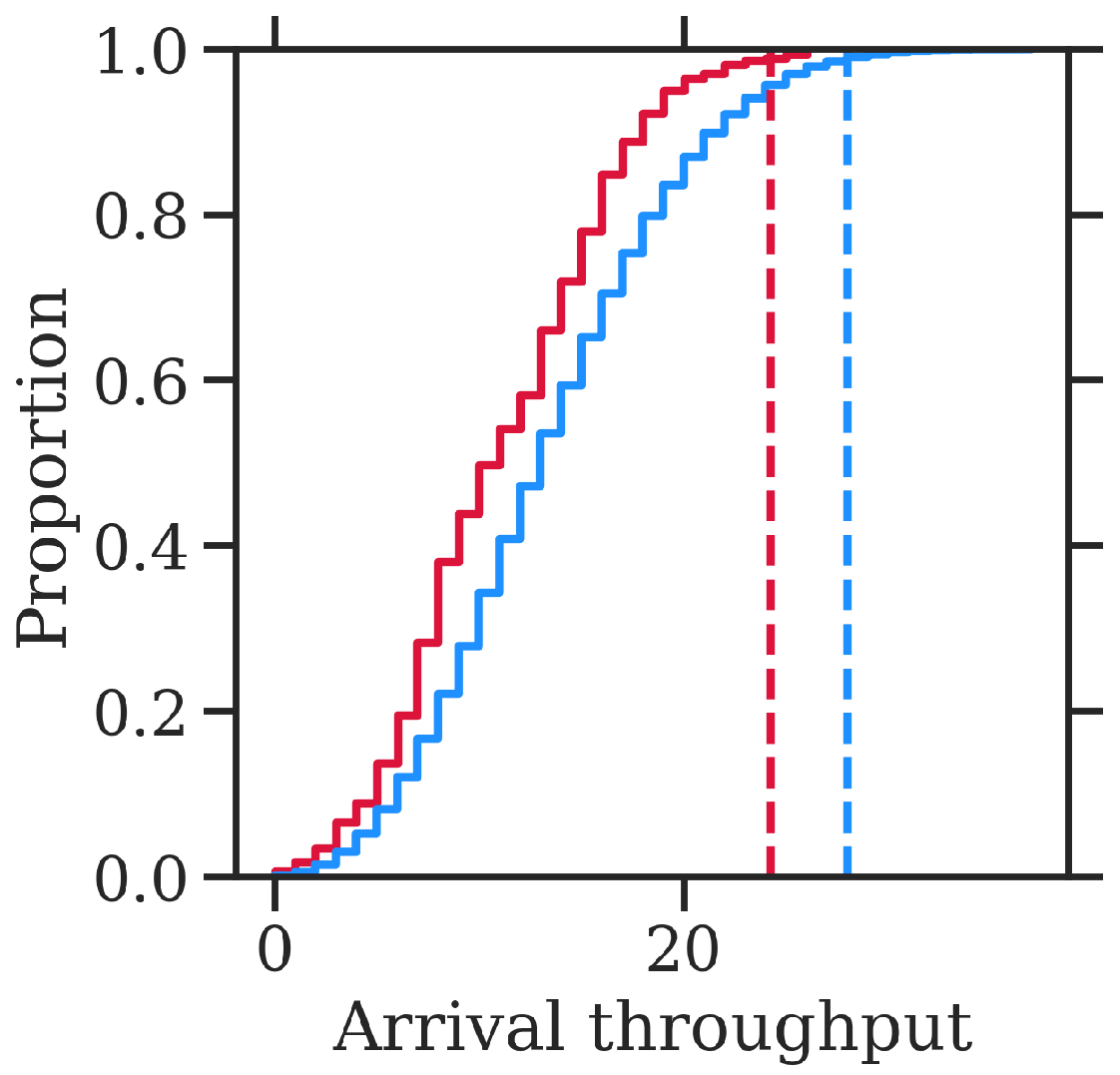
The target of each observation (y) is the delivered throughput (i.e., the number of movements per hour), based on which the model attempts to learn the 99th percentile conditioned on the vector of input features. Section 3.1.1 describes the calculation of the target from the traffic data. The vector of input features is composed of (1) the runway configuration in use during the time window of the observation and (2) various numerical and categorical features describing the weather conditions prevailing at that time. Section 3.1.2 and Section 3.1.3 describe the inference of the runway configuration from traffic data and the extraction of the weather conditions from meteorological reports, respectively.

3.1.1. Delivered Throughput

The delivered throughput of the airport can be defined as the number of movements (arrivals or departures) per hour. As a result, this information can be easily calculated using the actual time of arrival and actual takeoff time of each flight.

3.1.2. Runway Configuration

Let the term runways in use refer to the set of runways where movements were observed during a specific time window and runway configuration refer to an official combination of runways that can be utilised according to the airport. For instance, when the runway configuration is 14/16 and 28, runway 14 can be utilised for arrivals, and runways 16 and 28 can be used for departures. However, there might be situations in which, during a specific time window with the runway configuration 14/16 of 28, no movement is observed on runway 28; that is, the runways in use are 14/16, while the runway configuration is 14/16 and 28.
The identification of the runways in use is a straightforward process when the arrival and departure runways of each flight are included in the traffic data. In cases in which such information is not readily available, it can be extracted from trajectory data (like ADS-B) using the takeoff_from_runway and aligned_on_ils methods implemented in traffic [12]. Thanks to this open-source tool, runway identification becomes feasible even in situations in which explicit runway information per movement is not available.
Assuming the runway used for each movement at the airport (arrival or departure) is known, the next step is to identify the runways in use during the time window of each observation. The following process can be applied to determine the runways in use for each type of movement. If a runway is utilised (at least one movement is observed) within a given 15 min interval and is also used in at least two of the next three intervals, the runway use is considered sustained and associated with the runways in use for that type of movement in the rolling hour starting from the first interval.
The observed runways in use could be utilised to infer the most frequent runway configurations and to condition the machine learning model on them. However, it is essential to acknowledge that the observed runway configurations may not precisely match those officially defined by the airport. For instance, consider the previous example with runway 28 being consistently underutilised when the airport configuration is specified as 14/16 and 28. In such cases, this data-driven method may identify 14 and 16 as a new runway configuration, which actually corresponds to 14/16 and 28. Moreover, data-driven runway configurations might not align perfectly with those defined in the Airport Corner. Consequently, a direct comparison between the predicted capacities based on data-driven configurations and those specified in the Airport Corner may not be feasible. To address these issues, the observed combination of runways in use within each time window is matched to the most likely runway configuration as defined in the Airport Corner.
The matching process can be conducted by considering the runway configurations as defined in the Airport Corner as predictions of a hypothetical classifier ( y ^ ), while the observed runways in use are the ground truth (y). Each observation is then assigned the most similar prediction (i.e., runway configuration) that corresponds to the observed combination of runways in use. To determine the similarity between the observed runways in use and a runway configuration, multilabel classification metrics are employed.
Each combination of runways, whether runways in use or a runway configuration, can be represented as a binary vector. Each element in the vector represents the use (1) or non-use (0) of a specific runway for a particular type of movement. For example, consider the airport in Zurich, where the possible runways for arrivals are 14, 16, 28, 32, and 34, while runways 14, 28, and 34 can be used for departures. In this case, a combination of runways can be expressed as a binary vector of eight elements. The first element represents whether runway 14 was used for arrivals, the second nd element indicates whether runway 16 was used for arrivals, …, the sixth element indicates whether runway 14 was used for departures, etc. Then, basic metrics can be used to quantify the similarity between two vectors.
The precision and recall are two well-known metrics for assessing the quality of a classification task. In a multilabel classification task, the precision determines the ratio between the number of matched labels and the number of predicted labels:
precision = matched predicted = | y y ^ | | y ^ | ,
whereas the recall is the ratio between the number of matched labels and the number of actual (observed) labels.
recall = matched observed = | y y ^ | | y | .
These two metrics can be combined using the F β score, which is the weighted harmonic mean of precision and recall, reaching its optimal value at 1 and its worst value at 0:
F β = ( 1 + β 2 ) precision × recall β 2 precision + recall ,
where the β parameter represents the ratio of recall importance to precision importance. Specifically, β > 1 gives more weight to recall, while β < 1 favours precision.
In the problem being addressed, prioritising recall over precision is crucial. The assigned runway configuration must capture as many runways in use as possible, even if some of the predicted runways are not actually utilised. For this study, a value of β = 2 is proposed, giving recall twice the importance of precision. By using β = 2 , the matching process attempts to identify a larger proportion of the actual runways used while still taking precision into account in the overall assessment. Table 3 shows the F β score with β = 2 for the different runway configurations in Table 1 when the observed combination of runways in use is runway 14 for arrivals and runway 16 for departures (i.e., 14/16).
In the process of identifying typical runway configurations, a minimum share (e.g., 5%) of the analysed time windows should be taken into account, as rare runway configurations are likely to be under-represented in the dataset; therefore, the estimation of the 99th percentile may not be reliable. The time window (i.e., observation) associated with rare runway configurations could be assigned the closest frequent runway configuration.

3.1.3. Weather Conditions

The weather conditions must be extracted from weather observations, as the objective of this paper is to model the cause–effect relationship. There is a common misunderstanding that machine models must always be trained with the same kind of data that will be used during prediction. For instance, when predicting the airport capacity several hours in advance, one might argue that weather observations are unsuitable for training because the actual weather will only be known in the future. In such cases, only the expected weather can be available from TAFs at the time of prediction. Therefore, training a model with the TAFs available at the time of prediction may seem to be a more appropriate approach.
Nevertheless, a model trained on TAFs does not effectively learn the impact of weather on capacity, the reason being that it was not the weather forecast that directly impacted the capacity but the actual weather conditions prevailing at that specific time. To accurately capture the relationship between weather and capacity, it is necessary to train the model using the actual weather observations (e.g., as reported in METARs) that were in effect during the times when capacity measurements were taken. Training the model on TAFs would result in a model that attempts to capture the forecast error of TAFs.
The raw METARs can be processed using metafora (
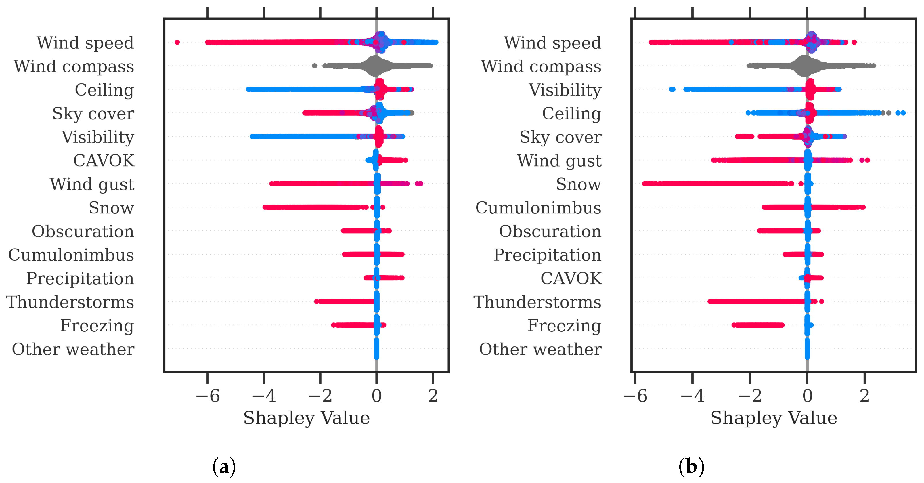
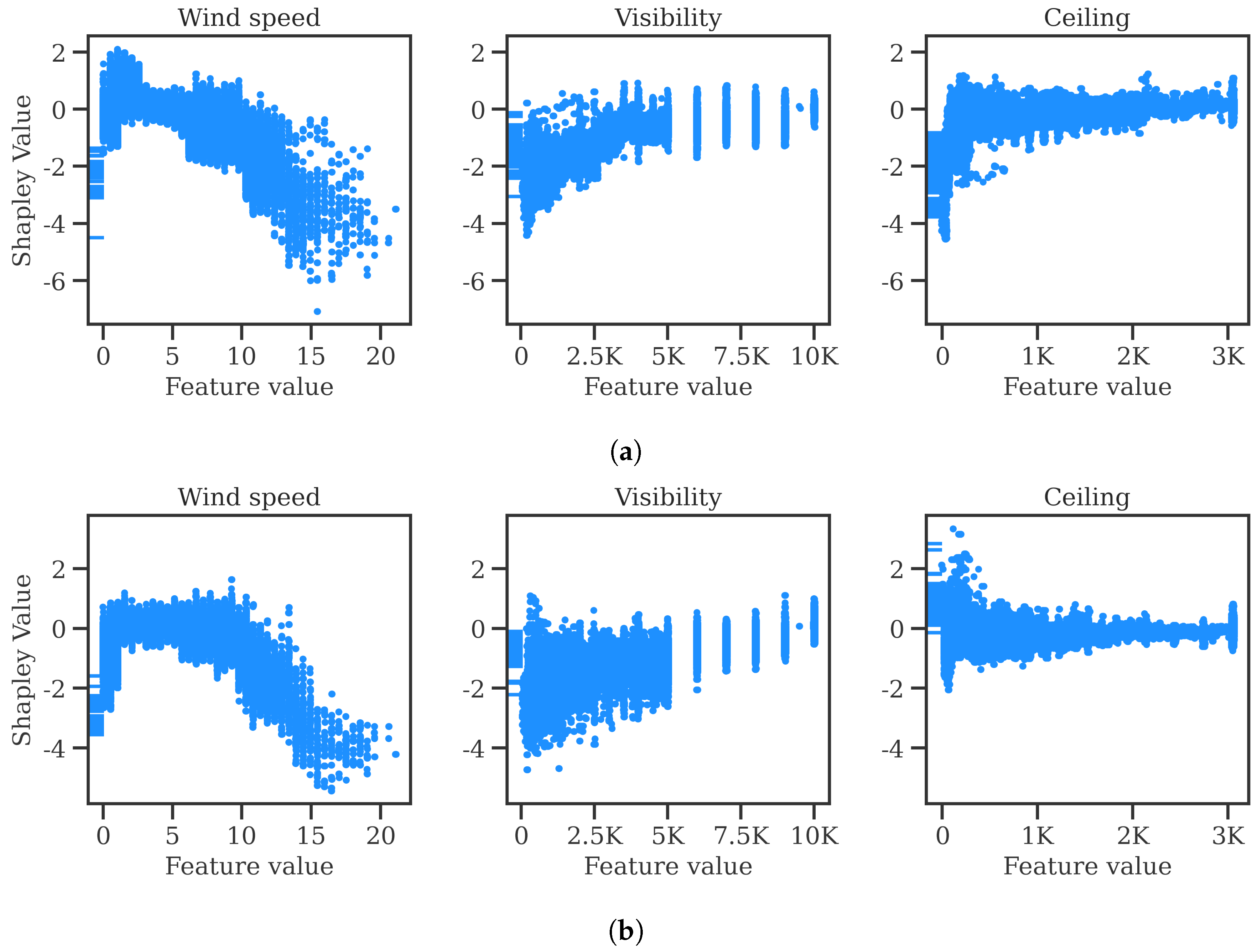
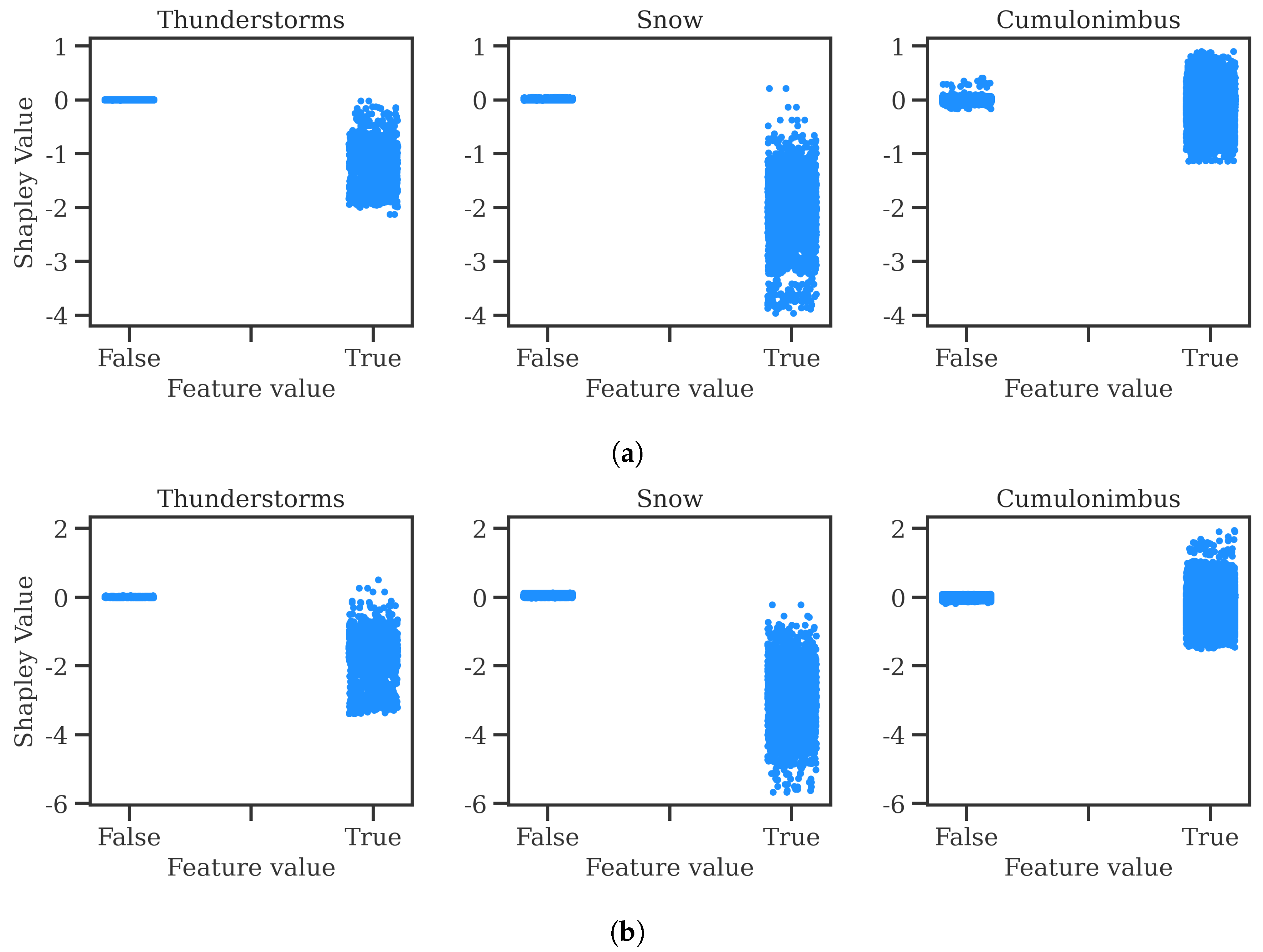
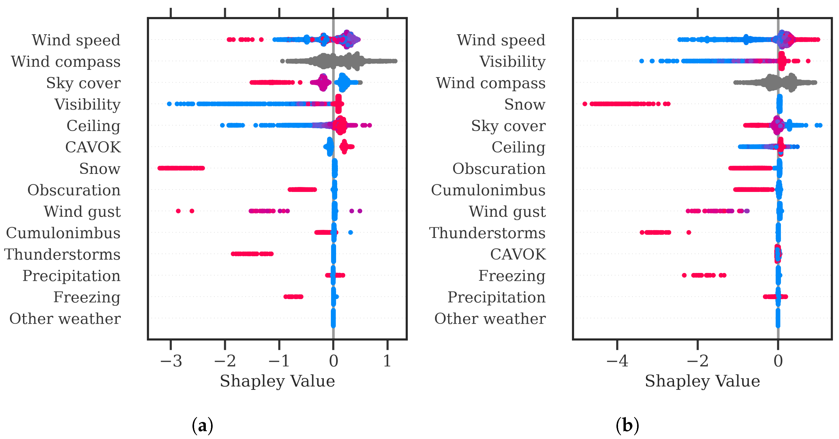
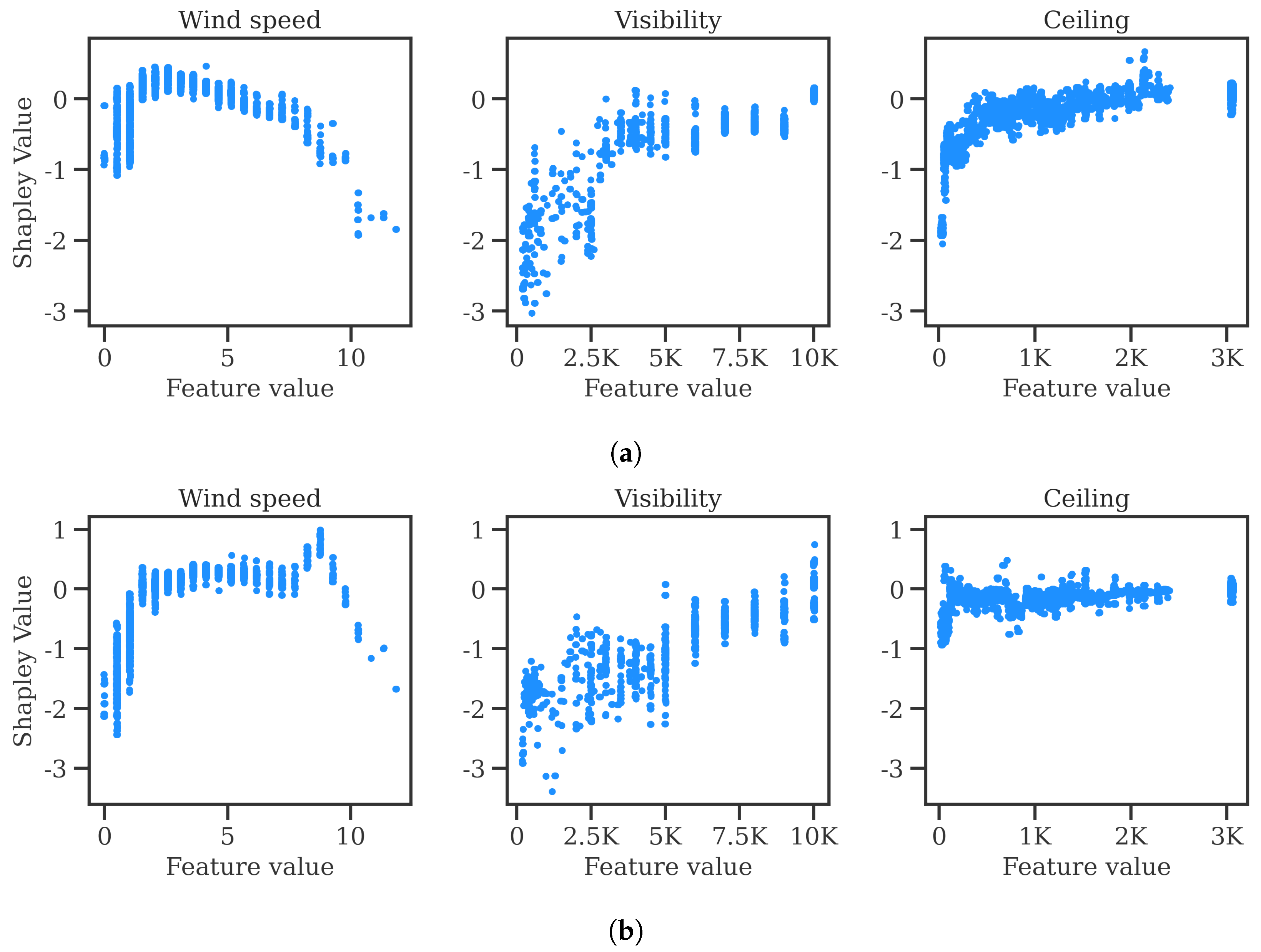
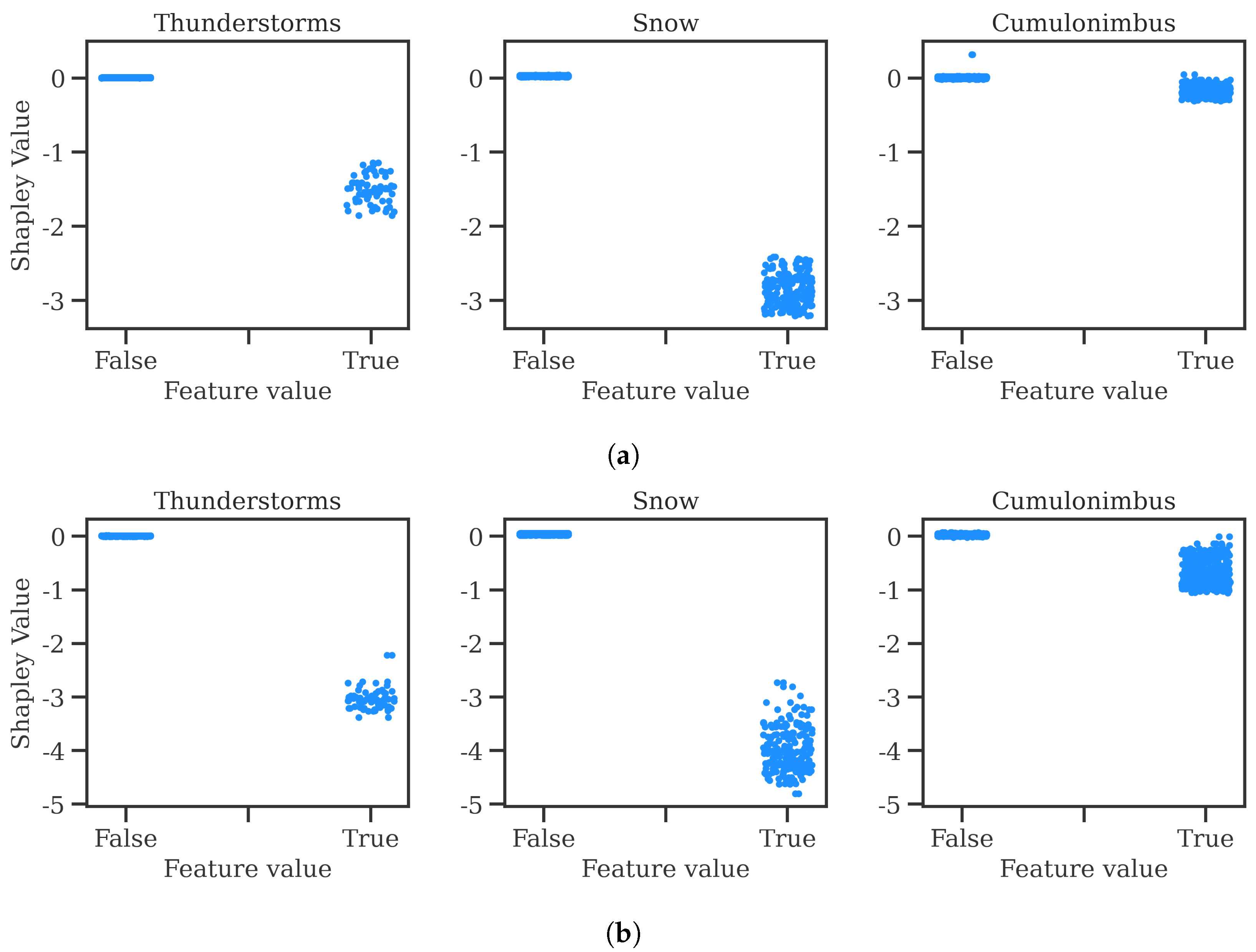
https://github.com/ramondalmau/metafora, accessed on 28 July 2023), an open-source tool specifically designed to transform textual meteorological reports into a vector representation including numerical and categorical features suitable for machine learning. For each METAR, the following features can be extracted: wind compass, speed, and gust; presence/absence of precipitation, obscuration, thunderstorms, freezing phenomena, snow, cumulonimbus, or other (rare) weather phenomena such as tornadoes or volcanic hash; CAVOK status; sky cover in oktas; and the specific visibility and ceiling in meters.
Finally, each observation must be assigned the vector representing the weather conditions of the METAR report released after and closest to the start time of the corresponding 1 h time window. This approach ensures that each observation is associated with the most relevant weather information available at the time of the corresponding time window.

3.2. Models

Given a dataset of historical observations, the straightforward approach to model the peak service rate as a function of the runway configuration and weather conditions consists of grouping the observed throughput for each combination of runway configuration and weather conditions, then computing the 99th percentile, thus not requiring any complex machine learning model. Despite its simplicity, this technique has several disadvantages. First, the term weather condition is vague, as it is determined by the combination of multiple numerical variables, such as visibility and ceiling, along with categorical variables, such as the type of weather phenomena (e.g., snow or thunderstorms). Discretising the numerical variables into bins, then performing grouping can lead to numerous groups with few observations, resulting in limited statistical significance for the inferred percentile.
In this paper, we propose the use of machine learning models, specifically quantile regressors, to overcome the limitations of discretisation and grouping, enabling a more comprehensive analysis of the inferred percentiles and their relationship with the predictor variables. The relationship between the input features and the 99th percentile of the target can be learned using a plethora of machine learning models, from simple tree-based models to ANNs. Regardless of the model used, its parameters are adjusted during the training process to minimise a loss function computed on the predictions and ground truth. In quantile regression problems, the mean pinball loss is commonly adopted as the loss function:
pinball ( y , y ^ ) = 1 n i = 1 n α max ( y i y ^ i , 0 ) + ( 1 α ) max ( y ^ i y i , 0 ) ,
where n is the number of observations used to compute the loss (e.g., a batch or the entire training set) and α is the percentile of the target variable to be learned.
Finally, the problem of modelling airport capacity for multiple airports can be approached in two distinct ways. The simpler approach involves training a separate model for each airport. In contrast, in this paper, we follow a different strategy by using a universal model that applies to all airports—actually two: one for arrivals and one for departures. The benefits of training a universal model are numerous. First, a single model is trained with a substantially larger amount of data, allowing it to learn more effectively while minimising overfitting. Furthermore, a model trained on data from all airports can also make predictions about the impact of bad weather on airports where specific weather conditions were not observed during training. In other words, the model can generalise its knowledge from one airport’s weather to make predictions for another airport, even if the exact weather conditions were not seen during the training process for that specific airport. For example, even if the training data for an airport never contained observations with snow, the model remains capable of forecasting that snow decreases the peak service rate based on knowledge acquired from observations of snow gathered at similar airports. Finally, maintaining a model in production is easier than maintaining one per airport.
However, opting to train a single model has significant implications when it comes to managing categorical (i.e., discrete) features, such as airport or runway configuration. The key advantage of employing a dedicated model for each airport is the elimination of the need to include airport as a recurring input feature in every observation. In contrast, when using a single model, airport must remain a part of the input features. Given that airport is a high-cardinality feature encompassing numerous unique values, using one-hot encoding becomes impractical due to the excessive feature dimensionality it would introduce. Specifically, this method would necessitate the creation of a large number of binary features, potentially hampering model performance and interpretability. Additionally, training a single model also precludes the utilisation of one-hot encoding to represent the runway configuration feature. The reason for this lies in the substantial variability of runway configurations across different airports. To illustrate, consider Zurich airport’s 14/10 runway configuration; it lacks an analogous counterpart at Barcelona airport.
Alternatives to one-hot encoding to enable the implementation of a single model include target encoding, in which each category (e.g., Zurich airport for the airport feature) is represented as the average of the target value in the observations of the training set where that category is present [13]. Another approach consists of creating additional features that capture generic attributes of the categorical feature. For instance, the airport feature could be represented by the following set of numerical and low-cardinality categorical features: size (small, medium, or large), country, number of runways, and elevation. For the runway configuration, they might encompass attributes like the length, width, orientation, and position (e.g., left, centre, or right). However, this appealing alternative requires the creation of an extensive amount of new features.
The choice of category encoding method is inevitably linked to model selection. For example, embeddings are strongly recommended when using ANNs, whereas GBDT models typically implement their internal encoding methods and advise users to use a simple integer encoding approach, where each category is assigned a unique integer value within the range of 0 to the total number of categories minus 1. The category encoding method adopted in this paper is expanded upon when presenting the model in Section 4.2.

4. Experiment

The generic method described in Section 3 was implemented for the airports that transmit airport data flow (APDF) to EUROCONTROL and were among the top 45 busiest airports during the year 2022. This section provides details about the dataset and models utilised in the experiment, with the results to presented in the following section.

4.1. Dataset

In this experiment, APDF was used as traffic data, whereas METARs from SADIS were used as meteorological reports. The APDF is established for 90 airports (as of April 2020) and includes extensive data for every flight, such as the scheduled and actual time of a movement (takeoff time for departures and landing time for arrivals), the type of movement (arrival or departure), and the runway used. The data are provided monthly by the airport operators and integrated into a common database after undergoing data quality checks. This kind of traffic data allows for the computation of the delivered throughput and the inference of the most likely runway configuration in each of the 1 h time windows, following the methods described in Section 3.1.1 and Section 3.1.2, respectively.
The dataset covers the period from 15 June 2021 to 31 May 2023. Each observation in the dataset corresponds to a 1 h time window, spanning from 7 AM to 10 PM local time. Each time window start 15 min after the previous one. For the train–test split, the observations were randomly assigned, with 80% (1.6M) allocated to the training set and 20% (397K) to the test set. However, to avoid (unintentional) information leakage from the training data into the test set, a constraint was implemented to guarantee that all observations pertaining to the same airport and date (e.g., Zurich airport on 14 July 2021) were exclusively assigned to either the training or test set but not both. For the remainder of the paper, this approach is denoted as grouping split. Notably, a temporal split could have also been employed to ensure an unbiased assessment of the model. This alternative approach involves organising all observations in chronological order. For each airport, the first 80% of these chronologically ordered observations are designated for training the model, while the remaining 20% are set aside for testing its performance. Figure 2 shows the difference between the grouping and the temporal split.
The advantage of the grouping split over the temporal split is that it ensures a more balanced representation of all weather events (e.g., snow and thunderstorms) in both the training and test sets. Conversely, a temporal split might lead to the allocation of all winter months to the test set, resulting in an insufficient number of snow-related observations for training and an excess for testing, for instance. This can result in two adverse outcomes: a decrease in model quality due to limited exposure to certain weather events during training and an overly pessimistic evaluation of performance metrics on the test set because of assessments of weather observations seldom encountered by the model. It is critical to note that regardless of the split method chosen, all airports should be included in both the training and test sets, as the airport is a critical input feature when it comes to capacity prediction in adverse weather conditions.
Table 4 provides a description of the categorical and numerical features present in both the training and test sets. For the categorical features, the table includes the percentage of missing values, the cardinality (i.e., the number of unique categories), the most frequent (top) category, and the frequency of the top category. As for numerical features, the table displays the percentage of missing values, along with the 5th, median, and 95th percentiles.

4.2. Models

Many machine learning models can be configured to handle quantile regression tasks. The model proposed in this study is based on ensemble methods, which produce a strong learner from a group of weak learners. Boosting is a well-known ensemble method that involves training a series of weak learners (e.g., rudimentary decision trees) sequentially. The training observations for the next learner in traditional adaptive boosting (AdaBoost) [14] are weighted based on how well the previous learners performed, i.e., observations that correspond to wrong predictions are assigned more weight in order to concentrate the model’s attention on correcting them. Gradient boosting differs from AdaBoost in that instead of assigning weights to observations based on performance, a new learner is trained in each iteration to fit the residual errors of the preceding learners. The ensemble is known as a GBDT model when decision trees are used as weak learners.
In comparison to simpler models, such as linear regression or conventional decision trees, GBDTs have emerged as the preferred choice due to their capacity to capture complex and non-linear interactions within the data. GBDTs also possess highly desirable attributes, including the ability to effectively handle missing data and categorical features with high cardinality, as exemplified by the airport feature. Their robustness in the presence of outliers is another pivotal factor, ensuring that data anomalies do not unduly exert influence on the results. Furthermore, GBDTs have consistently demonstrated outstanding performance across various practical applications, particularly on tabular datasets, where each row represents an individual observation and each column represents a distinct feature [15]. It is noteworthy that while GBDTs may not provide the same level of interpretability as simpler models, techniques like the Shapley method can still yield valuable insights. Among all GBDT implementations, Microsoft’s lightGBM was selected in this study. The reader is referred to [16] for more information about the distinctive features of lightGBM when compared to other popular implementations like XGBoost [17] or CatBoost [18].
It is worth noting that lightGBM simplifies the encoding of categorical features by advocating for straightforward integer encoding. Subsequently, lightGBM employs the methodology introduced in [19] to identify optimal splits among integer-encoded categories. In accordance with lightGBM best practices, integer encoding was applied to the non-boolean categorical features, i.e., airport, wind compass, and runway configuration (see Table 4). Integers were assigned to airport and wind compass in alphabetical order; for example, EBBR was mapped to 0, EDDB to 1, and so on. In contrast, integers for runway configuration were assigned based on frequency, which means that runway configuration 0 at EBBR, for example, is the most frequently used configuration at that airport.
The performance of any machine learning model is heavily influenced by its hyperparameters. In the case of GBDTs, fine tuning primarily revolves around adjusting the number of weak learners (i.e., decision trees), along with the maximum depth and number of leaves for each tree. To identify the optimal hyperparameter configuration for the GBDT model, a grouping k-fold cross-validation approach with k = 5 was employed. In the cross-validation process, akin to the train–test split, the training set was divided into folds while ensuring that all observations belonging to one airport during one date remained exclusively within a single fold. To expedite the search for the best combination of hyperparameters in terms of cross-validation score, which was measured using the mean pinball error (see Equation (4)), the HalvingGridSearchCV method [20] was utilised. This approach entails initially evaluating all possible hyperparameter candidates with a limited amount of resources. In subsequent iterations, only a subset of these candidates is selected for further evaluation, with more resources allocated to them; this process then continues iteratively. In this experiment, the number of decision trees in the ensemble was used as the resource for the HalvingGridSearchCV method. It should be noted that the two quantile regressors (one for arrivals and one for departures) were optimised independently.

4.3. Baseline Model

To assess the quality of the proposed model, it is essential to compare it with a baseline model. For this purpose, the tables from the Airport Corner (take Table 1 as an example) were adopted as a baseline model. The advantage of using the Airport Corner tables lies in the fact that the runway configurations considered by the machine learning model precisely align with those defined in the Airport Corner, thanks to the matching process explained in Section 3.1.2. This alignment allows for a direct comparison between the two models. Specifically, for each observation in the test set, the capacity (for arrivals or departures) reported in the Airport Corner for the inferred runway configuration can be contrasted with the peak service rate prediction generated by the machine learning model, which takes into account both the runway configuration and the weather conditions.
However, this comparison is not meant to determine the best or worst performer. Actually, the machine learning and Airport Corner models report different quantities: peak service rate and operational capacity, respectively. Therefore, the comparison needs to be interpreted with caution, as the service peak rate only approximates the operational capacity when the considered period includes enough hours so that the demand exceeded the capacity. It is worth noting that in cases of systematically underutilised airports, the peak service rate primarily reflects the peak demand rather than the real operational capacity.
As stated in the Introduction, it is worth noting that certain airports also report capacity reductions as a function of weather, especially concerning arrival capacity. These capacity reductions are quantified in terms of percentages and primarily rely on factors like visibility and ceiling conditions. Some airports may also provide capacity reduction values for specific weather conditions such as snow and rain intensity, as well as strong winds.
During the comparison between the machine learning model and the tables from the Airport Corner, the specific capacity reductions associated with visibility and ceiling conditions were taken into account whenever available. This involved utilising the visibility and ceiling values of each individual observation to determine the corresponding capacity reduction from the Airport Corner tables. For departure capacity, as capacity reductions are often not reported in the tables, the nominal capacities under clear weather conditions were used as the baseline. Similarly, for arrival capacity at airports where capacity reductions were not reported, the nominal capacities were used as the reference value.

5. Results

The machine learning models were utilised to predict the departure and arrival peak service rate for each observation in the test set. Section 5.1 presents the predictions of the models compared to the baseline. In Section 5.2, the importance of the features is analysed to provide a human-interpretable understanding of the impact of weather on capacity. Finally, Section 5.3 showcases the particular case of Zurich airport for illustrative purposes.

5.1. Model Performance

Table 5 shows the mean pinball error (see Equation (4)) of the arrival and departure peak service rate predictions in the test set (lower is better). Results are shown for each type of movement, CAVOK status, model (Airport Corner or machine learning), and airport.
Table 5 demonstrates that, in general, the machine learning models provide more reasonable estimations of the peak service rate compared to the capacities as defined in the Airport Corner in terms of mean pinball error. The extent of performance improvement varies depending on the specific airport. For instance, at Paris Charles De Gaulle airport (LFPG), the machine learning model exhibits a significantly lower mean pinball error in the test set compared to the baseline model. At Porto airport (LPPR), both models perform identically, while at London Heathrow airport (EGLL), the machine learning predictions show slightly worse performance than the baseline model under CAVOK conditions.
Interestingly, the machine learning models consistently outperform or match the baseline model for both types of movements under non-CAVOK weather conditions. This outcome aligns precisely with the objective of this paper, showcasing the superior modelling capabilities of the machine learning models in adverse weather scenarios.
The peak service rate, as discussed in the introduction, serves as a capacity proxy for airports that operate at or near capacity. In contrast, for airports that are consistently underutilised, the peak service rate represents the maximum demand. Because we do not know the actual capacity of these airports—otherwise, it would have been used as the target variable instead of defining the peak service rate—there is no way to distinguish between airports where the peak service rate represents capacity and those where it reflects maximum demand. Despite this, the capacity as reported in the Airport Corner can be compared to the observed throughput to pinpoint airports where actual demand is consistently lower than the capacity as declared in the Airport Corner. Table 6 shows the frequency of the various ranges of observed throughput-declared capacity ratios.
In Table 6, airports with observed throughput exceeding 75% of the declared capacity for at least 10% of the time or surpassing the declared capacity for at least 1% of the time are highlighted in bold in order to easily identify airports where the peak service rate may be a good capacity proxy. For example, Table 6 shows that at EBBR, the observed throughput consistently remains at or below 75% of the declared capacity, while at LFPG, the observed number of arrivals surpasses the declared capacity 15% of the time. As a result, the peak service rate most likely represents actual capacity at LFPG but may only represent maximum demand at EBBR. However, it is important to note that these conclusions are based on declared capacities, which may not always correspond to true capacities.

5.2. Model Interpretation

Principles from game theory can be used to interpret the prediction of a machine model for a given observation, assuming that each feature is a player of a game and the output of the model (i.e., the prediction) is the payout. Let us consider the following scenario: all players participate in the game, and they join the game in a random order.
The attribution of a player is the average change in the payout received by a player in the game when he or she joins. More formally, the Shapley value ( ϕ i ( x , θ ) ) of feature i for a given input vector (x) and model parameters ( θ ) is defined as the expected marginal contribution of i to the prediction across all possible feature permutations [15]. In other words, the Shapley value quantifies how much each feature contributes to the model output, on average, when considering all possible subsets of features that include i:
ϕ i ( x , θ ) = S 1 , 2 , , d i ( d | S | 1 ) ! | S | ! d ! f x S i , θ f x S , θ ,
where S is a subset of features not including i, x ( S ) denotes the input vector with only the features in S, and f ( · ) is the model function that maps the input vector to its output.
In practical applications, computing Shapley values precisely is a computationally intensive task. To address this issue, a new explanation method called TreeExplainer was developed for tree-based models, such as GBDTs. TreeExplainer can approximate Shapley values in polynomial time and was used in the referenced paper. Further details about TreeExplainer can be found in [15]. It is worth noting that the Shapley values are given in the same units as the output of the model, i.e., movements per hour.
Figure 3 shows the Shapley value distribution for the features related to weather of the arrival and departure peak service rate models, considering all observations in the test set. The y axis indicates the name of the features in order of mean absolute Shapley value from the top to the bottom. Each dot on the x axis shows the Shapley value of the associated feature in the prediction for one observation, and the colour indicates the magnitude of that feature: red indicates high, while blue indicates low. For non-Boolean categorical features, the colour has no meaning, which is why points are grey. By definition, positive (resp. negative) Shapley values increase (resp. decrease) the output of the model, i.e., the peak service rate, with respect to the expected value of a featureless dummy model.
Figure 3 illustrates that wind direction and compass play a crucial role in determining arrival and departure peak service rates, followed by the cloud ceiling, visibility, and sky cover. Specifically, stronger winds are associated with lower peak service rates. The results also indicate that lower ceiling and visibility tend to decrease both arrival and departure peak service rates. Nevertheless, while the effect of the ceiling on arrival peak service rate is comparable, its impact on departure peak service rate is not as evident. We hypothesise that the low ceiling primarily affects the rate of arrivals, as aircraft face more difficulties during landing. In contrast, for departures, given the same maximum runway throughput that determines the total movements per hour in the runway system, more departures become feasible, leading to a potential increase in the departure peak service rate.
Additionally, as shown in Figure 3, snow, thunderstorms, obscuration, and freezing phenomena have a noticeable detrimental impact on peak service rates (up to six movements per hour). However, the impact of precipitation and cumulonimbus clouds is less clear. Lastly, certain weather phenomena, like tornadoes, appear to have a negligible effect on peak service rates. It is essential to note that these rare weather occurrences are infrequently encountered during the training process. Consequently, conclusions regarding the contribution of these factors are not definitive and should be interpreted with caution.
It is also instructive to delve further into and study the detailed relationship between the value of a feature and its Shapley value. Figure 4 shows the detailed Shapley values for three of the most important numerical features related to weather.
According to Figure 4a, strong winds can lead to a decrease in the arrival peak service rate by up to six movements per hour, with the decrease rate becoming more pronounced beyond 10 m/s. This pattern is also observed in Figure 4b, indicating a similar impact on the departure peak service rate. As for visibility, peak service rates decrease as visibility values become lower, with a particularly significant effect when visibility approaches zero. Regarding the ceiling, its impact is not as notable when the value remains above approximately 100 m. However, when the ceiling drops below this threshold, the arrival peak service rate experiences a significant decrease. Interestingly, in such situations, the departure peak service rate may eventually increase, which presents the intriguing phenomenon discussed previously.
Complementing the previous figure, Figure 5 shows the detailed Shapley values for three of the most important categorical features related to weather.
Based on Figure 5, it is evident that the presence of thunderstorms may have a modest impact on the arrival peak service rate, leading to approximately two fewer movements per hour. However, this weather event seems to have a more pronounced effect on the departure peak service rate. Similarly, the presence of snow can significantly impact both peak service rates, potentially causing a reduction of up to four arrivals and six departures per hour. On the other hand, the impact of cumulonimbus clouds is relatively less significant compared to that of thunderstorms and snow. It is essential to note that Shapley values represent the individual impact of each feature on the prediction of the model, and their contribution may depend on the values of other features, much like the collaborative dynamics of players in a soccer game, where each player’s impact is influenced by the presence and performance of other team members. This may explain the small proportion of positive contributions of the cumulonimbus feature. Furthermore, in the context of Shapley values, slight overfitting could also impact the attribution of importance to features, making some features appear more or less impactful than they actually are or attributing importance to noise in the data.
Certain implementations of the GBDT algorithm, such as CatBoost, offer the flexibility to set monotonous constraints. These constraints enforce that the model’s outcome must monotonically increase or decrease with the values of specific features. For instance, all else being equal, the lower the visibility, the lower the peak service rate. By incorporating these constraints during the training process, the seemingly inconsistent findings related to feature attribution can be mitigated. Unfortunately, lightGBM does not currently support the implementation of monotonous constraints in quantile regressors.

5.3. Illustrative Example

As the Shapley values are computed per observation, it is possible to extract the Shapley values of the observations corresponding to an airport to understand the specific impact of weather. By isolating the observations associated with the desired airport and examining their corresponding Shapley values, one can gain insights into how weather conditions influence the capacity of a particular airport and understand the unique weather-related factors affecting its operations. In this section, for illustrative purposes, we use the Shapley values for Zurich airport considering all observations in the test set.
Figure 6 shows the Shapley value distribution for the features related to weather of the arrival and departure peak service rate models, specifically for Zurich airport.
Comparing Figure 3 and Figure 6, the attribution of the various features appears similar, although the ranking in terms of mean absolute Shapley value shows slight differences. For instance, when considering the Shapley values of the arrival peak service rate model for all airports (Figure 3a), ceiling is followed by sky cover and visibility, whereas specifically at Zurich airport, the order is sky cover, visibility, and ceiling. In terms of absolute value, low visibility and snow are the most influential factors with respect to arrival peak service rate. Regarding the departure peak service rate, wind speed, visibility, sky cover, snow, and ceiling are the main detrimental factors. Such figures provide insight into both the typical and maximum impact of each weather variable on the peak service rates of individual airports.
Figure 7 and Figure 8 show the detailed Shapley values for three of the most important numerical and categorical features related to weather, respectively, specifically for Zurich airport. The patterns shown in these figures are very similar to those shown in Figure 4 and Figure 5. Notably, the detrimental impact of wind speed on the arrival peak service rate remains below two movements per hour, and visibility causes a decrease when values fall below 5000 m. Thunderstorms and snow consistently reduce the arrival peak service rate by two and three movements per hour, respectively, while cumulonimbus clouds have a negligible impact. Regarding the departure peak service rate, it decreases when the wind speed is lower than 2 m/s, and its relationship with visibility appears to be linear. The impact of thunderstorms and snow is more pronounced for departures, causing a drop in the peak service rate by three and four to five movements per hour, respectively. As for the arrivals, the presence of cumulonimbus clouds has a residual effect on the peak service rate, causing a slight reduction in movements per hour.
As an illustrative example of the proposed models’ predictions during adverse weather conditions is presented in Figure 9, shows the throughput (blue), declared capacity (black), and predicted peak service rate (red) at Zurich airport on 14 February 2023. On this specific day, the morning and evening were impacted by severe obscuration caused by freezing fog. This is supported by the meteorological reports displayed in Table 7.
In Figure 9a, the impact of adverse weather on the declared arrival capacity (black line) becomes evident during two specific time windows: from 6:00 to 8:20 and from 20:20 to 21:50. Notably, there is a significant 30% decrease in capacity during these periods, which is attributed to the visibility falling below 800 m. During these time windows affected by severe adverse weather, the predicted arrival peak service rate closely approximates the declared capacity, particularly in the evening period, when they are identical. However, outside these affected time periods and amid better weather conditions, the model predicts a slightly higher peak service rate, although it still remains well below the declared capacity. The capacity change observed from 16:50 to 17:20 resulted from a brief change in runway configuration, as identified by our algorithm for runway configuration detection.
On the other hand, in Figure 9b, it is evident that the declared departure capacity remained unaffected by weather, with only the change in runway configuration causing modifications. However, the predicted departure service peak was notably lower during the periods affected by adverse weather conditions. It should be noted that regardless of weather conditions, the departure throughput consistently remained below the predicted peak service rate, showcasing the model’s efficacy in accurately predicting the maximum number of movements conditioned on runway configuration and weather conditions.

6. Conclusions

The peak service rate, as a proxy for capacity, enables a consistent analysis of operational capacity across all airports by leveraging historical data. The method presented in this paper ensures the application of the same methodology, leading to the maintenance of a coherent and up-to-date airport capacity database, accounting for both runway configurations and weather conditions. These weather conditions encompass not only ceiling and visibility but also other phenomena, like snow, thunderstorms, or cumulonimbus clouds, for instance.
Keep in mind that at airports with infrequent congestion or underutilisation, the peak service rate may significantly differ from the real operational capacity. Therefore, this proxy remains valid only when the considered period includes enough hours during which the demand exceeded the capacity. In cases of systematically underutilised airports, the peak service rate primarily reflects the peak demand rather than the real operational capacity.
This paper makes contributions to the state of the art in the following ways. First, it introduces the concept of service peak demand and provides a novel approach to uncover unknown capacity from the observed delivered throughput using machine learning. Secondly, the proposed quantile regressor model is not only conditioned to weather conditions but also incorporates the runway configuration, offering a comprehensive model that considers both critical factors in determining airport capacity. Thirdly, in contrast to artificial neural networks (ANNs), the method proposed in this work uses a tree-based model, enabling predictions that can be easily interpreted by humans to increase trust.
In future work, the model will be extended to predict the probability of air traffic management (ATFM) regulation due to weather. This will provide stakeholders with a rough indication of the criticality of the weather. Furthermore, the model should be expanded to cover more airports, and monotone constraints should be implemented to ensure consistent feature attributions. For instance, the attribution of the cumulonimbus feature should be negative. A performance comparison with ANNs is also envisaged.
Last but not least, ATFM regulations are typically implemented with advance notice, relying on predictions of airport capacity in the near future. These predictions, in turn, depend on TAFs, which involve an additional layer of speculation. Consequently, if the model presented in this paper were utilised to predict airport capacities and support the implementation of ATFM measures (such as defining more precise entry rates), the quality of the model’s predictions would be contingent on the accuracy of the TAFs. This emphasises the need for more precise and reliable forecasts, as operational decisions are made with some lead time.

Author Contributions

Conceptualization, R.D., J.A. and G.G.; methodology, R.D., J.A. and G.G.; software, R.D.; validation, J.A.; formal analysis, R.D.; investigation, R.D.; data curation, R.D.; writing—original draft preparation, R.D.; writing—review and editing, J.A. and G.G.; visualization, R.D.; project administration, J.A. and G.G. All authors have read and agreed to the published version of the manuscript.

Funding

This research received no external funding.

Institutional Review Board Statement

Not applicable.

Informed Consent Statement

Not applicable.

Data Availability Statement

No new data were created or analysed in this study. Data sharing is not applicable to this article.

Acknowledgments

The authors would like to acknowledge the contribution of Sara Meson-Mancha and Thierry De Lange from the Aviation Intelligence Unit for kindly providing the APDF data, as well as for their priceless recommendations and ideas for this study. Special thanks also go to Rocío Barragán-Montes from the Airports Unit, as well as all the airports and airlines involved in this project, for their unconditional support and operational expertise.

Conflicts of Interest

The authors declare no conflict of interest.

Abbreviations

The following abbreviations are used in this manuscript:
ADS-BAutomatic dependent surveillance broadcast
AIUAviation Intelligence Unit
ANNsArtificial neural networks
APDFAirport operational data flow
ATFMAir traffic flow management
ATCAir traffic control
CAVOKCeiling and visibility okay
ECACEuropean Civil Aviation Conference
GBDTsGradient-boosted decision trees
ICAOInternational Civil Aviation Organization
METARsMeteorological aerodrome reports
RUCRapid update cycle
TAFTerminal area forecast

References

  1. Wang, Y. Prediction of weather impacted airport capacity using ensemble learning. In Proceedings of the IEEE/AIAA 30th Digital Avionics Systems Conference, Seattle, WA, USA, 16–20 October 2011; pp. 2D6-1–2D6-11. [Google Scholar] [CrossRef]
  2. Wang, Y. Prediction of weather impacted airport capacity using RUC-2 forecast. In Proceedings of the IEEE/AIAA 31st Digital Avionics Systems Conference (DASC), Williamsburg, VA, USA, 14–18 October 2012; pp. 3C3-1–3C3-12. [Google Scholar] [CrossRef]
  3. Dhal, R.; Roy, S.; Taylor, C.P.; Wanke, C.R. Forecasting Weather-Impacted Airport Capacities for Flow Contingency Management: Advanced Methods and Integration. In Proceedings of the 2013 Aviation Technology, Integration, and Operations Conference, Los Angeles, CA, USA, 12–14 August 2013. [Google Scholar] [CrossRef]
  4. Kicinger, R.; Chen, J.T.; Steiner, M.; Pinto, J. Probabilistic Airport Capacity Prediction Incorporating Weather Forecast Uncertainty. In Proceedings of the AIAA Guidance, Navigation, and Control Conference, National Harbor, MD, USA, 13–17 January 2014. [Google Scholar] [CrossRef]
  5. Kicinger, R.; Chen, J.T.; Steiner, M.; Pinto, J. Airport Capacity Prediction with Explicit Consideration of Weather Forecast Uncertainty. J. Air Transp. 2016, 24, 18–28. [Google Scholar] [CrossRef]
  6. Tien, S.L.A.; Taylor, C.; Vargo, E.; Wanke, C. Using Ensemble Weather Forecasts for Predicting Airport Arrival Capacity. J. Air Transp. 2018, 26, 123–132. [Google Scholar] [CrossRef]
  7. Choi, S.; Kim, Y.J. Artificial neural network models for airport capacity prediction. J. Air Transp. Manag. 2021, 97, 102146. [Google Scholar] [CrossRef]
  8. Schultz, M.; Reitmann, S.; Alam, S. Predictive classification and understanding of weather impact on airport performance through machine learning. Transp. Res. Part C Emerg. Technol. 2021, 131, 103119. [Google Scholar] [CrossRef]
  9. Lattrez, O.; Barrag’an-Montes, R.; Michalski, M. Predicting Airport ATFM Regulations using Deep Convolutional Networks. In Proceedings of the 12th SESAR Innovation Days (SID), Budapest, Hungary, 5–8 December 2022. [Google Scholar]
  10. Simone, F.; Di Gravio, G.; Patriarca, R. Performance-based Analysis of Aerodrome Weather Forecasts. In Proceedings of the 2022 New Trends in Civil Aviation (NTCA), Prague, Czech Republic, 26–27 October 2022; pp. 27–33. [Google Scholar] [CrossRef]
  11. Patriarca, R.; Simone, F.; Di Gravio, G. Supporting weather forecasting performance management at aerodromes through anomaly detection and hierarchical clustering. Expert Syst. Appl. 2023, 213, 119210. [Google Scholar] [CrossRef]
  12. Olive, X. traffic, a toolbox for processing and analysing air traffic data. J. Open Source Softw. 2019, 4, 1518. [Google Scholar] [CrossRef]
  13. Micci-Barreca, D. A Preprocessing Scheme for High-Cardinality Categorical Attributes in Classification and Prediction Problems. SIGKDD Explor. Newsl. 2001, 3, 27–32. [Google Scholar] [CrossRef]
  14. Schapire, R.E. Explaining adaboost. In Empirical Inference; Springer: Berlin/Heidelberg, Germany, 2013; pp. 37–52. [Google Scholar]
  15. Lundberg, S.M.; Erion, G.; Chen, H.; DeGrave, A.; Prutkin, J.M.; Nair, B.; Katz, R.; Himmelfarb, J.; Bansal, N.; Lee, S.I. From local explanations to global understanding with explainable AI for trees. Nat. Mach. Intell. 2020, 2, 56–67. [Google Scholar] [CrossRef] [PubMed]
  16. Ke, G.; Meng, Q.; Finley, T.; Wang, T.; Chen, W.; Ma, W.; Ye, Q.; Liu, T.Y. LightGBM: A Highly Efficient Gradient Boosting Decision Tree. In Advances in Neural Information Processing Systems 30; Guyon, I., Luxburg, U.V., Bengio, S., Wallach, H., Fergus, R., Vishwanathan, S., Garnett, R., Eds.; Curran Associates, Inc.: Red Hook, NY, USA, 2017; pp. 3146–3154. [Google Scholar]
  17. Chen, T.; Guestrin, C. XGBoost: A Scalable Tree Boosting System. In Proceedings of the 22nd International Conference on Knowledge Discovery and Data Mining, San Francisco, CA, USA, 13–17 August 2016; pp. 785–794. [Google Scholar] [CrossRef]
  18. Prokhorenkova, L.; Gusev, G.; Vorobev, A.; Dorogush, A.V.; Gulin, A. CatBoost: Unbiased boosting with categorical features. In Proceedings of the 31st Advances in Neural Information Processing Systems (NIPS), Montreal, QC, Canada, 3–8 December 2018. [Google Scholar]
  19. Fisher, W.D. On Grouping for Maximum Homogeneity. J. Am. Stat. Assoc. 1958, 53, 789–798. [Google Scholar] [CrossRef]
  20. Pedregosa, F.; Varoquaux, G.; Gramfort, A.; Michel, V.; Thirion, B.; Grisel, O.; Blondel, M.; Prettenhofer, P.; Weiss, R.; Dubourg, V.; et al. Scikit-learn: Machine Learning in Python. J. Mach. Learn. Res. 2011, 12, 2825–2830. [Google Scholar]
Figure 1. Cumulative proportion of arrival throughput when the visibility was above (blue) and below (red) 800 m at Zurich airport from 15 June 2021 to 31 May 2023. The vertical dashed line indicates the 99th percentile (i.e., the peak service rate as defined in this paper).
Atmosphere 14 01476 g001
Figure 2. Train–test split alternatives. Red: train; blue: test. Each row corresponds to an airport. Within an airport, observations are ordered chronologically. (a) Grouping; (b) temporal.
Atmosphere 14 01476 g002
Figure 3. Shapley value distribution for the features related to weather. In this figure, red means high value, blue means low value, and grey is used for categorical features. (a) Arrival peak service rate; (b) departure peak service rate.
Atmosphere 14 01476 g003
Figure 4. Detailed Shapley values for three of the most important numerical features related to weather. (a) Arrival peak service rate; (b) departure peak service rate.
Atmosphere 14 01476 g004
Figure 5. Detailed Shapley values for three of the most important categorical features related to weather. (a) Arrival peak service rate; (b) departure peak service rate.
Atmosphere 14 01476 g005
Figure 6. Shapley value distribution for the features related to weather specifically for Zurich airport. In this figure, red means high value, blue means low value, and grey is used for categorical features. (a) Arrival peak service rate; (b) departure peak service rate.
Atmosphere 14 01476 g006
Figure 7. Detailed Shapley values for three of the most important numerical features related to weather, specifically for Zurich airport. (a) Arrival peak service rate; (b) departure peak service rate.
Atmosphere 14 01476 g007
Figure 8. Detailed Shapley values for three of the most important categorical features related to weather, specifically for Zurich airport. (a) Arrival peak service rate; (b) departure peak service rate.
Atmosphere 14 01476 g008
Figure 9. Delivered throughput (blue), declared capacity (black), and predicted peak service rate (red) at Zurich airport on 14 February 2023. (a) Arrival peak service rate; (b) departure peak service rate.
Atmosphere 14 01476 g009
Table 1. The various runway configurations and their corresponding capacities, in movements per hour, for Zurich airport according to the Airport Corner on 31 May 2023.
ConfigurationArrival
Runway (s)
Departure Runway (s)Arrival CapacityDeparture Capacity
14/1014102830
14/16 & 281416 & 284041
28/32 & 342832 & 343230
34/3234323235
Table 2. Arrival capacity reduction as a function of the visibility and ceiling for Zurich airport according to the Airport Corner on 31 May 2023.
Visibility/RunwayVisual Range (m)
<800/550>800/550
Ceiling (ft)<20030%30%
>20030%0%
Table 3. Example of a runway configuration matching for β = 2 when the observed observed combination of runways in use at Zurich airport is runway 14 for arrivals and runway 16 for departures, the vector representation of which is [1, 0, 0, 0, 1, 0, 0, 0]. The best matching is highlighted in bold.
ConfigurationVector RepresentationPrecisionRecall F β with β = 2
14/10[1, 0, 0, 1, 0, 0, 0, 0] 1 2 1 2 0.50
14/16 & 28[1, 0, 0, 0, 1, 1, 0, 0] 2 3 2 2 0.91
28/32 & 34[0, 1, 0, 0, 0, 0, 1, 1] 0 3 0 2 0.00
34/32[0, 0, 1, 0, 0, 0, 1, 0] 0 2 0 2 0.00
Table 4. Description of the categorical (top) and numerical (bottom) features in the training and test sets.
Set Metric FeatureTraining (1.6M Observations)Testing (397K Observations)
MissingUniqueTopTop Freq.MissingUniqueTopTop Freq.
Airport0.0045 0.020.0045 0.02
Runway configuration0.00700.640.00700.63
Wind compass0.0017VRB0.090.0017VRB0.09
CAVOK0.00BooleanFalse0.640.00BooleanFalse0.64
Precipitation0.00BooleanFalse0.910.00BooleanFalse0.91
Obscuration0.00BooleanFalse0.960.00BooleanFalse0.96
Other weather0.00BooleanFalse0.990.00BooleanFalse0.99
Thunderstorms0.00BooleanFalse0.990.00BooleanFalse0.99
Freezing0.00BooleanFalse0.990.00BooleanFalse0.99
Snow0.00BooleanFalse0.990.00BooleanFalse0.99
Cumulonimbus0.00BooleanFalse0.950.00BooleanFalse0.95
Metric FeatureMissing5th perc.Median95th perc.Missing5th perc.Median95th perc.
Wind speed (m/s)0.001.003.608.200.001.003.608.20
Wind gust (m/s)0.000.000.000.000.000.000.000.00
Visibility (m)0.006K10K10K0.006K10K10K
Ceiling (m)0.002443K3K0.002443K3K
Sky cover (oktas)0.41 2 8 6 8 8 8 0.41 2 8 6 8 8 8
Table 5. Mean pinball error (see Equation (4)) of the arrival and departure peak service rate predictions in the test set (lower is better). Results are shown for each type of movement, CAVOK status, model, and airport. Airports that provided arrival capacity reduction information are indicated with an asterisk ( * ).
MovementDeparturesArrivals
CAVOKFalseTrueFalseTrue
Model AirportAirport CornerMachine LearningAirport CornerMachine LearningAirport CornerMachine LearningAirport CornerMachine Learning
EBBR * 0.320.160.320.160.360.170.360.16
EDDB * 0.390.110.380.120.380.130.370.13
EDDF0.300.260.300.260.320.260.320.27
EDDH0.240.110.230.120.230.100.220.11
EDDK * 0.260.080.260.070.250.120.240.14
EDDL * 0.270.150.260.150.230.160.220.16
EDDM0.370.270.370.270.380.250.380.25
EFHK0.300.220.310.210.310.220.310.21
EGBB0.150.100.150.120.150.090.140.08
EGGW * 0.150.110.130.160.120.090.110.10
EGKK0.260.190.240.180.240.150.210.13
EGLL * 0.180.180.210.190.210.160.250.28
EHAM * 0.700.270.650.280.520.300.620.31
EIDW0.240.180.290.220.170.120.180.18
EKCH * 0.340.160.320.170.340.140.330.17
ENGM0.250.180.250.180.250.160.250.16
EPWA * 0.200.160.190.160.170.160.160.16
ESSA0.300.160.310.160.310.140.310.15
LEAL0.130.110.130.130.130.120.120.11
LEBL * 0.200.170.200.160.180.150.180.14
LEMD * 0.310.310.310.300.240.230.240.23
LEMG0.150.140.150.140.150.120.140.12
LEPA * 0.200.190.160.160.200.190.150.15
LFMN * 0.200.130.210.140.190.130.210.13
LFPG * 0.840.250.930.241.100.271.410.31
LFPO0.240.150.230.140.230.150.220.16
LGAV * 0.460.150.560.140.330.160.450.14
LHBP * 0.250.090.250.090.350.090.310.10
LICC * 0.070.070.100.070.070.070.070.07
LIMC * 0.180.120.180.120.280.110.280.12
LIPZ0.170.100.170.090.140.100.140.08
LIRF * 0.430.170.440.170.370.180.370.19
LIRN0.100.090.100.090.090.080.080.08
LKPR * 0.260.110.270.100.250.100.250.10
LOWW * 0.350.190.360.190.330.160.330.16
LPPR * 0.090.090.090.090.080.080.080.08
LPPT * 0.090.090.100.100.090.080.090.09
LSGG * 0.290.110.300.110.140.110.140.10
LSZH * 0.240.170.250.180.230.140.240.18
LTFM0.310.300.340.360.290.250.260.24
Table 6. Frequency of the various ranges of observed throughput capacity as reported in the Airport Corner ratios. Airports that provided arrival capacity reduction information are indicated with an asterisk ( * ).
Movement Throughput–ACDeparturesArrivals
Capacity Ratio Airport≤0.75(0.75, 1]>1 (Overload)≤0.75(0.75, 1]>1 (Overload)
EBBR * 1.000.000.001.000.000.00
EDDB * 1.000.000.001.000.000.00
EDDF0.910.090.000.920.080.00
EDDH1.000.000.001.000.000.00
EDDK * 1.000.000.001.000.000.00
EDDL * 1.000.000.000.990.010.00
EDDM0.980.020.000.990.010.00
EFHK0.980.020.001.000.000.00
EGBB1.000.000.001.000.000.00
EGGW * 0.980.020.000.970.030.00
EGKK0.980.020.001.000.000.00
EGLL * 0.670.330.000.730.260.00
EHAM * 0.720.200.080.780.180.04
EIDW0.990.010.000.970.030.00
EKCH * 1.000.000.001.000.000.00
ENGM0.980.020.000.990.010.00
EPWA * 0.980.020.000.940.060.00
ESSA1.000.000.001.000.000.00
LEAL0.960.040.000.960.030.00
LEBL * 0.930.070.000.920.080.00
LEMD * 0.860.130.010.870.130.00
LEMG0.940.050.000.940.050.00
LEPA * 0.870.130.000.850.140.00
LFMN * 0.990.010.000.990.010.00
LFPG * 0.530.310.160.580.260.15
LFPO0.990.010.000.990.010.00
LGAV * 0.580.280.130.610.300.09
LHBP * 0.940.030.030.900.040.06
LICC * 0.810.170.030.940.050.00
LIMC * 0.990.010.001.000.000.00
LIPZ1.000.000.001.000.000.00
LIRF * 0.980.010.011.000.000.00
LIRN0.940.060.000.930.060.00
LKPR * 1.000.000.001.000.000.00
LOWW * 1.000.000.001.000.000.00
LPPR * 0.910.090.010.900.090.01
LPPT * 0.690.310.010.780.220.00
LSGG * 1.000.000.000.970.030.00
LSZH * 0.980.020.000.990.010.00
LTFM0.890.100.010.920.080.00
Table 7. Meteorological reports at Zurich airport on 14 February 2023. The meteorological reports where the visibility was lower than 800 m (i.e., Cat II/IIIA/IIIB precision approach conditions) are highlighted in bold.
METAR LSZH 142150Z VRB02KT 0400 FZFG VV002 M01/M01 Q1032
METAR LSZH 142120Z VRB02KT 0250 FZFG VV001 M01/M01 Q1032
METAR LSZH 142050Z VRB02KT 0200 FZFG VV001 M01/M01 Q1032
METAR LSZH 142020Z 31003KT 0300 BCFG VV002 M02/M02 Q1033
METAR LSZH 141950Z 31003KT 4500 BR FEW002 M02/M02 Q1033
METAR LSZH 141920Z 29002KT 5000 BR NSC M02/M03 Q1033
METAR LSZH 141850Z VRB01KT 6000 NSC M00/M01 Q1033
METAR LSZH 141820Z 31005KT 7000 NSC M00/M01 Q1033
METAR LSZH 141750Z 32003KT 8000 NSC M00/M01 Q1033
METAR LSZH 141720Z 32004KT 9000 NSC 00/M02 Q1033
METAR LSZH 141650Z 33004KT 9000 NSC 01/M01 Q1033
METAR LSZH 141620Z 35004KT 9000 NSC 04/00 Q1033
METAR LSZH 141550Z 32004KT 9000 NSC 05/01 Q1033
METAR LSZH 141520Z 31004KT 9000 NSC 05/01 Q1033
METAR LSZH 141450Z 30004KT 270V340 9000 NSC 05/01 Q1033
METAR LSZH 141420Z 30004KT 270V330 8000 NSC 04/01 Q1033
METAR LSZH 141350Z 29005KT 260V330 8000 NSC 04/01 Q1033
METAR LSZH 141320Z 30005KT 260V320 8000 NSC 04/00 Q1034
METAR LSZH 141250Z 28005KT 250V320 8000 FEW007 03/01 Q1034
METAR LSZH 141220Z VRB03KT 6000 SCT005 SCT008 02/00 Q1034
METAR LSZH 141150Z VRB02KT 5000 BR FEW004 BKN006 02/M00 Q1035
METAR LSZH 141120Z VRB02KT 4000 BR FEW003 BKN005 01/M01 Q1035
METAR LSZH 141050Z VRB03KT 2500 BR BKN003 OVC005 01/M00 Q1036
METAR LSZH 141020Z VRB02KT 2500 BR BKN003 OVC004 00/M01 Q1036
METAR LSZH 140950Z VRB01KT 1800 PRFG OVC003 M00/M01 Q1036
METAR LSZH 140920Z VRB03KT 1200 PRFG VV003 M00/M01 Q1036
METAR LSZH 140850Z VRB01KT 0900 FZFG VV002 M00/M01 Q1036
METAR LSZH 140820Z VRB01KT 0600 FZFG VV002 M01/M01 Q1037
METAR LSZH 140750Z VRB02KT 0600 FZFG VV002 M01/M01 Q1037
METAR LSZH 140720Z VRB03KT 0600 FZFG VV002 M01/M01 Q1037
METAR LSZH 140650Z VRB02KT 0600 FZFG VV002 M01/M01 Q1037
METAR LSZH 140620Z VRB02KT 0700 FZFG VV003 M01/M01 Q1036
Disclaimer/Publisher’s Note: The statements, opinions and data contained in all publications are solely those of the individual author(s) and contributor(s) and not of MDPI and/or the editor(s). MDPI and/or the editor(s) disclaim responsibility for any injury to people or property resulting from any ideas, methods, instructions or products referred to in the content.

