
Research on Design of Emergency Science Popularization Information Visualization for Public Health Events-Taking “COVID-19”as an Example

Abstract
:1. Introduction
1.1. Definitions of Relevant Concepts
1.2. The Concept of Information Visualization Design
2. Materials and Methods
2.1. Theoretical Basis
2.2. Perceptual Narrative Theory
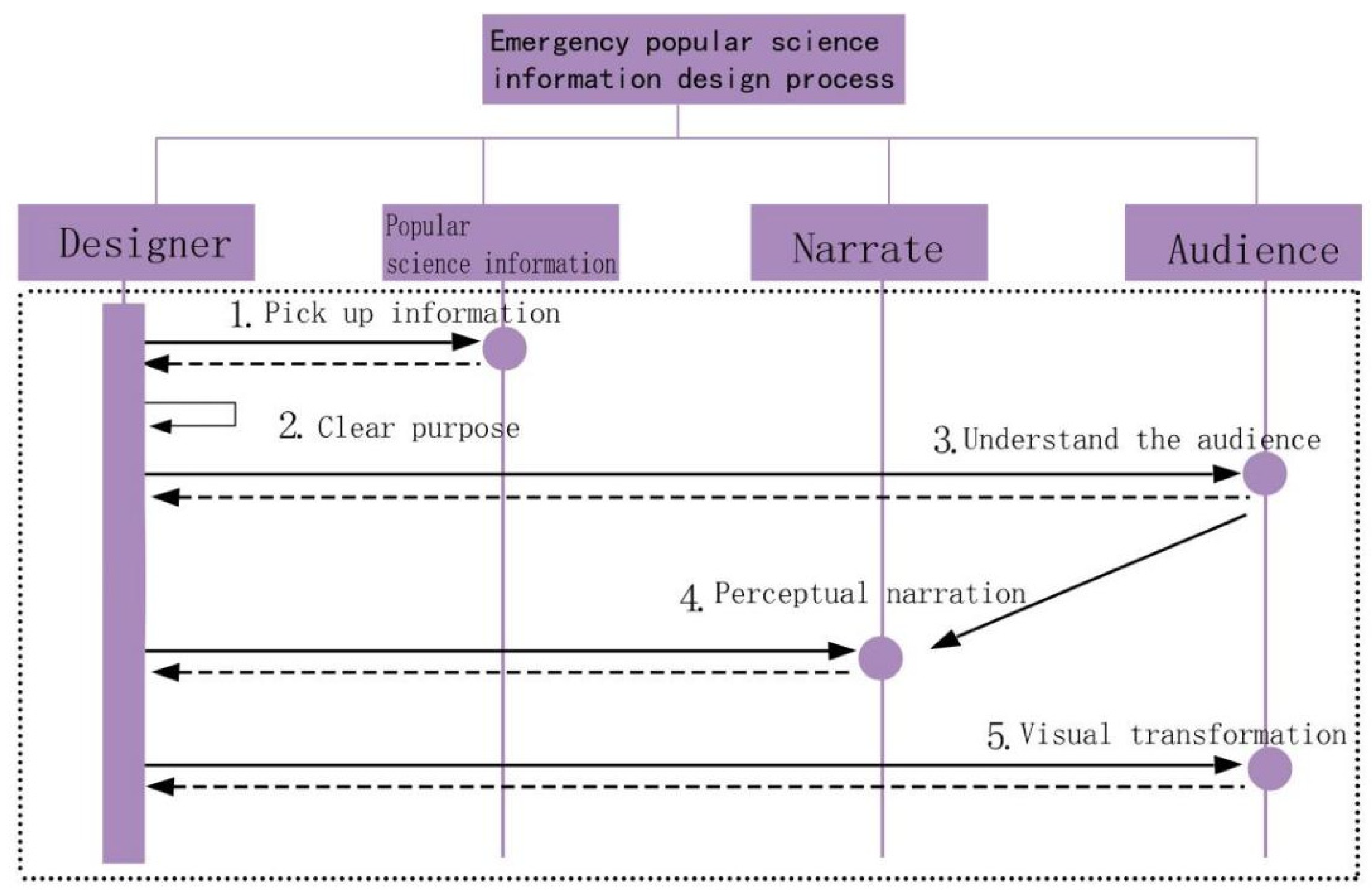
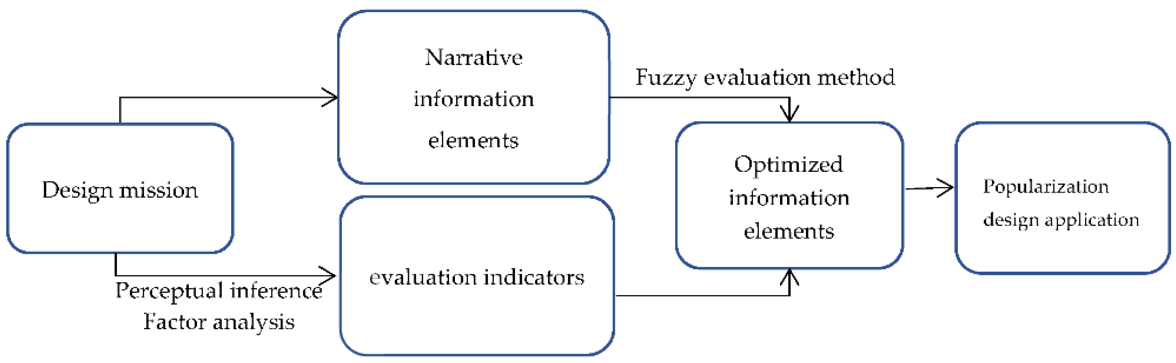
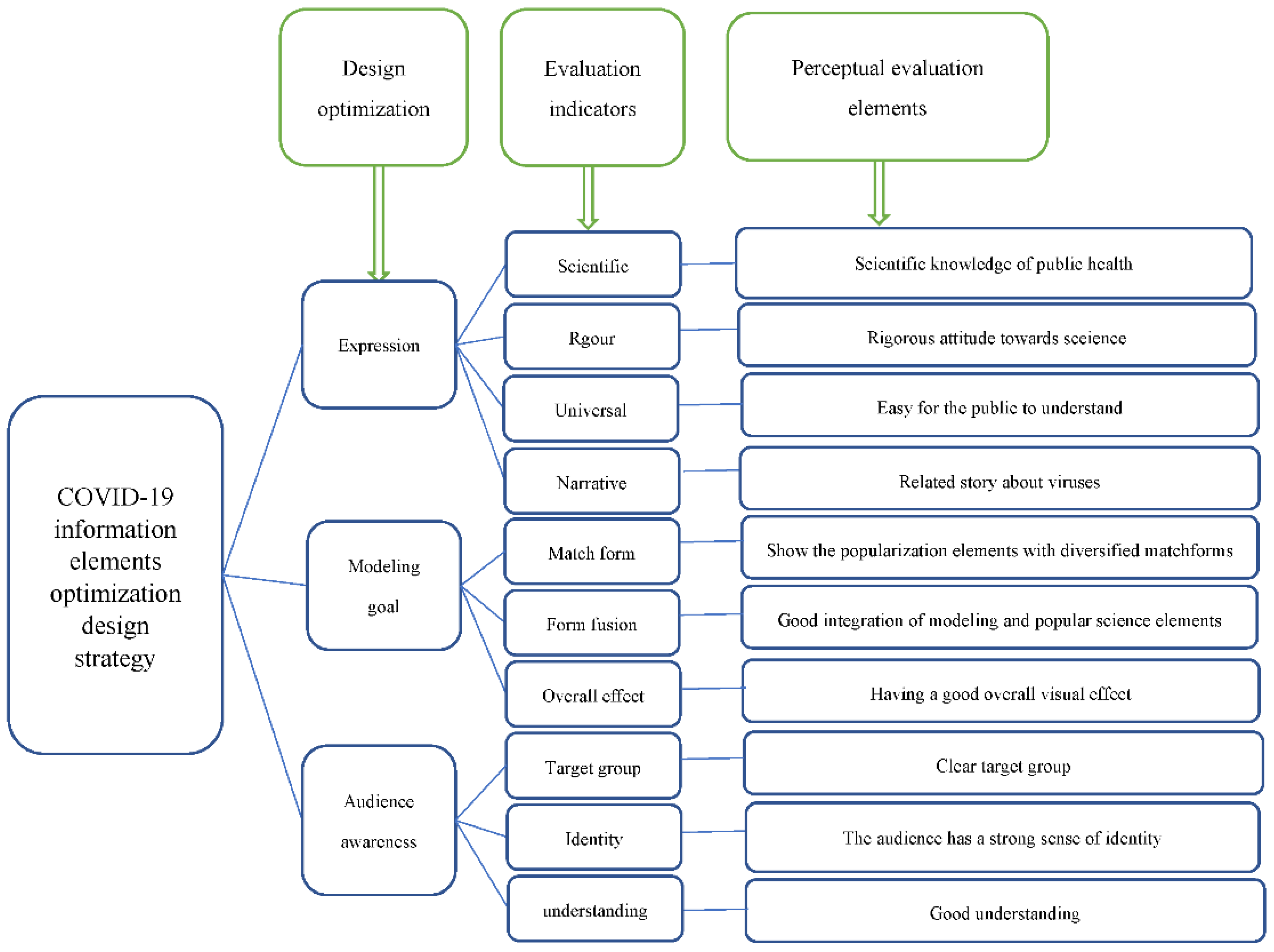
2.3. Design Process of Emergency Popular Science Information
- (1)
- Acquiring information
- (2)
- Clarifying purpose
- (3)
- Understanding the audience
- (4)
- Perceptual narrative
- (5)
- Visual transformation
3. Results
3.1. Case Design
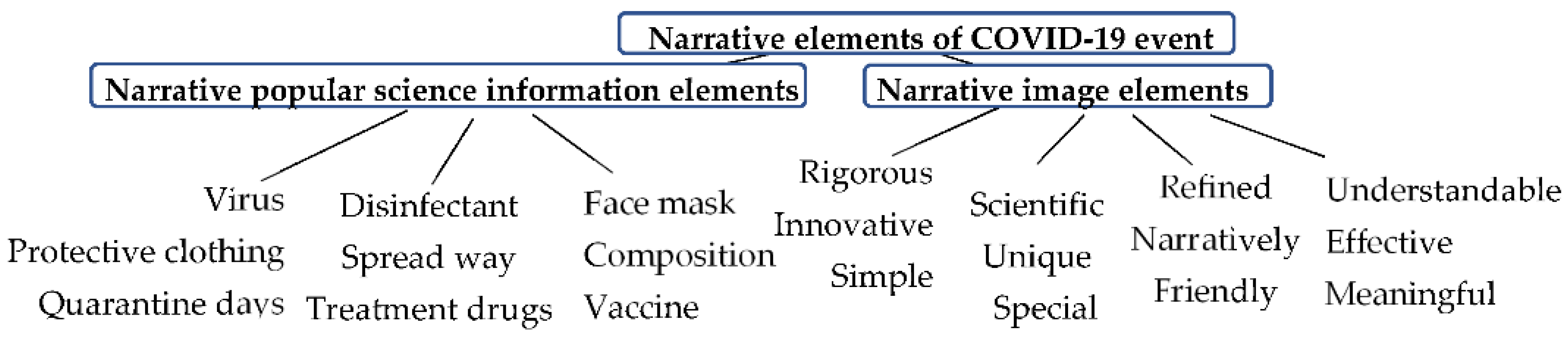
3.2. Analysis of COVID-19 Narrative Elements
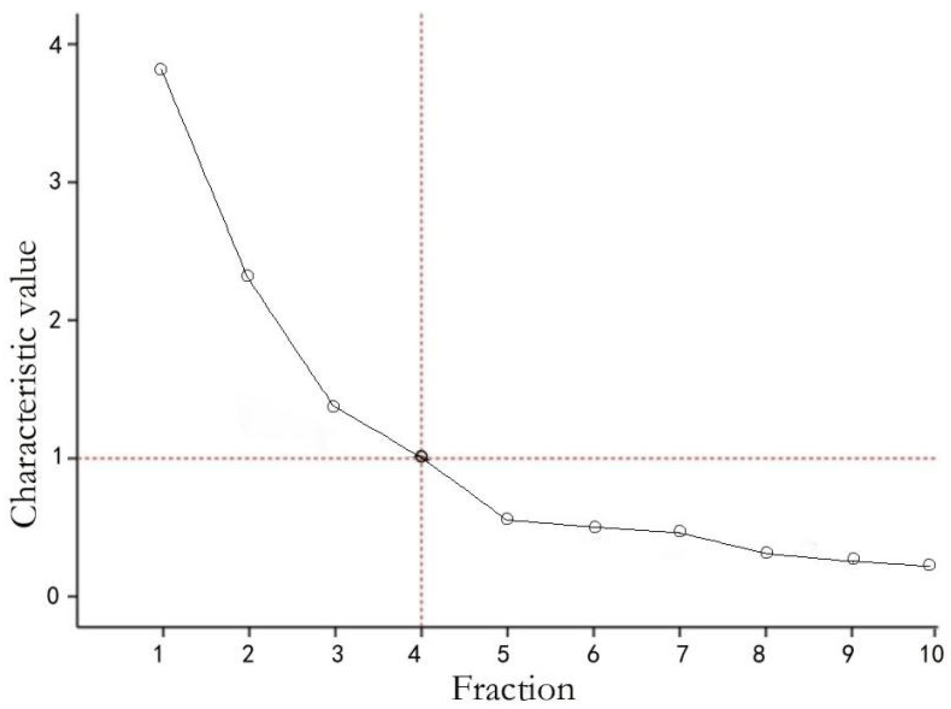
3.3. Composition of Evaluation Indicators
4. Discussion
5. Conclusions
Author Contributions
Funding
Institutional Review Board Statement
Informed Consent Statement
Data Availability Statement
Acknowledgments
Conflicts of Interest
References
- World Health Organisation (WHO). Timeline of Who’s Response to COVID-19; World Health Organization: Geneva, Switzerland, 2020; Available online: https://www.who.int/news-room/detail/29-06-2020-covidtimeline (accessed on 2 July 2020).
- Hu, B.; Guo, H.; Zhou, P.; Shi, Z.-L. Characteristics of SARS-CoV-2 and COVID-19. Nat. Rev. Microbiol. 2021, 19, 141–154. [Google Scholar] [CrossRef]
- Lesser, I.A.; Nienhuis, C.P. The Impact of COVID-19 on Physical Activity Behavior and Well-Being of Canadians. Int. J. Environ. Res. Public Health 2020, 17, 3899. [Google Scholar] [CrossRef]
- Belardo, M.B.; Herrero, M.B. La salud internacional frente al COVID-19: Entre los sistemas sanitarios y las políticas. Hamartia 2020, 7, 1–10. [Google Scholar]
- Pan, J.; St. Pierre, J.M.; Pickering, T.A.; Demirjian, N.L.; Fields, B.K.K.; Desai, B.; Gholamrezanezhad, A. Coronavirus Disease 2019 (COVID-19): A Modeling Study of Factors Driving Variation in Case Fatality Rate by Country. Int. J. Environ. Res. Public Health 2020, 17, 8189. [Google Scholar] [CrossRef]
- Bogucka, E.P.; Jahnke, M. Feasibility of the Space–Time Cube in Temporal Cultural Landscape Visualization. IISPRS Int. J. Geo. Infor. 2018, 7, 209. [Google Scholar] [CrossRef] [Green Version]
- Coronaviridae Study Group of the International Committee on Taxonomy of Viruses. The Species Severe Acute Respiratory Syndrome-Related Coronavirus: Classifying 2019-NCoV and Naming It SARS-CoV-2. Nat. Microbiol. 2020, 5, 536–544. [Google Scholar] [CrossRef] [Green Version]
- Pathak, Y.; Shukla, P.K.; Tiwari, A.; Stalin, S.; Singh, S. Deep transfer learning based classification model for COVID-19 disease. IRBM 2020, 4, 213. [Google Scholar] [CrossRef]
- Tableau. Business Intelligence and Analytics Software. Available online: https://www.tableau.com/ (accessed on 16 September 2020).
- Kim, M.C.; Zhu, Y.; Chen, C. How are they different? A quantitative domain comparison of information visualization and data visualization (2000–2014). Scientometrics 2016, 107, 123–165. [Google Scholar] [CrossRef]
- Dudáš, M.; Lohmann, S.; Svátek, V.; Pavlov, D. Ontology Visualization Methods and Tools: A Survey of the State of the Art. Knowl. Eng. Rev. 2018, 33, e10. [Google Scholar] [CrossRef]
- Murti, M.; Achonu, C.; Smith, B.T.; Brown, K.A.; Kim, J.H.; Johnson, J.; Ravindran, S.; Buchan, S.A. COVID-19 Workplace Outbreaks by Industry Sector and Their Associated Household Transmission, Ontario, Canada, January to June 2020. J. Occup. Environ. Med. 2021, 63, 574–580. [Google Scholar] [CrossRef]
- SaM Solutions. Pros and Cons of Tableau Software for Data Visualization. Available online: https://www.sam-solutions.com/blog/tableau-software-review-pros-and-cons-of-a-bi-solution-for-data-visualization/ (accessed on 7 January 2021).
- Huang, H.; Lebeau, P.; Macharis, C. The Multi-Actor Multi-Criteria Analysis (MAMCA): New Software and New Visualizations. In Proceedings of the International Conference on Decision Support System Technology, Zaragosa, Spain, 27–29 May 2020; pp. 43–56. [Google Scholar]
- Otu, A.; Charles, C.H.; Yaya, S. Mental health and psychosocial well-being during the COVID-19 pandemic: The invisible elephant in the room. Int. J. Ment. Health Syst. 2020, 14, 38. [Google Scholar] [CrossRef]
- Bruner, J. The narrative construction of reality. Crit. Inq. 1991, 18, 1–21. [Google Scholar] [CrossRef]
- Oinaskukkonen, H.; Harjumaa, M. A systematic framework for designing and evaluating persuasive systems. Lect. Notes Comput. Sci. 2008, 5033, 164–176. [Google Scholar]
- Castro, J.L.A.; Villegas, O.R.T. COVID-19 y sus implicaciones sociales: Una mirada desde las ciencias computacionales. Educere 2021, 25, 147–164. [Google Scholar]
- Khan, A.I.; Shah, J.L.; Bhat, M.M. CoroNet: A deep neural network for detection and diagnosis of COVID-19 from chest x-ray images. Comput. Methods Programs Biomed. 2020, 196, 105581. [Google Scholar] [CrossRef]
- Shneiderman, B.; Plaisant, C.; Cohen, M.; Jacobs, S. Designing the User Interface: Strategies for Effective Human-Computer Interaction, 5th ed.; Addison-Wesley: Boston, MA, USA, 2010; Chapter 14. [Google Scholar]
- Siddiquea, B.N.; Shetty, A.; Bhattacharya, O.; Afroz, A.; Billah, B. Global epidemiology of COVID-19 knowledge, attitude and practice: A systematic review and meta-analysis. BMJ Open 2021, 11, e051447. [Google Scholar] [CrossRef]
- Trahar, S. Contextualising Narrative Inquiry: Developing Methodological Approaches for Local Contexts; Routledge: Abingdon, UK, 2013. [Google Scholar]
- Holten, D. Hierarchical edge bundles: Visualization of adjacency relations in hierarchical data. IEEE Trans. Vis. Comput. Graph. 2006, 12, 741–748. [Google Scholar] [CrossRef]
- Davison, K.M.; Thakkar, V.; Lin, S.L.; Stabler, L.; MacPhee, M.; Carroll, S.; Collins, B.; Rezler, Z.; Colautti, J.; Xu, C.C.; et al. Interventions to Support Mental Health among Those with Health Conditions That Present Risk for Severe Infection from Coronavirus Disease 2019 (COVID-19): A Scoping Review of English and Chinese-Language Literature. Int. J. Environ. Res. Public Health 2021, 18, 7265. [Google Scholar] [CrossRef]
- Baratto, C.; Caravita, S.; Faini, A.; Perego, G.B.; Senni, M.; Badano, L.P.; Parati, G. Impact of COVID-19 on exercise pathophysiology: A combined cardiopulmonary and echocardiographic exercise study. J. Appl. Physiol. 2021, 130, 1470–1478. [Google Scholar] [CrossRef]
- UK Office for National Statistics. Prevalence of Ongoing Symptoms Following Coronavirus (COVID-19) Infection in the UK: 1 April 2021; UK Office for National Statistics: Newport, UK, 2021. [Google Scholar]
- Ricœur, P. Time and Narrative; Chicago UP: Chicago, IL, USA, 1984; Volume 1. [Google Scholar]
- Shafiq, M.; Elharake, J.A.; Malik, A.A.; McFadden, S.M.; Aguolu, O.G.; Omer, S.B. COVID-19 Sources of Information, Knowledge, and Preventive Behaviors Among the US Adult Population. J. Public Health Manag. Pract. 2021, 27, 278–284. [Google Scholar] [CrossRef]
- Clandinin, D.J.; Huber, J. Narrative inquiry. In International Encyclopedia of Education; Peterson, P.L., Baker, E., McGaw, B., Eds.; Elsevier Ltd.: Amsterdam, The Netherlands, 2010. [Google Scholar]
- Ryan, M.-L. Narrative as Virtual Reality 2: Revisiting Immersion and Interactivity in Literature and Electronic Media; JHU Press: Baltimore, MD, USA, 2015; Volume 2. [Google Scholar]
- Klemmer, S.R.; Hartmann, B.; Takayama, L. How bodies matter: Five themes for interaction design. In Proceedings of the 6th Conference on Designing Interactive Systems, University Park, PA, USA, 26–28 June 2006; pp. 140–149. [Google Scholar]
- Shorten, A.; Smith, J. Mixed Methods Research: Expanding the Evidence Base. Evid. Based Nurs. 2017, 20, 74–75. [Google Scholar] [CrossRef] [PubMed] [Green Version]
- Ahamad, M.M.; Aktar, S.; Rashed-Al-Mahfuz, M.; Uddin, S.; Liò, P.; Xu, H.; Summers, M.A.; Quinn, J.M.; Moni, M.A. A machine learning model to identify early stage symptoms of SARS-Cov-2 infected patients. Expert Syst. Appl. 2020, 160, 113661. [Google Scholar] [CrossRef] [PubMed]
- Dahlstrom, M.F. Using narratives and storytelling to communicate science with nonexpert audiences. Proc. Natl. Acad. Sci. USA 2014, 111, 13614–13620. [Google Scholar] [CrossRef] [PubMed] [Green Version]
- Jones, P.H. Systemic Design Principles for Complex Social Systems. In Social Systems and Design. Translational Systems Sciences; Metcalf, G.S., Ed.; Springer: Tokyo, Japan, 2014; pp. 91–128. [Google Scholar]
- Harley, D.; Chu, J.H.; Kwan, J.; Mazalek, A. Towards a framework for tangible narratives. In Proceedings of the TEI’16: Tenth International Conference on Tangible, Embedded, and Embodied Interaction, Eindhoven, The Netherlands, 14–17 February 2016; pp. 62–69. [Google Scholar]
- Kaur, M. Application of Mixed Method Approach in Public Health Research. Indian J. Commun. Med. 2016, 41, 93. [Google Scholar] [CrossRef]
- Green, M.C.; Brock, T.C. The role of transportation in the persuasiveness of public narratives. J. Pers. Soc. Psychol. 2000, 79, 701. [Google Scholar] [CrossRef]
- Charmaz, K. Constructing Grounded Theory: A Practical Guide through Qualitative Analysis; Sage Publications: Thousand Oaks, CA, USA, 2014. [Google Scholar]
- Yan, L.; Zhang, H.T.; Goncalves, J.; Xiao, Y.; Wang, M.; Guo, Y.; Sun, C.; Tang, X.; Jing, L.; Zhang, M.; et al. An interpretable mortality prediction model for COVID-19 patients. Nat. Mach. Intell. 2020, 2, 283–288. [Google Scholar] [CrossRef]
- Sedig, K.; Parsons, P.; Babanski, A. Towards a Characterization of Interactivity in Visual Analytics. JMPT 2012, 3, 12–28. [Google Scholar]
- Haverfield, J.; Tannenbaum, C. A 10-year longitudinal evaluation of science policy interventions to promote sex and gender in health research. Health Res. Policy Syst. 2021, 19, 94. [Google Scholar] [CrossRef]
- Moser, A.; Korstjens, I. Series: Practical Guidance to Qualitative Research. Part 3: Sampling, Data Collection and Analysis. Eur. J. Gen. Pract. 2018, 24, 9–18. [Google Scholar] [CrossRef] [Green Version]
- Diekmann, O.; Heesterbeek, J.A.P. Mathematical Epidemiology of Infectious Diseases: Model Building, Analysis and Interpretation; John Wiley & Sons: Hoboken, NJ, USA, 2000; Volume 5. [Google Scholar]
- Yakerson, A. Women in clinical trials: A review of policy development and health equity in the Canadian context. Int. J. Equity Health 2019, 18, 56. [Google Scholar] [CrossRef] [Green Version]
- van der Bijl-Brouwer, M.; Malcolm, B. Systemic Design Principles in Social Innovation: A Study of Expert Practices and Design Rationales. She Ji J. Des. Econ. Innov. 2020, 6, 386–407. [Google Scholar] [CrossRef]
- Bakker, S.; Antle, A.N.; Van Den Hoven, E. Embodied metaphors in tangible interaction design. Pers. Ubiquitous Comput. 2012, 16, 433–449. [Google Scholar] [CrossRef] [Green Version]
- Wahed, W.Y.A.; Hefzy, E.M.; Ahmed, M.I.; Hamed, N.S. Assessment of Knowledge, Attitudes, and Perception of Health Care Workers Regarding COVID-19, A Cross-Sectional Study from Egypt. J. Community Health 2020, 45, 1242–1251. [Google Scholar] [CrossRef]
- Chun Tie, Y.; Birks, M.; Francis, K. Grounded Theory Research: A Design Framework for Novice Researchers. SAGE Open Med. 2019, 7, 2050312118822927. [Google Scholar] [CrossRef] [Green Version]
- Deng, Y.; Loy, C.C.; Tang, X. Image aesthetic assessment: An experimental survey. IEEE Signal Process. Mag. 2017, 34, 80–106. [Google Scholar] [CrossRef]
- Nabi, R.L.; Green, M.C. The role of a narrative’s emotional flow in promoting persuasive outcomes. Media Psychol. 2015, 18, 137–162. [Google Scholar] [CrossRef]
- Cucinotta, D.; Vanelli, M. WHO declares COVID-19 a pandemic. Acta Biomed. 2020, 91, 157–160. [Google Scholar]
- Fenglin, S. Data visualization design for real-time report of epidemic map. Youth J. 2020, 15, 60–61. (In Chinese) [Google Scholar]
- Feng, L. SEIR Model Combined with LSTM and GRU for the Trend Analysis of COVID-19; Middle Tennessee State University: Murfreesboro, TN, USA, 2021. [Google Scholar]
- Rubio, F.; Flores, M.J.; Puerta, J.M. Drawing a baseline in aesthetic quality assessment. In Proceedings of the Tenth International Conference on Machine Vision (ICMV 2017), Vienna, Austria, 13–15 November 2018; Volume 10696, pp. M1–M8. [Google Scholar]
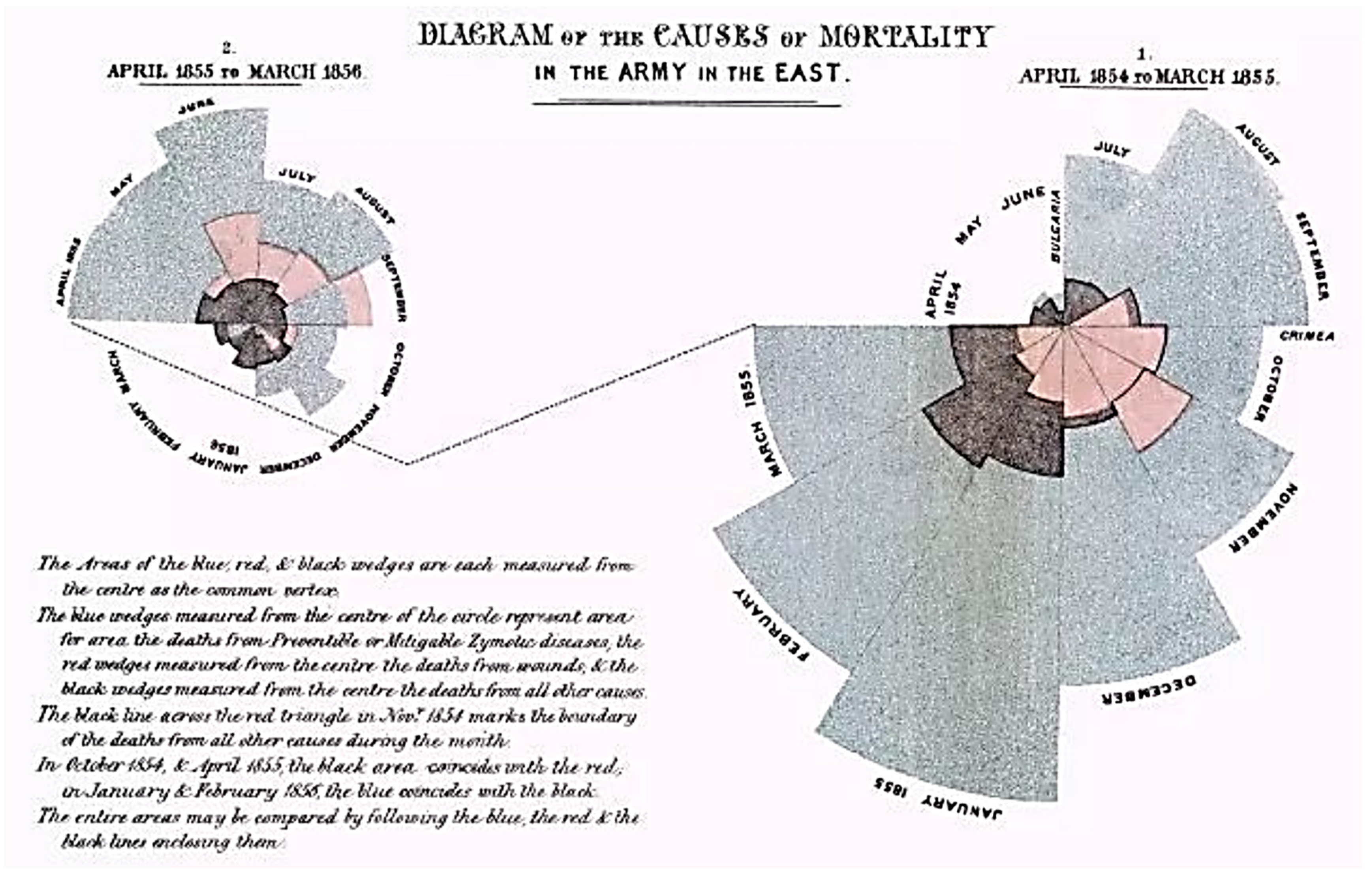
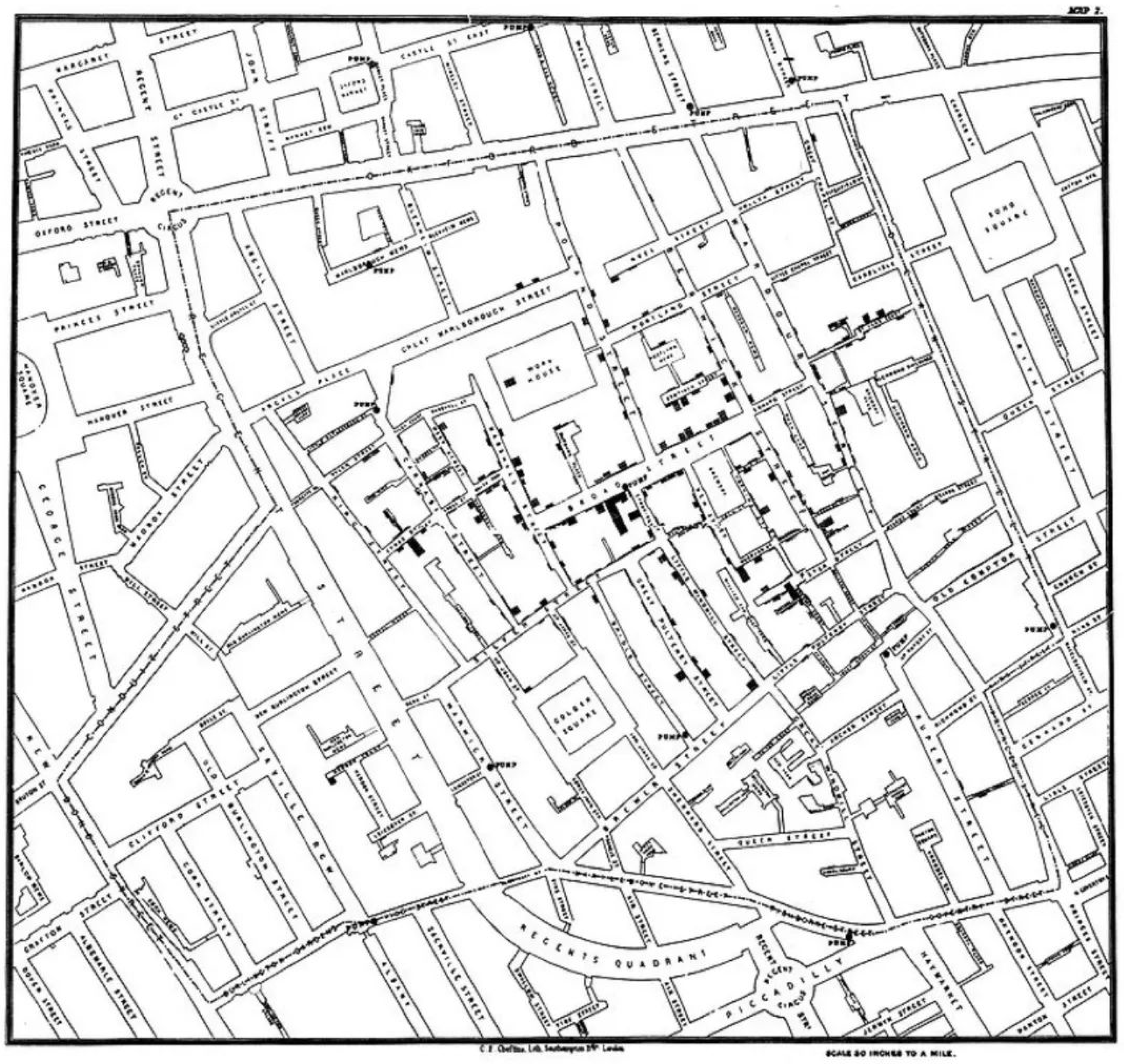
- Friendly, M. Milestones in the History of Thematic Cartography, Statistical Graphics, and Data Visualization; Citeseer: University Park, PA, USA, 2001. [Google Scholar]
- Hong, L. Visual design path of epidemic data from the perspective of the public. Pack. Eng. 2020, 41, 221–227. (In Chinese) [Google Scholar]
- Han, R.; Li, Z.; Ti, P.; Xu, Z. Experimental evaluation of the usability of cartogram for representation of GlobeLand30 data. ISPRS Int. J. Geo-Inf. 2017, 6, 180. [Google Scholar] [CrossRef] [Green Version]
- Koochaksaraei, R.H. Qualitative Analysis in Many-Objective Optimization with Visualization Methods. Ph.D. Thesis, Federal University of Minas Gerais, Belo Horizonte, Brazil, 2017. [Google Scholar]
- Caban, J.J.; Gotz, D. Visual analytics in healthcare—Opportunities and research challenges. J. Am. Med. Inform. Assoc. 2015, 22, 260–262. [Google Scholar] [CrossRef] [PubMed] [Green Version]
- Tuo, L. Information visualization: A design method of making the Epidemic “visible” to the public. Art. Des. 2020, 2, 38–45. (In Chinese) [Google Scholar]
- Zhang, C.; Zhu, C.; Xu, X.; Liu, Y.; Xiao, J.; Tillo, T. Visual aesthetic understanding: Sample-specific aesthetic classification and deep activation map visualization. Signal Process. Image Commun. 2018, 67, 12–21. [Google Scholar] [CrossRef]
- Ambrosio, C. Objectivity and Visual Practices in Science and Art. In New Directions in the Philosophy of Science. The Philosophy of Science in a European Perspective; Galavotti, M., Dieks, D., Gonzalez, W., Hartmann, S., Uebel, T., Weber, M., Eds.; Springer: Cham, Switzerland, 2014; Volume 5, pp. 353–368. [Google Scholar]
- Toh, A. Big Data Could Undermine the COVID-19 Response. Wired. Available online: https://www.wired.com/story/big-data-could-undermine-the-covid-19-response/ (accessed on 15 August 2020).
- Johns Hopkins University. COVID-19 Map. Available online: https://coronavirus.jhu.edu/map.html (accessed on 16 August 2020).
- Sedig, K.; Parsons, P. Design of Visualizations for Human-Information Interaction: A Pattern-Based Framework. Synth. Lect. Vis. 2016, 4, 185. [Google Scholar] [CrossRef] [Green Version]
- Borg, I.; Groenen, P.J.F. Modern Multidimensional Scaling: Theory and Applications; Springer: New York, NY, USA, 2005. [Google Scholar]
- Lewandowsky, S.; Oberauer, K. Motivated rejection of science. Curr. Dir. Psychol. Sci. 2016, 25, 217–222. [Google Scholar] [CrossRef] [Green Version]


| Common Factors | Evaluation Factors | Factor Loading | Percentage of Variance | Cumulative Variance Contribution % |
|---|---|---|---|---|
| Significance | Convey scientific knowledge of prevention and control | 0.845 | 38.401 | 38.258 |
| Popularizing scientific principles | 0.647 | |||
| Scientific disposal | 0.832 | |||
| Design performance | Characteristic form effect | 0.796 | 15.079 | 54.872 |
| Good modeling transformation | 0.682 | |||
| Audience expectation | Easy to understand | 0.804 | ||
| Trigger audiences’ interest | 0.859 | 12.326 | 64.239 | |
| Design is attractive | 0.738 | |||
| Artistic appeal | Good visual effects | 0.872 | 11.147 | 73.473 |
| Aesthetic interest | 0.715 |
| Information Elements. | f1 Epidemic Prevention | f2 Virus | f3 Drugs | f4 Disinfectant | f5 Taking Temperature | f6 Mask | f7 Protective Clothing | f8 Temperature | f9 Infection | f10 Vaccine |
|---|---|---|---|---|---|---|---|---|---|---|
| Comprehensive evaluation value | 4.18 | 4.31 | 4.12 | 4.27 | 4.13 | 4.20 | 4.15 | 4.07 | 4.22 | 4.16 |
| COVID-19 Information Elements | Narrative Information | Design Expression |
|---|---|---|
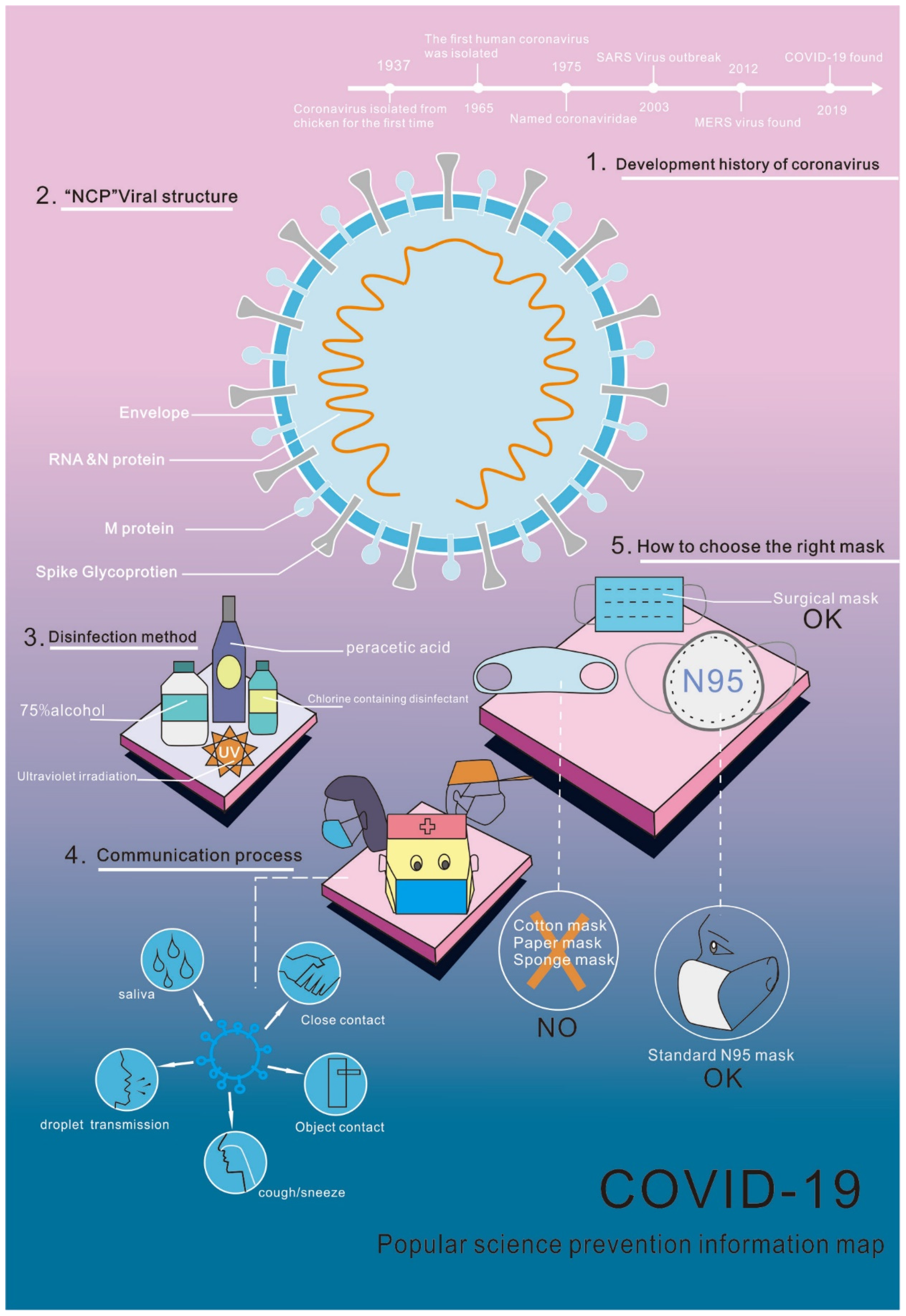
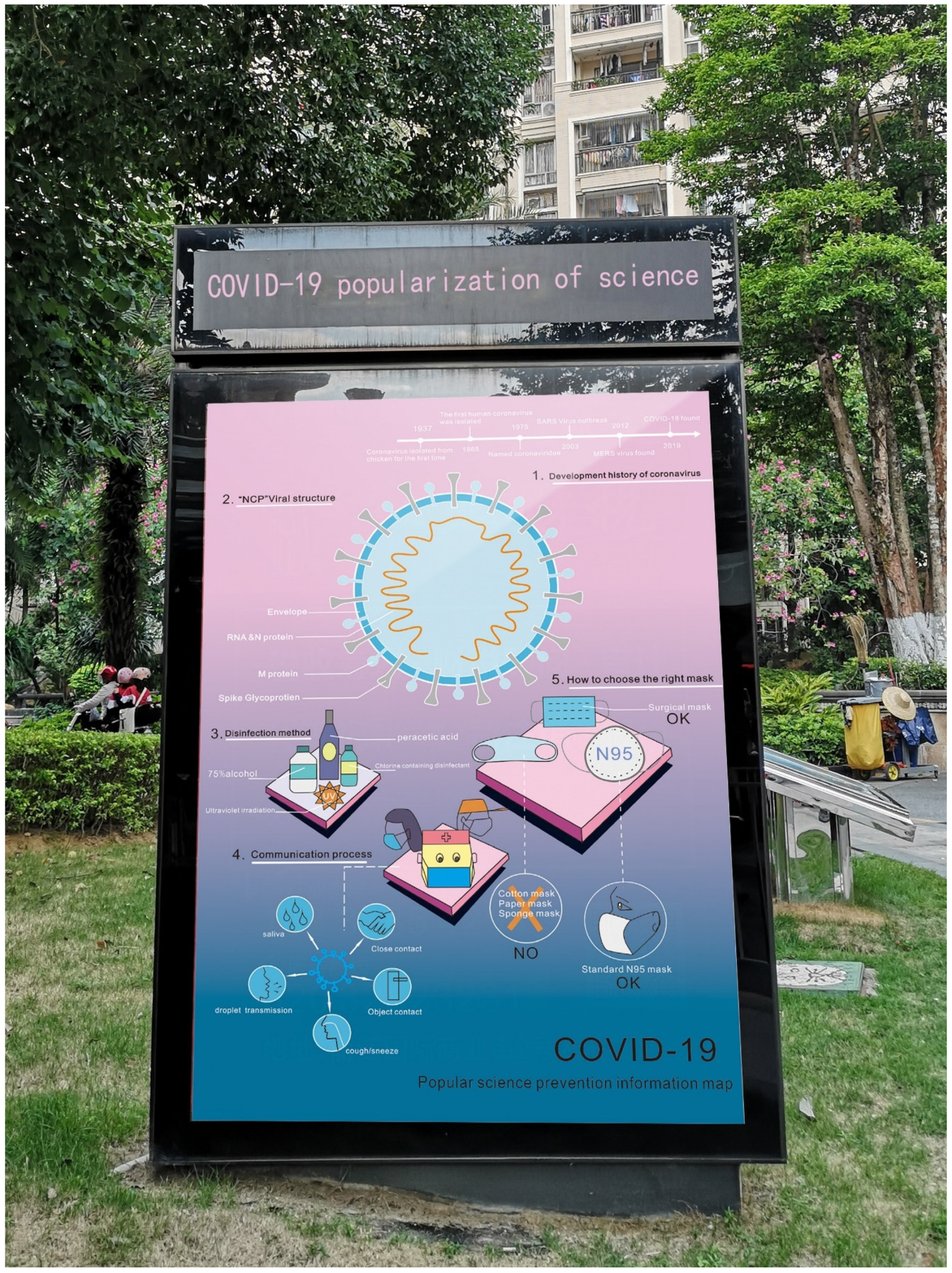
| Virus | The structure of COVID-19 virus is in a spherical coronal state, and its internal structure is an RNA virus with envelope on the surface and protrusion on the outside of the envelope, which looks like a crown, so it is called novel coronavirus. |  |
| Disinfectant | Novel coronavirus remains relatively weak in the outside world and can be killed with 75% ethanol, chlorine-containing disinfectants and other disinfectants. |  |
| Infection | Transmission routes include respiratory droplet transmission and contact transmission. Transmission through respiratory droplets, such as sneezing, coughing, foaming and close contact of exhaled air, can lead to continuous transmission of the disease. |  |
| Mask | It’s better to choose surgical masks and N95 masks. Others such as sponge masks, activated carbon masks, paper masks, etc., cannot effectively prevent the transmission of novel coronavirus. |  |
| Indicators | Significance | Design Performance | Audience Expectation | Artistic Appeal |
|---|---|---|---|---|
| Satisfaction | Average value | Average value | Average value | Average value |
| COVID-19 prevention info-graphic | 4.26 | 4.31 | 4.28 | 4.33 |
Publisher’s Note: MDPI stays neutral with regard to jurisdictional claims in published maps and institutional affiliations. |
© 2022 by the authors. Licensee MDPI, Basel, Switzerland. This article is an open access article distributed under the terms and conditions of the Creative Commons Attribution (CC BY) license (https://creativecommons.org/licenses/by/4.0/).
Share and Cite
Li, H.; Wen, K. Research on Design of Emergency Science Popularization Information Visualization for Public Health Events-Taking “COVID-19”as an Example. Sustainability 2022, 14, 4022. https://doi.org/10.3390/su14074022
Li H, Wen K. Research on Design of Emergency Science Popularization Information Visualization for Public Health Events-Taking “COVID-19”as an Example. Sustainability. 2022; 14(7):4022. https://doi.org/10.3390/su14074022
Chicago/Turabian StyleLi, Hong, and Kuohsun Wen. 2022. "Research on Design of Emergency Science Popularization Information Visualization for Public Health Events-Taking “COVID-19”as an Example" Sustainability 14, no. 7: 4022. https://doi.org/10.3390/su14074022