Article

Graphs from Features: Tree-Based Graph Layout for Feature Analysis

1
School of Computer Science and Information Technology, University College Cork, Western Road, T12 CY82 Cork, Ireland
2
Institute of Mathematical and Computer Sciences, University of São Paulo, São Paulo 03178-200, Brazil
3
Superintendência de Tecnologia da Informação, Federal University of Piauí, Teresina 64049-550, Brazil
4
Instituto de Computação, University of Campinas, Campinas 13083-852, Brazil
*
Author to whom correspondence should be addressed.
These authors contributed equally to this work.
Algorithms 2020, 13(11), 302; https://doi.org/10.3390/a13110302
Submission received: 18 October 2020 / Revised: 13 November 2020 / Accepted: 14 November 2020 / Published: 18 November 2020
(This article belongs to the Special Issue Graph Drawing and Information Visualization)

Abstract

:
Feature Analysis has become a very critical task in data analysis and visualization. Graph structures are very flexible in terms of representation and may encode important information on features but are challenging in regards to layout being adequate for analysis tasks. In this study, we propose and develop similarity-based graph layouts with the purpose of locating relevant patterns in sets of features, thus supporting feature analysis and selection. We apply a tree layout in the first step of the strategy, to accomplish node placement and overview based on feature similarity. By drawing the remainder of the graph edges on demand, further grouping and relationships among features are revealed. We evaluate those groups and relationships in terms of their effectiveness in exploring feature sets for data analysis. Correlation of features with a target categorical attribute and feature ranking are added to support the task. Multidimensional projections are employed to plot the dataset based on selected attributes to reveal the effectiveness of the feature set. Our results have shown that the tree-graph layout framework allows for a number of observations that are very important in user-centric feature selection, and not easy to observe by any other available tool. They provide a way of finding relevant and irrelevant features, spurious sets of noisy features, groups of similar features, and opposite features, all of which are essential tasks in different scenarios of data analysis. Case studies in application areas centered on documents, images and sound data demonstrate the ability of the framework to quickly reach a satisfactory compact representation from a larger feature set.

Graphical Abstract

1. Introduction

Many data analysis tasks are performed on datasets where each data item (also referred to as sample, example or instance) has a set of features (also referred to as variables or attributes) that define it. When the set of features is large, and this is currently the typical case, exploring and analyzing the data is harder: more computing resources will be demanded and inaccurate relations among data will be introduced just by chance, either locally or globally, making it harder to understand. Exploratory tasks that are often performed during data analysis, like data classification, clustering, and the construction of representations to unveil correlations and causal effects among samples and features, are affected [1].
Two main strategies have been proposed for dimensionality reduction of datasets: feature selection and feature transformation [2]. Feature selection techniques discard features in the quest for a small subset of features that preserves relationships among data. Feature transformation (also referred to as feature extraction) techniques build a new, smaller, feature space from the original features.
Selecting a subset of features that still preserves the correlations in the original space is known to be a computationally hard (NP-hard) problem under a variety of formulations [3]. This is not a surprise, as the number of subsets of a set of d features is 2 d . The problem gets specially daunting with typical d in the order of hundreds or thousands for multimedia and textual datasets. From a combinatorial perspective, the feature selection problem has been approached with a variety of exact and heuristic techniques, such as branch-and-bound [4], local search [5,6], evolutionary algorithms [7,8,9] and integer programming [6].
In addition to this scenario, automatic feature selection or transformation strategies fail to consider the user expertise [10]. From a data visualization perspective, an attempt to relief the intrinsic hardness of the problem is the inclusion of an specialist in the process through an interactive tool that provides a layout of the data and means to interfere or guide the feature selection, typically in cycles.
Graphs are an expressive means to represent a non-euclidean geometry, being often a natural model for a dataset and for the representation of intricate relations among samples, represented as vertices, with weighted edges representing similarity (or dissimilarity, or other type of measure) between samples. Alternatively, features may be represented as vertices connected by weighted edges representing correlation, mutual information or another measure of their mutual importance or similarity for data description.
As the underlying representation for a visual map of data, graphs are rapidly overflowed by edges, ( O ( n 2 ) for n vertices on a complete graph), and drawing the graph in a visually suitable layout is computationally hard (for instance, recognizing whether a graph may be realized on the plane having at most one crossing per edge is an NP-complete [11] problem). Some open problems in graph aesthetics are related to determining minimum area requirements under assumptions on the maximum number of edge crossings. While exploring graph drawing alternatives and algorithms is possible, resorting to the more sparse representation provided by trees is a computationally light alternative that has various visual favourable characteristics, perhaps the most appealing being putting a backbone of vertices relationship in evidence [12].
In this article, we propose a visual analysis framework for a graph representation of the attributes (or feature vectors) in a dataset, with features represented as vertices and feature similarity as edges. From that graph, that we call graph from features, we generate a tree aiming at reflecting the similarity structure among attributes. The tree layout serves two purposes: 1—supporting initial interaction to find relevant features for a given task; and 2—spreading vertices (features) in a similarity based configuration, decreasing the visual complexity of the layout of the remaining edges. The remaining edges of the graph are added by the user as the search for more similarities or dissimilarities between features progresses, putting clusters of features in evidence and thus supporting adding and removing features to the selection.
The main contributions of this article are therefore:
  • The proposal of a graph layout strategy for feature analysis based on circular node placement guided by similarity trees, followed by on-demand edge drawing.
  • The proposal of a framework that combines that tree layout with other visual elements anda data representations to support graph based feature analysis.
  • An open source tool to implement the ideas of this paper, immediately applicable to data sets in the order of a few thousand points and a few hundred attributes.

2. Related Work

2.1. Automatic Graph-Based Feature Selection Methods

Some works in the literature use graphs to model and solve the feature selection problem. The approaches vary largely on how the problem is modeled by a graph and on the algorithmic solutions. The references in the sequel provide an overview of such strategies.
Sebban and Nock [13] construct a graph having one vertex for each labeled instance connected by edges weighted by the heterogeneous value diference metric [14], which combines numeric and categorical attributes. A minimum spanning tree of this graph is used to evaluate local and global uncertainty measures. A greedy forward feature selection is then performed using the value of a homogeneity hypothesis test on the uncertainty measures as a threshold. The authors also report improving the computational performance of their algorithm using a nearest neighbor graph with similar results.
Hero et al. [15] use a graph to estimate the Shannon entropy of a set of features more efficiently and less prone to noise in data. Bonev et al. [16] then apply this evaluation technique to select features based on mutual information using a greedy forward selection algorithm, which starts with a small set of features and adds one feature at a time.
For a partially labeled dataset, Zhong et al. [17] propose selecting a subset of features using a supervised algorithm. Then the following procedure is repeated a certain number of times. A complete graph is built having each sample as a vertex and the weight of each edge is evaluated using the subset of features selected so far as a parameterized exponential function. Class labels probabilities are propagated throughout the graph taking edge weights into account in a probabilistic transition model and a fraction of the best classified vertices are labeled. A new supervised feature selection is performed and its average confidence is evaluated. At the end of the process, the subset of features with the largest prediction confidence is selected.
Berretta et al. [18] proposes using a hybrid graph that includes pairs of classified instances and pairs of features as colored vertices depending on their classes. Edges are added depending on the state of a feature in the incident vertices. A feature selection problem is then defined in terms of a minimal subset of vertices subject to color and degree constraints, and then refined to include edge weights and a limit on the number of features. The authors then solve both integer linear programs in combination using a commercial solver.
Lastra et al. [19] build a complete graph where vertices represent both discrete features and labels. Edge weights are calculated as the symmetric uncertainty (a normalized form of multiple information). Then the attribute vertices whose distance to any label is smaller than or equal to k are selected and a ranking of features is produced as well.
Zhang and Hancock [20] propose the construction of a complete undirected graph with a vertex for each feature where edge weight is the mutual information between features. Then they partition the graph into a set of dominating vertices and a set of non-dominating vertices. This procedure is applied recursively to the set of non-dominating vertices while it is not empty. From the sets of dominating vertices, up to k features are selected based on the multidimensional interaction information. Dominating-set clustering was defined in [21] to capture the notion of a set of vertices connected by edges with large weights among each other and connected by edges with small weights to any other vertices. With that formulation, a dominant-set may be found solving a quadratic program. In a latter work, Zhang and Hancock [22] model the problem as a hyper-graph having features as vertices and adding hyper-edges for large values of the multidimensional interaction information measure. Then the most informative features subset is found by solving a non-linear optimization problem followed by an iterative adjustment of edge weights.
In the work by Mandal and Mukhopadhyay [23], a complete weighted graph is constructed having features as vertices and edge weights given by the information compression index. Then, vertices whose mean weight with respect to its neighbors (density) is smaller than the average density are removed. The process terminates when the average density ceases to increase, and the remaining vertices form the set of selected features.
In the work by Zhao et al. [24], the nearest neighbor graph is used to define a (hard) optimization problem on the feature space and on the graph neighborhoods, which they then solve with a gradient method that selects a set of features.
On a labeled dataset, Das et al. [25] propose evaluating mutual information between each feature and its class, and selecting those above a given threshold. Among these features, the highly correlated ones are connected by edges in a graph. An approximate maximum vertex cover selected through path traversals then represents the set of selected features.
Roffo et al. [26] construct a weighted complete graph of features having edge weights (for the supervised case) composed by the Fisher criterion, the normalized mutual information and by the standard deviation with respect to other classes. A simple path in the graph is a subset of features and its weight reflects the importance of its features. The authors then evaluate the contribution of each feature across all the paths in the graph as their length goes to infinity to produce an ordered list of features.
These strategies aim at an automatic solution for the selection of features, while interactions with the graph and user exploration are not prioritized. While they can become guidelines to some of the features in our proposal, they serve a different set of purposes from the ones targeted here.

2.2. Visual Feature Selection

Interactive feature selection emerged as an alternative to automated algorithms where users join the loop and may contribute with their expertise to the selection task. Users may have insights on relations among features by inspecting a layout of the feature space that would not be distinctive on the instance space.
Aiming to visually summarize the results of automatic algorithms for feature selection, Krause et al. [27] proposed INFUSE (INteractive FeatUre SElection), which helps users to understand how the features are being ranked or selected by the algorithms. The initial INFUSE interface includes three views: the first shows features as sliced glyphs to represent the values collected by feature selection algorithms; the second displays an ordered list of features according to some chosen criterion; and the third shows quality scores calculated through known classification algorithms.
Some approaches attempt to find correlations beyond their global distributions. Bernard et al. [28] present an approach intended to expose relationships of features and their bins visually. The adopted metrics to estimate the bins relationships are Pearson’s X 2 test or the mutual information; these measures also support finding strong correlations between bins in mixed datasets.
May et al. [29] proposed an interactive feature selection tool called SmartStripes that supports the investigation of dependencies and interdependencies between different subsets of features and items related to a target feature. Inside SmartStripes, users interact mainly through two views. The feature partition view allows determining combinations of items’ subsets. The dependency view shows quality metrics calculated between the selected partitions and the chosen target, encoded as a heat map.
Radial-based visual techniques have also been applied to feature visualization. Wang et al. [30] employ the cluster and class separation concept from a linear discriminant analysis model to find the dimensional anchors’ optimal initial arrangement in a star coordinate visualization. The approach is advantageous in defining weights for features, since users can identify each feature’s contribution to cluster formation. Sanchez et al. [31] introduce a visual technique called scaled radial axis (SRA), where a set of axis represents the features. The authors show that SRA generates less cluttered points compared to previous methods (star coordinates and adapted radial axis). Also, longer axes usually represent features giving smaller contributions to the projection in SRA, allowing users to perform backward feature selections.
More recently, Artur and Minghim [32] proposed a dual linked RadViz supporting a correlation analysis of features combined with data analysis. The authors have shown by case studies that features selected using the tool have as good quality as those selected by automatic feature selection algorithms (being occasionally better).
Other visual attribute analysis approaches also explore dual or multiple views methods to enable features and instances prospecting simultaneously. Turkay et al. [33] present an approach that allows the linked interaction of instances and features through a dual-view aspect. The dual view also provides an interactive interface that adopts the linking and brushing style, where the interactivity of one view subsequently updates the other in a focus + context manner. Therefore, analysts can recognize the feature space structure jointly to the related distribution of the data instances. Yuan et al. [34] presented the Dimension Projection Matrix/Tree which allow the simultaneous exploration of both data items and features. The Dimension Projection Matrix is a set of scatterplots arranged in rows and columns. In the Dimension Projection Tree, every node can be either a dimension projection plot or a Dimension Projection Matrix. Users can perform investigations by drilling down the data, restricting its range and pruning dimensions to examine different data levels. Rauber et al. [35] proposed a projection-based visual analytics methodology to provide predictive feedback on classification systems design. Inside the tool, users can perform feature selection tasks, project items associated with the current selection, query feature’s relevance related to labels (or groups of items), and map features using a chosen projection technique.
Other approaches use regression models as a basis for generating feature space interactive exploration, or, in contrast, handle the visualization of features to support the generation and validation of regression models. Mühlbacher and Piringer [36] presented a framework for building regression models with visual support to show the relationships of features related to a selected target feature. Also, the framework allows investigating the relationships of features by disjoint partitions and pairs, together with feature ranks to assist the user. Klemm et al. [37] presented the 3D Regression Heat Map, a regression analysis tool that shows all combinations of two or three independent features related to a target outcome. The visual interface works as a three-dimensional heat map, showing the results for subsequent user exploration. Zhang et al. [38] apply logistic regression models to inspect the predictive power and to analyze potential subgroups of features. The approach defines three basic steps: feature selection according to univariate analysis indicators, evaluation of relationships of previously selected variables, and evaluation of regression models according to the selected subgroups. Dingen et al. [39] proposed the RegressionExplorer, a tool that helps users finding and evaluating feature subsets and later applying them to regression models. An univariate analysis view presents single attribute significance indicators, which supports the search for robust feature subsets and the construction of logistic regression models.
Graphs have been applied to represent objects and their relationships respectively as vertices and edges. Various works concern the display and interaction with graphs where vertices and edges have attributes that must be visualized together with the graph topology [40]. Other works represent features as vertices, and employ the graphs as a model that is explored visually. Wang et al. [41] built a visual approach based on a graph that tracks the data flow of time-varying multivariate data. Quantitatively, the model attempts to expose the information transfer between features using the transfer entropy concept of information transfer theory. The authors employ graphs to show the influence among all pairs of features in a user-chosen time step. The authors also show the approach’s effectiveness to visualize information transfer for volumetric and particle datasets. Zhang et al. [42] construct graphs where edges denote the strength of association between dimensions. Users can interactively choose vertices (features) to visit, and the framework computes the optimal route (best order), avoiding unrelated features, and then displays it in a corresponding parallel coordinates visualization. Biswas et al. [43] proposed a framework that employs graphs to generate clusters of features. In those graphs each vertex represents a feature, and the edges encode the mutual information shared by features. The tool allows features inside clusters to be analyzed and selected by conditional entropy measures, and use parallel coordinates plots and isocontours to display data and spatial domains.
To the best of our knowledge, previous literature have employed graphs to represent similarity between features mostly to support automatic methods for detecting feature relevance. Additionally, there have been quite a few frameworks to visually support feature analysis, but not with the properties proposed here. In summary, the combination of feature-based graphs and the visual exploration of feature sets has not been proposed before in the context of multidimensional data analysis, and particularly not in combination with tree-based vertex placement.

3. The Graphs from Features Approach

In this work, we propose an interactive visual approach for analyzing and selecting features. The key idea of the analysis pipeline is that a similarity tree is a powerfull tool to summarize the information in a complete weighted graph of features, and that the selective introduction of additional information in graph edges enables the user to select features that reveal interesting patterns on the data. That similarity tree is both a first tool for feature exploration and an auxiliary method to provide a meaningful layout for the graph. We explore such graph from features to find features of interest and to generate a layout of the items in the dataset based on the selected features. That layout, performed by multidimensional projections, gives evidence for the quality of the features chosen on the graph. The underlying framework for this proposal is named Graphs from Features (GFF), which is also the name of the tool that supports it.
Three types of empirical evidence led to the framework in this paper. They are enumerated below.
  • When one builds a similarity graph having all the attributes in a dataset as vertices and the similarity between vertices represented by weights on the edges, both the minimum spanning tree and the neighbor joining tree built from that graph have the property of placing the most similar items in neighboring branches.
  • When one uses the structure of either tree to layout nodes on the screen radially, it is likely to have, as a consequence of the dissimilarity measure and layout algorithms, similar nodes in the same screen space, and bridging nodes in the middle, which in turn supports visually finding groups of similar features when graph edges are added to the layout.
  • When one represents features that way, he or she is capable of finding attributes with similar relevance as well as with different relevance by, respectively, locating them in the same or in opposite neighborhoods (by adding edges with low and high values respectively). Both types of observations are necessary in feature set studies.
All the above characteristics are useful to help understanding the set of attributes in a dataset and to support the selection of features of interest that reflects aspects of the phenomenon the data is supposed to represent. The next sections illustrate how the Graphs from Features approach helps identifying features of relevance and interest when exploring a dataset.

4. Methodology

The pipeline for the interactive analysis of features based on graphs and trees is illustrated in Figure 1. The input for the pipeline is a tabular dataset X with n rows that represent instances and d columns that represent features together with a target feature (selected among the d input features), denoted by t. The pipeline was implemented as the interactive software Graphs From Features (GFF), whose implementation details are provided in Section 4.6. The steps in the pipeline and layout and analysis tools of GFF are detailed in the sections below.

4.1. Feature Relevance

From X a transpose X T is obtained and a relevance value is evaluated between each feature and the target attribute t, as a means to reflect similarity. The relevance values are mapped to visual features of the layout constructed downstream in the pipeline. Relevance values may also be used by the user as a means to select features. Two measures of relevance are currently available in GFF: the Pearson correlation and Extra Trees Classifier (ETC) [44].
Pearson coefficient is a standard measure of correlation. Taking the absolute value turns Pearson correlation into a measure of relevance expressed as similarity and evaluated as
R ( t , y ) = i = 1 n ( t i t ¯ ) ( y i y ¯ ) i = 1 n ( t i t ¯ ) 2 ( y i y ¯ ) 2
where t is the target attribute, t i denotes its i-th component, y is any feature of the dataset, and t ¯ and y ¯ are the mean for t and y respectively.
Extra Trees Classifier [44] is an ensemble learning algorithm whose forest produces classification results. In ETC trees, internal nodes represent the features and the leaves determine the result of a classification. During the construction of the trees, a mathematical criterion (such as the Gini Index) is used to partition the values of features where the partitioning results are evaluated with relation to the results of the classification in a training stage. Used for feature selection, the ETC is regarded as an embedded method where the Gini Index values are used to attribute importance to the features. The output of the algorithm is a ranking of features with values in the range [ 0 , 1 ] , where 1 means higher importance and 0 means lower importance.
To obtain the ranking of features, we consider the relevance values of each feature generated by Pearson or by ETC (user choice), against a categorical attribute or label of the data set. That generates a ranking of importance of features, presented by a colored bar from low to high rank. In this way, the features will form part of the interaction with the user where he or she can select features on the left bar in the GFF prototype tool (see Figure 2).

4.2. Graph Construction

A complete undirected graph G is constructed having one vertex for each feature and with edge weights w ( i , j ) that represent dissimilarity between each pair of features i and j.
Different dissimilarity measures may be used in the analysis. GFF includes Euclidean distance (Equation (1)), cosine distance (Equation (2)), Manhattan distance (Equation (3)), Chebyshev distance (Equation (4)) and Pearson correlation (Equation (5)). In the equations, x and y are two feature vectors, x i and y i denote their i-th component, and x ¯ and y ¯ denote the mean of x and y respectively.
E u c ( x , y ) = i = 1 n ( x i y i ) 2
C o s ( x , y ) = | i = 1 n ( x i y i ) | i = 1 n x i 2 i = 1 n y i 2
M h t ( x , y ) = i = 1 n x i y i
C h e ( x , y ) = max 1 i n x i y i
P e r ( x , y ) = i = 1 n ( x i x ¯ ) ( y i y ¯ ) i = 1 n ( x i x ¯ ) 2 i = 1 n ( y i y ¯ ) 2
Regardless of the dissimilarity measure, edge weights are scaled to the range [ 0 , 1 ] , by evaluating ( d i s ( x , y ) min / ( max min ) ) , where min and max are the minimum and maximum dissimilarity values. C o s and P e r are turned into a dissimilarity measure by simply subtracting from 1.

4.3. Tree Construction

The next step in the pipeline is the construction of a tree that summarizes the information in G. Two different types of trees may be constructed by GFF currently: the minimum spanning tree (MST) and the neighbor-joining (NJ) tree. The MST is constructed using the standard Kruskal algorithm and is a subgraph of G whose sum of edge weights is minimum. The NJ tree is not a subgraph of G: it has d 2 additional vertices and none of its edges are in G. In the NJ tree, the vertices of G are leaves and every internal node has degree 3. Internal nodes are not vertices of G and represent hypothetical ancestors that could exist in an evolutionary process that gives rise to the leaves. Such notion of evolution translates to similarity relations among features in the leaves [12,45]. A NJ tree may be constructed by the algorithm introduced by Saitou and Nei [46]. The NJ tree offers an initial positioning of the nodes by similarity as well as a partition of the feature set.

4.4. Visualization and Interaction

Interaction with the dataset starts out on the layout of the tree, as illustrated in Figure 2a. Vertices are shown as circles whose size and color reflect its relation with the target feature. The tree is initially displayed in a radial layout. A force-based algorithm may be executed to produce a more compact organization of the vertices. Features may be selected by name or by their relevance with t.
Other relations among the features in the vertices of the MST or in the leaves of the NJ tree may be understood by gradually adding edges from G to the tree. Edges may be added as a percentage of the edges in the graph, sorted by weight, or through an edge histogram. An edge histogram with 400 bins combined with a color scale enables the selection of graph edges that will be added to the tree layout, thus providing a finer control on the layout density.
Edge bundling may be applied to the layout to relief the effect of edge density and improve the user ability of distinguishing clusters of related nodes at different levels of similarity. Alternative layouts for features, namely sunburst and circle packing, are available to assist the user in the exploration of feature sets under relevance relations. They help confirm the differences in sizes of nodes, for instance.

4.5. Projection

From a set of m features selected by the user, the samples in the dataset may be projected from the m-dimensional space defined by restricting X to the selected features on 2D, as illustrated in Figure 2b. Three multidimensional projection techniques are available to use in GFF: t-SNE [47], LSP [48] and UMAP [49].
As a measure of the quality of a projection, GFF evaluates and reports the silhouette coefficient (S), which evaluates the cohesion and separation between groups of instances on the projected space [50], and is computed as
S = 1 n i = 1 n ( b i a i ) m a x { a i , b i }
where n is the number of instances and for each instance i, a i is the average distance between all instances with the same target attribute t i (cohesion), and b i is the minimum average distance between all other instances in other groups different of t i (separation). S has values in the interval [ 1 , 1 ] , with values closer to 1 meaning that the projection is better in terms of cohesion and separability.

4.6. Implementation

The software system (https://ivarvb.github.io/GFF) that implements this approach and was used in the cases studied in this article was implemented in a client/server architecture. The client was implemented in JavaScript, thus enabling its execution on virtually any modern web-browser. It uses libraries D3.js (https://github.com/d3/d3), Bootstrap (https://github.com/twbs/bootstrap) and jQuery (https://github.com/jquery/jquery) to support layout display and user interaction tasks.
The most computationally intensive tasks of the pipeline are performed on the server, namely feature relevance evaluation, graph and tree construction and data projection, and were implemented in Python, Cython and C. LSP (https://github.com/hhliz/LSP) projection was freshly implemented in Python from the original code in Java [48]. A Cython interface was coded to allow distance calculations in C and thus improve processing time. We use a multi-core version of t-SNE (https://github.com/DmitryUlyanov/Multicore-TSNE) implemented in Python and Cython, and a Python version of UMAP (https://github.com/lmcinnes/umap). We use the ETC version included in the scikit-learn (https://github.com/scikit-learn/scikit-learn) library.

5. Results

In this section, we present the application of our approach for graph-based visual feature selection on a series of tasks on different datasets summarized in Table 1. We show strategies to explore feature sets and to identify representative features, and we discuss the advantages of using graph and tree displays in the process.

5.1. Graphs from Features

Graphs and trees generated from feature vectors, such as defined here, can be a powerful support for feature analysis and selection. While using underlying trees to place the vertices helps to distribute edges of the graph by similarity, thus avoiding some of the clutter typical of graph layouts, these trees are also tools themselves to locate similar and contrasting feature vectors of the representation [12]. We first show our results by exemplifying the use of graphs from features with two case studies.

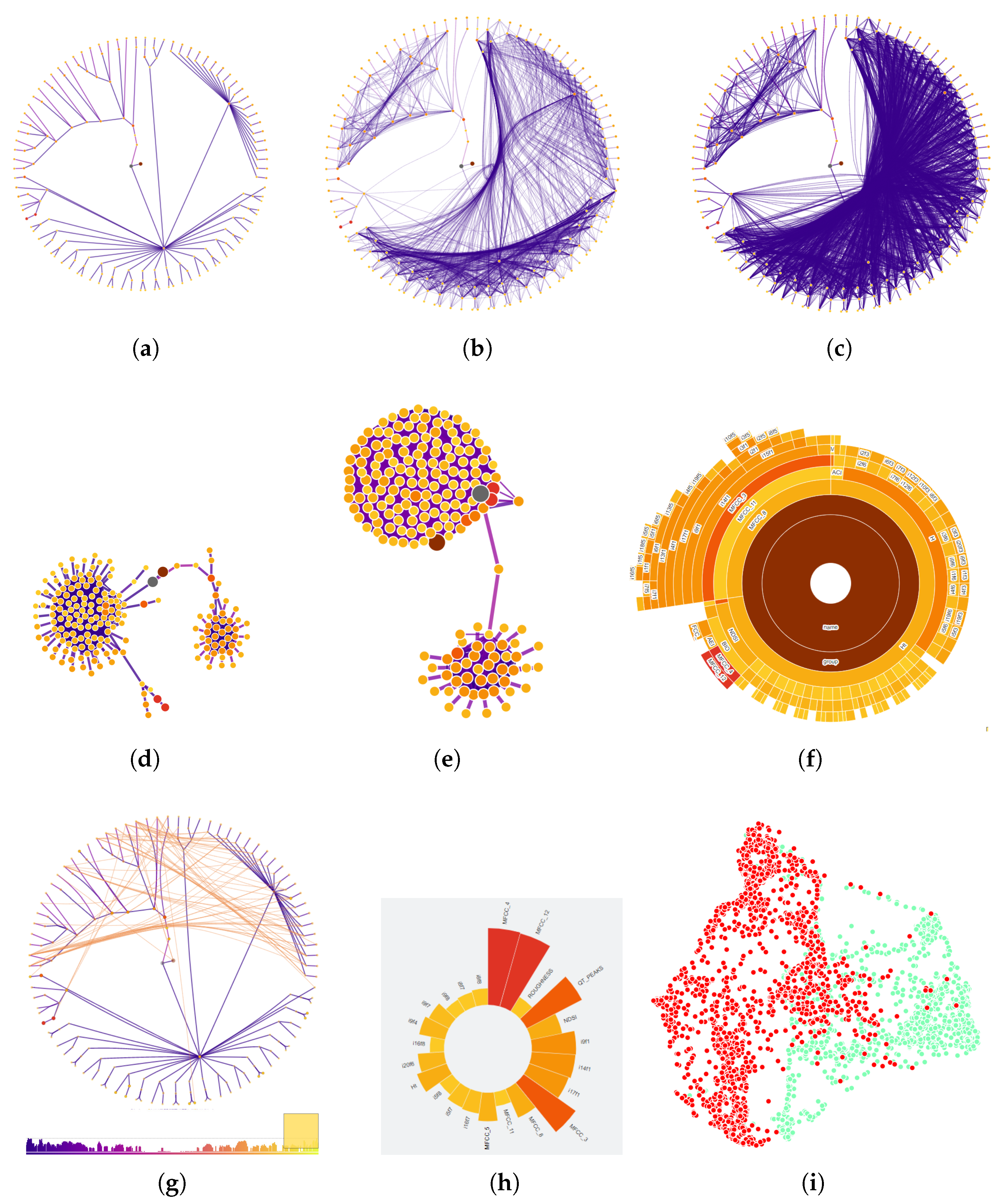
5.1.1. Exploring Features

Our first example is the News corpus (see Table 1), which is a set of documents each containing a reasonably short description of a news feed. The corpus was pre-processed by standard bag-of-words vector space modeling. Figure 3 presents the main elements of the visual feature analysis strategy. In Figure 3a we see the feature graph on the left, displaying 612 features as vertices. In the figure, the graph shows edges that represent the 3 % largest similarity, that is, the connection between the most similar features. The right window shows the data items themselves, by means of a multidimensional projection. In Figure 3a we chose the t-SNE projection with cosine similarity between documents. Individual items are colored by their topic. The projection is generated after the user chooses a set of features by interacting with the graph on the left.
Figure 3b shows the first selection of features on the left window, represented by a circular histogram. The larger the bar and the darker its color, the more correlated that attribute is with the target attribute (in this case, the attribute topic). At the right of Figure 3b is a Least Square Projection [48]. Both projections in Figure 3 were generated using only the selected attributes. Next we describe the process of investigating and selecting attributes using this type of graph display.

5.1.2. Identifying Groups of features

In the process of trying to find a useful set of features to describe a phenomenon, categorical data can guide understanding of what the data can tell. There are various analysis scenarios in multidimensional visualization. In many cases there is a target variable or feature, such as a class or an event that one wishes to predict. Frequently, in exploratory situations, there is more than one phenomenon represented in the data, which are described by different sets of features. For instance, in medical records, while the initial intention could be the detection of risk factors for a particular disease, it is possible that the data collection can lead to understanding other underlying conditions that are frequent in patients. Another scenario is that of collecting too much information because of the possibilities yielded by sensors, simulations and algorithms. This leads to redundancy, contradiction, and varied degrees of relevance among variables. In all of these scenarios one wishes to identify groups of features that are similar, either to simplify the representation discarding highly similar features or to identify different events in the same dataset.
Graph representations of features such as the one employed here can lend themselves to locating such groups of features and using that information to shape the data analysis.
We exemplify this argument by the case of a soundscape ecology, or soundscape for short, which are recordings taken in a certain landscape (most frequently partly or totally preserved) in order to understand that environment and its changes via audio. The applications vary largely, from trying to distinguish different habitats and diversities to locating warning signs of environmental changes, such as the decrease in the population of a particular species. From a recording, many features can be extracted using the original sound wave, an spectrogram or individual sound properties specific to the environment. For each different application, a distinct subset of those features may be ideal for representation. The analysis of a soundscape dataset is shown in Figure 4. That figure illustrates various steps of employing the feature graph and its supporting visualizations in the analysis of recordings collected from two distinct forest landscapes in Costa Rica. These landscapes, although different, are contiguous in territory, which makes them share at least part of the same sounds.
In Figure 4a, the minimum spanning tree for the feature graph is presented. Nodes with darker colors are features with highest relevance, calculated by the Pearson correlation against the target variable, which is the area (CostaRica1 and CostaRica2). The tree can be interpreted as having four or five different groups of branches. By adding more edges in progressive order of similarity to the graph visualization (Figure 4b) one already observes that three groups of nodes remain loosely connected. These can be interpreted as three groups of features that are highly similar among them. If the task is identifying different phenomena, one could start the analysis from the partition offered by this graph. When even more edges are added (Figure 4c) the three groups can still be identified although two of them are more connected now than in previous edge sets. Naturally all vertices will eventually be adjacent, since the underlying structure is a complete graph. However, the connection based on degree of similarity offers insight on the feature groups. Figure 4d,e are force-based drawings of the graph, showing that evolution. Figure 4d is the force-based drawing of the same graph as Figure 4b and Figure 4e has additional edges, identifying two remaining groups.
The initial task for this dataset is to distinguish the two areas. For that, we first selected the features that are mostly correlated with the target variable, avoiding very similar features, that is, features that are plotted together on the tree, since that is the case for features that are highly similar. The sunburst tree visualization of Figure 4f supports locating such features in case they are not clearly visible in the circular tree plot. After choosing the first group of features, we wanted to choose other features that distinguish themselves from the initial selection, this way capturing additional information that are not represented by the initial group. For that we employed a set of graphs similar to that in Figure 4g, where we added edges representing lower similarity between nodes. The histogram at the bottom of that picture is a histogram of edges in order of similarity value. By choosing edges on the right (orange and yellow colors) we are adding edges with lower degree of similarity. We have then chosen additional features that are dissimilar to the initial set of features and added them to the group, again avoiding too many features that are closely placed on the tree.
The final selection of features is shown in the circular histogram of Figure 4h. From those, the projection in Figure 4i was generated. It can be seen that, although this was the first pass at locating features that could distinguish the areas (green and red in the picture), a good degree of separation is already obtained from the strategy, employing 23 features out of 187. It is worth noting that the full set of features would not separate those areas as well, mostly because of contradiction of values regarding to segregation. Other tasks for this dataset, such as examining the effect of features in a subset and tagging particular events, were also performed using the tool. The results matched closely a previously developed study on the same data [51], with the advantage of obtaining the same level of segregation with fewer features in some cases.

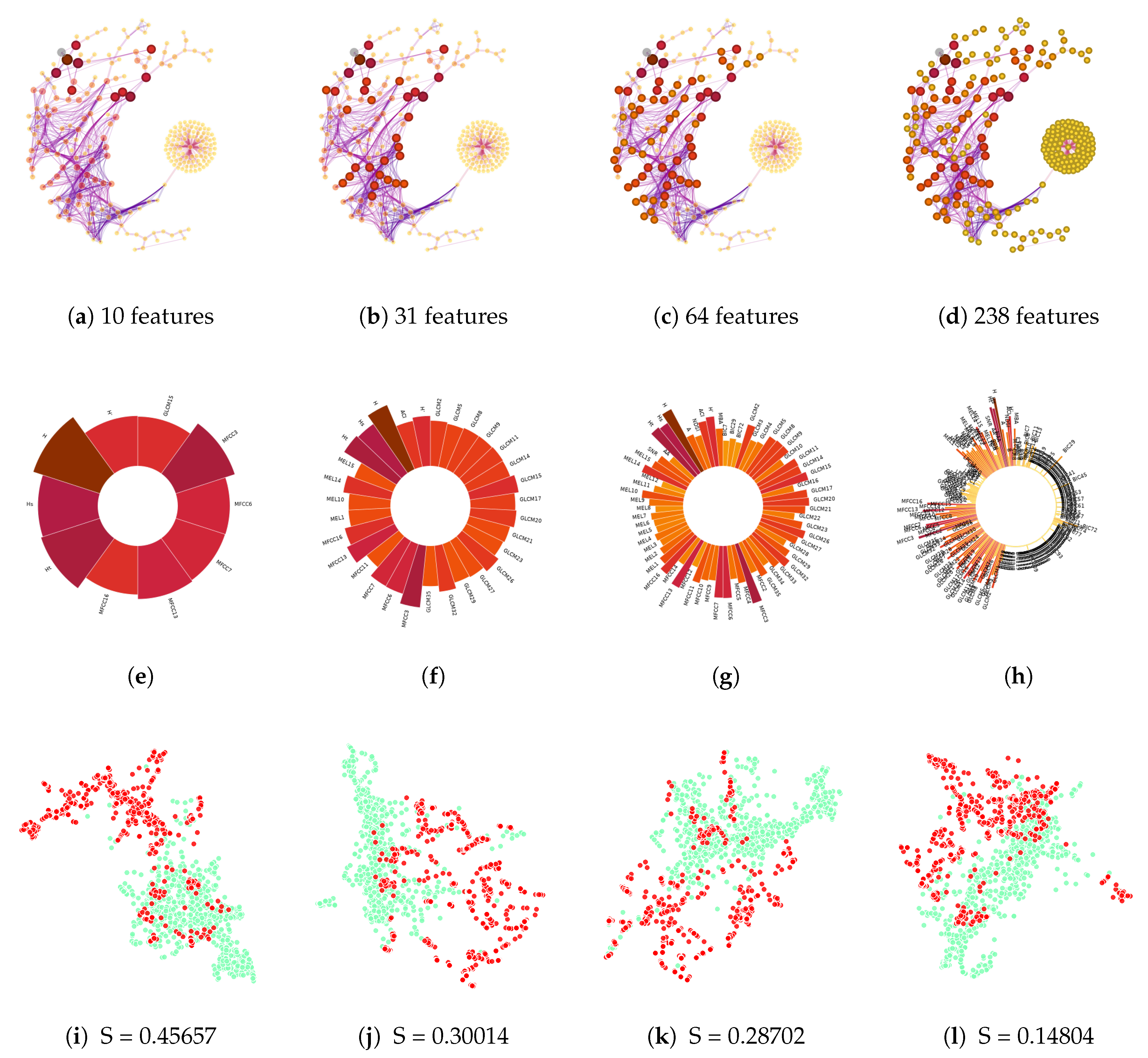
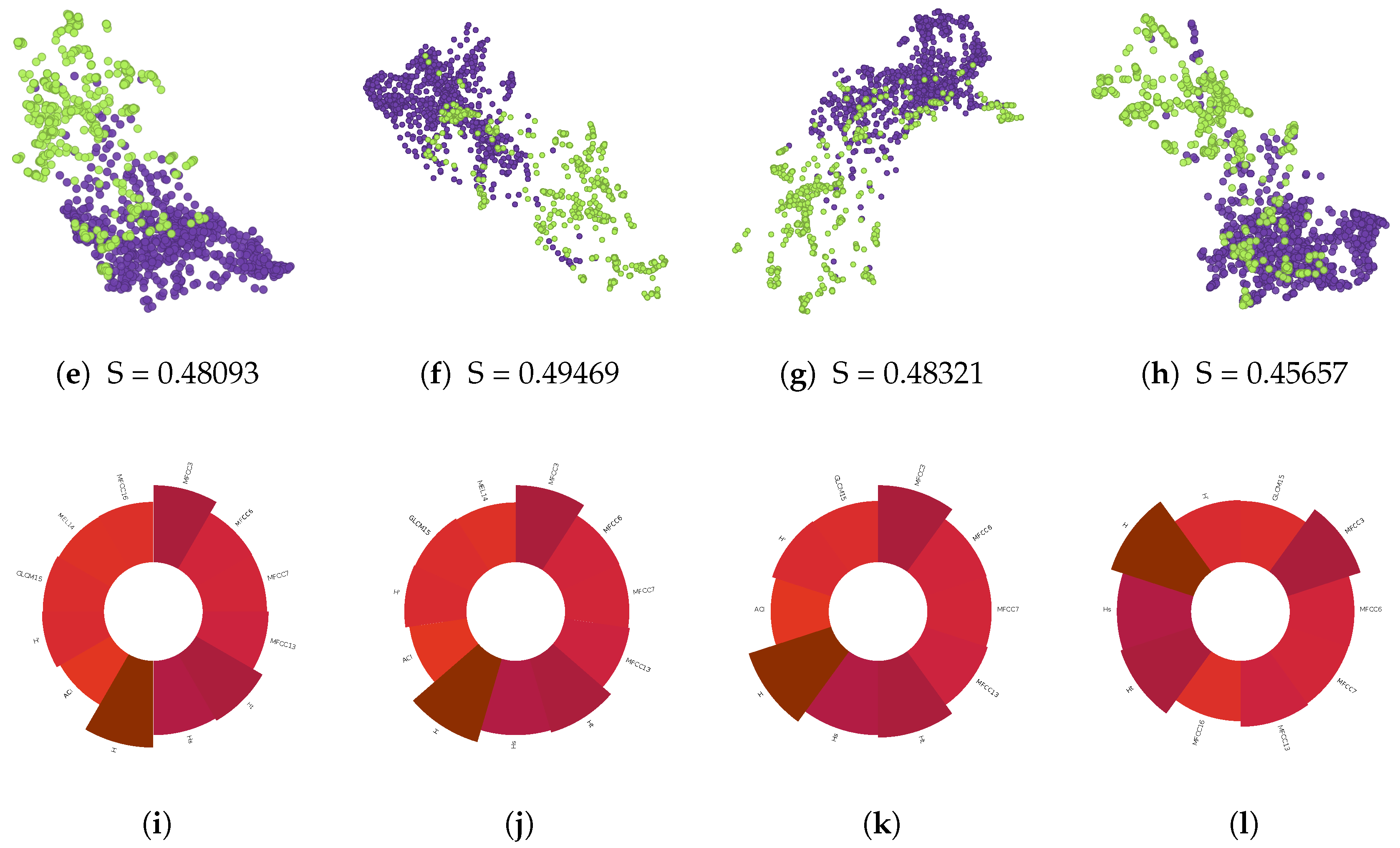
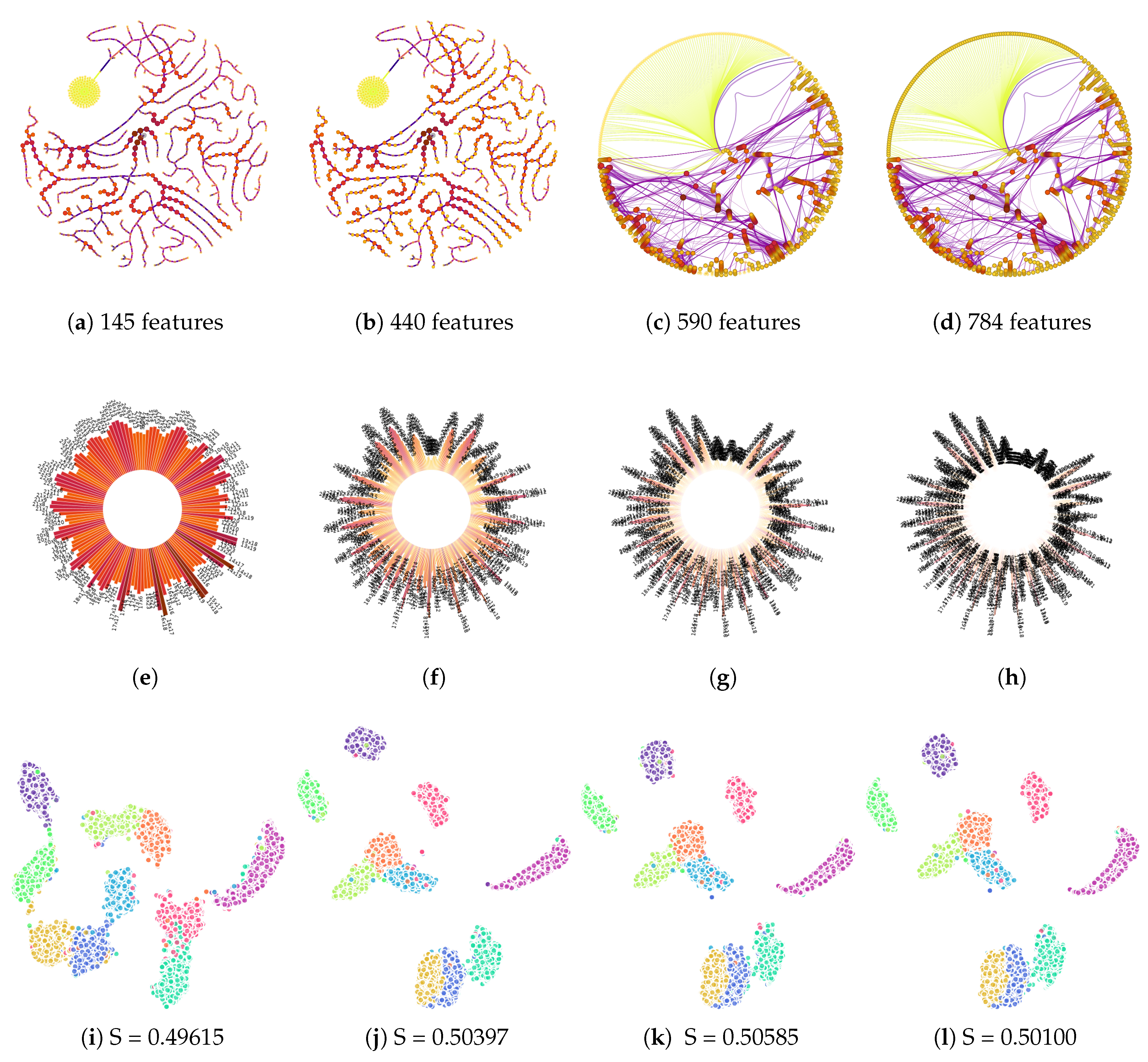
5.2. Selecting Features of Interest by Relevance

One of the most common tasks in feature selection is to define a small set of features that properly describes the data. That usually reflects in better segregation of labels when plotting projections of the data based on selected features, as exemplified above. In the following text we present three cases of feature selection for practical applications that are being highly benefited by this framework. They are meant to reflect the effectiveness of GFF for different sources of data and for different numbers of points and attributes.
Case 1: Feature selection to find discriminant features for soundscape ecology data.
We have analyzed several datasets from the soundscape ecology application for the purpose of finding relationship between extracted features and particular environmental descriptions. The soundscape recordings used in these tests are part of a long term ecological research project within the Cantareira–Mantiqueira corridor, a cooperation of natural parks in the State of São Paulo, Brazil. The audio data were recorded within 22 landscapes distributed in the region. The dataset has more than 40,000 sound files of one minute each. In the current case, a total of 1662 sound files were used. They were labeled by experts, who tagged 822 recordings for birds and 840 for insects. In a previous work [52], a method was developed to identify the most discriminant features for categorizing sound events in soundscapes. The goal for this dataset is to find features that are capable of distinguishing two categories of sound events (bird and insect) in the soundscape. A set of 238 features were extracted from the dataset, as Temporal Entropy (Ht), Spectral Entropy (Hs), Acoustic Entropy (H), Acoustic Complexity Index (ACI), Shannon Index (H’), Mel Frequency Cepstral Coefficients (MFCCs) and some of Gray level co-concurrence matrix (GLCM).
During the exploration of the feature set with the implemented framework, we have interacted with the structure and layout of the tree and graph and with the relevance bar. The relevance bar highlights features by correlation between them and the target label (Figure 5a–h). The combination these tools allowed us to discover some sets of highly discriminating features having 10 (Figure 5a) and 31 features (Figure 5b), evidencing a good degree of segregation between sounds of birds and insects. In the figures, larger vertices with a darker color indicate the most discriminating features. The images in Figure 5i–l show the LSP projections of the instances in the dataset under study for each selected feature set. We can see that the values of silhouette coefficient S decrease when less relevant features are added.
An exploratory analysis of the features allows us to gain knowledge of their behaviour in relation to the task, in this case segregation. The tree and graph layouts of the feature set afford interpretation of sets of features that may be important to the task at hand.
In Figure 5a–d, a distinguished group of features can be easily located in a clustered branch to the right of the layout. A closer inspection revealed non-informative and noisy attributes that ended up plotted together and that were eventually discarded from the dataset, thus reducing features from 238 to 141. A new cycle of analysis started with the graph in Figure 6a to which edges that indicate low similarity (yellow and orange edges) were added. Edge bundling suggests two distinct regions that could be used to select or de-select features from. In Figure 6b,c we have de-selected one feature in each graph layout. Figure 6d illustrates the selection of features through the relevance bar and their effects on the projection of the data instances as shown in Figure 6e–h. The projections created from the selected features are displayed in Figure 6i–l.
A different course of action was used in the analysis illustrated in Figure 7. The ranking bar was used to initially select 45 out of the 141 features in the data after filtering. Then we searched for highly connected vertices with high similarity. In this process, we de-selected some features manually and aggregated others, improving the projection (as measured by the silhouette coefficient.) The visual, finer inspection of feature relations represented by edges allows improving the selection of features beyond of what is possible using the automatic tools.
When selecting and de-selecting features, sometimes vertices in close visual proximity prevent a proper interpretation of size and color. The Sunburst visualization of the tree, such as presented in Figure 7b,f yields an easier interpretation of such ambiguities by showing more clearly the difference between features with basis on area and color properties of the nodes.
Case 2: Feature selection to find relevant features in and Image collection.
The Corel 1k dataset contains 1000 color images in 10 classes: people, beaches, buildings, buses, dinosaurs, elephants, flowers, horses, mountains, and foods. For this test case, 150 descriptors related to color and texture were used. Figure 8 shows the results obtained using our method. Minimum spanning trees of features are shown in Figure 8a–c, with an increasingly larger set of features selected automatically via the relevance bar. Figure 8d shows an MST with a set of features manually selected by interacting with the graph. Figure 8e–h show a radial display of the selected features. From each selection, a t-SNE projection of the data is shown in Figure 8i–l, together with their silhouette coefficients. Through interacting and visually exploring this dataset we were able to improve class separation through the successive, incremental selection of features using the relevance bar, as indicated by the silhouette coefficient. A manual refinement of the selection, guided by the inspection of graph edges included in the tree, resulted in an even better separation.
Case 3: Feature selection to find features of interest for the MNIST dataset.
The MNIST dataset (http://yann.lecun.com/exdb/mnist) has 10,000 images of handwritten decimal digits with 28x28 pixels. There are 784 features, as many as there are pixels in the images. By interacting with the rank of features bar, whose visual results are shown in trees in Figure 9a–d, we were able to discover a set of features that can generate similar or better discrimination of labels than the whole set of features. In addition, the topological structure of the graph positioned by the tree allows us to visualize a cluster with noisy features (seen as a yellow ‘blob’ in Figure 9a,b). These features can be easily selected out. This case illustrates that, for large datasets, this type of visual interaction facilitates visual identification of outlying groups of features.

6. Discussion

Since GFF uses trees and graphs for the analysis of features, the organization of relationships is structured by edges and vertices that can be dynamically exposed and filtered according to users’ interests. The focus on relationships, in general, can reveal observations not present in non-graph based approaches.
Let us illustrate how the focus on the relationship can be advantageous over approaches that do not make this type of analysis. A recent approach, called Attribute-RadViz [32], similarly to the strategy of GFF, constructs a mapping of features based on correlation estimates between features and data labels. Thus, the relationships among features are also indirectly exposed since similar features tend to correlate with the same labels. When comparing the two approaches, we see that Attribute-RadViz is useful for exploring features that describe the labels as well as in choosing subsets of potentially useful features to segregate particular labels, for instance, in a classification task. However, information about the structure of the attribute space is not clear, for instance, information regarding which features are strongly or weekly correlated, or even which features strongly correlate with the labels but are far from each other. Making that explicit by edges on a graph or branches on a tree allows direct examination of additional characteristics of features.
Figure 10 shows the representation of the same dataset (Corel) by the two approaches. While in Attribute-RadViz relationships are focused on the attribute relationship plus individual labels, in GFF relationships between features are emphasized and represented by edges; this facilitates the identification of strong as well as weak or distant relationships. Eventually, users are interested not in the near or similar features but in the distant or distinctive ones. For example, in situations where an attribute is chosen and, in an attempt to avoid redundancies, the user wants to choose another strong correlation (with the labels), but for a completely different feature; this type of investigation is allowed by the structure of the tree or graph.
Comparing both techniques further, we can also notice other characteristics of the tree-based layout. In Figure 10a, we recognize that features correlated with the labels “beaches” and “mountains” are relatively mixed. In contrast, the other labels are somewhat segregated, which may imply that these labels are strongly correlated. These situations should be preferably recognized by the users to allow them to make the necessary adjustments to the model. When testing this dataset on a linear SVM with a training and test partition of 0.3 and then checking the classification details in a confusion matrix, the highest rate of miss-classification is precisely between the labels “beaches” and “mountains”. This is also additional evidence, as previously mentioned in the introduction and supported elsewhere, that multidimensional projections offer evidence as to potential quality of additional mining and machine learning algorithms [35]. Naturally, further interaction with the representation can lead to finding additional features to improve the pictures model.
Other works also apply graphs to expose features relationships for different purposes. Zhang et al. [42] use graphs to build a perspective of the correlations of features in unsupervised data. One of its purposes is to find an order of relevant dimensions that can allow the data to be better visualized in order-sensitive visualizations, such as parallel coordinates or radial techniques like RadViz. In contrast our work attempts to expose the correlations of features from the perspective of a target categorical attribute or label, which generally holds essential information about the dataset. Wang et al. [41] generates a graph to allow visualization of information transfer between features in time-varying datasets; in their framework, users can observe the estimated amount of information transfer in a user-chosen time step. Our work does not intend to analyze time-varying data; we create graphs from the target feature’s perspective since it encodes relevant information about the data. Similar to our work, Biswas et al. [43] apply graphs where nodes and edges represent features and relationships, respectively. However, the metrics and objectives are different. In their work, the graph’s relationships represent mutual information, and the main objective of the graph is to identify clusters of features for the user to choose features within these subgroups. Our work attempts to visually expose the predictive power of features in relation to the target as well as in relation to one another; for this purpose, we use Pearson’s correlation or similarity functions to build the graph’s relationships.

7. Conclusions

We have demonstrated that the Graphs from Features (GFF) approach supports feature analysis and understanding as well as fast user-centered feature selection for targeted tasks such as segregation. Finding relevant features, similar and opposing features, subsets of representative features, relationships between different features or groups of features (predicted or unexpected) and feature clusters are all tasks supported by the approach and corresponding system prototype. Additional visualizations and visual analysis tools, such as the edge histogram, the circular feature histogram and the sunburst view of the feature tree all play a central role in adding flexible functionality and in confirming selections and interpretations.
Node placement started by circular display of tree layouts has the additional advantage of distributing nodes by similarity, allowing progressive additions of graph edges to support similarity based visual clustering of features.
Besides supporting the types of tasks illustrated by our cases in this paper, in principle the approach would be valuable to provide support to the data cleaning step in data science approaches in general, by allowing to identify features that do not carry relevance in regards to a target category or that present unusual visual configuration, and can thus be eliminated from the dataset.
The visualization of data items using multidimensional projections to understand the effect of subsets of selected features is also essential to support user choices and to allow the whole process to iterate until an adequate group of features is found.
We believe the set of basic features and properties offered by this framework can be used in an extensive number of applications. The approach has been successfully applied for feature sets and datasets of different sizes and of different natures (sound, image, text).
As short term future work it is our intent to customize the tool to support partners in application areas. One of these application partners has already been briefed on the tool and is eager to employ that for his teams’ analyses. Further functionality is planned to make the approach more usable, such as the implementation of visual clues for relationships between points and features (such as that illustrated in Figure 10) and better interaction with the projections to support the analysis of groups formed there.
The current prototype, used here for the case studies, is fully functional and will be made freely available, along with some of the data employed in our use cases.

Author Contributions

Conceptualization: R.M. and I.V.B.; all authors participated in regular meetings during the project and contributed to ideas to shape the concepts and complement their the execution. Implementation: L.H. and I.V.B. Contextualization and verification: G.P.T. and E.A. Testing and Use Case Scenarios: All authors. Writing: all authors. Revision: G.P.T. and R.M. All authors have read and agreed to the published version of the manuscript.

Funding

RM was partly funded by Conselho Nacional de Desenvolvimento Científico e Tecnológico grant number 307411/2016-8; LH was financed in part by the Coordenação de Aperfeiçoamento de Pessoal de Nível Superior - Brasil (CAPES) - Finance Code 001; GPT was partly funded by Conselho Nacional de Desenvolvimento Científico e Tecnológico grant number 310299/2018-7; IVB was financed in part by the Coordenação de Aperfeiçoamento de Pessoal de Nível Superior - Brasil (CAPES) - Finance Code 001.

Acknowledgments

We would like to sincerely thank Brian Pjanowsky for the Costa Rica sounds and Fabio Felix Dias for the data extraction on that dataset. We also thank Milton Ribeiro at LEEC, UNESP, for the collaboration on the Cantareira–Mantiqueira project and data collection.

Conflicts of Interest

The authors declare no conflict of interest.

References

  1. Chen, J.; Chen, Y.; Du, X.; Li, C.; Lu, J.; Zhao, S.; Zhou, X. Big Data Challenge: A Data Management Perspective. Front. Comput. Sci. 2013, 7, 157–164. [Google Scholar] [CrossRef]
  2. Liu, H.; Motoda, H. Computational Methods of Feature Selection (Chapman & Hall/Crc Data Mining and Knowledge Discovery Series); Chapman & Hall/CRC: London, UK, 2007. [Google Scholar]
  3. Guyon, I.; Gunn, S.; Nikravesh, M.; Zadeh, L.A. Feature Extraction: Foundations and Applications; Springer: New York, NY, USA, 2008; Volume 207. [Google Scholar]
  4. Narendra, P.M.; Fukunaga, K. A Branch and Bound Algorithm for Feature Subset Selection. IEEE Trans. Comput. 1977, C-26, 917–922. [Google Scholar] [CrossRef]
  5. Pudil, P.; Novovičová, J.; Kittler, J. Floating search methods in feature selection. Pattern Recognit. Lett. 1994, 15, 1119–1125. [Google Scholar] [CrossRef]
  6. Bermejo, P.; Gámez, J.A.; Puerta, J.M. A GRASP algorithm for fast hybrid (filter-wrapper) feature subset selection in high-dimensional datasets. Pattern Recognit. Lett. 2011, 32, 701–711. [Google Scholar] [CrossRef]
  7. Siedlecki, W.; Sklansky, J. A note on genetic algorithms for large-scale feature selection. Pattern Recognit. Lett. 1989, 10, 335–347. [Google Scholar] [CrossRef]
  8. Vafaie, H.; Jong, K.D. Genetic algorithms as a tool for feature selection in machine learning. In Proceedings of the Fourth International Conference on Tools with Artificial Intelligence, Arlington, VA, USA, 10–13 November 1992; pp. 200–203. [Google Scholar]
  9. Yang, C.; Chuang, L.; Chen, Y.; Yang, C. Feature Selection Using Memetic Algorithms. In Proceedings of the Third Int. Conf. on Convergence and Hybrid Information Technology, Busan, Korea, 11–13 November 2008; Volume 1, pp. 416–423. [Google Scholar]
  10. Keim, D.A.; Mansmann, F.; Thomas, J. Visual Analytics: How Much Visualization and How Much Analytics? SIGKDD Explor. Newsl. 2010, 11, 5–8. [Google Scholar] [CrossRef]
  11. Korzhik, V.P.; Mohar, B. Minimal Obstructions for 1-Immersions and Hardness of 1-Planarity Testing. J. Graph Theory 2013, 72, 30–71. [Google Scholar] [CrossRef] [Green Version]
  12. Paiva, J.G.; Florian, L.; Pedrini, H.; Telles, G.; Minghim, R. Improved Similarity Trees and their Application to Visual Data Classification. IEEE Trans. Vis. Comput. Graph. 2011, 17, 2459–2468. [Google Scholar] [CrossRef]
  13. Sebban, M.; Nock, R. A hybrid filter/wrapper approach of feature selection using information theory. Pattern Recognit. 2002, 35, 835–846. [Google Scholar] [CrossRef]
  14. Wilson, D.R.; Martinez, T.R. Improved Heterogeneous Distance Functions. J. Artif. Intell. Res. 1997, 6, 1–34. [Google Scholar] [CrossRef]
  15. Hero, A.O.; Ma, B.; Michel, O.J.J.; Gorman, J. Applications of entropic spanning graphs. IEEE Signal Process. Mag. 2002, 19, 85–95. [Google Scholar] [CrossRef]
  16. Bonev, B.; Escolano, F.; Cazorla, M. Feature selection, mutual information, and the classification of high-dimensional patterns. Pattern Anal. Appl. Vol. 2008, 11, 309–319. [Google Scholar] [CrossRef]
  17. Zhong, E.; Xie, S.; Fan, W.; Ren, J.; Peng, J.; Zhang, K. Graph-Based Iterative Hybrid Feature Selection. In Proceedings of the IEEE International Conference on Data Mining, Pisa, Italy, 15–19 December 2008; IEEE Computer Society: Piscataway, NJ, USA, 2008; pp. 1133–1138. [Google Scholar]
  18. Berretta, R.; Costa, W.; Moscato, P. Combinatorial Optimization Models for Finding Genetic Signatures from Gene Expression Datasets. In Bioinformatics: Structure, Function and Applications; Humana Press: Totowa, NJ, USA, 2008; pp. 363–377. [Google Scholar]
  19. Lastra, G.; Luaces, O.; Quevedo, J.R.; Bahamonde, A. Graphical Feature Selection for Multilabel Classification Tasks. In Proceedings International Symposium of Advances in Intelligent Data Analysis; Springer: New York, NY, USA, 2011; Volume 7014, pp. 246–257. [Google Scholar]
  20. Zhang, Z.; Hancock, E.R. A Graph-Based Approach to Feature Selection. In Proceedings of the International Workshop on Graph-Based Representations in Pattern Recognition; Jiang, X., Ferrer, M., Torsello, A., Eds.; Springer: New York, NY, USA, 2011; Volume 6658, pp. 205–214. [Google Scholar]
  21. Pavan, M.; Pelillo, M. Dominant Sets and Pairwise Clustering. IEEE Trans. Pattern Anal. Mach. Intell. 2007, 29, 167–172. [Google Scholar] [CrossRef] [PubMed]
  22. Zhang, Z.; Hancock, E.R. Hypergraph based information-theoretic feature selection. Pattern Recognit. Lett. 2012, 33, 1991–1999. [Google Scholar] [CrossRef]
  23. Mandal, M.; Mukhopadhyay, A. Unsupervised Non-redundant Feature Selection: A Graph-Theoretic Approach. In Proceedings of the International Conference on Frontiers of Intelligent Computing: Theory and Applications; Springer: New York, NY, USA, 2013; pp. 373–380. [Google Scholar]
  24. Zhao, Z.; He, X.; Cai, D.; Zhang, L.; Ng, W.; Zhuang, Y. Graph Regularized Feature Selection with Data Reconstruction. IEEE Trans. Knowl. Data Eng. 2016, 28, 689–700. [Google Scholar] [CrossRef]
  25. Das, A.; Kumar, S.; Jain, S. An information-theoretic graph-based approach for feature selection. Sadhana 2020, 45, 11. [Google Scholar] [CrossRef]
  26. Roffo, G.; Melzi, S.; Castellani, U.; Vinciarelli, A.; Cristani, M. Infinite Feature Selection: A Graph-based Feature Filtering Approach. IEEE Trans. Pattern Anal. Mach. Intell. 2020, 1. [Google Scholar] [CrossRef]
  27. Krause, J.; Perer, A.; Bertini, E. INFUSE: Interactive Feature Selection for Predictive Modeling of High Dimensional Data. IEEE Trans. Vis. Comput. Graph. 2014, 20, 1614–1623. [Google Scholar] [CrossRef]
  28. Bernard, J.; Steiger, M.; Widmer, S.; Lücke-Tieke, H.; May, T.; Kohlhammer, J. Visual-interactive Exploration of Interesting Multivariate Relations in Mixed Research Data Sets. Comput. Graph. Forum 2014, 33, 291–300. [Google Scholar] [CrossRef]
  29. May, T.; Bannach, A.; Davey, J.; Ruppert, T.; Kohlhammer, J. Guiding feature subset selection with an interactive visualization. In Proceedings of the 2011 IEEE Conference on Visual Analytics Science and Technology (VAST), Providence, RI, USA, 23–28 October 2011; pp. 111–120. [Google Scholar]
  30. Wang, Y.; Li, J.; Nie, F.; Theisel, H.; Gong, M.; Lehmann, D.J. Linear Discriminative Star Coordinates for Exploring Class and Cluster Separation of High Dimensional Data. Comput. Graph. Forum 2017, 36, 401–410. [Google Scholar] [CrossRef]
  31. Sanchez, A.; Soguero-Ruiz, C.; Mora-Jiménez, I.; Rivas-Flores, F.; Lehmann, D.; Rubio-Sánchez, M. Scaled radial axes for interactive visual feature selection: A case study for analyzing chronic conditions. Expert Syst. Appl. 2018, 100, 182–196. [Google Scholar] [CrossRef]
  32. Artur, E.; Minghim, R. A novel visual approach for enhanced attribute analysis and selection. Comput. Graph. 2019, 84, 160–172. [Google Scholar] [CrossRef]
  33. Turkay, C.; Filzmoser, P.; Hauser, H. Brushing Dimensions—A Dual Visual Analysis Model for High-Dimensional Data. IEEE Trans. Vis. Comput. Graph. 2011, 17, 2591–2599. [Google Scholar] [CrossRef] [PubMed]
  34. Yuan, X.; Ren, D.; Wang, Z.; Guo, C. Dimension Projection Matrix/Tree: Interactive Subspace Visual Exploration and Analysis of High Dimensional Data. IEEE Trans. Vis. Comput. Graph. 2013, 19, 2625–2633. [Google Scholar] [CrossRef] [PubMed]
  35. Rauber, P.E.; Falcao, A.X.; Telea, A.C. Projections as Visual Aids for Classification System Design. Inf. Vis. 2017, 17, 282–305. [Google Scholar] [CrossRef]
  36. Mühlbacher, T.; Piringer, H. A Partition-Based Framework for Building and Validating Regression Models. IEEE Trans. Vis. Comput. Graph. 2013, 19, 1962–1971. [Google Scholar] [CrossRef]
  37. Klemm, P.; Lawonn, K.; Glaßer, S.; Niemann, U.; Hegenscheid, K.; Völzke, H.; Preim, B. 3D Regression Heat Map Analysis of Population Study Data. IEEE Trans. Vis. Comput. Graph. 2016, 22, 81–90. [Google Scholar] [CrossRef]
  38. Zhang, C.; Yang, J.; Zhan, F.B.; Gong, X.; Brender, J.D.; Langlois, P.H.; Barlowe, S.; Zhao, Y. A visual analytics approach to high-dimensional logistic regression modeling and its application to an environmental health study. In Proceedings of the 2016 IEEE Pacific Visualization Symposium (PacificVis), Taipei, Taiwan, 19–22 April 2016; pp. 136–143. [Google Scholar]
  39. Dingen, D.; van’t Veer, M.; Houthuizen, P.; Mestrom, E.H.J.; Korsten, E.H.H.M.; Bouwman, A.R.A.; van Wijk, J. RegressionExplorer: Interactive Exploration of Logistic Regression Models with Subgroup Analysis. IEEE Trans. Vis. Comput. Graph. 2019, 25, 246–255. [Google Scholar] [CrossRef]
  40. Nobre, C.; Streit, M.; Meyer, M.; Lex, A. The State of the Art in Visualizing Multivariate Networks. Comput. Graph. Forum (EuroVis) 2019, 38, 807–832. [Google Scholar] [CrossRef]
  41. Wang, C.; Yu, H.; Grout, R.W.; Ma, K.; Chen, J.H. Analyzing information transfer in time-varying multivariate data. In Proceedings of the 2011 IEEE Pacific Visualization Symposium, Hong Kong, China, 1–4 March 2011; pp. 99–106. [Google Scholar]
  42. Zhang, Z.; McDonnell, K.T.; Mueller, K. A network-based interface for the exploration of high-dimensional data spaces. In Proceedings of the 2012 IEEE Pacific Visualization Symposium, Songdo, Korea, 28 February–2 March 2012; pp. 17–24. [Google Scholar]
  43. Biswas, A.; Dutta, S.; Shen, H.; Woodring, J. An Information-Aware Framework for Exploring Multivariate Data Sets. IEEE Trans. Vis. Comput. Graph. 2013, 19, 2683–2692. [Google Scholar] [CrossRef]
  44. Geurts, P.; Ernst, D.; Wehenkel, L. Extremely Randomized Trees. Mach. Learn. 2006, 36, 3–42. [Google Scholar] [CrossRef] [Green Version]
  45. Cuadros, A.M.; Paulovich, F.V.; Minghim, R.; Telles, G.P. Point placement by phylogenetic trees and its application to visual analysis of document collections. In Proceedings of the IEEE Symposium on Visual Analytics Science and Technology, Sacramento, CA, USA, 30 October–1 November 2007; pp. 99–106. [Google Scholar]
  46. Saitou, N.; Nei, M. The neighbor-joining method: A new method for reconstructing phylogenetic trees. Mol. Biol. Evol. 1987, 4, 406–425. [Google Scholar] [PubMed]
  47. Van der Maaten, L.; Hinton, G. Visualizing High-Dimensional Data Using t-SNE. J. Mach. Learn. Res. 2008, 9, 2579–2605. [Google Scholar]
  48. Paulovich, F.V.; Nonato, L.G.; Minghim, R.; Levkowitz, H. Least Square Projection: A Fast High-Precision Multidimensional Projection Technique and Its Application to Document Mapping. IEEE Trans. Vis. Comput. Graph. 2008, 14, 564–575. [Google Scholar] [CrossRef] [PubMed]
  49. McInnes, L.; Healy, J.; Melville, J. UMAP: Uniform Manifold Approximation and Projection for Dimension Reduction. Available online: https://arxiv.org/abs/1802.03426 (accessed on 16 November 2020).
  50. Rousseeuw, P.J. Silhouettes: A graphical aid to the interpretation and validation of cluster analysis. J. Comput. Appl. Math. 1987, 20, 53–65. [Google Scholar] [CrossRef] [Green Version]
  51. Dias, F.F.; Pedrini, H.; Minghim, R. Soundscape segregation based on visual analysis and discriminating features. Ecol. Inform. 2020, 101184. [Google Scholar]
  52. Hilasaca, L.M.H. Visual Active Learning para Rotulagem por Características Discriminantes em Paisagens Acústicas. Master’s Thesis, Instituto de Ciências Matemáticas e de Computação, Universidade de São Paulo, São Carlos, Brazil, 9 July 2020. [Google Scholar]
Figure 1. Analysis pipeline of Graphs from Features (GFF). From a dataset X with n data instances having d features each, (a) a proximity measure between pairs of features is evaluated, and (b) a complete graph is created where vertices represent features and edges represent dissimilarity between features. (c) A tree is constructed to summarize the information in the complete graph. (d) Visualization and interaction tools that combine information from the tree and from the underlying graph may be used by the user to search for patterns among the features and to select the most discriminating features. (e) Data instances may be projected based on the features selected by the user during the interaction.
Algorithms 13 00302 g001
Figure 2. GFF main window and its two panels. The left panel (a) exhibits a minimum spanning tree for a dataset with 129 features. At the top the display construction parameters may be selected. The bar at the left enables selecting features by relevance. The slider at the bottom controls the inclusion of graph edges by increasing weight. Above the slider, the edge histogram allows a finer inclusion of graph edges by weight. The right buttons control force-directed placement, filtering, node transparency and visualization of selected features, among other features. The right panel (b) shows a projection of all data instances by using the selected features, with tool controls to the right.
Algorithms 13 00302 g002
Figure 3. News data. (a) A graph from features (left) connecting the top 3 % similarities between 612 features. A t-SNE projection (right) was generated with 101 features selected from the graph. (b) A circular histogram showing the features selected from the graph (left) and an LSP projection from the same set of features (right).
Algorithms 13 00302 g003
Figure 4. Soundscape data from two forest areas in Costa Rica. (a) Initial similarity minimum spanning tree (MST). (b) Added edges in increasing order of similarity between nodes (features). (c) Further edges added to (b). Three groups of features can still be observed. (d) Force-based layout identifying three main groups of features. (e) With further edge addition still two separate groups of features remain. (f) Same tree from (a) presented as sunburst. (g) Addition of low similarity edges employing the edge histogram. (h) Preliminary feature selection from (a,f,g). (i) Resulting visualization of soundscapes after a projection with the selected features.
Algorithms 13 00302 g004
Figure 5. Soundscape ecology data for bird and insect classes, initially with 238 features. (ad) Similarity MSTs displaying an increasingly larger set of features selected by ranked relevance (Pearson correlation), with high similarity graph edges. (eh) Circular histograms of the selected features. (il) LSP projections (cosine dissimilarity) of the 1662 data points from the space of selected features on 2D and silhouette values. In the figure, a graph is related to the projection and to the circular histogram in the same column.
Algorithms 13 00302 g005
Figure 6. Soundscape ecology data of bird and insect classes with 141 features. (a,d) Similarity MSTs with automatically selected features and graph edges with low similarity. (b,c) MSTs with manually de-selected features and graph edges with low similarity. (eh) LSP projection of 1662 data points from the space of selected features on 2D and silhouette coefficients. (il) Circular histogram visualization of the selected features.
Algorithms 13 00302 g006aAlgorithms 13 00302 g006b
Figure 7. Soundscape ecology data with 141 features from bird and insect classes. (a) MST with additional graph edges highlighting 45 features selected automatically by ranked relevance and (b) Sunburst visualization of the features. (c) Circular histogram of the selected features. (d) The LSP projection of the 1662 data points from the space of selected features on 2D and its silhouette coefficient. (eh) The same types of layouts for 45 features selected by a combination of calculated rank and interaction.
Algorithms 13 00302 g007
Figure 8. Corel 1k dataset with 10 classes. (ac) Minimum spanning trees with with an increasingly larger set of features selected by ranked relevance. (d) Minimum spanning tree with manually selected features, based on the information provided by graph edges and neighborhoods. (eh) Radial histograms of the selected features. (il) t-SNE projection for the 1000 data instances subject to the selected features space, and silhouette values.
Algorithms 13 00302 g008
Figure 9. MNIST dataset with 10 classes (digits). (a,b) MST layouts by force-based placement, highlighting an increasingly larger set of features selected by ranked correlation. (c,d) Graph layouts with placement by circular tree layout from a minimum spanning tree, highlighting an increasingly larger set of features selected by ranked correlation. (eh) Circular histogram of the selected features. (il) UMAP projection of the 10,000 data points generated from the space formed by selected features, with corresponding silhouette values.
Algorithms 13 00302 g009
Figure 10. Comparison between GFF (a) and Attribute-RadViz (b) under the same color encoding (each attribute assumes the color of the strongest correlation per label). While Attribute-RadViz highlights the relationships between features and data labels, in GFF the final tree displays the relationship among the features themselves.
Algorithms 13 00302 g010
Table 1. Datasets used in the exploration of feature sets on graphs and trees.
TitleDescriptionData ItemsFeaturesData Labels
Newssnipets of news3816127
Corel 1kimages descriptors100015010
Cantareirasoundscape descriptors16622382
CostaRicasoundscape descriptors30611872
Mnistdigits pixels intensity descriptors10,00078410
Publisher’s Note: MDPI stays neutral with regard to jurisdictional claims in published maps and institutional affiliations.

