Article

The Use of Principal Component Analysis (PCA) in Building Yield Curve Scenarios and Identifying Relative-Value Trading Opportunities on the Romanian Government Bond Market

Doctoral School of Finance and Banking, University of Economic Studies, 010961 Bucharest, Romania
J. Risk Financial Manag. 2022, 15(6), 247; https://doi.org/10.3390/jrfm15060247
Submission received: 2 May 2022 / Revised: 23 May 2022 / Accepted: 26 May 2022 / Published: 31 May 2022
(This article belongs to the Special Issue Fixed Income Market)

Abstract

:
Based on previous research addressing the use of principal component analysis (PCA) in modeling the dynamics of sovereign yield curves, in this paper, we investigate certain characteristics of the Romanian government bond market. We perform PCA on data between March 2019 and March 2022, with emphasis on periods marked by extreme market stress, such as the outbreak of the COVID-19 pandemic in March 2020 or the Russian military invasion in Ukraine in February 2022. We find that on 25 March 2022, the first principal component explained 80.83% of the yield curve changes, the first two 91.92%, and the first three 96.87%, consistent with previous results from the literature, which state that the first three PCs generally explain around 95% of the variability in the term structure. In addition, we observe that principal components’ coefficients (factor loadings) at 2 years were lower than those at 10 years, suggesting that in case of market sell-offs, yields at 10 years increase more than those at 2 years, leading to yield curve steepenings. Interestingly, we observe that the explanatory power of the first PC increases significantly following extreme market events, when interest rates’ movements tend to become more synchronized, leading to higher correlations between tenors. We also employ PCA to check for relative-value (RV) trading signals and to assess the historical plausibility of yield curve shocks. We found that while both explanatory power and shape plausibility were characteristics of the yield curve dynamics during the outbreak of the COVID-19 pandemic, the magnitude of the market movement registered in mid-March 2020 was unlikely from a historical perspective. Finally, we use a forecasting model to derive the entire structure of the Romanian yield curve while also incorporating the trader’s view on a few benchmark yields.

1. Introduction

Principal component analysis (PCA) is a widely known statistical tool used to describe, investigate, model, and explain complex multivariate real-life structures in a parsimonious way, while also solving for the correlation problem. Principal components are by construction uncorrelated composite variables, as they are obtained from the original interdependent variables via an orthogonalization transformation.
While PCA has been extensively used for decades in various fields, such as natural sciences or geology, in finance, it was employed in the 1980s, first, in equity markets and afterwards in fixed income markets, and it has become of interest to academics and practitioners ever since (Golub and Tilman 2000, p. 93). However, due to the less intuitive nature of principal components in direct market movements, for many years, they have been of relatively limited usage in trading and portfolio management.1 Eventually, PCA has gained terrain so that, nowadays, large financial institutions, such as J.P. Morgan (Yau 2012) or Credit Suisse, use this tool to perform portfolio risk management and develop trading strategies that are PCA duration adjusted (Credit Suisse Securities Research and Analytics 2012).
In fixed income finance, principal components (PCs) are primarily used to reduce the dimensions of the risk factor spectrum for those instruments that are interest rate sensitive and for options portfolios (Alexander 2008). Actually, principal components can be attributed a very intuitive interpretation, as they depict the most characteristic yield curve shocks. Research in the field has revealed that the first three principal components can be interpreted as the level, steepness, and curvature of the yield curve and, generally, explain between 90% and 95% of returns on fixed income instruments.
In this paper, we analyzed how the PCA method succeeds in describing the dynamics of the Romanian sovereign yield curve at different points in time, especially in the proximity of major events, such as the outbreak of the COVID-19 pandemic or the military escalation of the Russian–Ukrainian conflict. We find that on 25 March 2022, the first principal component explained 80.83% of the yield curve changes, the first two 91.92%, and the first three 96.87%, results that are consistent with previous works from the literature.
Moreover, we observed that the explanatory power of the first principal component (the yield curve variance explained by the first PC) increases significantly following extreme market events. For example, on 28 February 2020, the first principal component explained only 70.52% of the yield curve variability, the first two principal components 90.35%, and the first three 95.71%. The explanatory power of PCs increased in the following weeks, such that on 20 March 2020,2 the first PC explained 91.51%, the first two 98.87%, and the first three 99.62%. These findings are consistent with those of Golub and Tilman (2000), in the sense that interest rate movements tend to become more synchronized in a severely distressed market environment, leading to higher correlations between maturities. As such, while the correlation coefficient between the 2-year and the 10-year yields was 0.51 on 28 February 2020, within less than a month, it reached 0.82.
Additionally, we observed that factor loadings corresponding to the 2-year maturity are lower than those corresponding to the 10-year maturity, suggesting that in the case of market sell-offs, yields at 10 years will increase more than those at 2 years, leading to a steepening of the yield curve. Similarly, in situations of market rallies, long-term interest rates will decrease less than short-term ones, resulting in a flattening pattern. When counting the actual patterns observed in the market, we found that, indeed, bull flattening and bear steepening patterns appeared to have dominated the period analyzed, between March 2019 and March 2022.
Finally yet importantly, we deployed PCA to highlight situations where segments of the yield curve were too rich or too cheap, and thus identified some real relative-value (RV) trading opportunities. Additionally, we performed an assessment of the historical plausibility of extreme market movements while providing actual scenario likelihoods.

2. Literature Review

Good estimates of the term structure of interest rates are of extreme importance to policymakers, investors, and basically any entity dealing with interest rate exposures. Among the first estimation methods was the smoothed bootstrap, introduced by Bliss and Fama (1987), in which discreet spot rates are derived from market data via a bootstrapping process, and afterwards, a smooth and continuous curve is fitted to the data. Although several curve fitting spline methods3 have been developed, they encountered a range of critics due to their undesirable economic properties and lack of intuitive interpretation (also considered “black box” models).
The one factor model deployed by Vasicek (1977) is one of the most pioneering and notable equilibrium models, where the instantaneous short-term interest rate follows a mean-reverting process. However, the Vasicek model was considered flawed because it allowed the short term to become negative, which was not consistent with global yields at that time. As a response, Cox et al. (1985) modelled the short-term rate such that the square root of the interest rate level was proportional to the standard deviation of changes in the interest rate. The main drawback of these term structure models is that even though they allow for desirable data manipulation, they tend to be inconsistent with actually observed market yields (Kumar 2019).
On the other hand, arbitrage-free models are calibrated with market data, such that provided values of the short-term yields are consistent with the current market rates. In this scope, Hull and White (1990) extended the Vasicek model to allow for a time-varying drift in the short rate. Eventually, the work of Heath et al. (1992) focuses on the evolution of forward rates.
Piazessi et al. (2019) uses “affine” models to explain changes in the term structure. The main advantage of these models lies in their functional-form assumptions regarding the yield curve (Piazessi 2010), resulting in tractable pricing formulas, and thus avoiding the computational burden implied by Monte Carlo methods.
While the aforementioned models are theorized on the “equilibrium” and “arbitrage-free” assumptions, another class of models develops parametric curves that are flexible enough to explain a wide variety of observed term structure shapes.
Such models are the ones developed by Nelson and Siegel (1987) and Svensson (1994, 1996). The NS model is being extensively used by both theoreticians and practitioners in central banks and policymakers (Bank of International Settlements 2005; European Central Bank 2020; Annaert et al. 2012), especially due to their factor interpretation (Litterman and Scheinkman 1991) of the term structure (level, slope, and curvature) and their parsimonious construction, as the sum of a polynomial times an exponential decay plus a constant. Apart from the aforementioned three factors, the Svensson model also incorporates a “hump” factor, which allows for an even more complex shape of the term structure. The Nelson and Siegel (NS) model has been used on a large scale by fixed income portfolio managers for immunization purposes (Barrett et al. 1995 and Hodges and Parekh 2006). In the academic field, Dullmann and Uhrig-Homburg (2000) used the NS model to perform interest rate risk calculations for the German bond market.
Fabozzi et al. (2005) and Diebold et al. (2008) compared results obtained from the NS approach with outputs from other term structure models and discovered that the former performs well, especially in the case of longer forecast horizons. Martellini and Meyfredi (2007) employed the NS model for the calibration of yield curve parameters and to estimate the value-at-risk for fixed income portfolios. Last but not least, the estimates obtained from the NS model can be used as an input for affine term structure models (Coroneo et al. 2008).
Though largely used, the NS model does have its drawbacks, the main one being that it is highly nonlinear. As indicated by Diebold et al. (2008), the high degree of correlation between NS model risk factors may often lead to difficulties in estimating the parameters correctly.
To address the multicollinearity problem, modern machine learning techniques can model the yield curve dynamics without necessarily solving for an underlying parametric structure (Asare 2019).
Principal component analysis (PCA) is an unsupervised learning technique4 used to reduce the dimensions of a large set of correlated features by transforming them into uncorrelated variables. This is performed throughout an orthogonalization process, which we will explain in more detail later in this paper.
The work of Litterman and Scheinkman (1991) provided evidence that principal components derived from market interest rates are a valuable information resource for fixed income portfolio managers and market risk officers, particularly due to their contribution as hedging tools. They identified three factors (accounting for level, slope, and curvature) that explained approximately 98% of the returns on U.S. Treasuries.
One of the most comprehensive works in the literature that addresses the applied use of PCA in the risk management of fixed income instruments was written by Golub and Tilman (2000). They emphasize that the principal components’ factor loadings reflect the historical relationship between key spot rates, and have an intuitive interpretation, as they visually depict the shape of the most dominant yield curve changes, meaning the principal components (Golub and Tilman 2000).
Golub and Tilman (2000) observed that the shape of the first principal component is similar to the one exhibited by the term structure of volatility (TSOV) of movements in U.S. Treasury spot rates, especially in business-as-usual times, when—except for the very short end of the yield curve—interest rates are typically highly correlated (Golub and Tilman 2000, pp. 102–3). Moreover, yield changes tend to become even more synchronized in times of market distress and financial turbulence, given the rise to even higher correlations (Ronn 1996). They compared the shape of the first principal component with that of the TSOV on 30 September 1996 and observed that the two curves were almost identical for the most volatile zone of the term structure (2–10 years) and diverged moderately in the proximity of the short and long ends of the yield curve. Golub and Tilman (2000) also observed that on 30 September 1996, the first principal component derived from the covariance matrix of changes in U.S. key interest rates5 explained almost 93% of the spot curve variability. The first two principal components explained 97%, and the first three, 99%. On 31 December 1998, the explanatory power of principal components declined, such that this time the first PC only explained 83% of the yield curve variability, the first two PCs explained 90%, and the first three 95%. It is of notable importance to specify that the explanatory powers of PCs are functions of the market environment. As such, in the aforementioned examples, as the front end of the yield curve became decoupled from the rest of the spot rates in fall 1998, the factor loadings of the first principal component in the case of the 3-month and 1-year yields declined dramatically.
Another interesting finding by Golub and Tilman was that for the 2-year rate, the factor loading of the first PC was larger than that of the 30-year rate, suggesting that in the case of market rallies, the decrease in yield for the 2-year tenor will be more pronounced than for the 30-year tenor, leading to a steepening of the yield curve (Golub and Tilman 2000, p. 105).
Golub and Tilman (2000) also introduced the concept of historical plausibility of interest rate shocks, representing the mix of three major features (explanatory power, magnitude plausibility, and shape plausibility) in assessing the likelihood of specific yield curve scenarios. As such, according to their computations, the shape plausibility of the yield curve movement on 9 October 19986 was 94%, while its explanatory power was 82%, both suggesting that the shape of this shock was characteristic of the dynamics of yields and historically plausible. However, the low magnitude plausibility of only 1% indicated that the dimension of such sell-off was uncommon from a historical perspective (Golub and Tilman 2000, p. 120).
A paper released by Nogueira (2008) assumes that a fixed income trader or portfolio manager is already able to provide a view on a few benchmark yields or a combination of yields (Nogueira 2008) based on the trader’s experience and knowledge of market conditions. Principal component analysis is afterwards used in a model that incorporates the trader’s view on a specific yield or a set of yields to derive the entire structure of the spot rate curve.
More recent research addressing the use of PCA in explaining yield curve dynamics was performed by Asare (2019), who extended the work of Bolder et al. (2004), by applying the PCA method to zero-coupon bond data from the Canadian bond market, between 2004 and 2018 (the analysis conducted by Bolder et al. comprised data for the period of 1986 to 2003). Bolder et al. (2004) observed that the first three principal components explained 99.5% of the data variability between 1986 and 2003, which was consistent with the later findings of Asare for the period following the financial crisis. Furthermore, Asare compared the results obtained from a traditional econometric model (the Vasicek model) with those derived from modern machine learning techniques (in this case, the PCA) and concluded that the principal component analysis outperformed the Vasicek model in fitting the yield curve (Asare 2019, p. 62).
In our study, the first goal was to analyze how the principal component analysis (PCA) method manages to describe the dynamics of the Romanian sovereign yield curve at different points in time, especially before and after major events, such as the COVID-19 pandemic, the transition to hawkish monetary policy measures due to elevated levels of inflation, or the military escalation of the Russian–Ukrainian conflict. In the second part, we intended to extend the concepts introduced by Golub and Tilman (2000) of historical plausibility of yield curve scenarios to the Romanian government bond market. That is, we computed the measures of historical plausibility (explanatory power, shape plausibility, and magnitude plausibility) for different yield curve shocks, while quantitatively assessing for their historical likelihood. Eventually, we used the forecasting model developed by Nogueira (2008) to derive the entire structure of the Romanian yield curve while also incorporating the trader’s view on a few benchmark interest rates.

3. Principal Component Analysis

3.1. Key Rates versus Principal Components

Measuring yield curve risk via deterministic approaches, such as key rates, is perhaps the most intuitive and most widely used practice among risk and portfolio managers. However, one drawback of using key rates is that their complex correlation and volatility structure make them less efficient in providing inferences on the yield curve movements from a statistical perspective (Golub and Tilman 2000, p. 93). Still, they are very useful in assessing certain patterns of the term structure as, for example, the likelihood of a yield curve steepening or flattening between two key maturities that exhibit high correlation.
The key rates approach, however, does not answer a whole class of questions, such as what would the entire yield curve normally look like if the spot rate for a specific maturity changes by a given number of basis points. This is one aspect we would like to know if we had a view only on a specific tenor.
Principal component analysis not only addresses this type of question, but also provides a probabilistic approach in the process of generating yield curve scenarios, as we will discuss in more detail in Section 5 of the present article. Generating yield curve scenarios of which shape and magnitude plausibility can be quantitatively measured is one particular feature of PCA that this paper addresses. However, the extensive use of this powerful dimensionality reduction tool goes beyond the scope of this article, as it also provides—among other things—valuable risk management techniques, with Monte Carlo simulation value-at-risk (VaR) being the most notable.

3.2. PCA Methodology

Principal component analysis (PCA) is being extensively used, particularly in discrete time finance, with the main purpose of reducing the dimensions of risk factors in the case of instruments that are sensitive to movements in interest rates (Alexander 2008, p. 59). The technique involves an orthogonalization transformation (Figure 1) of a highly correlated system, such as the term structure of market yields.
The concepts of eigenvectors and eigenvalues are of utmost importance when dealing with PCA. Essentially, eigenvectors and eigenvalues are components that explain the volatility of a given term structure. Principal components usually exhibit particular shapes and graphically depict the level of shifts across maturities (Farid and Salahuddin 2010). However, that limited intuition behind PCs resulted in their scarce use in portfolio management and trading for a prolonged period.
Golub and Tilman (2000) observed that the shape of the first principal component resembles that of the term structure of volatility (TSOV) of changes in the U.S. spot rates (Golub and Tilman 2000, p. 103), given that—except for the very short maturities—movements in U.S. Treasury yields are generally highly correlated during business-as-usual regimes.
The work of Golub and Tilman (2000) clearly brings light to a common misunderstanding that the first principal component should be automatically assumed to represent a parallel yield curve shock. While the first principal component does reflect more of a level shift in interest rates (Ronn 1996, p. 2), it should not be implicitly assumed to be a parallel movement.
Moreover, the assumption that the shape of the first principal component is parallel determines principal components to become correlated in case a proper adjustment of other principal components is not applied (Golub and Tilman 2000, p. 95). Essentially, principal components represent linear combinations of changes in the level of key rates, both (principal components and key rates) being random variables:
p i = j = 1 n p i , j .   Δ y j .
where p i are principal components, Δ r j are changes in the level of key rates, and p i , j represent the coefficients of principal components or factor loadings. In mathematical terms, principal components are vectors, and Equation (1) can be rewritten in a matrix format as such:
[ p 1 p n ] = [ p 1 , 1 p 1 , n p n , 1 p n , n ] [ Δ y 1 Δ y n ]
Given that the matrix of principal components’ coefficients is orthogonal by construction, the reverse transformation of [3.1.] and [3.2.] is also valid:
Δ y i = j = 1 n p j , i   p j   .  
Additionally,
[ Δ y 1 Δ y n ] = [ p 1 , 1 p n , 1 p 1 , n p n , n ] [ p 1 p n ]
Movements in systematic risk factors are considered to follow a joint multivariate normal distribution with zero mean. Thus, principal components shall be deducted from covariance matrix ∑ changes in risk factors, which in this case are represented by changes in key rates.
This is performed throughout an optimization process by repeatedly searching through all possible combinations of key rates’ movements that explain the largest proportion of the total system variance. The process is described in detail in the work of (Golub and Tilman 2000, p. 98).
Mathematically, the factor loadings of the principal components are the eigenvectors of the covariance matrix ∑:
  [ p i , 1 p i , n ] = λ i [ p i , 1 p i , n ]
Equation (5) can be rewritten in terms of matrix notation as such:
[ λ i 0 0 λ n ] = [ p 1 , 1 p 1 , n p n , 1 p n , n ]   [ p 1 , 1 p 1 , n p n , 1 p n , n ] T
Equivalently,
Λ = P Σ P T
where Λ is a diagonal matrix containing the eigenvalue Λ i on the diagonal and zeros elsewhere and P is the matrix of principal components’ coefficients (factor loadings). Given that the rows of matrix P are linearly independent unit-length vectors, P is an orthogonal matrix:
P 1 = P T
Thus, given that variances and covariances are measures of central tendency, what PCs actually represent are ways in which term rates composing a yield curve can deviate from their mean levels.
Additionally, in terms of interpretation, eigenvectors are the components that explain the volatility of a given term structure, while an eigenvalue assigns the corresponding eigenvector with a level of relative importance (Farid and Salahuddin 2010, pp. 43–45). The greater the value is, the greater will be the percentage of total variability explained by that particular eigenvector. Thus, PCA provides an alternative description of the dynamics of a yield curve by transforming the information contained in the covariance matrix of yield changes into two different descriptive statistics:
  • The vector λ = ( λ 1 , λ 2 ) of the variances of principal components;
  • The matrix P of the factor loadings associated with the principal components.
Given that any change in the yield curve can be explained by the set of uncorrelated PCs, the sum of the principal components’ variances will equal the system’s total variability:
T o t a l   V a r i a b i l i t y = i = 1 n λ i .
It can be shown that the ratio of a given variable’s variance to the total variability of the system represents the amount of variability explained by that particular variable. In the case of principal components, that is the percentage of the total variability of changes in the yield curve explained by a particular PC:
P r i n c i p a l   C o m p o n e n t   V a r i a b i l i t y = ζ i = λ i j = 1 n λ j
The amount of variability of yield curve movements explained by a given principal component is called explanatory power and has an important role in providing insights into the dynamics of interest rates. For instance, explanatory powers of principal components can be used to determine the number of risk factors needed to approximate the changes in interest rates with sufficient accuracy (Golub and Tilman 2000, p. 100). For example, in environments where the first principal component’s explanatory power is more than 95%, describing yield curve movements with a single risk factor is the optimal choice. However, when the explanatory power of the first PC is low, two or even three principal components might be required. As stated earlier, in most market environments, the first three PCs generally explain almost completely the dynamics of a yield curve.

4. Building Yield Curve Shocks of Deterministic Probability

4.1. The Probabilistic Framework of Interest Rate Scenarios

Apart from describing the historical relationship among key interest rates, the factor loadings of principal components ( p 1 , p 2 p n ) also have a very intuitive interpretation, as they visually reflect the most prominent changes in the yield curve structure, that is, principal components.
It can be shown that the principal components’ yield curve shocks can be generated by multiplying the one standard deviation λ 1 of PCs with the factor loadings’ vectors ( p 1 , p 2 p n ) (Golub and Tilman 2000, p. 109). Under the assumption that changes in interest rates are normally distributed, any yield curve movement corresponds to a realization of a standard random variable.7 Therefore, in addition to hypothetical what-if scenarios formulated in terms of yield curve shocks with the purpose of approximating potential losses corresponding to a given interest rates’ movement (via key rate durations), principal components’ shocks have the advantage of allowing for the computation of the likelihood associated with a particular movement. For example, if a specific interest rate shock corresponds to a realization of three standard deviations of the underlying standard normal variable, then this yield curve scenario will be considered historically unlikeable (Golub and Tilman 2000, p. 108). We will further describe the process used by Golub and Tilman to determine the likelihood of specific yield curve scenarios, which we will apply later in this paper for the case of the Romanian government bond market.
Since both key rates and principal components can be judged as random variables, specific interest rate movements will represent realizations of Δ y i and p 1 , n corresponding to a vector of coefficients. For instance,
z ¯ = ( z 1 , , z n ) K R
represents a yield curve shock written in terms of key rate changes, where the first key rate is shocked by z 1 basis points, the second one with z 2 basis points, and so on. The same yield curve shock can be written in terms of a principal component’s realization:
z ¯ = ( v 1 , , v n ) P C
Recall from Equations (1)–(4) that the matrix of principal components’ coefficients is orthogonal by construction, so when applied to interest shock z ¯ , Equation (4) can be formulated as follows:
[ z 1 z n ] = [ p 1 , 1 p n , 1 p 1 , n p n , n ] . [ v 1 v n ] = i = 1 n [ p i , 1 p i , n ] v i
Equation (13) reveals that any yield curve movement can be written as a sum of the factor loadings of principal components multiplied by the realization of the appropriate principal component (Golub and Tilman 2000, p. 109). For any arbitrary change in the level of yields, there is a unique combination of principal components’ realizations, and they can be determined analytically.
An important corollary to Equation (13) is related to the possibility of building interest rate shocks from PCs. In the orthogonal coordinate system of PCs, one standard deviation change in the first principal component is represented as such:
O n e   S D   P C 1 = ( λ 1 , 0 , 0 ) P C
where λ 1 , as before, represents one standard deviation of the first principal component. In terms of changes in key rates, the shock of the first PC can be written as follows:
O n e   S D   P C 1 = [ p 1 , 1 p n , 1 p 1 , n p n , n ] [ λ 1 0 ] = ( λ 1 p 1 , 1 , , λ 1 p 1 , n ) K R
When dealing with interest rate shocks of principal components, practitioners generally refer to Equation (16). Since one standard deviation is determined for a specific time horizon (daily, monthly, annually, etc.), the corresponding principal component shocks will be represented within the same horizon.
Yield curve shocks z ¯ and x ¯ are considered to be of the same shape if one can be determined from the other by scaling it with a nonzero number c:
( z 1 , , z n ) K R = ( c x 1 , , c x n ) K R .
As mentioned previously, given that any interest rate shock can be attributed a particular realization of a standard normal variable, by establishing the relationship between an arbitrary yield curve shock z ¯ and its corresponding realization, it will allow for the measurement of the probability of z to occur.
The probability associated with z ¯ can be computed by first constructing a vector ( ξ 1 , , ξ n ) of unit length that has the same shape as z ¯ :
z ¯ = | z ¯ | ( ξ 1 , , ξ n ) K R
where z ¯ = | z ¯ | ( ξ 1 , , ξ n ) K R represents the length of vector z ¯ .
Similar to principal components, Equation (1) can be rewritten in terms of a new random variable ξ that represents a different linear combination of key rates:
ξ = i = 1 n ξ i   Δ y i .
Additionally, its corresponding variance, just as Equation (7), is given by the following formula:
σ 2 ( ξ ) = ( ξ 1 , , ξ n ) Σ ( ξ 1 , , ξ n ) T
Afterwards, a new orthogonal basis of the space of yield curve changes can be constructed via optimization. Just as any yield curve shock can be represented as a function of principal components’ realizations, the result corresponding to the newly formed coordinate system can be derived as well:
[ Δ y 1 Δ y n ] = [ ξ 1 ξ n ] ξ + o t h e r   e l e m e n t s   o f   t h e   b a s i s
The one standard deviation shock of the same shape as z ¯ can be described as follows:
( σ ( ξ )   ξ 1 , , σ ( ξ )   ξ n ) K R
and ξ σ ( ξ ) is a standard normal variable.
The general results stated in Equation (20) can be applied to particular realizations of random yield changes, meaning the z ¯ shock. Thus, given its orthogonality, z ¯ is fully explained by the first element ( ξ ) of the new coordinate system:
z ¯ = [ z 1 z n ] = [ σ ( ξ )   ξ 1 σ ( ξ )   ξ n ] | z ¯ | σ ( ξ )
where | z ¯ | σ ( ξ ) is the realization of the standard normal variable corresponding to z ¯ .
Equation (22) can be employed in a wide range of applications, including the computation of a standard deviation of the parallel yield curve shock. This, in turn, will allow for the construction of a probabilistic framework for scenario analysis.
In Section 5 of this paper, we show how to compute the annualized one standard deviation of a parallel yield curve shock with an example from the Romanian government bond market. Afterwards, we estimate the probabilities associated with various parallel movements (in basis points) across different time horizons.

4.2. Measures of Historical Plausibility of Yield Curve Shocks (Explanatory Power, Magnitude Plausibility, and Shape Plausibility)

The universe of imaginable interest rate scenarios is unlimited, and measuring the magnitude of potential losses associated with specific yield curve scenarios was particularly the area of utmost interest. However, it is important to evaluate how characteristic of the recent dynamics of interest rates a specific hypothetical shock is. The measures of historical plausibility explained below are aimed to provide a perspective on how and whether given yield curve scenarios are actually prone to happen.
Nevertheless, only assessing the impact of historically plausible interest rate scenarios is not enough, as less probable scenarios resulting from highly uncharacteristic market movements should also be taken into account, like throughout stress testing.
As stated before in this article, explanatory power represents the percentage of the total system variability explained by a specific yield curve shock. It is therefore a measure of how representative an interest rate shock is of the recent yield curve dynamics, and it is considered the simplest measure of plausibility. The first principal component has, by construction, the largest explanatory power, and it is the most characteristic representation of the yield curve dynamics.
While explanatory power reviews how characteristic a specific interest rate shock is of the recent yield curve dynamics, magnitude plausibility indicates whether the size of a specific shock can be deemed too large from a historical approach. For instance, a low magnitude plausibility suggests that the shock is unusually large judging by the recent volatility of yields.
When estimating magnitude plausibility, a symmetrical approach should be implemented, in the sense of assessing the joint probability of both an increase and a decrease in interest rates by a given number of basis points, over the course of a specified time horizon.8
In general terms, the magnitude plausibility of a given yield curve shock z ¯ can be computed by using the following formula:
m p l   ( z ¯ ) = P ( N ( 0 , 1 ) | S |   or   N ( 0 , 1 )     | S | ) = 2 P ( N ( 0 , 1 ) | S | )
where P() represents the probability, N(0,1) a standard normal variable, and S a realization of a standard normal variable associated with a specific interest rate shock z ¯ .
The measure of plausibility introduced above implicitly assumes that irrespective of their current level, market yields are as likely to rally as they are to sell off (Golub and Tilman 2000, p. 117). However, this hypothesis might not be realistic in certain market environments; more specifically, if yields are at their historical highs, the probability of a reversal might seem higher than that of a trend continuation. To address these aspects, magnitude plausibility can be enriched to account for the mean reversion of interest rates by incorporating conditional probabilities. However, it is worth mentioning that additional mean-reverting processes should be considered only if the market is not believed to have undergone a permanent shift (Golub and Tilman 2000, p. 117). The use of conditional probabilities to improve the estimation of magnitude plausibility is beyond the scope of this paper.
Shape plausibility is another important feature that helps in characterizing the dynamics of interest rates. Golub and Tilman (2000) proposed a more unconventional method to measure shape plausibility, inspired by modeling techniques often used in medicine, behavioral and environmental sciences, or other domains where subjective expert judgment is being extensively used. The measure they proposed makes use of two concepts obtained via PCA:
1. 
The representation of any yield curve shock as a set of principal components’ realizations;
2. 
The ranking of principal components given by their explanatory powers ζ i .
More specifically, it is reasonable to think that if an interest rate shock is very characteristic of recent yield curve movements, then its decomposition into principal components should, to some extent, be consistent with how the total variability of yields is explained by PCs. Thus, a yield curve shock is said to be the most representative if each principal component’s contribution ( θ M , i ) to this shock is the same as its explanatory power ( ζ i ). Therefore, the vector representing the decomposition of the most representative shock into principal components will be precisely the vector of the explanatory powers:
PC Decomposition of the Most Representative Shock
( θ M , 1 , , θ M , n ) = ( ζ 1 , ,   ζ n )
On the other hand, since the last principal component has, by construction, the lowest explanatory power, the composition of the least representative interest rate shock will have the following structure:
PC Decomposition of the Least Representative Shock
( θ L , 1 , , θ L , n ) = ( 0 ,   ,   0 ,   100 )
The metric of shape plausibility spl ( z ¯ ) would thus be computed as a number between 0% and 100% that can be assigned to a certain interest rate shock:
s p l :   z ¯   x   є   [ 0 % , 100 % ]
The most representative shock will have a shape plausibility of 100%, while the least representative one 0%.
There are various ways in which the measure of shape plausibility can be defined, and one possible approach is exposed by Golub and Tilman (2000). After defining a hypothetical yield curve shock z ¯ in terms of principal components’ realizations ( v 1 , , v n ), the contribution of each principal component to z ¯ will be defined as the percentage of the squared length of z ¯ due to v i , as such:
θ i = v i 2 j = 1 n v j 2
The functional form of shape plausibility proposed by Golub and Tilman enables the comparison between the principal component decomposition of a given builder shock with those of the most and least characteristic shocks:
s p l ( z ¯ ) = 1 i = 1 n ( θ i θ M , i ) 2 i = 1 n ( θ M , i θ L , i ) 2 .
where θ i , θ M , i ,   θ L , i represent the principal component decomposition of the given yield curve shock, the most characteristic shock, and the least characteristic shock, respectively.
It is of utmost importance to mention that all measures of interest rate shocks’ plausibility (explanatory power, magnitude plausibility, and shape plausibility) are prone to substantial changes depending on the market conditions. More interpretations based on the historical perspective of the Romanian government bond market are presented in Section 5 of the present paper.

4.3. Incorporating Trader’s View into Yield Curve Forecasts

Although financial modeling plays a key role in forecasting interest rates, traders and portfolio managers often base their decision on expert judgment, encompassing both experience and intuition.
In a paper written by Nogueira (2008), the author assumes that a portfolio manager or trader is able to provide a view of a few benchmark yields or a combination of yields (Nogueira 2008, pp. 3–6), and then derive a forecast of the entire term structure. His model is also built on the theory of principal components (PCA), and its main contribution is in scenario analysis, where the trader can split the forecasting process into two steps: the forecasting of a few benchmark yields based on macroeconomic developments and own expert judgment, and the second part, where the model developed in the paper is used to derive the entire yield curve while incorporating the trader’s view.
Nogueira uses a model that is tractable,9 does not depend on any type of probability distribution,10 is linear, can easily be extended for higher dimensionality data, does not assume any structure for the risk factors, and provides intuitive forecasts.
Given a group of m random variables to forecast and a group of n views on linear combinations of the respective variables, with nm, Nogueira (2008) derives the scenario estimations for the m random variables and assigns a standard error to each variable. This is performed by mapping the n views into a forecast for the first n principal components of the set of normalized random variables (Nogueira 2008, p. 2). The mapping is linear, unique, and correct under the hypothesis that the trader’s view can be fully explained by the n most relevant principal components. Thus, this approach assumes that the dynamics expressed in the views are the consequence of broad market movements (decision of central banks, GDP results, surprises about inflation, or other macroeconomic events) rather than the specific behavior of individual variables—which are captured in the remaining m–n principal components.
Without entering into further details in regard to the model developed by Nogueira,11 we expose the central and most important theorem from his work. It states that under the hypothesis that all yield curve variations expressed in the views can be fully explained by movements in the first n PCs of normalized yield changes, the forecasted yield curve at time t + 1 is given by the following equations:
E [ y t + 1 ] = y t + μ + D A   ( Δ q V μ )
V a r [ y t + 1 ] = D   ( A Ω A T + B Λ ^ B T )   D .
where A m   x   n =   W ˜ ( V D W ˜ )   1 , B m   x   ( m n ) =   A m   x   n = ( I m A V D )   W ˜ , and I m is the identity matrix.
The theorem above offers a point estimate to the vector of yields y t + 1 and the covariance matrix of this forecast. While DA: R n R m maps the n views into a forecast of changes for the m interest rates, DB: R m n R m maps the error of approximation using PCA into an error for the random variables. Together, they account for the construction of the expected yield curve that is consistent with that of the trader’s view.
We can see that V a r [ y t + 1 ] sums up two clearly defined structures: D A Ω A T D , which captures the trader’s uncertainty on the views, and DB Λ ^ B T D, which captures the approximation error.
In order to use Nogueira’s theorem to perform a yield curve forecast, we need the yield curve at time t, a set of subjective views {V, q t + 1 , Ω }, the mean vector, and the covariance matrix of yield changes. In the case of yield curves, it is acceptable to set μ = 0, as it is generally very low.
In Section 5 of this article, we use data from the Romanian government bond market to perform a series of weekly forecasts at different points in time, including before and after large market movements, such as the ones caused by the COVID-19 pandemic or the Russian–Ukrainian military conflict. Eventually, we compare our estimates with realized market yields.

5. PCA Applied to the Romanian Government Bond Market

5.1. Explanatory Powers of Principal Components

For the purpose of our analysis, weekly changes of the Romanian government bond yields between March 2019 and March 2022 (Figure 2) were used to derive principal components (PCs), via eigenvalue decomposition of the covariance matrix, as per the methodology described in Section 3 of the present article. This period was chosen to analyze how government market yields react in times of severe market stress, such as the outbreak of the COVID-19 pandemic in March 2020 or the Russian military invasion in Ukraine in February 2022. The patterns observed in our analysis are deeply rooted in the particularities of the Romanian government bond market. For example, in the proximity of extreme events, such as the aforementioned ones, Romanian government yields marked increases of large magnitude, in bear-steepening movements. This was mainly due to the 10-year segment being particularly sensitive to such events, given that offshore holdings are largely concentrated in the back-end zone of the yield curve (in times of severe market distress, foreign investors tend to liquidate their holdings at a faster pace).
The period considered was marked not only by global turbulences but also by internal pressures arising from fiscal imbalances, elevated twin deficits, and political uncertainty. However, pessimistic prospects were counterbalanced by expectations of a resilient economic growth and fiscal consolidation amid reforms undertaken within the Recovery and Resilience Facility (RRF) plan12 and the Excessive Deficit Procedure (EDP).
The raw data set consisted of closing midmarket yields from Bloomberg, corresponding to the 6-month and 1-, 2-, 3-, 4-, 5-, 7-, and 10-year tenors. The covariance matrix was computed from exponentially weighted observations13 in order to put more emphasis on recent market developments. Afterwards, the orthogonal factors were calculated from the covariance matrix of the weekly yield changes at different points in time.
The loading for each factor represents the sensitivity of a particular variable to a one-unit change in a specific factor (principal component). In the case of the example obtained from our most recent data, on 25 March 2022 (Table 1, Figure 3), we can observe that if the first principal component goes up by one unit, then the 2-year government market yield will change by 0.32 basis points, the 5-year market yield will increase by 0.40 basis points, and the 10-year rate will increase by 0.49 basis points (the first column of the factor loading matrix). In the second column, the loadings for the second principal component are displayed. From there, we can notice that when the second principal component increases by one unit, the short end of the yield curve will increase while the longer end will decrease, suggesting a flattening of the yield curve as the second principal component increases. Eventually, when the third principal component increases, the very short and long end segments of the sovereign curve increase, while yields around the belly zone decrease. Additionally, we observe that on 25 March 2022, the first principal component (PC1) explains 80.83% of the yield curve changes, the first two 91.92%, and the first three 96.87%. These findings are consistent with previous works from the literature, which state that the first three PCs generally explain around 95% of the variability in the term structure.
Figure 4 depicts what has been stated previously, that the first principal component (PC) captures most level shifts within the yield curve, when the entire term structure moves in the same direction. This can correspond to a general rise or fall of all forward rates in the yield curve (not necessarily a parallel shift!). The second PC captures the slope of the yield curve and, more specifically, situations in which the short end moves in opposite direction compared with the long end zone (Moody’s Analytics 2014). The third PC captures the curvature (butterfly) of the sovereign yield curve, when the short and long end segments move up at the same time as the yields corresponding to the belly zone move down, or vice versa (Moody’s Analytics 2014).
When plotting the factor loadings, their interpretation becomes clearer:
Even though there are as many principal components as there are variables in the original data, it was observed that in the case of interest rates, the first three principal components generally explain most of the variance in the data. More factor loadings corresponding to the fourth or fifth principal component can be plotted (Figure A1 from Appendix A), but no specific economic interpretation has been assigned to them, nor have they been of particular interest for researchers throughout time.
As research in the field pointed out that the first three principal components typically account for about 95% of the total variance in yield changes, we conducted calculations at different moments to check whether this theory also holds in the case of the Romanian government bond market.
Interestingly, we observed that the explanatory power of the first principal component (the yield curve variance explained by the first PC) increases significantly following extreme market events. Figure 5 reveals that on 28 February 2020, the first principal component explained only 70.52% of the yield curve variability, the first two principal components 90.35%, and the first three 95.71%. The explanatory power of PCs increased in the following week to 79.28% for the first PC, 92.89% for the first two and 96.43% for the first three PCs (Figure 6). On 20 March 2020,15 the first PC was already explaining 91.51% of the yield curve movements, the first two 98.87%, and the first three 99.62% (Figure 7). This finding suggests that when market movements of such amplitude take place, they usually reflect more of a level shift in interest rates (Ronn 1996, p. 14).
Our observations are consistent with those of Golub and Tilman (2000), in the sense that interest rate movements tend to become more synchronized in a severely distressed market environment, leading to higher correlations between maturities (Golub and Tilman 2000, p. 103). We can observe that at the same time with the increase in the first principal component’s explanatory power, yield correlations at the term structure level increased dramatically in March 2020. For example, while the correlation coefficient between the 2-year and the 10-year yields was 0.51 on 28 February 2020 (Table 2), within less than a month, it reached 0.82 (Table 3).

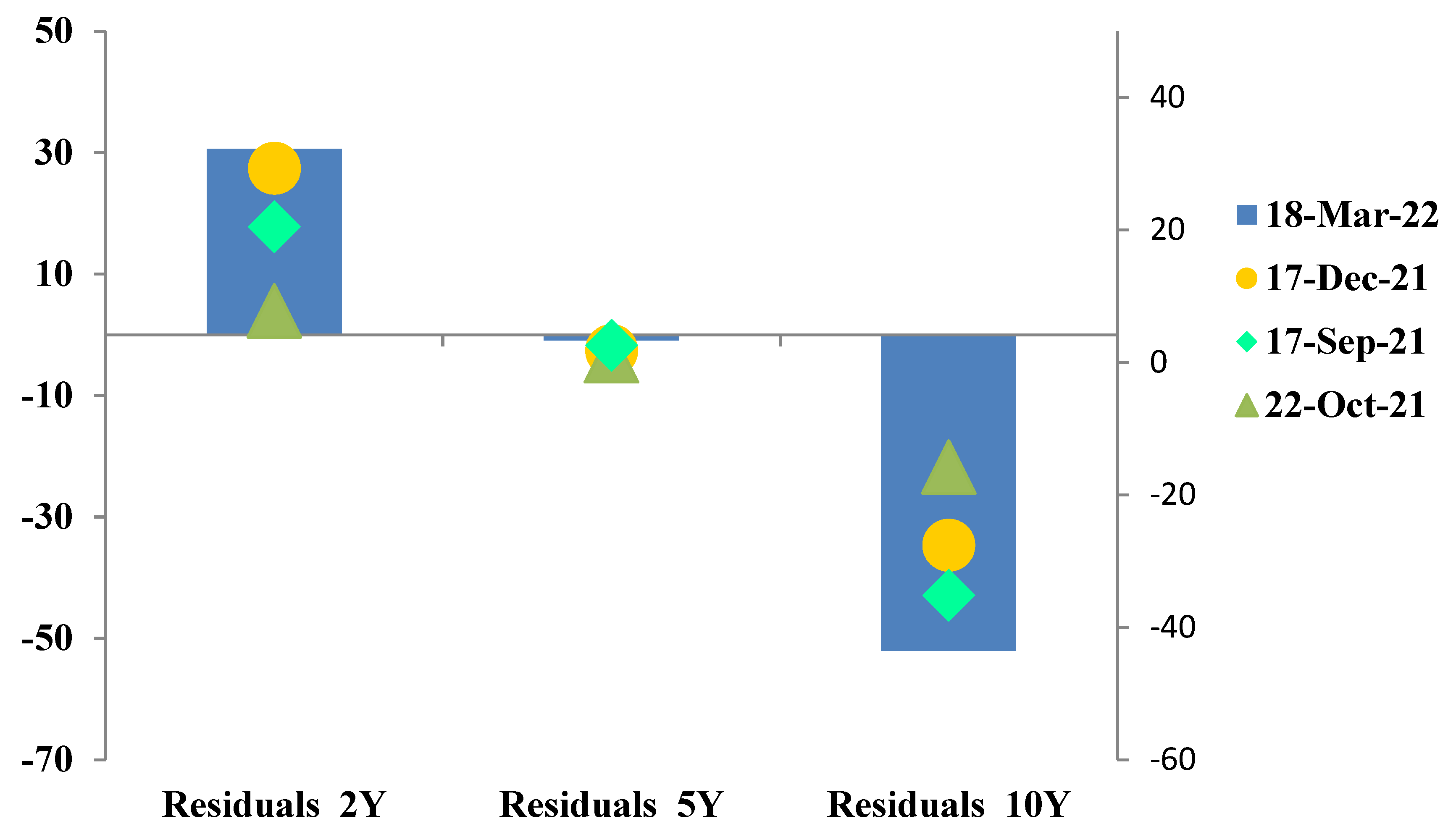
5.2. Steepeners and Flatteners of the Romanian Sovereign Yield Curve: The Use of PCA in Identifying Relative-Value Trading Opportunities

So far, we have been addressing the subject of principal components’ explanatory powers and how they change depending on market conditions. However, principal components’ coefficients (factor loadings or eigenvectors), as well as principal components themselves (scores or eigenvalues), also provide valuable information on the pattern of yield changes.
For instance, returning to the example from Table 1, we can observe that the factor loadings corresponding to the 2-year maturity are lower than those corresponding to the 10-year maturity, suggesting that in the case of a market sell-off, yields at 10 years will increase more than those at 2 years, leading to a steepening of the yield curve. Similarly, in situations of market rallies, long-term interest rates will decrease less than short-term ones, resulting in a flattening pattern.
An additional experiment16 was performed to investigate whether actual patterns observed in the market support these theoretical findings. Weekly changes in the level and slope of the Romanian sovereign yield curve were considered. Afterwards, data were categorized such that the market was considered bull if the 10-year yield decreased by more than 5 basis points in a week, bear if it increased by more than 5 basis points, and neutral otherwise. Similarly, a change in the slope of the yield curve was categorized as a steepening if the spread between the 2- and the 10-year interest rates increased by more than 5 basis points, flattening if it decreased by more than 5 basis points, and unchanged otherwise.
Over the 2-year period spreading from 20 March 2020 to 25 March 2022 (Figure 8), the ratio of bull flattenings to bull steepenings of the Romanian sovereign yield curve was 20 to 0, and the ratio of bear steepenings to bear flattenings was 4.6 to 1. Bull flattening and bear steepening patterns also seemed to dominate the period before the COVID-19 pandemic (Figure 9). However, the proportions were different: the ratio of bull flattenings to bull steepenings was 5.5 to 1, and the ratio of bear steepenings to bear flattenings was 4 to 1. The patterns that emerged in the last 52 trading weeks before 25 March 2022 are also available in Figure A2 from Appendix A.
The conclusions of the experiment are consistent with what the factor loadings of the first principal component revealed, that in the case of market sell-offs, yields at 10 years increase more than those at 2 years, leading to yield curve steepenings, while in market rallies, long-term interest rates decrease less than short-term ones, resulting in flattening patterns.
The patterns observed in our analysis are deeply rooted in the characteristics of the Romanian government bond market, where they find logical explanations. For example, in the immediate proximity of extreme events (such as the start of the Russian military invasion in Ukraine or the start of the COVID-19 pandemic), Romanian government yields marked increases of large magnitude, in bear-steepening movements (Figure 10 and Figure 11). This is mainly due to the fact that the 10-year segment is particularly sensitive to such stressful events, given the offshore share that remains concentrated in the back-end zone of the yield curve.17 However, part of the steepening pattern tends to reverse in the weeks following such shocks, as some bull-flattening movements emerge in the form of market corrections.
In March 2020, two major risks were weighing on the Romanian economy and, implicitly, on the government debt market: on the one hand, the government ordinance for organizing snap elections was declared unconstitutional18 by the Constitutional Court. On the other hand, the local event coincided with the severe stress that the COVID-19 pandemic was determining on the global markets, which caused the long-term RON yields to rise sharply.
On 20 March, the National Bank of Romania (NBR) joined the global monetary easing policy measures adopted by most central banks in an extraordinary meeting. Among the decisions adopted by the central bank was the cut of the key rate by 50 basis points to 2.00% and the narrowing of the standing facilities corridor from ±100 basis points to ±50 basis points. In addition, the NBR decided to provide liquidity to credit institutions via repo transactions, in order to facilitate the smooth functioning of the money market, and to purchase Romanian government bonds from the secondary market to consolidate liquidity in the banking system. As such, following a short period of severe stress, marked by an increase in the 10-year yield towards the 6% level, the Romanian government bonds finally benefitted from the support provided by the NBR. By the end of March 2020, the 10-year interest rate fell near the 4.5% level. However, the yield curve remained steeper than before the sell-off, and the 10y–1y ROMGB spread was around 150 basis points, compared with an average of 100 basis points in January—February 2020 (Erste Group Research 2020).
Throughout the year 2021, the Romanian yield curve continued to bear-steepen (Figure 12), as the back-end yields followed core market inflation repricing, while the front-end zone was, to some extent, supported by the liquidity surplus from the domestic money market (Erste Group Research 2021). Moreover, in April 2021, the NBR stopped buying Romanian government bonds, and in the August meeting, it announced the end of the bond-buying program, leaving the ROMGBs more vulnerable to the impact of the global sell-off.
The Russian invasion of Ukraine at the end of February 2022 reshaped the course of events once again. A sell-off driven by a risk-off sentiment, combined with rising commodity prices and hence rising inflation expectations, propelled yields from the Central Eastern European (CEE) countries and especially from Romania to historical highs, in a bear steepening pattern (Figure 11 from the present chapter and Figure A2 from Appendix A). In light of the aforementioned events, on 8 March 2022, the National Bank of Romania returned to domestic sovereign debt buying, with the scope of providing liquidity to the banking system, and prevented it from becoming scarce in times of sell-offs caused by severely stressful events. This led to a flattening of the yield curve and to the outperformance of ROMGBs compared with peers in the region since the start of the war in Ukraine.
Market movements of large amplitudes—such as the ones triggered by intense risk-off or risk-on sentiments—not only determine yield curve reshaping, but can also launch assets into oversold or overbought territories. In the case of fixed income instruments, the oversold or overbought conditions can emerge at the level of the yield curve as a whole, or only at specific maturities, causing the term structure of interest rates to become “too flat” or “too steep”.
Apart from being a widely known technique used to reduce data complexity, PCA can also be deployed in the identification of relative-value trading opportunities. For example, it can highlight a segment of the yield curve that is too rich or too cheap, in which the relative valuation is independent of the market direction (Credit Suisse Securities Research and Analytics 2012, p. 3). This can be performed throughout the computation of residual values as the difference between actually observed market yields and reconstructed data (principal components). Thus, for each date and variable, a residual can be calculated as below:
r e s i d u a l s i j = d a t a i j r e c o n s t r u c t e d i j
with i = 1:8 (8 tenors considered) and j = 1:192 (192 weekly observations).
For the calculation of the reconstructed data, we recall that each principal component is a linear combination of the original data and the factor loadings. For example, on 18 March 2022, the vector of actual weekly yield changes (in basis points) for the tenors [6M; 1Y; 2Y; 3Y; 4Y; 5Y; 7Y; 10Y] was [−2; −2; −13.15; −6.67; −14.38; −26.45; −37.72; −49.27], and the loadings for the first principal component were [ 0.18 ;   0.15 ; 0.32 ;   0.32 ;   0.35 ;   0.40 ;   0.47 ;   0.49 ] T . Therefore, on that particular date, the value of the first PC was [−2 × 0.18 ; −2 × 0.15 ; −13.15 × 0.32 ; −6.67 × 0.32 ; −14.38 × 0.35 ; −26.45 × 0.40 ; −37.72 × 0.47 ; −49.27 × 0.49 ] = −64.26. Analogously, the value of the second principal component was also −64.26, while the value of the third PC equaled −0.02. Therefore, given the negative realizations of PC1 and PC2 and almost no effect from PC3, we can conclude that on that date, the yield curve bull-flattened.
By multiplying each principal component considered (the first three in our case) by their corresponding factor loading, we were able to derive the reconstructed weekly yield changes for each tenor [−37.82; −20.95; −43.77; −49.31; −36.79; −25.51; −5.55; 2.75] and, implicitly, the reconstructed yields.
The most interesting step of this process was the analysis of residuals, as potential rich–cheap trading signals. For instance, in the aforementioned example, we can observe that the PCA-reconstructed yield changes for the 2- and 10-year yields were −44 and 2.75 basis points, respectively, while the actual market changes were −13 and −49 basis points, respectively. The residuals for the 2- and 10-year tenors were thus 31 basis points (=−13–(−44)) and −52 basis points, respectively (=−49–2.75), suggesting that the yield curve might have turned too flat following such strong decrease in the level of the 10-year yield. Interestingly, in the following week, the yield movements corrected for those residuals’ mismatches, as the 2-year interest rate increased by 11 basis points, while the 10-year rate increased by 40 basis points.
Another occasion where PCA-reconstructed data were revealing a “too flat” yield curve was on 17 December 2021. While residuals for the same 2- and 10-year maturities were 27.4 and −35 basis points, respectively, even though for the following 2 weeks there were no significant movements registered on the Romanian domestic bond market, on the third week since the mismatch discovery, both the 2- and 10-year yields increased by 13 and 30 basis points, respectively. Similar situations followed by bull-steepening patterns were observed on 17 September 21 and 22 October 2021 (Figure 13).
On the other side, PCA residuals signaling “too steep” or “too expensive” yield curves (Figure 14) were generally followed by bull-flattening corrections.
Not only the slope of the yield curve but also the curvature can be traded via PCA-based residuals. For instance, if the residual corresponding to the belly zone of the yield curve is very positive/negative on a certain date, while the residuals corresponding to the “wings” are negative/positive, then a relative-value trader might consider entering a short-term butterfly position (Credit Suisse Securities Research and Analytics 2012, p. 3) (pay wings, receive bell, or vice versa).

5.3. Developing Romanian PCA Yield Curve Scenarios: Examples from the Outbreak of the COVID-19 Pandemic and the Start of the Russian–Ukrainian War

5.3.1. Plausibility Measures of Interest Rate Shocks for Romanian Government Bonds

One of the major applications of principal component analysis (PCA) in finance is that it provides valuable insights into both historical and hypothetical market movements, while enabling the concept of historical plausibility (Golub and Tilman 2000, p. 231).
The general practice in scenario analysis is to investigate the price sensitivity of fixed income instruments or portfolios to deterministic interest rate shocks without assessing their historical likelihood. Practitioners often employ scenario analysis to determine whether they represent acceptable interest rate exposures. In addition, they might consider a couple of extreme shocks to check whether their portfolios would face unacceptable losses under the circumstances of a crisis or severe market event. Incorporating the concept of likelihood into a scenario analysis would improve its outcome in the sense that it would not only help the portfolio manager to assess the large losses generated by extreme market events, but also associate a probability estimation for that event to occur.
Given that principal component shocks are formulated in terms of standard deviations (not basis points), it enables the principal component scenario analysis to be defined in a probabilistic setting (Golub and Tilman 2000, p. 211). Afterwards, a transformation into basis points might be needed, given that yield curve shocks measured in basis points are what portfolio managers are most accustomed to. This can be performed via Equations (14) and (15) from Section 4 of the present article.
Returning to our most recent example from 25 March 2022, we were able to construct the weekly principal components’ yield curve shocks in basis points corresponding to one-standard-deviation changes in PCs (Table 4 and Figure 15):
Figure 16 and Table A1 from Appendix A display the corresponding annualized shock. In addition, another shock that is said to be of the same shape as the first one, and which corresponds to two-standard-deviation changes in the level of PCs, can be consulted in Table A2 from Appendix A.
The contribution of each principal component in explaining the variability of the yield curve dynamics (the explanatory power of a PC) is a measure of how representative a shock is of the recent term structure dynamics. As such, among all interest rate shocks, the first PC has, by construction, the highest explanatory power. The explanatory power of principal components and, implicitly, of interest rate shocks is the simplest measure of historical plausibility. For instance, on 25 March 2022, the first principal component explained 80.83% of the Romanian yield curve variability, while the parallel shock explained 73.33%.
We computed the one standard deviation corresponding to a parallel yield curve shock as in (Golub and Tilman 2000, p. 113). Afterwards, the historical likelihood of various parallel movements could be assessed as, for example, the weekly parallel increase in the level of yields of 50 basis points. As such, assuming that the whole range of systematic risk factors is represented by eight key interest rates as displayed in Table 4, a yield curve shock can be formulated as follows:
z ¯ = ( 50 , 50 ) K R
As such, the yield curve shock of unit length that has the same shape as z ¯ is given by:
( ξ 1 , , ξ 10 ) = ( 1 8 ,   , 1 8 ) K R
By using the covariance and correlation matrices along with Equation (19) from Section 3 of the current paper, it can be shown that:
σ ( ξ ) = ( ξ 1 , , ξ 8 ) Σ ( ξ 1 , , ξ 8 ) T = 57
and thus, one standard deviation of a parallel yield curve shock on 25 March 2022 is 57 1 8   = 20 basis points per week (Table 5).
Analogous to Equation (22) from Section 4.1 of this article, a 50-basis-point parallel increase of the term structure can be written as follows:
z ¯ = [ 50 50 ] = [ 20 20 ]     50   8 57   = [ 20 20 ]     50 57   = [ 20 20 ]   2.5
Equation (35) reveals that on 25 March 2022, the weekly 50-basis-point parallel yield curve shift corresponded to a 2.5 standard deviation realization of the underlying standard normal variable. Using a table of cumulative normal distributions, we find that on 25 March 2022, the probability of government yields increasing by 50 basis points over the course of 1 week was 0.62% (Table 5). Similarly, the probability associated with a weekly 30-basis-point increase was 6.68% (corresponding to a 1.5 standard deviation) and so on. The annualized parallel shocks can also be computed as well (Table A2 from Appendix A).
Additionally, we computed the probabilities of yield curve shocks based on PCA, along with their corresponding standard deviations, for a series of dates characterized by severe market turbulences due to events such as the outbreak of the COVID-19 pandemic in March 2020 or the start of the war in Ukraine on 24 February 2022.(Table A3 from Appendix A) We observe that on 28 February 2020, the likelihood associated with a weekly 25 basis points increase in the level of yields was 0.16% (Table 6). On 13 March 2020, the probability corresponding to the same event was already higher than 15.8% (Table 7).
Two years later, on 18 February 2022, the likelihood of a weekly 25 basis points increase across the yield curve was only 0.24% (Table 8) and it raised to roughly 2.28% on 25 February (Table 9), after the strike of the Russian war in Ukraine. Similarly, the probability associated with a weekly 15-basis-point increase rose from 4.55% on 18 February 2022 to 10.56% on 25 February 2022.
Magnitude plausibility (mpl) represents the second historical plausibility measure of yield curve scenarios based on PCA. By applying Equation (23) from Section 4.2 of the present article to our examples from the Romanian government bond market, we can assess whether the magnitudes of specific registered market movements could be considered plausible from a historical perspective.
For instance, in the example from 25 March 2022 (Equations (36) and (37) and Table 5), the magnitude plausibility of a weekly 50-basis-point shift (in either direction) was 1.24%.
( 50 , 50 ) K R   S = 2.5
m p l   ( z ¯ ) = P ( N ( 0 , 1 ) 2.5   or   N ( 0 , 1 )     2.5 ) = 1.24 %    
Analogously, on that date, the magnitude plausibility of a weekly 40- and 30-basis-point shift (in either direction) was 4.56% and 13.36%, respectively.
Moving to the probabilistic framework of weekly yield curve scenarios during the outbreak of the COVID-19 pandemic, we found that on 13 March 2020, the magnitude plausibility of a weekly 102-basis-point shift (in either direction) was 0.26% (corresponding to a three standard deviation). This result suggests that the amplitude of market movements registered in that particular week (up to 80–100 basis point increases across the yield curve) was highly improbable from a historical perspective.
Eventually, shape plausibility represents a more fine-tuning measure of historical plausibility. Recall from Section 4.2 that the decomposition of the most representative yield curve shock is given by ( θ M , 1 , , θ M , n ) = ( ζ 1 , ,   ζ n ) , where each principal component’s contribution ( θ M , i ) to this shock is the same as its explanatory power ( ζ i ). In our case, on 25 March 2022, the decomposition of the most representative interest rate shock is:
( θ M , 1 , , θ M , n ) = ( ζ 1 , ,   ζ n ) = ( 80.83 ,   11.16 ,   4.88 ,   ,   0.02 )
and the least representative one is always given by:
( θ L , 1 , , θ L , n ) = ( 0 , , 0 ,   100 ) .
Between the most and the least representative shocks, the shape plausibility spl ( z ¯ ) will take a value between 0% and 100% that can be assigned to a certain interest rate shock spl: z ¯  x є [0%, 100%].
Under these hypotheses and with the use of Equations (27) and (28) from Section 4.1 of the present paper, we were able to compute the shape plausibility of interest rate shocks at different points in time. We computed the shape plausibility (spl) of actual yield changes from 13 March 2020 and 25 February 2022 and discovered that the likelihood of the first shape was high, 98.15% (Table A4 from Appendix A). Combining this result with the above observations, we conclude that during the outbreak of the COVID-19 pandemic, both explanatory power and shape plausibility were characteristic of the yield curve dynamics and, from this angle, historically plausible. However, the magnitude of the increases in the level of interest rates was unusually large from the historical perspective. As regards the interest rate changes registered on 25 March 2022, apart from being historically too large, they were also unusually steeper judging by recent market developments, with a shape plausibility of only around 70%.

5.3.2. Incorporating Trader’s View to Derive Romanian PCA Yield Curve Forecasts

Besides the results obtained from financial modelling, when deriving yield curve forecasts, traders and portfolio managers often incorporate a significant amount of expert judgment and intuition based on market experience. PCA is particularly useful in this case if, for example, we have a view on a specific point on the yield curve and we might probably demand to know what the rest of the term structure would look like if our view turns to be correct. As we have stated previously in this article, Nogueira (2008) assumes that a portfolio manager or trader is able to provide a view of a few benchmark yields or a combination of yields and then derive a forecast of the entire yield curve.
Since the vast majority of term structure variability can typically be attributed to one or two principal components (Golub and Tilman 2000, p. 237), having a view on one or two relatively distanced tenors should be enough to derive a forecast of the entire term structure.
For example, suppose we have two views on the 2- and 5-year yields of the Romanian sovereign curve and we need to update the rest of the yield curve points to fit our two-view expectations. To do this, we impose that the shape of the yield curve is consistent with the main principal components, and implement the theorem developed by Nogueira (Equations (31) and (32) from Section 3 of the present paper). Since the trader only has two views, according to Nogueira’s theorem, all movements expressed in the views are explained by the first two principal components alone.
First, we considered the example from 18 February 2022, a date that coincided with the week before the concretization of the Russian military invasion in Ukraine. In this case, we considered that the trader had the following two views on the yield curve:
i.
The Romanian 2-year yield to increase from 4.48% to 4.62%;
ii.
The Romanian 5-year yield to increase from 5.12% to 5.38%;
Given the example above, we will first display an argument interpretation of Nogueira’s formulas:
E [ y t + 1 ] represents our derived forecast for the yield curve, which incorporates the expectations for the 2- and 5-year interest rates.
y t is the current yield curve corresponding to six benchmark maturities (2, 3, 4, 5, 7, and 10 years) such that vector y t T = ( y t 2 Y   y t 3 Y   y t 4 y   y t 5 y   y t 7 y   y t 10 y ).
D represents a matrix of standard deviations of each yield curve tenor.
Δq is an nx1 matrix of expected changes for the two particular tenors that we had a view on, meaning the 2-year and the 5-year yield; in our case, q t + 1 = ( 4.62 %   5.38 % ) in our Δq = ( 0.14   0.27 ) .
W ˜ is the eigenvalue matrix associated with the principal components. In this case, a subsection mxn matrix is taken from the original mxm PCA matrix, where n represents the number of principal components included in the forecast; in the case of our two-view example, that would be a 6 × 2 matrix of PCA eigenvalues.
Lastly, V is an nxm dummy matrix, which takes the value 1 for any tenor that we have a view on and 0 otherwise; in our case, V = ( 1 0 0 0 0 0 0 0 0 1 0 0 ) .
Afterwards, we perform matrix multiplication and inverse function to derive the expected movement for every yield curve tenor. It is important to mention here that the views in our example, as in the case of Nogueira (2008), were deliberately chosen to match the realized yields (Nogueira 2008, p. 7) for the 2- and 5-year tenors, registered 1 week later, on 25 February 2022. The choice of this date was not coincidental, as it represented the first day following the Russian invasion of Ukraine, with a significant impact on the sovereign debt costs of all peers in the CEE region.
The same procedure was repeated for the case of a single view on the yield curve, that is, the 2-year yield.
Table 10 and Figure 17 display the current market yields on 18 February 2022, their forecasts (with the one- and two-tenor-view approach), and the actually realized market yields on 25 February 2022.
We observe that the forecast method performs well even in times of severe market turbulence for both one- and two-view approaches. This is also proved by the square errors of estimations, which are very close to 0 in both situations.
One interesting observation was that for both one- and two-view forecasts, the estimations were suggesting a steeper evolution of the term structure than what was actually observed on the market 1 week later. This can be largely attributed to the way the covariance matrix was built. More precisely, it was computed using the EWMA model, given that this model attributes higher weights to more recent data. As we recall from Section 5.2 of this article, the most recent pattern of the Romanian yield curve dynamics starting 2022 was that of a bear steepener).
In addition to the period surrounding the Russian war with Ukraine, which determined intense volatility and a pronounced increase in the level of interest rates throughout the CEE region and, implicitly, across the Romanian yield curve, we also performed the above analysis for the period surrounding the outbreak of SARS-CoV-2 in March 2020. We forecasted the entire term structure of interest rates on 28 February 2020 for 6 March 2020 (Figure 18 and Table 11) and on 13 March 2020 for 20 March 2020 (Figure 19 and Table 12) also based on the one-view (the 2-year yield) and two-view (2- and 5-year yields) approaches:
From Figure 19 and Table 12 above, we observe that only by providing a view on a single tenor (the 2-year yield), the model performs extremely well across the entire term structure, but especially in the case of the belly and back-end zones of the curve.
Interestingly, in the example from 28 February 2020, the model performed even better than in the case when the trader engaged two views. This is primarily due to the shape of the second principal component (PC2), which we incorporated in the estimation based on the two views we provided for the 2- and 5-year tenors. We recall from the beginning of this chapter that most often, our PCA analysis revealed that when the second principal component increases by one unit, the short end of the yield curve increases, while the longer end decreases, leading to a flattening of the yield curve as the second principal component increases (Table 13).
This is why in the case of the two-view approach, the estimation for the 1-year yield was better than in the case of the one-view approach (the actual realized market yield was higher), but performed more poorly in the case of the back-end zone. By taking into account the second principal component in the forecast, we accounted for a flattening of the curve. However, in real life, the curve bull flattened the following week, giving the one-view approach better predictability results. This finding is consistent with the globally observed empirical data, which support the idea that changes in the slope of the yield curve are consistent with those implied by the shape of the first PC (Golub and Tilman 2000, p. 106). As a result, if a significant market movement is expected, using the first PC to forecast the term change appears to be the most historically plausible alternative (Golub and Tilman 2000, p. 106).

6. Conclusions

Principal component analysis (PCA) is a modern machine learning technique that has been extensively used in discrete time finance in general and in the risk management of fixed income instruments in particular, with the main purpose of reducing the dimensions of risk factors. Even tough other deterministic approaches, such as the key rates method, are more familiar among risk and portfolio managers, they do exhibit one major drawback: their complex correlation and volatility structure make them less efficient in providing inferences on the yield curve movements from a statistical perspective. Still, key rates remain very useful in assessing certain patterns of the term structure as, for example, the likelihood of a yield curve steepening or flattening between two key maturities that exhibit high correlation.
The key rates approach, however, does not answer a whole class of questions, such as what would the entire yield curve normally look like if the spot rate for a specific maturity changes by a given number of basis points. This is one aspect we would like to know if we had a view only on a specific tenor. Principal component analysis not only addresses this type of questions, but also provides a probabilistic setting in the process of generating yield curve scenarios. Generating yield curve scenarios of which shape and magnitude plausibility can be quantitatively measured is one particular feature of PCA that this paper addresses. Moreover, principal components’ factor loadings reflect the historical relationship between key spot rates and have an intuitive interpretation, as they visually depict the shape of the most dominant yield curve changes, meaning the principal components.
The first goal of this paper was to analyze how the PCA method manages to describe the dynamics of the Romanian sovereign yield curve at different points in time, especially before and after major events, such as the outbreak of the COVID-19 pandemic, the transition to hawkish monetary policy measures due to elevated levels of inflation, or the military escalation of the Russian–Ukrainian conflict. In the second part, we extended the concepts of historical plausibility of yield curve scenarios introduced by Golub and Tilman (2000) to the Romanian government bond market. That is, we computed the measures of historical plausibility (explanatory power, shape plausibility, and magnitude plausibility) for different yield curve shocks, while quantitatively assessing for their historical likelihood. Eventually, we used the forecasting model developed by Nogueira (2008) to derive the entire structure of the Romanian yield curve while also incorporating the trader’s view on a few benchmark interest rates.
For the purpose of our analysis, weekly changes of the Romanian government yields between March 2019 and March 2022 were used to derive principal components (PCs) via eigenvalue decomposition of the covariance matrix. The data set consisted of closing midmarket yields corresponding to the 6-month and 1-, 2,- 3-, 4-, 5-, 7-, and 10-year tenors. The covariance matrix was computed from exponentially weighted observations in order to put more emphasis on recent market developments. We performed PCA for different moments in time with emphasis on the 2020–2022 period. In our most recent data, that is, 25 March 2022, we found that the first principal component (PC1) explained 80.83% of the yield curve changes, the first two 91.92%, and the first three 96.87%. These results are consistent with previous works from the literature, which state that the first three PCs generally explain around 95% of the variability in the term structure.
Interestingly, we observed that the explanatory power of the first principal component (the yield curve variance explained by the first PC) increases significantly following extreme market events. Due to the start of the COVID-19 pandemic in 2020, the second half of March was marked by extreme market movements on the government bond market, with yields increasing by up to 150 basis points across the sovereign yield curve within only 2 weeks. On 28 February 2020, the first principal component explained only 70.52% of the yield curve variability, the first two principal components 90.35%, and the first three, 95.71%. The explanatory power of PCs increased in the following weeks, such that on 20 March 2020, the first PC explained 91.51%, the first two 98.87%, and the first three, 99.62%. This finding suggests that when market movements of such amplitude take place, they usually reflect more of a level shift in interest rates.
Our observations are also consistent with those of Golub and Tilman (2000) in the sense that interest rate movements tend to become more synchronized in a severely distressed market environment, leading to higher correlations between maturities. For example, while the correlation coefficient between the 2-year and the 10-year yields was 0.51 on 28 February 2020, within less than a month, it reached 0.82.
Another observation in our study was that the factor loadings corresponding to the 2-year maturity are lower than those corresponding to the 10-year maturity, suggesting that in the case of a market sell-off, yields at 10 years will increase more than those at 2 years, leading to a steepening of the yield curve. Similarly, in situations of market rallies, long-term interest rates will decrease less than short-term ones, resulting in a flattening pattern.
An additional experiment was performed to investigate whether actual patterns observed in the market support these theoretical findings. Weekly changes in the level and slope of the Romanian sovereign yield curve were considered. Afterwards, data were categorized such that the market was considered bull if the 10-year yield decreased by more than 5 basis points in a week, bear if it increased by more than 5 basis points, and neutral otherwise. Similarly, a change in the slope of the yield curve was categorized as steepening if the spread between the 2- and the 10-year interest rates increased by more than 5 basis points, flattening if it decreased by more than 5 basis points, and unchanged otherwise.
Over the 2-year period spreading from 20 March 2020 to 25 March 2022, the ratio of bull flattenings to bull steepenings of the Romanian sovereign yield curve was 20 to 0, and the ratio of bear steepenings to bear flattenings was 4.6 to 1. Bull flattening and bear steepening patterns also seemed to dominate the period before the COVID-19 pandemic. However, the proportions were different: the ratio of bull flattenings to bull steepenings was 5.5 to 1, and the ratio of bear steepenings to bear flattenings was 4 to 1. The conclusions of this experiment were consistent with what the factor loadings of the first principal component revealed, that in the case of market sell-offs, yields at 10 years increase more than those at 2 years, leading to yield curve steepenings, while in market rallies, long-term interest rates decrease less than short-term ones, resulting in flattening patterns.
The patterns observed in our analysis are deeply rooted in the characteristics of the Romanian government bond market, where they find logical explanations. For example, in the immediate proximity of extreme events (such as the start of the Russian military invasion in Ukraine or the start of the COVID-19 pandemic), Romanian government yields marked increases of large magnitude, in bear-steepening movements. This is mainly due to the fact that the 10-year segment is particularly sensitive to such stressful events, given the offshore share that remains concentrated in the back-end zone of the yield curve. However, part of the steepening pattern tends to reverse in the weeks following such shocks, as some bull-flattening movements emerge in the form of market corrections.
Market movements of large amplitudes—such as the ones triggered by intense risk-off or risk-on sentiments—not only determine yield curve reshaping, but also can launch assets into oversold or overbought territories. In the case of fixed income instruments, the oversold or overbought conditions can emerge at the level of the yield curve as a whole, or only at specific maturities, causing the term structure of interest rates to become “too flat” or “too steep”.
Apart from being a widely known technique used to reduce data complexity, PCA can also be used by traders and portfolio managers to identify relative-value trading opportunities. For example, it can highlight a segment of the yield curve that is too rich or too cheap, in which the relative valuation is independent of the market direction (Credit Suisse Securities Research and Analytics 2012, p. 3). This can be performed throughout the computation of residual values as the difference between actually observed market yields and reconstructed data (principal components). We observed that when PCA-reconstructed data were revealing a “too flat” yield curve, generally, a steepening pattern followed. On the other side, PCA residuals signaling “too steep” or “too expensive” yield curves were generally succeeded by bull-flattening corrections.
When incorporating the concept of likelihood into scenario analysis, it improves its outcome in the sense that it does not only help portfolio managers to assess the large losses generated by extreme market events, but also associates a probability estimation for that event to occur. We concluded that during the outbreak of the COVID-19 pandemic, both explanatory power and shape plausibility were characteristic of the yield curve dynamics and, from this point of view, historically plausible. However, when moving to the probabilistic framework of weekly yield curve scenarios during the outbreak of the COVID-19 pandemic, we found that on 13 March 2020, the magnitude plausibility of a weekly 102-basis-point shift (in either direction) was 0.26% (corresponding to a three standard deviation). This result suggests that the amplitude of market movements registered in that particular week (up to 80–100 basis points increases across the yield curve) was highly improbable from a historical perspective.
Finally, we use the forecasting model developed by Nogueira (2008) to derive the entire structure of the Romanian yield curve while also incorporating a trader’s view on a few benchmark yields. We observe that the forecast method performs well even in times of severe market turbulence for both one- and two-view approaches (when we provide our views on a single tenor or on two tenors). This is also proved by the square errors of estimations that are very close to 0 in both situations.

Funding

This research received no external funding.

Data Availability Statement

Data supporting reported results can be accessed via the Bloomberg platform.

Acknowledgments

The opinions expressed in this research paper are those of the author and do not necessarily reflect the views of the institutions mentioned in the paper, nor do they engage them in any way.

Conflicts of Interest

The authors declare no conflict of interest.

Appendix A

Figure A1. Factor loadings of the fourth and fifth principal components on 25 March 2022. Source: Bloomberg, own computation of PCs with the use of a VBA add-in developed by Leonardo Volpi.
Jrfm 15 00247 g0a1
Figure A2. Weekly yield curve patterns at 25.03.2022 (last 52 weeks). Source: Bloomberg yields, own computation of yield curve patterns.
Jrfm 15 00247 g0a2
Table A1. One-standard-deviation PCA annualized yield curve shocks and corresponding explanatory powers on 25 March 2022.
Annualized Shock (bps)6M1Y2Y3Y4Y5Y7Y10YContribution (Explanatory Power)
PC1 shock786413813914817220020980.83%
PC2 shock6528577136−1−61−8411.16%
PC3 shock7846−37−19−19−1−4084.88%
Parallel Shock14414414414414414414414473.33%
YC PCAs Shock22113815816517014913322196.87%
Source: Bloomberg, own computation of PCs with the use of a VBA add-in developed by Leonardo Volpi.
Table A2. Likelihood of principal components’ annualized yield curve shocks on 25 March 2022.
YC Annualized Shock (bps.)Corresp. STDEVLikelihood
500.3536.32%
1441.0015.87%
1000.6924.51%
1501.0414.92%
2001.398.23%
2251.565.94%
2501.734.18%
Source: Own computation.
Table A3. Two-standard-deviation PCA annualized yield curve shocks and corresponding explanatory powers on 25 March 2022.
Annualized Shock of Same Shape (bps)6M1Y2Y3Y4Y5Y7Y10Y
PC1 shock155129275278297343401417
PC2 shock1305611514172−1−121−169
PC3 shock15691−73−39−39−1−8017
Parallel Shock289289289289289289289289
YC PCAs Shock441276317330341297266441
Source: Bloomberg, own computation of PCs with the use of a VBA add-in developed by Leonardo Volpi.
Table A4. Shape plausibility of actual yield curve evolution on 13 March 2020. Source: Own computation.
θ i θ M , i θ L , i ( θ i θ M , i ) 2 ( θ L , i θ i ) 2
PC199.97%97.78%0.00%0.000.96
PC20.01%1.22%0.00%0.000.00
PC30.02%0.66%0.00%0.000.00
PC40.00%0.19%0.00%0.000.00
PC50.00%0.07%0.00%0.000.00
PC60.00%0.04%0.00%0.000.00
PC70.00%0.02%0.00%0.000.00
PC80.00%0.01%100.00%0.001.00
Sum of Squares 0.031.40
Shape Plausibility98.15%

Notes

1
By the time Golub and Tilman wrote the book Risk Management: Approaches for Fixed Income Markets in 2000, there were only a few proprietary and government trading desks that used principal component durations in weighting butterfly yield curve trades and in other portfolio management and trading decisions.
2
Due to the outbreak of the COVID-19 pandemic in 2020, the second half of March in particular was marked by extreme market movements on the government bond market, with yields increasing by up to 150 basis points across the sovereign yield curve within only 2 weeks.
3
In unsupervised learning, models are trained to find patterns or methods for data subgrouping or categorization based on variables and observations. Such unsupervised learning techniques include principal component analysis (PCA) and a range of clustering methods. On the other hand, in supervised learning, predictive models are developed through the use of classification and regressions (logistic regression and neural networks, to name a few). While supervised learning models are trained by comparing their output against known true observations, in unsupervised learning, no correct answer is provided throughout the training phase.
4
Obtained from RiskMetrics® (monthly data set).
5
That day was market by a dramatic increase in U.S. interest rates as a result of the credit and liquidity crisis in 1998. The shock was characterized by a day-on-day 10-basis-point increase in the 3-month yield, an approximately 20-basis-point move in the intermediate zone of the yield curve, and an about 7-basis-point change in the 30-year spot rate.
6
By definition, a standard normal variable N(0,1) has a mean of 0 and a standard deviation of 1.
7
Generally 1 year.
8
Unlike the factor models developed by Nelson and Siegel (1987) and Diebold et al. (2008), where factors have an intuitive interpretation (level, slope, curvature) but calibration is nonlinear, so models lose part of their tractability.
9
For an extensive review of Nogueira’s model, see the chapter “Expressing Views” in his work “Updating the Yield Curve to Analyst’s Views”, specified in Note 19 in this article.
10
11
With lambda set at 0.8, in order to capture the effects of very recent market dynamics, especially around extremely stressful events, such as the start of the COVID-19 pandemic or the start of the Russian military invasion of Ukraine.
12
Available at https://learn.bowdoin.edu/excellaneous/#downloads, accessed on 21 March 2022.
13
Due to the start of the COVID-19 pandemic in 2020, the second half of March in particular was marked by extreme market movements on the government bond market, with yields increasing by up to 150 basis points across the sovereign yield curve within only 2 weeks.
14
Similar to the one performed by Golub and Tilman (2000) on the U.S. Treasury curve, 105.
15
In November 2021, the offshore exposure to ROMGBs reached 16.5%, a 3.6 percentage points drop from the 20.1% level registered in December 2020. By the end of February 2022, the offshore share in Romanian local debt further decreased to 15.7%, suggesting an underweight position.
16
In the months preceding this event, demand for ROMGBs increased, given that investors had been gradually pricing in the rising chances for early elections; also, until that moment, the demand for Romanian government bonds was sustained by supportive liquidity conditions on the market.
17
The 10-year Romanian government bond yield reached 6.41% on 11 March 2022.
18
“Updating the Yield Curve to Analyst’s Views”, Nogueira (2008).

References

  1. Alexander, Carol. 2008. Market Risk Analysis—Quantitative Methods in Finance. Chichester: John Wiley & Sons Ltd., vol. 1, pp. 59–65. [Google Scholar]
  2. Annaert, Jan, Anouk G. P. Claes, Marc. J. K. De Ceuster, and Hairui Zhang. 2012. Estimating the Yield Curve Using the Nelson-Siegel Model: A Ridge Regression Approach. Brussels: University of Antwerp, pp. 2–6. Available online: https://papers.ssrn.com/sol3/papers.cfm?abstract_id=2054689 (accessed on 21 March 2022).
  3. Asare, Sekyere. A. 2019. Yield Curve Modelling: A Comparison of Principal Components Analysis and the Discrete-Time Vasicek Model. Ph.D. thesis, Concordia University, Montreal, QC, Canada; pp. 25–26, 62. Available online: https://spectrum.library.concordia.ca/id/eprint/985642/1/SekyereAsare_MSc_S2020.pdf (accessed on 21 March 2022).
  4. Bank of International Settlements. 2005. Zero-coupon yield curves-technical documentation. BIS Paper 25: 1–37. Available online: https://www.bis.org/publ/bppdf/bispap25.htm (accessed on 20 September 2021).
  5. Barrett, W. Brian, Thomas F. Gosnell Jr., and Andrea. J. Heuson. 1995. Yield curve shifts and the selection of immunization strategies. Journal of Fixed Income 5: 5–64. [Google Scholar] [CrossRef]
  6. Bliss, Robert, and Eugen Fama. 1987. The information in long-maturity forward rates. American Economic Review 77: 680–92. Available online: http://www.jstor.org/stable/1814539 (accessed on 16 May 2021).
  7. Bolder, David Johnson, Grahame Jamieson, and Adam Metzler. 2004. An Empirical Analysis of the Canadian Term Structure of Zero-Coupon Interest Rates. Bank of Canada Working Papers, SSRN 1082833. Available online: https://papers.ssrn.com/sol3/papers.cfm?abstract_id=1082833 (accessed on 23 May 2021).
  8. Coroneo, Laura, Ken Nyholm, and Rositsa Vidova-Koleva. 2008. How Arbitrage-free is the Nelson-Siegel Model? ECB Working Paper No. 874. Available online: https://papers.ssrn.com/sol3/papers.cfm?abstract_id=1091123 (accessed on 15 January 2022).
  9. Cox, John C., Jonathan. E. Ingersoll, and Stephen. A. Ross. 1985. A Theory of the Term Structure of Interest Rates. Econometrica 53: 385–407. Available online: https://www.jstor.org/stable/1911242 (accessed on 12 October 2021). [CrossRef]
  10. Credit Suisse Securities Research and Analytics, Fixed Income Research. 2012. PCA Unleashed. pp. 11–16. Available online: https://research-doc.credit-suisse.com/docView?language=ENG&format=PDF&source_id=csplusresearchcp&document_id=1001969281&serialid=EVplkK6oNi2Oum067aSBs%2Bp%2F04%2F3pgbDBc%2B1pGHrQ0U%3D&cspId=null (accessed on 7 February 2022).
  11. Diebold, Francis X., Canlin Li, and Vivian Z. Yue. 2008. Global Yield Curve Dynamics and Interactions: A Generalized Nelson-Siegel Approach. Journal of Econometrics 146: 35–60. Available online: https://www.sciencedirect.com/science/article/abs/pii/S0304407608001127 (accessed on 30 April 2021). [CrossRef] [Green Version]
  12. Dullmann, Klaus, and Marliese Uhrig-Homburg. 2000. Profiting Risk Structure of Interest Rates: An Empirical Analysis for Deutschemark-Denominated Bonds. European Financial Management 6: 367–88. [Google Scholar] [CrossRef]
  13. Erste Group Research. 2020. Navigating Storm with One Engine Gone. CEE Country Macro Outlook, April 2, 4. [Google Scholar]
  14. Erste Group Research. 2021. Twin Deficits in Spotlight with Political Noise in Background. CEE Country Macro Outlook, September 10, 4. [Google Scholar]
  15. European Central Bank. 2020. The new euro area yield curves. Monthly Bulletin. February, pp. 95–103. Available online: https://www.ecb.europa.eu/stats/financial_markets_and_interest_rates/euro_area_yield_curves/html/index.en.html#data (accessed on 10 December 2021).
  16. Fabozzi, Frank J., Lionel Martellini, and Philippe Priaulet. 2005. Predictability in the shape of the term structure of interest rates. Journal of Fixed Income 15: 40–53. [Google Scholar] [CrossRef]
  17. Farid, Jawwad A., and F. Salahuddin. 2010. Interest Rate Modeling. Karachi: Alchemy Software Pvt Limited, pp. 43–45. Available online: http://FourQuants.com (accessed on 5 March 2021).
  18. Golub, Bennett W., and Leo M. Tilman. 2000. Risk Management: Approaches for Fixed Income Markets. Hoboken: John Wiley & Sons, pp. 93–120, 211–37. [Google Scholar]
  19. Heath, David, Robert Jarrow, and Andew Morton. 1992. Bond Pricing and the Term Structure of Interest Rates: A New Methodology for Contingent Claims Valuation. Econometrica 60: 77–105. [Google Scholar] [CrossRef]
  20. Hodges, Stewart D., and Naru Parekh. 2006. Term Structure Slope Risk. Journal of Fixed Income 16: 54–59. [Google Scholar] [CrossRef]
  21. Hull, John, and Alan White. 1990. Pricing Interest Rate Derivatives Securities. Review of Financial Studies 3: 573–92. Available online: http://www.ressources-actuarielles.net/EXT/ISFA/1226.nsf/0/3853d6e3a251918ec1257917004418f0/$FILE/Pricing%20interest-rate-derivative%20securities.pdf (accessed on 10 August 2021). [CrossRef]
  22. Kumar, Vinayak. 2019. Risk Premia in the Yield Curve. Philadelphia: University of Pennsylvania, pp. 4–5. Available online: https://repository.upenn.edu/cgi/viewcontent.cgi?article=1076&context=joseph_wharton_scholars (accessed on 11 April 2022).
  23. Litterman, Robert, and Jose Scheinkman. 1991. Common factors affecting bond returns. Journal of Fixed Income 1: 54–61. Available online: https://jfi.pm-research.com/content/1/1/54 (accessed on 15 September 2021). [CrossRef]
  24. Martellini, Lionel, and Jean Christophe Meyfredi. 2007. A copula approach to value-at-risk estimation for fixed-income portfolios. Journal of Fixed Income 17: 5–15. Available online: https://risk.edhec.edu/sites/risk/files/EDHEC_Working_Paper_A_Copula_Approach_to_Value-at-Risk_Estimation.pdf (accessed on 20 September 2021). [CrossRef]
  25. Moody’s Analytics. 2014. Principal Component Analysis for Yield Curve Modeling—Reproduction of Out-of-Sample Yield Curves. Available online: https://www.moodysanalytics.com/-/media/whitepaper/2014/2014-29-08-PCA-for-Yield-Curve-Modelling.pdf (accessed on 20 April 2022).
  26. Nelson, Charles, and Andrew F. Siegel. 1987. Parsimonious modeling of yield curves. Journal of Business 60: 473–89. Available online: https://www.jstor.org/stable/2352957 (accessed on 12 November 2021). [CrossRef]
  27. Nogueira, Leonardo M. 2008. Updating the Yield Curve to Analyst’s Views’, Central Bank of Brazil—Foreign Reserves Department; University of Reading—ICMA Centre, pp. 2–7. Available online: https://papers.ssrn.com/sol3/papers.cfm?abstract_id=1107653 (accessed on 12 April 2022).
  28. Piazessi, Monika. 2010. Afine Term Structure Models. Stanford: Elsevier, p. 703. Available online: https://web.stanford.edu/~piazzesi/s.pdf (accessed on 11 April 2022).
  29. Piazzesi, Monika, Moritz Lenel, and Martin Schneider. 2019. The Short Rate Disconnect in a Monetary Economy. Journal of Monetary Economics 106: 59–77. Available online: https://doi.org/10.1016/j.jmoneco.2019.07.008 (accessed on 14 November 2021).
  30. Ronn, Ehud I. 1996. The Impact of Large Changes in Asset Prices on Intra-Market Correlations in the Stock and Bond Markets. Working Paper. Austin: University of Texas at Austin, p. 2. [Google Scholar]
  31. Svensson, Lars E. O. 1994. Estimating and Interpreting forward Interest Rates: Sweden 1992–1994. IMF Working Paper, WP/94/114. Available online: https://www.elibrary.imf.org/view/journals/001/1994/114/001.1994.issue-114-en.xml (accessed on 21 October 2021).
  32. Svensson, Lars E. O. 1996. Estimating the term structure of interest rates for monetary policy analysis. Scandinavian Journal of Economics 98: 163–83. Available online: https://doi.org/10.2307/3440852 (accessed on 10 December 2021).
  33. Vasicek, Oldrich. 1977. An Equilibrium Characterisation of the Term Structure. Journal of Financial Economics 5: 177–88. [Google Scholar] [CrossRef]
  34. Yau, Roland. 2012. Principal Components Analysis and Interest Rate Modeling. Available online: https://www.risklatte.xyz/Videos/video21.php (accessed on 15 November 2021).
Figure 1. Orthogonalization transformation of interdependent interest rates into uncorrelated principal components.
Jrfm 15 00247 g001
Figure 2. Romanian government bond yields between March 2019 and March 2022. Source: Bloomberg.
Jrfm 15 00247 g002
Figure 3. Yield curve variability explained by principal components on 25 March 2022. Source: Bloomberg, own computation of PCs with the use of a VBA add-in developed by Leonardo Volpi.
Jrfm 15 00247 g003
Figure 4. Factor loadings of the first three principal components on 25 March 2022. Source: Bloomberg, own computation of PCs with the use of a VBA add-in developed by Leonardo Volpi.
Jrfm 15 00247 g004
Figure 5. Yield curve variability explained by principal components on 28 February 2020. Source: Bloomberg, own computation of PCs with the use of a VBA add-in developed by Leonardo Volpi.
Jrfm 15 00247 g005
Figure 6. Yield curve variability explained by principal components on 6 March 2020. Source: Bloomberg, own computation of PCs with the use of a VBA add-in developed by Leonardo Volpi.
Jrfm 15 00247 g006
Figure 7. Yield curve variability explained by principal components on 20 March 2020. Source: Bloomberg, own computation of PCs with the use of a VBA add-in developed by Leonardo Volpi.
Jrfm 15 00247 g007
Figure 8. Weekly yield curve patterns between 20 March 2020 and 25 March 2022. Source: Bloomberg yields, own computation of yield curve patterns.
Jrfm 15 00247 g008
Figure 9. Weekly yield curve patterns on 28 February 2020 (last 52 weeks). Source: Bloomberg yields, own computation of yield curve patterns.
Jrfm 15 00247 g009
Figure 10. Weekly yield curve patterns on 20 March 2020 (last 4 weeks). Source: Bloomberg yields, own computation of yield curve patterns.
Jrfm 15 00247 g010
Figure 11. Weekly yield curve patterns on 25 March 2022 (last 5 weeks). Source: Bloomberg yields, own computation of yield curve patterns.
Jrfm 15 00247 g011
Figure 12. Weekly yield curve patterns in 2021. Source: Bloomberg yields, own computation of yield curve patterns.
Jrfm 15 00247 g012
Figure 13. PCA residuals (in basis points) signaling “too flat” yield curves. Source: Own computation of PCA residuals.
Jrfm 15 00247 g013
Figure 14. PCA residuals (in basis points) signaling “too steep” yield curves. Source: Own computation of PCA residuals.
Jrfm 15 00247 g014
Figure 15. One-standard-deviation weekly yield curve shocks corresponding to each principal component on 25 March 2022. Source: Bloomberg yields, own computation.
Jrfm 15 00247 g015
Figure 16. One-standard-deviation annualized yield curve shocks of the same shape corresponding to the first three principal components combined, on 25 March 2022. Source: Bloomberg yields, own computation.
Jrfm 15 00247 g016
Figure 17. Weekly yield curve forecasts incorporating the trader’s views on 18 February 2022 and realized yields on 25 February 2022. Source: Bloomberg, own computation.
Jrfm 15 00247 g017
Figure 18. Weekly yield curve forecasts incorporating the trader’s views on 28 February 2020 and realized yields on 06 March 2020. Source: Bloomberg, own computation.
Jrfm 15 00247 g018
Figure 19. Weekly yield curve forecasts incorporating the trader’s views on 13 March 2020 and realized yields on 20 March 2020. Source: Bloomberg, own computation.
Jrfm 15 00247 g019
Table 1. Factor loadings, eigenvalues, and variances explained by principal components on 25 March 2022. Source: Bloomberg, own computation of PCs with the use of a VBA add-in developed by Leonardo Volpi.14
CumVar80.83%91.99%96.87%99.23%99.72%99.95%99.98%100.00%
Var80.83%11.16%4.88%2.36%0.49%0.23%0.03%0.02%
EigVal3531.13487.69213.29103.1521.369.971.270.85
PC1PC2PC3PC4PC5PC6PC7PC8
6M0.18100.40690.74190.49450.03810.01150.04130.0583
1Y0.15010.17560.4322−0.85770.15130.0318−0.0072−0.0165
2Y0.32100.3603−0.34720.06660.60100.1689−0.44610.2311
3Y0.32430.4433−0.3073−0.0078−0.07680.21430.5462−0.5038
4Y0.34650.2261−0.1851−0.0886−0.4217−0.36550.19840.6602
5Y0.4008−0.0038−0.00610.0056−0.3370−0.4117−0.5689−0.4823
7Y0.4674−0.38110.08460.0162−0.31070.7073−0.11390.1384
10Y0.4871−0.53000.08000.08480.4697−0.34810.3536−0.0392
Table 2. Correlation matrix of Romanian weekly yield changes on 28 February 2020. Source: Bloomberg, own computation of the correlation matrix of yield changes.
Corell.6M1Y2Y3Y4Y5Y7Y10Y
6M10.4451850.2673830.2718430.2190320.2521810.2322880.263297
1Y0.44518510.3720530.4285190.2771620.2331980.2358280.18192
2Y0.2673830.37205310.8049010.616610.5697230.5607360.514846
3Y0.2718430.4285190.80490110.8631540.7845790.8003670.779038
4Y0.2190320.2771620.616610.86315410.8949210.9163320.891449
5Y0.2521810.2331980.5697230.7845790.89492110.8865390.899717
7Y0.2322880.2358280.5607360.8003670.9163320.88653910.960033
10Y0.2632970.181920.5148460.7790380.8914490.8997170.9600331
Table 3. Correlation matrix of Romanian weekly yield changes on 20 March 2020. Source: Bloomberg, own computation of the correlation matrix of yield changes.
Corell.6M1Y2Y3Y4Y5Y7Y10Y
6M10.3724960.636880.6174350.5673520.6286320.5478620.568978
1Y0.37249610.3940080.4993550.5040740.3189970.5121230.481065
2Y0.636880.39400810.9448690.8683140.9021380.8179780.824703
3Y0.6174350.4993550.94486910.9499670.918850.9163320.925064
4Y0.5673520.5040740.8683140.94996710.9203610.9710060.966721
5Y0.6286320.3189970.9021380.918850.92036110.8986220.909081
7Y0.5478620.5121230.8179780.9163320.9710060.89862210.987694
10Y0.5689780.4810650.8247030.9250640.9667210.9090810.9876941
Table 4. One-standard-deviation PCA weekly yield curve shocks and corresponding explanatory powers on 25 March 2022.
Weekly Shocks (bps)6M1Y2Y3Y4Y5Y7Y10YRealizationContribution (Explanatory Power)
PC1 shock11919192124282959.4280.83%
PC2 shock9481050−8−1222.0811.16%
PC3 shock116−5−4−301114.604.88%
Parallel Shock202020202020202056.6073.33%
YC First 3 PCAs Shock3119222324211831 96.87%
Source: Own computation.
Table 5. Likelihood of principal components’ weekly yield curve shocks on 25 March 2022.
YC Weekly Shock (bps.)Corresponding Standard DeviationLikelihood
100.5030.85%
201.0015.87%
251.2510.56%
301.506.68%
402.002.28%
502.500.62%
603.000.13%
Source: Bloomberg yields, own computation
Table 6. Likelihood of principal components’ weekly yield curve shocks on 28 February 2020.
YC Weekly Shock (bps.)Corresp. STDEVLikelihood
50.5928.76%
81.0015.87%
151.773.84%
202.360.91%
252.950.16%
Source: Bloomberg yields, own computation.
Table 7. Likelihood of principal components’ weekly yield curve shocks on 13 March 2020.
YC Weekly Shock (bps.)Corresp. STDEVLikelihood
170.5030.85%
341.0015.87%
431.2510.56%
511.506.68%
682.002.28%
852.500.62%
1023.000.13%
Source: Bloomberg yields, own computation.
Table 8. Likelihood of principal components’ weekly yield curve shocks on 18 February 2022.
YC Weekly Shock (bps.)Corresp. STDEVLikelihood
50.5628.77%
91.0015.87%
151.694.55%
202.251.22%
252.820.24%
Source: Bloomberg yields, own computation
Table 9. Likelihood of principal components’ weekly yield curve shocks on 25 February 2022.
YC Weekly Shock (bps.)Corresp. STDEVHistorical likelihood
60.5030.85%
121.0015.87%
151.2510.56%
181.506.68%
242.002.28%
302.500.62%
363.000.13%
Source: Bloomberg yields, own computation.
Table 10. Weekly yield curve forecasts incorporating the trader’s views on 18 February 2022 and realized yields on 25 February 2022. Source: Bloomberg, own computation.
2Y3Y4Y5Y7Y10Y
Yields on 18 February 20224.484.684.885.125.305.62
Expected yields at 1 week (1 view)4.624.805.065.505.926.22
Expected yields at 1 week (2 views)4.624.795.125.385.936.24
Realized yields on 25 February 20224.624.865.075.385.705.92
Square error (1 view)0.000.000.000.010.050.09
Square error (2 views)0.000.000.000.000.060.11
Table 11. Weekly yield curve forecasts incorporating the trader’s views on 28 February 2020 and realized yields on 06 March 2020. Source: Bloomberg, own computation.
6M1Y2Y3Y4Y5Y7Y10Y
Yields on 28 February 20202.862.963.153.203.453.563.774.02
Expected yields at 1 week (1 view)2.762.673.033.063.253.423.523.76
Expected yields at 1 week (2 views)2.792.993.033.083.143.333.333.49
Realized yields on 6 March 20202.852.863.033.113.273.333.523.84
Square error (1 View)0.010.040.000.000.000.010.000.01
Square error (2 Views)0.000.020.000.000.010.000.040.12
Table 12. Weekly yield curve forecasts incorporating the trader’s views on 13 March 2020 and realized yields on 20 March 2020. Source: Bloomberg, own computation.
6M1Y2Y3Y4Y5Y7Y10Y
Yields on 13 March 20203.283.003.903.914.034.314.414.84
Expected yields at 1 week (1 view)3.323.014.054.054.164.514.585.06
Expected yields at 1 week (2 views)3.363.144.054.084.164.424.524.93
Realized yields on 20 March 20203.313.564.054.224.444.424.975.45
Square error (1 View)0.000.300.000.030.080.010.160.15
Square error (2 Views)0.000.170.000.020.080.000.200.27
Table 13. Factor loadings, eigenvalues, and variances explained by the first two PCs on 28 February 2020. Source: Bloomberg, own computation of PCs with the use of a VBA add-in developed by Leonardo Volpi.
CumVar70.52%90.35%
Var70.52%19.83%
EigVal592.25813166.55078
PC1PC2
6M0.23770.2096
1Y0.39260.7628
2Y0.28620.1059
3Y0.31020.1535
4Y0.3963−0.1365
5Y0.3099−0.1718
7Y0.4177−0.3202
10Y0.4286−0.4344
Publisher’s Note: MDPI stays neutral with regard to jurisdictional claims in published maps and institutional affiliations.

