1. Introduction
According to the Center for Disease Control and Prevention and the World Health Organization, there are approximately 12 million people living with blindness or visual impairments in the United States, and 285 million worldwide [
1,
2]. This population could greatly benefit from new tools, such as tactile maps, that improve their mobility and independence [
3,
4]. Even a brief exposure to a tactile map provides effective means for introducing a new space and a significant benefit over verbal description [
5,
6]. Tactile maps help users to efficiently determine connections to reference points such as symbols and travel routes prior to visiting the location, aiding in the construction of mental mini-maps that they can use to better understand and navigate these environments [
7,
8]. Tactile maps used before and during navigation also improve not only cognitive map formation but also navigation success [
9,
10]. Additionally, tactile maps support better decision making, environmental knowledge, and independent travel, thus contributing to an overall improved quality of life of individuals with blindness through better ways to navigate [
11,
12,
13].
Methods used to produce tactile aids include embossing, 3D-printing, thermoform, handmaking from craft materials, refs. [
14,
15] or swell paper. 3D-printing, in comparison to other methods, can reduce cost, provide greater accessibility, and produce volumetric shapes that have more realistic, complex, and customized properties [
16]. In addition to that, 3D-printed maps are sometimes easier to understand than other tactile maps due to the higher elevations [
17]. An alternative approach is to use interactive maps with audio information added to 3D-printed tactile maps. This works well for specialized cases, e.g., museum exhibits, but requires the use of special equipment and would be difficult to do by non-specialists and in regular rooms and offices [
5,
14,
18]. At the same time, 3D-printing is readily available as an effective solution for the production of inexpensive maps that can be customized and easily updated [
19,
20]. In addition to the actual fabrication of tactile maps, it is possible to create virtual tactile experience using haptics. There have been innovative publications about haptic graph interfaces and how they are useful for the tactile reading of simple lines and curves [
21]. However, more sophisticated and compact symbols are easier to create and read using 3D-printing. Some studies have shown that users prefer and could easily understand 3D-printed maps over traditional raised tactile graphics [
17]. Furthermore, these maps can be accessible to the general population because hardware and material costs of 3D-printing continue to drop [
19]. Additionally, this technology is similar to other production methods as it is easy to disseminate since digital models can be easily shared and reproduced using 3D-printing [
15]. Furthermore, recent studies have provided many practical guidelines related to the creation of printable models, such as processing a digital source via computer graphics before printing and the use of appropriate 3D slicing software that can be useful for map creators [
22].
One of the challenges to the broad dissemination of 3D-printed maps is that standards for tactile information delivery for non-sighted individuals is limited to text (e.g., braille embossing, or raised text), and some pictorial signage (e.g., raised gender-specific restroom signs) [
23]. There has been no standardization for the encoding of visual-spatial and navigational information on tactile maps, while correct tactile information conversion and standardization is vital for map universality and readability [
24]. Different countries and even different producers within the same country design their maps based on very different principles [
25]. Additionally, other work has been geared towards a broader view of developing tactile guidelines as opposed to focused symbol standardization [
26]. This general view can lead to confusion in determining when and how to use certain tactile components. For example, there is no agreement on the optimal height of the features on tactile maps. As a result, features on swell paper are generally raised by ~0.5 mm, and Braille embossers produce dots at elevations or heights of 0.25 to 1.0 mm [
26]. According to one of the guidelines [
27], 0.4 mm is the minimum that should be used, while other guidelines [
26,
28] simply suggest that features should be of a sufficient elevation without specifying what is sufficient. Additionally, other studies have indicated that the acceptable “line height” was found to be 0.4 mm [
29]. These features seem to be determined by the limitations of the traditional production method rather than the user’s needs.
Determining which elements of an interior environment should be included or excluded and then finding good representations for the tactile map components is challenging [
30,
31]. Some previous attempts at creating 3D-printed maps were focused on using information provided for sighted people such as 2D maps illustrations, or photographic imagery, such as Google Maps, and applying braille text, [
30]. As past research has shown, direct translation of a 2D image into a tactile map produces maps that are inconvenient to blind users [
32]. There have been previous approaches to standardizing tactile map encodings in quasi 3D using various substrates, and different tactile symbol representations have been evaluated [
30,
32,
33] and proven not to be as effective as similar 3D-printed maps. In a 2012 study by Lobben and Lawrence [
28], a set of twenty-eight tactile symbols was tested using microcapsule paper, and representations of exterior elements were found to be discriminable and easy-to-use by study participants. Recently, studies of this symbol set have been applied to 3D-printing and were shown to be accepted among blind users [
24]. Another study investigated 41 tactile symbols for their effectiveness at indicating direction [
34]. While previous studies were focused on individual symbol readability [
35,
36], comprehension of the whole map is greatly affected by the user’s ability to rapidly scan and recognize complex surface topologies as a combination of symbols. Tactile maps composed of 3D points, lines, and areal parts are useful as a support aid for orientation and mobility training because they provide high tactile readability [
37] and have resulted in faster response times [
38]. It was also suggested that tactile encodings should be abstracted from their actual physical object but at the same time contain details that allow users to connect the encoding with physical references in the space [
39]. Although some recent research points to the use of 3D-printed iconic symbols [
40], the results from these and other studies demonstrate that the function (i.e., the readability and representation) of a symbol must drive the design and inclusion parameters. Additionally, an overview of the previous tactile maps in [
31,
40] mentions that the users were specifically interested in safety and navigation information, entrances/exits, and indications of hazardous areas. In this study we present our iterative development process and the resulting set of new tactile encodings for improved navigation of interior spaces that were designed using continuous user feedback.
2. Materials and Methods
2.1. Participants and Recruitment
A total of 15 participants with blindness (9 women and 6 men) participated in this study (
Table 1). The study plan and the ways to address all potential ethics and privacy issues were discussed and approved by the Institutional Review Board/Human Research Protection Program of the University of South Florida #00033464. All participants were provided with the statement of informed consent and voluntarily agreed to participate in the study. Out of the participants, 4 were from the University of South Florida (USF), Tampa campus; 3 were from the Conklin Center, Daytona Florida; 4 were from Lighthouse of Tampa Bay; and 4 were from Southeastern Guide Dogs organization. Participant ages ranged from 18 to 59 years old, and the average age of the participants was ~34 years. All the participants were blind from birth. In total, 10 of them were using canes and 5 were using guide dogs for their daily mobility assistance. All participants were fluent with Braille, but only 3 participants had some prior tactile map experience. The participants took part in the 3-part study process and provided detailed feedback. Videos with audio recordings were taken and later used to collect data that may have been missed during the study. A field test was conducted with 12 of the participants, in which they were observed while using the maps to navigate specific locations. A total of 4 separate field tests were conducted to evaluate the tactile map encodings and types of maps based on the specific locations. All the maps utilized the same encoding and spacing design for each location.
2.2. Map Development/3D-Printing
The maps were 3D modelled using Autodesk Maya. Once the models were created, they were exported as either an OBJ or STL file and imported into the Cura application for 3D-print slicing and setup. The 3D-printers used to create the tactile maps were consumer-grade fused deposition modeling (FDM) printers. The maps were printed on multiple 3D-printers using Polylactic Acid (PLA) filament. The printer models used were Flash Forge Creator Pro, Makerbot Replicator 2, Monoprice Maker Ultimate, and MakergearM2. The print time ranged from 2.5 to 3.5 h depending on the number of symbols and print layer height of 0.1 mm or 0.2 mm. The map size was not very large and could be printed on most consumer-grade 3D-printers: 10 cm × 13 cm × 3 mm. Even though the maps were created using 3D modeling and printing, by their nature they should be considered 2.5D. They did not represent true 3D environment or spatial relations, but emphasized the experience of flatness, verticality, slants, bends, rhythms of stairs, and rotation of the opening doors, etc. Therefore, it was not about mapping space, but about building an adequate association with various tactile and kinesthetic activities. In addition to that, the horizontal and vertical items could have slightly different scales. As a result, they would not truly represent geometric proportions of the environment, but schematically describe it for better readability and easier understanding of the map. Once the maps were printed, they were evaluated by the study participants and their feedback was used for further iterative design improvements.
2.3. Videos
Video of the participants’ hands interacting with the maps and their voices while talking out loud about their experiences were recorded. Later, these videos were reviewed, and detailed feedback with specific comments from the users was extracted. Videos of the field tests were also recorded, and data relating to navigation and orientation with the use of the map and without were collected and analyzed. The data collected from the videos and information from the questionnaire helped to update the designs and further enhance the maps.
2.4. Procedure
A structured interview was conducted using a predefined questionnaire focusing on user needs, experience with tactile graphics, map readability, and their preferred representation of the encodings. Questions were asked prior to, during, and after map use. Multiple iterations of maps were compared and evaluated by each participant. As a result, there was an average of 3.5 meetings per subject (between 3 and 4). Some participants required fewer meetings since multiple map generations were tested during the same meeting. When the participants were comfortable with “reading” the encodings on the maps with little to no explanations, the map was used for field testing. Each map and symbol were given to the participant at random and oriented at random. Every map/path was only seen once by each participant. Some of the participants joined the study when all generations of the maps were already available. It is important to mention that when they were given different generations of maps in random order, they still preferred later generations of the maps. This confirms that this preference was caused by improvement of the maps and not by improvement of the map reading through multiple meetings.
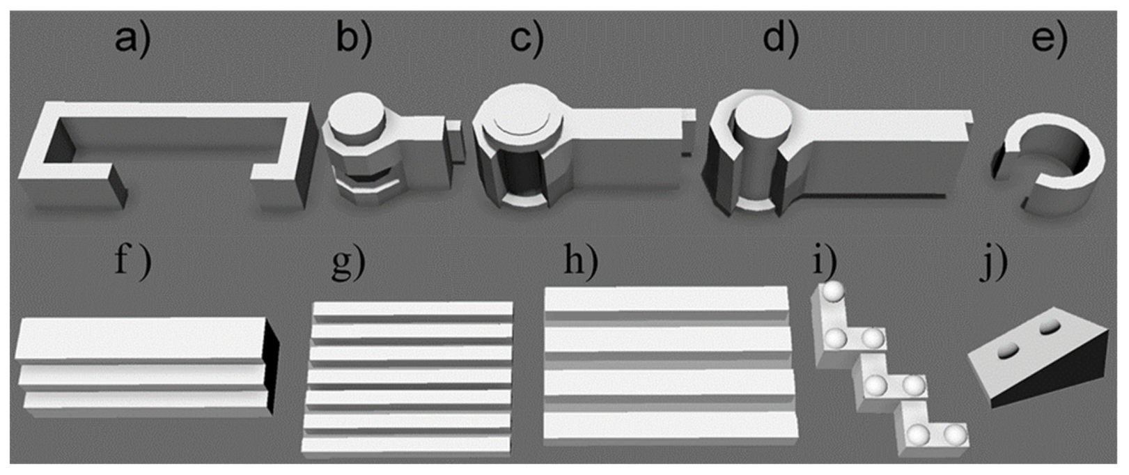
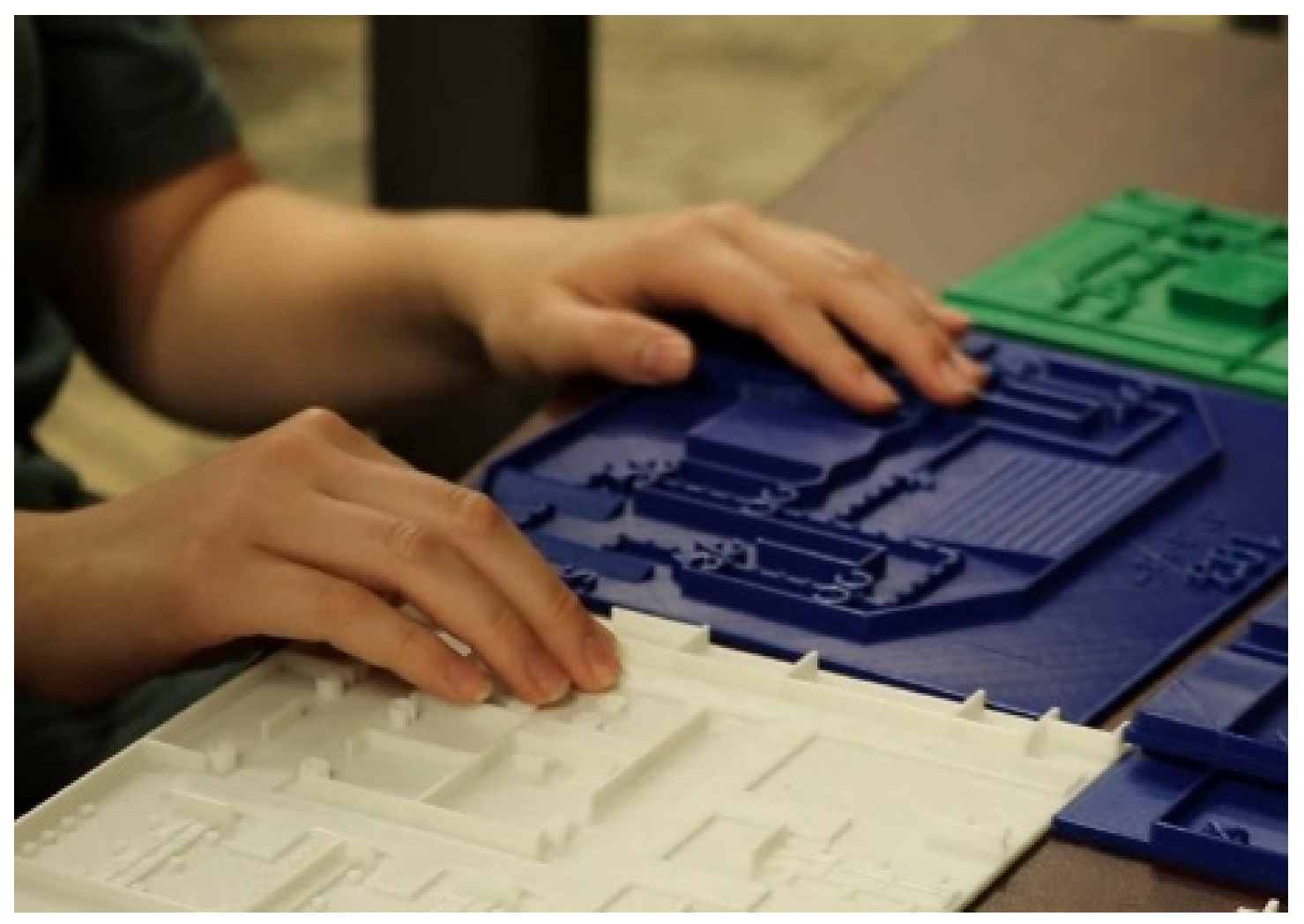
Data were collected using a 3-part user-testing study. Each of the parts was broken-down as follows: Part (A) Readability, Part (B) Representation, and Part (C) Map Difficulty Level. During parts A and B participants were asked a series of 5 questions, 3 related to Readability and 2 on Representation for each map and tactile symbol (see list of questions below). The tactile encodings were tested in isolation, separate from the map and other symbols, as well as integrated into a map, combined with other objects. Participants were first given a 3D-printed plate with multiple designs of the same isolated symbol, similar to
Figure 1a–e or f–j. In some iterations the symbol was represented by the same design but in different scales (larger or smaller). For each part of the study the encoding evaluated by the participant was chosen at random. Readability questions were used to evaluate how well participants understood the orientation and direction of the encoding. Representation questions were given next to evaluate the participants’ ability to identify the encoding symbol based on touch, and then they were asked whether they agreed that the encoding design was appropriate for describing a corresponding real-world object. The goal of the readability questions was to determine a set of symbols that can be approved by the majority of the users. This was critical, since if a user cannot understand the symbol in isolation, s/he would not be able to recognize it in a map. Therefore, the symbols were improved until they were almost universally approved. Similarly, agreement regarding the representativeness of the symbol was very important for choosing the best encodings.
The three Readability questions (Q1–Q3) were:
The two Representation questions (Q1–Q2) were:
Are you able to identify and recognize this symbol as a unique encoding different from all other encodings? If so, what does it represent? Possible answers: Yes or no, followed by the name of the encoding.
Do you agree with the use of the encoding for representing the object? Possible answers: Yes or no.
Once the isolation Readability and Representation test was complete, the participants were given a map and again asked the same Readability and Representation questions for the symbol integrated into a map and surrounded by other symbols. After the map Readability and Representation questions were completed, participants were asked to freely explore the tactile map (
Figure 2) and provide “think out loud” feedback. A separate 3D-printed legend with braille or embossed textual explanations of the encodings was provided. Initial map exploration ranged in time from 1 min to 5 min. As participants became more comfortable using the maps, and as the encodings became more optimized, the average exploration times for new maps dropped from 5 min to just under a minute.
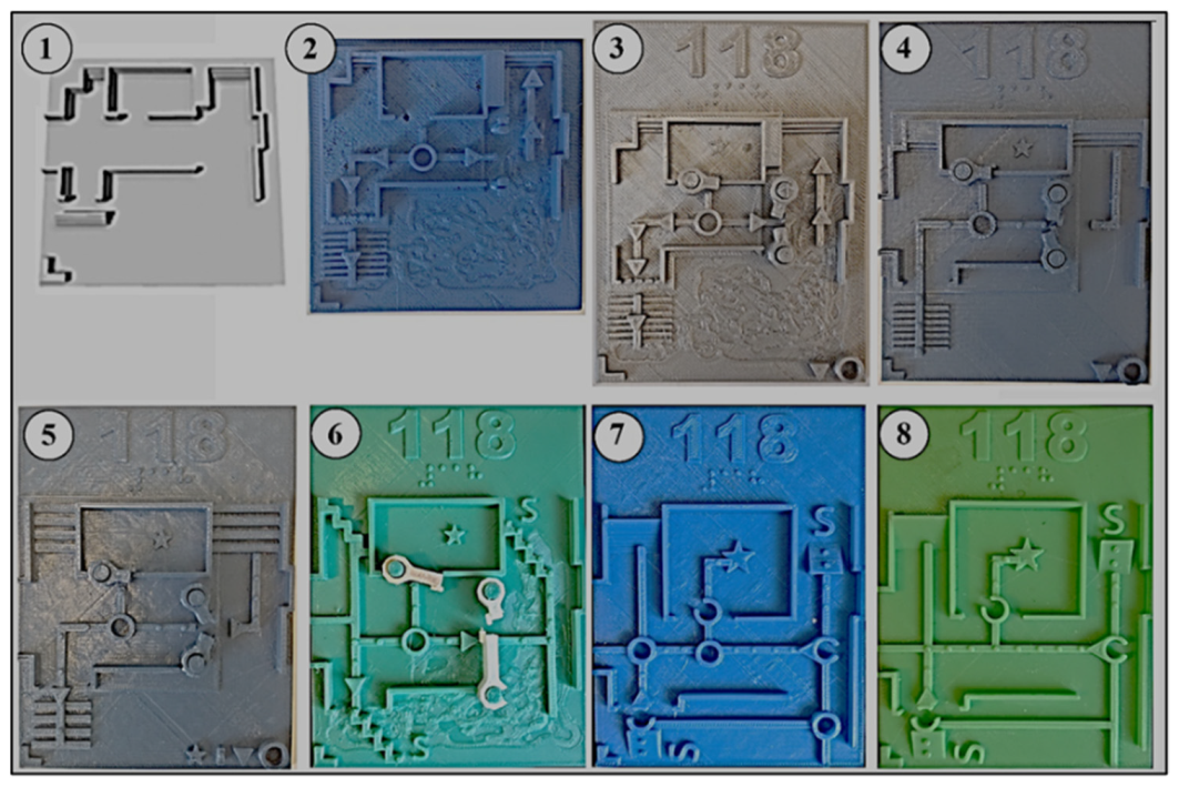
After map exploration, Part C Map Difficulty Level tasks and survey were conducted. Participants were asked to complete a series of tasks using the map. They were asked to show the travel route from the primary entrance to a specific room, then the emergency route from the room to the proper exit, how many and what type of doors were represented, how many stairways/ramps, and if there were any other paths. After these tasks were completed, a five-point Likert survey was given to each participant to evaluate the difficulty level of the map reading using a single question with a possible answer values from 1—very easy, to 5—very difficult. There were eight generations of the maps in which we continuously collected feedback and iteratively implemented for every sub-sequent design. Representative examples of 8 generations of maps designed for the same room can be found in
Figure 3. Generations refer to a major change in the map such as a new symbol addition, removal, or a major layout change. Not all encodings were updated in each map generation. Each experimental session required dozens of 3D-printed plates with multiple symbols printed at different scales together with different maps representing different map generations. A minimum of 1 teaching staff member from the test site and 2 research investigators were present at every session. A single investigator conducted the 3-part study, while the other investigators recorded observation data such as map reading strategy, map reading issues, and participant comments. Study time ranged from 30 min to 1 h, with an average study session taking approximately 40 min. Maps of different rooms were randomly assigned to the users, and every time a new map was chosen for a new room because repeated exposure to the same layout would produce unfair advantage. The overall complexity of different maps was similar, and the encodings were consistent across users for each map iteration tested.
2.5. Field Test
After the 3-part study was conducted, we began the field testing. The results from the 3-part study were used to determine which maps to use during field testing. Maps with low scores in readability and representation and high scores in difficulty level were not used. In field studies, each participant was given a map and asked to complete two navigation tasks. Specifically, they had to travel from the primary building entrance to the specified classroom or office, and then find different exits from the classroom or office and independently get to a safe location, often outside of the building. The participants could ask questions during the field test. An observer followed the participants and documented their use of the map, navigation, any questions, and time spent during the process. The main criteria of success was that the participants were able to independently complete a navigation task; the users were able to do this in all experiments. Additionally, the observers were noting how many times the users were looking at the map during the navigation. Many of them studied the map beforehand, but did not use it during the navigation, while others could check it between 1 to 3 times. We did not optimize for faster completion of the route because different participants were working at different speeds, so it would not be an indicative marker of success. All observations were used to inform the development of the map along with the 3-part study data. Observation data are vital during field tests as they allow researchers to objectively analyze characteristics of an individual participant’s navigation and map reading process [
41]. The observation data were compared with the reading and representation questionnaire and difficulty survey data to further evaluate the participants’ answers. The findings from the comparison were aligned with the participants’ 3-part study answers and the use of the maps during field testing. The 3-part study and field test results of the optimization of each individual encoding and map is described in detail below. Additional details about collected data, role of the experimenter, and field tests are available in the
Supplementary Materials.
3. Results
Below we describe the results of the iterative process focused on individual symbol encoding, followed by optimization findings of the symbol integration into a map.
3.1. Paths
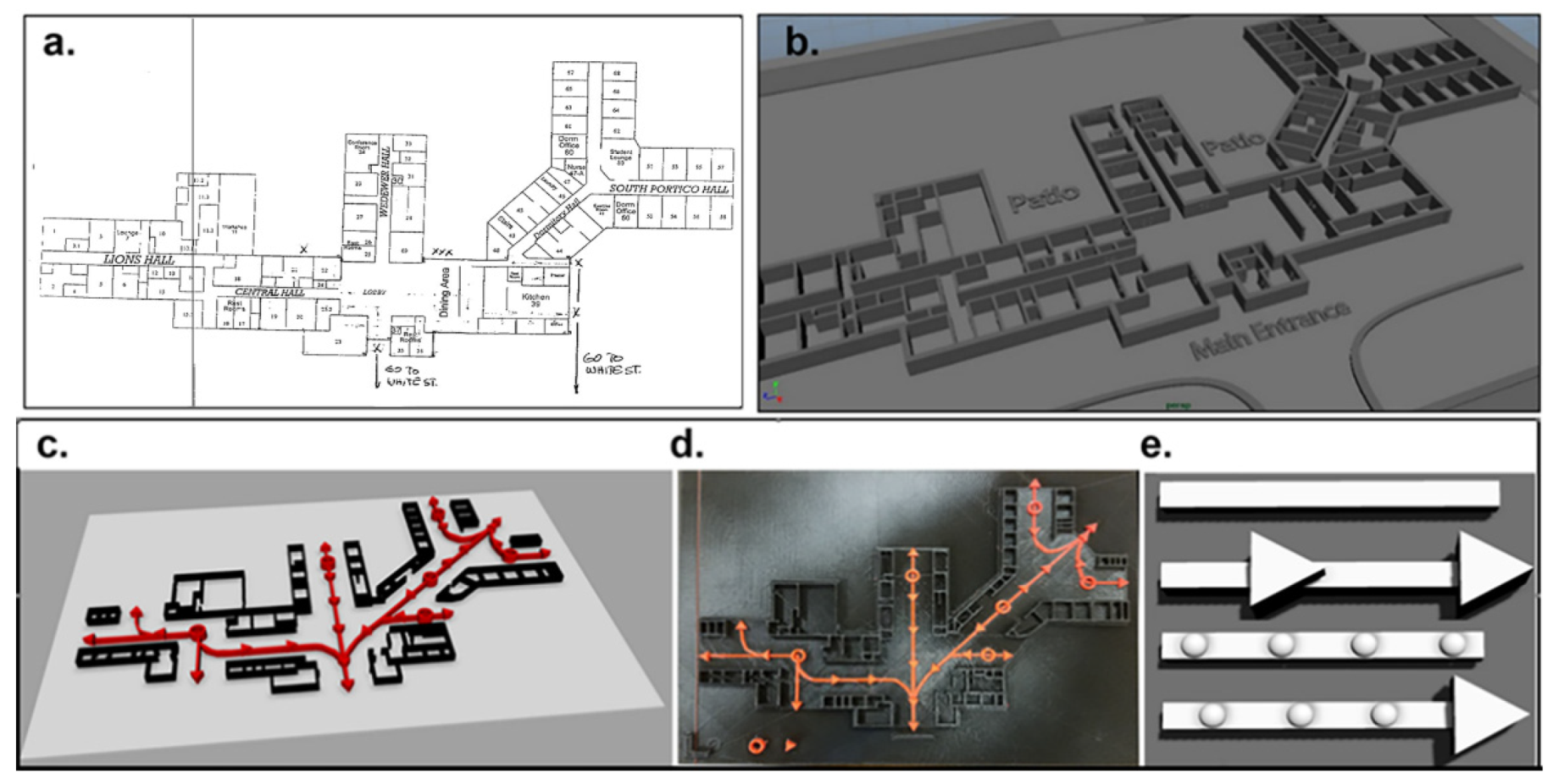
The most important goal of the tactile maps is to assist the user with an improved ability to safely navigate the space. While, traditionally, the floor plans and the positions of the walls would be considered the most important for a sighted individual, for a person with blindness the most vital feature of a map is the pathway. Based on our early evaluations, the first request from the users was to include tactile indicators for pathways. Our initial 3D-printed map was based on a floor plan and did not have any tactile encoded pathways (
Figure 4a,b). These early maps were generated directly from the blueprint as raised elements on the 3D-print. This map was difficult for users to understand because they often confused the walls of the hallway with the walls of a room, and as a result the users could not determine their location or how to navigate to other locations on the map.
In the next generation of the map encoding system, we developed representations for a pathway (
Figure 4c,d): as a rail with arrows showing potential directions of movement and as a rail with raised dots used to introduce new texture to the map and make pathways feel different from the walls (
Figure 4e). All these representations were tested for various line widths and elevations. In some of the maps, pathways were interrupted by other symbols, such as doors or stairs. It was observed that if a path had a gap or was obstructed, it became more difficult for the users to follow. The user feedback revealed that a continuous path provides the best readability while communicating travel routes.
Another challenge was to provide the user an opportunity to differentiate between a regular path versus an evacuation safety route. For this reason, our solution was to use smooth rails to indicate regular routes and rails with dots for evacuation pathways. The use of dashed lines on top of a rail was also tested. Users preferred the dots because that texture more easily translated to a sense of urgency. One user said, “The dashed lines are a smoother texture to feel, but the dots make more sense to me, these are like harsh dots so pay attention that this is the way.” In addition to that, the width of the path was also a very important parameter. Out of the fifteen participants, four preferred the wider path, eight preferred the narrow path, and three had no preference. An interesting finding was that older participants preferred the wider path and the younger participants liked the narrow path. However, all the participants could accurately follow both path types if they remained connected. When testing the path encodings with different map sizes, participants performed better with narrow paths on smaller maps and wider paths on larger maps. Therefore, it was determined that the optimal width and elevation of the path for smaller maps (10 cm × 10 cm) were 4 mm and 4 mm, respectively. For larger maps, pathways were 13 mm wide and 2 mm high.
3.2. Walls
Walls were among the first encodings to be created and tested. Users had to be able to locate and comprehend the shapes of rooms, buildings, and hallways. Most participants started by lightly touching and slowly moving over the walls with both hands. They would leave one had at an ending position, typically the room of interest, while using the other hand to identify and track the pathways. The encoding optimization was continued for the wall until all participants were confirming that they were able to differentiate the walls from other objects. For example, one participant said, “The walls are identifiable.” Another participant said: “I can clearly see the room.” The encodings for the wall height were not defined by a precise proportion, but by the ability of the users to recognize them as walls. The distance between walls could also be adjusted for better readability. For example, in case of very narrow corridors, the spacing between walls could be disproportionally increased to ensure that the information about the presence of the corridor can be reliably perceived. This approach is called “contaminated scale” and it is frequently used while preparing tactile materials for individuals with blindness [
42].
As with the pathway encoding development, different parameters were tested and optimized over several iterations. For example, the users performed better with 5 mm height than with lower heights of 2 mm. It was also observed that the encoding for the walls should be higher than the encoding for the paths, otherwise the participants were confused between those two. One participant commented, “I prefer them because they are more realistic, than the lower 2D versions.” We also concluded that the optimal height difference between the path and wall encodings ranges from 1 mm to 3 mm.
3.3. Doors
Different encodings of doors were initially tested as isolated symbols and then as a part of the map. The door encodings included two movable “doors”, one opening in the “wall”, and one circular symbol (
Figure 1a–e). The door heights were between 2 mm to 8 mm (optimal height 5 mm). During tests for optimal dimensions, users were provided with multiple versions of the encodings with the whole range of heights. The dimensions that were perceived as acceptable by most users were considered the optimal. Similarly, the diameter for a circular door was between 4 mm and 15 mm, and the optimal was 6 mm. The very first door encoding was represented as an opening in the wall. Later, one user suggested making a movable door that could be opened the same way as an actual door. It was determined that users really wanted to know the direction of the door opening and if it was manual or automatic. This information was specifically requested by multiple participants, since they find it important to know it in case of an emergency. This was especially important for them if the doors were leading outside of the building. We agreed that this information would be important to include in the map since in some instances the automatic doors could malfunction and in some locations emergency exits were through automatic doors.
Even though the movable doors were liked by most of the participants as isolated symbols, in general they had issues when integrated into an actual map. In combination with other map encodings, the doors restricted encoding space and limited finger movement. The functionality of the swinging was also hindered by the other encodings, such as the path. Therefore, we decided to simplify the encoding but still provide all the information requested by the users.
The next door encoding was a ring shape with a small gap indicating if the door was automatic or manual and the direction that it opens. A ring with one gap indicated a manual door, while a ring with two small gaps was an automatic door. The ring symbol proved to be an easier, more effective encoding, since the participants identified the doors faster. All participants were able to identify the doors in isolation and in combination tests. However, two of the older participants had trouble reading the direction of the door opening due to the small gap size. Therefore, the gap size was increased and retested, resulting in an optimal gap size of 3 mm. An additional finding was that even though the older participants had trouble with the small gap size, they preferred an overall smaller door encoding size, whereas the younger participants liked the larger door encoding.
Finally, triangle shapes were added to doors to designate a transition to and from interior to exterior spaces. One participant said, “I like having the triangle to indicate the transition.” Another participant was surprised when she discovered an exit that she did not know existed, saying “oh, there’s a door here. Huh, that’s cool, I didn’t know I could go that direction.” The transition door encoding additionally informed the user about the location of the emergency exits.
3.4. Stairs
A variety of stair encodings were developed and evaluated. Five main types of stairs were used both individually and as a part of a map, (
Figure 1f–j). Surprisingly, stair encodings that mimicked physical stairs (
Figure 1f) were difficult for the participants to recognize. When tested in isolation, participants had difficulty distinguishing individual steps which caused readability issues in determining direction. In addition to that, when the stairs were integrated into maps, some participants became confused and said they were “too similar to the Wall and/or Path.” We observed similar identification and orientation issues with two more stair encodings (
Figure 1g,h). These encodings did not supply adequate 3D support as elevation was lower when compared to the other encodings (
Figure 1g (1 mm) and
Figure 1h (2 mm)). The negative feedback from these two encodings was also due to the size and spacing of each step, and the overall size of the encodings caused issues in map integration. In combination with other encodings on the map, the three symbols (
Figure 1f–h) were even more challenging for the users. Reading errors were frequent when participants combined multiple encodings to form geometric shapes that were incorrectly perceived as one encoding. Stair encoding (
Figure 1h) was more recognizable, however, since this symbol was similar to one in
Figure 1g, only with larger elements. The fourth encoding (
Figure 1i) had better results in terms of identification and readability in isolation; however, when combined in the map, it presented similar issues to the previous stair encodings. When testing the ramp encoding (
Figure 1j), all the participants were comfortable with the representation in the isolation test, and thirteen agreed with the representation in the integrated map test. The participants also understood this encoding as both stairs and ramps. An interesting finding was that all the participants were not concerned necessarily with the map providing information on whether stairs or ramps were present as separate structures; rather, the encoding should represent a change in physical structure and elevation in the space. One participant said, “We will be able to tell if there are stairs or a ramp when we are there.”
There are two important conclusions related to the choice of the encoding for the stairs and ramps. The first is that the combination of symbols, such as doors and walls, already provided architectural context notifying the user that the stairs or ramps might be present. Many participants knew that they would be navigating spaces that would most likely contain stairs and ramps. The second conclusion was that participants were mainly concerned about information regarding a change in elevation over knowing specific structures. It was also noted, based on user feedback, that separating the encoding into two—one for stairs and another for ramps—would add additional spacing, combination, and comprehension issues. Therefore, including a single representation provided them with the necessary information to understand that within the space, a change in elevation—either from stairs or ramps—would occur.
3.5. Other Symbols
In addition to the most frequently used symbols, i.e., walls, stairs, and exits, additional symbols were developed, tested, and optimized to enhance map functionality. For example, a requested symbol for “the end of evacuation path” or “safe area” was developed and incorporated in the map. A raised “S” was used starting in the sixth generation of maps and was determined to be the optimal encoding for participants to identify. It was observed that curved shapes were more distinguishable when combined with the other map encodings.
However, not all the experimental encodings were chosen for use in the maps. For example, a raised ring indicating a path split in multiple directions was tested by several users on various iterations of maps and was later discarded. The multi-direction rings were implemented prior to the paths being connected, allowing participants to build a general overview of the map. However, once we connected the paths, the rings were not needed to indicate multiple directions. This decision to discard unneeded elements was similar to others made during iterative development and testing of the maps and encodings. This approach was used to determine the optimal set of map encodings providing the most useful information to the users.
3.6. Map Spacing and Size
Another important parameter of the map is its size and the spacing between different elements. When used alone, many types of 2D and 3D shapes are identifiable. However, when combined, many shapes were misidentified. These errors were largely based on the close proximity of multiple symbols, because in combination they could be perceived as a new shape. This means, when used in combination, standardization of encodings required not only size and elevation parameters, but also considerations for spacing. For example, distance between two walls of a hallway should be at least two centimeters. This enables the user to properly move their fingers across the map for reading, and this requirement was satisfied for the maps at least 10 cm × 10 cm in size designed for a single room.
Additionally, when increasing the spacing between map elements was tested, an increase from 2 cm to 3 cm was found to be confusing for the users. Users became lost with respect to travel direction and their current orientation within the map. One participant said: “The walls are here, and the path is here, but mentally I perceive this area between the walls and path as a space that has to be crossed.” Another participant suggested that we “reduce the white space.”
3.7. Eight Generations of Maps
Figure 3 demonstrates eight generations of a map for the same room. Iterative improvements were conducted for each following generation based on the feedback from the users. The details of the changes between generations can be found in the
Supplementary Materials.
3.8. 3-Part Study Results
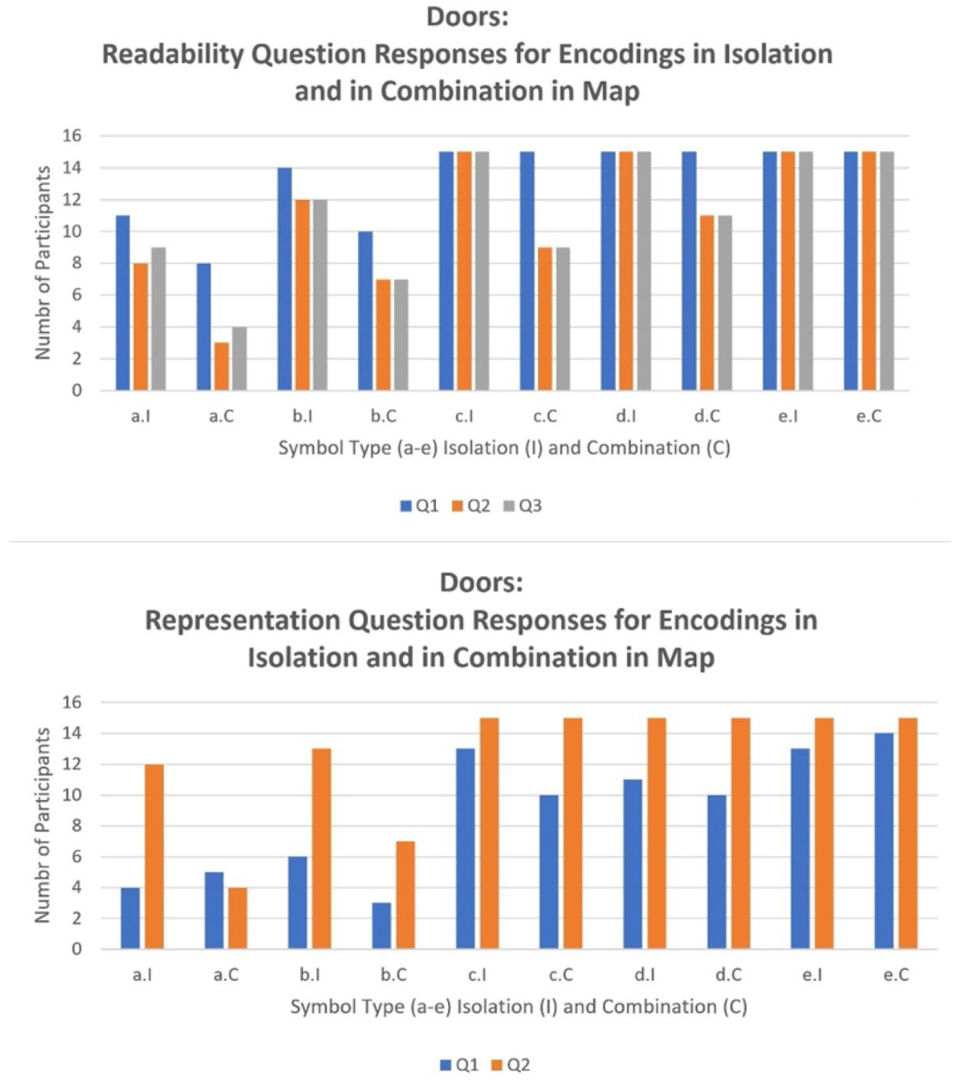
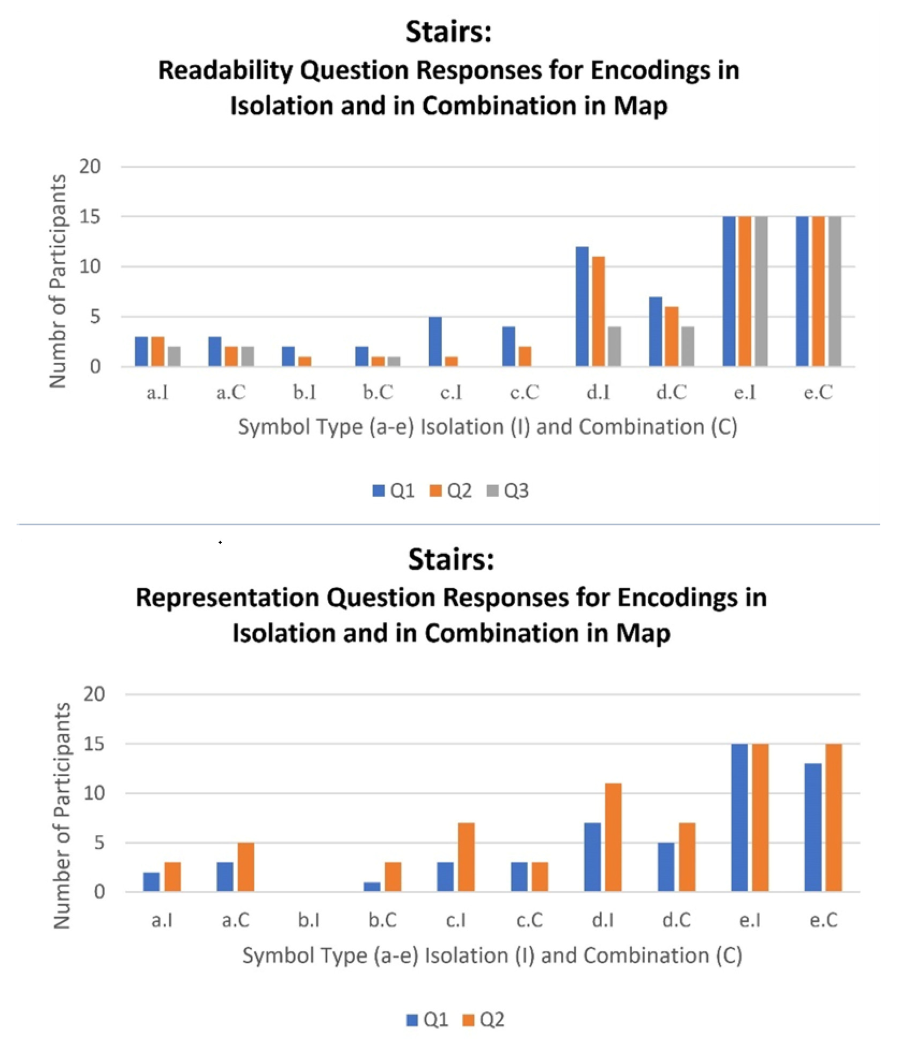
The results of the Readability and Representation questionnaire for the Door and Stair symbol encodings are plotted in the bar graphs below (
Figure 5 and
Figure 6). Each participant tested the symbols in insolation (
Figure 5a.I–e.I and
Figure 6a.I–e.I) and in combination (
Figure 5a.C–e.C and
Figure 6a.C–e.C) in multiple maps. The height of the bar shows the number of participants (out of 15) who were able to positively answer to the questions about Readability and Representation. Different generations of symbols are labeled from a (#1) to e (#5), and for each generation symbols were evaluated in isolation (I) and in combination with other symbols on the map (C). From left to right, with the later generations, the data show that readability gradually improved and that the symbol encoding design was accepted by more participants. With readability we found that if the participant could not feel a symbol then the other readability markers were also negatively impacted. As a result, the user could not comprehend the encoding symbol. Similarly, if the participant could feel the symbol but not its parts and properties providing additional information about the symbol’s direction and orientation, then the readability was negatively impacted and therefore the participant could not read the symbol. Finally, if the participant could feel and distinguish the parts and details of the symbol, then the additional information pertaining to the direction and/or orientation was understood by the participant and therefore the readability of that encoding symbol was confirmed.
In
Figure 5 we see that initially, even when symbols were recognized in isolation, the participants had trouble identifying them on the map. However, later, optimized symbols were well recognized both in isolation in when combined with other symbols on the map. This demonstrates the need to test the symbol encodings in combinations with other symbols as the goal is to introduce the symbols within the context of a tactile map. Similar to the Readability results, the findings for the symbol encoding Representation showed that if the participant could not identify the symbol encoding, then they also did not agree with the tactile symbol encoding as representing the physical object. An interesting finding was that for several encoding Representation tests, the symbol encodings were more accepted when in combination with other symbol encodings on the map as opposed to in isolation. We believe that this is because the other symbols helped to provide context when used in combination. Overall, we could confirm following “formula” that “optimized encodings + proper spacing = easier to understand maps.”
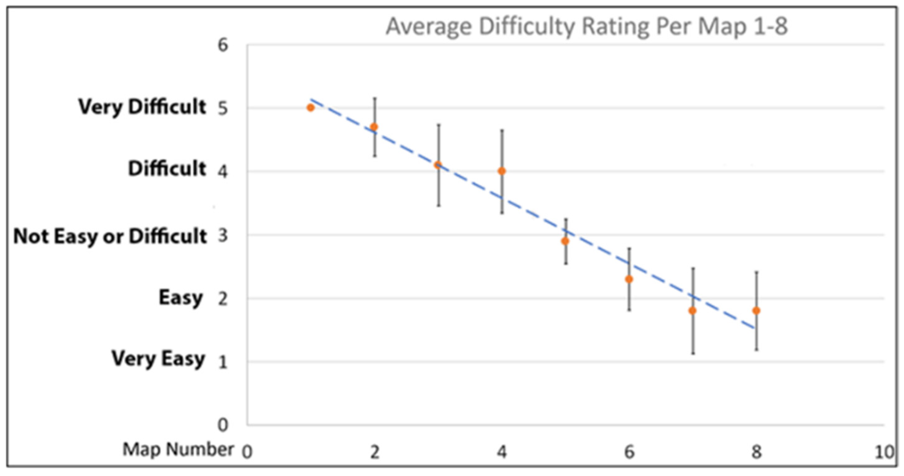
The difficulty rating for the maps from the same generation were averaged and plotted. Each generation of the map was evaluated by 15 participants. The mean values for each map generation were plotted in
Figure 7, and the error bars represent the standard deviations. The first point has 0 error because all the participants concluded that the map was very hard to read and rated it as 5.
Figure 7 demonstrates that with each design iteration of the encodings the participants found that the maps were easier to understand, and the difficulty level decreased from almost 5 to less than 2. This further shows that iterative development and testing of the encodings positively affected the Readability, Representation, and overall user experience of the maps. The summary of the optimized symbols and the optimal map configuration are shown in
Figure 8.
3.9. Field Test Results
Field tests demonstrated that the participants benefited from the iterative map development process because they were able to comfortably use the optimized maps for the navigation. All participants studied maps before the navigation and were given a target location on the map. They had to get there by themselves and were observed during the whole process. Only 9 of the 15 participants took part in the field test, so more research can be conducted in the future. To evaluate the generality of the approach, the field tests were conducted in four different locations which will now be discussed.
3.9.1. Location 1: Conklin Center
Two participants took part in the field test at the Conklin Center, using one of the earlier versions of 3D-printed tactile floor maps to navigate the location. One participant had experience navigating the location prior to the study, while the other did not. During the field testing, one of the participants was able to get to the specific locations without assistance. The other participant required guidance in navigating and identifying rooms. Both participants said that the arrow encodings on the paths of the map were confusing. We determined that the arrows were confusing to the participants since they imply a specific direction; however, the path can be travelled in any direction. The arrows also caused interruptions in the path and made it hard for the participants to maintain consistent finger reading. As a result, the encoding was greatly improved in later generations of the map, as a smooth or dotted line that could be easily followed by the participants without interruption.
3.9.2. Location 2: USF
Single room maps were used by two USF participants to locate a room entrance and identify multiple travel routes and emergency exits for two different rooms. One of the rooms was previously visited at least once by each participant, while the second was completely unfamiliar to them. Both USF participants navigated the locations without error. One of the participants was using the map while walking to the exit. The other participant read the map prior to navigation and did not use it during the trip, but was able to locate and travel using multiple routes including the emergency path.
3.9.3. Location 3: Lighthouse Office Suite
Two 3D-printed tactile maps were used for the Tampa Lighthouse location. First-floor and a fifth-floor maps of the office suites were given to each participant. Four participants were observed navigating the space.
During the field test, all participants completed the first- and fifth-floor navigation without assistance from staff, successfully finding both the needed room and building emergency exit. All participants also referred to the map at some point during the field test to locate travel routes, stairwells, rooms, and exits. We observed one participant refer to the map twice and two participants refer to the map three times. We also observed one participant taking a longer route to reach the specific destination than the other participants. However, we could not determine if this was a map reading error or individual preference.
3.9.4. Location 4: Southeastern Guide Dogs
One participant from Southeastern Guide Dogs used a 3D-printed tactile floor map to get to two different target locations, a room and an emergency exit. The participant had very limited knowledge of the location. During field testing, the participant was able to walk to the target room without any issues or assistance. This participant paused twice, once at the beginning of the test, and later to check orientation while navigating a hallway just before making a turn. In summary, field studies demonstrated that the latest map iterations were comfortably used by the participants for navigation at different locations.
4. Discussion
The study shows that 3D-printed tactile maps can be used to deliver spatial and navigational information about environments to people with blindness. As such, the maps should be given to the user along with the map legend, in either braille or raised text, prior to navigating the space or mounted next to the primary entrance along with traditional emergency maps. Additionally, the field test indicated that the maps’ portability could also be used during real-time wayfinding [
43]. Consideration should be given to the style and complexity of the map and map encodings based on the area, such as office space or a specific room. The user should be given as much time as they need to independently explore the map and related encodings. We observed each participant exploring and learning the map symbol encodings at various speeds for different sections of the map. Therefore, it was not vital for us, the researchers, to calculate the speed of identification, as the study aims to provide the user with an optimal map-reading experience in terms of acceptance and understanding. If necessary, the user can be further assisted by the caregiver with a verbal description of the map, space, and encodings while the user explores the map and the legend. This method of implementation is in line with previous studies, showing that providing tactile mapping tools can improve the users understanding over just verbal descriptions alone [
3].
Some of the findings of this study were unexpected and were discovered only from explicit feedback from the participants. First, it was interesting to know that they were less worried about finding cafeterias and restrooms then knowing about all exits from a lecture hall or an office. For instance, lecture halls might have three or four exits, and typically people with blindness only knew about one or two of them. Information about cafeterias and restrooms is often provided at orientations, but unfortunately such critical information as closest safety exits from different lecture halls is not readily available and was highly desired. Additionally, participants were interested to know if the doors were manual or automatic but did not care much if elevation change was because of stairs or ramps.
Another important finding was that a single encoding can be enhanced using small modifications to deliver more information to the user. This is the case with the added triangle and gap for the doors and the dots for the emergency path. These types of optimizations limit the number of unique symbols that the user has to remember, while at the same time improve readability, since the overall encoding design remains consistent, a ring shape for the door with small modifications providing information about specific properties. This implies that proper encoding and map optimization can reduce cognitive overload, thus allowing for more efficient map use.
Several of our findings are consistent with the published literature focused on different types of tactile maps. For example, ref. [
39] studied different encodings for food, drinks, and other items that can be found in a park. The approval rating for the encodings were from 0 to 88%. This demonstrates that for any given set of encoding it is hard to find reasonable representations from the first try and that an iterative approach is critical for the development of useful tactile encodings. Additionally, all respondents in [
41] indicated that roads and paths should be included in the maps. This is very consistent with our observations that the users requested pathways as important components of the interior maps. In addition to that, this study agrees with the conclusions from [
40] that the users were interested in both safety and navigation information including entrances/exits and indications of hazardous areas. Our study for the interior maps agrees that the users were interested in the navigation information with respect to safety, especially safety exits and shortest pathways from the classrooms and lecture halls in case of emergency. Another important observation was that the maps should not be cluttered with unnecessary components [
17,
22,
44]. This means that it is important to create encodings that are compact but still recognizable and that ideally could still provide additional useful information. Based on that requirement, we had to make multiple iterations for some encodings, especially stairs and doors, to determine the optimal performance. The results of the optimized encoding suggest the optimal amount of information that should be present in an interior map of this nature, as well as the symbol design and types for intuitive/improve map layout.
This study also demonstrates optimized design considerations that can be used to help map creators enhance their maps. We conclude that for map developers, when designing and evaluating the maps, an optimal set of parameters should be considered. For example, width and height of the features, spacing, texture, and size. In addition to that, maps can be designed slightly differently based on their functionality. Additionally, 3D-printed maps have many opportunities for optimizing encoding designs and especially for producing tactile maps with different level of symbol elevation. The summary of the symbols optimized in this research and the optimal map configuration are shown in
Figure 8. Furthermore, it is important to understand that the use of 3D-printing provides an alternative production approach that is more accessible to map creators and users. Additionally, user feedback is critical for design of maps optimized for the user needs and experience. Finally, if the maps are created for individuals who are not blind but have limited vision, maps should be printed using two colors. Specifically, background and all encoded elements should have contrasted colors, e.g., black and white. Depending on how much they can process visually, this might help them to process the map faster.


