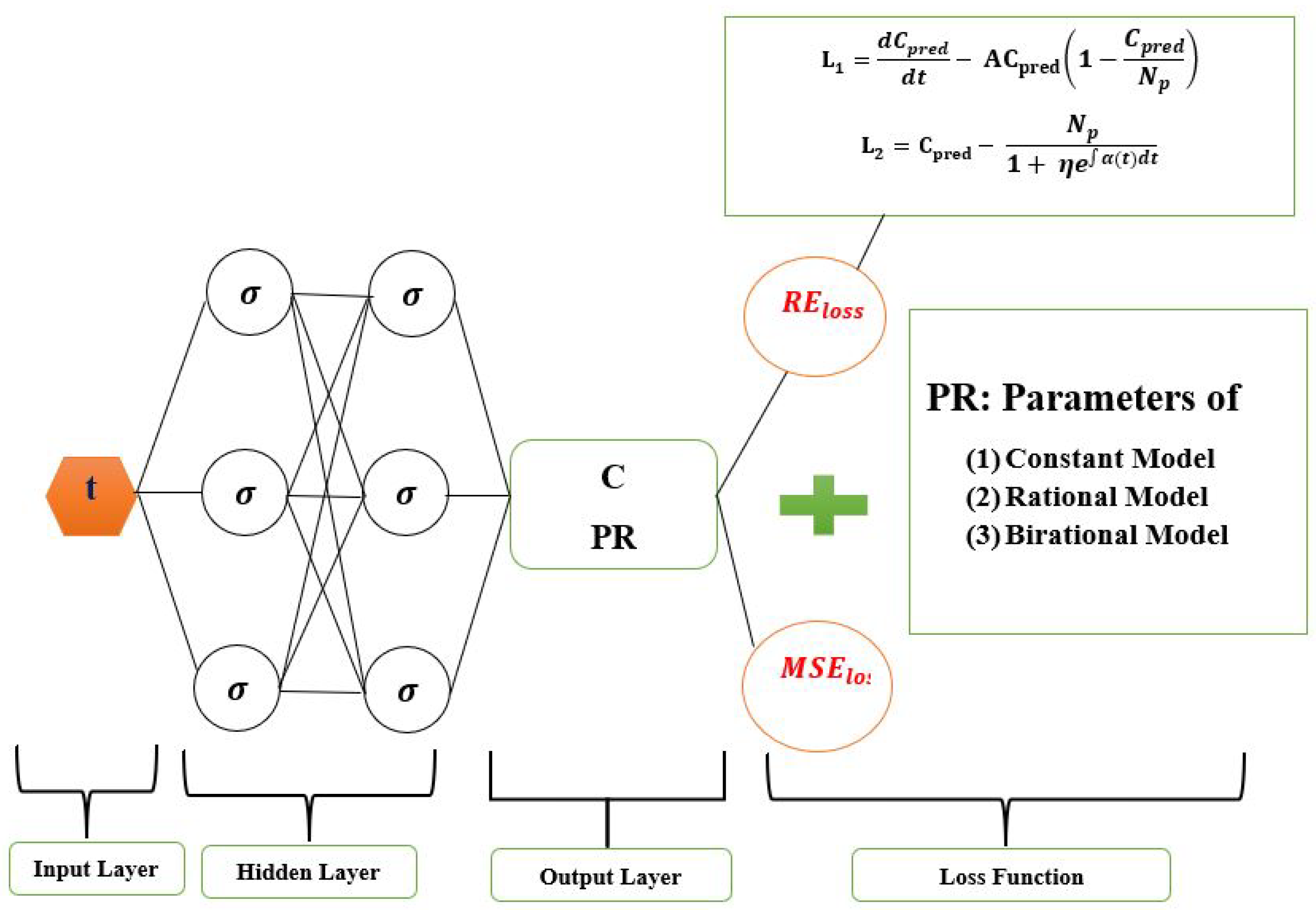
Figure 1.
Logistic-Informed Neural Network schematic diagram with non-linear time-varying transmission rate.
Figure 1.
Logistic-Informed Neural Network schematic diagram with non-linear time-varying transmission rate.
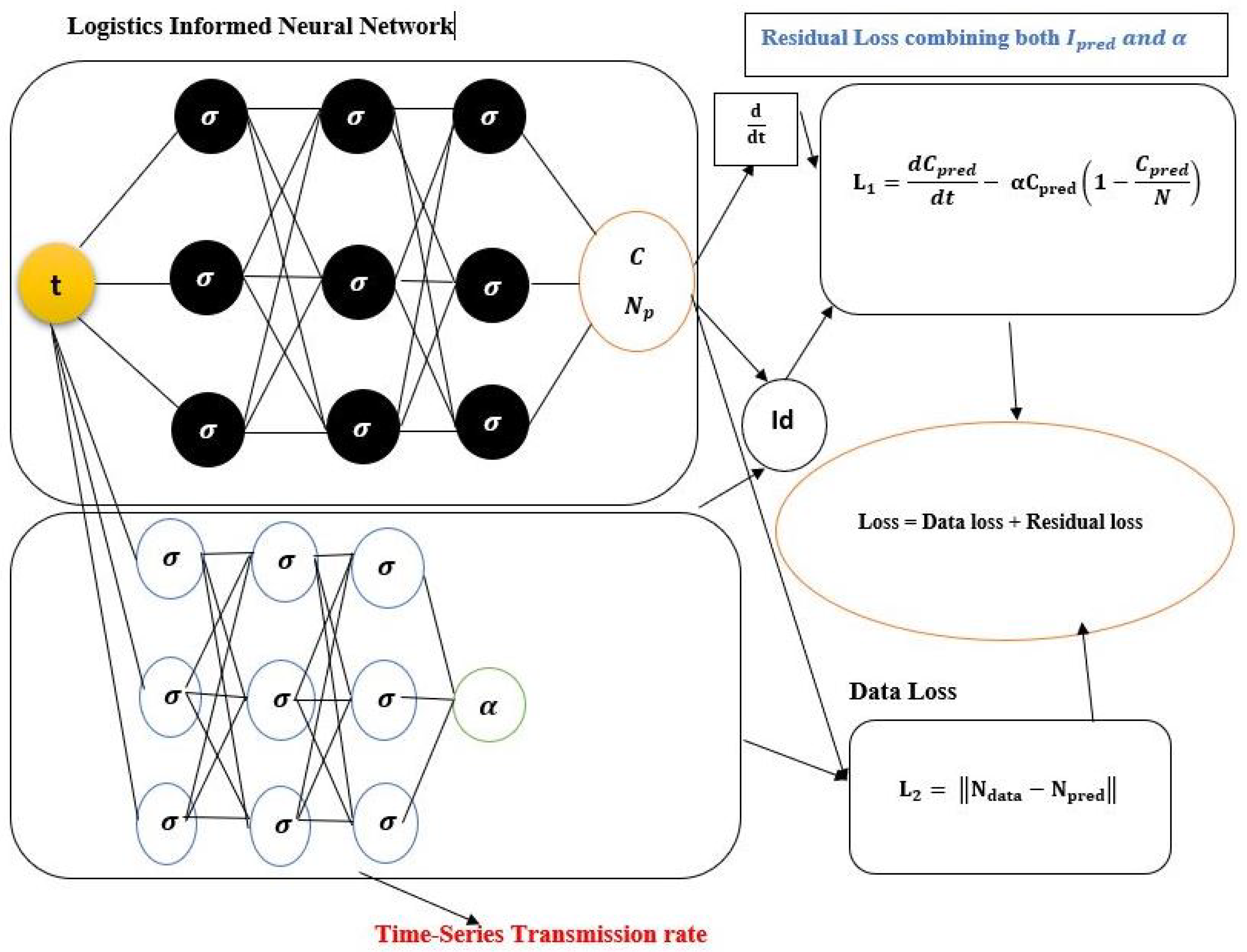
Figure 2.
Schematic diagram of the Logistic-Informed Neural Network with non-linear time-series transmission rate.
Figure 2.
Schematic diagram of the Logistic-Informed Neural Network with non-linear time-series transmission rate.
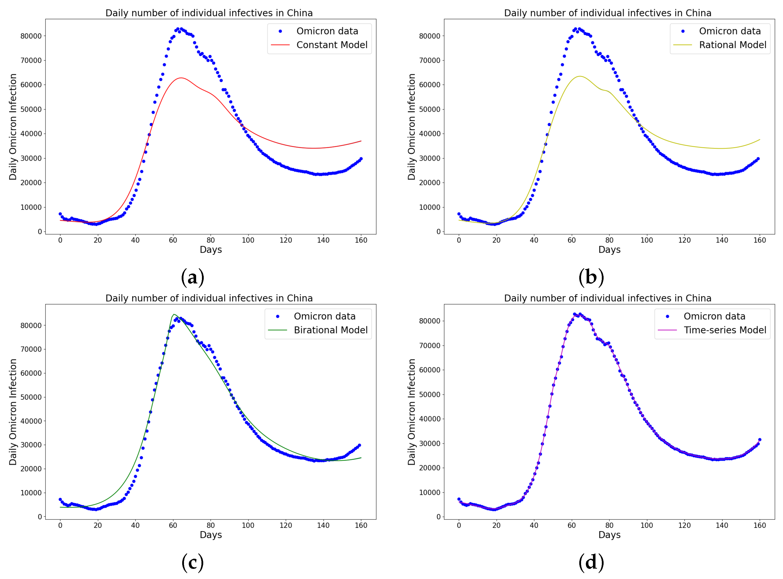
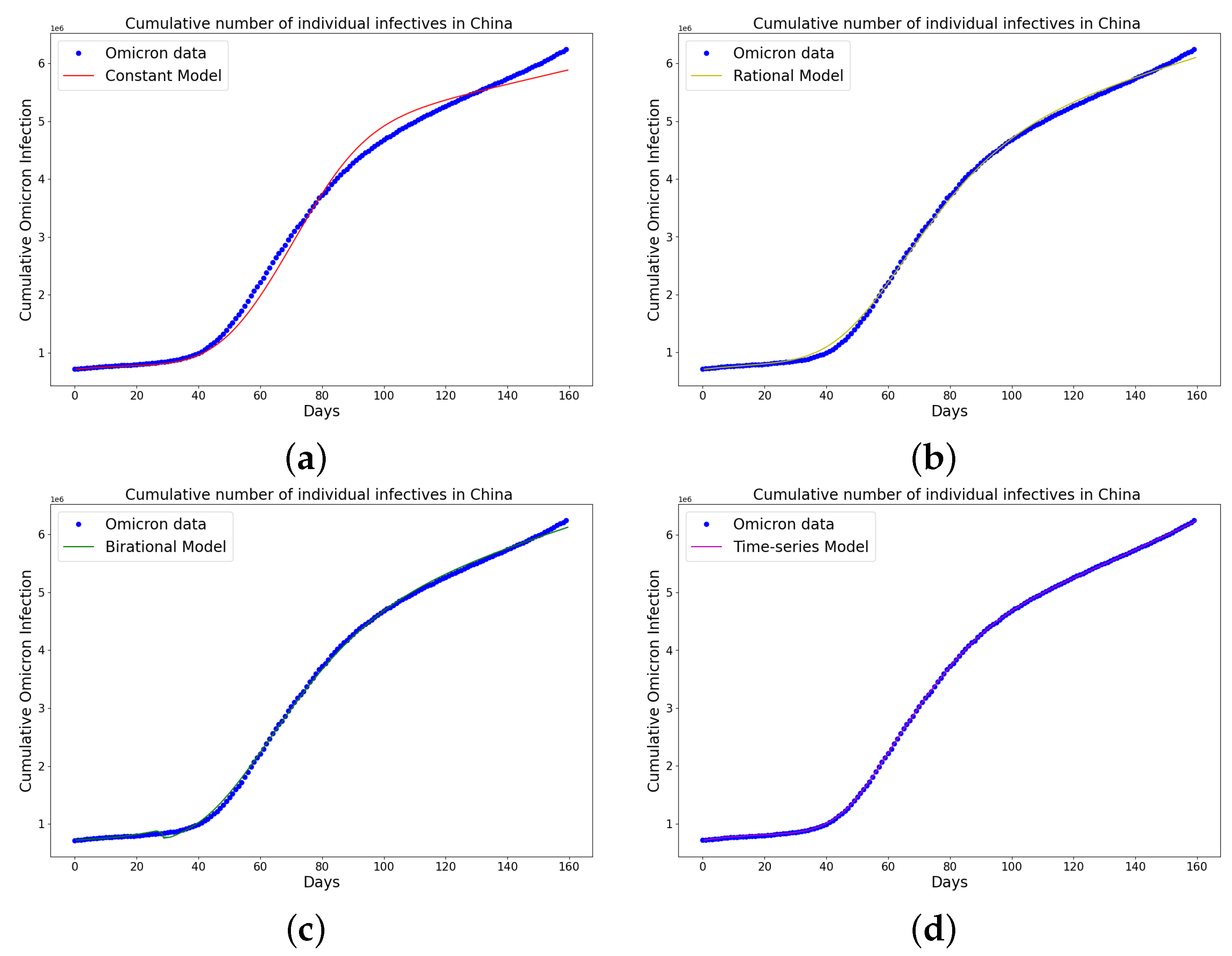
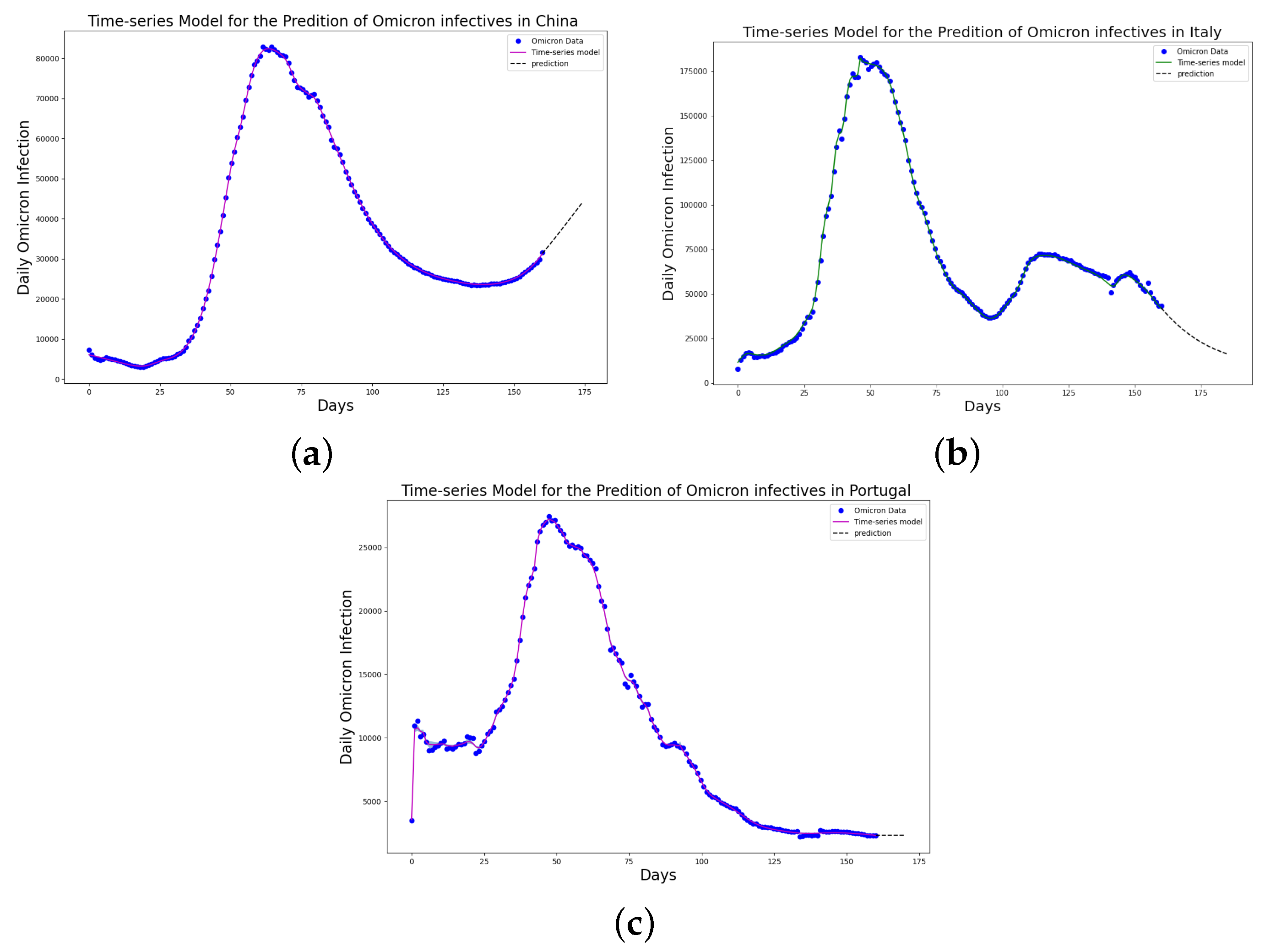
Figure 3.
Simulation results of China daily Omicron data from 25th of March to 31 August 2022. The graph of daily Omicron infective data and the learned infectives of (a) constant model using LINN Algorithm 1; (b) rational model using LINN Algorithm 2; (c) birational model using LINN Algorithm 3; (d) time-series model using LINN Algorithm 4. The figure shows how closely each model accurately fits the data. Notably, the time-series model fits the observed data better than the other models, which shows how well it can learn and describe how the Omicron variant infection spreads in China. This excellent fit shows that the model captures the complex patterns and trends of daily Omicron infections in China.
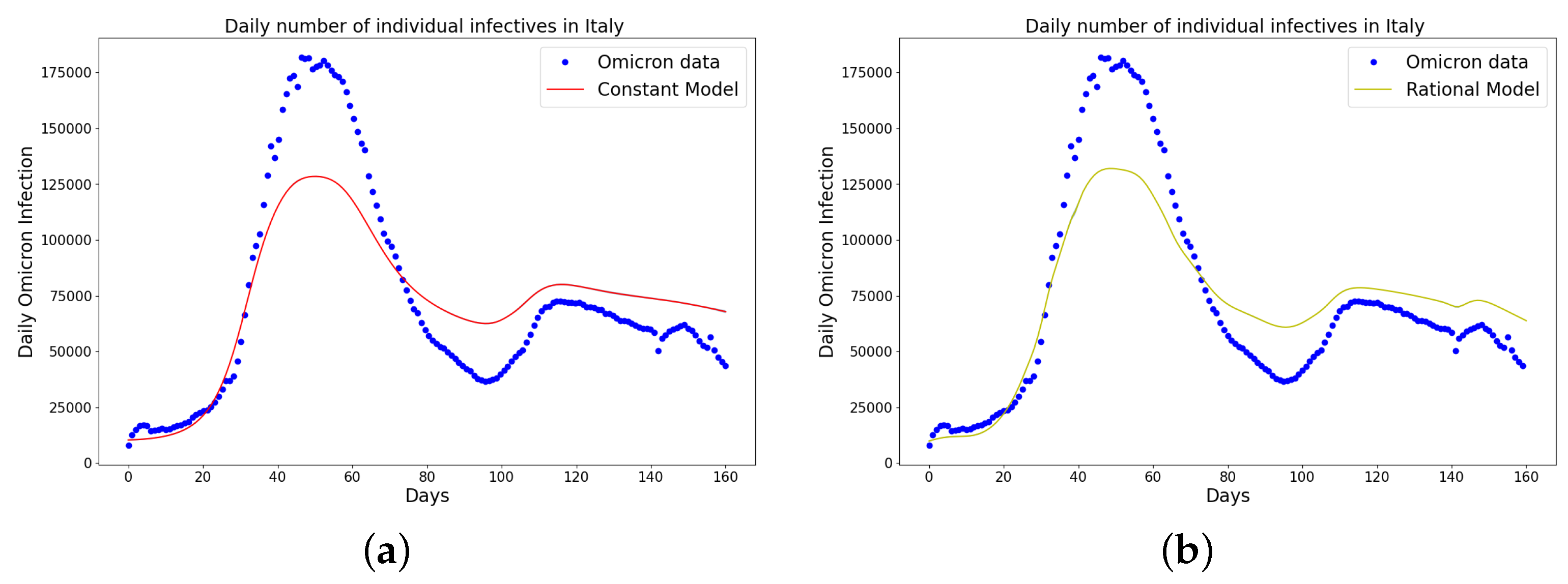
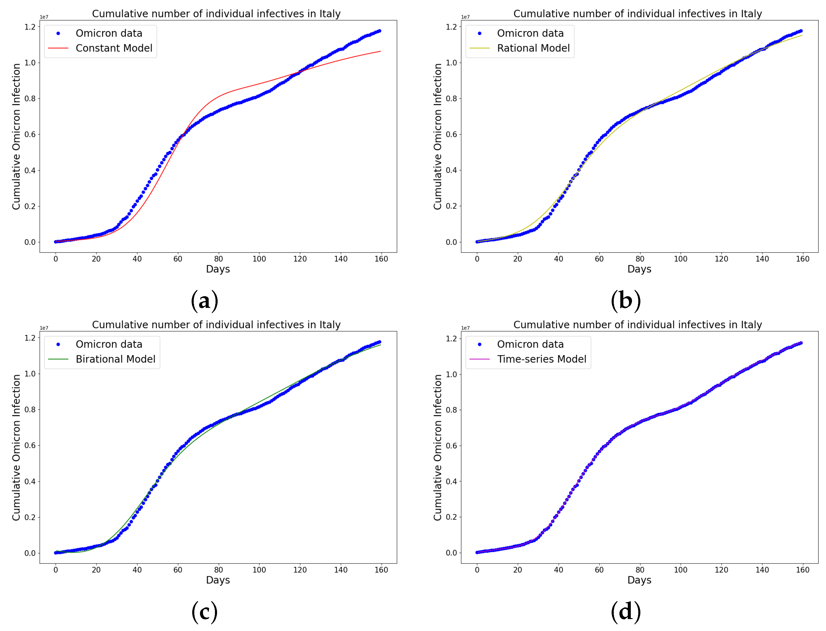
Figure 4.
Simulation results of Italy daily Omicron data from 30th of November 2021 to 8th of May 2022. (a) The graph of daily Omicron infective data and the learned infectives using the constant model by the LINN Algorithm 1; (b) the graph of daily Omicron infective data and the learned infectives using the rational model by the LINN Algorithm 2; (c) the graph of daily Omicron infective data and the learned infectives using the birational model by the LINN Algorithm 3; (d) the graph of daily Omicron infective data and the learned infectives using the time-series model by the LINN Algorithm 4. The figure shows how closely each model accurately fits the data. Notably, the time-series model fits the observed data better than the other models, which shows how well it can learn and describe how the Omicron variant infection spreads in Italy. This excellent fit shows that the model captures the complex patterns and trends of daily Omicron infections in Italy.
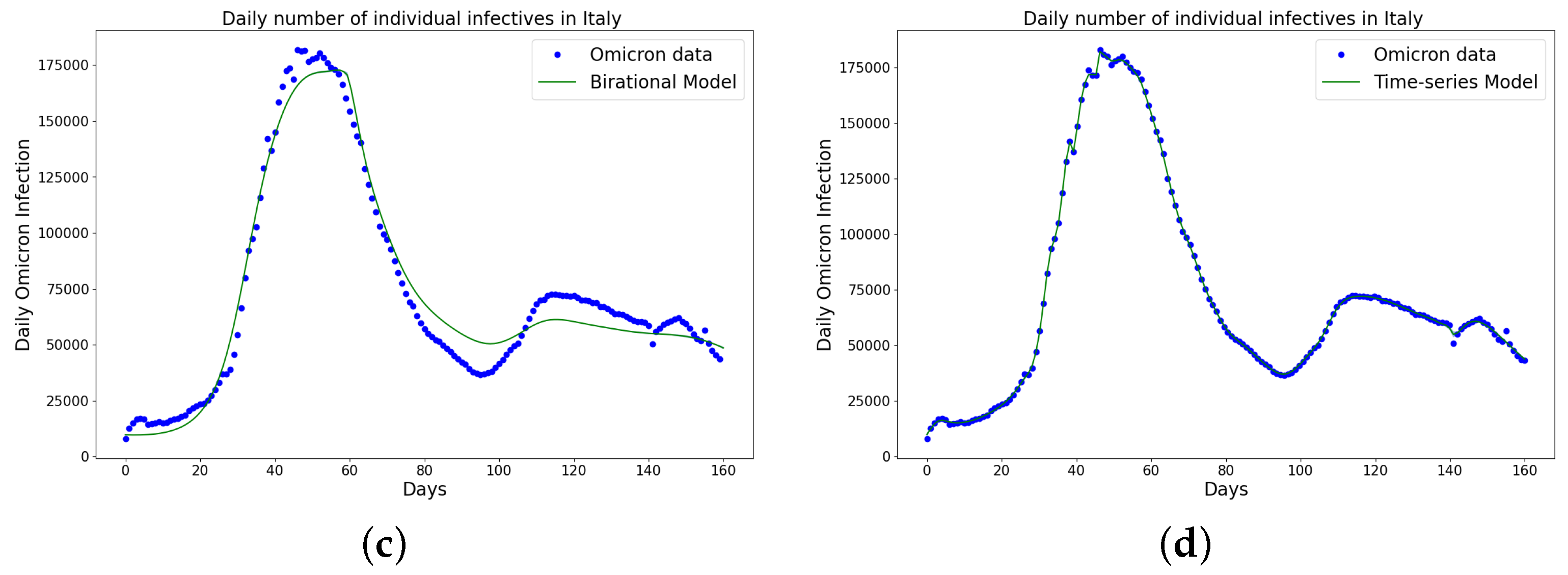
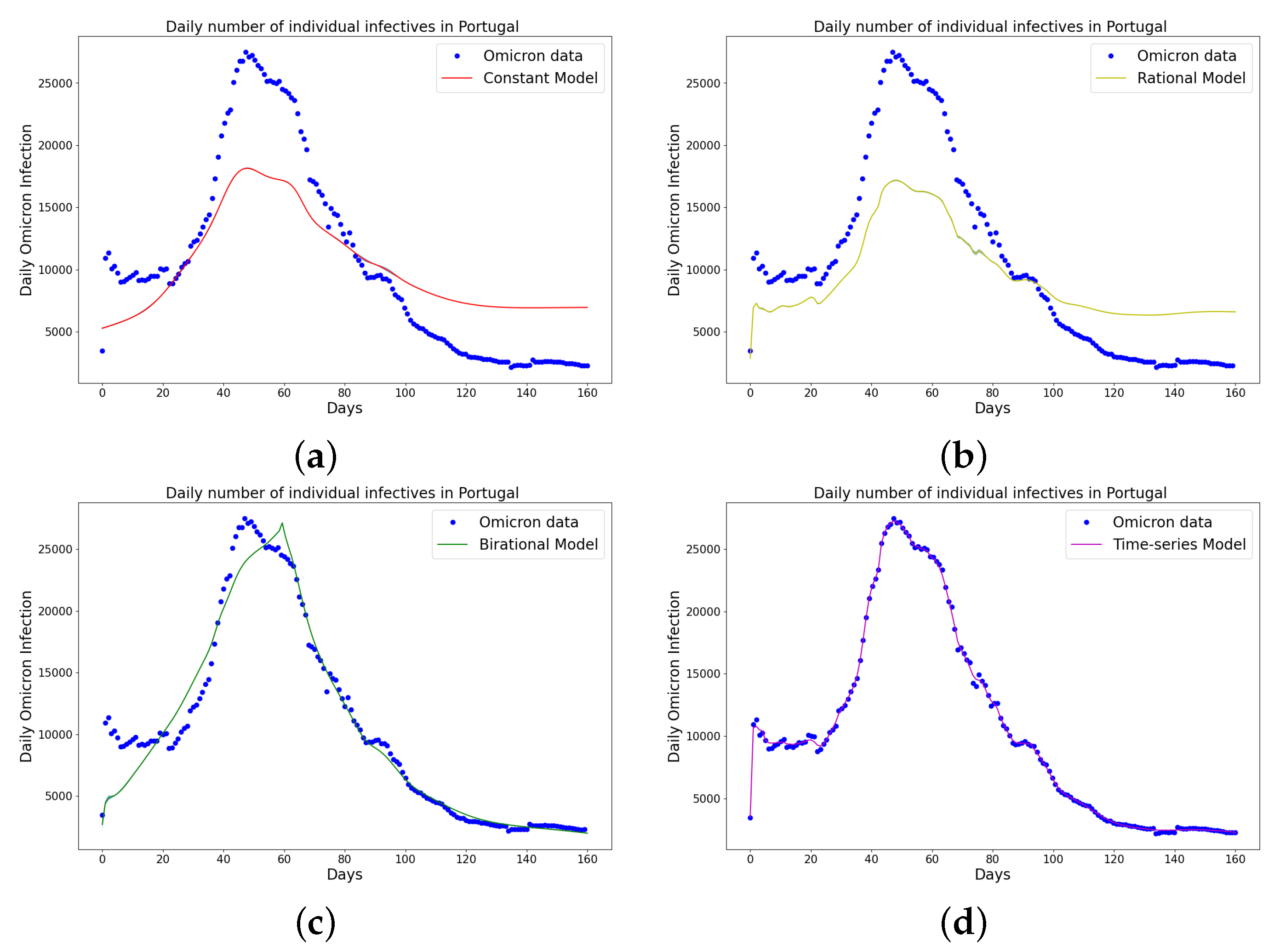
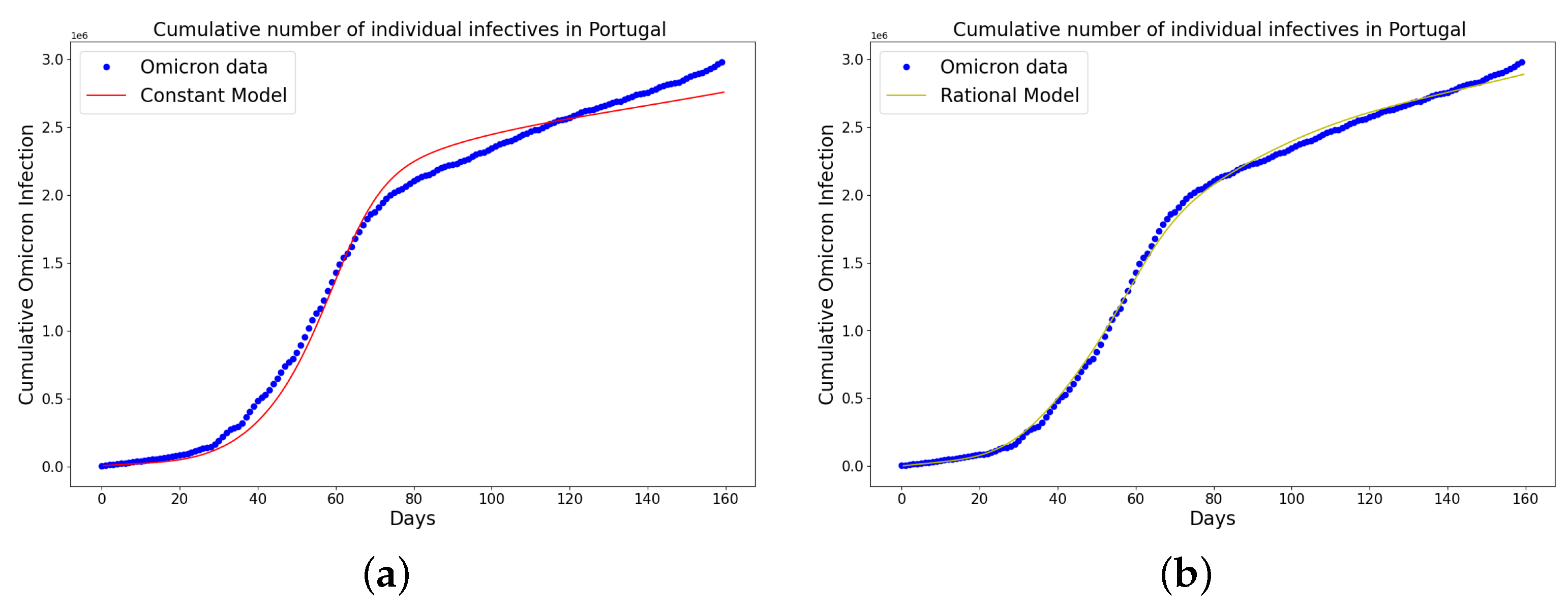
Figure 5.
Simulation results of Portugal daily Omicron data from 5th of April to 11th of September 2022. (a) The graph of daily Omicron infective data and the learned infectives using the constant model by the LINN Algorithm 1; (b) the graph of daily Omicron infective data and the learned infectives using the rational model by the LINN Algorithm 2; (c) the graph of daily Omicron infective data and the learned infectives using the birational model by the LINN Algorithm 3; (d) the graph of daily Omicron infective data and the learned infectives using the time series model by the LINN Algorithm 4. The figure shows how closely each model accurately fits the data. Notably, the time-series model fits the observed data better than the other models, which shows how well it can learn and describe how the Omicron variant infection spreads in Portugal. This excellent fit shows that the model captures the complex patterns and trends of daily Omicron infections in Portugal.
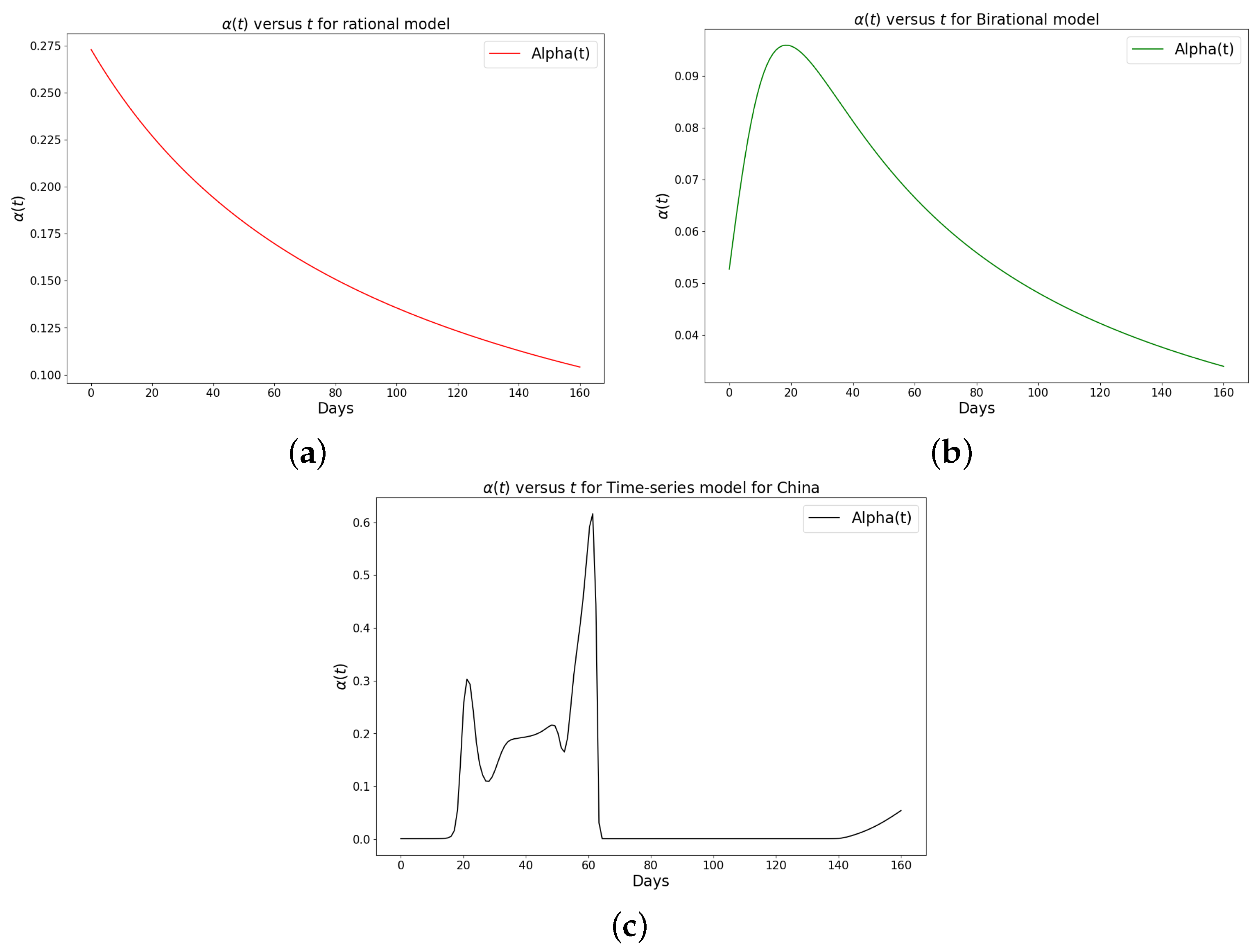
Figure 6.
Simulation results of the rate of transmission () for the daily Omicron infection in China using (a) rational model; (b) birational model; (c) time-series model.
Figure 6.
Simulation results of the rate of transmission () for the daily Omicron infection in China using (a) rational model; (b) birational model; (c) time-series model.
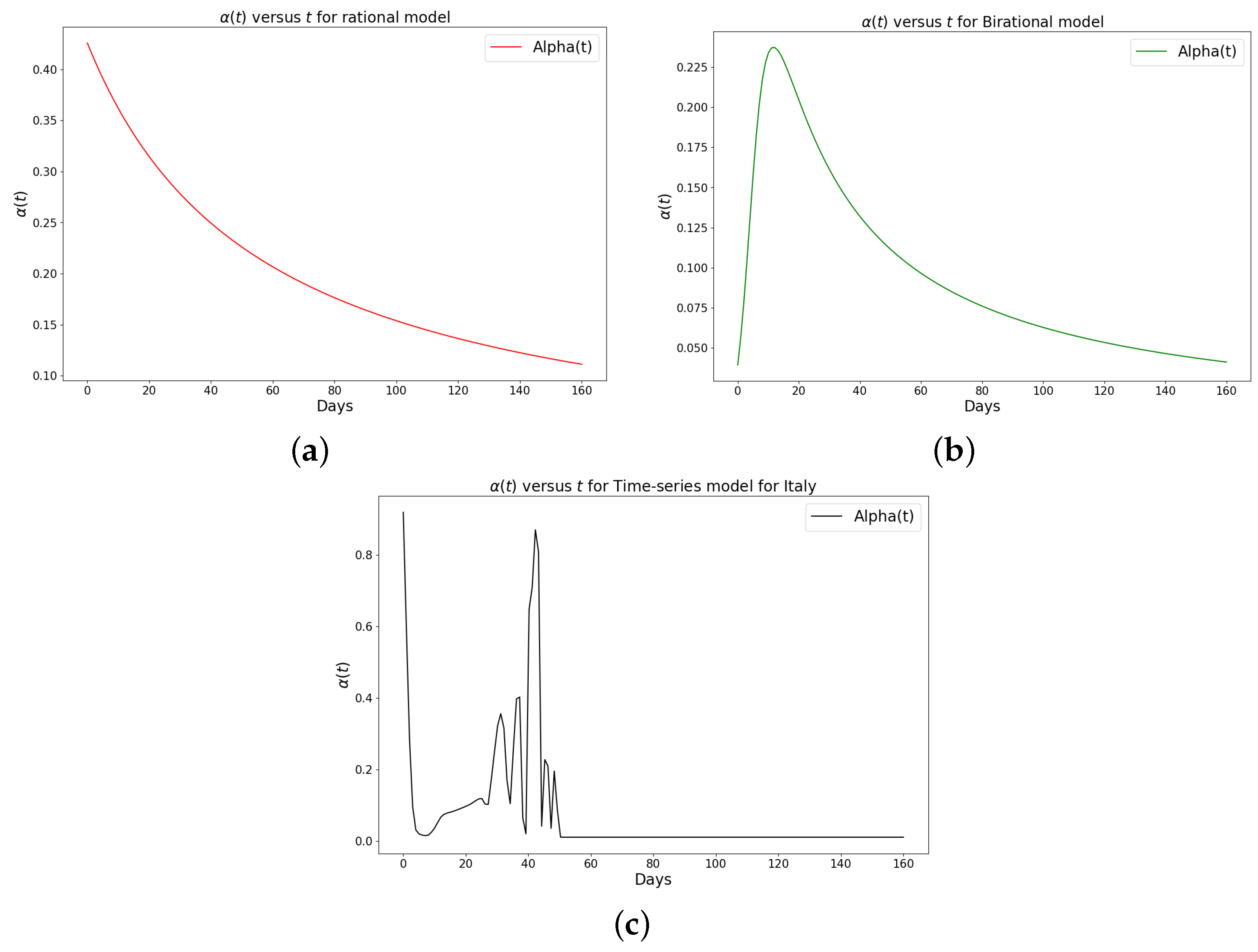
Figure 7.
Simulation results of the rate of transmission () for the daily Omicron infection in Italy using (a) rational model; (b) birational model; (c) time-series model.
Figure 7.
Simulation results of the rate of transmission () for the daily Omicron infection in Italy using (a) rational model; (b) birational model; (c) time-series model.
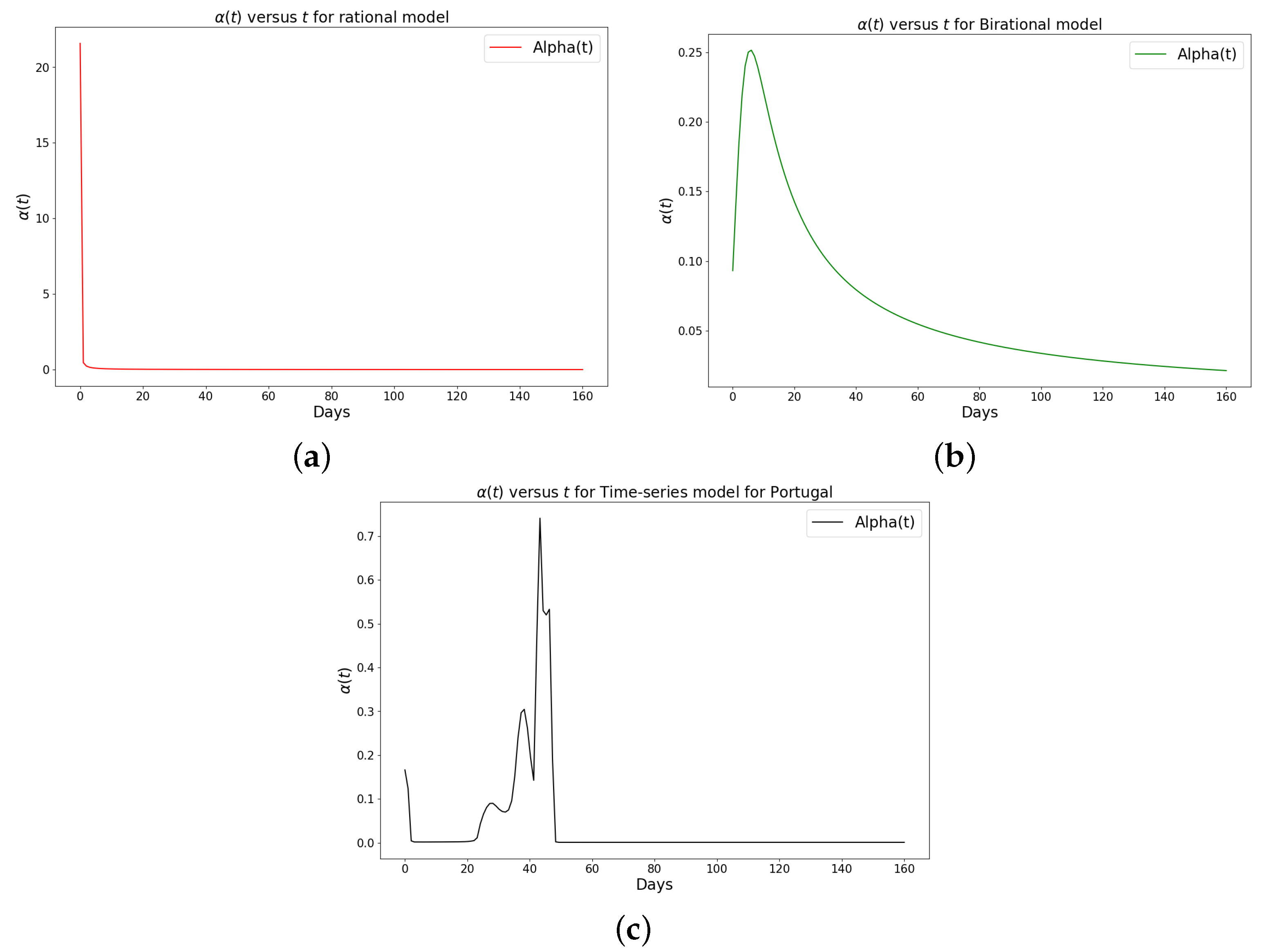
Figure 8.
Simulation results of the rate of transmission () for the daily Omicron infection in Portugal using (a) rational model; (b) birational model; (c) rime-series model. This figure illustrates the learning and representation of the daily Omicron variant’s transmission rate from observed data. It is evident that the rational and birational models exhibit a trend in that suggests exponential decay, whereas the time-series model reveals a different, more varied trend in . This distinction implies that the time-series model has successfully captured extensive information on the ongoing mitigation measures evident in the data. Basically, this difference shows that the time-series model is better at capturing the details and nuances of the data, pointing to its enhanced reliability in representing the real-world dynamics of the Omicron variant’s spread.
Figure 9.
Simulation results of China cumulative Omicron data from 25th of March to 31 of August 2022. The graph of the cumulative Omicron infective data and the learned infectives using (a) the constant model by the LINN Algorithm 1; (b) the rational model by the LINN Algorithm 2; (c) the birational model by the LINN Algorithm 3; (d) the time-series model by the LINN Algorithm 4. The figure shows how closely each model accurately fits the data. Notably, the time-series model fits the observed data better than the other models, which shows how well it can learn and describe how the Omicron variant infection spreads in China. This excellent fit shows that the model captures the complex patterns and trends of cumulative data on Omicron infections in China.
Figure 10.
Simulation results of Italy cumulative Omicron data from 30th of November 2021 to 8th of May 2022. The graph of the cumulative Omicron infective data and the learned infectives using (a) constant model; (b) rational model; (c) birational model; (d) time-series model. The figure shows how closely each model accurately fits the data. Notably, the time-series model fits the observed data better than the other models, which shows how well it can learn and describe how the Omicron variant infection spreads in Italy. This excellent fit shows that the model captures the complex patterns and trends of cumulative data on Omicron infections in Italy.
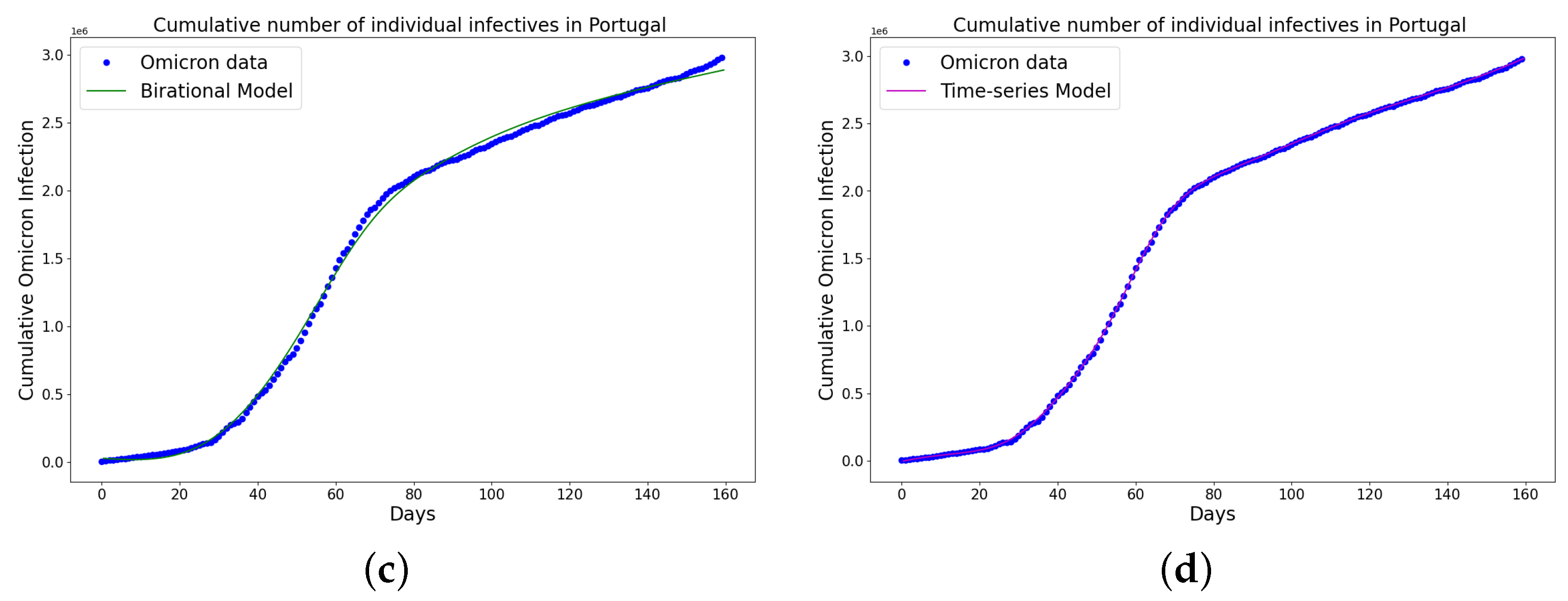
Figure 11.
Simulation results of Portugal cumulative Omicron data from 5th of April to 11th of September 2022. The graph of the cumulative Omicron infective data and the learned infectives using (a) constant model; (b) rational model; (c) birational model; (d) time-series model. The figure shows how closely each model accurately fits the data. Notably, the time-series model fits the observed data better than the other models, which shows how well it can learn and describe how the Omicron variant infection spreads in Portugal. This excellent fit shows that the model captures the complex patterns and trends of cumulative data on Omicron infections in Portugal.
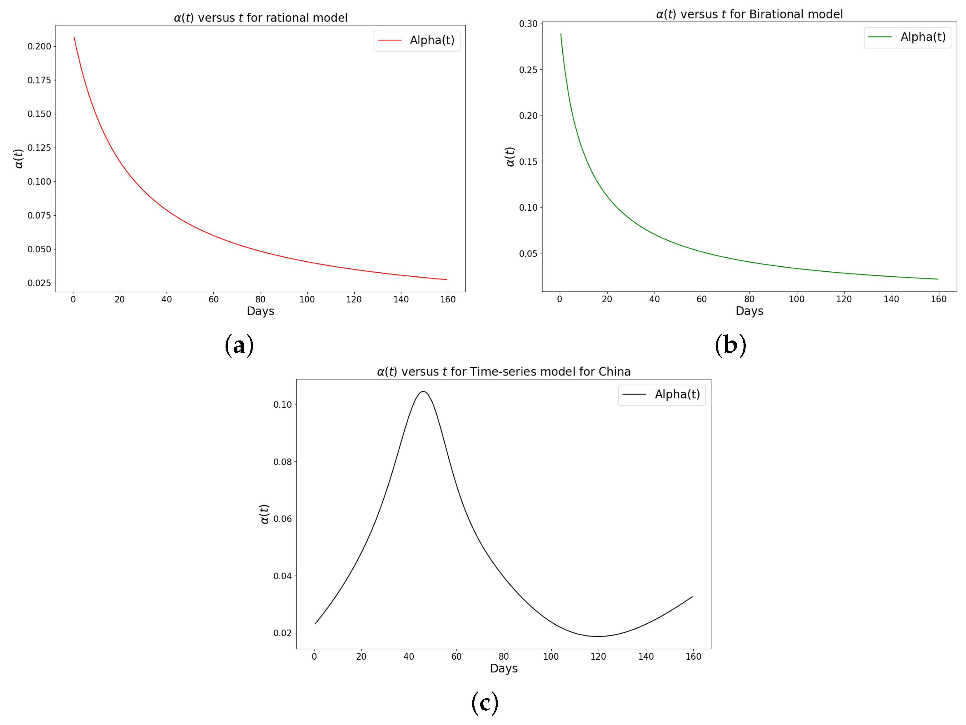
Figure 12.
Simulation results of the rate of transmission () for the cumulative Omicron infection in China using (a) rational model; (b) birational model; (c) time-series model.
Figure 12.
Simulation results of the rate of transmission () for the cumulative Omicron infection in China using (a) rational model; (b) birational model; (c) time-series model.
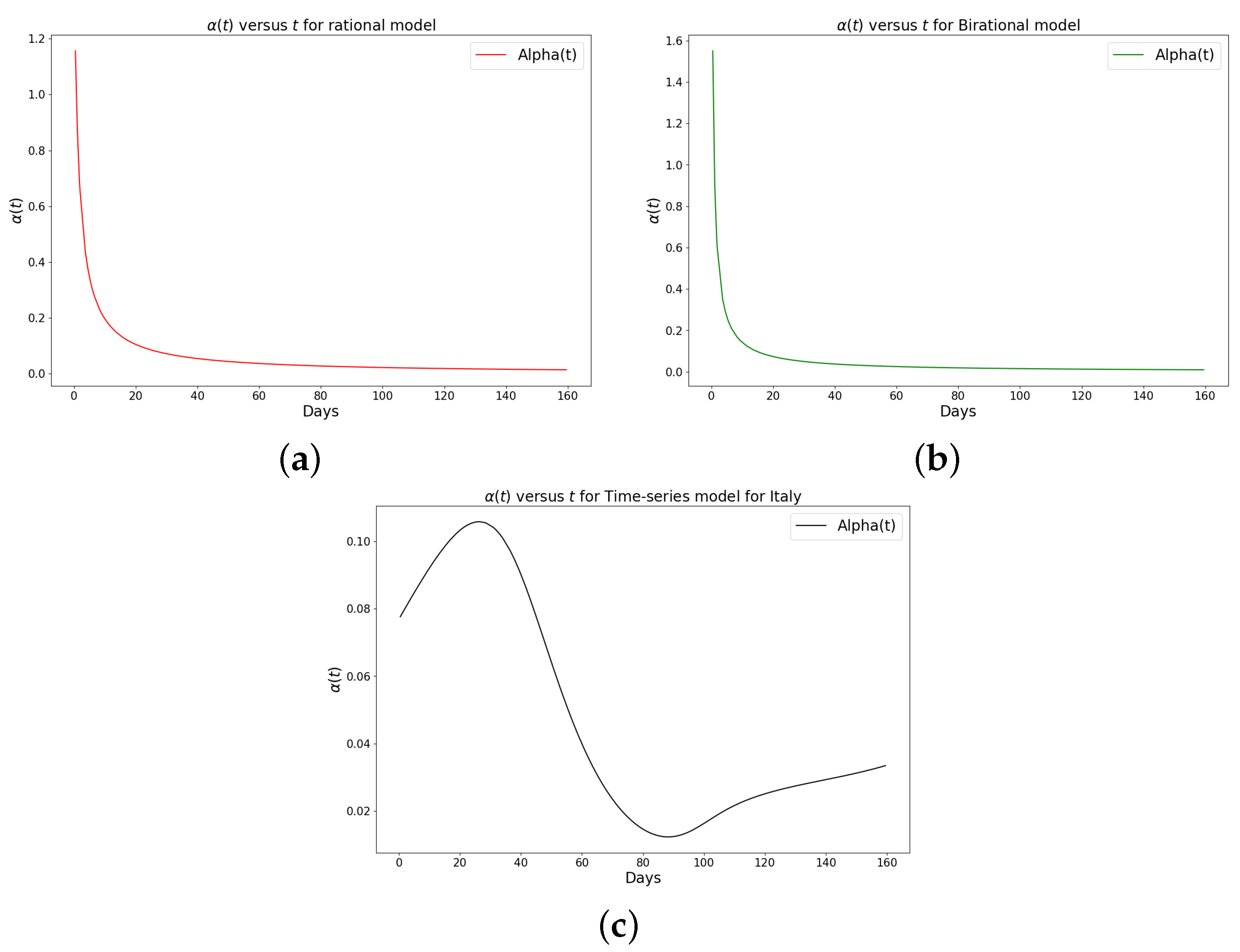
Figure 13.
Simulation results of the rate of transmission () for the cumulative Omicron infection in Italy using (a) rational model; (b) birational model; (c) time-series model.
Figure 13.
Simulation results of the rate of transmission () for the cumulative Omicron infection in Italy using (a) rational model; (b) birational model; (c) time-series model.
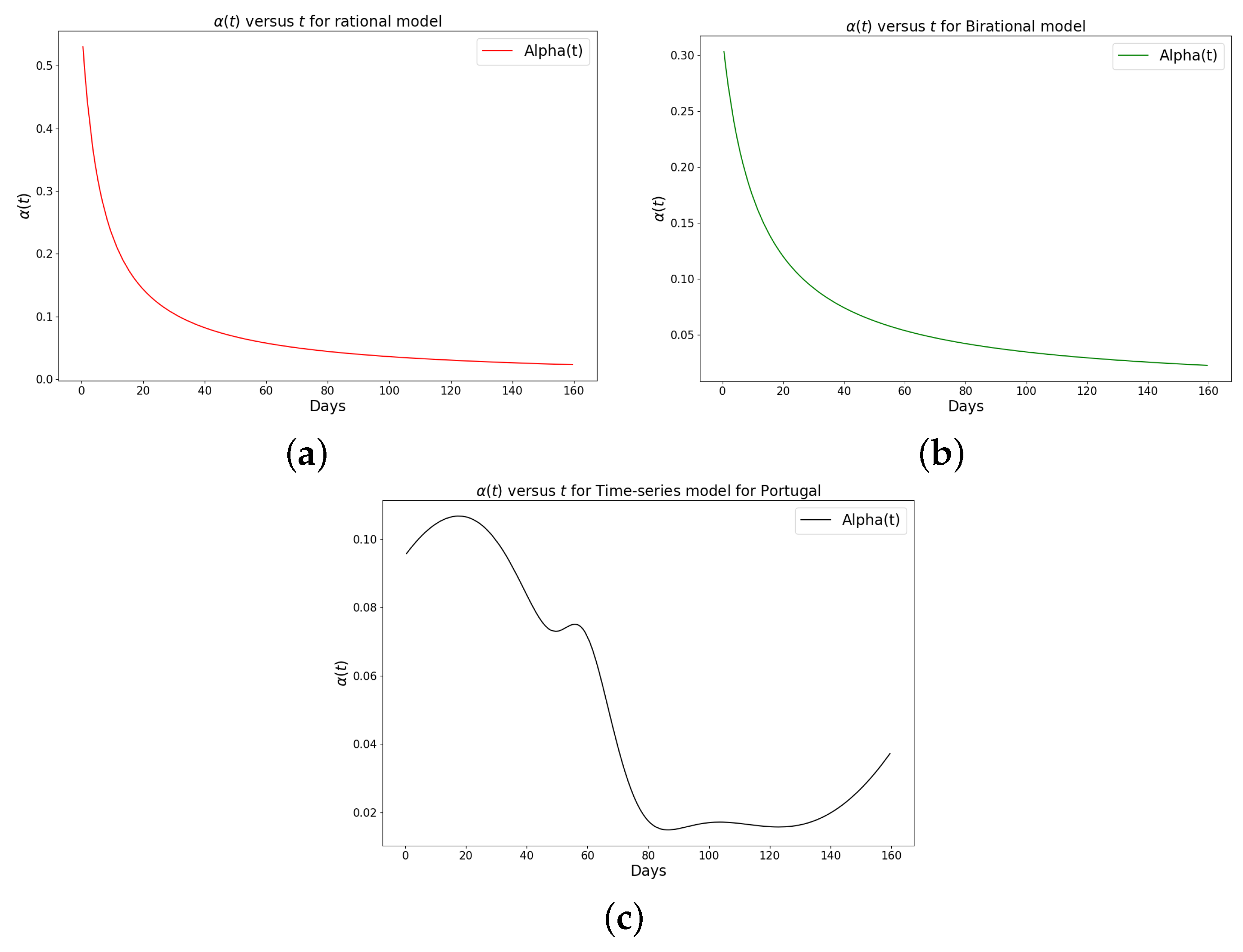
Figure 14.
Simulation results of the rate of transmission () for the cumulative Omicron infection in Portugal using (a) rational model; (b) birational model; (c) time-series model. This figure illustrates the learning and representation of the cumulative Omicron variant’s transmission rate from observed data. It is evident that the rational and birational models exhibit a trend in that suggests exponential decay, whereas the time-series model reveals a different, more varied trend in . This distinction implies that the time-series model has successfully captured extensive information on the ongoing mitigation measures evident in the data. Basically, this difference shows that the time-series model is better at capturing the details and nuances of the data, pointing to its enhanced reliability in representing the real-world dynamics of the Omicron variant’s spread.
Figure 15.
The prediction for the 14-day daily number of individuals reported to be infected by COVID-19 Omicron variant using time-series model in (a) China; (b) Italy; (c) Portugal. This accomplishment was realized by utilizing both the constant parameter and the time-dependent function () for predictions. The success in fitting the daily data for the COVID-19 Omicron variant enabled this approach with the time-series model. Using the time-series model, the outcomes derived from the constant parameter and the time-dependent function were then integrated into the logistic differential equation to formulate predictions for the subsequent 14 days. We noticed that the infection numbers in China continue to rise, contrasting with Italy, where the numbers are declining, and Portugal, where the numbers seem stable. These trends accurately reflect the real-life situations of the COVID-19 Omicron variant infection in these countries.
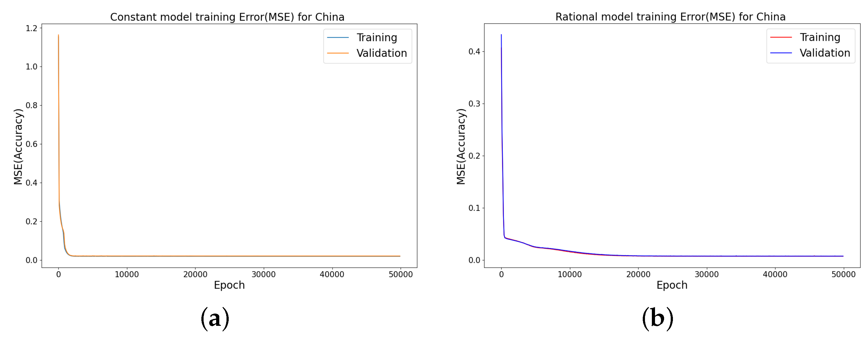
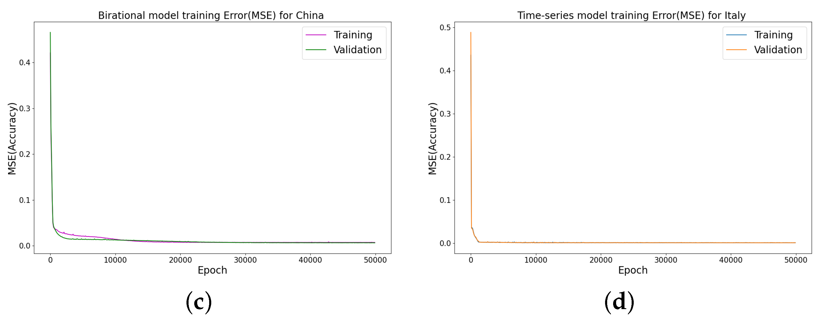
Figure 16.
Error metrics for the infected cases using the random splits for China COVID-19 Omicron data, where we use 30% of the dataset for testing. Training and testing errors in LINN for nonlinear time-varying transmission rate. MSE at different epochs, using four hidden layers, learning rate of 0.001, and 64 neurons per layer in (a) constant model; (b) rational model; (c) birational model; (d) time-series model.
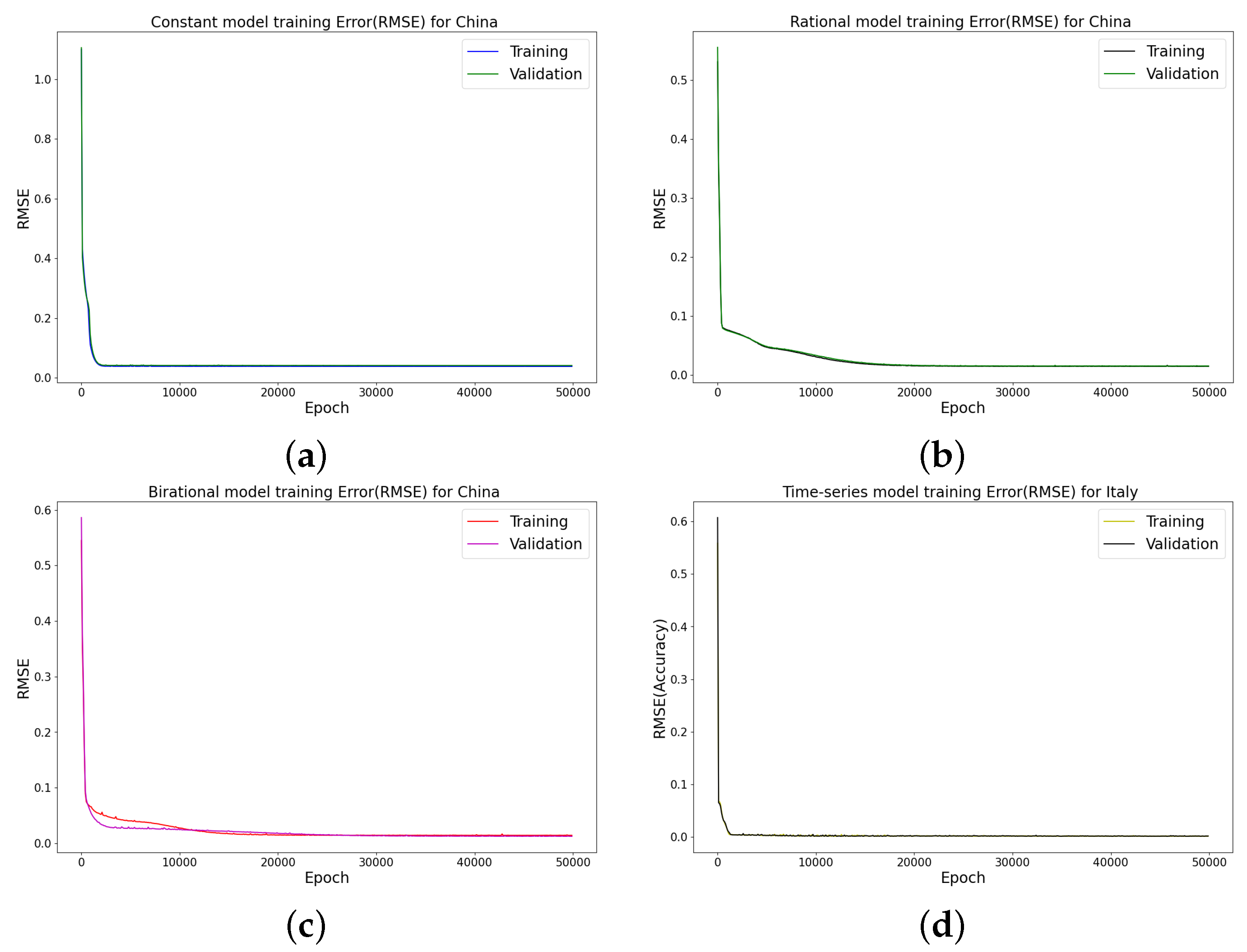
Figure 17.
RMSE at different epochs, using three hidden layers, learning rate of 0.001, and 64 neurons per layer in (a) constant model; (b) rational model; (c) birational model; (d) time-series model.
Figure 17.
RMSE at different epochs, using three hidden layers, learning rate of 0.001, and 64 neurons per layer in (a) constant model; (b) rational model; (c) birational model; (d) time-series model.
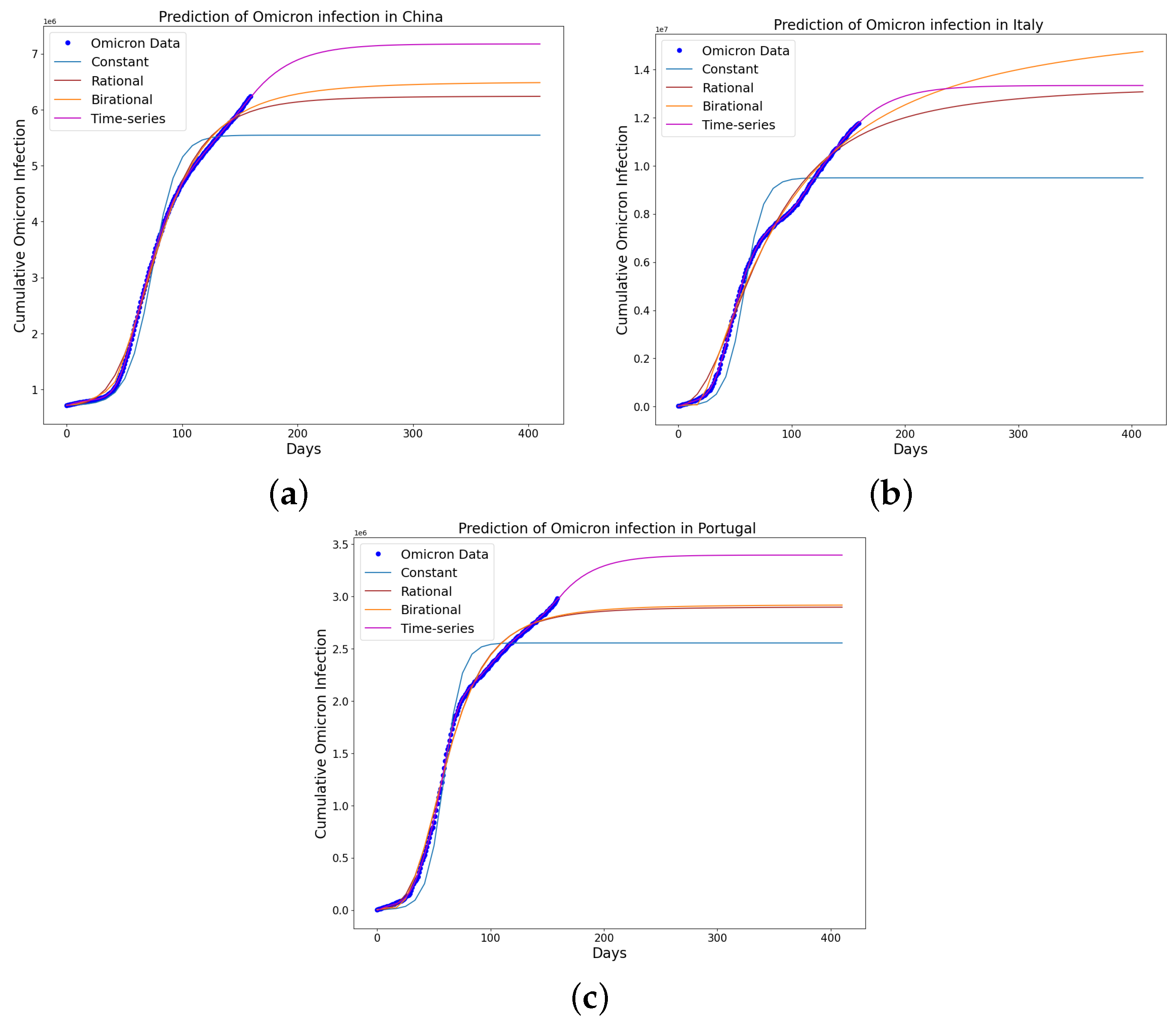
Figure 18.
The mathematical model prediction for the time that a plateau will be reached as well as the cumulative number of individuals reported to be infected by the Omicron variant in (a) China; (b) Italy; and (c) Portugal. The predictions displayed in the figure were made possible by employing the learned parameters of each model, combined with their analytical solutions. It is evident from the figure that the time-series model excels both in fitting the data and in predicting the time when a plateau will be reached and the cumulative number of individuals reported to be infected by the Omicron variant in the given country. The plateau is when the rate of change in the people reported to be infected is of the maximum infection rate. Additionally, observations revealed a consistent increase in the predicted trends for Italy when using the rational and birational models. These models struggled to perform accurately due to implementing only partial mitigation measures at that time in Italy. However, these models demonstrated better accuracy in predicting the time when a plateau will be reached and the cumulative number of individuals reported to be infected by the Omicron variant in China and Portugal, attributed to the strict mitigation measures enforced in these countries. Lastly, the constant model tended to underestimate the predictions, failing to account for the long series of existing data on the epidemics in the given country.
![Epidemiologia 04 00037 g018]()
Table 1.
Comparative analysis of model parameters and error metrics of daily Omicron infections in China. This table shows how the four distinct mathematical models are evaluated to determine the fitting accuracy of the observed data. It also provides insights into the effectiveness of different models in capturing the infection dynamics. The table illustrates the superiority of the time-series model in terms of reduced error metrics and higher variance explained, demonstrating its optimal fit and reliability in modeling the epidemic’s daily data in China.
| Parameters | Constant | Parameters | Rational | Parameters | Birational | Parameters | Time-Series |
|---|
| N | 44,743 | N | 44,444 | d | 364,597 | N | 82,837 |
| k | 0.1783 | a | 26.9413 | a | 6.3973 | RMSE | 386 |
|
| 1020.4299 |
| 7521.3825 |
| 2006.2519 | MAPE | 0.0202 |
| RMSE | 9349 | b | 0.0101 | b | 0.02868 | EV | 0.9997 |
| MAPE | 0.2517 | RMSE | 9142 |
| 85,368 | | |
| EV | 0.8558 | MAPE | 0.2357 |
| 6.9310 | | |
| | | EV | 0.8621 |
| 1501.4508 | | |
| | | | |
| 0.02449 | | |
| | | | | RMSE | 2864 | | |
| | | | | MAPE | 0.1667 | | |
| | | | | EV | 0.9869 | | |
Table 2.
Comparative analysis of model parameters and error metrics of daily Omicron infections in Italy. This table shows how the four distinct mathematical models are evaluated to determine the fitting accuracy of the observed data. It also provides insights into the effectiveness of different models in capturing the infection dynamics. The table illustrates the superiority of the time-series model in terms of reduced error metrics and higher variance explained, demonstrating its optimal fit and reliability in modeling the epidemic’s daily data in Italy.
| Parameters | Constant | Parameters | Rational | Parameters | Birational | Parameters | Time-Series |
|---|
| N | 86,344 | N | 84,524 | d | 175,403 | N | 175,649 |
| k | 0.2601 | a | 24.1175 | a | 13.5611 | RMSE | 1035 |
|
| 980.6510 |
| 7519.4065 |
| 5227.3434 | MAPE | 0.01607 |
| RMSE | 21897 | b | 0.0177 | b | 0.02696 | EV | 0.9995 |
| MAPE | 0.2451 | RMSE | 20385 |
| 1,859,879 | | |
| EV | 0.7866 | MAPE | 0.2302 |
| 7.1762 | | |
| | | EV | 0.8151 |
| 9519.0627 | | |
| | | | |
| 0.07002 | | |
| | | | | RMSE | 7833 | | |
| | | | | MAPE | 0.1377 | | |
| | | | | EV | 0.9728 | | |
Table 3.
Comparative analysis of model parameters and error metrics of daily Omicron infections in Portugal. This table shows how the four distinct mathematical models are evaluated to determine the fitting accuracy of the observed data. It also provides insights into the effectiveness of different models in capturing the infection dynamics. The table illustrates the superiority of the time-series model in terms of reduced error metrics and higher variance explained, demonstrating its optimal fit and reliability in modeling the epidemic’s daily data in Portugal.
| Parameters | Constant | Parameters | Rational | Parameters | Birational | Parameters | Time-Series |
|---|
| N | 11,393 | N | 1,165,436 | d | 67,997 | N | 27,541 |
| k | 0.2795 | a | 0.4740 | a | 1.3654 | RMSE | 377 |
|
| 278.8262 |
| 8871.1400 |
| 5497.3608 | MAPE | 0.02786 |
| RMSE | 4350 | b | 45.5159 | b | 6.5310 | EV | 0.9973 |
| MAPE | 0.6676 | RMSE | 4633 |
| 169,104 | | |
| EV | 0.6889 | MAPE | 0.6111 |
| 3.5296 | | |
| | | EV | 0.6712 |
| 2570.4033 | | |
| | | | |
| 0.2312 | | |
| | | | | RMSE | 1633 | | |
| | | | | MAPE | 0.1067 | | |
| | | | | EV | 0.9575 | | |
Table 4.
Comparative analysis of model parameters, plateau days, plateau cases, and error metric for constant, rational, birational, and time-series models for the cumulative Omicron infections in China. This table shows how the four distinct mathematical models are evaluated to determine the fitting accuracy of the observed data and predict the plateau days and cases. It also provides insights into the effectiveness of different models in capturing the infection dynamics. The table illustrates the superiority of the time-series model in terms of reduced error metrics and higher variance explained, demonstrating its optimal fit and reliability in modeling the epidemic’s cumulative data in China.
| Parameters | Constant | Parameters | Rational | Parameters | Birational | Parameters | Time-Series |
|---|
| N | 5,544,704 | N | 6,243,040 | d | 4,303,425 | N | 7,320,999 |
| k | 0.09262 | a | 5.0366 | a | 2.00762 | RMSE | 1657179 |
|
| 954.2391 |
| 1505.8875 |
| 2499.9048 | MAPE | 0.3406 |
| RMSE | 1737625 | b | 0.04187 | b | 0.3706 | EV | 0.7808 |
| MAPE | 0.3609 | RMSE | 1664443 |
| 6,919,512 | plateau(days) | 390 |
| EV | 0.7565 | MAPE | 0.3334 |
| 3.8630 | cases | 7,320,636 |
| plateau(days) | 122 | EV | 0.7728 |
| 1202.6787 | | |
| cases | 5,488,350 | plateau(days) | 282 |
| 0.06890 | | |
| T | 74 | cases | 6,221,115 | RMSE | 1657179 | | |
| | | | | MAPE | 0.3403 | | |
| | | | | EV | 0.7792 | | |
| | | | | plateau(days) | 317 | | |
| | | | | cases | 6,458,279 | | |
Table 5.
Comparative analysis of model parameters, plateau days, plateau cases, and error metric for constant, rational, birational, and time-series models for the cumulative Omicron infections in Italy. This table shows how the four distinct mathematical models are evaluated to determine the fitting accuracy of the observed data and predict the plateau days and cases. It also provides insights into the effectiveness of different models in capturing the infection dynamics. The table illustrates the superiority of the time-series model in terms of reduced error metrics and higher variance explained, demonstrating its optimal fit and reliability in modeling the epidemic’s cumulative data in Italy.
| Parameters | Constant | Parameters | Rational | Parameters | Birational | Parameters | Time-Series |
|---|
| N | 9,502,524 | N | 13,375,081 | d | 73,618 | N | 13,338,639 |
| k | 0.1182 | a | 2.2535 | a | 14.8388 | RMSE | 2604505 |
|
| 953.5184 |
| 7499.3847 |
| 1998.6043 | MAPE | 0.3933 |
| RMSE | 2605441 | b | 0.6809 | b | 4.8570 | EV | 0.8957 |
| MAPE | 0.4474 | RMSE | 2652081 |
| 18,112,258 | plateau(days) | 381 |
| EV | 0.8953 | MAPE | 0.3515 |
| 1.5291 | cases | 13,337,516 |
| plateau(days) | 96 | EV | 0.8832 |
| 996.7389 | | |
| cases | 9,396,847 | plateau(days) | 442 |
| 1.1285 | | |
| T | 58 | cases | 13,121,787 | RMSE | 2651400 | | |
| | | | | MAPE | 0.4851 | | |
| | | | | EV | 0.8940 | | |
| | | | | plateau(days) | 641 | | |
| | | | | cases | 15,409,748 | | |
Table 6.
Comparative analysis of model parameters, plateau days, plateau cases, and error metric for constant, rational, birational, and time-series models for the cumulative Omicron infections in Portugal. This table shows how the four distinct mathematical models are evaluated to determine the fitting accuracy of the observed data and predict the plateau days and cases. It also provides insights into the effectiveness of different models in capturing the infection dynamics. The table illustrates the superiority of the time-series model in terms of reduced error metrics and higher variance explained, demonstrating its optimal fit and reliability in modeling the epidemic’s cumulative data in Portugal.
| Parameters | Constant | Parameters | Rational | Parameters | Birational | Parameters | Time-Series |
|---|
| N | 2,556,208 | N | 2,901,213 | d | 21614 | N | 3,396,848 |
| k | 0.1280 | a | 3.8416 | a | 14.5922 | RMSE | 720538 |
|
| 1954.1612 |
| 7499.4426 |
| 2498.6008 | MAPE | 0.4133 |
| RMSE | 743396 | b | 0.1478 | b | 4.6981 | EV | 0.8821 |
| MAPE | 0.4732 | RMSE | 723210 |
| 18,112,258 | plateau(days) | 312 |
| EV | 0.8490 | MAPE | 0.4209 |
| 3.9029 | cases | 3,395,243 |
| plateau(days) | 94 | EV | 0.8787 |
| 999.9216 | | |
| cases | 2,526,824 | plateau(days) | 305 |
| 0.0797 | | |
| T | 59 | cases | 2,892,395 | RMSE | 723022 | | |
| | | | | MAPE | 0.4972 | | |
| | | | | EV | 0.8747 | | |
| | | | | plateau(days) | 308 | | |
| | | | | cases | 2,911,888 | | |


