Article

Augmenting Printed School Atlases with Thematic 3D Maps

Institute of Cartography and Geoinformation, ETH Zurich, 8093 Zurich, Switzerland
*
Author to whom correspondence should be addressed.
Multimodal Technol. Interact. 2020, 4(2), 23; https://doi.org/10.3390/mti4020023
Submission received: 17 April 2020 / Revised: 13 May 2020 / Accepted: 20 May 2020 / Published: 27 May 2020
(This article belongs to the Special Issue 3D Human–Computer Interaction)

Abstract

:
Digitalization in schools requires a rethinking of teaching materials and methods in all subjects. This upheaval also concerns traditional print media, like school atlases used in geography classes. In this work, we examine the cartographic technological feasibility of extending a printed school atlas with digital content by augmented reality (AR). While previous research rather focused on topographic three-dimensional (3D) maps, our prototypical application for Android tablets complements map sheets of the Swiss World Atlas with thematically related data. We follow a natural marker approach using the AR engine Vuforia and the game engine Unity. We compare two workflows to insert geo-data, being correctly aligned with the map images, into the game engine. Next, the imported data are transformed into partly animated 3D visualizations, such as a dot distribution map, curved lines, pie chart billboards, stacked cuboids, extruded bars, and polygons. Additionally, we implemented legends, elements for temporal and thematic navigation, a screen capture function, and a touch-based feature query for the user interface. We evaluated our prototype in a usability experiment, which showed that secondary school students are as effective, interested, and sustainable with printed as with augmented maps when solving geographic tasks.

1. Introduction

In recent years, an increasing number of students have gained access to mobile devices. On the one hand, students use smartphones for communication, information retrieval, and entertainment in their leisure time. On the other hand, students are provided with tablets by their schools. In the city of Zurich, for example, all primary students in year five are equipped with a personal tablet for the new subject “Media and Informatics” [1]. The subject shall foster digitalization, as demanded by the legislative curriculum in Switzerland [2]. Another global trend involves students bringing their own mobile devices to schools where they solve tasks by means of applications using an inquiry-based learning approach [3]. However, the modern technologies are not only applied in new subjects, like computer science, but also in existing ones, like geography. In this work, we therefore want to explore synergies of printed school atlases with mobile devices, especially tablets, and their capabilities for augmented reality.
Augmented reality (AR) is a type of mixed reality that ranges between real environment and augmented virtuality on the reality-virtuality-continuum [4]. AR systems are further characterized as being interactive in real time and registered in three-dimensions (3D) [5]. Applications featuring AR have permeated everyday life in domains, such as entertainment (e.g., games [6], books [7]), information presentation (e.g., cultural heritage [8], news [9]), work assistance (e.g., medicine [10], surveying [11]), retail (e.g., glasses [12], clothes [13]), planning (e.g., interior design [14], urban development [15]), and navigation (e.g., indoors [16], outdoors [17]). In these fields, particularly for navigation and maps, AR can be experienced by head-mounted [18], hand-held [19], and projection-based [20] devices. These devices use primarily on-board or external cameras to recognize features in reality with either marker-based or markerless methods. While marker-based approaches require either artificial (e.g., codes or patterns [21]) or natural (e.g., points in images [22]) features as references, the objects are located in the physical environment on-the-fly by detection algorithms (e.g., ORB [23]) in markerless AR. Besides cameras, the connection between reality and virtuality can be also established by other sensors (e.g., GNSS [24], IMU [25]). Once the matching is completed, digital content can be combined with the real world via the AR device, allowing the user to interact with this content in real time. Interactions are mainly based on multi-touch (i.e., using finger gestures), tangible (i.e., using physical objects), and spatial (e.g., moving a paper sheet) modalities [26]. AR seems to be well-suited for cartographic applications, as interactivity is also a main part of digital maps.
The available 3D space can be augmented with topographic and thematic elements. Topographic map elements comprise the terrain surface (e.g., hypsometric tints), physical map objects (e.g., water bodies), virtual map features (e.g., borders), and labels (e.g., place names) [27]. The digital terrain surface of real-time 3D applications mostly consists of a uniform triangle mesh, also known as regular grid (i.e., two triangles yield a square), or an irregular triangle mesh, which has less triangles [28]. Textures (e.g., satellite images) and rasterized or tessellated geometries (e.g., lines representing rivers) can be clamped on the terrain. 3D map features (e.g., buildings) can be imported as 3D models (e.g., in glTF) or parametrically constructed [29] on top of the terrain. Labels are usually added as billboards to 3D scenes. In contrast, thematic map elements represent statistical data by applying visual variables to geometric primitives or pictographs. For example, inhabitants of different communes may be depicted by translated points along the height axis [30] or CO2 emissions of different countries by scaled cylinders [31]. Multivariate thematic data can be visualized as two-dimensional (2D) chart billboards [31] or 3D chart polyhedrons. For instance, river runoffs of different seasons and years may be by nested hemispheres [32]. Multimedia content, like images, videos, audios, or texts, can be added inside or aside the map to illustrate topographic and thematic data.
In this work, we specially focus on augmenting maps of a printed school atlas with thematic map elements. This is an extension to recent AR applications which mainly display topographic map elements on single maps [33] or are targeted on textbooks [34]. In our prototype, we enrich map sheets of an atlas with 3D visualizations, including simple animations, for point, line, and polygon data. We compare two workflows to insert the georeferenced data into a game engine, so that it matches the map sheets. With the game engine, we implement a touch-based user interface with atlas-specific functionalities for printed and augmented maps. We contribute to the reproducibility of our application by describing key functions of the game engine for creating thematic maps and user interface elements. Finally, we discuss our achieved results and describe a conducted usability experiment, in which we compared printed and augmented maps.

2. Related Work

Early AR applications used marker-based approaches with codes, mainly based on ARToolKit, to create digital 3D visualizations on printed maps. Bobrich and Otto [18] augmented a paper map of an archaeological site with a 3D terrain model. Users could switch the representation of the terrain or query information of the site by holding markers with certain patterns into the field of view of the head-mounted display. Liarokapis et al. [35] printed campus map tiles on marker cards and extruded buildings in AR. Their application targeted at geography students who should correctly join the map tiles. Adithya et al. [21] visualized parts or the full extent of a 3D terrain model over a paper map by physical AR markers. The authors also added some static or animated objects, like planes on top of the digital terrain. Even recent AR applications, like Zhang et al.’s [36] flood visualization system, rely on fiducial markers when the recognition of natural features is difficult. The authors showed a digital flood scene, including dynamics and occlusions, on a 3D-printed terrain model using the mixed reality glasses HoloLens.
Some works combined the marker-based AR technique with others. Hedley et al. [37] extracted locations of the user’s hands for retrieving and displaying map coordinates at the finger tips. Apart from that, they mapped geological and hydrological information on a 3D terrain model that could be swapped by holding markers into the AR view. Bergig et al. [38] used a model–based tracking package additionally to a marker–based registration package. This enabled detecting and animating icons of buses and skiers inside maps. Furthermore, Bergig et al. elevated the terrain inside relief maps. The authors named their approach in-place augmented reality, since the “content is embedded in the same place (e.g., on printed paper) on which it is viewed” (p. 202).
Recent AR applications follow mostly marker-based approaches with natural features, primarily using the software development kit Vuforia and the game-engine Unity. Eggert et al. [39] added digital 3D models of buildings, either as point cloud or triangulated, to a paper map of an archaeological site. When touching a model on the hand-held device, a description and a photo of the building appears. Moreover, Eggert et al. augmented the paper map with a 2D Roman street network layer of a roman settlement whose grid size could be dynamically altered. Their system also allowed archaeologists to add notes to the augmented map. Marques et al. [33] presented another cultural heritage AR application. On a paper city map of Lisbon, they placed digital 3D models of aqueducts, reservoirs, and fountains, a 3D terrain model, and multimedia content. Users could rotate or enlarge the 3D models on a touch-based device.
Wiehr et al. realized another interactive AR application that was based on natural markers [40]. In their prototype, a topographic paper map was overlaid with a digital 3D terrain, textured with a satellite image, so that users can collaboratively plan walking or bike tours. Users with different smartphones can add waypoints to the terrain and a route is accordingly calculated. Wüest and Nebiker [41] describe a hierarchical marker-based solution for natural features. For a large orthophoto in a museum, recognizable features for different level of details were detected and stored in sparse quad tree structure, so that their AR application works at varying viewing distances. While walking on the orthophoto with hand-held devices, museum visitors can query names of points of interest and details of flights whose 3D plane models and trajectories are shown in real-time in AR. The latest weather is represented by icon and label billboards and the current cloud coverage by particle effects. Although no quantities are depicted, the overlays of air traffic and weather can be considered as thematic maps, since certain spatial patterns may come to the fore related to the topic. Another example of an augmented thematic 3D map is given in a study of Pereira et al. [42]. Here, a choropleth map, depicting the number of inhabitants of different regions in New Zealand, was clamped to the 3D terrain.
When teaching map literacy in geography classes, AR might raise the students’ interest and create joyful experiences, for instance, by gamification. Memory games [43] or puzzles [35] may act as entry portals to the learning matter, while simultaneously promoting collaboration among students. Subsequently, AR might guide students on how to correctly understand, analyze, and evaluate maps. In a study by Pereira et al. [44], the participants validated their drawings of geographic features (e.g., rivers and potential dams) with AR. The learners reported that they felt comfortable by getting feedback from the AR system. Other experiments showed that university students preferred the appeal [45], were more motivated [46], and learned more effectively [47], reading relief representations with augmented 3D maps than with 2D paper maps. The effectiveness of AR applications was confirmed in a case study by Joo-Nagata et al. [17] where the students received higher scores for remembering the history of buildings when working with AR-enabled mobile devices than with desktop PCs.
Summarizing, previous work mainly concentrated on augmenting maps with topographic information, such as terrain models or buildings, whereas the visualization of statistical data in thematic 3D maps is rather the exception. When taking map sheets of atlases, which often contain sufficient topographic information for orientation, as base maps, AR seems to be suited for presenting thematic information on digital 3D maps to users, in particular, students. Empirical experiments have shown that the students’ motivation and effectiveness in solving geographic tasks can be increased by educational AR applications, however the tasks mainly concerned topography.

3. Methods

3.1. Choice of Maps and Visualizations

For our prototypical AR application for Android tablets, we chose three exemplary map sheets differing in geographic extents and content from the Swiss World Atlas (SWA). This atlas is published by the Swiss Conference of Cantonal Ministers of Education, and it is one of the most widespread printed school atlases in Switzerland [48]. The data for the augmented maps either originate from the map itself, similarly to the in-place AR approach [38], or from the Atlas of Switzerland–online (AoS), the Swiss national atlas [49].
Printed and augmented maps are thematically related (Table 1). The mountainous topographic map of the Bernina region in Switzerland is augmented with glacier areas (SWA) and volumes (AoS). The population density map in Europe is amplified with its own data (SWA) and supplemented with electricity consumption of different countries (AoS). A world-wide map regarding the economic significance of tourism is complemented with the most popular holiday destinations of Swiss citizens (SWA) and international flight routes from Swiss airports (AoS).
The chosen augmented visualizations are defined as follows:
  • Polygons: a layer with polygons is overlaid the map [42].
  • Extruded polygons: polygons are extruded along the height axis [31].
  • Stacked cuboids: cuboids varying in length and height are put on top of each other and aligned in their centers [32].
  • Dot distribution map: points, which represent a certain quantity, are translated along the height axis to maintain a minimum distance between each other [30].
  • Pie charts: charts are rendered inside billboards [31] and centered at the top of an anchor line.
  • Curved lines: as graphics hardware is not able to draw curves, lines are segmented, and the height values of the segments are derived from a circular function [30].
  • 3D bars: squares are extruded along the height axis [31].
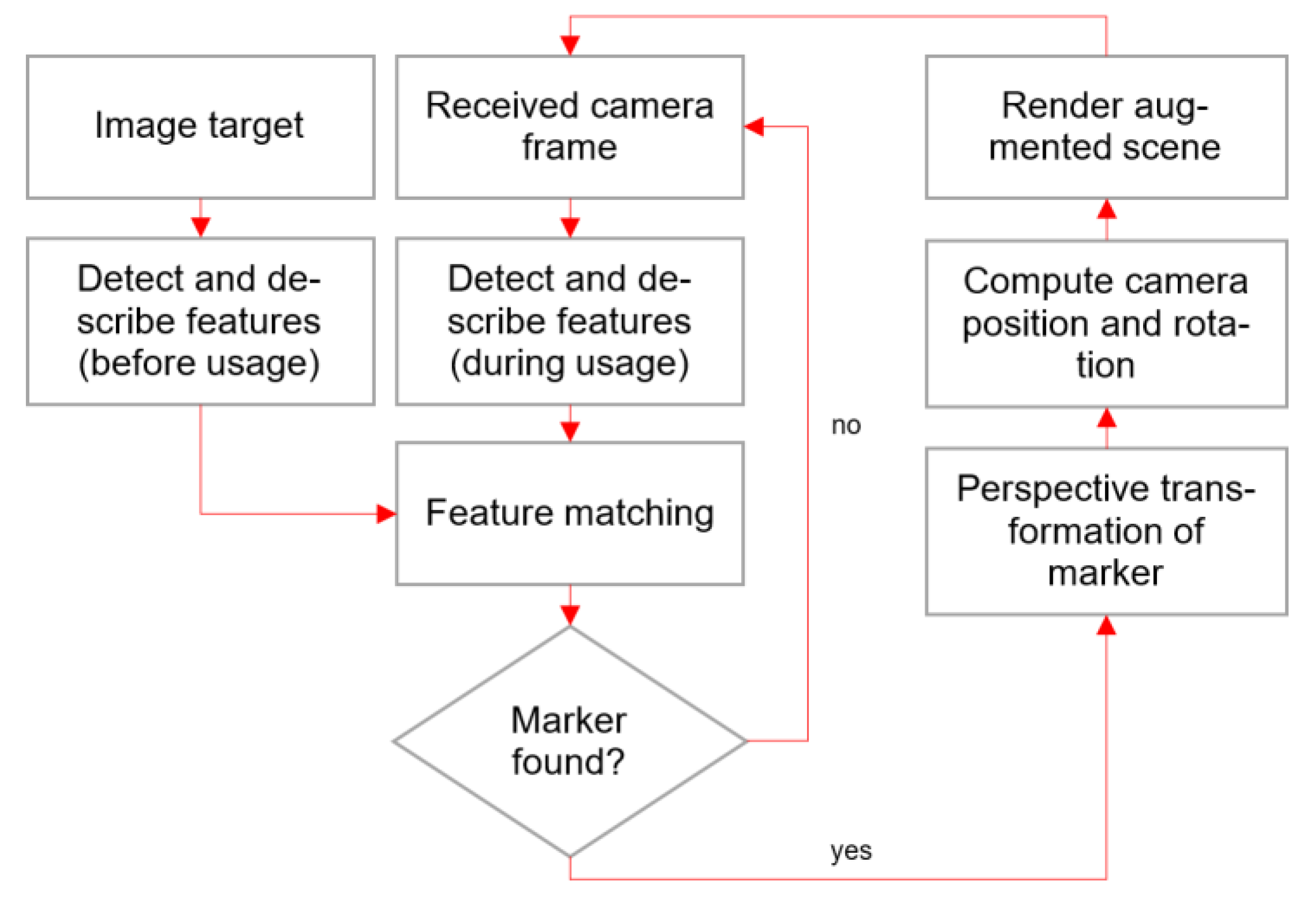
The relation between data and visualizations will be described in detail in Section 4.

3.2. Implementation

We used the software development kit Vuforia [50] for recognizing and tracking the printed maps. Vuforia matches extracted markers of an image target—in our case an image of a map—with those from camera frames of a device—in our case a tablet. This enables computing the position and rotation of the camera, and subsequently to render virtual objects on the screen of the tablet in real-time, which creates an augmented reality (Figure 1). As Vuforia is a closed source product, we cannot give any details to the underlying feature extraction, description, and matching algorithms.
The number of extracted markers from image targets can greatly differ. From our selected three printed maps, the Bernina Area map has the least number of markers. This originally declined the recognition and tracking performance, especially under bad lighting conditions [51]. We assume that the low number of markers resulted from the low contrast and generalization of the map image. We overcame this problem by stretching the contrast to increase the difference between lighter and darker colors, so that more markers could be derived by Vuforia. We assume a stable performance, as classrooms—our target environment for our application—are usually well-lit.
Once all of the markers were generated, the images were imported into the game engine Unity [52], which provides an extension for Vuforia. In Unity, the images can be complemented with digital 2D and 3D objects. We examined two workflows to add geo-data from the SWA and AoS, as Unity is not able to import any georeferenced data formats. We first transformed the geo-data with the mapping software QGIS into the custom coordinate reference systems (CRS) of the printed atlas maps. Next, the re-projected geo-data were imported into Unity using the following two concurrent workflows:
  • Workflow 1: with the BlenderGIS add-on, we imported the geo-data as Shapefiles into Blender and exported them as FBX-files, which can be read by Unity. Since BlenderGIS could not handle the custom CRS, the geo-data had a scaling and an offset error in Unity, which we had to correct manually. The projection is accurate though.
  • Workflow 2: with the GeoJSON.Net library, we imported the geo-data directly into Unity. The library allows to read the geo-data into a GeoJSON.Net “FeatureCollection”, whose attributes can be applied to Unity “Prefabs” representing the 3D objects. By applying a scaling transformation to the “Prefabs”, which relates the extent of the projected geo-data to the size of the map image, the imported objects are positioned correctly.
When a map is detected by Vuforia, the C# script “DefaultTrackableEventHandler“ is executed in Unity, which is linked to every image target. This script can be extended to load or to unload corresponding geo-data for the detected map. In our application, we implemented the following visualizations for the geo-data, according to their geometry type:
  • Dot distribution map: we calculated average population densities for a virtual map grid, vertically translated and colored vertices for each grid cell corresponding to its density, and stored the vertices in Unity “Meshes”. In a custom shader, we resized the vertices according to the distance between the camera and the map center. We also discarded corner pixels by applying a Euclidean distance function, so that the points appear as circles and not as squares.
  • Billboards for pie charts: we instantiated an empty Unity “GameObject” and added an “Image” component for the appearance of the billboard. An update function resets the billboard rotation parameters to match the parameters of the camera, so that the billboards always face the camera. Additionally, we attached a “SphereCollider” to make the billboards responsive to touch events.
  • Anchor lines: we created a Unity 3D object “Cylinder” with a small radius and adjusted its height to reach the base of billboards and cuboids.
  • Curved lines: we instantiated Unity “GameObjects” with a “LineRenderer” component for each line. The start and end points of lines of our geo-data are connected with the segments of the “LineRenderer” whose heights follow a sine function.
  • Flat and extruded polygons: we imported FBX files as Unity “GameObjects” with “Mesh” components. For the extruded polygons, we added a small, imperceptible offset to Unity’s standard shader to prevent z-fighting artifacts, which would occur since the polygon boundaries are partly identical.
  • Cuboids and 3D bars: we created a Unity 3D object “Cube” and scaled their heights accordingly. The thereby formed cuboids are translated at centered positions on top of each other.
Additionally, we changed the height of 3D bars and extruded polygons with the Unity “Animator” over a defined time frame to let the objects appear smoothly when the maps are loaded.
Not only visualizations are generated when maps are detected, but also a graphical user interface (GUI) is added to the tablet screen. The GUI consists of Unity “Button”, “Dropdown”, and “Slider” objects, which we manually positioned on “Panels”, which partly include “Text” areas. The GUI objects are associated with event handlers such as “OnClick” or “OnValueChanged”, which can be linked to scripts. For example, a website containing metadata to a map will be opened in a web browser with the “Application.OpenURL” function in a script after a click on an information button. For the touch input, virtual rays can be sent from the touched screen coordinate along the camera viewing direction into the scene with Unity’s functions “Camera.ScreenPointToRay” and “Physics.Raycast”. The resulting “RaycastHit” structure contains data regarding possible intersections with scene objects, which can be modified (e.g., highlighted) via scripts afterwards. Lastly, we combined the Unity function “ScreenCapture.CaptureScreenshot” with the Android function “Intent” to share a screenshot with different apps on the device.
All map images, visualizations, GUI elements, and scripts are finally assembled into an Android application package, which is built by Unity.

4. Results

We deployed our AR application on two Android tablets differing in operating system version and hardware. The application judders on an Asus Transformer Pad TF300T, released in 2012, and having Android version 4.2.1, with a NVIDIA TEGRA 3 Quad-core CPU and 1GB RAM. On a Samsung Galaxy Tab S4, released in 2018 and having Android version 8.1.0, with a Snapdragon 835 Octa-core CPU and 4GB RAM, all virtual objects are smoothly displayed while tracking the map. Currently, Unity applications with Vuforia’s AR extension can be deployed on 32-bit Android devices having a version higher than 4.1.x [53]. In the following, we describe augmented visualizations and functions for the three selected maps of the Swiss World Atlas.

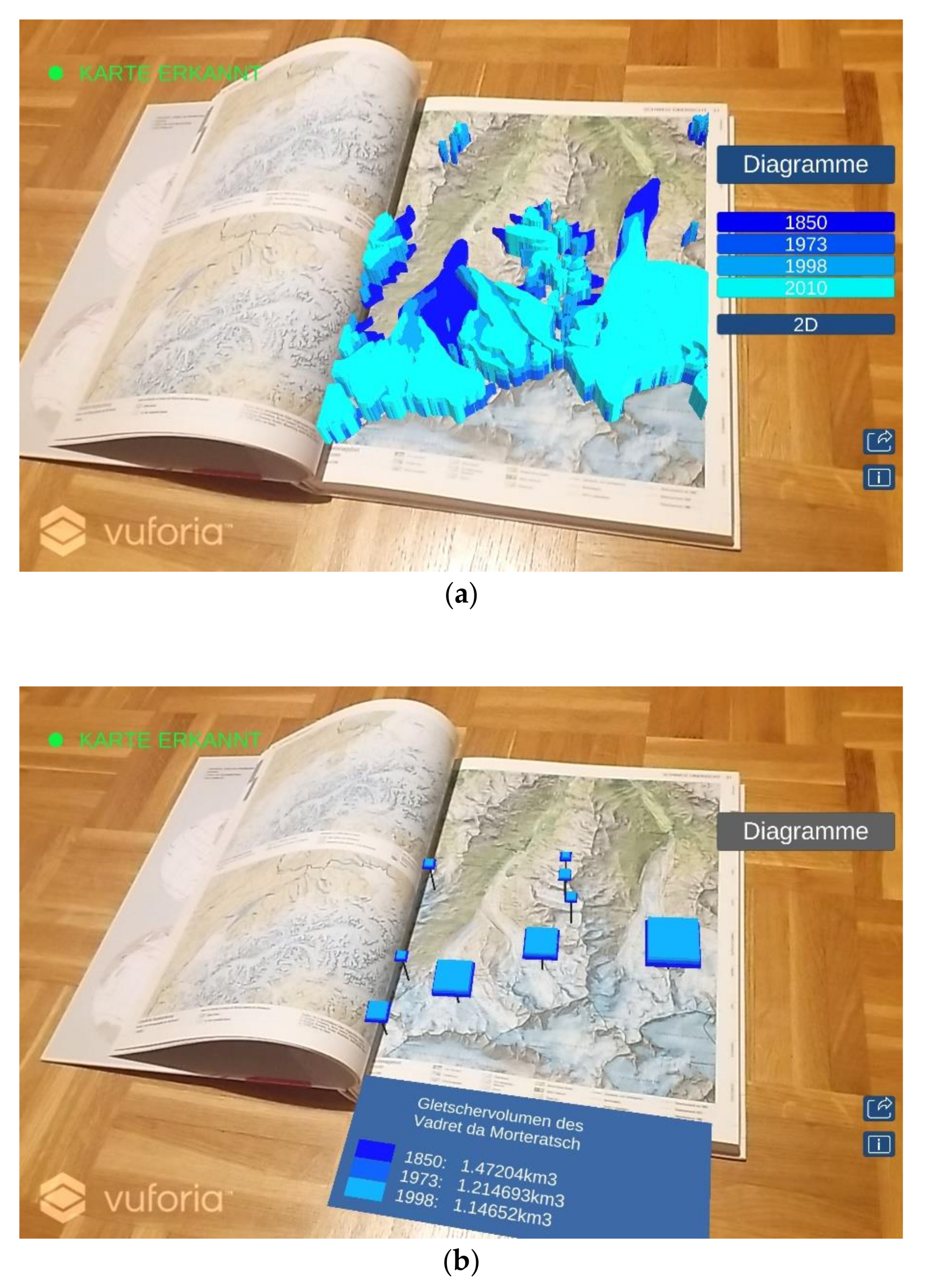
4.1. Glacier Extent Map of the Bernina Region, Switzerland

We augmented a topographic map of a mountainous region in Switzerland with glacier extents and volumes at four different points in time from 1850 to 2010. We chose blue as a base color for glaciers while depicting more recent years in lighter shades and earlier years in darker shades. When displaying glacier areas as polygons (Figure 2a), a time button panel enables or disables layers of different years. Once activated, the color of the button changes to the color of the glacier layer, thus it implicitly serves as a legend entry. An additional “2D/3D” button allows for switching between flat and extruded polygons. After initialization, extrusion heights of the polygons are animated, however, the heights are not related to any quantities.
The second visualization, stacked cuboids (Figure 2b), can be toggled via the “Diagramme” button. The product of length and width of the cuboids is proportional to the area of a glacier and the height of the cuboids to the average height of the glaciers. The cuboids are anchored to the mid points of corresponding glaciers on the map. A legend appears below the map with the glacier name and its volumes in the different years when clicking on one of the stacked cuboids. Overall, a decline of glacier areas and volumes is visible in both visualizations.

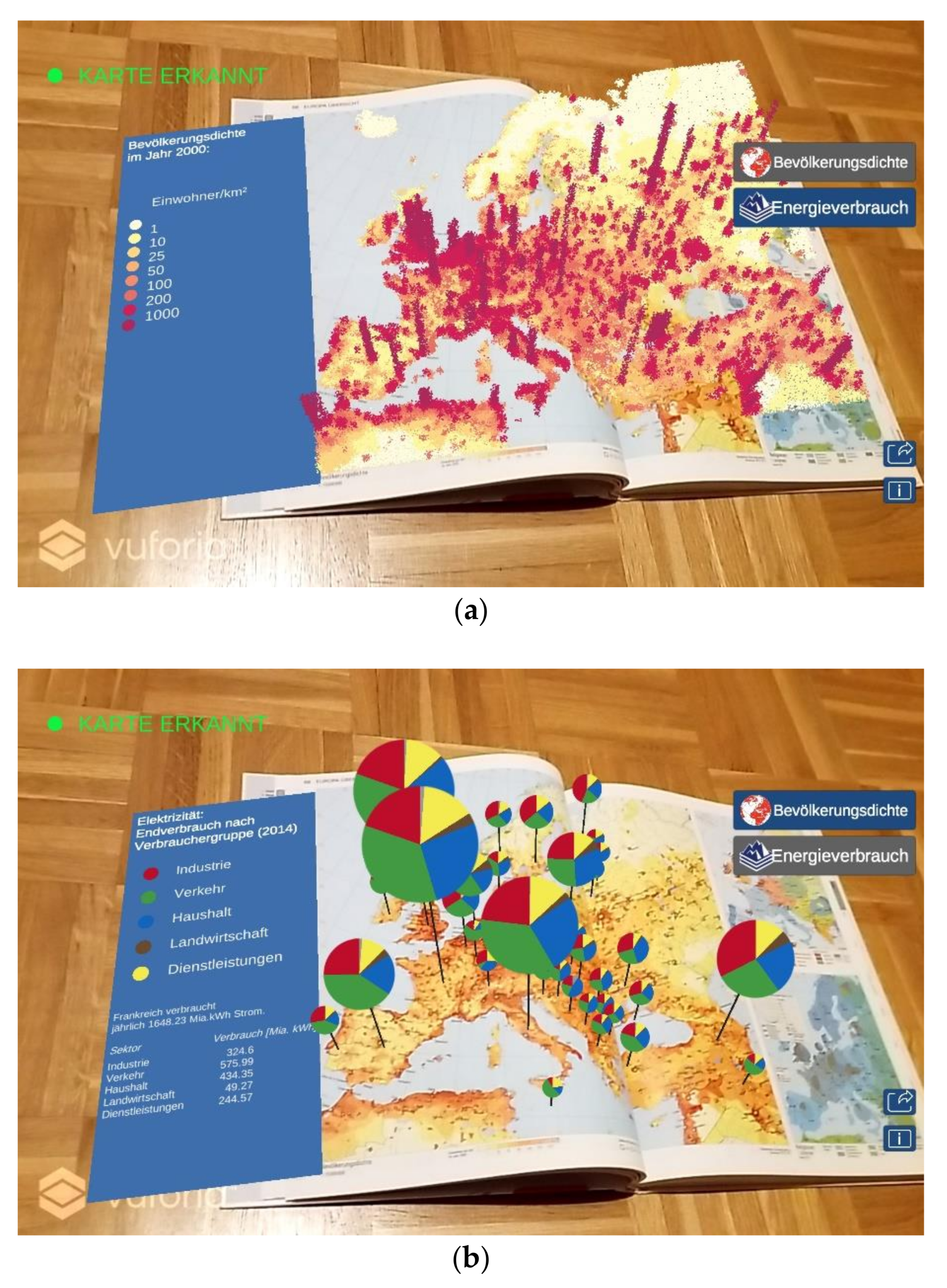
4.2. Population Density Map of Europe

We enriched a population density map with a different visualization of the population density and with electricity use in different European countries. A dot distribution map illustrates the magnitude of the population density when clicking the “Bevölkerungsdichte” button with the SWA icon (Figure 3a). On the paper map, a high density is indicated by a red hue and low density by a yellow hue. In the augmented 3D visualization, each point represents a population density of 100 inhabitants per 10 km2, whereas points are discarded for regions with a lower density than this threshold.
As a second augmentation, we represented the electricity consumption for different European countries in the year of 2012 by pie chart billboards (Figure 3b). These are added when pressing the “Energieverbrauch” button with the AoS icon, since the data originate from this source. The colors of the pie chart sectors correspond to different fields of energy consumption: red for industry, green for traffic, blue for households, brown for agriculture, and yellow for services. The radii of the pie charts are scaled according to the total values of energy consumption. When clicking a pie chart billboard, a legend appears to the left of the map with the name of the country and electricity consumption values for the different sectors.

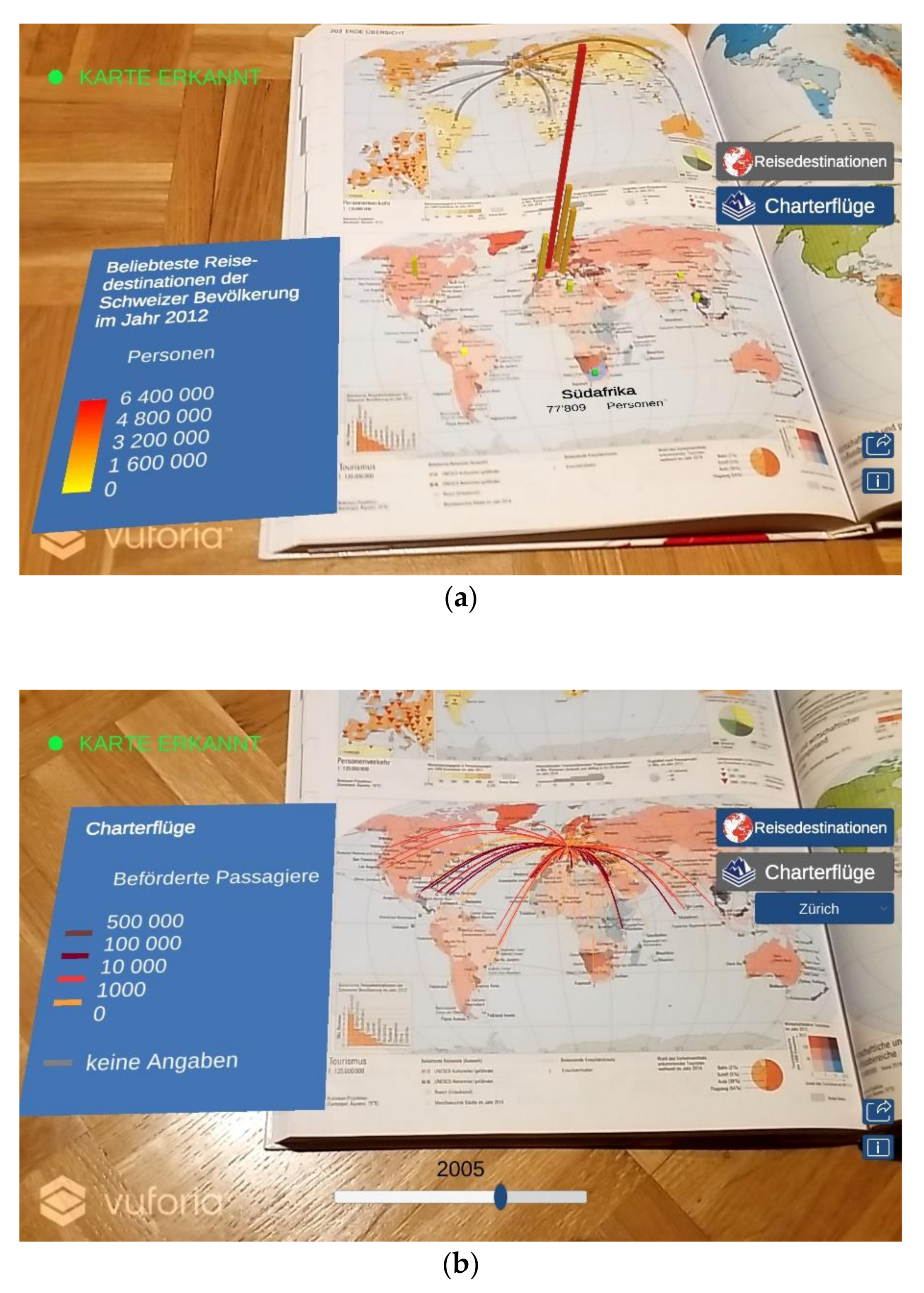
4.3. Holiday Destination World Map

The last printed atlas map shows the economic significance of tourism in different countries in terms of the number of visitor arrivals per inhabitants and the percentage of tourism on the gross domestic product. Our AR application enables correlating these two indicators with the number of Swiss citizens travelling to a country or a region in 2012 (Figure 4a), which is also depicted in the bar chart in the bottom left of the printed map. The heights of 3D bars are proportional to the number of Swiss travelers, while large numbers are intensified with a red hue and small number extenuated with a yellow hue. When clicking a bar, it is highlighted in green and the place name and number of persons are displayed on the empty ocean area on the printed map.
The second augmentation adds charter flights from different Swiss airports as curved lines to the map (Figure 4b). The curved lines are scaled and colored according to the number of travelers. In a dropdown menu, the user can choose different departure airports in Switzerland and compare the amount of destinations. We implemented a slider in order to change the time of the depicted data in steps from 1985 to 2016. The visualization demonstrates that the number of served airports increased over the years.

5. Discussion

Overall, we succeeded in developing a working AR prototype that extends a printed school atlas with digital cartographic visualizations and functionalities for thematic data. During the implementation, we encountered various challenges that we will address in the following sections.

5.1. Recognition and Tracking

On the whole, the printed atlas maps are recognized well and the tracking of camera movements is performant, so that the augmented maps are nearly immediately presented on the tablets. Nevertheless, the digital visualizations begin to jitter when the angle between the camera and paper map becomes too steep. This issue is mentioned in the Vuforia developer documentation [51], but there is not any solution recommended. We suspect that image recognition with convolutional neural networks [54] might possibly increase the tracking accuracy for difficult cases like this in future.
Bent printed map sheets are another problem, since they cause an erroneous positioning of the augmented content. This is due to the assumption of planarity for the image target [51], which is not fulfilled by double-sided maps as well as by maps on left-hand pages at the beginning and right-hand pages at the ending of the atlas. Virtual objects seem to be placed on the biggest recognized part of the map by the Vuforia Engine. In the case of double-sided maps, the positioning works well on one page, while there is an error in height and scale on the other page (Figure 5). One possible approach to counter this issue would be to apply a folded surface model [55].

5.2. Import and Storage of Geographic Data and Image Targets

A main challenge was the import of data that are needed to create the digital thematic maps into the game engine Unity since data formats containing a georeference are not supported natively. From our two examined workflows tackling this issue, we favor using the GeoJSON.Net library over exporting FBX files with the BlenderGIS plug-in, as it does not involve manual corrections of position and scale of the imported data in Unity. All steps on transforming the geo-data to coordinate system of the printed map and inserting them into Unity could be automated, so that, theoretically, any digital map content can augment any printed map if the geographic extents match. All of the geo-data are stored in the application on the device currently, but they could be also downloaded on-demand once an image target has been detected. This would cause an initial delay and it also requires an internet connection, but a web-based solution would reduce the initial size of the application, and it facilitates updates of the content.
We stored all of the image targets in a device database, since the number of printed map sheets in our given atlas is smaller than the threshold of 1000 proposed in the Vuforia documentation [56]. This step was manually carried out for the three exemplary map sheets by using a web application in the browser, but it would be a rather tedious task when generating targets for all map sheets of the atlas. Unfortunately, Vuforia does not offer an API to create device database for image targets yet, so this step cannot be automated. An alternative would be to programmatically upload and store the targets in a cloud database via an API, so that detected markers are sent from the device to a server and the calculations for matching features are performed there. Longer times to identify the images would be expected and an internet connection would have to be available; however, the workload of creating image targets would be reduced with this cloud-based solution. We would not consider cloud recognition for our usage scenario though, as the risks (i.e., additional failure points) outweigh the benefits (i.e., time savings) and data privacy issues also may arise when sending camera images to an external server.

5.3. Visualizations and Graphical User Interface

Overlaps of the map elements, for example, the pie charts depicting energy consumption (Figure 3b), may occur when the distance between the tablet and the printed map increases. Applying cartographic generalization techniques—such as selection, aggregation, or displacement—depending on the viewing distance could reduce the cluttering of these map elements. It is sometimes difficult to trigger the hit event with the user’s finger tips when trying to query information for small map elements, for instance, 3D bars on the holiday destination map (Figure 4a). Larger “Colliders” could be defined on the augmented objects in Unity to increase the trigger area.
When decoding the meaning of map symbols, for example, colors of stacked cuboids (Figure 2b), the augmented legend can be aligned to the printed map or be shown in the graphical user interface. While the first placement is more aesthetically pleasing in our opinion, the second option ensures that the legend maintains its size. Another option, which would be especially suitable for quantitative data, would be to attach reference frames to the 3D symbols to better compare their sizes [57]. Questions regarding the most convenient legend placement and other design decisions are addressed in Section 7.
In general, greater care should be taken to make the GUI consistent to the corporate identity of the printed school atlas, the Swiss World Atlas in our case. While implementing our prototype, we concentrated rather on visualizations and functions than on design. Moreover, the GUI should be responsive to smaller digital devices, such as smartphones. At the moment, our prototype is optimized for tablets, since students are provided with them in a rising number of schools in Switzerland, as indicated in the introductory chapter. However, most students own smartphones nowadays [58], so they should also be able to use the AR application on these smaller devices for their homework in case the tablets are kept in schools.

5.4. Operating System

We deployed our AR application on Android tablets that may be acquired by schools due to their cost efficiency. However, the AR application could also be compiled for iOS devices and Windows tablets without any major modifications in Unity. Only minimal changes on platform-dependent functions, like sharing screen-captures, would be required. Additionally, Unity would allow for building standalone applications for desktop computers, but pointing the atlas towards a webcam would be too cumbersome to trigger the AR effects. We do not consider creating a purely digital version, since printed maps are still expedient in a number of situations due to their tangibility, ease of use, and support of collaborative work [59]. By using AR, we can eventually exploit the advantages both of analog and digital cartographic representations.

6. Evaluation

6.1. Hypotheses

We conducted a usability experiment to investigate which impact augmented maps may have in education. In detail, we examined the following hypotheses, for which we take printed maps solely as a baseline:
Hypotheses 1 (H1):
Spatial literacy will be improved by AR.
Hypotheses 2 (H2):
The interest to study a geographic topic will be more encouraged by AR.
Hypotheses 3 (H3):
Sustainable values and norms will be better conveyed by AR.
We put our main emphasis on the first hypothesis, because the ability to analyze and interpret maps is an essential skill to be acquired in school education. In this connection, AR might clarify the students’ understanding of the depicted magnitudes and value ranges of a map theme. We like to verify whether students can find and locate objects in space and determine their characteristics. Our secondary focus lies in motivating the students to immerse in a geographic setting, which may be beneficial for learning, as seen in [47]. We try to raise the students’ interest through examples from everyday life and we test whether they are able to explain facts. Finally, as sustainability is an integral component of the Swiss curriculum, the students’ attitudes may be shifted to an environmental-friendly and resource-saving direction by amplifying the map message with intriguing AR visualizations, which show the human footprint on the planet. We like to assess whether students can evaluate and judge these facts accordingly.

6.2. Experiment

We displayed our AR application at a Geomatics exhibition for secondary school students. The students came from different schools and classes, and they were neither particularly specialized in geography nor in computer science (incl. augmented reality). Our stand consisted of a large poster wall, a 2×1×1m table, and two chairs. On the table, we placed a lamp, two sets of high-end tablets and smartphones, and three laminated printed maps from the school atlas. The exhibition took place in a large room with other stands and it lasted six hours. The noise level and the overall illumination was moderate. Most students visited our stand voluntarily and some were actively approached to test our application. We had adapted the app for the experiment, so that only the first augmented visualization (see middle column in Table 1) and non-animated map elements appeared. Individual students were asked to sit down by one of the two tutors, who stood next to the table. Introductorily, a tutor explained the upcoming tasks and demonstrated the AR app briefly, while paying attention to not show the map that was the subject of the current run. Next, the tutor referred the student to one of the smartphones with our custom survey application.
The initial page of the application contained a brief description of the procedure of the survey and a consent form. On the next page, students indicated their age and gender. The following six pages formed our main experiment and targeted one of the three maps (i.e., glacier extents, population density, holiday destinations).
The main experiment consisted of two parts: each part started with a specification of the required map and mode (i.e., printed only or augmented), was followed by an assessment task, and completed with a reflection question. The exact wording of tasks and questions is given in Listing A1 (Appendix A). One part had to be solved with and the other one without AR, whereas the order was systematically varied (Table 2). We also distributed correct answers equally at different positions in the survey. The assessment task (T1) in the first part focused the students’ visualization literacy skills [60], that is, reading values, finding extreme values, and comparing values. After selecting one of three possible answers, students reflected (Q1) on a five-point Likert-type scale how difficult the spatial orientation was for the map literacy task. The second part comprised an interpretation or a judgement task. One of three answers was correct for the interpretation task (T2); however, the correct answer could be merely deduced from the glacier extent map, whereas the students had to apply their general knowledge for the population density and holiday destination map. The reflection question (Q2) following the interpretation task targeted examining the students’ interest in exploring a map topic. As the judgement task (T3) involved the students’ opinions, none of the possible answers was correct or wrong, however they differed in the degree of sustainable behavior concerning climate change, overpopulation, and resource utilization. The following reflection question (Q3) aimed to compare whether reviewing a geographic setting has changed the students’ attitude on sustainability.
A text, expressing our gratitude for participating in our study and offering to give optional feedback to the tutor, was displayed on the final page of our survey. The students were not compensated for their efforts, however they could inspect the maps, which were not part of the experiment, with our AR app afterwards.

6.3. Measurements

58 students participated in our experiment, but we excluded two students from the following analysis, so that tasks and questions per map are counter-balanced with respect to the order of used devices (Table 2). The students had an average age of 15.6 years (SD = 1.8 years). 37 students were male, 19 female, and zero diverse. 24 students solved tasks with the glacier extent map, 16 with the population density map and 16 with the holiday destination map. Students used either the printed map only or the printed map combined with the augmented reality application to solve a task, which is, a between-subject design. To determine the effectiveness of students’ actions, we gave one point for correct answers and zero points for incorrect answers for the first two assessment tasks (i.e., map analysis and interpretation). We gave a score of -1.0 for a non-sustainable attitude, 0.0 for a neutral opinion, and 1.0 for a sustainable view for the third assessment task (i.e., map judgement). For the reflection tasks, we assigned scores ranging from -1.0 to 1.0 in steps of 0.5 to the five Likert-scale items, whereas -1.0 means very difficult, very boring, or much less sustainable, 0.0 is neutral, and 1.0 corresponds to very easy, very interesting, or much more sustainable. We aggregated the results of the three maps (Table 3), since calculations based on individual maps (Table A1 in Appendix B) and tasks would be too little statistically relevant.
Overall, the students analyzed printed maps more accurately than augmented maps and interpreted augmented maps slightly more accurately than printed maps, though a chi-square test reveals no significant differences in terms of response accuracy between the devices (Χ²(1, N = 56) = 1.79, p = 0.18, φ = 0.18 for map analysis tasks (T1) and Χ²(1, N = 28) = 0.14, p = 0.7, φ = 0.07 for map interpretation tasks (T2)). Welch’s t-test shows that students classified their spatial orientation (Q1) as significantly improved (t(54) = -2.11, p < 0.05, d = 0.56) after having analyzed maps with the augmented reality application (M = 0.39, SD = 0.34) than with printed maps only (M = 0.18, SD = 0.41). Students rated their interest in a map topic (Q2) higher after having interpreted a map with the AR app; however, the result does not significantly differ from the students’ self-evaluation after having worked with the printed maps only (t(26) = -0.89, p = 0.3837, d = 0.33). Students mainly chose neutral to sustainable answers for the map judgement task (T3), but their attitude did not vary between printed and augmented maps (t(26) = -0.27, p = 0.7909, d = 0.1). However, they indicated that their opinion (Q3) became significantly more sustainable (t(26) = -2.7, p < 0.05, d = 1.02) after using the AR app (M = 0.32, SD = 0.32) when compared to judging a geographic topic with printed maps only (M = 0.04, SD = 0.31).

6.4. Further Observations

Although the experiment was not conducted under laboratory conditions, almost all of the students were highly focused on the tasks and took their time (about five minutes on average) to complete the survey. Most of the students independently solved the survey, only a few students asked questions to the tutors or other surrounding students, if any. Sitting next to each other, students occasionally looked at their neighbor, which caused an approximate five second interruption, but this incident almost exclusively occurred only once per run.
Sometimes, the tutors helped the students to focus the maps with the tablets’ camera to activate the AR visualizations since recognizing the images does not work initially when the distance to the camera is very small. One student stood up during the survey, the other students solved the tasks while sitting on the chair, but most had to lean back. The tutors demonstrated the touch-based feature query to half of the students, which was helpful, but not necessarily needed, in order to solve the map analysis task. Afterwards, students expected events to be triggered when clicking on other map objects. The inline feature query panel and the inline legend were noticed in about half of the runs because students held the tablet too close to the map.
After an initial reticence, students’ feedback was throughout positive while testing the application (“fascinating”, “awesome”). Additionally, teachers who approached our stand showed interest in the application.

6.5. Appraisal

Our usability experiment proved that supplementing printed atlas maps with an AR application leads to a positive learning experience perceived by the students. On the one hand, the students indicated in our survey that they could spatially orientate themselves easier in augmented maps (Q1). This is possibly due to the fact that the application highlights certain map features, thus it acts as a filter and can, therefore, help the student to focus on the relevant map content. Students may have felt also more comfortable when being assisted by a digital device, which can give hints or feedback. In the holiday destination map, for instance (Figure 4a), students could verify the estimated amount of travelers by reading the exact amount in the feature information panel.
On the other hand, students reported that the AR application influenced their opinion in a more sustainable way (Q3). The augmented 3D visualizations seemed to have sensitized the students to the geographic magnitude order of the human impact on the environment and possibly encouraged them to think about future consequences of their actions. It was intended to convey more sustainable values by the maps, however a shift into the other direction might be also possible. For example, the augmented dot density map drew much attention on population so students thought it is the decisive factor for regulating migration, whereas all students, who worked with the printed map, judged for this task (see T3 in Table A1) that other factors are also important.
Regarding the students’ effectiveness, we did not observe any differences between the printed and augmented maps (T1, T2). This can be interpreted as a good result concerning the future usage of AR atlases in geography classes, since it indicates that AR is not too distractive when solving map specific tasks. Yet, issues, like the additional cognitive load [61] and potential interferences from other apps, have to be kept in mind when using AR generally. Nevertheless, our AR visualizations could still be improved, such as in the glacier map, where students were mostly incorrect (see T1 in Table A1). Transparency might be applied to the flat or extruded polygons, so that the printed map remains visible, or a text or speech input may help users to search and highlight specific objects (e.g., mountains, huts, etc.) in the map.
When considering current youth climate movements, debates about migration, and concepts like ‘flight shame’, we assume that students’ attitudes towards sustainability (T3) and interest in these map topics (Q2) are already on a high level on average, so it is a difficult task for AR applications to increase them even further. Eventually, the concept of storytelling might bridge the gap between abstract visualizations and real-world entities to further raise the students’ awareness of environmental problems. Consequently, we have to reject all hypotheses (H1–H3), but due to the students’ subjectively experienced ease of spatial orientation and change towards a more sustainable behavior, we still recommend the usage of AR applications in schools in combination with printed atlases. Yet another iteration of our prototype is needed, as implied by the previous and next chapter, to potentially achieve an objective change of these three indicators.

7. Conclusions and Future Work

In our work, we have shown the technical-cartographic feasibility of an AR application that combines printed atlas maps with digital thematic 3D maps. With the augmented visualizations and the implemented workflow, we like to share our hands-on experiences with other atlas producers. When turning the prototype (see Supplementary Materials) into a deployable application, costs of about 2,000$ for purchasing the Unity Pro license and the Vuforia Basic license would arise each year for the developers. We believe that using these two commercial products is the most cost-beneficial option, when considering the high costs for creating an AR application from scratch. Although not all discussed issues (e.g., bent pages, recognition performance) can be tackled when relying on these mainly closed source products, they provide the necessary stability to develop a market-ready application for schools.
We have examined students’ competences on working with maps in a user experiment to determine whether augmented content and functionalities foster meaningful and practical work with atlases in geography classes. We found that the effectiveness to analyze and interpret maps is not different between printed and augmented maps, yet students rated their spatial orientation as easier after having solved tasks with the AR application. Students were slightly more interested in a topic with augmented maps, but we observed no statistically significant difference to paper maps. Lastly, students perceived that the AR application changed their attitude towards more sustainable values; however, it did not manifest objectively in their task responses, thus there was no difference between printed and augmented maps concerning the formation of more sustainable norms.
For a more profound understanding of teaching map competences by AR atlases, the following thematic and content-related questions may be addressed in future research: should additional geo-data, which are related to the already existing map content, be displayed as in our AR prototype? In this way, learners could discover and develop further thematic interrelations. Or should the content be constructed rather as a kind of learning aid that supports the understanding of the already mapped geographical facts (e.g., by story maps)? This could be realized in the form of textual, visual, and aural media, which could digitally augment the maps [34]. Or would completely different content be thinkable that could support the promotion of map competences in or beyond the classroom (e.g., encyclopedia, quizzes)? And finally, how could analog and digital content be aligned in a coherent design? So far, we have primarily focused on technical aspects than on aesthetics, but the detailed printed maps need to be harmonized with the relatively coarse augmented maps in a next step.
Besides diversifying the content and beautifying its appearance, our AR prototype could also be enriched in functionality. For example, navigation functions (e.g., search, index of themes) and general functions (e.g., help, language selection) are thinkable. Likewise, cartographic functions (e.g., modification of symbolization, selection of data) and elementary GIS functions (e.g., measurement of distances and areas, creating profiles, or comparison of different map layers) could be embedded [62]. These functions could be aligned with the ‘mental model building’ approach [63], where the map acts as a graphic model and in which potential misconceptions from daily life are opposed to professional knowledge. Students first resolve the triggered cognitive conflicts and then reflect on their gained insights.
Content, functions, and didactical concepts could be tested by other direct usability methods, like eye-tracking, where hotspots and paths of gazes could be identified, or school visits by educationists, who observe an actual teaching sequence in a geography lesson. These methods enable to inspect students’ interactions between the printed school atlas and the AR application in terms of solving tasks and acquiring map competences. Indirect methods, such as more comprehensive questionnaires for teachers and learners, would be imaginable to evaluate the added value and the process of conveying geographic knowledge when comparing printed maps solely to AR maps.

Supplementary Materials

Author Contributions

The following contributions were made by the authors: conceptualization, R.S., C.D., S.S., and P.T.; data curation, C.D. and S.S.; methodology, R.S., C.D., S.S., and P.T.; project administration, R.S.; software, R.S., C.D., and S.S.; supervision, R.S., P.T., and L.H.; validation, R.S., C.D., and P.T.; visualization, C.D. and S.S.; writing—original draft preparation, R.S., C.D., S.S., and P.T.; writing—review and editing, R.S., P.T., and L.H. All authors have read and agreed to the published version of the manuscript.

Funding

This research received no external funding.

Acknowledgments

The authors thank Mattia Ryffel from Disney Research Studios for his advice on implementing the AR application. Two copies of the Swiss World Atlas and two Android tablets were gratefully provided for this research project by the Institute of Cartography and Geoinformation, ETH Zurich.

Conflicts of Interest

The authors declare no conflict of interest.

Appendix A

  • Listing A1: Assessment tasks, reflection questions, and their answers of our usability experiment. Those are translated from German—the language, in which the experiment was conducted. Correct answers for assessment tasks T1 and T2, and most sustainable answers for T3 are highlighted in green. Moderately sustainable answers for T3 are highlighted in blue. Answers to the reflection questions are based on a five-point Likert-type scale.

Appendix A.1. Assessment Tasks

Appendix A.1.1. Glacier Extent Map

T1
Compare whether the Tschierva glacier or the Morteratsch glacier has decreased more between 1850 and 2008:
(a) The Tschierva glacier has decreased more.
(b) The Morteratsch glacier has decreased more.
(c) Both glaciers have decreased by about the same size.
T2
Select a location where you can take an impressing photograph of the decreased Morteratsch glacier and explain your decision:
(a) Hotel Morteratsch, since one can look frontally at the glacier
(b) Piz Palü, since one can look down to the glacier from this mountain
(c) Boval hut, since one can look laterally at the glacier
T3
Judge the decrease of glaciers in the Swiss Alps taking the example of the Bernina area:
(a) It makes me sad and angry, and also I am feeling helpless.
(b) The situation does not evoke any emotions to me.
(c) I perceive the decrease of glaciers as not very dramatic.

Appendix A.1.2. Population Density Map

T1
State a sparsely and a densely populated area in Europe:
(a) South of Poland and Iceland
(b) England and Po valley
(c) Lapland und the Pyrenees
T2
Explain the difference in peopling of Scandinavia compared to Central Europe:
(a) high emigration number
(b) small birth rate
(c) late industrialization
T3
Judge the following statement by Johansson, the Swedish minister on integration by means of the population density map "One can also seek asylum in Germany or Denmark. Europe is larger than Sweden":
(a) I agree to the statement according to the population density distribution in Europe.
(b) In my opinion, the number of inhabitants of a country should not be the only decisive factor for the distribution of asylum seekers.
(c) Sweden should grant asylum to more people since the country is sparsely populated.

Appendix A.1.3. Holiday Destination Map

T1
Determine the number of Swiss citizens who travelled to Italy in 2012:
(a) ca. 500‘000
(b) approximately 2 Mio.
(c) about 8 Mio.
T2
Explain the fact “France is the top travel destination among Swiss citizens“:
(a) Swiss citizens like to go on seaside holidays in a nearby country.
(b) Swiss citizens prefer France since they are familiar with the local language.
(c) Swiss citizens are attracted by the wilderness in France.
T3
Judge the Swiss citizens‘ travel behavior on the basis of their selected destinations considering the overall concept of sustainability:
(a) Swiss citizens can go unscrupulously on long-haul journeys.
(b) The proportion of near- and long-haul journey should be about the same.
(c) Swiss citizens should indeed choose more near-haul than long-haul journeys.

Appendix A.2. Reflection Questions

Q1
How easy or difficult was it to spatially orientate yourself?
(a)
very easy
(b)
easy
(c)
moderately difficult
(d)
difficult
(e)
very difficult
Q2
How interesting or boring was the previously elaborated topic to you?
(a)
very interesting
(b)
interesting
(c)
moderately interesting
(d)
boring
(e)
very boring
Q3
How did your opinion change while working with the map?
(a)
much less sustainable
(b)
less sustainable
(c)
equally sustainable
(d)
more sustainable
(e)
much more sustainable

Appendix B

Table A1. Detailed results of our usability experiment in which secondary year students solved assessment tasks (= T) and answered reflection questions (= Q). The top bar depicts the results of printed map usage and the bottom bar shows the results of augmented map usage.
Glacier Extent MapPopulation Density MapHoliday Destination Map
Effectiveness of map analysis (T1)
Mti 04 00023 i001
N = 2 × 12
Mti 04 00023 i002
N = 2 × 8
Mti 04 00023 i003
N = 2 × 8
correct  incorrect
Effectiveness of map interpretation (T2)
Mti 04 00023 i004
N = 2 × 6
Mti 04 00023 i005
N = 2 × 4
Mti 04 00023 i006
N = 2 × 4
correct  incorrect
Attitude from map judgement (T3)
Mti 04 00023 i007
N = 2 × 6
Mti 04 00023 i008
N = 2 × 4
Mti 04 00023 i009
N = 2 × 4
sustainable  neutral  not sustainable
Ease of spatial orientation (Q1)
Mti 04 00023 i010
N = 2 × 12
Mti 04 00023 i011
N = 2 × 8
Mti 04 00023 i012
N = 2 × 8
very easy  easy  moderately difficult  difficult  very difficult
Interest in map topic (Q2)
Mti 04 00023 i013
N = 2 × 6
Mti 04 00023 i014
N = 2 × 4
Mti 04 00023 i015
N = 2 × 4
very interesting  interesting  moderately interesting  boring  very boring
Change of attitude (Q3)
Mti 04 00023 i016
N = 2 × 6
Mti 04 00023 i017
N = 2 × 4
Mti 04 00023 i018
N = 2 × 4
much more sustainable  sustainable  equally sustainable
less sustainable  much less sustainable

References

  1. Schul- und Sportdepartement, Stadt Zürich KITS-Tablets. Available online: https://www.stadt-zuerich.ch/ssd/de/index/volksschule/kits_informatik_computer/infrastruktur/kitstablets.html (accessed on 22 May 2020).
  2. Deutschschweizer Erziehungsdirektoren-Konferenz Lehrplan 21. Available online: https://www.lehrplan21.ch (accessed on 22 May 2020).
  3. Johnson, L.; Becker, S.A.; Estrada, V.; Freeman, A. BYOD. In NMC Horizon Report: 2014 K-12 Edition; The New Media Consortium: Austin, TX, USA, 2014; pp. 34–36. Available online: https://eric.ed.gov/?id=ED559369 (accessed on 22 May 2020).
  4. Milgram, P.; Kishino, F. A Taxonomy of Mixed Reality Visual Displays. Ieice Trans. Inf. Syst. 1994, E77-D, 1321–1329. Available online: https://search.ieice.org/bin/summary.php?id=e77-d_12_1321 (accessed on 22 May 2020).
  5. Azuma, R.T. A Survey of Augmented Reality. Presence Teleoperators Virtual Environ. 1997, 6, 355–385. [Google Scholar] [CrossRef]
  6. Chess, S. Augmented regionalism: Ingress as geomediated gaming narrative. Inf. Commun. Soc. 2014, 17, 1105–1117. [Google Scholar] [CrossRef]
  7. Magnenat, S.; Ngo, D.T.; Zünd, F.; Ryffel, M.; Noris, G.; Rothlin, G.; Marra, A.; Nitti, M.; Fua, P.; Gross, M.; et al. Live Texturing of Augmented Reality Characters from Colored Drawings. IEEE Trans. Vis. Comput. Graph. 2015, 21, 1201–1210. [Google Scholar] [CrossRef] [PubMed]
  8. Tscheu, F.; Buhalis, D. Augmented Reality at Cultural Heritage sites. In Proceedings of the Information and Communication Technologies in Tourism 2016; Inversini, A., Schegg, R., Eds.; Springer International Publishing: Cham, Switzerland, 2016; pp. 607–619. [Google Scholar] [CrossRef]
  9. Pavlik, J.V.; Bridges, F. The Emergence of Augmented Reality (AR) as a Storytelling Medium in Journalism. J. Commun. Monogr. 2013, 15, 4–59. [Google Scholar] [CrossRef]
  10. Marescaux, J.; Rubino, F.; Arenas, M.; Mutter, D.; Soler, L. Augmented-Reality–Assisted Laparoscopic Adrenalectomy. JAMA 2004, 292, 2211–2215. [Google Scholar] [CrossRef]
  11. Schall, G.; Zollmann, S.; Reitmayr, G. Smart Vidente: Advances in mobile augmented reality for interactive visualization of underground infrastructure. Pers. Ubiquit. Comput. 2013, 17, 1533–1549. [Google Scholar] [CrossRef]
  12. Zhang, Q.; Guo, Y.; Laffont, P.; Martin, T.; Gross, M. A Virtual Try-On System for Prescription Eyeglasses. IEEE Comput. Graph. Appl. 2017, 37, 84–93. [Google Scholar] [CrossRef]
  13. Pereira, F.; Silva, C.; Alves, M. Virtual Fitting Room Augmented Reality Techniques for e-Commerce. In Proceedings of the ENTERprise Information Systems; Cruz-Cunha, M.M., Varajão, J., Powell, P., Martinho, R., Eds.; Springer: Berlin/Heidelberg, Germany, 2011; pp. 62–71. [Google Scholar] [CrossRef]
  14. Tang, J.K.T.; Lau, W.; Chan, K.; To, K. AR interior designer: Automatic furniture arrangement using spatial and functional relationships. In Proceedings of the 2014 International Conference on Virtual Systems Multimedia (VSMM), Hong Kong, China, 9–12 December 2014; pp. 345–352. [Google Scholar] [CrossRef]
  15. Maquil, V.; Psik, T.; Wagner, I. The ColorTable: A Design Story. In Proceedings of the 2nd International Conference on Tangible and Embedded Interaction; ACM: New York, NY, USA, 2008; pp. 97–104. [Google Scholar] [CrossRef]
  16. Rehman, U.; Cao, S. Augmented-Reality-Based Indoor Navigation: A Comparative Analysis of Handheld Devices Versus Google Glass. IEEE Trans. Hum. -Mach. Syst. 2017, 47, 140–151. [Google Scholar] [CrossRef]
  17. Joo-Nagata, J.; Martinez Abad, F.; García-Bermejo Giner, J.; García-Peñalvo, F.J. Augmented reality and pedestrian navigation through its implementation in m-learning and e-learning: Evaluation of an educational program in Chile. Comput. Educ. 2017, 111, 1–17. [Google Scholar] [CrossRef]
  18. Bobrich, J.; Otto, S. Augmented maps. Int. Arch. Photogramm. Remote Sens. Spat. Inf. Sci. 2002, 34, 502–505. Available online: https://www.isprs.org/proceedings/XXXIV/Part4/ (accessed on 22 May 2020).
  19. Morrison, A.; Oulasvirta, A.; Peltonen, P.; Lemmela, S.; Jacucci, G.; Reitmayr, G.; Näsänen, J.; Juustila, A. Like Bees Around the Hive: A Comparative Study of a Mobile Augmented Reality Map. In Proceedings of the SIGCHI Conference on Human Factors in Computing Systems; ACM: New York, NY, USA, 2009; pp. 1889–1898. [Google Scholar] [CrossRef] [Green Version]
  20. Reitmayr, G.; Eade, E.; Drummond, T. Localisation and interaction for augmented maps. In Proceedings of the Fourth IEEE and ACM International Symposium on Mixed and Augmented Reality (ISMAR’05), Vienna, Austria, 5–8 October 2005; pp. 120–129. [Google Scholar] [CrossRef]
  21. Adithya, C.; Kowsik, K.; Namrata, D.; Nageli, V.S.; Shrivastava, S.; Rakshit, S. Augmented reality approach for paper map visualization. In Proceedings of the 2010 International Conference on Communication and Computational Intelligence (INCOCCI), Erode, India, 27–29 December 2010; pp. 352–356. Available online: https://ieeexplore.ieee.org/abstract/document/5738756/ (accessed on 22 May 2020).
  22. Uchiyama, H.; Saito, H.; Servières, M.; Moreau, G. AR GIS on a physical map based on map image retrieval using LLAH tracking. In Proceedings of the 11th IAPR Conference on Machine Vision Applications, MVA 2009, Yokohama, Japan, 20–22 May 2009; pp. 382–385. Available online: http://www.mva-org.jp/Proceedings/2009CD/program.html (accessed on 22 May 2020).
  23. Ufkes, A.; Fiala, M. A Markerless Augmented Reality System for Mobile Devices. In Proceedings of the Tenth Conference on Computer and Robot Vision, CRV 2013, Regina, SK, Canada, 28–31 May 2013; pp. 226–233. [Google Scholar] [CrossRef]
  24. Paelke, V.; Sester, M. Augmented paper maps: Exploring the design space of a mixed reality system. Isprs J. Photogramm. Remote Sens. 2010, 65, 256. [Google Scholar] [CrossRef]
  25. Neges, M.; Koch, C.; König, M.; Abramovici, M. Combining visual natural markers and IMU for improved AR based indoor navigation. Adv. Eng. Inform. 2017, 31, 18–31. [Google Scholar] [CrossRef]
  26. Chatain, J.; Demangeat, M.; Brock, A.M.; Laval, D.; Hachet, M. Exploring Input Modalities for Interacting with Augmented Paper Maps. In Proceedings of the 27th Conference on L’Interaction Homme-Machine; ACM: New York, NY, USA, 2015; pp. 22:1–22:6. [Google Scholar] [CrossRef] [Green Version]
  27. Häberling, C. Topographische 3D-Karten: Thesen für kartographische Gestaltungsgrundsätze. Ph.D. Thesis, ETH Zurich, Zurich, Switzerland, 2003. [Google Scholar] [CrossRef]
  28. Luebke, D.; Reddy, M.; Cohen, J.D.; Varshney, A.; Watson, B.; Huebner, R. Terrain Level of Detail. In Level of Detail for 3D Graphics; The Morgan Kaufmann Series in Computer Graphics; Morgan Kaufmann: San Francisco, CA, USA, 2003; pp. 185–228. ISBN 978-1-55860-838-2. [Google Scholar]
  29. Parish, Y.I.H.; Müller, P. Procedural Modeling of Cities. In Proceedings of the 28th Annual Conference on Computer Graphics and Interactive Techniques; ACM: New York, NY, USA, 2001; pp. 301–308. [Google Scholar] [CrossRef]
  30. Sieber, R.; Schnürer, R.; Eichenberger, R.; Hurni, L. The Power of 3D Real-Time Visualization in Atlases—Concepts, Techniques and Implementation. In Proceedings of the 26th International Cartographic Conference, Dresden, Germany, 25–30 August 2013; Available online: https://icaci.org/files/documents/ICC_proceedings/ICC2013/ (accessed on 22 May 2020).
  31. Sandvik, B. Using KML for Thematic Mapping. Master’s Thesis, University of Edinburgh, Edinburgh, UK, 2008. Available online: http://hdl.handle.net/1842/2464 (accessed on 22 May 2020).
  32. Schnürer, R.; Eichenberger, R.; Sieber, R.; Hurni, L. 3D Charts – Taxonomy and Implementation in a Virtual Globe. Rev. Bras. De Cartogr. 2015, 67, 1055–1065. Available online: http://www.seer.ufu.br/index.php/revistabrasileiracartografia/article/view/44627 (accessed on 22 May 2020).
  33. Marques, L.; Tenedório, J.A.; Burns, M.; Româo, T.; Birra, F.; Marques, J.; Pires, A. Cultural heritage 3D modelling and visualisation within an augmented reality environment, based on geographic information technologies and mobile platforms. Archit. City Environ. 2017, 11, 117–136. [Google Scholar] [CrossRef] [Green Version]
  34. Westermann-Gruppe Zoom-App. Available online: http://www.zoom-app.de (accessed on 22 May 2020).
  35. Liarokapis, F.; Greatbatch, I.; Mountain, D.; Brujic-Okretic, V.; Raper, J. Mobile augmented reality techniques for GeoVisualisation. In Proceedings of the Ninth International Conference on Information Visualisation (IV’05), London, UK, 6–8 July 2005; pp. 745–751. [Google Scholar] [CrossRef]
  36. Zhang, G.; Gong, J.; Li, Y.; Sun, J.; Xu, B.; Zhang, D.; Zhou, J.; Guo, L.; Shen, S.; Yin, B. An efficient flood dynamic visualization approach based on 3D printing and augmented reality. Int. J. Digit. Earth 2020, 12, 1–19. [Google Scholar] [CrossRef]
  37. Hedley, N.R.; Billinghurst, M.; Postner, L.; May, R.; Kato, H. Explorations in the Use of Augmented Reality for Geographic Visualization. Presence Teleoperators Virtual Environ. 2002, 11, 119–133. [Google Scholar] [CrossRef]
  38. Bergig, O.; Hagbi, N.; El-Sana, J.; Kedem, K.; Billinghurst, M. In-Place Augmented Reality. Virtual Real. 2011, 15, 201–212. [Google Scholar] [CrossRef]
  39. Eggert, D.; Hücker, D.; Paelke, V. Augmented Reality Visualization of Archeological Data. In Cartography from Pole to Pole: Selected Contributions to the XXVIth International Conference of the ICA, Dresden 2013; Buchroithner, M., Prechtel, N., Burghardt, D., Eds.; Lecture Notes in Geoinformation and Cartography; Springer Berlin Heidelberg: Berlin, Heidelberg, 2014; pp. 203–216. [Google Scholar] [CrossRef]
  40. Wiehr, F.; Daiber, F.; Kosmalla, F.; Krüger, A. ARTopos: Augmented Reality Terrain Map Visualization for Collaborative Route Planning. In Proceedings of the 2017 ACM International Joint Conference on Pervasive and Ubiquitous Computing and Proceedings of the 2017 ACM International Symposium on Wearable Computers; ACM: New York, NY, USA, 2017; pp. 1047–1050. [Google Scholar] [CrossRef]
  41. Wüest, R.; Nebiker, S. Geospatial Augmented Reality for the interactive exploitation of large-scale walkable orthoimage maps in museums. In Proceedings of the International Cartographic Conference (ICC), Washington, DC, USA, 3 July 2017. [Google Scholar] [CrossRef] [Green Version]
  42. de Almeida Pereira, G.H.; Stock, K.; Delazari, L.S.; Centeno, J.A.S. Augmented Reality and Maps: New Possibilities for Engaging with Geographic Data. Cartogr. J. 2017, 54, 313–321. [Google Scholar] [CrossRef]
  43. Roy, S.; Sarkar, P.; Dey, S. Augmented Learning Experience for School Education. Encycl. Comput. Graph. Games 2017, 1–7. [Google Scholar] [CrossRef]
  44. de Almeida Pereira, G.H.; Bravo, J.V.M.; Centeno, J.A.S. A User Study of a Prototype of a Spatial Augmented Reality System for Education and Interaction with Geographic Data. Big Data Cogn. Comput. 2018, 2, 20. [Google Scholar] [CrossRef] [Green Version]
  45. Schroth, O.; Zhang, C. Augmented Landform–An Educational Augmented Reality Tool for Landscape Architecture Students. In Peer Reviewed Proceedings of Digital Landscape Architecture 2014 at ETH Zurich; Herbert Wichmann Verlag: Berlin/Offenbach, Germany, 2014; ISBN 978-3879075300. [Google Scholar]
  46. Carbonell-Carrera, C.; Jaeger, A.J.; Shipley, T.F. 2D Cartography Training: Has the Time Come for a Paradigm Shift? ISPRS Int. J. Geo-Inf. 2018, 7, 197. [Google Scholar] [CrossRef] [Green Version]
  47. Carbonell-Carrera, C.; Asensio, L.A.B. Augmented reality as a digital teaching environment to develop spatial thinking. Cartogr. Geogr. Inf. Sci. 2017, 44, 259–270. [Google Scholar] [CrossRef]
  48. Hurni, L. Schweizer Weltatlas; Schweizerische Konferenz der kantonalen Erziehungsdirektoren (EDK), Lehrmittelverlag Zürich: Zurich, Switzerland, 2017; ISBN 978-3-03713-760-4. [Google Scholar]
  49. Sieber, R.; Serebryakova, M.; Schnürer, R.; Hurni, L. Atlas of Switzerland Goes Online and 3D—Concept, Architecture and Visualization Methods. In Progress in Cartography; Gartner, G., Jobst, M., Huang, H., Eds.; Lecture Notes in Geoinformation and Cartography; Springer International Publishing: Cham, Switzerland, 2016; pp. 171–184. [Google Scholar] [CrossRef]
  50. Parametric Technology Corporation (PTC) Vuforia Engine. Developer Portal. Available online: https://developer.vuforia.com/ (accessed on 22 May 2020).
  51. Parametric Technology Corporation (PTC) Optimizing Target Detection and Tracking Stability. Available online: https://library.vuforia.com/articles/Solution/Optimizing-Target-Detection-and-Tracking-Stability.html (accessed on 22 May 2020).
  52. Unity Technologies Unity. Available online: https://unity.com/ (accessed on 22 May 2020).
  53. Unity Technologies Vuforia Hardware and Software Requirements. Available online: https://docs.unity3d.com/2019.1/Documentation/Manual/vuforia_requirements.html (accessed on 22 May 2020).
  54. Lalonde, J.-F. Deep Learning for Augmented Reality. In Proceedings of the 2018 17th Workshop on Information Optics (WIO), Québec, QC, Canada, 16–19 July 2018; pp. 1–3. [Google Scholar] [CrossRef]
  55. Martedi, S.; Saito, H. Towards bendable augmented maps. In Proceedings of the 12th IAPR Conference on Machine Vision Applications, MVA 2011, Nara, Japan, 13–15 July 2011; pp. 566–569. Available online: http://www.mva-org.jp/Proceedings/2011CD/program.html (accessed on 22 May 2020).
  56. Parametric Technology Corporation (PTC) Comparison of Device and Cloud Databases. Available online: https://library.vuforia.com/articles/Solution/Comparison-of-Device-and-Cloud-Databases.html (accessed on 22 May 2020).
  57. Bleisch, S. Toward appropriate representations of quantitative data in virtual environments. Cartogr. Int. J. Geogr. Inf. Geovisualization 2011, 46, 252–261. [Google Scholar] [CrossRef] [Green Version]
  58. Bundesamt für Sozialversicherungen Jugendliche und Medien—Fakten und Zahlen. Available online: https://www.jugendundmedien.ch/digitale-medien/fakten-zahlen.html (accessed on 22 May 2020).
  59. Hurst, P.; Clough, P. Will we be lost without paper maps in the digital age? J. Inf. Sci. 2013, 39, 48–60. [Google Scholar] [CrossRef]
  60. Lee, S.; Kim, S.-H.; Kwon, B.C. VLAT: Development of a Visualization Literacy Assessment Test. IEEE Trans. Vis. Comput. Graph. 2016, 23, 551–560. [Google Scholar] [CrossRef]
  61. Wu, H.-K.; Lee, S.W.-Y.; Chang, H.-Y.; Liang, J.-C. Current status, opportunities and challenges of augmented reality in education. Comput. Educ. 2013, 62, 41–49. [Google Scholar] [CrossRef]
  62. Cron, J.; Sieber, R.; Hurni, L. Guidelines to optimized graphical user interfaces of interactive atlases. In Proceedings of the 23rd International Cartographic Conference, Moscow, Russia, 4–10 August 2007; Available online: https://icaci.org/files/documents/ICC_proceedings/ICC2007/html/Proceedings.htm (accessed on 22 May 2020).
  63. Reinfried, S. Conceptual Change in Physical Geography and Environmental Sciences through Mental Model Building: The Example of Groundwater. Int. Res. Geogr. Environ. Educ. 2006, 15, 41–61. [Google Scholar] [CrossRef]
Figure 1. Simplified workflow of how augmented reality is established in a marker-based approach.
Mti 04 00023 g001
Figure 2. Augmented visualizations on the topographic map of the Bernina region: (a) extruded polygons depicting glacier areas of different years, (b) stacked cuboids representing glacier volumes of different years.
Mti 04 00023 g002
Figure 3. Augmented visualizations on the population density map of Europe: (a) dot distribution map where each point represents 100 inhabitants per 100 km2; (b) pie chart billboards displaying the energy consumption of different sectors.
Mti 04 00023 g003
Figure 4. Augmented visualizations on the map of world-wide tourism: (a) three-dimensional bars displaying Swiss citizens travelling in 2012; (b) curved lines showing charter flights from selected Swiss airports in different year.
Mti 04 00023 g004
Figure 5. Positioning of augmented content (blue) on a curved double-sided atlas map (red).
Mti 04 00023 g005
Table 1. Exemplary printed maps from the Swiss World Atlas are augmented with thematically related maps which are differently visualized.
Atlas MapAugmented Visualization 1Augmented Visualization 2
Switzerland >
Bernina area (p. 31)
Glacier extent of different years -
Polygons (2D),
Extruded polygons (3D)
Volume of selected glaciers of the measurement network -
Stacked cuboids (3D)
Europe > Population density (p. 68/69)Population density -
Dot distribution map (3D)
Electricity: end use by
consumer group -
Pie charts (2D)
World >
Tourism (p. 202)
Most popular holiday destinations of Swiss citizens -
Bars (3D)
Charter flights: international flight routes from Swiss Airports -
Curved lines (3D)
Table 2. Distribution of maps, tasks, and questions among participants in the main part of our usability experiment.
PMapFirst PartSecond Part
1Glacier extentPrinted map: T1+Q1Augmented map: T2+Q2
2Augmented map: T1+Q1Printed map: T2+Q2
3Printed map: T1+Q1Augmented map: T3+Q3
4Augmented map: T1+Q1Printed map: T3+Q3
5Population densityPrinted map: T1+Q1Augmented map: T2+Q2
6Augmented map: T1+Q1Printed map: T2+Q2
7Printed map: T1+Q1Augmented map: T3+Q3
8Augmented map: T1+Q1Printed map: T3+Q3
9Holiday destinationPrinted map: T1+Q1Augmented map: T2+Q2
10Augmented map: T1+Q1Printed map: T2+Q2
11Printed map: T1+Q1Augmented map: T3+Q3
12Augmented map: T1+Q1Printed map: T3+Q3
The order repeats for the thirteenth participant (= P). An augmented map consists of the printed map and the AR application on the tablet. Each part consists of an assessment task (= T) and a reflection question (= Q). Listing A1 (Appendix A) provides the wording of tasks and questions.
Table 3. Aggregated results of secondary school students (N = 2 × 28 for T1+Q1; N = 2 × 14 for T2+Q2 and T3+Q3) who solved assessment tasks and answered reflection questions after having worked with printed and augmented maps in our usability experiment. Error bars: ± SEM, * p < 0.05.
Assessment TasksReflection Questions
Effectiveness of map analysis (T1)Ease of spatial orientation (Q1)
Mti 04 00023 i019 Mti 04 00023 i020
Effectiveness of map interpretation (T2)Interest in map topic (Q2)
Mti 04 00023 i021 Mti 04 00023 i022
Attitude from map judgement (T3)Change of attitude (Q3)
Mti 04 00023 i023 Mti 04 00023 i024

