Article

Exploring the Influence of the Illumination and Painting Tone of Art Galleries on Visual Comfort

1
Research Institute of Photonics, Dalian Polytechnic University, Dalian 116034, China
2
School of Foreign Languages, Dalian Polytechnic University, Dalian 116034, China
*
Author to whom correspondence should be addressed.
Photonics 2022, 9(12), 981; https://doi.org/10.3390/photonics9120981
Submission received: 30 October 2022 / Revised: 26 November 2022 / Accepted: 2 December 2022 / Published: 14 December 2022

Abstract

:
Because of the increase in green lighting in recent years, scholars have been trying to find more comfortable lighting methods in various fields to meet people’s lighting needs. In previous studies, we found that most museum lighting was conducted in the form of subjective questionnaires, but in this study, we tried to introduce a new way to explore the impact of the lighting environment on comfort, namely eye tracking technology. This paper aims to explore the influences when viewing paintings in cold, warm, and middle tones under illumination of 50 lx, 150 lx, and 300 lx, respectively, on the visual comfort of viewers, and the use visual fatigue as the evaluation index to find the most appropriate illumination value for different painting systems in the art museum. By collecting eye movement data under different illuminance and color combination of different paintings and subjective evaluation from the subjects, this paper studies the impact of different illuminances and colors on the subjects’ visual fatigue. By considering the illumination intensity of the light environment and the tone of the painting, it can be found that the warm tone painting was more suitable for 150 lx, the cold tone painting was more suitable for 50 lx, and the middle tone painting was more suitable for 300 lx.

1. Introduction

At present, the lighting design of museums tends to be in a mature stage of development, and international standards have been gradually improved. The emotion problems in the lighting environment have increasingly been paid attention by designers. For example, when a viewer views a work, they will psychologically feel the cold and warm changes given by the light, which will unknowingly affect their emotions. High-quality museum lighting design allows visitors to better enjoy the process of the visit while meeting their visual needs. Therefore, how to design a people-oriented exhibition environment will be one of the important topics discussed by researchers in the future.
In 1941, the curve proposed by Kruithof [1] described that a specific area with high (low) color temperature and high (low) illuminance would make the observer feel comfortable; however, it is doubt whether this rule is suitable for the museum, which requires a high-quality lighting environment. In order to verify the Kruithof rule, Vie’not et al. [2] set the cct to 2700 K, 4000 K, and 6500 K and the illuminance to 150 lx, 300 lx, and 600 lx. They concluded that it is unpleasant in the environment of low illuminance and high color temperature. In 1982, Loe et al. [3] studied the influence of illuminance on two kinds of paintings in the experiment of display lighting for watercolor painting and oil painting, and concluded that both the oil painting and watercolor needed illuminance close to 200 lx to allow the observer experience visual satisfaction. Luo et al.’s [4] research team simulated 12 illuminance and CCT combinations for studying the effect of illuminance and color temperature on the images of ornamental art works in the museum’s light environment, and concluded that the observer’s preference was 2850 K × 200 lx and 4000 K × 800 lx, which was consistent with the Kruithof curve. In 2017, Szabo et al. [5] explored the best conditions for exhibition lighting in the museum. The experiment changed the illuminance (30~6000 lx) and color temperature (2850~6500 K) at the same time. The results showed that 4000 K and 5000 K were pleasant under high illuminance conditions, while a lower color temperature would bring discomfort. In 2017, the Fotios [6] team pointed out that illumination is the main factor that affects people’s preference for the exhibition lighting environment. They found that 500 lx could provide a pleasant light environment. Based on preliminary research, this paper mainly discusses the influence of museum lighting on the viewer’s mood from two aspects: color and illumination.
In recent years, the research regarding human–computer interaction (HCI) tends to enhance the system’s ability to detect, process, and respond to the user’s emotional state [7]. Eye movement signals have become widely used in HCI research for usability analysis and assessment as they can provide a natural and efficient way to observe the behaviors of users [8]. Eye tracking is an important method in psychological research. The eye tracker can obtain the real-time data of the subjects in the viewing process, so as to explore the related data information of the subjects’ visual processing. The eye movement signal is an important clue for people to perceive the environment. Through the acquisition of eye movement data, we can not only find things that attract users’ attention, but also explore the psychological changes of the observer. So far, eye movement features are mostly used in the related research of emotion recognition [9,10,11,12]. The light environment also has a significant effect on eye movement. Yandan Lin et al. [13] studied the effect of glare on eye movement and pupil size contraction. The results showed that the subjective evaluation of glare discomfort was highly correlated with eye movement and pupil contraction. Severe glare discomfort can increase the speed of eye movement and cause large pupil contraction. In the elderly, eye movement changes more. By searching a large amount of literature on eye tracking technology, we found that the widely used fields of eye tracking technology are search behavior, reading behavior, and purchase behavior. Few researchers have applied eye movement technology to the research field of museum lighting. Through previous discussions, we found that the current research on museum lighting is more in the form of subjective questionnaires, and few scholars can testify favorably to the research content through objective physiological experimental data. Our experiment started from both subjective and objective aspects so as to make our experimental data more authentic and to avoid the experimental deviation caused by the error of objective data. The two complement each other and make the experimental results more authentic.
Research suggests that there are two kinds of visual attention—conscious (top-down) and largely unconscious (bottom-up) [14]. Bottom-up processing is generally thought of as “stimulus-driven”—meaning that it is largely involuntary [15]. Therefore, it is difficult to change or control visual attention artificially. At the same time, for the research of attention, we used the eye tracker to better monitor the data. Graham et al. [16] believed that even if participants attempted to control their attention, doing so was nearly impossible, given that the attentional control processes could be unconscious to the participant and are largely driven by habit. For these reasons, in the previous museum lighting research, compared with the previous subjective questionnaire, we tried to introduce the application of eye tracker to better help us prove the subjects’ attention.
This paper discusses the relationship between the museum light environment and psychology through subjective investigation and objective eye movement experiments. On the one hand, we used the coefficient of variation of pupil diameter to characterize the visual fatigue and discuss the influence of light and painting color on the coefficient of variation for pupil diameter for the eye movement index; on the other hand, the authenticity of the subjective evaluation data was verified by the objective eye movement state of the subjects. Thus, this research is not only more comprehensive and more practical, but also expands on the basic research work of the previous laboratory.

2. Experiment

2.1. Subjects

Here, 30 college students, 15 males and 15 females, aged between 20 and 25, were invited as subjects, and they all had normal vision. Everyone was unaware of the purpose and expected results of the experiment, had no psychological or physiological diseases, had no visual homework before the experiment, and had never seen the experimental environment and the paintings used in the experiment.

2.2. Experimental Environment

According to the investigation on the light environment of the art museum, it was found that the design was based on lighting protection of the exhibits so as to minimize the use of natural light. The projection lamps needed to be arranged according to the position of the exhibition wall, and the point projection lamps mostly adopted the track type [17]. Therefore, in this experiment, natural light was avoided, and the experiment was carried out in a windowless closed darkroom. The point projection lamp was used for the lighting of the painting.
The experiment was carried out in a relatively confined space without windows, i.e., not disturbed by external light. The screen print was hung on the wall, and a comfortable sofa was prepared for the subjects, so that the subjects could maintain a comfortable degree of their body and avoid the influence of height, and so that the subjects could maintain the same viewing angle for the paintings. The size of the oil painting was 60 cm × 50 cm. Because of the long viewing time, a sofa was prepared for the subjects. The distance between the sofa and the painting was 2.1 m. The painting was hung at a height of 1.65 m from the ground to its bottom. For the height of people sitting on the sofa, it allowed for the subjects to view the painting at an elevation of 60° in the experiment. See Figure 1 for the experimental environment.
For the lighting of the museums and art galleries, the most important thing was the protection of cultural relics and various exhibits. Therefore, the lighting products of museums and art galleries are not only the expression tools of the art, but also meet the protection requirements of cultural relics [18]. According to GB/T 23863-2009 The Code for Lighting Design of Museums, in order to reduce the damage as a result of lighting to paintings, the illuminance of the exhibits insensitive to light needs to be less than 300 lx, and the color temperature of exhibits needs to be less than or equal to 3300 K. We referred to the lighting research of the Orange Garden Museum in Paris, France, and according to the Clough curve, 3300 K would allow the subjects to be more comfortable. Therefore, we chose a color temperature of 3300 K, hoping to provide a relatively comfortable light environment for visitors.
Art galleries usually use only key lighting, or both environmental lighting and key lighting. In this experiment, only key lighting scenes were simulated to study the effects of lighting intensity and painting tone on visual fatigue. The lamp adopted was the Sanxiong Aurora LED guide rail spotlight, and its color temperature was 2700 K. The illumination intensity on the painting could be changed through changing the illumination angle of the lamp. According to the degree of damage, paintings could be divided into three categories: very sensitive to light, sensitive to light, and insensitive to light. See Table 1 for a classification of painting sensitivity to light. In addition, according to the Code for Lighting Design of Museums, the color temperature of paintings could not be higher than 2900 K.
In the lighting of the art museum, the loss and impact of lighting on paintings need to be considered. Therefore, in this experiment, the color temperature was set at 2700 K, in strict accordance with the Code for Lighting Design of Museums. Prints were used. The illuminance was not higher than 300 lx, and the illuminance intensities were 50 lx, 150 lx, and 300 lx, respectively.

2.3. Experimental Materials

According to the different tones of the paintings, the paintings were divided into three tones for the experiments, namely cold tone, warm tone, and middle tone. Three paintings were selected for each tone, and the paintings of each tone were from a unified series to ensure that the direction of the paintings of each tone remained unchanged. The size of the painting was 60 cm × 50 cm. The subjects did not see the paintings before the experiment, and the paintings were shown to the subjects in random order. As shown in Figure 2, the first horizontal group was warm tone paintings, the second group was medium tone paintings, and the third group was cold tone paintings.

2.4. Experimental Equipment

The Tobii Glasses eye tracker was used for the data acquisition. The eye tracker could capture the area of interest and monitor the fixation point of the subjects’ eyes in real time. In addition, the change in pupil diameter could be recorded, and the blinking speed and eye wetness could be observed.
We used an illuminance meter to measure the planned illuminance and to calculate the illuminance uniformity.
In the experiment, we used the Sanxiong Aurora interstellar series LED guide rail spotlight.

2.5. Experimental Design

Before the experiment, the subjects rested their eyes. In addition, it was ensured that after the experiment of each group, the subjects were given some time to rest their eyes to alleviate visual fatigue. Each subject participated in nine groups of experiments so as to view the prints of the three tones under illuminations of 50 lx, 150 lx, and 300 lx, respectively. After the experiment, a questionnaire survey was conducted to subjectively score the light environment, the evaluation of the painting, and the degree of visual fatigue after the experiment.

2.5.1. Illumination Uniformity

The eyes will instinctively pay attention to the brightest part of the field of vision, and will be attracted by contrast, change, and movement [19]. Therefore, when arranging the spotlights, the illumination uniformity of paintings were fully considered. From the Code for Lighting Design of Museums, we learned that “the illumination uniformity of plane exhibits should not be less than 0.8, and for plane exhibits with a height greater than 1.4 m, the illumination uniformity should not be less than 0.4” [20]. Therefore, before the experiment, the center distribution method was used to divide the painting into nine grids on average, and the illuminance value of each grid center was tested with an illuminance meter according to the formula below:
U 0 = E min E a v
E a v = E 1 + E 2 + E 3 + E 4 + E 5 + E 6 + E 7 + E 8 + E 9 9
U 0 is the illumination uniformity, E n is the central illuminance value at n, E min is the minimum illuminance value, and E a v is the average illuminance value.
Before the experiment, the illuminance values of the nine parts were calculated using the point by point calculation method. The illuminance intensity of each point is shown in Table 2, Table 3, and Table 4, respectively. The average illuminance was 303.2 lx (σ = 39.56), 155.3 lx (σ = 13.13), and 52.35 lx (σ = 4.37), respectively. The illuminance uniformity was 0.85, 0.88, and 0.87 respectively, while the error was within the acceptable range.

2.5.2. Visual Impact

Through the research of Guoping Lei et al. [21], it was found that when the pupil diameter increased by more than 0.4 mm, it could be defined as fatigue. In order to ensure the accuracy of the experiment, a pre-experiment was done in advance. Three subjects were selected to watch the paintings in different light environments. Through the experiment, it was found that the pupil diameter of each of the three subjects exceeded 0.4 mm in about 3.5 min. Therefore, the experimental time was set as 5 min, which was long enough to produce visual fatigue, and the experimental time could be defined. Visual fatigue is a phenomenon accompanied by visual perception activities, which is mainly manifested through eye pain and a reduction in the speed and accuracy of visual operation [22]. The change in pupil diameter was measured by an eye tracker, and then the degree of visual fatigue was judged by calculating the coefficient of variation for the pupil diameter. The greater the coefficient of variation for the pupil diameter, the higher the degree of visual fatigue. In 2014, the optometry group of the Chinese Medical Association (CMA) reached a consensus based on expert diagnosis and treatment experience that, on the premise of clarifying the cause of visual fatigue, visual fatigue can be diagnosed if the following symptoms occur after eye use: (1) non-durable vision and temporary blurred vision; (2) dry eyes, burning sensation, itching, swelling pain, and tears; and (3) headache, dizziness, and memory loss, insomnia [23]. Therefore, the subjects’ eye condition was judged and recorded by observing the subjects’ blink frequency with an eye tracker. In addition, visual fatigue was judged by dry eyes, distracted attention, and sleepiness. Immediately after the test, the subjects were asked to fill in the subjective questionnaire to record the eye state and the subjects’ evaluation of the light environment and painting.
Each subject needed to view nine paintings at random so as to ensure that they had seen one of the three groups of paintings of cold tone, warm tone, and middle tone under each illumination intensity. The viewing order was random. VDT syndrome (video display terminal syndrome), also known as computer vision syndrome (CVS), is defined by the American Optometry Society as complex eye and visual problems caused by excessive use of near vision in the process of patients operating a computer or staring at a display [24]. VDT staff’s line of sight needs to move frequently and alternately between screens, keyboards, and documents for a long time, so it requires more complex eye movements than ordinary copywriting. Katsuyama et al. [25] confirmed in vitro experiments on rabbit ciliary muscle that when the eye movement load increases, if you do not rest and relax in time, it can cause eye muscle (especially ciliary muscle) fatigue, reduce eye adjustment function, and cause visual fatigue [26]. Therefore, in order to avoid the impact of more eye movements on the results of visual fatigue caused by the subjects’ unseen paintings, we designed the experiment to select three paintings from the same series for each color tone, so as to ensure that the paintings viewed by the subjects in the nine experiments were brand-new and unseen. Each painting was viewed for 5 min, and the data were recorded using the eye tracker. The experimental schedule is shown in Table 5 below.

2.6. Experimental Steps

  • The illuminance and the tone of the paintings formed nine combinations. Each subject needed to complete nine experiments, and it lasted three consecutive days.
  • On the first day, the experiment of three groups of paintings in the 50 lx environment was carried out, and one of the three groups of paintings in cold tone, warm tone, and middle tone was randomly selected. Before each experiment, the subjects were given 10 min to close their eyes and rest to ensure the best eye state.
  • The second group of experiments was carried out at the same time the next day. The light environment was set to 150 lx. Other paintings with a cold tone, warm tone, and middle tone were randomly selected to ensure that each painting did not appear again. Before each experiment, the subjects still needed to close their eyes and rest for 10 min. We made sure the eyes were in good condition before the experiment.
  • The third group of experiments was conducted at the same time on the third day. The light environment was set to 300 lx, and the subjects were shown the remaining three paintings. Before each experiment, the subjects still needed to close their eyes and rest for 10 min to ensure that their eyes were in good condition in the experiment.
  • Each subject conducted nine experiments and each experiment was conducted for 5 min. Before the experiment, the subjects needed to calibrate the eye movement instrument, and the calibration time was about 2–3 min. During this period, the subjects needed to adapt to the light environment at the same time, and then paintings were hung for the experiment after they were ready.
  • The eye movement instrument was used to collect the eye movement data in real time. During the experiment, the special conditions in the experiment were recorded, and the subjects’ blink frequency, eye dryness, and sleepiness in the early stage (0 s–30 s), the middle stage (2 min–2.5 min), and the end of the experiment (4.5 min–5 min) were recorded.
  • After the experiment, we needed to fill in the subjective questionnaire immediately in this light environment to score the light environment, painting evaluation, and eye state after the experiment.
  • After each experiment, the subjects needed to close their eyes and rest for 5–10 min before starting the next round of experiments.

2.7. Dependent Variable

The degree of eye fatigue was the dependent variable of this experiment. The subjective questionnaire and data collected by the eye tracker were used to determine the degree of eye fatigue.

2.7.1. Pupil Diameter Variation Coefficient

The degree of eye fatigue could be defined by the change in pupil diameter. The degree of visual fatigue could be judged by the coefficient of variation of the pupil diameter. The smaller the coefficient of the variation of pupil diameter, the lower the degree of fatigue. The variation coefficient of the pupil diameter was the ratio of the standard deviation of the pupil diameter in the analysis unit to the average value of the pupil diameter, and its calculation formula is as follows:
c v = σ u ¯
where is c v is the coefficient of variation of pupil diameter, σ is the standard deviation of the pupil diameter, and u ¯ is the average pupil diameter.

2.7.2. Subjective Questionnaire

The Likert scale was used in the questionnaire, as shown in the appendix. The light environment, paintings, visual fatigue before the experiment, visual fatigue during the experiment, and fatigue in the later stage of the experiment were investigated separately. Blink frequency refers to the frequency of rapid eye closing and opening. In the experiment, the blink frequency of subjects’ eyes could be clearly observed. The more frequent the blinking, the higher the degree of visual fatigue. In this experiment, the blink frequency, dryness, and sleepiness of the subjects in the early stage (0–30 s, the middle stage (2 min–2.5 min), and the end of the experiment (4.5 min–5 min) were recorded, individually. After 5 min of viewing the paintings, the subjects needed to be scored according to their own eye conditions.

3. Results and Analysis

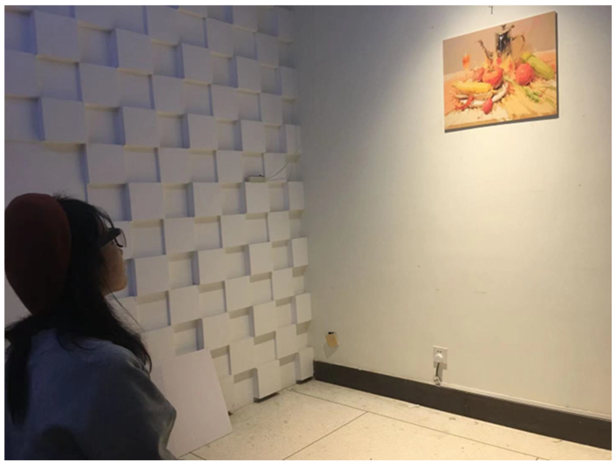
3.1. Subjective Experimental Data Analysis

3.1.1. Reliability Analysis

In order to ensure the reliability of the experimental data results, the reliability of the questionnaire was analyzed using the following formula
γ tt = n n 1 [ 1 i = 1 n S D i 2 S D t 2 ]
In Equation (1), γ tt is the reliability coefficient of the evaluation scale; n is the number of subjects, where n = 4, 4, 12; S D i 2 is the variance of item i; and S D t 2 is the variance of the total score of the scale.
The experimental data are shown in the Table 6. We analyzed the reliability of the three dimensions, and the results were >0.7, so the questionnaire had reliability and could be used.

3.1.2. Data Comparison before and after Questionnaire
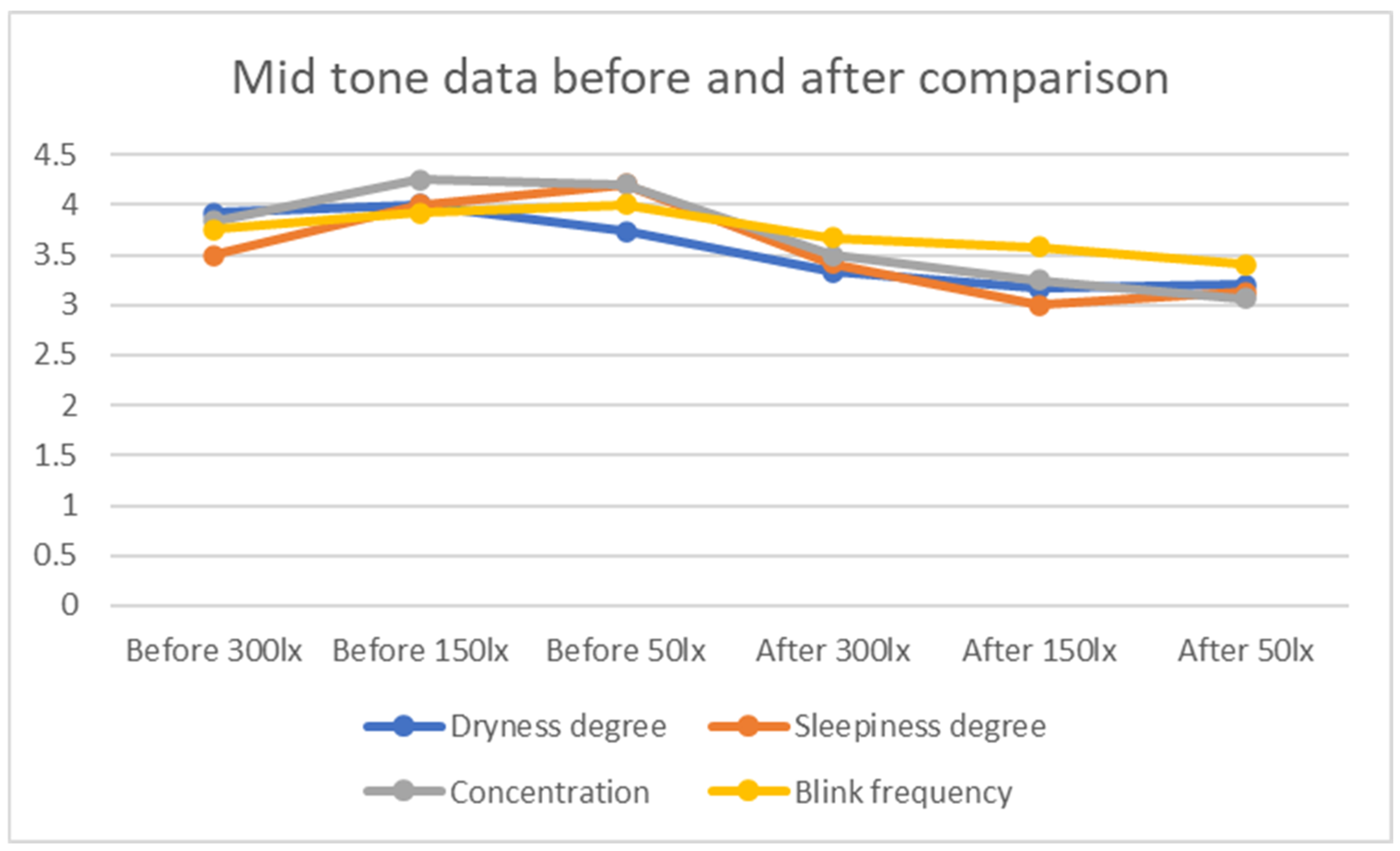
As shown in Figure 3, Figure 4 and Figure 5, by comparing the data before and after the experiment, we found there was a great difference in the scores before and after the experiment. The scores before the experiment were significantly greater than those after the experiment, so it was proven that there was visual fatigue. After looking at the picture, the subjects had different degrees of fatigue in their eyes.

3.1.3. Relevance

First of all, we conducted a correlation analysis on the data in the questionnaire, trying to explore whether the lighting environment would affect the visual fatigue and whether it will affect the subject’s evaluation of the painting content. This paper used the Pearson correlation coefficient for research, and the formula was as follows:
r x y = i = 1 n ( x i x ¯ ) ( y i y ¯ ) ( x i x ¯ ) 2 ( y i y ¯ ) 2
where n was the sample size, and x i and y i were the variable values of two variables, respectively. The analysis results are shown in Table 7.
The Pearson correlation coefficient measures linear correlation. The greater the absolute value of the correlation coefficient, the stronger the correlation: the closer the correlation coefficient is to 1 or −1, the stronger the correlation, and the closer the correlation coefficient is to 0, the weaker the correlation is. When the correlation coefficient is 0.8–1.0, the correlation is very strong; 0.6–0.8 is a strong correlation; 0.4–0.6 is a moderate correlation; 0.2–0.4 is a weak correlation; 0.0–0.2 is a very weak correlation or no correlation.
Therefore, from Table 7, we could see that the correlation coefficient between the subjects’ scores for the light environment and painting scores was 0.480, the significance probability value of the two tailed test was 0.000, and the double star sign indicated that the correlation coefficient of 0.480 was significant at the level of 0.01, which indicated that the correlation between the current aura and painting scores was very strong. In addition, the light environment was also relevant to visual fatigue.
First of all, we analyzed the light environment rating and painting rating. It was found that there was a significant correlation between the evaluation of the light environment and the painting. The subjects’ comfort in the light environment had a positive impact on the evaluation of the painting. In addition, there was a significant correlation between the evaluation of the light environment and the degree of fatigue after the experiment. The higher the subjects’ evaluation of the painting, the better the eye state and the lower the degree of visual fatigue. The correlation is shown in Table 7. The sig values of the light environment and painting, light environment, and visual state after the experiment were less than 0.05, so the correlation coefficient between them was considered to be of significance. According to the Pearson correlation, we could see from the figure that the light environment had a significant correlation with the painting, and the light environment had a significant correlation with the eye state after the experiment. This shows that the light environment would affect the painting and eye state. In addition, the Pearson correlation coefficient between the painting and the light environment was 0.480, indicating that they were positively correlated, that is, the better the subjects evaluated the light environment, the more they liked the painting. The Pearson correlation coefficient between the light environment and the eye state after the experiment was 0.311, indicating that they were also positively correlated. The higher the subjects’ evaluation of the light environment, the better the eye state after the experiment. The subjects mainly rated the light environment from four aspects: light color comfort, relaxation under the light environment, stimulation of the light environment, and love for the light environment, and it was scored from the clarity, love, brightness, and color richness for the painting.

3.1.4. ANOVA Analysis

In the above work, we found that the higher the subjects’ rating of the lighting environment, the smaller their visual fatigue, and the higher their eye comfort. Next, we conducted more detailed research. We explored whether the changes in the light environment and color affected the subjects’ appreciation of the painting. We analyzed the four scores (clear/fuzzy, like/dislike, bright/dim, and rich/monotonic colors) of the painting through one-way ANOVA. The formula used is as follows:
S S T = S S A + S S B + S S A B + S S E
S S A = i = 1 k j = 1 r n i j ( x i ¯ A x ¯ ) 2
S S B = i = 1 k j = 1 r n i j ( x i ¯ B x ¯ ) 2
S S E = i = 1 k j = 1 r m = 1 n i j ( x i j m x i j ¯ A B ) 2
where n i j is the number of sample observations at the i th level of factor A and the j th level of factor B; x i ¯ A is the mean value of the observed variable at the i th level of factor A; x i ¯ B is the mean value of the observed variable at the j th level of factor B; x i j m is the i th observation value of the i th level of factor A and the m th observation value of the j th level of factor B; and x i j ¯ A B is the mean value of the observed variables of factors A and B at levels i and j , resectviely.
F A = S S A ( p 1 ) S S E ( n p q ) = M S A M S E
F B = S S B ( q 1 ) S S E ( n p q ) = M S B M S E
F A B = S S A B ( p 1 ) ( q 1 ) S S E ( n p q ) = M S A B M S E
If the p value is greater than the significant level (0.05), the original hypothesis cannot be rejected, and it is considered that there is no significant difference on the factor level. If the p value is less than the significance level (0.05), the original hypothesis will be rejected and it is considered that there is a significant difference in the level of each factor.
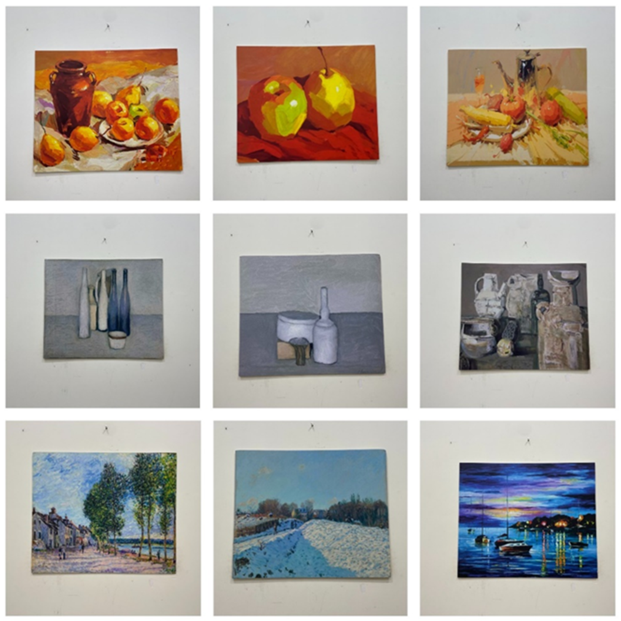
We analyzed whether the different colors of the painting would affect the subjects’ subjective psychological impact on the painting, including clear/fuzzy, like/dislike, bright/dim, and rich/monotonous colors.
From Table 8, we found that hue had no significant effect on clarity/blur, but it would affect the degree of subjects’ likes/dislikes.
When studying the influence of illuminance on the painting, we found that illuminance had no significant effect on the clarity/fuzziness, like/dislike, and rich/monotonous color observed by the subjects, but had a significant effect on the brightness/dimness of the painting.
Through the above data, we found that the external environment had little effect on the content of the painting itself, which proved that the content of the selected painting would not affect the accuracy of the experimental results.

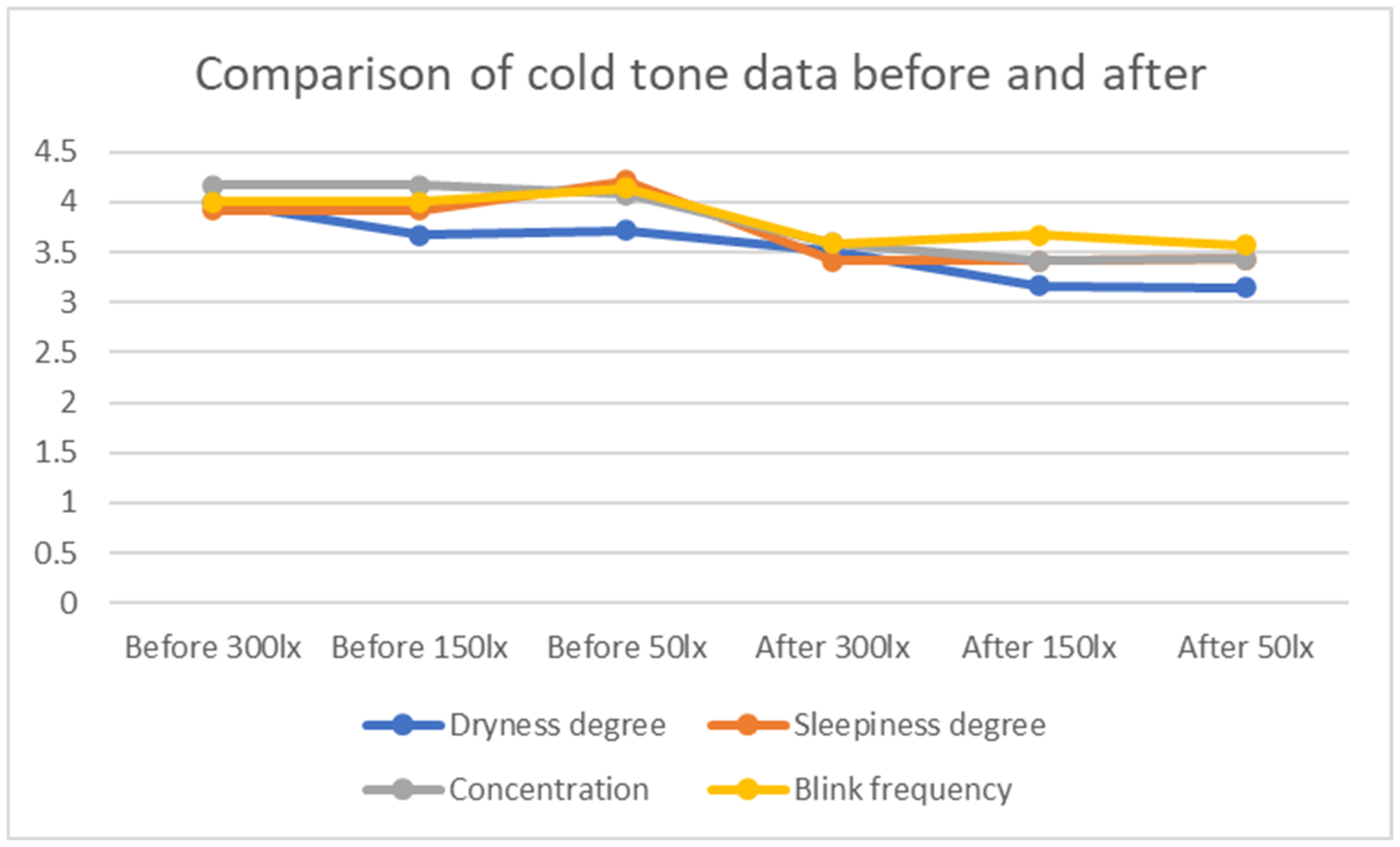
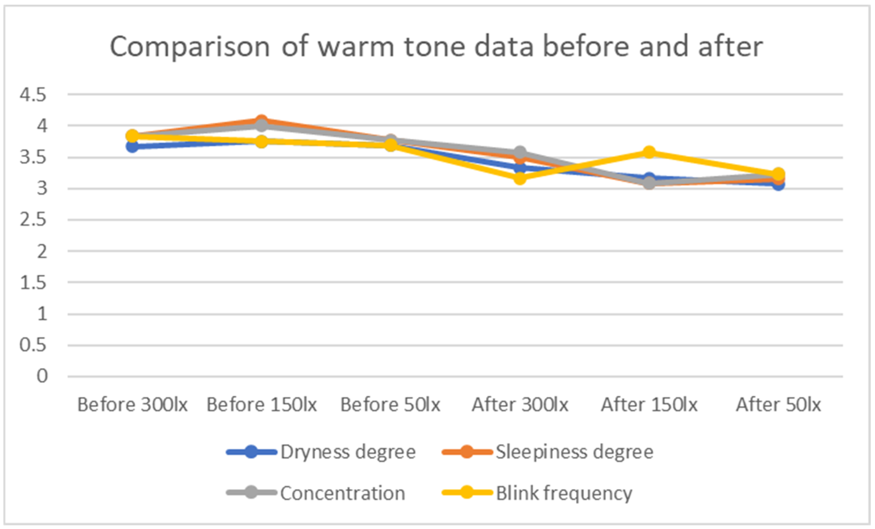
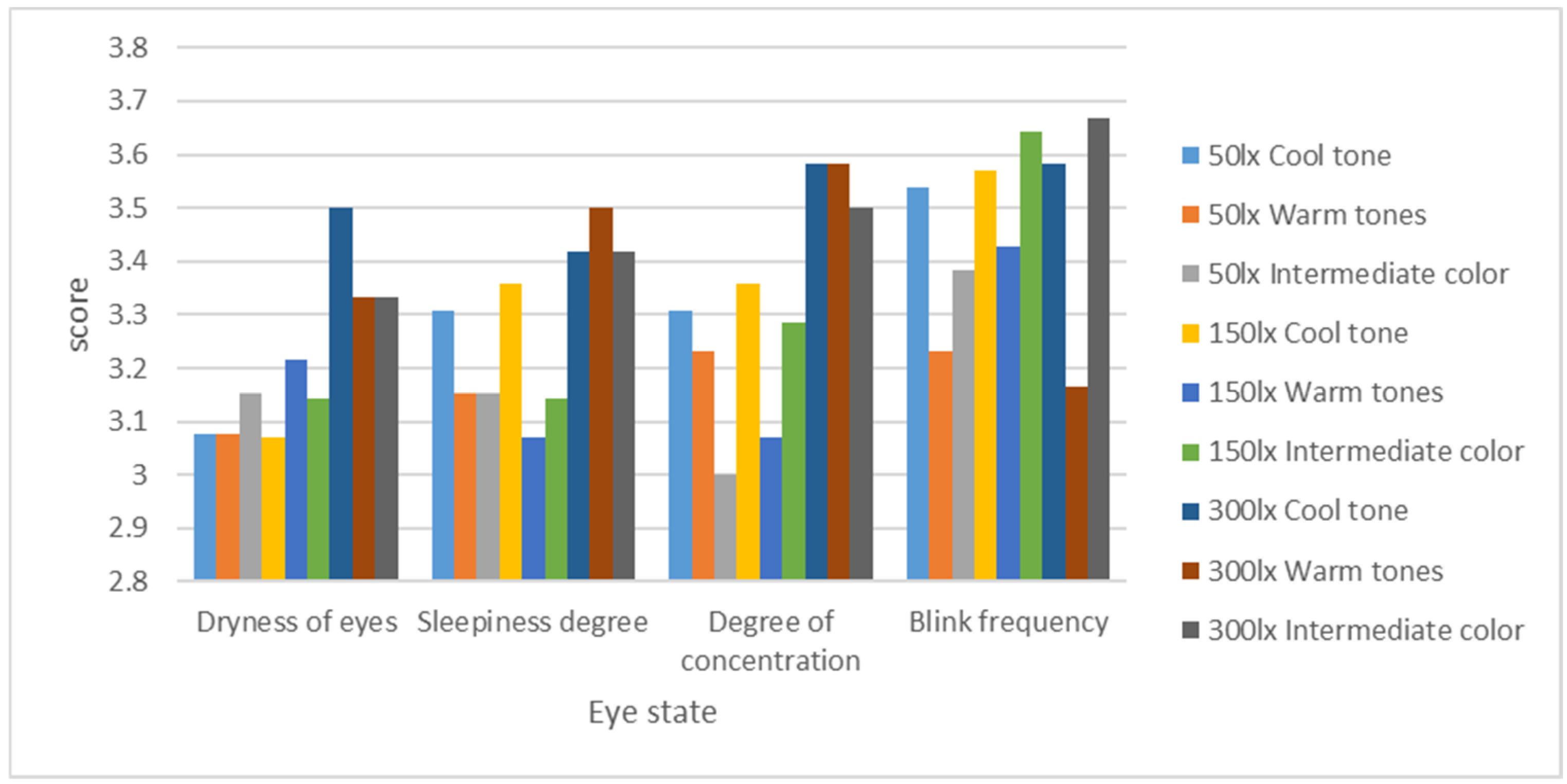
3.1.5. Questionnaire Analysis

The degree of eye dryness, sleepiness, concentration, and blink frequency of eyes were investigated through a subjective questionnaire. The results are shown in Figure 6 below.
On the whole, we found that the overall score of eye dryness was low, while the blink frequency was relatively high, indicating that the subjects’ eyes were dry and the blink frequency was relatively infrequent after the experiment. For the degree of eye dryness, it was obvious that 300 lx was the least likely to cause dry eyes, 50 lx was the most likely to cause dry eyes, and 150 lx was also prone to dry eyes. Judging from the degree of sleepiness and concentration, 300 lx did not easily cause sleepiness and distraction, while 150 lx and 50 lx caused sleepiness and concentration, which were in a low state. In terms of blink frequency, the warm tone scores were generally low, resulting in frequent blinking, discomfort in the subjects’ eyes, and the subjects commented that the warm tones were dazzling at 300 lx during the experiment. Therefore, we could judge that 300 lx was the least prone to eye fatigue, and the warm tone painting was more dazzling than the other tones, which was more likely to cause eye fatigue. In the case of 150 lx, the warm tone eye fatigue wa less.

3.2. Objective Data Analysis

Next, when analyzing and recording the change in pupil diameter using objective data, we analyzed the pupil change of each subject in each experiment. If the pupil change exceeded 0.4 mm, it was considered to produce visual fatigue. It was found that 98% of the sample data produced visual fatigue, so we could use the pupil diameter variation coefficient to judge the degree of visual fatigue. The variation coefficient of pupil diameter is shown in Table 9.
Next, we conducted a one-way multivariate ANOVA to try to explore whether illumination and painting tone would have a significant impact on the subjects. The results are shown in Table 10 that “illumination intensity”, “painting tone”, and “illumination intensity × painting tone” had significant differences (p ≤ 0.05).
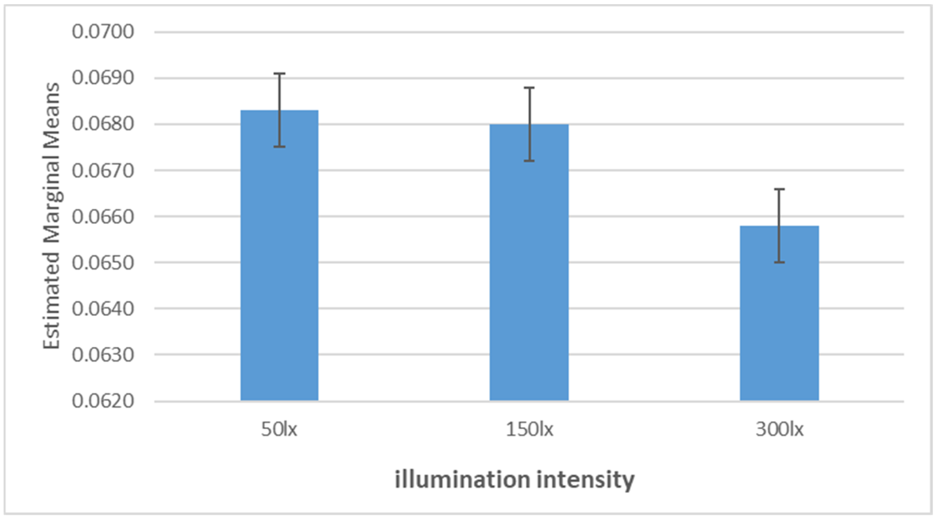
Next, we only analyzed the influence of light intensity on visual fatigue, and the results are shown in Figure 7.
Among 50 lx, 150 lx, and 300 lx, the pupil diameter variation coefficient of 300 lx was the smallest, so the eye fatigue degree was the lowest at 300 lx. The pupil diameter variation coefficient of 50 lx was the largest and the fatigue degree was the highest. In addition, the data of 50 lx and 150 lx were similar and significantly larger than 300 lx, so it was obviously soft for the eyes in the light environment of 300 lx. This was consistent with our objective questionnaire data. The objective questionnaire data processing also showed a positive correlation between the light environment and eye comfort. With the improvement of the light environment, the subjects’ eye comfort was significantly enhanced. Therefore, in order to ensure a comfortable state for the eyes in the lighting design of the art museum, the illuminance of the light environment could be enhanced as much as possible while meeting relevant standards. While protecting the paintings of the art museum, it also provided a relatively good visual environment for viewers.
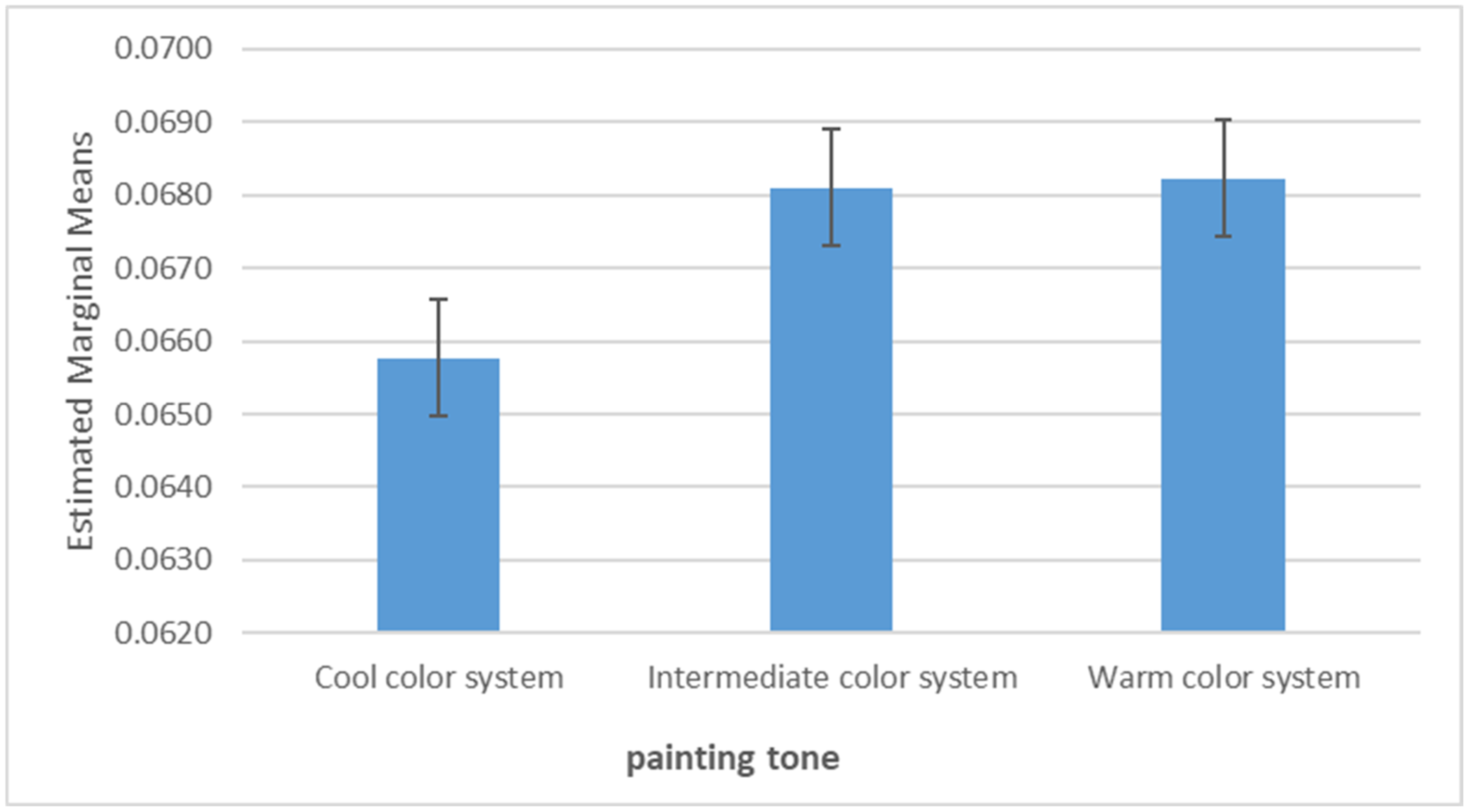
The influence of the tone of the painting on visual fatigue was analyzed separately, and the results are shown in Figure 8.
The variation coefficient for pupil diameter for cold tone paintings was the smallest, so the cold tone would make the subjects feel more comfortable compared with other tones. The warm tone and middle tone paintings had little difference, and were significantly higher than the cold tone paintings, so the two paintings were more prone to visual fatigue. In addition, the warm tone paintings were the most eye stimulating of the three paintings. During the experiment, two subjects reported that they felt obvious dazzling when viewing warm tone paintings, and compared with the other color paintings, warm tone paintings increased the subjects’ blink frequency.
Through the analysis of the above two data, we found that the changes in painting tone and illumination for the light environment would have an impact on visual fatigue. Is there a role to alleviate or reduce visual fatigue under the joint action of illumination and painting tone? Next, we analyzed the degree of visual fatigue under the joint action of the two.
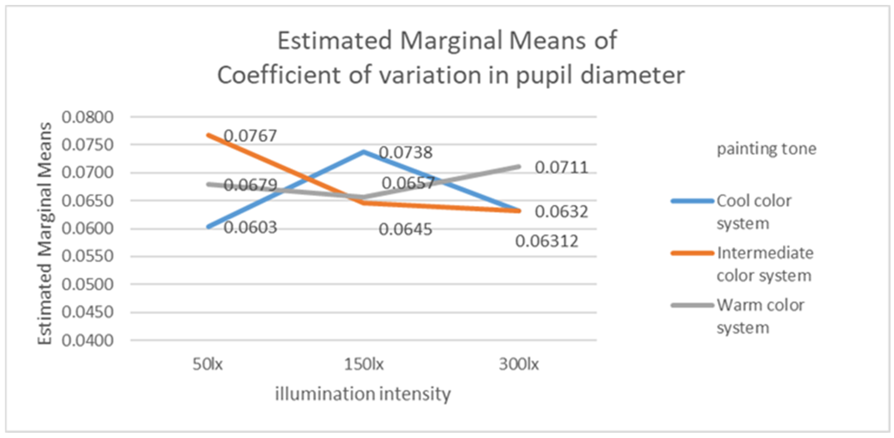
Considering the influence of both, it was necessary to build a general linear model with single factor variables, and the results are shown in Figure 9. At the same time, we sorted out the variation coefficients of pupil diameter under various conditions and displayed them in the form of a line chart in Figure 10.
As mentioned above, the illuminance and the tone of the painting affect the degree of visual fatigue. In this figure, blue is the variation coefficient of the pupil diameter of the cold tone paintings. We found that 150 lx produced visual fatigue relatively easier for cold tone paintings, and it was significantly higher than 50 lx and 300 lx. Therefore, 50 lx for cold tone paintings would reduce stimulation to the eyes. Red refers to warm tone paintings. We found that the coefficient of variation of the pupil diameter of the warm tone was relatively high under the three illuminations. Combined with the subjects’ observations that a warm tone would produce a dazzling phenomenon in the experiment, it was not difficult to find that the eye stimulation of warm tone paintings was significantly higher than that of other paintings. Under the three illuminations, 150 lx would relatively reduce the eye stimulation. Green was the middle tone. The middle tone painting was similar to the cold tone one. The pupil diameter variation coefficient under a certain illumination was significantly higher than the other two, while the pupil diameter variation coefficient under the other two illuminations was lower. For the middle tone painting, 50 lx was relatively high, which means that the middle tone painting was more suitable for higher illumination, and the pupil diameter variation coefficient was lower under 300 lx.
In 50 lx, the variation coefficient of the pupil diameter of the cold tone was the lowest, while the variation coefficient of the pupil diameter of the middle tone was the highest. Therefore, in 50 lx, the cold tone would be more comfortable, while the degree of visual fatigue caused by the middle tone was the highest. In 150 lx, the variation coefficient of the pupil diameter in the cold tone was the highest, while the variation coefficient of the pupil diameter in the middle tone was the lowest. This indicates that for these conditions, it would be more comfortable to view the middle tone, and the cold tone was the most likely to cause visual fatigue. In 300 lx, both middle tone and cold tone were relatively low, while warm tone was high, and warm color was the most likely to cause eye fatigue at this time. According to the above experimental results, when arranging the illuminance intensity of the art museum, we could give priority to 50 lx illuminance for cold tone paintings, 150 lx illuminance for warm tone paintings, and 300 lx illuminance for middle tone paintings.

4. Discussion

According to the conclusion of this paper, in order to reduce visual fatigue, we can appropriately consider changing the illumination intensity according to the tone of different paintings in the design of the art museum, so as to allow the viewers’ vision to be in the most comfortable state. At the same time, we provide a new idea for light environment design in the art museum.

5. Conclusions

In recent years, museums have provided new choices for people to relax. However, the lighting environment in the museum is darker than that in other places, so we tried to explore the relationship between paintings and lighting intensity in the museum to minimize the visual fatigue of visitors and provide them with a more comfortable experience. This paper studies the influence of subjects’ viewing cold, warm, and medium tone paintings under 50 lx, 150 lx, and 300 lx illuminance on visual effects. It was found that the results of the objective pupil diameter data were consistent with those of subjective research. There was a significant difference between the illuminance and the coefficient of variation of the pupil diameter, which means that the higher the illuminance, the lower the visual fatigue. The colors of the paintings also had a significant difference in the coefficient of variation for the pupil diameter. The warm colors were more likely to cause visual fatigue, while the cold colors made the degree of fatigue relatively low. Next, we found that there was an obvious interaction between illumination intensity * painting tone, which proved that their interaction would have an impact on visual fatigue. Thus, we could draw the following conclusion, namely, the coefficient of variation of the pupil diameter was the smallest in 150 lx for warm tone paintings, so warm tone paintings were more suitable for configuring 150 lx illuminance, cold tone paintings were more suitable for 50 lx, and middle tone paintings were more suitable for 300 lx.

Author Contributions

Conceptualization, Y.F. and Z.W.; methodology, Y.F. and Z.W.; software, Y.F. and M.Z.; validation, Y.F., X.Q. and Z.W.; formal analysis, Y.F. and T.L.; investigation, Y.F. and X.Q.; resources, Y.F.; data curation, Y.F.; writing—original draft preparation, Y.F.; writing—review and editing, X.Q., T.L. and M.Z.; All authors have read and agreed to the published version of the manuscript.

Funding

This work was supported by Humanities and Social Sciences Research Project of Ministry of Education of China (Grant number: 21YJC740036); Scientific Research Project of The Educational Department of Liaoning Province of China (Grant number: LJKR0210); 2022 Annual Research Project of Dalian Academy of Social Sciences (Research Center) (Grant number: 2022dlsky107).

Institutional Review Board Statement

The study was approved by Dalian Polytechnic University.

Informed Consent Statement

Informed consent was obtained from all subjects involved in the study.

Data Availability Statement

All of the data are contained within the article.

Conflicts of Interest

The authors declare no conflict of interest.

References

  1. Kruithof, A.A. Tubular luminance lamps for general illumination. Philips Tech. Rev. 1941, 6, 65–96. [Google Scholar]
  2. Viénot, F.; Durand, M.L.; Mahler, E. Kruithof’s rule revisited using LED illumination. J. Mod. Opt. 2009, 56, 1433–1446. [Google Scholar] [CrossRef]
  3. Loe, D.L.; Rowlands, E.; Watson, N.F. Preferred lighting conditions for the display of oil and water colour paintings. Light. Res. Technol. 1982, 14, 173–192. [Google Scholar] [CrossRef]
  4. Zhai, Q.Y.; Luo, M.R.; Liu, X.Y. The impact of illuminance and colour temperature on viewing fine art paintings under LED lighting. Light. Res. Technol. 2015, 47, 795–809. [Google Scholar] [CrossRef]
  5. Szabó, F.; Kéri, R.; Csuti, P. The preferred conditions of LED lighting for fine art paintings: The influence of illuminance level and correlated colour temperature. In Proceedings of the 1st International Museum Lighting Symposium, London, UK, 11–12 September 2017; pp. 50–52. [Google Scholar]
  6. Fotios, S. A Revised Kruithof Graph Based on Empirical Data. Leukos 2017, 13, 3–17. [Google Scholar] [CrossRef] [Green Version]
  7. Tanguy, E.; Willis, P.J.; Bryson, J. Emotions as durative dynamic state for action selection. In Proceedings of the IJCAI, Hyderabad, India, 6–12 January 2007; Volume 7, pp. 1537–1542. [Google Scholar]
  8. Lu, Y.; Zheng, W.L.; Li, B.; Lu, B.L. Combining Eye Movements and EEG to Enhance Emotion Recognition. In Proceedings of the Twenty-Fourth International Joint Conference on Artificial Intelligence, Buenos Aires, Argentina, 25–31 July 2015; Morgan Kaufmann: Burlington, MA, USA, 2015. [Google Scholar]
  9. Rayner, K. The 35th Sir Frederick Bartlett Lecture: Eye movements and attention in reading, scene perception, and visual search. Q. J. Exp. Psychol. 2009, 62, 1457–1506. [Google Scholar] [CrossRef] [PubMed]
  10. Bradley, M.M.; Miccoli, L.; Escrig, M.A.; Lang, P.J. The pupil as a measure of emotional arousal and autonomic activation. Psychophysiology 2008, 45, 602–607. [Google Scholar] [CrossRef] [PubMed] [Green Version]
  11. Soleymani, M.; Pantic, M.; Pun, T. Multimodal Emotion Recognition in Response to Videos. IEEE Trans. Affect. Comput. 2011, 3, 211–223. [Google Scholar] [CrossRef] [Green Version]
  12. Zheng, W.L.; Dong, B.N.; Lu, B. Multimodal emotion recognition using eeg and eye tracking data. In Proceedings of the 36th Annual International Conference of the IEEE Engineering in Medicine and Biology Society, Chicago, IL, USA, 26–30 August 2014; pp. 5040–5043. [Google Scholar]
  13. Lin, Y.; Fotios, S.; Wei, M.; Liu, Y.; Guo, W.; Sun, Y. Eye Movement and Pupil Size Constriction Under Discomfort Glare. Investig. Ophthalmol. Vis. Sci. 2015, 56, 1649–1656. [Google Scholar] [CrossRef] [PubMed] [Green Version]
  14. Miller, E.K.; Buschman, T.J. Brain Rhythms for Cognition and Consciousness. In Neurosciences and the Human Person: New Perspectives on Human Activities; Italian, Scripta Varia; Pontifical Academy of Sciences: Vatican City, Vatican, 2013. [Google Scholar]
  15. Vraga, E.; Bode, L.; Troller-Renfree, S. Beyond Self-Reports: Using Eye Tracking to Measure Topic and Style Differences in Attention to Social Media Content. Commun. Methods Meas. 2016, 10, 149–164. [Google Scholar] [CrossRef]
  16. Graham, D.J.; Orquin, J.L.; Visschers, V.H.M. Eye tracking and nutrition label use: A review of the literature and recommendations for label enhancement. Food Policy 2012, 37, 378–382. [Google Scholar] [CrossRef]
  17. Dang, R.; Wei, Z.; Zhang, M. Investigation and Research on the light environment of the exhibition hall of the art museum. J. Light. Eng. 2013, 24, 16–21. [Google Scholar]
  18. Yao, Z. On the importance of LED in lighting application in museums and art galleries. Lit. Life (Art China) 2017, 7, 127–129. [Google Scholar]
  19. Hu, J.; Yuan, Q. Lighting research of art galleries. J. Light. Eng. 2010, 21, 19–25. [Google Scholar]
  20. General Administration of Quality Supervision, Inspection and Quarantine of the People’s Republic of China. GB/T 23863-2009, Code for Lighting Design of Museums. Available online: https://std.samr.gov.cn (accessed on 2 December 2022).
  21. Lei, G.; Ding, Y.; Dai, M. Stereo image visual fatigue evaluation method. Sci. Technol. Horiz. 2015, 11, 49+107. [Google Scholar] [CrossRef]
  22. Yang, C.; Hu, H.; Xiang, Y.; Wang, T. Effect of lighting parameters on human visual fatigue under LED lighting environment. Civ. Archit. Environ. Eng. 2018, 40, 88–93. [Google Scholar]
  23. Optometry Group of Ophthalmology Branch of Chinese Medical Association. Consensus of experts in the diagnosis and treatment of visual fatigue. Chin. J. Optom. Vis. Sci. 2014, 16, 385–387. [Google Scholar]
  24. Barar, A.; Apatachioaie, I.D.; Apatachioaie, C.; Marceanubrasov, L. Ophthalmologist and “Computer vision syndrome”. Oftalmologia 2007, 51, 104–109. [Google Scholar] [PubMed]
  25. Katsuyama, I.; Arakawa, T. A novel in vitro model for screening and evaluation of anti-asthenopia drugs. J. Pharmacol. Sci. 2003, 93, 222–224. [Google Scholar] [CrossRef] [PubMed]
  26. Zheng, X.; Zhang, H. Overview of research on visual fatigue. Clin. Res. Tradit. Chin. Med. 2020, 12, 136–139. [Google Scholar]
Figure 1. Experimental environment.
Photonics 09 00981 g001
Figure 2. Three tones of paintings used in the experiment.
Photonics 09 00981 g002
Figure 3. Line chart of visual fatigue rating before and after the experiment under three illumination levels in the cold tone paintings.
Photonics 09 00981 g003
Figure 4. Line chart of visual fatigue rating before and after the experiment under three illumination levels in the warm tone paintings.
Photonics 09 00981 g004
Figure 5. Line chart of visual fatigue rating before and after the experiment under three illumination levels in the paintings with a middle tone.
Photonics 09 00981 g005
Figure 6. Subjective questionnaire survey of visual fatigue.
Photonics 09 00981 g006
Figure 7. Effect of illuminance on the variation coefficient for pupil diameter.
Photonics 09 00981 g007
Figure 8. The influence of the tone of the painting on the coefficient of variation for pupil diameter.
Photonics 09 00981 g008
Figure 9. Variation coefficient of the pupil diameter of different tones under different illuminance.
Photonics 09 00981 g009
Figure 10. Mean value of coefficient of variation of pupil diameter under nine conditions.
Photonics 09 00981 g010
Table 1. Classification of the light sensitivity of the paintings.
Classification of Light Sensitivity of Painting
Very sensitiveTraditional Chinese painting, mural painting, gouache painting, watercolor paintingIllumination ≤ 50 lx
SensitiveOil painting, egg white paintingIllumination ≤ 200 lx
InsensitiveCopper engraving, silk screen engravingIllumination ≤ 300 lx
Table 2. Measuring illuminance at 300 lx using the center point method.
Measuring Illuminance at 300 lx by Center Point Method
269.7347.2306.8
269.1376.9338.3
258.6291.0270.8
Table 3. Illuminance at 150 lx measured using the center point method.
Illuminance at 150 lx Measured by Center Point Method
138.1163.7140.3
144.2176.5150.6
148.7167.2168.7
Table 4. Illuminance at 50 lx measured using the center point method.
Illuminance When Measuring 50 lx by Center Point Method
48.250.545.6
55.055.948.9
57.459.150.6
Table 5. Experiment schedule.
Experiment Schedule
Illuminance intensityLook at the tone of the picture
150 lxCool tone 1
250 lxWarm tone 1
350 lxHalftone 1
4150 lxCool tone 2
5150 lxWarm tone 2
6150 lxHalftone 2
7300 lxCool tone 3
8300 lxWarm tone 3
9300 lxHalftone 3
Table 6. Reliability analysis.
DimensionCronbach’s AlphaNumber of Items
Light environment0.8424
Paintings0.7334
Visual fatigue0.79612
Table 7. Pearson correlation analysis of the light environment, paintings, and visual fatigue.
Light EnvironmentPaintingsVisual Fatigue
Light EnvironmentPearson Correlation10.480 **0.311 **
Sig. (2-tailed) 0.0000.001
n 270270
PaintingsPearson Correlation 10.128
Sig. (2-tailed) 0.169
n 270
Visual FatiguePearson Correlation 1
Sig. (2-tailed)
n
** Correlation is significant at the 0.01 level (2-tailed).
Table 8. Test of between-subject effects.
Effect FSig.
Illumination intensity(painting) clear and fuzzy0.4340.649
(painting) like/dislike0.2370.790
(painting) bright/dim4.6220.012
(painting) rich in color/monotonous0.0810.922
Painting tone(painting) clear and fuzzy2.8140.064
(painting) like/dislike4.2170.017
(painting) bright/dim6.6910.002
(painting) rich in color/monotonous33.5130.000
Illumination intensity × painting tone(painting) clear and fuzzy0.4370.782
(painting) like/dislike0.2130.931
(painting) bright/dim0.5290.715
(painting) rich in color/monotonous0.1720.952
Table 9. Pupil diameter variation coefficient.
Coefficient of Variation in Pupil Diameter
50 lx Cool color system0.0603
50 lx Intermediate color system0.0767
50 lx Warm color system0.0679
150 lx Cool color system0.0738
150 lx Intermediate color system0.0645
150 lx Warm color system0.0657
300 lx Cool color system0.0632
300 lx Intermediate color system0.0631
300 lx Warm color system0.0711
Table 10. Multivariate analysis of variance.
SourceFSig.
illumination intensity4.6560.010
painting tone3.0110.050
illumination intensity × painting tone29.4460.000
Publisher’s Note: MDPI stays neutral with regard to jurisdictional claims in published maps and institutional affiliations.

