
Investigating the User Interface Design Frameworks of Current Mobile Learning Applications: A Systematic Review

 , ,
, ,
Abstract
:1. Introduction
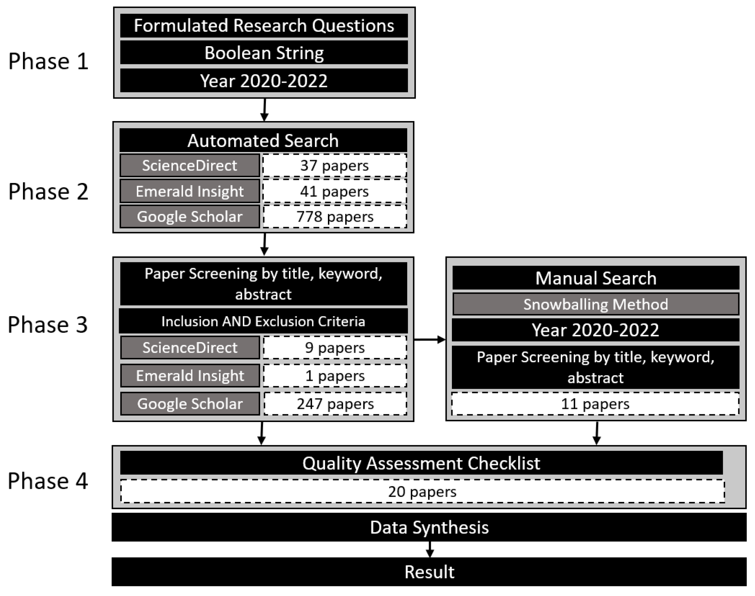
2. Methods
2.1. Research Questions
2.2. Search Strategies
2.3. Study Selection
2.4. Quality Assessment Checklist (QAC) Questions
2.5. Data Synthesis
3. Results
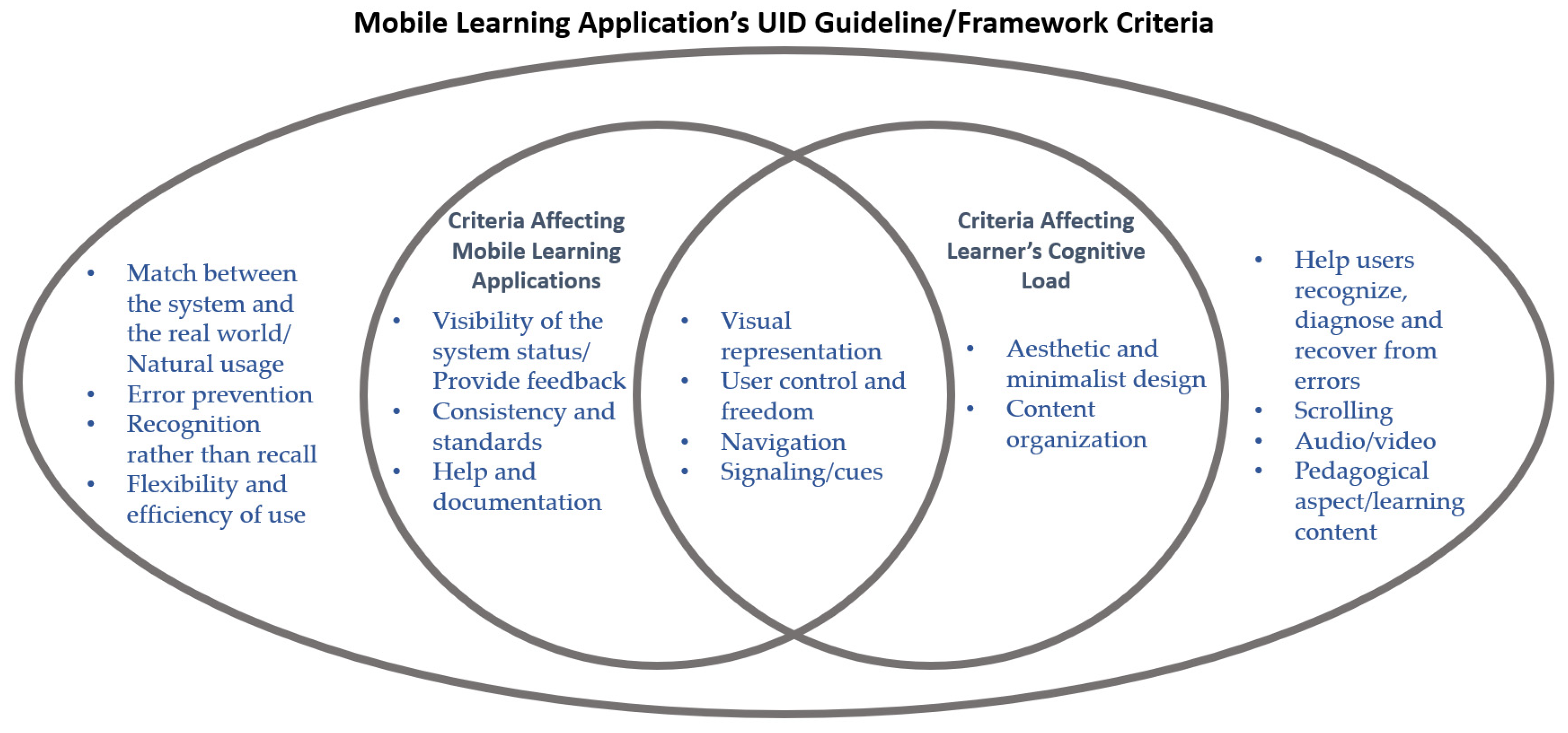
3.1. Guideline/Framework for Mobile Learning Application (RQ1)
3.2. Criteria of Guideline/Framework for Mobile Learning Application (RQ2)
3.3. Research Contribution and Limitation (RQ3)
- (1)
- Guideline: this type of contribution provided recommendations that could be followed when designing UI for a mobile learning application;
- (2)
- Framework: this type of contribution provided a structure for designing UI for a mobile learning application;
- (3)
- Case study: this type of contribution provided evidence based on case studies and user experiences involving the use of available UID guidelines/frameworks for the deployment of mobile learning applications.
3.4. The Effect of UID on Cognitive Load (RQ4)
4. Discussions
5. Conclusions
Author Contributions
Funding
Institutional Review Board Statement
Informed Consent Statement
Data Availability Statement
Acknowledgments
Conflicts of Interest
Appendix A

| Feature | Criteria | Reference |
|---|---|---|
| Visibility of the system status/provide feedback | Provide visible application progress and status through appropriate and timely notification | [38] |
| Provide feedback | [38] | |
| Visibility of the system status | [43,54,58,62] | |
| Give immediate feedback and the system should indicate the current system status | [61] | |
| Match between the system and the real world/natural usage | Match the system design with real-world convention | [38] |
| Natural usage/user friendly | [44] | |
| Match between the system and the real world | [43,54,62] | |
| Use the same behavior/gestures in all places if possible and use natural gestures close to real-world actions | [61] | |
| User control and freedom | Ability to manipulate and control the information and contents available | [21] |
| Allow users to take control of the system and provide them with navigational freedom | [38] | |
| Provide easy and accessible controls for video/audio playback (pause, go back, go forward) | [53] | |
| Provide the opportunity to stop and start module activities as desired | [53] | |
| Audio control rather than automatically played audio | [56] | |
| User control and freedom | [43,54,58,62] | |
| Consistency and standards | Match interaction design with familiar standards | [39] |
| Place links to the content in a highly visible, consistent location | [39] | |
| Use consistent language and maintain software interaction standards | [38] | |
| Consistency: similar information and action needs to be inserted in a similar position | [44] | |
| Be consistent with navigation functions | [53] | |
| Provide a clear and consistent way to return to the home screen | [53] | |
| Keep color coding consistent throughout the content design | [53] | |
| Apply consistency in the use of design elements such as color, font, graphics, etc. | [53] | |
| Consistency and standards | [43,54,58,62] | |
| Error prevention | Provide error prevention | [38] |
| Error prevention | [43,54,62] | |
| Recognition rather than recall | Design for recognition rather than recall | [38] |
| Recognition rather than recall | [43,54,62] | |
| Use familiar buttons/icons | [61] | |
| Flexibility and efficiency of use | Provide flexibility and efficiency of use | [38] |
| Flexibility: the alternative display can be added to perform the same function | [44] | |
| Flexibility and efficiency of use | [43,54,62] | |
| Aesthetic and minimalist design | Aesthetic: features of the stimulus, appeal and attractiveness of an interface expressed through graphics, color and animation | [21] |
| Attract with clean, straightforward, simplistic designs and ample white space (visual gaps) | [39] | |
| Feature an elegant visual design that matches the content | [39] | |
| Design a user-friendly and aesthetic look | [39] | |
| Use aesthetic and minimalist design | [38] | |
| Design an attractive layout | [52] | |
| Aesthetic and minimalistic design | [43,54,58,62] | |
| The overall organization of the app should be clean and straightforward | [56] | |
| Use simple interfaces, avoiding unnecessary, disturbing UI elements as much as possible | [61] | |
| Avoid complex menu and sub-menu | [61] | |
| Help users recognize, diagnose and recover from errors | Help users recognize, diagnose, and recover from errors | [38,43,54,62] |
| Help and documentation | Offer help and documentation | [38] |
| Navigation should provide easy access to help, both technical and instructional | [53] | |
| Help and documentation | [43,54,62] | |
| Avoid manuals needing to be read by children | [61] | |
| Content organization | Organize content by meaningful categories | [39] |
| Divide information into small clear groupings | [39] | |
| Avoid cutting content arbitrarily over multiple pages | [39] | |
| Content in partial groupings | [44] | |
| Avoid unnecessary information | [44] | |
| Provide a strong information structure, with topic, sub-topics hierarchy, matching access controls and a search facility for direct access, for a large structure | [48] | |
| Reduce the irrelevant through consistency, attention, needlessness, spatial proximity and temporal proximity | [57] | |
| Manage basic processes by dividing information into pieces, providing preliminary exercise and format | [57] | |
| Number of words per frame should be below 30 words | [50] | |
| Design content in small units | [53] | |
| Deliver content in the simplest possible formats | [53] | |
| Present information in multiple formats, such as a combination of text, graphics, and/or video | [53] | |
| Limit concepts to one per screen | [53] | |
| Keep sentences short | [53] | |
| Text for content must be short and straightforward | [56] | |
| Nicely organized icon | [56] | |
| Content organization | [43] | |
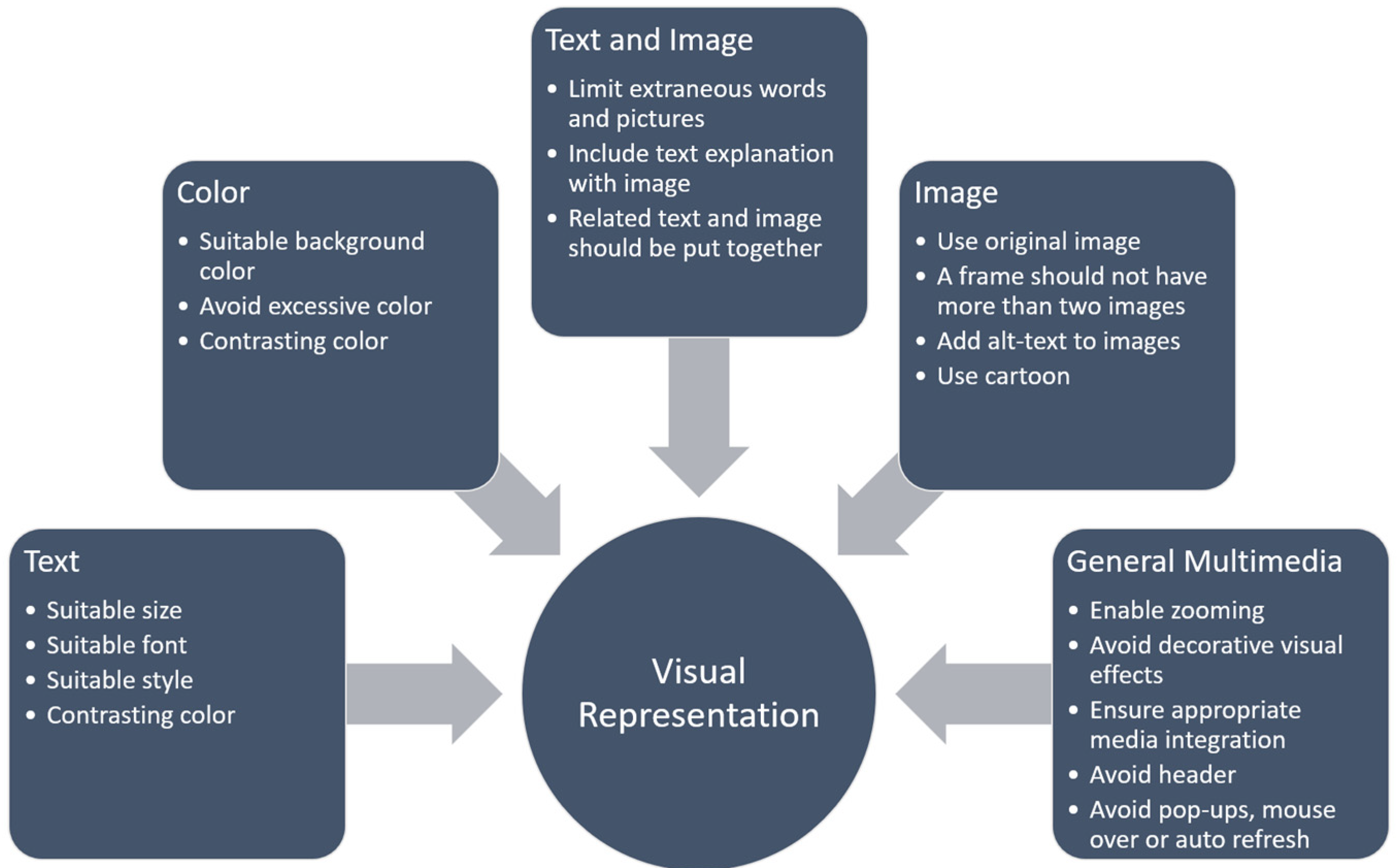
| Visual representation | Provide options for different font sizes. Let users choose their preferred font size, such as PowerPoint font size option | [22] |
| Provide element-wise zoom interaction that magnifies the complete element (e.g., text box, image) instead of parts of elements. Enable zooming in on the whole content without cut-offs. | [22] | |
| Provide alternative zoom methods that can prevent unwanted actions. Provide zoom methods such as tap or press, since current pinch–zoom interactions lead to unintended actions such as the exit of full-screen mode or scene transitions | [22] | |
| Avoid using decorative visual effects such as slide animations and fancy backgrounds | [22] | |
| Provide a design option to change decorative visual effects. Provide different design modes, for example, basic mode and decorative mode | [22] | |
| Provide dark mode for video content with light color text in a dark background | [22] | |
| Encourage instructors to increase the zoom level of the code editor screen during live coding | [22] | |
| Zoom in code editor window in post-production editing | [22] | |
| Provide a lightweight IDE with code snippets for simple coding practice | [22] | |
| Provide a typed version of hand-written text as lecture notes | [22] | |
| Minimize the use of generic-looking stock photography (staged photograph); use original, relevant, and action-oriented images for positive attention | [39] | |
| Use variation of font family | [39] | |
| Feature images with simple backgrounds to keep the focus on the image | [39] | |
| Feature icons sparingly, and only when they have meaning | [39] | |
| Use colors sparingly, e.g., background color | [39] | |
| Excessive colors inundate people’s senses needlessly | [39] | |
| Balance style and function, with a lean towards function | [39] | |
| Offer a reasonable number of choices | [39] | |
| Avoid structuring only by segmentation | [39] | |
| Ensure appropriate media integration | [38] | |
| Coherence principle: when giving a multimedia explanation, use few rather than many extraneous words and pictures | [46] | |
| Multimedia principle: it is better to present an explanation in words and pictures than solely in words | [46] | |
| Contiguity principle: when giving a multimedia explanation, present corresponding words and pictures contiguously rather than separately | [46] | |
| Avoid header | [52] | |
| To attract attention, use colorful, bright and contrasting components | [55] | |
| Use bold and larger font | [55] | |
| Produce process development through multimedia, personification, sound and picture | [57] | |
| Use color | [59] | |
| Average font size of a frame should be above 21.4 pt | [50] | |
| A frame should contain maximum two images | [50] | |
| Add appropriate graphics to textual content to help visualize concepts | [53] | |
| Add alt–text descriptions to graphics | [53] | |
| Use sans serif fonts to increase legibility | [53,59] | |
| Use contrasting colors to highlight and draw attention to key concepts | [53] | |
| Use a color contrast checker to preview color selection decisions | [53] | |
| Use contrasting colors to increase legibility of text | [53] | |
| Avoid small font size to ensure legibility | [53] | |
| Check text for readability | [53] | |
| Design instructional text using a simple and clear writing style | [53] | |
| Make buttons easy to click/use with one hand | [53] | |
| Avoid pop-ups, mouse-overs, or auto-refresh for mobile content | [53] | |
| A colored background is preferable to a white or black colored background | [56] | |
| Cartoon images are the favorite, although real photographs are also acceptable | [56] | |
| Avoid text-based instructions | [61] | |
| Avoid text-based input | [61] | |
| For child applications, interfaces should be bright, colorful and attractive; should include objects children prefer | [61] | |
| Selection driven command: use menu, list, buttons and icons to reduce input | [43] | |
| Visual representation: use pictures, icons, screen objects, sound, text color, background color and animations to assist in user learning process | [43] | |
| Navigation | Navigation quality: the structure and arrangement scheme that helps to explore the information resources | [21] |
| Indicate clickable elements | [39] | |
| Do not make items appear clickable if they are not | [39] | |
| Make sure links do not resemble decorations or ads | [39] | |
| When a graphic is associated with a link, make them both clickable | [39] | |
| Avoid including fancy features just for the sake of having them | [39] | |
| Embed links within content that lead to more detailed information | [39] | |
| Provide direct access to high priority content | [39] | |
| Too many options (icon/button) can deter people from making the correct decisions or from deciding at all | [39] | |
| Create navigation by icon, button or link icon; needs to be nicely organized | [39] | |
| Choose familiar navigation schemes | [39] | |
| Avoid cute and fancy navigation | [39] | |
| Provide breadcrumbs and other navigational cues to orient users to the rest of the site | [39] | |
| Make sure the back button works | [39] | |
| Avoid complex navigation | [44] | |
| Buttons and icons easily visible | [52,59] | |
| Adding a boundary makes a button look clickable | [55] | |
| Limit the use of external links | [53] | |
| Include the ability to review previously viewed content | [53] | |
| Include a menu or table of contents for easy navigation of instruction | [53] | |
| Shadowed or animated button/icon | [56] | |
| Navigation by an icon is a must, next favorite is a button and the least is a link | [56] | |
| Panel-based or breadcrumb | [56] | |
| For child applications, button should only contain a graphic image | [59] | |
| For child applications, make sure they are always able to return to the home button | [59] | |
| Make clickable items large and distinct from the background | [61] | |
| Avoid complex navigation and provide automatic navigation to the next page/level as much as possible | [61] | |
| Allow them to exit at any time using a clear close button | [61] | |
| Selection driven commands: menu or list selection, use of buttons and user control interface should be used to reduce input | [43] | |
| Scrolling | Use vertical scroll layout | [39] |
| Minimize scrolling | [44] | |
| No scroll design | [52] | |
| Less steps and less screens | [52] | |
| Avoid the need for excessive scrolling | [53] | |
| Design content such that mobile users can readily view content, despite device screen size | [53] | |
| Vertical scroll layout is preferable | [56] | |
| Signaling/cues | Display cues or signals on the current explanation spot, both for images and text. Visual cues include underlines, highlighting, and arrows | [22] |
| Title or headlines should be bold or colored | [39] | |
| Signaling principle: students learn better when training is signaled rather than non-signaled | [51] | |
| Use color for visual cueing | [53] | |
| Use text signaling strategies such as outlines, headings, highlighting, bolding, or pointer words (e.g., first, second, etc.) to draw attention to salient points | [53] | |
| Title or headlines must be bold, colored or animated. | [56] | |
| Audio/video | Add visual lecture material such as overlay text or images to pure talking-head lectures in post-production editing | [22] |
| Provide an option to toggle picture-in-picture talking-head window | [22] | |
| Provide a context-aware * subtitle, for example, automatically turn on subtitle when a learner is in a noisy environment. | [22] | |
| Provide a context-aware * audio description or extended audio ** | [22] | |
| Provide redundant on-screen text with audio narration, for example, display a summary of the audio narration in the form of keywords or a bulleted list | [22] | |
| Provide information on video content design in the lecture selection stage and improve information sent about mobile-friendliness, for example, the information sent includes the design guideline, compliance rate of font sizes, or involvement of programming practice | [22] | |
| Use video or photographic images of people with speech to involve the user and current arguments | [48] | |
| Use audio and video whenever possible to attract the user and avoid long text | [48] | |
| Segment video and audio files into smaller chunks, when possible | [53] | |
| Use speech input as a viable alternative for text entry | [53] | |
| Avoid the inclusion of text that duplicates audio narration information | [53] | |
| Add captions to video content and transcripts to audio content; text-to-speech features can assist with this process | [53] | |
| Explore the use of speech recognition as a plausible means of entering information | [53] | |
| Embedded video is better over online streaming video | [56] | |
| Adult voice is better than child’s voice | [56] | |
| Provide voice-based instructions in the native language | [61] | |
| Provide simple, clear (able to understand by a preschooler) and short voice-based instructions | [61] | |
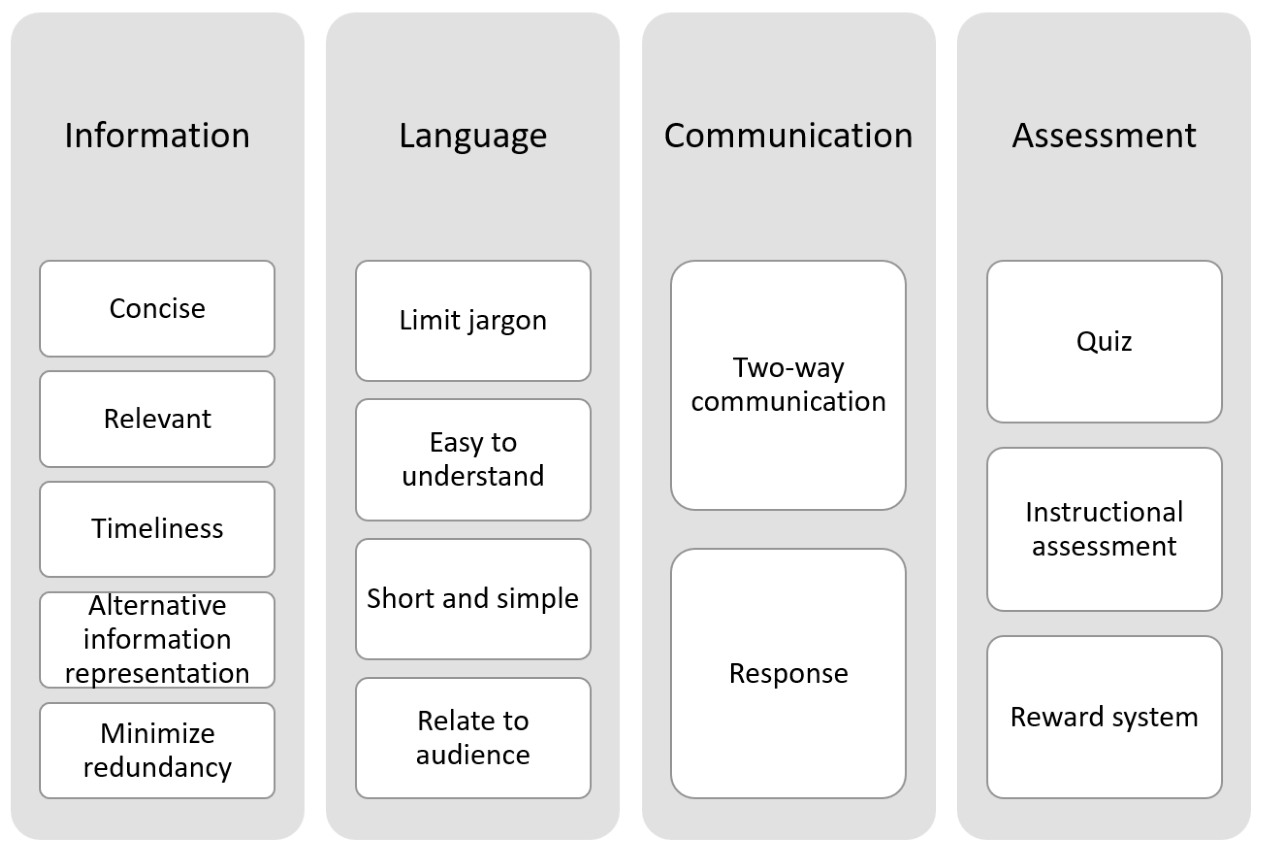
| Learning content | Information: relevance, timeliness, accuracy, format and usefulness of information | [21] |
| Responsiveness: the ability to respond to user queries and the user’s sense of how efficient a website behaves in providing their desired content | [21] | |
| Communication: an individual’s feeling of being connected to others via two-way communication | [21] | |
| Choose words and concepts that relate to the audience | [39] | |
| Summarize key points and pare down | [39] | |
| Limit the use of jargon, minimize redundancy, and format text for readability | [39] | |
| Format content so that multiple items can be compared at a glance | [39] | |
| When appropriate, consider alternative representations of information so that the data can be interpreted quickly and accurately | [39] | |
| Text for content must be short and straightforward | [39] | |
| Language needs to be easy to understand | [39,56] | |
| Quiz is compulsory for assessment | [39,56] | |
| Provide instructional assessment | [38] | |
| Provide external resources | [38] | |
| Ground learning design on learning theory | [38] | |
| To describe casual arguments, offer background information first, demonstrate the casual sequence by images for each step, followed by animations to integrate the sequence, then review steps and principles using bullet points or numbered lists | [48] | |
| Manage basic processes by dividing information into pieces, providing a preliminary exercise and format | [57] | |
| Use a reward system | [59] | |
| Make textual content as concise as possible | [53] | |
| Allow repeat attempts to encourage them to try again when they fail | [61] | |
| Appreciate or give rewards for correct attempts | [61] | |
| Others | No advertisements | [39] |
| Create a search function | [39] | |
| Provide interactivity | [38] | |
| Use design heuristic when appropriate | [48] | |
| Develop a system that is easy to be used | [59] | |
| Preview the content on a variety of mobile phone screens | [53] | |
| Use cloud-computing file storage and sharing to address storage and access needs | [53] |
References
- Sattarov, A.; Khaitova, N. Mobile learning as new forms and methods of increasing the effectiveness of education. Архив Научных Публикаций JSPI 2020, 7, 1169–1175. [Google Scholar]
- Quinn, C. mLearning. Mobile, Wireless, In-Your-Pocket Learning. Linezine. Fall 2000. Available online: http://www.linezine.com/2.1/features/cqmmwiyp.htm (accessed on 23 February 2022).
- Kinash, S.; Brand, J.; Mathew, T. Challenging mobile learning discourse through research: Student perceptions of Blackboard Mobile Learn and ipads. Australas. J. Educ. Technol. 2012, 28, 639–655. [Google Scholar] [CrossRef]
- Traxler, J. Defining, Discussing and Evaluating Mobile Learning: The moving finger writes and having writ…. Int. Rev. Res. Open Distrib. Learn. 2007, 8, 9–24. [Google Scholar] [CrossRef] [Green Version]
- Ozdamli, F.; Cavus, N. Basic elements and characteristics of mobile learning. Procedia Soc. Behav. Sci. 2011, 28, 937–942. [Google Scholar] [CrossRef] [Green Version]
- Wang, S.; Higgins, M. Limitations of mobile phone learning. In Proceedings of the IEEE International Workshop on Wireless and Mobile Technologies in Education (WMTE’05), Tokushima, Japan, 28–30 November 2005; pp. 179–181. [Google Scholar] [CrossRef]
- Pozzi, F. The impact of m-Learning in school contexts: An “inclusive” perspective. Lect. Notes Comput. Sci. 2007, 4556 LNCS, 748–755. [Google Scholar] [CrossRef]
- Shadiev, R.; Hwang, W.; Huang, Y.; Liu, T. The Impact of Supported and Annotated Mobile Learning on Achievement and Cognitive Load: Masarykovy Univerzity. Educ. Technol. Soc. 2015, 18, 53–69. [Google Scholar]
- Feng, Y.; Liao, Y.; Ren, Y. Effects of M-Learning on Students’ Learning Outcome: A Meta-analysis. In New Media for Educational Change; Springer: Singapore, 2018; pp. 115–123. [Google Scholar] [CrossRef]
- Hwang, G.J.; Wu, P.H.; Zhuang, Y.Y.; Huang, Y.M. Effects of the inquiry-based mobile learning model on the cognitive load and learning achievement of students. Interact. Learn. Environ. 2013, 21, 338–354. [Google Scholar] [CrossRef]
- Lin, Y.T.; Lin, Y.C. Effects of mental process integrated nursing training using mobile device on students’ cognitive load, learning attitudes, acceptance, and achievements. Comput. Human Behav. 2016, 55, 1213–1221. [Google Scholar] [CrossRef]
- Motiwalla, L.F. Mobile learning: A framework and evaluation. Comput. Educ. 2007, 49, 581–596. [Google Scholar] [CrossRef]
- Hani, A. Access to Mobile Phone, Computer Increased to 98.6%: Stats Dept. Available online: https://themalaysianreserve.com/2021/04/12/access-to-mobile-phone-computer-increased-to-98-6-stats-dept/ (accessed on 24 April 2022).
- Suartama, I.K.; Setyosari, P.; Sulthoni; Ulfa, S. Development of an instructional design model for mobile blended learning in higher education. Int. J. Emerg. Technol. Learn. 2019, 14, 4–22. [Google Scholar] [CrossRef]
- Elkhair, Z.; Mutalib, A.A.; Ntroduction, I. Mobile Learning Applications: Characteristics, Perspectives, And Future Trends. Int. J. Interact. Digit. Media 2019, 5, 18–21. [Google Scholar]
- Nielsen, J. Mobile Content Is Twice as Difficult. Alertbox 2011. Available online: https://www.nngroup.com/articles/mobile-content-is-twice-as-difficult-2011/ (accessed on 2 March 2021).
- Alasmari, T. The effect of screen size on students’ cognitive load in mobile learning. J. Educ. Teaching, Learn. 2020, 5, 280–295. [Google Scholar] [CrossRef]
- Kumar, P.; Raja, V. Mobile Learning. In Digital Education, 1st ed.; APH Publishing: Delhi, India, 2019; Volume 25, pp. 97–105. [Google Scholar]
- Lee, S.S.; Tay, S.M.; Balakrishnan, A.; Yeo, S.P.; Samarasekera, D.D. Mobile learning in clinical settings: Unveiling the paradox. Korean J. Med. Educ. 2021, 33, 349–367. [Google Scholar] [CrossRef] [PubMed]
- Sophonhiranrak, S. Features, barriers, and influencing factors of mobile learning in higher education: A systematic review. Heliyon 2021, 7, e06696. [Google Scholar] [CrossRef]
- Faisal, C.M.N.; Fernandez-Lanvin, D.; De Andrés, J.; Gonzalez-Rodriguez, M. Design quality in building behavioral intention through affective and cognitive involvement for e-learning on smartphones. Internet Res. 2020, 30, 1631–1663. [Google Scholar] [CrossRef]
- Kim, J.; Kim, J.; Choi, Y.; Xia, M. Mobile-Friendly Content Design for MOOCs: Challenges, Requirements, and Design Opportunities. In Proceedings of the CHI Conference on Human Factors in Computing Systems, New Orleans, LA, USA, 30 April–5 May 2022; pp. 1–6. [Google Scholar]
- Curum, B.; Khedo, K.K. Cognitive load management in mobile learning systems: Principles and theories. J. Comput. Educ. 2021, 8, 109–136. [Google Scholar] [CrossRef]
- Kim, J.; Kim, J. Guideline-Based Evaluation and Design Opportunities for Mobile Video-based Learning. Conf. Hum. Factors Comput. Syst. Proc. 2021, 359, 1–6. [Google Scholar] [CrossRef]
- Ahn, T.; Lee, S.M. User experience of a mobile speaking application with automatic speech recognition for EFL learning. Br. J. Educ. Technol. 2016, 47, 778–786. [Google Scholar] [CrossRef]
- Huynh, L.N.; Lee, Y.; Balan, R.K. DeepMon: Mobile GPU-based deep learning framework for continuous vision applications. In Proceedings of the 15th Annual International Conference on Mobile Systems, Applications, and Services, Niagara Falls, NY, USA, 16 June 2017; pp. 82–95. [Google Scholar] [CrossRef]
- Papadakis, S. Advances in Mobile Learning Educational Research (A.M.L.E.R.): Mobile learning as an educational reform. Adv. Mob. Learn. Educ. Res. 2021, 1, 1–4. [Google Scholar] [CrossRef]
- Solecki, I.; Porto, J.; Alves, N.D.C.; Gressevon, C.; Hauck, J.; Borgatto, A.F. Automated assessment of the visual design of android apps developed with app inventor. In Proceedings of the 51st ACM Technical Symposium on Computer Science Education, Portland, OR, USA, 11–14 March 2020; pp. 51–57. [Google Scholar] [CrossRef]
- Wong, E. Shneiderman’s Eight Golden Rules Will Help You Design Better Interfaces. Interact. Des. Found. 2016, 1–18. Available online: https://www.interaction-design.org/literature/article/shneiderman-s-eight-golden-rules-will-help-you-design-better-interfaces (accessed on 23 February 2022).
- Mobile Accessibility at W3C|Web Accessibility Initiative (WAI)|W3C. Available online: https://www.w3.org/WAI/standards-guidelines/mobile/ (accessed on 23 February 2022).
- Pibernik, J.; Dolic, J.; Milicevic, H.A.; Kanizaj, B. The Effects of the Floating Action Button on Quality of Experience. Futur. Internet 2019, 11, 148. [Google Scholar] [CrossRef] [Green Version]
- Ballantyne, M.; Jha, A.; Jacobsen, A.; Hawker, J.S.; El-Glaly, Y.N. Study of accessibility guidelines of mobile applications. In Proceedings of the 17th International Conference on Mobile and Ubiquitous Multimedia, Cairo, Egypt, 25–28 November 2018; pp. 305–315. [Google Scholar] [CrossRef]
- Nie, R. Research on dynamic visual communication graphics design under mobile terminal platform. In Proceedings of the 2018 International Conference on Intelligent Transportation, Big Data & Smart City (ICITBS), Xiamen, China, 25 January 2018; pp. 198–201. [Google Scholar] [CrossRef]
- Al-Hunaiyyan, A.; Alhajri, R.A.; Al-Sharhan, S. Perceptions and challenges of mobile learning in Kuwait. J. King Saud Univ. Comput. Inf. Sci. 2018, 30, 279–289. [Google Scholar] [CrossRef]
- Li, X.; Heng, Q. Design of Mobile Learning Resources Based on New Blended Learning: A Case Study of Superstar Learning APP. In Proceedings of the 2021 IEEE 3rd International Conference on Computer Science and Educational Informatization (CSEI), Xinxiang, China, 18–20 June 2021; pp. 333–338. [Google Scholar] [CrossRef]
- Brata, K.C.; Brata, A.H. User experience improvement of japanese language mobile learning application through mental model and A/B testing. Int. J. Electr. Comput. Eng. 2020, 10, 2659–2667. [Google Scholar] [CrossRef]
- Chu, H.C. Potential negative effects of mobile learning on students’ learning achievement and cognitive load-a format assessment perspective. Educ. Technol. Soc. 2013, 17, 332–344. [Google Scholar]
- Limtrairut, P. Newly Developed heuristics to Evaluate M-learning Application Interface. In Proceedings of the 2020 5th International Conference on Information Technology (InCIT), Chonburi, Thailand, 21–22 October 2020. [Google Scholar]
- Rosmani, A.F.; Abdul Mutalib, A.; Zarif, S.M. Hybridising Signaling Principle and Nielsen’s Design Guidelines in a Mobile Application. Asia-Pac. J. Inf. Technol. Multimed. 2021, 10, 62–76. [Google Scholar] [CrossRef]
- Moher, D.; Liberati, A.; Tetzlaff, J.; Altman, D.G. Preferred reporting items for systematic reviews and meta-analyses: The PRISMA statement. Int. J. Surg. 2010, 8, 336–341. [Google Scholar] [CrossRef] [Green Version]
- Mayer, R.E. Multimedia Learning; Cambridge University Press: Cambridge, UK, 2012; Volume 41. [Google Scholar]
- Nielsen, J. Enhancing the explanatory power of usability heuristics. In Proceedings of the SIGCHI Conference on Human Factors in Computing Systems: Celebrating Interdependence, Boston, MA, USA, 24–28 April 1994; pp. 152–158. [Google Scholar] [CrossRef]
- Kumar, B.A.; Goundar, M.S.; Chand, S.S. A framework for heuristic evaluation of mobile learning applications. Educ. Inf. Technol. 2020, 25, 3189–3204. [Google Scholar] [CrossRef]
- Astuti, S.; Fitriana, A.; Wan Ahmad, W.F.; Ratna Ermawati, I.; Hasan, M.H. Analysis User Interface: Mobile Application to Blended Learning Model. In Proceedings of the 2021 International Conference on Computer & Information Sciences (ICCOINS), Kuching, Malaysia, 13–15 July 2021; pp. 30–33. [Google Scholar] [CrossRef]
- Hashim, A.S.; Fatimah, W.; Ahmad, W.; Ahmad, R. A study of design principles and requirements for the M-learning application development. In Proceedings of the 2010 International Conference on User Science and Engineering (i-USEr), Shah Alam, Malaysia, 13–14 December 2010; pp. 226–231. [Google Scholar] [CrossRef]
- Desilawati, D.; Setyawan, H.; Isnanda, R.G. Android-based Dental Anatomy Learning Application Using Mayer’s Multimedia Learning Principles. Emerg. Inf. Sci. Technol. 2020, 1, 70–74. [Google Scholar] [CrossRef]
- Mayer, R.E.; Moreno, R. A Cognitive Theory of Multimedia Learning: Implications for Design Principles. J. Educ. Psychol. 1998, 91, 358–368. [Google Scholar]
- Nagro, S.; Aldekhail, M. Evaluation of Multimedia User Interface Design Method for M-learning (MobLearn): A Comparative Study. Informatica 2021, 45, 633–641. [Google Scholar] [CrossRef]
- Nagro, S.; Campion, R. A method for multimedia user interface design for mobile learning. In Proceedings of the Computing Conference 2017, London, UK, 18–20 July 2017; IEEE: Piscataway, NI, USA, 2017; pp. 585–590. [Google Scholar]
- Kim, J.; Kim, J. FitVid: Towards Development of Responsive and Fluid Video Content Adaptation. In Proceedings of the IPCE 2021: Imagining Post-COVID Education with AI (AAAI 2021 Workshop), Virtual, 2–9 February 2021. [Google Scholar]
- Maulida, R.P.; Ivone, F.M.; Wulyani, A.N. Fostering Autonomy through Digital Reading: Students’ Evaluation of the ReadyRead Application. J. Pendidik. Hum. 2020, 8, 113–123. [Google Scholar]
- Umar, M.M.; Bakhat, M.U.; Hassan, M. Mapping HCI Principals to Evaluate the Usability of Learning Applications for CCI User. J. Comput. Sci. 2020, 11, 1–7. [Google Scholar]
- Ofori, E.; Lockee, B.B. Next generation mobile learning: Leveraging message design considerations for learning and accessibility. IAFOR J. Educ. 2021, 9, 123–144. [Google Scholar] [CrossRef]
- Irsyad, M.; Bil, S.; Adrian, M. Usability Measurement in User Interface Design Using Heuristic Evaluation & Severity Rating (Case Study: Mobile TA Application based on MVVM). In Proceedings of the 2022 IEEE 12th Annual Computing and Communication Workshop and Conference (CCWC), Las Vegas, NV, USA, 26–29 January 2022; IEEE: Piscataway, NI, USA, 2022; pp. 974–979. [Google Scholar]
- Desideria, G.; Bandung, Y. User efficiency model in usability engineering for user interface design refinement of mobile application. J. ICT Res. Appl. 2020, 14, 16–33. [Google Scholar] [CrossRef]
- Rosmani, A.F.; Mutalib, A.A.; Sarif, S.M. Construction of the Guidelines for Mobile Learning Design: Hybridizing Signaling Principle and Nielsen’s Design Guidelines. In Proceedings of the 22nd International Conference on Human-Computer Interaction, Oldenburg, Germany, 5–8 October 2020; pp. 92–99. [Google Scholar]
- Taş, F.; Bolatlı, G. A new model in medicine education: Smart model education set. Surg. Radiol. Anat. 2022, 44, 1201–1209. [Google Scholar] [CrossRef] [PubMed]
- Rosmani, A.F.; Abdul Mutalib, A.; Sarif, S.M. Asmaul Husna Mobile Application (AHMA): Foundation of the Prototype Design and Development. J. Comput. Res. Innov. 2021, 6, 142–153. [Google Scholar] [CrossRef]
- Osman, A.A.F.; Al-Sulami, S.A.; Al-jumaiah, F.A.; Al-doullah, F.I. Developing a Smartphone Application Based on Cci Standards To Teach Computer Parts for Children. Int. J. Comput. Sci. Mob. Comput. 2020, 9, 144–153. [Google Scholar]
- Ishaq, K.; Rosdi, F.; Zin, N.A.M.; Abid, A. Usability and design issues of mobile assisted language learning application. Int. J. Adv. Comput. Sci. Appl. 2020, 11, 86–94. [Google Scholar] [CrossRef]
- Samarakoon, S.M.U.P.; Weerasinghe, T.A.; Usoof, H. Usability Heuristics for Early Primary Children: A Case Study in Sri Lanka. In Proceedings of the 2021 International Conference on Computational Science and Computational Intelligence (CSCI), Las Vegas, NV, USA, 15–17 December 2021; pp. 933–939. [Google Scholar] [CrossRef]
- Puebla, C.; Fievet, T.; García, J.; Tsopanidi, M.; Clahsen, H. Promoting social and collaborative language learning among older adults in the digital era: Development and evaluation of a smartphone app prototype using a design-thinking approach. Gerontechnology 2022, 21, 1–12. [Google Scholar] [CrossRef]
- Nielsen, J.; Molich, R. Heuristic evaluation of user interfaces. In Proceedings of the SIGCHI Conference on Human Factors in Computing Systems Empowering People—CHI’90, Seattle, WA, USA, 1–5 April 1990; ACM Press: New York, NY, USA, 1990; pp. 249–256. [Google Scholar] [CrossRef]
- Shneiderman, B.; Plaisant, C.; Cohen, M.; Jacobs, S.; Elmqvist, N.; Diakopoulos, N. Designing the User Interface: Strategies for Effective Human-Computer Interaction; Pearson Education Limited: London, UK, 2018; Volume 2, ISBN 9780134380384. [Google Scholar]
- Agrawala, M.; Li, W.; Berthouzoz, F. Design principles for visual communication. Commun. ACM 2011, 54, 60–69. [Google Scholar] [CrossRef] [Green Version]
- Wood, D. Interface Design: An Introduction to Visual Communication in UI Design; Bloomsbury Publishing: London, UK, 2014; ISBN 2940447578. [Google Scholar]
- Kelly, M. Visual communication design as a form of public pedagogy. Aust. J. Adult Learn. 2015, 55, 390–407. [Google Scholar]
- Klett, F. Visual communication in Web-based learning environments. Educ. Technol. Soc. 2002, 5, 38–48. [Google Scholar]
- Mullet, K.; Sano, D. Designing Visual Interfaces: Communication Oriented Techniques; Prentice Hall: Hoboken, NJ, USA, 1995; ISBN 0133033899. [Google Scholar]
- Yee, C.K.; Ling, C.S.; Yee, W.S.; Zainon, W.M.N.W. GUI design based on cognitive psychology: Theoretical, empirical and practical approaches. In Proceedings of the 8th International Conference on Computing Technology and Information Management (NCM and ICNIT), Seoul, Republic of Korea, 24–26 April 2012; Volume 2, pp. 836–841. [Google Scholar]
- Chang, D.; Nesbitt, K.V.; Wilkins, K. The gestalt principles of similarity and proximity apply to both the haptic and visual grouping of elements. Conf. Res. Pract. Inf. Technol. Ser. 2007, 64, 79–86. [Google Scholar]
- Blauhut, D. Handheld Devices for Use within Integrated Operations in the Petroleum Industry. Ph.D. Thesis, Norwegian University of Science and Technology, Trondheim, Norway, March 2016. [Google Scholar]
- Gómez Reynoso, J.M.; Olfman, L. The impact of combining gestalt theories with interface design guidelines in designing user interfaces. 18th Americas Conference on Information Systems, AMCIS 2012, Seattle, WA, USA, 9–11 August 2012; Volume 3, pp. 2367–2374. [Google Scholar]
- Marriott, A.; Beard, S. gUI: Specifying Complete User Interaction. In Life-Like Characters: Tools, Affective Functions, and Applications; Springer: Berlin/Heidelberg, Germany, 2004; pp. 111–134. [Google Scholar]
- Machado Neto, O.; Pimentel, M.D.G. Heuristics for the assessment of interfaces of mobile devices. In Proceedings of the 19th Brazilian Symposium on Multimedia and the Web, Salvador, Brazil, 5–8 November 2013; pp. 93–96. [Google Scholar] [CrossRef]
- Parente da Costa, R.; Dias Canedo, E. A Set of Usability Heuristics for Mobile Applications. Lect. Notes Comput. Sci. 2019, 11566 LNCS, 180–193. [Google Scholar] [CrossRef]
- Kharel, S.; Fernström, M.; Bal, B.K. Omnichannel Heuristics for E-commerce. In Proceedings of the 34th British HCI Conference, Online, 20–21 July 2021; pp. 99–103. [Google Scholar] [CrossRef]


| Inclusion Criteria | Exclusion Criteria |
|---|---|
| 1. Articles published in the English language | 1. Articles published in a language other than English |
| 2. Articles with user interface design guidelines/frameworks | 2. Articles that presented studies other than mobile learning applications |
| 3. Articles involving the development/evaluation of a mobile learning application | 3. Mobile learning applications that adopted gamification or MR, VR, AR |
| Questions No. | QAC Questions |
|---|---|
| 1 | Does the article clearly mention the UID guideline/framework used for mobile learning? |
| 2 | Does the article clearly describe the criteria of the UID guideline/framework used for mobile learning? |
| 3 | Does the article highlight the contributions of the UID guideline/framework used for mobile learning? |
| No | Article Title | Method Used | Guideline/Framework Used | Subject Domain | Sample Size | Target Population |
|---|---|---|---|---|---|---|
| 1 | Design quality in building behavioral intention through affective and cognitive involvement for e-learning on smartphones [21] | Quantitative | Model by Faisal et al. | Not mentioned | 662 | Undergraduate and postgraduate students |
| 2 | Mobile-friendly content design for MOOCs: challenges, requirements, and design opportunities [22] | Mixed method | Design guideline for creating mobile-friendly MOOCs | Multiple subjects | Survey study: 134; interview study: 56; expert review: 11 | Survey study: people aged between 18 and 74 years old; interview study: people aged between 18 and 44 years old; expert review: video production engineers |
| 3 | Newly developed heuristics to evaluate m-learning application interface [38] | Qualitative | Heuristics for mobile learning | Engineering | 21 engineering students and 7 experts | Engineering students and experts |
| 4 | Hybridising signaling principle and Nielsen’s design guidelines in a mobile application [39] | Mixed method | Mayer’s principles of multimedia learning [41], Nielsen’s design guidelines [42] | Religious material | For user requirement: 134; consultation with experts: 6; user testing, pilot: 35; user testing, actual: 177 | For user requirement: 18–24 year old mobile user; consultation with experts: experts from higher education institutions (HEIs); user testing: college students |
| 5 | A framework for heuristic evaluation of mobile learning applications [43] | Qualitative | Heuristic evaluation framework for mobile learning | Not mentioned | 5 | University lecturers who have experience in HCI |
| 6 | Analysis user interface: mobile application to blended learning model [44] | Quantitative | Hashim and Wan Fatimah’s 5 user interface principles [45] | Not mentioned | 32 | Not mentioned |
| 7 | Android-based dental anatomy learning application using Mayer’s multimedia learning principles [46] | Quantitative | Mayer’s multimedia learning principles [47] | Medical | 20 | Dentistry students |
| 8 | Evaluation of multimedia user interface design method for m-learning (MobLearn): a comparative study [48] | Qualitative | MobLearn [49] | Anatomy, chemistry, engineering subjects | 5 | Software developers |
| 9 | FitVid: towards development of responsive and fluid video content adaptation [50] | Quantitative | FitVid | Not mentioned | 24 | College students |
| 10 | Fostering autonomy through digital reading: students’ evaluation of the ReadyRead application [51] | Mixed method | Mayer’s principles of multimedia learning [41] | Language | 34 | Primary school children |
| 11 | Mapping HCI principals to evaluate the usability of learning applications for CCI user [52] | Mixed method | Child computer interaction usability heuristics (CCIHU) | Language | 30 children and 4 experts | Children aged between 4 and 13 years and experts from IT industries |
| 12 | Next generation mobile learning: leveraging message design considerations for learning and accessibility [53] | Qualitative | Guidelines for m-learning message design | Not mentioned | 5 | Experts |
| 13 | Usability measurement in user interface design using heuristic evaluation and severity rating (case study: mobile TA application based on MVVM) [54] | Quantitative | Nielsen’s heuristics [42] | Project | 18 | People who understand the system |
| 14 | User efficiency model in usability engineering for user interface design refinement of mobile application [55] | Qualitative | User efficiency model | Multiple subjects | 20 | Not mentioned |
| 15 | Construction of the guidelines for mobile learning design: hybridizing signaling principle and Nielsen’s design guidelines [56] | Mixed method | Mayer’s principles of multimedia learning [47], Nielsen’s design guidelines [42] | Religious study | For user requirement: 134; consultation with experts: 6; user testing, pilot: 35; user testing, actual: 229 | For user requirement: PhD holder and software developers; consultation with experts: experts from higher education institutions (HEIs); user testing: college students |
| 16 | A new model in medicine education: smart model education set [57] | Quantitative | Mayer’s principles of multimedia learning [47] | Medical | 138 | Nursing students |
| 17 | Asmaul Husna mobile application (AHMA): foundation of the prototype design and development [58] | Mixed method | Mayer’s principles of multimedia learning [47], Nielsen’s design guidelines [42] | Religious study | 89 college students and 6 experts | College students and experts |
| 18 | Developing a smartphone application based on CCI standards to teach computer parts for children [59] | System proposal | Kraleva’s children’s interface design principles [60] | Computer | Not implemented | Children |
| 19 | Usability heuristics for early primary children: a case study in Sri Lanka [61] | Qualitative | Usability heuristics for early primary children | Mathematics | 10 | Preschool children |
| 20 | Promoting social and collaborative language learning among older adults in the digital era: development and evaluation of a smartphone app prototype using a design-thinking approach [62] | Mixed method | Nielsen’s heuristics [42] | Language | 10 | Older adults |
| UID Feature | Number of Articles | List of Articles |
|---|---|---|
| Visibility of the system status/provide feedback | 6 | [38,43,54,58,61,62] |
| Match between the system and the real world/natural usage | 6 | [38,43,44,54,61,62] |
| User control and freedom | 8 | [21,38,43,53,54,56,58,62] |
| Consistency and standards | 8 | [38,39,43,44,53,54,58,62] |
| Error prevention | 4 | [38,43,54,62] |
| Recognition rather than recall | 5 | [38,43,54,61,62] |
| Flexibility and efficiency of use | 5 | [38,43,44,54,62] |
| Aesthetic and minimalist design | 10 | [21,38,39,43,52,54,56,58,61,62] |
| Help users recognize, diagnose and recover from errors | 4 | [38,43,54,62] |
| Help and documentation | 6 | [38,43,53,54,61,62] |
| Content organization | 8 | [39,43,44,48,50,53,56,57] |
| Visual representation | 13 | [22,38,39,43,46,50,52,53,55,56,57,59,61] |
| Navigation | 8 | [21,39,43,44,52,53,56,61] |
| Scrolling | 5 | [39,44,52,53,56] |
| Signaling/cues | 5 | [22,39,51,53,56] |
| Audio/video | 5 | [22,48,53,56,61] |
| Learning content | 9 | [21,38,39,48,53,56,57,59,61] |
| Others | 5 | [38,39,48,53,59] |
| Types of Contribution | Number of Articles | List of Articles |
|---|---|---|
| Case study | 12 | [21,44,46,48,51,52,54,55,57,58,59,62] |
| Guidelines | 7 | [22,38,39,50,53,56,61] |
| Framework | 1 | [43] |
| UID Feature | Limitation | Reference |
|---|---|---|
| Visibility of the system status/provide feedback | The application did not provide sufficient feedback to the learner | [38] |
| User control and freedom | Texts were resized automatically, which was not the preference of all learners | [50] |
| No user control on the in-app activity | [51] | |
| Consistency and standards | No indication that the color and font size should be consistent | [44] |
| Help and documentation | Help function should be embedded within the application | [43] |
| Visual representation | The application did not include a color scheme for dark mode | [22] |
| Lack of mobile friendliness | [22] | |
| Only one type of font—not to participants preference | [51] | |
| No detailed recommendation on colors and component size | [55] | |
| Some shadowing on the elements was not required | [58] | |
| Navigation | Navigation controls were missing in the application | [43] |
| Navigation from one page to another should not take more than two key presses | [44] | |
| Signaling/cue | Some of the implementations on the prototype contradicted the signaling principles and Nielsen’s heuristics, therefore, further investigation was needed, i.e., the case of animated text | [39] |
| Contradicting guideline between signaling principles and Nielsen’s heuristics | [56] |
| Article References | Measure Usability | Collect Usability Requirement and Measure Usability | No Usability Evaluation Implemented |
|---|---|---|---|
| [39] | √ | ||
| [43,44,46,51,52,54,55,56,58,62] | √ | ||
| [21,22,38,48,50,53,57,59,61] | √ |
| UID Feature | Effects on Learners’ Cognitive Load | References |
|---|---|---|
| Visual representation | A smaller font requires excessive mental resources because learners must focus on reading and exploring the required information. | [21] |
| Inappropriate font sizes increase cognitive load, resulting in decreased reading and a lower assessment of the learning process. | [22] | |
| Information overload and cognitive load are both increased by using too many words. | [22] | |
| When several images are displayed at once or when graphics are overly complex, image elements can potentially increase cognitive load by splitting learners’ attention. | [22] | |
| Inappropriate font sizes of learning materials lead to unnecessary cognitive load and poorer assessment of learning. | [50] | |
| Making animations with narratives and on-screen text should be avoided because this may cause cognitive overload. When possible, use narration over text and avoid simultaneous narration. | [53] | |
| Content organization | Incomplete or inconsistent information can lead to comprehension problems for the target audience. | [21] |
| Structure, arrangement of menus, hierarchical order and logical roadmap reduce the use of excessive mental resources. | [21] | |
| By grouping and arranging related things, the Gestalt principles can be used to increase understanding and reduce complexity. | [21] | |
| Content-rich lecture materials (especially lecture slides) on small screens increase learners’ cognitive load. | [22] | |
| An excessive number of words is a factor that increases cognitive load. | [50] | |
| Lecture slides should contain a maximum of two images on one slide. Picture elements can increase cognitive load by splitting the learner’s attention. | [50] | |
| Mobile content should be designed in small sections or units so learners can better understand it without any overload. | [53] | |
| Signaling/cue | In multimedia learning settings, cues such as color coding, labeling, and vocal references increase the efficiency of visual search and can minimize redundant processing by guiding the learner’s attention to key parts in circumstances when the learner is unsure where to go. | [39] |
| Several words that reflect the main ideas of the text should be highlighted, to avoid cognitive overload. | [51] | |
| Cueing should be used to lower subjective cognitive load, facilitate signal transfer, improve retention, and transfer performance. | [58] | |
| User control and freedom | Learners should have the freedom to learn at their own pace to minimize cognitive load. | [51] |
| Aesthetic and minimalist design | Content should be designed in a very simple and easy to understand format. Content should be designed for the smallest cell phones, and make sure the content fits without cognitive overload. | [53] |
| Navigation | Learners will find unstructured or confusing navigation irritating and challenging. It can increase the cognitive complexity and time required of the user. | [21] |
Disclaimer/Publisher’s Note: The statements, opinions and data contained in all publications are solely those of the individual author(s) and contributor(s) and not of MDPI and/or the editor(s). MDPI and/or the editor(s) disclaim responsibility for any injury to people or property resulting from any ideas, methods, instructions or products referred to in the content. |
© 2023 by the authors. Licensee MDPI, Basel, Switzerland. This article is an open access article distributed under the terms and conditions of the Creative Commons Attribution (CC BY) license (https://creativecommons.org/licenses/by/4.0/).
Share and Cite
Ahmad Faudzi, M.; Che Cob, Z.; Omar, R.; Sharudin, S.A.; Ghazali, M. Investigating the User Interface Design Frameworks of Current Mobile Learning Applications: A Systematic Review. Educ. Sci. 2023, 13, 94. https://doi.org/10.3390/educsci13010094
Ahmad Faudzi M, Che Cob Z, Omar R, Sharudin SA, Ghazali M. Investigating the User Interface Design Frameworks of Current Mobile Learning Applications: A Systematic Review. Education Sciences. 2023; 13(1):94. https://doi.org/10.3390/educsci13010094
Chicago/Turabian StyleAhmad Faudzi, Masyura, Zaihisma Che Cob, Ridha Omar, Sharul Azim Sharudin, and Masitah Ghazali. 2023. "Investigating the User Interface Design Frameworks of Current Mobile Learning Applications: A Systematic Review" Education Sciences 13, no. 1: 94. https://doi.org/10.3390/educsci13010094