
Accepting the Digital Challenge: Public Perceptions and Attitudes toward Interactivity in Data Journalism

Abstract
:1. Introduction
2. Theoretical Background
- Perceived interactivity: Perceived interactivity provides the user with a variety of methods for controlling and accessing information on the site, both personal and responsive [15].
- Enjoyment: Davis defines enjoyment as a feeling that causes a person to experience pleasure [21].
- Engagement: User engagement refers to the emotional, cognitive, and behavioral connections that exist between a user and a resource at any given point in time and possibly over time [22].
3. Hypothesis Development
3.1. Enjoyment
3.2. Engagement
3.3. Enjoyment and Engagement
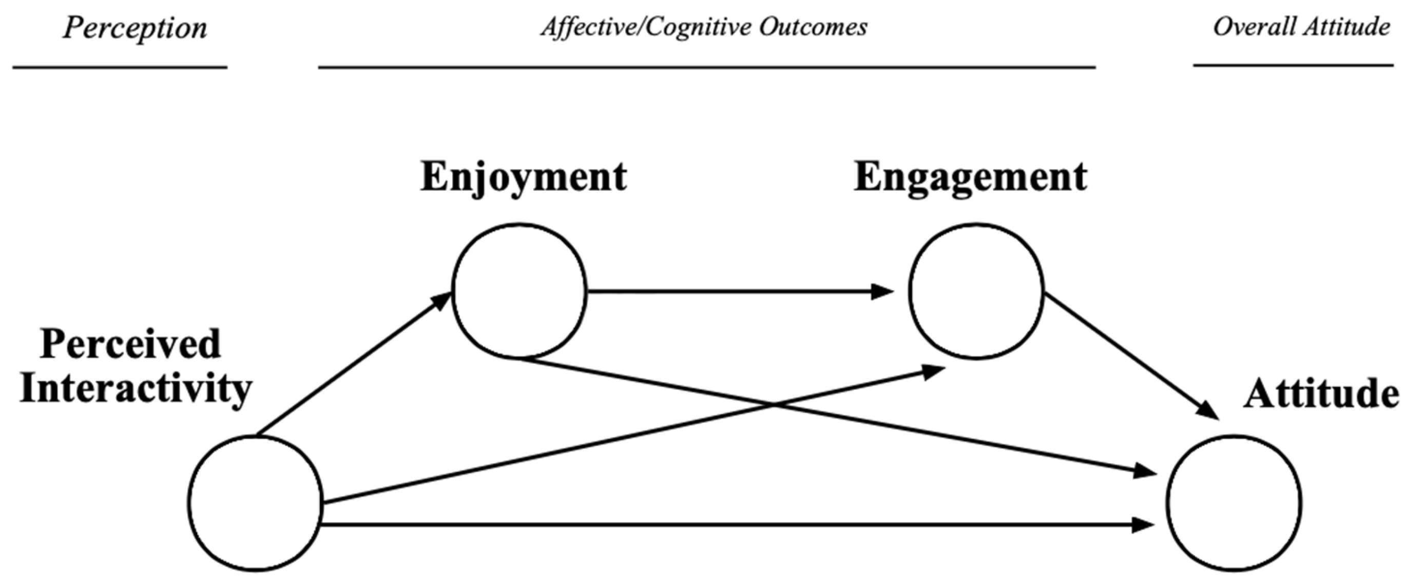
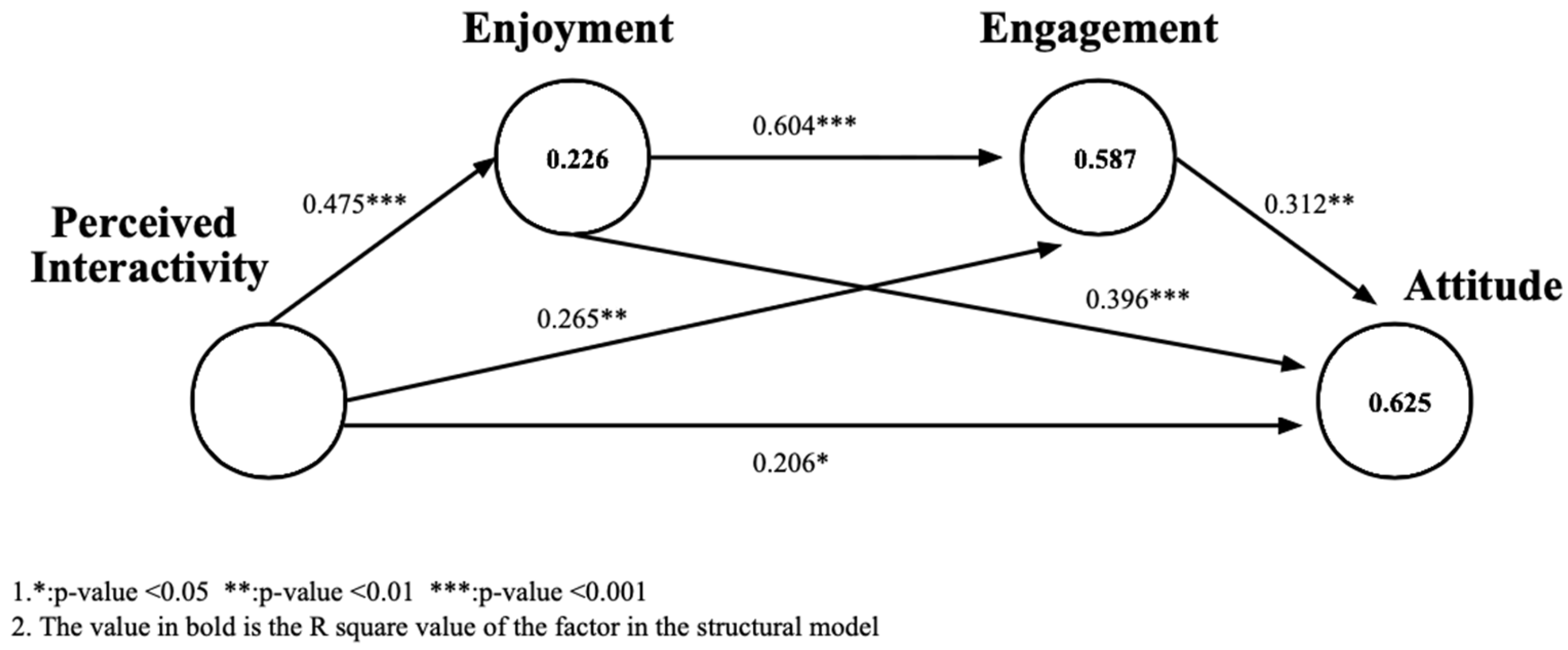
- Perceived Interactivity → Enjoyment → Attitude
- Perceived Interactivity → Engagement → Attitude
- Perceived Interactivity → Enjoyment → Engagement → Attitude
4. Methodological Approach
4.1. Participants
4.2. Task Design and Treatments
4.3. Stimuli
4.4. Measures
5. Results
5.1. Manipulation Test
5.2. Measurement Validation
5.3. Hypothesis Test
5.4. Exploratory Analysis of Qualitative Data
- Aesthetics: Visual design qualities that contribute to the attractiveness or pleasant appearance of the news interface. The concept is embodied in codes such as “visually appealing”, “eye-catching”, “colorful”, and “having a sense of design.”
- Emotion: Emotion refers to design elements that evoke emotions. The codes “fun”, “novel”, “engaging”, and “satisfying” are examples of emotional properties.
- Functionality: The components of the news structure and visualization, such as information design, navigation, and layout. Codes may include “data are intuitively clear”, “easy to obtain”, and “easy to remember.”
- Interactivity: This refers to giving users a variety of opportunities to interact with the news. Examples of codes include “a sense of feedback and control”, “change from passive reception to active interaction”, and “more accessibility.”
- Narrative: This refers to the sequence of the news narrative. This concept is encapsulated by codes like “too much text”, “lengthy”, and “lack of rhythm”.
6. Discussion and Conclusions
6.1. Theoretical and Practical Contributions
6.2. Research Limitations and Future Directions
Author Contributions
Funding
Institutional Review Board Statement
Informed Consent Statement
Data Availability Statement
Conflicts of Interest
Appendix A. Survey Items
- Perceived Interactivity [52]
- PI-1 While surfing this data journalism, my actions decided the kind of experiences I got.
- PI-2 This data journalism processed my input very quickly.
- Enjoyment [53]
- EJ-1 I found my visit to this data journalism entertaining.
- EJ-2 I found my visit to this data journalism enjoyable.
- EJ-3 I found my visit to this data journalism pleasant.
- Engagement [54]
- EG-1 This data journalism was aesthetically appealing.
- EG-2 I consider my reading experience a success.
- EG-3 The content of this data journalism incited my curiosity.
- EG-4 I was really drawn into my reading task.
- Attitude [55]
- AT-1 This data journalism is appealing.
- AT-2 This data journalism is attractive.
- AT-3 This data journalism is high-quality.
Appendix B. Data Journalism Experiments

| Data Journalism Experiment | Description of the Visualization and Available Control |
|---|---|
 | It is not possible to manipulate the content in the visualization. The map, the number of wetlands in each province, the selected batches, and the wetland directories can be seen directly. |
 | Participants can interact with the map via mouse hover to show the number of corresponding provinces, the selected batches, and the wetland directories. |
 | Participants can filter the data categories by the left navigation bar (show all/by wetland selected batches/by wetland distribution number) and mouse hover to interact with the map to show the number of corresponding provinces, the selected batches, and the wetland directories. |
References
- Ancker, J.S.; Chan, C.; Kukafka, R. Interactive Graphics for Expressing Health Risks: Development and Qualitative Evaluation. J. Health Commun. 2009, 14, 461–475. [Google Scholar] [CrossRef]
- Wojdynski, B.W. Interactive Data Graphics and Information Processing. J. Media Psychol. 2015, 27, 11–21. [Google Scholar] [CrossRef]
- Oh, J.; Lim, H.S.; Copple, J.G.; Chadraba, E.K. Harnessing the Persuasive Potential of Data: The Combinatory Effects of Data Visualization and Interactive Narratives on Obesity Perceptions and Policy Attitudes. Telemat. Inform. 2018, 35, 1755–1769. [Google Scholar] [CrossRef]
- Metzger, M.J.; Flanagin, A.J. Credibility and Trust of Information in Online Environments: The Use of Cognitive Heuristics. J. Pragmat. 2013, 59, 210–220. [Google Scholar] [CrossRef]
- O’Brien, H.L.; Cairns, P.; Hall, M. A Practical Approach to Measuring User Engagement with the Refined User Engagement Scale (UES) and New UES Short Form. Int. J. Hum. Comput. Stud. 2018, 112, 28–39. [Google Scholar] [CrossRef]
- Sundar, S.S.; Jia, H.; Waddell, T.F.; Huang, Y. Toward a Theory of Interactive Media Effects (TIME) Four Models for Explaining How Interface Features Affect User Psychology. In The Handbook of the Psychology of Communication Technology; Wiley: Hoboken, NJ, USA, 2015; pp. 47–86. [Google Scholar] [CrossRef]
- Saket, B.; Endert, A.; Stasko, J. Beyond Usability and Performance: A Review of User Experience-Focused Evaluations in Visualization. In Proceedings of the Sixth Workshop on beyond Time and Errors on Novel Evaluation Methods for Visualization, Baltimore, MD, USA, 24 October 2016; pp. 133–142. [Google Scholar] [CrossRef]
- Norman, D.A. Emotional Design: Why We Love (or Hate) Everyday Things; Civitas Books: London, UK, 2004; ISBN 0-465-05135-9. [Google Scholar]
- Brehmer, M.; Munzner, T. A Multi-Level Typology of Abstract Visualization Tasks. IEEE Trans. Vis. Comput. Graph. 2013, 19, 2376–2385. [Google Scholar] [CrossRef]
- Haroz, S.; Kosara, R.; Franconeri, S.L. Isotype Visualization: Working Memory, Performance, and Engagement with Pictographs. In Proceedings of the 33rd Annual ACM Conference on Human Factors in Computing Systems, Seoul, Republic of Korea, 18–23 April 2015. [Google Scholar] [CrossRef]
- Perloff, R.M. The Dynamics of Persuasion: Communication and Attitudes in the 21st Century; Routledge: London, UK, 1993; ISBN 1-4106-0688-0. [Google Scholar] [CrossRef]
- Teo, H.-H.; Oh, L.-B.; Liu, C.; Wei, K.-K. An Empirical Study of the Effects of Interactivity on Web User Attitude. Int. J. Hum. Comput. Stud. 2003, 58, 281–305. [Google Scholar] [CrossRef]
- Ducoffe, R.H. Advertising Value and Advertising on the Web. J. Advert. Res. 1996, 36, 21. [Google Scholar]
- Ajzen, I. Nature and Operation of Attitudes. Annu. Rev. Psychol. 2001, 52, 27–58. [Google Scholar] [CrossRef]
- Cyr, D.; Head, M.; Ivanov, A. Perceived Interactivity Leading to E-Loyalty: Development of a Model for Cognitive–Affective User Responses. Int. J. Hum. Comput. Stud. 2009, 67, 850–869. [Google Scholar] [CrossRef]
- Veglis, A.; Bratsas, C. Towards a taxonomy of data journalism. J. Media Crit. 2017, 3, 109–121. [Google Scholar] [CrossRef]
- Bucy, E.P. Interactivity in Society: Locating an Elusive Concept. Inf. Soc. 2004, 20, 373–383. [Google Scholar] [CrossRef]
- Wei, H.-L.; Lin, K.-Y.; Lu, H.-P.; Chuang, I.-H. Understanding the Intentions of Users to ‘Stick’ to Social Networking Sites: A Case Study in Taiwan. Behav. Inf. Technol. 2015, 34, 151–162. [Google Scholar] [CrossRef]
- Bucy, E.P.; Tao, C.-C. The Mediated Moderation Model of Interactivity. Media Psychol. 2007, 9, 647–672. [Google Scholar] [CrossRef]
- Wu, G. The Mediating Role of Perceived Interactivity in the Effect of Actual Interactivity on Attitude toward the Website. J. Interact. Advert. 2005, 5, 29–39. [Google Scholar] [CrossRef]
- Davis, W.A. A Causal Theory of Enjoyment. Mind 1982, 91, 240–256. [Google Scholar] [CrossRef]
- Attfield, S.; Kazai, G.; Lalmas, M.; Piwowarski, B. Towards a Science of User Engagement (Position Paper). In Proceedings of the WSDM Workshop on User Modelling for Web Applications, Hong Kong, China, 9–12 February 2011; Citeseer: State College, PA, USA, 2011; Volume 1. [Google Scholar]
- Rosenberg, M.J.; Hovland, C.I.; McGuire, W.J.; Abelson, R.P.; Brehm, J.W. Attitude Organization and Change: An Analysis of Consistency among Attitude Components.(Yales Studies in Attitude and Communication), Vol. III; Yale University Press: New Haven, CT, USA, 1960. [Google Scholar]
- Brandtzæg, P.B.; Følstad, A.; Heim, J. Enjoyment: Lessons from Karasek. In Funology 2: From Usability to Enjoyment; Springer: Berlin/Heidelberg, Germany, 2018; pp. 331–341. [Google Scholar] [CrossRef]
- Csikszentmihalyi, M.; Csikszentmihalyi, M. Toward a Psychology of Optimal Experience. Flow and the Foundations of Positive Psychology: The Collected Works of Mihaly Csikszentmihalyi; Springer: Berlin/Heidelberg, Germany, 2014; pp. 209–226. [Google Scholar]
- Skelly, T. Seductive Interfaces–Engaging, Not Enraging the User. In Proceedings of the Microsoft Interactive Media Conference. 1995. Available online: http://www.designhappy.com/sedint/TheMaze.htm (accessed on 10 April 2001).
- Davenport, G.; Holmquist, L.E.; Thomas, M. Fun: A Condition of Creative Research. IEEE MultiMedia 1998, 5, 10–15. [Google Scholar] [CrossRef]
- Hassenzahl, M. The Thing and I: Understanding the Relationship between User and Product. In Funology 2: From Usability to Enjoyment; Springer: Berlin/Heidelberg, Germany, 2018; pp. 301–313. [Google Scholar] [CrossRef]
- Oh, J.; Sundar, S.S. How Does Interactivity Persuade? An Experimental Test of Interactivity on Cognitive Absorption, Elaboration, and Attitudes. J. Commun. 2015, 65, 213–236. [Google Scholar] [CrossRef]
- Horning, M.A. Interacting with News: Exploring the Effects of Modality and Perceived Responsiveness and Control on News Source Credibility and Enjoyment among Second Screen Viewers. Comput. Hum. Behav. 2017, 73, 273–283. [Google Scholar] [CrossRef]
- Yang, F.; Shen, F. Effects of Web Interactivity: A Meta-Analysis. Commun. Res. 2018, 45, 635–658. [Google Scholar] [CrossRef]
- Childers, T.L.; Carr, C.L.; Peck, J.; Carson, S. Hedonic and Utilitarian Motivations for Online Retail Shopping Behavior. J. Retail. 2001, 77, 511–535. [Google Scholar] [CrossRef]
- Van Der Heijden, H. Factors Influencing the Usage of Websites: The Case of a Generic Portal in The Netherlands. Inf. Manag. 2003, 40, 541–549. [Google Scholar] [CrossRef]
- Muhammad, S.S.; Dey, B.L.; Kamal, M.M.; Syed Alwi, S.F. Consumer Engagement with Social Media Platforms: A Study of the Influence of Attitudinal Components on Cutting Edge Technology Adaptation Behaviour. Comput. Hum. Behav. 2021, 121, 106802. [Google Scholar] [CrossRef]
- Jin, E.; Oh, J. The Role of Emotion in Interactivity Effects: Positive Emotion Enhances Attitudes, Negative Emotion Helps Information Processing. Behav. Inf. Technol. 2022, 41, 3487–3505. [Google Scholar] [CrossRef]
- Chang, C.-M. Understanding Social Networking Sites Continuance: The Perspectives of Gratifications, Interactivity and Network Externalities. Online Inf. Rev. 2018, 42, 989–1006. [Google Scholar] [CrossRef]
- Xu, X.; Yao, Z.; Sun, Q. Social Media Environments Effect on Perceived Interactivity: An Empirical Investigation from WeChat Moments. Online Inf. Rev. 2018, 43, 239–255. [Google Scholar] [CrossRef]
- Sundar, S.S.; Kim, J. Interactivity and Persuasion: Influencing Attitudes with Information and Involvement. J. Interact. Advert. 2005, 5, 5–18. [Google Scholar] [CrossRef]
- Mcmillan, S.J.; Hwang, J.-S.; Lee, G. Effects of Structural and Perceptual Factors on Attitudes toward the Website. J. Advert. Res. 2003, 43, 400–409. [Google Scholar] [CrossRef]
- Coyle, J.R.; Thorson, E. The Effects of Progressive Levels of Interactivity and Vividness in Web Marketing Sites. J. Advert. 2001, 30, 65–77. [Google Scholar] [CrossRef]
- Mollen, A.; Wilson, H. Engagement, Telepresence and Interactivity in Online Consumer Experience: Reconciling Scholastic and Managerial Perspectives. J. Bus. Res. 2010, 63, 919–925. [Google Scholar] [CrossRef]
- Lustria, M.L.A. Can Interactivity Make a Difference? Effects of Interactivity on the Comprehension of and Attitudes toward Online Health Content. J. Am. Soc. Inf. Sci. Technol. 2007, 58, 766–776. [Google Scholar] [CrossRef]
- Pavlou, P.A.; Stewart, D.W. Measuring the Effects and Effectiveness of Interactive Advertising: A Research Agenda. J. Interact. Advert. 2000, 1, 61–77. [Google Scholar] [CrossRef]
- Zaichkowsky, J.L. Measuring the Involvement Construct. J. Consum. Res. 1985, 12, 341–352. [Google Scholar] [CrossRef]
- McMillan, S.J.; Hwang, J.-S. Measures of Perceived Interactivity: An Exploration of the Role of Direction of Communication, User Control, and Time in Shaping Perceptions of Interactivity. J. Advert. 2002, 31, 29–42. [Google Scholar] [CrossRef]
- Wu, G. Perceived Interactivity and Attitude toward Website. Available online: https://citeseerx.ist.psu.edu/document?repid=rep1&type=pdf&doi=c1f977e07ff306ca9ceb9b5ede8622bec2ac6cbe (accessed on 26 March 1999).
- Mcmillan, S. Interactivity Is in the Eye of the Beholder: Function, Perception, Involvement, and Attitude toward the Web Site. In Proceedings of the 2000 Conference of the American Academy of Advertising, Newport, RI, USA, 14–17 April 2000; American Academy of Advertising: Pullman, WA, USA, 2000; pp. 71–78. [Google Scholar]
- Xie, L.; Antle, A.N.; Motamedi, N. Are Tangibles More Fun? Comparing Children’s Enjoyment and Engagement Using Physical, Graphical and Tangible User Interfaces. In Proceedings of the 2nd International Conference on Tangible and Embedded Interaction, Bonn, Germany, 18–20 February 2008; ACM: Bonn, Germany, 2008; pp. 191–198. [Google Scholar] [CrossRef]
- O’Brien, H.; Cairns, P. Why Engagement Matters: Cross-Disciplinary Perspectives of User Engagement in Digital Media; Springer: Berlin/Heidelberg, Germany, 2016; ISBN 978-3-319-27446-1. [Google Scholar]
- O’Brien, H.L.; Toms, E.G. What Is User Engagement? A Conceptual Framework for Defining User Engagement with Technology. J. Am. Soc. Inf. Sci. 2008, 59, 938–955. [Google Scholar] [CrossRef]
- Kristoff, R.; Satran, A. Interactivity by Design; Adobe Press: San Francisco, CA, USA, 2002; ISBN 978-0-201-79930-9. [Google Scholar]
- Liu-Thompkins, Y. Developing a Scale to Measure the Interactivity of Websites. J. Advert. Res. 2003, 43, 207–216. [Google Scholar] [CrossRef]
- Hassanein, K.; Head, M. The Impact of Infusing Social Presence in the Web Interface: An Investigation across Product Types. Int. J. Electron. Commer. 2005, 10, 31–55. [Google Scholar] [CrossRef]
- O’Brien, H.L.; Toms, E.G. The Development and Evaluation of a Survey to Measure User Engagement. J. Am. Soc. Inf. Sci. 2010, 61, 50–69. [Google Scholar] [CrossRef]
- Kalyanaraman, S.; Sundar, S.S. The Psychological Appeal of Personalized Content in Web Portals: Does Customization Affect Attitudes and Behavior? J. Commun. 2006, 56, 110–132. [Google Scholar] [CrossRef]
- Dawes, J. Do Data Characteristics Change According to the Number of Scale Points Used? An Experiment Using 5-Point, 7-Point and 10-Point Scales. Int. J. Mark. Res. 2008, 50, 61–104. [Google Scholar] [CrossRef]
- Rivard, S.; Huff, S.L. Factors of Success for End-User Computing. Commun. ACM 1988, 31, 552–561. [Google Scholar] [CrossRef]
- Nunnally, J.C. An Overview of Psychological Measurement. In Clinical Diagnosis of Mental Disorders: A Handbook; Wolman, B.B., Ed.; Springer: Boston, MA, USA, 1978; pp. 97–146. ISBN 978-1-4684-2490-4. [Google Scholar]
- Straub, D.; Boudreau, M.-C.; Gefen, D. Validation Guidelines for IS Positivist Research; Communications of the Association for Information Systems: Atlanta, GA, USA, 2004; p. 13. [Google Scholar] [CrossRef]
- Fornell, C.; Larcker, D.F. Evaluating Structural Equation Models with Unobservable Variables and Measurement Error. J. Mark. Res. 1981, 18, 39–50. [Google Scholar] [CrossRef]
- Hayes, A.F. Partial, Conditional, and Moderated Moderated Mediation: Quantification, Inference, and Interpretation. Commun. Monogr. 2018, 85, 4–40. [Google Scholar] [CrossRef]
- Link, E.; Henke, J.; Möhring, W. Credibility and Enjoyment through Data? Effects of Statistical Information and Data Visualizations on Message Credibility and Reading Experience. J. Stud. 2021, 22, 575–594. [Google Scholar] [CrossRef]
- Zillmann, D.; Callison, C.; Gibson, R. Quantitative Media Literacy: Individual Differences in Dealing with Numbers in the News. Media Psychol. 2009, 12, 394–416. [Google Scholar] [CrossRef]
- Coddington, M. Clarifying Journalism’s Quantitative Turn. Digit. J. 2015, 3, 331–348. [Google Scholar] [CrossRef]
- Cushion, S.; Lewis, J.; Callaghan, R. Data Journalism, Impartiality and Statistical Claims. J. Pract. 2017, 11, 1198–1215. [Google Scholar] [CrossRef]
- Knight, M. Data Journalism in the UK: A Preliminary Analysis of form and Content. J. Media Pract. 2015, 16, 55–72. [Google Scholar] [CrossRef]
- Hullman, J.; Drucker, S.; Riche, N.H.; Lee, B.; Fisher, D.; Adar, E. A Deeper Understanding of Sequence in Narrative Visualization. IEEE Trans. Visual. Comput. Graph. 2013, 19, 2406–2415. [Google Scholar] [CrossRef]
- Lee, E.-J.; Kim, Y.W. Effects of Infographics on News Elaboration, Acquisition, and Evaluation: Prior Knowledge and Issue Involvement as Moderators. New Media Soc. 2016, 18, 1579–1598. [Google Scholar] [CrossRef]


| Interactivity Level | Description of the Visualization and Available Control |
|---|---|
| Low-interactivity (n = 25) | It is not possible to manipulate the content in the visualization. The map, the number of wetlands in each province, the selected batches, and the wetland directories can be seen directly. |
| Medium-interactivity (n = 25) | Participants can interact with the map via mouse hover to show the number of corresponding provinces, the selected batches, and the wetland directories. |
| High-interactivity (n = 25) | Participants can filter the data categories by the left navigation bar (show all/by wetland selected batches/by wetland distribution number) and mouse hover to interact with the map to show the number of corresponding provinces, the selected batches, and the wetland directories. |
| Construct Indicators | Indicator’s Loadings | Composite Reliability | Average Variance Extracted |
|---|---|---|---|
| Perceived Interactivity_1 | 0.735 | 0.708 | 0.549 |
| Perceived Interactivity_2 | 0.746 | ||
| Enjoyment_1 | 0.770 | 0.860 | 0.673 |
| Enjoyment_2 | 0.879 | ||
| Enjoyment_3 | 0.809 | ||
| Engagement_1 | 0.673 | 0.838 | 0.565 |
| Engagement_2 | 0.738 | ||
| Engagement_3 | 0.841 | ||
| Engagement_4 | 0.745 | ||
| Attitude_1 | 0.964 | 0.909 | 0.771 |
| Attitude_2 | 0.894 | ||
| Attitude_3 | 0.764 |
| Perceived Interactivity | Enjoyment | Engagement | Attitude | |
|---|---|---|---|---|
| Perceived Interactivity | 0.741 | |||
| Enjoyment | 0.475 | 0.821 | ||
| Engagement | 0.552 | 0.730 | 0.752 | |
| Attitude | 0.567 | 0.721 | 0.715 | 0.878 |
| Indirect Paths | Effect | 95% BootCI |
|---|---|---|
| Perceived Interactivity → Enjoyment → Attitude | 0.221 | [0.072~0.394] |
| Perceived Interactivity → Engagement → Attitude | 0.097 | [0.002~0.243] |
| Perceived Interactivity → Enjoyment → Engagement → Attitude | 0.105 | [0.010~0.223] |
| T1 (n = 25) | T1 (n = 25) | T1 (n = 25) | p Value | ||||
|---|---|---|---|---|---|---|---|
| Mean | Sd | Mean | Sd | Mean | Sd | ||
| Perceived Interactivity | 4.56 | 1.12 | 4.96 | 0.79 | 5.32 | 0.96 | 0.025 * |
| Enjoyment | 4.44 | 1.13 | 4.57 | 0.84 | 4.79 | 1.11 | 0.494 |
| Engagement | 4.84 | 1.40 | 4.96 | 0.88 | 5.15 | 0.86 | 0.591 |
| Attitude | 4.67 | 1.47 | 5.21 | 0.86 | 5.52 | 0.99 | 0.032 * |
| Data Journalism Experiment | Positive Emerging Concepts | Negative Emerging Concepts |
|---|---|---|
| G1 | Aesthetics: “visually appealing”; “eye-catching”; “nice layout”; “special”; “Colorful”; “Strong aesthetic and design sense” Emotion: “Have fun”; “Engaging”; “Want to get involved”; “Contextualization”; “Curiosity”; “Create empathy and familiarity” Functionality: “Novel subject matter” | Emotion: “Less engagement and fun”; “There is pressure to read” Functionality: “The way the data are organized makes it easier to focus on certain information and ignore others” Interactivity: “Interactivity is weak”; “Adding interactive points and images would be more user-friendly” Narrative: “Infographics at the end of the article make me a little impatient”; “Too much text and concentration” |
| G2 | Aesthetics: “Outstanding visual novelty”; “Nice color”; “The color is in line with the theme”; “With visual impact”; “With design sense” Emotion: “Touch heartstring”; “Gratification”; “A sense of involvement and experience feeling”; “Novelty”; “Interesting” Functionality: “Data are accurate”; “Very detailed”; “Easy to remember”; “Information is clear and concise”; “Easy to access, easy to find information”; “Intuitive” Interactivity: “Interactive”; “Sense of feedback and control”; “Room for manipulation and active choice”; “Interacting with the charts brings visual enjoyment”; “Vividly”; “Interactivity enhances my reading interest”; “ Arouses curiosity to continue exploring more information”; “Increased communication power of the message” | Emotion: “Tiredness easily”; “Reading pressure” Functionality: “Single form of information presentation”; “Icons and images can be added” Narrative: “Too much text”; “Lengthy”; “Lack of rhythm”; “Interactive diagrams at the end tend to make users jump out and lose interest” |
| G3 | Aesthetics: “Uniformity of color”; “Rejuvenation”; “Novel”; “Holistic”; “Thematic Sense”; “Innovative”; “Easy to grab people’s attention” Emotion: “Very engaging”; “Interesting”; “Good experience feeling”; “Credible and convincing”; Functionality: “Data are clear and intuitive”; “Detailed” “Useful for receiving data”; “Helps with memory”; Interactivity: “Interactive”; “With control”; “Easy access to data details”; “Interactivity makes data more straightforward”; “From passive acceptance to active interaction”; “Interactive maps are novel and more intuitive”; “Interactivity makes me feel that the data source is reliable” | Emotion: “The text part tends to be boring”; “Want to skip the text” Functionality: “Could add some pictures combined with visualization” Interactivity: “Increase the number of levels of hyperlinks to get more specific information”; “Add more interactivity”; “The interaction cues were not so evident that I ignored the interaction” Narrative: “Large sections of text can be broken up” |
Disclaimer/Publisher’s Note: The statements, opinions and data contained in all publications are solely those of the individual author(s) and contributor(s) and not of MDPI and/or the editor(s). MDPI and/or the editor(s) disclaim responsibility for any injury to people or property resulting from any ideas, methods, instructions or products referred to in the content. |
© 2023 by the authors. Licensee MDPI, Basel, Switzerland. This article is an open access article distributed under the terms and conditions of the Creative Commons Attribution (CC BY) license (https://creativecommons.org/licenses/by/4.0/).
Share and Cite
Zhang, B.; Zhang, Y.; Pan, Y. Accepting the Digital Challenge: Public Perceptions and Attitudes toward Interactivity in Data Journalism. Appl. Sci. 2023, 13, 10857. https://doi.org/10.3390/app131910857
Zhang B, Zhang Y, Pan Y. Accepting the Digital Challenge: Public Perceptions and Attitudes toward Interactivity in Data Journalism. Applied Sciences. 2023; 13(19):10857. https://doi.org/10.3390/app131910857
Chicago/Turabian StyleZhang, Boning, Yuxin Zhang, and Younghwan Pan. 2023. "Accepting the Digital Challenge: Public Perceptions and Attitudes toward Interactivity in Data Journalism" Applied Sciences 13, no. 19: 10857. https://doi.org/10.3390/app131910857