Article

What Do Global Metrics Tell Us about the World?

by
John Rennie Short
1,*,
Justin Vélez-Hagan
1,2 and
Leah Dubots
1
1
School of Public Policy, University of Maryland Baltimore County, Baltimore, MD 21250, USA
2
National Puerto Rican Chamber of Commerce, 629 K St NW, Suite 300, Washington, DC 20006, USA
*
Author to whom correspondence should be addressed.
Soc. Sci. 2019, 8(5), 136; https://doi.org/10.3390/socsci8050136
Submission received: 17 April 2019 / Revised: 24 April 2019 / Accepted: 26 April 2019 / Published: 1 May 2019
(This article belongs to the Section Contemporary Politics and Society)

Abstract

:
There are now a wide variety of global indicators that measure different economic, political and social attributes of countries in the world. This paper seeks to answer two questions. First, what is the degree of overlap between these different measures? Are they, in fact, measuring the same underlying dimension? To answer this question, we employ a principal component analysis (PCA) to 15 indices across 145 countries. The results demonstrate that there is one underlying dimension that combines economic development and social progress with state stability. Second, how do countries score on this dimension? The results of the PCA allow us to produce categorical divisions of the world. The threefold division identifies a world composed of what we describe and map as rich, poor and middle countries. A five-group classification provided a more nuanced categorization described as: The very rich, free and stable; affluent and free; upper middle; lower middle; poor and not free.

1. Introduction

Part of the proliferation of performance measures (Van Noorden 2010) is the growing range and number of what we may term global indices, which are used to compare the socio-economic-political characteristics of countries. The range of global metrics has expanded to include economic competitiveness and economic complexity (Cristelli et al. 2013), estimating corruption (Olken and Pande 2012), global warming (Peters et al. 2011), governance (Hulme et al. 2014), health (Adams 2016), land cover (DeFries et al. 1995), market performance (Clark et al. 2005), measuring happiness (Blanchflower and Oswald 2011; Inglehart et al. 2008), social development (Morris 2013), and sustainable development (Morse 2015; Wilson et al. 2007). The number of indices has increased. One survey identifies 178 global indices that range from an aging vulnerability index to a free press ranking (Bandura 2008).
Our focus in this paper is on socio-economic-political measures. We seek to answer some key questions. To what extent are the different socio-economic-political indices measuring the same underlying dimension? Are some indices more useful than others? In this paper, we will examine a range of socio-economic-political indices currently in everyday use. We will use principal components analysis (PCA) to see the nature of the underlying dimensions, identify the more useful indicators and identify countries of similar characteristics. The paper deepens our understanding of global metrics used to measure global socio-economic-political differences.

2. The Data Set

There are now a wide range of global social indicators that allow us to compare, contrast and rate countries by their socio-economic-political attributes. They give us a sense of how countries in the global community rank against each other. Major international organizations provide some of the most widely used indices. The International Monetary Fund (IMF), United Nations (UN), World Bank and many other organizations such as the World Health Organization (WHO) provide global indices based on national data collections. The UN Human Development Index (HDI), for example, measures a country’s achievements in terms of life expectancy, educational attainment and adjusted real income. High human development countries include Norway, Australia, Canada, Sweden, Belgium and the US while some of the lowest are Burundi, Niger and Sierra Leone. The Gender Inequality Index created by the UN measures progress along the dimensions of reproductive health, empowerment and economic status. Non-government agencies (NGOs) also provide metrics. The Civil Society Index, for example, plots the position of each country in relation to four dimensions: Civil society, structure, environment, values and impact. The Freedom Index provides a measure of political rights and civil liberties.
There are at least three problems in using these indices. First, there is the differential quality of data collected by national authorities. Many poor countries lack the technical staff to adequately measure and prepare the required data. Richer countries can devote more resources to provide good quality, accurate and timely data.
Second, even when accurate and timely, the indices treat nation states as single units, with one measure covering the entire territory. This is an unrealistic assumption especially for larger countries and for states that are not perfectly homogenous, and few are. National scale data is a spatial fiction covering a range of experiences within countries, especially between the rural and urban areas.
An important spatial unit that matches more closely with the realities of local lives is cities. A major problem is that there are few sources of good quality comparable urban data. Even such seemingly simple measures such as city population are very difficult to generate. One flawed exception is the Global Urban Indicators produced by the United Nations Human Settlement Program. The program identified 30 urban indicators and nine qualitative variables to be used in comparing cities across the world. The program provides a patchy coverage of these data sets for cities. So far, the program is more of a promise of possible data rather than a delivery of global urban data.
To illustrate the problems of using national data, let us consider some measures of globalization. The Swiss Economic Institute, KOR, publishes a globalization index of countries (Gygli et al. 2018). In 2018, the top scoring countries were Belgium, Netherlands, Switzerland and Sweden. The Globalization and World Cities (GaWC) survey, in contrast, ranks cities by their degree of global connectivity (The Globalization and World Cities Research Network n.d.). If we compare the rank of the top countries in the KOR index with the rank of their major city in the GaWC index, then substantial differences can be noted. While Belgium was ranked first by the KOR Globalization Index, the city of Brussels was ranked only 27th, Amsterdam was 26th, Zurich was 34th and Stockholm was 38th. Small, rich homogenous countries tend to score higher on globalization measures than their respective cities score on global city connectivity. The differences between the two measures highlight the more general point of the importance of the spatial scale of analysis and the fact that different spatial resolutions produce different results.
Third, especially for composite indices, the index is only as robust as the inputted data.
There are pitfalls in using any metric; Hauser and Katz have identified at least seven (Hauser and Katz 1998). These are exacerbated if we only use one metric. One solution then, is to widen the range, and while using a large number of indices does not solve all the problems, it does tend to provide a better overall picture.
We collected data on 15 indices for 145 countries (Table 1; a fuller discussion of these indices is contained in Appendix A). The indices are commonly used, freely available and often cited in established newspapers and journals. In other words, they constitute a relatively well used and respected set of indices.
In reality, many more indices are available but we see this study as just the beginning; a preliminary analysis of a relatively small but manageable data set. We have drawn a sample of indices on development and human rights.
Indices often vary in their coverage, so we have estimated missing values, as explained in Appendix A. Different indices use different scales, which make statistical analysis difficult. We standardized the indices to the same scale of 0 to 100. The nature of the standardization is discussed for each index in Appendix A.

3. The Analysis

We employed a statistical technique known as principal component analysis (PCA) that allows us to identify underlying dimensions from the original data (Jolliffe 2011). The principal component analysis is a well-tested dimensionality reduction technique that reduces the number of variables, while still retaining much of the original data (Jolliffe 2014). PCA extracts important information from an array of data in the form of new orthogonal variables, called principal components, through eigenvalue decomposition of date covariance (Abdi and Williams 2010).
A PCA thus allows us to identify:
  • The underlying dimensions (components)
  • How each index contributes to the underlying component (component loadings)
  • The national scores on these components (component scores)
Table 2 shows that the components explained the total variance of the original data. Notice that the first component explains 68 percent of the total variance. The two subsequent components explain less variance, but three components cumulatively explain just over 86 percent of the total variance. What are these components?
We can identify their characteristics by looking at how each of the original indices scores on the new components (Table 3). These values, known as component loadings, allow us to identify the nature of the underlying components through their statistical relationship with the original data.

3.1. Component 1: Rich, Progressive and Stable/Poor, Regressive and Unstable

We have entitled the first component: Rich, progressive and stable versus poor, regressive and unstable. It explains more than two-thirds of the total variance and is associated positively with each of the indices, bar one. As shown in Table 3, all of the indices, apart from Economic Freedom, scored equally highly and positively. This component reaffirmed and highlighted the connection between social progress and political stability. It is a powerful component that was the fundamental statistical backbone of explanatory variance in our data set. It suggests that economic development and social progress go hand in hand with state stability.
This statistical finding reaffirms other work that shows how democratic institutions and rule of law promotes economic growth (Wang et al. 2018). Acemoglu et al. (Acemoglu et al. 2019), for example, showed that democracies increase economic growth. They suggested that democratization increases GDP per capita by about 20 percent in the long run. Democracy increases growth through greater investment in social welfare and education, the encouragement of investment and economic reforms and the reduction of social conflict. Democracy, social stability and economic growth go hand in hand.
Therefore, to a large extent all the indices—except one, Economic Freedom—are essentially measuring countries along this one dimension. All the indices have similar sized and positively signed component loadings. Even such specific and distinctive indices as gender inequality, digital access, and life satisfaction are measuring different facets of this one dimension. Many of the different indices would thus seem to be measuring the same underlying reality of political stability, social progress and economic development. The five best performing indicators, as measured by the component loadings in Table 3, are, in order: CIPF risk, country risk, social progress, digital access and HDI.
It is always useful to look at the component scores: How each country scores on the component. Table 4 lists the countries that scored highest and lowest on this component. No real surprise was found here, which was comforting. The component seemed to be measuring something real and tangible; not just a statistical artifact without connection to our understanding of the world. The top scorers were some of the most stable and richest counties in the world, while the lowest scores were some of the poorest and least stable.
Component 1 had a connection with the reality of the world and was not just a statistical construction from this data set. The component picked up most of the variance in the original data and was powerfully suggestive of the inter-linkages between political stability, social progress and economic growth.

3.2. Component 2: Let Freedom Ring

Component 2, as shown in Table 3, was positively associated with the: Democracy Index, Freedom Index, Freedom of Press and Human Rights. The component was useful for identifying the more regressive regimes. Table 5 lists the top five negative scores. Again, there was no surprise, which was comforting in that this component seemed to be measuring something real in the external world. The component only explains 11.4 percent of the total variance, much less than Component 1 but still significant, in that it identifies a world divided up into countries with very different freedoms.

3.3. Component 3: Neoliberalism

Component 3 is associated with one index—Economic Freedom produced by the Heritage Foundation—a group committed to a neoliberal agenda of open markets and limited government. It measures market freedoms associated most closely with a neoliberal agenda. This component had no other strong statistical connections to other indices, which is suggestive of a more insular and singular index. It measures countries along a yardstick of neoliberalism. The statistical results showed that neoliberalism was not associated with either socio-economic development or political freedoms. This is an important point, since the advocates for neoliberalism often argue that it improves socio-economic performance and increases freedoms. Neither of these assertions were validated in this analysis.

4. A Tripartite Global Geography

There is a long tradition of classifying countries, but the geographical terms used to describe the world are constantly changing. During early years of the Cold War, the world was divided into the first world of capitalist economies, the second world of communist societies, and a large swathe of countries in South America and Asia that were either neutral or non-aligned and described as the third world. Industrialization in selected countries such as Japan and South Korea—and more recently, India and China—created a specific category of Newly Industrializing Countries, with the membership changing as economies such as Japan and South Korea matured into the first world designation.
Three other terms also emerged: developed, developing and underdeveloped. The term developing suggested a path to progress while the term underdeveloped implied a more end state of permanent poverty. Scholars pointed out that underdevelopment was created in the process of some economies being developed (Harris et al. 2009; Emmanuel 1974). It was not the case that developing countries were slower in catching up to the developed, but that the wealth of the developed countries was based on the underdevelopment of the so-called developing countries. From this perspective, underdevelopment was not due to lack of progress but to an unfair distribution of the fruits of progress and the transfer of resources from colonies to imperial centers.
The terms developed and developing are now replaced in the academic literature by the new division into global North and global South. The term global South is used to refer to a line roughly 30 degrees North latitude that divides much of the world into richer and poorer countries. The term is widely used despite the problems with lumping together Australia, New Zealand and many South American countries with some very poor countries.
There is now a proliferation of country groupings, yet the need remains for a more information-based grouping, rather than the ideological and too generalized distinction of global South and North (Alonso et al. 2014).
We can use the previous analysis to advance this debate. We used Component 1 scores, identified as the most important underlying structure to the statistical variance in this data set, to create groupings of similar countries. We used k-means clustering, one of the most commonly applied clustering techniques in statistical analyses (Jain 2010; Wagstaff et al. 2001; Wilks 2011). Applying this form of cluster analysis allowed us to group countries with similar characteristics.
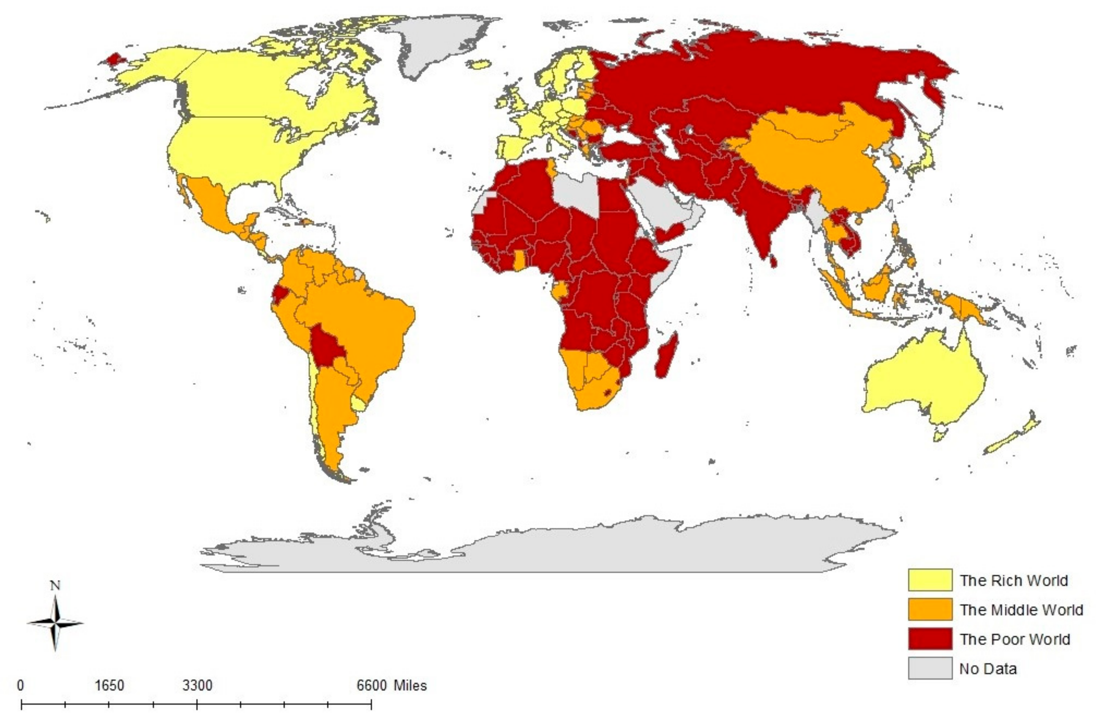
In any grouping exercise, a choice has to be made between too few and too many categories. In the first instance, we have adopted a three-group classification. The results are shown in Appendix B and mapped in Figure 1 (Jiang 2016).
Grouping the component scores of individual countries on Component 1 into three groups provided a rough classification of what we term rich, poor and middle. These are simple terms but have a deeper meaning. Rich implies a wealth of not only economic growth, but also political freedoms and social stability. The poverty of poor countries is not only in low income per capita but also in the lack of political freedoms and social progress. The rich include Northwest Europe, North America, Australia and New Zealand. The poor world contains much of Africa and Asia. The middle includes those neither very rich nor very poor and includes much of South and Central America, Southern Africa and Eastern Europe. In Figure 1, we get a better sense of the global nature of the middle. The middle includes those countries on the way up, such as China and Vietnam, as well as those on the way down such as Venezuela.

5. A Global Geography: Five Groups

A five-group classification, shown in Appendix C and Figure 2, provides a finer mesh. A tight core of very rich countries, such as Australia and Denmark remain, but some countries classified as rich in the tripartite division fall a category, such as Estonia, Italy, Poland and Uruguay. The middle of the tripartite categorization became more nuanced, with some, such as Brazil and Colombia, now classified as upper middle and others, such as China and Russia, now grouped under lower middle. Some classified as poor in the three-group classification were shifted into the lower middle, such as Algeria, Cambodia and Vietnam. The very poorest category shrinks to a hard core of deep poverty in Africa and the Middle East, including countries such as Afghanistan, Chad and Syria. Let us look in more detail.

5.1. The Very Rich, Free and Stable

This group consisted of the very richest countries that are stable democracies and score high on human development and social progress. They were the rich core of the global economy with the highest standards of living and the freest of societies. It was a relatively tight nexus that covered countries only in North America, Europe, and Australasia. Japan was the only country that made this group from Asia and there were none from Africa, the Middle East or South and Central America. This is the very rich core of the global economy and the democratic heart of the global polity.

5.2. Affluent and Free

This group was only one notch down from the very rich core. It included countries from across the globe but are most prevalent in Eastern and Southern Europe and in South America.

5.3. Upper Middle

Between the two extremes of very rich and very poor are two groups that constituted a middle ground between rich and poor, free and unfree, stable and unstable. The term upper middle is suggestive that this group consisted of countries closer to the top than the bottom. There was global coverage with countries in South and Central America, Southern Africa, and Eastern Europe. Asian countries in this category included the Philippines, Thailand, and Mongolia.

5.4. Lower Middle

The lower middle included countries rapidly developing, such as China, but with issues of human rights, as well as poorer counties with more authoritarian, undemocratic regimes and more limited human rights. The geographic spread was concentrated in Asia and Africa.

5.5. Poor and Not Free

These were the problem countries with limited economic and social progress and greater instability. The tropical region of Africa is home to many of these countries, as well as the cockpit of the Middle East, and Laos, Turkmenistan, and Pakistan.

6. Limitations of Study

The study has a number of limitations. First, the analysis was based on a relatively small sample of indices. The results referred to only the data that was inputted. A larger, more diverse set of indices may produce different results. However, as we have shown, many indices measure the same underlying dimension.
Second, the data analysis was descriptive. The PCA highlights statistical covariation; it does not directly address causality. We identified the underlying statistical relationships and had to make assumptions about the causal connections.
Third, PCA is only as robust as the initial data. A variety of indices were used and some had to be contorted in order to be compatible. The distortion reinforced confusion for the smaller variance components and made interpretation difficult. Once we got past the main component, the remaining components became less clear cut and obvious.
Fourth, there were numerous methodological problems in using composite indices, especially if they included indicators that were not all positively intercorrelated (Bandura 2008; Paruolo et al. 2013). We sought to make sure that all the composite indices had positively correlated indicators (see Appendix A).
Fifth, although the applied k-means clustering technique is among the most commonly applied statistical methods for cluster grouping, other statistical data analysis techniques may provide slightly different results.
Sixth, the classifications of the countries were only one snapshot in time. Further work with time series data would allow the changing trajectory of countries to be noted as they move upwards or downwards, or even keep their place in these groupings.

7. Conclusions

In the introduction, we stated the goals of the paper were to identify underlying dimensions of socio-economic-political difference across the globe, identify the more useful individual indicators and identify countries of similar characteristics. We have answered these questions and despite the limitations of this study, some important conclusions can be drawn; we note seven.
First, the results highlight the importance of one underlying dimension that combines stability, social progress and economic development. The finding reinforces the idea that stability and social progress go hand in hand with economic development. We are acutely aware of this at the time of state failure or collapse. But it is important to remember that even without complete collapse, the economic and social welfare of a nation is a function of stability and peace. A stable political system is both a prerequisite and the embodiment of social progress and economic growth. It is a truism, but no less a powerful finding: Social conflict and state instability are both a cause and a reflection of limited social and economic progress.
Second, a less important dimension of the statistical variation across the data was the importance of a range of freedoms, which included human rights and freedom of the press. Together these two components explained almost 80 percent of the total variance.
Third, Component 3 referred to only one index, that of Economic Freedom. The distinctiveness suggests an index that measures along an insular dimension largely independent from economic development and social progress. It is possible to be neoliberal and poor and unfree. Despite the claims of its apologists, neoliberalism neither secures economic development nor ensures social stability.
Fourth, in summary, the majority work of fifteen indices can effectively be done by just one component and the vast majority by just three synthetic indices. We can rate and rank countries using at least just one dimension and at most three dimensions without losing too much of the original statistical variation of fifteen indices. This is a great improvement.
Fifth, we identified a number of indices with high component loadings, suggesting their individual usefulness as surrogate measures of the underlying primary dimension. In order, the top five were: CIFP risk, country risk, social progress, digital access and HDI. Not all indices are equal in usefulness. Our work suggests that these five are some of the most useful indices to use.
Sixth, the country grouping allowed us to move beyond simple classification to a deeper appreciation of the national diversity in the global community. The classification was most powerful at the extremes where it distinguished the very rich, free and stable from the very poor, unfree and unstable. It could be argued that the groupings confirmed, rather than undermined existing ideas. This is the ‘so what’ critique often used when conventional wisdom is confirmed. But we see this as a strength. It confirms that our method of using PCA to identify an underlying dimension, then grouping the component scores, aligns with our understanding of the reality of the world. The classification—indeed the analysis as a whole—was only a preliminary stage in a deeper appreciation of the meaning and limitations of global measures of socio-economic-political difference.
Seventh, the paper has added to our understanding of the global geography of socio-economic-politics and allows us to see how the position of individual countries can change with the number of categories employed. Using the three and five-group classifications together gave a better sense of the fluidity of country classification using global metrics. To take just one example from our results: Afghanistan, Albania and Algeria are classified as part of the poor world in the three-group classification (Appendix B). They were effectively lumped together as part of the poor world. But in the five-group classification, they were filtered out into three separate categories of, respectively: Poor and not free; lower middle; and upper middle (Appendix C). The paper highlights the importance of the number of categories used to understand global geographies.

Author Contributions

Conceptualization, J.R.S.; Methodology J.-V.H.; Formal Analysis, J.R.S., J.-V.H.; Data Curation, J.-V.H.; Writing-Original Draft Preparation, J.R.S.; Writing-Review and Editing, J.R.S., J.-V.H., L.D.; Visualization, L.D.; Supervision, J.R.S., Project Administration, J.R.S.

Funding

This research received no external funding.

Conflicts of Interest

The authors declare no conflict of interest.

Appendix A. Detailed Description of Indices

Economic Freedom: The Heritage Foundation measures economic freedom based on 10 quantitative and qualitative factors, grouped into four broad categories, or pillars, of economic freedom: Rule of Law (property rights, freedom from corruption); Limited Government (fiscal freedom, government spending); Regulatory Efficiency (business freedom, labor freedom, monetary freedom); and Open Markets (trade freedom, investment freedom, financial freedom). Each of the ten economic freedoms within these categories is graded on a scale of 0 to 100. A country’s overall score is derived by averaging these ten economic freedoms, with equal weight being given to each. More free = higher value.
Corruption Perception Index: Transparency International’s index ranks countries and territories based on how corrupt their public sector is perceived to be. It is a composite index—a combination of polls—drawing on corruption-related data collected by a variety of reputable institutions. The index reflects the views of observers from around the world, including experts living and working in the countries and territories evaluated. Less corrupt = higher value.
Human Development Index (HDI): The Human Development Index (HDI) is a summary measure of average achievement in key dimensions of human development, including long and healthy life, being knowledgeable and having a decent standard of living. The HDI is the geometric mean of normalized indices for each of the three dimensions. More developed = Higher value. *We scaled the index by multiplying by 100 to match 0–100 range of other indices.
Democracy Index: The Democracy Index is an index compiled by the Economist Intelligence Unit that measures the state of democracy in 167 countries, of which 166 are sovereign states and 165 are United Nations member states. The index is based on 60 indicators grouped in five different categories measuring pluralism, civil liberties, and political culture. In addition to a numeric score and a ranking, the index categorizes countries as one of four regime types full democracies, flawed democracies, hybrid regimes and authoritarian regimes. More democracy = higher value. *Scaled by multiplying by 10 to match 0–100 range of other indices.
Freedom Index: In the original index, countries are given a total press freedom score from 0 (best) to 100 (worst) on the basis of a set of 23 methodology questions divided into three subcategories, and are also given a category designation of “Free,” “Partly Free,” or “Not Free.” In order to standardize our indices, the Freedom Index was reconfigured to reverse the significance of the resulting values. By subtracting original values from an arbitrary number equal to or greater than 100, we created a new freedom score that ranges from 0 (worst) to 100 (best).
Country Risk: The Fund for Peace’s Fragile State Index (FSI) is compiled by collecting thousands of reports and information from around the world, detailing the existing social, economic and political pressures faced by each of the 178 countries that we analyze. The FSI is based on The Fund for Peace’s proprietary Conflict Assessment System Tool (CAST) analytical platform. Based on comprehensive social science methodology, data from three primary sources are triangulated and subjected to critical review to obtain final scores for the FSI. In the original index, More fragile = higher value. In order to standardize our indices, the index was reconfigured to reverse the significance of the resulting values. By subtracting original values from an arbitrary number equal to or greater than 100, we created a new freedom score that ranges from 0 (worst) to 100 (best). *We then scaled the resulting index by multiplying by 0.75 to match 0–100 range of other indices.”
Gender Inequality (UN): Index for measurement of gender disparity that was introduced in the 2010 Human Development Report 20th anniversary edition by the United Nations Development Programme (UNDP). According to the UNDP, this index is a composite measure which captures the loss of achievement within a country due to gender inequality. It uses three dimensions to do so: reproductive health, empowerment, and labor market participation. More unequal = higher value. In order to standardize our indices, the Gender Inequality was reconfigured to reverse the significance of the resulting values. By subtracting original values from an arbitrary number equal to or greater than 1, we were effectively able to create a new index that ranges from 0 (perfect inequality) to 1 (perfect equality). *This standardization assumes that inequality is a negative/detrimental component and is reversed to ensure that higher values align with the expected outcome of advanced countries. **Scaled by multiplying by 100 to match 0–100 range of other indices.
Quality of Life: Social Watch’s Basic Capabilities Index (BCI) looks at basic social indicators such as health and education. BCI values for 2011 were computed for 167 countries where data are available out of the 193 member states of the United Nations. Better quality of life = higher value.
Country Indicators for Foreign Policy Risk (CIFP): The data set provides at-a-glance global overviews, issue-based perspectives and country performance measures. Currently, the data set includes measures of domestic armed conflict, governance and political instability, militarization, religious and ethnic diversity, demographic stress, economic performance, human development, environmental stress, and international linkages. More risk = higher value. In order to standardize our indices, this index was reconfigured to reverse the significance of the resulting values. By subtracting original values from 10, we created a new index whereby a lower figure represents more risk and vice versa. **Scaled by multiplying by 10 to match 0–100 range of other indices.
Digital Access: International Telecommunications Union Digital Access Index measures the overall ability of individuals in a country to access and use new Information and Communications Technologies (ICTs). The DAI is built around four fundamental vectors that impact a country’s ability to access ICTs: infrastructure, affordability, knowledge and quality and actual usage of ICTs. The DAI has been calculated for 181 economies where European countries were among the highest ranked. The DAI allows countries to see how they compare to peers and their relative strengths and weaknesses. The DAI also provides a transparent and globally measurable way of tracking progress towards improving access to ICTs. Greater access = higher value. *Scaled by multiplying by 100 to match 0–100 range of other indices.
State Fragility: Systemic Peace’s Index composed of eight component indicators for the most recent year available for 167 countries with populations greater than 500,000 in 2013 (no data for newly independent South Sudan). More fragile = higher value. In order to standardize our indices, this index was reconfigured to reverse the significance of the resulting values. By subtracting original values from 100, we created a new index whereas a lower figure represents more fragility.
Freedom of the Press: Reporters without Borders’ index measures the level of freedom of information in 180 countries. It reflects the degree of freedom that journalists, news organizations and netizens enjoy in each country, and the efforts made by the authorities to respect and ensure respect for this freedom. Less freedom = higher value. In order to standardize our indices, this index was reconfigured to reverse the significance of the resulting values. By subtracting original values from 100, we created a new index whereas a lower figure represents less freedom.
Satisfied with Life Index: The subjective well-being index represents the overall satisfaction level as one number. The index based on data from UNESCO, the CIA, the New Economics Foundation, the WHO, the Veenhoven Database, the Latinbarometer, the Afrobarometer, and the UNHDR. These sources are analyzed to create a value for subjective well-being: the first world map of happiness. Whilst collecting data on subjective well-being is not an exact science, the measures used are very reliable in predicting health and welfare outcomes. More satisfied = higher value. *Scaled by multiplying by 0.33 to match 0–100 range of other indices.
Human Rights Index: The Cingranell–Richards (CIRI) Human Rights Dataset contains standards-based quantitative information on government respect for 15 internationally recognized human rights for 202 countries, annually from 1981–2011. It is designed for use by scholars and students who seek to test theories about the causes and consequences of human rights violations, as well as policy makers and analysts who seek to estimate the human rights effects of a wide variety of institutional changes and public policies including democratization, economic aid, military aid, structural adjustment, and humanitarian intervention. The composite index presented is an average of the 20 measures created by CIRI. Fewer human rights abuses = higher value. *Scaled by multiplying by 100, then multiplied by 0.33 to match 0–100 range of other indices.
Social Progress: The Social Progress Index, first released in 2014 building on a beta version previewed in 2013, measures a comprehensive array of components of social and environmental performance and aggregates them into an overall framework. The index was developed based on extensive discussions with stakeholders around the world about what has been missed when policymakers focus on GDP to the exclusion of social performance. Better social and environment progress = higher value.
*Where noted, some indices were “standardized” in order to allow significance of high values to move in a similar direction across indices. For example, the original “Freedom Index” equates higher values with less freedom, while higher values in the “Democracy Index” indicate more democracy. Adjustments were made to ensure that higher values represented positive outcomes.
**Explanation of how proxies were found when indices provided unknown values or insufficient data: Proxy figures were calculated by adding 70% of the average of adjacent countries’ values to 30% of the average of the remaining countries’ values in the associated World Bank region. If adjacent values were unavailable, a regional average was used. We concur that for some indices, such as biodiversity—where similar plant and animal life can be found in adjacent countries—it is feasible that such proxy calculations may not provide the best reflection of a country’s true circumstances, given the vast differences across political borders. For example, there is little reason to expect that an index for press freedom in a country with a state-controlled press, such as can be found in Venezuela, can be approximated based on its relatively free surrounding neighbors. Another example can be found frequently in Afghanistan, where its continued war has imposed greater hardships, less infrastructure, a less stable government, and lower satisfaction than any of even its close neighbors who were not in a state of war at the time of index construction. No data at all were available for some countries, such as Libya and Somalia.

Appendix B. Three Group Classification

The Rich WorldThe Middle WorldThe Poor World
AustraliaArgentinaAfghanistan
AustriaBhutanAlbania
BelgiumBotswanaAlgeria
CanadaBrazilAngola
ChileCape Verde/Cabo VerdeArmenia
Costa RicaChinaAzerbaijan
Czech RepublicColombiaBangladesh
DenmarkCroatiaBelarus
FinlandDominican RepublicBenin
FranceEl SalvadorBolivia
GermanyEstoniaBosnia and Herzegovina
Hong Kong SARGabonBulgaria
IcelandGhanaBurkina Faso
IrelandGreeceBurundi
ItalyGuatemalaCambodia
JapanGuyanaCameroon
LuxembourgHondurasCentral African Republic
NetherlandsHungaryChad
New ZealandIndonesiaComoros
NorwayIsraelCote d’Ivoire
PolandJamaicaDemocratic Republic of Congo
PortugalKyrgyz RepublicEcuador
SingaporeLatviaEgypt
SloveniaLithuaniaEthiopia
SpainMalaysiaGambia
SwedenMexicoGeorgia
SwitzerlandMongoliaGuinea
United KingdomNamibiaGuinea-Bissau
United StatesNicaraguaHaiti
UruguayPanamaIndia
Papua New GuineaIran
ParaguayIraq
PeruJordan
PhilippinesKazakhstan
The Rich WorldThe Middle WorldThe Poor World
QatarKenya
Republic of South KoreaLaos
RomaniaLesotho
SerbiaLiberia
Slovak RepublicMadagascar
South AfricaMalawi
SurinameMali
ThailandMauritania
Trinidad and TobagoMoldova
TunisiaMorocco
VenezuelaMozambique
Nepal
Niger
Nigeria
Pakistan
Republic of Congo
Russia
Rwanda
Senegal
Sierra Leone
Sri Lanka
Sudan
Swaziland
Syria
Tajikistan
Tanzania
Togo
Turkey
Turkmenistan
Uganda
Ukraine
Uzbekistan
Vietnam
Yemen
Zambia
Zimbabwe

Appendix C. Five Group Classification

Very Rich, Free and StableRich and FreeUpper MiddleLower MiddlePoor and Not Free
AustraliaArgentinaAlbaniaAlgeriaAfghanistan
AustriaChileBhutanArmeniaAngola
BelgiumCosta RicaBoliviaAzerbaijanBurkina Faso
CanadaCroatiaBosnia and HerzegovinaBangladeshBurundi
Very Rich, Free and StableRich and FreeUpper MiddleLower MiddlePoor and Not Free
Czech RepublicEstoniaBotswanaBelarusCameroon
DenmarkGreeceBrazilBeninCentral African Republic
FinlandHong Kong SARBulgariaCambodiaChad
FranceHungaryCape Verde/Cabo VerdeChinaCote d’Ivoire
GermanyIsraelColombiaComorosDemocratic Republic of Congo
IcelandItalyDominican RepublicEgyptEthiopia
IrelandLatviaEcuadorGabonGambia
JapanLithuaniaEl SalvadorGuatemalaGuinea
LuxembourgPolandGeorgiaHaitiGuinea-Bissau
NetherlandsRepublic of South KoreaGhanaHondurasIran
New ZealandSingaporeGuyanaIndiaIraq
NorwaySlovak RepublicKyrgyz RepublicIndonesiaLaos
PortugalTrinidad and TobagoMalaysiaJordanLiberia
SloveniaUruguayMexicoKazakhstanMali
Spain MoldovaKenyaMauritania
Sweden MongoliaLesothoMozambique
Switzerland NamibiaMadagascarNiger
United Kingdom PanamaMalawiNigeria
United States ParaguayMoroccoPakistan
PeruNepalRepublic of Congo
PhilippinesNicaraguaRwanda
QatarPapua New GuineaSierra Leone
RomaniaRussiaSudan
SerbiaSenegalSyria
South AfricaSri LankaTogo
SurinamSwazilandTurkmenistan
ThailandTajikistanUganda
TunisiaTanzaniaYemen
TurkeyUzbekistanZimbabwe
UkraineVenezuela
Vietnam
Zambia

References

  1. Abdi, Hervé, and Lynne J. Williams. 2010. Principal Component Analysis. Wiley Interdisciplinary Reviews: Computational Statistics 2. [Google Scholar] [CrossRef]
  2. Acemoglu, Daron, Suresh Naidu, Pascual Restrepo, and James A. Robinson. 2019. Democracy Does Cause Growth. Journal of Political Economy 127: 47–100. [Google Scholar] [CrossRef]
  3. Adams, Vincanne. 2016. Metrics: What Counts in Global Health. Durham: Duke University Press. [Google Scholar]
  4. Alonso, José Antonio, Ana Luiza Cortez, and Stephen Klasen. 2014. LDC and Other Country Groupings: How useful are current approaches to classify countries in a more heterogenous developing world? United Nations: Department of Economic and Social Affairs. CDP background Paper No. 21. Available online: http://www.un.org/en/development/desa/policy/cdp/cdp_background_papers/bp2014_21.pdf (accessed on 8 March 2019).
  5. Bandura, Romina. 2008. A Survey of Composite Indices Measuring Country Performance: 2008 Update; A UNDP/ODS Working Paper. New York: United Nations Development Programme, Office of Development. Available online: http://old.usc.ac.ir/IPPWebV1C035/TemplateFileFolder/10-8-2013/OriginalFolder/0a6e29c4-1fa6-4496-a362-000f0851d4fc_indices_2008_bandura.pdf (accessed on 11 March 2019).
  6. Blanchflower, David G., and Andrew J. Oswald. 2011. International Happiness; NBER Working Paper no. 16668. Cambridge: National Bureau of Economic Research. Available online: http://www.nber.org/papers/w16668 (accessed on 11 March 2019).
  7. Clark, Gordon L., Tessa Hebb, and Dariusz Wójcik. 2005. Institutional Investors and the Language of Finance: The Global Metrics of Market Performance. WPG Working Paper No. 05-05. Available online: http://dx.doi.org/10.2139/ssrn.675779 (accessed on 11 March 2019).
  8. Cristelli, Matthieu, Andrea Gabrielli, Andrea Tacchella, Guido Caldarelli, and Luciano Pietronero. 2013. Measuring the Intangibles: A Metrics for the Economic Complexity of Countries and Products. PLoS ONE 8: e70726. [Google Scholar] [CrossRef] [PubMed]
  9. DeFries, Ruth, Matthew Hansen, and John Townshend. 1995. Global Discrimination of Land Cover Types from Metrics Derived from AVHRR Pathfinder Data. Remote Sensing of Environment 54: 209–22. [Google Scholar] [CrossRef]
  10. Emmanuel, Arghiri. 1974. Myths of Development versus Myths of Underdevelopment. New Left Review 85: 61–82. [Google Scholar]
  11. Gygli, Savina, Florian Hälg, and Jan-Egbert Sturm. 2018. The KOF Globalization Index—Revisited. KOF Working Papers (439), 01–53. Zurich: KOF Swiss Economic Institute. [Google Scholar] [CrossRef]
  12. Harris, Dan, Mick Moore, and Hubert Schmitz. 2009. Country Classifications for a Changing World. IDS Working Papers, 1–48. [Google Scholar] [CrossRef]
  13. Hauser, John, and Gerald Katz. 1998. Metrics: You are what you measure. European Management Journal 16: 517–28. [Google Scholar] [CrossRef]
  14. Hulme, David, Antonio Savoia, and Kunai Sen. 2014. Governance as a Global Development Goal? Setting, Measuring, and Monitoring the Post-2015 Development Agenda. Global Policy 6: 85–96. [Google Scholar] [CrossRef]
  15. Inglehart, Ronald, Roberto Foa, Christopher Peterson, and Christian Welzel. 2008. Development, Freedom, and Rising Happiness: A global perspective (1981–2007). Perspectives on Psychological Science 4: 264–85. [Google Scholar] [CrossRef] [PubMed]
  16. Jain, Anil K. 2010. Data Clustering: 50 years beyond K-means. Pattern Recognition Letters 31: 651–66. [Google Scholar] [CrossRef]
  17. Jiang, Liangcun. 2016. Global Country Boundaries from DIVA-GIS. Available online: https://www.arcgis.com/home/item.html?id=2ca75003ef9d477fb22db19832c9554f (accessed on 27 August 2018).
  18. Jolliffe, Ian T. 2011. Principal Component Analysis. In International Encyclopedia of Statistical Science, 2011 ed. Edited by Miodrag Lovric. Heidelberg: Springer. [Google Scholar] [CrossRef]
  19. Jolliffe, Ian. 2014. Principal Component Analysis. In International Encyclopedia of Statistical Science, 2011 ed. Available online: https://link.springer.com/referenceworkentry/10.1007%2F978-3-642-04898-2_455 (accessed on 7 March 2019).
  20. Morris, Ian. 2013. The Measure of Civilization: How Social Development Decides the Fate of Nations. Princeton: Princeton University Press. [Google Scholar]
  21. Morse, Stephen. 2015. Developing Sustainability Indicators and Indices. Sustainable Development 23: 84–95. [Google Scholar] [CrossRef]
  22. Olken, Benjamin A., and Rohini Pande. 2012. Corruption in Developing Countries. Annual Review of Economics 4: 479–509. [Google Scholar] [CrossRef]
  23. Paruolo, Paolo, Michaela Saisana, and Andrea Saltelli. 2013. Ratings and Rankings: Voodoo or science? Journal of the Royal Statistical Society: Series A (Statistics in Society) 176: 609–34. [Google Scholar] [CrossRef]
  24. Peters, Glen P., Borgar Aamaas, Marianne T. Lund, Christian Solli, and Jan S. Fuglestvedt. 2011. Alternative “Global Warming” Metrics in Life Cycle Assessment: A case study with existing transportation data. Environmental Science & Technology 45: 8633–41. [Google Scholar] [CrossRef]
  25. The Globalization and World Cities Research Network. n.d. The World According to GaWC. Available online: https://www.lboro.ac.uk/gawc/gawcworlds.html (accessed on 8 March 2019).
  26. Van Noorden, Richard. 2010. Metrics: A profusion of measures. Nature 465: 864–66. [Google Scholar] [CrossRef] [PubMed]
  27. Wagstaff, Kiri, Claire Cardie, Seth Rogers, and Stefan Schroedl. 2001. Constrained K-Means Clustering with Background Knowledge. In Proceedings of the Eighteenth International Conference on Machine Learning ’01. Williamstown: Williams College, pp. 577–84. [Google Scholar]
  28. Wang, Ping, Tsz-Nga Wong, and Chong K. Yip. 2018. Institutional Barriers and World Income Disparities. Federal Reserve Bank of St Louis Review, Third Quarter 100: 259–79. [Google Scholar] [CrossRef]
  29. Wilks, Daniel S. 2011. Chapter 15—Cluster Analysis. International Geophysics 100: 603–16. [Google Scholar] [CrossRef]
  30. Wilson, Jeffrey, Peter Tyedmers, and Ronald Pelot. 2007. Contrasting and Comparing Sustainable Development Indicator Metrics. Ecological Indicators 7: 299–314. [Google Scholar] [CrossRef]
Figure 1. A three-group classification.
Socsci 08 00136 g001
Figure 2. A five-group classification.
Socsci 08 00136 g002
Table 1. Description of indices.
Economic Freedom: Heritage Foundation. More free = higher value.
Corruption Perception Index: Transparency International. Less corrupt = higher value.
Human Development Index (HDI): United Nations. More developed = higher value.
Democracy Index: Economist Intelligence Unit. More democracy = higher value.
Freedom Index: Cato Institute. We created a new freedom score that ranges from 0 (worst) to 100 (best).
Country Risk: The Fund for Peace Fragile State Index (FSI). More fragile = higher value.
Gender Inequality: United Nations. More unequal = higher value
Quality of Life: Social Watch’s Basic Capabilities Index (BCI). Better quality of life = higher value.
Country Indicators for Foreign Policy Risk (CIFP): Data set from CIFP. More risk = higher value
Digital Access: International Telecommunications Union Digital Access Index. Greater access = higher value.
State Fragility: Systemic Peace. More fragile = higher value.
Freedom of the Press: Reporters without Borders. Less freedom = higher value.
Satisfied with Life Index: The index is based on data from UNESCO, the CIA, the New Economics Foundation, the WHO, the Veenhoven Database, the Latinbarometer, the Afrobarometer, and the UNHDR. More satisfied = higher value.
Human Rights Index: Cingranell–Richards (CIRI) Human Rights Dataset. Fewer human rights abuses = higher value.
Social Progress: Social Progress Index. Better social and environment progress = higher value.
Table 2. Cumulative variance explained by components.
ComponentCumulative Variance Explained
168.0
279.4
386.2
Table 3. Component loadings.
IndexComponent 1Component 2Component 3
Economic Freedom0.0139−0.00150.9719
Corruption0.27300.08360.0201
HDI0.2800−0.3037−0.0051
Democracy Index0.26810.2203−0.0144
Freedom Index0.25060.38980.0229
Country Risk0.3010−0.01120.0026
Gender Inequality0.2754−0.23560.0762
Quality of Life0.2479−0.3866−0.0645
CIFP Risk0.3013−0.06480.0281
Digital Access0.2863−0.20340.0297
State Fragility0.2892−0.1198−0.0184
Freedom of Press0.20840.49510.0515
Satisfied Life Index0.20930.0663−0.1924
Human Rights 0.22700.4190−0.0484
Social Progress0.2986−0.10120.0122
Table 4. Top five positive and negative component scores for Component 1.
CountryComponent Score
Denmark6.29
Sweden6.22
Norway6.09
Switzerland5.99
Netherlands5.97
Yemen−5.14
Dem. Rep. Congo−5.31
Sudan−5.48
Central African Rep.−5.59
Chad−5.60
Table 5. Top five negative component scores for Component 2.
CountryComponent Score
China−3.74
Turkmenistan−3.71
Iran−3.51
Belarus−3.21
Syria−3.19

