An Empirical Approach to Colour in Glass


School of Arts & Humanities, Royal College of Art, London SW7 2EU, UK
Arts 2019, 8(1), 15; https://doi.org/10.3390/arts8010015
Submission received: 1 December 2018
/
Revised: 10 January 2019
/
Accepted: 15 January 2019
/
Published: 18 January 2019
(This article belongs to the Collection Contemporary Glass Art: Materiality and Digital Technologies)
Abstract
:This paper focuses on the characteristics and use of transparent homogenous coloured glass for cast glass sculpture. It provides an overview of glass colouring agents and their characteristics, and establishes factors that influence the appearance of colour in glass. Methods to visually evaluate appropriate colour density for a given form are discussed, as well as essential characteristics that a form must possess to achieve results within a density threshold area, where coloured glass changes in value and/or hue between thick and thin sections.
Keywords:
colour; volume colour; glass; glass casting; glass sculpture; glass art; optics; density threshold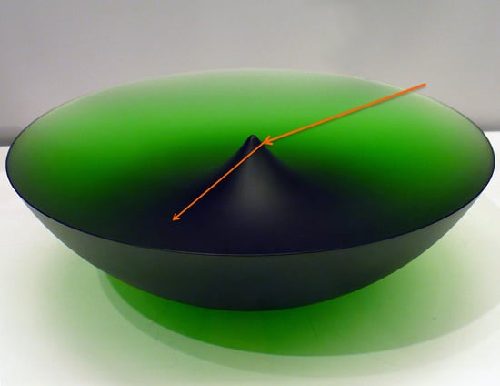
1. Introduction
Colour in glass is an extensive subject and one that I have been researching for many years, with a focus on colours for kiln cast solid glass sculpture. A given form’s appearance can change drastically depending on its colour, and on whether it is transparent, translucent or opaque. Colour decisions are of critical importance to glass artists—they can ‘make or break’ a work. Many glass artists’ approach to choosing colour may be loosely defined as ‘hit and miss’, a method which becomes more reliable as an artist’s experience increases. While glaze testing is an integral part of ceramics methodology, this approach is not always suitable for glass. Although glass artists do employ colour tests, especially when working with frits and powders or designs with multiple colours, to obtain effective test results on how a transparent colour works within a form, one would have to test at full scale, and essentially make a duplicate of the form, the first one being the test. This is labour-intensive and expensive—and if the colour is appropriate, the test becomes the work anyway.
My PhD research (Brachlow 2012) explores the possibilities of colouring glass in a studio environment to achieve specific transparent colour results for given forms. The results, with regards to establishing a generic formula to calculate colour density at a given thickness, were somewhat disappointing: a different formula for each oxide or combination of oxides would be required. Furthermore, colouring larger amounts of glass in a studio environment would require a furnace, which means it is impractical and expensive. This paper draws from and builds on my previous research by exploring the relationship of colour, form and light in relation to commercially available casting glass. What are the factors that influence the appearance of transparent colour in glass? How can a studio glass artist make reliable colour judgements when using a single transparent homogenous colour? Rather than attempting to set up experiments with controlled lighting conditions, this paper attempts to establish general guidelines, using as example coloured glass made by the three companies best known for selling coloured glass for casting in the UK: Banas, Bullseye and Gaffer.
While plenty of literature exists on the subject of surface colour, there is not much to be found about what Joseph Albers defines as “volume colour, which exists and is perceived in 3-dimensional fluid” (Albers [1963] 2006), and I have defined as “the colour of a transparent or translucent 3-dimensional object which is coloured throughout its mass” (Brachlow 2012). Sylvie Vandenhoucke and Max Stewart both explored colouring glass with oxides at casting temperatures in their MPhil and PhD research, respectively, but this approach does not yield transparent glass (Vandenhoucke 2003; Stewart 2010). Scientific manuscripts about colour in glass do of course exist, for example W. A. Weyl’s seminal work Coloured Glasses (Weyl [1951] 1999), but are difficult to understand by a layperson. An investigation into volume colour for artists requires a visual and empirical approach.
2. The Appearance of Colour in Glass
My approach to understanding colour in glass is empirical and iterative: observation of glass objects leads to forming theories, which are then visually confirmed or refuted through observation and evaluation of glass objects. It is important to note that observations are conducted on glass objects rather than photographs thereof, as colours in photographs are seldom true, and specialist lighting is used, which is unsuitable for exhibition or other viewing environments.
Volume colour is a curious subject. By definition, it is 3-dimensional, but it could be argued that the addition of light (and colour does not exist without light) lends a fourth dimension. Take a billet of coloured glass, for example a Bullseye billet, which is a solid cuboid of coloured glass measuring approximately 127 × 254 × 20 mm. How would you evaluate it? You are outside on an overcast day and your billet sits on a white background in front of you. It will appear an even light colour when viewed from the top, much darker along its long side and even darker along its short side. The same is true if you try this in artificial light, only there might be light reflections near the edges, and from certain viewing angles reflections from the uneven base of the billet. Pick it up and slowly lift it to ~20 centimetres above the white background. Your white background, when viewed through the moving billet, will show swirling shadows, caused by the billet’s uneven base, receding into nothing as you lift. The billet is now a much lighter even colour when viewed through the top surface, but shadows and background colours may interfere with an even appearance. The sides of the billet still appear much darker. Now hold it up to the light—the colour appearance will probably be even lighter and diaphanous, and the background will have an impact. The type of light also makes a difference, in the case of shift colours, that is colours that change hue in different types of light, such as Rhubarb, it can make a big difference: from greenish in fluorescent light to reddish in light with a continuous spectrum, such as daylight and incandescent light. Take it outside again and hold it up against the sky—the colour will be different. Again, the background colour has to be taken into account. If the colour appearance in a simple rectangular billet is this difficult to pin down or evaluate, how much harder is it to appraise a more complicated form? And how would one go about this?
C. R. Bamford introduces his volume Colour Generation in Glass with the following paragraph:
The colour of glass is that of the light either reflected or transmitted by the glass. The two colours may be different but are interrelated. Three elements govern the colour of the light transmitted by glass, namely:
- (i)
- (ii)
- (iii)
This is a good starting point, but how does the light interact with the glass? My PhD research identifies a series of factors that influence the appearance of colour in glass objects, here slightly revised:
- colour of glass;
- form of object;
- form and size of object in relation to colour density of glass;
- surface finish of glass;
- intensity of light;
- wavelength of light;
- incident angle of light; and
- refractive index of glass.
Together, these factors (and possibly more that I have not yet taken into consideration) determine the appearance of a transparent object.
2.1. Glass Colouration
A discussion about glass colour affecting an object’s appearance requires an overview of the two main types of glass colouration: ionic colouration and colloidal colouration. In ionic colouration, also called solution colouration, colours are achieved through the addition of transition metals, for example cobalt (Co), chromium (Cr), copper (Cu), manganese (Mn) and iron (Fe). When these colours are melted in an oxidised atmosphere, they are largely unaffected by repeated heat treatments. Colloidal colouration is achieved through precipitation of very small metallic particles within the glass, such as those of gold (Au), copper (Cu) or silver (Ag). These particles develop when glass of suitable composition, which is melted under reducing conditions, is subjected to a secondary or extended heat treatment, which causes the metallic particles to grow and produce colour caused by light absorption of certain wavelengths by the metal nanoparticles. This secondary process of generating colour centres is called ‘striking’. The particle size is critical, between 5 and 60 nm (Weyl [1951] 1999), as larger crystals give rise to reflection and scattering, and can cause a muddy brown colour as well as opacity. A ‘good colour’ (red in the case of gold and copper) is achieved only when particles of a smaller size than one-quarter of a wavelength are obtained, and the colour is caused by absorption, not reflection. If the particles grow considerably larger than the desirable range, for example to 200–500 nm, they scatter and reflect the light, and may cause the glass to appear a considerably different hue in transmitted and reflected light (Figure 1). This can result in a dichroic effect, also referred to as Lycurgus effect after its most famous example, the Lycurgus cup in the British Museum, which appears translucent pink in transmitted light and opaque greenish-yellow in reflected light (Freestone et al. 2007). Stanislav Libenský and Jaroslava Brychtová have used a similar type of dichroic colour in some of their sculptures: safirin appears blue in transmitted and brown in reflected light (Figure 1).
Various different colour effects are labelled dichroic: firstly, certain colloidal colours as described above. Secondly, shift colours, also called polychromatic or photochromic colours, which change in different types of light, such as Bullseye Rhubarb, Light Rhubarb, Neo-Lavender, Lavender Green, Gaffer Rhubarb, Semillon and Sapphire Rose, as well as many of Banas’ glasses. Here, the hue change is caused by narrow absorption bands produced by lanthanides (rare earth oxides) interacting with emission spectra of different light sources. This phenomenon is described in detail by Charles Bellows in his honour thesis (Bellows 2016) (see Supplementary Materials). In the case of neodymium oxide, the hue changes depending on the percentage of colouring agent in the glass as well as depending on the illumination. Thirdly, glasses with metal deposits, mostly on the surface of the glass, which change colour when viewed from different directions. This type is most commonly described as dichroic glass.
2.2. Form of Object
Form of object is intimately connected to light, to optics, and also to colour density of glass. What paths will the light take through a given object? How does this affect its appearance? And, in reverse, how can a form be constructed that shows the possibilities inherent in transparent coloured glass? Many forms created by glass artists are in fact lenses or prisms, at least in part. Rod lenses and spherical lenses are used to direct light into a focal area or focal point. For an artist using cylindrical or round forms, this means that when lit from the curved side, the light will be refracted towards the middle of the object, leaving the circumference to appear darker (Figure 2).
If the same coloured glass is used for a thick and a thin object, the thick object will appear darker. For the purpose of addressing colour appearance in glass, I define thickness as the smallest dimension of an object, the dimension through which light penetrates the most. If there are variations in thickness within the same object, thinner areas will appear lighter, and sometimes differ in hue. Differences in hue happen in some colloidal glasses, such as Gaffer orange red, which ranges from light yellow at extreme thinness to deep red, and in some solution colours containing neodymium oxide, such as the shift colours described above (Figure 3).
If the object has angled planes, like a prism, and thick thin variations, a colour fade and/or shift in hue is relatively easy to achieve unless a very light colour is used. Often, artists employ wedge shapes to achieve a colour fade to almost nothing, for example, Czech artist Pavel Trnka in his spectrum series. Voids or recesses can also be used to achieve highlighted areas, and are an important part of Czech masters’ Stanislav Libensky and Jaroslava Brychtova’s vocabulary of form. When making such forms, the outcome is difficult to predict, and experience does not always help, especially when curves and angles are involved. Libensky and Brychtova’s Green Eye of the Pyramid is a good example: Libensky used to develop forms through drawing, and Brychtova would then use the drawing to render the shape in clay. Figure 4 shows that Libensky’s predictions were not always accurate: he predicted the thickest part of the sculpture to be the darkest part, reaching from the base all the way to the top of the pyramid. When cast in glass, this proved fairly accurate for the lower and upper part of the sculpture, but the ‘eye,’ the lens in the middle, appears brightly lit, as if from within.
2.3. Surface Finish of Glass
Different surface finishes also have a considerable impact on the appearance of an object. A matte surface diffuses the light and the object appears translucent rather than transparent (Figure 5a). Rough matte surfaces obscure the view into the internal space more than fine matte surfaces, and may appear grainy white, unless treated with a sealant or mechanically polished, for example brush-polished with pumice (Figure 5c). A polished surface allows more light to enter the object, and the inner form to become visible, but the polished surface reflects light directly rather than diffusely, which means reflections become visible on the surface (Figure 5b). When one surface is polished and the opposite surface matte and the object is lit through the polished surface and viewed on the matte side, it will appear lighter than the same object with all matte surfaces.
2.4. Light
The wavelength of ambient light has an impact on nearly all transparent colours, with differences in hue ranging from almost imperceptible in the case of some blues and greens to considerable in the case of shift colours. It should be noted that the angle and intensity of ambient light create different effects. When exhibiting an object, lighting options should be taken into account, however these considerations are made after the object is finished and do not normally feed into colour decisions, except in the case of polychromatic glasses, that is, glasses that change in hue in different types of light (Figure 6). In order to exhibit this hue change, considering lighting options is paramount. If two different light sources, for example fluorescent and incandescent, illuminate this glass, both colour variations are visually present at the same time. However, the cause of the different hues is not necessarily obvious to the viewer. I have exhibited polychromatic sculptures with the lighting concealed in the plinth, switching automatically from fluorescent to incandescent and back. Viewers were convinced that the sculpture was lit with different coloured lights. The best way to convey the colour behaviour of such glasses is with both light sources visible, and a switch that can be operated by viewers. However, this is more in line with science demonstrations than art exhibitions.
2.5. Optics
A study of optics in order to gain an understanding of light paths through cubes, lenses, prisms, etc. may be beneficial for artists wanting to explore transparent colour in glass, or indeed form in clear glass. There are many manuscripts on basic optics, for example Leno Pedrotti’s Basic Geometrical Optics (Pedrotti and Roychoudhuri [2000] 2008) (see Supplementary Materials). My own interest in optics began with the desire to solve colour mysteries such as the one posed by Frantisec Vizner’s Bowl with point, on permanent exhibition in the glass collection of the Victoria and Albert Museum. Why is the point dark, even though it is quite thin? The study of optics provides the solution: due to its shape, all light entering the point is refracted down into the base (Figure 7). While I do not actually trace light paths when creating a new form, this developing understanding of optics undoubtedly feeds into my design process.
3. Working with Colour and Form
There are two basic options when working with coloured glass: choosing colour for a specific form or making a form for a predetermined colour. The starting point for most artists is form, and once the form is completed, a colour is chosen. Glass blowers may start with colour (or at least, colour and shape may be more intertwined), as when working with rod, the physical starting point is the colour. But most likely, they have a shape in mind when choosing their colour. In kiln casting, the necessity to choose colour occurs later in the process, after determining form (making or choosing a model) and making a mould.
To understand how to approach the question of achieving a desired colour result, one needs to define the desired result. At the very beginning of my research into volume colour, my primary focus was on obtaining coloured glass that is light enough to achieve an inner glow in artificial light, specifically exhibition lighting, for a cylindrical form with a diameter of 15 cm. Here, the desired result can be defined as “very light, producing an inner glow”. When I first came across this issue, Bullseye Glass did not have many casting colours that were suitable for such thick forms, but they became aware of this issue and have since expanded their range to include lighter colours. While all glass manufacturers provide colour charts, in form of catalogues, posters and on their websites, the difficulties of accurately reproducing colour, especially transparent colour, are well known. Such colour charts can give a general idea, but to make visual colour judgements prior to casting a form, fairly large samples of coloured glass are needed. Both Banas and Bullseye billets are of a good size and shape, but Gaffer billets are less useful due to their compact and rounded shape, which makes them harder to cut and harder to evaluate, as curved surfaces enter the equation. Using Bullseye billets as an example, each billet measures approximately 127 × 254 × 19 mm. To work out if a colour is suitable, a billet can be cut so one of its dimensions matches the thickness of the proposed sculpture, and the light on two or four sides of the sample can be blocked out (depending on the dimensions of the sample in relation to the dimensions of the proposed sculpture), leaving a channel of the desired length to emulate a larger piece of glass. Now a visual colour density judgement can be made by looking through the channel, ideally in different light conditions. This could be daylight and various different types and intensities of electric light. If the sculpture is thicker than a billet’s length, two billets could be glued together or attached with museum gel or similar, in order to reach the desired length. Superimposing—stacking up—chunks of glass does not work in the same way, as light is reflected from each surface, making the overall appearance lighter. Glue, museum gel or even water, all of which have a refractive index greater than air, can, when forming an unbroken layer in between pieces of glass, help simulate one larger piece. Generally, colour samples produced by glass manufacturers are of limited use, because they are too small to give an idea of colour appearance for larger sculptures. With Banas or Bullseye glass, a billet could be cut diagonally to make a wedge, for recurrent use as a colour sample. For each colour judgement, the area of roughly the required length could be masked off; otherwise it is difficult to focus in when looking at a sliding scale, which is what a wedge sample represents.
When evaluating the colour samples I created as part of my PhD research (Brachlow 2012), the area which holds the most interest for me is where the difference in value between thick and thin sections is the greatest, where the colour result hovers around a tipping point or density threshold (Figure 8, highlighted areas).
The tipping point can only be reached in glasses with certain colour saturation. If the colour is too light, it very gradually darkens as the thickness increases. Witness Roni Horn’s very large, lightly coloured glass cylinders and cubes—glass with such little colour density will never reach a tipping point. Also, certain colours do not exhibit a defined density threshold, for example Neodymium purple (Figure 8b). During the last decade, my desired results have been centred around this tipping point or density threshold, and could be defined as ‘exhibiting considerable shifts in colour value and/or hue between thick and thin areas’. When working within this territory, objects will have light and dark areas, as if the artist had employed different coloured glasses ranging from dark to light within the same hue, or differing in hue as well as in value, in case of shift colours and some reds and greens. To explore this tipping point, a specific type of form is needed, a form with variations in the thickness of the glass. Depending on the type of coloured glass, these variations might be as little as a few millimetres to much larger. Much of Libensky and Brychtova’s work is hovering around this tipping point, which is likely part of the secret to their success. Good contemporary examples are ceramic artist Ashraf Hanna’s glass sculptures. When he decided to make works in glass, his forms were designed to explore colour density in various different ways within the same work: the basic form is a wedge, tapering from thick to thin. Out of the wedge protrudes the anecdotal body of a vessel, in the middle of which, through exchange of positive and negative shape, a hemispherical cavity tapers from fairly thick around the sides to almost nothing in the middle. The back surface is polished, which means more light will enter the form, especially when lit from behind (Figure 9b).
With little experience in evaluating volume colour, having worked with glass for only a short time, Hanna both sought advice and applied the insights gained from his previous sculptures, the Ripple Series (Figure 9a), low bowl shapes sitting on a surface, which prevents the light from transmitting through the 11 centimetre thickness of the glass. The 33 and 31 centimetre length and width are too thick in relation to the colour density of the glass for much light to transmit. These sculptures appear much lighter in an upright position, but their design does not allow for such a display, therefore Hanna changed the orientation in his subsequent forms.
When choosing coloured glass for such a form, the same method as for uniformly thick shapes applies: one or more billet(s) can be cut into several pieces, with each one matching, in one of its dimensions, one of the various thicknesses of the proposed sculpture, then the light on two or four sides of each sample can be blocked out to emulate a larger piece of glass and visual colour density judgements can be made, taking into account the rounded shape of the protruding vessel body. This method is not possible with strikers, that is, glass which develops its colour during the firing. With Bullseye red strikers, the billet needs to be pre-fired to develop its colour before such an experiment is possible. With some other strikers, for example opalines, pre-evaluating the colour is not possible at all as the final appearance depends on the exact firing cycle. Red strikers are often very dark and intense colours, which works very well for small and thin forms and can be dramatically effective for forms with considerable thick thin variations (Figure 10).
4. Concluding Remarks
Evaluating and using coloured glass in such a fashion can compensate for an artist’s lack of experience in the use of volume colour, and ensure better control over colour in transparent solid objects. While the methods described above may give a rough idea of colour value, there are many considerations that determine the appearance of a given colour in a given shape. What path does the light take through the shape? Is the shape rounded, will it appear darker in its circumference? What is the proposed surface finish? Thinking about glass sculpture in terms of glass colouration, form of object, surface finish, impact of light, optical principles, etc. may promote a better understanding of the relationship between colour, form and light and open up new and exciting creative possibilities. Working in the density threshold or tipping point area in coloured glass remains my personal challenge. How does one design a form which takes full advantage of the possibilities offered by the density threshold? Ashraf Hanna’s work is particularly successful in using this phenomenon, utilising spherical protrusions which trap the light, set within larger wedge shapes. Libenský and Brychtová’s forms use sharp angles, geometric apertures and very thin sections set within a larger, thicker shape. In my own current work, curves taper from thick to thin, dark to light, in a more subtle approach. There are many possibilities within the extensive range of variables provided by form, texture, colour and light still to be explored.
Supplementary Materials
The supplementary materials are available to download here: http://spie.org/publications/fundamentals-of-photonics-modules, https://aura.alfred.edu/handle/10829/7232.
Funding
This research received no external funding.
Conflicts of Interest
The author declares no conflict of interest.
References
- Albers, Josef. 2006. Interaction of Color. New Haven and London: Yale University Press, pp. 45–46. ISBN 978-0-300-11595-6. First published 1963. [Google Scholar]
- Bamford, C. R. 1977. Colour Control and Generation in Glass. Amsterdam: Elsevier Scientific Publishing Company, vol. 2, pp. 1–2. ISBN 0-444-41614-5. [Google Scholar]
- Bellows, Charles H. 2016. Photochromism in Rare Earth Oxide Glasses. Bachelor’s Thesis, Alfred University, Alfred, NY, USA; pp. 12–18. [Google Scholar]
- Brachlow, Heike. 2012. Shaping Colour: Density, Light and Form in Solid Glass Sculpture. Ph.D. Thesis, Royal College of Art, London, UK. [Google Scholar]
- Freestone, Ian, Nigel Meeks, Margaret Sax, and Catherine Higgitt. 2007. The Lycurgus Cup—A Roman Nanotechnology. Gold Bulletin. The Journal of Gold Technology, Science and Applications. 40: 270–77. [Google Scholar] [CrossRef]
- Pedrotti, Leno S., and Chandrasekhar Roychoudhuri, eds. 2008. Basic Geometrical Optics. In Fundamentals of Photonics. Connecticut: University of Connecticut, Chapter 3. ISBN 9781628412710. First published 2000. [Google Scholar]
- Stewart, Max. 2010. The Sense of My Screaming Skin. An investigation into the colouring process of Amalric Walter (1870–1959) using metallic salts in pâtes-de-verre. Ph.D. Thesis, University of Edinburgh, Edinburgh, UK. [Google Scholar]
- Vandenhoucke, Sylvie. 2003. Glass Towards and Inner Space: On Introducing Metallic Oxides in pate de verre. M. Phil Thesis, Royal College of Art, London, UK. [Google Scholar]
- Weyl, Woldemar A. 1999. Coloured Glasses. Sheffield: Society of Glass Technology, ISBN 0-900682-06-X. First published 1951. [Google Scholar]
Figure 1.
Stanislav Libenský and Jaroslava Brychtová, Silhouettes of the Town III, 1989. Photographs by the author. (a) In transmitted light. (b) In reflected light.
Figure 1.
Stanislav Libenský and Jaroslava Brychtová, Silhouettes of the Town III, 1989. Photographs by the author. (a) In transmitted light. (b) In reflected light.

Figure 2.
Appearance of rounded forms. (a) Heike Brachlow, Mirrormovement, 2006, cast glass, dimensions 33.5 × 16.5 × 16.5 cm; 30.5 × 16.5 × 16.5 cm. Photograph by Sylvain Deleu, courtesy of the artist. (b) Bruno Romanelli, Caliban, 2018, cast glass, 24 × 25 × 25 cm. Photograph by Andy Smart at AC Cooper, courtesy of the artist.

Figure 3.
Bullseye 1844 Lavender Green shift glass showing a change in hue. (a) Heike Brachlow, Equinox I, 2011, cast glass, stainless steel, lead, dimensions 70 × 42 × 13 cm, photograph by Roger Lee, courtesy of the artist. (b) Ashraf Hanna, Lavender Green Form, cast glass, dimensions 38 × 35 × 9 cm, photograph by Ester Segarra, courtesy of the artist.

Figure 4.
Prediction and reality. Photographs by the author. (a) Stanislav Libensky, design drawing for Green Eye of the Pyramid. (b) Stanislav Libensky and Jaroslava Brychtova, Green Eye of the Pyramid, 1993–2009, cast glass. (c) Stanislav Libensky and Jaroslava Brychtova, side view of Green Eye of the Pyramid, 1993–2009, cast glass.

Figure 5.
Surface finish of glass. (a) Heike Brachlow, Apophasis 2016, cast glass, fine matte surface, 30 × 31 × 27 cm, photograph by Ester Segarra, courtesy of the artist. (b) Heike Brachlow, Nimbus, 2018, cast glass, one surface polished, 36 × 38 × 31 cm, photograph by Ester Segarra, courtesy of the artist. (c) Richard Whiteley, Light cone, 2013, cast glass, 33.5 × 33.5 × 13 cm, rough sawn and sealed surface. Photograph by Greg Piper, courtesy of the artist.

Figure 6.
Heike Brachlow, Theme and Variations I, 2009. Line blend, Bullseye glass doped with neodymium, cerium, and titanium oxides in the ratio 2:1:1. Photographed in incandescent (top) and fluorescent light by Ester Segarra, courtesy of the artist.
Figure 6.
Heike Brachlow, Theme and Variations I, 2009. Line blend, Bullseye glass doped with neodymium, cerium, and titanium oxides in the ratio 2:1:1. Photographed in incandescent (top) and fluorescent light by Ester Segarra, courtesy of the artist.

Figure 7.
Frantisec Vizner, Bowl, cut and sandblasted. 1984, with approximated light paths superimposed. Photographs by the author.
Figure 7.
Frantisec Vizner, Bowl, cut and sandblasted. 1984, with approximated light paths superimposed. Photographs by the author.

Figure 8.
Heike Brachlow, Line blends, cast glass, with tipping point highlighted. Photographs by Ester Segarra, courtesy of the artist. (a) Cobalt oxide: 0.00025–0.01%; copper oxide: 0.01–2%; chromium oxide: 0.01–0.5%. (b) Nickel oxide: 0.0025–0.1%; red iron oxide Fe2O3: 0.1–3%; and neodymium oxide (3 cm): 0.25–15%.

Figure 9.
Ashraf Hanna. Photographs by Ester Segarra, courtesy of the artist. (a) Ripple Series, Blue Bowl Form, cast glass, dimensions 11 × 33 × 31 cm. (b) Blue Vessel Form, 2014, cast glass, dimensions 32 × 48 × 10 cm.
Figure 9.
Ashraf Hanna. Photographs by Ester Segarra, courtesy of the artist. (a) Ripple Series, Blue Bowl Form, cast glass, dimensions 11 × 33 × 31 cm. (b) Blue Vessel Form, 2014, cast glass, dimensions 32 × 48 × 10 cm.

Figure 10.
Bullseye 1931-65 Ruby Pink Striker. Photographs by Ester Segarra, courtesy of the artist. (a) Heike Brachlow, Perihelion 2018, cast glass, 39 × 55 × 43 cm. (b) Heike Brachlow, Samoon 2018, cast glass, 34.5 × 35 × 32 cm.
Figure 10.
Bullseye 1931-65 Ruby Pink Striker. Photographs by Ester Segarra, courtesy of the artist. (a) Heike Brachlow, Perihelion 2018, cast glass, 39 × 55 × 43 cm. (b) Heike Brachlow, Samoon 2018, cast glass, 34.5 × 35 × 32 cm.

© 2019 by the author. Licensee MDPI, Basel, Switzerland. This article is an open access article distributed under the terms and conditions of the Creative Commons Attribution (CC BY) license (http://creativecommons.org/licenses/by/4.0/).
Share and Cite
MDPI and ACS Style
Brachlow, H. An Empirical Approach to Colour in Glass. Arts 2019, 8, 15. https://doi.org/10.3390/arts8010015
AMA Style
Brachlow H. An Empirical Approach to Colour in Glass. Arts. 2019; 8(1):15. https://doi.org/10.3390/arts8010015
Chicago/Turabian StyleBrachlow, Heike. 2019. "An Empirical Approach to Colour in Glass" Arts 8, no. 1: 15. https://doi.org/10.3390/arts8010015
Note that from the first issue of 2016, this journal uses article numbers instead of page numbers. See further details here.