Article

The “Geometry” of Matyushin’s Color Triads: Mapping Color Combinations from the Reference Book of Color in CIELAB

Sociology and Philosophy, Smolensk State University, Smolensk 214000, Russia
Arts 2022, 11(6), 125; https://doi.org/10.3390/arts11060125
Submission received: 24 July 2022 / Revised: 27 November 2022 / Accepted: 9 December 2022 / Published: 12 December 2022
(This article belongs to the Section Visual Arts)

Abstract

:
This study analyzes the color combinations composed by the Russian avant-garde artist Mikhail Matyushin and his disciples for the Reference Book of Color (1932), summarizing their experimental research on the psychophysiology of color perception. Having extracted 90 colors from the 34 hand-painted charts of the book’s first edition, we mapped these colors into CIELAB and CIELCh color space to identify their chromatic characteristics (hue, lightness, and chroma) and their combination criteria. We demonstrate graphically that each of Matyushin’s color triads has a similar “geometry” in CIELAB color space and on the color circle, with the “intermediary” color much closer to the environment background color than to the main color. We conclude that the revealed patterns of these relationships are identical in all four sections of the Reference Book and reflect underlying principles of Mathyshin’s theory of color as well as fundamental aspects of human perception. The analysis presented in this paper will facilitate opportunities for artists, architects, designers, and other color professionals to use Matyushin’s original color charts and incorporate Matyushin’s style in creating their own triads.

1. Introduction

Throughout the first third of the 20th century, a key feature of the Russian avant-garde was innovative experimentation with color (see e.g., Barron and Tuchman 1980; Kampasakali et al. 2007; Ioffe and White 2012; Bowlt 2017). The most intensive research on color was conducted at the State Institute of Artistic Culture (GINKhUK) under the initiative and guidance of Mikhail Matyushin (1861–1934), a charismatic personality who entered the history of the arts as a painter, composer, art, and music critic, teacher, and experimental researcher in the psychophysiology of art perception. In 1924, Matyushin was appointed in GINKhUK to direct the Department of Organic Culture (Gamwell 2002). Under his expert guidance, Matyushin’s disciples formed two different working groups, Zorved and KORN (see e.g., Zhadova 2007; Cannon 2009).
The group Zorved, whose name combined zorkost (acute vision) and vedaniye (knowledge), was created in April 1923 to study the relationship between color, shape, and sound. Regular members of this group included Nikolay Greenberg and the following four talented Ender siblings: Boris, Georgy, Maria, and Xenia.
The other group, KORN, whose name originated as an acronym for Koллeктив pacшиpeннoгo нaблюдeния (Kollektiv rasshirennogo nablyudeniya), or Collective of Expanded Observation, included Elizaveta Astafieva, Vera Besperstova, Irina Walter, Olga Vaulina, Valida Delacroix, Nikolai Kostrov, Evgenia Magaril, and Elena Khmelevskaya.
In the GINKhUK laboratory, Matyushin and his disciples conducted numerous psychophysiological experiments with color, focusing on changes in colored objects’ chromatic characteristics under the influence of various factors in their spatial environment. The researchers studied how motion, angles of view, and shape affect chromatic characteristics (see for more details: Kapelush 1976; Povelikhina 1975/76, 1999a; Nesmelov 2007; Tillberg 2002, 2003, 2013; Matyushin 2011; Wünsche 2012).
Most of these experiments were organized in real space with large objects. For example, a 6 × 6 m color screen and a 60 cm diameter swinging circle facilitated the study of motion’s impact on color change patterns. A colored pendulum was set in motion with an oscillation amplitude of 5 m. The experimenters observed the pendulum’s color in the following different ways: first by concentrating their eyes on the moving circle, then by focusing on the background screen. Observations of shifts in color perception were carefully recorded. The experiment was repeated over and over again, incorporating different colors for the pendulum and screen (see for more details: Nesmelov 2007, pp. 23–24).
To analyze changes in color perception depending on the angle of view, painted circles were suspended in different positions relative to the observer as follows: directly at eye level at a distance of 4–5 m, or on both sides of the head at a distance of 2 or 6 m from each other. The researchers studied how the position of the object affected the perceptual characteristics of color and how these sensations changed over time (Nesmelov 2007, pp. 23, 25).
Constant observations of color changes in nature and their experimental testing in the GINKhUK laboratory led Matyushin to a number of conclusions about some general patterns governing color variability. In particular, the researchers inferred that color plays an important form-building role as follows: warm colors “soften” sharp forms, whereas cold colors, on the contrary, can sharpen rounded edges. Color changes correlate with expansions in the angle of view, as well as with the dynamics of motion. Most importantly, the researchers became convinced that between a colored object and the surrounding environment a third, linking color always appears.
The main outcome of the experimental research by Matyushin and members of the groups Zorved and KORN was the treatise A Reference Book of Color: The Laws Governing the Variability of Color Combinations, first published in Leningrad in 1932 and republished in 2007 (Matyushin [1932] 2007). The book addressed the practical use of color in interior and exterior architectural design, textile, porcelain, wallpaper, printing, and other industries, and consisted of four sections with color charts, as well as a large article entitled “The Law of the Variability of Color Combinations.” In this article, Matyushin attempted for the first time to introduce the ideas that later formed the basis of his color theory. The key idea concerned the relativity of colors in their interaction in combinations. Matyushin viewed color as a complex, fluid phenomenon, dependent on variables such as neighboring colors, the strength of illumination, and the scale of color fields. He made an appeal for considering color as possessing dynamic visual properties in space and time.
One of color theory’s main concepts relates to “expanded vision” (see, e.g., Povelikhina 1999a, p. 49). Matyushin used this term to denote the ability to see not only details but also to encompass everything observed at once and in its entirety. He was convinced that a person’s ability to “widen the angle of vision” could gradually develop as a habit of “seeing everything at once, fully and all around oneself,” bolstered by special exercises similar to conventional gymnastics. He even claimed that by using all possible channels of perception, one can “learn to see with the back of the head, the parietal lobe, the temples and even the soles of the feet, just as Yoga in Hinduism teaches us to breathe not only with the lungs but with all parts of the body” (Matyushin 1976, pp. 185–86).
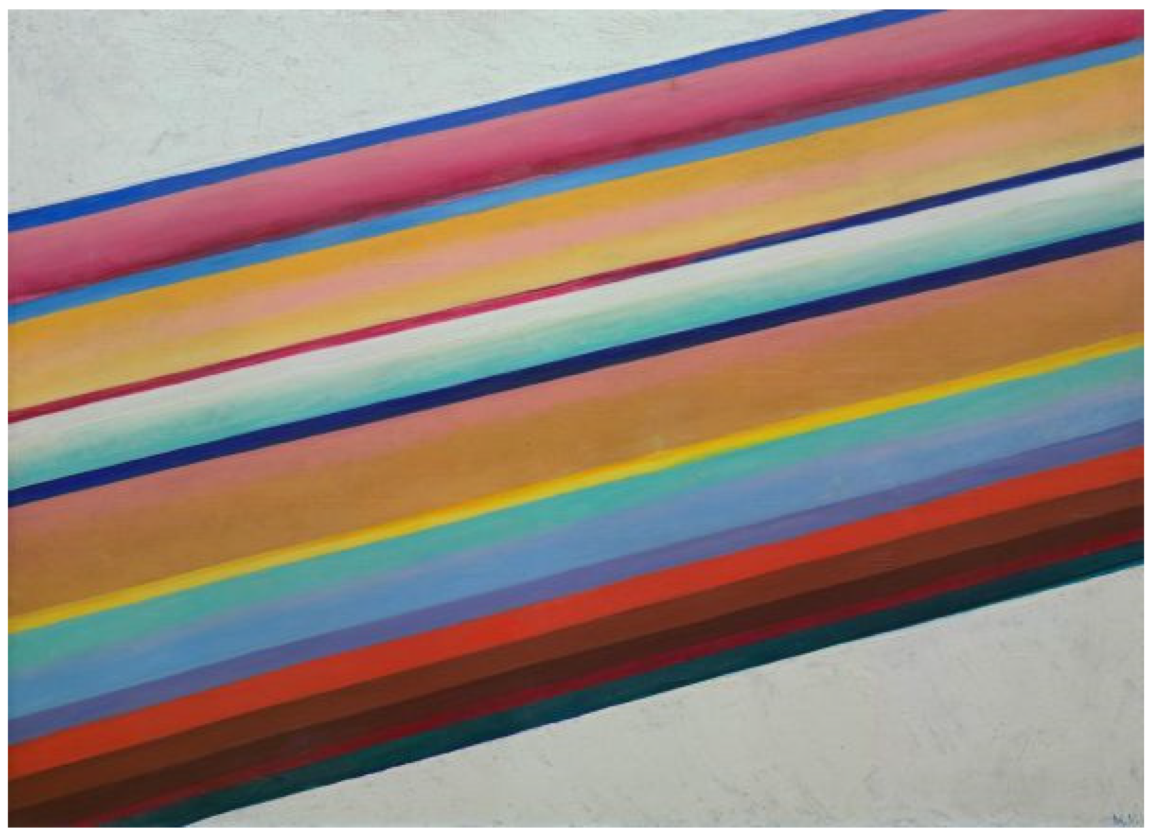
As scholars of Matyushin’s life and work rightly observe, his work Movement in Space, painted in 1921 (Figure 1), can be seen as a kind of epigraph to the Reference Book of Color. Like the book, the large canvas embodies an inquiry into the interaction of color and the environment. The canvas represents the intrinsic aesthetic significance of color by means of forcefully extended diagonal multicolored lines, rendered with carefully chosen variations of lightness and chroma of red, orange, yellow, yellow-green, blue, light blue, and purple. The artist demonstrates that color in art has an “independent life and movement” (Matyushin 1915/16, p. 5), as well as that color perception is not static but kinetic and fast-paced, depending on space, environment, and time. The painting inevitably leaves the viewer with a sense of each color being influenced by neighboring colors, their size, and their location (Cannon 2009, pp. 71–72). Moreover, this perception varies depending on the degree of illumination and the angle of view as follows: colors are perceived differently depending on whether the viewer uses central, “expanded,” or peripheral vision (Matyushin 1976).
The authors considered the Reference Book of Color “a first step in determining the regularity of color relations” (Matyushin [1932] 2007, p. 15). They saw the book as primarily aiming to establish the “connection between the conceptual color in science and the material color in practice” (Matyushin [1932] 2007, p. 28). Conclusions about color variability presented in the Reference Book stemmed naturally from Matyushin’s and his disciples’ art education, from their experience of using color in artistic practice, and, most importantly, from many years of everyday observations of color variability in both laboratory conditions and natural environments. The development of Matyushin’s color theory remained incomplete. However, his understanding of color abounds with original and innovative ideas that have not lost their relevance to this day. Matyushin’s theory represents an important point in the history of color design and undoubtedly deserves serious attention and detailed research.
Several authors have carefully studied the Reference Book of Color. They have explained the genesis of the artist’s ideas (Kapelush 1976; Cahn 1995; Zhadova 2007; Wünsche 2015); documented these ideas’ connection to the theories of his predecessors and contemporaries (Povelikhina 1975/76, 1999b; Douglas 1986; Galeyev 2005; Wünsche 2012); explored Matyushin‘s “color vision” through his color charts in connection with his philosophy and worldview, as well as with the external circumstances under which it emerged in Stalin‘s Russia (Tillberg 2002, 2003, 2011, 2013). To date, however, the color combinations presented in the Reference Book have not yet received sufficient analysis from the point of view of the perceptual characteristics of colors (their hue, chroma, and lightness) and their combination criteria.
The purpose of this study is to fill this gap and to analyze Matyushin’s color combinations in the Reference Book of Color in CIELAB color space in order to obtain quantitative indicators of the variability of their chromatic characteristics and to visualize their correlations on the color circle.

2. Materials

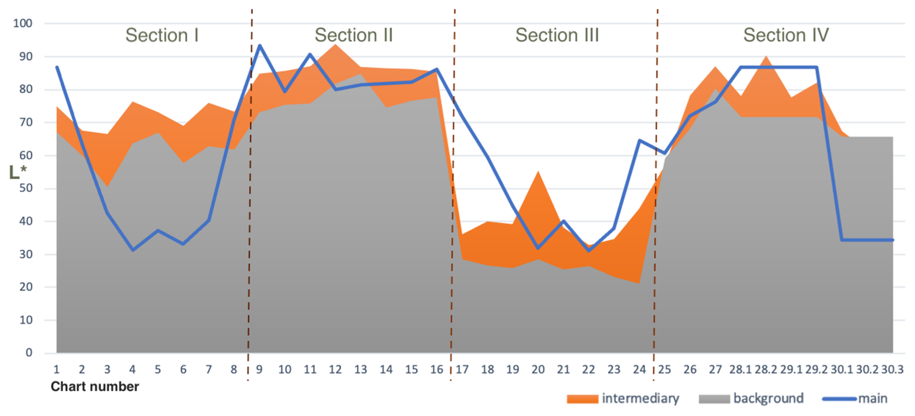
In this study, we focus on the 34 color charts included in the first edition of the Reference Book of Color. The charts were intended to illustrate the laws governing the variability of color combinations described in the book. Like Matyushin’s color science in general, the charts were based on observations and experiments studying the psychophysiological factors of color perception and human color vision processes under different conditions.
In the original publication, the charts comprise four series (sections) of cardboard sheets (pages) sequentially glued together. Each of the first three sections contains eight color charts. The last, the fourth, includes ten more.
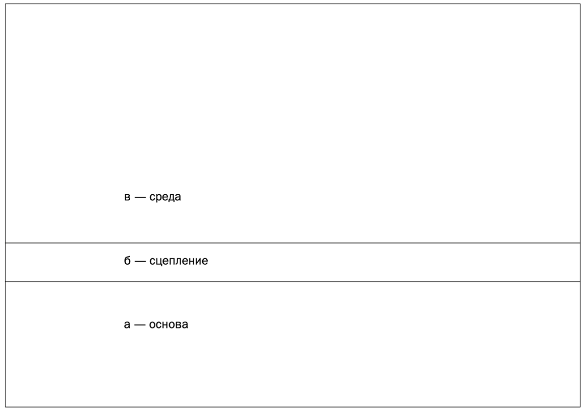
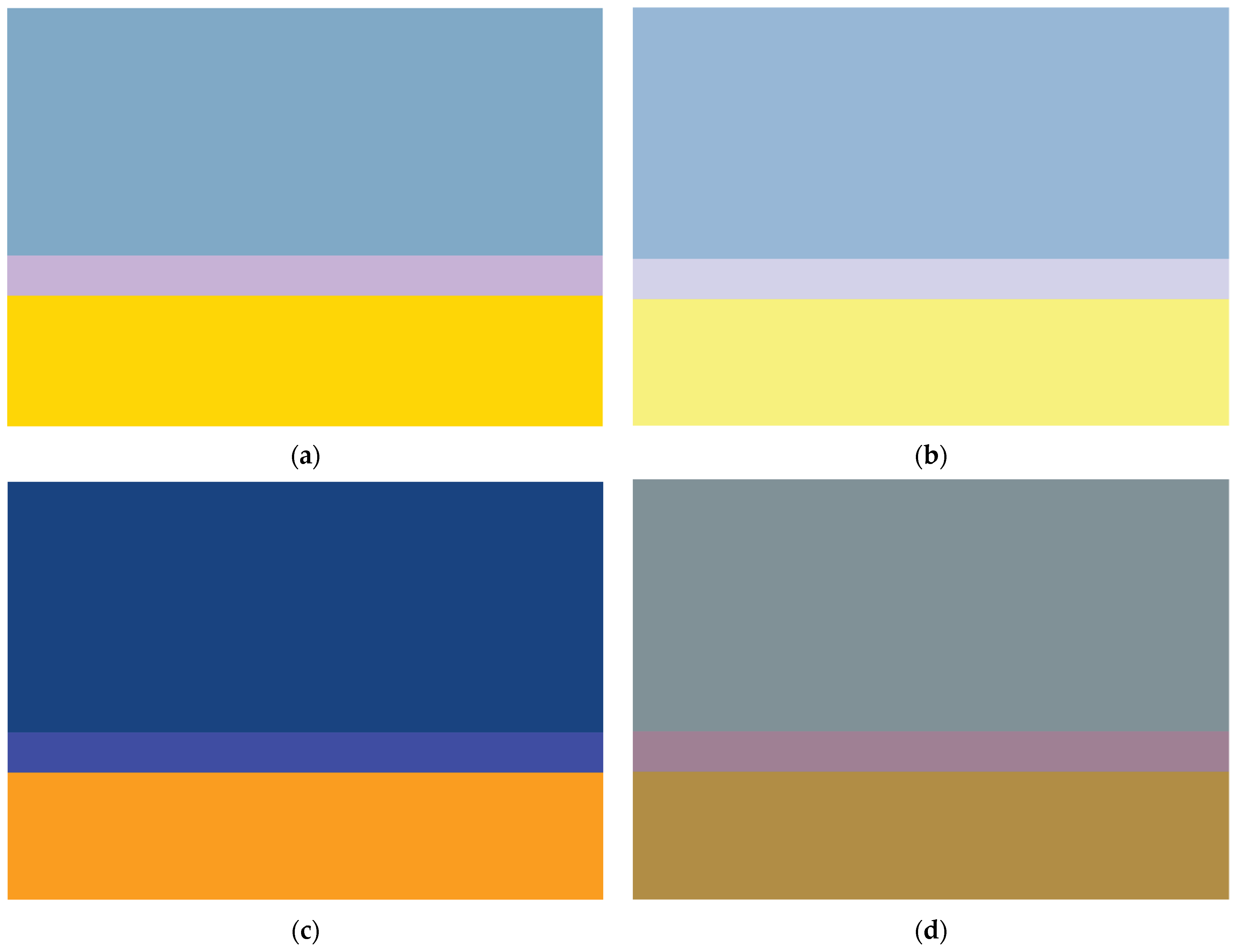
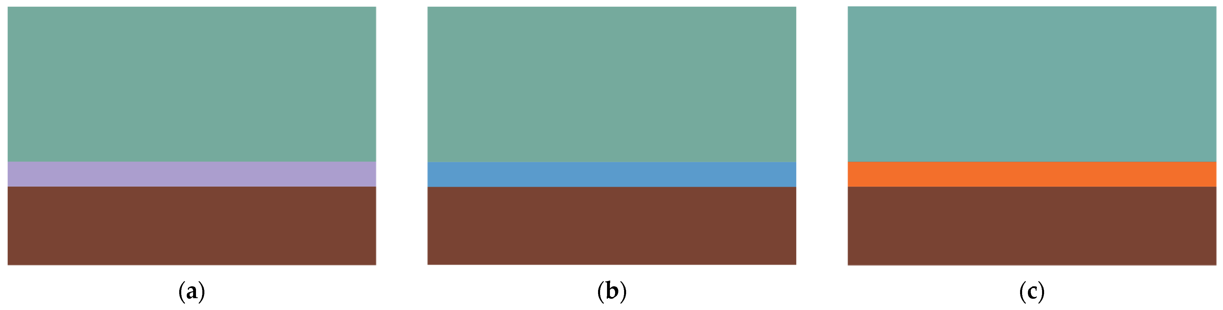
All the charts in the Reference Book have the same structure. Each of them is a set of the following three colors (a “color triad” or “color chord”) (Zhadova 2007, p. 10):
(1)
The environmental background color;
(2)
The “intermediary” linking color;
(3)
The main active color (Figure 2).
These three groups of colors have different spatial functions.
The main active color is the color of the object. Under laboratory conditions this is the color of the body being observed, whose changes Matyushin and his disciples studied in their experiments (see, e.g., Nesmelov 2007, pp. 23–25). For example, a colored pendulum was swung from side to side to study color perception in motion. Or large colored cardboard circles were suspended at different distances from the observer in order to understand how color perception changes depending on the angle of view (see Introduction). However, in a broader sense, main colors might derive from any objects in a given environment—large details of interior and exterior architectural decorations, patterns on porcelain and wallpaper, or designs in textiles and print art.
The dependent environmental background color is the color that necessarily exists around the object’s color in a neutral environment, always accompanying it. This natural accompanying color supports the object’s color and significantly affects its expressiveness.
The “intermediary” color has a special role in the color chord. Its function is to link the object’s color with the environment, to create and maintain balance between them, without violating the spatial expressiveness of the main color as the leading one in a given composition.
The “quantity” of each color also plays an important role in the color charts’ structure. The charts’ bands of color samples have a height ratio of 3:1:6. That is, the background color occupies twice as much area as the main color and six times as much as the intermediary color of the middle stripe. The main color band is three times larger than that of the intermediary color. However, in his comments on the color charts, Matyushin explains that in real life and artistic practice it is not necessary to observe such a strict proportion in order to obtain a harmonious color combination. Most importantly, what is viewed as a background color should have the largest area, while the linking color should have the smallest one. Much more essential than quantitative ratios is the suggested sequence in space, i.e., the “intermediary” color should always be located between the main and the background colors (Matyushin [1932] 2007, p. 33).
The charts were hand-painted with gouache by a group of young artists, Matyushin’s students, a year before the book’s publication. The team of artists included Irina Walter, Olga Vaulina, Sofia Vlasyuk, Valida Delacroix, Tatiana Sysoeva, and Elena Khmelevskaya (Zhadova 2007, p. 7).
This manual manufacturing method of a significant part of the book explains the first edition’s limited circulation as follows: two years before Matyushin’s death, the State Publishing House of Fine Arts in Leningrad released only 425 copies of the Reference Book (Kapelush 1976, p. 11). Many of these books have survived in state collections in St. Petersburg and in private archives in St. Petersburg and Moscow and were available for our study.

3. Methods

For a quantitative analysis of chromatic characteristics, we measured all the colors of the Reference Book’s original hand-painted charts using a Konica Minolta CM 700d portable spectrophotometer (Konica Minolta Sensing Europe B.V., Nieuwegein, The Netherlands) with an 8 mm diameter aperture under D65 standard illuminant and 10° angle observer. The color coordinates were recorded in the 360–740 nm range with 10 nm spectral resolution and converted into CIELAB notation.
The CIELAB system is an internationally recognized color space that enables the description of any perceived color as three values (see e.g., Luo 2015b). Two of these values represent chromaticity. The a* axis correlates to the opponent red-green colors, and the b* axis to the opponent blue-to-yellow color scale. The chromaticity coordinates (a* and b*) can take positive and negative values. If a* is positive, the color has a “reddish” hue; if negative, it is “greenish”. With a positive value of b*, the color is located in the yellow area of the color space, and with a negative value, in the blue area. The third coordinate is lightness (L*), with values varying from 0 (black) to 100 (white).
To calculate the distance between two colors in three-dimensional color space, we used the following color difference metric:
CIEDE2000 (∆E*00)
(see e.g., Sharma et al. 2005; Luo 2015a).
To facilitate visualization of each color within the CIELAB spherical color space, we transformed it into cylindrical coordinates to provide values for CIE hue (h*) and chroma (C*), or CIECh, as follows:
ab = arctan(b*/a*)
C* = √ (a*2 + b*2)
To quantify differences in perceived lightness (∆L*), chroma (∆C*), and hue (∆h*), we used the following Formulas (4)–(6):
∆L* = L*1 − L*2
∆C* = C*1 − C*2
∆h* = h*1 − h*2
For computing the triangles’ angles in CIELAB color space we used the following cosine Formulas (7)–(9):
α = arccos (b2 + c2 − a2)/2bc
β = arccos (a2 + c2 − b2)/2ac
γ = arccos (a2 + b2 − c2)/2ab,
where a, b, and c are color distances ∆E*00 between the main, intermediary, and background colors.
To assess the relationship between hue angles of the main, intermediary, and background colors we used the following circular correlation coefficient pcc (Jammalamadaka and SenGupta 2001, p. 176; Berens 2009, p. 15) (10):
ρ c c = i sin ( α i α ¯ ) sin ( β i β ¯ ) i sin 2 ( α i α ¯ ) sin 2 ( β i β ¯ ) ,
where α and β denote two samples of angular data and α ¯ the angular mean.
Since the authors of the Reference Book of Color did not offer any color names for the selected colors (all of them were simply numbered in the tables), we “translated” them into a natural language in order to analyze their subjective perception. For this purpose, we correlated the color notations in the CIELAB color space with a database of color names from an open psycholinguistic experiment with native Russian speakers (for more details see: Griber et al. 2018; Paramei et al. 2018; Griber et al. 2021).

4. Data Analysis

The colors extracted from the Reference Book of Color were analyzed as follows: we
(1)
Identified the patterns of variability in hue (h) and chroma (C) of all the color samples in the main active colors (Section 5.1), environmental background colors (Section 5.2), and “intermediary” colors (Section 5.3) in the book’s charts;
(2)
Determined correlations of the chromatic characteristics of the colors from the three groups in each of the book’s four sections (Section 5.4 and Section 5.5);
(3)
Visually projected all the color triads into the CIELCh color circle (Section 5.6) and CIELAB color space (Section 5.7) to analyze their “geometric” properties.

5. Results

5.1. Main Active Colors

Altogether, the 34 charts of the Reference Book of Color contain color combinations in 102 color bands of different widths. However, since a number of the same colors repeat in different triads, the four sections of the Reference Book present a total of 90 color samples with different chromatic characteristics.
Section I contain eight main colors (Table 1):
(1)
Red (vermilion);
(2)
Orange (orange chrome);
(3)
Yellow (yellow chrome);
(4)
Yellow-green (a mixture of chrome and azurite);
(5)
Green (also a mixture of chrome and azurite, but with relatively more azurite);
(6)
Light blue (azurite);
(7)
Blue (light ultramarine);
(8)
Purple (aniline).
Sections II and III also contain eight primary colors each. All of them are derived from the main colors of Section I. In Section II (Matyushin [1932] 2007, pp. 9–17), the main color is produced by moving the eyes from an observed surface, painted in the main color of Section I, to a neutral screen (Figure 3b). In Section 3 (Matyushin [1932] 2007, pp. 17–24), the main color is produced by closing the eyes after observing the object for at least several minutes (Figure 3c).
The main colors of Section IV (Matyushin [1932] 2007, pp. 25–30) represent the shades typical of the existing practice of architectural design in Russia at that time. Since the Reference Book was intended primarily for practical use, the authors tried to bring the colors in this section as close as possible to the low-chroma tones obtainable from the limited number of cheap pigments used at that time to paint the façades of buildings (Zhadova 2007, p. 11). As a result, with yellow ochre (chart 25), light umber (charts 26 and 27), light ochre (charts 28 and 29), and burnt umber (chart 30) serving as main colors, the chromatic characteristics covered in this section differ significantly from those in the first three sections (Figure 3d).
As for hue, the main colors of the first three sections are fairly evenly distributed across the four quadrants of the color circle. Seven of them lie in the range between red and yellow (26.74 ≤ h° ≤ 71.83), six each fall between yellow and green (103.89 ≤ h° ≤ 149.89) and between green and blue (186.20 ≤ h° ≤ 265.14), and another five are situated between blue and red (281.31≤ h° ≤ 322.72). Warm colors (greens, yellows, oranges, and reds) have greater chroma than cold ones (blue-greens, blues, and purples) (Figure 4).
The colors of Sections II and III in the CIELLAB color space have three patterns of “shift” from the main colors of Section I (Figure 5 circle). The warm colors (red, orange, and yellow) have lower chroma values in Section II (Figure 5 square), and in Section III (Figure 5 diamond), they become “redder”. In both sections, light blue, blue, and purple have lower chroma and brightness. Moreover, in both sections, yellow-green and green become warmer and lighter.
The 10 color charts in Section IV include only five main colors (Table 1, Figure 6). All these colors represent different lightnesses (34.47 ≤ L ≤ 86.78) of red-brown shades with low chromaticity (8.93 ≤ C ≤ 36.92), three of which (charts 25, 27, and 28) almost completely coincide in hue (84.28 ≤ h° ≤ 85.39), while two others (charts 26 and 30) fall within the color circle’s 30-degree arc between red and yellow (44.73 ≤ h° ≤ 77.74).

5.2. Environmental Background Colors

Matyushin considered the environmental background color “dependent” on the main active color (Table 2). At the same time, the background color area in each of his book’s color charts is twice as large as that of the main color. His own experiments convinced him that a background color necessarily changes around an active main color in a neutral environment (Matyushin [1932] 2007, p. 9). According to its chromatic characteristics, the background color moves towards a “complementary, not strongly pronounced color,” which the main color “generates” as a result of dynamic contrast (Matyushin [1932] 2007, p. 10).
Since the charts’ environmental background colors in most cases complement the charts’ main active colors, the background colors similarly translate into an even distribution across four quadrants of a color circle (Figure 7). Seven of them fall in a range from red to yellow (31.66 ≤ h° ≤ 84.47), six range between yellow and green (90.66 ≤ h° ≤ 173.41) and green and blue (224.03 ≤ h° ≤ 263.21), and another five range between blue and red (283.73 ≤ h° ≤ 335.23).
On a color circle, the environmental background colors map as opposite or almost opposite their corresponding main active colors (cf. Figure 4 and Figure 7). The average hue difference between the main and the background color is 173.03° (min = 114.90°, max = 212.61°). All environmental background colors have low chroma (7.40 ≤ C ≤ 43.30), on average not exceeding 20.76.
Section IV’s environmental background colors are predominantly light (mean L = 69.52) with low chroma (mean C = 10.05). Two of these colors (charts 27 and 30) are located on the color circle between green and yellow (h° = 112.56 and 175.45, respectively), while the other four (charts 25, 26, 28, and 29) fall within the 20° arc in the range between blue and green (215.71 ≤ h° ≤ 239.97) (Figure 8).

5.3. “Intermediary” Colors

In the structure of a color chord, a third color, which Matyushin calls “intermediary” or “linking” (Matyushin [1932] 2007, pp. 31–32), plays a preeminent role. Placed between the fields of surrounding colors, this smaller color field functions as a bridge between two contrasting colors. The intermediary color enables bonding any colors together, uniting and balancing them. Moreover, according to Matyushin (Matyushin [1932] 2007, pp. 30, 32, 33), it can solve various additional tasks—e.g., strengthening brightness, purity, depth, and transparency (Table 3).
Among the intermediary colors, blue and violet hues predominate (Figure 9). Almost two-thirds of the colors in this group (14 out of 24) are located in the lower quadrants of the color circle and have h° values ranging from 216.06 to 321.59. The colors of this group have different chroma. Green and purple intermediary colors have the highest average chroma (mean C = 43.89 and 31.92, respectively). Red-yellow intermediary colors are less chromatic (average chroma C = 29.86). All blue intermediary colors have a low average chroma (mean C = 18.62).
In Section IV, the intermediary colors are mainly concentrated in the two quadrants bordering on red (the right side of the color circle in Figure 10). Predominantly, these are light colors (mean L = 74.11) with different chroma (5.72 ≤ C ≤ 61.14).
Charts 26 and 27 contain identical main colors but different background colors as follows: in the first case, the background color is gray (Figure 11a); in the second case, yellow-green (Figure 11b). Accordingly, the intermediary colors also differ crucially. The harmony of gray and light brown is supported by a low-chroma lilac (chart 26). The balance of the same light brown with yellow-green is achieved by the color chord’s inclusion of a more intense and more yellow shade from the same quadrant of the color circle (chart 27).
In the color charts 28 and 29, not only the main active colors but also the environmental background colors coincide. According to his comments to the Reference Book (Matyushin [1932] 2007, p. 32–33), Matyushin uses these charts to show how a harmony can be created from two colors by adding a color in several different ways. Each of the four charts contains an intermediary color from another quadrant of the color circle as follows: a slightly bluish light gray (chart 28-1), a pale green (chart 28-2), a warm low-chroma pinkish cream (chart 29-1), and a pale lilac (chart 29-2) (Figure 12).
Matyushin uses the last three charts of Section IV (charts 30-1, 30-2, and 30-3) to demonstrate how the intermediary color can impact the perception of blue-green. In his comments to the charts (Matyushin [1932] 2007, p. 33), he points out that intermediary pale lilac makes the environmental background color “more balanced”; intermediary sky-blue “elicits green” in the background; high-chroma orange “visually lends the background color greater depth and transparency” (Figure 13). Matyushin’s idea here was that such effects of the color combinations do not happen immediately. They require the viewer’s concentration, introspection, observation, time, and adaptation.

5.4. Correlation between the Chromatic Characteristics of the Main and the Background Colors

In Section II of the Reference Book, we found a significant negative correlation between the hue angles (h°) of the main and background colors (pcc = −0.761, p = 0.40) (Table 4).
In Section III, the lightness of the main color (Lm) correlated with the chroma of the environmental background (CB) (r = 0.82, p = 0.01) (Table 5).

5.5. Correlation of Chromatic Characteristics of the “Intermediary” Color with the Main and Background Colors

In Section I, the hue of the main color affected the hue of the intermediary color (pcc = −0.920, p = 0.013) (Table 6).
In all color triads, with the exception of only three charts from Section IV (charts 25, 30-2, and 30-3), the intermediary color was lighter than the background color (on average, these values differed by 10.88 ± 5.27) and significantly correlated with the background (b) color in lightness (r = 0.95, p < 0.0001). A weaker but also significant correlation was found between the lightness of the main (m) and intermediary (i) colors (r = 0.61, p = 0.0001) (Figure 14).

5.6. Color Triangles on the CIELCh Color Circle

All of Matyushin’s color triads in the Reference Book have a similar “geometry” on the color circle (Figure 15). The “intermediary” color is much closer in hue to the environmental background color than to the main color. On average, in Sections I, II, and III, the intermediary colors are located within a 40° arc on the color circle relative to their corresponding background colors (h min = 6.64°, max = 102.04°).
In Section IV (Figure 16), the colors of all three groups (the main, “intermediary,” and background colors) are located much closer to each other on the color circle than the colors of the other sections (Figure 15). Meanwhile, the pattern revealed for the other sections remains as follows: the difference between the background and intermediary colors in almost all the charts is less than that between the main active and intermediary colors.

5.7. “Geometric” Properties of the Color Triads Plotted in CIELAB

In order to further analyze the “geometric” properties of the color triads plotted in CIELAB color space, we computed the color differences between the vertices of each triangle according to the CIEDE2000 Formula (1) and used them as a measurement of length for each side of the triangles (Table S1, Figure 17).
Both Figure 17 and Table S1 indicate that in all Sections, the triangles have similar proportions. They all have two long sides adjacent to the main color and one short side between the background and the intermediary colors. The lengths of the long sides are strongly correlated (r(32) = 0.80, p = < 0.00001). Most of the triangles are approximately isosceles as follows: the ∆E*00 distance between the vertices formed by the main and intermediary colors (m-i), the main and the background color (m-b) in 16 of them does not exceed 5, and in another 10 it is in the range from 5 to 10. The longer triangles also tend to be wider. However, we did not find a statistically significant correlation between the length of the long and short sides.
Using the cosine Formulas (7)–(9), we also computed internal angle values in each triangle (Table S2 and Figure 18). Such analysis showed that in all triangles, the angle adjacent to the main color was acute (mean value 28.06° ± 16.50). Furthermore, 16 of the 34 were acute-angled triangles, with all three interior angles less than 90°.
The triangles derived from different sections of the Reference Book have unequal areas (Figure 17, bottom). The largest relates to Section I (MA = 367.72 ± 97.35, min = 184.34; max = 458.68), while the smallest relates to Section II (MA = 169.86 ± 41.96, min = 104.90; max = 227.02) (Table S1). However, in all four sections, we found a strong negative correlation between the area of the triangle in CIELAB color space and the lightness of the main (r = −0.491, p = 0.003), intermediary (r = −0.405, p = 0.018), and background (r = −0.382, p = 0.026) colors (Figure 19). The darker the colors, the smaller the area of the triangle.

6. Conclusions

Our CIELAB color space study of the color triads selected by Matyushin for the Reference Book of Color allows a number of important conclusions about the chromatic characteristics of colors (hue, chroma, and lightness) and their combination criteria.
Chromatic characteristics of colors. The Reference Book’s triads contain those colors that Matyushin and his disciples subjected to thorough experimental study in the GINKhUK laboratory.
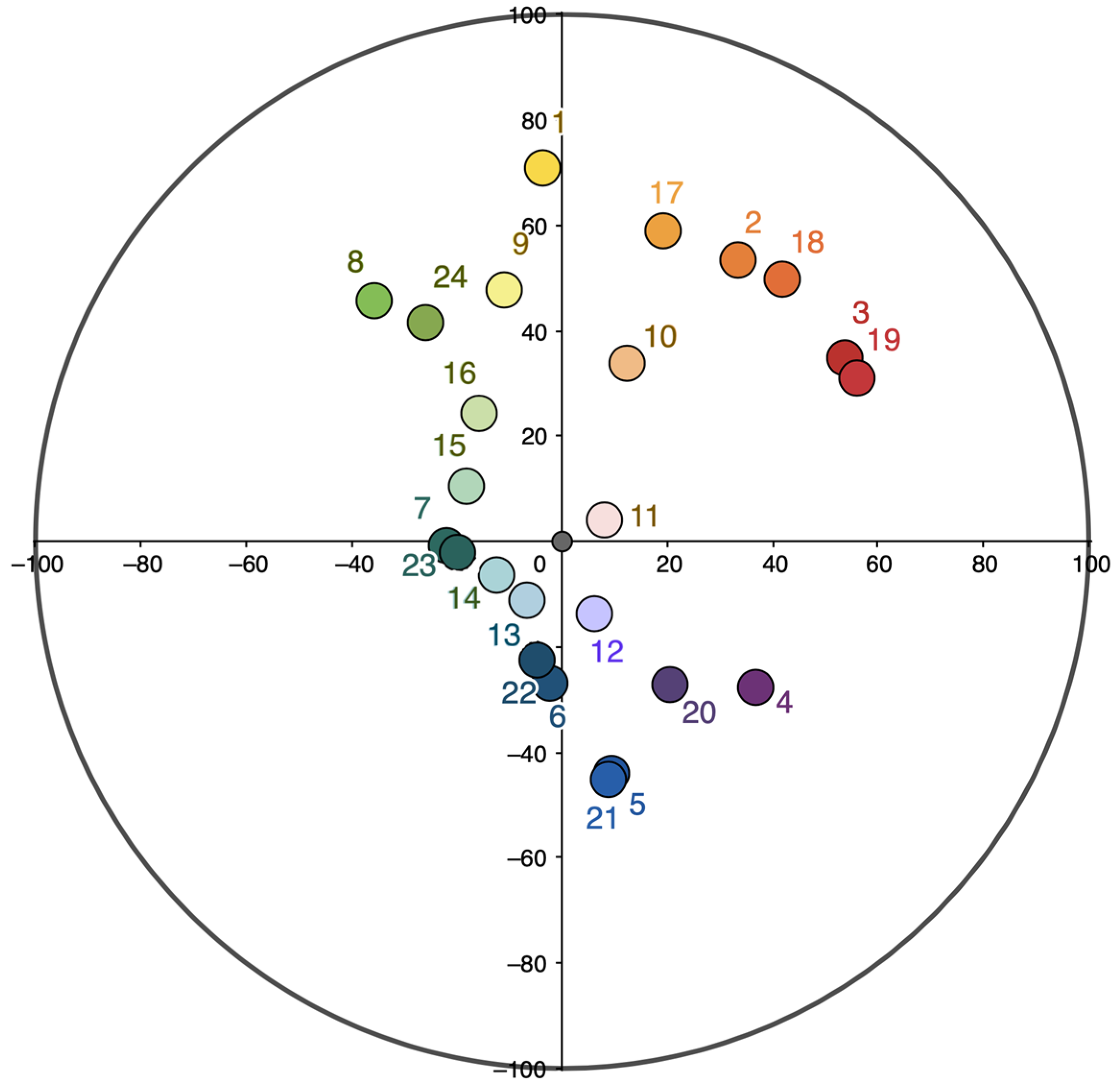
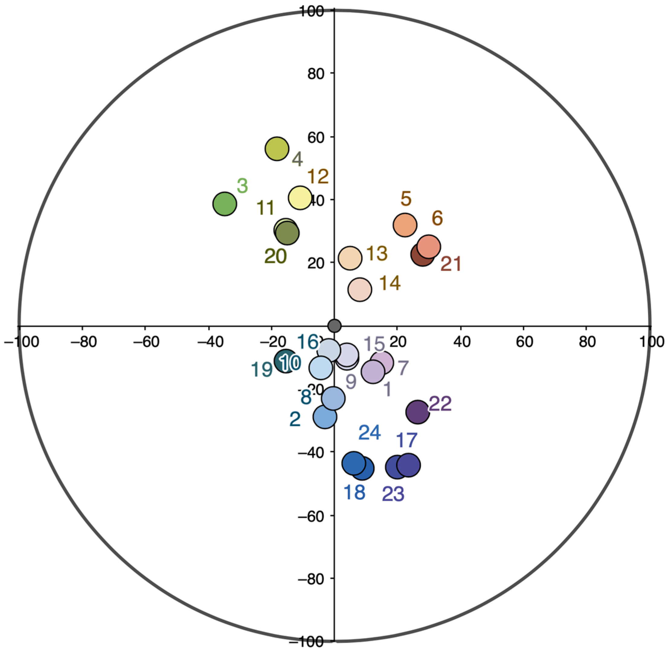
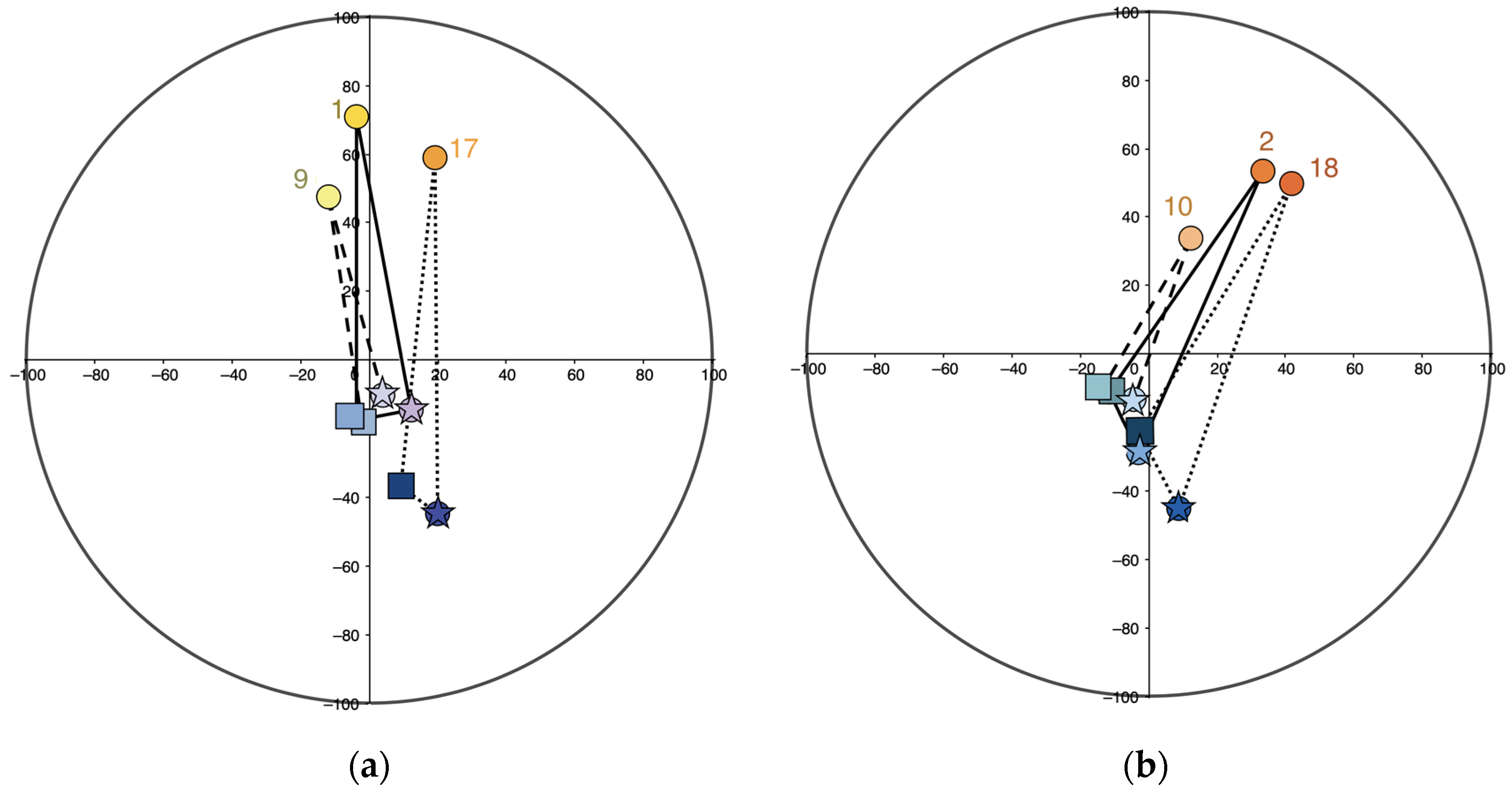
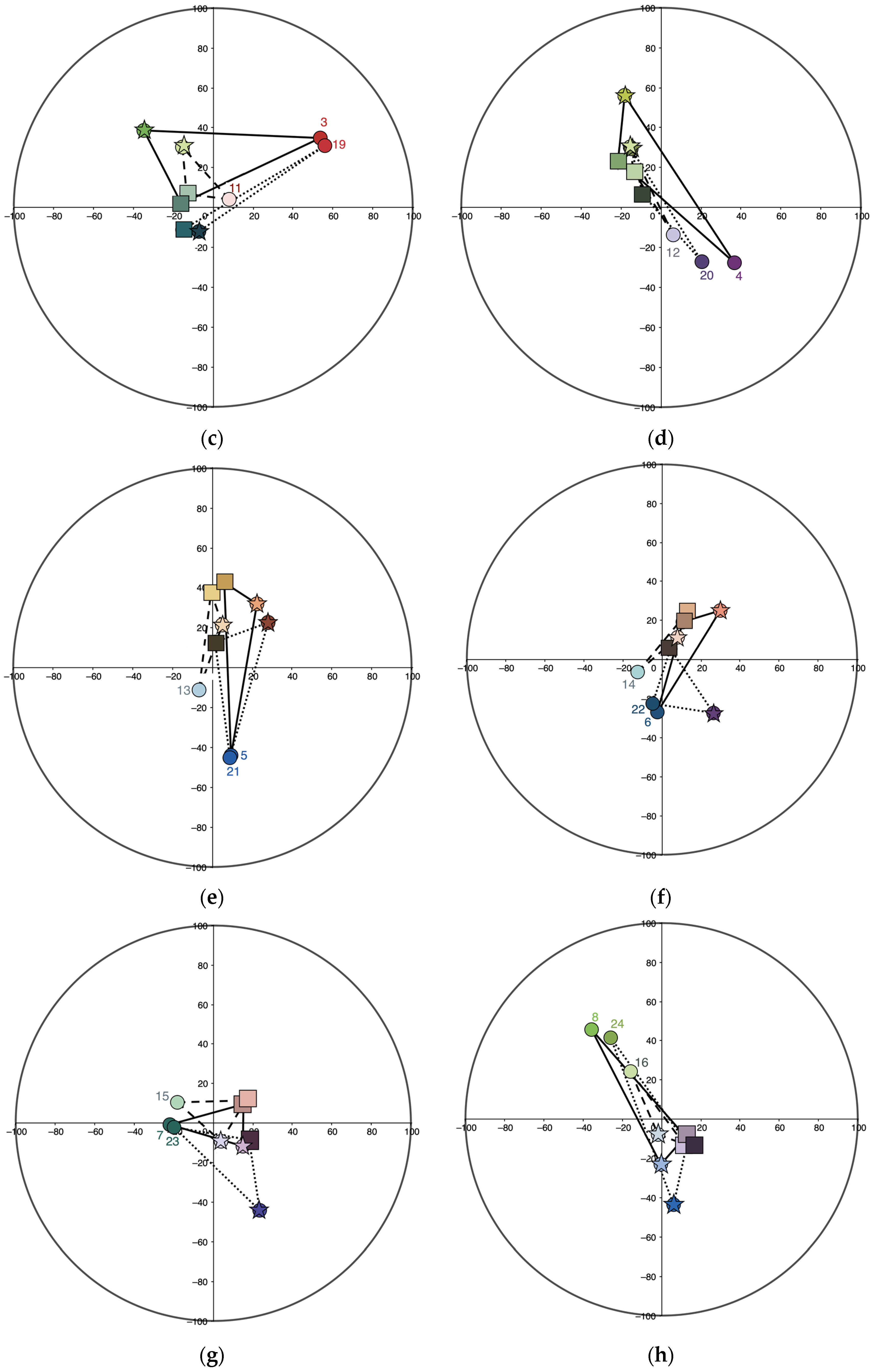
For his main colors, Matyushin selects deep, high-chroma shades that are fairly evenly distributed in the quadrants of the color circle. These are as follows: red, orange, yellow, yellow-green, light blue, blue, and purple.
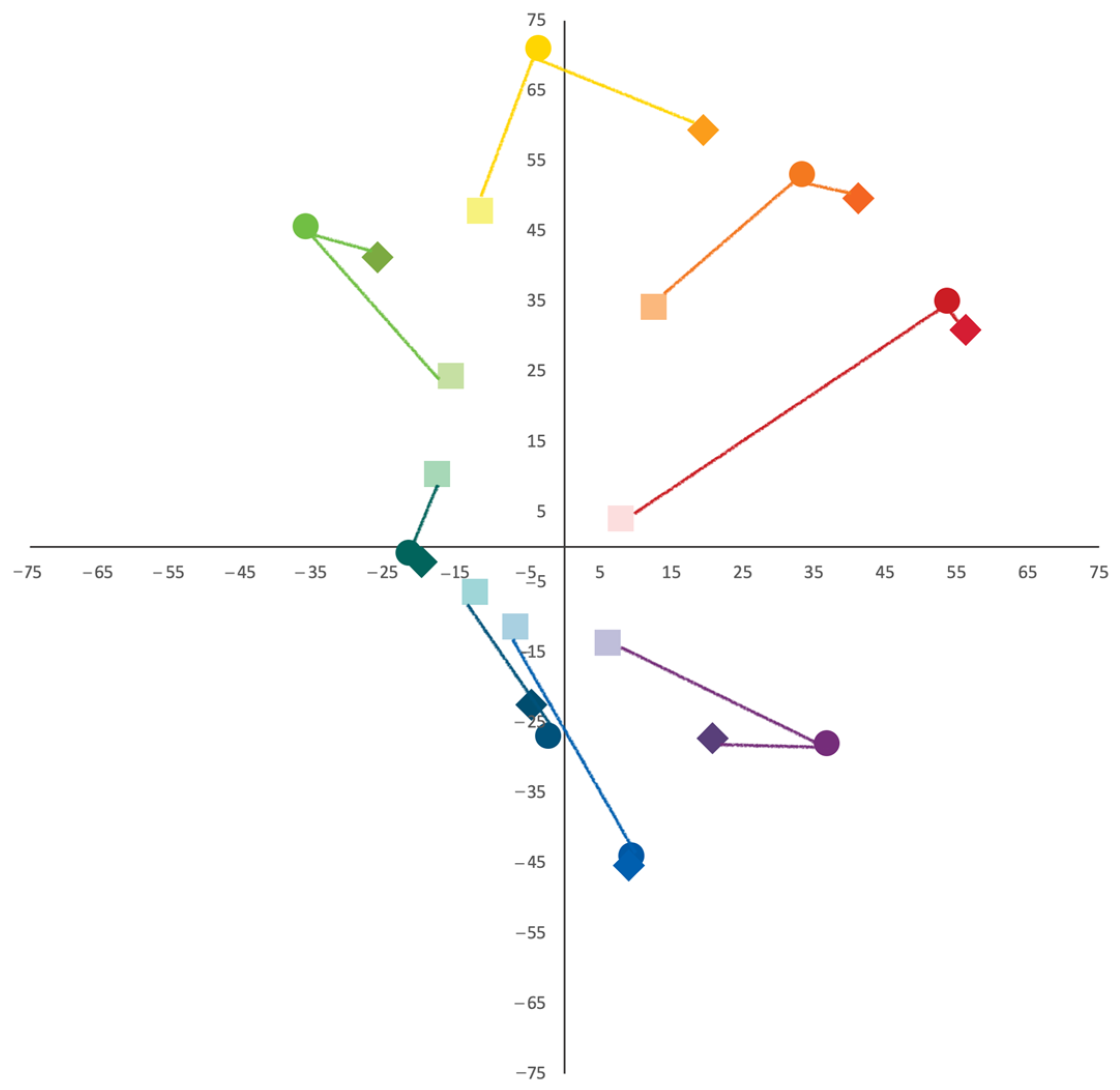
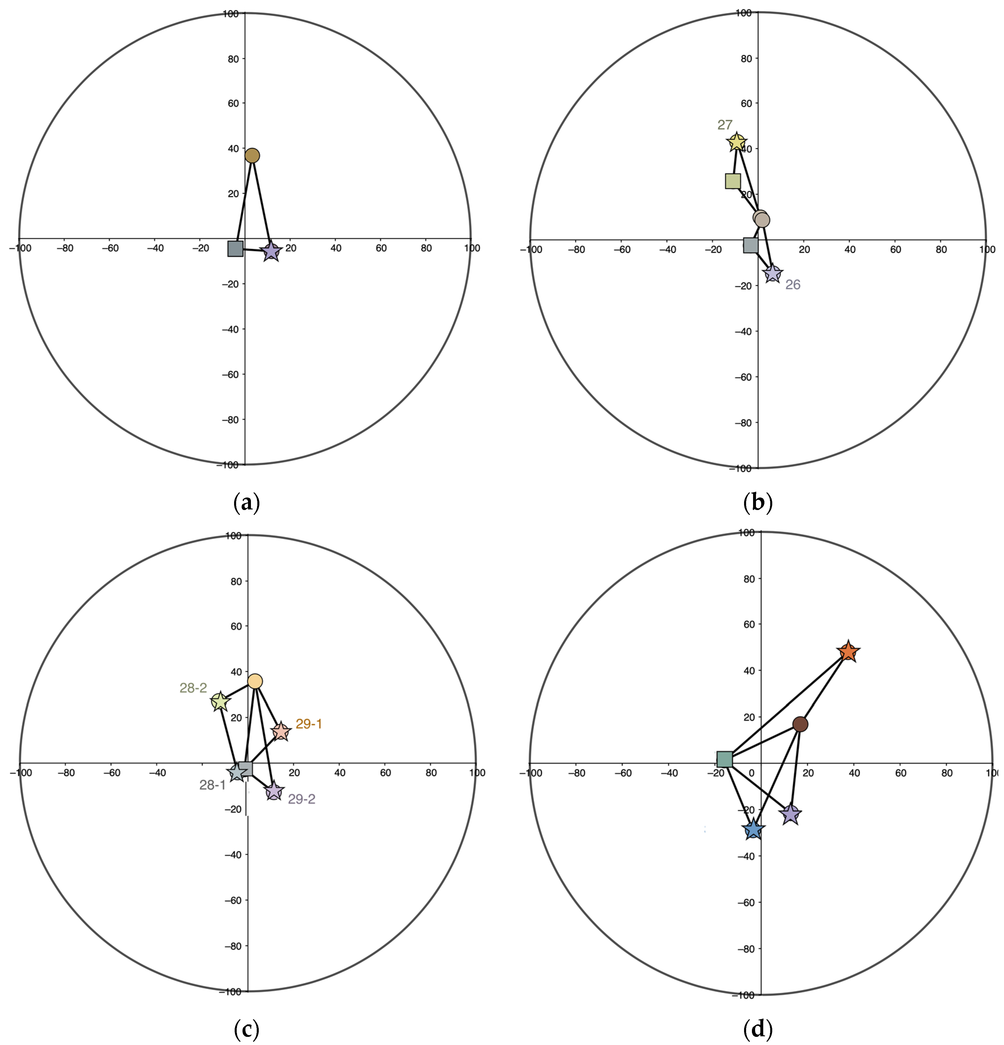
The charts’ environmental background colors, as a rule, are complementary to the main colors, and on the color circle are located opposite or almost opposite their corresponding main counterparts (cf.: Figure 4 and 
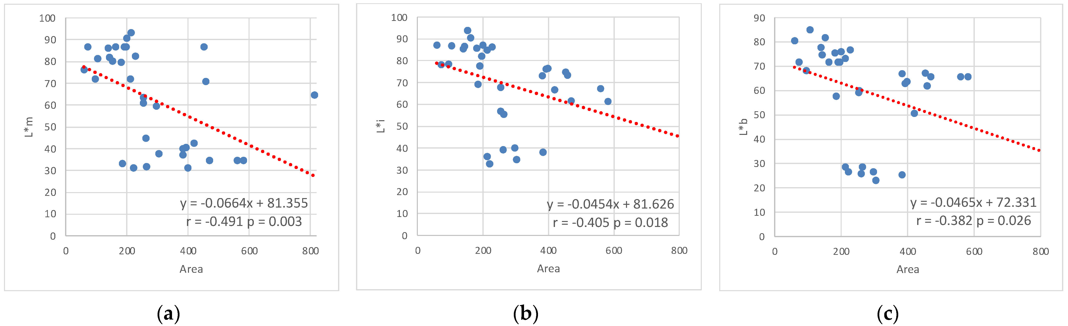
Figure 7). However, since his observations on color caused Matyushin to conclude that color combinations have maximum expressiveness under conditions of decreased chromaticity of the environmental background (Matyushin [1932] 2007, p. 29), most of this group’s colors have low chroma (Figure 7 and Figure 8; Table 2).
As for the preeminently important “intermediary” colors, their lightness noticeably correlates with the background colors, but in almost all charts they are significantly lighter than the latter (Figure 14). Among the intermediary colors in the Reference Book, fairly light blues and purples (Table 3) with low to medium chroma predominate (Figure 9). However, Matyushin aims to demonstrate that the same combination of main and environmental background colors can be harmonized by a linking color in several different ways, rather than one in particular. The choice depends on the practical task because, according to Matyushin’s deepest conviction, the intermediary color can diametrically change the overall impression produced by a color combination as follows: the intermediary color can enhance or reduce contrast, create depth, or add transparency, making the composition calm and comfortable or, conversely, active and stimulating (cf. Figure 12 and Figure 13).
The Reference Book does not contain color combinations in which gray (achromatic) colors are considered the main colors. Matyushin intended to fill this gap in the book’s next editions (Matyushin 1932, item 324). However, already in this work, he makes extensive use of grays as environmental and linking colors and, as such, demonstrates their properties in color combinations.
Art historians note that the charts’ color palette is consonant with Matyushin’s painting and “organically related” to it (Zhadova 2007, p. 6). Essentially, the charts “translate” the artist’s painting into “another existence” (Zhadova 2007, p. 8)—into architectural and spatial compositions. However, this observation, as well as Matyushin’s statement that a linking color can yield specific changes in the overall impression produced by a color combination, remains in need of detailed psychophysical investigation.
Color combination criteria. In his experimentation with color combinations, Matyushin relied on contemporary scientific ideas but used them in ways tempered by his judgment about “actual live color observation” (Matyushin 2011, p. 286).
In particular, the phenomena of simultaneous and successive contrast play a special role in the color composition in the Reference Book charts. Experimental observations of these physiological effects inform the organizing principles for the color charts in the Reference Book.
Scholars of the artist’s creative biography and work (see, for example: Zhadova 2007) note that Matyushin and his pupils showed great interest in the work of the French chemist Michel Eugène Chevreul, who in 1829 formulated the law of simultaneous contrast and ten years later published a book devoted to this phenomenon (Chevreul 1839). Drawing on this work and their own experiments, the researchers built color chords based on the premise that, over time, any observed color begins to “generate” a complementary afterimage: red produces blue-green, orange—blue, and yellow—purple.
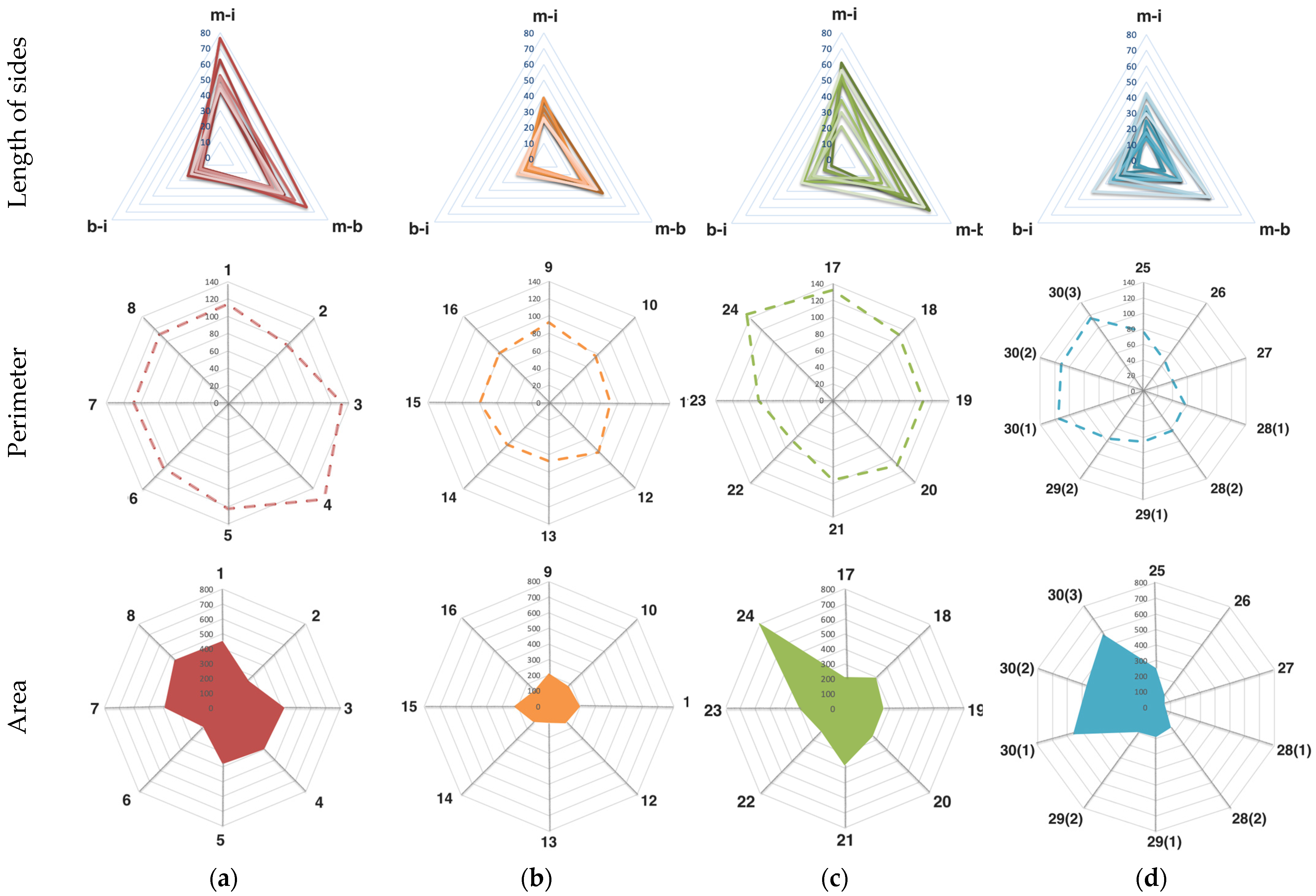
As a result, the triangles that triads always form in color space have a number of interestingly similar geometric properties. Plotted in CIELAB color space (Tables S1 and S2, Figure 17 and 
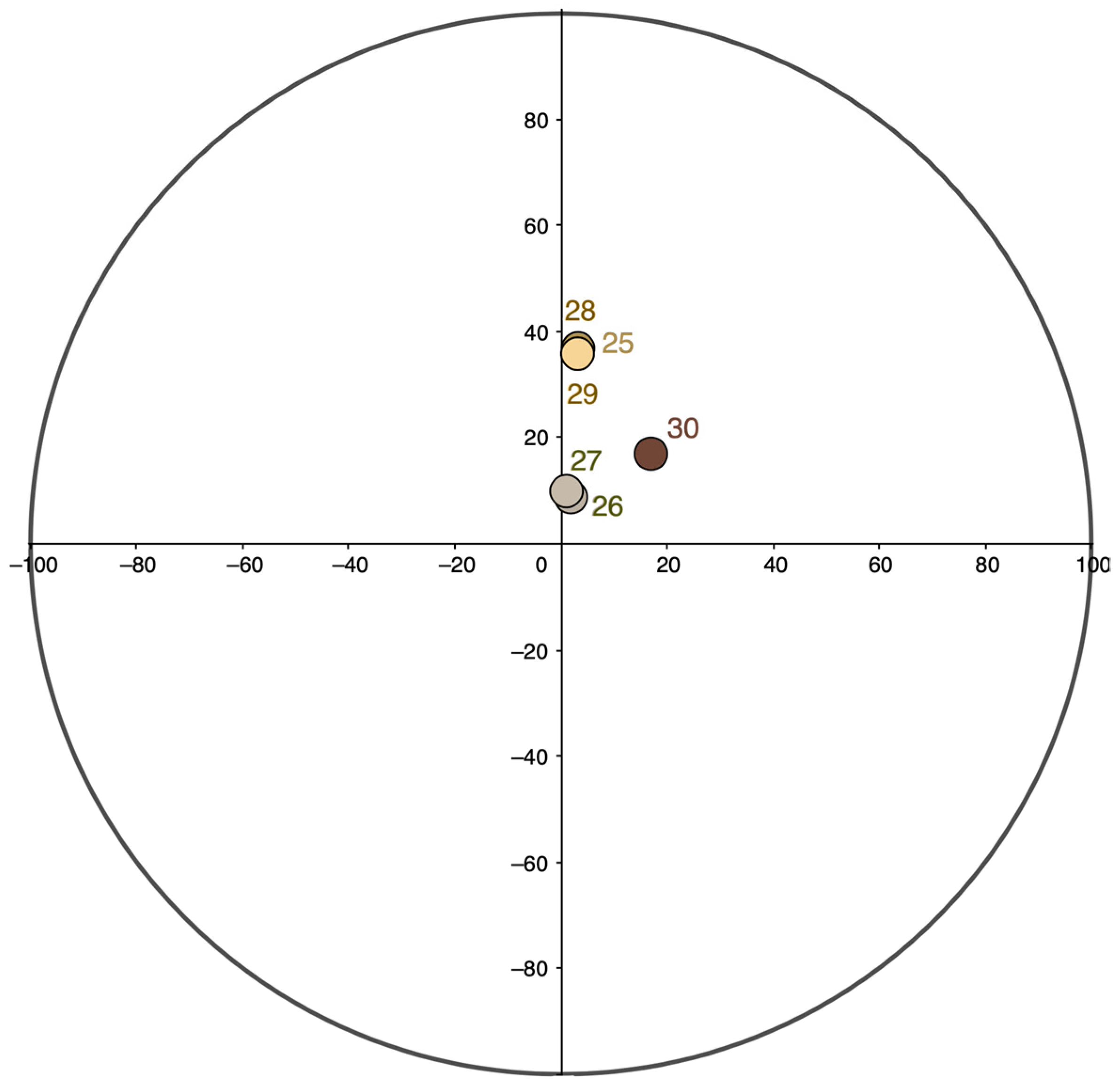
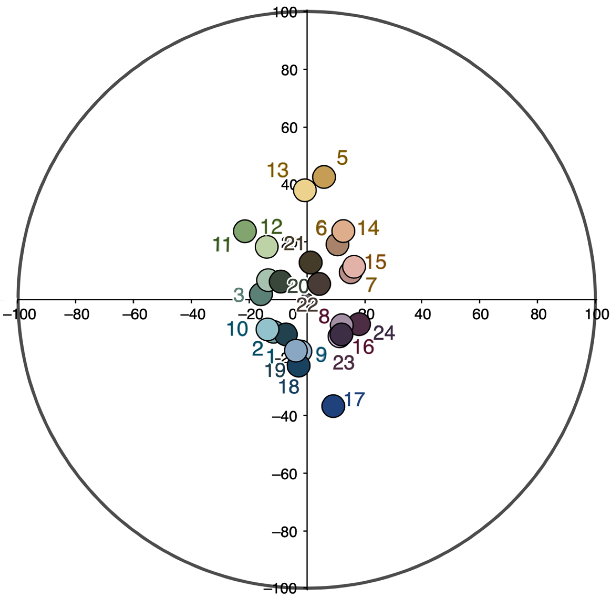
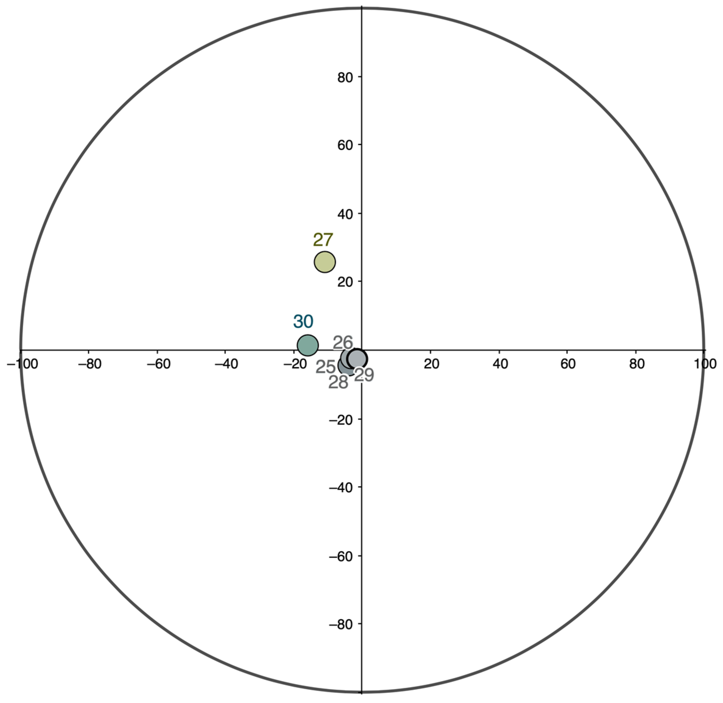
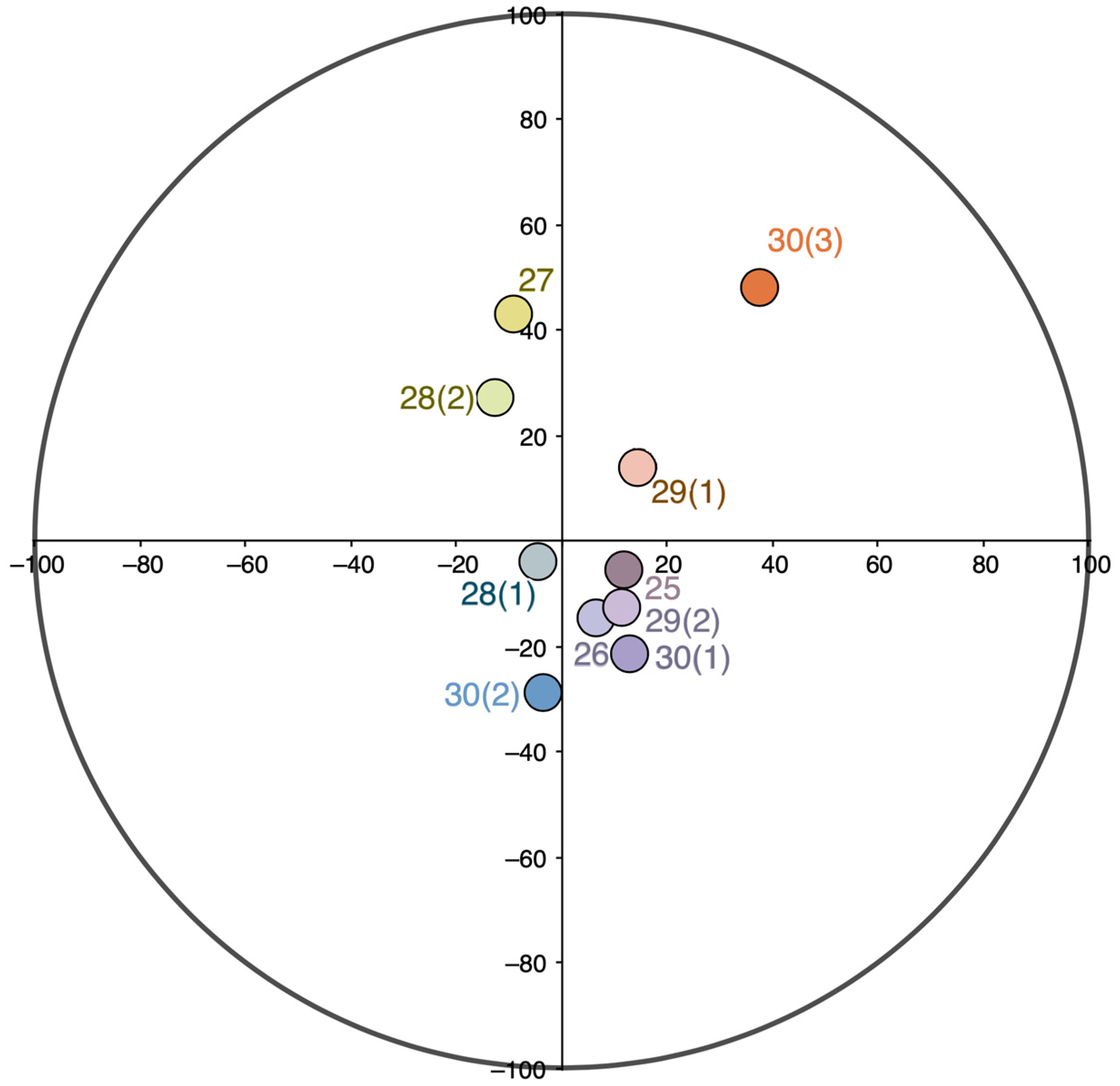
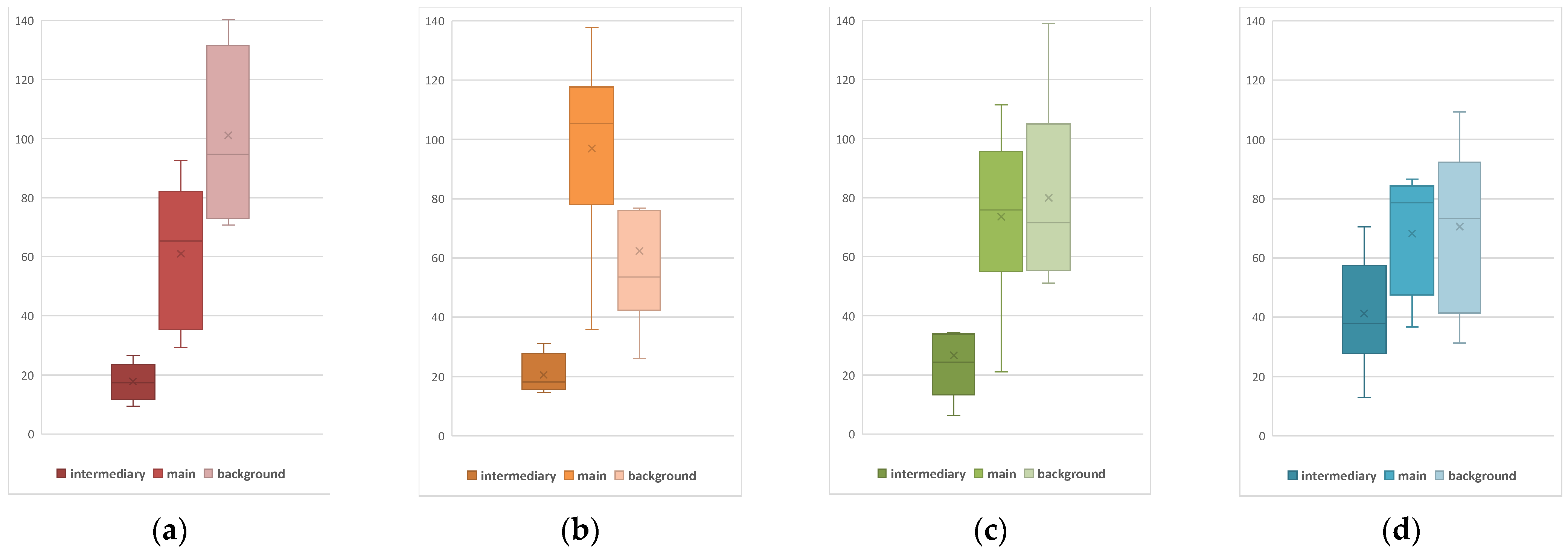
Figure 18), they all have two long sides adjacent to the main color and one short side between the background and the intermediary colors. Most of the triangles are approximately isosceles. The longer triangles also tend to be wider. In all triangles, the angle adjacent to the main color is acute. In all charts, the area of the triangle depends on the lightness of the main, intermediary, and background colors as follows: the darker the colors, the smaller the area of the triangle.
All the triads also have a similar “geometry” on the CIELCh color circle. Here too, the intermediary color is much closer to the environmental background color than to the main color. In the different sections of the Reference Book, the geometric pattern implied by these relationships does not change (cf. Figure 15 and Figure 16). Considering the same regularities of color combinations in various “lightness relations” (Matyushin [1932] 2007, p. 31), the artist similarly demonstrates that decreasing the initial main color’s chroma makes the whole triad less chromatic (as in Section II) (Figure S1). If, on the other hand, the main color has higher chroma (as in Sections I and III), noticeably darker background colors will support a harmonious color combination (cf. Figure S1 and Figure 14).
The application of color combinations. In general, laws derived from a basic level of observation, rather than rigorous scientific investigation, determine the variability of the Reference Book’s color combinations. Matyushin refrained from defining his color combinations by wavelength or pigments, as well as from any mathematical calculations.
As conceived by the Reference Book’s authors, their triads composed from 90 colors with different chromatic characteristics may serve as a convenient didactic tool to train the eye, intuition, and creative imagination.
The main idea of the Reference Book is that color triads are not a “closed” but an “open” system. When working with them, one should not simply transfer the colors from the book to real environments but should play the role of co-author and engage in co-creation. The triads presented in the book need “adjustment” to the specific conditions of reality (Matyushin [1932] 2007, p. 29). Thus, having understood the main principle of the variability of colors and their “geometry” in the color space, practitioners should independently compose the combinations they need and, considering the content and nature of practical tasks, may deviate more or less from the examples given in the Reference Book.
We believe that the analysis presented in this paper will facilitate opportunities for artists, architects, designers, and other color professionals to use Matyushin’s original color charts and to incorporate Matyushin’s style in creating their own color triads.

Supplementary Materials

The following supporting information can be downloaded at: https://www.mdpi.com/article/10.3390/arts11060125/s1, Figure S1: A circular histogram of the hue and chroma distributions for the background (b), in-termediary (i), and main (m) colors for the Section I (a), II (b), III (c), and IV (d); the bars are col-ored as in charts 1, 9, 17, and 25, respectively (the first charts of each section); Table S1: Length of sides, perimeters, and areas of color triangles plotted in CIELAB; Table S2: Angle values of color triangles plotted in CIELAB.

Funding

This research was funded by Russian Science Foundation, project No. 22-18-00407, https://rscf.ru/en/project/22-18-00407/ (accessed on 1 December 2022).

Data Availability Statement

The data presented in this study are available on request from the corresponding author.

Acknowledgments

The author is indebted to Olga Lavrenova for invaluable discussions of Matyushin’s theory of color. The author would like to express their gratitude to Alexei Delov and Karina Zygankova for their support in data processing. The author is grateful to the anonymous reviewers whose detailed and constructive comments to an earlier version of the manuscript were helpful for improving the article. The author also thanks James Manteith for proofreading the article.

Conflicts of Interest

The author declares no conflict of interest.

References

  1. Barron, Stephanie, and Maurice Tuchman, eds. 1980. The Avant-Garde in Russia, 1910–1930: New Perspectives. Los Angeles: Los Angeles County Museum of Art. Cambridge: MIT Press. [Google Scholar]
  2. Berens, Philipp. 2009. CircStat: A MATLAB Toolbox for Circular Statistics. Journal of Statistical Software 31: 1–21. [Google Scholar] [CrossRef] [Green Version]
  3. Bowlt, John E. 2017. Russian Art of the Avant-Garde. Theory and Criticism 1902–1934. New York: Thames and Hudson. [Google Scholar]
  4. Cahn, Jennifer. 1995. Mikhail Matiushin and the Evolution of Simultaneous Dimensions. Experiment 1: 219–28. [Google Scholar] [CrossRef]
  5. Cannon, A. 2009. The New Perpendicular. Mikhail Matiushin’s Quest for the Art of the Fourth Dimension. Master’s thesis, City College of the City University of New York, New York, NY, USA. [Google Scholar]
  6. Chevreul, Michel-Eugène. 1839. De la loi du contraste simultané des couleurs et de l’assortiment des objets coloures [On the Law of Simultaneous Contrast of Colors]. Paris: Gauthier-Villars et fills. [Google Scholar]
  7. Douglas, Charlotte. 1986. Beyond reason: Malevich, Matiushin, and their circles. In The Spiritual in Art: Abstract Painting 1890–1985. Edited by Maurice Tuchman. Los Angeles: County Museum of Art, New York: Abbeville Press, pp. 185–97. [Google Scholar]
  8. Galeyev, Bulat. 2005. Mikhail Matyushin’s Contribution to Synthetic Art. Leonardo 38: 151–54. Available online: https://monoskop.org/images/8/81/Galeyev%2C_Bulat_%282005%29_-_Mikhail_Matyushin%27s_Contribution_to_Synthetic_Art.pdf (accessed on 1 December 2022). [CrossRef]
  9. Gamwell, Lynn. 2002. Exploring the Invisible: Art, Science and the Spiritual. Princeton and Oxford: Princeton University Press. [Google Scholar]
  10. Griber, Yulia A., Dimitris Mylonas, and Galina V. Paramei. 2018. Objects as culture-specific referents of color terms in Russian. Color Research and Application 43: 958–75. [Google Scholar] [CrossRef]
  11. Griber, Yulia A., Dimitris Mylonas, and Galina V. Paramei. 2021. Intergenerational differences in Russian color naming in the globalized era: Linguistic analysis. Humanities & Social Sciences Communications 8: 262. [Google Scholar] [CrossRef]
  12. Ioffe, Dennis G., and Frederick White. 2012. The Russian Avant-garde and Radical Modernism. Boston: Academic Studies Press. [Google Scholar] [CrossRef]
  13. Jammalamadaka, S. Rao, and Ashis SenGupta. 2001. Topics in Circular Statistics. Singapore: World Scientific Press. [Google Scholar] [CrossRef]
  14. Kampasakali, Elli, Zoe E. Papliaka, Dimitrious Christofilos, and Evangelia A. Varella. 2007. The Russian avant-garde painting palette—documentary and physicochemical study of inorganic colorants. Annali di Chimica 97: 447–72. [Google Scholar] [CrossRef]
  15. Kapelush, Boris N. 1976. Arkhivy Mikhaila Matyushina i Eleny Guro [Mikhail Matyushin‘s and Elena Guro‘s Archive]. In Annual of Manuscript Division of the Institute of Russian Literature (The Pushkin House). Leningrad: Nauka. Available online: http://lib2.pushkinskijdom.ru/Media/Default/PDF/ROPD/EROPD-na-1974-god.pdf#page=3 (accessed on 1 December 2022). (In Russian)
  16. Luo, Ming R. 2015a. CIEDE2000, History, Use, and Performance. In Encyclopedia of Color Science and Technology. Edited by Ronnier Luo. Berlin and Heidelberg: Springer. [Google Scholar] [CrossRef]
  17. Luo, Ming R. 2015b. CIELAB. In Encyclopedia of Color Science and Technology. Edited by Ronnier Luo. Berlin and Heidelberg: Springer. [Google Scholar] [CrossRef]
  18. Matyushin, Mikhail. 1915/16. Dnevniki [Diary]. Moscow: RGALI [Russian State Archive of Literature and Art], Fund 134, inv. 2, item 24. (In Russian)
  19. Matyushin, Mikhail. 1932. Chto dobavit’ v “Spravochnik po cvetu” [What to add to the Reference Book of Color]. St. Petersburg: CGALI [Central State Archive of Literature and Art], Fund 1334, inv. 2, item 324. (In Russian) [Google Scholar]
  20. Matyushin, Mikhail. 2007. Spravochnik po tsvetu: Zakonomernost’ izmenyayemosti tsvetovykh sochetany [A Reference Book of Color: The Laws Governing Variability of Color Combinations]. Moscow: D. Aronov. First published in 1932. (In Russian) [Google Scholar]
  21. Matyushin, Mikhail. 1976. Opyt hudozhnika novoj mery [The experience of the artist of a new measure]. In Toward the History of the Russian Avant-Garde. Edited by Nikolay Khardzhiev. Stockholm: Gileya, pp. 159–87. (In Russian) [Google Scholar]
  22. Matyushin, Mikhail. 2011. Zvuko-cvet [Sound-color]. In Mikhail Matyushin. Tvorcheskij put’ khudozhnika [Mikhail Matyushin. Creative Career of the Artist]. Kolomna: Museum of Organic Culture, pp. 283–88. (In Russian) [Google Scholar]
  23. Nesmelov, Nikita, ed. 2007. Professor Mikhail Matyushin and his Students. 1922–1926. St. Petersburg: Research Museum of the Russian Academy of Arts. (In Russian) [Google Scholar]
  24. Paramei, Galina V., Yulia A. Griber, and Dimitris Mylonas. 2018. An online color naming experiment in Russian using Munsell color samples. Color Research and Application 43: 358–74. [Google Scholar] [CrossRef] [Green Version]
  25. Povelikhina, Alla. 1975/76. Matyushin’s Spatial System. Structurist 15/16: 64–70.
  26. Povelikhina, Alla. 1999a. GINKhUK: Department of Oganic Culture. In Organica: The Non-objective World of Nature in the Russian Avant-Garde of the 20th Century. Köln: Galerie Gmurzynska, pp. 48–53. [Google Scholar]
  27. Povelikhina, Alla. 1999b. The Theory of the world unity and organic division in the Russian avant-garde in XX century. In Organica: The Non-Objective World of Nature in the Russian Avant-Garde of the 20th Century. Köln: Galerie Gmurzynska, pp. 8–18. [Google Scholar]
  28. Sharma, Gaurav, Wencheng Wu, and Edul N. Dalal. 2005. The CIEDE2000 color-difference formula: Implementation notes, supplementary test data, and mathematical observations. Color Research and Application 30: 21–30. [Google Scholar] [CrossRef]
  29. Tillberg, Margareta. 2002. The Russian Avant-Garde and Color as Worldview. Paper presented at 9th Congress of the International Colour Association Proceedings, Rochester, NY, USA, June 24–29 2001; Volume 4421, pp. 41–43. [Google Scholar] [CrossRef]
  30. Tillberg, Margareta. 2003. Coloured Universe and the Russian Avant-Garde. Matiushin on Colour Vision in Stalin’s Russia, 1932. Stockholm: Stockholm University. [Google Scholar]
  31. Tillberg, Margareta. 2011. “Be a Spectator with a large ear”: Victory over the sun as a public laboratory experiment for Mikhail Matiushin’s theories of colour vision. In Victory over the Sun: The World’s First Futurist Opera. Edited by Rosamund Bartlett and Sarah Dadswell. Exeter: University of Exeter Press, pp. 208–23, 304–7. [Google Scholar]
  32. Tillberg, Margareta. 2013. Farbe als Erfahrung: Experiment und praktische Anwendung in Kunst und Wissenschaft an der Moskauer GAKhN und Leningrader GINChUK. In Form und Wirkung: Phänomenologische und Empirische Kunstwissenschaft in der Sowjetunion der 1920er Jahre. Edited by Aage Hansen-Löve, Brigitte Obermeyr and Georg Witte. Munich: Fink, pp. 209–21. [Google Scholar]
  33. Wünsche, Isabel. 2012. Kunst & Leben: Michail Matjuschin und die Russische Avantgarde in St. Petersburg. Vienna, Cologne and Weimar: Böhlau. [Google Scholar]
  34. Wünsche, Isabel. 2015. Mikhail Matiushin and the Emergence of the Organic School. In The Organic School of the Russian Avant-Garde: Nature’s Creative Principles. Farnham: Ashgate, pp. 83–140. [Google Scholar]
  35. Zhadova, Larisa. 2007. Cvetovaja sistema Mikhaila Matyushina [Matyushin’s color system]. In Spravochnik po tsvetu: Zakonomernost’ izmenyayemosti tsvetovykh sochetany [A Reference Book of Color: The Laws Governing Variability of Color Combinations]. Moscow: D. Aronov, pp. 5–12. (In Russian) [Google Scholar]
Figure 1. Mikhail Matyushin. Movement in Space, 1921, oil on canvas, 124 × 168 cm, Russian Museum, St. Petersburg.
Arts 11 00125 g001
Figure 2. Structure of a color chart: the environmental background color (top); the “intermediary” linking color (middle); the main active color (bottom).
Arts 11 00125 g002
Figure 3. The sequentially first color charts in Sections I (a), II (b), III (c), and IV (d).
Arts 11 00125 g003
Figure 4. Hue (h°) and chroma (C) of the main colors of the charts from Sections I–III of the Reference Book; projection into the CIELCh color circle.
Arts 11 00125 g004
Figure 5. The main colors of the charts from Sections I (circle), II (square), and III (diamond) mapped in the a*b* plane of CIELAB color space; lines connect the different sections’ corresponding colors.
Arts 11 00125 g005
Figure 6. Hue (h°) and chroma (C) of the main colors from Section IV; projection into the CIELCh color circle.
Arts 11 00125 g006
Figure 7. Hue (h°) and chroma (C) of the environmental background colors from the charts of Sections I to III of the Reference Book; projection into the CIELCh color circle.
Arts 11 00125 g007
Figure 8. Hue (h°) and chroma (C) of the environmental background colors from the charts of Section IV of the Reference Book; projection into the CIELCh color circle.
Arts 11 00125 g008
Figure 9. Hue (h°) and chroma (C) of the “intermediary” colors from the charts of Sections I to III of the Reference Book; projection into the CIELCh color circle.
Arts 11 00125 g009
Figure 10. Hue (h°) and chroma (C) of the “intermediary” colors from the charts of Section IV of the Reference Book; projection into the CIELCh color circle.
Arts 11 00125 g010
Figure 11. Charts 26 (a) and 27 (b) from Section IV.
Arts 11 00125 g011
Figure 12. Charts 28-1 (a), 28-2 (b) 29-1 (c), and 29-2 (d) from Section IV.
Arts 11 00125 g012
Figure 13. Charts 30-1 (a), 30-2 (b), and 30-3 (c) from Section IV.
Arts 11 00125 g013
Figure 14. Lightness (L) of the corresponding intermediary, background, and main colors in the charts of Sections I–IV of the Reference Book.
Arts 11 00125 g014
Figure 15. Hue (h°) and chroma (C) of the main (circle), background (square), and “intermediary” (star) colors in Sections I (unbroken line), II (dash line), and III (dotted line); projection into the CIELCh color circle: (a) Charts 1, 9, and 17; (b) Charts 2, 10, and 18; (c) Charts 3, 11, and 19; (d) Charts 4, 12, and 20; (e) Charts 5, 13, and 21; (f) Charts 6, 14, and 22; (g) Charts 7, 15, and 23; (h) Charts 8, 16, and 24.
Arts 11 00125 g015aArts 11 00125 g015b
Figure 16. Hue (h°) and chroma (C) of the main (circle), background (square) and “intermediary” (star) colors in Section IV; projection into the CIELCh color circle: (a) Chart 25; (b) Charts 26 and 27; (c) Charts 28 and 29; (d) Chart 30.
Arts 11 00125 g016
Figure 17. Color differences CIEDE2000 between the main and “intermediary” (m–i), main and background (m–b), background and “intermediary” (b–i) colors in Sections I (a), II (b), III (c), and IV (d). Perimeters and areas of the triangles in the Sections I (a), II (b), III (c), and IV (d).
Arts 11 00125 g017
Figure 18. Angle values of color triangles in Sections I (a), II (b), III (c), and IV (d); within bars, lines show medians and the “x” symbols show the mean; whiskers denote minimum and maximum values.
Arts 11 00125 g018
Figure 19. Correlation between the area of the triangle in CIELAB color space and the lightness (L) (a) of the main (m), (b) “intermediary” (i), and (c) background (b) colors.
Arts 11 00125 g019
Table 1. Main active colors.
SectionChartColorL*a*b*Color Name *
I1 86.78−3.6870.94bright yellow
2 63.5433.3353.05orange
3 42.6453.6935.04red
4 31.3036.77−27.99purple
5 37.299.40−43.97blue
6 33.06−2.29−26.90dirty blue
7 40.42−21.85−0.83blue-green
8 70.85−36.2445.64lime
II9 93.31−11.8347.84light yellow
10 79.4912.5134.13sandy
11 90.687.903.98milky
12 80.106.11−13.64light gray
13 81.39−6.87−11.34pale light blue
14 81.86−12.52−6.41light blue
15 82.35−17.7910.32light turquoise
16 86.17−15.8824.32pale lettuce
III17 72.0319.4859.36light orange
18 59.3941.2649.59orange
19 44.7556.3330.89red
20 31.8520.84−27.30deep purple
21 40.089.09−45.43blue
22 31.07−4.64−22.51dirty blue
23 37.84−19.99−2.17blue-green
24 64.69−26.2341.26dark lettuce
IV25 60.792.9636.80sandy
26 72.091.898.72beige
27 76.341.0010.01ivory
28 86.783.4135.53pale yellow
29 86.783.4135.53pale yellow
30 34.4717.0916.92chocolate
Note. * Color names from an open psycholinguistic experiment with native Russian speakers (for more details see: Griber et al. 2018; Paramei et al. 2018; Griber et al. 2021).
Table 2. Environmental background colors.
SectionChartColorL*a*b*Color Name *
I1 67.20−3.74−17.69gray-blue
2 59.91−11.27−10.89dirty blue
3 50.62−15.521.79gray-green
4 63.71−21.7223.81Pistachio
5 67.016.3842.82sandy
6 57.6510.6618.96dark beige
7 62.8815.389.49powder
8 61.8711.89−8.67gray-lilac
II9 73.11−2.07−17.43gray-light-blue
10 75.48−13.37−10.12pale blue
11 75.91−13.376.91pale green
12 81.77−14.1818.62pistachio
13 84.91−0.4437.99pale yellow
14 74.6312.9524.16beige
15 76.6016.1011.27flesh
16 77.7411.54−12.83pale lilac
III17 28.498.96−36.65navy blue
18 26.64−2.82−22.45dirty blue
19 25.77−7.16−12.06wet asphalt
20 28.49−9.276.48dark green
21 25.421.2412.79dark brown
22 26.494.565.83charcoal
23 23.1018.32−8.45dark maroon
24 21.2012.64−12.21dark purple
IV25 59.23−3.96−4.36gray
26 68.15−3.12−2.24light gray
27 80.42−10.7225.81pistachio
28 71.78−1.67−2.89light gray
29 71.78−1.67−2.89light gray
30 65.77−15.901.26gray-green
Note. * Color names from an open psycholinguistic experiment with native Russian speakers (for more details see: (Griber et al. 2018; Paramei et al. 2018; Griber et al. 2021)).
Table 3. “Intermediary” colors.
SectionChartColorL*a*b*Color Name *
I1 74.9212.23−14.42pale lilac
2 67.68−3.19−28.63sky-blue
3 66.59−35.0538.89dark lettuce
4 76.44−18.6956.16yellow-green
5 73.0722.0631.97pale orange
6 69.1229.6725.07peach
7 76.0815.18−12.04pale lilac
8 73.31−0.27−22.58sky-blue
II9 84.773.98−10.31light gray
10 85.76−4.34−13.74pale light blue
11 87.06−15.4529.73pale green
12 93.81−10.5240.14pale yellow
13 86.844.8921.03light beige
14 86.557.7511.13milky
15 86.254.09−9.67light lilac
16 85.38−1.83−7.88light gray
III17 36.0619.66−44.65blue
18 40.089.09−45.43blue
19 39.12−15.55−11.33blue-green
20 55.50−14.9529.31dirty green
21 38.2428.1823.15reddish brown
22 32.8226.39−26.95plum
23 34.7823.95−44.26blue
24 43.995.88−43.88bluish light blue
IV25 57.0212.21−5.69gray-pink
26 78.366.56−14.69light lilac
27 87.06−9.3143.13light yellow
28(1) 78.15−4.32−3.75light gray
28(2) 90.35−12.7427.16pale green
29(1) 77.7411.54−12.83cream
29(2) 82.1314.5913.91pale lilac
30(1) 67.3112.56−21.20pale lilac
30(2) 61.57−3.58−28.69sky-blue
30(3) 61.4237.4148.36orange
Note. * Color names from an open psycholinguistic experiment with native Russian speakers (for more details see: (Griber et al. 2018; Paramei et al. 2018; Griber et al. 2021)).
Table 4. Circular correlations (pcc) between the hue angles (h°) of the main and background colors in Sections I, II, III, and IV.
SectionIIIIIIIV
pcc−0.074−0.761−0.2060.418
p-value0.8020.0400.5000.290
Table 5. Correlations between the lightness (L) and chroma (C) of the main (m) and background (b) colors in Sections I, II, III, and IV.
Section ISection IISection IIISection IV
LBCB LBCB LBCB LBCB
Lm0.28−0.52Lm−0.50−0.47Lm−0.100.82Lm0.59−0.53
Cm−0.06−0.27Cm−0.52−0.44Cm0.210.51Cm−0.27−0.62
p-valuep-valuep-valuep-value
LBCB LBCB LBCB LBCB
Lm0.500.19Lm0.210.24Lm0.810.01Lm0.070.12
Cm0.890.52Cm0.190.28Cm0.620.20Cm0.450.06
Table 6. Circular correlations (pcc) between the hue angle (h°) of the “intermediary” and main colors in Sections I, II, III, and IV.
SectionIIIIIIIV
pcc−0.9200.571−0.4260.314
p-value0.0130.1200.1720.274
Publisher’s Note: MDPI stays neutral with regard to jurisdictional claims in published maps and institutional affiliations.

