Predictive Power of Adaptive Candlestick Patterns in Forex Market. Eurusd Case


Conselleria d’Educació, Cultura i Esport, Avda. de Campanar, 32, ES-46015 València, Spain
Mathematics 2020, 8(5), 802; https://doi.org/10.3390/math8050802
Submission received: 26 March 2020
/
Revised: 27 April 2020
/
Accepted: 8 May 2020
/
Published: 14 May 2020
(This article belongs to the Special Issue On Interdisciplinary Modelling and Numerical Simulation in the Realm of Physics & Engineering)
Abstract
:The Efficient Market Hypothesis (EMH) states that all available information is immediately reflected in the price of any asset or financial instrument, so that it is impossible to predict its future values, making it follow a pure stochastic process. Among all financial markets, FOREX is usually addressed as one of the most efficient. This paper tests the efficiency of the EURUSD pair taking only into consideration the price itself. A novel categorical classification, based on adaptive criteria, of all possible single candlestick patterns is presented. The predictive power of candlestick patterns is evaluated from a statistical inference approach, where the mean of the average returns of the strategies in out-of-sample historical data is taken as sample statistic. No net positive average returns are found in any case after taking into account transaction costs. More complex candlestick patterns are considered feeding supervised learning systems with the information of past bars. No edge is found even in the case of considering the information of up to 24 preceding candlesticks.
1. Introduction
Intensive research has been done on checking the validity of the Efficient Market Hypothesis (EMH) and its softer variations in financial markets. In fact, different markets have been tested to offer inefficiencies and some works conclude there exists some, for example in the Stock Exchange of Thailand [1], European stock exchanges [2], European emerging stock markets [3], or African stock markets [4].
Candlestick patterns predictive power has been widely studied for several financial instruments. Shooting star and hammer patterns for index have been recently studied [5] finding little forecasting reliability when using close prices. In addition, morning and evening star patterns have been studied for Shanghai 180 index component stocks where some predictive power is concluded [6]. Some works (e.g., [7]) show how the predictive power of certain Japanese candlestick patterns vanishes as predicting time increases in Chinese stock market, in line with the conclusions of this paper. Some works have studied two-candlestick patterns, finding certain predictive power for the emerging equity market of Taiwan [8].
This work explores the role of candlestick patterns in price forecasting for the EURUSD pair in the FOREX market. Four different timeframes are employed in our analysis: 30, 60, 240 and 1440 min. These periods of time refer to how long is represented in each single candlestick. For this purpose, several trading strategies are analysed, each one defined by a different entry condition for its trades: the occurrence of a specific candlestick pattern. Simple and complex candlestick patterns are studied when the pattern is comprised of one or more candlesticks. In the latter case, supervised learning methods are employed to define which exact pattern offers better results for the trading strategy, that is, which complex patterns yield better equity curves when used as entry signals. Although these complex patterns are not explicitly described, they emerge from the output of the tree-based supervised learning algorithms.
As we can see, many of the studies mentioned above focus only on certain specific patterns. Our approach deals with all possible single candlestick patterns. For analysing more complex predictive structures of the price, we focus our attention on one specific candlestick pattern (which is our reference-pattern) and then we try to find out which the influence of previous candlesticks is over the performance of the strategy that uses the reference pattern as a signal to enter the market. This influence is studied using a machine learning setup, where different supervised learning systems are trained in order to improve the performance of the strategy. We use the three-barrier method presented in [9] for labelling all orders (whether they are profitable or not) to be used for feeding the supervised learning algorithm.
Taking into account market dynamics is essential whenever one pretends to check the predictive power of certain patterns. These patterns should adapt to the market if we want to use them under different market regimes. It is well known that volatility clustering occurs frequently in financial instruments, as we can see in Figure 1, making it clear that things that may work in high volatility conditions may work differently when low volatility comes to the market. One of the possibilities to adapt to this behaviour of the market is to classify different patterns according to different regimes of the market. In this sense, it is possible to use Hidden Markov Chain Models (HMCM) to predict different regimes of the market [10]. Normalisation of the data using a rolling window of certain period is also a possibility to try to adapt to market changing conditions. This way we could compare the evolution of the series no matter which regime they pertain to.
A novel categorical and adaptive classification of candlestick patterns is employed in this work, which relies on classifying candlestick features such as the size of its body and shadows (upper and lower) categorically, defining three different values depending on its relative size compared to their average size in a rolling window. Possible values are big, medium and small for all three features characterising a single candlestick. The exact procedure for obtaining the adaptive candlesticks is further explained in Section 2.
In this work, integer difference over the close prices is calculated to obtain the return of the price along different timeframes. However, this calculation produces a stationary time series that erases all possible memory that could be present in the original series. By this, we mean that there does not remain any correlation among the original series and its differentiated series. Although stationarity obtained by the differencing procedure is a valuable characteristic of any feature feeding classification methods [11], such as those that are employed in this paper, by doing so, we are also erasing all possible predictive power of the original time series, thus leading to noninformative features for our machine learning algorithm. It has been recently suggested that the calculation of fractional differences addresses this problem, thus obtaining a stationary series that is still correlated with the original time series [11]. Although not being at the core of this paper, two innovative results are shown in this paper regarding the use of decision-tree based classifiers in forecasting prices of the FOREX market: First, we give a quantitative measure to show how different their forecasting abilities are for supervised learning methods employing fractional differenced variables as input features respect to the typical integer differencing procedure. Second, tests are done with three different supervised learning algorithms, named Decision Trees (DT), Random Forests (RF) and AdaBoost (AB), that allow us to conclude which of them is better suited for the problem of forecasting prices in the FOREX market.
After this Introduction we present in Section 2 the methodology employed, paying special attention to the way categorical classification of candlestick patterns has been done, and how statistical tools are employed to get rid of all possible biases of our analysis. Section 3 presents the main results and discussion of our studies consisting of single candlestick pattern triggered strategies as well as more complex candlestick patterns using supervised learning algorithms. Finally, Section 4 shows our concluding remarks and potential future works.
2. Methodology
The analysis presented in this paper is based on the study of the performance of different trading strategies. A trading strategy refers to a set of rules that define all decisions necessary to deploy trading activity in any market, in a unique way. There are many variables which will affect to the performance of a trading strategy. Some of them are under our control and some other are not. Typically, those variables which are under our control refer to the rules that define how the trades are done, so we will refer to them as endogenous variables. However, a trading strategy is applied to certain market, and there are some variables that depend on the market itself and not on the trading strategy. We refer to these out-of-control variables as exogenous variables. Both variables must be known in order to assess the actual performance of a trading strategy.
Main endogenous variables are:
- Entry condition: It refers to the condition that has to be met to open a position in the market. It can be defined by a specific price (open a buy when the ask price hits certain level), a specific time (open a buy at a.m), or any other condition which may depend on the value of other parameter (open a buy when the value of the moving average of the close price is below the ask price).
- Exit condition: It refers to the condition that has to be met to close a position in the market. It is defined in the same way as the entry condition. When specific prices are set to exit the position, we are defining a level of price at which we exit the position with earnings, which we refer to as Take Profit (TP) level, and a level of price at which we exit the trade with loses, the Stop Loss (SL) level.
- Direction: The direction of the trade defines whether a buy (going long) or a sell (going short) is opened.
- Size of the trade: In FOREX, it refers to the amount of lots to be traded.
Main exogenous variables are:
- Lot size: In Foreign Exchange Market (FOREX), it refers to the amount of currency units that define one lot, which is what is actually traded.
- Leverage: It permits the trader to open positions much larger that his own capital. It depends on the instrument being traded and the broker which offers you the trading service.
- Margin: It defines a minimum capital to be held in the account, without being invested in any trade. The higher is the leverage, the lower is the margin required to open a position, and conversely.
- Transaction costs: There are several components that form the actual transaction cost of a trade, e.g., the spread (difference between ask price and bid price), commission per order (a fixed amount per lot) and swap (in FOREX, it is a daily commission depending on which currency pair is being traded).
When analysing the predictive power of a trading strategy, we only consider the direction of the trades, and their entry and exit conditions for its design. This is because we measure the performance of the strategy using pips (the minimum variation of price in FOREX market, typically ten thounsandth the quote currency unit being traded in FOREX). That means we use price quotations of the EURUSD pair when analysing the predictive power of candlestick patterns. All data were downloaded for free from Dukascopy server, https://www.dukascopy.com/trading-tools/widgets/quotes/historical_data_feed. Such data are not meant to indicate the actual value at any given point in time but represent a discretionary assessment by Dukascopy Bank SA only. That makes our analysis independent of any money management policy, so that exogenous variables do not take part in the analysis done to conclude about the forecasting ability of candlestick patterns. From this approach, we understand a positive performance of a trading strategy implies that its returns, measured in pips, are positive. When trying to find out whether a strategy showing predictive power is profitable or not, we consider all variables, endogenous and exogenous.
Our main goal is showing the predictive power arising from the use of adaptive candlestick patterns for the EURUSD pair in the FOREX market. We present different analysis, which may be classified in three different stages:
- First, we show the results coming from the analysis of the performance of the trading strategies that use the occurrence of all single candlestick patterns as their entry condition. These strategies enter the market at the next open price of a certain candlestick pattern and exit the market at its close price. Thus, the exit condition is event based. Both directions (long and short) are considered for all possible single candlestick patterns.
- Then, we want to know whether changing the exit condition, from an event based exit condition to a price fixed-level strategy for both TP and SL, could improve the performance of the best strategy found in the previous analysis.
- Finally, we ask ourselves whether supervised learning algorithms could improve the performance of the best price fixed-level strategy found. We use three different supervised learning algorithms for classification purposes: a Decision Tree (DT) and two ensemble methods, Random Forest classifier (RF) and AdaBoost classifier (AB). Each of these three learning algorithms is fed in two different ways: first, with all parameters defining last candlesticks (which are the relative size of its body and shadows and the integer difference of two consecutive close prices), which yields a total of features for the classification algorithm, and, second, the same features as before but changing the value of the integer difference of two consecutive close prices for the fractional difference of two consecutive close prices. This way we can compare the equity curves of the strategies arising from all classification models and conclude which one performs better and which features present better predictive power.
Once the analysis of predictive power for each stage is finished, we proceed with the analysis of the profitability of the best trading strategy found. For this purpose, size of the trades is fixed to one lot for all trading strategies and all exogenous variables are also determined: lot size is considered to be 100,000 currency units, which is usually referred to as the standard lot size. Leverage of EURUSD pair in FOREX is fixed to 30:1, which makes the margin . These latter values are usually fixed for retail trading, and it makes sense to take them into account when we only want to study how an initial capital is evolving with trading, since it shows which percentage of the initial capital is available for entering new trades. Since we are not studying how an initial capital evolves, we do not use these parameters, as they do not influence on the actual profitability of the strategy in absolute terms when enough initial capital is considered. Finally, spread and commissions per trade are also considered as transaction costs, using typical values for these parameters among different brokers. Swap is not considered since it is a commission only charged to an account when a trade is opened along certain periods of time, typically at the end of the day, and most of our trades do not meet that requirement.
2.1. Adaptive Candlestick Patterns Classification
First, we present the method employed to classify the candlesticks categorically, and then we discuss the parameters that arise as degrees of freedom involved in the classification process.
We pretend to classify all possible types of one single candlestick pattern. For this purpose, we focus on three parameters: the size of the three different parts in which a candlestick can be divided, i.e., its body and its upper and lower shadows, as shown in Figure 2a. This way, we distinguish among those candlesticks which have a large body or a small lower shadow respect to an average value, for example. It is interesting to point out that it is possible to establish certain correspondence among the different type of candlestick patterns arising from this classification and the existing classification coming from Japanese candlestick realm where many candlestick configurations are already classified [12]. For example, doji or hammer candlesticks, to present a couple of examples, could have its correspondent equivalent, as presented in Figure 2b.
The problem that arises here is that a comparison is needed to correctly define what is big and what is small. We could use a fixed value serving as a reference to which we compare with in order to find out the relative size of whatever we are analysing. The problem with this approach is that it is not adaptive, thus it may make no sense to compare the bodies of two candlesticks which are classified as big but in different market regimes, where volatility may be very different. They may have nothing in common, so the comparison may not provide any useful information. To deal with this problem, we need to look back at the past, say n periods, and compare the current value of the parameter with the distribution comprised of all past n values for that parameter. When this distribution is ordered, what place takes our current value on that distribution? The answer to this question leads us in a solid way to state that certain parameter is a big or small respect to the past n values of that same parameter. Thus, we use dynamic reference for comparing purposes. It is yet not defined what is big and small when being compared with the past n values. We need to define thresholds that distinguish different sizes. These thresholds have to do with the frequency of appearance of the parameter values in the distribution conformed by the past n values of the parameter. We consider that a value which fits into the first quartile in the distribution defined before is small, because that will mean that there are few values which have a size lower than that which is being analysed (at most 25% of the n values considered in the distribution). Those values located in the second and third quartiles are classified as medium size and those values which are bigger than the third quartile are considered big. Here, we introduce two degrees of freedom: first, the rolling window size, n, which defines the size of the distribution we use to compare with as a reference, and, second, the quantile Q used as a threshold to delimit different classes of sizes.
2.1.1. Effect of Rolling Window Size, n
The size of the rolling window, n, defining the size of the distribution to which we compare with, impacts directly on the capability of our strategy to adapt to quick changes in the market. The bigger is n, the slower is the adaption to new conditions of our strategy. On the other side, the lower is n, the quicker is the adaption to new scenarios but also the less meaning there is to our parameter values (because we compare with just a few values).
Figure 3 shows different equity curves of one single candlestick pattern strategy changing the value of n for different trigger signals. We can see the behaviour cannot be generalised since it depends on how well our strategy behaves for certain historical data. That is why it probably makes no sense to try to optimise this parameter. We need different criteria to choose a value for this parameter n. In this sense, we want to make sure that the size of the rolling window, n, is big enough for the price to have experienced different market behaviours. Let us suppose that market behaviour is heavily influenced by the volume being traded. This is exactly true if one considers all real volume traded for an asset, and it is as approximate as the relative size of the volume considered referred to the total real volume. We also know that volume data show periodicity in all timeframes since they reflect the trading habits of all stakeholders, from retail traders to institutional investors. We can see this periodicity in the volume data for EURUSD pair in Figure 4, where a daily period is clearly seen in all timeframes. From that ground, we should look for periods of time comprising some periods of volume data. Since all intraday timeframes exhibit that daily periodicity, choosing a rolling window size that comprises a whole labour week for all these timeframes makes sense. For daily candlesticks, having just five candlesticks as a reference to measure the relative size of the candlestick parameters may be too low, and that is why we choose a whole month for the daily case. All different values used in our simulations are shown in Table 1.
2.1.2. Effect of the Quantiles Used as Thresholds
The second degree of freedom is the threshold (if symmetric, otherwise there are two degrees of freedom, one per threshold) defining whether something is usual or not taking into account its frequency of appearance in the reference distribution. We choose a symmetric threshold when considering all the values that are below the Q% of values or above the % of values in the reference distribution. This gives us two quantiles for defining the lower and upper bounds that let us distinguish what is frequent and what is not, which tells us whether a certain size is big (if not frequent in the reference distribution and above the average), medium, or small. If we take Q as very small, we focus mainly on outliers (with respect to our reference distribution). The point is that, in this latter case, we may be left with most of the candlesticks pertaining to a medium size while few candlesticks fall into the big and small categories. Working under these conditions may provide us very few signals when focused on big or small values, and may yield non-statistically significant results. Thus, we are interested in a more balanced classification of what is small and big. That is why we take the value . We can see in Figure 5 two different histograms showing the frequency of appearance of each type of candlestick, using different Q thresholds.
The classification of single candlestick patterns considering three different parameters, lower shadow, body and upper shadow, and three different sizes, big, medium and small, yields 27 different types of candlesticks. When considering whether they are bullish or bearish, we are left with a total of 54 different type of one-single candlestick patterns. Figure 6 shows how all different type of bearish candlesticks could look, just to give more intuition on what we are working with. Remember, we are not doing any calculations on our candlesticks, just classifying them in a categorical way based on how big their parameter sizes are with respect to the past n candlesticks values. It can be seen in Figure 5 how the frequency of occurrence of each candlestick pattern is approximately discretely distributed and heavily dependent on how many parameters are classified as medium size: by construction, we have the highest frequency of appearance for the case where all three defining parameters of a candlestick are classified as medium size. We classify these candlestick patterns as Class 1 patterns, the most frequent ones. The following candlestick patterns by frequency of appearance are those which have two out of three parameters that are medium size, which we refer to as Class 2 candlestick patterns, yielding a number of trades that are approximately half of those corresponding to Class 1 candlestick patterns strategies. A similar approach is followed to obtain Class 3, just one parameter classified as medium size and Class 4 with no parameters classified as medium size.
2.2. Hypothesis Testing
The scientific method is necessary to make new findings and discover alphas in the form of robust and profitable trading strategies. However, it is often easy to follow some common reasonings which are subtly full of different biases that are responsible for many trading strategies underperforming just after beginning their way in real accounts.
Following Aronson’s approach [13], we first define our hypothesis and design experiments that may let us infer their validity following a statistical analysis approach. Our goal is to determine whether a trading strategy based on buying or selling a whole candlestick (entering at its open price and closing the position at its close price) of the timeframe we are working with is profitable consistently in time for EURUSD pair in FOREX. Long and short signals are defined by a specific type of candlestick pattern (which may be a single candlestick pattern or a more complex one), the appearance of which triggers our trade at the open price of the next candlestick.
It is time to define our claim clearly. We use a conditional syllogism to find out whether a trading strategy has any predictive power. This conditional syllogism has two premises and one conclusion. These premises are based in the hypothesis that the strategies considered are free of biases (such as trend bias or data mining bias, which we focus in later to make sure these hypothesis hold). The major premise reads: If the trading strategy has no predictive power, its average return is zero. The minor premise is: The strategy considered yields a non-zero average return. Since we are negating the consequence of the major premise, we are led to negate the antecedent of the major premise as a conclusion. Thus, the conclusion reads as: The strategy considered has predictive power.
Now, we want to focus on finding out the validity of the minor premise, i.e., whether or not the strategy yields a non-zero average return. This is where we use hypothesis testing, where the null-hypothesis is: The average return of the strategy is zero. As far as we find sufficiently large positive values for the metric considered (the average return of the strategy) for assessing the profitability of the trading strategy, we can reject the null hypothesis, thus leading to affirming the minor premise aforesaid, which means we have found a profitable trading strategy, following the modus tollens logic. In this latter case, we would have shown empirically that it is possible to produce positive returns coming from the predictive power of certain candlestick patterns, thus contravening the stronger form versions of the EMH.
Thus, our sample statistic is the average return of the strategy, and the sampling distribution for the mean of the average return of the strategy follows a normal distribution with zero mean, as long as we can apply the Central Limit Theorem (CLT) [14]. It is important to say that the application of CLT in this case is an approximation that is more accurate when the suppositions made by the CLT are more realistic. There are two prerequisites: all of the samples forming the sampling distribution for the mean of the average returns must be independent and identically distributed. The latter condition is usually not true in the financial realm, but usually employed since it offers a way of approximating to the solution of the problem. We use a confidence level of , which means that a p-value lower than is necessary to reject the null hypothesis.
For the average return of a random strategy to be zero, we must check first that the average return of the price itself (we work with the close price) in the historical data is also zero, otherwise we may get positive (or negative) average returns due to a trend bias present in the price itself. Thus, we work, when calculating the returns (given by the difference of the close prices between two consecutive candlesticks) of our trading strategy, with the detrended series of returns for the close price of EURUSD pair, by subtracting to the time series of differenced close prices the average of the same series itself.
Since we are looking for the best rule performance among all different candlestick patterns, we have to consider data mining bias being present in our results. Positive returns of a trading strategy may be due to two main reasons: luck and predictive power [13]. Luck due to good fit of the parameters of a trading strategy to the price history is a data mining bias appearing whenever a set of parameters is chosen among a big space of parameters that have been simulated and the best performing one is chosen. Given a trading strategy, we can get rid of the luck component of the average returns by calculating different samples generated randomly, using Monte Carlo method, forming the sampling distribution to be employed in the hypothesis test [13].
Calculating Sampling Distributions
Monte Carlo is employed for obtaining the sampling distribution of the average return of a strategy. Monte Carlo can tell us how big is the luck component of the average return since it yields values of average returns that arise from random entries for our trades. Doing this experiment N times obtains a sampling distribution for the average return of a strategy, where one can do frequentist inference to accept or reject the null hypothesis. While this approach is perfectly feasible for non-fixed levels for exiting the trades, it is not for the fixed level strategies. In this latter case, the returns arising from randomly shuffling the trades in our historical data requires looping for all trades in 1-min timeframe bars to check what exactly happens for each trade. That process is very computationally expensive (we have 3000 MC simulations with around 1000 trades per simulation). Thus, an approximation is used in this latter case (fixed-level exit conditions) to obtain the sampling distribution: instead of checking one by one all trades, we need to have an estimate of which the percentage of winning trades could arise by chance, which defines the average return of the strategy. The estimation of this percentage for winning trades is a Gaussian -entered distribution (as long as the process is random, of the trades are expected to be winners) whose dispersion is calculated as the standard deviation of the winning percentage for all strategies arising from the same candlestick pattern class, for it to have similar number of trades for the in-sample period. The concept of pattern class is explained at the end of Section 2.1.2. We understand this approximation is realistic since in-sample period and out-of-sample period are the same length (approximately eight years) and a similar number of trades is expected for the same class of candlestick patterns in both periods, thus the sampling variance is expected to be similar for both cases.
To estimate how profitable it is certain strategy, we need to have an estimate for its average return and this can be done by subtracting from the actual average return obtained for our strategy first the average return given by the percentile of the sampling distribution obtained by Monte Carlo method (this is the component due to luck) and second the transactional costs per trade. Thus, we are left with the net average profit of our strategy due to its predictive power.
2.3. Robustness of the Strategies
We use Walk Forward Analysis (WFA) as presented by Pardo [15] to define the robustness of our strategy. We want to know whether the strategy behaviour we see in-sample holds for the out-of-sample period of our historical data. As long as this happens, we have a robust strategy.
To decide which are the different folds of our historical data, we define two parameters: , the number of different folds we would like to have as in sample data, and , which tells us the ratio of sizes between the in sample folds and the out of sample data for each fold. Let us use an example to clearly show how folds are defined. Let n be the sample size of all the historical data and . We have that each fold is defined by:
It is interesting to notice that, whenever we decide , then we are left with two halves of the historical data, being the first half the first in sample block and the second half the total out of sample data, comprised of smaller chunks of out of sample put together, as shown in Figure 7.
WFA is usually considered to incur in selection bias whenever it is employed to optimise the strategy, choosing the best OOS performance or the best OOS efficiency (the ratio between the strategy’s performance OOS respect to its performance IS). This is not our case since we use the out of sample performance as a robustness measure and not a feature we consider in our optimisation process.
2.4. Stop Loss (SL) and Take Profit (TP) Levels
When setting levels for TP and/or SL for each trade, tick data are necessary to check which of the two conditions is reached first, which gives us the result of the trade. Working with tick data for a long historical period is hard because of the very large amount of memory needed and subsequent computational cost. In this study, we work with 1-min candlesticks close price as the best resolution in the change of the close prices since it permits to do calculations in a reasonable amount of time. However, we have to take into account that the minimum change our calculations we can notice has an upper bound equal to the volatility experienced in the 1-min timeframe, since all tick data are not being registered. That fact imposes a restriction when analysing our strategies results, which is that we should not work with SL and TP levels that are close to the 1-min volatility, since the results would not be reliable. Let us define a threshold representing a value for the 1-min volatility (defined as the difference between high and low prices) that is not surpassed most of the time. The cumulative distribution function (CDF) of the 1-min volatility can be seen in Figure 8. Fixing a threshold in percentile for this CDF gives a value of pips for the period considered. This is the value we use as a reference when assessing whether our results are accurate or not.
We decide to keep since it offers a very clear idea of when the expected value of the strategy is positive: whenever the percentage of winning trades is higher than the percentage of losing trades. Regarding the exact value we give to this level, we want these levels to depend on the volatility, so that they are bigger when volatility is high and get closer when volatility is low. We define this level as a multiple of the volatility average evaluated in a rolling window of size n, the same size we use for categorising the candlesticks types shown in Figure 6, thus we are left with
where c is a coefficient that permits us to go over or below the average of the volatility of the price at that timeframe and and stand for the high and low prices, respectively.
2.5. Role of Supervised Learning Methods
When dealing with patterns of more than one candlestick, the computational cost increases exponentially. In fact, there are different n-candlestick patterns when considering b different types of a single candlestick. Besides, as the number of different possible patterns increases, it decreases the size of the available sample for each pattern, thus leading to non-statistically significant samples because of the low number of trades. This is why we propose a novel method to consider how other candles than that we are studying influence in the strategy returns: we first decide which single candlestick pattern we want to analyse in a deeper way. Then, we want to find out how those parameters which define the type of past candlesticks, i.e. the relative size of their body and shadows, affect the strategy’s results. For this purpose, we use supervised learning algorithms (DT, RF and AB) that learn to predict the result of a trade (profitable or not) based on the parameters defining the last x candlesticks and the difference of the close prices (integer or fractional). Since we train a supervised learning algorithm, we want to work in a scenario where fat tails of returns are not present because that could do it opaquely to find the reasons that explain the strategy’s returns. That is why, when attempting to find out the best performing strategy with complex candlesticks patterns, we use fixed levels of Take Profit (TP) and Stop Loss (SL) for each trade instead of keeping the position open the whole next candlestick. Some more details on the consequences and calculation procedure on this fixed level strategy are explained in Section 2.4.
It is necessary to label all the trades depending on their profitability in the training set of the historical data, for this information to be used as an input of the supervised learning algorithm. The three-barrier method presented in [11] is used for trade labelling purposes. We do not keep only the result of each trade, but also its open and close times. We use two different flag variables, one devoted to catch the trades which closed at TP level, if TP is touched, otherwise, and the other flag variable with the same purpose but related to the SL level this time. In our study, we do not consider the case where neither TP nor SL is reached within the holding period of the trade. We set a holding period equivalent to 20 times the timeframe we are working with in order to ensure that the amount of trades not being closed by touching the predefined levels is low. In the case any of the trades remain open after that period of time, we would set the trade result as a loss, considering the worst possible case in these situations, thus we get a lower bound of the total strategy return.
Supervised learning algorithms are trained to learn when trades are profitable based on the defining parameters of the past x candlesticks, thus we are left with features (size of the body and shadows for each candlestick and the close difference between two consecutive candlesticks) as predictors and one target, which is the flag used to label the profitability of the strategy trades, . In the testing period of our historical data, the signal for entering a position is the output of this algorithm, i.e. the prediction of whether that trade is going to touch the TP level or not. In the case of any of the features employed being informative, we expect to reduce the amount of losing trades of our strategy, which would increase the rate of profitable trades at the cost of reducing the total number of trades done. It may lead to lower the total returns of the strategy but we also expect a less risky strategy, thus it may still be profitable in terms of metrics that consider both the total return and the deviation of the returns, such as the SQN® [16].
Let us take a case where a classifier has worked well. Specifically, the results shown in Figure 9 and Table 2 come from a hourly timeframe AB classifier fed with fractional differences, choosing the feature set number 11 (meaning we take the information of 11 past bars to form all input features of the classifier) and a value of the coefficient , being c the parameter introduced in Section 2.4. Equity curves of both a base strategy and its improved version through the use of supervised learning methods are shown in Figure 9. The base strategy is defined by a single candlestick pattern triggering the signal to enter the market for each trade. It can be seen how the AB classifier is able to cut losing trades in order to reach higher net profits (cumulative pips) and, consequently, also higher SQN value.
If we take a deeper look into what happened in the month of September 2015 for the trading strategies for which equity curves are shown in Figure 9, we can see in Table 2 how the predictions of the classifier, when used as a signal to enter the market, worked much better than the original trading signal consisting of the occurrence of a single candlestick pattern. In fact, it succeeded in cutting loser trades, while keeping winners, resulting in a total amount of pips of cumulative profit, instead of the pips from the original trading strategy.
2.6. Supervised Learning Methods Employed for Classification Purposes
As mentioned above, three different classification models are employed in this study, each of which is fed in two different ways, producing a total amount of six different classification models. The first kind of classification model is a decision tree, which is commonly used for classification purposes because of its easy calculation and good performance. However, decision trees can overfit easily to the training data, yielding poor prediction performance. This is tuned with the parameter minimum-samples-split that was set to a value equal to of the size of the training set, which we understand is big enough to not overfit easily at the time it provides reasonable predictions, according to the simulations performed by the author. A lower value would better fit the training set, yielding poorer predictions and a higher value would fit in a looser way the training data and also produce poor predictions due to its inability to catch important features of the data.
Random forest is the second classifier employed, which introduces randomness in two different ways: first, doing bootstrapping (resample with substitution) in the data which feeds the algorithm (the predictors and the target, accordingly) and, second, randomising the predictors employed in each decision tree forming the forest setting a prefixed maximum of predictors. Random forest is an ensemble method which usually improves the performance of decision trees. We did not use the latter way of introducing randomness in the decision trees forming the forest because we wanted all the trees considering all the predictors, since they are the parameters defining the past candlesticks. In total, 300 estimators (decision trees) were used to form the random forest, which is far above the default value (100) for that parameter in scikit-learn package for python.
Finally, AdaBoost classifier was also employed. It is an ensemble method which works over a base model which is a weak learner (in the sense that it provides predictions that are slightly better than random) given by a decision tree with a maximum depth of one, which means that only one predictor (the most informative one) is used as splitting variable. The idea behind AdaBoost is iteratively improving the performance of decision trees that follow by focusing more on those results which have been incorrectly classified from past decision trees using higher weights for wrongly classified items and lower weights for correctly classified ones [17]. This method can emphasise the different prediction capabilities of different predictors (since each weak learner has a maximum depth of one, only one splitting predictor, the most informative one) and this is why it is so interesting in our case, in which we want to know which predictors perform better classifications. In this case, 300 estimators were also used since it is a number that provide a good balance between the computational effort required for its calculation and the precision of the method, and it coincides with the number of estimators employed for the RF classifier, thus it is reasonable to compare the results of both classifiers.
2.7. Fractional Differences Calculation
The fractional difference of the close prices can be calculated with Equation (3), with being the backward operator. As can be seen, an infinite number of terms are necessary to exactly define the value of any fractional difference value. Since this is not computationally possible, a truncation criterion must be used. In this work, fixed-window method is employed to calculate a fractional difference of order d [11]. This means that we set a maximum value to the terms of the expansion which are considered. Those terms which have a lower value to that of the threshold defined (it works as a tolerance value or an error estimate) are not considered. We set this tolerance to since we want a precision of up to tenths of a pip in the price. Now, we have set the tolerance we have to decide which value order d we are using for the fractional difference. In other works [9], this value is taken as the highest order that retains stationarity (predicted by an Augmented Dickey Fuller test) at the same time it preserves memory in the form of high autocorrelation. Since this amount of memory is higher when d is lower, we take the lowest d value that does not affect us much in terms of computational effort and training data size penalty (the lower is the d value, the lower is the effective training data size). A value of is taken in this paper, which yields a fixed temporal window of approximately two years, necessary to perform its calculations, while it still keeps the series to be stationary. Figure 10 shows how it looks this fractional difference. The ADF test p-value ( confidence interval): , for for the hourly timeframe in the period considered, ranging from 2003-05-05 01:00:00 to 2018-09-12 15:00:00.
3. Discussion of Results
3.1. One Single Candlestick Pattern
3.1.1. Strategies without Fixed Levels for SL and TP
In this case, we are considering the case where no levels are employed to exit the trade. The exit condition in this case becomes the last value of the candlestick being traded at each timeframe, so that the return of any trade can be calculated as the difference among the open price and close price of the candlestick coming just after our one-single candlestick pattern occurs.
Since WFA is done, we do not have just one single candlestick pattern that is optimum for the whole set of historical data; instead, we have a set of single candlesticks patterns, being the number of out-of-sample periods, which all together form the optimum single candlestick pattern vector for that historical data. A size of for the out-of-sample period is usually taken, referred to the size of a whole period, when doing WFA [13]. Following the procedure explained in Section 2.3, we take so that we are left with an in-sample period which is four times greater than each out-of-sample period. Using these numbers and applying Equation (1), we have our first in-sample period coinciding with the first half of our historical data, and the concatenation of all five out-of-sample periods as the second half of the historical data.
This analysis is done in four different timeframes, 30-, 60-, 240- and 1440-min candlesticks. Testing the performance of all 54 single candlestick patterns in each in-sample period, we can choose the best performing one to be used in the subsequent out-of-sample period. That produces a big amount of information dealing with the performance metrics of all of the strategies in-sample (a set of strategies analysed in-sample, 54 per in-sample period per timeframe) and the best ones out-of-sample (a set of performance analysis out of sample).
Results of the First in-Sample Period for the 60 min Timeframe
To give a deeper insight of how the performance metrics of theses strategies look, we show in Table 3 the results from the performance metrics for all 54 strategies in the first in-sample period for the timeframe of 60 min. Historical data range from 2003-05-05 to 2018-09-12, making the first in-sample period going from the 2003-05-05 to 2011-09-01, which is the period analysed in Table 3. Let us explain briefly what each column means:
- ID: This is the identification number for each type of candlestick. It depends on whether it is bullish (IDs 1–27) or bearish (IDs 28–54), and the relative size of its body and shadows. If one maps a numeric code into these parameters (0→small, 1→medium and 2→big), one could think in this ID as the decimal number expressed in base 3 by the sequence , being B the body of the candlestick, its top shadow, and its lower shadow.
- Body: This is the relative size of the candlesticks body, classified categorically as small (S), medium (M), or big (B).
- TS: This is the relative size of the candlesticks top shadow, classified categorically as small (S), medium (M), or big (B).
- LS: This is the relative size of the candlesticks lower shadow, classified categorically as small (S), medium (M), or big (B).
- Trades: This is the number of trades done by the strategy. It coincides with the number of each type of candlestick pattern in the period considered, since that is the signal triggering the order.
- Return: This is the total net return of the strategy, in pips. It coincides with the gross winnings minus gross loses, in pips.
- APpT: This is the average profit per trade, in pips, calculated as the total net return divided by the number of trades.
- Drawdown: This is the maximum absolute drawdown, in pips.
- % W: This is the percentage of winning trades.
- % L: This is the percentage of losing trades.
- Winners: This is the average pips for winning trades.
- Losers: This is the average pips for losing trades.
- SQN®: This is the System Quality Number®, from now on SQN, a federally registered trademark of International Institute of Trading Mastery, calculated as , being the mean value of the returns of the strategy (being each return the result of one trade, since it is held along one whole period in the corresponding timeframe), the standard deviation of the returns of the strategy and N the number of trades [16].
All parameters that have to do with prices are given in pips so that we make the results of this study completely independent from the money management policy, which we do not deal with in this paper. Notice how, according to what is explained in Section 2.1, the more common the size (of each parameter) is, the higher the amount of trades, being the two candlestick patterns (one bullish and other bearish) characterised as , the two strategies with more trades over all the rest of the strategies, with IDs 14 and 41, respectively, as they pertain to Class 1 candlestick patterns. Since the results shown are calculated for long-only strategies, and considering that the exit condition is symmetric, results are the same for long and short positions but a negative sign in the total net return mean a positive sign when switching the signal to short-only for that same strategy. We do not consider here the transaction costs. The best strategy is highlighted in green color, the one that offers the best value. This means that the best thing we can do in a long-only strategy in the first in sample period is going long just the next candlestick after appearing a bearish candlestick with a medium body, a medium top shadow, and a small lower shadow.
Best Performing Strategies for in-Sample Periods
Choosing the best performing strategies in-sample for each timeframe yields the results shown in Table 4. It is interesting pointing out how stable appears to be the best candlestick pattern along the lower timeframes. In fact, it does not change any time for the 60-min timeframe, while changing just once for the 30-min timeframe. We understand this is due to the adaptive candlestick capability of describing different regime conditions with similar adaptive candlestick patterns. We can see very low number of trades for the highest timeframe, what may be guiding us to non-statistically significant information due to the selection criteria (best SQN strategy), which seems to work best for lower timeframes, as the number of trades increases. We can see how the average profit per trade increases for higher timeframes (as the number of trades decreases), at the same time the statistical significance of the data gets lower.
Out of Sample Performance for the Best in-Sample Strategies
Now that we have which are the best performing strategies in-sample, we can run them in their respective out-of-sample periods for each timeframe, which produces the results shown in Table 5. Those results can be seen in the form of the equity curve for the out-of-sample period for each timeframe, which is shown in Figure 11, whose performance metrics are shown in Table 6.
For analysing the predictive power of these best performing strategies, we proceed with the statistical analysis explained in Section 2.2. We see the results summarised in Table 7 and Figure 12. It is clear from this analysis that the best strategy selected as the combination of best-performing one-single candlestick pattern strategies for each in-sample period, do not give good results for the out-of sample period in the daily timeframe. However, the rest of the timeframes analysed show that the average return of the best strategies in the out of sample period is far enough from zero to become statistically significant at a confidence level, since the values for their average returns fall above the threshold of the quantile. This fact permits us to reject the null hypothesis that the strategies lack predictive power, thus we can conclude, up to a confidence level, that the strategies selected do have predictive power. Once we predict certain predictive power for some strategies, we wonder how big the average return of the strategy in out of sample period could be. To answer this question, we should do an estimation for the average return of the strategies. This can be done subtracting to the average return found, the value for the threshold defined by the quantile (which can be understood as the luck component) and the transactional costs. At the time of writing this paper, the average transaction costs of trading the EURUSD pair in different broker platforms is a bit below one pip, depending on the broker. Here, we consider a fixed amount of pips for the roundtrip commission, and a variable spread that falls around 0.1∼0.4 pips. These transaction costs do not reflect the price offer of any specific broker, but, instead, an approximation the transaction costs for trading at FOREX the EURUSD pair. However, this has not been always the case. If we consider that the spread has been possibly wider in a big part of the time of the historical data considered, we may be left with an average value for the transactional costs that is close to one pip (a bit below or above). No swap has been considered. Market slippage is the mispricing error produced by the delay produced when placing an order to the market. This error is random as far as price movements in the range of this time delay are mostly noisy, and can be neglected since they are supposed to cancel each other in the long run. The calculations for the actual average return values due to predictive power, after considering transaction costs are summarised also in Table 7 where we can see that, although there appears to be some predictive power in some timeframes, the average return of those predictive strategies does not survive the transaction costs, thus they cannot be profitably traded.
3.1.2. Fixed Levels for TP and SL
In this case, we consider fixed levels for the exit conditions of the trades, that is, TP and SL levels. However, since we deal with adaptive candlestick patterns, it does not make any sense to set the same level for the TP and/or SL for the whole period of the historical data. Instead, we set SL and TP levels that are a multiple of the volatility average for each timeframe for the last n candlesticks, being n the period defined in Section 2.1.1, so that we are left with , being L the value calculated in Equation (2) from Section 2.4. An example of the evolution of L parameter along the whole historical data can be seen in Figure 13a, and an example of how it looks like the setup for a specific trade in the 1-min timeframe in Figure 13b. Trades are closed when high and/or low prices touches TP or SL levels correspondingly.
Since we add a degree of freedom to our analysis, the value of the parameter c in Equation (2) that defines the SL and TP levels, it is necessary to run simulations for different values of this parameter to find out if the strategies being considered in this section yields any predictive power for any value of c. We consider for all four timeframes being analysed, and perform simulations where the best-performing single-candlestick pattern in-sample is run over each corresponding out-of-sample period, producing walk-forward equity curves, such as the ones produced in Section 3.1, but considering fixed levels for SL and TP this time. As stated in Section 2.4, the way we check the exit conditions is not using tick data but 1-min candlestick data instead, because of computational resources limitations. This introduces a threshold, the quantile of the 1-min volatility data, below which we can not be sure of any trade result, since it may be possible that the price hits the level in the intra-minute period data, which we are not taking into account. This is why we should not give credit to the results arising from strategies whose average amount of pips for its winning trades is close to this threshold.
We show in Figure 14 the relation existing between the p-values corresponding to the average return of each optimal strategy (for each c value) and the size of the average winning pips, measured by the quotient , being the average amount of pips for the winning trades of the strategy being analysed and the threshold (in pips) defined in Section 2.4. This figure shows how it appears to be certain predictive power, specially in the hourly timeframe, corresponding to those p-values below . Specifically for the hourly timeframe, strategies where the fixed levels for SL and TP are defined by coefficients of show p-values under and average amount of pips for winning trades above the threshold . Other strategies with p-values lower than have average winning pips below the threshold, so they are not considered since it is probably due to an illusory predictive power which is just due to the inefficiency of the 1-min candlestick data we are using to define the exit conditions (although they all are highlighted in green in Table 8 and Table 9).
We cannot clearly state that all four strategies selected are statistically significant because a confidence level of permits up to of results being classified as significant while they are not. All data points plot in Figure 14 can be seen in Table 8 and Table 9.
Performance metrics of the four selected strategies in the 60-min timeframe are shown in Figure 15 and Table 10. Summary of the equity curve resulting for the out-of-sample period for these four strategies is shown in Table 11.
The results of the MC analysis for each of the four strategies selected for the fixed-level SL and TP case are summarised in Table 12. Again, certain predictive power can be inferred, sometimes even beating the transaction costs.
We now show the results arising from the use of supervised learning algorithms, those already explained in Section 3.1, to try to find complex candlesticks patterns when considering how past candlesticks parameters inform to the learning algorithm for it to learn the profitability of the trades. We present this in Section 3.2. Special emphasis is given to the use of fractional difference prices when used as features feeding each Machine Learning (ML) algorithm.
3.2. Complex Candlestick Patterns
Number of Past Candlesticks to be Considered by the Classification Models
It is first necessary to define the amount of candlesticks that we consider to give extra information to our classification algorithms. Since we focus on the 60-min candlestick bars, it makes sense to define a major period which, somehow, retains what we may consider relevant information of the evolution of the price. One possible criterion to define this parameter is based on the daily periodicity of the volume traded at the exchange so we could think of a 24-h window as the base for our predictions in the 60-min timeframe. Of course other choices are perfectly possible. This period gives us a maximum total amount of features to be considered by our classification algorithms, since each candlestick bar is defined by the size of its body and shadows, as well as its integer (or fractional) difference of two consecutive close prices. We make two input sets of features, Features Set A and Features Set B, where integer difference and fractional difference of two consecutive close prices are chosen, respectively. This way we can check the different predictive power of both calculations.
Number of Classification Models Employed
We run 24 simulations per feature set (a total number of 48 per model) where the first simulation considers the information of just one candlestick bar (the previous to that considered as the trigger signal), the second considering two candlesticks bars and so on, up to a total of 24 candlestick bars.
Figure 16 summarises the process of generating different subsets of features (up to 24 different subsets) for feeding each different model. These 24 subsets are doubled when considering that integer or fractional difference of the close prices can be taken, yielding Feature Set A and Feature Set B, respectively. These subsets of features feed each of the three different classification models (decision tree, random forest and AdaBoost) explained in Section 2.5, producing a total amount of model runs. These 144 model runs are done for a specific value of the parameter c defining the size of the level L explained in Section 2.4. We consider a set of values for this parameter , which makes 50 different values. That makes a total amount of simulations of simulation runs. Table 13 shows a detailed explanation for defining each one of the simulations performed.
Metric Employed to Measure the Learning Capability of a Model
Our classification models try to predict whether a trade will be profitable or not as function of the predictors. In this sense, measuring the percentage of winning trades will let us know whether the model results show any advantage from the percentage of winning trades for that same period of the reference equity curve. The reference equity curve is the single candlestick pattern equity for the corresponding value of parameter c. Thus, the parameter we use for comparing purposes is , which gives us the learning ability of the model in percentage points. We can say the model improves the performance of the equity performance used as reference whenever this value of is higher than zero. Although , and net final profit are strongly correlated, having only a bigger does not necessarily means that the model would produce higher net benefits or higher values, since it also depends on the number of trades.
3.2.1. Vanishing Learning Capability with Increasing Size of c
The parameter c accounted for the size of the pre-fixed levels given by L as explained in Section 2.4. The bigger c, the bigger the amount of averaged pips won or lost in our trades. Thus, we can say it establishes kind of prediction window forward, since it will take more bars to reach a bigger amount of pips.
Taking into account the results of all 7200 models listed in Table 13, we first want to know whether the learning capability given by depends on the value of c, no matter which is the model employed. We can see in Figure 17a 50 different boxplots, each one showing the values of the distribution of values for each value of parameter c. That means that each boxplot is showing the results arising from models: one per feature subset per model. If we set our attention to the evolution of the median, the quantile of each distribution, we can see that it is below zero from onwards. This can be better appreciated in Figure 17b where the median is explicitly plotted for each value of the parameter c. This means that the learning capability of all models vanishes with the parameter c so it has no meaning to include all these model results in our analyses from now on, since we already know those sets of parameters do not offer any improvement in the performance metrics no matter what the model or the feature sets are. Thus, from now on, we restrict our analyses to those models whose c parameter falls in the window . First, the values of parameter c are not considered as we know our reference equity curves (those from the single candlestick pattern) are not reliable for that range of values of c, as already explained in Section 2.4. Thus, from now on, we are left with models.
3.2.2. Integer or Fractional Differences
One of the four features characterising the behaviour of a specific candlestick is the difference between the close prices of two consecutive bars, the rest being the categorical sizes of its body and shadows. Regarding the way of calculating this difference, one can use integer difference or fractional difference, as explained in Section 2.7. We want to find out which way of calculating this difference is higher informative for the classification models, and that is why we use two different sets of features, each one taking into account a different approach for this calculation.
Plotting the results of the variable accounting for the learning capability arising from the application of all 3024 models we are left with, after limiting the possible values of c, produces Figure 18a,b, where a direct comparison among models being fed with integer or fractional differences is made. Figure 18a shows 24 pairs of boxplots, each pair accounting for the distribution of predictive power values for each case (integer or fractional) separately. Each boxplot is showing the information of models (one per c value per different model, DT, RF or AB). As far as we plot 48 boxplots, we are showing the information of all 3024 models. A summarised version of this figure can be found in Figure 18b, where the evolution of the median value for each boxplot is shown. It can be seen how the results for the models using fractional differences show more predictive power for almost every value of the feature sets. Remember, the feature sets number represents the amount of past bars whose parameters are being considered as predictors for the classification algorithms.
3.2.3. Best Predictive Model among DT, RF and AB
We show in Figure 19 the results of the models which make use of fractional differences among all 3024 models that were analysed in Figure 18, making a total number of 1512 models. From all those simulations, we have 504 runs which are fed differently for each different model (DT, RF or AB) raising from the combination of 21 possible c values per 24 different feature sets. That means that each boxplot in Figure 19a shows the information of 21 models, one per c value. It is again useful to summarise this amount of information through the median values of each boxplot, which are shown in Figure 19b. From this last figure, we can say that AdaBoost classifier is the method that yields the best results in terms of predictive power for a big part of the feature sets. In fact, calculating the mean value of each plot from Figure 19b, gives , and .
4. Conclusions
In this study, a novel approach was conducted to define adaptive candlestick patterns. These adaptive patterns take into account volatility changes of the market so that different volatility regimes can be described with similar candlestick patterns. These adaptive candlestick patterns have shown some adaptability when determining which pattern means the best entry condition for trading strategies. All parameters defining the adaptive candlestick patterns were analysed to deeply understand how they influence the performance of trading strategies.
Hypothesis testing was employed to check whether trading strategies being analysed present returns that are greater than or equal to zero. Monte Carlo was used to generate sampling distributions of the average return of trading strategies for which entries are totally random. These results allow us to define a threshold for the average return of a strategy, which must be understood as the luck component of the returns of a trading strategy, above which we can understand there exists some predictive power of the entry rules governing the respective trading strategy.
The predictive power analysis of trading strategies was done following a three-stage procedure: first, trading strategies with all single candlestick patterns defining its entry condition and with an event based exit condition were simulated to choose which the best entry condition was when obtaining out-of-sample performance. Second, the same strategies as the first case were simulated but only changing the exit condition, from event based to fixed level price. Although some trading strategies were found to present certain degree of predictive power, none of them presented positive average returns when transaction costs were taken into account. These results mean that EMH hold on the EURUSD pair, in line with the conclusion of other papers (e.g., [18]). This does not necessarily means that finding inefficiencies in this instrument is impossible, but it seems not possible with the adaptive candlestick pattern approach used in this work, using 1-min resolution in close prices.
Finally, three different supervised learning methods were employed to widen the complexity of candlestick patterns defining the entry condition of fixed-level price exit condition trading strategies.
It is the first time, to the author’s knowledge, that the predictive power of fractional differences has been quantitatively calculated. For this purpose, a new parameter is introduced, the learning capability of the classifier, allowing us to check whether the classification algorithm is able to improve the percentage of winning trades of the same candlestick pattern fixed-level price trading strategy. It was found that 19 out of 24 simulations showed higher median LC values (each median value representing a distribution of 63 different models) when using fractional differences as input features instead of typical integer differences. Thus, the use of fractional differences for the close prices shows better predictive power than integer differences, when feeding classification algorithms trying to predict winning trades.
Which supervised learning method works better for classifying winner and loser trades, fed with the parameters defining past candlesticks, was also quantified. An analysis on the same LC parameter shows that AB classifier yield better performances when its prediction is used as signal generator for the entry condition of trading strategies in out-of-sample data. In fact, a value of was calculated, a bit higher than twice the value for other classifiers. This parameter represents the mean value of all median values for LC parameter coming from 21 different simulations. We can then conclude that supervised learning algorithms can be applied to the financial realm to improve the performance metrics of trading strategies, thus allowing quantitative traders to go one step further in their seek for alphas.
Main Limitations of the Methodology Employed
- Central limit theorem is based on the premise of independent and identically distributed samples comprising its sample distribution, which is not exactly true in the financial realm.
- The p-values calculated are heavily dependent on the precision of the sampling distributions calculated for each case. Since there are some approximations in the calculation of these sample distributions, we may consider this is as an additional source of error in our model.
- We are assuming that the future will behave the same way as the past we have analysed.
- Embargo should be done when doing WFA to prevent overlapping trades between folds, which yields erroneous results.
Future Work
We will consider several different lines of research for widening our knowledge of these strategies performances:
- We will consider different values for the ratio SL/TP, since some increase in the EV of the strategy is expected when the signal/noise ratio increases, as stated by de Prado [9].
- We will analyse systematically the effect of increasing the number of features on the success of the supervised learning method.
- We will study the effect of changing the value minimum-samples-split for the case of decision trees would be interesting since it is mostly responsible of the classifier overfitting to the training data.
- We will use a second supervised learning method on the output of the first one, which improves the F1 score decreasing the amount of false positives of the first method. This approach is the meta-labelling method described in [9]. For this purpose, we need informative features, otherwise it is completely useless.
- We will use bootstrap forms on sampling distribution (of the close price returns) by resampling the historical data with substitution randomly to obtain different realisations of the historical data with similar statistical properties. Applying the trades to this new realisation of the returns gives new equity curves, with which a sampling distribution can be formed.
- We will consider the effects a flag for those positions which do not close in a certain period of time (the third label of the triple barrier method).
- The possibility for other values of the fractional difference order d for the close prices being more predictive is something that should be explored deeply.
- This same analysis could be done over the tick data, instead 1-min data, which would yield more accurate results.
- The calculation of the mean decrease accuracy of all the features (conveniently clustered to avoid multicollinearity effects) should yield the response to the question of which of them are more informative, which would be complementary and valuable analysis to this work.
Funding
This research received no external funding.
Acknowledgments
The author would like to thank his family for their continuous support, and Alberto Muñoz Cabanes, Applied Economics and Statistics Department from Universidad Nacional de Educación a Distancia, Spain, for his insightful suggestions and critical comments about this work.
Conflicts of Interest
The author declares no conflict of interest.
Abbreviations
The following abbreviations are used in this manuscript:
| AB | AdaBoost |
| APpT | Average Profit per Trade |
| CDF | Cumulative Distribution Function |
| DD | DrawDown |
| DT | Decision Tree |
| EMH | Efficient Market Hypothesis |
| LC | Learning Capability |
| PP | Predictive Power |
| RF | Random Forest |
| SL | Stop Loss |
| SQN | System Quality Number |
| TP | Take Profit |
| WFA | Walk Forward Analysis |
References
- Thammakesorn, S.; Sornil, O. Generating Trading Strategies Based on Candlestick Chart Pattern Characteristics. J. Phys. Conf. Ser. 2019, 1195, 012008. [Google Scholar] [CrossRef]
- Borges, M.R. Efficient market hypothesis in European stock markets. Eur. J. Financ. 2010, 16, 711–726. [Google Scholar] [CrossRef] [Green Version]
- Smith, G.; Ryoo, H.J. Variance ratio tests of the random walk hypothesis for European emerging stock markets. Eur. J. Financ. 2003, 9, 290–300. [Google Scholar] [CrossRef]
- Smith, G.; Jefferis, K.; Ryoo, H.J. African stock markets: Multiple variance ratio tests of random walks. Appl. Financ. Econ. 2002, 12, 475–484. [Google Scholar] [CrossRef]
- Jamaloodeen, M.; Heinz, A.; Pollacia, L. A Statistical Analysis of the Predictive Power of Japanese Candlesticks. J. Int. Interdiscip. Bus. Res. 2018, 5, 62–94. [Google Scholar]
- Lv, T.; Hao, Y. Further Analysis of Candlestick Patterns’ Predictive Power. In International Conference of Pioneering Computer Scientists, Engineers and Educators; Springer: Singapore, 2017; pp. 73–87. [Google Scholar]
- Chen, S.; Bao, S.; Zhou, Y. The predictive power of Japanese candlestick charting in Chinese stock market. Phys. Stat. Mech. Its Appl. 2016, 457, 148–165. [Google Scholar] [CrossRef]
- Lu, T.H.; Shiu, Y.M. Tests for Two-Day Candlestick Patterns in the Emerging Equity Market of Taiwan. Emerg. Mark. Financ. Trade 2012, 48, 41–57. [Google Scholar] [CrossRef]
- De Prado, M.L. Advances in Financial Machine Learning, 1st ed.; John Wiley & Sons, Inc.: Hoboken, NJ, USA, 2018. [Google Scholar]
- Jalen, L.; Mamon, R.S. Parameter Estimation in a Regime-Switching Model with Non-normal Noise. In Hidden Markov Models in Finance: Further Developments and Applications; Mamon, R.S., Elliott, R.J., Eds.; Springer: Boston, MA, USA, 2014; Volume 2, pp. 241–261. [Google Scholar]
- López de Prado, M. The 10 Reasons Most Machine Learning Funds Fail. J. Portf. Manag. 2018, 44, 120–133. [Google Scholar] [CrossRef]
- Tam, F.K.H. The Power of Japanese Candlestick Charts: Advanced Filtering Techniques for Trading Stocks, Futures, and Forex, Revised Edition, 1st ed.; John Wiley & Sons Singapore Pte. Ltd.: Singapore, 2015. [Google Scholar]
- Aronson, D. Evidence-Based Technical Analysis: Applying the Scientific Method and Statistical Inference to Trading Signals; John Wiley & Sons, Inc.: Hoboken, NJ, USA, 2007. [Google Scholar]
- Anderson, C.J. Central Limit Theorem. In The Corsini Encyclopedia of Psychology; John Wiley & Sons, Inc.: Hoboken, NJ, USA, 2010; pp. 1–2. [Google Scholar]
- Walk-Forward Analysis. In The Evaluation and Optimization of Trading Strategies; John Wiley & Sons, Inc.: Hoboken, NJ, USA, 2015; Chapter 11; pp. 237–261.
- Tharp, V. The Definitive Guide to Position Sizing: How to Evaluate Your System and Use Position Sizing to Meet Your Objectives; International Institute of Trading Mastery, Inc.: Cary, NC, USA, 2008. [Google Scholar]
- Freund, Y.; Schapire, R.E. A Decision-Theoretic Generalization of On-Line Learning and an Application to Boosting. J. Comput. Syst. Sci. 1997, 55, 119–139. [Google Scholar] [CrossRef] [Green Version]
- Charles, A.; Darné, O. Testing for Random Walk Behavior in Euro Exchange Rates. Econ. Int. 2009, 119, 25–45. [Google Scholar]
Figure 1.
Volatility clustering can be appreciated in EURUSD price history.

Figure 2.
(a) Different parts of a bearish candlestick. (b) A doji is a kind of candlestick where the size of the body is much smaller than both shadows, while a hammer has a small body, one small shadow, and one big shadow (depending on whether we are referring to an inverted hammer or not).
Figure 2.
(a) Different parts of a bearish candlestick. (b) A doji is a kind of candlestick where the size of the body is much smaller than both shadows, while a hammer has a small body, one small shadow, and one big shadow (depending on whether we are referring to an inverted hammer or not).

Figure 3.
There is not a clear pattern of how the parameter n affects the performance of different strategies.
Figure 3.
There is not a clear pattern of how the parameter n affects the performance of different strategies.

Figure 4.
Daily periodicity of volume data for EURUSD pair in May 2018.

Figure 5.
When the quantile chosen is low, we see two peaks at those candlesticks which have medium size for all three parameters (body and shadows), one bullish and the other bearish. This concentration disappears as the quantile used as a threshold grows.
Figure 5.
When the quantile chosen is low, we see two peaks at those candlesticks which have medium size for all three parameters (body and shadows), one bullish and the other bearish. This concentration disappears as the quantile used as a threshold grows.

Figure 6.
Each box is identified by the size of each parameter defining the single-candlestick pattern. In the upper area of each box, we read the size of the top shadow (STS, MTS and BTS for small, medium and big sizes, respectively). Similarly, we find the information about the lower shadow in the lower part of each box.

Figure 7.
The final out-of-sample period is comprised of all smaller out-of-sample periods coming from different folds.
Figure 7.
The final out-of-sample period is comprised of all smaller out-of-sample periods coming from different folds.

Figure 8.
The volatility of EURUSD in the 1-min timeframe experiences values above pips just of the time for the period considered.
Figure 8.
The volatility of EURUSD in the 1-min timeframe experiences values above pips just of the time for the period considered.

Figure 9.
Blue curve shows the out of sample equity curve arising from the optimal single candlestick pattern strategy. In green, we have the equity curve of the same strategy, where a AB classifier algorithm was used to define the signal for entering the market on the same training data used by the single candlestick pattern strategy.

Figure 10.
The first two years of historical data are needed to compute the first value of the fractional difference. It can be seen how it is more stationary than the close price at the time it still preserves some memory since it is still correlated with the close price.
Figure 10.
The first two years of historical data are needed to compute the first value of the fractional difference. It can be seen how it is more stationary than the close price at the time it still preserves some memory since it is still correlated with the close price.

Figure 11.
Vertical lines are coloured for the beginning of each of the out of sample periods. It can be seen how the first half of the historical data coincides with the first in-sample period, while the second half coincides with the whole out-of-sample ensembled data.
Figure 11.
Vertical lines are coloured for the beginning of each of the out of sample periods. It can be seen how the first half of the historical data coincides with the first in-sample period, while the second half coincides with the whole out-of-sample ensembled data.

Figure 12.
Normalised histograms are shown for 3000 Monte Carlo distributions of average returns for each timeframe for the period considered (second half of the whole historical data, which is the total out of sample period). The y-axis represents the probability density function. A vertical line has been drawn for the quantile, to show which is the threshold above which a mean return is a reflection of predictive power. The mean return of each out-of-sample equity curves are marked in the figure with an arrow ( pips, pips, pips, pips).

Figure 13.
(a) Average volatility for the 60-min timeframe experiences different periods during 2003–2018. Vertical lines have been drawn at the beginning of each out of sample period. This is the reason that, even though , the average amount of pips for the winning trades are not the same as the average amount of pips for the losing trades. (b) Example of a specific trade evolution in 1-min timeframe: it corresponds to candlestick ID 44, first out of sample period, timeframe of 60 min, operation number 1112, opened at the open price on 2010-07-14 at 09:00, and closed at 09:36, just when the high value of the price touched the TP level.

Figure 14.
A horizontal blue line is set at level, which defines the threshold for the p-values to be considered as statistically significant enough to reject the null hypothesis that the rule has no predictive power. The x-axis represents the average relative size of the winning trades, calculated as , being the mean return of the strategy analysed and the quantile for the volatility in the 1-min timeframe (which is equal to 7.3 pips). Values of this quotient close to 1 produces unreliable results.

Figure 15.
The difference between the average winning pips per trade is clear, although they all follow similar curves due to similar choices of optimum candlestick patterns.
Figure 15.
The difference between the average winning pips per trade is clear, although they all follow similar curves due to similar choices of optimum candlestick patterns.

Figure 16.
Set of 24 feature subsets per feature set (A or B) per model (six models) per value of coefficient c.
Figure 16.
Set of 24 feature subsets per feature set (A or B) per model (six models) per value of coefficient c.

Figure 17.
(a) Although the variance of each boxplot is different, the median appears to have certain tendency, being below 0 for on; and (b) only coefficients below are considered.
Figure 17.
(a) Although the variance of each boxplot is different, the median appears to have certain tendency, being below 0 for on; and (b) only coefficients below are considered.

Figure 18.
(a) Learning capability boxplots show how those distributions where fractional differences have been used, present, mostly, higher values of first, second and third quartiles. (b) Line plots showing median values of learning capability offer a clearer representation where it can be easily seen that 19 out of 24 feature sets using fractional differences outperform the corresponding cases that use integer differences instead.

Figure 19.
(a) AdaBoost classifier performs better than RF and DT, possibly because it takes advantage of the fractional differences informative power in a more efficient way than the rest of the classifiers, since AdaBoost is based on one-predictor decision tree (the most informative one among all predictors given). (b) Line plots showing median values of learning capability show how the use of AB outperforms both DT and RF results in 13 out of 24 total feature sets.


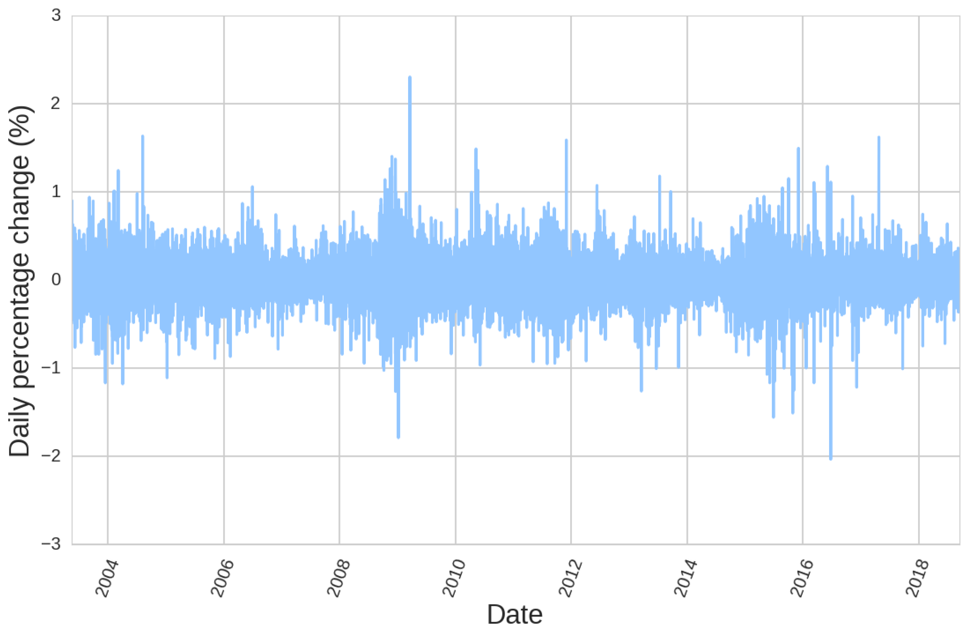
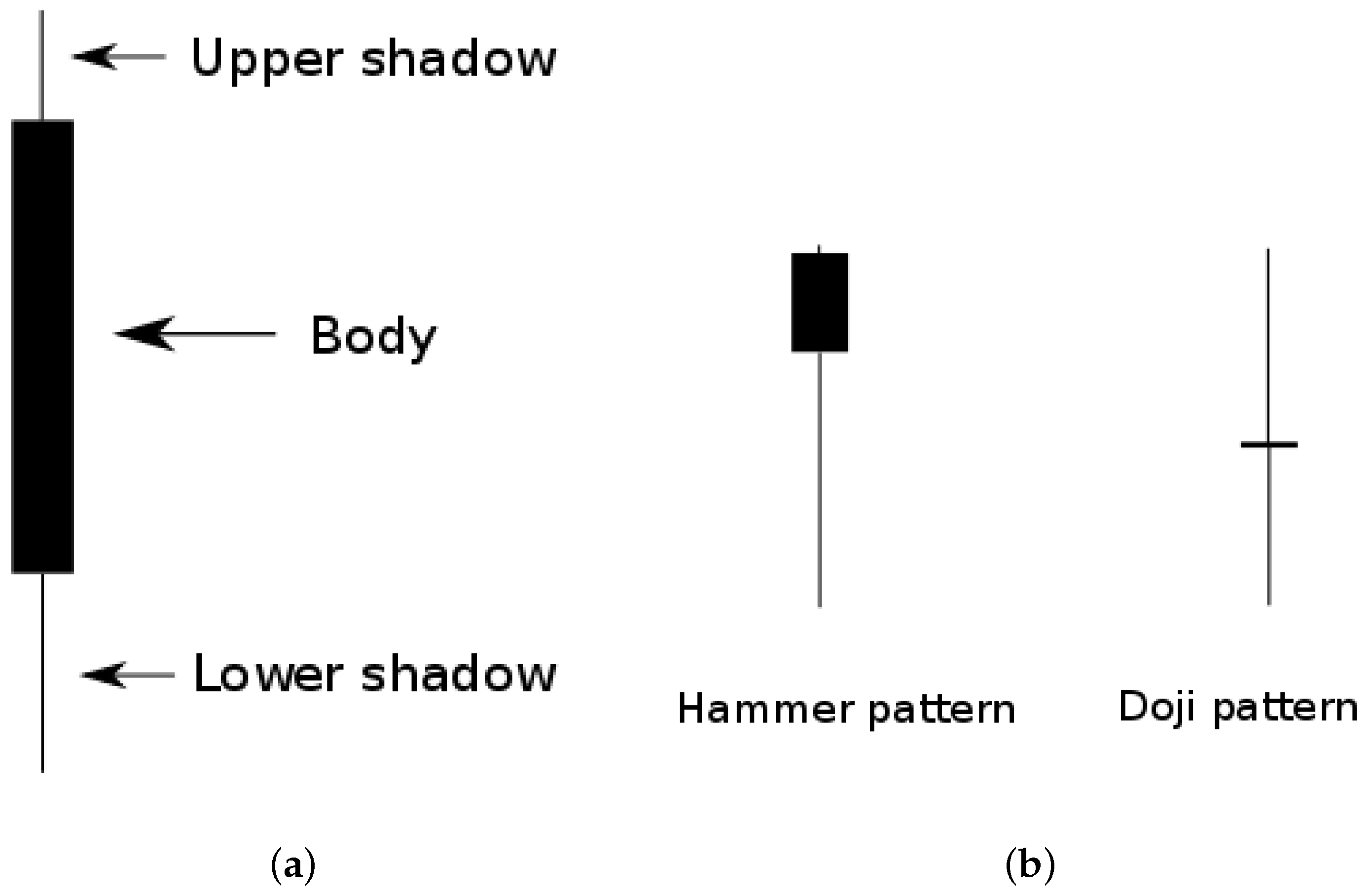
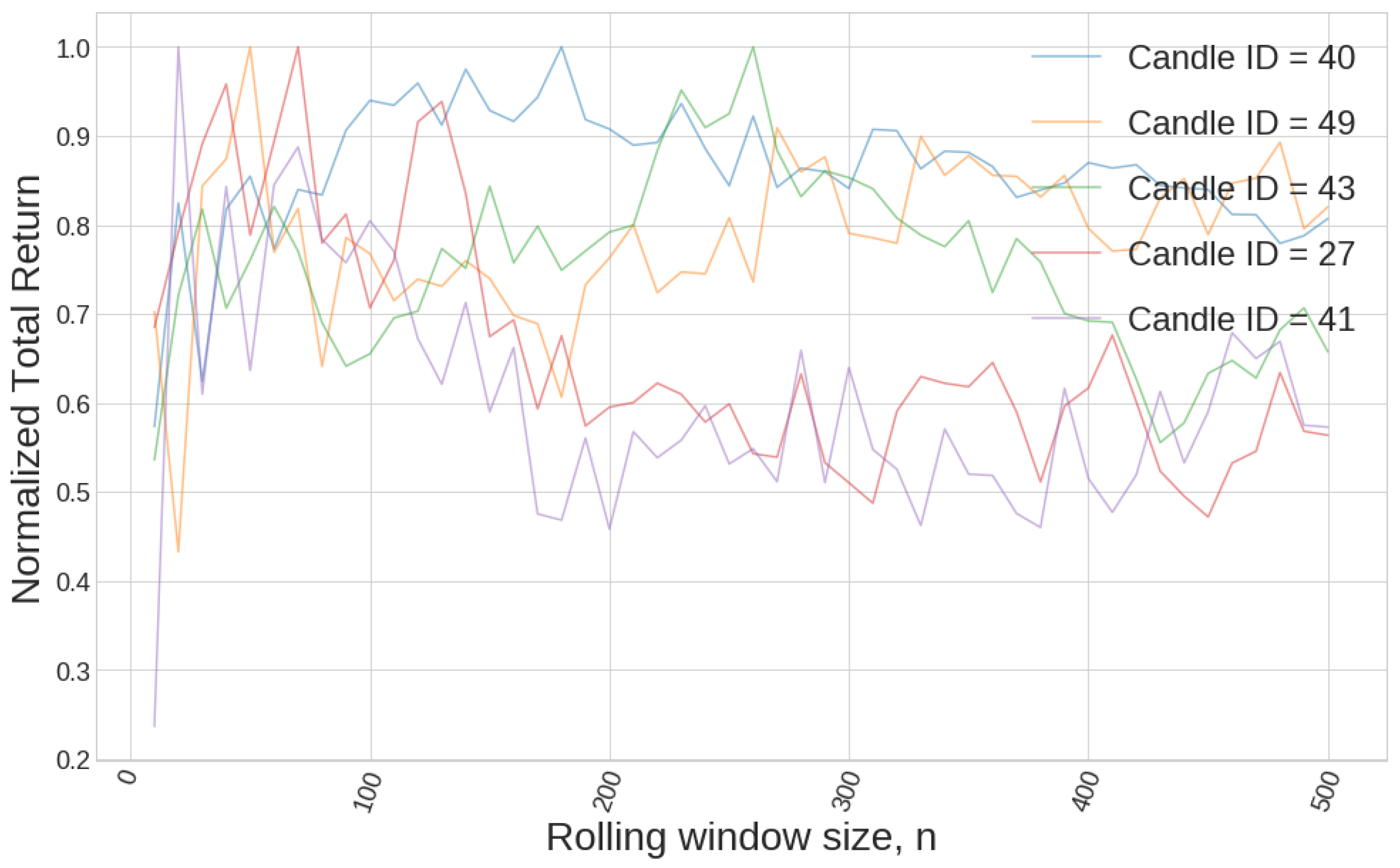
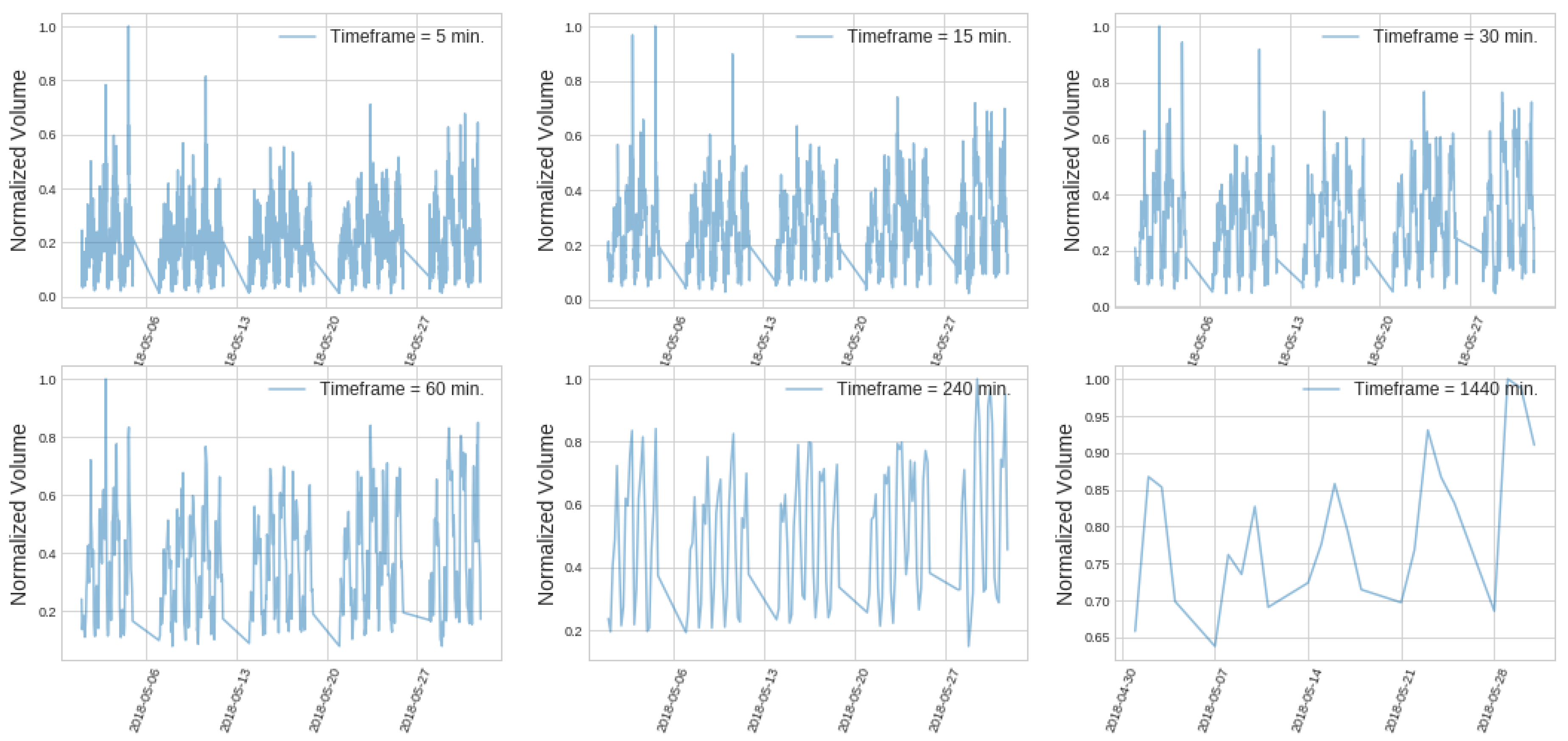
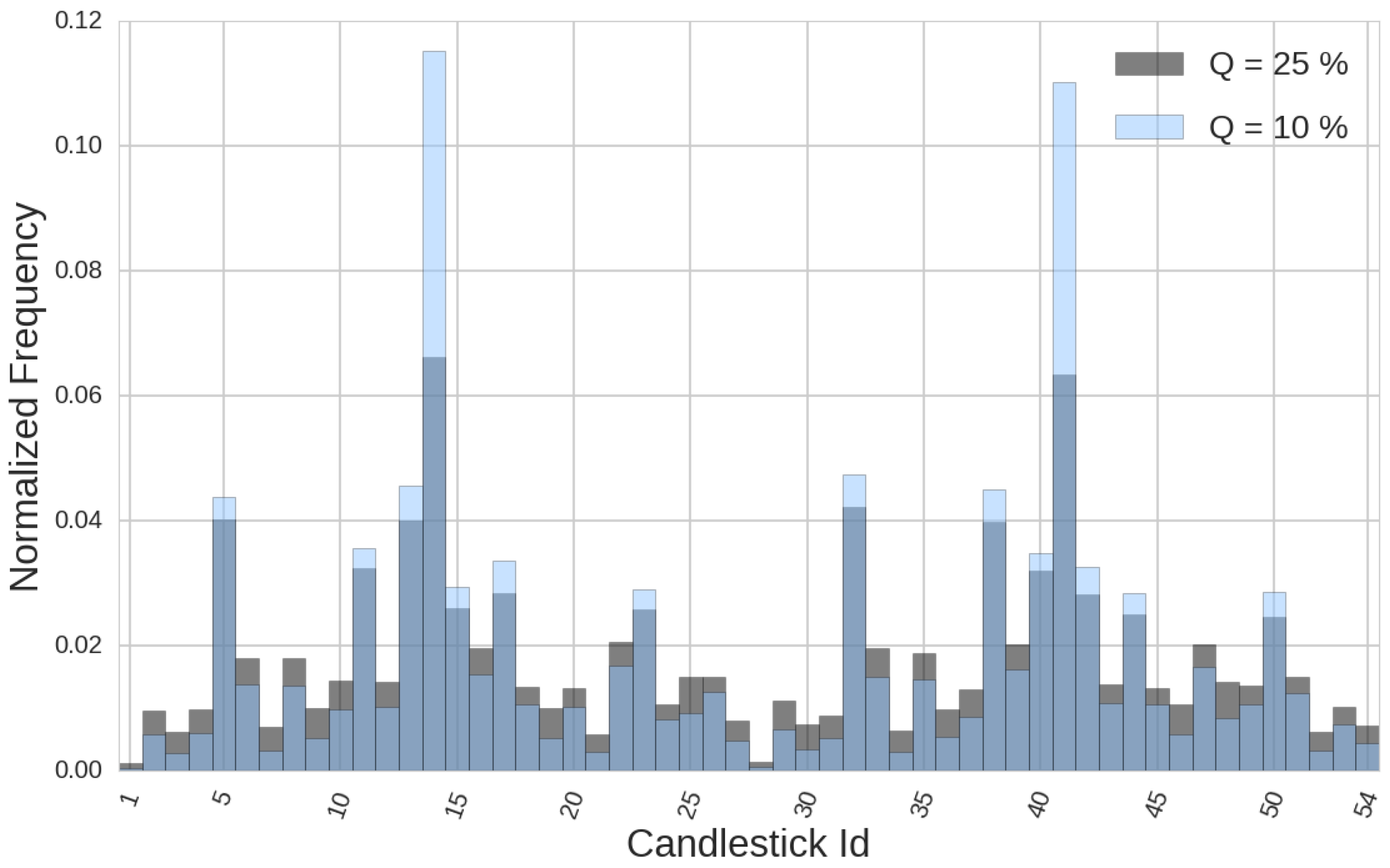
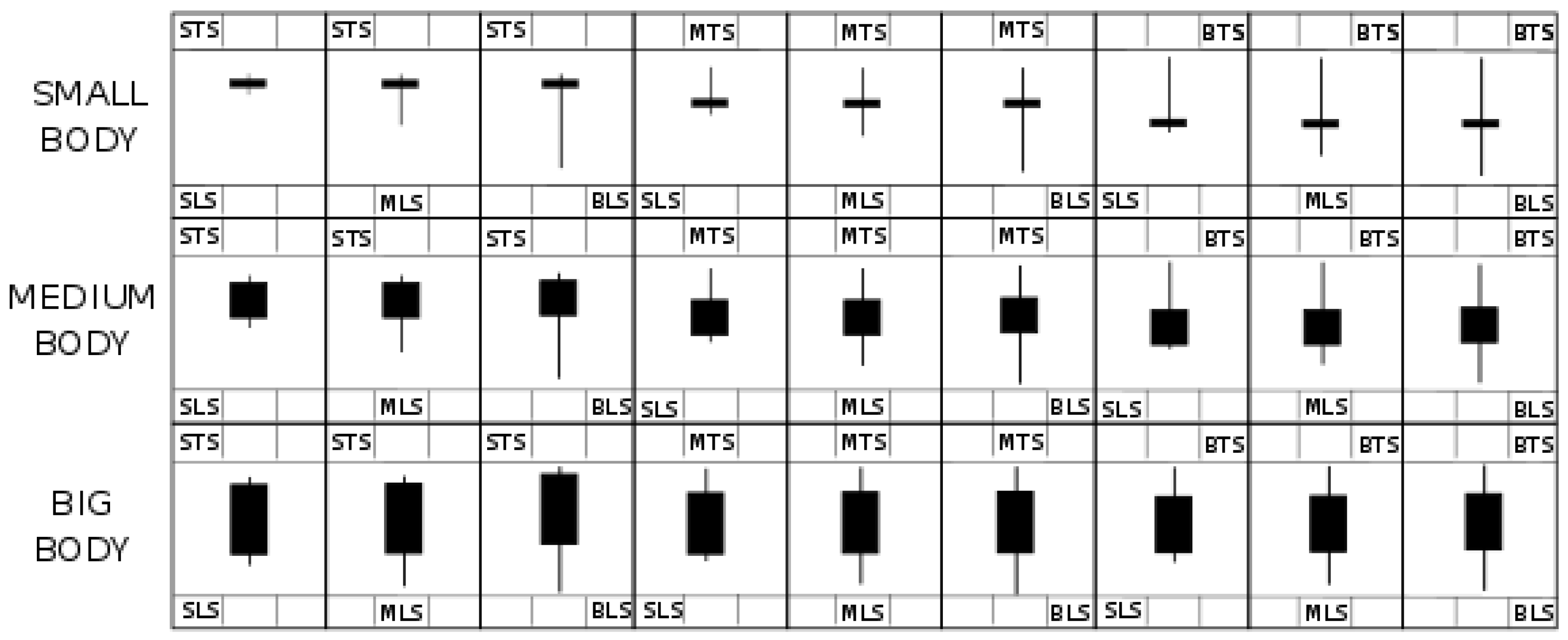
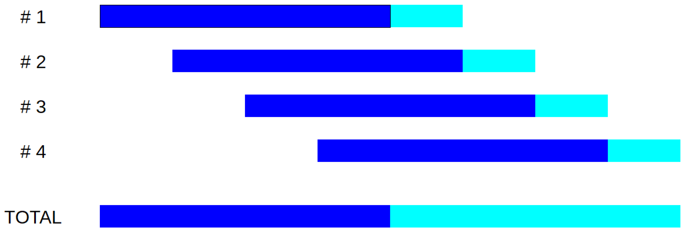
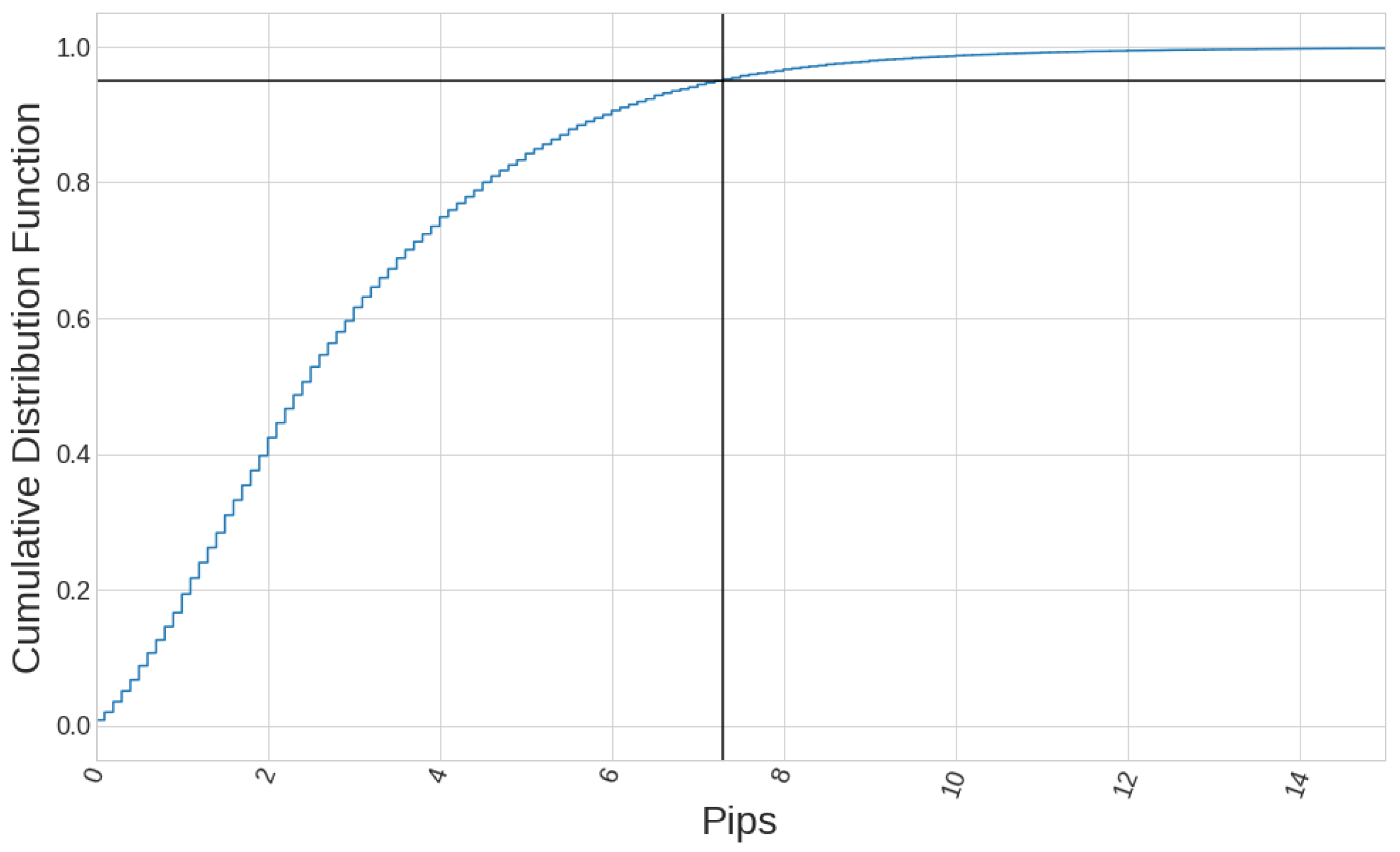
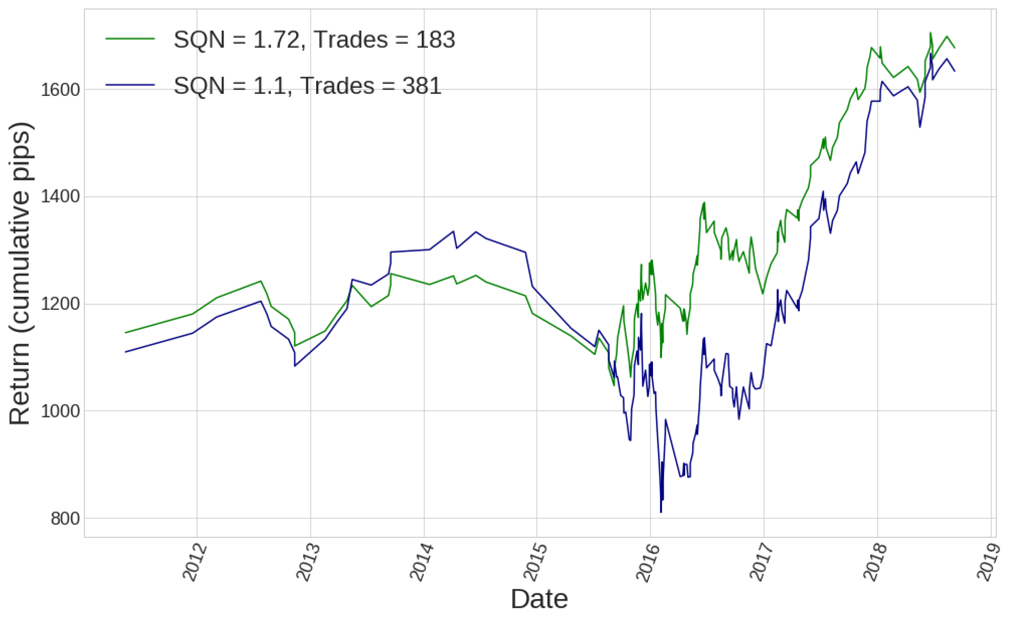
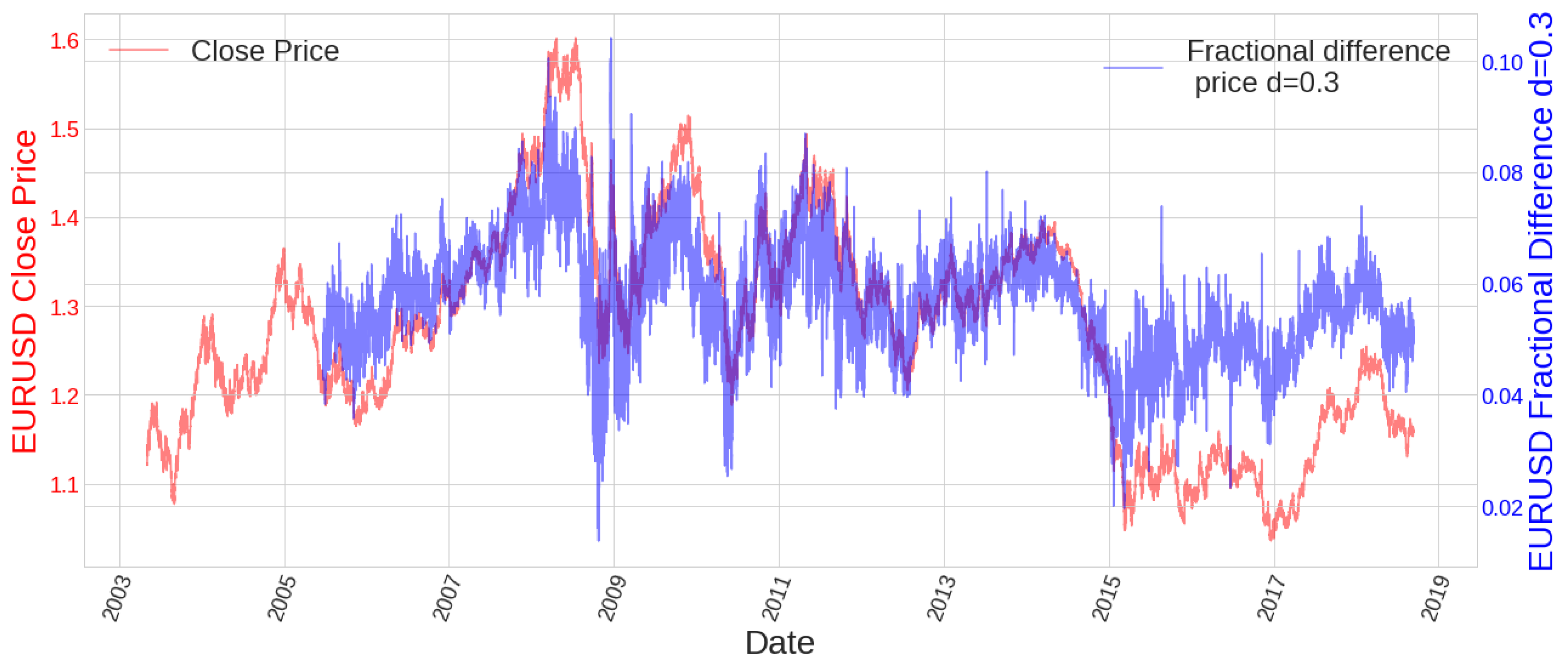
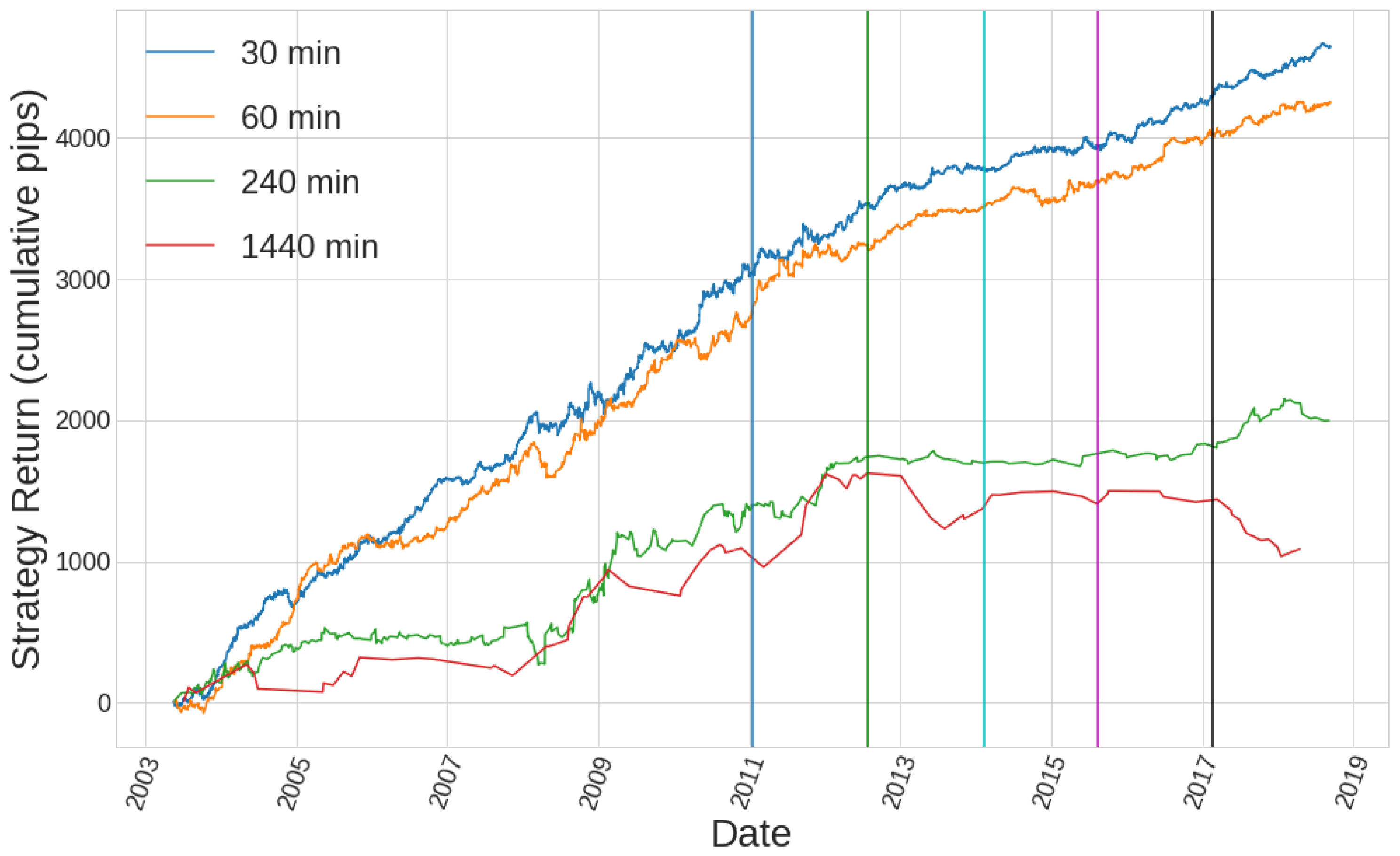
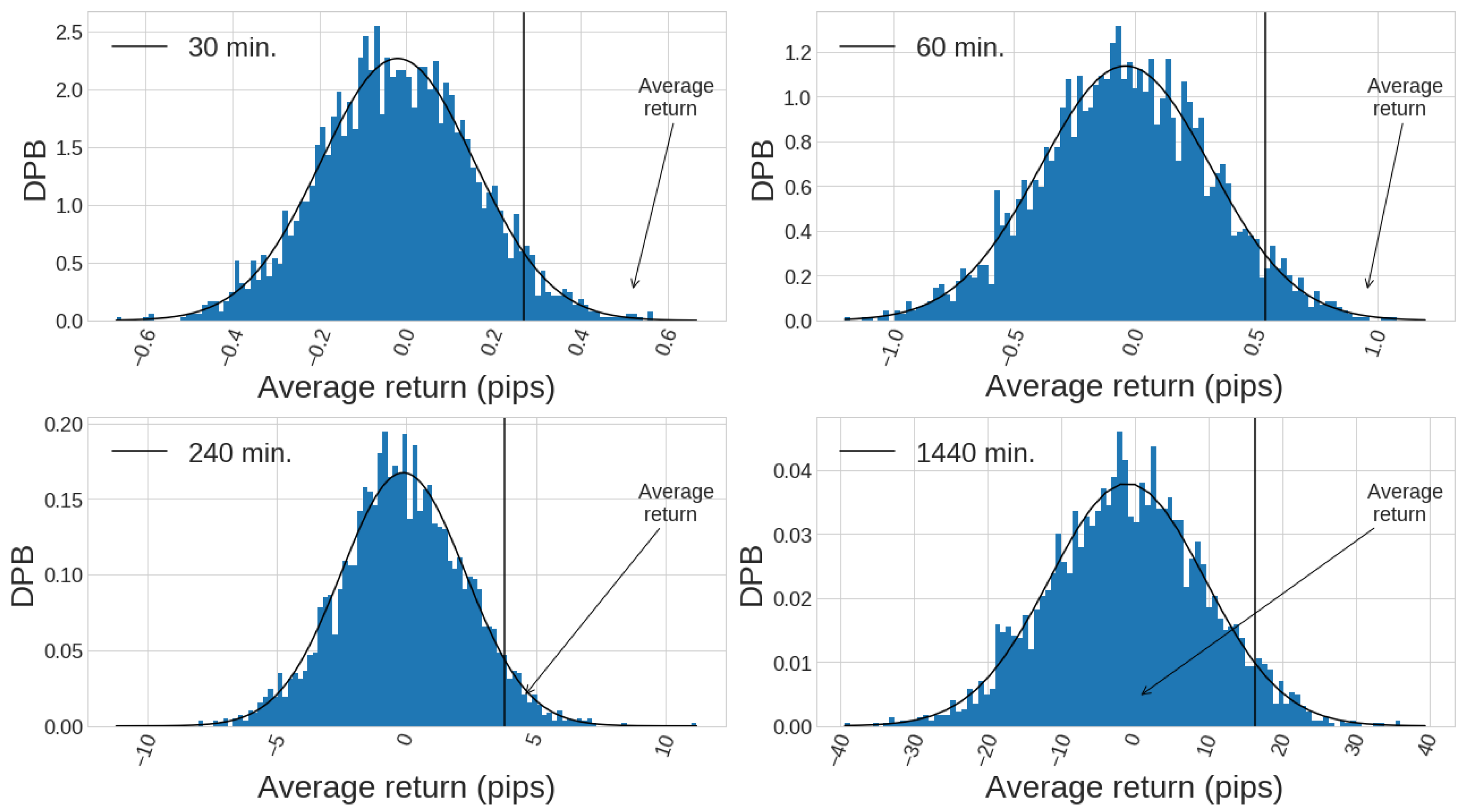
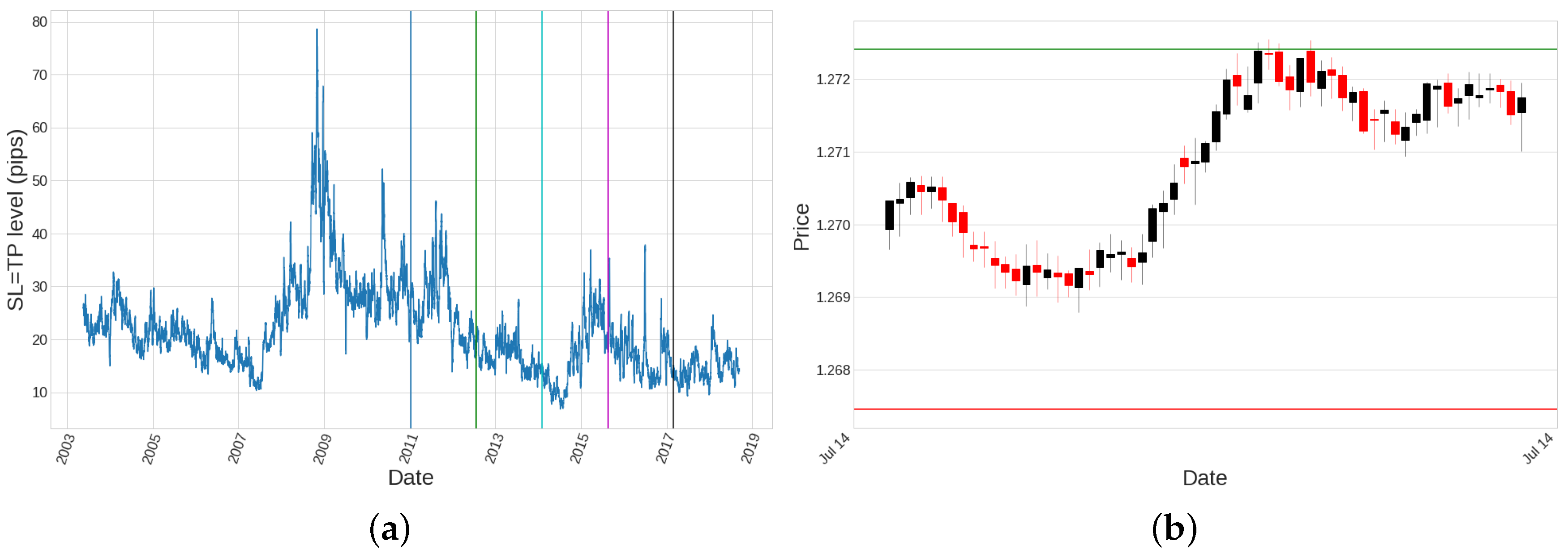
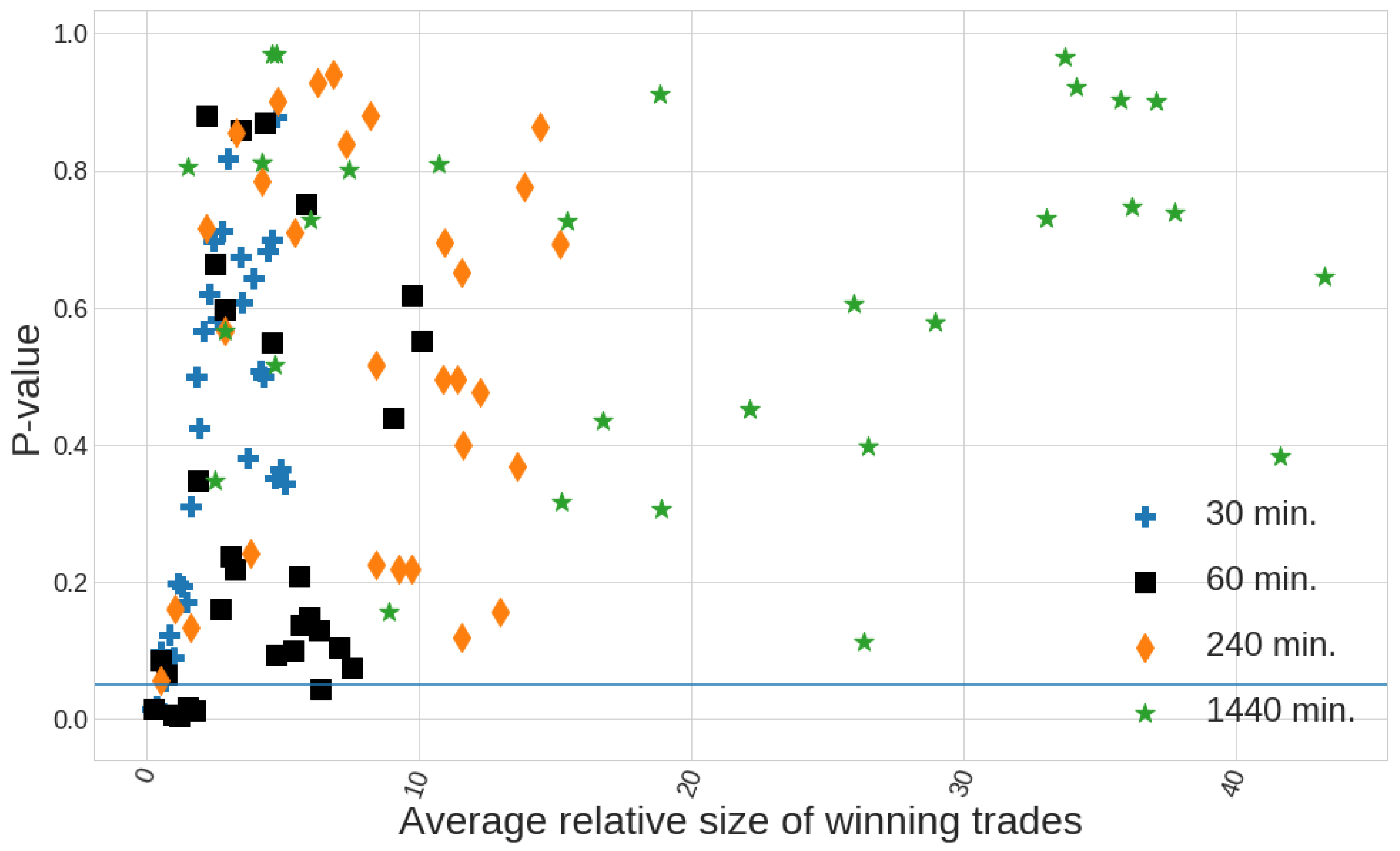
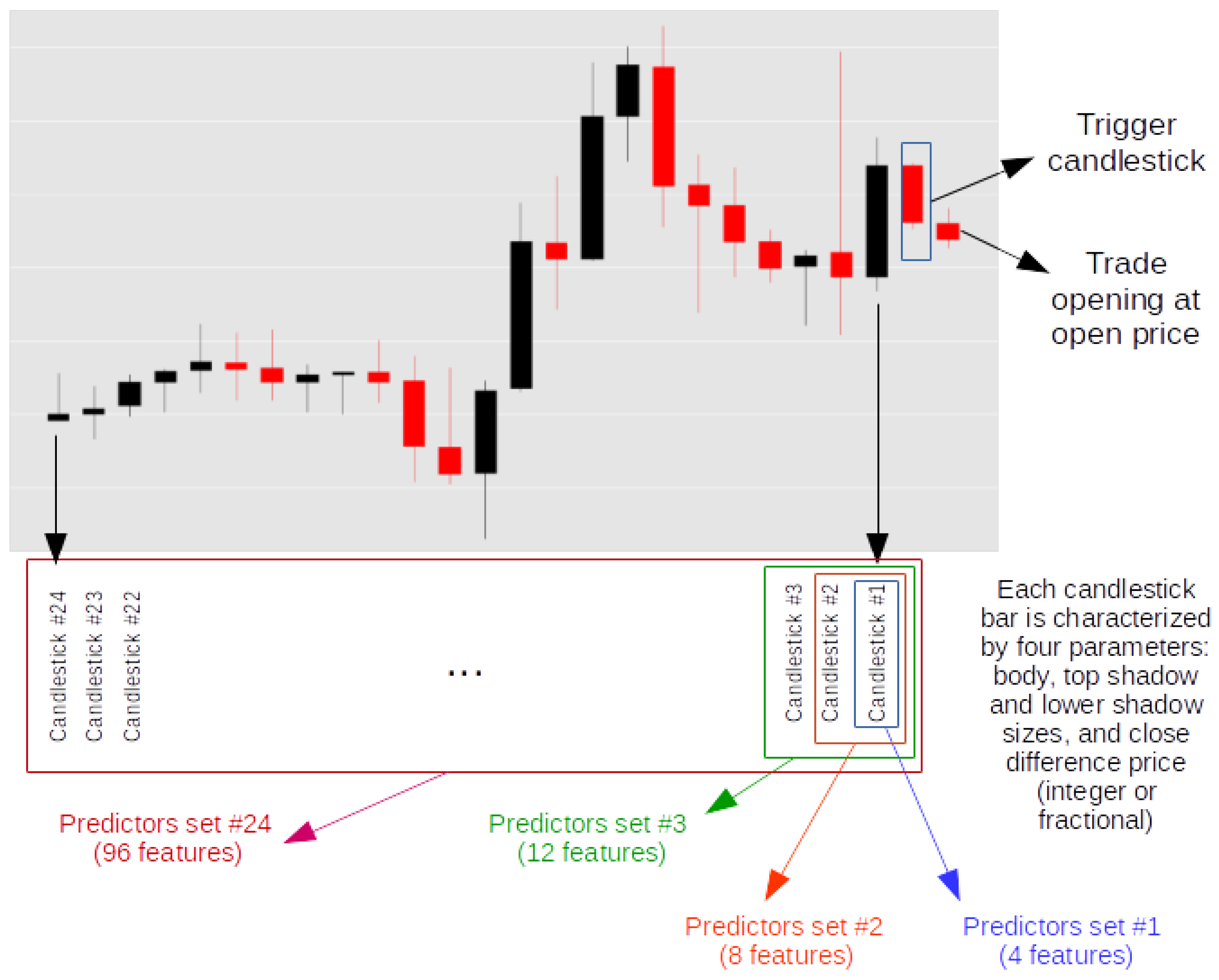
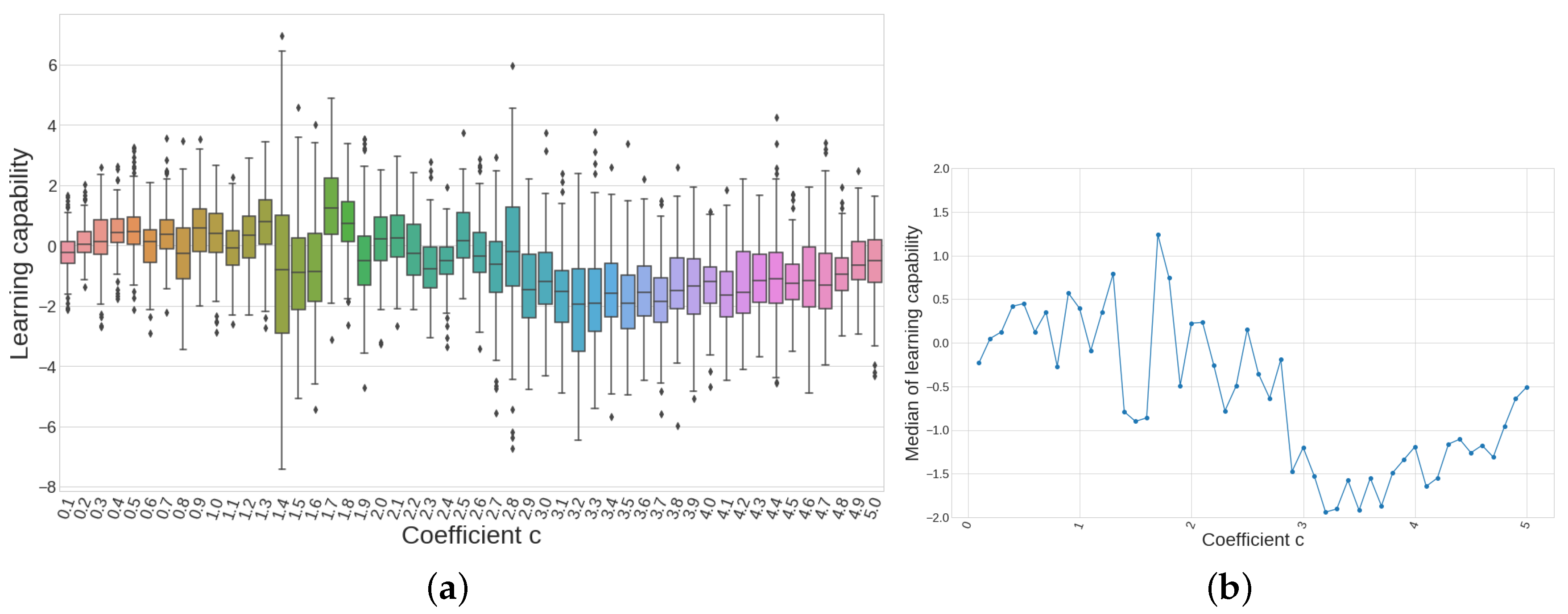
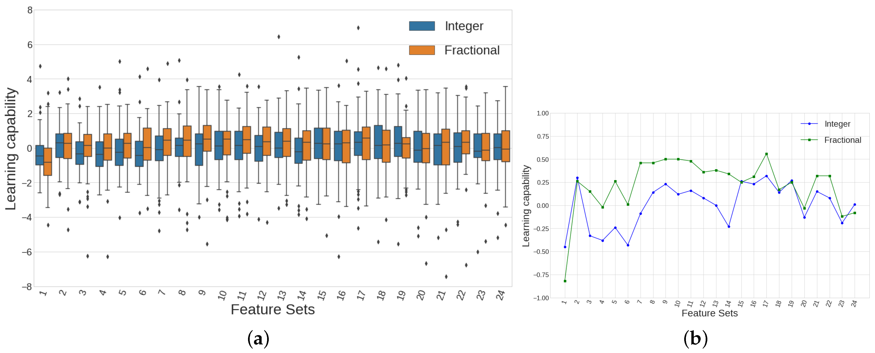
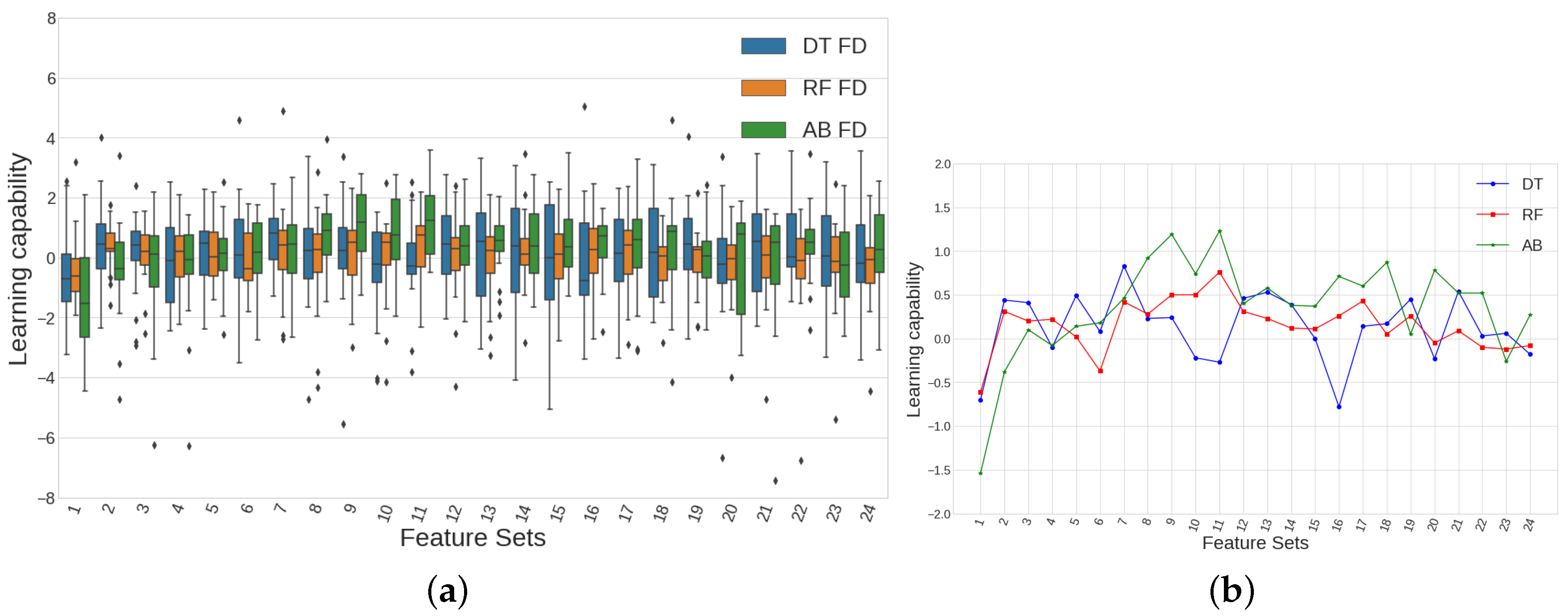
Table 1.
Rolling window size n shrinks as the timeframe expands.
| Timeframe (min) | Rolling Window Size n |
|---|---|
| 30 | 240 |
| 60 | 120 |
| 240 | 30 |
| 1440 | 22 |
Table 2.
Trade returns of an hourly timeframe trading strategy and its filtered version using AdaBoost classifier to learn which trades are profitable. Only the performance of the month of September is shown in this table. Figure 9 shows both equity curves for all the out-of-sample data. Notice how the AB-filtered strategy shows 0 for the returns of all those trades which were predicted to yield negative returns and a non-zero value for all those trades which were predicted to yield positive returns. It can be seen that the prediction is not always good, since there are negative predictions for true positive returns and conversely.
| Date of the Trade | Trade Returns of Base Strategy (Pips) | Trade Returns of AB-Filtered Strategy (Pips) |
|---|---|---|
| 2015-09-03 21:00:00 | −35.1 | 0 |
| 2015-09-07 11:00:00 | −33.2 | −33.2 |
| 2015-09-08 07:00:00 | 31.3 | 31.3 |
| 2015-09-08 16:00:00 | −29.8 | 0 |
| 2015-09-11 16:00:00 | −28.4 | 0 |
| 2015-09-15 11:00:00 | 28.5 | 28.5 |
| 2015-09-16 16:00:00 | −28.7 | 0 |
| 2015-09-18 12:00:00 | 28.5 | 28.5 |
| 2015-09-23 19:00:00 | −32.5 | 0 |
| 2015-09-24 14:00:00 | −33.9 | 0 |
| 2015-09-24 15:00:00 | −33.9 | 0 |
| 2015-09-25 13:00:00 | 33.3 | 0 |
| 2015-09-28 11:00:00 | 33.0 | 33.0 |
| TOTAL | −100.9 | 88.1 |
Table 3.
Results from a long-only strategy. Candlesticks IDs 1–27 are bullish, while Candlesticks IDs 28–54 are bearish. It is highlighted the best SQN-performing strategy, which corresponds to an entry condition defined by candlestick ID 40.
Table 3.
Results from a long-only strategy. Candlesticks IDs 1–27 are bullish, while Candlesticks IDs 28–54 are bearish. It is highlighted the best SQN-performing strategy, which corresponds to an entry condition defined by candlestick ID 40.
| ID | Body | TS | LS | Trades | Return | APpT | Drawdown | % W | % L | Winners | Losers | SQN |
|---|---|---|---|---|---|---|---|---|---|---|---|---|
| 1 | S | S | S | 64 | 194.75 | 3.04 | −34.52 | 35.94 | 64.06 | 11.43 | −11.66 | 1.56 |
| 2 | S | S | M | 385 | 87.52 | 0.23 | −164.86 | 45.45 | 54.55 | 9.18 | −7.23 | 0.31 |
| 3 | S | S | B | 342 | 36.55 | 0.11 | −282.31 | 48.83 | 51.17 | 10.61 | −9.92 | 0.12 |
| 4 | S | M | S | 366 | 38.73 | 0.11 | −240.14 | 50.55 | 49.45 | 8.45 | −8.42 | 0.16 |
| 5 | S | M | M | 1946 | 852.09 | 0.44 | −507.75 | 52.16 | 47.84 | 8.41 | −8.25 | 1.51 |
| 6 | S | M | B | 921 | 88.53 | 0.10 | −462.47 | 48.64 | 51.36 | 11.86 | −11.04 | 0.17 |
| 7 | S | B | S | 359 | 33.44 | 0.09 | −357.42 | 52.65 | 47.35 | 9.75 | −10.64 | 0.12 |
| 8 | S | B | M | 897 | −623.25 | −0.69 | −766.99 | 48.83 | 51.17 | 11.48 | −12.31 | −1.18 |
| 9 | S | B | B | 502 | 195.24 | 0.39 | −311.01 | 49.20 | 50.80 | 14.03 | −12.82 | 0.45 |
| 10 | M | S | S | 606 | −778.74 | −1.29 | −846.34 | 42.74 | 57.26 | 8.97 | −8.94 | −2.39 |
| 11 | M | S | M | 1514 | −651.90 | −0.43 | −1122.79 | 43.13 | 56.87 | 10.35 | −8.61 | −1.18 |
| 12 | M | S | B | 725 | −122.83 | −0.17 | −689.77 | 45.10 | 54.90 | 13.81 | −11.65 | −0.22 |
| 13 | M | M | S | 1911 | −268.29 | −0.14 | −1276.31 | 48.67 | 51.33 | 9.62 | −9.40 | −0.40 |
| 14 | M | M | M | 3245 | −907.66 | −0.28 | −1143.12 | 47.92 | 52.08 | 10.52 | −10.22 | −0.98 |
| 15 | M | M | B | 1240 | −572.40 | −0.46 | −909.52 | 45.48 | 54.52 | 14.06 | −12.58 | −0.82 |
| 16 | M | B | S | 1063 | 677.93 | 0.64 | −355.90 | 51.18 | 48.82 | 12.14 | −11.42 | 1.20 |
| 17 | M | B | M | 1337 | −890.17 | −0.67 | −1335.98 | 48.24 | 51.76 | 12.44 | −12.88 | −1.27 |
| 18 | M | B | B | 599 | −861.34 | −1.44 | −1223.49 | 46.91 | 53.09 | 15.50 | −16.41 | −1.46 |
| 19 | B | S | S | 522 | −319.08 | −0.61 | −588.77 | 39.46 | 60.54 | 13.51 | −9.82 | −0.83 |
| 20 | B | S | M | 704 | −1100.81 | −1.56 | −1516.04 | 40.77 | 59.23 | 13.76 | −12.11 | −2.11 |
| 21 | B | S | B | 296 | −703.52 | −2.38 | −752.88 | 41.22 | 58.78 | 14.66 | −14.32 | −1.98 |
| 22 | B | M | S | 1095 | −909.80 | −0.83 | −1335.43 | 44.29 | 55.71 | 13.55 | −12.27 | −1.42 |
| 23 | B | M | M | 1211 | 319.32 | 0.26 | −822.70 | 47.07 | 52.93 | 15.72 | −13.48 | 0.42 |
| 24 | B | M | B | 480 | 594.05 | 1.24 | −390.88 | 48.75 | 51.25 | 18.37 | −15.06 | 1.09 |
| 25 | B | B | S | 786 | 608.33 | 0.77 | −455.96 | 49.11 | 50.89 | 14.60 | −12.56 | 1.04 |
| 26 | B | B | M | 670 | 356.11 | 0.53 | −470.43 | 50.75 | 49.25 | 14.25 | −13.60 | 0.68 |
| 27 | B | B | B | 341 | 774.75 | 2.27 | −302.31 | 56.01 | 43.99 | 17.26 | −16.81 | 1.70 |
| 28 | S | S | S | 79 | −4.46 | −0.06 | −72.00 | 46.84 | 53.16 | 4.48 | −4.06 | −0.05 |
| 29 | S | S | M | 452 | −151.63 | −0.34 | −366.98 | 47.79 | 52.21 | 8.52 | −8.44 | −0.53 |
| 30 | S | S | B | 388 | −575.38 | −1.48 | −708.13 | 43.81 | 56.19 | 11.28 | −11.43 | −1.59 |
| 31 | S | M | S | 325 | −22.44 | −0.07 | −342.53 | 52.92 | 47.08 | 7.08 | −8.11 | −0.12 |
| 32 | S | M | M | 2041 | 282.42 | 0.14 | −722.18 | 51.64 | 48.36 | 8.42 | −8.71 | 0.47 |
| 33 | S | M | B | 994 | −1105.72 | −1.11 | −1480.98 | 47.18 | 52.82 | 11.98 | −12.80 | −1.77 |
| 34 | S | B | S | 337 | 383.86 | 1.14 | −209.93 | 55.49 | 44.51 | 10.44 | −10.46 | 1.24 |
| 35 | S | B | M | 972 | 572.19 | 0.59 | −319.46 | 50.41 | 49.59 | 12.42 | −11.44 | 1.00 |
| 36 | S | B | B | 495 | −581.96 | −1.18 | −663.13 | 48.08 | 51.92 | 14.04 | −15.26 | −1.23 |
| 37 | M | S | S | 545 | −10.10 | −0.02 | −211.02 | 53.58 | 46.42 | 8.22 | −9.53 | −0.03 |
| 38 | M | S | M | 1882 | 572.23 | 0.30 | −508.57 | 50.16 | 49.84 | 9.00 | −8.45 | 1.00 |
| 39 | M | S | B | 1020 | 133.36 | 0.13 | −733.85 | 52.35 | 47.65 | 11.14 | −11.97 | 0.24 |
| 40 | M | M | S | 1455 | 2717.64 | 1.87 | −249.93 | 59.24 | 40.76 | 9.24 | −8.86 | 5.34 |
| 41 | M | M | M | 3140 | 2157.72 | 0.69 | −513.82 | 54.17 | 45.83 | 10.65 | −11.09 | 2.19 |
| 42 | M | M | B | 1349 | 54.82 | 0.04 | −903.55 | 52.19 | 47.81 | 12.43 | −13.48 | 0.08 |
| 43 | M | B | S | 686 | 989.30 | 1.44 | −292.12 | 53.94 | 46.06 | 12.30 | −11.27 | 2.05 |
| 44 | M | B | M | 1206 | −1247.78 | −1.03 | −1387.62 | 49.17 | 50.83 | 12.90 | −14.52 | −1.76 |
| 45 | M | B | B | 567 | 440.79 | 0.78 | −441.16 | 53.62 | 46.38 | 14.78 | −15.41 | 0.87 |
| 46 | B | S | S | 577 | 38.78 | 0.07 | −548.94 | 53.73 | 46.27 | 11.30 | −12.97 | 0.09 |
| 47 | B | S | M | 998 | 69.38 | 0.07 | −529.02 | 54.46 | 45.54 | 11.86 | −14.00 | 0.11 |
| 48 | B | S | B | 715 | −107.02 | −0.15 | −456.95 | 49.93 | 50.07 | 13.53 | −13.79 | −0.21 |
| 49 | B | M | S | 723 | 1170.67 | 1.62 | −265.01 | 58.09 | 41.91 | 12.40 | −13.32 | 2.40 |
| 50 | B | M | M | 1092 | −241.49 | −0.22 | −789.93 | 55.40 | 44.60 | 12.60 | −16.15 | −0.35 |
| 51 | B | M | B | 641 | −965.07 | −1.51 | −1018.63 | 50.55 | 49.45 | 13.52 | −16.87 | −1.69 |
| 52 | B | B | S | 328 | 181.36 | 0.55 | −296.95 | 53.05 | 46.95 | 15.53 | −16.37 | 0.45 |
| 53 | B | B | M | 414 | 329.50 | 0.80 | −382.83 | 58.45 | 41.55 | 13.60 | −17.23 | 0.77 |
| 54 | B | B | B | 317 | −28.83 | −0.09 | −398.57 | 50.16 | 49.84 | 16.92 | −17.21 | −0.07 |
Table 4.
In-sample strategy results considering all different timeframes and all five in-sample periods. Each in-sample period comprises approximately eight years of data. The column says which candlestick performs best for that period of historical data, while the columns tells us whether we should go short-only or long-only to obtain the results shown.
| IS Fold | TF | ID | Trades | Return | AppT | Drawdown | % W | % L | Winners | Losers | SQN | Direction |
|---|---|---|---|---|---|---|---|---|---|---|---|---|
| 1 | 30 | 11 | 3050 | 3040.34 | 1.00 | −3139.11 | 57.28 | 42.72 | 6.15 | −6.33 | 5.89 | Short |
| 2 | 30 | 11 | 3013 | 2807.62 | 0.93 | −2880.30 | 56.95 | 43.05 | 6.51 | −6.56 | 5.09 | Short |
| 3 | 30 | 40 | 2800 | 2700.37 | 0.96 | −314.93 | 58.04 | 41.96 | 6.37 | −6.51 | 4.81 | Long |
| 4 | 30 | 11 | 3000 | 2300.82 | 0.77 | −2324.61 | 56.80 | 43.20 | 6.36 | −6.19 | 4.25 | Short |
| 5 | 30 | 11 | 3059 | 2169.24 | 0.71 | −2180.44 | 57.14 | 42.86 | 5.31 | −5.23 | 4.69 | Short |
| 1 | 60 | 40 | 1455 | 2717.64 | 1.87 | −249.93 | 59.24 | 40.76 | 9.24 | −8.86 | 5.34 | Long |
| 2 | 60 | 40 | 1465 | 2677.83 | 1.83 | −249.93 | 58.57 | 41.43 | 9.68 | −9.27 | 4.93 | Long |
| 3 | 60 | 40 | 1452 | 2393.14 | 1.65 | −249.93 | 58.95 | 41.05 | 9.00 | −8.90 | 4.57 | Long |
| 4 | 60 | 40 | 1501 | 2001.11 | 1.33 | −249.93 | 56.70 | 43.30 | 8.81 | −8.46 | 3.84 | Long |
| 5 | 60 | 40 | 1555 | 1874.17 | 1.21 | −156.41 | 57.43 | 42.57 | 7.50 | −7.28 | 4.22 | Long |
| 1 | 240 | 22 | 295 | 1359.39 | 4.61 | −1409.79 | 53.56 | 46.44 | 22.81 | −28.38 | 2.06 | Short |
| 2 | 240 | 46 | 136 | 923.87 | 6.79 | −305.02 | 63.97 | 36.03 | 22.62 | −21.30 | 2.4 | Long |
| 3 | 240 | 3 | 105 | 793.52 | 7.56 | −158.21 | 57.14 | 42.86 | 27.95 | −19.64 | 2.26 | Long |
| 4 | 240 | 3 | 95 | 866.14 | 9.12 | −158.21 | 61.05 | 38.95 | 29.09 | −22.19 | 2.48 | Long |
| 5 | 240 | 24 | 126 | 925.59 | 7.35 | −168.14 | 54.76 | 45.24 | 27.26 | −16.76 | 2.68 | Long |
| 1 | 1440 | 46 | 36 | 1064.47 | 29.57 | −1118.44 | 52.78 | 47.22 | 42.19 | −93.78 | 1.93 | Short |
| 2 | 1440 | 46 | 41 | 1525.09 | 37.20 | −1547.60 | 56.10 | 43.90 | 41.16 | −98.52 | 2.46 | Short |
| 3 | 1440 | 12 | 39 | 1364.62 | 34.99 | −1407.49 | 71.79 | 28.21 | 52.85 | −69.50 | 2.42 | Short |
| 4 | 1440 | 9 | 34 | 1349.11 | 39.68 | −1562.74 | 73.53 | 26.47 | 74.85 | −80.91 | 2.5 | Short |
| 5 | 1440 | 22 | 57 | 1555.81 | 27.29 | −1839.28 | 70.18 | 29.82 | 49.52 | −59.94 | 2.76 | Short |
Table 5.
Results are better for those strategies with more trades. Each out of sample period runs for a period of over two years.
Table 5.
Results are better for those strategies with more trades. Each out of sample period runs for a period of over two years.
| OOS Fold | TF | ID | Trades | Return | APpT | Drawdown | % W | % L | Winners | Losers | SQN | Direction |
|---|---|---|---|---|---|---|---|---|---|---|---|---|
| 1 | 30 | 11 | 599 | 497.16 | 0.83 | −144.66 | 56.09 | 43.91 | 6.76 | −6.75 | 1.87 | Short |
| 2 | 30 | 11 | 600 | 231.56 | 0.39 | −58.79 | 57.83 | 42.17 | 3.85 | −4.37 | 1.56 | Short |
| 3 | 30 | 40 | 639 | 171.42 | 0.27 | −86.73 | 56.34 | 43.66 | 3.68 | −4.13 | 1.22 | Long |
| 4 | 30 | 11 | 623 | 367.27 | 0.59 | −80.85 | 55.38 | 44.62 | 4.24 | −3.94 | 2.55 | Short |
| 5 | 30 | 11 | 618 | 330.67 | 0.54 | −66.07 | 57.28 | 42.72 | 3.73 | −3.75 | 2.52 | Short |
| 1 | 60 | 40 | 279 | 519.40 | 1.86 | −122.35 | 54.12 | 45.88 | 11.57 | −9.59 | 1.90 | Long |
| 2 | 60 | 40 | 288 | 270.09 | 0.94 | −47.51 | 61.11 | 38.89 | 4.85 | −5.21 | 2.18 | Long |
| 3 | 60 | 40 | 365 | 191.63 | 0.53 | −136.47 | 54.25 | 45.75 | 5.59 | −5.48 | 1.21 | Long |
| 4 | 60 | 40 | 320 | 327.87 | 1.02 | −58.71 | 59.69 | 40.31 | 5.87 | −6.15 | 2.28 | Long |
| 5 | 60 | 40 | 349 | 225.55 | 0.65 | −76.52 | 57.59 | 42.41 | 5.56 | −6.02 | 1.45 | Long |
| 1 | 240 | 22 | 46 | 376.48 | 8.18 | −117.59 | 54.35 | 45.65 | 29.97 | −17.75 | 1.76 | Short |
| 2 | 240 | 46 | 23 | −33.74 | −1.47 | −94.31 | 43.48 | 56.52 | 13.43 | −12.92 | −0.44 | Long |
| 3 | 240 | 3 | 13 | 39.78 | 3.06 | −47.50 | 61.54 | 38.46 | 15.64 | −17.06 | 0.49 | Long |
| 4 | 240 | 3 | 20 | 77.67 | 3.88 | −69.42 | 60 | 40 | 18.46 | −17.99 | 0.72 | Long |
| 5 | 240 | 24 | 39 | 177.53 | 4.55 | −155.82 | 64.10 | 35.90 | 18.80 | −20.89 | 0.98 | Long |
| 1 | 1440 | 46 | 11 | 559.81 | 50.89 | −104.92 | 63.64 | 36.36 | 113.61 | −58.87 | 1.44 | Short |
| 2 | 1440 | 46 | 8 | −253.84 | −31.73 | −393.19 | 25 | 75 | 83.98 | −70.30 | −1.09 | Short |
| 3 | 1440 | 12 | 6 | 36.60 | 6.10 | −89.53 | 50 | 50 | 42.58 | −30.38 | 0.30 | Short |
| 4 | 1440 | 9 | 5 | 13.61 | 2.722 | −78.75 | 40 | 60 | 46.18 | −26.25 | 0.15 | Short |
| 5 | 1440 | 22 | 11 | −333.19 | −30.29 | −403.24 | 36.36 | 63.64 | 19.21 | −58.57 | −1.97 | Short |
Table 6.
The highest timeframe is not profitable out of sample. values are better for lower timeframes, where we have more trades. However, the APpT is smaller in these cases. The APpT shown here is the weighted average of the APpT, whose weights are the number of trades at each out of sample period.
| TF | Trades | Return | APpT | Drawdown | % W | % L | Winners | Losers | SQN | WFA Eff. |
|---|---|---|---|---|---|---|---|---|---|---|
| 30 | 3066 | 1618.59 | 0.52 | −144.66 | 56.62 | 43.38 | 4.42 | −4.56 | 4.20 | 0.53 |
| 60 | 1595 | 1444.14 | 0.96 | −136.47 | 57.24 | 42.76 | 6.39 | −6.44 | 3.69 | 0.53 |
| 240 | 138 | 597.91 | 4.52 | −155.82 | 55.80 | 44.20 | 21.56 | −17.42 | 1.90 | 0.44 |
| 1440 | 41 | 22.99 | 0.56 | −587.69 | 43.90 | 56.10 | 70.01 | −53.79 | 0.05 | 0.02 |
Table 7.
The highest timeframe is the only one exhibiting no predictive power at all. However, taking into account transaction costs of one pip per trade (taken as an average for the whole period ranging from 2003 to 2018), we see the net predictive power component of all four strategies is below 0, which makes them all unprofitable to trade.
| TF | 95% Quantile | Avg. Return | p-Value | PP Component | Net PP Component |
|---|---|---|---|---|---|
| 30 | 0.27 | 0.52 | 0.00104 | 0.25 | −0.75 |
| 60 | 0.53 | 0.96 | 0.00199 | 0.43 | −0.57 |
| 240 | 3.80 | 4.52 | 0.02615 | 0.72 | −0.28 |
| 1440 | 10.96 | 0.56 | 0.44465 | −10.4 | −11.4 |
Table 8.
Coefficient c and respective p-values for timeframes of 30 and 60 min. Those strategies which present p-values lower than have been highlighted.
Table 8.
Coefficient c and respective p-values for timeframes of 30 and 60 min. Those strategies which present p-values lower than have been highlighted.
| TF | c | Avg. Winners | q | p-Value |
|---|---|---|---|---|
| 30 | 0.1 | 1.45 | 0.20 | 0.0161 |
| 30 | 0.2 | 2.58 | 0.35 | 0.0192 |
| 30 | 0.3 | 3.53 | 0.48 | 0.0974 |
| 30 | 0.4 | 4.62 | 0.63 | 0.0572 |
| 30 | 0.5 | 5.89 | 0.81 | 0.1244 |
| 30 | 0.6 | 7.07 | 0.97 | 0.0909 |
| 30 | 0.7 | 8.27 | 1.13 | 0.1983 |
| 30 | 0.8 | 9.28 | 1.27 | 0.1936 |
| 30 | 0.9 | 10.72 | 1.47 | 0.1718 |
| 30 | 1.0 | 11.86 | 1.62 | 0.3113 |
| 30 | 1.1 | 13.08 | 1.79 | 0.4994 |
| 30 | 1.2 | 14.04 | 1.92 | 0.4241 |
| 30 | 1.3 | 15.13 | 2.07 | 0.5660 |
| 30 | 1.4 | 16.57 | 2.27 | 0.6212 |
| 30 | 1.5 | 17.84 | 2.44 | 0.6977 |
| 30 | 1.6 | 18.97 | 2.60 | 0.5822 |
| 30 | 1.7 | 20.11 | 2.75 | 0.7112 |
| 30 | 1.8 | 21.49 | 2.94 | 0.8171 |
| 30 | 1.9 | 26.93 | 3.69 | 0.3816 |
| 30 | 2.0 | 25.38 | 3.48 | 0.6070 |
| 30 | 2.1 | 24.92 | 3.41 | 0.6747 |
| 30 | 2.2 | 31.03 | 4.25 | 0.4991 |
| 30 | 2.3 | 28.68 | 3.93 | 0.6425 |
| 30 | 2.4 | 30.35 | 4.16 | 0.5080 |
| 30 | 2.5 | 32.26 | 4.42 | 0.6830 |
| 30 | 2.6 | 33.46 | 4.58 | 0.7002 |
| 30 | 2.7 | 34.58 | 4.74 | 0.8786 |
| 30 | 2.8 | 34.39 | 4.71 | 0.3523 |
| 30 | 2.9 | 35.63 | 4.88 | 0.3642 |
| 30 | 3.0 | 36.86 | 5.05 | 0.3431 |
| 60 | 0.1 | 1.75 | 0.24 | 0.0152 |
| 60 | 0.2 | 3.48 | 0.48 | 0.0861 |
| 60 | 0.3 | 5.11 | 0.70 | 0.0661 |
| 60 | 0.4 | 7.17 | 0.98 | 0.0062 |
| 60 | 0.5 | 8.52 | 1.17 | 0.0041 |
| 60 | 0.6 | 10.83 | 1.48 | 0.0180 |
| 60 | 0.7 | 12.68 | 1.74 | 0.0139 |
| 60 | 0.8 | 13.76 | 1.88 | 0.3473 |
| 60 | 0.9 | 16.03 | 2.20 | 0.8804 |
| 60 | 1.0 | 18.27 | 2.50 | 0.6650 |
| 60 | 1.1 | 19.83 | 2.72 | 0.1612 |
| 60 | 1.2 | 22.26 | 3.05 | 0.2385 |
| 60 | 1.3 | 24.98 | 3.42 | 0.8589 |
| 60 | 1.4 | 21.00 | 2.88 | 0.5970 |
| 60 | 1.5 | 23.64 | 3.24 | 0.2192 |
| 60 | 1.6 | 33.46 | 4.58 | 0.5500 |
| 60 | 1.7 | 31.50 | 4.32 | 0.8700 |
| 60 | 1.8 | 34.67 | 4.75 | 0.0935 |
| 60 | 1.9 | 40.79 | 5.59 | 0.2081 |
| 60 | 2.0 | 39.14 | 5.36 | 0.1011 |
| 60 | 2.1 | 41.11 | 5.63 | 0.1385 |
| 60 | 2.2 | 43.61 | 5.97 | 0.1480 |
| 60 | 2.3 | 46.53 | 6.37 | 0.0438 |
| 60 | 2.4 | 46.22 | 6.33 | 0.1293 |
| 60 | 2.5 | 51.43 | 7.05 | 0.1044 |
| 60 | 2.6 | 54.75 | 7.50 | 0.0759 |
| 60 | 2.7 | 65.82 | 9.02 | 0.4392 |
| 60 | 2.8 | 42.60 | 5.84 | 0.7518 |
| 60 | 2.9 | 70.84 | 9.70 | 0.6184 |
| 60 | 3.0 | 73.49 | 10.07 | 0.5522 |
Table 9.
Coefficient c and respective p-values for timeframes of 240 and 1440 min.
| TF | c | Avg. Winners | q | p-Value |
|---|---|---|---|---|
| 240 | 0.1 | 3.78 | 0.52 | 0.0575 |
| 240 | 0.2 | 7.36 | 1.01 | 0.1607 |
| 240 | 0.3 | 11.65 | 1.60 | 0.1346 |
| 240 | 0.4 | 15.96 | 2.19 | 0.7167 |
| 240 | 0.5 | 21.01 | 2.88 | 0.5670 |
| 240 | 0.6 | 24.09 | 3.30 | 0.8562 |
| 240 | 0.7 | 27.89 | 3.82 | 0.2424 |
| 240 | 0.8 | 31.00 | 4.25 | 0.7848 |
| 240 | 0.9 | 35.12 | 4.81 | 0.9021 |
| 240 | 1.0 | 39.65 | 5.43 | 0.7098 |
| 240 | 1.1 | 45.86 | 6.28 | 0.9286 |
| 240 | 1.2 | 50.13 | 6.87 | 0.9409 |
| 240 | 1.3 | 53.55 | 7.34 | 0.8391 |
| 240 | 1.4 | 61.50 | 8.42 | 0.5173 |
| 240 | 1.5 | 59.74 | 8.18 | 0.8813 |
| 240 | 1.6 | 61.50 | 8.42 | 0.2253 |
| 240 | 1.7 | 67.59 | 9.26 | 0.2198 |
| 240 | 1.8 | 71.14 | 9.74 | 0.2185 |
| 240 | 1.9 | 79.78 | 10.93 | 0.6953 |
| 240 | 2.0 | 79.35 | 10.87 | 0.4967 |
| 240 | 2.1 | 83.15 | 11.39 | 0.4953 |
| 240 | 2.2 | 84.54 | 11.58 | 0.1189 |
| 240 | 2.3 | 84.87 | 11.63 | 0.4004 |
| 240 | 2.4 | 84.53 | 11.58 | 0.6516 |
| 240 | 2.5 | 89.38 | 12.24 | 0.4776 |
| 240 | 2.6 | 99.29 | 13.60 | 0.3688 |
| 240 | 2.7 | 94.68 | 12.97 | 0.1558 |
| 240 | 2.8 | 101.20 | 13.86 | 0.7767 |
| 240 | 2.9 | 105.36 | 14.43 | 0.8629 |
| 240 | 3.0 | 110.91 | 15.19 | 0.6926 |
| 1440 | 0.1 | 10.86 | 1.49 | 0.8065 |
| 1440 | 0.2 | 18.08 | 2.48 | 0.3485 |
| 1440 | 0.3 | 20.80 | 2.85 | 0.5669 |
| 1440 | 0.4 | 31.00 | 4.25 | 0.8112 |
| 1440 | 0.5 | 43.90 | 6.01 | 0.7293 |
| 1440 | 0.6 | 34.17 | 4.68 | 0.5168 |
| 1440 | 0.7 | 54.25 | 7.43 | 0.8019 |
| 1440 | 0.8 | 64.97 | 8.90 | 0.1563 |
| 1440 | 0.9 | 78.36 | 10.73 | 0.8100 |
| 1440 | 1.0 | 112.78 | 15.45 | 0.7266 |
| 1440 | 1.1 | 110.98 | 15.20 | 0.3174 |
| 1440 | 1.2 | 122.24 | 16.75 | 0.4344 |
| 1440 | 1.3 | 138.03 | 18.91 | 0.3059 |
| 1440 | 1.4 | 137.56 | 18.84 | 0.9115 |
| 1440 | 1.5 | 161.46 | 22.12 | 0.4516 |
| 1440 | 1.6 | 189.48 | 25.96 | 0.6051 |
| 1440 | 1.7 | 192.25 | 26.34 | 0.1127 |
| 1440 | 1.8 | 193.18 | 26.46 | 0.3974 |
| 1440 | 1.9 | 211.36 | 28.95 | 0.5791 |
| 1440 | 2.0 | 315.89 | 43.27 | 0.6448 |
| 1440 | 2.1 | 241.24 | 33.05 | 0.7302 |
| 1440 | 2.2 | 303.94 | 41.64 | 0.3843 |
| 1440 | 2.3 | 264.22 | 36.19 | 0.7464 |
| 1440 | 2.4 | 275.70 | 37.77 | 0.7394 |
| 1440 | 2.5 | 249.27 | 34.15 | 0.9230 |
| 1440 | 2.6 | 246.00 | 33.70 | 0.9654 |
| 1440 | 2.7 | 260.96 | 35.75 | 0.9023 |
| 1440 | 2.8 | 270.62 | 37.07 | 0.9004 |
| 1440 | 2.9 | 33.53 | 4.59 | 0.9694 |
| 1440 | 3.0 | 34.69 | 4.75 | 0.9703 |
Table 10.
It can be seen that the vector comprising the optimum sequence of candlestick patterns is very similar for coefficient values which are very close.
Table 10.
It can be seen that the vector comprising the optimum sequence of candlestick patterns is very similar for coefficient values which are very close.
| c | OOS Fold | ID | Trades | Return | AppT | DD | % W | % L | Winners | Losers | SQN | Direction |
|---|---|---|---|---|---|---|---|---|---|---|---|---|
| 0.5 | 1 | 19 | 99 | 257.88 | 2.6 | −41.74 | 59.6 | 40.4 | 12.83 | −12.47 | 2.03 | Short |
| 0.5 | 2 | 40 | 285 | 469.07 | 1.65 | −70.47 | 59.65 | 40.35 | 8.45 | −8.41 | 3.32 | Long |
| 0.5 | 3 | 40 | 358 | 271.33 | 0.76 | −108.6 | 54.75 | 45.25 | 8.44 | −8.54 | 1.57 | Long |
| 0.5 | 4 | 40 | 313 | 766.4 | 2.45 | −62.69 | 63.26 | 36.74 | 8.72 | −8.34 | 5.06 | Long |
| 0.5 | 5 | 40 | 341 | 333.44 | 0.98 | −58.58 | 57.18 | 42.82 | 7.21 | −7.34 | 2.48 | Long |
| 0.6 | 1 | 40 | 277 | 371.4 | 1.34 | −137.08 | 54.15 | 45.85 | 15.51 | −15.4 | 1.41 | Long |
| 0.6 | 2 | 40 | 285 | 303.56 | 1.07 | −182.34 | 55.44 | 44.56 | 10.08 | −10.15 | 1.77 | Long |
| 0.6 | 3 | 40 | 358 | 472.73 | 1.32 | −159.05 | 55.87 | 44.13 | 10.29 | −10.04 | 2.3 | Long |
| 0.6 | 4 | 40 | 313 | 685.48 | 2.19 | −86.92 | 59.74 | 40.26 | 10.45 | −10.07 | 3.7 | Long |
| 0.6 | 5 | 40 | 341 | 238.46 | 0.7 | −88.5 | 54.84 | 45.16 | 8.59 | −8.88 | 1.47 | Long |
| 0.7 | 1 | 40 | 277 | 505.22 | 1.82 | −157.26 | 54.87 | 45.13 | 18.1 | −17.96 | 1.64 | Long |
| 0.7 | 2 | 40 | 285 | 304.07 | 1.07 | −172.46 | 54.74 | 45.26 | 11.75 | −11.86 | 1.51 | Long |
| 0.7 | 3 | 40 | 358 | 455.07 | 1.27 | −268.3 | 53.91 | 46.09 | 12.19 | −11.5 | 1.89 | Long |
| 0.7 | 4 | 40 | 313 | 853.25 | 2.73 | −104.73 | 60.38 | 39.62 | 12.2 | −11.72 | 3.96 | Long |
| 0.7 | 5 | 40 | 341 | 218.28 | 0.64 | −158.26 | 53.96 | 46.04 | 10.02 | −10.35 | 1.15 | Long |
| 2.3 | 1 | 38 | 399 | 1482.19 | 3.71 | −1230.44 | 51.13 | 48.87 | 62.61 | −57.9 | 1.2 | Long |
| 2.3 | 2 | 38 | 439 | 1918.11 | 4.37 | −1145.19 | 56.26 | 43.74 | 38.76 | −39.87 | 2.32 | Long |
| 2.3 | 3 | 4 | 146 | −194.24 | −1.33 | −430.41 | 47.26 | 52.74 | 41.32 | −39.55 | −0.37 | Long |
| 2.3 | 4 | 23 | 251 | 212.11 | 0.85 | −558.16 | 51 | 49 | 38.62 | −38.46 | 0.34 | Short |
| 2.3 | 5 | 1 | 21 | 152.01 | 7.24 | −96.85 | 61.9 | 38.1 | 34.43 | −36.95 | 0.94 | Short |
Table 11.
Columns Return, APpT, % W, % L, Winners, Losers, SQN are calculated as a weighted average of the corresponding values shown in Table 10, being the column Trades the weights employed.
Table 11.
Columns Return, APpT, % W, % L, Winners, Losers, SQN are calculated as a weighted average of the corresponding values shown in Table 10, being the column Trades the weights employed.
| c | Trades | Return | AppT | Drawdown | % W | % L | Winners | Losers | SQN |
|---|---|---|---|---|---|---|---|---|---|
| 0.5 | 1396 | 2098.12 | 1.50 | −108.60 | 58.60 | 41.40 | 8.52 | −8.45 | 2.96 |
| 0.6 | 1574 | 2071.63 | 1.32 | −182.34 | 56.04 | 43.96 | 10.83 | −10.76 | 2.15 |
| 0.7 | 1574 | 2335.89 | 1.48 | −268.30 | 55.53 | 44.47 | 12.68 | −12.50 | 2.03 |
| 2.3 | 1256 | 3570.18 | 2.84 | −1.230.44 | 52.63 | 47.37 | 46.53 | −45.23 | 1.23 |
Table 12.
None of the strategies selected show positive net predictive power after considering one pip per trade as an approximation for transaction costs.
Table 12.
None of the strategies selected show positive net predictive power after considering one pip per trade as an approximation for transaction costs.
| c | 95% Quantile | APpT | p-Value | PP Component | Net PP Component |
|---|---|---|---|---|---|
| 0.5 | 0.95 | 1.50 | 0.00413 | 0.55 | −0.45 |
| 0.6 | 0.99 | 1.32 | 0.01812 | 0.33 | −0.67 |
| 0.7 | 1.1 | 1.48 | 0.01391 | 0.38 | −0.62 |
| 2.3 | 2.76 | 2.84 | 0.04379 | 0.08 | −0.92 |
Table 13.
Predictors Sets 1–24 use integer difference close price as the last feature for each candlestick, while Predictors Sets 25–48 use fractional difference close prices instead.
Table 13.
Predictors Sets 1–24 use integer difference close price as the last feature for each candlestick, while Predictors Sets 25–48 use fractional difference close prices instead.
| Model ID | Model Name | c | Predictors Set |
|---|---|---|---|
| 1 | Decision Tree | 0.1 | 1 |
| 2 | 2 | ||
| ⋮ | ⋮ | ||
| 48 | 48 | ||
| 49 | 0.2 | 1 | |
| 50 | 2 | ||
| ⋮ | ⋮ | ||
| 96 | 48 | ||
| ⋮ | ⋮ | ||
| 2353 | 5 | 1 | |
| 2354 | 2 | ||
| ⋮ | |||
| 2400 | 48 | ||
| 2401 | Random Forest | 0.1 | 1 |
| 2402 | 2 | ||
| ⋮ | ⋮ | ||
| 2448 | 48 | ||
| 2449 | 0.2 | 1 | |
| 2450 | 2 | ||
| ⋮ | ⋮ | ||
| 2496 | 48 | ||
| ⋮ | ⋮ | ||
| 4753 | 5 | 1 | |
| 4754 | 2 | ||
| ⋮ | |||
| 4800 | 48 | ||
| 4801 | AdaBoost | 0.1 | 1 |
| 4802 | 2 | ||
| ⋮ | ⋮ | ||
| 4848 | 48 | ||
| 4849 | 0.2 | 1 | |
| 4850 | 2 | ||
| ⋮ | ⋮ | ||
| 4896 | 48 | ||
| ⋮ | ⋮ | ||
| 7153 | 5 | 1 | |
| 7154 | 2 | ||
| ⋮ | |||
| 7200 | 48 |
© 2020 by the author. Licensee MDPI, Basel, Switzerland. This article is an open access article distributed under the terms and conditions of the Creative Commons Attribution (CC BY) license (http://creativecommons.org/licenses/by/4.0/).
Share and Cite
MDPI and ACS Style
Orquín-Serrano, I. Predictive Power of Adaptive Candlestick Patterns in Forex Market. Eurusd Case. Mathematics 2020, 8, 802. https://doi.org/10.3390/math8050802
AMA Style
Orquín-Serrano I. Predictive Power of Adaptive Candlestick Patterns in Forex Market. Eurusd Case. Mathematics. 2020; 8(5):802. https://doi.org/10.3390/math8050802
Chicago/Turabian StyleOrquín-Serrano, Ismael. 2020. "Predictive Power of Adaptive Candlestick Patterns in Forex Market. Eurusd Case" Mathematics 8, no. 5: 802. https://doi.org/10.3390/math8050802
Note that from the first issue of 2016, this journal uses article numbers instead of page numbers. See further details here.