
GeoGraphVis: A Knowledge Graph and Geovisualization Empowered Cyberinfrastructure to Support Disaster Response and Humanitarian Aid
 ,
,
Abstract
:1. Introduction
2. Literature Review
2.1. Disaster Ontologies and Knowledge Graphs
2.2. Cyberinfrastructure as an Empowering Technology for Disaster Management and Decision Support
3. A Disaster Relief Use Case for Hurricane Preparedness and Response
- Q1:
- What is happening now in the disaster area?
- Q2:
- What happened here in the past?
- Q3:
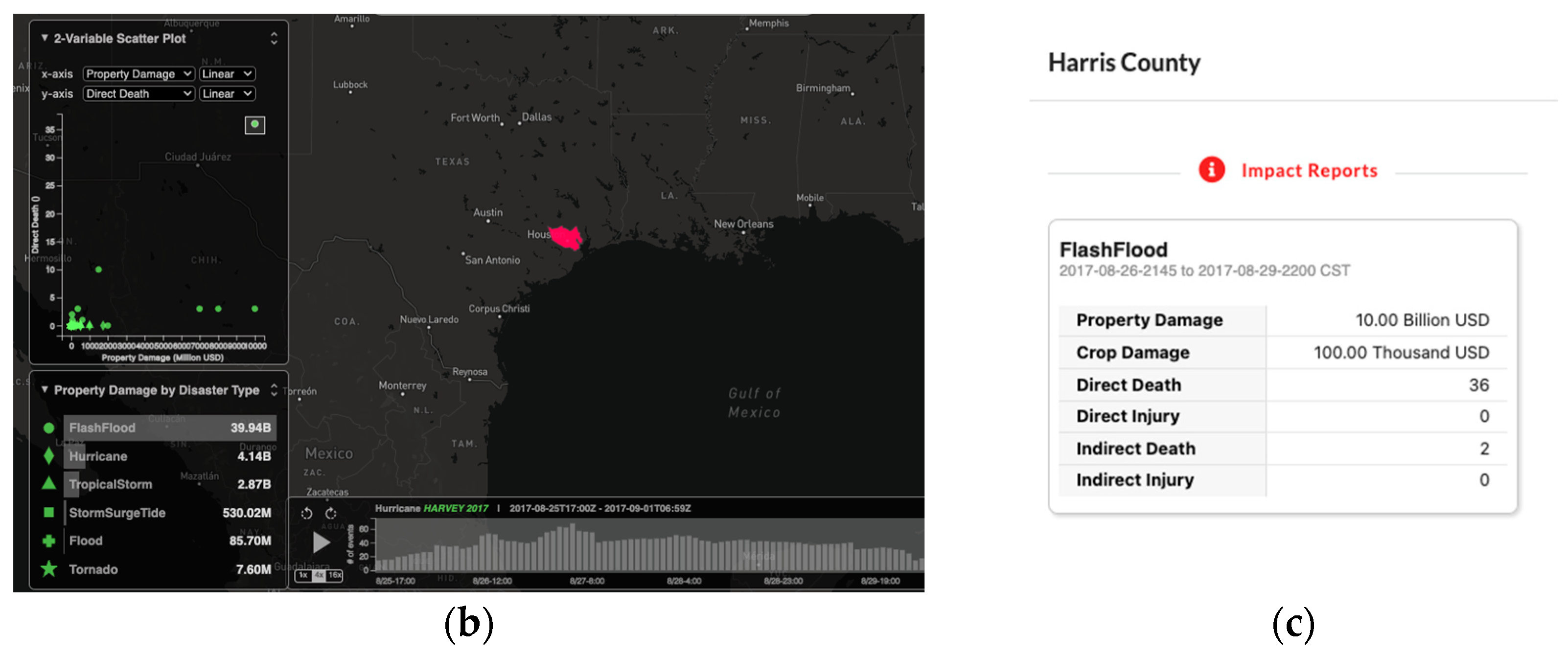
- What are the consequences? What damage has this caused due directly to the disaster or the cascading aftereffects?
- Q4:
- To whom is this happening? Specifically, how many people are affected? Where are the most vulnerable populations located?
- Q5:
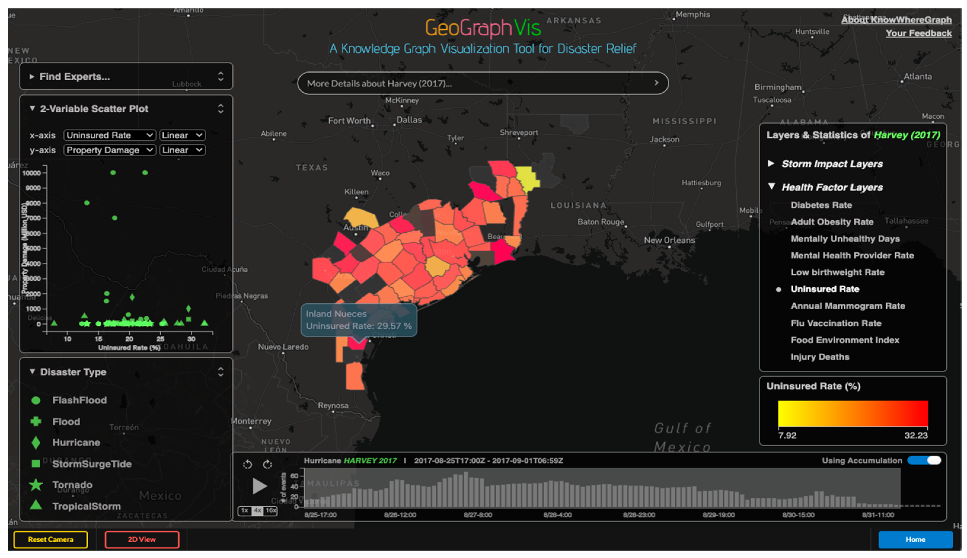
- What are the health risks in the region?
- Q6:
- What are the immediate medical needs of the population and what is the capacity of the local health infrastructure to meet those needs?
4. Knowledge Graph Construction
4.1. An Integrated Ontological Schema
4.2. Semantic- and Spatial-Relationship Building to Link Cross-Domain Datasets
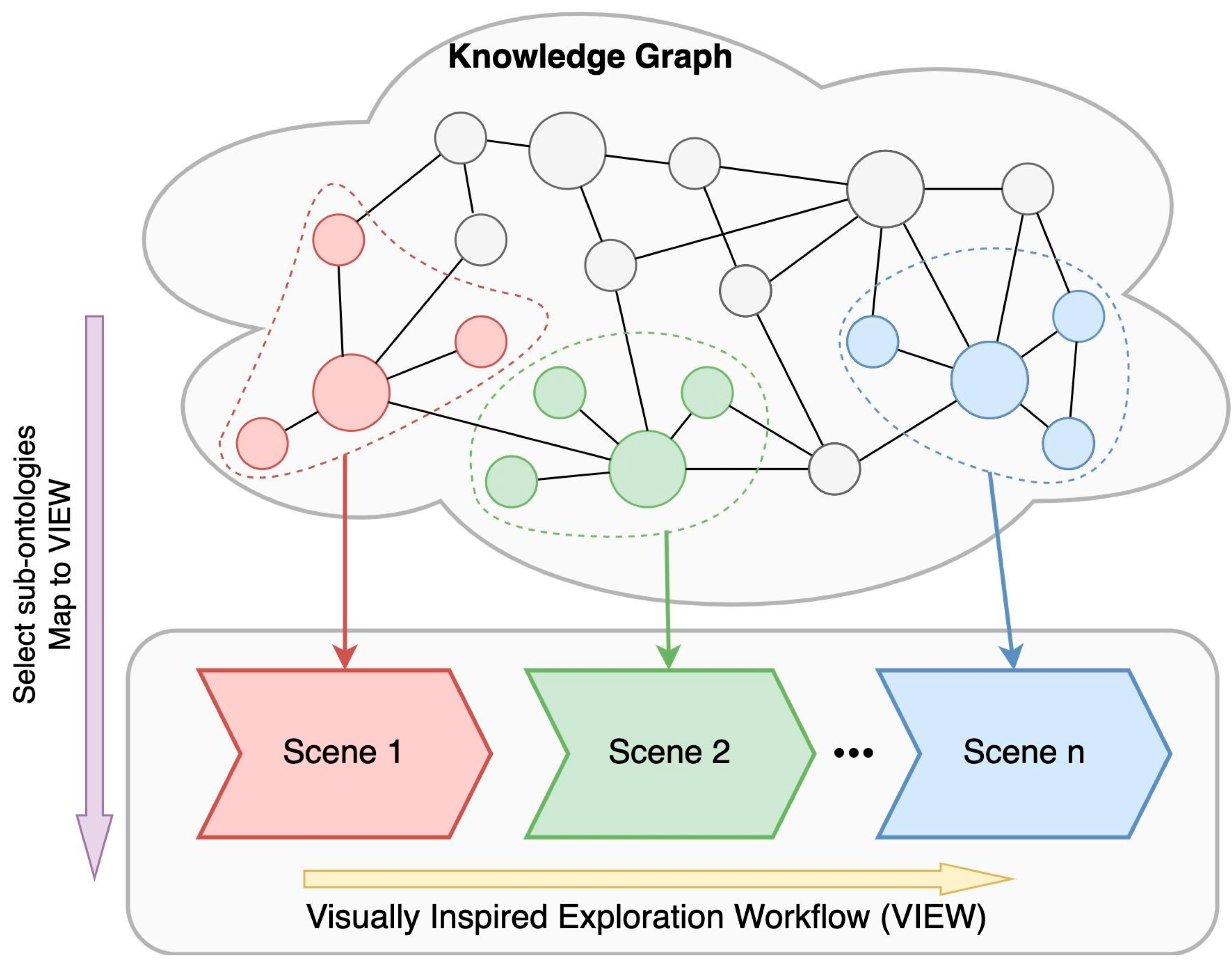
5. Visualization-Based Semantic Exploration
5.1. Rationale for Scene-Based Visualization
5.2. The Role of Users (i.e., Disaster-Relief Experts)
5.3. Capturing a Disaster-Response/Relief Workflow
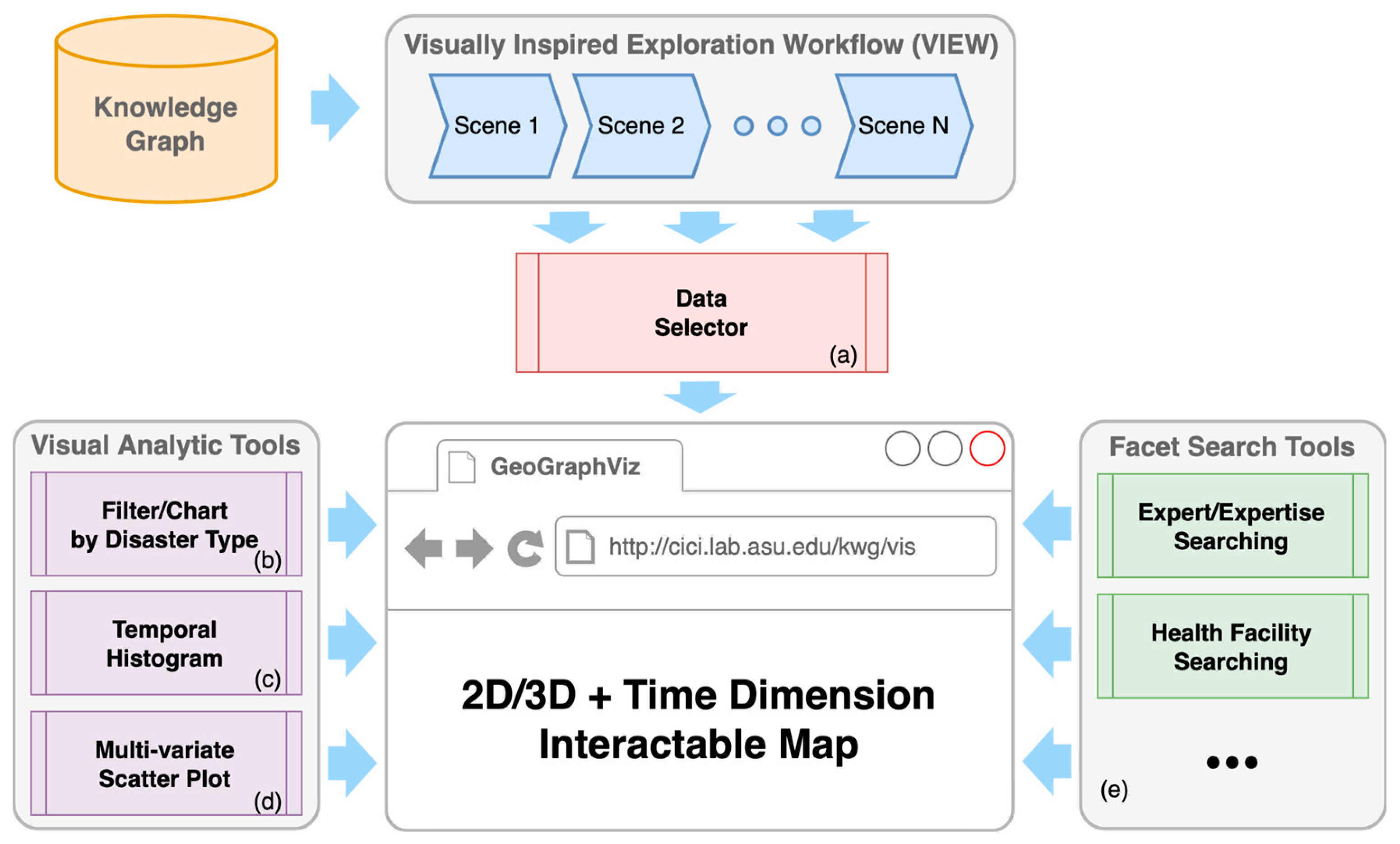
5.4. Interactive Visualization Framework
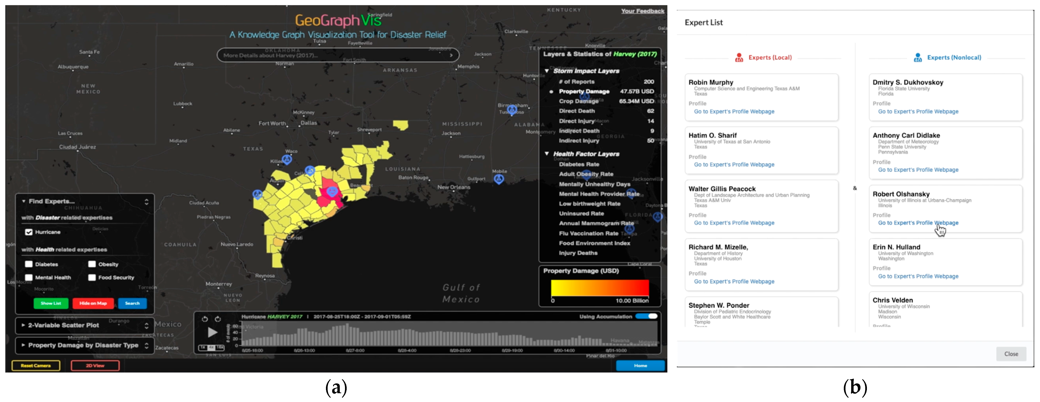
6. Graphical User Interface of GeoGraphVis Customized for the Disaster-Relief Use Case
7. Conclusions and Discussion
Author Contributions
Funding
Data Availability Statement
Acknowledgments
Conflicts of Interest
References
- NOAA National Centers for Environmental Information (NCEI) U.S. Billion-Dollar Weather and Climate Disasters. 2022. Available online: https://www.ncei.noaa.gov/access/billions/ (accessed on 1 March 2023). [CrossRef]
- IDMC. Internal Displacement Data for the United States. Internal Displacement Monitoring Centre (IDMC). 2022. Available online: https://www.internal-displacement.org/countries/united-states (accessed on 1 November 2022).
- Pinelli, J.P.; Esteva, M.; Rathje, E.M.; Roueche, D.; Brandenberg, S.J.; Mosqueda, G.; Padgett, J.; Haan, F. Disaster risk management through the designsafe cyberinfrastructure. Int. J. Disaster Risk Sci. 2020, 11, 719–734. [Google Scholar] [CrossRef]
- Li, W.; Song, M.; Zhou, B.; Cao, K.; Gao, S. Performance improvement techniques for geospatial web services in a cyberinfrastructure environment–A case study with a disaster management portal. Comput. Environ. Urban Syst. 2015, 54, 314–325. [Google Scholar] [CrossRef] [Green Version]
- Li, W.; Wu, S.; Song, M.; Zhou, X. A scalable cyberinfrastructure solution to support big data management and multivariate visualization of time-series sensor observation data. Earth Sci. Inform. 2016, 9, 449–464. [Google Scholar] [CrossRef]
- Li, W. GeoAI: Where machine learning and big data converge in GIScience. J. Spat. Inf. Sci. 2020, 20, 71–77. [Google Scholar] [CrossRef]
- Li, W.; Batty, M.; Goodchild, M.F. Real-time GIS for smart cities. Int. J. Geogr. Inf. Sci. 2020, 34, 311–324. [Google Scholar] [CrossRef]
- Janowicz, K.; Hitzler, P.; Li, W.; Rehberger, D.; Schildhauer, M.; Zhu, R.; Shimizu, C.; Fisher, C.; Cai, L.; Mai, G.; et al. Know, Know Where, KnowWhereGraph: A densely connected, cross-domain knowledge graph and geo-enrichment service stack for applications in environmental intelligence. AI Mag. 2022, 43, 30–39. [Google Scholar]
- Li, W.; Wang, S.; Wu, S.; Gu, Z.; Tian, Y. Performance benchmark on semantic web repositories for spatially explicit knowledge graph applications. Comput. Environ. Urban Syst. 2022, 98, 101884. [Google Scholar] [CrossRef]
- Stodden, V.; Miguez, S.; Seiler, J. Researchcompendia. org: Cyberinfrastructure for reproducibility and collaboration in computational science. Comput. Sci. Eng. 2015, 17, 12–19. [Google Scholar] [CrossRef]
- Li, W.; Song, M.; Tian, Y. An ontology-driven cyberinfrastructure for intelligent spatiotemporal question answering and open knowledge discovery. ISPRS Int. J. Geo Inf. 2019, 8, 496. [Google Scholar] [CrossRef] [Green Version]
- Shao, H.; Li, W.; Kang, W.; Rey, S.J. When spatial analytics meets cyberinfrastructure: An interoperable and replicable platform for online spatial-statistical-visual analytics. J. Geovisualization Spat. Anal. 2020, 4, 17. [Google Scholar] [CrossRef]
- Wang, S.; Li, W. Capturing the dance of the earth: PolarGlobe: Real-time scientific visualization of vector field data to support climate science. Comput. Environ. Urban Syst. 2019, 77, 101352. [Google Scholar] [CrossRef]
- Atkins, D.E.; Droegemeier, K.K.; Feldman, S.I.; Garcia-Molina, H.; Klein, M.L.; Messerschmitt, D.G.; Messina, P.; Ostriker, J.P.; Wright, M.H. Revolutionizing Science and Engineering through Cyberinfrastructure: Report of the National Science Foundation Blue-Ribbon Advisory Panel on Cyberinfrastructure 2003. Available online: https://citeseerx.ist.psu.edu/document?repid=rep1&type=pdf&doi=841a9bb02faa96203b5058252640b260a5538e3e (accessed on 1 March 2023).
- Stein, L.D. Towards a cyberinfrastructure for the biological sciences: Progress, visions and challenges. Nat. Rev. Genet. 2008, 9, 678–688. [Google Scholar] [CrossRef]
- Goodall, J.L.; Castronova, A.M.; Bandaragoda, C.; Morsy, M.M.; Sadler, J.M.; Essawy, B.; Tarboton, D.G.; Malik, T.; Nijssen, B.; Clark, M.P.; et al. Cyberinfrastructure to Support Collaborative and Reproducible Computational Hydrologic Modeling. In AGU Fall Meeting Abstracts; American Geophysical Union: New Orleans, LA, USA, 2017; Volume 2017, p. H14H-05. [Google Scholar]
- Michener, W.; Vieglais, D.; Vision, T.; Kunze, J.; Kruze, P.; Janée, G. DataONE: Data Observation Network for Earth—Preserving Data and Enabling Innovation in the Biological and Environmental Sciences. D-Lib Mag. 2011, 17, 12. [Google Scholar] [CrossRef]
- Goff, S.A.; Vaughn, M.; McKay, S.; Lyons, E.; Stapleton, A.E.; Gessler, D.; Matasci, N.; Wang, L.; Hanlon, M.; Lenards, A.; et al. The iPlant collaborative: Cyberinfrastructure for plant biology. Front. Plant Sci. 2011, 2, 34. [Google Scholar] [CrossRef] [PubMed] [Green Version]
- Hacker, T.J.; Eigenmann, R.; Bagchi, S.; Irfanoglu, A.; Pujol, S.; Catlin, A.; Rathje, E. The NEEShub cyberinfrastructure for earthquake engineering. Comput. Sci. Eng. 2011, 13, 67–78. [Google Scholar] [CrossRef]
- Wright, D.J.; Wang, S. The emergence of spatial cyberinfrastructure. Proc. Natl. Acad. Sci. USA 2011, 108, 5488–5491. [Google Scholar] [CrossRef] [Green Version]
- Wang, S. A CyberGIS framework for the synthesis of cyberinfrastructure, GIS, and spatial analysis. Ann. Assoc. Am. Geogr. 2010, 100, 535–557. [Google Scholar] [CrossRef]
- Li, W. Lowering the barriers for accessing distributed geospatial big data to advance spatial data science: The PolarHub solution. Ann. Am. Assoc. Geogr. 2018, 108, 773–793. [Google Scholar] [CrossRef]
- Shao, H.; Li, W. A comprehensive optimization strategy for real-time spatial feature sharing and visual analytics in cyberinfrastructure. Int. J. Digit. Earth 2019, 12, 250–269. [Google Scholar] [CrossRef]
- Zhou, Z.; Cheng, Z.; Ning, K.; Li, W.; Zhang, L.J. A sub-chain ranking and recommendation mechanism for facilitating geospatial web service composition. Int. J. Web Serv. Res. 2014, 11, 52–75. [Google Scholar] [CrossRef]
- Purohit, H.; Kanagasabai, R.; Deshpande, N. Towards next generation knowledge graphs for disaster management. In Proceedings of the 2019 IEEE 13th international conference on semantic computing (ICSC), Newport Beach, CA, USA, 30 January–1 February 2019; IEEE: Piscataway, NJ, USA, 2019; pp. 474–477. [Google Scholar]
- Xu, W.; Zlatanova, S. Ontologies for disaster management response. In Geomatics Solutions for Disaster Management; Springer: Berlin/Heidelberg, Germany, 2007; pp. 185–200. [Google Scholar]
- Neches, R.; Fikes, R.E.; Finin, T.; Gruber, T.; Patil, R.; Senator, T.; Swartout, W.R. Enabling technology for knowledge sharing. AI Mag. 1991, 12, 36. [Google Scholar]
- Murgante, B.; Scardaccione, G.; Casas, G.L. Building ontologies for disaster management: Seismic risk domain. In Urban and Regional Data Management; CRC Press: Boca Raton, FL, USA, 2009; pp. 271–280. [Google Scholar]
- Dhakal, S.; Zhang, L.; Lv, X. Ontology-based semantic modelling to support knowledge-based document classification on disaster-resilient construction practices. Int. J. Constr. Manag. 2022, 22, 2059–2078. [Google Scholar] [CrossRef]
- Wache, H.; Voegele, T.; Visser, U.; Stuckenschmidt, H.; Schuster, G.; Neumann, H.; Hübner, S. Ontology-Based Integration of Information—A Survey of Existing Approaches. In Ois@ Ijcai. Available online: http://ftp.informatik.rwth-aachen.de/Publications/CEUR-WS/Vol-47/ONTOL2-Proceedings.pdf#page=110 (accessed on 1 March 2023).
- Zhu, R.; Cai, L.; Mai, G.; Shimizu, C.; Fisher, C.K.; Janowicz, K.; Lopez-Carr, A.; Schroeder, A.; Schildhauer, M.; Tian, Y.; et al. Providing Humanitarian Relief Support through Knowledge Graphs. In Proceedings of the 11th on Knowledge Capture Conference, Virtual Event, 2–3 December 2021; pp. 285–288. [Google Scholar]
- Wu, Z.; Shen, Y.; Wang, H.; Wu, M. Urban flood disaster risk evaluation based on ontology and Bayesian Network. J. Hydrol. 2020, 583, 124596. [Google Scholar] [CrossRef]
- Ge, X.; Yang, Y.; Chen, J.; Li, W.; Huang, Z.; Zhang, W.; Peng, L. Disaster prediction knowledge graph based on multi-source spatio-temporal information. Remote Sens. 2022, 14, 1214. [Google Scholar] [CrossRef]
- Wang, S.; Zhang, X.; Ye, P.; Du, M.; Lu, Y.; Xue, H. Geographic knowledge graph (GeoKG): A formalized geographic knowledge representation. ISPRS Int. J. Geo Inf. 2019, 8, 184. [Google Scholar] [CrossRef] [Green Version]
- Jung, H.; Chung, K. Ontology-driven slope modeling for disaster management service. Clust. Comput. 2015, 18, 677–692. [Google Scholar] [CrossRef]
- Bouyerbou, H.; Bechkoum, K.; Lepage, R. Geographic ontology for major disasters: Methodology and implementation. Int. J. Disaster Risk Reduct. 2019, 34, 232–242. [Google Scholar] [CrossRef]
- Stewart, C.A.; Simms, S.; Plale, B.; Link, M.; Hancock, D.Y.; Fox, G.C. What is cyberinfrastructure. In Proceedings of the 38th Annual ACM SIGUCCS Fall Conference: Navigation and Discovery, Norfolk, VA, USA, 24–27 October 2010; pp. 37–44. [Google Scholar]
- Li, W.; Li, L.; Goodchild, M.F.; Anselin, L. A geospatial cyberinfrastructure for urban economic analysis and spatial decision-making. ISPRS Int. J. Geo Inf. 2013, 2, 413–431. [Google Scholar] [CrossRef]
- Patrisina, R.; Meilani, D.; Habib, M. An information management system for effective disaster relief operations. In IOP Conference Series: Earth and Environmental Science; IOP Publishing: Bristol, UK, 2021; Volume 708, p. 012066. [Google Scholar]
- Kijewski-Correa, T.; Taflanidis, A.; Vardeman, C.; Sweet, J.; Zhang, J.; Snaiki, R.; Wu, T.; Silver, Z.; Kennedy, A. Geospatial environments for hurricane risk assessment: Applications to situational awareness and resilience planning in New Jersey. Front. Built Environ. 2020, 6, 549106. [Google Scholar] [CrossRef]
- Hong, J.H.; Tsai, C.Y. Using 3D WebGIS to support the disaster simulation, management and analysis–examples of tsunami and flood. Int. Arch. Photogramm. Remote Sens. Spat. Inf. Sci. 2020, XLIV-3/W1-2020, 43–50. [Google Scholar] [CrossRef]
- Sermet, Y.; Demir, I. An intelligent system on knowledge generation and communication about flooding. Environ. Model. Softw. 2018, 108, 51–60. [Google Scholar] [CrossRef]
- Landsea, C.W.; Franklin, J.L. Atlantic hurricane database uncertainty and presentation of a new database format. Mon. Weather Rev. 2013, 141, 3576–3592. [Google Scholar] [CrossRef]
- Global Administrative Areas. GADM database of Global Administrative Areas, Version 4.1. 2022. Available online: https://www.gadm.org (accessed on 1 March 2023).
- Lo, K.; Wang, L.L.; Neumann, M.; Kinney, R.; Weld, D.S. S2ORC: The semantic scholar open research corpus. arXiv 2019, arXiv:1911.02782. [Google Scholar]
- Manola, F.; Miller, E.; McBride, B. RDF primer. W3C Recomm. 2004, 10, 6. [Google Scholar]
- Antoniou, G.; Harmelen, F.V. Web ontology language: Owl. In Handbook on Ontologies; Springer: Berlin/Heidelberg, Germany, 2004; pp. 67–92. [Google Scholar]
- Janowicz, K.; Haller, A.; Cox, S.J.; Le Phuoc, D.; Lefrançois, M. SOSA: A lightweight ontology for sensors, observations, samples, and actuators. J. Web Semant. 2019, 56, 1–10. [Google Scholar] [CrossRef] [Green Version]
- Battle, R.; Kolas, D. Geosparql: Enabling a geospatial semantic web. Semant. Web J. 2011, 3, 355–370. [Google Scholar] [CrossRef]
- Hobbs, J.R.; Pan, F. Time ontology in OWL. W3C Work. Draft 2006, 27, 3–36. [Google Scholar]
- Liu, Z.; Shi, M.; Janowicz, K.; Regalia, B.; Delbecque, S.; Mai, G.; Zhu, R.; Hitzler, P. LD Connect: A Linked Data Portal for IOS Press Scientometrics. In Proceedings of the European Semantic Web Conference, 19th International Conference, ESWC 2022, Hersonissos, Crete, Greece, 29 May–2 June 2022; Springer: Cham, Switzerland, 2022; pp. 323–337. [Google Scholar]
- Tian, Y.; Li, W. GeoAI for Knowledge Graph Construction: Identifying Causality Between Cascading Events to Support Environmental Resilience Research. arXiv Preprint 2022, arXiv:2211.06011. [Google Scholar]
- Rigby, D.K.; Sutherland, J.; Noble, A. Agile at scale. Harv. Bus. Rev. 2018, 96, 88–96. [Google Scholar]
- Rosario Michel, G.; Muñoz Tapia, S.; Manzano Aybar, F.; Guzmán Javier, V.; Crompvoets, J. Identifying users’ requirements for emergency mapping team operations in the Dominican republic. ISPRS Int. J. Geo Inf. 2020, 9, 165. [Google Scholar] [CrossRef] [Green Version]
- Becker, R.A.; Cleveland, W.S. Brushing scatterplots. Technometrics 1987, 29, 127–142. [Google Scholar] [CrossRef]
- Wikipedia. List of costliest Atlantic Hurricanes. 2022. Available online: https://en.wikipedia.org/wiki/List_of_costliest_Atlantic_hurricanes (accessed on 26 December 2022).
- Li, W.; Hsu, C.Y. GeoAI for Large-Scale Image Analysis and Machine Vision: Recent Progress of Artificial Intelligence in Geography. ISPRS Int. J. Geo Inf. 2022, 11, 385. [Google Scholar] [CrossRef]
- Van Cauter, L.; Crompvoets, J.; Voets, J. Improving intergovernmental information processes: In search of the appropriate management strategy. In Proceedings of the EGPA Annual Conference 2012, Bergen, Norway, 3–4 September 2012. [Google Scholar]
- Richter, C.; Miscione, G.; Georgiadou, Y. Conceptualizing people in SDI literature: Implications for SDI research and development. Int. J. Spat. Data Infrastruct. Res. 2010, 5, 286–325. [Google Scholar]
- Buttigieg, P.L.; Morrison, N.; Smith, B.; Mungall, C.J.; Lewis, S.E.; Envo Consortium. The environment ontology: Contextualising biological and biomedical entities. J. Biomed. Semant. 2013, 4, 43. [Google Scholar]
- Huang, W.; Harrie, L. Towards knowledge-based geovisualisation using Semantic Web technologies: A knowledge representation approach coupling ontologies and rules. Int. J. Digit. Earth 2020, 13, 976–997. [Google Scholar] [CrossRef] [Green Version]
- Viry, M.; Villanova-Oliver, M. How to derive a geovisualization from an application data model: An approach based on Semantic Web technologies. Int. J. Digit. Earth 2021, 14, 874–898. [Google Scholar] [CrossRef]
- Laurini, R. Semantic analysis of feedforward knowledge for regional policymaking. In Knowledge Management for Regional Policymaking; Springer International Publishing: Cham, Switzerland, 2023; pp. 89–108. [Google Scholar]


| Ontology | Dataset | Publisher | Description | URI |
|---|---|---|---|---|
| Storm Track | Atlantic hurricane database | National Oceanic and Atmospheric Administration (NOAA) | A dataset with data collected every six hours, containing information on location, maximum winds, central pressure, and size of known tropical cyclones and subtropical cyclones. | https://www.nhc.noaa.gov/data/#hurdat (accessed on 16 Janurary 2023) |
| Disaster Impact | Storm event database | National Oceanic and Atmospheric Administration (NOAA) | A dataset covering storm and other significant weather event reports with statistics on personal injuries and damage estimates. | https://www.ncdc.noaa.gov/stormevents/ (accessed on 16 Janurary 2023) |
| Health Index | Public health data | University of Wisconsin Population Health Institute | A database containing public health factors, such as a food environment index based on counties. | https://www.countyhealthrankings.org/explore-health-rankings (accessed on 16 Janurary 2023) |
| Centers for Disease Control and Prevention | A database containing public health factors, such as diabetes rates and obesity rates | https://nccd.cdc.gov/DHDSPAtlas/ (accessed on 16 Janurary 2023) | ||
| Disaster Expert | Expert data | Semantic Scholar | A dataset on experts’ areas of expertise, work affiliations, and locations. | https://www.semanticscholar.org/product/api (accessed on 16 Janurary 2023) |
| Location | Global administrative areas | Database of Global Administrative Areas (GADM) | Boundaries of the world’s administrative regions. | https://gadm.org/data.html (accessed on 16 Janurary 2023) |
| Weather forecast zones | National Weather Service (NWS) | Boundaries of areas used by NWS for forecasts and warnings as well as map backgrounds. | https://www.weather.gov/gis/PublicZones (accessed on 16 Janurary 2023) |
Disclaimer/Publisher’s Note: The statements, opinions and data contained in all publications are solely those of the individual author(s) and contributor(s) and not of MDPI and/or the editor(s). MDPI and/or the editor(s) disclaim responsibility for any injury to people or property resulting from any ideas, methods, instructions or products referred to in the content. |
© 2023 by the authors. Licensee MDPI, Basel, Switzerland. This article is an open access article distributed under the terms and conditions of the Creative Commons Attribution (CC BY) license (https://creativecommons.org/licenses/by/4.0/).
Share and Cite
Li, W.; Wang, S.; Chen, X.; Tian, Y.; Gu, Z.; Lopez-Carr, A.; Schroeder, A.; Currier, K.; Schildhauer, M.; Zhu, R. GeoGraphVis: A Knowledge Graph and Geovisualization Empowered Cyberinfrastructure to Support Disaster Response and Humanitarian Aid. ISPRS Int. J. Geo-Inf. 2023, 12, 112. https://doi.org/10.3390/ijgi12030112
Li W, Wang S, Chen X, Tian Y, Gu Z, Lopez-Carr A, Schroeder A, Currier K, Schildhauer M, Zhu R. GeoGraphVis: A Knowledge Graph and Geovisualization Empowered Cyberinfrastructure to Support Disaster Response and Humanitarian Aid. ISPRS International Journal of Geo-Information. 2023; 12(3):112. https://doi.org/10.3390/ijgi12030112
Chicago/Turabian StyleLi, Wenwen, Sizhe Wang, Xiao Chen, Yuanyuan Tian, Zhining Gu, Anna Lopez-Carr, Andrew Schroeder, Kitty Currier, Mark Schildhauer, and Rui Zhu. 2023. "GeoGraphVis: A Knowledge Graph and Geovisualization Empowered Cyberinfrastructure to Support Disaster Response and Humanitarian Aid" ISPRS International Journal of Geo-Information 12, no. 3: 112. https://doi.org/10.3390/ijgi12030112