
A Review of Control Charts and Exploring Their Utility for Regional Environmental Monitoring Programs

Alberta Environment and Protected Areas, Calgary, AB T2L 1Y1, Canada
Environments 2023, 10(5), 78; https://doi.org/10.3390/environments10050078
Submission received: 17 March 2023
/
Revised: 25 April 2023
/
Accepted: 30 April 2023
/
Published: 5 May 2023
Abstract
:Industrial control charts are used in manufacturing to quickly and robustly indicate the status of production and to prompt any necessary corrective actions. The library of tools available for these tasks has grown over time and many have been used in other disciplines with similar objectives, including environmental monitoring. While the utility of control charts in environmental monitoring has been recognized, and the tools have already been used in many individual studies, they may be underutilized in some types of programs. For example, control charts may be especially useful for reporting and evaluating data from regional surveillance monitoring programs, but they are not yet routinely used. The purpose of this study was to promote the use of control charts in regional environmental monitoring by surveying the literature for control charting techniques suitable for the various types of data available from large programs measuring multiple indicators at multiple locations across various physical environments. Example datasets were obtained for Canada’s Oil Sands Region, including water quality, air quality, facility production and performance, and bird communities, and were analyzed using univariate (e.g., x-bar) and multivariate (e.g., Hotelling’s T2) control charts. The control charts indicated multiple instances of unexpected observations and highlighted subtle patterns in all of the example data. While control charts are not uniquely able to identify potentially relevant patterns in data and can be challenging to apply in some monitoring analyses, this work emphasizes the broad utility of the tools for straightforwardly presenting the results from standardized and routine surveillance monitoring.
1. Introduction
Identifying patterns in measurements prompting additional studies are common tasks for scientists and engineers. While statistical hypothesis testing has been the typical approach for this work across disciplines, control charts were introduced in the mid- 1900s in industrial manufacturing to quickly alert process engineers and production managers to either existing or potential future deficiencies in the desired qualities of finished products, e.g., [1,2]. The original Shewart chart eventually spread and was later joined by additional procedures, such as the exponentially weighted moving average (EWMA), the cumulative sum (CUSUM), and attribute control charts, to address more nuanced questions and to increase the sensitivity of the techniques to novel sources of variation [2,3,4,5,6,7,8,9]. The suite of control charting techniques has been further broadened to include multivariate and non-parametric approaches and various techniques suitable for non-normal, censored, or auto-correlated data [2].
Since their introduction, control charts have become standard tools in manufacturing and industrial process control [2,8], but these tools are also applicable in other fields of study with similar goals and practices. For example, environmental monitoring also measures indicators to document their current state, applies tools and approaches to detect various types of changes, including subtle differences, trends, or other relevant differences [10,11,12], and uses this information to inform future work [13]. Similar to industrial process control, varying types of data are also collected in environmental monitoring programs [14,15,16,17], including censored and/or auto-correlated observations [18,19,20,21,22,23,24,25,26,27]. Additionally, the desire to straightforwardly and intuitively present data is shared by practitioners in both manufacturing and environmental monitoring, e.g., [2,13,28,29].
This overlap has been recognized, and control charts have either been recommended for or used in environmental monitoring [13,28,29,30]. However, the tools may not be equally valuable across all types of environmental monitoring. For example, control charts may not be well-suited for short-term, small-scale, or mechanistic studies [28,29,30,31]. In contrast, control charts may be especially useful in large-scale programs with long historical data records of standardized measurements obtained from multiple locations, with plans for similar data collections in the future, and in which more detailed studies can be instigated by decision triggers [13,29,32,33]. However, the potential unfamiliarity of control charts, their statistical limitations, the need to define baseline or reference states, the greater variability of uncontrolled environments compared to controlled factories, and the overlap and comfort with existing methods, e.g., [13,28,30], may impede their adoption in environmental monitoring. Consequently, the tools may be underutilized in large regional monitoring programs [14,29,34].
Despite the potential challenges to their use, control charts have valuable benefits for regional environmental monitoring [28,29,30,31]. The purpose of this work is to add to the existing literature describing the use of control charts in environmental monitoring and to promote their use in the routine reporting of results in large-scale regional programs. While not an exhaustive technical treatment of all of the control chart types available, e.g., [2,26,35,36], the paper briefly reviews some of the more common tools and applies them to monitoring data from Canada’s Oil Sands Region (OSR). In this paper, example data from the OSR were obtained from public sources and were analyzed using techniques suitable for the measured and reported variables, e.g., [15,16,17]. Section 2 examines environmental chemistry data (water quality and air quality) using univariate (x-bar, EWMA, and CUSUM) charts of raw and residual data and multivariate control charts (standard multivariate EWMA (MEWMA), multivariate CUSUM (MCUSUM), and Hotelling’s T2). Section 3 uses industrial performance data using Hotelling’s T2 and decomposition using principal components analysis, and it examines diagnostics. Section 4 uses a distance-based multivariate technique for songbird communities [30]. The final section, Section 5, summarizes the analyses and discusses the use of the techniques for regional monitoring. The review of the techniques, along with the example analyses, demonstrates the widespread utility of control charting for identifying changes in regional monitoring data and further supports its broader adoption for routine reporting.
2. Control Charts and Environmental Chemistry Datasets
2.1. Univariate Control Charts
The first control chart developed was the Shewart univariate x-bar chart [1]. The Shewart chart examines patterns in process means over time and relies on the normality of sample means despite sampling from a non-normal population [31]. The x-bar chart is typically used to flag unusually large (or small) means, but it can also be used to examine individual observations [2]. Commonly, narrow thresholds set at ±2 standard deviations (SD) are called ‘warning limits’, while wider thresholds, such as ±3 SDs, are called ‘control limits’, e.g., [37]. Specification limits may also be defined in manufacturing, and probability-based limits have also been widely used [2]. Other thresholds, such as the probability limits, may also be used often to extend the sensitivity of the method to additional types of change, including improbable series or runs of observations [38]. While these typical thresholds are often used, there are no restrictions beyond the acceptability of the false-positive, or false negative rates defined by the user.
Other types of univariate charts have also been introduced. For example, cumulative sum of deviations from a long-term mean (CUSUM) charts have been developed [3,39,40]. Several versions of these charts have evolved, but the tabular type tracks two statistics, and , to respectively indicate increases and decreases in deviations from a target value over time [2]. CUSUMs are sensitive to small changes [40] and are also favored when single samples (rather than sample means) are the input variables [2]. CUSUMs can also be more sensitive than x-bar charts. For example, a CUSUM applied to water availability in Australia was triggered 21 years before exceedances were identified with an x-bar chart [41]. CUSUM charts are also typically applied prospectively for Phase II control charting after cleaning the data in a retrospective Phase I analysis [2,42], and in one simulation study, they were robust for up to 50% fewer data points [43]. Potential challenges with the retrospective application of the CUSUM in Phase I analyses have prompted the development of additional techniques, such as the self-starting CUSUM [2,42]. Further details of the CUSUM, including the calculation of its control limits, are available elsewhere, e.g., [2].
The final univariate example examined here, the EWMA chart, is also used routinely in manufacturing [4,6,7]. EWMA charts use exponential weighting, denoted by λ (ranging from 0 to 1), to account for historical measurements [4]. As λ approaches 0, weighting is spread among all previous observations and resembles that with the CUSUM. In contrast, as λ approaches 1, less weight is ascribed to historical observations, and the chart resembles the Shewart chart [4]. The weighting factor λ is typically set between 0.2 and 0.3 [4]. However, a smaller λ can be used to detect smaller shifts, while a larger λ is used to detect larger shifts [2]. Similar to CUSUM, EWMA charts are also typically applied in Phase II control charting and are particularly recommended for analyses of individual observations, including non-normally distributed data [2]. A forecast of a single time-step is, however, also an inherent quality of the EWMA [4], and this property can be used to examine historical data (although the opportunities for dynamic (and contemporaneous) process control [4] will be lost). Since the EWMA is a smoothed and transformed variable, any detected shifts must also be referenced to the raw data [5]. Further details of the EWMA, including the calculation of its control limits, are available elsewhere, e.g., [2].
2.1.1. Control Charts with Raw Concentration Data
Among the literature reviewed for this study, water quality, estimated as chemical concentrations, were commonly examined using control charts [44,45,46,47,48]. The parameters selected for the univariate analyses were vanadium (V) and arsenic (As) measured between 2004 and 2020 at the Lower Muskeg River (site AB07DA0610; Figure 1). These variables were selected for several reasons. All measurements were greater than the detection limits; in bitumen, vanadium is enriched, and arsenic is depleted [49]; and these data are publicly available [50]. While examining these elements alone cannot provide a complete picture of any potential industrial influence on watercourses in the OSR, the changes in them over time and the types of changes present may help to diagnose the causes or highlight the environmental risks. For example, while other drivers, such as natural erosion, also affect these elements, a signal indicating greater industrial contamination in streams in the OSR may be a systematic increase in V over time, coupled with a concurrent decrease in As.
The first (and preliminary analyses) of V and As were performed using an x-bar chart for individual raw observations, an EWMA, and a CUSUM using the ‘qcc()’ function in the qcc package for R [51] and using the default settings for calculating the control limits (Figure S1). The raw concentration data were also plotted over time (Figure S1). These preliminary and supplemental analyses showed a general decrease in the average concentration of V over time and an increase in As over time. The plots also highlight the relative advantages of the chart types. The Shewart charts are most sensitive to large differences and highlight unusual runs, while both the EWMA and CUSUM charts are more sensitive to smaller differences. The EWMA and CUSUM charts also more clearly highlight some of the temporal patterns in the data at shorter durations than the entire set. For example, patterns suggesting seasonality are present in the EWMA and CUSUM charts for As in 2008, 2009, 2012, and 2013. These patterns are also present in the raw data and in the x-bar, but they are more apparent in the EWMA and CUSUM charts.
Particular challenges with the water quality datasets available for the OSR, including the lower Muskeg River, include both autocorrelation and unequal intervals between the sampling events. For example, seasonal sampling was performed prior to 2008, monthly sampling was performed between 2010 and 2015, and a mixed design (sub-weekly, sub-monthly, and monthly sampling) was used after 2017 (Figure S2). There is also a two-year gap from April 2015 to March 2017 in the water quality dataset examined here (Figure S2). Discharge in rivers also affects the concentration of many chemical parameters, e.g., [48]. These factors and other limit the potential utility of univariate analyses of these water quality data by increasing the false-positive rate [52,53].
2.1.2. Residual Control Charts
While programs can be designed with additional features to address high false-positive rates [54] or to prospectively plan for other foreseeable challenges [55], statistical tools are also useful for retrospectively addressing some weaknesses. Among some water quality data, using auto-regressive models for data with equal sampling intervals, e.g., [56], and applying the control chart procedure to the residuals are common approaches. Residual control charts are suggested when data are affected by an external and measurable drivers, or they are auto-correlated [2,57]; they can extend the utility of control charts to additional data structures, e.g., [58]; and they may be useful for diagnostics in multivariate analyses [59]. However, residual control charts using the x-bar approach may be insensitive to small process shifts, and EWMA and CUSUM processes are recommended for these analyses [2] (and references in [2]). In this analysis, the generalized estimating equation (GEE) was used (appropriate for unequal sampling intervals; [60]) using the AR1 correlation structure and a Gaussian distribution with the identity link function in the geeglm() function in the R package geepack [61]. The data were log10-transformed prior to the analysis. Discharge from the 07DA008 location was also included as a covariate [62], but chemical observations after 2019 and in the winter (November-February) for data collected before 2013 were omitted because discharge was not available at the time of analysis, highlighting a potential weakness of this approach for many environmental datasets assembled from multiple data sources.
Response residuals were used as input variables for x-bar, EWMA, and CUSUM charts to examine their relative utility (Table S1). The residual control charts used in this analysis all indicate that neither V nor As is in statistical control after accounting for the effects of discharge and unequal sampling intervals (Figure 2). Exceedances of the upper control limits (UCLs) and the lower control limits (LCLs) set at ±3 SD of the three example control charts are observed for both parameters. Statistically unlikely runs of data either greater (e.g., As) or less than (e.g., V) mean residual value (>6 sequential observations greater than less than the mean) were also identified in the x-bar chart (Figure 2). Although EWMA and CUSUM are typically used in Phase II monitoring, changes are especially apparent after ~2015 in these two chart types, indicating a lack of statistical control in the data-generating processes.
While examining these potentially relevant differences can provide some focus for identifying the sources of the exceedances, the patterns apparent in the control charts are also consistent with the advantages of each type of chart. The x-bar is sensitive to discrete exceedances, and EWMA is even more sensitive [2]. CUSUM is also sensitive to long-term patterns in the data (such as greater-than-average vanadium from 2007 to 2015 and lower than average afterward) but less sensitive to larger step-changes [2]. However, the susceptibility of CUSUM to inertia are also apparent, as long-run increases followed by decreases are slow to return to the in-control conditions [63].
Some of these changes in water quality may be associated with industrial activities. Spikes in V in the lower Muskeg River may be associated with local development in 2008 (beginning of Kearl construction; Figure 1), including mine construction and consequent groundwater depressurization (depending on the fate of this water), but earlier construction of the Jackpine mine (started in 2006; Figure 1) is not apparent from the x-bar, EWMA, or CUSUM charts (Figure 2). However, four of the nine exceedances of the UCL in the V x-bar chart occur in the month of April, suggesting that the changes may still be associated with discharge. Relationships between concentration and discharge in rivers may be poorly defined at extreme values [64], and the performance may also be further diminished when instantaneous discharge information for the moment and location at which a sample is collected is not available. For example, previous work in the Athabasca River has also shown the likely residual influence of discharge despite its inclusion in statistical models describing total metals, such as V [48]. While discharge was used as an opportunistic covariate in this other study, e.g., [48], and it did not benefit from planning for co-located flow adjustments, there are also only weak effects of discharge on both As and V at the lower Muskeg River station (Figure S3).
Opposite long-term trends (most apparent in the EWMA and CUSUM analyses (Figure 2) but also shown in the raw concentration data (Figure S1)) were also observed in V and As. Vanadium was progressively lower than predicted over time, while the concentration of As was progressively greater than predicted over time (Figure 2). The discordant changes in As and V may suggest an alteration of sources influencing water quality in the Muskeg River from 2004 to 2019. Changes in groundwater interactions with surface waters, bedrock or surficial sediment erosion, seasonal groundwater recharge and discharge (Figure S4), the fate of mine depressurization water, and activities at individual facilities may also affect these variables, e.g., [65]. While a lack of a clear correlation between As and V (Figure S5) also suggests the influence of different drivers or sources, the changes in V and As may, however, also be associated with study design changes or alterations in the data-generating process after 2015, despite the continuation of the chemical measurement methodology. Although specifically and clearly diagnosing the causes of these changes is beyond the scope of this work, the control charts have demonstrated their value by clearly highlighting differences after accounting for background sources of variation that may be worth pursuing in further detailed analyses.
2.2. Multivariate Control Charts
While univariate analyses can be performed using individual parameters, single measurements are rarely performed in most monitoring programs. In contrast, multiple and concurrent measurements are often obtained on various indicators, e.g., [66], and in these cases, multivariate techniques to evaluate all measurements simultaneously may be preferred [2]. Hotelling’s T2 was the first multivariate control chart developed and is analogous to the Shewart x-bar [2]. Other multivariate control charts include the multivariate CUSUM (MCUSUM; [67,68]) and the multivariate EWMA (MEWMA; [69]). While these charts have important advantages over examining many univariate charts, including accounting for correlations among variables, they have weaknesses as well [36]. For example, tools such as MEWMA indicate only the magnitude (e.g., distance) of a shift but not its actual direction [36]. The variable(s) driving the change is/are also obscured [2]. Subsequently, diagnostics are required to determine the origin of the changes and to determine whether the alterations are driven by unusually large or unusually small deviations in the individual input variables ([69]; although important to multivariate control charting, diagnostics were reserved for the next section in this study on industrial performance and production data (See Section 3)).
Examining PM2.5 at Three Stations Using Multivariate Control Charts
Along with water quality, another commonly measured attribute of the environment is air quality. Air quality is estimated as chemical concentrations of parameters, such as sulfur dioxide or size fractions of particulate matter measured routinely near industrial facilities or in populated areas [16]. The indicators are compared individually, combined into indices, or compared using multivariate statistics, e.g., [70]. Additionally, although comparisons to guidelines or calculations of air quality indices are common practices for estimating potential health effects [71], other objectives, such as estimating downwind influence and understanding patterns in data, are also common [72,73,74]. The example analyses here were focused on the latter.
Air quality parameters are measured routinely in the OSR by the Wood Buffalo Environmental Association (WBEA) [16]. While there can be unavoidable problems with consistency of a parameter across multiple stations and analyzers going offline occasionally (or data may be otherwise unavailable, such as 24 June–22 September 2016 and 16 September–31 December 2020 at the AMS15 site), the air quality network provides quality-controlled and publicly available data. Unlike water quality sampling, air quality data are typically available with equal sampling intervals. However, as outlined above, unexpected breaks in the dataset may also occur.
In this example analysis, PM2.5 data were obtained from three stations (Horizon [AMS15], Fort McKay-Bertha Ganter [AMS01], and Fort MacKay South [AMS13]; Figure 1) in the OSR from 1 January 2010 to 31 December 2020 [75]. Prior to analyses with the control charts, weekly means were calculated from the 1-h QA/QC’ed data available from WBEA. The concentrations were used in an autoregressive (AR1) linear model by site for AMS01 and AMS13 with no missing weeks and equal sampling intervals (although some individual 1-h samples were missing). A GEE was used again for the AMS15 station to address the gaps in the dataset at this site (Table S2). The response residuals from each individual model were used in multivariate control charts: T2, MEWMA, and MCUSUM. Two MCUSUM procedures, MCUSUM and MCUSUM2, were used and respectively correspond to the Crosier [67] and the Pignatiello and Runger [68] techniques. These multivariate control charts were created using the mult.chart() function in the qcc R package [51] using the default settings. Two sets of control charts were also created. First, all points were included in the initial charts, observations likely associated with known fires were removed, and a second updated analysis was also performed. In the second set of control charts, the GEE was used to account for unequal gaps in the sampling intervals [60].
Similar to the univariate control charts used for individual parameters of water quality, the initial multivariate control charts of mean weekly PM2.5 from three air stations in the OSR identified some out-of-control conditions (Figure 3). The Hotelling’s T2 control chart indicated five consecutive out-of-control weeks in 2011 and two in 2016. Additionally, the two largest single deviations for PM2.5 occurred during these periods. Two well-known forest fires likely affected these patterns. First, the Richardson fire occurred in the spring of 2011 and the Horse River fire occurred in the spring of 2016. The impact of these fires, especially the Horse River fire, have been examined extensively in the peer-reviewed literature, e.g., [76].
Other out-of-control (OOC) points were also observed, but they are more apparent in the MEWMA and the two MCUSUM charts. The first clustering occurs in the weeks of 25 June and 2 July 2015 and may be associated with two fires in the Birch Mountains northwest of the Horizon mine (in the Peace basin; Figure S6). A second clustering of OOC points in both the MEWMA and both MCUSUM charts occurred in 2014 (weeks of 30 July–20 August 2014). This clustering does not appear related to any proximate forest fires (Figure S6), but as described next (Section 4), the increased T2 may be directly or indirectly associated with greater flaring/wasting of sulfur at the Horizon mine (Figure 4). Another anomalous clustering of weeks exceeding the control limits was identified in August 2018 only in the MCUSUM charts and as a single OOC point in the Hotelling’s T2 chart; a spike was also indicated in the MEWMA chart, but no exceedances of the control limits were identified. While more specific analyses may be warranted, OOC points in PM2.5, such as those in 2018, may be associated with distant fires hundreds or thousands of kilometers away, e.g., [77]. Importantly, the ‘exaggeration’ of patterns associated with the inclusion of historical measurements in the MCUSUMs highlights the utility of this approach but also the need for processes to protect against over-interventions. Additionally, the results from the multivariate charts also emphasize the typical avoidance of MCUSUM charts for Phase I analyses [2], but they also suggest how the sensitivity can be beneficial when the tools are used in retrospective analyses. However, the charts can also be used in a pseudo-Phase II approach to illustrate whether and when OOC points were observed, potentially to develop hypotheses to explain changes in the chosen indicators, and to demonstrate opportunities for earlier interventions [41]. A pseudo-Phase II process may be enhanced by comparing the results of the Hotelling’s T2 and other multivariate charts to respectively highlight large and small deviations, but it may also emphasize important distinctions between industrial and ecological control charts. For example, industrial process control occurs in highly controlled, enclosed, and bounded settings, whereas the opposite is often true in natural areas.
From these initial charts, identifying events not associated with oil sands industrial activity suggests that the known fires can be removed from the analyses, and we can progress into the second tier of preliminary analyses. Removing the observations associated with the 2011 and 2016 forest fires reveals many additional OOC points (Figure 3), including three large values in the MEWMA in January 2012, July 2015, and August 2018. The analyses also suggest greater sensitivity of the MCUSUM compared to the MCUSUM2 when the forest fire data are removed.
Several additional points apparent from the analyses of the reduced dataset are worth emphasizing. First, some of these OOC points may still also be associated with other fires, such as the OOC data in July 2015 (Figure 3 and Figure S6), but a large exceedance also occurs in the winter (e.g., 2012). While this difference in the winter may be driven by discrepancies in the PM2.5 measurements among sampling locations, the combination of unique industrial and weather conditions during these times and any available and detailed chemical profiles of the particulate matter [78] may assist in future diagnostics. These results also show the potential difficulties of prematurely or only using tools such as MCUSUM in Phase I analyses (with ≥68% of observations are OOC (Figure 3)) and suggest the likely need for other analyses of these data using additional tools. Additionally, like other control charts, the results are self-referential and may not have any relevance for objectives, such as implications for human or ecosystem health [30,79] when not calibrated to do so.
3. Multivariate Control Charts, High Dimensionality, and Diagnostics: Industrial Production and Performance Data for the Horizon Mine
Multivariate control charts are useful for examining datasets comprised of multiple measurements, but two potential issues require special attention. The first is the problem of high dimensionality. Including too many variables in a multivariate control chart can affect the calculation of variance-covariance matrices [80] and reduce their efficiency [2]. To rectify this ISSUE, subsets of variables can be included, or techniques such as Principal Components Analysis (PCA) can be used to reduce the dimensionality of the original dataset [2].
Although multivariate control charts can indicate changes among multiple variables, they can also reduce the interpretability of the patterns requiring diagnostics [36]. Many diagnostic techniques have been proposed, including multiple regression [59], univariate control charts, and decomposing of the control chart statistic by removing one variable at a time [2]. However, some diagnostic approaches can be challenging with charts based on PCA [2] and can erode the straightforwardness typical of control charting. In some cases, straightforward plots of the individual input variables may reveal the measurements likely driving the exceedances [36].
Among the example datasets used here, the production and performance data provided to the Alberta Energy Regulator (AER) by the Horizon mine are closest to the types of data used in industrial control charts [2]. The performance and production data provide general information about the status of a facility and include metrics of mining and primary/secondary separation (e.g., the volume of crude bitumen produced and the mass of mined oil sand), the performance of upgrading equipment (e.g., volume of synthetic crude produced and mass of petroleum coke produced), and environmental performance (e.g., sulfur production, sulfur flared/wasted). These data are provided to the AER as monthly sums. For the analysis here, these data were scaled to daily averages per month and were log10 transformed prior to analysis.
These analyses of the industrial data were performed using three control charts using the functions and R packages described above. First, Hotelling’s T2 was applied to 15 variables available for the Horizon mine [81]. PCA was also performed to decompose the Horizon dataset and reduce its dimensionality, and two additional control charts were created. From the decomposed data, two additional control charts were produced. First, an x-bar chart was applied to the first PC (capturing ~67% of the variability present in the raw data; Table 1) describing mining and synthetic crude production at the Horizon mine (Table 1). A second T2 chart was also used to examine patterns in the first five PCs (comprising ~95% of the variability; Table 1). The second PC was associated with diluent naphtha as fuel and plant use of natural gas, while PC3 to PC5 were associated with flaring/wasting of various substances, such as process gas and sulfur (Table 1). However, the loss of information from using PCA is also apparent from the factor loadings (Table 1).
Multivariate control charts of the industrial production data from the Horizon mine highlight relevant patterns (Figure 4). First, the exceedances in the three charts produced using the production and performance data correspond, but do not match exactly. For example, the gradual increase in production shown as the exceedances of the LCL and the runs after ~2016 in the PC1 x-bar chart are not indicated in the T2 or the PC T2 charts (Figure 4). However, the analyses do show the correspondence between Hotelling’s T2 and the PCA charts for the largest outliers, such as ~January to July 2011 (Figure 4). Overall, the multivariate charts indicate general patterns in the status of input variables and can indicate subtle shifts that are difficult to parse when using multiple univariate charts [2].
Although multivariate options reduce the number of charts needed, they can simultaneously reduce the specificity of the analysis requiring diagnostics. Diagnosing the primary drivers of a multivariate control chart can be performed by viewing plots of the individual input variables or of univariate control charts (Figure 4, Figure S7, and Figure S8). The univariate plots of raw data suggest that the periods of potential warnings in December 2010 (near the UCL) and January 2011 (greater than the UCL) in the PC1 x-bar chart, as an example, are associated with reduced or no production at the facility during the upgrading shutdown from ~January to July 2011 (Figure 4). However, plots of the raw variables compared to the multi- or univariate control charts also show how processing the data alters the sensitivity of a given approach to patterns in the data. For example, the flaring and wasting of sulfur in August 2014 and June 2015 are among the largest measurements in the raw data (Figure 4) and are flagged in the Shewart x-bar and EWMA charts (Figure S8), but the 3 multivariate charts do not all highlight both instances (Figure 4).
While viewing raw data or univariate control charts can easily suggest the variables driving a multivariate statistic such as Hotelling’s T2, diagnostics can also be more formal. Omitting individual variables and re-running the analysis can reveal the variables driving the T2 [2]. Among the OOC points identified with the full T2 model, most are affected by more than one process/performance variable (Table 2). For example, the OOC point in January 2011 is affected by multiple variables, including the production of sulfur, crude bitumen, and process gases (Table 2). However, these data may also suggest the role of upgrading in driving unusual plant conditions, consistent with the technological sophistication of this process compared to mining and primary/secondary separation [82].
Utilizing control charts of industrial production and performance data has important implications for interpreting the results of regional environmental monitoring. As discussed in other work [17,83], a production/upgrading shutdown in 2011 may have implications for the deposition of contaminants of concern in snow during 2011 snowpack studies [84,85]. Later reductions in production at Horizon, including February 2012, May 2013, and October 2017, may also have implications for other studies; another slowdown occurred in July 2016 and may be associated with the Horse River fire. The gradual increase in synthetic crude production at the Horizon mine after ~2013 and other alterations, such as greater flaring and wasting of sulfur after ~2016 (Figure 4 and Figure S8), are also apparent from these analyses, which, along with changes at other facilities e.g., [86], are likely relevant to interpreting the results of regional monitoring studies. Retrospective analyses, such as Phase I control charting applied to industrial data and highlighting periods of changes in production, may focus additional analyses of ambient monitoring using data available from those periods.
Prospectively, designing opportunistic studies and adjusting any ongoing monitoring may also be prompted by routinely examining control charts of the industrial performance data. For example, any observed patterns in the control charts of industrial performance may be tested using indicators that respond quickly. These indicators may be used to document the influence of industrial facilities by identifying any responses to unplanned shutdowns, plant re-starts, or other changes in production.
Longer shutdowns, or slowdowns over a season may also be relevant for designing collections of indicators that respond over longer periods of time, including benthic communities [87]. Similarly, the occurrence of any observed differences in environmental indicators during the ‘normal’ operational status of a facility or multiple facilities may be used to better contextualize any relevant patterns in the ambient data.
However, there are also some challenges with using routinely reported production and performance data to adjust a monitoring program or contextualize results of field studies. Currently, only monthly production and performance data are available for these facilities. Daily averages (or totals) reported per calendar month are likely not sufficient to identify acute events. For example, known upset events lasting less than one day (e.g., [88]) were not apparent in the control chart of mean daily (calculated from monthly statistics) production and performance data for the Horizon mine. Similarly, longer events spanning the end of one month and the beginning of the next may be obscured by the reporting schedule of the data. Finally, data provided by the AER are also three months out of date. Overcoming these challenges may benefit the detection of the acute or chronic effects of oil sands development and may also improve any state of environment reporting.
4. Control Charts and Biological Monitoring Data
As already discussed briefly, many previous applications of control charts in environmental monitoring have examined either chemical or physical endpoints. However, biological monitoring is also commonplace, and many of these data may not conform to the assumptions of traditional control charts, e.g., [28]. In these instances, analogs of control charts can be derived from estimating data distributions and their attributes, including gamma, Weibull, lognormal, or other distributions, e.g., [22,24,25]. Others have also developed generic techniques for multivariate data. For example, Anderson and Thompson [30] developed a generic distance-based multivariate control chart to examine benthic communities. The benefit of this approach is its use with any desired dissimilarity measurements, and there is no limit to the number of variables that can be included [30]. While diagnostics are required to determine which variables may be driving any observed exceedances and can have challenges for understanding relevance [89], the approach has been used for community structures in saline lagoons [90] and coastal wetlands [91]. The distances for an age-structured fish population have also been used as an input variable in a CUSUM [92], further highlighting the potential versatility of control charts.
Unlike other types of metrics used to calculate a T2 chart, for example, chart types proposed for some biological data often use simulations/bootstrapping to calculate the control limits, e.g., [30,93]. The main advantages of using a bootstrapping procedure to calculate a control limit is its versatility and the many versions available, such as the smoothed bootstrapping applicable for small sample sizes [94].
Bird Communities in the Ells River Basin
Exploring the utility of control charts for biological data was performed here using bird community data. The methodology developed by Anderson and Thompson [30] was adopted here to examine changes in bird community data available from Saracco et al. [95] and were collected using methods developed for the Monitoring Avian Productivity and Survivorship (MAPS) program. Data collection for birds occurred in the spring from 2012 to 2019 at the selected example locations. Data for two adjacent sites in the Ells Basin (sites ELBS and ELBN; Figure 1) designated here at the test sites were compared to data from the MAKR reference site. The MAKR location is roughly 4–5 km from the ELBS and ELBN test sites but is the least disturbed from the MAPS data [95]. Relative to the MAKR location, the physical habitat disturbance within 5 km of the ELBS and ELBN sites were 2.6 and 3.03 times greater in 2018 (the year used to gauge disturbance pressure [95]).
Following Anderson and Thompson [30] multivariate (Euclidean) distances for each of the test sites were calculated and used to further calculate two test statistics relative to a two-year baseline period (2012 and 2013; BL; ) and to predict each additional year of data over time (OT; ) compared to all previous years [30]. Additionally, following [30], thresholds to interpret the test statistics used simulations from data from the MAKR site. Using kernel smoothers of capture rates of each bird species, simulations of 10,000 eight-year random (and reference) bird communities were generated. The UCL was set to the 90th percentile of the 10,000 iterations. The median was also calculated.
Observed distances compared to the expected range of possible distances for each location suggested no exceedances of the 90th percentile UCL in the comparisons over time (e.g., ; Figure 5). However, a run of four values from 2016 to 2019 at the ELBN exceeded the UCL computed for the first two years from the MAKR data (Figure 1; Figure 5). These exceedances could be related to the changes in the Ells Basin after development of the Joslyn North mine was halted in May 2014 [96].
The analyses of the bird community data highlight some of the main advantages for adopting control charts in biological monitoring. The goals of control charting align closely with the goals of environmental monitoring, including identifying unusual states in environmental indicators. Another advantage of incorporating control charts into environmental monitoring is the potential for standardizing the presentation and interpretation of data [28]. However, a standardized and simplified presentation can also obscure the details embedded in the analyses, including the validity of any assumptions made. The approach also requires reference data, which may be challenging to obtain, especially in the OSR, where multiple stressors, such as physical disturbances of habitats, may often be accompanied by atmospheric deposition of contaminants of concern [96].
5. Discussion
Control charting is well established in manufacturing [2] and has been adopted in many disciplines, including environmental monitoring, e.g., [97,98,99]. Control charts have been used in many environmental studies, including studies of water quality, air quality, sediment quality, and many others [21,30,37,41,72,100,101,102,103,104,105,106,107,108,109,110,111]. Control charts have also been suggested and used as tools in conservation science [31,112], and the concept has been used in other work, e.g., [96,113].
While often not necessary for identifying some types of differences, including known spills, for data collected as covariates, or for data not intended for a direct comparison among treatments, control charts have desirable attributes for further expanding their use in environmental monitoring [13]. The tools are well suited for quickly identifying subtle step-changes, gradual trends, or other unusual or non-random patterns in surveillance data. The tools can be applied to grouped data or can be used to examine individual observations [2]. Control charts can ingest many different types of data, their versatility can be expanded by pre-processing, and both stock and custom control charts can be used [30,114]. Control charts may also be useful for presenting preliminary results of data collected from instrumented watersheds [41].
While the tools are broadly useful and the use of control charting in surveillance monitoring is possible, there are some types of programs that may benefit from the approach. For example, control charts may be especially useful in large-scale and long-term regional monitoring programs examining many physical environments, in which study questions are tiered (e.g., surveillance and investigations of cause), measurements are routinized and planned, and a filtering mechanism is needed to categorize results [29,54,55]. Control charts (and the concept) may also be well suited when relatively uniform reporting across multiple indicators with varying attributes is desired by managers and stakeholders to assess the state of the environment, e.g., [34]. As practices improve and better programs are planned and implemented in the future, e.g., [33], control charting may also become a standard approach to simplify any initial reporting of the routine data. Additionally, regular, current, and expeditious analyses of industrial performance data with control charts and the widespread availability of those results may also greatly improve the efficiency and design of monitoring programs.
Although there are benefits to adopting control charting within regional monitoring, the approach is neither infallible nor universally applicable. For example, some control charts are susceptible to the directional inertia of serial observations [63], and the causes of changes can be difficult to diagnose, especially with multivariate charts [2]. Additionally, not all activities considered ‘monitoring’ may require probabilistic control charts, such as comparisons of chemical concentrations to well-established, robust, and relevant guidelines. Furthermore, although activities in which conventional statistical approaches and hypotheses are tested are typically used may be the best targets for gaining the benefits of control charts, the new tools will likely compete against those established methods [2,29,112,115,116,117,118]. In some or many applications, the conventional tools may also be sufficient. For example, simple linear regressions identified temporal trends in V and As (Figure S2). Additionally, control charts and the control limits may have limited or no inherent ecological or social relevance [89] and cannot be used to make management decisions, e.g., [41], unless explicitly imbued with these properties [29].
Other challenges are also likely with using control charts. Confidently transitioning from the Phase I (retrospective) to Phase II (prospective) analyses [2] in uncontrolled, natural environments can be challenging. However, Phase I retrospective analyses are intended to eliminate special causes [2] and for instigating deeper studies, including either initiating new focused collections of data or obtaining and analyzing other existing and relevant data. As we have seen, accounting for natural background covariation may simplify these analyses, but complex, arduous, and data-intensive physical models or pre-processing of data may also eventually be required. Despite these difficulties, planning for the use of control charts, e.g., [29], and for the eventual transition to Phase II analyses can greatly improve the utility of environmental monitoring.
Another potential challenge is a discrepancy between the actual and estimated false-positive rates [9,100,119]. Control charts can also be susceptible to high false-positive rates, especially if autoregressive models are not used where they are likely useful. Similarly, breaks in datasets can also complicate analyses. For example, both missing PM2.5 data from the Horizon air quality station and time delays in releasing data used as covariates, such as discharge data for the lower Muskeg, can affect the suitability of default control charts for analyzing data. Expanding analyses to multiple stations (as for air) or to multiple semi-independent datasets (as for water quality) may be especially challenging. Additionally, the challenges of combining semi-independent datasets, such as discharge and water quality, will be further affected when these analyses are not planned. The tools and presentation of the results can also obscure the technical details of the underlying analyses, and the tools can require well-defined reference or baseline data [28].
Despite the potential challenges with control charts, the tools have broad applicability within environmental monitoring. However, as with most approaches, understanding their advantages and limitations is necessary. As described above, control charts are well suited for reporting the results of routine surveillance monitoring obtained from long-term programs [13] and could be included as one part of a suite of techniques.
Supplementary Materials
The following supporting information can be downloaded at: https://www.mdpi.com/article/10.3390/environments10050078/s1. Table S1. Regression table for vanadium and arsenic. Generalized estimating equations used to calculate response residuals used in Figure 2. Table S2. Regression results for PM2.5 at three stations in the oil sands regions used to calculate response residuals for multivariate control charts in Figure 3; AR1 indicates the correlation coefficient between adjacent observations calculated using the geeglm() function in the geepack R package; Lag1 variable is the lagged PM2.5 for previous week used as an input variable in the full regression models with no missing weeks. Figure S1. Control charts of raw concentrations of vanadium and arsenic at the lower Muskeg station, plus the raw concentrations plotted over time with a linear model. Figure S2. Time intervals between sampling events at the lower Muskeg River site between 2004 and 2021. Figure S3. Relationships of the concentrations of vanadium and arsenic with discharge in the lower Muskeg River from 2004 to 2019; statistical relationship described with a generalized additive model (with its 95% confidence interval). Figure S4. Mean daily elevation of groundwater at the sampling well 07DAG051 in the Muskeg drainage area (57.237790845° N, −111.449408386° W). Figure S5. Relationship between the concentrations of vanadium and arsenic (mg/L) at the lower Muskeg River site between 2004 and 2019. Figure S6. Areas of forest fires from 2010 to 2020 in northern Alberta showing the oil sands administrative area along with all project areas. Figure S7. Scaled (0 to 1) performance and production mean daily values (per month) for the Horizon mine; red symbols show out-of-control measurements using all variables and the T2 chart (see Figure 4 in main text). Figure S8. Univariate control charts (x-bar, EWMA, CUSUM) for industrial production and performance measurements for the Horizon mine from January 2010 to December 2020; red symbols indicate exceedances of upper control limits (UCLs); blue symbols indicate exceedances of lower control limits (LCLs); yellow symbols indicate runs of >6 serial observations greater or less than the mean in the x-bar chart.
Funding
This research received no external funding.
Data Availability Statement
All data used in this study are publicly available; websites are provided in the references.
Acknowledgments
The author acknowledges the efforts of all investigators involved in collecting the original data used in this study. While the work was conducted under the funding umbrella of the Oil Sands Monitoring (OSM) program, this work does not represent an official position of OSM or the sponsoring organizations, including the governments of Alberta and Canada.
Conflicts of Interest
The author declares no conflict of interest.
References
- Shewart, W.A. Economic Control of Quality of Manufactured Product; Van Nostrand Company, Inc.: New York, NY, USA, 1931. [Google Scholar]
- Montgomery, D.C. Introduction to Statistical Quality Control; John Wiley & Sons: Hoboken, NJ, USA, 2020; ISBN 1-119-72309-4. [Google Scholar]
- Page, E.S. Continuous Inspection Schemes. Biometrika 1954, 41, 100. [Google Scholar] [CrossRef]
- Hunter, J.S. The Exponentially Weighted Moving Average. J. Qual. Technol. 1986, 18, 203–210. [Google Scholar] [CrossRef]
- Crowder, S.V. Design of Exponentially Weighted Moving Average Schemes. J. Qual. Technol. 1989, 21, 155–162. [Google Scholar] [CrossRef]
- Lucas, J.M.; Saccucci, M.S. Exponentially Weighted Moving Average Control Schemes: Properties and Enhancements. Technometrics 1990, 32, 1–12. [Google Scholar] [CrossRef]
- Roberts, S.W. Control Chart Tests Based on Geometric Moving Averages. Technometrics 2000, 42, 97–101. [Google Scholar] [CrossRef]
- Caulcutt, R. Control Charts in Practice. Significance 2004, 1, 81–84. [Google Scholar] [CrossRef]
- Woodall, W.H.; Faltin, F.W. Rethinking Control Chart Design and Evaluation. Qual. Eng. 2019, 31, 596–605. [Google Scholar] [CrossRef]
- Greig, L.A.; Duinker, P.N. A Proposal for Further Strengthening Science in Environmental Impact Assessment in Canada. Impact Assess. Proj. Apprais. 2011, 29, 159–165. [Google Scholar] [CrossRef]
- Russell, E.W.B. Discovery of the Subtle. In Humans as Components of Ecosystems; McDonnell, M.J., Pickett, S.T.A., Eds.; Springer: New York, NY, USA, 1993; pp. 81–90. ISBN 978-0-387-98243-4. [Google Scholar]
- Yoccoz, N.G.; Nichols, J.D.; Boulinier, T. Monitoring of Biological Diversity in Space and Time. Trends Ecol. Evol. 2001, 16, 446–453. [Google Scholar] [CrossRef]
- Burgman, M.; Lowell, K.; Woodgate, P.; Jones, S.; Richards, G.; Addison, P. An Endpoint Hierarchy and Process Control Charts for Ecological Monitoring. In Biodiversity Monitoring in Australia; CSIRO: Clayton, Australia, 2012; pp. 71–78. [Google Scholar]
- Roberts, D.R.; Hazewinkel, R.O.; Arciszewski, T.J.; Beausoleil, D.; Davidson, C.J.; Horb, E.C.; Sayanda, D.; Wentworth, G.R.; Wyatt, F.; Dubé, M.G. An Integrated Knowledge Synthesis of Regional Ambient Monitoring in Canada’s Oil Sands. Integr. Environ. Assess. Manag. 2022, 18, 428–441. [Google Scholar] [CrossRef]
- Roberts, D.R.; Bayne, E.M.; Beausoleil, D.; Dennett, J.; Fisher, J.T.; Hazewinkel, R.O.; Sayanda, D.; Wyatt, F.; Dubé, M.G. A Synthetic Review of Terrestrial Biological Research from the Alberta Oil Sands Region: 10 Years of Published Literature. Integr. Environ. Assess. Manag. 2022, 18, 388–406. [Google Scholar] [CrossRef]
- Horb, E.C.; Wentworth, G.R.; Makar, P.A.; Liggio, J.; Hayden, K.; Boutzis, E.I.; Beausoleil, D.L.; Hazewinkel, R.O.; Mahaffey, A.C.; Sayanda, D.; et al. A Decadal Synthesis of Atmospheric Emissions, Ambient Air Quality, and Deposition in the Oil Sands Region. Integr. Environ. Assess. Manag. 2022, 18, 333–360. [Google Scholar] [CrossRef] [PubMed]
- Arciszewski, T.J.; Hazewinkel, R.R.O.; Dubé, M.G. A Critical Review of the Ecological Status of Lakes and Rivers from Canada’s Oil Sands Region. Integr. Environ. Assess. Manag. 2022, 18, 361–387. [Google Scholar] [CrossRef] [PubMed]
- Quinn, G.P.; Keough, M.J. Experimental Design and Data Analysis for Biologists; Cambridge University Press: Cambridge, UK; New York, NY, USA, 2002; ISBN 978-0-521-81128-6. [Google Scholar]
- Manly, B.F.J. CUSUM Environmental Monitoring in Time and Space. Environ. Ecol. Stat. 2003, 10, 231–247. [Google Scholar] [CrossRef]
- Elevli, S.; Uzgören, N.; Bingöl, D.; Elevli, B. Drinking Water Quality Control: Control Charts for Turbidity and PH. J. Water Sanit. Hyg. Dev. 2016, 6, 511–518. [Google Scholar] [CrossRef]
- Schneider, H.; Hui, Y.; Pruett, J.M. Control Charts for Environmental Data. In Frontiers in Statistical Quality Control 4; Lenz, H.-J., Wetherill, G.B., Wilrich, P.-T., Eds.; Physica-Verlag HD: Heidelberg, Germany, 1992; pp. 216–226. ISBN 978-3-7908-0642-7. [Google Scholar]
- Aykroyd, R.G.; Leiva, V.; Ruggeri, F. Recent Developments of Control Charts, Identification of Big Data Sources and Future Trends of Current Research. Technol. Forecast. Soc. Chang. 2019, 144, 221–232. [Google Scholar] [CrossRef]
- Aslam, M.; Bantan, R.A.R.; Khan, N. Design of a Control Chart for Gamma Distributed Variables Under the Indeterminate Environment. IEEE Access 2019, 7, 8858–8864. [Google Scholar] [CrossRef]
- de Araujo Lima-Filho, L.M.; Mariano Bayer, F. Kumaraswamy Control Chart for Monitoring Double Bounded Environmental Data. Commun. Stat.—Simul. Comput. 2021, 50, 2513–2528. [Google Scholar] [CrossRef]
- Bayer, F.M.; Tondolo, C.M.; Müller, F.M. Beta Regression Control Chart for Monitoring Fractions and Proportions. Comput. Ind. Eng. 2018, 119, 416–426. [Google Scholar] [CrossRef]
- Bersimis, S.; Psarakis, S.; Panaretos, J. Multivariate Statistical Process Control Charts: An Overview. Qual. Reliab. Engng. Int. 2007, 23, 517–543. [Google Scholar] [CrossRef]
- Qiu, P.; Li, W.; Li, J. A New Process Control Chart for Monitoring Short-Range Serially Correlated Data. Technometrics 2020, 62, 71–83. [Google Scholar] [CrossRef]
- Morrison, L.W. The Use of Control Charts to Interpret Environmental Monitoring Data. Nat. Areas J. 2008, 28, 66–73. [Google Scholar] [CrossRef]
- Cook, C.N.; de Bie, K.; Keith, D.A.; Addison, P.F.E. Decision Triggers Are a Critical Part of Evidence-Based Conservation. Biol. Conserv. 2016, 195, 46–51. [Google Scholar] [CrossRef]
- Anderson, M.J.; Thompson, A.A. Multivariate Control Charts for Ecological and Environmental Monitoring. Ecol. Appl. 2004, 14, 1921–1935. [Google Scholar] [CrossRef]
- Burgman, M. Risks and Decisions for Conservation and Environmental Management; Cambridge University Press: Cambridge, UK, 2005; ISBN 0-521-54301-0. [Google Scholar]
- Bowles, D.E.; Bolli, J.M.; Clark, M.K. Aquatic Invertebrate Community Trends and Water Quality at Homestead National Monument of America, Nebraska, 1996–2012. Trans. Kans. Acad. Sci. 2013, 116, 97–112. [Google Scholar] [CrossRef]
- Lindenmayer, D.B.; Burns, E.L.; Tennant, P.; Dickman, C.R.; Green, P.T.; Keith, D.A.; Metcalfe, D.J.; Russell-Smith, J.; Wardle, G.M.; Williams, D. Contemplating the Future: Acting Now on Long-term Monitoring to Answer 2050′s Questions. Austral Ecol. 2015, 40, 213–224. [Google Scholar] [CrossRef]
- Culp, J.M.; Cash, K.J.; Wrona, F.J. Cumulative Effects Assessment for the Northern River Basins Study. J. Aquat. Ecosyst. Stress Recovery 2000, 8, 87–94. [Google Scholar] [CrossRef]
- MacCarthy, B.L.; Wasusri, T. A Review of Non-standard Applications of Statistical Process Control (SPC) Charts. Int. J. Qual. Reliab. Manag. 2002, 19, 295–320. [Google Scholar] [CrossRef]
- Oiffer, A.A.L.; Barker, J.F.; Gervais, F.M.; Mayer, K.U.; Ptacek, C.J.; Rudolph, D.L. A Detailed Field-Based Evaluation of Naphthenic Acid Mobility in Groundwater. J. Contam. Hydrol. 2009, 108, 89–106. [Google Scholar] [CrossRef]
- Chapman, P.M.; DeBruyn, A.M.H. A Control Chart Approach to Monitoring and Communicating Trends in Tissue Selenium Concentrations. Environ. Toxicol. Chem. 2007, 26, 2237–2240. [Google Scholar] [CrossRef]
- Nelson, L.S. Technical Aids: Notes on the Shewhart Control Chart. J. Qual. Technol. 1984, 16, 238–239. [Google Scholar] [CrossRef]
- Page, E.S. On Problems in Which a Change in a Parameter Occurs at an Unknown Point. Biometrika 1957, 44, 248. [Google Scholar] [CrossRef]
- Johnson, N.L. A Simple Theoretical Approach to Cumulative Sum Control Charts. J. Am. Stat. Assoc. 1961, 56, 835–840. [Google Scholar] [CrossRef]
- Gove, A.D.; Sadler, R.; Matsuki, M.; Archibald, R.; Pearse, S.; Garkaklis, M. Control Charts for Improved Decisions in Environmental Management: A Case Study of Catchment Water Supply in South-West Western Australia. Ecol. Manag. Restor. 2013, 14, 127–134. [Google Scholar] [CrossRef]
- Hawkins, D.M.; Olwell, D.H. Cumulative Sum Charts and Charting for Quality Improvement; Springer Science & Business Media: New York, NY, USA, 1998; ISBN 0-387-98365-1. [Google Scholar]
- Regier, P.; Briceño, H.; Boyer, J.N. Analyzing and Comparing Complex Environmental Time Series Using a Cumulative Sums Approach. MethodsX 2019, 6, 779–787. [Google Scholar] [CrossRef] [PubMed]
- Mac Nally, R.; Hart, B.T. Use of CUSUM Methods for Water-Quality Monitoring in Storages. Environ. Sci. Technol. 1997, 31, 2114–2119. [Google Scholar] [CrossRef]
- Manly, B.F.J.; Mackenzie, D. A Cumulative Sum Type of Method for Environmental Monitoring. Environmetrics 2000, 11, 151–166. [Google Scholar] [CrossRef]
- Zimmerman, S.M.; Dardeau, M.R.; Crozier, G.F.; Wagstaff, B. The Second Battle of Mobile Bay—Using SPC to Control the Quality of Water Monitoring. Comput. Ind. Eng. 1996, 31, 257–260. [Google Scholar] [CrossRef]
- Follador, F.A.C.; Boas, M.A.V.; Schoenhals, M.; Hermes, E.; Rech, C. Tabular Cusum Control Charts of Chemical Variables Applied to the Control of Surface Water Quality. Eng. Agríc. 2012, 32, 951–960. [Google Scholar] [CrossRef]
- Arciszewski, T.J.; Hazewinkel, R.R.; Munkittrick, K.R.; Kilgour, B.W. Developing and Applying Control Charts to Detect Changes in Water Chemistry Parameters Measured in the Athabasca River near the Oil Sands: A Tool for Surveillance Monitoring. Environ. Toxicol. Chem. 2018, 37, 2296–2311. [Google Scholar] [CrossRef]
- Bicalho, B.; Grant-Weaver, I.; Sinn, C.; Donner, M.W.; Woodland, S.; Pearson, G.; Larter, S.; Duke, J.; Shotyk, W. Determination of Ultratrace (\textless0.1 Mg/Kg) Elements in Athabasca Bituminous Sands Mineral and Bitumen Fractions Using Inductively Coupled Plasma Sector Field Mass Spectrometry (ICP-SFMS). Fuel 2017, 206, 248–257. [Google Scholar] [CrossRef]
- Alberta Environment and Protected Areas. Available online: http://osmdatacatalog.alberta.ca/dataset/surface-water-quality-discrete (accessed on 21 August 2022).
- Scrucca, L. Qcc: An R Package for Quality Control Charting and Statistical Process Control. R News 2004, 4, 11–17. [Google Scholar]
- Noorossana, R.; Vaghefi, S.J.M. Effect of Autocorrelation on Performance of the MCUSUM Control Chart. Qual. Reliab. Eng. Int. 2006, 22, 191–197. [Google Scholar] [CrossRef]
- Smeti, E.M.; Koronakis, D.E.; Golfinopoulos, S.K. Control Charts for the Toxicity of Finished Water—Modeling the Structure of Toxicity. Water Res. 2007, 41, 2679–2689. [Google Scholar] [CrossRef]
- Arciszewski, T.J.; Munkittrick, K.R.; Scrimgeour, G.J.; Dubé, M.G.; Wrona, F.J.; Hazewinkel, R.R. Using Adaptive Processes and Adverse Outcome Pathways to Develop Meaningful, Robust, and Actionable Environmental Monitoring Programs. Integr. Environ. Assess. Manag. 2017, 13, 877–891. [Google Scholar] [CrossRef]
- Nita, A.; Fineran, S.; Rozylowicz, L. Researchers’ Perspective on the Main Strengths and Weaknesses of Environmental Impact Assessment (EIA) Procedures. Environ. Impact Assess. Rev. 2022, 92, 106690. [Google Scholar] [CrossRef]
- Guarnieri, J.P.; Souza, A.M.; Jacobi, L.F.; Reichert, B.; da Veiga, C.P. Control Chart Based on Residues: Is a Good Methodology to Detect Outliers? J. Ind. Eng. Int. 2019, 15, 119–130. [Google Scholar] [CrossRef]
- Mandel, B.J. The Regression Control Chart. J. Qual. Technol. 1969, 1, 1–9. [Google Scholar] [CrossRef]
- Trexler, J.C.; Goss, C.W. Aquatic Fauna as Indicators for Everglades Restoration: Applying Dynamic Targets in Assessments. Ecol. Indic. 2009, 9, S108–S119. [Google Scholar] [CrossRef]
- Hawkins, D.M. Multivariate Quality Control Based on Regression-Adiusted Variables. Technometrics 1991, 33, 61–75. [Google Scholar] [CrossRef]
- Hardin, J.W.; Hilbe, J.M. Generalized Estimating Equations; CRC Press (Taylor & Francis Group): London, UK, 2013. [Google Scholar]
- Halekoh, U.; Højsgaard, S.; Yan, J. The R Package Geepack for Generalized Estimating Equations. J. Stat. Softw. 2006, 15, 1–11. [Google Scholar] [CrossRef]
- Environment and Climate Change Canada. Available online: https://wateroffice.ec.gc.ca/report/historical_e.html?stn=07DA008 (accessed on 10 November 2022).
- Yashchin, E. Some Aspects of the Theory of Statistical Control Schemes. IBM J. Res. Dev. 1987, 31, 199–205. [Google Scholar] [CrossRef]
- Towler, E.; Rajagopalan, B.; Gilleland, E.; Summers, R.S.; Yates, D.; Katz, R.W. Modeling Hydrologic and Water Quality Extremes in a Changing Climate: A Statistical Approach Based on Extreme Value Theory: Hydrological Extremes under Climate Change. Water Resour. Res. 2010, 46, W11504. [Google Scholar] [CrossRef]
- Alexander, A.C.C.; Chambers, P.A.A. Assessment of Seven Canadian Rivers in Relation to Stages in Oil Sands Industrial Development, 1972–2010. Environ. Rev. 2016, 24, 484–494. [Google Scholar] [CrossRef]
- Azhar, S.C.; Aris, A.Z.; Yusoff, M.K.; Ramli, M.F.; Juahir, H. Classification of River Water Quality Using Multivariate Analysis. Procedia Environ. Sci. 2015, 30, 79–84. [Google Scholar] [CrossRef]
- Crosier, R.B. Multivariate Generalizations of Cumulative Sum Quality-Control Schemes. Technometrics 1988, 30, 291–303. [Google Scholar] [CrossRef]
- Pignatiello, J.J.; Runger, G.C. Comparisons of Multivariate CUSUM Charts. J. Qual. Technol. 1990, 22, 173–186. [Google Scholar] [CrossRef]
- Lowry, C.A.; Woodall, W.H.; Champ, C.W.; Rigdon, S.E. A Multivariate Exponentially Weighted Moving Average Control Chart. Technometrics 1992, 34, 46–53. [Google Scholar] [CrossRef]
- Brody, S.D.; Peck, B.M.; Highfield, W.E. Examining Localized Patterns of Air Quality Perception in Texas: A Spatial and Statistical Analysis. Risk Anal. 2004, 24, 1561–1574. [Google Scholar] [CrossRef]
- Plaia, A.; Ruggieri, M. Air Quality Indices: A Review. Rev. Environ. Sci. Biotechnol. 2011, 10, 165–179. [Google Scholar] [CrossRef]
- Marchant, C.; Leiva, V.; Cysneiros, F.J.A.; Liu, S. Robust Multivariate Control Charts Based on Birnbaum–Saunders Distributions. J. Stat. Comput. Simul. 2018, 88, 182–202. [Google Scholar] [CrossRef]
- Marchant, C.; Leiva, V.; Christakos, G.; Cavieres, M.F. Monitoring Urban Environmental Pollution by Bivariate Control Charts: New Methodology and Case Study in Santiago, Chile. Environmetrics 2019, 30, e2551. [Google Scholar] [CrossRef]
- Lu, H.; Zhen, J. EWMA Control Chart of NOx Atmospheric Environmental Monitoring System. In Proceedings of the 21st International Conference on Industrial Engineering and Engineering Management 2014; Qi, E., Shen, J., Dou, R., Eds.; Atlantis Press: Paris, France, 2015; pp. 403–406. ISBN 978-94-6239-101-7. [Google Scholar]
- Wood Buffalo Environmental Association. Available online: https://wbea.org/historical-monitoring-data/ (accessed on 15 November 2022).
- Wentworth, G.R.; Aklilu, Y.; Landis, M.S.; Hsu, Y.-M. Impacts of a Large Boreal Wildfire on Ground Level Atmospheric Concentrations of PAHs, VOCs and Ozone. Atmos. Environ. 2018, 178, 19–30. [Google Scholar] [CrossRef]
- Matz, C.J.; Egyed, M.; Xi, G.; Racine, J.; Pavlovic, R.; Rittmaster, R.; Henderson, S.B.; Stieb, D.M. Health Impact Analysis of PM2.5 from Wildfire Smoke in Canada (2013–2015, 2017–2018). Sci. Total Environ. 2020, 725, 138506. [Google Scholar] [CrossRef] [PubMed]
- Bari, M.A.; Kindzierski, W.B. Ambient Fine Particulate Matter (PM 2.5) in Canadian Oil Sands Communities: Levels, Sources and Potential Human Health Risk. Sci. Total Environ. 2017, 595, 828–838. [Google Scholar] [CrossRef]
- Allen, D.; Edwards, D.; Feller, R.; Hutchinson, S.; Ogburnmatthews, V. Detection and Analysis of Unusual Events in Long-Term Zooplankton and Nekton Data Sets from North Inlet Estuary, South Carolina, USA. Ocean. Acta 1997, 20, 165–175. [Google Scholar]
- Bodnar, R.; Bodnar, T.; Schmid, W. Sequential Monitoring of High-dimensional Time Series. Scand. J Stat. 2022; early view. [Google Scholar] [CrossRef]
- Alberta Energy Regulator. Available online: https://www.aer.ca/providing-information/data-and-reports/statistical-reports/st39 (accessed on 3 May 2022).
- Gray, M.R. Upgrading Oilsands Bitumen and Heavy Oil; University of Alberta: Edmonton, AB, Canada, 2015. [Google Scholar]
- Arciszewski, T.J. A Re-Analysis and Review of Elemental and Polycyclic Aromatic Compound Deposition in Snow and Lake Sediments from Canada’s Oil Sands Region Integrating Industrial Performance and Climatic Variables. Sci. Total Environ. 2022, 820, 153254. [Google Scholar] [CrossRef]
- Gopalapillai, Y.; Kirk, J.L.; Landis, M.S.; Muir, D.C.G.; Cooke, C.A.; Gleason, A.; Ho, A.; Kelly, E.; Schindler, D.; Wang, X.; et al. Source Analysis of Pollutant Elements in Winter Air Deposition in the Athabasca Oil Sands Region: A Temporal and Spatial Study. ACS Earth Space Chem. 2019, 3, 1656–1668. [Google Scholar] [CrossRef]
- Chibwe, L.; Muir, D.C.G.; Gopalapillai, Y.; Shang, D.; Kirk, J.L.; Manzano, C.A.; Atkinson, B.; Wang, X.; Teixeira, C. Long-Term Spatial and Temporal Trends, and Source Apportionment of Polycyclic Aromatic Compounds in the Athabasca Oil Sands Region. Environ. Pollut. 2021, 268, 115351. [Google Scholar] [CrossRef]
- Arciszewski, T.J.; Roberts, D.R. Analyzing Relationships of Conductivity and Alkalinity Using Historical Datasets from Streams in Northern Alberta, Canada. Water 2022, 14, 2503. [Google Scholar] [CrossRef]
- Arciszewski, T.J. Exploring the Influence of Industrial and Climatic Variables on Communities of Benthic Macroinvertebrates Collected in Streams and Lakes in Canada’s Oil Sands Region. Environments 2021, 8, 123. [Google Scholar] [CrossRef]
- Gordon, M.; Li, S.-M.; Staebler, R.; Darlington, A.; Hayden, K.; O’Brien, J.; Wolde, M. Determining Air Pollutant Emission Rates Based on Mass Balance Using Airborne Measurement Data over the Alberta Oil Sands Operations. Atmos. Meas. Tech. 2015, 8, 3745–3765. [Google Scholar] [CrossRef]
- Munkittrick, K.R.; Arens, C.J.; Lowell, R.B.; Kaminski, G.P. A Review of Potential Methods of Determining Critical Effect Size for Designing Environmental Monitoring Programs. Environ. Toxicol. Chem. 2009, 28, 1361–1371. [Google Scholar] [CrossRef] [PubMed]
- Stringell, T.B.; Bamber, R.N.; Burton, M.; Lindenbaum, C.; Skates, L.R.; Sanderson, W.G. A Tool for Protected Area Management: Multivariate Control Charts ‘Cope’ with Rare Variable Communities. Ecol. Evol. 2013, 3, 1667–1676. [Google Scholar] [CrossRef]
- Parker, S.R.; Harpur, C.; Murphy, S.D. Monitoring for Resilience within the Coastal Wetland Fish Assemblages of Fathom Five National Marine Park, Lake Huron, Canada. Nat. Areas J. 2015, 35, 378–391. [Google Scholar] [CrossRef]
- Petitgas, P.; Poulard, J.-C. A Multivariate Indicator to Monitor Changes in Spatial Patterns of Age-Structured Fish Populations. Aquat. Living Resour. 2009, 22, 165–171. [Google Scholar] [CrossRef]
- Leiva, V.; dos Santos, R.A.; Saulo, H.; Marchant, C.; Lio, Y. Bootstrap Control Charts for Quantiles Based on Log-symmetric Distributions with Applications to the Monitoring of Reliability Data. Qual. Reliab. Eng 2023, 39, 1–24. [Google Scholar] [CrossRef]
- Silverman, B.W.; Young, G.A. The Bootstrap: To Smooth or Not to Smooth? Biometrika 1987, 74, 469–479. [Google Scholar] [CrossRef]
- Saracco, J.F.; Pyle, P.; Kaschube, D.R.; Kohler, M.; Godwin, C.M.; Foster, K.R. Demographic Declines over Time and Variable Responses of Breeding Bird Populations to Human Footprint in the Athabasca Oil Sands Region, Alberta, Canada. Ornithol. Appl. 2022, 124, duac037. [Google Scholar] [CrossRef]
- Arciszewski, T.J.; Ussery, E.J.; McMaster, M.E. Incorporating Industrial and Climatic Covariates into Analyses of Fish Health Indicators Measured in a Stream in Canada’s Oil Sands Region. Environments 2022, 9, 73. [Google Scholar] [CrossRef]
- Chaloupka, M.; Pendoley, K.; Moro, D. Control Charts—A Robust Approach for Monitoring Endangered Species Exposure to a Major Construction Project. In Proceedings of the International Conference on Health, Safety and Environment in Oil and Gas Exploration and Production, Perth, Australia, 11–13 September 2012. [Google Scholar] [CrossRef]
- Lund, R.; Seymour, L. Assessing Temperature Anomalies for a Geographical Region: A Control Chart Approach. Environmetrics 1999, 10, 163–177. [Google Scholar] [CrossRef]
- Saulo, H.; Leiva, V.; Ruggeri, F. Monitoring Environmental Risk by a Methodology Based on Control Charts. In Theory and Practice of Risk Assessment; Kitsos, C.P., Oliveira, T.A., Rigas, A., Gulati, S., Eds.; Springer Proceedings in Mathematics & Statistics; Springer International Publishing: Cham, Switzerland, 2015; Volume 136, pp. 177–197. ISBN 978-3-319-18028-1. [Google Scholar]
- Zhou, W.; Beck, B.F.; Pettit, A.J.; Wang, J. Application of Water Quality Control Charts to Spring Monitoring in Karst Terranes. Environ. Geol. 2008, 53, 1311–1321. [Google Scholar] [CrossRef]
- Greenberg, A.E.; Navone, R. Use of the Control Chart in Checking Anion-Cation Balances in Water. Am. Water Work. Assoc. 1958, 50, 1365–1370. [Google Scholar] [CrossRef]
- Vogelgesang, J. The Quality Control Chart Principle: Application to the Routine Analysis of Pesticide Residues in Water. Fresenius’ J. Anal. Chem. 1991, 340, 384–388. [Google Scholar] [CrossRef]
- Maurer, D.; Mengel, M.; Robertson, G.; Gerlinger, T.; Lissner, A. Statistical Process Control in Sediment Pollutant Analysis. Environ. Pollut. 1999, 104, 21–29. [Google Scholar] [CrossRef]
- Thomann, M.; Rieger, L.; Frommhold, S.; Siegrist, H.; Gujer, W. An Efficient Monitoring Concept with Control Charts for On-Line Sensors. Water Sci. Technol. 2002, 46, 107–116. [Google Scholar] [CrossRef]
- Chèvre, N.; Gagné, F.; Blaise, C. Development of a Biomarker-Based Index for Assessing the Ecotoxic Potential of Aquatic Sites. Biomarkers 2003, 8, 287–298. [Google Scholar] [CrossRef]
- Scandol, J.P. Use of Cumulative Sum (CUSUM) Control Charts of Landed Catch in the Management of Fisheries. Fish. Res. 2003, 64, 19–36. [Google Scholar] [CrossRef]
- Petitgas, P. The CUSUM Out-of-Control Table to Monitor Changes in Fish Stock Status Using Many Indicators. Aquat. Living Resour. 2009, 22, 201–206. [Google Scholar] [CrossRef]
- Lee, P.-H.; Huang, Y.-H.; Kuo, T.-I.; Wang, C.-C. The Effect of the Individual Chart with Variable Control Limits on the River Pollution Monitoring. Qual. Quant. 2013, 47, 1803–1812. [Google Scholar] [CrossRef]
- Iglesias, C.; Sancho, J.; Piñeiro, J.I.; Martínez, J.; Pastor, J.J.; Taboada, J. Shewhart-Type Control Charts and Functional Data Analysis for Water Quality Analysis Based on a Global Indicator. Desalination Water Treat. 2016, 57, 2669–2684. [Google Scholar] [CrossRef]
- Mashuri, M.; Khusna, H.; Wibawati; Putri, F.D. Mixed Multivariate EWMA-CUSUM (MEC) Chart Based on MLS-SVR Model for Monitoring Drinking Water Quality. J. Phys. Conf. Ser. 2021, 2123, 012019. [Google Scholar] [CrossRef]
- Marais, H.L.; Zaccaria, V.; Odlare, M. Comparing Statistical Process Control Charts for Fault Detection in Wastewater Treatment. Water Sci. Technol. 2022, 85, 1250–1262. [Google Scholar] [CrossRef]
- Addison, P.F.E.; Cook, C.N.; de Bie, K. Conservation Practitioners’ Perspectives on Decision Triggers for Evidence-Based Management. J. Appl. Ecol. 2016, 53, 1351–1357. [Google Scholar] [CrossRef]
- Wiklund, J.A.; Hall, R.I.; Wolfe, B.B.; Edwards, T.W.D.; Farwell, A.J.; Dixon, D.G. Use of Pre-Industrial Floodplain Lake Sediments to Establish Baseline River Metal Concentrations Downstream of Alberta Oil Sands: A New Approach for Detecting Pollution of Rivers. Environ. Res. Lett. 2014, 9, 124019. [Google Scholar] [CrossRef]
- Harvey, R.; Lye, L.; Khan, A. Recent Advances in the Analysis of Real-Time Water Quality Data Collected in Newfoundland and Labrador. Can. Water Resour. J. / Rev. Can. Des Ressour. Hydr. 2011, 36, 349–361. [Google Scholar] [CrossRef]
- Addison, P.F.E.; Rumpff, L.; Bau, S.S.; Carey, J.M.; Chee, Y.E.; Jarrad, F.C.; McBride, M.F.; Burgman, M.A. Practical Solutions for Making Models Indispensable in Conservation Decision-Making. Divers. Distrib. 2013, 19, 490–502. [Google Scholar] [CrossRef]
- Foster, C.N.; O’Loughlin, L.S.; Sato, C.F.; Westgate, M.J.; Barton, P.S.; Pierson, J.C.; Balmer, J.M.; Catt, G.; Chapman, J.; Detto, T.; et al. How Practitioners Integrate Decision Triggers with Existing Metrics in Conservation Monitoring. J. Environ. Manag. 2019, 230, 94–101. [Google Scholar] [CrossRef]
- Bal, P.; Rhodes, J.R.; Carwardine, J.; Legge, S.; Tulloch, A.; Game, E.; Martin, T.G.; Possingham, H.P.; McDonald-Madden, E. How to Choose a Cost-effective Indicator to Trigger Conservation Decisions? Methods Ecol. Evol. 2021, 12, 520–529. [Google Scholar] [CrossRef]
- Hilton, M.; Walsh, J.C.; Liddell, E.; Cook, C.N. Lessons from Other Disciplines for Setting Management Thresholds for Biodiversity Conservation. Conserv. Biol. 2022, 36, e13865. [Google Scholar] [CrossRef] [PubMed]
- Mesnil, B.; Petitgas, P. Detection of Changes in Time-Series of Indicators Using CUSUM Control Charts. Aquat. Living Resour. 2009, 22, 187–192. [Google Scholar] [CrossRef]
Figure 1.
Oil Sands Region showing the example data locations in northeastern Alberta, including water quality (green circle; AB07DA0610), air quality (purple triangles; Horizon, Fort McKay-Bertha Ganter, and Fort McKay South, bird collection sites (test sites: ELBN and ELBS [red squares]; reference site: MAKR [blue square]), and river discharge location (07DA008; yellow cross); mine project areas shown with white hatching (facilities mentioned in the manuscript text are named in the figure); in situ project areas are shown as white dotted fill; and the Joslyn North mine project area is shown in gray cross-hatching.

Figure 2.
Univariate control charts (Shewart’s x-bar, EWMA, and CUSUM) for residual concentrations of example water quality variable (vanadium and arsenic) measurements at the lower Muskeg River (station AB07DA0610; Figure 1); red symbols indicate exceedances of upper control limits (UCLs); blue symbols indicate exceedances of lower control limits (LCLs); yellow symbols indicate runs of >6 serial observations greater or less than the mean (dashed horizontal line) in the x-bar chart.

Figure 3.
Multivariate control charts (T2, MEWMA, MCUSUM, MCUSUM2) applied to residual concentrations of example air quality data (PM2.5) from three stations in the Oil Sands Region: Horizon, Fort McKay-Bertha Ganter, and Fort McKay South from January 2010 to December 2020; red horizontal lines show estimated control limits for each chart; red/filled circles indicate exceedances of control limits; white/open circles indicate no exceedances of control limits; left panes show control charts using all available data; and right panes show control charts with large forest fire events from 2011 and 2016 removed.

Figure 4.
Example control charts (T2, x-bar (PC1), and T2 (PC1:PC5)) for industrial production and performance data at the Horizon mine from January 2010 to December 2020 and plots of example input variables over time scaled to a range of 0:1; red symbols indicate exceedances of upper control limits (UCLs); blue symbols indicate exceedances of lower control limits (LCLs); yellow symbols indicate runs of serial observations greater or less than the mean (dashed horizontal line in the x-bar chart; half red and half yellow symbols indicate both exceedances of UCLs and a run of >6 observations greater than the mean; half blue and half yellow symbols show exceedances of LCLs and a run of >6 observations less than the mean; black symbols show input variables when the original T2 (top pane) indicates an out-of-control condition.

Figure 5.
Multivariate distance-based control charts [30] for adult bird communities at two sites (ELBN and ELBS) in the Ells basin compared to a fixed 2-year baseline (2012 and 2013) and to all previous years (t-X rolling baseline); solid red lines show estimated upper control limit (UCL) as 90th percentile of simulated bird communities for the MAKR reference location; dashed red lines show the median of simulated bird communities for the MAKR reference location; open symbols show no exceedances of the UCL; closed symbols show exceedance of the estimated UCL.


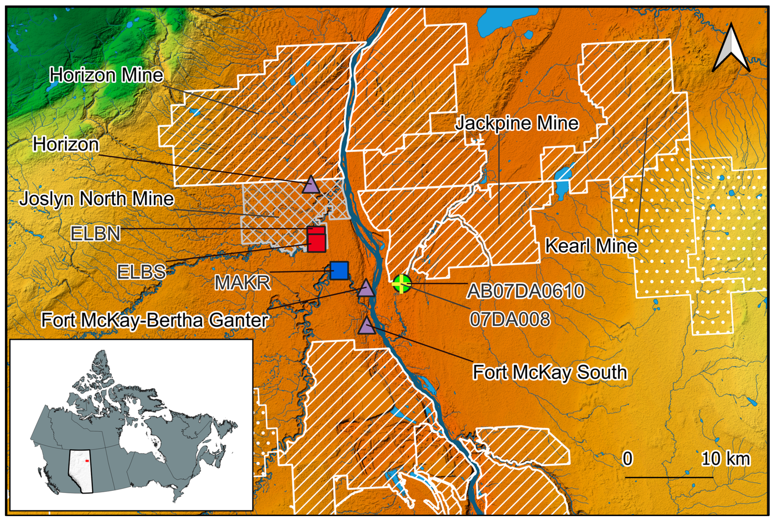
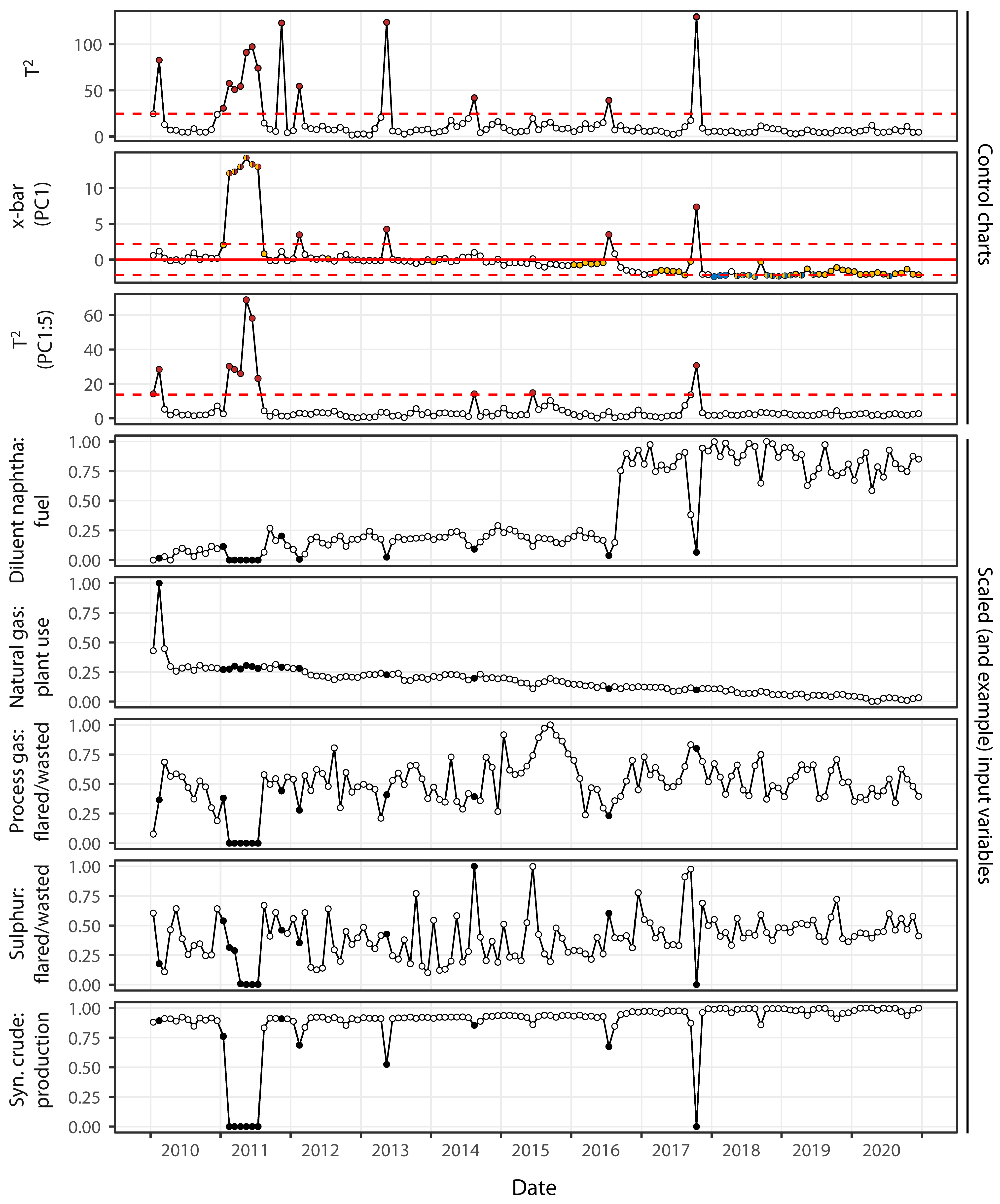
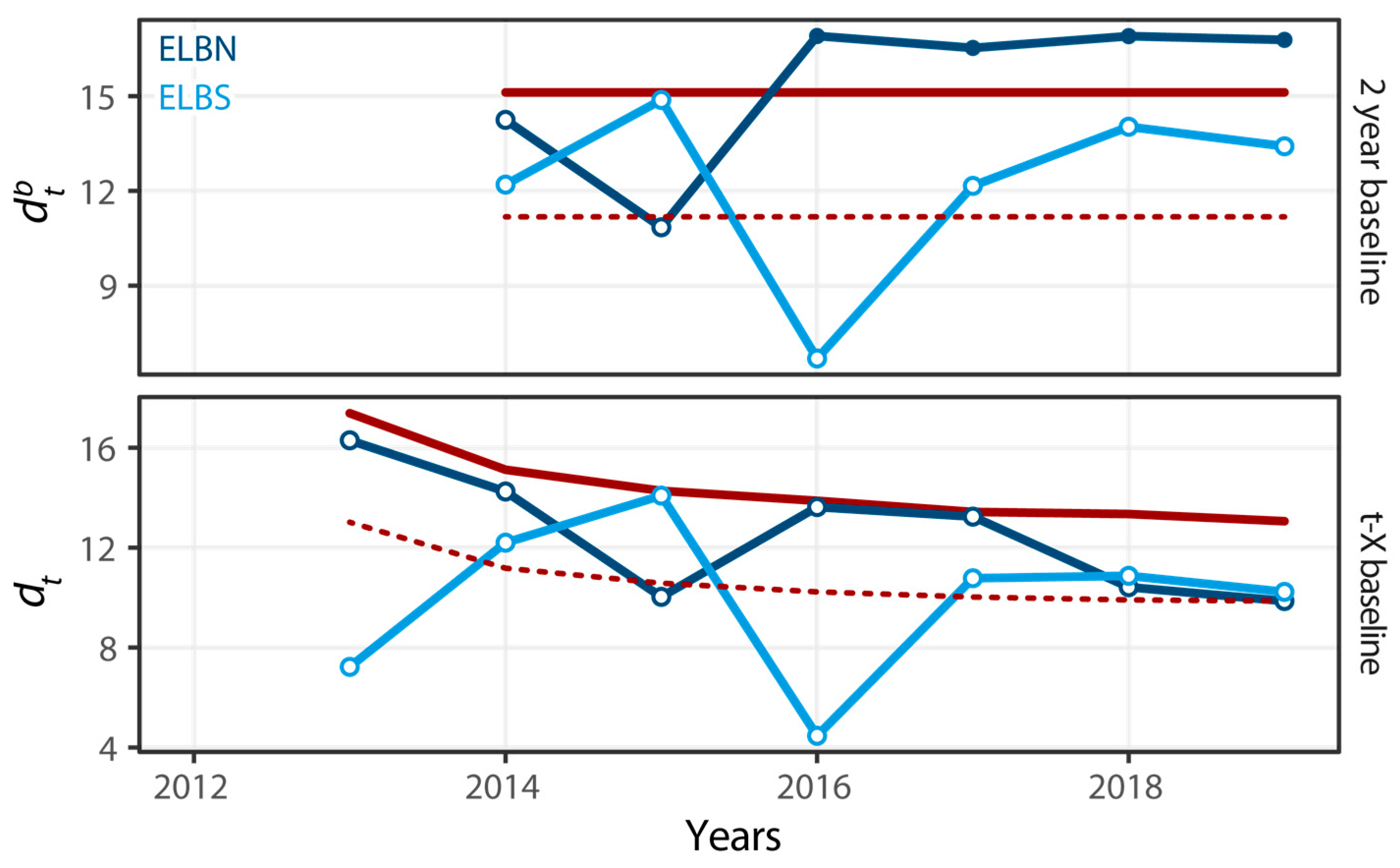
Table 1.
Factor loadings of input variables with the first five principal components (PCs) for production and performance data from the Horizon mine from January 2010 to December 2020, along with standard deviation and variance estimates; yellow highlighting shows input variables most associated with each PC.
| Input Variables | PC1 | PC2 | PC3 | PC4 | PC5 |
|---|---|---|---|---|---|
| Diluent Naphtha–Flared/Wasted | −0.301 | 0.045 | −0.121 | −0.070 | 0.026 |
| Process gas-Flared/Wasted | −0.173 | −0.175 | 0.222 | 0.662 | −0.515 |
| Natural gas-Flared/Wasted | −0.171 | −0.151 | 0.586 | −0.485 | −0.449 |
| Sulphur-Flared/Wasted | −0.126 | 0.205 | 0.703 | 0.286 | 0.596 |
| Diluent Naphtha-Fuel | −0.177 | 0.570 | −0.132 | −0.017 | −0.048 |
| Process Gas-Fuel | −0.286 | −0.197 | −0.061 | −0.002 | 0.002 |
| Natural Gas-Fuel | −0.213 | 0.424 | 0.087 | −0.358 | −0.081 |
| Oil Sand-Mined | −0.291 | −0.094 | −0.223 | 0.168 | 0.165 |
| Natural Gas-Plant Use | 0.133 | −0.547 | 0.056 | −0.275 | 0.323 |
| Petroleum Coke-Production | −0.309 | −0.058 | −0.062 | −0.011 | 0.063 |
| Crude Bitumen-Production | −0.310 | −0.102 | −0.028 | −0.010 | −0.009 |
| Intermediate Hydrocarbon-Production | −0.308 | −0.105 | −0.044 | −0.038 | 0.117 |
| Process Gas-Production | −0.309 | −0.115 | −0.047 | −0.009 | −0.025 |
| Sulfur-Production | −0.310 | −0.046 | −0.074 | −0.059 | 0.074 |
| Synthetic Crude Oil-Production | −0.308 | −0.104 | −0.055 | −0.041 | 0.115 |
| Standard deviation | 3.161 | 1.320 | 0.967 | 0.916 | 0.816 |
| Proportion of variance | 0.67 | 0.12 | 0.06 | 0.06 | 0.04 |
| Cumulative proportion of variance | 0.67 | 0.79 | 0.85 | 0.91 | 0.95 |
Table 2.
Values of (1 − (T2reduced/T2full)) used for diagnosing drivers of Hotelling’s T2 statistic at the Horizon mine, where exceedances were observed in the original T2 control chart from Figure 4 (February 2010–October 2017); higher values (and greater saturation of green color) within columns indicate greater influences of the row variable(s) on the full T2 statistic; DN = diluent naphtha; PG = process gas; NG = natural gas; S = sulfur; OS = oil sand; PC = petroleum coke; CB = crude bitumen; IH = intermediate hydrocarbon; SCO = synthetic crude oil; F/W = flared/wasted; F = fuel; M = mined; PU = plant use; P = production.
| Industrial Variable | Feb. ‘10 | Jan. ‘11 | Feb. ‘11 | Mar. ‘11 | Apr. ‘11 | May ‘11 | Jun. ‘11 | Jul. ‘11 | Nov. ‘11 | Feb. ‘12 | May ‘13 | Aug. ‘14 | Jul. ‘16 | Oct. ‘17 |
|---|---|---|---|---|---|---|---|---|---|---|---|---|---|---|
| DN-F/W | 0.02 | 0.01 | 0.01 | 0.01 | 0.01 | 0.00 | 0.00 | 0.01 | 0.00 | 0.03 | 0.00 | 0.00 | 0.01 | 0.00 |
| PG-F/W | 0.00 | 0.03 | 0.00 | 0.01 | 0.02 | 0.01 | 0.01 | 0.01 | 0.00 | 0.02 | 0.00 | 0.02 | 0.10 | 0.00 |
| NG-F/W | 0.00 | 0.07 | 0.04 | 0.09 | 0.13 | 0.21 | 0.07 | 0.41 | 0.00 | 0.00 | 0.00 | 0.05 | 0.29 | 0.00 |
| S-F/W | 0.00 | 0.00 | 0.02 | 0.02 | 0.03 | 0.01 | 0.00 | 0.02 | 0.00 | 0.08 | 0.00 | 0.31 | 0.00 | 0.00 |
| DN-F | 0.09 | 0.08 | 0.06 | 0.01 | 0.24 | 0.00 | 0.00 | 0.00 | 0.00 | 0.02 | 0.00 | 0.00 | 0.06 | 0.00 |
| PG-F | 0.00 | 0.00 | 0.00 | 0.00 | 0.00 | 0.00 | 0.00 | 0.00 | 0.98 | 0.00 | 0.00 | 0.00 | 0.01 | 0.00 |
| NG-F | 0.01 | 0.08 | 0.02 | 0.00 | 0.17 | 0.05 | 0.03 | 0.09 | 0.01 | 0.04 | 0.00 | 0.03 | 0.20 | 0.00 |
| OS-M | 0.00 | 0.07 | 0.03 | 0.06 | 0.04 | 0.14 | 0.20 | 0.53 | 0.00 | 0.00 | 0.00 | 0.05 | 0.23 | 0.00 |
| NG-PU | 0.89 | 0.00 | 0.00 | 0.00 | 0.01 | 0.02 | 0.00 | 0.01 | 0.01 | 0.02 | 0.00 | 0.00 | 0.19 | 0.00 |
| PC-P | 0.01 | 0.17 | 0.00 | 0.00 | 0.02 | 0.00 | 0.00 | 0.00 | 0.00 | 0.07 | 0.00 | 0.43 | 0.05 | 0.00 |
| CB-P | 0.00 | 0.31 | 0.00 | 0.01 | 0.10 | 0.12 | 0.13 | 0.10 | 0.00 | 0.09 | 0.00 | 0.04 | 0.04 | 0.01 |
| IH-P | 0.00 | 0.02 | 0.01 | 0.02 | 0.01 | 0.01 | 0.02 | 0.10 | 0.00 | 0.07 | 0.37 | 0.07 | 0.11 | 0.02 |
| PG-P | 0.00 | 0.25 | 0.02 | 0.02 | 0.05 | 0.02 | 0.01 | 0.01 | 0.01 | 0.27 | 0.00 | 0.00 | 0.02 | 0.00 |
| S-P | 0.00 | 0.33 | 0.32 | 0.31 | 0.09 | 0.00 | 0.01 | 0.28 | 0.00 | 0.06 | 0.00 | 0.02 | 0.06 | 0.00 |
| SCO-P | 0.00 | 0.09 | 0.02 | 0.01 | 0.06 | 0.02 | 0.03 | 0.00 | 0.00 | 0.22 | 0.43 | 0.05 | 0.21 | 0.00 |
Disclaimer/Publisher’s Note: The statements, opinions and data contained in all publications are solely those of the individual author(s) and contributor(s) and not of MDPI and/or the editor(s). MDPI and/or the editor(s) disclaim responsibility for any injury to people or property resulting from any ideas, methods, instructions or products referred to in the content. |
© 2023 by the author. Licensee MDPI, Basel, Switzerland. This article is an open access article distributed under the terms and conditions of the Creative Commons Attribution (CC BY) license (https://creativecommons.org/licenses/by/4.0/).
Share and Cite
MDPI and ACS Style
Arciszewski, T.J. A Review of Control Charts and Exploring Their Utility for Regional Environmental Monitoring Programs. Environments 2023, 10, 78. https://doi.org/10.3390/environments10050078
AMA Style
Arciszewski TJ. A Review of Control Charts and Exploring Their Utility for Regional Environmental Monitoring Programs. Environments. 2023; 10(5):78. https://doi.org/10.3390/environments10050078
Chicago/Turabian StyleArciszewski, Tim J. 2023. "A Review of Control Charts and Exploring Their Utility for Regional Environmental Monitoring Programs" Environments 10, no. 5: 78. https://doi.org/10.3390/environments10050078
Note that from the first issue of 2016, this journal uses article numbers instead of page numbers. See further details here.