Article

Using High Resolution Optical Imagery to Detect Earthquake-Induced Liquefaction: The 2011 Christchurch Earthquake

1
Geohazards Research Lab, Tufts University, Medford, MA 02155, USA
2
Center for Remote Sensing, Boston University, Boston, MA 02215, USA
*
Author to whom correspondence should be addressed.
Remote Sens. 2020, 12(3), 377; https://doi.org/10.3390/rs12030377
Submission received: 31 December 2019 / Revised: 20 January 2020 / Accepted: 20 January 2020 / Published: 24 January 2020
(This article belongs to the Collection Feature Papers for Section Environmental Remote Sensing)

Abstract

:
Using automated supervised methods with satellite and aerial imageries for liquefaction mapping is a promising step in providing detailed and region-scale maps of liquefaction extent immediately after an earthquake. The accuracy of these methods depends on the quantity and quality of training samples and the number of available spectral bands. Digitizing a large number of high-quality training samples from an event may not be feasible in the desired timeframe for rapid response as the training pixels for each class should be typical and accurately represent the spectral diversity of that specific class. To perform automated classification for liquefaction detection, we need to understand how to build the optimal and accurate training dataset. Using multispectral optical imagery from the 22 February, 2011 Christchurch earthquake, we investigate the effects of quantity of high-quality training pixel samples as well as the number of spectral bands on the performance of a pixel-based parametric supervised maximum likelihood classifier for liquefaction detection. We find that the liquefaction surface effects are bimodal in terms of spectral signature and therefore, should be classified as either wet liquefaction or dry liquefaction. This is due to the difference in water content between these two modes. Using 5-fold cross-validation method, we evaluate performance of the classifier on datasets with different pixel sizes of 50, 100, 500, 2000, and 4000. Also, the effect of adding spectral information was investigated by adding once only the near infrared (NIR) band to the visible red, green, and blue (RGB) bands and the other time using all available 8 spectral bands of the World-View 2 satellite imagery. We find that the classifier has high accuracies (75%–95%) when using the 2000 pixels-size dataset that includes the RGB+NIR spectral bands and therefore, increasing to 4000 pixels-size dataset and/or eight spectral bands may not be worth the required time and cost. We also investigate accuracies of the classifier when using aerial imagery with same number of training pixels and either RGB or RGB+NIR bands and find that the classifier accuracies are higher when using satellite imagery with same number of training pixels and spectral information. The classifier identifies dry liquefaction with higher user accuracy than wet liquefaction across all evaluated scenarios. To improve classification performance for wet liquefaction detection, we also investigate adding geospatial information of building footprints to improve classification performance. We find that using a building footprint mask to remove them from the classification process, increases wet liquefaction user accuracy by roughly 10%.

Graphical Abstract

1. Introduction

Liquefaction is an important ground failure to be identified and mapped after a major earthquake. Detecting liquefaction surface effects in near-real time after an earthquake can expedite clean-up efforts, rescue operation, and loss estimation. Detailed maps of liquefaction surface effects are also useful for the research community. After a major earthquake occurs, a geotechnical/geologic reconnaissance team such as those launched by the US Geological Survey (USGS) or Geotechnical Extreme Event Reconnaissance (GEER) may travel to the region to observe and map liquefaction along with other impacts. Field mapping generally occurs several days or weeks after the event and has a heavy logistical burden as well as a high cost. Satellite and aerial imageries as remote sensing data are valuable tools to aid with disaster relief and damage mapping and therefore, an automated classification that is available in the planning stage of a field reconnaissance can significantly improve the efficiency and impact of a field reconnaissance trip [1]. Aerial imagery usually has a higher spatial resolution than satellite imagery but requires some lead time to plan the flight. Satellites can be redirected quickly to acquire imagery that is often made available very soon after an event for disaster response.
In many studies, human visual interpreter(s) look at the pre- and post-event imagery and note the changes to the ground and map the liquefaction [2,3,4]. After the 1995 Kobe earthquake in Japan, [2] manually detected and mapped the liquefaction using high resolution aerial imagery taken prior and after the event; however, this method would take long if the affected area is large and is beyond rapid response framework. After the 2014 Iquique earthquake in Chile, [3] used a small drone (unmanned aerial system) to capture aerial imagery from two liquefied sites and interpreted the extent and damage to the built environment visually; they only processed imagery captured after the event and visually detected the liquefaction on images with no automatic procedure. In [4], the liquefaction extent after the Canterbury earthquake sequences in New Zealand (2010–2011) was mapped by visually looking at the satellite and aerial imageries after the events and incorporating them with the field observation surveys; this process again took weeks to finish and cannot be suggested to first responders. As an alternative, investigators have mapped liquefaction automatically using remotely sensed data. In [5], researchers used the optical satellite imagery with 0.5 m resolution after the 2010 Darfield, February 2011 Christchurch, and 2011 Tohoku Earthquakes to map the liquefaction and measure the lateral displacement using pre- and post-event imagery by detecting the changes. Furthermore, [6] detected the liquefaction-induced water bodies by combining different spectral bands from Indian Remote Sensing Satellite (IRS-1C) imagery with spatial resolution ranging from 5.8 to 188 m and using a wetness index as a proxy for soil moisture after the Bhuj 2001 earthquake in India; however, they used pre- and post-event imageries with very low resolution and cannot be recommended for loss estimation and rescue operation. For the same earthquake, [7] related the changes in temperature and moisture content of the earth’s surface to the surficial manifestation of earthquake-induced liquefaction using Landsat imagery (which has a low spatial resolution) before and after the event. In [8], investigators detected and classified the liquefied materials on the ground using object-based image analysis on high resolution (10 cm) airborne RGB imagery along with LiDAR (light detection and range) data that was acquired 2 days after the event. They treated each liquefaction patch on the ground as an object and then statistically classified objects on the ground into two different liquefaction classes; however, this process may take long for larger area as it needs to treat each object differently. Similarly, [9] used an automated workflow for mapping the liquefaction manifestation after the 2011 Tohoku earthquake in Japan using object-based classification methods on a high-resolution (2 m) Word-View 2 optical imagery before and after the event. They concluded that in highly urban areas, detecting liquefaction is more challenging despite the availability of imagery pair of pre- and post-event.
Using automated supervised methods with optical imagery for liquefaction mapping is a promising step in providing detailed, region-scale maps of liquefaction extent very quickly after an earthquake; however, it is still primarily a research undertaking and has yet to become operational. This paper takes a step toward making automated classification of optical imagery operational by providing important recommendations on how to construct an appropriate training dataset. This paper will help elucidate questions such as: “Should I use aerial or satellite imagery? What spectral bands are most important to include? How many training pixels are required? What accuracy should I expect? Are liquefaction surface effects detectable? Can geospatial information be used to improve classification accuracy?”
One approach to automatically detect liquefaction surface effects is to compare the pre- and post-event imagery and measure the difference (multi-temporal change detection process) as used by [6,7,9]; however, this method requires both images to have the same acquisition characteristics (sensor, looking angle, time of the day, etc.) to generate reliable results. Differences in looking angle and shadows can have a significant detrimental effect on classification accuracy as shown by [9]. Furthermore, a close-date pre-event image is not always available or useable. Another approach for liquefaction detection is pixel-based or object-based image classification using a single imagery (mono-temporal) as demonstrated by [8]. Object-based classification integrates neighboring homogeneous pixels into objects, segments the image accordingly, and finally performs the classification object by object [10,11]. Object-based analysis requires several parameters for image segmentation that are difficult to select, especially for urban areas [12,13]. Pixel-based classifications assign pixels to landcover classes using unsupervised or supervised techniques. Unsupervised pixel-based classifications group pixels with similar spectral values into unique clusters according to statistically predefined thresholds and can be applied faster; however, they are usually less accurate and require more data cleaning than supervised methods. Supervised pixel-based classifications need training data set (samples of known identity) to classify unknown image pixels and take longer to apply but tend to result in more accurate and robust classifications.
The accuracy of automated supervised methods in image classification mainly depends on the quantity and quality of training samples, and number of spectral bands. For parametric classifiers (e.g., maximum likelihood and minimum distance), there is a direct relation between the size of the training dataset and the classifier’s accuracy and reliability [14]. Digitizing a large number of high-quality training samples from an event may not be feasible in the desired timeframe for rapid response as the training pixels for each class should be typical and accurately represent the spectral diversity of that specific class [15]. In satellite or aerial imagery, it is possible for different classes on the ground to have similar spectral information, which make the sampling process harder and could eventually weaken the classifier performance. Furthermore, the availability of spectral bands beyond the visible spectrum (RGB) in satellite or aerial imagery can impact the image classification performance. To further improve the classification performance, prior knowledge of landcover/use (e.g., GIS spatial layers) can be used to remove objects that have high spectral variation and overlap with other classes, which users desire to detect and classify. In summary, the quality and quantity of the training data as well as the number of available spectral bands and additional land use knowledge will all impact automated classification performance.
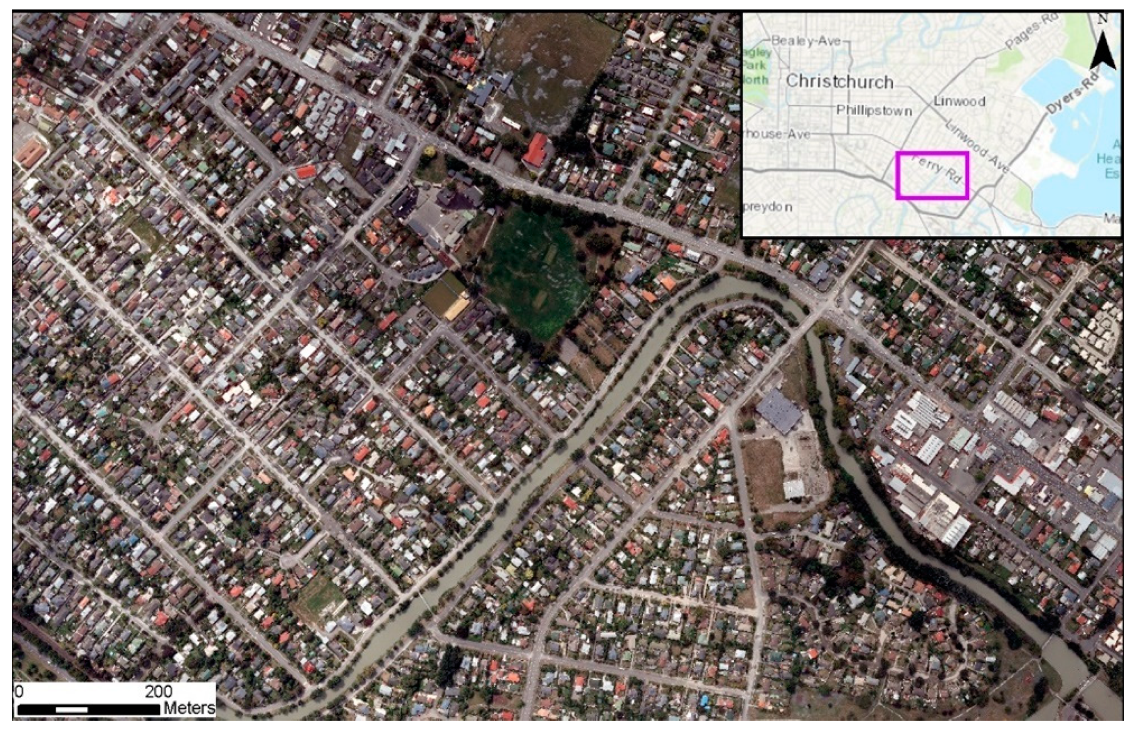
To perform automated classification to detect liquefaction surface effects with reliable results, we need to understand how to build an optimal training dataset. This study investigates the effects of quantity of high-quality training pixel samples as well as the number of spectral bands on the performance of a pixel-based parametric supervised classifier for liquefaction detection using both satellite and aerial imageries. The study compares aerial and satellite imageries for liquefaction classification as they have different radiometric resolution. The study also uses a building footprint mask as prior land use information to improve the accuracy of the classifier. The goal is to provide guidance on building training data for automated classification of liquefaction surface effects in terms of the optimum number of high-quality pixels, spectral bands, platform, and landcover masks considering performance accuracy. To this end, we use very high resolution (VHR) optical satellite imagery with eight spectral bands (coastal blue, blue, green, yellow, red, red-edge, near infrared 1, and near infrared 2) and VHR aerial imagery with four spectral bands (red, green, blue, and near infrared) to classify the liquefaction surface effects after the 22 February, 2011 Christchurch earthquake using a maximum likelihood supervised classifier. We evaluate classifier performance depending on the pixel size of datasets (50, 100, 500, 1000, 2000. 4000) and number of spectral bands: red, green, blue (RGB) versus RGB+NIR versus all eight spectral bands.

2. Data and Area of Study

The Christchurch region of New Zealand was severely affected by the M 6.2 22 February, 2011 Christchurch earthquake. The seismic source was shallow and close to the Christchurch Metropolitan Area, resulting in high peak ground accelerations in populated and developed areas and significant damage to infrastructure. Widespread surface manifestations of liquefaction were observed and more than half a million tons of liquefied materials were removed from streets and properties [16]. For the objectives of this study, roughly 2 square kilometers were selected near the Christchurch Metropolitan Area as illustrated in Figure 1. This area was selected because extensive liquefaction occurred in the area and both satellite and aerial imagery were available in eight and four spectral bands, respectively. The selected area has diverse landcover/use including water, vegetation, liquefied materials on the ground, asphalt and buildings. The satellite imagery (Satellite imagery has been granted by Digital Globe Foundation. All rights reserved for Digital Globe Foundation) is captured on 11 March, 2011 (18 days after the event) and the aerial imagery is captured on 24 February, 2011 (2 days after the event). The satellite imagery has eight multi-spectral bands and a panchromatic band with roughly 2 m and 50 cm spatial resolution at nadir, respectively. It has been captured by the Digital Globe World-View 2 sensor. The aerial imagery has four spectral bands (blue, green, red, and near-infrared) with 15 cm spatial resolution and was captured by New Zealand Aerial Mapping (NZAM) using the UltraCam XP digital aerial camera at 1700 m above the ground surface. Table 1 presents the characteristics of the satellite and aerial imageries. For the sake of computational time, we decreased the spatial resolution of the aerial imagery by down sampling to a common resolution of 50 cm. However, a direct comparison between satellite and aerial imageries is not possible for two main reason: 1—the radiometric resolution (dynamic range) of satellite imagery is higher than the aerial imagery (2048:255), which could lead to a better discrimination between different landcover/use pixels; and 2—the satellite imagery was captured 18 days after the aerial imagery and during this time gap, the liquefied materials could have been dried or removed.

3. Methodology

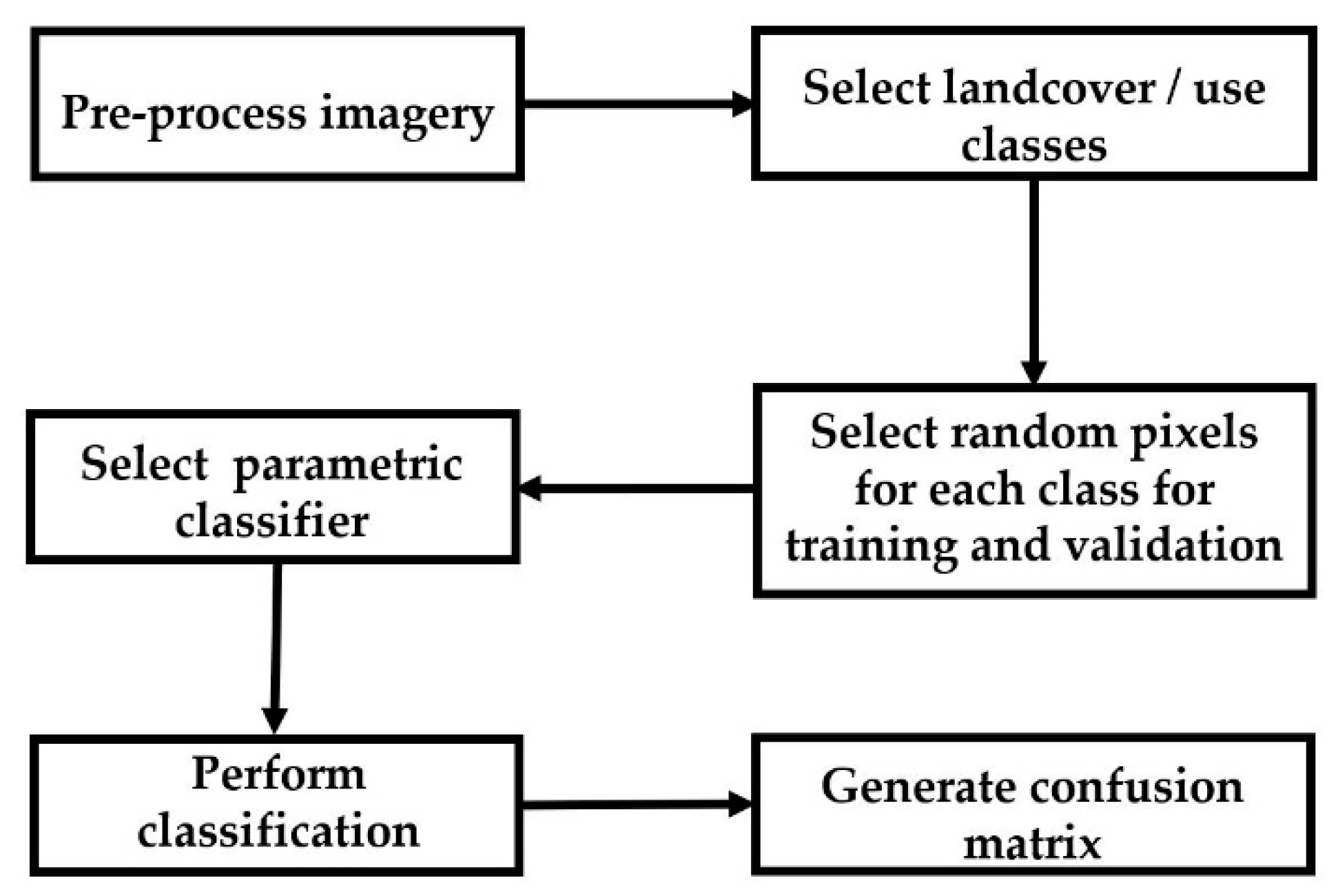
Imagery analysis and supervised classification include several steps. First the images should be preprocessed. Next, the landcover/use classes are defined. Once the landcover/use classes are defined, the image is sampled to generate the training and validation pixels within each class. Once the training and validation datasets are ready, a classifier is chosen. The classifier’s accuracies are usually evaluated using performance metrics. We used a single classifier across a variety of training datasets to compare performance. Figure 2 presents a schematic workflow of these steps and each is described in following section. We have done all of the steps using ENVI 5 software.

3.1. Preprocessing

As part of the image preprocessing, the satellite imagery was pan-sharpened. In pan-sharpening, the panchromatic band (which has a higher spatial resolution than the other spectral bands) is fused with multi-spectral bands image (which have higher spectral resolution) to benefit from both high spatial and spectral resolutions. Therefore, the final satellite imagery used for classification has 8 multi-spectral bands with roughly 50 cm spatial and 11-bit radiometric resolution. Although the aerial imagery was collected at 15 cm, we chose to down sample to 50 cm using nearest neighbor method to reduce the computational time and to discard changes due to different spatial resolutions as this is not the goal of this study. Therefore, the final aerial imagery has 50 cm spatial and 8-bit radiometric resolutions.

3.2. Landcover/Use Classes

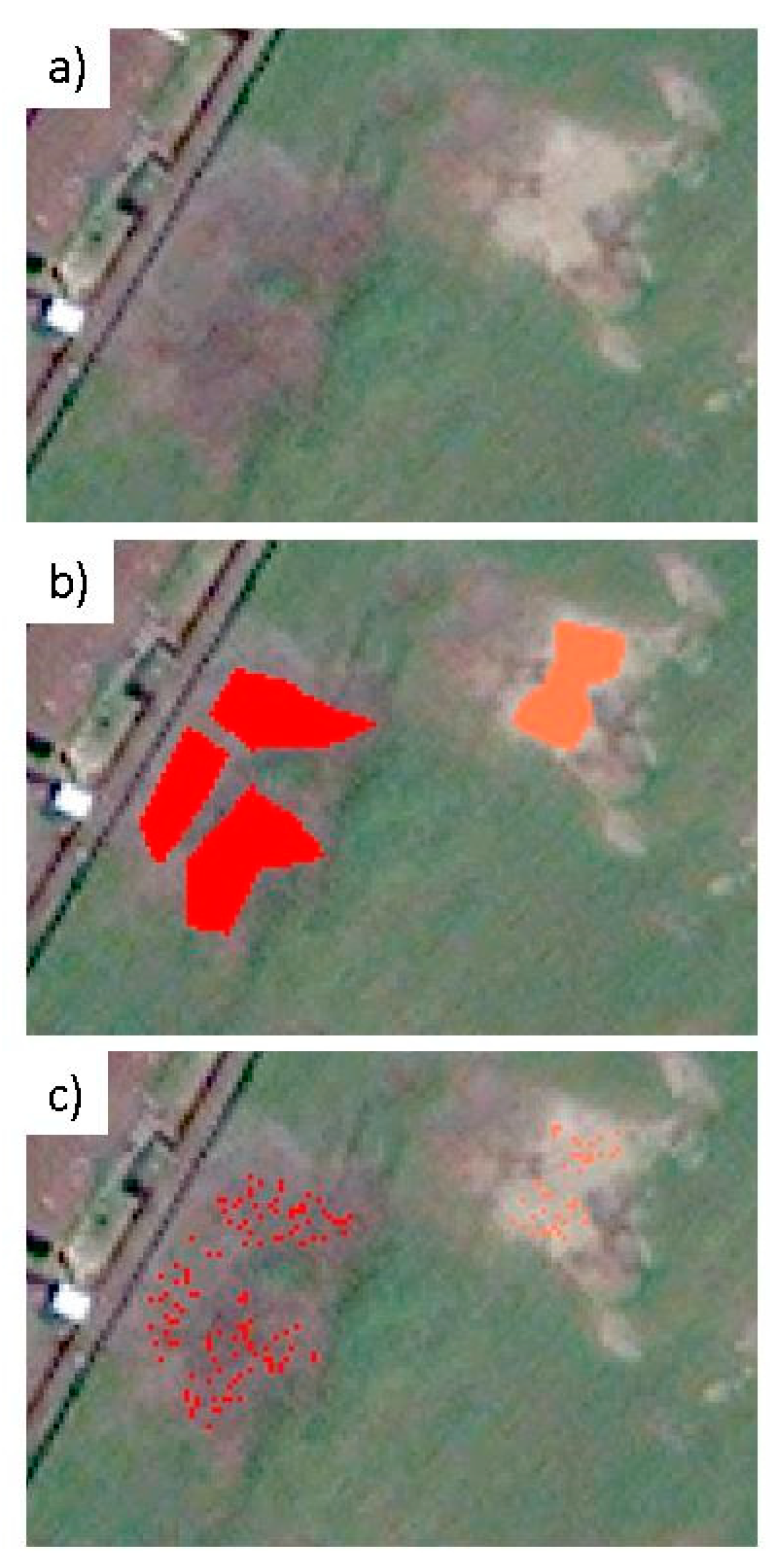
For classifying landcover/use, five classes are considered: water, vegetation, shadow, building roof, and asphalt as shown in 
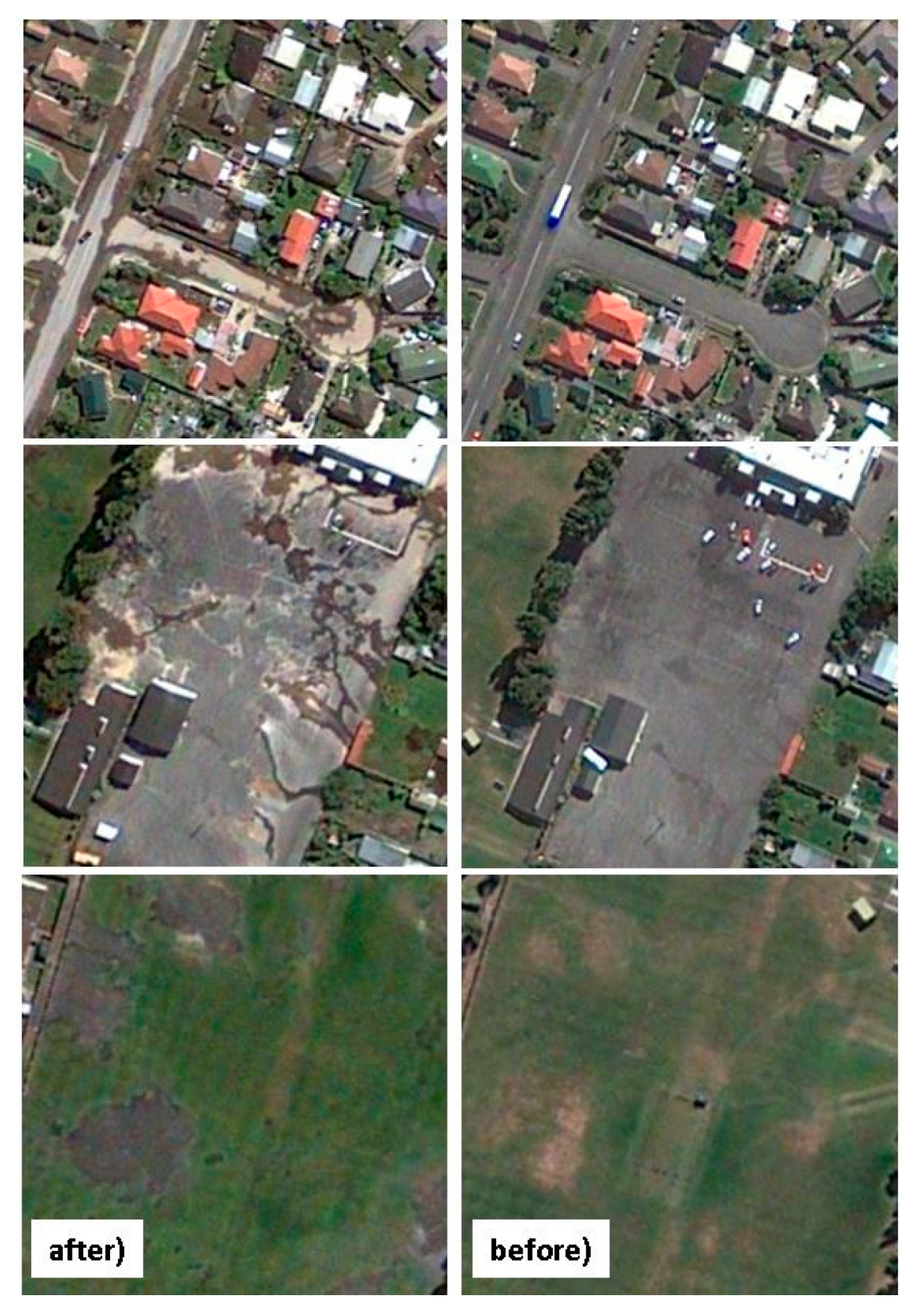
Figure 3. By comparing pre- and post-event imageries (
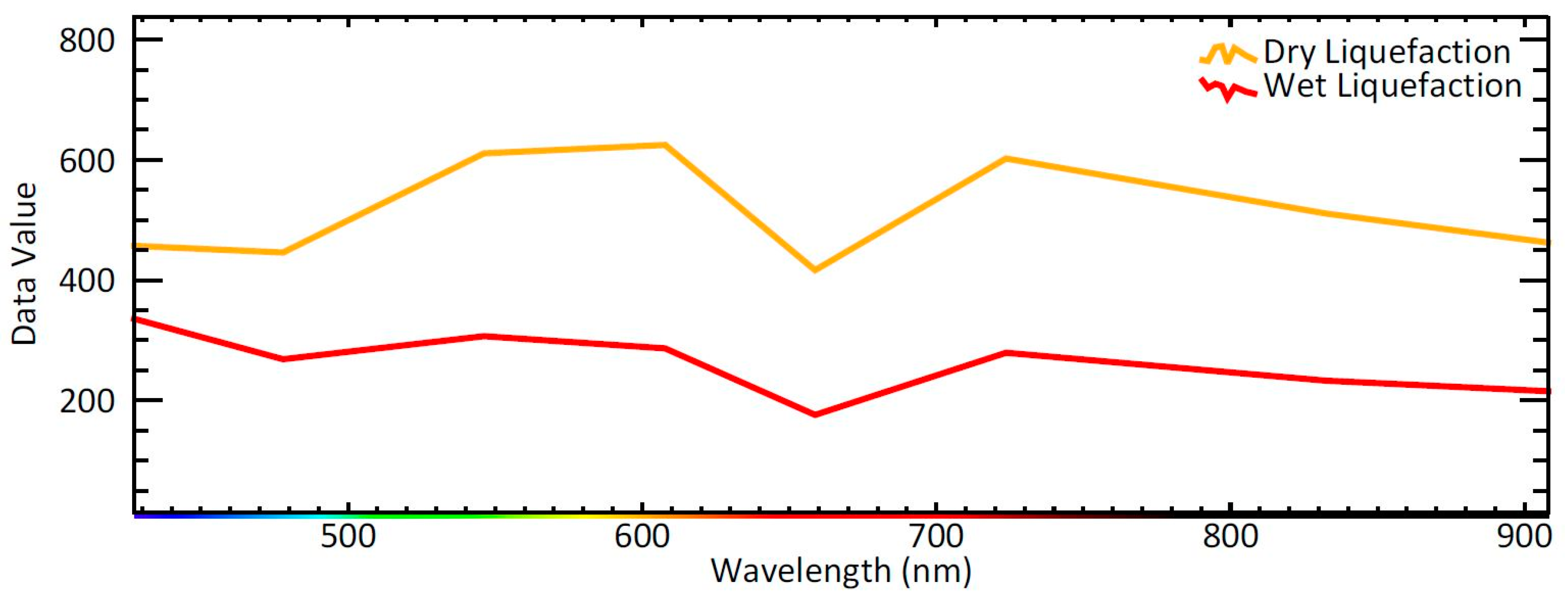
Figure 4), two classes of liquefaction are also identified: wet liquefaction and dry liquefaction. The reason for considering two classes is that the water contents of the liquefied materials are different, resulting in different spectral behavior as shown in Figure 5. Figure 6a shows two types of liquefaction investigated. As the building roofs are highly variable in terms of colors and materials, they have a high spectral variation that makes it difficult to discriminate them from other classes in a pixel-wise classification framework. Therefore, we will introduce a geospatial layer of building footprints as a mask to improve the classifier’s performance.

3.3. Sampling

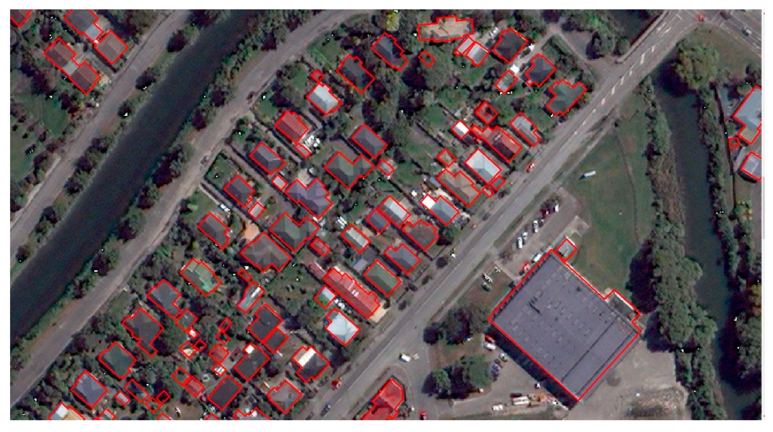
For preparing the training and validation datasets, first, polygons for each landcover/use class were drawn across the study area. The polygons for a given class are distributed across the whole image to guarantee that pixels in each class cover the full range of spectral information. The polygons have been visually drawn with extensive care and with near pixel resolution to make sure they represent the corresponding class on the ground and therefore, serve as ground truth for that class. To avoid the influence of boundary (edge effect) and mixed landcover/use pixels on the classification accuracy, polygons were drawn within the boundaries of each landcover/use class. Then, all polygons are pixelated at 50 cm resolution and 4000 pixels are randomly selected as ground truth for each class. This number represents the total available number of pixels for each landcover/use class for training and validation datasets. Figure 6 shows the sampling process for liquefaction classes as an example. The number of pixels per class is equal to represent a balanced sampling approach; This will make sure that the classifier statistics are not biased toward any categories due to larger sample size. A biased classifier can assign more pixels to the majority class. However, in reality, data often exhibit class imbalance (e.g., vegetation: wet liquefaction), where some classes are represented by large number of pixels while other classes by a few [17].

3.4. Maximum Likelihood Classifier

Maximum likelihood (ML) is a method of estimating the parameters of a statistical model given observations, by finding the parameter values that maximize the likelihood of making the observations given the parameters [18]. maximum likelihood (ML) is a parametric classifier that assumes a normal spectral distribution for each landcover class. With the assumption that the distribution of a class sample is normal, a class can be characterized by the mean vector and the covariance matrix. The classifier works based on the probability that a pixel belongs to a specific class (prior probability among all classes is equal). ENVI calculates the likelihood of a pixel belongs to a specific class according to Equation (1) [19] as follows:
g i ( x ) = ln ( p ( w i ) ) 1 2 ln ( |   i   | )   1 2   ( x m i ) T ·   i 1 ( x m i )
where “i” is the specific class, “x” is the n-dimensional data (where n is the number of bands), p(wi) is the probability that class wi occurs in the image and is assumed the same for all classes, |∑i| is the determinant of the covariance matrix of the data in class wi, i 1 is the inverse matrix and finally mi is the mean vector.
As the ML classifier accounts for the variability of classes by using the mean vector and covariance matrix, it demands a sufficient number of training pixels to precisely calculate the moments and covariance [20]. A set of high quality training samples will provide an accurate estimate of the mean vector and the covariance matrix. This is achieved when the training samples only include the landcover class (minimum noise in the data) and the population of training samples are sufficient to sample the full spectral distribution observed in the landcover class. When the training samples are not high quality (not representing spectral variation for a class) or limited in number, the ML classifier will perform poorly due to inaccurate calculation of moments and covariance. The ML classifier is among the most popular and common classifiers used for satellite imagery classification due to the well-founded theory behind it and its feasibility in practice [20].

3.5. Classification Approach and Accuracy Measurements

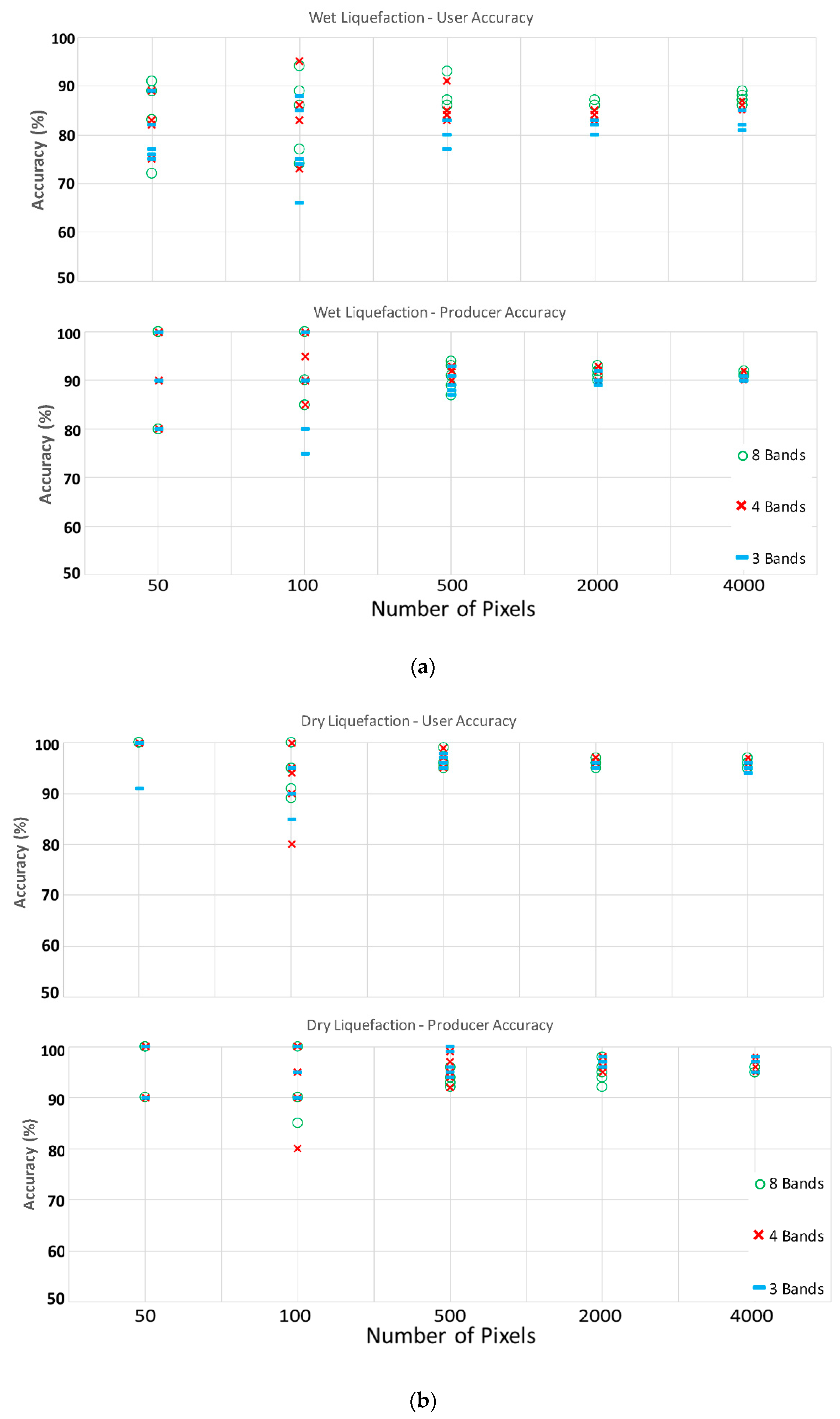
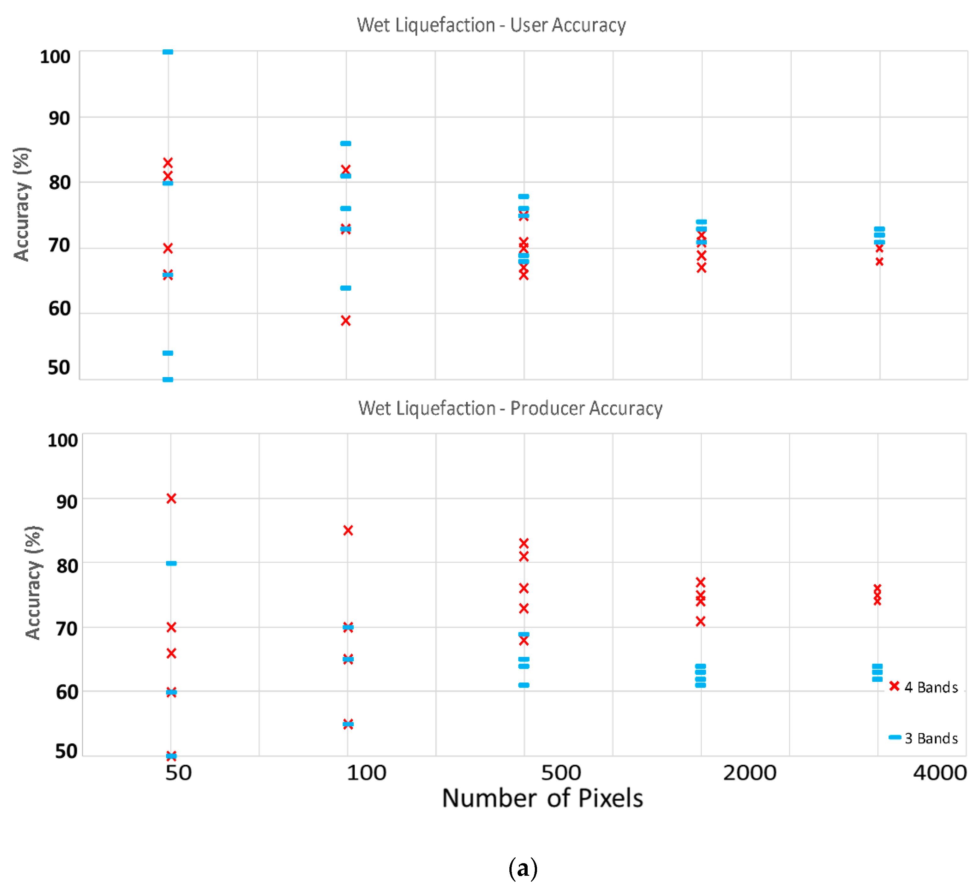
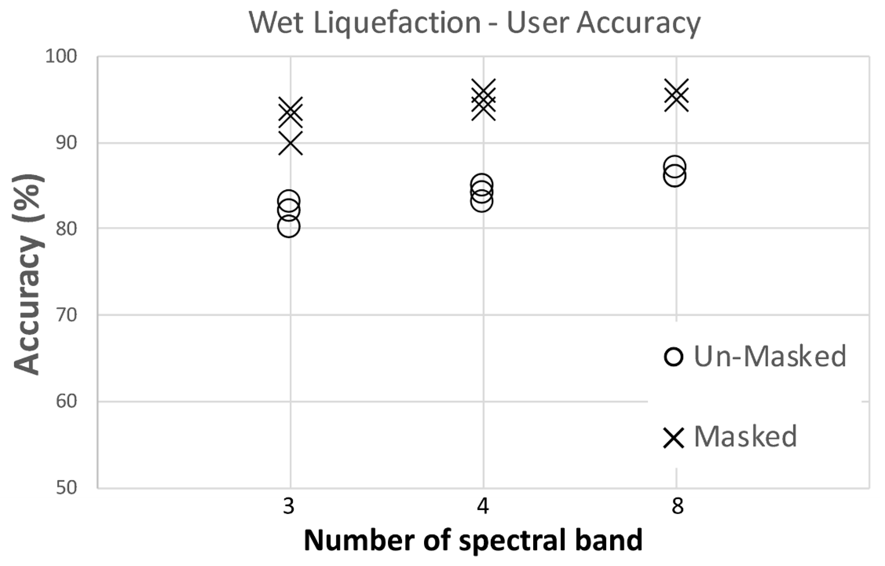
The classification accuracy is evaluated across all different datasets and spectral content for both satellite and aerial imageries. For training and validation datasets, samples for each class are increased from 50 to 100, 500, 2000, and 4000 to evaluate classifier performance across different sample sizes. 80% of the samples are allocated for training and the remaining 20% are for validation using a 5-fold cross-validation technique. Five-fold cross validation is an iterative process in which the complete dataset is first split into five subsets of equal size; then in each iteration, one subset is withheld and the maximum likelihood classifier is fit to the other four subsets (training set) using the chosen spectral bands. The performance measures are calculated on the held-out subset (validation). This is repeated five times so that each subset is held out for validation exactly once. The validation dataset is always independent from the training dataset to avoid any possible biases. The effect of increasing the number of spectral bands (from 3 to 4, and 8 in satellite and from 3 to 4 in aerial imagery) across each sample size has also been investigated. Note that by stating different number of spectral bands, the authors mean using full spectrum for 8 bands, red green blue Near-Infrared channels for 4 bands, and red green blue channels for 3 bands. Therefore, there are overall 15 scenarios for the satellite imagery and 10 scenarios for aerial imagery.
As explained previously, for measuring the accuracy of the classifier in each case, the training data is used to train the classifier and then a confusion matrix is generated for that classifier against the validation data. A confusion matrix is a table that summarizes the performance of a classifier by presenting the number of ground truth pixels for each class and how they have been classified by the classifier. There are three important accuracy measurements that can be calculated from a confusion matrix: 1—overall accuracy, 2—producer’s accuracy, and 3—user’s accuracy. Overall accuracy is calculated as the ratio of the total number of correctly classified pixels to the total number of the test pixels. The overall accuracy is an average value for the whole classification method and does not reveal the performance of the method for each class. Producer’s and user’s accuracies are defined for each of the classes. The producer’s accuracy corresponds to error of omission (exclusion) and shows how many of the pixels on the classified image are labeled correctly for a given class in the reference data. Producer’s accuracy is calculated as:
Producer’s Accuracy = N u m b e r   c o r r e c t l y   i d e n t i f i e d   i n   r e f .     p l o t   o f   a   g i v e n   c l a s s N u m b e r   a c t u a l l y   i n   t h a t   r e f .     c l a s s
User’s accuracy corresponds to the error of commission (inclusion) and shows how many pixels on classified image are correctly classified. User’s accuracy is calculated as:
User’s Accuracy = N u m b e r   c o r r e c t l y   i d e n t i f i e d   i n   a   g i v e n   m a p   c l a s s N u m b e r   c l a i m e d   t o   b e   i n   t h a t   m a p   c l a s s
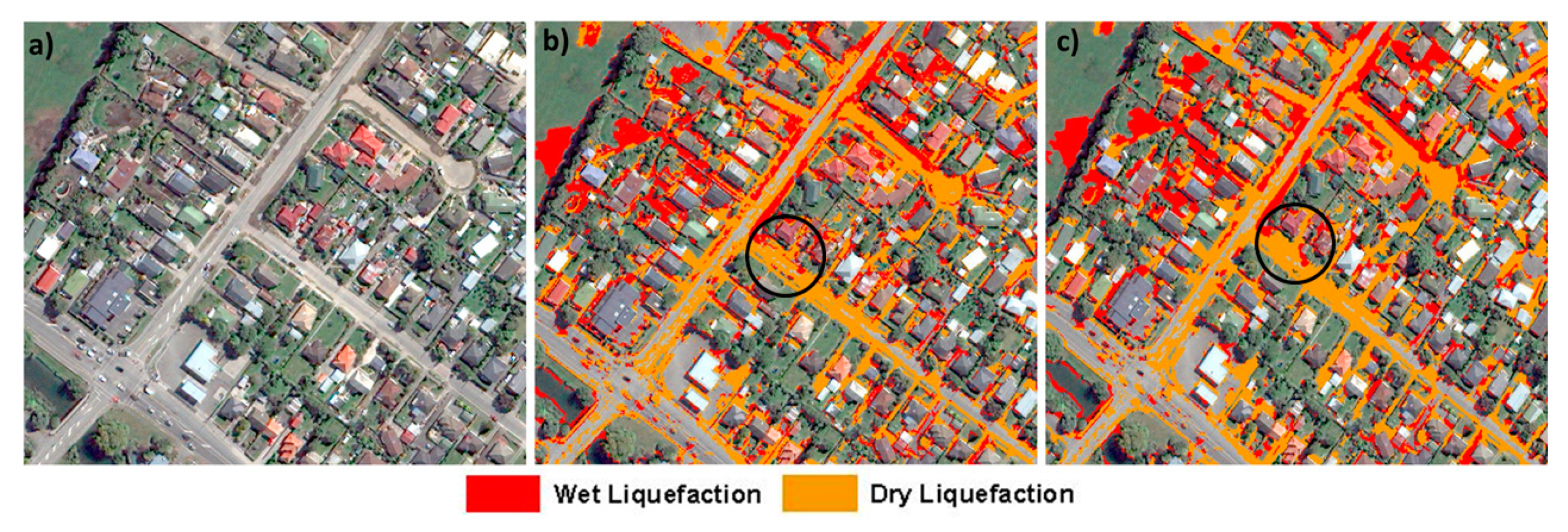
In addition, the classified map is compared with ground truth to enable the readers to visually evaluate the classification performance as well.

4. Results

4.1. Effect of Sample Size and Number of Spectral Bands on Liquefaction Classification Accuracy

To compare the accuracy of the ML classifier by using different sample sizes and number of spectral bands, the producer’s and user’s accuracies of each fold of each scenario for wet and dry liquefaction are plotted in Figure 7 and Figure 8 for satellite and aerial imagery, respectively. The average accuracies of all scenarios are also presented in Table 2. The results are split across the wet and dry liquefaction classes in each figure to evaluate their relative identifiability.
For the satellite imagery in Figure 7a,b, the results show that by increasing the number of training pixels for both wet and dry liquefaction, the variation between the five folds decreases, which indicates higher confidence level and higher reliability and repeatability of the classifier results. Using 50 or 100 pixels leads to high variability in the accuracy statistics and therefore, can be concluded to be insufficient to capture the spectral distribution of both wet and dry liquefaction classes. The spread deceases significantly when getting to 500 pixels and the mean accuracy (averaged between all five folds in each scenario) increases in the majority of scenarios with increasing sample size across both dry and wet liquefaction. Our conclusion is that the increase in accuracy from 500 to 2000 pixels is significant; however, the increase in accuracy from 2000 to 4000 pixels may not be enough to merit the increased effort in acquiring training pixels.
When comparing wet and dry liquefaction for a given sample size, the mean accuracy is higher, and the spread is lower for dry liquefaction. This implies that the classifier can detect and discriminate the dry liquefaction more accurately and with fewer training pixels than for wet liquefaction. When comparing average user’s and producer’s accuracies with each other for a given scenario in satellite imagery, we see that they are not considerably different from each other (Table 2), which means the classifier tends neither to over-predict nor under-predict dry and wet liquefaction classes. These observations lead to our conclusion that 2000 training and validation pixels are sufficient for identifying wet and dry liquefaction.
When we look at the impact of the choice of spectral bands, the mean accuracy of the classifier in detecting dry liquefaction is not affected; which implies that the RGB bands (three bands) has sufficient spectral information for classification of dry liquefaction. However, for wet liquefaction, the user’s accuracy decreases as we remove the near-infrared band and only use RGB. Increasing from RGB+NIR to all eight spectral bands, does not change performance. Therefore, one can conclude that wet liquefaction detection accuracy increases by adding the NIR spectral content to the classifier. Note that for both liquefaction classes, having eight or four (RGB + NIR) spectral bands have almost no meaningful impact on the final accuracies.
As shown in Figure 8a,b and presented in Table 2 for the aerial imagery, the mean producer’s and user’s accuracies of the classifier are lower and variations between folds are higher for both wet and dry liquefaction classes when one uses aerial imagery rather than satellite imagery; this difference is more prominent for wet liquefaction. For instance, when using three bands (RGB) and 100 pixels dataset, the average user’s accuracy when using satellite imagery is around 82% while this value when using aerial imagery is 63%. Similar to the results for satellite imagery, the dry liquefaction is detected by the classifier more accurately (higher mean accuracies and less variability) than wet liquefaction (Table 2). In aerial imagery as well as satellite imagery, removing near-infrared spectral content decreases the classifier accuracies specially for wet liquefaction. Furthermore, increasing the number of training and validation pixels from 2000 to 4000 does not improve the accuracy considerably.
By looking at Figure 7 and Figure 8, one can easily conclude that doubling the data set size from 2000 to 4000 has no meaningful effect on increasing accuracies. This is even more clear by looking at the numbers in Table 2—in the best-case scenario, the accuracy only increases by 1% if using 4000 pixels instead of 2000 pixels. Overall, our observations are that satellite imagery leads to higher accuracy for the automated classification of wet and dry liquefaction than when using aerial imagery; this observation is more noticeable for wet liquefaction.
If we focus on classification of wet and dry liquefaction using 2000 pixels for training and validation with RGB and NIR spectral bands from satellite imagery, we can make several important observations. producer’s and user’s accuracy for dry liquefaction are 95% and 96%, respectively. The producer’s and user’s accuracy for wet liquefaction are lower at 91% and 84%, respectively. These accuracy statistics are promising. In the next sections, we will investigate the cause of the lower accuracy for wet liquefaction and propose possible solutions.
Note that as discussed earlier, direct pixel to pixel comparison between satellite and aerial imageries is not recommended as they have different characteristics and were captured on different dates.

4.2. Cluster Analysis

As presented in Table 2, the classifier accuracy (specifically user’s accuracy) for detecting wet liquefaction is lower than for dry liquefaction. To understand the cause, we examine the spectral information across the landcover/use classes. The scatter plots of landcover/use classes are shown in Figure 9 for satellite imagery. Note that each point on this figure represents a pixel and its corresponding digital number value in band 2 (blue channel) versus band 7 (near-infrared). As can be seen, building roofs have a wide range of spectral values and therefore, have overlap with other class clusters. The wide spectral range of building roofs not only makes it harder for the classifier to separate it from other classes, but also reduces the final accuracy of the classifier in detecting other classes. This is because the building roofs are made from different materials and have different colors and therefore, resemble different landcover/use categories for the classifier. Note that the overlap between building roofs and other classes is not due to sampling error as the process has been done with extensive care and by making sure each training sample belongs to the desired landcover class.

4.3. Using Prior GIS Information to Increase the Accuracy of the Classifier

As shown in Figure 9, building roofs have wide spectral range, which make it difficult for the classifier to correctly discriminate the pixels. Nowadays, there are plenty of geospatial data that can be used as prior knowledge of landcover for classification purposes. For liquefaction classification, using the building footprint as a mask is appropriate because liquefaction surface effects would not be visible under a building. On the other hand, liquefaction often occurs on roads; therefore, a landcover mask of roads although available would not be useful in this case. In this project, we use the geospatial layer of building footprints created by the New Zealand Aerial Mapping (NZAM) to heuristically exclude building roofs from the image classification. Figure 10 shows a portion of the study area with the building footprint geospatial layer overlaid.
For evaluating the performance of the classifier, as mentioned earlier, we only present the results on satellite imagery with 2000 pixels for training and validation. The producer’s and user’s accuracies before and after the implementation of building footprint mask are presented in Table 3 for both liquefaction classes. The results show that applying the building mask increases the user accuracy of wet liquefaction class by roughly 10% disregarding number of spectral bands (Figure 11). As presented in Table 3, adding the building mask has no significant impact on producer’s accuracies of both liquefaction classes as well as the user’s accuracy of dry liquefaction. The user’s accuracy is impacted because the denominator of its equation has been reduced with the removal of the roof landcover class. This result illustrates the benefit of using a geospatial layer of building roofs to mask buildings and improve the classification of wet liquefaction. With this improvement, the producer’s and user’s accuracy are all above 90% for wet and dry liquefaction using 2000 training and validation pixels on satellite imagery with all sets of spectral bands tested.

4.4. Visual Evaluation of the Classified Image

The final step in the classification process is to visually evaluate the classified map and compare it against ground truths. Figure 12a shows a close-up portion of the study area that contains multiple landcover/use classes captured by satellite imagery. Figure 12b shows the classified image for the same area using 2000 training pixels and RGB+NIR spectral bands and using the building footprint mask. Note that we only show the liquefaction classes on the final classified map as detecting and classifying them was the main goal of this study. As can be visually seen and based on the accuracy values in Table 3, wet and dry liquefaction classes are mostly identified correctly on asphalt and grass. Most of the dry liquefied materials, which were on the asphalt (e.g., sandy asphalt), are correctly classified. Some wet liquefied materials across the asphalt and close to the sidewalk can be seen in the satellite imagery and are correctly classified. However, there are some pixels in the original image that can be visually identified as other classes but are wrongly classified as liquefied materials. To overcome this issue and remove the noise from the final classified map product, we have smoothed the classified image by majority-voting of the 20 neighboring pixels. The result of the smoothing is shown in Figure 12c. By comparing Figure 12b,c, it can be noted that many of the previously-segregated pixels are now classified as part of their surrounding majority class (note the black circle drawn on Figure 12b,c). Figure 13 shows the smoothed classified map for the whole study area. As expected, most of the dry liquefaction pixels are detected on asphalt and most of the wet liquefaction on grass. As the satellite imagery was captured roughly 3 weeks after the event, we expect most of the liquefaction observed on roads to be dry; on the other hand, liquefied materials on grass tend to be wet. Therefore, it is crucial to use an image that is as close as possible to the event time and date.
Another way to look at the final classified map is to compare it with the real report of liquefaction observation recorded by the reconnaissance team after the event. Figure 14 shows the observed severity of liquefaction on the roads recorded by the reconnaissance team using either visual interpretation on aerial photography or by passing the streets with vehicles [21]. The classified liquefaction on these roads are clipped and overlaid on reconnaissance observation. As previously mentioned, the satellite imagery used in this study has been captured roughly 3 weeks after the event and in this time gap, the liquefied materials on the ground could have been removed. Therefore, it is not accurate to directly compare the quantity of liquefied materials (that implies the severity of liquefaction) classified by the ML classifier with the recorded liquefaction severity by reconnaissance team. Nevertheless, as shown in Figure 14, there is fair amount of correlation between the quantity of classified liquefaction on the roads with the severity observed by reconnaissance team. Precisely, 26%, 35%, and 55% of the roads are classified as liquefied using the ML classifier when reconnaissance team respectively observed no, moderate, and severe liquefaction. While it is not clear how the reconnaissance team has categorized the liquefaction severity, the ML classifier seems to over-predict the liquefaction for the roads where no liquefaction was recorded.

5. Conclusions

In this study, satellite and aerial imageries as remote sensing data have been used to detect the liquefaction on the ground after the 21 February, 2011 Christchurch earthquake. To this end, a maximum likelihood (ML) classifier was used to perform a pixel-based 5-fold cross-validation classification across a variety of training datasets and spectral bands. The objectives of the study were to find the effect of number of training pixels and the choice of spectral bands across VHR satellite and aerial imageries on the final accuracy of the classifier. Furthermore, building footprints, as a priory GIS knowledge, was utilized to increase the accuracy and reliability of the classified image. The number of training and validating pixels were increased from 50 to 100, 500, 2000, and 4000. For satellite imagery, the classification was performed on eight (coastal blue, blue, green, yellow, red, red Edge, NIR1 and 2), four (RGB + NIR), and three (RGB) spectral bands and for aerial imagery on four (RGB + NIR) and three (RGB) spectral bands. To identify liquefaction surface effects, we selected two different landcover modes, one for wet liquefaction and one for dry liquefaction because their spectral characteristics were different.
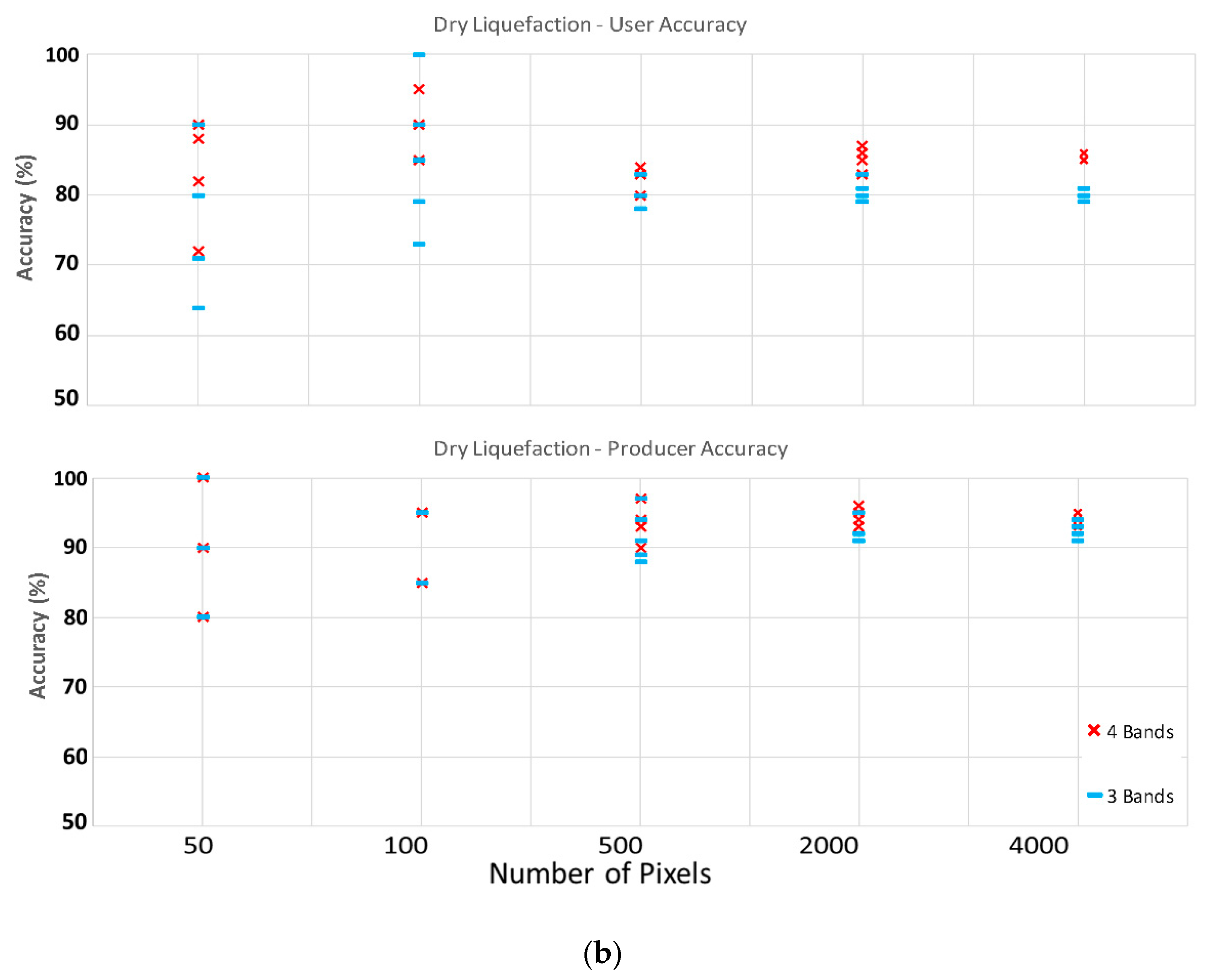
Overall, 15 and 10 scenarios for satellite and aerial imageries were investigated. It was observed that increasing the number of training pixels will decrease the variation between each fold of individual scenarios; in other words, by increasing the number of training pixels, the reliability and repeatability of the classifier increases. The reduction in folds’ variation is not meaningful when moving from 2000 to 4000 pixels dataset (look at Table 2); therefore, we recommend using 2000 training and validation pixels for the classification of liquefaction on aerial and satellite imageries. When considering the choice of spectral bands, it was observed that increasing from four (RGB+NIR) spectral bands to the full available spectrum of eight bands in satellite imagery does not considerably affect the classifier performance in detecting the liquefied materials on the ground specially the dry one. However, when removing the NIR band from the analysis in both satellite and aerial imageries (only uses RGB), a reduction in accuracy specially for wet liquefaction will occur. Therefore, using 2000 pixels for training and validation and utilizing the NIR band as well as visible bands (RGB) are the most time and cost-effective combination for liquefaction classification. Overall, the classifier can detect dry liquefied materials with higher accuracies in compare to wet liquefied materials. The satellite imagery has higher accuracies in detecting liquefied materials on the ground than the aerial imagery. Note that training and validation pixels locations are different for each imagery.
To improve the accuracy of wet liquefaction detection, a geospatial layer of building footprints was used to exclude the roofs from automatic classification. Building roofs have very broad spectral distribution due to the variety of materials and colors; therefore, the spectral data distribution for building roofs overlap with other landcover/use on the ground. After removing the building footprints from classification, the user accuracy of wet liquefaction was increased by 10% in all scenarios using the satellite imagery.
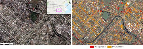
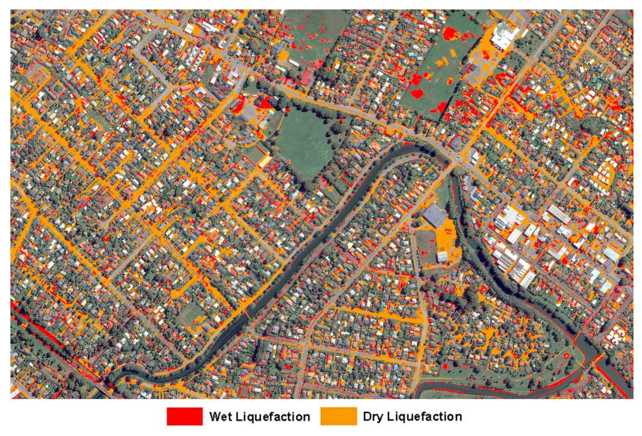
The final recommended combination of imagery, spectral bands, and training pixels is to use satellite imagery with near-infrared, red, green, and blue channels and 2000 pixels for training and validation. We also recommend using the building footprint to mask out building roofs. The producer’s and user’s accuracies for this case are both 98% for dry liquefaction and 92% and 95% for wet liquefaction, respectively. Using this final combination, the classified map of the study area not only has high accuracy but also has a good visual correlation between the number of liquefied pixels on the roads detected by the classifier and the quantity of liquefied materials on the road recorded by the reconnaissance team after the event.

Author Contributions

Conceptualization, V.R., L.G.B and M.K.; methodology, V.R.; software, V.R.; validation, V.R.; formal analysis, V.R.; investigation, V.R.; resources, L.G.B., M.K.; data curation, V.R.; writing—original draft preparation, V.R.; writing—review and editing, L.G.B., M.K.; visualization, V.R.; supervision, L.G.B., M.K.; project administration, L.G.B. All authors have read and agreed to the published version of the manuscript.

Funding

This research received no external funding.

Conflicts of Interest

The authors declare no conflict of interest.

References

  1. Rathje, E.M.; Franke, K. Remote sensing for geotechnical earthquake reconnaissance. Soil Dyn. Earthq. Eng. 2016, 91, 304–316. [Google Scholar] [CrossRef] [Green Version]
  2. Hamada, M. The 1995 Hyogoken-Nanbu (Kobe) Earthquake, liquefaction. In Ground Displacement and Soil Condition in Hanshin Area, 194; NIST: Gaithersburg, MD, USA, 1995. [Google Scholar]
  3. Rollins, K.; Ledezma, C.; Montalva, G.A.; Sáez, E. Geotechnical Aspects of April 1, 2014, M 8.2 Iquique, Chile Earthquake; Geotechnical Extreme Event Reconnaissance Association: USA, 2015. [Google Scholar]
  4. Townsend, D.; Lee, J.M.; Strong, D.T.; Jongens, R.; Smith Lyttle, B.; Ashraf, S.; Taylor, M.L. Mapping surface liquefaction caused by the September 2010 and February 2011 Canterbury earthquakes: A digital dataset. N. Z. J. Geol. Geophys. 2016, 59, 496–513. [Google Scholar] [CrossRef]
  5. Martin, J.G. Measuring liquefaction-induced deformation from optical satellite imagery (Doctoral dissertation). Master Sci. Civ. Eng. 2014. [Google Scholar] [CrossRef]
  6. Ramakrishnan, D.; Mohanty, K.K.; Nayak, S.R.; Chandran, R.V. Mapping the liquefaction induced soil moisture changes using remote sensing technique: An attempt to map the earthquake induced liquefaction around Bhuj, Gujarat, India. Geotech. Geol. Eng. 2006, 24, 1581–1602. [Google Scholar] [CrossRef]
  7. Oommen, T.; Baise, L.G.; Gens, R.; Prakash, A.; Gupta, R.P. Documenting earthquake-induced liquefaction using satellite remote sensing image transformations. Environ. Eng. Geosci. 2013, 19, 303–318. [Google Scholar] [CrossRef]
  8. Morgenroth, J.; Hughes, M.W.; Cubrinovski, M. Object-based image analysis for mapping earthquake-induced liquefaction ejecta in Christchurch, New Zealand. Nat. Hazards 2016, 82, 763–775. [Google Scholar] [CrossRef]
  9. Zhu, J.; Baise, L.G.; Koch, M. Mapping Earthquake Induced Liquefaction Surface Effects from the 2011 Tohoku Earthquake Using Satellite Imagery. In Proceedings of the Geoscience and Remote Sensing Symposium (IGARSS), 2016 IEEE International, Beijing, China, 10–15 July 2016; pp. 2328–2331. [Google Scholar]
  10. Baik, H.; Son, Y.S.; Kim, K.E. Detection of Liquefaction Phenomena from the 2017 Pohang (Korea) Earthquake Using Remote Sensing Data. Remote Sens. 2019, 11, 2184. [Google Scholar] [CrossRef] [Green Version]
  11. Lu, C.H.; Ni, C.F.; Chang, C.P.; Yen, J.Y.; Chuang, R. Coherence Difference Analysis of Sentinel-1 SAR Interferogram to Identify Earthquake-Induced Disasters in Urban Areas. Remote Sens. 2018, 10, 1318. [Google Scholar] [CrossRef] [Green Version]
  12. Blaschke, T.; Burnett, C.; Pekkarinen, A. Image segmentation methods for object-based analysis and classification. In Remote Sensing Image Analysis: Including the Spatial Domain; Springer: Dordrecht, The Netherlands, 2004; pp. 211–236. [Google Scholar]
  13. Stumpf, A.; Kerle, N. Object-oriented mapping of landslides using Random Forests. Remote Sens. Environ. 2011, 115, 2564–2577. [Google Scholar] [CrossRef]
  14. Miura, H.; Midorikawa, S.; Kerle, N. Detection of building damage areas of the 2006 Central Java, Indonesia, earthquake through digital analysis of optical satellite images. Earthq. Spectra 2013, 29, 453–473. [Google Scholar] [CrossRef]
  15. Lesparre, J.; Gorte, B.G.H. Using mixed pixels for the training of a maximum likelihood classification. Int. Arch. Photogramm. Remote Sens. Spat. Inf. Sci. 2006. Available online: https://www.isprs.org/proceedings/xxxvi/part7/PDF/212.pdf (accessed on 22 January 2020).
  16. Villemure, M.; Wilson, T.M.; Bristow, D.; Gallagher, M.; Giovinazzi, S.; Brown, C. Liquefaction Ejecta Clean-up in Christchurch during the 2010–2011 Earthquake Sequence. In Proceedings of the New Zealand Society for Earthquake Engineering Annual Conference 2012, Auckland, New Zealand, 13–15 April 2011. [Google Scholar]
  17. Oommen, T.; Baise, L.G. Model development and validation for intelligent data collection for lateral spread displacements. J. Comput. Civ. Eng. 2010, 24, 467–477. [Google Scholar] [CrossRef]
  18. Chambers, R.L.; Steel, D.G.; Wang, S.; Welsh, A. Maximum Likelihood Estimation for Sample Surveys; Chapman and Hall/CRC; CRC Press: Boca Raton, FL, USA, 2012. [Google Scholar]
  19. Richards, J.A.; Richards, J.A. Remote Sensing Digital Image Analysis; Springer: Berlin, Germany, 1999; Volume 3, pp. 10–38. [Google Scholar]
  20. Settle, J.J.; Briggs, S.A. Fast maximum likelihood classification of remotely-sensed imagery. Int. J. Remote Sens. 1987, 8, 723–734. [Google Scholar] [CrossRef]
  21. New Zealand Geotechnical Database. Liquefaction and Lateral Spreading Observations. Map Layer NZGD0300 - 11 Feb 2013. Available online: https://www.nzgd.org.nz/Map (accessed on 22 January 2020).
Figure 1. Study area near Christchurch, New Zealand. Roughly 2 km2.
Remotesensing 12 00377 g001
Figure 2. Workflow for the liquefaction classification in this study using satellite and aerial imageries.
Remotesensing 12 00377 g002
Figure 3. Natural landcovers encountered in imageries: (a) vegetation, (b) building roof, (c) shadow, (d) asphalt, (e) water.
Remotesensing 12 00377 g003
Figure 4. Satellite imagery before (14 February, 2011) and after (23 February, 2011) the Christchurch earthquake. Liquefied materials on the ground can be seen. Images from Google Earth. Note that these imageries are selected very close to the earthquake event date for only sake of showing the meaning of earthquake-induced liquefaction. These imageries are not use in this study for classification as they do not have any spectral information associated with them.
Remotesensing 12 00377 g004
Figure 5. Spectral differences between wet and dry liquefaction using the average of 4000 pixels. Satellite imagery with eight bands is used. For visual difference, please see Figure 6a.
Remotesensing 12 00377 g005
Figure 6. Sampling process: (a) raw imagery, (b) creating polygons of dry and wet liquefaction, (c) selecting pixels from the polygons (wet and dry liquefied materials in red and orange colors, respectively).
Remotesensing 12 00377 g006
Figure 7. (a)Accuracy of the maximum likelihood (ML) classifier on detecting wet liquefaction when using satellite imagery with different number of spectral bands and training and validation pixels. (b) Accuracy of the ML classifier on detecting dry liquefaction when using satellite imagery with different number of spectral bands and training and validation pixels.
Remotesensing 12 00377 g007
Figure 8. (a) Accuracy of the ML classifier on detecting wet liquefaction when using aerial imagery with different number of spectral bands and training and validation pixels. (b) Accuracy of the ML classifier on detecting dry liquefaction when using aerial imagery with different number of spectral bands and training and validation pixels.
Remotesensing 12 00377 g008aRemotesensing 12 00377 g008b
Figure 9. Scatter plot of all landcover/use classes for band 2 (blue channel) and band 7 (near-infrared 1 channel) of the satellite imagery.
Remotesensing 12 00377 g009
Figure 10. A portion of the building footprint geospatial layer used as prior knowledge to mask out roof class.
Remotesensing 12 00377 g010
Figure 11. Increase in wet liquefaction user accuracy after implementing the building footprint layer when using satellite imagery with 2000 training and validation pixels.
Remotesensing 12 00377 g011
Figure 12. Close-up shot of the final classified map when using satellite imagery with four bands, 2000 training and validation pixels and the building footprint mask: (a) original satellite image, (b) classified wet and dry liquefaction on the satellite imagery, (c) smoothed classified wet and dry liquefaction on the satellite imagery.
Remotesensing 12 00377 g012
Figure 13. The final classified map of the study area when using satellite imagery with four bands, 2000 training and validation pixels and the building footprint mask.
Remotesensing 12 00377 g013
Figure 14. Liquefaction severity observation on the roads after the event by reconnaissance team along with the classified liquefaction using ML classifier on the satellite imagery.
Remotesensing 12 00377 g014
Table 1. Imagery characteristics.
PlatformAcquisition DateSpatial ResolutionDynamic RangeSensor
Satellite11 March 20112 m for multi-spectral bands; 50 cm for panchromatic band (at nadir)11-bitWorldview-2
Aerial24 February 201115 cm for RGB and NIR (down sampled to 50 cm)8-bitUltraCam XP
Table 2. Averaged accuracies between all folds of each scenario in satellite and aerial imageries.
Num. Pixels5010050020004000
PlatformNum. BandsPUPUPUPUPU
DWDWDWDWDWDWDWDWDWDW
Satellite898921008590929484939096879591968695919687
498921008293939384959197859591968496919685
39892988094879177968996819690958197909582
Aerial48867887393699072937682709474856994758569
38856777093648576916579739262807392638072
*“P” indicates producer accuracy, “U” indicates user accuracy, “D” indicates dry liquefaction, “W” indicates wet liquefaction. Accuracies are in percent and rounded down.
Table 3. Classifier accuracies using satellite imagery with 2000 training and validation pixels before and after implementing geospatial layer of building footprints.
Num. Pixel2000
PlatformNum. BandsBeforeAfter
PUPU
DWDWDWDW
Satellite89592968698939895
49692968498929895
39690958198909592
*“P” indicates producer accuracy, “U” indicates user accuracy, “D” indicates dry liquefaction, “W” indicates wet liquefaction. Accuracies are in percent and rounded down.

