Article

Periodicity Intensity Reveals Insights into Time Series Data: Three Use Cases

Insight Centre for Data Analytics, Dublin City University, Glasnevin, 9 Dublin, Ireland
*
Author to whom correspondence should be addressed.
Algorithms 2023, 16(2), 119; https://doi.org/10.3390/a16020119
Submission received: 6 January 2023 / Revised: 9 February 2023 / Accepted: 14 February 2023 / Published: 15 February 2023
(This article belongs to the Special Issue Machine Learning for Time Series Analysis)

Abstract

:
Periodic phenomena are oscillating signals found in many naturally occurring time series. A periodogram can be used to measure the intensities of oscillations at different frequencies over an entire time series, but sometimes, we are interested in measuring how periodicity intensity at a specific frequency varies throughout the time series. This can be performed by calculating periodicity intensity within a window, then sliding and recalculating the intensity for the window, giving an indication of how periodicity intensity at a specific frequency changes throughout the series. We illustrate three applications of this, the first of which are the movements of a herd of new-born calves, where we show how intensity in the 24 h periodicity increases and decreases synchronously across the herd. We also show how changes in 24 h periodicity intensity of activities detected from in-home sensors can be indicative of overall wellness. We illustrate this on several weeks of sensor data gathered from each of the homes of 23 older adults. Our third application is the intensity of the 7-day periodicity of hundreds of University students accessing online resources from a virtual learning environment (VLE) and how the regularity of their weekly learning behaviours changes throughout a teaching semester. The paper demonstrates how periodicity intensity reveals insights into time series data not visible using other forms of analysis.

1. Introduction

A common application of data analytics to data streams or time series is detecting anomalous behaviour or outliers that deviate in some way from normal behaviour, where normal behaviour is defined by the recurring patterns within the data stream. As noted by Li et al. in [1], this is useful for applications such as fraud detection, network intrusion detection, medical diagnosis, video surveillance, fault diagnosis and more. By definition, outlier detection detects baseline patterns within data and then detects and alerts us to outliers or to subtle variations outside those baseline patterns.
Periodicity is defined as the characteristic or tendency for some pattern to recur at regular intervals within a data stream. The term is used to describe the regularity of phenomena that reoccur throughout nature as normal behaviour and from which deviations are characterised as outliers. Such temporal recurrence is an important property associated with complex systems, and the study of such temporal recurrence is useful for gaining insights into the behaviour of the systems [2].
There is regular periodicity in the rotation of the earth, the lunar cycle, the earth’s revolving around the sun, the seasons, the tides and the rhythm of our daily 24-h cycle. Humans, and most other living creatures, have a strong circadian rhythm, the 24-h cycle which brings routine and structure to our lives. Chronobiology is the field within life sciences that explores how this 24-h cycle influences the health, wellness and behaviour of living organisms [3]. Twenty-four-hour periodicities are observed in many human behaviours as we strive for homeostasis—equilibrium in our physiology and stability in the face of external and environmental changes [4]. It is known that when we live our lives and behave in ways that map strongly to the periodicity of the circadian clock, then which is a sign of better health and improved overall wellness [5].
One approach to detecting recurrences in data streams is visualising them via recurrence plots (RPs) [6]. These are visualisations of a matrix in which elements of the matrix correspond to instances at which there is a recurrence in a dynamic system. RPs operate by first performing a cluster analysis on the data and then building graphical patterns to illustrate recurrences in the data. RPs have been used in many applications, for example, fault diagnosis in machinery [7] and image transformations [8].
Recurrence plots are useful for providing analysis of short sequences with a limited amount of recurrence, but for longer time series with many iterations of recurrences, they are designed to hide the volume of iterations and to mask variations that may occur among the iterations. Sometimes when we look for and find patterns in time series data, we want to measure those patterns and compare the patterns over time or even compare them to other recurring patterns. This goes far beyond just using the patterns to detect outliers. If we could measure the patterns and how strong their recurrence is at different points throughout a dataset, then this might reveal insights into the patterns and deeper insights into the data.
In previous work, we developed a technique for calculating and visualising the strength of periodicity at a given frequency throughout a time series. The technique was applied to the sleeping patterns of US war veterans who continuously wore wrist-worn accelerometers for 90 consecutive days each, and we found that the 24 h periodicity strength varied significantly across participants [9]. That work also found that high levels of periodicity indicating regular sleep and movement patterns, were associated with lower measures of LDL-cholesterol, triglycerides and hs-CRP, as well as improved health-related quality of life measures [9]. The same technique for visualising periodicity strength over time was used in an analysis of lifelog data defined as the automatic digital recording of everyday activities, and it provided insights into shifts in the underlying behaviour of the subjects [10].
While Chegini et al. [11] used the same term, “periodicity intensity”, in their work on the diagnosis of faults in machine bearings, their work defines periodicity intensity as the ratio of the energy of the local maxima to the total energy in the autocorrelation of vibration signals in faulty machinery and that is very different to the definition of periodicity used here.
Our research hypothesis is that computing a visualisation of the strength of 24-h periodicity for a range of longitudinal time series data will reveal insights into the data that are not visible using other forms of analysis. In this paper, we apply the calculation of periodicity strength to three different use cases and show how, in each case, deeper insights into the data are revealed by the analysis. The paper’s importance lies in the relative simplicity of the technique and of the computation and the powerful insights into time series data that it provides. The technique can be used on any data series where underlying temporal patterns reoccur and where the strength of those patterns throughout the data is important to determine.

2. Materials and Methods

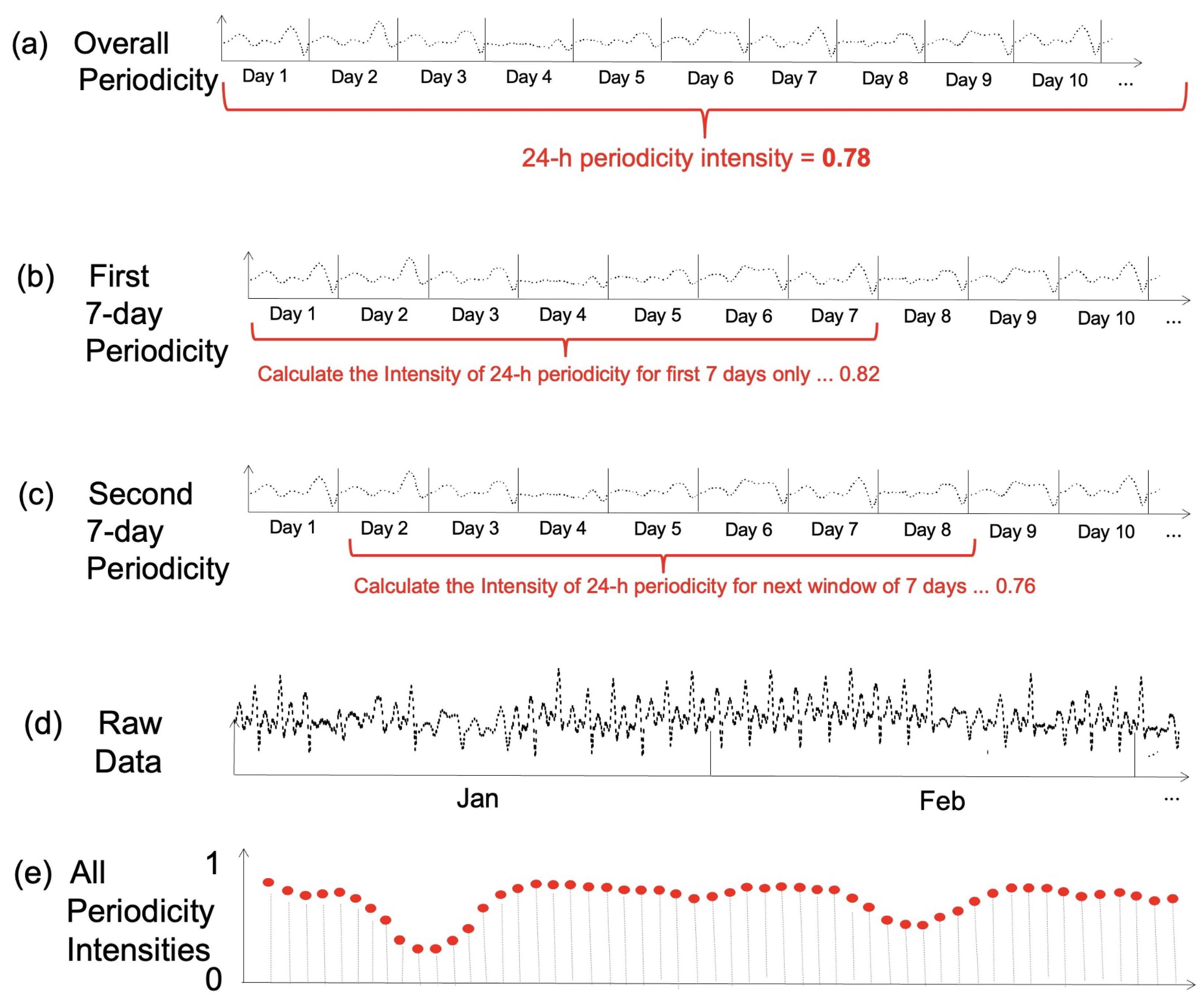
2.1. Calculating Periodicity Intensity Using Time-Lagged Overlapping Windows

A periodogram [12] is a well-established technique for exploring the magnitudes of recurring patterns at different frequencies in time series data. A periodogram uses samples in time series data to measure the amplitude vs. the frequency characteristics of an underlying continuous function, and thus, it reveals the spectral power density of the underlying function. If the function is sampled unevenly or there is missing data from the sample, then the Lomb–Scargle periodogram is a well-known algorithm that can cope with such unevenly sampled data [13].
The Lomb–Scargle periodogram has been used widely within those domains where there is an interest in exploring both the frequencies and magnitudes of periodicity, such as data from astronomical observations. In this work, we are interested in the magnitude or amplitude of the data samples only at a known frequency, such as the 24-h circadian rhythm. Software implementations of the Lomb–Scargle periodogram are readily available across multiple platforms, including MatLab and  Python.
To illustrate how we calculate the magnitude of the periodicity changes at a given frequency throughout a time series using time-lagged overlapping windows, we will use the schematic presented in Figure 1.
Figure 1a shows a plot of the first 10 days of a longer (synthetic) series of data points, and we can see from the visualisation that there is a noticeable recurring daily pattern, i.e., when the frequency is 24 h, although if we examine it carefully, we see that each day is slightly different from the others. If we compute the magnitude of this 24-h periodicity over the whole time series, it has a value of, let us say, 0.78 on a scale of 0 to 1.
While such an analysis has benefit if we have a long period of data (e.g., weeks, months or years, then calculating a single number (0.78 in the diagram) for the 24-h periodicity over the whole duration will hide any variational details within the data, instead, we calculate the 24-h periodicity from a window of the first 7 days only, as shown in Figure 1b, and this generates a value of, say, 0.82. We then shift the 7-day window forward in time by an interval of, say, 1 whole day and recalculate the 24-h periodicity, as shown in Figure 1c, and this generates a value of, say, 0.76. We repeat this process of shifting the 7-day window and recalculating until we reach the end of the time series.
Three important parameters in this process are (1) the frequency of the recurring pattern F o , often 24 h if we are interested in circadian rhythms but not always so, (2) the size of the window in which the periodicity is calculated m and (3) the overlap between the windows l, also referred to as stride length, namely the amount by which a window is shifted before calculating a new value for a periodicity window.
For a series of N data points such as that shown in Figure 1d and a window size of m with a shifting or stride length of l for each periodicity re-calculation, this generates a time series of N m + 1 l data points, as in Figure 1e. This captures gradual behaviour changes in the regularity of the data sampled over time rather than instances of particularly abnormal data values. Periodicity intensity graphs are just one of many possible forms of analysis of time series data but differ from each of the others. While we do perform a spectral analysis [14] of the data, this is not carried out across a full spectrum. Instead, we focus on 24-h circadian periods because previous studies indicate that circadian periodicity carries most of the energy in the longitudinal accelerometer data [15]. Likewise, we do not map the time series data into another space, such as an embedded space, as has been performed in [16] with protein sequences. Discrete wavelet transforms [17] can be used with time series data for noise filtering and data reduction, and specifically for detecting singularities such as outliers [18], but this is different to our use case where we are looking to identify long-term behaviour changes. Hilbert transforms (empirical mode decomposition) [19] are often used with time series for gathering information about frequency characteristics, such as amplitude and phase, but not long-term shifts in time series characteristics. The zero crossing rate (ZCR) [20] is used extensively in speech and music audio processing and corresponds to the rate at which a signal transitions from positive to negative or negative to positive, while historical volatility [21] is a statistical measure from economics and finance measuring the degree of variation of adjacent values in a time series. Each of these latter forms of analysis measures the dynamic changes in a time series but does not give the longitudinal changes in 24-h periodicity intensity, which our measure does.
These signal processing techniques are used in a wide variety of applications, such as data augmentation to support deep learning [22] and in [23] where time, frequency and spectral power domain feature vectors are derived from vibration and acoustic emissions from bearings in machinery in order to detect faults. Empirical Mode Decomposition (EMD) is a technique used to decompose a signal into useful components similar to analysis methods, such as Fourier transforms and wavelets, and it is particularly useful in exploratory analyses of data. The principle behind EMD is to split an original time series into a set of smooth curves or intrinsic mode functions. In the case of fault diagnosis, it is typically used to decompose a vibration signal into components used to train classifiers, usually with high accuracy. However, EMD is known to be sensitive to noise as well as requiring a manual selection of parameters [24] to support its exploratory nature. Zerocross Density Decomposition (ZCD) is a more recently developed technique [25] that is based on the concept of zero-crossings and is computationally more efficient than EMD. However, EMD is more effective than DD in terms of accuracy and robustness when dealing with non-stationary signals [26]. Our algorithm does not split a time series into constituents as EMD or ZCD do, and our method is less sensitive to noise because we use the Lomb–Scargle periodogram [13] to calculate periodicity, an algorithm that tolerates irregular sampling and missing data.
Algorithm 1 demonstrates the method to compute periodicity intensity. We assume we already know the optimal window size m, stride length l and the frequency F o that we have identified and are interested in. In this case, for studies in this paper, F o can either be circadian (24-h) or weekly periodicity. X w is the windowed input data, and S f is the periodogram computed with Fast Fourier Transform. IntensityFunc computes intensity by taking the periodogram of a windowed/local time series data and one focused frequency, F o . We aggregate energy carried by all close frequencies that are around F o in the case of energy leakage.
Algorithm 1: Compute Periodicity Intensity.
Input: A time series data x n X Where n = 1 , 2 , 3 N with N data points.
Optimal window size m and stride length l. F o { 1 24 h , 1 168 h }
Output: A time series data y t Y where t = 1 , 2 , 3 , N m + 1 l .
1for t 0 to N m + 1 l do
2 X w = x k × l x k × l + m
3 S f = FFT ( X w )
4 y t = IntensityFunc ( F o , S f ) where
5 In this work IntensityFunc = f F o ^ S f where F o ^ is the close neighbours of
F o in terms of frequency satisfying | 1 F o 1 F o ^ | < 0.01 .
6 IntensityFunc can also be the same form as defined in [10]
7end for

2.2. Use Cases for Calculating Periodicity Intensity

2.2.1. Periodicity Intensity in Sensor Data from the Homes of Older Adults

The NEX project [27] developed an integrated IoT system to offer unobtrusive health and wellness monitoring to support older adults living independently in their homes. This involved the use of ambient sensors non-intrusively placed around the home to detect various domestic, in-home activities. The resulting time series data gathered from each sensor can be combined and analysed to create a model of an individual’s normal daily patterns of activity. During the first half of 2022, twenty-four healthy older adults aged 60 years or older and living independently at home participated in a trial of the NEX project. The gender profile was predominantly female (81% n = 21), with a total population mean age of 73.2 years. The majority of participants were independent and high functioning, with only 8% (n = 2) reporting difficulties in completing activities of daily living (ADLS) [28], such as dressing, etc., and only 4% (n = 1) reporting difficulties in completing more complex tasks defined as instrumental activities of daily living (IADLS) [29], such as shopping for groceries, etc.
A range of in-home sensors was installed in each participant’s home, including (1) contact sensors on the doors of cupboards or drawers, which were used for kitchen crockery, cutlery, delph, food staples and pots, (2) contact sensors on the fridge door and (3) electrical plug sensors on the kettle, microwave and toaster. There were also contact sensors on wardrobe door(s) and on the drawer(s) in the bedroom, a 6-in-1 environmental sensor for temperature, humidity, light and presence in the bathroom and contact sensors on the front door, the patio door or the back door. Collectively, data from these sensors capture the purposeful actions of the participants, i.e., they indicate a deliberate action, thus the opening or closing of doors, the movement of a person and the switching on or off of electrical devices. Sensor data were gathered from the in-home sensors from the 24 participants’ homes over periods varying from 6 weeks to 6 months each [27].
The importance of the 24 h circadian rhythm and the conformance that each of the NEX project participants has to that 24-h rhythm can be shown by computing the strength of 24-h periodicity over all data from multiple sensor devices in the home. The fusion of multiple data streams from multiple sensors capture the activities of daily living, including food preparation and eating, self-grooming, cleaning, relaxing and others. Periodicity intensity emphasises the regular recurrence of such activities in the home.
Periodicity intensity visualisations were presented to participants in the NEX project as a visualisation of their long-term behaviour and changes and the regularity of those trends over time. A periodicity intensity graph is a continuous timeline where high values indicate periods of regular behaviour as detected by the in-home sensors, and low values indicate periods of irregular activities. Such irregular activities are indicators of changes in regular habits and can point to changes in their sleep patterns (sleep onset, duration, waking during the night, napping during the day), in their movement into and out of, as well as around, the home (awake at night, sleeping during the day, staying in the home longer or shorter than normal), in self-grooming (using the restroom at irregular times) and in eating (snacking during the day or during the night as opposed to having regular meals).
For the NEX trial, we used fused the data gathered from sensors in the homes of participants and computed a single overall periodicity intensity timeline for each participant, and we present some of these in the Results section (Section 3) of this paper.

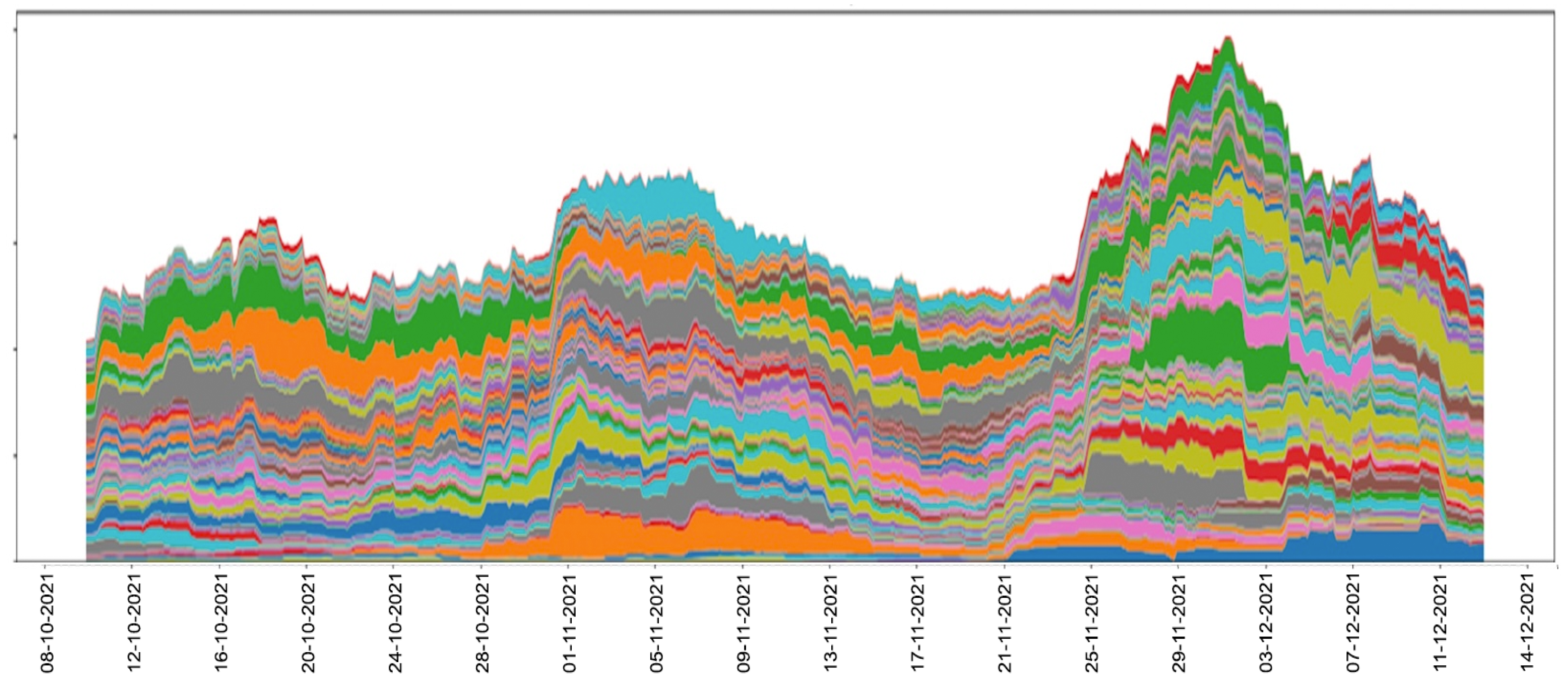
2.2.2. Periodicity Intensity in Student Learning Habits

Many Universities have wellness programs to promote the overall health and well-being of their staff and students [30]. Their benefits lead to improved health literacy, healthier mindsets, healthier relationships with others and positive changes in lifestyles regarding exercise, nutrition and more. In our University, we created and ran an elective undergraduate course on wellness called FLOURISH. This also includes elements of data literacy by showing students how their own personal data, gathered from devices used to measure their sleep, exercise, nutrition, etc., can be used for good as part of students themselves monitoring these wellness factors.
The wellness course was delivered entirely online via the University’s virtual learning environment (VLE) Loop, a variation of Moodle, and was accredited by the University, earning 5 ECTS for students who successfully completed it. For each of the 10 wellness topics, the personal data that students were required to gather on themselves was not shared with the course instructor or with the University. However, as part of their participation in the course and to demonstrate how personal data gathered by the University as part of recording their online activities could also be used for good, each of the 169 students on the course authorised us to download their VLE access logs for all their taught courses for the semester. This included the date, time and URL of the Loop resource for each time that a student accessed any resource on the VLE.
At the end of the teaching semester, we used the log of all student accesses to all Loop resources on all their courses and generated a single periodicity intensity graph for each student covering all online accesses and shared the graph online privately with them. The resulting graphs provide insight for each student into which period(s) of the preceding taught semester their learning habits, as exemplified by their access to online resources, were more structured and regular. This may help them in reflecting back on their learning throughout the semester. Some sample graphs to illustrate this, as well as further insights, are presented in the Results section (Section 3) of this paper.

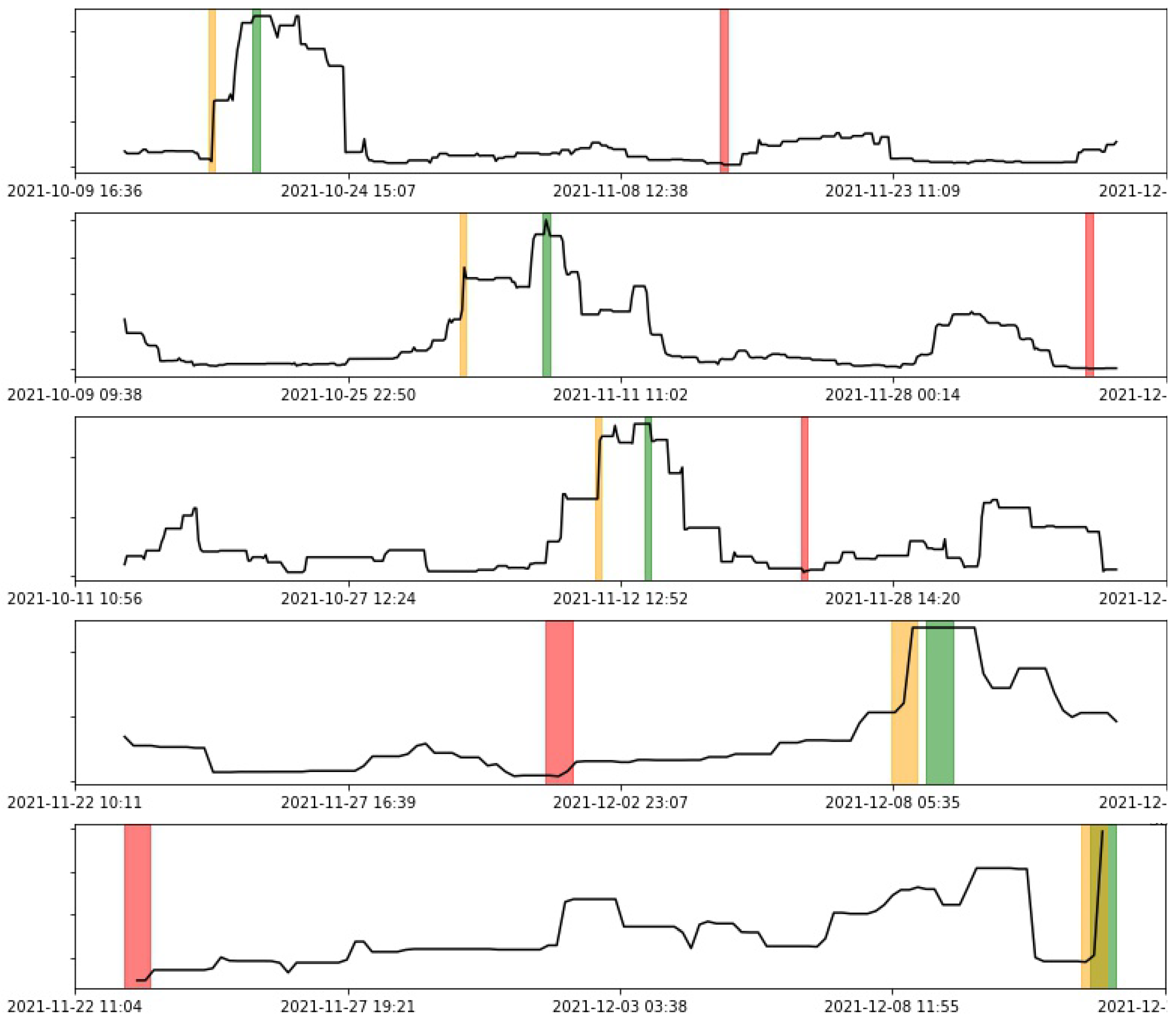
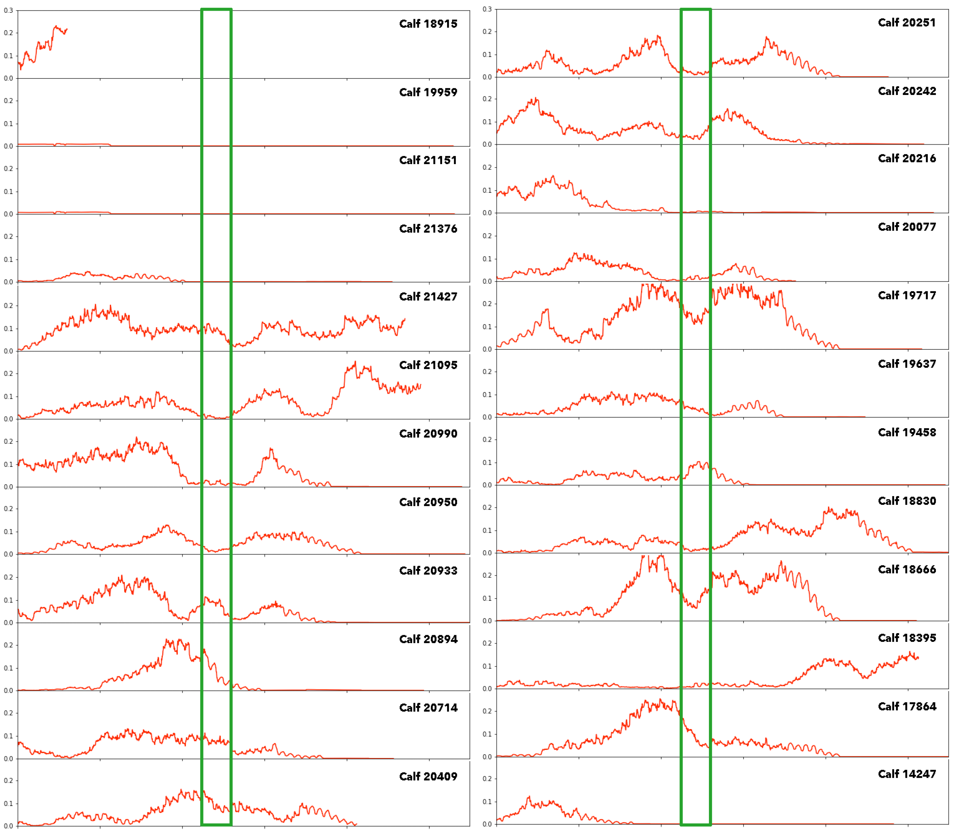
2.2.3. Periodicity Intensity in Calf Movements

The regularity of the sleep-wake cycle is important not just for humans but for other living animals. We investigated the strength of the circadian periodicity of new-born calves on a commercial farm and how that strength of periodicity changes throughout their first 6–8 weeks after birth [31]. Many animals, including cattle, are behaviourally synchronised with herds, coordinating reactions to external zeitgebers [32], so our interest in this use case is in the periodicity intensity of the circadian rhythm for the herd as a whole as well as for individual calves.
We gathered data from an Axivity AX3 wearable accelerometer [33] affixed to a collar worn on the necks of each of the 24 dairy calves from just after birth. The calves were fed twice a day, were bedded daily and had human contact during these activities. Feeding times were at similar times to milking as they were fed whole milk. Thus their day-to-day activities would have been very structured and regular. Individual calf movements, as detected by the accelerometers, would have varied among calves as they play and interact and explore their surroundings, so despite the regular structure to feeding and sleep, there is scope for a lot of individual variability among them.
Data from the accelerometers was sampled at 12.5 Hz and gathered for up to 8 weeks for each calf. It was processed in the way described in [34] by pre-processing into signal vector magnitude (SVM), a time series independent of sensor orientation and thus invariant to the movement of the collar around the neck. A Butterworth fourth-order band-pass filter [35] with frequency in the range 0.5 to 20 Hz was then applied to remove any white noise, and negative values were converted into absolute values. Movement values used for analysing periodicity were the aggregated mean of SVM calculated over non-overlapping 60-s windows.

3. Results

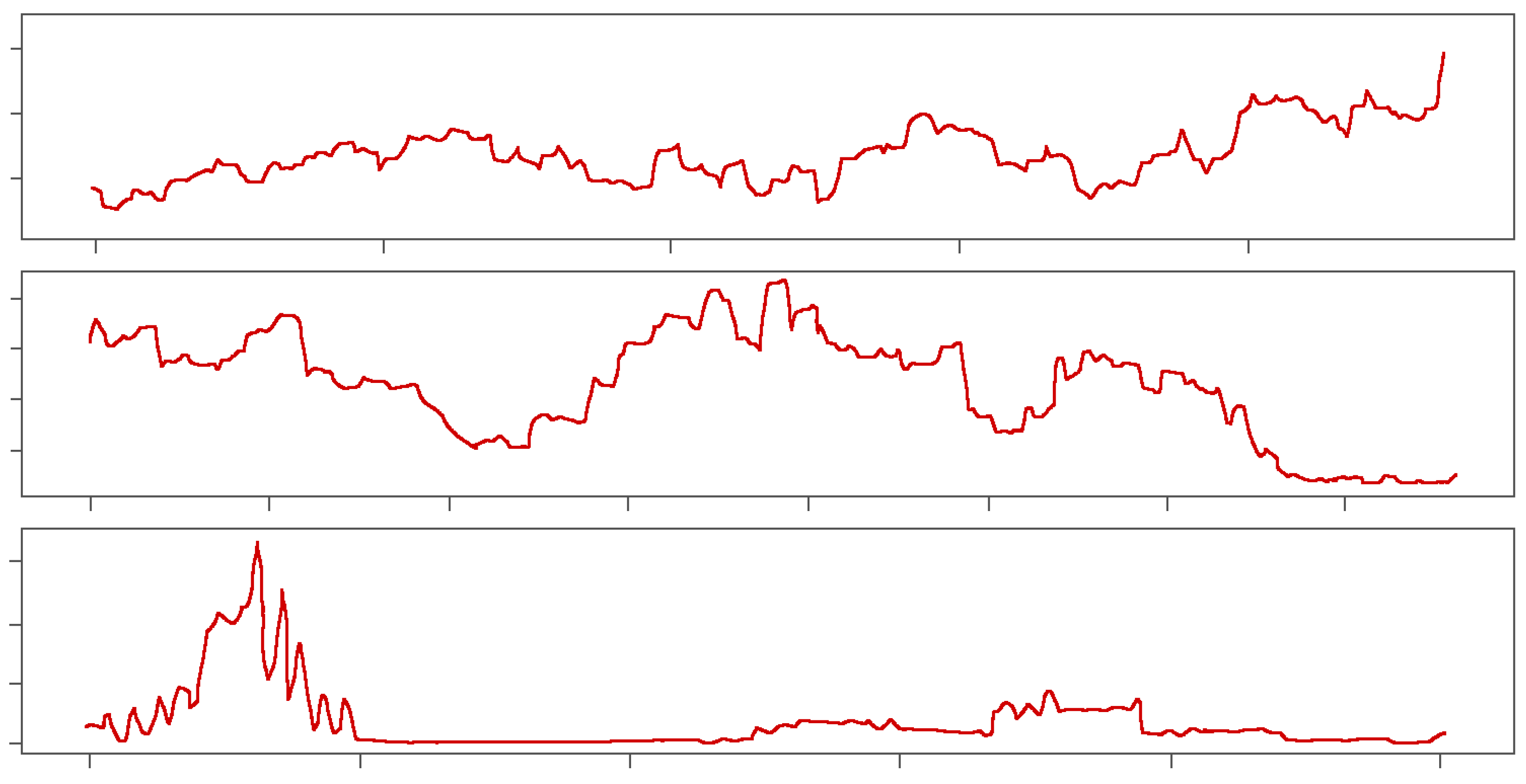
3.1. Results of Periodicity Intensity in the Homes of Older Adults

We first examine and discuss the results of periodicity intensity calculation on sensor data from the homes of older citizens. The output from periodicity detection on data from the NEX project participants was calculated in real-time and made available online. These visualisations were used in debriefings with participants by their clinical carers and project researchers and supported by a short-form informative YouTube video to explain the graphs and to ensure the participants understood how to interpret them.
Three example outputs are shown in Figure 2, where the values in each graph are normalised to a [0, 1] range as actual periodicity intensity values will vary considerably across participants, and each participant is interested in the relative changes in their own graph rather than in absolute values or in comparison to others. Following experimentation to determine the best parameters to use for each of the graphs, the frequency for periodicity calculation is 24 h, reflecting interest in the circadian rhythm. The window is 7 days, thus eliminating changes between weekends/weekdays, and the overlap or stride length is 1 h, making the computation fast. Each graph represents a periodicity intensity over a 3-month period.
The first graph in Figure 2 shows a participant with a relatively stable and regular lifestyle and only small variations in periodicity intensity. The gradual rise in periodicity intensity towards the end of the 3 months shows a slight improvement in lifestyle regularity, and there are no major perturbations throughout the 3 months. This participant is known to have a healthy, regular and comfortable lifestyle.
In the second graph in Figure 2, we see a participant with much more ups-and-downs in lifestyle. The increase in lifestyle regularity in the middle of the period corresponds to a constant presence at home due to catching COVID-19, self-isolating and recovering with regular behaviour and habits. For this period, the volume of sensor activations was much lower than in the earlier period as the participant was not doing much at home except spending time in bed, but it is not the number of sensor activations but their timing that contributes to periodicity intensity. Towards the end of the 3-month monitoring period, this participant moved out of the home to recuperate with family, hence the flatlining at the end.
The third graph in Figure 2 shows a participant who also caught COVID-19 during the early part of the 3-month recording period and then soon afterwards also moved out of their home to recuperate with family, which was indicated by the flatlining in the graph. The slight rise in periodicity intensity during the second half of the 3 months indicates family calling to the home on a semi-regular basis to collect mail and check it for security.
The result of this analysis is a form of self-monitoring of the individual but with deeper insights into overall behaviour and activities. This may be used to promote or sustain long-term behaviour change as the subject seeks to maintain high levels of rhythmicity in their lives.

3.2. Results of Periodicity Intensity in Student Learning Habits

We now present an in-depth analysis and discussion of the results of applying periodicity intensity to students’ online learning habits. The periodicity intensity graphs for each student were made available to them at the end of the teaching semester, supported by a short-form informative YouTube video to explain the graphs and to ensure they understood how to interpret them. Five sample graphs are shown in Figure 3. In each graph, the periodicity intensity values are normalised to a [0, 1] range to smooth out variance across students and to make each graph equally legible. This is similar to the older adult participants in the previous study in that each student will be interested in the relative changes in their own graph rather than in absolute values or in comparison to others. We also added 3 coloured vertical bands to each graph, red indicating the period of lowest periodicity intensity, green indicating the period of highest and yellow indicating the period of greatest (steepest) change. The parameters used in the calculation of the graphs are a frequency of 24 h, a window size of 7 days and a window shift or stride of 3 h.
The five graphs shown in Figure 3 have different start dates reflecting the different times students started studying, and they reflect totally different study patterns within the first, second, third and fourth students peaking at different times during the semester in terms of the structured and regular nature of their online access. The first student has her/his peaks earliest in the semester, while the fourth student has her/his peaks last. The graph for the fifth student shows a student with a gradual increase in regularity of studying throughout the semester with a burst of regular studying at the end, just before the course examinations.
While individual periodicity intensity graphs are of value for each student, we can get further value from this analysis by time-aligning and stacking the 169 individual student graphs, as shown in Figure 4. For these, we set a fixed start and end date/time before stacking the graphs. Since periodicity calculations are for windows of 7 days, there is a gap of 3.5 days at the beginning and the end of the graph.
Figure 4 shows the aggregated periodicity intensities for the cohort of 169 students, where the y-axis is a stack of periodicity intensities for each student; each student is shown in a different colour. The top line of the overall graph shows the aggregated periodicities from all students, and it reveals three distinct peaks corresponding to the early part of the semester as students settle into University life, the middle of the semester as students take advantage of the mid-semester reading week to catch up on study, and at the end of the semester, just before examinations, as students prepare for those examinations.
As shown by Byron and Wattenberg in [36], stacked line graphs may present an illusion of peaks and troughs, which might be caused by a subset of students rather than the peaks and troughs appearing across all students. Thus the overall stacked line graph might be artificially boosted or deflated by peaks or troughs from a small number of students. To assess this, we divided the students into random sub-groups and plotted a stacked line graph for each sub-group. Since the stacked line graphs for the sub-groups show the same shape as the stacked line graph for the whole cohort, there are no artificial boosts or troughs from a sub-group of students, and the pattern is generalised across the cohort.
We can see from Figure 4 that there is a fault line just before 1st November. The University’s academic calendar shows this was the date for the closing of registrations for the student course choices. A second interesting fault line appears just before 25 November. The semester’s teaching period ended on 27 November, and the pre-examination study period was between 29 November and 5 December. We can see an increase in the structured nature of VLE activities from students with their assignment submissions and revision of study materials in preparation for examinations, and this tails off as each student finishes their examinations.
The result of this analysis of periodicity intensity is personalised feedback for each student on their learning habits with deeper insights into the learning behaviour and activities of the overall student cohort. This has personal benefit for each student as well as benefit for the University and course directors.

3.3. Results of Periodicity Intensity in Calf Movements

Our final in-depth discussion is of the periodicity intensity algorithm applied to accelerometer data from new-born calves. The 24 calves used in the calf movement study had different dates of birth, and their sensor data thus started on different dates. For the oldest calf (sensor ID 20714), the accelerometer data began on 2nd March at 09:00, and for the youngest calf, the accelerometer data began on 5 April at 10:00. Though start dates varied, all calves in the herd were contributing accelerometer data by 5th April. Thus it is from that date onwards that we obtain a picture of the full herd’s periodicity. Of the 24 calves, 5 are considered outliers and did not contribute to the analysis of the overall herd because their collars had fallen off at some point during the data logging, and if reattached, it would have created a gap in the data, which would have impacted the calculation of periodicity intensity for a period of more than 2 weeks. The 19 remaining calves were used in the analysis. The graphs of periodicity intensity for individual calves can be seen in Figure 5, and their x-axes are time-aligned. For these, the periodicity frequency was set to 24 h, the window size was 7 days and the stride length or shift of the time-lagged overlapping windows was 15 min.
Figure 5 shows the 24 individual periodicity intensity graphs, and the first 4 in the left column and the 3rd in the right column were discarded for reasons mentioned earlier. The vertical green lines in the graph indicate the dates of disbudding, a process of the surgical removal of horn buds before the calves grow and cause danger to other calves and to the farmer [37].
Looking across the set of 19 graphs, it is difficult to discern any coordinated pattern across the herd. When we generate a stacked graph of the time-aligned periodicity intensities in the same way as was performed for the student VLE accesses, we get the graph shown in Figure 6, where each colour represents periodicity intensity for a different calf.
The staked line graph of periodicity intensities shows a peak at around the beginning of May followed by a clear drop in 24 h periodicity intensity across the herd, indicating a synchronous dis-improvement in herd welfare. This reached its low point after about 1 week, around 9 May and was followed by a return to better herd welfare, although not as high at around 2 May. Because of the 7-day windowing in our calculations, the drop-off, which reached its minimum point around 9 May, was most likely caused by a stressful or traumatic event at around 2 May, which is the time window during which the disbudding process took place.
As with the use case of student learning habits from a VLE, we divided the calves into random sub-groups and plotted a stacked line graph for each sub-group. These show the same shape as the stacked line graph for the whole herd. Thus there is no artificial boost or trough from a sub-group of calves, and the pattern is generalised across the herd.
The result of this analysis of periodicity intensity is similar to that from the analysis of student accesses to their VLE. We have individual feedback on a well-being indicator for each calf based on their movements with deeper insights into the well-being of the overall herd, and this is of interest to the farmer.

4. Discussion

This paper presents three applications of calculating periodicity intensity throughout a time series on three very different real-world use cases. In each case, we gain deeper insights into the data than would have been revealed without periodicity analysis. These powerful insights into the underlying time series data can be obtained from any data source that has underlying periodicity as an inherent feature.
The value of this form of data analysis is that it is unsupervised, requires no training data, and thus, it is generalisable. This makes the value of the technique in terms of economic impact quite attractive as it can be applied to any use case where there is longitudinal time series data to be analysed in order to detect gradual shifts or changes over time.
In terms of implementation, the choice of values for the three parameters is not difficult to determine. The frequency of the recurring pattern to be investigated, F o , is often 24 h but not always so and the use case usually already knows what this should be. The size of the window in which the periodicity is calculated m is also usually known in advance. For example, if F o is 24 h, then setting m to 7 days nullifies any effects of weekend/weekday behaviour transitions in the underlying data. The overlap between windows or stride length l is influenced by the demands of the use case and the amount of computation resources available and not any algorithmic limitation. The technique is agile in terms of the number and even the type of time series data used, and it is fast to compute. Because we use the Lomb–Scargle algorithm [13] to calculate periodicity in windows, it handles irregularly sampled data, such as our students’ access to their VLE, as well as moderate amounts of missing data, though not completely missing data as in those calves whom’s collars fell off but were replaced quickly in our third use case. Finally, the algorithm for calculating periodicity intensity is mathematically deterministic, producing the same output from the same input repeatedly.
Periodicity intensity is a complex metric to fully comprehend because it is novel and non-conventional. In the two of our use cases which involved human participants—in-home sensors in the homes of older adults and students accessing their VLE—we needed the support of an animated helper video to describe what the periodicity intensity was because our users were healthcare professionals and older adults.
For future work, we will concentrate on ways to make the metric more intuitively understandable by mapping changes in a periodicity intensity graph back to the underlying data, thus showing exactly what data has caused changes in periodicity intensity, and this would be useful in those use cases involving human subjects. We will also explore the robustness of the algorithm as a function of data quality by introducing noise to see how a decrease in data quality impacts the generated output. Finally, we will focus on the implementation of the Lomb–Scargle algorithm to determine periodicity at the 24 h frequency only, as our experience has been that this frequency setting is the one that most use cases are interested in.

Author Contributions

Conceptualization, A.F.S. and F.H.; methodology, A.F.S. and F.H.; software, F.H.; validation, A.F.S. and F.H.; formal analysis, A.F.S. and F.H.; investigation, A.F.S. and F.H.; data curation, A.F.S.; writing—original draft preparation, A.F.S.; writing—review and editing, A.F.S. and F.H. All authors have read and agreed to the published version of the manuscript.

Funding

This research was funded by Science Foundation Ireland grant number SFI/12/RC/2289_P2, cofunded by the European Regional Development Fund and by the Disruptive Technologies Innovation Fund administered by Enterprise Ireland, project grant number DT-2018-0258 and by a UCD Wellcome Institutional Strategic Support Fund, which was financed jointly by University College Dublin and the SFI-HRB-Wellcome Biomedical Research Partnership (ref 204844/Z/16/Z).

Institutional Review Board Statement

The study was conducted in accordance with the Declaration of Helsinki, and ethical approvals for (1) the study involving sensor data from the homes of older adults was obtained from the DCU Research Ethics Committee (DCUREC202221) and (2) the study involving log data from student access to an online VLE was approved by DCU’s Data Protection Unit 07042021-DPO with ethics approval was given by the School of Computing Research Ethics Committee. As ethical approval for (2) was deemed to be notification-only, the institutional policy is that only School-level ethics approval is needed. The animal study protocol for the study involving sensor data from movement and behaviour of the herd of cattle were collected under an ethical exemption from UCD Animal Research Ethics Committee, approval number AREC-E-19-46-McAloon.

Informed Consent Statement

Informed consent was obtained from all human subjects involved in the studies.

Data Availability Statement

The data presented in the study involving sensor data from the homes of older adults are openly available in FigShare at https://doi.org/10.6084/m9.figshare.21415836.v2, accessed on 5 January 2023. The data presented in the study involving student access to an online VLE are openly available in Figshare at https://doi.org/10.6084/m9.figshare.20288763.v2, accessed on 5 January 2023. The data presented in the study involving movement and behaviour of a herd of cattle are openly available in Figshare at https://doi.org/10.6084/m9.figshare.20039486.v1, accessed on 5 January 2023.

Conflicts of Interest

The authors declare no conflict of interest. The funders had no role in the design of the study; in the collection, analyses, or interpretation of data; in the writing of the manuscript; or in the decision to publish the results.

Abbreviations

The following abbreviations are used in this manuscript:
ADLActivity of daily living
ECTSEuropean credit transfer and accumulation system
IADLInstrumental activity of daily living
RPRecurrence plots
SVMSignal vector magnitude
VLEVirtual learning environment
EMDEmpirical Mode Decomposition
ZCRZero crossing rate
ZCDZerocross Density Decomposition

References

  1. Li, J.; Zhang, J.; Bah, M.J.; Wang, J.; Zhu, Y.; Yang, G.; Li, L.; Zhang, K. An Auto-Encoder with Genetic Algorithm for High Dimensional Data: Towards Accurate and Interpretable Outlier Detection. Algorithms 2022, 15, 429. [Google Scholar] [CrossRef]
  2. Fisher, D.N.; Pruitt, J.N. Insights from the study of complex systems for the ecology and evolution of animal populations. Curr. Zool. 2019, 66, 1–14. [Google Scholar] [CrossRef]
  3. Kuhlman, S.J.; Craig, L.M.; Duffy, J.F. Introduction to chronobiology. Cold Spring Harb. Perspect. Biol. 2018, 10, a033613. [Google Scholar] [CrossRef]
  4. Cohen, M. Wellness and the thermodynamics of a healthy lifestyle. Asia-Pac. J. Health Sport Phys. Educ. 2010, 1, 5–12. [Google Scholar] [CrossRef]
  5. Farhud, D.; Aryan, Z. Circadian rhythm, lifestyle and health: A narrative review. Iran. J. Public Health 2018, 47, 1068. [Google Scholar] [PubMed]
  6. Marwan, N.; Romano, M.C.; Thiel, M.; Kurths, J. Recurrence plots for the analysis of complex systems. Phys. Rep. 2007, 438, 237–329. [Google Scholar] [CrossRef]
  7. Nath, A.G.; Udmale, S.S.; Raghuwanshi, D.; Singh, S.K. Improved Structural Rotor Fault Diagnosis Using Multi-Sensor Fuzzy Recurrence Plots and Classifier Fusion. IEEE Sens. J. 2021, 21, 21705–21717. [Google Scholar] [CrossRef]
  8. Li, X.; Li, T.; Wang, Y. GW-DC: A Deep Clustering Model Leveraging Two-Dimensional Image Transformation and Enhancement. Algorithms 2021, 14, 349. [Google Scholar] [CrossRef]
  9. Buman, M.P.; Hu, F.; Newman, E.; Smeaton, A.F.; Epstein, D.R. Behavioral periodicity detection from 24 h wrist accelerometry and associations with cardiometabolic risk and health-related quality of life. Biomed Res. Int. 2016, 2016, 485–506. [Google Scholar] [CrossRef] [Green Version]
  10. Hu, F.; Smeaton, A.F. Periodicity intensity for indicating behaviour shifts from lifelog data. In Proceedings of the 2016 IEEE International Conference on Bioinformatics and Biomedicine (BIBM), Shenzhen, China, 15–18 December 2016; pp. 970–977. [Google Scholar]
  11. Chegini, S.N.; Manjili, M.J.H.; Bagheri, A. New fault diagnosis approaches for detecting the bearing slight degradation. Meccanica 2020, 55, 261–286. [Google Scholar] [CrossRef]
  12. Bartlett, M.S. Periodogram analysis and continuous spectra. Biometrika 1950, 37, 1–16. [Google Scholar] [CrossRef] [PubMed]
  13. VanderPlas, J.T. Understanding the Lomb–Scargle Periodogram. Astrophys. J. Suppl. Ser. 2018, 236, 16. [Google Scholar] [CrossRef]
  14. Azar, Y.; Fiat, A.; Karlin, A.; McSherry, F.; Saia, J. Spectral Analysis of Data. In Proceedings of the Thirty-Third Annual ACM Symposium on Theory of Computing, Hersonissos, Greece, 6–8 July 2001; Association for Computing Machinery: New York, NY, USA, 2001; pp. 619–626. [Google Scholar] [CrossRef]
  15. Montaruli, A.; Castelli, L.; Mulè, A.; Scurati, R.; Esposito, F.; Galasso, L.; Roveda, E. Biological rhythm and chronotype: New perspectives in health. Biomolecules 2021, 11, 487. [Google Scholar] [CrossRef] [PubMed]
  16. Ho, Q.T.; Phan, D.V.; Ou, Y.Y. Using word embedding technique to efficiently represent protein sequences for identifying substrate specificities of transporters. Anal. Biochem. 2019, 577, 73–81. [Google Scholar]
  17. Rhif, M.; Ben Abbes, A.; Farah, I.R.; Martínez, B.; Sang, Y. Wavelet transform application for/in non-stationary time-series analysis: A review. Appl. Sci. 2019, 9, 1345. [Google Scholar] [CrossRef] [Green Version]
  18. Chaovalit, P.; Gangopadhyay, A.; Karabatis, G.; Chen, Z. Discrete Wavelet Transform-Based Time Series Analysis and Mining. ACM Comput. Surv. 2011, 43, 1–3. [Google Scholar] [CrossRef]
  19. Shukla, S.; Mishra, S.; Singh, B. Empirical-mode decomposition with Hilbert transform for power-quality assessment. IEEE Trans. Power Deliv. 2009, 24, 2159–2165. [Google Scholar] [CrossRef]
  20. Lartillot, O.; Toiviainen, P. A Matlab toolbox for musical feature extraction from audio. In Proceedings of the 8th International Conference on Music Information Retrieval, ISMIR 2007, Vienna, Austria, 23–27 September 2007; Volume 237, p. 244. [Google Scholar]
  21. Hong, Y.; Lee, Y.J. A general approach to testing volatility models in time series. J. Manag. Sci. Eng. 2017, 2, 1–33. [Google Scholar] [CrossRef]
  22. Abayomi-Alli, O.O.; Sidekerskienė, T.; Damaševičius, R.; Siłka, J.; Połap, D. Empirical Mode Decomposition Based Data Augmentation for Time Series Prediction Using NARX Network. In Artificial Intelligence and Soft Computing; Rutkowski, L., Scherer, R., Korytkowski, M., Pedrycz, W., Tadeusiewicz, R., Zurada, J.M., Eds.; Springer International Publishing: Cham, Switzerland, 2020; pp. 702–711. [Google Scholar]
  23. Altaf, M.; Akram, T.; Khan, M.A.; Iqbal, M.; Ch, M.M.I.; Hsu, C.H. A New Statistical Features Based Approach for Bearing Fault Diagnosis Using Vibration Signals. Sensors 2022, 22, 2012. [Google Scholar] [CrossRef]
  24. Cohen, M.X. Analyzing Neural Time Series Data: Theory and Practice; MIT Press: Cambridge, MA, USA, 2014. [Google Scholar]
  25. Sidekerskienė, T.; Damaševičius, R.; Woźniak, M. Zerocross Density Decomposition: A Novel Signal Decomposition Method. In Data Science: New Issues, Challenges and Applications; Dzemyda, G., Bernatavičienė, J., Kacprzyk, J., Eds.; Springer International Publishing: Cham, Switzerland, 2020; pp. 235–252. [Google Scholar] [CrossRef]
  26. Uzunoğlu, C.P. A Comparative study of empirical and variational mode decomposition on high voltage discharges. Electrica 2018, 18, 72–77. [Google Scholar] [CrossRef]
  27. Timon, C.M.; Heffernan, E.; Kilcullen, S.M.; Lee, H.; Hopper, L.; Quinn, J.; McDonald, D.; Gallagher, P.; Smeaton, A.F.; Moran, K.; et al. Development of an Internet of Things Technology Platform (the NEX System) to Support Older Adults to Live Independently: Protocol for a Development and Usability Study. JMIR Res. Protoc. 2022, 11, e35277. [Google Scholar] [CrossRef] [PubMed]
  28. Katz, S.; Ford, A.B.; Moskowitz, R.W.; Jackson, B.A.; Jaffe, M.W. Studies of illness in the aged: The index of ADL: A standardized measure of biological and psychosocial function. J. Am. Med Assoc. 1963, 185, 914–919. [Google Scholar] [CrossRef] [PubMed]
  29. Lawton, M. Instrumental Activities of Daily Living (IADL) Scale. Psychopharmacol. Bull. 1988, 24, 785–787. [Google Scholar]
  30. Baik, C.; Larcombe, W.; Brooker, A. How universities can enhance student mental wellbeing: The student perspective. High. Educ. Res. Dev. 2019, 38, 674–687. [Google Scholar] [CrossRef]
  31. Rhodes, V.; Maguire, M.; Shetty, M.; McAloon, C.; Smeaton, A.F. Periodicity Intensity of the 24 h Circadian Rhythm in Newborn Calves Show Indicators of Herd Welfare. Sensors 2022, 22, 5843. [Google Scholar] [CrossRef]
  32. Conradt, L.; Roper, T.J. Group decision-making in animals. Nature 2003, 421, 155–158. [Google Scholar] [CrossRef]
  33. De Craemer, M.; Verbestel, V. Comparison of Outcomes Derived from the ActiGraph GT3X+ and the Axivity AX3 Accelerometer to Objectively Measure 24-Hour Movement Behaviors in Adults: A Cross-Sectional Study. Int. J. Environ. Res. Public Health 2021, 19, 271. [Google Scholar] [CrossRef]
  34. Riaboff, L.; Aubin, S.; Bedere, N.; Couvreur, S.; Madouasse, A.; Goumand, E.; Chauvin, A.; Plantier, G. Evaluation of pre-processing methods for the prediction of cattle behaviour from accelerometer data. Comput. Electron. Agric. 2019, 165, 104961. [Google Scholar] [CrossRef]
  35. Fridolfsson, J.; Börjesson, M.; Buck, C.; Ekblom, Ö.; Ekblom-Bak, E.; Hunsberger, M.; Lissner, L.; Arvidsson, D. Effects of frequency filtering on intensity and noise in accelerometer-based physical activity measurements. Sensors 2019, 19, 2186. [Google Scholar] [CrossRef] [Green Version]
  36. Byron, L.; Wattenberg, M. Stacked graphs–geometry & aesthetics. IEEE Trans. Vis. Comput. Graph. 2008, 14, 1245–1252. [Google Scholar]
  37. Espinoza, C.; Lomax, S.; Windsor, P. The effect of topical anaesthesia on the cortisol responses of calves undergoing dehorning. Animals 2020, 10, 312. [Google Scholar] [CrossRef] [PubMed] [Green Version]
Figure 1. Schematic demonstrating the calculation of periodicity intensity throughout a time series using time-lagged overlapping windows. (a) shows overall periodicity for a time series, (b) shows periodicity calculated for the first 7 days only, (c) shows periodicity for 7 days with a shift of 1 day, (d) shows some sample raw data and (e) shows periodicity intensity calculated for the whole time series.
Algorithms 16 00119 g001
Figure 2. Normalised periodicity intensity from three sample ARC trial participants for a three-month duration. The frequency is 24 h, the window size is 7 days, and the window shift is 1 h. x-axis values span 3 months, and y-axis values have been normalised to the range 0 to 1.
Algorithms 16 00119 g002
Figure 3. Normalised periodicity intensity for a sample of five student participants. The frequency is 24 h, window size is 7 days and window shift or stride is 3 h. y-axis values have been normalised to the range 0 to 1.
Algorithms 16 00119 g003
Figure 4. Stacked line chart of cumulative periodicity intensity from all 169 student participants. y-axis values have been normalised to the range 0 to 1.
Algorithms 16 00119 g004
Figure 5. Line graphs of calf periodicity intensities for each of the 24 calves. Frequency is 24 h, window size is 7 days and window shift is 15 min. The vertical green lines indicate the dates of disbudding.
Algorithms 16 00119 g005
Figure 6. Stacked line chart of cumulative calf periodicity intensity from 19 of the 24 calves, from [31]. y-axis values have been normalised to the range 0 to 1.
Algorithms 16 00119 g006
Disclaimer/Publisher’s Note: The statements, opinions and data contained in all publications are solely those of the individual author(s) and contributor(s) and not of MDPI and/or the editor(s). MDPI and/or the editor(s) disclaim responsibility for any injury to people or property resulting from any ideas, methods, instructions or products referred to in the content.

